#and Miles’s first outfit is from a concept art!
Explore tagged Tumblr posts
Text
college miles and gwen pt. 2!


they’d 100% be the cute couple in the library that everyone hates
#gwiles#ghostflower#gwen x miles#gwiles art#across the spiderverse#spiderverse art#yes i stole Gwen’s shirt from marvel rising bc it’s actually such a cute t shirt!#and Miles’s first outfit is from a concept art!#I think they’d be everyone’s vigilante otp#into the spider verse#spiderverse au#pls let them grow old together#gwen stacy#miles morales#my art
988 notes
·
View notes
Text
Kinda sad that they replaced sunflower with another song in this scene BUT I’m delusional so this is what happened it’s true I was there


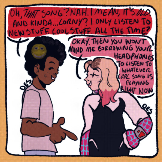
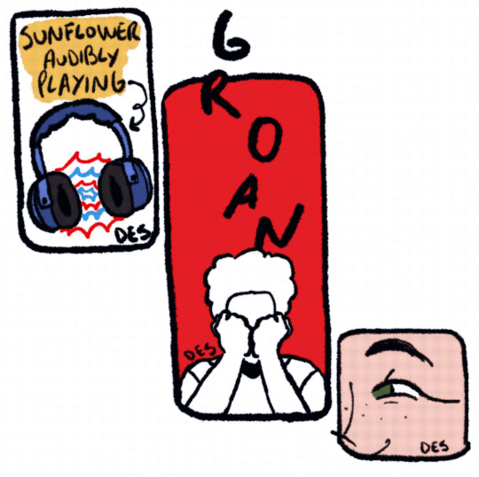
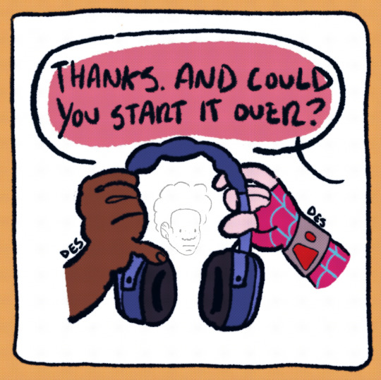


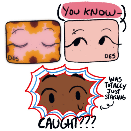
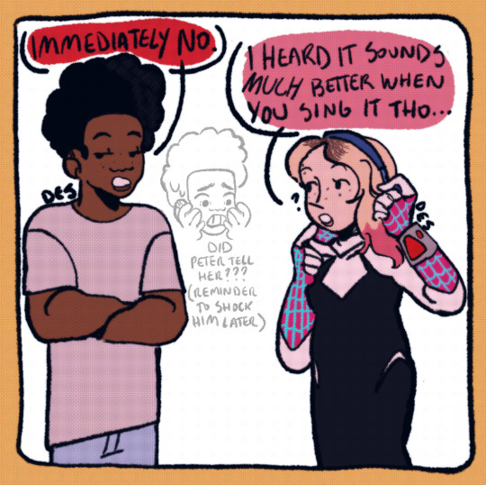
#des art tag#across the spiderverse#atsv#miles morales#gwen stacy#across the spider verse fanart#spider man across the spider verse#miles heart eyes morales 😔#note: I made Gwen’s eyes green instead of blue because of some of the concept art in the first art book#never drawing headphones again ts SUCKED goodbye 😭#omg I saw spiderverse again and I forgot that they changed a lot of things from the -first look- like the outfits#and even tho I drew this after I saw across the spiderverse before I drew this I took references from that first look so PLEASE ignore that#thank you 😁
3K notes
·
View notes
Text
had my second high definition viewing of atsv in the theater today and here are my favorite details that i missed due to being overwhelmed on my first viewing:
LONG AF POST:
-gwen is literally wearing a rainbow shaped trans pride pin on her jacket with her prom outfit. she's soooo so canon trans <3
-captain stacy HAS A TRANS FLAG PATCH ON HIS POLICE UNIFORM JACKET?????? when i'm telling u my eyes popped out of my head 😳 SHES SO CANON TRANS!!!
-poster outside miles's guidance counselor's office reads: "visions sciences: telling you your story".
-parallel of miles's and gwen's dad kicking things out of general exasperation towards the beginning and end of the movie respectively
-when miles as spidey is talking to his dad and giving him advice (for himself) there's a reference to miles possibly reading vonnegut? (maybe in class??) "if this isn't nice what is" is a collection of kurt vonnegut's commencement speeches. (literally subtitled "advice to the young". the writers were extremely clever for this reference. if not reading it in class, miles has been searching up life advice on his own)
-i barely caught this but i'm PRETTY sure that in miles' room near his door there's a MICHELLE OBAMA presidential race sticker??? was president obama in the earth-1610 dimension michelle obama?? iconic if so
-fedex on earth-1610 is REDEX
-gayatri seems like they took elements of both gwen (police dad) and mj (young model) for her background as i believe i caught her visible on a "zomato" ad billboard (which appears to be the earth-50101 version of ubereats)
-i spent all of hobie's scenes trying to pick up the details of his many pins; but the only one that i could really make out with the quick shot changes besides the union jack pin was the one right above it, which is a three-leaf clover. i wondered if maybe it had some kind of significance to maybe irish independence or smth but i couldn't find anything online that backed that up so not sure what it means. if u know pls drop it in the replies.
-hobie's boots are definitely NOT ladder laced. i KNOW there is concept art and poster art of him with ladder laces but in the actual movie they are 100% crossed. also unlike the poster art, both boots have blue laces, not one blue, one yellow/orange. i wanted to be all on board the ladder lace code train but i'm pretty sure they just made his laces blue so that they could contrast against the red boots and be spidey colors. they probably abandoned the ladder lace part of the visual when someone realized what blue ladder laces meant in lace code. "HAS hobie killed a cop," you ask? given his comic backstory i'd say the odds are HIGH. but i would bet they didn't want people to think that since he's gone through canon event asm-90 ("a police captain close to spider-man is killed by falling rubble during a battle with a nemesis") that there's any possibility THAT was the cop he killed and he's proud of it (since it's supposed to be all abt character development from the ✨trauma✨ of the event)
-during the whole "intervention" scene, while all the other spider-people are facing directly in towards miles and miguel from wherever they are standing in the circle, hobie is the only one whose back is turned. he watches most of the scene over his shoulder. also, during a couple shots facing miles before the entire society of spiders show up, hobie is separated in the shot from all the other main spiders (Peter B, Gwen, Jess, etc) BY MILES. he is visible over one shoulder and everybody else is visible over the other. these two details are great signals of hobie having already MORALLY turned his back on miguel's authoritarianism, as well as giving a nice inverted "devil/angel on the shoulders" nod.
-peter b asks miguel to take a picture of him and mayday since it's her first chase; miguel brushes him off but mayday understands and uses her webshooter to click the camera button on peter b's phone and take a selfie without him noticing 😂😂😂 shes everything to me
-when miguel is pinning miles to the train, after gwen and peter b have caught up, there is a very fast moment when miles calls for help ("PETER!!") and peter doesn't reply to him, but calls out to miguel to calm down (smth like that) instead 🥲 peter for the love of god step up your mentor game and look out for this kid i can't handle it anymore
-when gwen takes the watch hobie made her out of the box, the screen is briefly visible and reads "project botleg". bootleg -> bot -> "botleg"; I SEE YOU HOBIE. people think he's so cool (and he is!!) but he's also just as much of a dork as all the other spiders. what a goofball
-in miles-42's room, a speed bag/speed ball/maize ball is attached to his wall near the door. there are other substantial differences to their rooms, but i think this is clearly a reference to uncle aaron-42's large presence in miles-42's life, given the association from both movies of aaron with the punching bag and miles getting guidance from him/looking to him for support.
-in addition to all the miles-1610 vs miles-42 prowler vs spidey reflection imagery in the end credits, guess who else has several moments of flashing from spider-man colors (red and black at least) to prowler colors (purple and green)?? miguel, that's who. miguel and miles-42/uncle aaron-42 team-up in beyond the spiderverse? or just an extra parallel for the antagonists sharing goals/possibly methods?
OKAY ANYWAY if ppl want i can try and dig up images of some of these but i figured that would make this post long af so that's all for now folks!! go see across the spider verse again and marvel at how much more fine detail you find like me 🕸🕸🕸
#across the spiderverse#across the spider verse spoilers#atsv#miles morales#gwen stacy#miguel o'hara#hobie brown#peter b parker#mayday parker#captain stacy#jefferson morales#gayatri singh#aaron davis#the prowler#earth 1610#earth 42#earth 50101#trans gwen stacy#this movie is driving me fucking NUTS bro#they are so so so insane for all of this#i can't wait for it to come out on dvd and blu-ray so i can pause it and pick through it more slowly#i'm sure there are SO MANY more things no one has picked up yet#also i tried to only include stuff in this list that i haven't really seen other people talk about#or that i noticed additional details to if i had heard someone reference it#r speaks#r tags
427 notes
·
View notes
Note
BONES !
I wanna hear all about Prism (apart from the things you already answered ofc <3) tell me something super niche about them I’m so curious
Also! If you waaaaant maybe perhaps yell about your version of the Ministry? I saw you talked a little about it and IM SO CURIOUS
I hope you have a good whatever time zone you’re in :3
SENTIENT GOLFBALL!
Uuhhhh, let’s seeee. A really niche thing about Prism is that their favorite color is black. But not like any black, it’s specifically that really inky black that reflects a bluish-purple hue when it’s shiny. It reminds them of their eyes, and as their concept is prismatic light, they don’t really produce black as a color.
It’s also interesting, as I haven’t done clothing studies, I’m not sure what looks good with their design in terms of outfit color palettes. I’m not sure if the entirely black with gold accent palette would necessarily look good with Prism’s design (I haven’t even tested it with the other ghouls beside Mountain and Swiss that one time, oops), so I’m considering Prism having a special uniform and mask that is white. Of course, it’s just a thought.
Oh, and then my Ministry. Oh my Ministry! I actually have done a full map mock-up of how my Ministry is laid out and it’s really big. So far, my favorite part about the Ministry is finding inspiration and thinking about the art and architecture used in the different buildings’ construction. What I call the Administration Building is based upon the Mausoleum filming location in the Chapters, of course expanded upon and developed. One of my favorite buildings though is the Central Cathedral, which of course is based on Gothic architecture for cathedrals, but my main reference points for it is the Cologne Cathedral and the Rouen Cathedral. I’m a pretty big art history nerd now thanks to going to art school, so my brain is always running a mile a minute when thinking about different parts of the Ministry grounds.
At some point, I hope to actually put together a document about my world building for my Ghostverse, cause it’s been getting really expansive. I’m doing my best to have it actually built like a real church, using the catholic system as the basis, just Satanic of course. It’s also really fun, cause I get to think about character interactions we’ll probably never get in canon cause I’m not killing off the first three Papas. I get to enjoy Primo and Terzo beefing with Copia becoming Frater Imperator (Primo wanted to do evil plots and Terzo wanted to improve the establishment, but noooo, Nepotism).
I’ve rambled a lot. Oops :D
23 notes
·
View notes
Text

I flew the SR-71 Blackbird in the Cold War, here’s why it was so important
Hush KitSeptember 29, 2022
SR-71 In the Cold War
By BC Thomas
The SR-71 has the deserved reputation of being the most unique air-breathing aircraft ever built. No other could fly as fast, as high, or carry thousands of pounds of equipment above 80,000 feet. It was the primary strategic reconnaissance asset for the Free World during the latter 25 years of the Cold War. The SR-71 could sustain continuous Mach 3+ flight for over an hour while obtaining the highest quality reconnaissance information from multiple sensors, and with aerial refueling, the aircraft could have circumnavigated the Earth in one flight. The aircraft was one of the first to employ stealth technology, thereby ensuring that the airplane was almost invisible to radar. Its speed and altitude also cloaked its presence. During this time of sparse reconnaissance satellite coverage over potential enemy targets, the SR-71 could sneak up, gather vital information, and leave the area without warning, and often without notice.

The SR-71 was never successfully intercepted by surface-to-air missile or aircraft. It had a state-of-the-art electronic defensive system which would defeat an incoming missile’s homing and steering. Detectors on board would alert the crew of a missile launch instantly and, since the SR-71 did not normally fly at its maximum speed or altitude, the aircraft’s defense was simultaneously to jam the missile’s guidance while accelerating, climbing, and turning with 45º of bank. No surface-to-air missile could out-turn, thus hit, an SR-71, a fact demonstrated many times, especially during the Vietnam War. Attempts to shoot down an SR-71 continued until August 25, 1981, which was the last time an enemy (North Korea) fired a surface-to-air missile at an SR-71; that mission was flown by Maury Rosenberg, pilot, and Ed McKim, Reconnaissance Systems Officer (RSO).
It missed.
We carried an array of sophisticated sensors and recorders which could glean reconnaissance data with cameras capable of high-quality photographs horizon-to-horizon. We also had radar imagery capable of one-foot resolution. This was the Advanced Synthetic Aperture Radar System (ASARS), which could deliver readable radar pictures night or day, bad weather or clear. I’m no photo interpreter, but even I could tell what was pictured. The SR-71 also carried electronic intelligence (ELINT) systems which are still classified. We advertised that the SR-71, within 24 hours notification, could be over any target on earth and be capable of surveying 100,000 square miles of terrain each hour. It was no idle boast.
The SR-71’s potential versatility is not widely known. Clarence ‘Kelly’ Johnson, the genius designer of all ‘Blackbirds’, was diligent in assuring that the Mach 3+ Blackbird aircraft could fulfil several roles, if needed for national contingencies. The first version was the A-12 aircraft, built for the Central Intelligence Agency (CIA). This was a single-person airplane and carried as principal sensor, one very high-resolution optical camera.

youtube
A differently capable aircraft was the YF-12, the Mach 3+ fighter/intercepter version of the Blackbird’s basic design. It was developed as part of Kelly Johnson’s “Universal Aircraft” concept of adapting the fore-body section to accept reconnaissance equipment, air-to-air missiles, or four nuclear weapons. Thus, the Mach 3+ Blackbird type could have been straight reconnaissance, a nuclear bomber, an interceptor, or recon/strike. There is at least one video, available to the public, which shows an actual missile launch from a YF-12 at Mach 3. I’ll add parenthetically that it was also outfitted to be a Mach 3 drone-launch vehicle, but the first test deployment of the D-21 drone failed and resulted in the loss of the Blackbird M-21 launch aircraft.

So it was versatile. But did it deliver?
By the late 1950s, we knew the Soviet Union had better, more capable rocket launch systems than any North Atlantic Treaty Organization (NATO) country. This was dramatically evidenced by two sudden leaps in Soviet advanced technology: 1957, Sputnik, the first artificial satellite; 1961, first man in space to orbit the Earth. These notable achievements shocked the people of the United States and indeed, the Western World.
Knowledge of the military and industrial strength of Communist states was extremely important, and reconnaissance missions against the Soviet Union started as early as 1947. Several American aircraft conducted these flights: the RB-29, RB-47, RB-50, C-130, PB4Y-2, U-2, and the Ryan 147 remotely piloted vehicle (RPV). Reconnaissance flights penetrated Soviet airspace, overflew the land mass, and many were shot down. The Los Angeles Times, 11/12/1992, reported that 40 such reconnaissance aircraft were lost and 200 American airmen died conducting these flights. That number of lost personnel was confirmed by Paul Glenshaw in his article: “Secret Causalities of the Cold War,” Smithsonian Air & Space Magazine, December 2017.
So aerial reconnaissance flights against potential enemies (the Soviet Union, China, North Korea, Cuba, the Middle East) were a top priority. These flights had to be conducted routinely and had to be survivable.
The SR-71 was developed to fill that need. From 1966 to 1990, the SR-71 flew over 3,500 operational reconnaissance missions while logging 11,000 hours in a flight environment which was most hostile: aircraft skin temperature averaged 620º F, outside air pressure was 0.4 pounds-per-square-inch (psi), altitude was 15-16 miles straight up, aerodynamic damping was low, and true airspeed was typically 2,000 to 2,100 miles-per-hour, making pitch controllability critical.
For operational survivability, the SR-71 was one of the safest military aircraft, as no Air Force crew member was killed while flying one, a testament to outstanding aircraft maintenance and crew training. A remarkable record given its extreme flight envelope and potential attack risk.
I’ll summarize the importance of the SR-71 missions by quoting Paul Crickmore, noted aviation historian and Blackbird author, in a letter to me.
“In theatre, the SR-71 proved the concept of high-Mach, high-altitude flight, to obtain vital aerial reconnaissance. The SR-71 regularly conducted reconnaissance missions in the skies over North Vietnam – particularly around Hanoi in 1968-70 which at the time, was the most highly defended area on the planet.”
“The Blackbirds provided superior flexibility compared to satellites, time after time, specific examples—Yom Kippur War 1973, Yemen 1979, Cuba 1977—1990, Lebanon October 1983 (following the truck-bomb attack killing over 240 US Marines), Libya 1986, The Persian Gulf 1987, but perhaps most importantly, the on-going monitoring of Soviet nuclear submarine fleets for the US Navy—particularly the Northern Fleet with their submarine-launched ballistic missiles (SLBMs), capable of hitting large areas of the United States, as well as all Allied Countries.”
“The simultaneous, synoptic coverage of information gathered by the SR-71’s sensors, provided the intelligence community and national leadership—with photographic imagery (PHOTINT), radar imagery (RADINT) and electronic intelligence (ELNT), that unquestionably helped to keep the Western World free.”
Richard H Graham, Colonel, USAF (ret) was an SR-71 Instructor Pilot, Squadron Commander, 9th Strategic Reconnaissance Wing Commander, and assigned to the Headquarters USAF (Pentagon) to supervise Programs and Resources as a Strategic Force Programmer. His evaluation of the SR-71’s worth as a reconnaissance asset is quoted from his book: “SR-71 The Complete Illustrated History of the Blackbird, The World’s Highest, Fastest Plane.”
“…the synoptic coverage (displaying conditions as they exist simultaneously over a broad area) provided by the SR-71 was far superior to satellite reconnaissance. Broad-area coverage from different approach angles, in a relatively short time span, produced considerably better intelligence than a predictable, single satellite pass, every ninety minutes. In 1990, the SR-71 was the only airborne reconnaissance platform that could penetrate hostile territory, accomplish wide-area synoptic coverage, and still survive. It could also be tasked reasonably quickly and had the element of surprise.”


Photographs of two SA-2 surface-to-air missiles which were launched against SR-71 #976, July 26, 1968 in the vicinity of Hanoi, Vietnam. Tony Bevacqua (Pilot), Jerry Crew (RSO).

Order the Hush-Kit Book of Warplanes here
@hush_kit via X
Sadly, this site will pause operations in December if it does not hit its funding targets. If you’ve enjoyed an article you can donate here.p
20 notes
·
View notes
Text


Cringetober day 13
Rule 63 (genderbent)
For a while I have considered drawing Miles Edgeworth genderbent because he's my fave aa character and I prefer drawing females but I held back because I knew I'd love drawing her too much and sure enough I was right XD
I named her Millie (I doubt I'm the first to do this it's a very obvious name choice) and if it wasn't already obvious I stole some design details from Franziska for Millie. I also had fun coming up with concepts based loosely on canon and my own hc's. For example, bratworth has more make up and long nails because bratworth looks more flashy in canon so in my mind the female version would wear more makeup and have long painted nails to stand out more.
Then for her regular version it's mostly same as canon, her hair is even short and fluffy because I hc Miles/Millie as having fluffy hair and after seeing Pink turnabout's amazing aa genderbent art (seriously go check that Tumblr out if you like aa fanart and cute shoujo art!). At first I did consider giving her a skirt but than decided to keep the pants, I hc Bratworth outfit has a skirt so not sure why she might of switched to pants, probably found them more practical or something like that.
Then I had to draw a Cheifworth Millie! She has a high ponytail with a red ribbon because my version of Cheifworth Miles has a ponytail of course >:3, currently not sure if I want her to wear a long pleated skirt or pants, I'll probably draw both and than decide which one I like better afterwards :-)
Of course after drawing Millie I had ideas for genderbent Phoenix (who I think will still be named Phoenix because that name is too iconic to change and I'm pretty sure it's gender neutral... right?) So I drew them. Main Phoenix of course has an outfit inspired both by Elle Woods iconic pink courtroom dress and Mia Fey's outfit. Than Feenie has shorter hair cuz canon Fennies hair is a lil shorter than his other versions and she's wearing a pink headband that I'd assume is a gift from her "boyfriend" (it's actually from genderbent Iris but she doesn't know that until years later), leading to her not wearing any hair accessories/hats until after she meets Iris and learns the truth behind her relationship because before than having things in her hair remind her to much of her ex :(. The 3rd drawing on the Phoenix page is loosely inspired by the end of case 1-3 when Phoenix is told to never show up in court again after Miles straight up rants about having feelings again after fanboying over Will Powers XD
Hope you all enjoy these designs and my very long commentary regarding them XD
#ace attorney#ace attorney art#ace attorney fanart#ace attorney headcanon#ace attorney genderbent#cringetober#cringetober day 13#cringetober 2024#miles edgeworth#phoenix wright#bratworth#cheifworth#dadworth#feenie#genderbend#traditional art#cyanart#cyansketchbook#cyanfanart#cyanaa
17 notes
·
View notes
Text

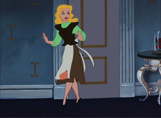


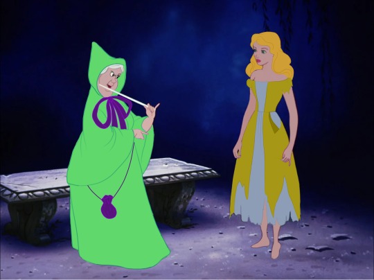

We all know the designs in Disney's Cinderella are iconic, but what if some iconic concept designs made it into the final film?
These are my first attempts at making screencap edits, taking inspiration from the 1940s-50s Golden Book of Walt Disney's Cinderella, with artwork by Disney's first credited female animator, Retta Scott Worcester. Her artwork is often mistaken for that of Mary Blair (one of Disney's most celebrated artists, who also worked on Cinderella and a handful of other movies), which makes sense, as their art styles are pretty similar. I have vague memories of having the book when I was little, and I've always been charmed and mesmerized by the artwork and the fact that the characters and their costumes looked so notably different from those in the Cinderella we got. Cinderella's ball gown and yellow party dress are especially so lovely, and I paid homage to them by including them in my Cinderella KiSS doll/dress up game, and Lady Tremaine's dress, accompanied by a mile-long pearl necklace and the key to Cinderella's room hanging from a rope wound around her midsection, is pretty sick. I also have always been fascinated by ideas of what could have been, for anything, really. So, I sat down and decided to play around with Krita, and these are the results! I actually started these roughly a year ago, when I was just getting started in digital art, and they had been sitting dormant in my files while I paid more attention to other projects, and I just now got around to finishing them.
I originally wanted to do the stepsisters too, but I was 1.) unsure of which outfits they were shown wearing in the book to draw for them, and 2.) a little apprehensive and unsure about the amount of detail to include in them, as there seemed too many to include in a traditionally animated film of the time.
Commissions info
#my art#disney#retro disney#vintage disney#disney art#disney fanart#cinderella#disney cinderella#cinderella 1950#retta scott worcester#fairy godmother#lady tremaine#prince charming#screencap edits#walt disney#disney Princess#disney princesses#Angie’s scribbles
127 notes
·
View notes
Text


Expanding on my very popular post about a character so many people love and care about
I wanted to show off her other clothes...at lest the basic main ones I might do a club outfit for fun I'm quite proud of these I'll expand on my thoughts behind them in read more Character is Tempest from the Spider-Man 2099 2014 comic run.
Alchemax janitor: Using the gray color palette from the concept art of what the people of Nueva York wear, I kind of wanted to show off how bland it is was compared the bright colors she uses to express herself, She years a wig to look more "presentable" but also to try and stand out even less then she already does. Luckily he people at Alchemax don't even remember her face or notice her orange colored eyes (they probably would think its contacts anyway) it also shows how the people working there even care about people with that kind of job, shes pretty much invisible to them. The only person to ever notice her really was Miguel. Normally she wears gloves but I took them off to show her bright nails and how much they stand out, She has a red wing cause I thought it be a cute idea to imply that shes Miguel's MJ.
Wasp costume: At first I was worried about it not being colorful enough to fit her character but, I still wanted to keep the Hawk Wasp colors so I added like a colorful hue tint to the suit so it still looks bit more colorful, also the wings and eyes are bright orange so they pop out even more. The big thing about her suit that I wanted to give it a "street" style to it, like how the marks are spray painted on (inspired by Mile's Spider-man suit in ITTSV and ATSV) Shes not a street artist or anything this mostly her using what she had on hand so I think it fits, wanted it to look "messy" (also her marking are meant to be like bug legs that why they're like 60 of them) I also like to think her suit is backless so her wings can grow out.
Wasp powers: She, super strong yes, I think that's a given when your fused with a bug/has tough/thick skin some of it even is armored but like in in patches/She can fly with her wings and VERY fast too/bio-electric blasts BUT I want to make it more of a fire thing like her mom in the comics but she didn't get them till after she was experimented on/her stingers come out of her hand and they strong enough to break threw steel and also her sting can paralyze you (idk if I'll make in permanent like an actual Hawk Wasp) its also VERY painful, pain will probably knock you out)
Hope you enjoyed my rambling.
#My art#Fan art#fan redesign#character redesign#redesign#Tempest Monroe#Spiderman 2099#Spiderman#the Wasp#Wasp#superheroes#super hero#Miguel/Tempest#MiguelXTempest#miguel o'hara x Tempest Monroe#ATSV#I GUESS#cause the art style is inspired by it
53 notes
·
View notes
Text
ok im sorry i realized pandemonium is close and got to thinking and im pissed as fuck about tsukasa’s lims again. prsk devs were really like “Ok guys let’s give this guy two of the most banger lims in the game-“


“Yes great perfect. Ok now as soon as ny3 ends let’s pivot 180° and beat him to death with a rusty metal pipe.” like for the love of god. since then we’ve had three kasa lims, and they are, in order:
managed to ruin my literal top dream mixed lineup of ruishizukasa by having leaks tease the thrilling concept of tanuki/kitsune limkasa and then ended up being Walking Nerd Emoji in a Plain Middle Schooler’s Uniform. when lineup and card set theme leaks dropped i was literally gearing up to podium this event, i wanted it to be my t3, and then the cards dropped and made me so mad i dropped to maybe t100 if i’m bored enough
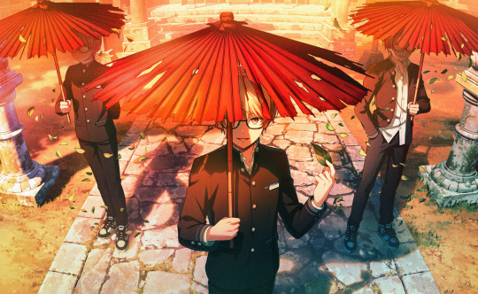
very pretty card art at least but my literal least favorite limkasa hair especially in terms of 3dmodel + previous world record holder for Most Boring Lim Costume

*audible snarling* fucking kasafes. fucking new world record holder for #1 Most Boring Lim Costume and on a fes card of all things. fucking plain white cotton tshirt HGTV sugar free breakfast syrup commercial ass sitting in a boring suburban kitchen holding a piece of bread. “what’s that?” said the devs. “you were excited to see tsukasa’s version of the concept of fragment sekais, the reality-bending time-warping realms of pure feeling given physical form where characters come face to face with deeply symbolic fantastical scenarios and confront reflections of their deepest emotions? you wanted to see how creatively we could address the myriad of different complex patterns of thought that make tsukasa who he is, and were excited to see which of many unique and interesting routes we could’ve taken to explore him at his roots? ha! hahahahaha! No. You get breadboy.”

LIKE. GIRL. HELLO. you have GOT to be shitting me. these are the lims we’re getting? for TENMA FUCKING TSUKASA of all people???? i could pull up to the most boring outfit competition in my last job’s uniform tshirt and a pair of uncomfortably textured khakis, and if i got up backstage and saw my opponents were these three chucklefucks, i would piss my pants in soul-crushing terror knowing i was miles out of my league.
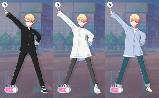
LIKE??? WHAT HAPPENED?????? compare them to his first three lims’ fits and hairstyles:

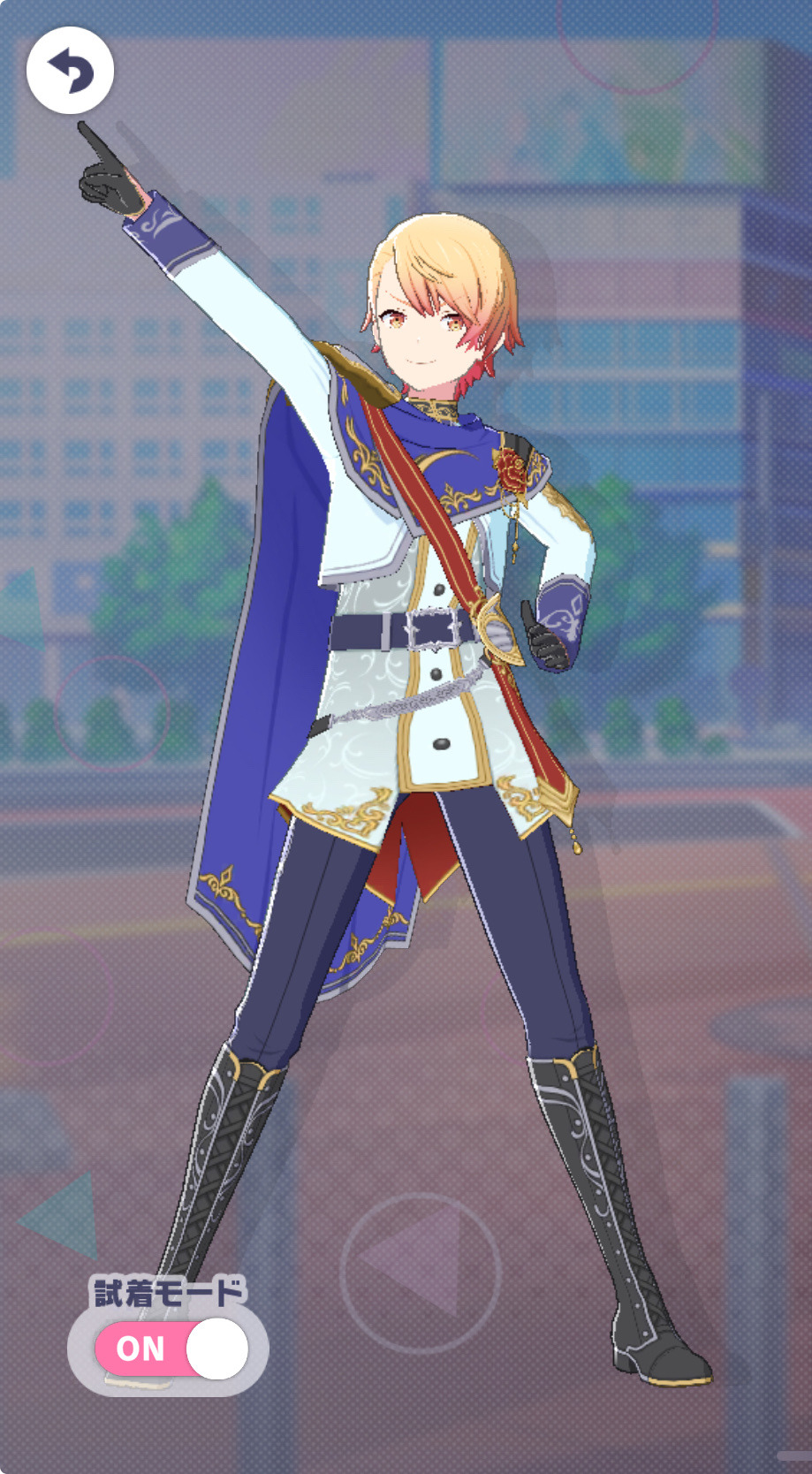

the fuckin reverse glowup from those to the latest three is unreal. absolute shitfest. world’s most rancid dimdown. someone get my boy some fucking CLOTHES
as i always provide on my kasaposts, please see my approved hater license below the cut:

i adore him guys i swear. im mad on his behalf not mad at him
#tsukasa tenma#project sekai#me.txt#okay thats my pettiness quota for like the next 3 months. apologies i will return to being chill now#also like no shade to ppl who do like the recent lims. i have no quarrel with you i prommy. i am just. Disappointed and Enraged#that said please do not try to argue with me about why kasafes is genius and im stupid for disliking it#i promise ive seen every argument under the sun. i simply do not agree. my friends have received many a discord rant on why that is
17 notes
·
View notes
Text


FINALLY sat down to do some designs for Phoenix’s outfits for The Swan Prince
I shamelessly used Derek’s outfits from the movies (since Phoenix is in Derek’s role) and just changed up the colors and added patterns - except with colored pencils I couldn’t quite get the small detailing of the sunflowers, crescent moons and suns 😣. But I’m still pleased with it for concept art to imagine him in for the story!
Umm but the for the prologue and 1st summer he’s not even 5 yet, so idk what he’s wearing the lmao. Much more casual stuff I think, he has a tendency of getting his clothes dirty right away. Will I draw that? Who knows…
Miles is going to be a bit more difficult for me to do, because I’d like to pull in some kind of feature from Odette’s outfits…
also is it any coincidence that Derek & Phoenix’s main color is blue and Odette & Miles’ main color is red? No. Not it is not.
Odette actually wears quite a few colors throughout the movie while Derek’s outfits hardly change lol.
As a little girl-pink with dark red, as a pre-teen-orangish-red with some blue, teen-periwinkle, as an adult she has this dress(is it a dress) that’s white with a dark red bodice and detailing. Her main dresses as an adult are white, one with green and the other more teal (although in some shots you might argue it’s closer to blue, how many dresses does she have like that lol), and then her imposter wears a black dress with red trim. So red is clearly her most frequent color, even if it’s not the first dress you think of for her. That second image is from one of the sequels (I think I’ve only ever tried to watch the 2nd one a long time ago and realized it was terrible so I didn’t watch any others, there’s so many sequels 😬)


#blue and red brainrot always wins y’all#narumitsu fanfiction#the swan prince#the swan princess#outfit doodles
2 notes
·
View notes
Text
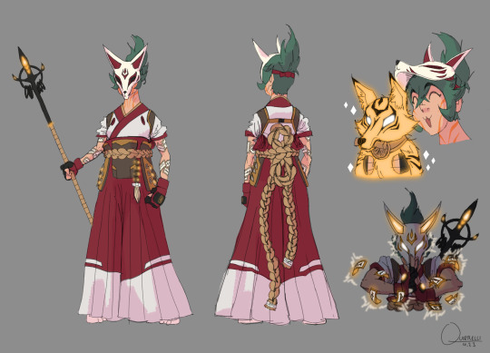
Quick and dirty Kiriko redesign
Main issues I tried to address:
The shilouette is pretty meh. It's not dire but at a glance/distance there is potential for confusion. So I tried to exaggerate notable features (hair, mask ears, hakama) and added a spear, like she has in some of the concept art. For one thing it looks cool and for another, it's been established through the Shimadas that these animal spirits are tied to a weapon and a spear fits in very neatly with a sword and bow.
The design is bland. (Which at least makes her fit in with the other OW2 default skins lmao). The first time I saw her I literally thought it was a D.Va skin. The idea, I would guess, was to merge traditional japanese clothing with modern day hip street fashion vibes and it just doesn't come together at all. Instead of enhancing them, all the aspects that should have visual impact are watered down. From her leggings to her face, there is no flavor; except in that trash garbage mask-visor nonsense. So I leaned into the traditional clothing, since leaning into the "hip young person" would just make her even less distinguishable from similar characters. I also tried to add some bits and bobs for flair (like the seals on her arms), just can't be bothered to really go into texture and detail atm.
Generic personality. This is more of a vibe thing than a character design thing but I want her to, at least at first glance, come across as a bit more cool and confident, maybe a little mysterious and just more interesting than the knock off Tracer/D.Va she turned out as. She can still be a bit of a goofball behind the mask but I feel her protector role demands that she can be at least a tiny bit intimidating.
That trash garbage mask-visor nonsense. My least favorite part by a goddamn mile. It just looks so fucking dumb and there's no way to make it cool; with its teeny kitten ears, dumbass white eyebrow triangles and perfectly flat bottom cut off. Again it's like mixing two things (naruto style ninja headband and kitsune mask) and ending up with the worst of both worlds. And you just know the reason she doesn't have a full or even half mask is because god forbid you can't see a female characters cute, utterly indistinguishable from the other cute 20-somethings, face. Fuck you, she gets a whole mask and it's badass.
Color. Her color palette has powerful "I'm 14 and this is my OC" energy. Actually, everything about her kinda has that, but the color palette especially. Now, I'm the first to admit that color isn't my strong suit either but even I can see some very obvious improvements. Like, why are her normal healing and her ult different colors? To me that's unnecessarily confused and looks bad, simply put. On top of that, they're yellow and cyan respectively, aka the most overused colors for glowy things ever. So I picked a yellowy orange bc it matches the fox motif and sets a nice contrast with the Shimadas' blue and green, just like the red in her outfit does. I incorporated some of that orange into her clothes as well, you know, for cohesion, and kept the green hair as a nice complementary to all the warm colors.
Feel free to make suggestions for improvements, might do a V2 eventually
#idk to me that already works much better and with some more finessing could be pretty awesome#kiriko is the first (and so far only) OW character I looked at and went “wow that's pretty fucking weak”#even the second worst design (Echo) is merely boring#my stuff#overwatch#ow2#kiriko
50 notes
·
View notes
Text
Soooo...
I read Dark Web, the 2023 Marvel comics crossover.

The plot: Two clones, Madeline Pryor (Jean Grey's) and Ben Reilly (Peter Parker's) join forces to wreak havoc, and suddenly, New York's usually inanimated objects suddenly start talking and biting everyone they see!
Overall, I really enjoyed it, but I'll give my thoughts on each series in it.
The X-Men issues are excellent, be it the plot or the art. I'm very tempted to read more of their adventures! I'm very thankful to have listened to Jay & Miles X-plain the X-Men, even for not so many episodes, because it definitely helped! Aside from the touching storyline between Jean and Madeline, there's also the matter of Cyclops and Havok both being detained. Cyclops hilariously can't open his eyes or the extremely adorable puppies dangling in front of his face will burn. What a cute predicament. I loved looking at the puppies! Meanwhile, Havok has an extremely sexy outfit that, I suppose, is damaged, but it really hides... not much of his body.
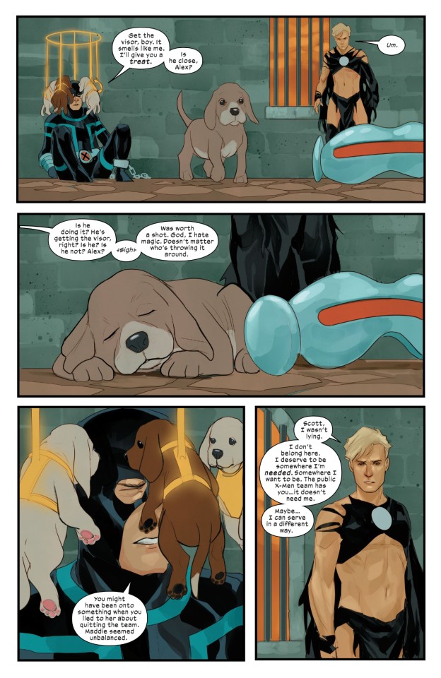
Is this his usual garment?! It seems so. I'm here for it, but also, what the heck. Not gonna complain though.
A prominent member of the cast is also Forge, my husband who's just as dashing as what I'd imagined. So overall, really loved those issues.
The Miss Marvel issues were also great. I don't really care about her powers, but what listen I've seen of her cast is really enjoyable. The objects are the most prominent in her story and are enjoyable conversation partners. We also get a nice Miles Morales cameo who helps the Muslim community in a big (literally) way.
The Mary Jane & Black Cat issues are also extremely enjoyable. MJ has her Jackpot powers, and they really work well as a duo. Aside from the delightful lesbian vibes, they're just great as friends (and previous romantic rivals). The art is great, the plot is fun and full of surprises. I loved their relationship with the purple demon where they all made it clear there would be a betrayal coming up, and were chill with that. And look, two women looking badass while fighting together? I'm easy to please, folks.

Spider-Man's issues are alright. Spidey's conflict with Chasm reaches hilarious proportions (be it Chasm's stupid plan to make Peter eat an apple, or Rek-Rap's whole character that I expected to hate and instead found intensely delightful), but the ending is quite sad. I did enjoy seeing Ben and his girlfriend, whom I'd never heard of before. Hallow's Eve has a sick costume design. Chasm also has a great suit, that's what made me aware of the event in the first place! I wish he had a good ending too, however. I'm curious about the aftermath...
The art was extremely good overall for these issues.
Now, for issues I enjoyed less...
Gold Goblin was a surprising, but not uninteresting delve into Norman's psyche around questionable plot points. In concept, it's not so bad, and here too, the art is impressive, but somehow those issues ended up being... boring.
But it's nothing compared to Venom. I'm not attached to those symbiotes, but this really didn't help either. I didn't really care about that plotline, it felt messy and boring.
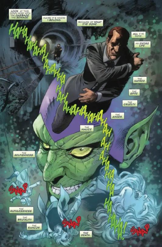
So overall, Dark Web was quite enjoyable. It made me want to read more of some characters, thirst on many men, and turn a lot of pages. Definitely not a beginner's comic storyline because there's a lot of bagage involved.
#spider-man#comics#peter parker#comic books#Black cat#mary jane watson#miss marvel#Gold Goblin#Norman Osborn#Venom#X-Men#Chasm#Jean Grey#Madeline pryor#Dark web
6 notes
·
View notes
Text
Major study of Concept art :
Blog 43:( forefront 2)
An Analysis of Pop Art Style in Conceptual Design of the Movie Spider Man: Into the Spider Verse (2018)
Spider Man: Into the Spider Verse is an animated film produced by Sony Animation, which tells the story of a black teenager named Miles Morales who gains Spider Man's abilities after being bitten by a spider. In the movie, Miles meets other Spider Men from different parallel universes and works together to stop Wilson Fiske's (Wilson Fiske) conspiracy to disrupt the order of the universe using time and space devices(Wang, 2023). Through this adventure, Miles learned how to become a true Spider Man.
Pop art style:
As early as the 20th century, Pop Art became an art movement that liberated individuality and emotions, and gradually gave birth to multiple artists and art styles. Pop artists, represented by Andy Warhol, were the first to apply animated character images to their works.(Niu, 2024) Animated character images, as a way of opposing expressionism and modernism, became the cornerstone of Pop Art films.
2.The female Spider Man:Gwen Stacy
The colors in movies are not just for visual beauty, but to inject unique personalities and emotions into the characters. Gwen Stacy, the female Spider Man, is a typical example. Her clothing uses a combination of white and purple, and her high brightness stands out in the overall picture dominated by black, blue, and red. White symbolizes coral and agility, while purple outlines her strikes. Mysterious and elegant(Ma& Jin, 2021). This color selection not only highlights Gwen's feminine qualities, but also reflects her lightness and flexibility in her movements, as if the spider silk she dances on the screen is like an elegant dance. In her appearance, the audience generally appreciated her unique lightness and agility, which is precisely through the use of color to convey the character's personality
youtube
Spider Man: Into the Spider Verse(2018)available at:https://www.youtube.com/watch?v=WjVfrGMgrSU
3.Shadow Spider Man:
Meanwhile, the design of Shadow Spider Man is completely opposite. He comes from a black and white world, and in the film, he is dressed in a pure black outfit, which fatally highlights his seriousness, ruthlessness, and classic detective style. In a colorful world, black and white visual tones are out of place. However, in order to prevent this character from being isolated or monotonous in the visual style of the film, the creator designed a key prop for him: a Rubik's Cube composed of high water level colors.(Niu, 2024) The brightly colored small items create a strong contrast with the black and white tone of Shadow Spider Man, symbolizing his deep desire and curiosity for this colorful world. The appearance of this Rubik's Cube is not only a prop, but also a manifestation of Shadow Man's inner emotions. It conveys his rebellion against the monotonous black and white world, as well as his longing for a colorful world.

The conflict and fusion of these colors actually reflect modern romanticism and post thinking. Shadow Spider Man is not just a character immersed in darkness, his deep thirst for color represents his pursuit of life, freedom, and diversity. The colors of the Rubik's Cube are dazzling in his world, symbolizing the possibility of hope and change, which is also a subtle connection between him and other Spider Man characters
Overall, Spider Man: Parallel Universe not only creates rich layers and artistry visually through the fine use of colors, but also deeply expresses the inner emotions and personalities of each character. Each character left a deep impression on the audience, while also taking the film to a new level in visual art. The colors of each character are not only for decoration, but also for a profound understanding of their inner world, making Spider Man: Parallel Universe not only an animated movie, but also an artistic visual experience
Reference
Ma Yu & Jing Mi. (2021). Explore new visual forms of expression in animated movies —— Take Spider-Man: Into the Spider-Verse as an example. Tomorrow fashion (09), 50-51.(Accessed: 6 August 2024)
Niu, Man. (2024). Spider-Man: A Study on the postmodernist aesthetic characteristics of Into the Spider-Verse. Theatre house (15), 168-170.(Accessed: 6 August 2024)
Wang , Yu Han. (2023). —— Take Spider-Man: Into the Spider-Verse as an example. Theatre house (27), 172-174.(Accessed: 6 August 2024)
Spider Man: Into the Spider Verse(2018)available at:https://www.youtube.com/watch?v=WjVfrGMgrSU(Accessed: 6 August 2024)
1 note
·
View note
Text
# How Ships are Made:
A Voyage Through Shipbuilding From the ancient canoes carved out of logs to the titanic container ships that crisscross our oceans today, ships have played a pivotal role in human history. They have facilitated trade, exploration, and migrations, shaping civilizations and the world as we know it. But have you ever stopped to wonder how these colossal structures are made? Let’s embark on a journey through the fascinating world of shipbuilding. ## 1. **Design and Planning** Before a ship sees the light of day, it begins as a concept on paper. Naval architects design ships using specialized software that helps visualize and test the vessel's performance under various conditions. These designs take into consideration the ship's purpose (cargo, passenger, naval, etc.), expected sea conditions, desired speed, and many other factors. ## 2. **Material Selection** Ships primarily use steel as their building material, but aluminum, fiberglass, and composites can also be used, especially for smaller vessels. The type and quality of materials chosen are critical to ensure the ship's durability, efficiency, and safety. ## 3. **Laying the Keel** The keel, often considered the backbone of the ship, is the first part to be laid down. It runs along the bottom of the ship and provides structural strength. Traditional shipbuilding ceremonies often revolve around the 'laying of the keel.' ## 4. **Assembling the Hull** The ship's hull, which provides buoyancy, is assembled in sections. Large steel plates are cut to size, shaped, and then welded together. As sections are completed, they're erected in a dry dock or a slipway, gradually forming the recognizable shape of a ship. ## 5. **Outfitting** Once the hull is complete, the ship moves to the outfitting stage. This involves installing all the internal components, such as engines, electronics, living quarters, and other equipment. For large vessels, this can be a highly complex process, with miles of piping, wiring, and intricate machinery. ## 6. **Launching** Launching marks the ship's first encounter with water. Depending on the shipyard's facilities, this can be done in a couple of ways: - **Gravitational Launch**: The ship slides down a slipway into the water. - **Floating-Out**: If built in a dry dock, the dock is flooded until the ship floats, after which the water is drained. ## 7. **Sea Trials** Before a ship is officially ready, it undergoes sea trials to test its performance and ensure everything works as intended. This is a critical step to identify any issues or defects that need rectifying. ## 8. **Delivery** Once satisfied with the ship's performance and all inspections are passed, the ship is handed over to its owner and is ready to embark on its maiden voyage. ## **Conclusion** Shipbuilding is a blend of art and science, an intricate dance of engineering, craftsmanship, and innovation. The next time you see a ship sailing across the horizon, take a moment to appreciate the incredible journey it has undergone, from a mere design on paper to a majestic vessel braving the vast oceans
1 note
·
View note
Text
Porsche is reimagining the EV charging experience with the opening of its first branded Charging Lounge in Germany. This luxurious hub provides a relaxing oasis for Porsche drivers to recharge their electric models. Here's an in-depth look at Porsche's new charging concept and what it offers owners: Highlights Luxury lounge in Germany has 6 fast 300kW DC chargers Also 4 slower 22kW AC charging stations Entry with license plate recognition or Porsche app Solar panels supplement grid electricity supply Food, drinks, and amenities provided inside More locations coming to Austria and Switzerland Part of plan as Porsche ramps up EV lineup Charging in High Style Porsche's new charging site provides more than just electricity - it's a complete luxury experience. The large lounge area allows drivers to relax in comfort while charging up. Food, drinks, and amenities make it feel like an airport business lounge. The Bingen am Rhein location has 6 fast 300kW DC chargers capable of adding 60 miles of range in just 5 minutes. Slower 22kW AC stations are also available for longer top-offs. With360 kWh of total power, it can charge up to 12 Taycans simultaneously at max speed. Seamless Access for Porsche Owners Gaining entry to Porsche's charging lounge is simple for Porsche owners. License plate recognition automatically identifies registered Porsches. The Porsche app can also unlock the doors. A QR code or charging card provides access if needed. Once inside, charging starts automatically when the cable is plugged in. No need to authenticate or pay. Quality Charging Hardware The charging stations themselves are state-of-the-art: 300kW DC fast chargers from Alpitronic can add over 60 miles of range in just 5 minutes. Liquid-cooled cabling allows for high currents. Future-proof for 400kW upgrades to charge coming models even quicker. With 6 fast-chargers, drivers don't have to wait long even if the lounge is at capacity. On-Site Solar and Dedicated Power The lounge utilizes on-site solar generation through roof panels, but most power comes from direct grid supply. Each station has a dedicated power line supplying up to 360 kW of capacity in total. This ensures charging speeds remain fast even at max utilization without bogging down the grid. Premium Interior Design Inside, the lounge is outfitted with upscale furnishings and amenities: Leather seating and wood surfaces provide a premium look and feel. Food and drink fridges offer complimentary refreshments. Occupants can use the free WiFi or watch Porsche racing highlights on a big screen. Bathrooms are available to freshen up during longer stops. It feels more like a first-class airport lounge than a charging station. More Locations Coming Porsche plans to open more of its Charging Lounges across Europe soon. Additional sites are upcoming in Austria and Switzerland, with more in Germany too. As Porsche ramps up its EV lineup, providing a premium charging experience becomes more important. More models beyond the Taycan will necessitate a larger fast-charging network. FAQs What models can use Porsche's charging lounge? Currently it's designed for the Taycan, but will support more Porsche EVs as they are released. Do drivers need to pay to use the chargers? No, charging is free for Porsche owners once authorized via license plate, smartphone app, or RFID card. How quick is the fastest charging option? 300kW DC fast charging can add over 60 miles of range in just 5 minutes. It's very quick. What food and drinks are provided inside? Premium coffee drinks, refrigerated sodas and water, and assorted snacks are complimentary for lounge users. Will Porsche build charging lounges in North America? Not confirmed yet, but they're possible in maj
or US cities once Porsche grows its EV model range. The Takeaway Porsche's new Charging Lounges provide EV owners with speedy charging in luxurious surroundings. The amenity-filled hubs being opened in Europe pamper drivers and take the hassle out of recharging. This premium concept fits with Porsche's brand image and hints at the coming prominence of EVs in its lineup. As Porsche ramps up electric vehicle production, the Charging Lounge experience could provide a template for reimagining EV ownership perks. #Wiack #Car #CarInsurance #CarRental #CarPrice #AutoLoans
0 notes