#and I really REALLY want an early 18th century mens coat
Explore tagged Tumblr posts
Text
tbh, as much fun as I'm having with making victorian skirts etc, I do really think that next year I'm going to focus much more on making menswear. it's more practical for me, it suits me better, and I just feel better in it.
#the skirts are for events that require fancy dressing up#a cosplay in a way#the menswear is for everyday wear#also casual vintage#just. I need to get out of the 'dressing in old clothes = wearing skirts' trap#anyway this is a long winded way of saying I really want a victorian mens suit with a really nice tailored black coat#and I really REALLY want an early 18th century mens coat#a pirate coat. so to speak.#also a great way to get clothes that swoosh without wearing womens skirts
4 notes
·
View notes
Note
Good sir, I am hoping to pick your brain. I’m making an 18-century (“pirate”) shirt as a gift to my friend. He wants tie closures on the neck and cuffs instead of buttons. Might you have any insight or resources for this? I’ve seen the ties in at least one of the extant shirts I’ve viewed online. I’m still pretty new to the sewing gig and I’d like to minimize inventing metaphorical wheel as much as possible. Thanks in advance!
It's very unusual, but do know of one example! (Not that extant one though)
But first - Link to my most thorough shirt construction blog post. (It's a few years old and I've improved a few little things in my technique since then, and I mean to finish writing a new and better one before the year is over.)
Ok, ties on shirts! I'm assuming this is the extant one you're talking about? Tbh I'd discount this one entirely if you're looking for information on 18th century men's shirts because I don't think it is one.

Besides the attached ties, the sleeves are extremely weird. They're cut off and have no wristbands!! This would make it quite impossible to wear under a coat, the wristbands are an absolutely essential part of an 18th century shirt. I also don't see any reason to believe this is actually 18th century when it could just as easily be 19th century, and considering how short the slit is I think that more likely.
(Lots of auction sellers like to say "late 18th century" about things that are like... yeahh maaaaybe that's plausibly from a very fashion forward guy in the late 1790's but it's much more likely early 19th century. And with court dress they sometimes just straight up date it several decades too early. Look at lots of examples and always question everything, because museums don't always date things correctly either.)
I think I remember seeing someone mention once that it was a 19th century workman's garment of some sort, but I can't remember where, and all we've got to go on are a few pictures and a brief caption from a seller who doesn't know what they're talking about. It does look like it could have been worn over another layer though, and the fabric is very coarse. It could also have been altered at a later date for theatrical costume, which is something the Victorians did to A LOT of 18th century garments.
So just ignore that shirt!
The vast majority of 18th century mens shirts close with 2 or 3 buttons on the collar, but there is a style that uses ribbons. It appears to have been fairly common in the late 17th and early 18th century, and then slowly dwindles as the century goes on. I have a section for it on my shirts pinterest board with 64 examples. Ooh, wait, 65, just found a new one.
The collar is made with little to no overlap and one buttonhole on each end, and a ribbon is threaded through them.
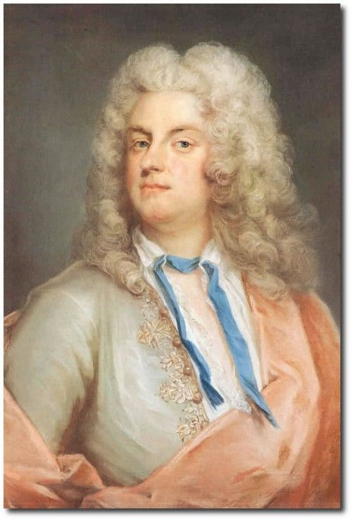
Portrait of Carl Gustaf Tessin, 1728.

Sir Charles Howard, 1738.
I actually made one of these last year!
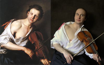
The collar doesn't sit as well with the ribbon as it does with 2 buttons, but once you put a stock over it it's fine.
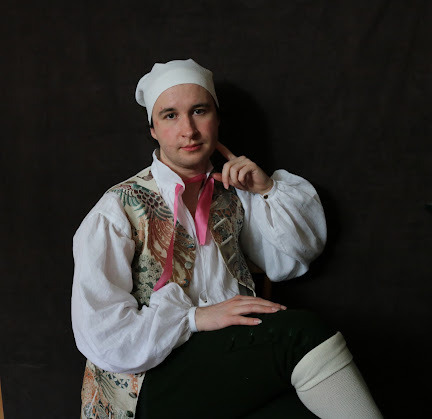

Nearly every single depiction of an 18th century shirt I've ever seen (and I've spent a LOT of time looking) uses sleeve links on the wristbands. (Which I have a tutorial for! They're really easy to make!) I do sleeve links on most of my everyday shirts because I like them better than sewn on buttons. When the wristband is this narrow, sewn on buttons don't sit very nicely.
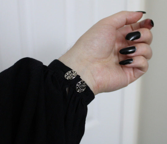
But! If your friend wants ties on the wrist in a historical way, I do know of one single example, and it's this guy!
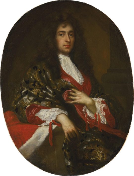
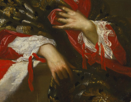
Giovanni Maria delle Piane, Portrait of a nobleman. No date given, but if I had to guess I'd say 1680's or 90's. Very late 17th century looking fellow.
We can't see his collar closure, but I think it's very possible that he has a matching red ribbon holding that closed.
Personally I wouldn't want to try these, because they look like an absolute nightmare to tie by yourself one handed. But the good news is that you could make just regular wristband that take sleeve links and they'd work for this too, since both just have a buttonhole at each end! I aim for a finished wristband length that's 10-14mm longer than my wrist measurement, with the buttonhole being about 4 or 5mm in from the edge, which gives me enough ease to wear them comfortably with sleeve links, so if you do that then he'll be able to wear them both ways.
288 notes
·
View notes
Note
What do you think of the costumes on Dreaming Back to the Qing Dynasty?
The plot of the drama is a mess, but the costumes look pretty, btw I'm not an expert:3
Hi, thanks for the request. To be honest I don't watch the dramas I review beginning to end because I don't usually have time for 50+ episodes dramas but the costumes in this one are so good that I actually watched 5 whole episodes, before getting put off by the plot...
Please stick around for this one because it is really good.
Dreaming Back to the Qing Dynasty 梦回 (2019)
There is no English Wikipedia entry that I can copy and paste from for this drama (no love 😥) but it's basically about a modern working woman who time travels back to the Qing Dynasty and gets involved in court drama and romances. It's directed by Lee Kwok Lap and Chui Wai Hong (Rakuten Viki). I think in episode 4 or 5 they mention that the historical bits take place in the 45th year of Kangxi which is 1706. With a significant portion of the plot taking place in court, many characters should wear Manchu fashion and court dress. All the screenshots are from the Youtube uploads. The credits list Guan Qiwen as the stylist, Gu Fengxian as the costume designer, Lai Zhuping as the hairstylist and Ma Jingjing as the makeup artist. I wanted to credit all of them because as you will see, the entire team did such a great job.

Source here
I think the costumes look great, although they do lean more toward the mid and late 18th century than 1706. Finally for once a Qing period drama landed in the 18th century and not the 19th, this is a watershed moment in the history of Qing drama costuming ok? This is exactly what Story of Yanxi Palace and Ruyi’s Royal Love in the Palace should’ve looked liked but failed to deliver (they teleported themselves to the 1850s).
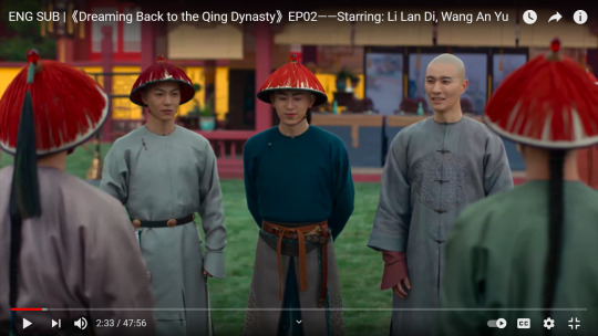
The construction of the 便服 bianfu (informal dress) robes here is extremely satisfying: they're collarless, they have the thin black binding around the neck, they have the horse hoof cuffs and they're in plain fabrics. The colors are also quite realistic and achievable in the early 18th century court. I do wish the male characters had less hair though; in the beginning of the Qing, men were practically bald with the exception of a teeny bit of hair at the back (about the size of a coin) which was grown into a pigtail. This is too much hair for me, although it is still a massive improvement compared to older dramas where the dudes barely shaved off any of their hair. The 褂 gua or coat the guy on the right is wearing is also very legit, it has the conventional five buttons and the sleeves that are looser and shorter than the robe sleeves. I’m super impressed!

Source here
Kangxi in a similar informal robe.

Source here
Kangxi in a similar coat.

The look on the right is highly questionable, maybe it was a specific type of uniform. I already trust the costume designer with my life so I’m sure whatever they came up with probably had historical precedent. The robe with a standing collar and the wide binding at the 大襟 dajin or lapel/front closure was something that existed, I’m just not sure if this particular color and pattern would be used.

Source here
Qianlong era portrait featuring a similar robe. If you look at the dajin you can see that binding was used.
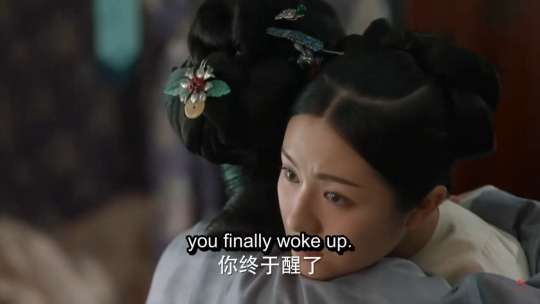

Her mother’s entrance look is very intriguing: while all the other characters in this seem to be Manchu, she is wearing Han clothing with a Han hairstyle. From the description given in the show it seems that her family was originally Han but served the Manchu emperors and got elevated into the Banners (the Manchu aristocracy) so it’s not completely out of place for her mom to wear Han clothing I guess. With that said, this hairstyle is pretty interesting. It looks like they were trying to do the 1710s/20s hairstyle that looks like poop and they got it almost right, it’s just that the “poop” part could sit closer to the forehead. Her robe looks very late 17th century which makes sense for her age, though the collar could be taller and have two buttons.
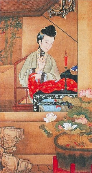
Source here
Painting from the series 雍亲王十二美人图 showing the hairstyle they were referencing.

Source here
Closeup of the painting 乔园之三好图 by 禹之鼎 from the 1680s showing the back of women’s hairstyles. The giant pompadour front has fallen out of fashion in the early 1700s.


In this scene we see again that the Manchu women’s robes featured in this show have slits at the sides, which shouldn’t exist for 衬衣 chenyi. They also layered a robe on top of another, going the 19th century chenyi + 氅衣 changyi route which also wasn’t a thing in the early 18th century.
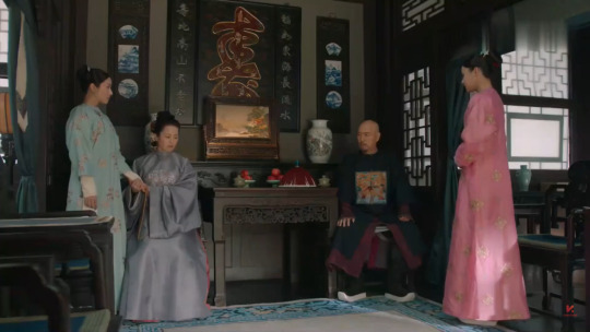
Here it looks like the mother’s robe is way too long to be a Han robe? Han robes were pretty long around this time but they would still show a bit of the skirt underneath. Her father’s outfit is great though, he has the wine colored robe with horse hoof cuffs and a coat with a 补子 buzi (square badge), which was appropriate for an official. I like that the buzi is also colorful, with waves and cliffs motifs and a single bird, which were the norm in the Qing.
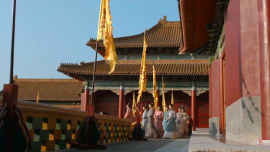
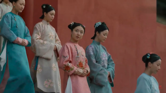
In this scene where the ladies go to court it becomes more obvious that the costume designer completely understood the difference between Han and Manchu women’s fashion at the time. The Han girls are wearing two piece ensembles whereas the Manchu girls wear a single floor length robe. They gave the Han girls white, heavily pleated skirts and hairstyles with swallow tails which were popular in the late 17th and early 18th centuries. I can’t really tell how the Manchu hairstyles are achieved but if they were indeed braided I need to give the hairstylist a trophy.
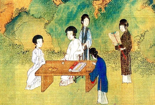
Source here
Closeup of painting 豪家佚乐图 by 杨晋 from the late 17th/early 18th century showing the white skirt with many pleats and floral embroidery.
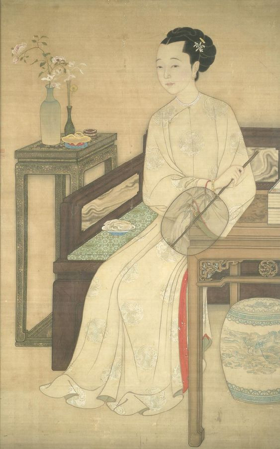
Source here
Late 17th/early 18th century portrait of a Manchu lady showing her braided hairstyle and collarless chenyi with roundel motifs.
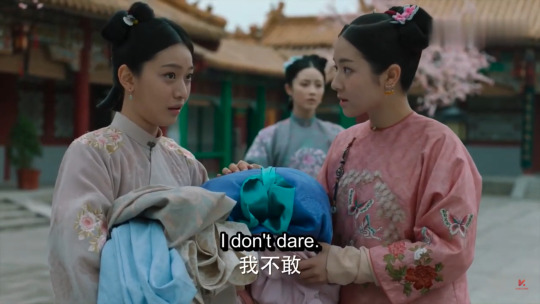
I just noticed that they did give the Manchu characters three earrings on each ear, a practice known as 一耳三钳 yi’ersanqian, to differentiate them from the Han ones, who wear one earring on each ear; that’s a nice touch. Ok I think the biggest problem with the Han women’s costumes in this show is the collar height and fit. It should be much taller and more fitted to the wearer’s neck. Oh and I love the embroidery on all of their costumes, they’re often in roundel patterns or at least follow the pattern distribution common to the early 18th century. The choice of florals and butterflies is also really cute and true to the era and season (this is probably springtime), in addition to adding contrast to the menswear which usually features plain fabrics or those with brocaded geometric patterns.

This square necked garment is very interesting and does have a historical precedent, they got the construction correct even down to the wide facing at the collar. I don’t particularly agree with the use of fake hair for this lady because I think it’d be more authentic to braid her hair or use a turban to cover it (it’s also a little too big).

Source here
Early Qing portrait of a Manchu lady. You can see her hair is much smaller.

They did recreate the smaller hair with another character, who is Han but probably changed into Manchu garb for riding. I cannot tell you how much I respect their attention to occasion.

Usually I would stop at episode 10 but I really want to see the winter clothes featured in the promotional photos so I skipped ahead. The winter clothes did not disappoint. The black fur collar trim is completely correct and so is the white fur trim for the rest of the coat. They’re also wearing winter hats with fur.
Source here
Winter clothing.
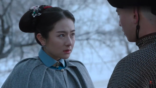

Omg this cloak YASSSSSS!! This might be the most legit early Qing cloak I have ever seen in a period drama. The construction is great because: 1) it doesn’t have a hood like in most period dramas, Chinese cloaks didn’t have attached hoods 2) it’s collarless, which is true to the early Qing 3) it’s pleated around the neck and most Qing cloaks were constructed by pleating or gathering around the neck 4) it buttons at the front with five buttons, which was conventional for Qing outerwear 5) it has no other shenanigans like openings or sleeves 6) it’s in a wool/felt fabric that actually looks appropriate for the season. I think 6 is particularly important and refreshing to me personally because fabric choice is something that’s very often overlooked in Chinese period dramas, like you would see people running around a field of snow in shiny silk adjacent fabrics and you’d just think “aren’t they cold in that?” Woolen fabrics, especially worsted wool which was waterproof, was usually imported from Europe to make rain coats and other outerwear and was quite unique to the Qing Dynasty, so I really appreciate the use of them here.

Source here
An artifact for early Qing cloaks. This one is pretty interesting since it also has a built in coat inside, but we can still see the construction of the outer cloak.

This Han look is very, very legit, and I love that it’s in a winter fabric too. The sleeves are a bit too short though, that’s also a recurring problem.

She’s probably wearing a 抹额 mo’e underneath her winter hat, which was a very popular accessory throughout the Kangxi and Yongzheng eras. Her 吉服 jifu robe looks pretty good too. I’m not sure if she would wear 朝珠 chaozhu (the bead necklace) for jifu though.
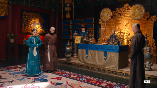
I leafed through 38 episodes and finally managed to get a screenshot of an outfit with the suspended kerchief. This is such a cool look that never got representation before this. You can see in many 18th century export paintings that sometimes Manchu women attached a plain white kerchief and other jewelry to the button at the dajin and just left them hanging there. My only quibble is that in the 18th century kerchiefs didn’t have this deliberately created rectangular shape yet, so they more than likely would just be loose and flowy instead of ironed and flat.

Source here
Late 18th century export painting showing the kerchief.
Conclusion
Phew this got really long. I absolutely loved looking at the costumes in this drama, words cannot express how refreshing and well made they are. Because this drama has such bad ratings I was expecting some sloppy costuming but this totally blew my mind. They pulled out some rare garments and looks that no other period drama (that I know of) has done before and executed them almost flawlessly, e.g. the suspended kerchief, the cloak, the square necked jacket, the fur trimmed winter clothing etc.. The differentiation between Manchu and Han womenswear was perfectly handled, in a lot of older dramas you couldn’t tell the ethnicity of the female characters at all where you should be able to. The construction and cut of the clothes are almost entirely period and I commend the costumer for not adding unnecessary details to “spice things up”. The attention to occasion and season is also remarkable, in spring the female characters wear clothing with floral and butterfly motifs and in winter everyone wears warmer, heavyweight fabrics. This is something that usually tends to be lacking in a lot of older guzhuang dramas which paraded their characters around in gaudy colors and fabrics regardless of weather and occasion. There is still the classic Qing court drama problem of the costumes being accurate to a different era; the Manchu clothes look more appropriate to the Qianlong era (mid to late 18th century) whereas the Han ones are more on point. A couple recurring problems also exist, such as the use of the not-yet-invented changyi, standing collars that are too low and sleeves that are too short. However, that does not at all detract from how much I want to give the costuming team a cookie----no, my entire fucking cookie collection. It’s such a shame that the plot was mediocre because the costumes really have the potential to make this show groundbreaking. I rate the costuming in this drama a solid 7/10 and I will be naming this the most historically accurate Qing drama to ever grace this earth until a worthy contender appears. Bravo.
#costume analysis#chinese drama#dreaming back to the qing dynasty#qing dynasty#chinese fashion#historic fashion#18th century#court dress#Manchu clothing#清汉女装
144 notes
·
View notes
Note
What would your ideal outfit for a ball at Lost Hope be?
Ooh that's a good question! In the book they all wore very up to date fashionable clothing there, but 1810's is later than my favourite eras of fashion, so I'll assume I can dress more like they did in the mini-series where everyone's in fashions of various different eras.
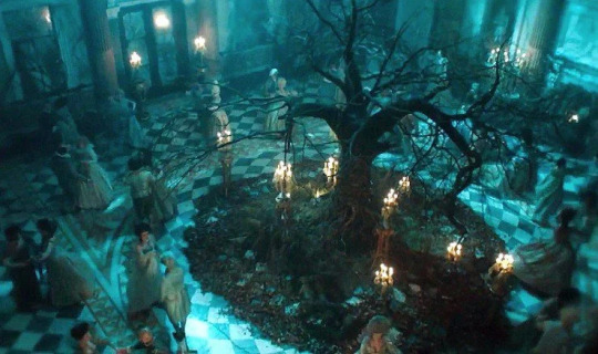
(Not the most accurate, but hey, they're mostly extras and it's a fantasy scene so I don't mind, especially since the main characters have such good costumes.)
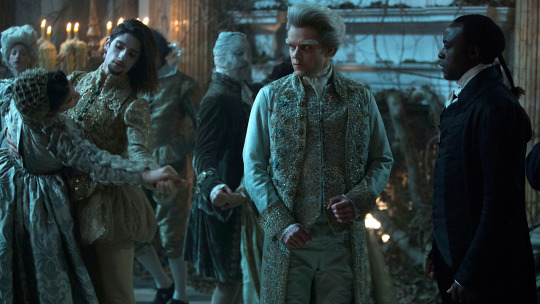
With the lighting it's hard to tell what the colours are, but it looks to be a lot of pale greenish greyish colours, which I quite like. I am very fond of lichen-y greens.
My first instinct would be to say a 1740's or 50's suit with frogging on the coat, kind of like this one, but in foresty colours to give it a mossy appearance.
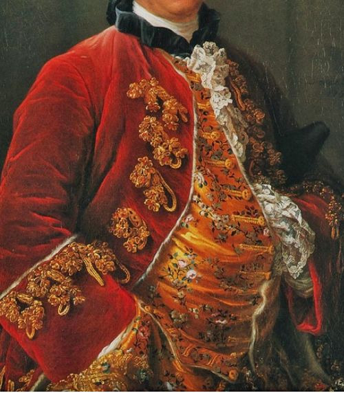
(Georges-Louis Leclerc, Comte de Buffon, by François-Hubert Drouais, 1753.)
I'm not sure if that would be appropriate for a ball though. I don't know for sure, but I get the impression that these frogged coats tend to be more informal? And quite a large portion of them are fur lined ones which I think are more for at-home wear.
It would be so much fun to make frogging that looked like little clusters of lichen and mushrooms, on a fabric that's.. hmm, maybe light brownish grey silk brocade that's woven to look like stylized tree bark texture. And I'd have a contrasting waistcoat in lichen green, with a lichen and mushroomy pattern either embroidered or woven to shape.
And of course the usual accessories - shoes with pretty buckles, white stockings, queue bag, plain white neck stock. I'd have my hair nicely styled like this (or Maybe a wig, since my hair is getting quite thin and harder to style):
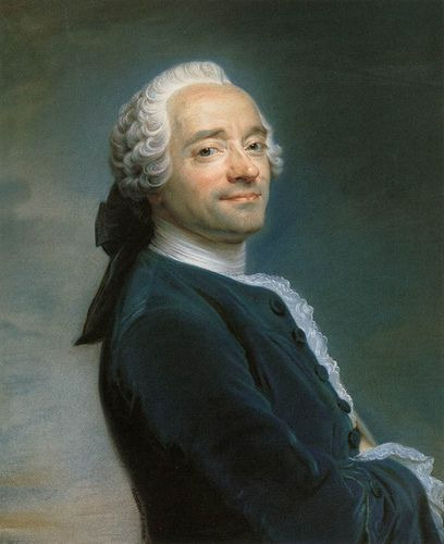
(Maurice Quentin De La Tour, Self portrait, 1751)
But if propriety forbids my possibly informal frogged coat then I think I'd have go 1730's. I do love love love the fashions of 1785-95, but I'm honestly not so keen on the court dress from that era. That particularly popular style of polychrome floral embroidery on dark velvet with little woven geometric patterns just doesn't do it for me. Late 80's-early 90's is my long time favourite, but more for the fun mix and match stuff, and all the wacky patterns and embroideries. I'm also not quite as fond of the cuts of late 18th-early 19th century court suits as I am of everything else.
But the 30's! No weird mixing of dark geometric velvet and bright florals! And the fuller coat skirts would look nicer while dancing. (I don't know how to dance at all, but I'm assuming I'd learn pretty quickly if I was kidnapped by fairies and sent to dance at a ball all night every night.)
I'd want a suit that's cut basically the same as this 1730's one I finished last year.
youtube
But with the breeches and the coat in plain velvet in either green or brown, and the coat cuffs and waistcoat in a contrasting brocade in mostly pale greens and greys. I like it when the coat has contrasting cuffs made of the same fabric as the waistcoat, and it continues well into the 18th century in some capacity, but was much more popular earlier. Which makes sense, since it works so much better with those bigger styles of coat cuff!
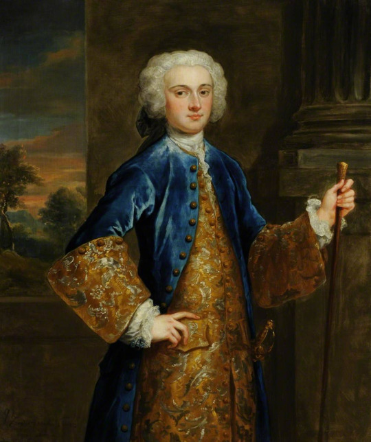
(John Vanderbank - John Bourchier, 1732)
Yeah I could just use a plain contrasting silk and embroider it instead, but I'd prefer to do that thing where you've got a gorgeous brocade with an absolutely enormous asymmetrical pattern and the repeat is so big that you can't see the whole design on your waistcoat, and certainly not on your coat cuffs, so you've got unique and varied little chunks of the design.
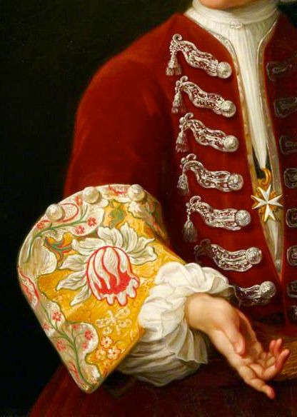
(Young Knight of the Order of St John by Antonio David, c. 1730, detail)
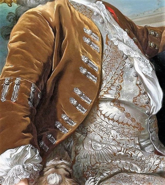
(Portrait of a Gentleman, Louis-Michel Van Loo, 1734, detail.)
So a big brocade like that, but in a more whimsical pattern depicting twisty old trees and mushrooms and lichen and such. It's a good thing the fabric I'm describing doesn't exist to tempt me, so I can't add this to my already horribly long "to sew" list.
And with the buttons and buttonholes all done in silver thread, like the ones above. Not this layout though, I'd want mine evenly spaced and I wouldn't put those extra buttons on the buttonhole side.
The shirt would be pretty much like the one in the above portrait, just a normal fancy shirt for the 30's with some nice lace. And as long as I'm describing fantasy textiles for a fairy ball, I also want a pattern of little mushrooms woven into the lace itself. Ohhh now I'm sad that I can't have some nice cotton or linen lace with a pattern of little mushrooms in it :( Maybe I could do some whitework embroidered ruffles like that someday...
Ok, yes, that is what I'd wear! 1730's suit in muted brown or green velvet with a waistcoat and coat cuffs in pale green/grey brocade with a huge woven pattern of forest-y things, and with silver buttons & buttonholes. Same accessories as I said for the one with the frogging, because stocks and queue bags and buckle shoes are in fashion for quite a long period of time. Normally the shoes and queue bag are black, but for this maybe I'd soften them down to a nice grey. Early 18th century men's shoes aren't nearly as cute as late 18th century men's shoes, but oh well! I'd still feel darn cute in such an outfit, with my big swishy coat and my hair in nice little poofy curled sections at the sides.
That was really fun to think about, thank you for asking!
103 notes
·
View notes
Photo
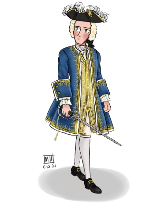

Commodore Norrington promotion redesign (with hat/without hat)
rip me putting the details on his coat :’)
I wanted to design his outfit sort of semi-formal for his promotion as a Commodore
From my previous Norrington redesign post, naval officers wear something formal for events or in portraits in early 18th century. I think it’s perfect for his ceremonial outfit redesign. I added the embroidery details in this look.
Cadogan style wigs become popular as long floof wigs still remained in first half of the century (long wigs persisted on among old men until 1760) . Tied back wigs become smaller around in 1720 and continue the reducing the size throughout the century.
I really want to add his cravat like one in the movie bc it’s cute on him :3
God why I made him feel look “princey” vibes and I cannot stop smile while coloring the design XD
#max draws#pirates of the caribbean#potc#curse of the black pearl#james norrington#commodore norrington#jack davenport#potc redesigns
62 notes
·
View notes
Text
Regarding Galloper Thompson’s clothes
Including his (slutty, thigh high) boots
It’s been brought to my attention that galloper’s slutty thigh high boots actually look like ankle boots with the thigh high part tucked into the boot. So I’ve decided to go beyond my jokes about him being a slut anyways and make this post going over his clothes. And buckle up folks, it gets long.
I’ll be honest, it’s pretty difficult to find details about 13th century (and 12th century) Scandinavian life specifically, especially since I’m using google. For this post, I have just used general European fashion, but in the future I’ll be mixing viking things with general European things from this time (but I’ll mostly try to keep the general European things to German and English/Irish stuff). I’ll also be referencing things from both the 13th century and the 12th century, since galloper “lived” during the early 13th century (and every website seems to think the 13th century started in 1250).
But anyways, an English knight from the mid 13th century apparently wore something like this on his bottom half (underneath other layers):

Now as you can see in this terrible quality picture (sorry about that, but I did try to label it), the hose are thigh high just like galloper’s leg coverings, which is what gave me the idea that maybe it’s hose he’s wearing. So let’s begin.
I would explain the whole system they used, but this does it better than I could (you only need to read until it starts talking about chausses since we’re only talking about the hose). The linked text is a bit weird and may (or may not) be unreliable, but it’s compact, explains things well, and has pictures (it’s where I got that *stunning* photo I labeled). However, keep in mind that it depicts a mid 13th century English knight, and galloper is from early 13th century Scandinavia, so while there may be similarities, there’s also definitely differences in how he would’ve dressed. Braies were apparently longer in the first half of the 13th century, for one, and didn’t really become “underwear” for everyone until the second half and later. Hose were also referred to as stockings, and apparently hose and stockings didn’t really refer to different things until later on. Additionally, clothing differed between class, but we’re not going to go over that today.
So how does this relate to galloper? Well his lower half actually sort of resembles the picture above, doesn’t it? His “hose” are thigh high, with ankle high shoes over them, just like the picture. Despite the similarities, though, there are differences. His “hose” aren’t pointed, and so there are no ties for them. Apparently, hose didn’t have to be pointed, and those thigh high hose that weren’t pointed were held up with pins.. but there are no pins to hold them up either. Without one of these mechanisms to hold up the hose, they would not stay in place. And considering we can see where the thigh high part ends, we should also be able to see at least part of what’s holding them up. The thigh high part could also theoretically be “leg bandages” that extend above the knee. However, his “hose” don’t look like wrapped or crisscrossed cloth, they look solid, so leg bandages are unlikely.
Now, I wanted to present hose as an explanation based (somewhat) in history, but I don’t actually think he’s wearing hose. We’ll go over why later in this post, but let’s keep going for now.
On to his tunic and coat. Well I say tunic, really it isn’t a tunic by medieval standards. Back in the 13th century, tunics didn’t have buttons—at least not on the front. And his coat.. well it’s not something you’d find in the 13th century. Longer coverings, down to the knee or lower, were the style then. Shorter coverings with buttons down the front didn’t appear until the 14th century in the form of things like doublets. Those “things” were usually very padded and form-fitting, however, and neither galloper’s shirt or coat seem to be padded or exceedingly form-fitting at all.
The history of gloves (in everyday wear, at least) is surprisingly complex, so I won’t be touching his gloves. I’m also ignoring his belt because I don’t have much to say on it, but they did have leather belts with “single-looped” buckles (whatever that means) in the 12th and 13th centuries.
Moving on to his cape. Ah yes, his tattered little cape (which matches his mare’s tattered little saddle blanket!). Who knows why the fuck he wears it. There doesn’t seem to be a hood (like the medieval chaperon) or a part that comes around to cover the shoulders, and it’s too short to be a cloak. My best guess is that it was a design choice based on the fact that such a short cape doesn’t need a fluttering animation. Why not axe (lol) the whole idea of a cape? Well, all the coolest characters have capes!
His weird ass shoulder pad I can’t come up with an explanation for, though (or at least a medieval one). If he had a neck, the shoulder pad would be digging into it based on the position. Maybe it’s supposed to be like those shoulder pads with tassels on some formal military uniforms (technically “epaulettes” with “fringe”)? Except instead of tassels it’s feather looking things and also there’s only one shoulder pad for some reason?
All of this is to say that none of what he’s wearing can realistically pass for 13th century clothing, except maybe his lower half, and that’s still stretching it.
His entire outfit actually most resembles military uniforms from the 18th and early 19th centuries, as @inkowl13 pointed out in this post. When he floats, you can even clearly see his tattered coattails, which are his trademark green on the underside. In the case of 18th century garb, his shirt would be a waistcoat (he doesn’t seem to be wearing an 18th century shirt underneath his “waistcoat” at all, but maybe we just can’t see it or distinguish it from his “waistcoat”), and his jacket-thing would be a uniformed soldier’s coat. His lower half would be breeches with either a. ankle boots and over-the-knee stockings, b. ankle boots and thigh high gaiters (those things with buttons that go over the top of the shoe), or c. thigh high boots, which appeared as riding boots in the 15th century and remained common until the 19th century—including in military uniforms (in fact, some cavalry units today still use them in their ceremonial dress uniforms). His shoulder pad would, in fact, be a strange attempt at an epaulet/epaulette (which were used in the 18th century (and beyond) to denote rank) with fringe the color of his trademark green. The fact that there’s only one also makes sense within this period; whether the epaulet/epaulette was on the right, left, or both shoulders indicated rank (Galloper’s “epaulet/epaulette” is on his right shoulder, our left). The issue of glove history is also eliminated since it seems military uniforms in the 1700s made use of gloves. Men’s capes/cloaks at this time went to the knee or below it, so my explanation for his cape is unchanged. Through this lens, things start to become clear.
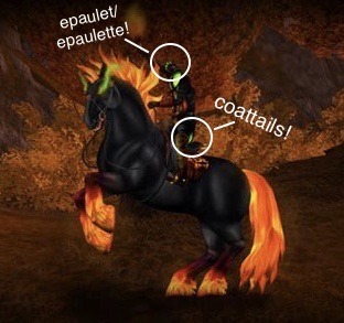
This is a mannequin (is that what you call the fake models of historical clothing? does mannequin apply in this context?) wearing an 18th century cavalry uniform:
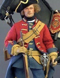
As you can see, he looks incredibly similar to galloper, despite the many differences.
And these are two sets of 18th century soldiers (again, sorry for the less than ideal quality):
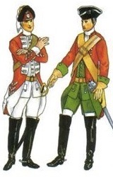
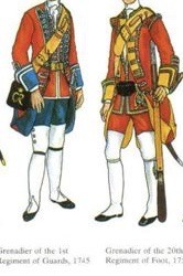
On the left there’s a pair of soldiers with over-the-knee boots and on the right there’s a pair with over-the-knee gaiters (see how they go over their shoes). Thigh high boots would make more sense for a horseman, but thigh high gaiters would explain some things about his lower half, like how his boots and the thigh high part are different colors. However, there are no buttons on the sides (like gaiters have) or garters at the knee (like both stockings and gaiters had), and the thigh high part is tucked into the shoe, more like stockings rather than gaiters. In these pictures you can also see how his upper half looks incredibly similar to all four soldiers, again, even with the differences.
Now, unless galloper was keeping up with fashion until the 18th century when he stopped (he gave up I guess? said “fuck that shit” and hasn’t changed clothes for the past 300 years?), he shouldn’t be wearing an 18th century military uniform. Especially since he was shown wearing the same clothes in his execution scene (which I don’t put too much stake in considering the Jarl was in his ghost form and even the soul riders don’t have 2 sets of clothes in game).
So why does he look like this, then? The reason why he looks like a revolutionary war soldier can be traced back to the inspiration used for his design. According to Jorvikipedia, his “...design takes direct inspiration from author Washington Irving’s Headless Horseman from The Legend of Sleepy Hollow...” which explains why he looks the way he does. Jorvikipedia has been wrong before (they list his place of birth as “Jorvik (presumably)” which doesn’t fit with his backstory), but if Galloper’s design was based on the headless horseman of “The Legend of Sleepy Hollow” (which it very likely was), it would provide justification for the 18th century look of his clothes. Washington Irving’s horseman was, after all, (alleged to be) killed during the revolutionary war in the 18th century.
It’s obvious his upper half is based on 18th century uniform, but the intention behind his lower half remains a mystery. Whether it’s meant to be stockings, gaiters, or boots, I don’t know. Theoretically, his lower half could even have been intended to be hose, braies, and shoes. But considering his entire look and the inspiration behind his design, an 18th century explanation seems more likely (I just don’t know which 18th century explanation, exactly). It would be pretty strange if half of him was medieval and the other half was from the revolutionary war era. Though, I’ll admit, it’s not completely impossible.
My theory for the contradiction between his design and his backstory is that his backstory came after his design. The 18th century look of him, along with his inspiration, and the lack of medieval elements in his design all make a compelling case for this theory. The only thing I can think of that may disprove it is his mare’s y-shaped bridle, but even that could be explained if she was designed after galloper, while his backstory was in its first stages of development (I’ll probably do another post on his horse’s tack, since this post is already long, but that’s for another day). But that’s just a theory; the star stable team could very well have just not done any research on 13th century attire, instead modeling his look on depictions of Irving’s headless horseman and adding the bridle as an indication of the origin they had already established for him.
Ok, but what about the rest? The other parts of his and his mare’s designs (color scheme, hanging pumpkin jack-o-lanterns) can be attributed to the fact that he is the halloween event character. Though his color scheme could be inspired by the headless horseman in World of Warcraft, who was introduced in 2007 (I found out about this horseman while looking into other possible inspirations for galloper’s design), all the colors seen on him and his mare (black, green, red, orange) are general Halloween colors. The hanging jack-o-lanterns are not historically accurate for the Middle Ages (or the revolutionary war era, actually) as pumpkins were not introduced into Europe until Columbus “discovered” the Americas, and did not become commonly carved into jack-o-lanterns until the 19th century in America -which was when and where “The Legend of Sleepy Hollow” was published (though the pumpkin “head” was not even carved in the original story). I suppose galloper could have developed an affinity for pumpkins (and for carving them) later on (Jorvik seems to have a lot of them), but it’s more likely that they added them (to the keep and his mare’s design) based on modern halloween practices instead of historical halloweens or consideration of galloper’s feelings on pumpkins.
Ok, so we’ve established he’s not historically accurate for the 13th century, but what would his clothes look like if they were actually historically accurate? The answer is: I don’t know! Maybe I’ll do another google deep dive and make a post on that, but for now we’ve come to the end.
All of my information about historical clothing came from sorting out google results, so take the historical bits with a hefty grain of salt (more like a bowl of salt actually). If you have any actual knowledge about history, please feel free to correct me.
#i am planning on doing more of these little deep dives into what life was like back then#a large chunk of this post is a bit of a mess but oh well#sso#star stable#star stable online#galloper thompson#gunnar thrymson#tagging this#googling history#separate from the ‘me overthinking’ tag
22 notes
·
View notes
Text
Adapting Historical Fashion for the Fantasy Eye

I’m back. Why? Because we’ve seen a resurgence of people talking about corsets and whether they were the death traps some would like you to believe (they weren’t and we’re not here to discuss that but I beg you to do some research), people not knowing that there is a vibrant and active historical fashion community who either engage in history bounding (dressing up in period accurate clothing) or add elements of it to their daily lives, and just as always people not knowing the difference between stays and corsets.
But, June, you say. You’re a fantasy writer. What does historically accurate clothing have to do with anything? Historical accuracy is for losers. And to that I say, you are correct. But if you’re using something that has a heavy historical context (like clothing, technology, etc) you might as well know a thing or two about the subject before looking a fool. If only because readers like me notice the small things and cry OR because the aesthetics are cool but knowing where they come from and how they can be changed to fit your world is even cooler.
Fashion defines a society. Fashion defines a culture. What garments are important? What garments are the same among the upper and lower class? Do their roles as garments change depending on class? (ex: stays were often wore “out” for working class women while upper class women would see them strictly as undergarments) How do fashion trends define the eras? It’s not hard to notice that throughout history nearly every decade as a definite silhouette. It’s not hard to tell the difference from a regency era gown from an early Victorian gown to a late Victorian one. They all look vastly different.
I’m not asking anyone to know the ins and out of historical clothing but it doesn’t hurt to read up on it or look at some existing examples. To know the anatomy and construction of what would make a complete outfit (or to read about what people might wear for a given situation if no artwork or garment exists). It all feeds into how your characters hold themselves, how they might be able to move. It’s not so much that people were just “Shaped Differently” back then. Their clothes were constructed with a certain poise or look in mind. And y’know. I just want to stop seeing modern underwear in fantasy underneath historical clothing while we all pretend the undergarments don’t contribute greatly to the finished overall look.
But again, you’re right. We’re not writing historical fiction here. We don’t need to have every mention of clothing in our fantasy novels be completely in line with the point in time we might be basing our setting off of. This is about adaptation.
Adapting Historical Fashion for Non-Historical Purposes.
I’ve said it a bunch by now I’m sure. My books take place in a world based off the late 18th century. Why? I dig it. As such, when I first started putting together the aesthetics of the world that period was also my go to. I know I already did a whole thing on culture and society but really this is more or less just about how fashion can amplify those two things. I mentioned setting and what fabrics might be commonly used or found. And what might make sense to use (lighter, breathy fabrics for hot climates vs thicker fabrics and furs for cold ones) vs ones considered high class and enviable or with trends that might be coming from other countries that have stronger influence.
When I take real life fashion and shove it into my world (give or take a few changes) I usually ask myself a few things first.
1. Who controls the fashion trends?
The younger generation, the monarchs, a group of travelers who just look super stellar? Who is the rest of the community following when it comes to the newest look and what elements of it are they trying to steal/adapt? What element is the thing that really catches on?
Anyone who knows me knows I’m a huge fan of waistcoats and breeches and stockings, tailed coats with flaps (although anyone who reads my book will also know I axed powdered wigs. Because I could.) But to just copy wouldn’t say much about the opulent and flamboyant Escana. To increase the idea of the vanity and the peacock attitude of the younger, partying courtiers I have young men who usually dye their stockings to match their waistcoats (because colored socks > white or black socks) and forgo the coat to show off sleeve details as well as lose some of that “seriousness”. It says a lot about them while still remaining in a circle that gives readers a clue as to where my inspiration came from.
2. Who disagrees with the fashion trends?
And how does their disagreement influence the perception of certain garments or the people who wear them? Just read one thing about how evil corsets are and how crinolines are literally cages for women and how many of us go around thinking Victorian ladies fainted every time they opened a window and understand these perceptions can be long-lasting and completely change an outsider’s opinion on how people lived. Granted for world-building or story purposes hopefully these will be happening currently instead of being a huge misunderstanding of history.
Over and over again I say things like cultures not being monoliths but neither are generations and there’s nothing that makes a world feel more lived in and full than people who don’t all wear a uniform based vaguely on what the author thinks a medieval gown looked like. It’s just also sometimes nice to get tidbits like a character wearing a scandalous or pricey color just to look good even if they can’t afford it. Is it usually super vital to the plot and story? No. If used sparingly can it be fun background information to how the society your character lives in works or views things? Sure.
3. Colors and fabrics and spares, oh my
Okay. That’s not a question. But it’s an umbrella for me to put my thoughts under. Because I live in the 21st century I don’t often think about things like dyes or luxury fabrics but this would be front of mind for most of my characters. Not everyone can afford to wear certain colors, or certain colors come with a context that means they shouldn’t be worn for certain situations or for certain people and the same could be said for fabric. We live with these fashion rules now (although I’m not so strict in my memory of them because my current life doesn’t depend on it, but I do write about princes and courts so it’s more important for a courtier to not wear a happy color to a funeral than for me. Or things like no white after labor day).
Hand-me-downs. I grew up wearing them. They were common in history and should be more common in fantasy. If a family was not wealthy they could only afford so much fabric or to follow fashion trends for their eldest. It wouldn’t be unheard of for a family to still be wearing clothes considered “outdated” and it’s not like we all just throw our clothes out when they get old. While a trend might have moved onto a new silhouette or something, someone with less means might still be wearing decades-old clothing that have held up well (these clothes were built to last. Fast fashion could never) or could have chosen not to jump on the trend at all. In my book, the opulent courtiers and royals of Graza Palace dress completely different than some traditionalists who wear garments more native to Escan before it was an empire that are completely different from the suits and 18th century gowns I’ve borrowed. They’re timeless and probably see a lot more turnover from one family member to the next than a gown that could be out of style in a year.
4. And lastly, making sure I’m not turning it into a costume
This becomes important when taking garments that have a cultural context in the real world and using something similar to it or basing another garment off of it. I would start with this for the purposes of using culture clues to ease someone into what actual culture the fantasy one is taking inspiration from to give them a taste of what certain things might look like without going into full detail but it’s key to then know what makes these garments...these garments so you’re not bastardizing them. Why do people wear them? (especially if a form is still worn in modern times) What are they usually made out of? What are the occasions they are worn for? A respectful nod to something will just add to your world building, a costume rendition with 0 understanding of how certain garments will work will just make it seem like all your characters are in cosplay.
So in conclusion: No, I’m not advocating you be historically accurate for your already not historically accurate but it pays to look into why your basing clothing off a certain period and what goes into making that piece of clothing...that piece of clothing. Why it looks that way, how someone wearing it would look/hold themselves, and what it means in the context of your setting as well as things you might change and take extra liberties with for the purpose of storytelling. Clothing can add character and it could be just as useful a tool in world building (in my biased opinion) as language given that fashion can have such a huge impact on people but it can also fall flat.
#june trash#world building#worldbuilding#tss trilogy#thanks for letting me rant#I'm glad I got that out#never post another picture of a robe a la anglaise and say something about corsets again if you wish to live
80 notes
·
View notes
Link
From left: Photo by Gi Naps/Getty Images; Photo by Rose Hartman/Archive Photos/Getty Images; Photo by Victor Virgil/Gamma-Rafo via Getty Images
Today, the House of Jean Paul Gaultier is relaunching its ready-to-wear line after a hiatus of six years. It comes 16 months after fashion’s “Maestro of Mehmed”, as journalist Georgina Howell dubbed her in the early ’90s, took her final bow as the brand’s designer, implying that this iteration of its namesake. will not be designed. Instead, the reins are taken over by a dedicated team from their atelier, with help crafted from the rotating doors of some of the most independent designers working today – Palomo Spain, Ottolinger, Nix Lecourt Mansion, Alan Crosetti and Marvin M’Tumo .
Since starting his own label in 1976, Jean Paul has been instrumental in turning underwear into acceptable outerwear, making sailor fashion sexy and, more generally, paving the way for designers to experiment with diverse and unexpected castings on the runway. have been responsible for. He also dedicated an entire collection – AW97 – to the fight against racism. The collection, titled ‘Fight Racism’, featured graphic prints of young anti-fascists with slogans printed on their chests.
In fact, with such a rich history behind it, and vintage JPGs becoming increasingly collectible since the recent renaissance—partly stemming from the Kardashians’ love of all things net—more thanks to the label’s revival. Couldn’t be the right time- the line to wear from now. Although it is a well-known fact that Jean Paul himself decided to step back from the category in 2014 after a somewhat tumultuous feud with Florence Tetier (graphic designer and co-founder). November MagazineNow serving as the brand’s creative and brand director, Ghar is poised to enter the field again. in an interview with WWDJPG’s general manager, Antón Gégy, described the relaunch as an opportunity to “celebrate Jean Paul Gaultier, its values, its archives and its history”. And what better way to raise the glass to the core of fashion? Horrible Instead look at seven of the most show-stopping moments from its most iconic era, the ’90s. Long live Gaultier!
Photo by Gie Knaeps/Getty Images
Madonna’s Conical Corset from the Blonde Ambition Tour, 1990
Back in 1989, when Jean-Paul Gaultier was told by an assistant that Madonna had told the audience, she was convinced that he was playing a trick with her. They knew how obsessed he was with her, just could not do be true But she soon found herself on the phone to the original queen of pop, making a match in ’90s fashion heaven. Naturally, Madonna already knew what she wanted: to create something for her that surrounded Jean Paul’s signature masculine-feminine crossover. Inspired by his love of the late ‘queen of Paris punk’ Edwij Belmore, Jean Paul conceived a pinstripe suit – the top of ’80s manhood – and a corset with the now famous conical bra, which he designed six years ago on AW84 had started for. /85.

Photo by Victor Virgil/Gamma-Rafo via Getty Images
Eva Herzigova’s cut-out dress, 1992
Thought harnesses were a new thing on the runway? Wrong! After all, you’re not known as a fashionista Horrible Without a sprinkling of kinks here and there, as this look proves well. Presented on JPG’s AW92 runway, this dress, so slick in its fit that clothes can even put on Eva’s body, exemplifies the powerful-yet-playful take on sexuality that serves as a throughline throughout the French designer’s body of work. runs as. Styled with bicep-clad opera gloves and proudly crafting the Czech-Italian supermodel’s bust, there’s a distinctive dome-y tone at play here, though no compromise on the beauty of the silhouette or the quality of the make. It speaks to an ideological throughline that runs through Jean Paul’s work – that no matter who a woman is or wants to be, she always has the right to be chic!
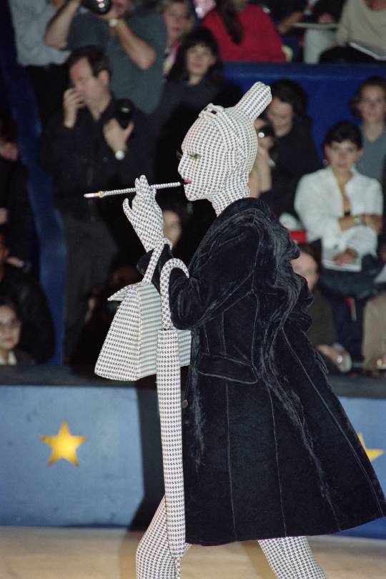
Photo by Pierre Guillaud/AFP via Getty Images
Houndstooth bodysuit inspired by Leigh Bowery, 1991
In an interview with iD in 2018, Jean Paul declared his love for the “London Way”, which means “just creating your own style, your own creativity and being free to do what you want to do”. When he took the idea back to Paris, it wasn’t very popular, but that didn’t stop him from creating his own trademark approach to design. He spent his youth in the 80s at famous London nightclubs such as Blitz and Heaven, where he met performance artist Leigh Bowery. In a nod to Bowery’s influence on fashion, Jean Paul sent down his interpretation of the Leigh Bowery Houndstooth bodysuit—which would later inspire Alexander McQueen for AW09 and Gareth Pugh for SS07.

Photo by Pierre Guillaud/AFP via Getty Images
‘Chic Rabbi’ Collection, 1993
For AW93/94, Jean Paul presented the ‘Chic Rabbi’ collection, inspired by the traditional dress of Hasidic Jews. Models in streamels and black suits danced to the sounds of a violinist who played live on the catwalk. The usual circle of supermodels was there, but Jean Paul also decided to cast someone who visually embodied the cultural context: a man with a big beard. During the ’80s and ’90s, designers were known for their casting choices, pioneering their diversity. “I’m fascinated by strong personalities, people who capture my imagination because they walk well down the street,” Gaultier explained in a 2014 interview. “Showing just one type of girl is a flaw,” he adds, “something I’ve always fought with. One kind of beauty – no. If I show a bigger girl, I’ll always show a younger girl.” will show.” It is now legend that Gaultier once posted an advertisement in a French daily newspaper release Looking for “atypical” models, saying that “facial distortions should not be avoided in application”.

Photo by Arnal/Garcia/Gama-Rafo via Getty Images
Mesh Tattoo Top, 1993
Back in 1993, the trend Declared this prestigious collection as “a startling vision of cross-cultural harmony”. While we’d be inclined to cringe at the somewhat reasonable look now that Jean Paul drove down the runway for the SS94 (which can actually be read as another nod to Leigh Bowery) it certainly Historical perspective. It also marked the debut of Jean Paul’s iconic mesh tops, which were inspired by a tattoo convention he once found himself spinning around – today, they are some of his most sought-after designs. The collection also includes heavy notes of punk, grunge, and 18th century men’s frock coats made in Jodhpur and denim in the typical JPG style. How did he ever find the place for all this?!
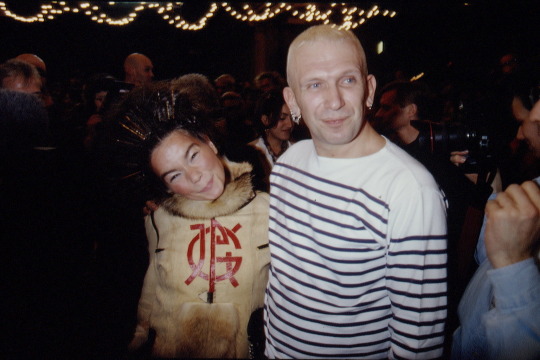
Photo by Pierre Vuthe/Sigma/Sigma via Getty Images
Björk!, 1994
Jean Paul’s celebrity friends don’t start and end with Madonna. A year after Björk’s properly titled debut solo album, First entry, Taking the music and fashion worlds by storm, she appeared on the designer’s AW94/95 show, about a magical train that stopped in a small village somewhere high in some mountains. And what, duh?! As you’d expect from JPG, the show was a mish-mash this time in terms of different styles of traditional arctic costume. The models trotted down the snow-covered runway (which almost tripped Kate Moss), decked out in a hell of a lot of fur, silk, wool, and leather.
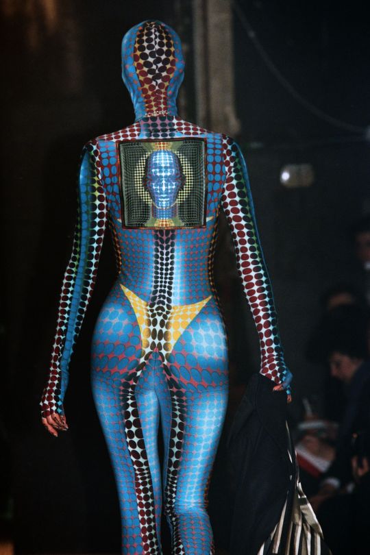
Photo by Pierre Verdi / AFP via Getty Images
Op-Art Inspired Catsuit, 1995
Two women riding a motorcycle hit them. One of them descends and climbs onto a loft at a DJ booth. Jean Paul’s AW95 ‘Mad Max’ Show Has Started. As he was in the middle of designing the costumes for Luc Besson’s famous film fifth element In which Bruce Willis and Milla Jovovich fight a mysterious cosmic force, they had science-fiction in mind, which means it was technology and cyber-heavy. The bodysuit inspired by Viktor Vasarelli’s op-art paintings became the show’s most memorable aspect—now made super collectible by Kim K and Cardi B and partly responsible for the JPG-madness we’re seeing on Depop these days. Also on the show was Carmen Dell’Orefice, who walked with a live falcon on her arm and sported ornate football armor that lit up like a circuit board. Really prestigious.
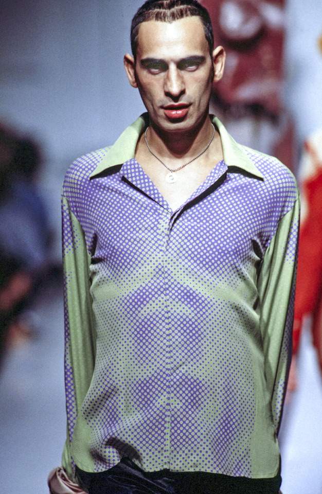
Photo by Victor Virgil/Gamma-Rafo via Getty Images
trompe l’oeil torso top, 1995
The next season, Jean Paul took his quest for sci-fi polka dots further, this time translating it into menswear. This time, however, he brought his knack for trompe l’oeil print placement to the table—skills he had previously flexed in the aforementioned Les Tautouzes, and even as early as 1992, when he sculpted the enviable Presented Printed Mesh Top with Toros. The look sported here by Tanel Bedrossiantz is perhaps a little more figurative in its approach, though no less direct is its infrared-style suggestion of what might lie beneath the longtime house muse’s button-down shirt.
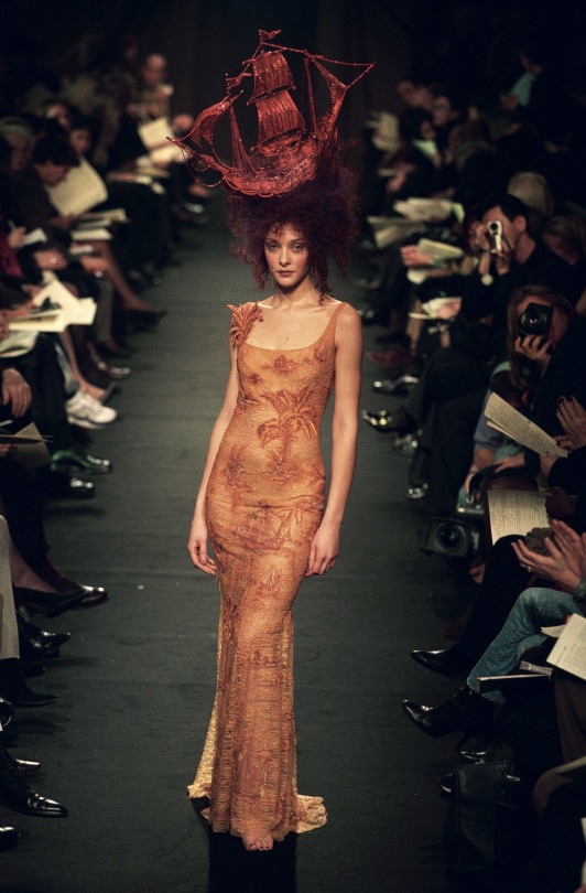
Photo by Danielle Simon/Gamma-Rafo via Getty Images
JPG Set Sale, 1998
In a promo video for JPG’s new ready-to-wear line, Bella Hadid is wearing a big red ship on her head. In case you didn’t already know, it debuted at the Haute Couture SS98 show, where it takes us back to the Age of Enlightenment. It was a time of scientific progress, the advent of modern capitalism and of course colonialism. The ‘explorers’ were sailing around the world from Europe, ‘discovering’ new lands for them – a ship serving as a nod to the continent’s shameful past. Some say, however, that it was during the Enlightenment that the fashion we know today – as a form of self-expression that can be accessed by the public – first began to emerge, making the historical period a fashion show. became an ideal subject. .
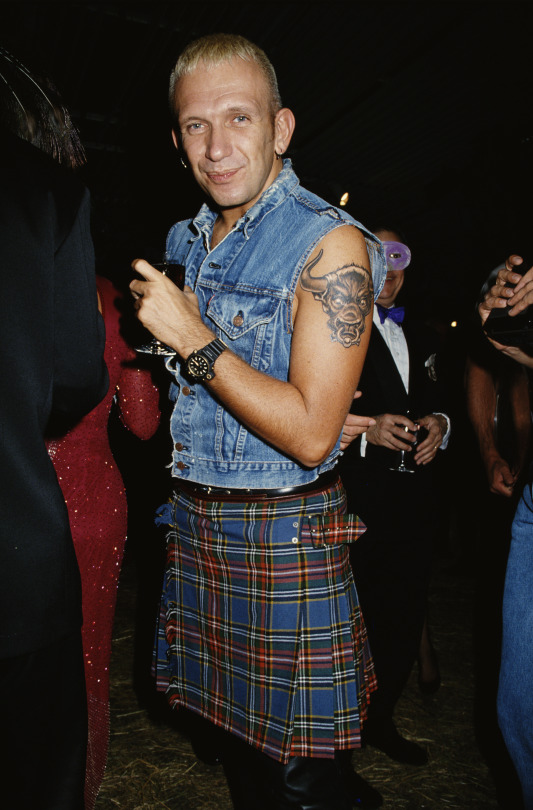
Photo by Rose Hartman / Archive Photos / Getty Images
Man Himself!, 1992
Sure enough, to write a list of Jean Paul Gaultier’s most iconic looks from his most iconic decade, and not for the man himself. Indeed, as Florence Tetier spoke to her before the label’s launch, “Everybody knows who she is!” whether it’s his striped Whether paired with a pleated black skirt or, as seen here, a denim vest and a punkish tartan kilt, JPG’s personal style has made her one of the most instantly recognizable designers of our time. Plus, there’s a direct connection between what she wore and what we then saw on the runway. While we may have never seen a proper, French Navy-standard Sailor From the designer, “he’s done a lot of stripes and nautical-inspired pieces,” notes Florence. “It’s really nice to see the link between the way he dresses and the way he designs.” we love you, Jean Paul! Follow iD on Instagram and TikTok for more fashion.
.
The post Jean Paul Gaultier’s most iconic 90s moments appeared first on Spicy Celebrity News.
5 notes
·
View notes
Text
Historical Paper Dolls: The Sun King’s Court
Last week, we discussed ruffs. Today, we’re staying in the 1600s, but focusing on a fairly specific niche: the fashions of Versailles between the 1660s and the 1690s. I was inspired to do this by @rennylurant‘s and my discussion of the “Versailles” series.
Alun and Alasdair and Joyeuse and Guiomar are all sharing center stage today. I simply couldn’t resist getting them all dressed up and making them go on a walk to see and be seen. I originally wanted them to promenade in a “Hall of Mirrors” set, but I couldn’t figure out how to get the pictures to not show the sky instead of the second story, so we have our trusty backdrop instead.

Men’s Fashion
Louis XIV mandated that all men who appeared at Versailles were to wear a long coat, a vest or waistcoat, a cravat, and knee breeches. This ensemble also required a hat for wearing outdoors. Charles II copied these fashion edicts upon his restoration to the throne in the 1660s. Don Draper’s work wardrobe and the trope of the “man in the grey flannel suit” are directly traced back from this style.
The waistcoat often reached to the jacket hem or just above it, buttoning up the front similarly to the modern version. (Earlier in the period, it had been rather shorter.) It was a canvas for embroidery, and could be made of contrasting fabric to add to the opulence of the look. The back of the waistcoat often remained plain, as it was not often seen when the justaucorps was worn; there are some instances of waistcoats having sleeves for winter wear. (Of course, you can then say that it is no longer a vest, and is instead a short coat--but that’s what the early form of the waistcoat was!)
The cravat is the ancestor of the modern necktie. Usually made of lace or fine linen, it was wound around the neck before allowing the ends to fall loose in front. There was a fashion in the 1660s for a ribbon to be tied around the cravat, which Alun is sporting once he’s fully dressed. The ribbons around the cravat were usually red, although other colors such as blue were not unheard of. This fashion trend continued, with the ribbons increasing in size and amount, until the 1690s. Then the cravat was worn without such decoration.

Knee breeches had been fuller (and/or shorter) prior to the 1660s, but with the popularity of the long-line justaucorps and waistcoat, slimmer and longer styles became more fashionable. Breeches were often made in the same fabric as the coat. They could be tied with ribbons or buttoned shut.
Because the new style was meant to emphasize the new-found peace after the turbulent early part of the 1600s, boots were gradually eschewed in favor of shoes. They were usually square toed and decorated with ribbons and bows and shoe-roses (essentially a pompom); there was a trend in the 1680s for red heels on one’s shoes. The heel, of course, became rather high, in order to emphasize the shapeliness of one’s calves, which were shown off by the slim knee breeches.
The long jacket was also known as a justaucorps, and would remain in fashion (with a great deal of change in how it looked) until the 1800s. The sleeve length varied from above to below the elbow, allowing the wearer’s shirt to poke through at the ends. Whether it had deep cuffs or shallow, broad lapels or none, and closed in the front or was worn open, the jacket was longer and more loosely cut than in previous decades. By the 1680s, it reached almost to the knee and remained full through the waist.

Men wore their hair long, often to mid-back. While some people kept their hair mostly straight, especially in Spain, loose curls or waves were favored. Louis XIV, who had gone bald at an early age, started a wig mania that didn’t die down until the late 18th century. He wanted something that would mimic his natural hair, only, of course, thicker and superior in almost every respect. The men of Versailles soon copied him. This early wig mimicked the wearer’s natural hair color, was not tied back in any way, and was styled with a rather severe and exaggerated center part.
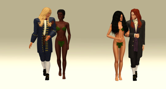
A variety of hats were worn. The most common was a hat with a wide brim and a moderate crown, often decorated with feathers; your classic “Musketeer” hat. One side of the brim was often turned up; this turned into a brim-turning craze, resulting in the tricorne.
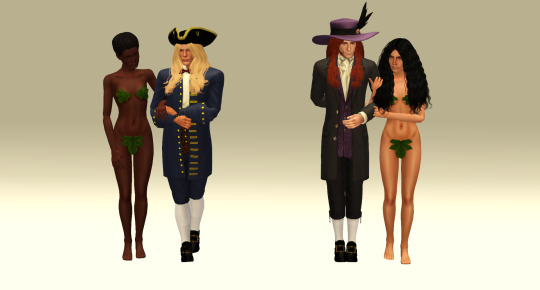
Women’s Fashion
From the 1660s to the 1670s, the trend in women’s fashion was a broad or off-the-shoulder neckline with full, elbow-length sleeves, a tightly corseted body, and a full skirt. While the gowns shown in portraits may look like a one-piece garment, the trend was actually for a separate bodice and petticoat, which usually were the same color and material. The bodice was attached to the skirt with tabs, which eventually transformed into less obvious hook-and-eye closures. (Terribly fiddly, of course, and essentially defeating the purpose of separates.)
The neckline became quite low in some cases, especially for portraits. In some cases, the breasts were totally exposed; more commonly, a good deal of the breast was shown, pushed up and accentuated by the tight corsetry of the period. It was a look very suited to the deceptively casual, libertine atmospheres of Charles II’s and Louis XIV’s courts. It was of course was frowned upon by the moralists, and was not terribly practical for those who needed to do anything more strenuous than embroider.
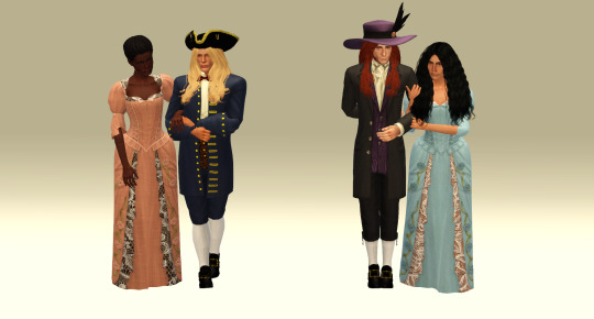
Throughout the period, pearl earrings and necklaces were very popular. The earrings often featured very large, teardrop-shaped pearls; the necklaces were made of the ordinary round, moderately sized pearls. Necklaces were worn very tight and very high, at the base of the throat. This was a look that would continue through the eighteenth century. Pendants were not as popular as they had been in previous years, but were still worn. Gemstones were also still very popular, as Joyeuse shows; I liked the contrast of the sapphires and her pink (salmon?) dress, and took a lot of inspiration from an image of Madame de Montespan I’ve linked in the credits.

Women generally did not openly wear wigs in this period; instead, they wore their natural hair (or someone else’s, if they had the misfortune to go bald). In the 1660s and 70s, the fashion was for curls at the front with buns in the back.

Here’s the fashion trend of the 1680 and 90s, the mantua. The mantua actually began as an “undress” dress, or casual wear; it was meant to showcase elaborate and exotic patterned fabric from overseas. It started as a fairly simple shoulder-to-floor open-fronted overdress (dolman-style sleeves, no fancy seam work, etc.) with a long train However, it soon evolved into the pleated, pinned, and looped style we see showcased here.
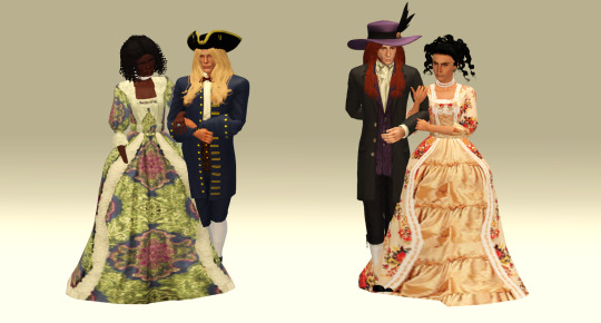
Although this was worn over the wearer’s shift, stays and petticoat, with only a stomacher (a decorative modesty panel pinned to the stays) and a coordinating outer petticoat keeping the underwear from becoming outerwear, the high neckline and longer sleeves were more modest than the somewhat revealing off-the-shoulder look previously popular.
In the 1680s and 90s, the hair was piled up at the front of the head and dressed with the towering mass of wire and ribbons known as the fontange. The fontange was inspired by one of Louis XIV’s “petit maitresses” doing up her hair in a pinch with a ribbon, and gradually mushroomed out of proportion into something involving starch, wire, and a serious amount of hat pins. This is a mere shadow of its extravagance.
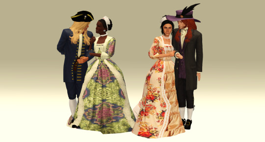
Credits
Alasdair
Wig by Cloudwalker Sims | Waistcoat by EA | Justaucorps and Waistcoat (V2) by Fortuna/Irene-Gouret on TSR | Knee Breeches by EA | Stockings by revolution-sims | Shoes by @revolution-sims | Hat by @deniisu-sims
Alun
Hair by @chazybazzy and Anto | Waistcoat and Knee Breeches by EA | Justaucorps, Waistcoat, and Knee Breeches by EA | Stockings by revolution-sims | Bow by s-club | Shoes by revolution-sims | Tricorne by assas-sims-creed
Guiomar, 1660-79
Hair by @aikea-guinea and Sussi | Earrings by Ladesire | Necklace by Vitasims | Bodice and Skirt by EA
Guiomar, 1680-99
Hair by Chazzybazzy and Toksik | Earrings by Ladesire | Necklace by Vitasims | Fontange by Traelia | Mantua by GlorinosaVG
Joyeuse, 1660-79
Hair by Chazzybazzy and Applekisssims | Jewelry by Tankuz | Bodice and Skirt by EA
Joyeuse, 1680-99
Hair by EA | Fontange by Traelia | Earrings by Ladesire | Necklace by Vitasims | Mantua by GlorinosaVG
Poses
Walking Couple poses by Lenina90
A few necessary side notes:
Image 2: The breeches are not quite correct for the period, nor are the lapels. The shoes are also a little anachronistic. However, they look nice.
Image 6: The severe line of the corset in this period is not a look easily achievable with sliders without distorting the clothes, unfortunately. See this wax figure of Madame de Montespan for an idea of how this looked in real life. It’s not really a look for the faint-hearted or prim-and-proper types.
Image 8: I honestly don’t know what’s going on with Guiomar’s hair. It’s not spaniel curls, it’s not really a bun, but she can almost pull it off.
Image 9: Neither of these are very close to a proper mantua, but I have yet to find a mesh I really love, or one that I can convert without it being a problem.
I’m still really pleased how much of this could be done using EA meshes. I also think I will permanently move these to Saturdays.
#historical paper dolls series#sims 3 historical#sims 3 baroque#sims 3 lookbook#sims 3 content list#sims historical#sims baroque#sims lookbook#sims content list
45 notes
·
View notes
Photo


WITCH WEEKLY - THE JANUARY ISSUE (1983)
“Yule is a time of giving, now give me what I want and get yourselves a new wardrobe for 1983.″ - Camille Rowle
A YULE TO REMEMBER: UNSTITCHED WITH CAMILLE ROWLE
This years Yule ball definitely ended the year with a bang, many of you have improved since my last article and for that I am eternally grateful. I would like to think you listened to my unsolicited advise and I am the sole reason for many of your much needed wardrobe updates. Alas there are still many of you out there who’s outfits left much to be desired and so, please read the following article with a fine-toothed comb, in fact I would suggest checking it twice.
It would seem that some of our males took their being left out of my last article personally as many of them up-ed their game so much so that they can now feature in this months edition. Firstly is none other than Lucius Malfoy || @lxciuss who went from fading in to the background on All Hallows Eve to looking like he had just stepped out of 18th century Russia at the Yule ball. From the looks he was gaining from many of the female population, and lets not lie, males too the man could have given any Durmstrang boy a run for his money. His red coat was extremely striking against his pale complexion and the fur that surrounded him made sure that you couldn't help but picture yourself snuggled up inside it with the man in question.
Next on my list of reformed men is James Potter || @jamspctter, it takes a bold man to wear full white and can I just say for all of us out there who saw him enter the Pavilion, he wore it will. His crisp white suit showed off the cooler tones of Yule, ones that I personally believe are much harder to pull off than your basic reds and greens, and so I applaud anyone who tries it (myself included, the pair of us sitting at the bar together must have looked like angels). Although, a word of warning Mr Potter, the white trousers looked much better with the ensemble than the blue pair that you seemed to have swapped with Mr Tonks || @badgepuff half way through the night. So next time please keep your clothes to yourself, unless you’re sharing them with my bedroom floor.
Now, as much as I said green was a basic colour to wear during Yule, if you have to wear it, then do it correctly like Regulus Black || @regulus7. A Slytherin through and through I wouldn't expect any other colour choice for Mr Black this Yule but it worked well for him. Taking a slightly more traditional approach the man wore a green velvet outer coat with puff sleeves and a white shirt with frill detail to really offset the masculine features of his face. Overall the slightly feminine curves of his attire did wonders at showing just how beautiful the boy truly is. Topping it off with a holly crown to get in the spirit of Yule made him a boy I could scarcely forget, one that would make any Slytherin parents fawn over if you were to bring him home, however, with that Black family crest peaking through Gryffindor parents may not feel quite the same.
Now time for the ladies that impressed, once again red is a basic Yule colour that I saw many of you wearing and so here’s some advice, if you are to wear red for Yule, go all out and make it pop just as Patricia Rakepick || @patrakepick did. Her Column silhouette gown showed her figure off perfectly, gracing us all with how tall and slender she is, the long sleeves and high neck redefined the meaning of sexy, proving you can gain every eye in the room without showing a single ounce of skin. Paired perfectly with her diamond encrusted ruby necklace and red shoes with diamond detailing made the girl sparkle from all the way across the room. The finishing touches being her red lips and striking red hair, well done Patricia, I can teach you no more.
Last but not least is another striking redhead Lily Evans || @oh-evans. For years the myth ‘don’t pair pink with red’ has been haunting stylists like myself. I take personal pride over the fact that Miss Evans has dared to look outside the box, not many would. The soft pale pink dress only enhanced the colour of her hair, making her skin look even paler and making her a sight one would not want to miss. The simple design of the dress was perfect on her figure creating an almost mythical effect that could rival any Veela I know. Finishing it off with a bold eye look was almost one step too far, but because the girl has already proved her boldness I think it worked perfectly, showcasing that this girl is not one to be reckoned with.
That concludes this months article, for those of you who were not mentioned don’t come crying to me, you only have yourselves to blame and I am making it my new years resolution to not take pity on those less fortunate - in the style department - than I. You have a whole year between now and next Yule, so maybe a few of you would like to set your own new years resolutions in regards to your wardrobe, some of you should burn it all and start from scratch. Start your spring cleaning a bit early this year and you may feature in the next addition of Unstitched, but for now, have a very merry Yule and an even happier new year!
(+2) DEATH EATERS (+3) THE ORDER (0) THE NEUTRAL
8 notes
·
View notes
Text
July Choices Challenge Day 2 - Everything That Glitters
Prompt: Gold Pairing: Oliver x M!MC (Eric Halsey) Tagging: @samgtt700 @julychoiceschallenge
I know it’s a little early, but I wanted to get this posted since I’m going to be working tomorrow and away from my laptop.
Gold was never really Eric’s favorite color. It took going back 200 years into the past for him to understand what all the fuss was about. But it wasn’t the cold metal of pirate plunder that really made him see the appeal.
It was a man.
A man whom he was supposed to hate, who had betrayed him, lied to him, and hurt his friends. A true siren if Eric had ever seen one.
Oliver Cochrane - with his hair like golden silk and his eyes that shined like molten coins in the sunlight - made him understand mankind’s obsession with the color. He was the embodiment of temptation itself; beautiful, unintentionally seductive with his shirt and coat opened low on his chest, and somehow wouldn’t leave Eric’s thoughts alone. Robert often called Eric a witch, but it was actually Oliver who had bewitched him.
Eric would be lying if he said he hadn’t craved Oliver. Every time they were near, all he could think about was doing things that anyone in the 1700′s would have considered scandalous. Even when he was alone, his thoughts wandered in that direction; how would he taste, feel, sound? If Eric were to kiss him, would he keep it chaste or allow him to ravage his mouth? If he touched him, how would he respond? Did he feel the same things that Eric was feeling, the all-consuming intensity of it all?
He couldn’t get enough of the man; how his skin always carried the faint scent of sea and soap, how his hair created a halo around his head when he lay back against the pillows in the bunk next to his own on the ship, how every eye was on him at the Governor’s Ball, but he was the only thing Eric could see.
“Men cannot dance, Eric.” he’d said when asked, “It isn’t something gentlemen do.”
“It is where I come from.” Oh how badly Eric wanted to tell Oliver of the future - where men could kiss, hold hands, and fall in love and nobody cared. But he couldn’t.
“And where do you come from, Mr. Halsey?” Oliver asked him, not for the first time.
“Somewhere that things are different different.” God, he wanted to tell him so much!
“You keep your secrets so well.” said Oliver with a saddened edge to his smile, “I suppose I deserve that.”
Eric shook his head. “You don’t. I just can’t tell you, Oliver. In another life...”
In another life. Those words were the very reason he was trapped.
He wanted to kiss him right there in front of everyone. Just throw caution to the wind and give in to everything he had felt for weeks. It took every ounce of willpower he had to hold himself back. Oliver deserved better; someone who could love him back without hurting him. It made Eric physically sick that when he went back to 2019, Oliver had a life without him waiting - marriage, children, and whatever else a man could look forward to in the 18th century. He didn’t need Eric to compromise that future happiness.
And so, blinking back the sting tears, he walked back out into the crowd, his heart cracking with every step away from the man with the golden hair who had given him his first and only taste of the possibility of love.
Everything that glitters isn’t gold, and that was something Eric would have to realize if he intended to do what he needed to. If he were to hold onto the strength to let him go.
#July Choices Challenge#Distant shores#oliver x mc#male mc#Eric Halsey is mine please don't use him#playchoices#oliver cochrane#I'm in a mood tonight guys idk
20 notes
·
View notes
Note
Um wow Totally blown away at your last post!!! It looks like THE complete pirate kit. Omfg i love it Which piece is your favorite? And what would you personally recommend for a female starter/advanced kit?
Hmm. It depends on the look you’re shooting for, historically you’re just wanting basically mens clothes, and if you’re looking for any type of female clothes (skirts/dresses/bras) I’m not the best person to ask. However I do know that theres been in depth searches for how Anne Bonny went through her days on board “dressing in womanly clothes but performing male duties” mixed with “she wore men’s clothes into battle” mixed with “she would pull back her shirt to reveal her bare breasts to men in battle” without a sports bra. Turns out there was a type of underbust corset that doesn’t cover up the full boob but still lends support throughout the day, that stops less than above mid-stomach that still lends support, doesn’t restrict shipwork mobility and would still allow bare-breast showing. lol That being said, I don’t know where to buy it or if it’d have to be commissioned. For anything like that, turn to Etsy first and stick to 18th century. So the base still boils down to pants/shirt/waistcoat/ sash + belt. What year your shoot for is the next deciding factor. Pants are typically button up the center up until around 1730, and fall-front breeches come in afterwards (what Jack Sparrow wears, which the first PotC is around 1725 or so). Frock coats are large cuffed in the 1600s, but get closer to the wrists starting with 1700s, and socks and buckle shoes are the default go-to for footwear (but boots were also available, as they’re riding boots and appear in ship logs dating back to 1660, so pirates had access to them but reenactors will ‘cancel’ you for contemplating them). Once you have a shirt/pants/waistcoat/sash/belt, then its time to start getting hat or weapons of sorts. Tricorn hats were called cocked hats (a hat cocked up on three sides, and weren’t called tricorns until 1740s after the ‘Golden Age of Piracy was over), and most of the public won’t identify you as a pirate without wearing one. Weapon wise, the least and cheapest you can do is get a flintlock replica from eBay, around $30/40 and just tuck it into your sash and call it a day, it gets the point across that you’re not just a normal sailor of the period. Baldrics are the horizontal straps that go across your chest (no idea who comfortable it is/isnt with boobs), that either goes down to where your cutlass is (called a Hanger, the term cutlass wasn’t used during the Golden Age of Piracy either, but instead called a hanger since it hung at your side). But this setup is going to cost you around $200-$400 to add to your outfit. You can get baldrics from Etsy for as cheap as $60 or so out of real leather, and you can get away with a decorative wall-display pirate sword from Amazon for around $60 (so I guess $120), but beware your sword will rust something awful if you take it to the beach, and it cannot be sharpened because its not made of tempered steel. Once you have shirt/pants/Waistcoat/sash down, then you can start saving for the rest of the outfit, thats when you start getting pieces to add on until you’re good. The key of thumb from what I’ve learned is that clothing articles are from $30 to $120 apiece. Then, everything else you wanna add that not just like jewelry/telescope/compass etc is $100+ each. I automatically assume whatever it is I’m thinking of adding to my kit is going to cost me $100 at least, and if its less, I’ll be surprised and question it. Go to thrift stores tho. My striped pants are actually female beach pants from Kohls I got for $30, cut off below the knee, dirtied up, added a button up crotch opening and called it good. I have a few real leather belts from Goodwill, along with decent buckles. And not every buckle has to be fancy, fancy buckles will only ever pop up online (mostly) and when you look at the characters portraying extras in PotC, Black Sails, or Cutthroat Island, honestly most buckles and belts are plain. If you do decide however to breach into non-history documented stuff and go for the more feminine look, look up concept art for Mary Read and Anne Bonney in Assassins’ Creed Black Flag. That’s a really good healthy mix between male and female clothing of the early 18th century. I’ll post a few female pirate outfits so far for inspiration. :)
7 notes
·
View notes
Note
Op got any advice on finding sources for 18th c mens fashion? (most of the things i get are for women And That Aint Me Goal)
(edited lots of times because I keep adding more stuff, but there’s bound to be more that I’ve forgotten, and I fear this is not very well organized)
Oh boy I sure do!!! (I assume you mean sewing and wearing it?)

It is, unfortunately, pretty hard to find resources for 18th century mens fashion on the internet. (Note to self: make more tutorials.) But as I’ve been doing it for some years I do have a list of useful stuff!
My first piece of advice is to get yourself a copy of Costume Close Up. It’s my most used reference book, and my sewing is SO MUCH BETTER since getting it. The first half of the book is women’s garments and the second half is men’s garments (11 mens garments, all quite nice, with pattern diagrams and pictures), and it goes over the construction in fantastic detail. It explains so, so much. 18th century clothing construction is completely different from modern clothing construction, but once you learn it it’s quite straightforward, and lends itself far better to hand sewing in a lot of places.
(Really, I cannot stress enough how totally different it is. If you haven’t done any modern sewing before then that’s fine, you’re probably in a better starting place to learn 18th century ones than I was! I took a 2 year college fashion course where I learned modern construction techniques, and about 95% of what I learned there is irrelevant to 18th century sewing.)
One place Costume Close Up is a bit lacking is in the shirt chapter, because the shirt it features had the cuffs and collar replaced in the early 19th century and has no ruffles, so there’s no mention of sleeve buttons or how to put ruffles on.
Here I originally had links to a bunch of questions I’d answered, but I’ve answered a lot more since I first posted this, so I made an FAQ page.

For hair, I really recommend getting a copy of The American Duchess Guide to 18th Century Beauty. Yes, it’s only got tutorials for women’s styles in it (because it’s a companion to their dressmaking book) BUT all the techniques are easily transferable to mens hairstyles! And it has recipes for powder and pomatum and stuff! ‘Tis a good resource, with much good insight into 18th century hair.
I’ve got a blogspot sewing blog where I post about my sewing projects in a lot more detail, so I’ll leave links to some of the more informative of those ones:
In which I talk about shirt ruffles.
In which I talk about the pattern of my 1730′s coat, and a little bit about the construction.
In which I talk about the construction of my 1730′s coat in excessive detail with about 50 photos.
And the post on how I made my 1730′s waistcoat.
And the 1730′s breeches construction.
A similarly detailed post for my 1790 black & white coat.
And one for my yellow striped 1780′s-90′s waistcoat.
This waistcoat post has some decent construction photos too.
This is a very tiny post about a queue bag with not many pictures, but I’ll leave a link anyways because a queue bag is an important accessory.
(But be suspicious of any posts earlier than 2018, because a lot of my construction is much less good before that. The further back in the archive you go the less idea I have of what I’m doing.)

(Photo by Hailley Fayle)
I have a youtube channel, which doesn’t have many videos because I am very slow, but I do have some tutorials and sewing videos, and try to cover things as clearly and thoroughly as I possibly can. I have posts on my blog with extra information & links for some of these videos. And written instructions for a couple of them, but I don’t usually do both.
As of the most recent edit of this post I have videos on death’s head buttons, cloth covered buttons, sleeve links, hand sewn buttonholes, machine sewn shirts, and hand sewn leather gloves.
If you want to do embroidery I recommend getting a copy of 18th Century Embroidery Techniques by Gail Marsh. Much like Costume Close Up, it explains everything! How an 18th century embroidery shop worked, how to transfer a design and stretch it in an embroidery frame, and all the necessary stitches and techniques. It has chapters on the many different kinds of embroidery and I really need to try them because I have only made 2 embroidered waistcoats and neither of them have proper 18th century embroidery. (I find the metal embroidery chapter especially intriguing, and have a bunch of metal embroidery supplies bookmarked on etsy. Did you know you can still get metal spangles and purl and all that stuff?! I’d really like to try crewel too. I love those big bold wool flowers.)
18th Century Fashion in Detail from the V&A is a fabulous book that I recently acquired. Not a pattern book, but a very good inspiration book. It has detailed photos of many many garments (about half of them are menswear) and line diagrams of what the entire garment looks like. The variety of embellishments shown there is mind boggling. There’s a lot of amazing embroidery, of course, but there’s also a painted waistcoat, one trimmed with strips of dyed green rabbit fur, and one with a pattern of decorative holes punched in it to let the lining show through! The introduction also details how the various businesses that made up the clothing industry worked.
Fitting & Proper - A book with patterns & construction details similar to Costume Close Up.
A Glimpse into 18th Century Tailoring - Another book with pattern diagrams & construction details, also fairly evenly divided between men’s and women’s garments. The text is printed in two columns, with Swedish on one side and English on the other.
(While I provided internet links for the books I mention, I strongly encourage you to order books through your local bookstore if you can.)
Other useful links:
The Cut of Mens Clothes 1600-1900 - a book of patterns that’s available online as a free pdf and also another better quality pdf (and somehow, magically, still hasn’t been taken down for copyright infringement. Which is good because it’s out of print and expensive! Go download it right now!!) This is VERY HELPFUL for pattern drafting and I’ve used it a lot! It hasn’t got much on construction though.
LACMA Pattern Project - More patterns on grids that you can scale up! I look forward to trying their c. 1790 cutaway coat one.
I should write a post sometime about how I scale up patterns to fit me. I basically trace out a little diagram of the pattern pieces, measure myself, guess at how big the various pieces ought to be based on that, and draw them up full scale on a big roll of stiff brown paper. An unprofessional method, I think, but it works surprisingly well for me. (Though that might only be because I’ve had years of practice… my earlier patterns were not good.) I usually mock them up in old sheets or very shitty thrift store fabric to make sure that they fit.
Burnley & Trowbridge - they have some good historical sewing tutorials on their youtube channel. Lots of little videos about certain techniques and things, and also a men’s shirt sew along, and a work cap one.
Neal Hurst’s youtube channel - He’s a tailor & collections curator at Colonial Williamsburg, and has some videos on sewing techniques, and some very long livestreams where he chats with various experts about particular topics.
Tips and tricks to make hand sewing easier.
Making linen buckram
False buttonhole tutorial
How to set in buckram interfacing (video)
Functional buttonhole tutorial (video)
Quick little post about how I made some metallic buttonholes, which is something I need to cover more thoroughly someday.
How to make bird’s eye thread buttons for shirts. That’s just one kind though, a lot of earlier 18th century ones seem to have Dorset knob buttons, and Dorset wheels are also on a lot of shirts (though mostly later ones I think.)
Gina B Silkworks has a lot of videos and books, workshops, etc. about various kinds of passementerie buttons, some of which are 18th century.
Video of some stretches to do to prevent damage to your hands
The Historical Sew Monthly Challenge - This isn’t specifically an 18th century thing, but it’s something I’ve been participating in (to various degrees) since 2013, and it’s actually what prompted me to make my sewing blog. I find it to be good motivation to finish things, and the people who run it are really lovely.
18th century notebook - pages of links to extant clothing, organized by kind of garment.
18th Century Material Culture - Lots of… slide shows I guess? They’ve got a bunch of pictures of specific garments all collected together, anyways. But I’m a tad suspicious of them because their coats page has a few sleeved waistcoats on it, and sleeved waistcoats are very obviously not the same thing as coats.
Here’s a link to my pinterest. I know a lot of people hate pinterest but I find it to be an excellent way to organize my historical reference pictures. (Oh my god I just noticed I have over a thousand pins on the extant 18th century waistcoat board?) Beware of pinterest captions in general though, there’s a LOT of mislabeled stuff floating around there. Thank goodness we have reverse google image search.
The more you look at reference pictures the more you’ll develop an eye for what looks “right”.
There are probably more things that I’m forgetting at the moment, but if I think of them I’ll edit this post & add them.
Some places to buy stuff (Not at all a complete list, and your best options will vary depending on where you live. I live in Canada so most of these are North American.)
Puresilks - They have an incredibly huge variety of silk, especially taffeta. (Which reminds me, stay away from slubby dupioni if you’re looking to be historically accurate!) I’ve ordered from them a few times and have always been pleased with the quality.
Silk Baron - never bought anything from them but I’ve heard they’re good?
Pure Linen Envy - Reasonably priced linens, and they’re right here in Canada for once! Their summer breeze weight is my favourite thing to make shirts out of, though the featherlight works for even finer shirts, and they have some heavier ones that are great for summer outerwear, buckram, waistcoat backs, etc.
Cotton Lace - As the name suggests, they sell nothing but cotton lace.
Renaissance Fabrics - Wool, linen, silk, and some other stuff. I have two pieces of wool from them and it’s nice. And they will send you up to 4 swatches for free!
Burnley & Trowbridge - I got the buckles for my breeches & stock from them, and many of my button blanks. They have fabric and ribbon too, among other things! (And a few books, I should get the little one about tailoring techniques next time I order something from them.)
Wm. Booth Draper - They carry much the same stuff as Burnley & Trowbridge.
American Duchess - They mostly do women’s shoes, but sometimes they do mens. Their stock doesn’t stay the same all the time. They have some stockings that work for menswear too.
Sock Dreams - I don’t know if they realize it but they have quite a few passably 18th century stockings! (And they’re more affordable than reproduction silk ones.) The O Woolies are perfect for an everyday 18th century look, but they also carry a lot of vertical stripes - something that was very popular in the 1780′s and 90′s! You see them a lot on fashion plates, but sometimes you see horizontal stripes too. And occasionally other patterns.
Delp Stockings - I’ve never bought anything from them before, but they have a lot of historical stockings.
LBCC Historical - cosmetics. I have their white foundation, liquid rouge, and lip stain and they’re good! They last forever too, you only need the teeniest little speck. (A word about the white face paint though - it looks lovely in dim lighting but terrible in bright sunlight or camera flashes.) Darkened eyebrows were part of 18th century makeup too, and for that you can just burn the round end of a clove and use it like a pencil.
I realize that a lot of the things on this list are fairly expensive, so you ought to have a good hard think about how much 18th century sewing you want to do before investing in them. Since this is my One Big Thing that I spend the majority of my free time on, and since I wear much of what I make for everyday, I feel okay about buying some expensive supplies now and then. And I do try to be very economical with my good fabric, and use all my scraps, just like they did in the 18th century! This isn’t to say you can’t make nice things with cheaper supplies though. I have several wool things made from picked apart thrift store skirts, and some plain cotton things that are somewhat inaccurate but still good. The selection at my local fabric store isn’t very good, but nice things do turn up occasionally.
Some general advice:
Trust the overall shapes of historical patterns, even if they look weird to your eyes. They aren’t supposed to fit the same way modern clothes do. A lot of movie costumes look “off” because they add modern amounts of ease to the clothes.
Just as you cannot always trust movie costumes or pinterest captions, you should be aware that the styled outfits on museum mannequins sometimes get things very wrong also.
Proportions are also super important in patterns! Look at portraits and observe how big things are in relation to other things, and where they sit on the body.
If you make your patterns out of stiff paper, like I do, you can punch holes in the pieces and hang them on shower hooks. This makes them easy to store because you can put several patterns on a coat hanger and hang them up in the closet. I also was taught to not add seam allowance to my patterns, which means when you trace around them that line is your stitching line.
Label your pattern pieces. Do it. Write the date you made the pattern and what the pattern is for on every single piece. (I admit this is something I’m still bad about) You may think “Oh, I’ll remember what this is for” but then 6 months later you’ll find 4 different unlabelled breeches patterns and have no idea which is the one that actually fits you properly.
Wipe down the work table before you set your sewing on it, especially if your fabric is a light colour, and even more especially if it’s a table that multiple people use. Wash your hands before doing hand sewing, and wash your ironing board cover once in a while too. Clean your iron when it gets gunky.
On that note, you should also keep your sewing machine clean and well oiled. The manual will tell you what to do.
Machine sewing and hand sewing are both good! I do both in most of my projects, in varying amounts. A lot of 18th century techniques are much much better done by hand, but I don’t see any problem with doing some machine sewing (instead of the backstitch or running stitch) on certain construction seams that aren’t visible, especially for shirts. (I should note that while I do strive for accuracy in most of my projects, I am not a reenactor.)
Facebook groups can be a great resource sometimes, but you’ll also find people telling you completely untrue things thinking they’re being helpful, so don’t trust anything without sources. And there are also a few assholes who hate fun, so just remember that miserable grumpy old reenactor men aren’t the boss of you and you should sew things that make you happy.
It’s best to use cheap fabric for your first few attempts, because you won’t be brilliant right away, but don’t be afraid of expensive material forever! It’s so much nicer to work with nice materials, and you should use them instead of hoarding them.
Here’s a post of some of the garbage I made when I was first trying to sew clothes. Don’t be discouraged by your early attempts! Keep sewing, we all have to start somewhere! With years of practice I’ve gotten so much better, and so will you!!
It’s hard to find good lace these days, and if you can only find shitty lace then plain organdy ruffles are always a better choice. I’ve tried putting bad lace on shirts and sadly there’s no way to hide its badness.
A few accessories can make a world of difference in how “complete” your ensemble looks. Gloves, hats, watch chains, muffs, fans, a walking stick if you can get one. All good things to add!

Good luck with your sewing! Have fun and remember to wax your thread and use a thimble!
#ask#anonymous#sewing#advice#18th century#Anonymous#long post#if anon did not mean sewing it then I'm still glad I typed this out because I've been meaning to make a post like this#tis a question I am getting more often these days and I need to have a link I can send them with all this stuff already written!#me#if anon just mean pictures for drawing reference or something well then there's plenty of those in the links I added too!#presumably the stockings post brought them here?
3K notes
·
View notes
Text
Beauty and the Beast is styled to the 1800′s not the 1700′s no I will not shut up
Today’s the day I’m finally salty enough to do this. It’s taken quite some time but finally the time has come. Now, general disclaimer - I have my degree in art history, not fashion history or military history, so I am aware there will be some mistakes. I own up to this, however.
All of this is under the cut
Everyone who does a “historically accurate” Belle always always styles her much like this painting of the Madame du Pompadour by Francois Bouchet painted in 1759 (on display in the Wallace Collection in London):

If you’ve ever seen one of those redrawings, you’ve seen this or something like it. Now, the Madame du Pompadour was at the height of fashion and witticism and learning etc (don’t come at me, I wrote a 10 page paper about how she chose her own codes of representation for herself to style herself that way) as she was King Louis XV’s mistress. So if you’re going to style a princess after the 1760′s, yes this is a good choice. But alas, Belle’s yellow gown looks nothing like it:

You put the two side by side and there’s really nothing there to insinuate Belle’s wearing a gown fit for a 1760′s princess (or mistress of the King as the case may be). Instead, it looks an awful lot more like this fashion plate published in Le Follet in 1863:

Oooh check out that bell shaped skirt, those bare shoulders and arms, and that hair styled down rather than up. That’s not a dress shape you’re gonna see in an era that uses panniers. To illustrate how wildly different skirt shapes are - here’s a 1859 illustration from Punch magazine:

and an actual pannier in LACMA’s collection:

So really, if Belle’s dress doesn’t go flying out at the sides like this, it’s not 1700′s.
But you may be saying, “You can’t base everything on Belle’s ballgown! That’s not fair!” Which is a very fair thing to say. So let’s move on to Beast’s outfit in the same scene, shall we?

Beast sure cuts a nice figure in his best clothes, doesn’t he? He would be wearing the latest fashions as well, if he wants to be on par with Belle, who he loves, and is trying to show that to, wouldn’t he? Great, now that we’re in agreement, let’s look at this.
Notice how his coat cuts back to the side? That doesn’t look at all like a 1700′s greatcoat. For reference, here is a 3 piece court suit in LACMA’s collection from about 1760, on par with the stylizing people usually give to Belle’s dress by way of the Madame du Pompadour:

Notice how this coat doesn’t cut back at all but just slides down on the same plane the whole way? Notice how highly decorated it can be? We have what’s called “The Great Male Renunciation” to thank for that, which came from French rejections of bourgeoisie dress styles of the Ancien Regime. In short, men’s fashion largely did away with all decoration as seen on the court suit from above (I say largely because of course we have the dandies who rejected that, bless them). Look at Beast’s clothes again, and now let’s look at tailcoats.
Dress styles from The Great Male Renunciation haven’t really changed much, if you go digging. There’s a little fussing about pants hems - should we stay with breeches at the knee or go full length? - but for the most part the lines are the same. Case in point, the tailcoat.
The tailcoat is what one wears for White Tie - which is the highest form of elegant dress. Black Tie is under that, now think about what a Black Tie event looks like. So, fine dress in the 1800′s, what does that look like? Well, here’s an 1805 illustration for the very beginnings:

And here’s an image of George W. and Laura Bush with Queen Elizabeth II and Prince Philip, Duke of Edinburgh from 2007:
Notice how the tailcoat is still there? How it cuts back rather than slides down the same plane? Let’s look at Beast again, keeping this in mind:

Yup. That’s a tailcoat. In fact, look at those pants too. What do those look like?
Oh, right, tuxedo pants with a side stripe. Which did not exist before The Great Male Renunciation.
But again you may be saying “You can’t base everything on evening dress! What about the others?! What about Lumiere and Cogsworth?!” Okay, let’s look at them. Human form, of course.

Firstly, I don’t exactly know what Lumiere is wearing there, why does he think an open vest (let’s not even try to call that a waistcoat) over shirtsleeves is going to fly at a royal party, but hey, let’s give him the benefit of the doubt of being an inanimate object for ten years, he’s still not totally up on sartorial codes.
So, his breeches and cuffs, those don’t look 19th OR 18th century. In fact, those breeches don’t look like breeches at all, they look like trunk hose, seen here on King James VI and I of Scotland and England (r. 1567/1603-1625) attributed to John de Critz circa 1605 (on display in the Museo del Prado in Madrid):

The cuffs also look 17th century as well, in fact if that’s supposed to be lace, it looks like the cuffs on van Dyck’s painting of Henri II of Lorraine painted 1634 (on display in the National Gallery of Art in Washington D.C):
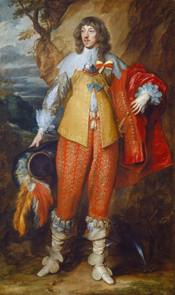
Why does Lumiere look so antique, even next to the theoretical timing of the 1760′s? Probably the same reason this member of staff at Buckingham Palace is dressed for the 1700′s (excepting the hat) while helping Kate Middleton with her wedding dress in 2011:
Servants of royal households (especially footmen) don’t exactly dress for the times, as it were. They get their livery and they wear it. You’ll see footmen dressed for the 1700′s as much as for the 1800′s nowadays, but in the 1800′s? Your footmen were livered for the previous century no doubt about it.
Cogsworth, as Head of the Household, has a bit more laxity about livery than Lumiere who is...never given a title. He’s just Lumiere. Cogsworth is Head of the Household, rather like a butler, Mrs. Potts is Housekeeper, and Lumiere is...well he’s Lumiere. For arguments sake let’s make him First Footman to be approaching equal status as the others and leave it at that.
Now you may be saying again, “But! Servants maybe aren’t great indicators, sure, but what about the town?! What about Gaston?!” Well, okay.

No one looks like a weird 19th century re-imagining of medieval eras like Gaston, I guess. Look at that tunic and hose. Looks more like Phillippe le Bon, Duke of Burgundy than a 1700′s man:
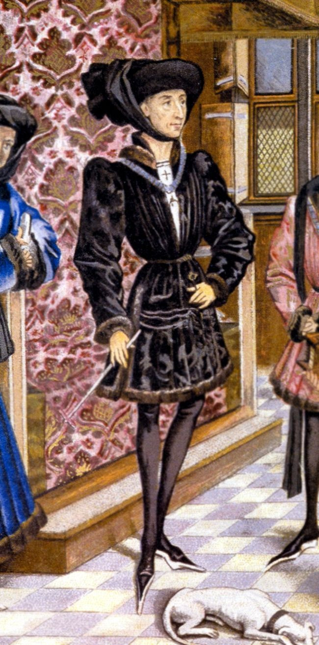
(Granted, Phillippe here is wearing poulaines, a popular long-toed shoe from the 15th c. rather than boots)
19th century re-imaginings of the medieval era were very common (looking at you, Viollet-le-Duc re-imagining what Notre Dame de Paris should have looked like). Dressing like it, maybe not. But nothing about Gaston says “1700′s” to me.

(Though, neither do these two kids with a turtle outside the bookshop during “Belle” so maybe this is a weird medieval town?)
Let’s take a look at when he’s dressed up to the nines for his “wedding” shall we? Just to keep it fair. Maybe he’s having an off day, sartorially during “Belle.”
What’s that line in that wedding coat? It seems to move back into being tails like a tailcoat again. Let’s investigate further.

Yup. Sure looks like that diverts into being tails in this silhouette shot.
So Beast and Gaston are both dressed for the 19th century and Great Male Renunciation with those tailcoats, even if Gaston absolutely must keep to his color palette.
For the sake of covering all our bases, let’s talk about his gun for a second, too. Again, I am an art historian, not a military historian, so I’m not claiming to have full knowledge about all this, mind. But this gun looks like a blunderbuss to me.

Gaston’s gun

Ottoman Blunderbuss gun, Circa 1820 (private collection (Knohl Collection))
Notice the barrel shapes? You might even say Gaston’s is exaggerated for visual interest, but there was a very special gun auctioned off in 2016 by Woolley and Wallis, Auctioneers:
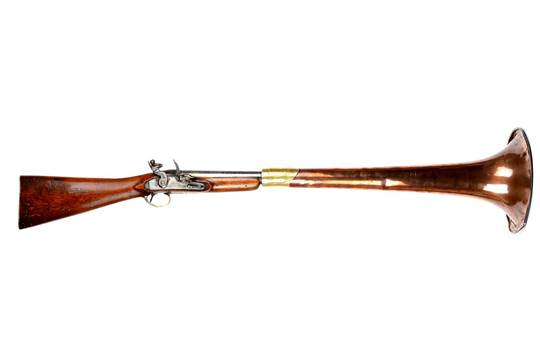
This is a “Fitzgerald patent flintlock signal trumpet, converted musket” that was “sold by appointment to Thomas Clio Rickman” by Willam Fitzgerald in the early 19th century and was patented in 1799.
Granted, this is not a common gun, it was patented, after all, but it does exist. And note the year of 1799, on the cusp of the 19th century, and certainly not the 1760′s.
Now you may be saying “But the Beast is a Prince! So it must be the 1700′s or the Revolution would have happened!”
The French Revolution of 1789 was a big deal, of course, and yes it did execute plenty “aristos.” Let’s not forget, however, that no one knew the Beast’s castle was there, so the Jacobins probably weren’t beating down the door of the castle anyway and planting liberty trees in the middle of Belle’s “poor provincial town” (unless that weird medieval kid was actually wearing a Phrygian Cap........)
But here’s something to keep in mind. Well, quite a few things.

When can a man have the title “Prince” in France? Well, the Ancien Regime, of course, and even further back than that. Let’s say Frankia as a starting point c.800 for clarity’s sake, all the way through 1792.
“Why not 1789? That’s the Revolution!” Well, it was the start of it, yes. And it was the storming of the Bastille. But the Revolution began with a period of a Constitutional Monarchy. It wasn’t officially a Republic until 1792, once Louis XVI’s head was in a wicker basket.
Moving on, you could be a Prince as well under Napoleon’s Empire, under the Restoration and the July Monarchy, and Napoleon III’s Second Empire. And even when those fell, people kept their titles. They weren’t getting murdered for them, after all.
Beast being a Prince does not necessitate him to have been alive before 1789. There’s a reason the 1800′s are called the Long Nineteenth Century, a lot of stuff happened really fast all the time. This list doesn’t even cover that time that the city of Paris became an anarchistic commune and so the National Guard was sent out to murder between 10,000 and 20,000 people for it.
All in all, “Beauty and the Beast” is styled to the 1800′s. It’s just obvious once you start looking at it and comparing it to the supposed time it’s equated to. Disney making it into the 1700′s in the live action remake is buying into incorrect readings of it, just like how they made the egg seller sing “That’s too expensive” during “Belle” when the original line is sung by this guy buying a jug.

38 notes
·
View notes
Photo
SUNDAY STATEMANTS - NO 1
This post is a solution that I have reached few days ago – due to having almost no time to create posts daily (while I really want to share my option), I thought of making one (longer) post on every Sunday (which I have mostly free – except fashion months) and combine everything that happened in Menswear during the past week – let’s see how It works out. So,
What would be the better start for the new format than Paris Men’s Fashion Week, that has just recently finished (on Sunday according to official FHCM schedule but actually on Monday with JACQUEMUS show).
FACTS
Runway Shows: 60 (according to official schedule)
Presentations: 27 (according to offial schedule)
Total Looks: Around 3500
Yes, when you combine the numbers, there’re fascinating results – there were around 3500 looks offered – just for Men, just in Paris – that is around 12000 pieces of clothing, 3500 pairs of shoes, around 2000 accessories – a lot! Especially considering the fact that few brands produce very identical outfits (in terms of fabrics, styling, vibes) and there’s a rapidly rising competition at Men’s fashion market. Thanks god Paris is the most diversified of them all and I could name like like only 7-8 brands that does not really fit in the schedule (compared to other 50 brands) – either they look similar, or I don’t get them (my problem?).
PALOMO SPAIN (18 June, 11:00)

The SS 2020 (that already sounds quite major itself) has started on Tuesday, 18th June, 11:00 AM with Palomo Spain (who returned in Paris after previous season’s try in NY) with some beautiful dresses – yes, you read it correctly. Designer thinks that none of the specific garments are made exclusilvey for any gender and that he sees many boys that could rock those chiffon garments – a significant part of the collection that was inspired by Pompeii.
BODE (18 June, 12:00)

Emily Adams Bode has just recently won CFDA Award (Emerging Designer of the Year) and there she was at 12:00 AM (straight after Palomo) in Paris, sending the collection that was inspired by her family’s history as wagonmakers for Circus in the early 1900s. She literally looked at the outfits from century ago and re-made them to keep appropriate with time.
AMI (18 June, 20:00)

My favorite Parisian house is becoming bigger and bigger every season (and it little bit worries me to be honest, strange no? Here’s why: what I always loved about AMI is that it’s one-off menswear-only brands that produces timeless men’s clothes in a very affordable prices (and in a perfect quality), everything in the collections always feels modern (with bit of a twist), the styling is always impeccable with unexpected colors combined together BUT! I kind of missed this in the latest collection, shown at Grand Palais, it felt little bit too dark and serious (especially for Summer collection), I’ve missed color and the sense of freshness. I did like what was shown, there is a lot I would wear myself (especially now when Black has become favorite of mine) but I kind of think I could find many of those pieces at other rival brands, I understand that now brand established itself and it just becomes matter of brand loyality, when you decide where to buy regular black trench coat - that’s where AMI is headed now I guess.
ACNE STUDIOS (19 June, 15:30)
With Ambition to Create Novel Expressions, Jonny Johansson (brand founder) presented the collection that felt little bit weird for me (a huge brand fan tbh). I totally loved the opening with beige shirt, styled with yellow scarf, but then I did not quite get printed cycling shorts, or lace insets, or pvc details (and bit more, tbh). It was kind of everything but kind of nothing notable (Luke Leith from Vogue Runway agrees), and I felt disappointed, especially after few very, very strong seasons and increasing fame (after so many years on the market). At least, some great blazers were there (thank god!).
J.W. ANDERSON (19 June, 13:00)

It’s a second time for Jonathan in Paris, after moving his namesake label from London (that probably made his 2 out of 3 famed iPhones busier than before). As one of the pioneers who pushed gender-fluid shapes since the very beginning of the career, designer has put signature pieces on the runway - including dresses worn by male models. Blazers and coats had wide shoulder extensions and pants included giant fringe insets. Some of the looks could be well-fitted at his Loewe (the show was day after this in the calendar) but this still feels ”harder” and more personal.
Y/PROJECT (19th June, 14:30)

Y/Project shows feel like a hard mathematical induction, you need a time to realize the logic behind and “solve” it, or maybe you don’t. Glenn Martens once again proved that there’s no stopping of him and he is cementing the brand aesthetic with gigantic steps every single season. For SS 20 (after showing previous Menswear at Pitti) distortion and asymmetric proportions became even more solid and serious. How can you not love the incredible outerwear, tailored blazers, knitwear and jaw-dropping denim pants – each of them proving that you can combine ugly and beautiful in a very smart way. One could analyze every single look in details, but I bet it would take a lots and lots and lots of time. Additional drama was brought by Bizet's "L'amour Est un Oiseau Rebelle" in one of the Parisian churches. It’s clear that brand’s approach to clothes are not welcomed just by fashion insiders or avid trend followers anymore, it’s just for everyone who love “smart”, fashion-forward and beautiful outfits (even if most of them are everything but classic understanding of beauty). There’s always a surprise cut or detail hidden in most of the Y/Project pieces, once you buy the garment, you get the freedom and possibility to wear it on your own way – I’ve seen myself three men wearing same Y/Project pieces in a completely different way in a same day.
VALENTINO (19 June, 17:30)

Pierpaolo Piccioli is keeping the youthful attitude with the insertion of loud graphic prints (this time deisgned by Roger Dean) at Valentino Men’s collections (continued from previous season’s UNDERCOVER collaboration) while keeping brand staple shapes and cuts and not following any of the ongoing trends as much, even the VLTN logo was gone this time (which makes me very happy), replaced with single vintage V sign. The signature camouflage sneaker (my first ever most expensive fashion purchase back in 2012) got upgrade shown alongside with new shapes. Long live Mr. Pierpaolo!
RAF SIMONS (19 June, 21:00)
Raf Simons clearly is not done with America. After leaving CALVIN KLEIN (end of 2018), it’s his second outing in Paris and I think he used this time to digest everything then to express all in his latest collection. It was very Raf, I feel like he was just being honest putting his feelings and thoughts as motifs (likes of: STONED AMERICA, etc) and showing that he was disappointed with America.
LOUIS VUITTON (20 June, 14:30)

Virgil Abloh has invited guests at Place Dauphine (Remember Carrie Bradshow walking there in SATC) and offered LV branded wooden green benches, crepes and ice creams, alongside with the beautiful collection. It was clear – Virgil has settled at the house in a year, already has several signature shapes (and lots of accessories) and as he mentioned he just (or “just”) wants to present collections that will be consistent, will help more men express themselves (and he has a huge fandom in that area) and he won’t push the exact specific inspirations (remember Michael Jackson case from previous season?). Show featured some mind-blowing floral pieces (in a form of signature harness, hat and various embroidery) modern tailoring (note: the colors), lots of mixtures of work wear with formal wear and many, many bags (some really hardcore shapes). Originally, show was planned around Notre Dame, but it had to be changed due to the recent fire (although the cathedral was still present as a motif on some of the pieces). In a few words – there’s no stopping for Virgil Abloh and his “work”.
DRIES VAN NOTEN (20 June, 16:30)

I can never describe my exact feelings about Dries. It means and express so much of everything for me. I just let clothes speak themselves – out of this world beauty, that is all things modern, masculine, sexy, sensual, rebellious, stylish - just b e a u t I f u l. Sometimes I cried…
VETEMENTS (20 June, 20:00)

I, myself predicted year ago that Vetements could go to McDonald’s one day - and it actually happened today. Guests went to Champs-Elysees branch of the restaurant (biggest one in Paris) to see the show that did not really shock anyone but I guess still brought the excitement to them. Show featured all things Capitalism and more - re-worked famous logos (Likes of Heineken, Vodafone, Internet Explorer to name a few), police-branded bombers, signature flower prints and awkward quotes - everything VETEMENTS has became known For. After previous season’s dark extravaganza (my least favorite show of the brand), they kind of got back to the roots and put everyone’s favorite parody and sarcasm backed pieces. Does it felt new? Ofc No, but still you do not get the fashion show at McDonald’s everyday (or at all) and condom as an invitation, so the mission that means making fashion more fun and sarcastic (but still sell it expensive) was again completed. One of the most interesting quotes that Demna Gvasalia has mentioned to Sarah Mower_ is that he always wanted to have his own celebration at McDonalds since 1997, when McD has opened in Tbilisi, Georgia (and I also remember that very day like it was yesterday, how happy I was to hold Happy Meal menu in my hands there) but he could complete it oy now, in Paris. I can’t stop loving the Gvasalias, for making my country on an international map by showcasing its darkest secrets to everyone!
BERLUTI (21 June, 13:00)

It’s Kris Van Assche’s 2nd runway show at Berluti and we kind of see where he is going - positioning brand as impeccable (quality-wise) tailor-maker with an youthful, modern touch (mostly expressed in vibrant colors of formal clothing alongside with layered styling). Featuring older models on the runway is a message that Berluti does not forget about mature customers but wants them to look modern. Despite the very strong comptetition in this particular niche (Dior Men's and Louis Vuitton Men's in the same holding as Berluti, LVMH), there's always a need for a good (and fashion-forward) tailoring.
JIL SANDER (21 June, 15:00)
If you thought Jil Sander could not get more sensitive and delicate, here you go with latest collection, as designers Lucie and Luke Meiers (wife and husband) mentioned in an interview with Alex Badia, they are showing their vision of tailoring, how they feel about the it and offering new ways of wearing it and it just feels right! I kind of feel the duo’s takeover at Jil Sander is still underrated and they are actual creators of the modern but absolutely timeless fashion!
SSS WORLD COPR (20 June, 11:00)

t’s a daddies world! Justin O’Shea keeps the dandy aesthetic and crazy prints on top of his brand, always showcasing at the fanciest locations of Paris - this time at Ritz, casting some really hot models who are actually various sport (boxing among them) athletes and maybe thats why all the extravagant prints felt more real and wearable than before. And I bet many of you saw the O’Shea serving the guests himself by champagne at the start and taking the bow while he was riding a bike - very casual, indeed.
DIOR MENS (21 June, 18:00)
Mr. Kim Jones was man of the hour (or the season) once again. He killed it 3rd time. With his couture-approach to the Men’s clothing (with continuous revisiting Dior’s women archives, especially Haute Couture alongside with John Galliano creations) and collaboratiosn with the hottest creative minds of the moment, Jones is just writing down history of modern menswear. This time it was Daniel Arsham, whom Kim contacted year ago with a request and to put his unique approach to the Dior pieces. Known formanipulating and reinterpreting existing materials and structures, Arsham has clearly engaged with Dior aesthetics and we have got some really extreme accessories (with Yoon Ambush included in the work). Appears, it’s not first time for Arsham working for Dior – back in 2005, Hedi Slimane commissioned him to design Dior’ Homme’s LA flagship. Wll, I just think of time, when they let Kim Jones take over entire Dior house (with rumors on Maria Grazia heading to Fendi after SS 20 show).
GmbH (21st June, 19:00)
Did you notice the evil eye? Hard not to! Serhat Isik and Benjamin Huseby literally decided to ”protect” models (and then customers) from the misfortune but making it look fashionable and wearable. Featuring the usual diverse and exotic casting, GmBH presented their best to date (imo) collection at the National Institute of Young Deaf People in Paris. It was all things GmbH does the best - tailoring mixed with sportswear paired with both formal and Asics collaboration shoes - and everything being as vegan as possible. Designer duo rapidly took the spot for one of the most anticipated shows at PFW and with every season they are showing a very logical development in all areas. They’ve easily made some of their signatures well-recognisable: would this be a double-zipper denim or their logo-branded pieces and now the broader introduction of accessories, they will surely strengthen their space in buyers order sheets and customers wallets - and the strange magical effect of the ”evil eye” should actually play the significant role.
SIES MARJAN (22 June, 13:00)

Sander Lak is the latest designer to move from NY to Paris (a step that has not been effective for Proenza or Rodarte, but still works for Altuzarra) and take Opera Bastille as a location for its debut Parisian show. Starting from knitted jampsuit (season’s trend) continued with beautiful segment of beiges (denim and cotton) and colorful crocodile-effect faux leather outwear, show also included variations on zebra print. Most of the pieces felt quite gender-fluid - all the pieces that were worn by male models could be well put on 6 females that also walked the show. Except SS 2020, show also featured Fall 2019 capsule pieces that will be available for purchase now. It all felt very modern and easily wearable - everything we all need now.
OFFICINE GENERALE (23 June, 10:00)

Peter Maheo always serves us with delightful Sunday morning breakfasts in Paris – no, there are no croissants or chocola-chauds, but some really chic Men’s clothes. I could spend entire Spring wearing the show’s opening look (mint tailored duo), or the second look, and third, and all of the 45 others. I love how Officine Generale has kept it consistent and doe not tries hard to present gimmicks that you can never wear – I just want them all!
LANVIN (23 June, 11:00)

After all the past year’s shake-overs at LANVIN , it seems that brand is on the way to settle and reboots itself with a fresh new page. Will this become a successful book tome? Only time will tell, but the foreword looks promising. It was a first Men’s show for house’s new creative director, Bruno Sialelli (who went from Loewe) and what he presented to audience made everyone think about only one thing – holidays! Staged around one of Parisian public pools, the show featured everything (and more) you associate with holidays – nautical stripes, bucket hats, sailor collars and even sleeping bags – white and blue shades dominated. LANVIN men now also wears printed sequin dress, azur intarsia knit jacket on a naked body and lots of baggy jumpsuits – and it all feels very young and naïve.
ALYX (23 June, 19:00)
Can we call it the coolest show of the season? It just amazes me how Matthew Williams managed to put the brand on top of the current fashion industry in such a short time. I guess the quality that you can feel all around the brand and a dedication that Matthew and her wife Jennifer Williams (who walked the show actually) put in their brand (they have moved from NY to Ferrara, Italy to oversee brand’s production in the local factories). The collection featured sharp and sophisticated shapes. Started with classy suits and quite sexy (women’s especially) looks, show continued with signature streetwear vibe, but it also felt very, very sophisticated and elegant (and that’s not wrong for streetwear, at all), outerwear was to die for - crocodile effect rubber-like coat just nailed it!
CELINE (23 June, 20:00)
With the second standalone Men’s show under the label, Hedi Slimane has presented “nostalgia for things I probably have never known” (read embroidery on a tote bag). It was classic Hedi (and it’s now a definition of particular style, not a single designer aesthetic), classic 70’s but felt still modern for me (and many argue on that). There’s clearly a huge market for what he is doing and with Saint Laurent making shifts to detach itself from Hedi (and CELINE as a brand), sales should be heading to the desired peak (LVMH plans to double brand sales with the help of Hedi in a short time).
JACQUEMUS (24 June, 17:00)
Do we need to say anything more on this show?
- - -
it was a season of SS 2019 (in June 2018) that made a huge breakthrough in Menswear – that was when Kim Jones and Virgil Abloh both had a debut seasons at Dior and Louis Vuitton and when Raf Simons returned to Paris – the craze that you could feel in Paris those days was insane, that was when everyone agreed that Menswear has its notable importance and it’s only gonna rise with every new season – with SS 2020 being fantastic continuation for that.
Oh and almost every designer mentioned how they are trying to be more sustainable, nature-friendly, gluten-free, etc…
#STATEMANT#PFW#PARIS FASHION WEEK#MENSWEAR#RUNWAY#AMI#BERLUTI#LOUIS VUITTON#DIOR#KIM JONES#VIRGIL ABLOH#YPROJECT#GLENN MARTENS#VETEMENTS#DEMNA GVASALIA#DRIES VAN NOTEN#JW ANDERSON#VALENTINO#RAF SIMONS#CELINE#HEDI SLIMANE#LANVIN#JIL SANDER#SIES MARJAN#GMBH#ALYX#OFFICINE GENERALE#SS20#SS2020#SS 20
6 notes
·
View notes
Text
Hello!
I’m announcing my most current WIP. It is a retelling of Iphis and Ianthe, a greco-roman myth solidified in Ovid’s Metamorphosis (book IX) that is set in 18th century Manchester, England. I’m planning on publishing it sometime this year as a free PDF, as well as on my AO3 as an original work.
It won’t be a perfect reinvention of the myth. the major differences are thus: My Iphis character is disguised as a man, but rather than physically turning into one, she essentially gets outed as a woman; the names of one of the main and all of the secondary characters are not parallel; Ianthe is the one with a creepy dad; Iphis is from Goa, India; Ianthe is Irish as fuck.
My Iphis character is named Satvi. She is a baker and a Goan Muslim, she stowed away on an East India Company ship to arrive in England, and she is very much a lesbian.
My Ianthe character keeps her name. She’s a half-Irish bookworm pseudo-feminist bisexual wonder who I would literally die for.
I’m going for a ‘Gentleman’s Guide to Vice and Virtue’ meets ‘Twelfth Night’ sort of very Shakespearean vibe in my plot. I’m excited to get this out into the world, because as far as I know there’s really only one retelling of this myth (Boy meets Girl by Ali Smith, 10/10 would recommend)
The title is ‘Where The World Has Gone’, so i’ll refer to it as WTWHG from here onward. I hope to track my writing here to keep myself motivated.
an excerpt from the first draft of the third chapter:
She meets Ianthe at the the tiny bookshop she works at. The shop has been there for as long as Satvi can remember, persisting through war preparations and annoying English children with their little readers. It smells of old books and brewed tea, and has a floor coated with Oriental carpets and piled high with bookshelves and many a tower of books. The little shop’s space is so very warm and comforting. It’s all reds and oranges and browns, dark colors that increase the claustrophobia of the space as well as the rather ironic calming effect. For years it’s had a little sign on the front that just reads ‘bookshop,’ for bookshop it is. Ianthe sits at the table crammed into the front corner of the room, surrounded with baskets of coins demonstrating the store’s strange and somewhat primitive monetary system. She’s got her hair in a simple plait and wears a olive green cotton dress with a brown shawl about her shoulders. At first, she doesn’t hear Satvi come in because she’s bent over some papers and writing away at a breakneck pace. Satvi clears her throat. “Ianthe, hello,” Ianthe looks up at her, a startled expression on her face. “It’s Sunday, you know, so I thought I’d drop in here early.” Ianthe shakes her head. “No, no. It’s good to see you. We’ve just had someone drop off a Sophocles play, if you’re interested in that.” “I don’t think so,” Satvi shakes her head in kind, “I prefer prose to poetry and play. Not to say the old Greek men aren’t good, they’re just not my type. Too bloody tragic.” “That’s fine. I’ve got a bunch of books over there that might be more your type. Miss Mary will be dropping in soon to help, so you can say hello to her. She told me once that she wanted some pastry. Just do you know.” “Miss Mary will soon lose her life if she insists on only consuming sugar, you know. Then you’ll be out of a job,” Satvi says as she wanders towards the collection of very old stinky books, as she has so chosen to label it.
#greek mythology#writing#wip#iphis and ianthe#1700s#18th century#retelling#lgbt#lesbian#books#self publishing#england#historical fiction
6 notes
·
View notes