#alt text's there as always and they can be clicked for full sized
Explore tagged Tumblr posts
Visit Tumblr Blog
Explore Tumblr blogs with no restrictions, modern design and the best experience.
Last Seen Tumblr Blogs


Fun Fact
The total number of visits Tumblr.com received during January 2021 is 327 million.
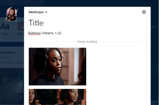
Text
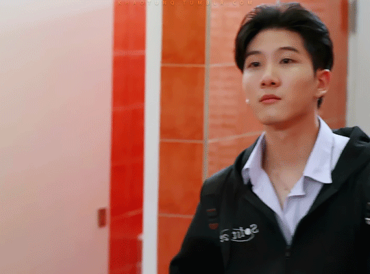


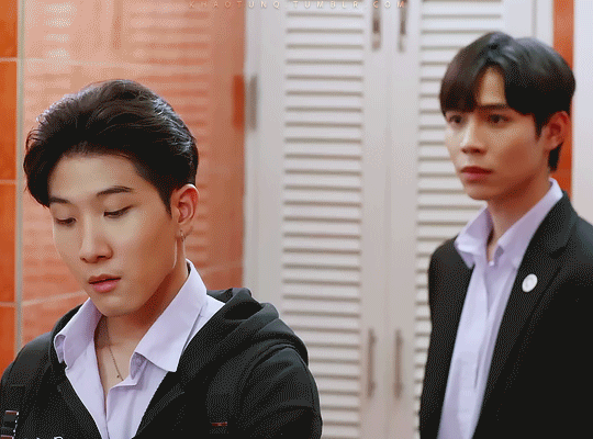
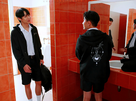


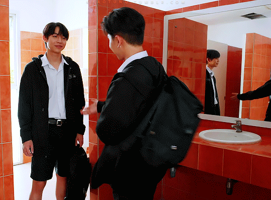
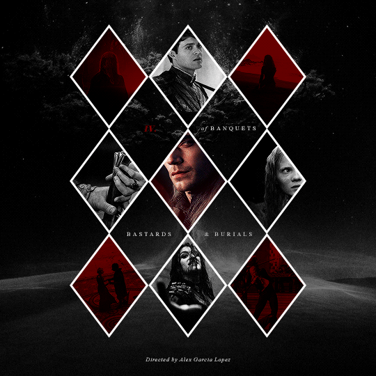
The Eclipse (2022): Episode 1 | Episode 12 Khaotung Thanawat as Ayan Sukkhaphisit; First Kanaphan as Akk Pipitphattana
#theeclipseedit#the eclipse the series#the eclipse#akkayan#akkaye#akk pipitphattana#ayan sukkhaphisit#the eclipse akk#eclipse ayan#eclipse akk#asianlgbtqdramas#boyslovesource#tuserrowan#userbon#tuserhidden#tusersilence#userjamiec#fordaniseyes#my gifs#mine: the eclipse#mine: akkayan#the love on the akk and ayan sets i posted last night has gotten me through today#thank u guys i'm glad they've brought u joy :')#these are all full size 540px gifs but they looked weird in one column#the text feels huge on the full size ones so hopefully it's ok to read with them in two columns? idk#alt text's there as always and they can be clicked for full sized#anyway characters of all time#i'll never be over them thanks x
62 notes
·
View notes
Text
4th year of Domaystic: 2025 prompts!
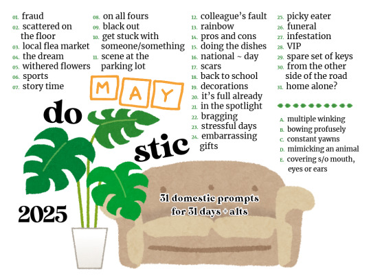
Everything's ready for Domaystic 2025 :D
Domaystic comes from “domestic” + “May” and it's a prompt event that runs throughout May with a list of 31 prompts for its 31 days. And also 5 alternatives are back. The overall theme is that of the domestic trope: anything inside, outside, beside the house or that has that normalcy flavor of everyday life.
Anyone, in their own way of expression, is welcome to use the prompts and create: fics, art, gifs, podcasts, whatever tickles your fancy, there are no restrictions. For any questions or such, the ask inbox is always open :)
Text prompts:
1 Fraud 2 Scattered on the floor 3 Local flea market 4 The dream 5 Withered flowers 6 Sports 7 Story time 8 On all fours 9 Black out 10 Stuck with someone/something 11 Scene at the parking lot 12 Colleague's fault 13 Rainbow 14 Pros and cons 15 Doing the dishes 16 National ~ day 17 Scars 18 Back to school 19 Decorations 20 It's full already 21 In the spotlight 22 Bragging 23 Stressful days 24 Embarrassing gifts 25 Picky eater 26 Funeral 27 Infestation 28 VIP 29 Spare set of keys 30 From the other side of the road 31 Home alone?
5 Alternatives:
A. Multiple winking B. Bowing profusely C. Constant yawns D. Mimicking an animal E. Covering s/o mouth, eyes or ears
-> More details under the cut!
Other languages:
Text prompts in Spanish: click here Text prompts in Italian: click here Text prompts in French: click here
General rules and guidelines
All fandoms or original content are welcome.
Any kind of media is welcome.
No restrictions in ships, size, pixels, min/max word count or language.
There are a 31 prompts, one for each day of the month + 5 alternatives if needed.
If you plan to share your work, and if you want, you can add it on the 2025 AO3 collection; or, by tagging or mentioning this blog here on tumblr, I'll reblog it.
It's okay to combine more prompts together or with another event.
You don’t have to do all the prompts: do the ones you enjoy.
Domaystic runs actively throughout May; tracking #domaystic2025, mentions @domaystic, and previous years tags too; if you tag the blog on a later date, that’s fine too, I just reblog on a lower pace after May is over.
Tags to navigate the blog: tumblr post or page on blog
Tagging your tumblr post:
Mention: @domaystic or use the tag: #domaystic2025
Tell me the fandom name or if it is original content
Tell me if it is sfw or nsfw
Tell me which prompt you used if a day# or an alt#
For lengthy posts, please use the “read more option”: ctrl-shift-k on rich text; [[*MORE*]] on html (remove asterisks)
Please, TAG PROPERLY. If there are any trigger warning, I will base my own reblog on your tags so, please, take even a moment longer to carefully tag it. I hope all participants to stay safe in this event.
Here’s an example:
This is my fic/art @domaystic !
#domaystic2025 #day1 #[altA - E if alternative prompt is used] #[fandom name or oc] #[sfw or nsfw] #[trigger warnings that I get from your post] tw
AO3 collection
As the previous years, the domaystic2025 collection will be open from May, 1st. On the profile page you'll find all the info and prompts as well.
Link to the 2025 collection: click here
#domaystic#domaystic2025#post about the event#domesticity#domestic trope#prompt list#prompt event#multifandom#fandom event#prompts#also prompt 16 is blatantly taken from a user on r/fanfiction that has been listing such (inter)national days :D so cool#thebigbangblogproject#as always if anybody has corrections on my translations pls tell me#did I forget something? hopefully not?#weeeeeeeeeeeeeee
185 notes
·
View notes
Text
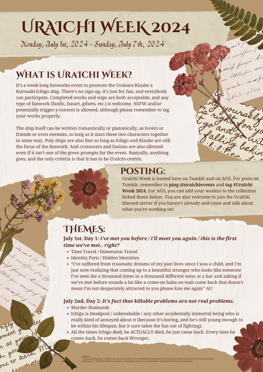
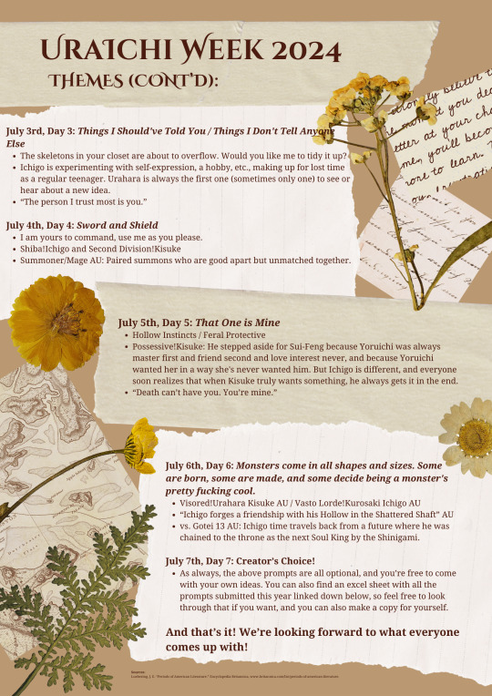
UraIchi Week 2024
Monday, July 1st, 2024 - Sunday, July 7th, 2024
AO3 Collection
Full Prompts List Submitted This Year
(Click images to enlarge. Alt text under the cut.)
What is UraIchi Week?
It’s a week-long fanworks event to promote the Urahara Kisuke x Kurosaki Ichigo ship. There’s no sign-up, it’s just for fun, and everybody can participate. Completed works and wips are both acceptable, and any type of fanwork (fanfic, fanart, gifsets, etc.) is welcome. NSFW and/or potentially trigger-y content is allowed, although please remember to tag your works properly.
The ship itself can be written romantically or platonically, as lovers or friends or even enemies, so long as it stars these two characters together in some way. Poly ships are also fine so long as Ichigo and Kisuke are still the focus of the fanwork. And crossovers and fusions are also allowed even if it isn’t one of the given prompts for the event. Basically, anything goes, and the only criteria is that it has to be UraIchi-centric.
Posting:
UraIchi Week is hosted here on Tumblr and on AO3. For posts on Tumblr, remember to ping @uraichievents and tag #UraIchi Week 2024. For AO3, you can add your work(s) to the collection linked up above. You are also welcome to join the UraIchi Discord server if you haven’t already and come and talk about what you’re working on!
Themes:
July 1st, Day 1: i've met you before / i'll meet you again / this is the first time we've met.. right?
Time Travel / Dimension Travel
Identity Porn / Hidden Identities
“I've suffered from traumatic dreams of my past lives since I was a child, and I'm just now realizing that coming up to a beautiful stranger who looks like someone I've seen die a thousand times in a thousand different ways at a bar and asking if we've met before sounds a lot like a come-on haha no wait come back that doesn't mean I'm not desperately attracted to you please kiss me again” AU
July 2nd, Day 2: It's fact that killable problems are not real problems.
Murder Husbands
Ichigo is Deadpool / unbreakable / any other accidentally immortal being who is really kind of annoyed about it (because it’s boring, and he’s still young enough to be within his lifespan, but it sure takes the fun out of fighting).
All the times Ichigo died, he ACTUALLY died, he just came back. Every time he comes back, he comes back Wronger.
July 3rd, Day 3: Things I Should've Told You / Things I Don't Tell Anyone Else
The skeletons in your closet are about to overflow. Would you like me to tidy it up?
Ichigo is experimenting with self-expression, a hobby, etc., making up for lost time as a regular teenager. Urahara is always the first one (sometimes only one) to see or hear about a new idea.
“The person I trust most is you.”
July 4th, Day 4: Sword and Shield
I am yours to command, use me as you please.
Shiba!Ichigo and Second Division!Kisuke
Summoner/Mage AU: Paired summons who are good apart but unmatched together.
July 5th, Day 5: That One is Mine
Hollow Instincts / Feral Protective
Possessive!Kisuke: He stepped aside for Sui-Feng because Yoruichi was always master first and friend second and love interest never, and because Yoruichi wanted her in a way she's never wanted him. But Ichigo is different, and everyone soon realizes that when Kisuke truly wants something, he always gets it in the end.
“Death can’t have you. You’re mine.”
July 6th, Day 6: Monsters come in all shapes and sizes. Some are born, some are made, and some decide being a monster's pretty fucking cool.
Visored!Urahara Kisuke AU / Vasto Lorde!Kurosaki Ichigo AU
“Ichigo forges a friendship with his Hollow in the Shattered Shaft” AU
vs. Gotei 13 AU: Ichigo time travels back from a future where he was chained to the throne as the next Soul King by the Shinigami.
July 7th, Day 7: Creator’s Choice!
As always, the above prompts are all optional, and you’re free to come with your own ideas. You can also find an excel sheet with all the prompts submitted this year linked up above, so feel free to look through that if you want, and you can also make a copy for yourself.
And that’s it! We’re looking forward to what everyone comes up with!
182 notes
·
View notes
Text
Excel Techniques: Mastering Excel with SheetNerds
Microsoft Excel is an incredibly powerful tool that, when used effectively, can help you organize data, perform complex calculations, and automate tasks to save time. At SheetNerds, we’re dedicated to providing expert tips and techniques for mastering Excel. Whether you're new to Excel or a seasoned user, there's always something new to learn. In this guide, we'll cover seven essential Excel techniques that will help you unlock the full potential of this amazing tool. Ready to level up your skills? Let’s dive in.

1. Leveraging Excel Formulas for Efficiency
Excel formulas are the backbone of efficient data analysis. With the right formula, you can quickly manipulate large datasets, perform calculations, and draw insights. The key to success in Excel lies in mastering a few core formulas.
Essential Excel Formulas to Know
SUM(): Adds values together.
AVERAGE(): Calculates the average of a set of numbers.
IF(): A logical function that returns a value based on a condition.
VLOOKUP(): Looks for a value in a vertical table.
INDEX MATCH: A more flexible alternative to VLOOKUP.
The SUM function is one of the simplest yet most powerful tools in Excel. It allows you to add up values from different cells. For example, =SUM(A1:A10) will return the sum of all the values in cells A1 through A10. This can be particularly useful for managing budgets, sales figures, and other numerical data.
Similarly, IF statements allow you to introduce decision-making logic into your sheets. If you need Excel to return a specific value based on a condition, you can write something like =IF(A1>10,"Over 10","10 or less"). This formula tells Excel to check if the value in A1 is greater than 10 and, if so, return "Over 10". Otherwise, it returns "10 or less."
Formula Tips for Faster Workflow
Use keyboard shortcuts: You can insert formulas quickly by pressing Alt + = for an auto sum.
Double-check ranges: Always ensure you're referencing the correct cell ranges to avoid errors in your calculations.
Mix formulas for advanced functionality: Combine formulas like IF and SUM for more complex calculations, e.g., =IF(A1>10,SUM(A2:A5),0).
2. Automating Repetitive Tasks with Macros
Excel Macros allow you to automate repetitive tasks, saving you significant time. A macro is a script or a series of instructions that Excel can execute automatically. Whether it’s formatting data, generating reports, or running calculations, macros simplify your workflow.
How to Create a Macro
Navigate to the Developer tab (if not visible, enable it through Excel Options).
Click on "Record Macro."
Perform the tasks you want to automate (Excel will record these actions).
Stop the recording when done.
Your macro is now ready to use.
For example, you could record a macro to format an entire spreadsheet—apply bold headers, align text, and set number formats—in just a few clicks. This technique is especially useful for tasks you perform regularly, such as generating weekly reports.
Best Practices for Macros
Plan your steps carefully: A well-thought-out sequence ensures that your macro runs smoothly.
Test your macro on a sample dataset: This ensures it works as expected before using it on important data.
Document your macros: Add descriptions so that you or your team members can easily understand what the macro does in the future.
Advantages of Using Macros
Increased productivity: Automating repetitive tasks frees up time for more critical work.
Consistency: Macros ensure that repetitive tasks are performed exactly the same way each time.
Scalability: With macros, you can apply actions to large datasets in seconds, regardless of the dataset size.
3. Advanced Data Analysis with Pivot Tables
Pivot tables are one of Excel’s most powerful features, allowing you to quickly summarize large datasets. They enable you to sort, filter, and group data into meaningful reports without needing complex formulas.
Creating a Pivot Table
Select the data range you want to analyze.
Go to the Insert tab and choose "PivotTable."
Choose where you want the PivotTable to appear (new worksheet or existing worksheet).
Drag and drop the fields into Rows, Columns, and Values to structure your report.
With a few simple clicks, you can transform hundreds or thousands of rows of data into a meaningful summary. For example, a sales report showing total sales by region or by product category can be easily created in seconds using a PivotTable.
Customizing Pivot Tables
Filters: Use filters to focus on specific data points, such as sales figures for a particular time period.
Grouping Data: Group data by custom date ranges or other criteria to simplify complex datasets.
Calculated Fields: You can create custom calculations in a Pivot Table that aren’t present in the original data, allowing for deeper insights.
Benefits of Using Pivot Tables
Quick summarization of large datasets.
Interactive reports that can be adjusted on the fly.
Flexible analysis by allowing multiple ways to view the same data.
Here are 10 frequently asked questions (FAQs) about Excel techniques:
1. How can I quickly sum up a column or row in Excel?
You can use the SUM function to quickly add up numbers in a column or row. For example, to sum values in column A, use the formula:
excel
Copy code
=SUM(A1:A10)
Alternatively, you can use the AutoSum feature by selecting the range and clicking the AutoSum button on the toolbar.
2. What is the fastest way to remove duplicates in Excel?
To remove duplicates:
Select the range of cells.
Go to the Data tab.
Click Remove Duplicates.
Choose the columns from which you want to remove duplicates, and click OK.
3. How can I freeze the top row or the first column in Excel?
To freeze the top row:
Click on the View tab.
Select Freeze Panes.
Choose Freeze Top Row.
To freeze the first column, follow the same steps and choose Freeze First Column.
4. What is conditional formatting and how do I use it?
Conditional formatting allows you to format cells based on specific conditions. To use it:
Select the cells you want to format.
Go to the Home tab and click Conditional Formatting.
Choose a rule, such as highlighting cells greater than a certain value, and apply it.
5. How do I combine text from multiple cells into one in Excel?
You can combine text using the CONCATENATE function or the & operator. For example, to combine text from cells A1 and B1, use:
excel
Copy code
=A1 & " " & B1
This will combine the text with a space between them.
6. How do I create a drop-down list in Excel?
To create a drop-down list:
Select the cell where you want the list.
Go to the Data tab.
Click Data Validation.
In the Allow box, select List.
Enter the values you want to appear in the drop-down list, separated by commas.
7. How can I split a cell's content into multiple columns?
To split content into multiple columns:
Select the cell range.
Go to the Data tab.
Click Text to Columns.
Choose the delimiter (such as comma or space) and follow the wizard to separate the data.
8. What is VLOOKUP and how do I use it?
VLOOKUP is a function used to search for a value in the first column of a table and return a value in the same row from another column. The syntax is:
excel
Copy code
=VLOOKUP(lookup_value, table_array, col_index_num, [range_lookup])
Example:
excel
Copy code
=VLOOKUP(A1, B2:C10, 2, FALSE)
This searches for the value in A1 in column B and returns the value in the second column (C) of the same row.
9. How can I apply a formula to an entire column in Excel?
To apply a formula to an entire column, type the formula in the first cell of the column, then double-click the small square (fill handle) in the bottom-right corner of the cell. Excel will automatically fill the formula down the column.
10. How do I use PivotTables to summarize data in Excel?
To create a PivotTable:
Select the range of data.
Go to the Insert tab.
Click PivotTable.
In the dialog box, choose where to place the PivotTable and click OK.
Drag fields into the Rows, Columns, and Values areas to organize your summary.
These FAQs cover essential techniques to help you work efficiently with Excel.
Follow Us Blogger | Wordpress | Twitter | Gravatar | Disqus | Google Sites | Youtube | About.me
1 note
·
View note
Text
Embedding images on AO3: A Guide
Since AO3 doesn't host images themselves, we'll just have to host them elsewhere.
In this guide we will use Google Drive, Discord, https://postimages.org/, or Tumblr as possible choices to host our images.
Step One: Grabbing the URL
Google Drive:
In google drive create a new folder where the image(s) or sub folders for further organization.
Right click and select New Folder, name this folder what ever you what.
Now upload your image(s)
Right click on your image and hit share

Under General Access ensure it is set to Anyone with the link
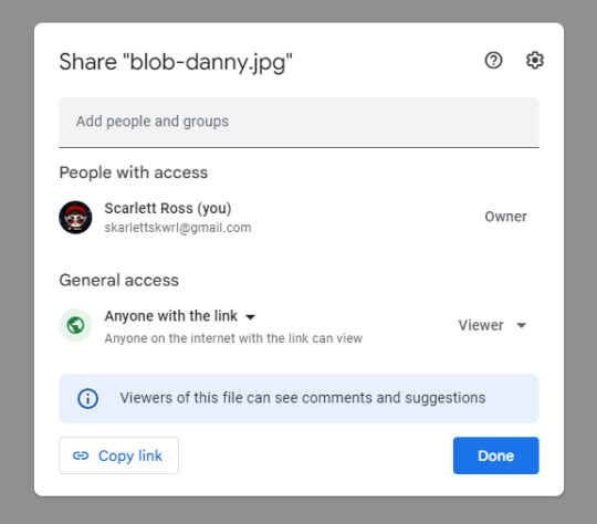
Hit Copy link
The link you have should look something like this
**https://drive.google.com/file/d/1mzOp9pOYhaWahgJP6yVFXbtYagCQ_0Up/view?usp=sharing **
But as is it won't work! We need to modify it first!
Copy the string of random numbers and letters after /d/ and before /view?
1mzOp9pOYhaWahgJP6yVFXbtYagCQ_0Up
Here's a template https://drive.google.com/uc?id=
paste your string after id=
your new link should look some thing like this...
https://drive.google.com/uc?id=1mzOp9pOYhaWahgJP6yVFXbtYagCQ_0Up
Now, you have a working link from Google Drive ready to use.
This Google Drive portion was from this guide here: https://archiveofourown.org/works/28132845
Discord
I have a personal discord server I use for sharing links and other information between devices/OSs. Alternatively, you can create a discord server dedicated to AO3 link hosting.
Create a new text channel. I’ll call mine ao3-image-links in this example.
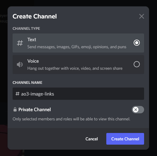
Once you’ve uploaded your image click/tap on it and hit Open original
Or on mobile tap this icon to open the original.

Copy the link from your browser’s address bar on desktop.

from mobile tap the share button then Copy URL

This will give you the full resolution of the image rather than the condensed preview you’d get from the Copy Link in Discord.
Now, you have a working link from Google Drive ready to use.
Using a image hosting service like https://postimages.org/
https://postimages.org/
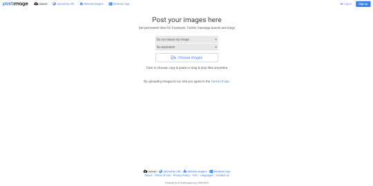
You can create an account for free with this one. This is pretty straightforward so I’ll gloss over. Hit the sign up button. Then, enter your desired email

Once logged in you will be presented with this page
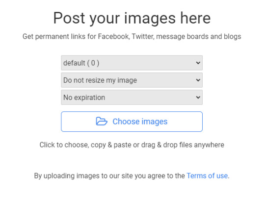
Upload your image, and you will be taken to this page.
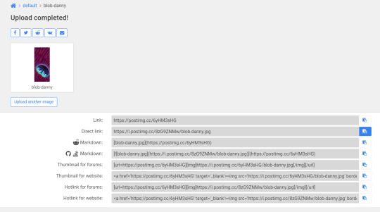
Copy Direct link
Now you have a working link from postimg.cc ready to use.
Tumblr (mobile):
Tumblr is not always the best to use as blogs can get deleted or URLs can change here. But I’ll include it here anyway.
Long tap the image you wish to use in a post.
You will be presented with this menu.
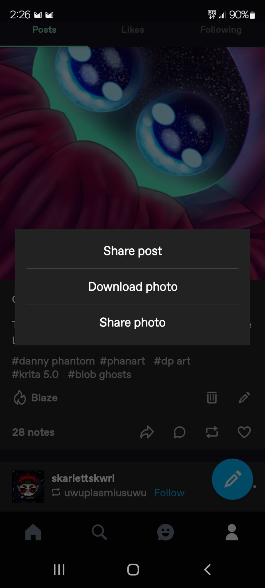
Tap share photo.
Then you will be presented with another menu.

Tap Copy URL
On Desktop (Google Chrome Browser)
Right on the image in the post.
You will be presented with this menu...
Click copy the image address.
Now you have a working link from Tumblr ready to use.
Now, you are ready to embed.
Step 2: Inserting and fitting the image
Go to the new/ existing chapter you wish to be embed.
HTML OPTION:
Make sure in the HTML editor view.

This is located next to the rich text button in the Worktext section, as shown.
Now, find the place in the text where the image should go...

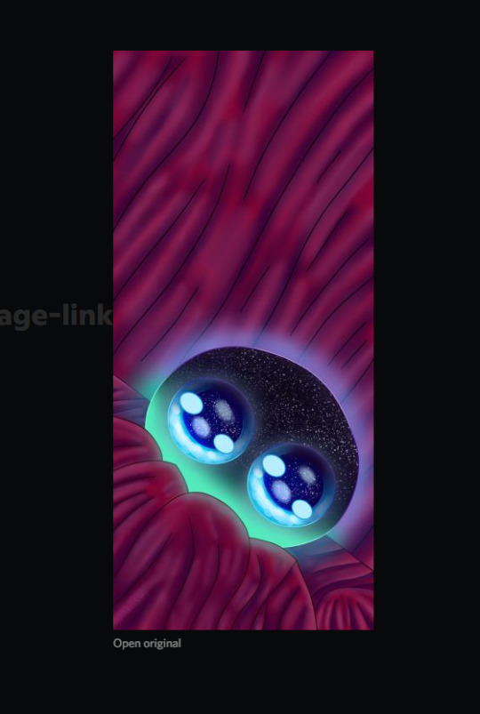
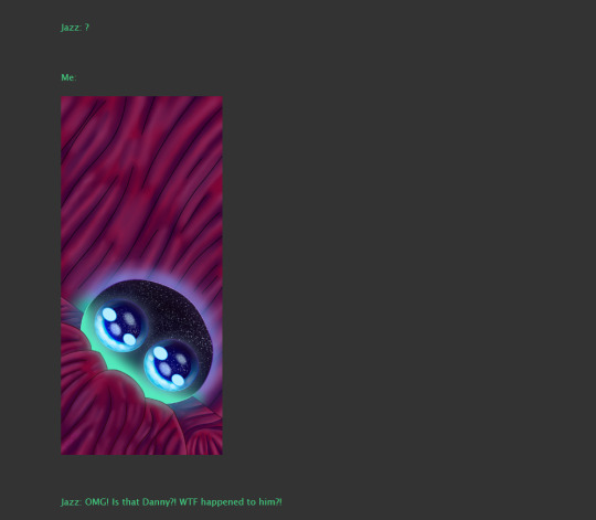
<p> <img src="https://i.postimg.cc/8zG9ZNMw/blob-danny.jpg" width="270" height="600" /> </p>
For this image, it was much too large. So, I modified it with the width and height modifiers.
**First you must find the dimensions of the image. **
This can be done with the same image URL from earlier. With this online tool.
http://myfreeonlinetools.com/get-image-size-and-dimensions/
In this example, my image is 1080x2400
Once you have the dimensions, you can find the aspect ratio.
Use this calculator:
https://www.digitalrebellion.com/webapps/aspectcalc
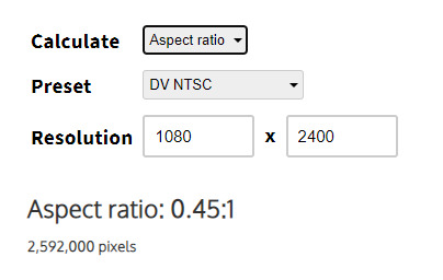
Once have the aspect ratio, you can half or quarter the height or width and calculate for the one you don't have.
Example I've quartered my height as halving it was still to big.
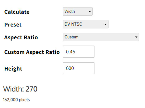
In my case the dimensions are now 600 by 270 which fits the page much better.
These will be your new dimensions.
Record them.
Here is a blank template to paste in.
<p>
<img src="" alt="" width="" height=""/>
</p>
src is the path to the URL.
alt is the alternative text for the image. This is used for accessibility as well as be a modern web standard.
width is the image width in pixels
height is the image height in pixels
You insert your values in between the double quotes.
_*remember to close your quote _
*remember to close your image tag
RICH TEXT OPTION
Make sure in the Rich Text editor view.

Set the cursor where you want the image. Click image icon.

Set the values in this form.
Use the URL we generated in one of the previous 4 options.
Set the Image description
The width and height may be input automatically, if not consult the HTML OPTION for finding the dimensions and aspect ratio of the image.

Here’s how it looks after posting
Shout out to @playedcrowd5610 for inspiring me to make this guide.
215 notes
·
View notes
Photo

Hello there! This is my new and (hopefully) improved tutorial on how to upload gifs for a gif pack page! Tumblr has changed in recent years when it comes to how to upload gifs and how they’re formatted (like .gifv coming in and ruining everyone’s day). People in the community have also made the shift towards more decorated and custom gif pack pages rather than strictly gif filled pages. As such, this tutorial will focus on how to prepare your gifs for those codes. Resources will be linked at the bottom!
NOTE: This tutorial is also available as a Google Doc (the recommended platform for reading this tutorial) with full size images that might be easier to see, however I know some users don’t like going outside of Tumblr to view tutorials, so it’s available on both platforms. To read the Google Doc version, please CLICK HERE.
Setting Up Your Gifs
Load all of your gifs as you usually would into a new post. I usually wait until I have around 20 gifs, then I get ready to move them. Moving them over periodically usually helps it feel like less of a strain waiting for a million gifs to load all at once. Make sure all of your gifs are under a READ MORE! This will prevent them from turning into the gifv format!
Once you’ve uploaded all your gifs, make sure to SAVE AS A DRAFT.
Next, you’re going to want to hit edit on the draft, again, this has to be SAVED before you can do the next step.
This is where all the magic happens. What we’re going to do is strip our gifs of any unnecessary code in a few simple steps. First, hit the gear icon at the top of your post and change the Text Editor from Rich Text to Markdown.
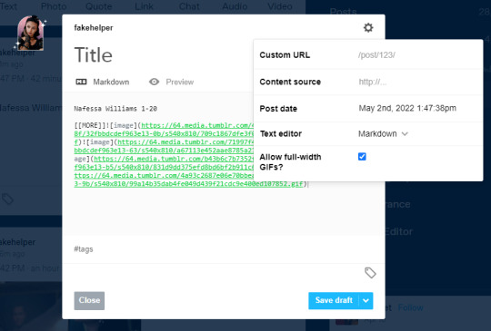
Next, you’re going to change it from Markdown, to HTML
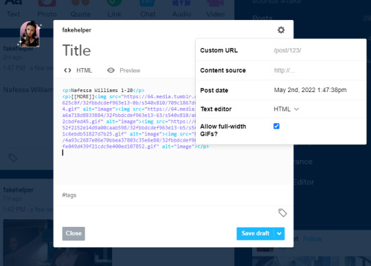
Now, you’re going to want to keep this tab open, and set up your sidepage!
NOTE: If you are using the beta editor, you may require some extra steps to clean up your code! Read more here.
Setting Up Your Sidepage
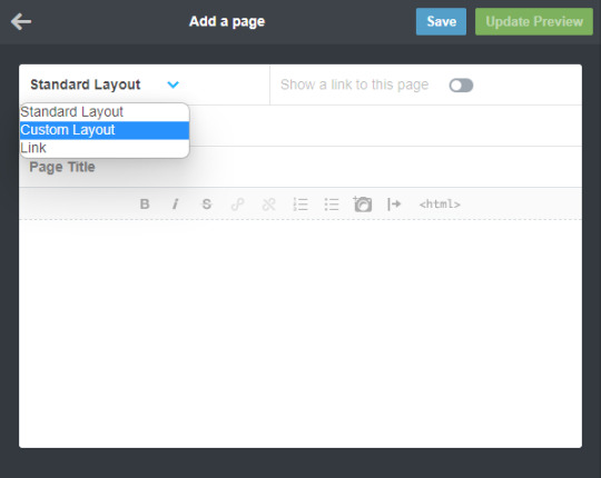
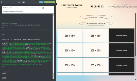
Now you can create your new page. You can do so by going to Customize and then clicking Add a page (I recommend using a sideblog for this as it can heavily clog your main blog, and if you ever change your main url, you can keep the url of your gif pages the same).

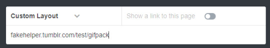
After creating your new page, make sure to change it from a standard layout to a custom layout using the dropdown menu, then give the page a url. You cannot save the page until you add a url.
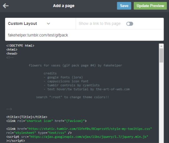
Okay, now for the next step, you can use any gif page code you’d like! I have a tag here with codes made by many different theme makers to choose from! If you’d like to use one of mine, you can find them here. Today I’ll be using my newest theme as an example. From the post, download the code and paste it into the page. It should look something like this.
Now you’re going to want to find the section to add your gifs. In my older codes, you would be able to find it looking something like this:
For this theme, however, I used placeholders because of the trigger warning feature. To figure out more on how to use that feature of the theme, please read the tutorial here. For the sake of this tutorial, however, you can DELETE THESE PLACEHOLDERS (highlighted by the blue box, make sure you keep the <p> and </p> tags).

Once those are deleted, you’re going to go back to your tab with your gifs and select everything after [ [ MORE ] ] , but before the </p> tag, then copy it.

Now, paste your code in between the <p> and </p> tags. Hit Update Preview to make sure it’s loading correctly. Every time you add gifs, make sure there are NO SPACES between the img links. (aka make sure those < ... alt=”image”><img src=”...> are back to back instead of < ... alt=”image”> <img src=”...> leaving a space in between).
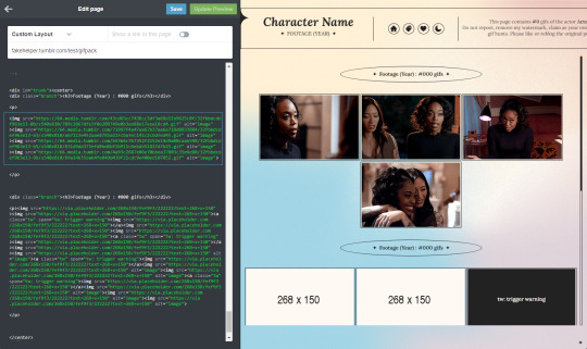
And that’s all! Make sure to change the other parts of the theme necessary (titles, fc info etc) and you’re good to go! Always make sure to hit save before you navigate away!!

Resources
My Gif Pack Page Codes
Recommended Gif Pack Page Codes (tag)
Previous Tutorial (How to upload to a Standard Sidepage)
Barebones Code (for previous tutorial)
#rph#rpc#rp tutorial#rp guide#gif pack tutorial#gif pack guide#mytutorial#fakecontent#PLEASE READ THE GOOGLE DOC IF U CAN INSTEAD#it's way easier to read lmao
117 notes
·
View notes
Photo
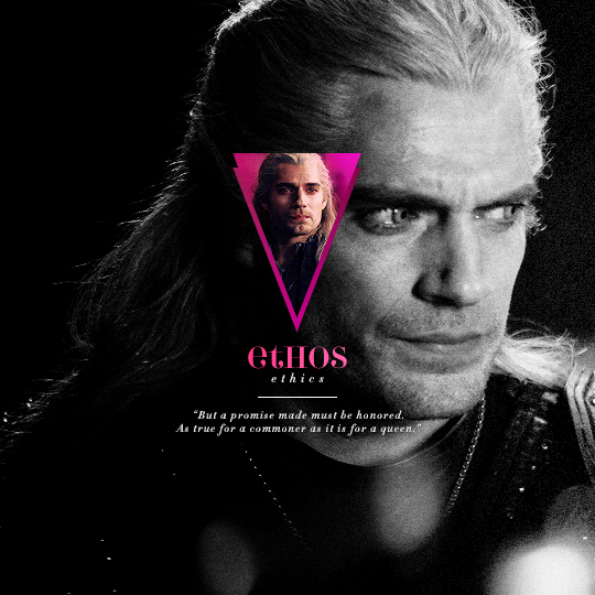
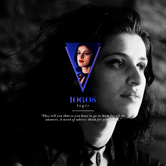
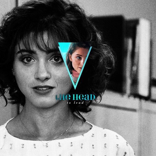
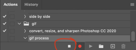
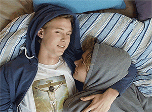
I've recently been asked by several lovely and curious souls to break down this Witcher set, so I thought I’d go ahead and put together a proper tutorial for everyone. All you need is Photoshop and basic giffing knowledge, preferably using the timeline. This isn't necessarily simple, but I would say it's one of the simpler things I've done—somewhere between easy and medium difficulty, maybe.
I. MAKE YOUR BASE GIF
To start, we’re going to be making our base/background gif, which is 540x540. You can color it any way you’d like, but I picked black and white for that particular set because I didn’t want the final product to be too ‘busy’. I wanted to keep the attention on a pop of color at the center instead, which ended up being the second gif and the text.
As a quick sidenote:
Since the gif is so big, I would recommend using at least 1080p footage. I’d recommend always using 1080p footage regardless, but I wouldn’t call it 100% necessary unless you’re making larger (540px, as opposed to 268px or 177px) gifs.
Keeping in mind that the second gif and text will be going in the center of the gif, you’ll want to align the subject/s accordingly. For example, I kept Geralt and Jaskier and Yennefer mostly to the left or right.

Here is the base gif I'll be using:

And here is a tutorial on how I make my black and white gifs if you’d like to get the same grain effect.
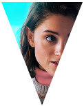
II. MAKE YOUR [SHAPE] GIF
Next is the gif for the shape. Sizing is up to you and ultimately depends on the shape you choose. For me, I know I want an isosceles triangle, so the height of my gif is going to be slightly bigger than the width. My dimensions in the original set were 118x150, so I’ll be making my gif 122x154. You want to oversize here since we’ll be trimming the edges off later on.
After sharpening and coloring, this is what my gif looks like:

III. GROUP YOUR LAYERS
Sounds simple, right? And it is, but it’s as pivotal as it is easy. Maybe it’s dramatic of me to say that I live and breathe by this step, but I kind of do live and breathe by this step. It’s the same technique from this tutorial, and it’s a pivotal step in my blending process also.
Having said that, let’s put all your layers in a group. Do this for both gifs!
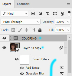
CTRL + A or Select > All
Layer > Layer Mask > Reveal Selection

IV. CUT OUT YOUR SHAPE
You can go about this a couple of different ways, but regardless, it’s as simple as editing your layer mask. No, really. It’s why I love grouping layers and slapping a layer mask on. It makes life so much easier in the long run.
➥ PHOTOSHOP’S CUSTOM SHAPE TOOL
The Custom Shape tool on Photoshop has all the basic shapes you need. Triangles, circles (even though you could just use the round selection tool), stars, and even all the playing suits.
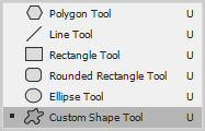
Go ahead and pick a shape to add to your canvas if you haven’t already. Don’t worry too much about the dimensions; you can manually input a specific width and height at the top. Rotate it if you need to (I’ll be rotating my triangle 180° so that it’s upside down) or leave it as is, but when you have it sized the way you’d like, center it and then merge it with a new layer. This way, we can right click on the layer thumbnail and select ‘Select Pixels’.

Next, click on the group layer mask. Invert your selection [SHIFT + CTRL + I or Select > Inverse] and then invert that part of the mask [CTRL + I or Image > Adjustments > Inverse]. Your gif should now be shaped accordingly.
➥ B&W TEXTURES AND VECTORS/PNGs
Alternatively, if you don’t want to limit yourself to basic shapes, you can use a texture or png of anything at all. An instrument, a specific symbol, something abstract, maybe even a flower—it can be literally anything, so long as it’s pure black and pure white. (If you aren’t familiar with how layer masks work, white is what shows and black is what’s hidden. Anything in between and what you get is partially or not all the way transparent, which will look wonky when the smaller gif goes on top of the base gif.)
For example, here’s an icon template by @argetnallison:

Select your image (CTRL + A or Select > All) and copy it.
Go back to your gif. Press ALT and click on the group layer mask at the same time. This will pull up your layer mask.
Paste your image onto the layer mask.
Et voila, as the French and magicians and... other various individuals including myself say.
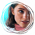
➥ PAINT BRUSHES
If you’re like me and have a bunch of custom brush sets downloaded, brushes are another way to get fun shapes. If you don’t have any downloaded but are interested in trying it out for yourself, DeviantArt and Brusheezy are the best (or at least my favorite) places to look for them.
It’s the same steps as above, but painting instead of pasting.
V. FINISHING TOUCHES
Now that you’re probably sick of me going on and on about shapes this and shapes that—we get it, Ava, there are shapes, get on with it—it’s time to drag the gif shape onto the base.
To center, because I am admittedly border-obsessive when it comes to things being perfectly 100% centered, I set guides [View > New Guide] in the middle. It’s your width and height divided by two, so I have a vertical guide at 270 and a horizontal guide at 270.
For a “3D” (I don’t know what else to call it, other than “well, I just thought it looked neat”) effect, I added a gradient with the same exact layer mask as my gif shape and positioned it underneath and slightly below the gif.
All that’s left is to add text (I wrote a mini tutorial on gradient text here if you’re interested) and we’re finally done!
You can also do this with more than one shape, like here:
Or make the shape full-scale, like here:
Happy editing!
#completeresources#allresources#yeahps#itsphotoshop#resources#tutorials#ps asks#mine*#as always feel free to reach out if any of this is confusing#i'm sleep deprived so i feel like the chances of that are pretty likely
1K notes
·
View notes
Text
vapoursynth versus photoshop
Hello! It’s me again with another long text post. Yesterday I spent over 4 hours experimenting with both vapoursynth and photoshop to make gifs and here I am going to show you my results.
For the purpose of this I will be using:
PotPlayer to make a split video in mov and open in photoshop;
Photoshop CC21;
Vapoursynth for windows (the newest version, links provided on my blog in /tagged/links);
A sharpen action I created with the setting shared by @kamalaskhans
Netflix’s Vincenzo episode 1 in 1080p and Sell Your Haunted House’s episode 11 in 1080p (but they are different in quality)
Without further due, click on read more to see what I am talking about.
I have been using vapoursynth to make gifs in this blog since I created it last year in May, however I already used the late avisynth when I used to run my kpop blog from 2012 to late 2016. I think that this program just made a HUGE change on how kpop tumblr’s make content and how we, drama tumblr’s make ours too.
We already know that vapoursynth keeps the maximum quality of our files and I don’t doubt that, HOWEVER since I don’t really use any denoise filter in VS and it just helps me to crop faster and import faster into photoshop, I always wondered why none of my old sharpen actions work... I mean, we see a lot of famous tumblrs sharing their settings but whenever we open up our files we can’t get the same result even if we have HD content. With that said, I made 3 gifs from 2 different HD videos and I’ll be showing you how different they are.
1. the gif below is made only with Photoshop’s resize. I made the video cut in PotPlayer using the alt+c command — saved as MOV — imported in PS. Sharpen: 500% - 0,4 + 10% - 0,10. 70 frames. basic coloring. link

NOTE: this is what I can call perfect sharpening. It stays clear but not oversharpened.
2. the gif below is cropped using vapoursynth with preprocessors: none & debilinear. no denoise and no sharpening. Once imported on PS: Sharpen: 500% - 0,4 + 10% - 0,10. 70 frames. basic coloring. (I tried to crop in the same position) link

NOTE: it looks extremely sharpened and it’s not on my likes. Please ignore that these are really fast I don’t really bother changing the frames’ delay for the sake of this post.
3. the gif below is made with everything stated above but the preprocessors on vapoursynth are DESPLINE and none. link
NOTE: this looks OK for me, but it’s still a bit oversharpened (you can notice on her fingers and hair) You can also notice that vapoursynth slightly change the color of the file and I have used the same edition layers on PS.
Result: I prefer the first one made with poptplayer and photoshop (even though I’d use the 3rd setting depending on the source file). What do you think? Feel free to answer this post with your thoughts.
Now we will be moving to another file: Netflix’s Vincenzo. This one has way more quality even though they are both 1080p.
1. the gif below is made only with Photoshop’s resize. I made the video cut in PotPlayer using the alt+c command — saved as MOV — imported in PS. Sharpen: 500% - 0,4 (80%) + 10% - 0,10. 97 frames. basic coloring. link

NOTE: this is perfect for my liking. It’s HD and not oversharpened.
2. the gif below is cropped using vapoursynth with preprocessors: none & debilinear. no denoise and no sharpening. Once imported on PS: Sharpen: 500% - 0,4 (80%) + 10% - 0,10. 87 frames. basic coloring. (I tried to crop in the same position) link

NOTE: this is so overshapened that I had to cut down 10 frames to fit the 10mb. also, it hurts my eyes a lot.
3. the gif below is made with everything stated above but the preprocessors on vapoursynth are DESPLINE and none. link
NOTE: it may look ok, but I don’t like this one. Still, I had to take down 10 frames in order to fit the 10mb limit (while the first gif fits just fine in that)
Result: I’m still on the side of photoshop’s reziser. But of course, these are my opinions, comment this post to tell me yours :)
FYI: As I previously mentioned, I don’t really use any denoise filters on VS so it’s only purpose to me is crop faster to import in photoshop. However, these results may not be worth if some of you actually use the denoise filters in VS. With that being said, I think VS is a really amazing tool that helps our gifs to be amazing and works beautifully keeping the quality of the source file. This post was made just to show you how the same sharpen setting can work differently in many ways with many kinds of 1080p source files.
(if you can’t read more on your dashboard I’ve provided links with the full size gifs for you)
#idk how should i tag this?#well... i'll keep this tagged in some way to find easily on my blog#vs versus ps
38 notes
·
View notes
Photo
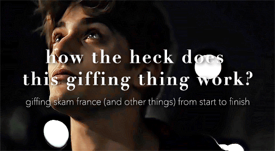
so here’s my disclaimer: I hardly know what I'm doing. This is my glued together homemade giffing method that I’ve created over months of just random experimentation and bits and pieces from all kinds of tutorials. there are probably better or more correct ways to do a lot of these things! this also isn’t a completely universal tutorial, some of the specifics are geared towards giffing skam, specifically skam france.
I gif in photoshop cc 2020 on a macbook. Some things like keyboard shortcuts and little things about the photoshop interface will probably vary if you are on a pc/ other version of photoshop!
this is very long and very unprofessional, but I hope there is something in here that someone will find helpful!
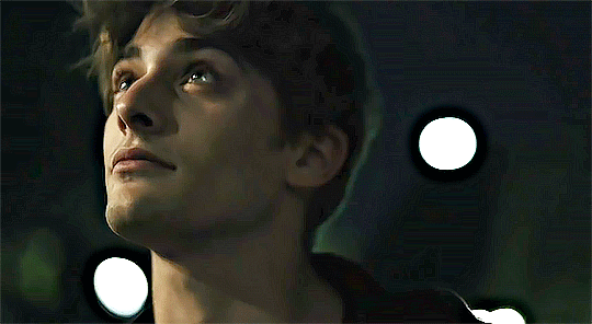
we’ll be going from this:
to this:

up to date as of October 25, 2020
downloading clips
selecting what part you’re going to gif
cropping
my action for resizing, converting to a smart object, and sharpening
coloring
exporting and setting the delay
tldr tips
1. downloading clips
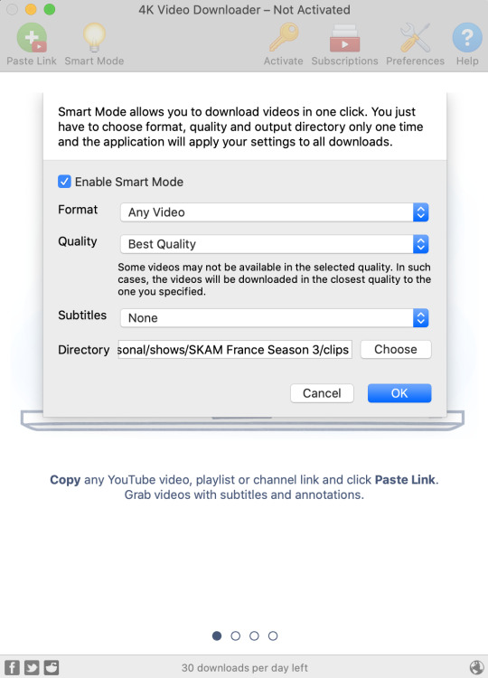
4k video downloader (which you can get for mac or pc here) is great for things posted to youtube, especially from skam france because all the clips are on their youtube with no weird geoblocks or anything! it’s really easy, you just have to open the clip in youtube, copy the link, and go into the program and hit paste link. I like to put on smart mode first and set the destination folder so all my clips go into the place I want.
There is a 30 video per day download limit, so if you’re thinking you really want to gif lots of stuff from the show, and want a big chunk or a full season it’s definitely worth hunting for a mega or google drive with full episodes to download because it’s just less hassle! I might come back to this post later and compile a list of all of those, but for now if you type “[remake] no subs google drive” or “[remake] no subs mega” into a google search, you’ll probably find something! the all of skam website has no subs for several remakes, but not all!
If you don’t have enough space on your computer to be keeping full seasons, I know there are methods to get screencaps without having to download (generally for giffing movies and regular tv I think this is a common method), but I’ve never done it so I’ll redirect you to this tutorial that explains it! you should probably just go there for the whole thing tbh it’s much more coherent than this, but I digress.
2. selecting the piece of the video you want to gif
now that you’ve got your episode or clip you’ll want to just open it in photoshop! if you go the screen capping route the way to do that is a bit wonky, so you can keep following the tutorial I linked above and join back in here at coloring if you like!
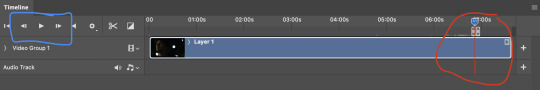
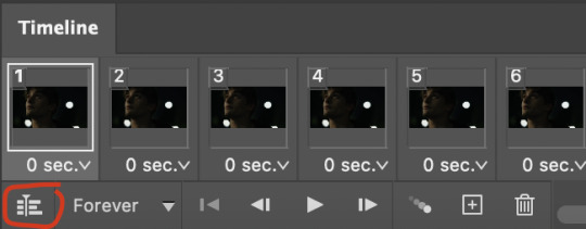
if the timeline at the bottom doesn’t pop up automatically you can go to window > timeline and turn it on! now you can use the scrubber bar thing to find the moment you want to gif!
The advantage of this over screen capping is you can scrub with more precision. the arrows circled in blue below let you jump only one frame, where in screen capping I'm pretty sure you can only go by ten second or one minute intervals.
I usually drag the scrubber as close as I can to the start of the shot/moment I want to use, fiddle with the arrows circled in blue below to jump forward or back one frame at a time until I'm at the first frame I want. I move the left grey handle to the scrubber and then I hit the play button and let the whole shot/moment play. Pause and repeat the shuffling with the arrows until you’ve landed on the last frame you want to use and move the other grey handle.
the moment you want to use should be between your handles (it’ll look like what I have circled in red), and if you hit play, you should see the thing you want to gif playing on loop above the timeline. the speed will probably be weird, but we’ll deal with that at the end.
now I recommend doing command or control + s to save your gif as a psd (photoshop document). this is a working, editable file which means if photoshop crashes you can open your file right back up and keep working as long as you’re hitting command or control + s at regular intervals as you work. later we’ll go through exporting in gif format that can actually be uploaded to tumblr.
3. cropping
next I crop out any logos or black space at the top and bottom. Just click on the crop tool on the lefthand side of the screen, drag the edges and hit enter when you’re done. you can of course crop out more than just that, but regardless of what you crop out, now is the time to do it.
you can set an aspect ratio for your crop at the top of the screen if you’d like to be positive that all the gifs in your set will be the same:

4. my trusty action: resizing, converting to a smart object, and sharpening with one click
Now is when I use an action I made that does all the resizing, converts to a smart object, and sharpens. I’ll take you through the steps so you can conceptually get what’s going on, but I highly recommend using the actions window to record your process as you follow along so you have this action as well. It easily shaves at least 5-10 minutes off of the whole process, and these steps will be the same every time.
here’s how you make an action: go to window > action and open the action panel. click the plus symbol to start recording a new action:
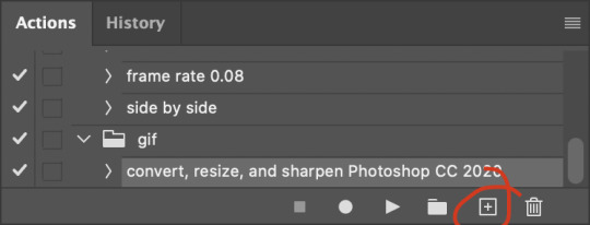
in the window that pops up, give it a name and hit record:

now just continue with the steps below, and it will save them!
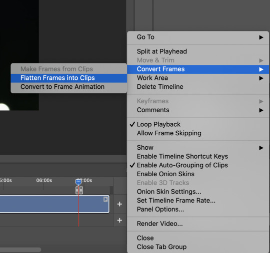
first you flatten frames to clips (I think it says flatten to layers on older versions of photoshop). this is in the menu at the top right corner of your timeline:
next you convert to frame animation by clicking on the symbol in the bottom left, circled in red:
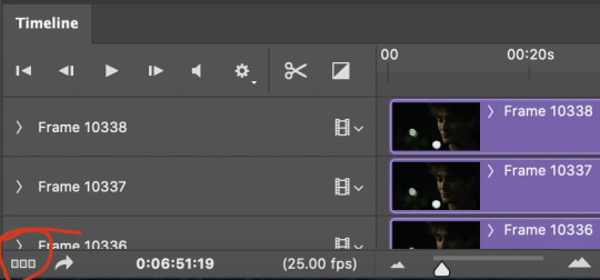
if there is more than one thing in the frame animation, delete the extra one. you don’t need to keep the last one but it won’t let you remove it until there are other frames in there. also go into your layers and delete video group 1 and its contents. don’t ask me why these steps are necessary, I don’t really know, but I’ve noticed it sometimes gets wonky if you don’t do this:
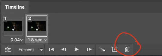

now you want to make frames from layers and delete that first frame that was there before:
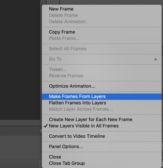
then we return to the timeline:
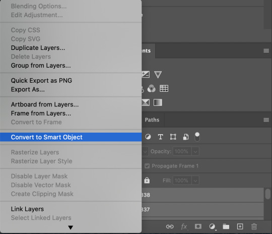
use command + option + a (control + alt + a for pc I'm pretty sure) to select all layers and then right click within your layers window and select convert to smart object. It’s important to convert to smart object after you go back to the timeline, or the gif won’t move:
next I resize. gifs for tumblr should be 540 pixels wide. for recording your action you should just go into image > image size and only change the width to 540 in case you ever have gifs cropped to different aspect ratios. don’t touch the height, let constrain proportions figure it out!

now, here’s what our base gif looks like, no sharpening, no coloring:
now to sharpen. go to filter > sharpen > smart sharpen. this is up to personal preference, but my go to settings are:
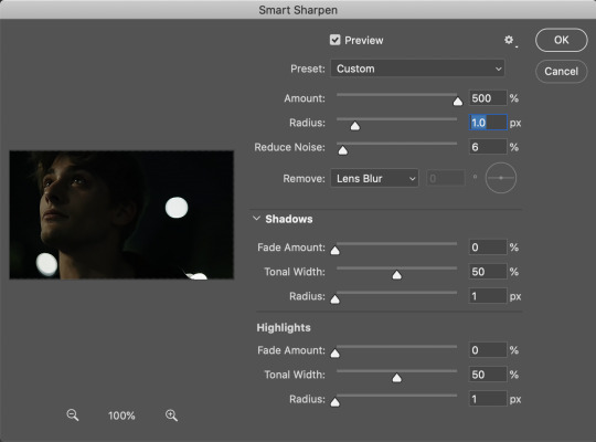
this is what we have after sharpening:

now is when you can stop recording your action.
just press the stop button in the action window:
this action is pretty much universal and after I select the moment the gif will be and crop however I want, I use it on every gif I make! so although this initial setup is tedious, now you’ll never have to do these steps again, and the process is magically much quicker.
5. it’s time to jump into coloring!
I typically start with exposure and sometimes some brightness/contrast. with really dark gifs like this, you kind of have to make it worse before you make it better. I did this:
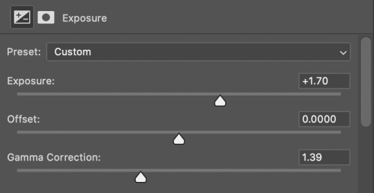
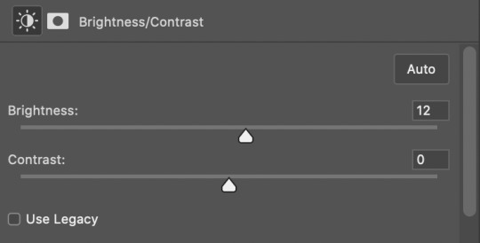
now the gif looks like this:
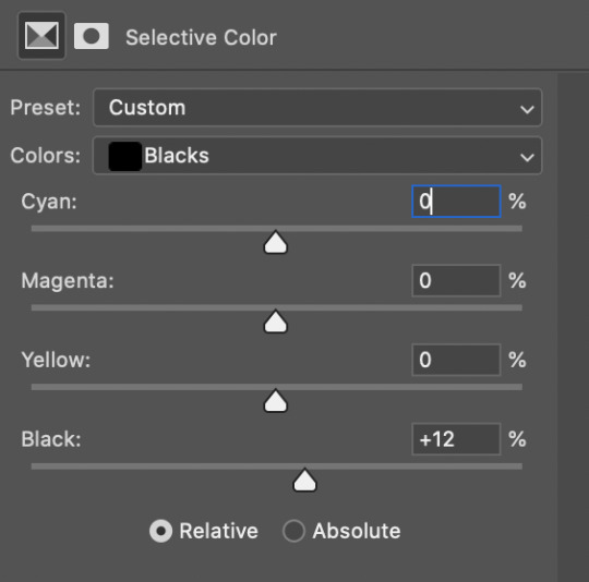
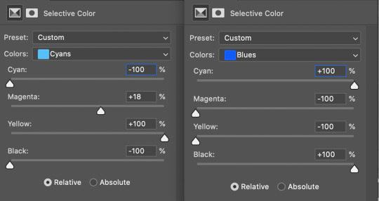
we have some static and some ugly bits, and this is where selective color comes in to fix it! boost blacks like this:
and now your gif looks like this:

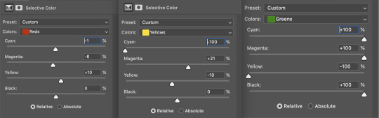
the skin tone is looking a little sickly and weird, so I go into the yellows and reds in my selective color layer to fix it! I also messed with the greens here because I didn't want color in the background (that part is totally optional and just up to your preference):
now we have this:
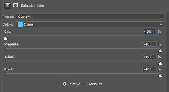
to really take the color 100% out of the background, I did one more separate selective color layer for cyan (again, I just felt like it but this is optional!):
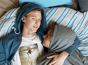
and now the finished gif:
there’s lots of fun extra things you can add like text and tints and overlays and all that I won’t get into, but feel free to reach out for help on those types of things!
this gif was certainly not the most complicated to color. some ridonkulously dark clips (*cough cough* vendredi 20h27 *cough cough*) take tons and tons more effort than this and a lot of the time you’ll want to use color balance layers and vibrance layers and all of that to mess with your coloring.
with all of this coloring business, I really just learned by doing. I don’t know all the technical purposes of each type of adjustment layer, and I tend to stay away from curves just because I find them confusing and annoying. The bottom line is that you should always experiment and find out whatever coloring works for you and run with it! I’m sure every gif maker you talk to does things at least a little differently!
I highly recommend taking the time to go through all the types of adjustment layers and just move the sliders around to see what they do! That’s honestly one of the best ways to learn and decide what you like!
6. now to export and adjust the delay!
the keyboard shortcut for exporting on mac is command + option + shift + s, control + alt + shift + s for pc, otherwise you can go to file > export > save for web
my settings are here:
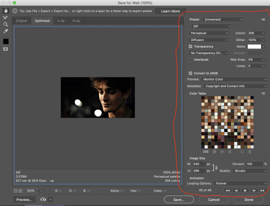
the settings only need to be configured once! otherwise just hit save and follow the pop ups to choose where to save and what name you want to give your gif. Since you saved as a psd way back, that will be the name it’s automatically given, but call it whatever you want!
then I adjust my delay by opening the gif I just exported (not the psd, the .gif file) and using one of my delay actions. I’ve made an action for each delay between 0.05 (real time) and 0.08 (really slow mo for certain super short shots, typically for more ~artsy~ sets).
all my action does is select all frames:
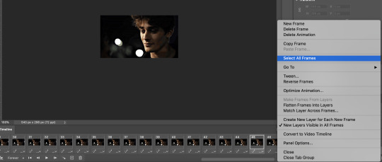
adjust the delay (which will differ based on whether you want them slowed down and by how much):

for reference, this is a 0.05 delay:
and this is a 0.08 delay
now you just export the same way you did before!
remember if you’re recording this as an action, you don’t want to touch the file name, just say yes when it asks if you want to replace the file. if you always save your gifs to the same place, your action will now enable you to override any gif with the incorrect delay with the correct one with one click!
7. tldr: the main tips
for downloading 4k video downloader works well for non geoblocked youtube videos, the all of skam website is another place you can look to download with no subs, here’s the screen capping method if you don’t want to download
The main way I combat dark lighting is to bump exposure to the right, gamma correction to the left, and then enhance black in a selective color layer. The amount of these three adjustments will vary gif to gif. I know lots of people use curves, but I find them really confusing for some reason, so this is my method! As my graphics teacher likes to say: there are always at least 3 different ways to reach the same result!
there’s a little bit of additional coloring on this one, but here’s another before and after example so you can get an idea of how those steps get you a better lit result without making the lighter parts super over exposed:

besides those three steps, you have free rein to use the other selective color channels, as well as color balance, vibrance, hue/saturation, etc. to restore color that was lost or to change the colors altogether! mess around with it and have fun experimenting!
7a. bonus coloring tip:
sometimes you can make use of selective color to completely alter an isolated color in your gif. You can get very adventurous with this, but here's a simple example of changing blue tones to teal (I got away with these gifs being longer because they were in rows of two in the set I posted them in. I'm too lazy to trim frames so I can put them here at 540 px without going over the 10mb limit so just ignore the quality ok):
7b. actions, actions, actions!
if you find yourself doing a certain thing over and over, always record it as an action. the amount of time they will save you is honestly really impressive.
You can duplicate actions, so, for example, if you have different sharpening preferences for different shows or scenes, you can duplicate your gif process action and go into the steps, double click smart sharpen, and alter it however you want!
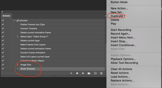
This could also be good to do for the different widths for tumblr if you ever do sets with rows of two or three! Duplicate actions is also how I made my actions that set delay at 0.05, 0.06, 0.07, and 0.08!
when in doubt, always make an action! it’s worth minimizing the tedious bits of the process as much as possible so you can focus on the fun part of seeing your awesome gifs come to life! any little task you find yourself doing often, make an action!
and for now that’s all I have. if any of this made no sense, if you want to suggest a correction or addition I could make, if you’re ever curious how I did something on any gifs I post, or if you have any other sort of questions, feel free to send me an ask or a dm! if I can’t answer your questions I’ll be happy to try to direct you to someone who can or a tutorial to help! again, I'm no expert, not even close, but I hope at least one person will find one thing in this mess that helps.
#this got . so long omg#mystuff#mytutorial#gif tutorial#tutorial#resources#fellow gif making peeps feel free to correct me or give input on how to improve or add to this tutorial!
31 notes
·
View notes
Photo

so i thought it’d be a good idea to make a full indepth tutorial on how i make my gifs and what i do to achieve them! please be aware that everyone’s giffing style is different and this is just how i make them and what my settings are! you can do absolutely whatever you wish when you’re making your gifs!
i will be going over where you can get videos, how you can download them, how to use photoshop, vapoursynth, and colouring (regular gifs, performance gifs and selective colouring to change colours in gifs)!
step one: downloading the video
so i always try to get 1080p videos and if not 720p for the highest quality possible (there is the option of 4k as well but that’s not used so often)
TS files: kpopexciting, kpop24hours (you need a login for this), HDhallyu (for more older performances circa 2015 and before), dongyoungsang (for kdramas/tv shows)
Youtube videos: 4K Video Downloader
Vlive videos: Soshistagram
Twitter videos: Twitter Video Downloader
Instagram videos: Dredown
step two: using vapoursynth
so vapoursynth is similar to avisynth but it works much faster and has more options when it comes to sharpening and denoising gifs especially performance gifs! i’ll go over the steps i do to use vapoursynth but i have also provided a video i’ve recorded (it’s very basic) in case text is a little too confusing! there’s also this tutorial that goes into details on how the options work and how you can use them!
have two windows open, one containing the videos you’re using and the other with vapoursynth.
drag whatever video you want to use onto ‘vapourscript.bat’ and a terminal window will popup. this is where you put in the the timestamp of where you want to start and end your clip in the HH:MM:SS format.
enter your starting point first and then it will prompt you again asking for the duration of how long you want the clip to be.
hit enter again and wait until the resizer.html pops up and from here you’ll put the settings you want to use for your gifs.
gif size
gif widths (the first number) recommended for Tumblr:
1 gif per row: 540px
2 gifs per row: 268px
3 gifs per row: 177/178px
opacity
changes how you view the video in the window.
preprocessor
refers to how the video will render! it refers to the number of frames per second (30 frames or 60 frames). i don’t normally use this cause it slows down the application for me personally but you can use it to your liking1
denoise
helps remove noise from gifs. I use KNLM and you can toggle the settings how you see fit
extra sharpening
it’s pretty self-explanatory but you just basically go off of your preference!!
then you just copy and paste your what you see on that white box in the browser onto the application and trim it to the length or number of frames you need! once your done you go to script > encode video and make sure to change the ‘no header’ to ‘y4m’!
step three: using photoshop
to create gifs in Photoshop, go to File > Import > Video Frames to Layers and then select your video file/output file from Vapoursynth. depending on how long your clip is you can press ok or select the option “limit to every 2 frames”.
with photoshop you can adjust the timing of your gif even further! my usual preferences are:
<20 frames: 0.15
20-59 frames: 0.1
60+ frames: 0.07
you gif should be under 3mb - to decrease a gif’s size, i usually delete frames and/or use selective color to increase the black percentage for whites, neutrals, and blacks.
with tumblr saying you can go over 3mb for gifs you definitely can but it will lower the quality of the gif. if i need to i’ll go up to 4mb at most.
step four: sharpening
it’s completely optional to do this since vapoursynth does some sharpening for you and you can find a ton from @completeresources and @yeahps to just name a couple ps resource blogs!!
you have to change the timeline from frame animation to video timeline and you can do that by clicking the button on the bottom left corner on the timeline that looks like stacked rectangles.
from here you will have to make all your frames into one layer so you have to go to filter > convert for smart filters. and you can use your action on that by going to the actions panel, selecting what action you want to use and press the play button.
now you can put the colouring that you would like on your gif!
step five: saving
now when you save you can do the shortcut ctrl+alt+shift+s or go to file > export > save for web and these are my setting for when i save:
miscellaneous notes
here i have three different gifs of the same scene to just show the difference between using .mp4, .ts only, and .ts + VS. as you can see there’s a significant difference between each of them especially the .mp4 versus .ts + VS.

how i colour
the adjustments i currently use the most are:
curves
brightness/contrast
color lookup
levels
selective color
some things that i personally like when i’m colouring is:
having the black of the gif to the darkest it can be
vibrant
to get the black areas to the darkest it can be, there are two options. option one is i would use a mix of curves and levels. i would start off with the curves and use the eye dropper tool that is filled with black and click on that then i would click on the darkest spot of the gif then it’ll automatically recolour the gif so the area that you selected would be black.
to keep the skin tone of idols intact i usually do the following:
keep the vibrance high
use selective colour to colour correct the skin
give a warmer tone to the gif using color balance
here’s just an example of how colouring can make a difference in the gifs and how they look afterwards as well:

most of the time i have around 3-5 adjustments for gifs if i need to but you definitely can add more to your desire!
how to change colours on gifs
changing colours completely is honestly a lot and sometimes it can take up to 10+ adjustment layers if you need to. it takes a lot of practice but the more you do the better you’ll be at it! i’ll basically be explaining how i went from this:

to this:

so tips for this type of colouring:
its easier on gifs that have mostly white backgrounds
it’s easier to change from cool tones to warm tones rather than the other way; especially if there are people in the gif. trying to change warm tones will affect the person’s skin colour
the main adjustments that i use to achieve this colouring is:
hue/saturation
colour balance
colour selective
so i’m going to be changing the blues of this gif into red/pink!
so you use the hue/saturation tool and click the drop-down with master and go to really any option cause you need the eye dropper to be activated.

i’ll use the eye dropper tool to select the cyans/blues in the gif and from there it’ll only change that colour to pretty much any colour you want. it doesn’t always allow you to have smooth changing of colours like this gif so sometimes you may need to use multiple hue/saturation layers to fix it! sometimes using colour balance also helps as well but it’s more broad in that it will change everything that is within the shade range of the colour you’ve selected.
for mostly white backgrounds what’s easiest is that you create a new layer and fill that layer with the colour you wish and change the layer from normal to multiply.
before:

after:
351 notes
·
View notes
Text
Links and images.
Hypertext is text that links to other texts which is fundamental to web design. Today I will share with you what I have learned about links and images. They’re very important! After all, they make the web. Links and images differ from elements as we know them in HTML. Links have external resources and point the user to a different HTML document. Images pull another resource to the page. In order to use links and images we need to learn their attributes.
Links use <a> element:
<a href=“www.”>Griffith College</a>
If you wanted to link another website, you would need an absolute link, which is the whole URL in the href attribute. On the other hand, if you wanted to link pages on the same page, you would use a relative link:
<a href=“about.html”>About Us</a>
You can store your website on your server directory, just make sure to keep everything from one website in one root folder, with separate css, images and scripts sub-directories (remember to keep file and folder names lowercase and space-less! If needed, use our trustworthy hyphen, it keeps things nice and neat. Trust me).
If you need to link something that is in a sub-folder of your root folder, you will need to use paths. You would do this by using two full stops followed by a forward slash (../). This simply tells the browser in order to find a file it has to “go up” a folder, or two (../../), and so on.
If you want a link to open in a new window when the user clicks on it, you add target=“_blank”> within your <a> element:
<a href=“http://www.example.com” target=“_blank”>Example</a>
You can also add some <ul> elements (unordered lists) for ease of navigation. If you wanted to link specific parts of the page to each list component, you would add and id attribute. This allows you to assign a unique identifier to any element, using the # value attribute:

Now let’s talk a little bit about images. They set the tone of the website, but be careful when choosing what images you will use. Some may be subject to copyright! Another thing to be careful with is that you should always make sure to be consistent in your layout. A sloppy looking website with images being shrunk and stretched does not look like a website someone would want to interact with.
Firstly, you must determine the purpose of the images on your website. If the image is part of the content, use HTML. If it’s purely for aesthetics, use CSS. For now, I will briefly show you how you would add an image in HTML.
You have your <img> tag and a src attribute (source), with the value being a path to the image:
<img src=“images/cat.jpg”>
Don’t forget to apply alternate text!:
<img src=“images/cat.jpg” alt=“cute cat” title=“cute cat”/>
Secondly, the browser doesn’t know the size of the images. So we must add the width:
<img src=“images/cat.jpg” alt=“cute cat” title=“cute cat” width=“420″/>
note to self: don’t add pixels to the width (px) because it won’t work!
Finally, make sure your images are between the 300-700KB sizes.. If you need to resize them, it can easily be done on software like Photoshop and GIMP or a website like picresize.com.
Thank you for stopping by again! I hope that I informed you wisely.. Correct me if I’m wrong! Please do..
Boo-bye, now!
1 note
·
View note
Text
Buy 5-star Yelp Reviews from eliteyelp24.com
Buy Yelp Review
Purchase yelp user reviews and offers of best restaurants, shopping, nightlife, food, entertainment, to-do, services, and much more in Yelp. One of the most popular and trusted platforms is Yelp Yelp reviews which always help customers get the best service. Also assists in quality verification. Yelp reviews can help as much as your marketing.
·
·
·
·
·
Add alt text
The dream of every business owner is to buy his services or products and to have long queues of customers with a happy smile but providing quality service is not enough. Several positive Yelp reviews can lead your business to a great profit. Don’t miss the opportunity to buy Yelp reviews from us regardless of the type of business you have because we have a great team of online business experts. Restaurants, dentists, bars, deliveries, takeout’s, everything, and every kind of business can be registered here in Yelp and double their business by buying 5 Star Yelp reviews.
How about our Yelp review quality?
We’ll give you 1 review from 1 device (iOS / Android / Computer / Unique IP address with iPad The Real Looking USA, UK, AO, and CA profile Photos must be attached to Yelp accounts We do not complete your order randomly, We will give you a natural system.
The importance of why to buy Yelp reviews
This is the most frequently asked question – should I buy Yelp reviews? , Or How Safe to Buy Yelp Reviews? Okay, we’re trying to answer you here.
Elite Yelp Reviews More than 150 million people using the platform. 80% of users are from the USA and UK. How can you benefit if your business is connected to such a large platform? That’s it! Good advantage. It allows you to get more customers with free traffic.
If there is no review on a review page or it is short, the customer thinks it is a poor business. Again, if the review rating is low on average, the customer is concerned about a bad idea of service. Review means it is important to compromise in order to buy reviews. So, buy Yelp reviews from here
Yelp is a website and mobile application that caters to customers with a great business. It helps customers check the quality of the business from its reviews before making a purchase. This is a great site with over 145 million monthly unique users. This proves how much people trust Yelp’s reviews!
More
So, if you have a business that has just started, or if your business has recently received bad reviews from your competitors or crazy customers, you should buy the reviews you want to increase or restore the credibility of your business. As a personal recommendation. Therefore, Yelp is one of the most powerful sites to guide customers towards your business.
A good number of positive reviews, including 5-star ratings, boost the confidence of your business inside customers. This strategy is very effective for local businesses. According to the study, they get a minimum 9 9,000 increase in their annual income. Thus, their business grows very fast with a good profit.
Not only small businesses, but the reviews are also great truth in the case of a well-established and reputable business. A bad review can have a devastating effect on their reputation overnight. So, popular companies are very aware of this. Many of them even followed the strategy of buying Yelp their first start review.
So, you can buy reviews from any reliable website without any hesitation. This will definitely help you to enlighten your business in the eyes of your customers. Promoting the team will help you in this case with confidence.
Do you want to purchase non-drop Yelp Elite and Yelp regular reviews?
Your results are our goal and your satisfaction is our priority. If you want to buy good quality Yelp Elite and get regular reviews then you are at the right place.
Because we always provide regular reviews to the best quality Shake Elite and Real Yelp users. So, we have no chance to exclude any reviews from the Yelp business page. Satisfaction is guaranteed.
We have been providing regular and Yelp Elite reviews with non-drops for almost 3 years. In the last 3 years, we have completed about 16,000 plus works with non-drop. So, buy Yep Elite now and start jumping to regular reviews and increase your page rating in a short time in a legal way.
Why EliteYelp24 is the best site to buy Yelp reviews?
All page reviews are permanent (guaranteed)
Full profile Real user account
100% Satisfaction Guaranteed
We do not use any proxy / VPN to provide reviews
All reviews are posted from real people’s profiles
Work started within 24 hours
100% secure and stable account
100% safe and guaranteed
High-quality service
Can I buy negative Yelp reviews or custom reviews?
1. Yes, you can. After you finish your purchase, you can let us know in our dashboard whether you want a positive review or a negative review. A positive review usually has 4 to 5 stars while a negative review has 1 to 2 stars.
2. If you have any custom review requirements before ordering, please contact support.
Are Yelp reviews fast? Is it safe to deliver them quickly?
Delivery in about 15-18 days depending on the size of your order. Geo-targeted commands may take longer. After placing your order you will receive a more accurate delivery timeline from our panel.
We deliver orders slowly over a period of time (drip feed) in order to present the natural growth of your brand and protect the security of your Yelp account. In other words, our smart system automatically promotes and delivers a small and secure amount of reviews on a daily basis.
We can’t deliver them faster than we said because we’re trying to leave a review for people who are interested in your business services (but don’t promise).
Why would you believe Elite Yelp Reviews?
Yes! This is actually a matter of thought. We have been providing regular and Yelp Elite reviews with non-drops for almost 3 years. In the last 3 years, we have completed about 16,000 plus works with non-drop. If you wish, we will provide samples of our previous work to verify our professionalism.
We have a large team of Yelp elite and regular reviewers. We have more regular and Yelp Elite profiles. If you want to see the quality of our Yelp Elite and Yelp Elite, click here and see some samples of our Yelp Elite.
We do not use fake profiles to post Yelp reviews. Because reviews of fake profiles are not permanent. So you can buy from us with confidence. If you buy from us, we guarantee you, you will get all the reviews from good quality Real Yelp users. 100% Satisfaction Guaranteed.
How many Yelp Elite reviews are we able to provide?
Many of our clients ask us how many Yelp Elite reviews can you provide me with non-drops?
We have simply informed all our clients that we are able to provide many Yelp regular reviews and we will be able to provide you with up to 120 Yelp Elite reviews with non-drop and real person profiles. We have the best and largest group for Yelp Reviews to work with and we have thousands of people in this group.
Even, many clients ask another question, how do you do it?
We just told them it, we do it legally. Even, we post all reviews from real people profiles. So, we have no chance to remove any reviews from your business page.
What if your reviews are dropped after 2/3 months?
If by chance any review is omitted, we replace it without charge and we replace it with a new one. We do not charge for review replacements.
Would you like to buy Elite Yelp reviews, but would you like to pay us once you’re done?
All right, no problem! You can do it. We will give you this offer. If you’d like to post Yelp Elite reviews on your business page before you pay, you’ll need to contact us via email or Skype. You will then need to send us your review link and comments. By posting reviews in full we can let you know when you pay for our Yelp Elite review.
1 note
·
View note
Note
I saw on someone else's post that you offered to show them how to make gifs? I am super interested in making The Magicians gifs so I was wondering if you could teach me as well? Or even make a public post or tutorial or something? Thank you!!!!
Yeah, of course! There are a lot of ways to make gifs, some of them undoubtedly better than what I do. But, for me, I have a couple methods I generally use, one with Photoshop (when I want very specific control over the colors, composition, type styles, etc.), and the other with just a free tool (when I just want to make a gif that looks decent and not sink a ton of time into it).
I’ll go over the free tool method here; it’s more straightforward and limited, but wayyyy friendlier for someone just starting out. Also, again: it’s free. (But lemme know if you wanna talk Photoshop and I’m always happy to open that giant can of worms.)
One nice thing about gifs becoming the one true currency of the web is that a lot of gif-oriented sites have built gif-making tools in the past couple years and made them free and easy to use, so we can all become gif-producing worker bees, constantly toiling to keep up with the internet’s insatiable demand for gifs.
I use Gif Brewery 3 for mac, built by Gfycat. (There’s also Giphy’s GIF Capture which I’ve used a few times and didn’t hate.) So for the purposes of this tutorial, Step 0: Download and install Gif Brewery 3
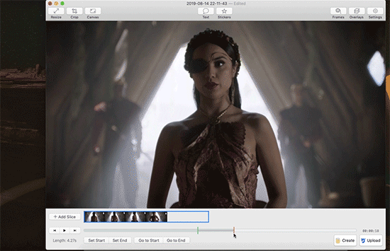
So! Now let’s make a gif. Let’s say I want to make some gifs of Margo taking her throne as high king.
Step 1: Open Netflix in Google Chrome (i.e. not Safari because it blanks your screen if you try to record your screen while a video’s playing) or play a DVD on your computer, or pull up the scene you want on YouTube. Basically get a video of the scene you want playing on your computer screen in whatever fashion you prefer.
Step 2: Open Gif Brewery and select “Record Screen.” Resize the window that Gif Brewery then opens up so that it frames the video, hit record, and then play the part of the video you want to gif.

Step 3: When you’re done with video, click “Stop.” Gif Brewery will then open the video clip that you made in their interface. You can close your browser and the blue frame window. You can see the full clip you just recorded in Gif Brewery. Trim the extra bits off of the clip by dragging the green bar to define your start point and the red bar to define your end point.

Step 4: Resize! Tumblr’s main content box is 540 pixels wide. So if you’re making a gif that’s meant to be full width, you can size down to that width. Make sure “Maintain Aspect Ratio” is checked. (Now’s a good time to also crop if you want to, say, gif only Margo’s face without the space to her left and right.)
Step 5: So now we have something that’s the size and shape of a gif. If you want to add text, now’s a good time to do it. Use the “Text” button at the top of the window to open the Text box. Here you add your text, adjust the font weight, size, color, and border if you’re using one. I’m going to use a Billie Eilish lyric for this example because I’m cliche as hell.
If you’re making a standard-style gif with a text caption, you’ll use a bold san serif font like Helvetica, with a black border around it to make sure it’s readable, and then keeping it small and centered at the bottom of your gif, like so:

But! if you’re feeling Artsy, go nuts with your font choice and placement. Find a font that captures the tone your message and clip are conveying. You can find a wide range of free fonts on Google Fonts or good old DaFont. I want that badass Margo ‘tude, so I’m using a grungy font and Margo’s signature bright fuschia. Drag the text box to move and resize it until you’re happy with it.

Step 6: Time to fix your colors! Screen captured images basically always look more dark and muted than they should. The fix is to fuss and fuss and fuss and then fuss some more over the colors. Gif Brewery has limited color controls, but as I’ve learned, you can still spend an inordinate amount of time fussing over them. The Magicians makes this an especially good exercise in finding the limits of your patience because they’re always backlighting scenes in a way that blow out your brightness when you try to make even small edits. (Which is why I’m switching over to a different shot that’s easier to work with for this example. Margo’s hella backlit in our gif.)

Exposure Adjust: Increase exposure to make your brights brighter
Gamma Adjust: Increase gamma to make your darks richer
Saturation: Increase to make the colors as rich as they can be
Vibrance: I also like increasing vibrance for even more of a pop of color
Hue Adjust: their hue controls are funky, but you can make some minor adjustments if at this point your gif looks weirdly too red or yellow.
Play around until you find what looks good to your eye. For a gif that’s meant to look like it’s colored normally, watch out for things like: the whole thing looks too dark and you have to squint to see the details; you overbrightened and now the white is blown out and blinding; or you oversaturated so much things look pixely and glitchy.
Step 7: Open the Settings panel with the button at the top right. Time for more fussing to make sure the timing, frames, and settings are how you want them.

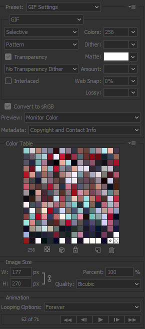
HERE’S THE THING: Tumblr does NOT let you upload gifs larger than 3mb. So everything you’re doing in this panel is a balancing game to keep your gif under 3mb without letting it look like trash. These are the settings you’ll fiddle with most often:
Speed is set to 100% by default. But you may want to slow it down, especially if your clip is only a couple seconds long. Slower means it’s easier to see the subtle changes in a character’s expressions and it makes the action look less jerky. The slower you set your speed, the more frames will be added to the gif, so keep an eye on that.
Frames per Second is what it sounds like. The lower you set this number, the fewer frames you’ll use, but the animation will look jerkier. You want enough frames per second that your animation looks as smooth as a hot knife sliding through butter. 12 is their default. I try to not go lower than 10. When I’m feeling particularly luxurious, I’ll set this to 15.
Color Count: Gifs can use as many as 256 colors and as few as 2, if you don’t care about your gif being an offense to nature. You can set it to the low 200s without compromising on quality, though, so that’s what I did here.
Step 8: Hit “Create” and wait an inordinate amount of time while your gif renders. When it finally, finally does, check the filesize on the bottom right. In the above gif, you’ll see my gif was 2.1mb. Perfect. So I can hit save and it’s done. But if it had said anything larger than 3mb, I’d have hit “Cancel” and then fiddled with the settings some more to get the number of frames down.
Alt-Step 6B: If I want to do anything fancier/artsy-ier/more unique than this kind of gif, this is when I’d usually crack open Photoshop. But there is some room for creativity within Gif Brewery. Let’s go back to Margo and look at some of our options:
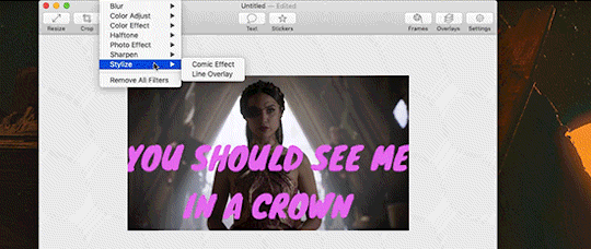
In the Filters menu, you can see there are a number of bre-built Photo Effects to play with. Sometimes they look awesome; sometimes they look like trash. So experiment! There’s also rando filters like Halftone effects. And the Color Effects can give you options like adding a vignette, fading the colors to old-timey sepia tones, or creating a duotone like I ended up doing.
Have fun with it and look for effects that will support the tone you’re setting with clip and text you chose. So like for this Margo example, going black and white, or dark and heavy, etc. would not have been tonally consistent with the badass vibe I’m going for.
And I… think that’s it? At least to get started. Hopefully that helps, let me know if you have any questions! Or want to talk about anything beyond the basics. I’m always happy to dive into the specifics of how a particular effect was made, or how to add more advanced refinements.
#bookster-lover#tutorial#pls don't judge my gif-making abilities based on#the shitty gifs I had to make to capture my screen
49 notes
·
View notes
Photo

the long awaited updated icon tutorial in which i will show you how i make all of the different icons that i make. (it’s a bit long so... you have been warned)
for this icon tutorial you will need:
a screencap
an icon psd
doodles / textures / templates
i. BASICS
okay, so you open your image on photoshop, here's Mera (the love of my life)
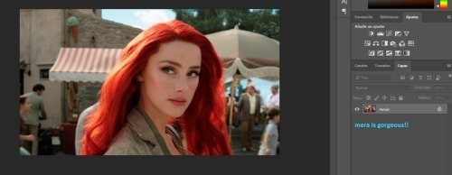
next, what i do is i duplicate the layer by right clicking on Mera and selecting duplicate
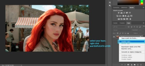
and i do this until i have three copied layers and my original
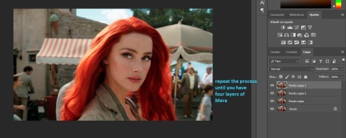
then i select the first layer and add auto tone
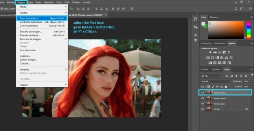
for the second layer i add auto contrast
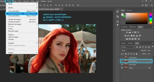
and for the third layer i add auto color
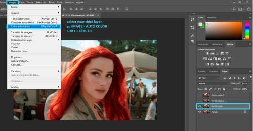
and i select those three layers and lower the opacity to 25% - i do this because it balance's the picture's look.
sometimes if the picture is too blue, the auto color will bring it back to its original color. in those cases, i use the fixed image as the "base" and set the blue image to 25% opacity.
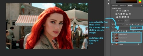
andf finally, i like to crop my picture. (you can crop it again later if you don't like the results, i simply like getting an idea of what my icon will look like)
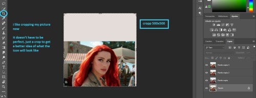
finally, i merge my layers together
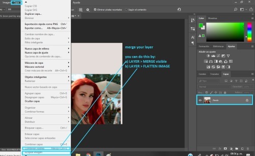
ii. COLORING
the first thing i do for coloring is add my icon psd. you can color your icon any way you like, but if you want to use my psd i will show you the basics of how to edit it so it looks good on any icon.
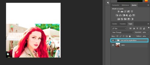
the first thing you need to do is open the folder. and take the visibility off all of the layers it contains, like so
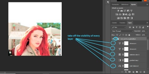
now, i do my editing in pieces, so first i look at brightness layers
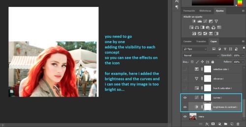
most likely, your picture will be too bright like mine. what you need to do is add another brightness / contrast layer and lower the brightness a bit
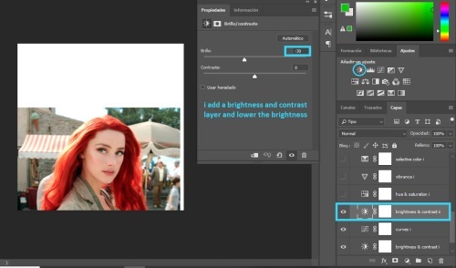
then i look at the saturation layers. and what i want to check is if my image is too yellow, or too red, or too much of a color.
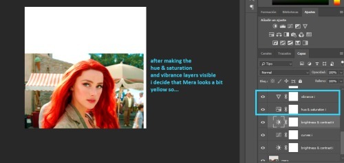
and if so, i fix it with a color balance layer.
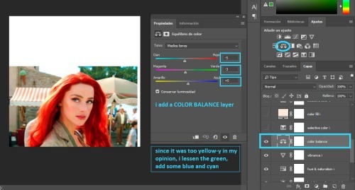
next i add all the selective color and the color fill.
the selective color should work for all fandoms (it has for me), but the color fill will need to be modified depending on the brightness of your image.
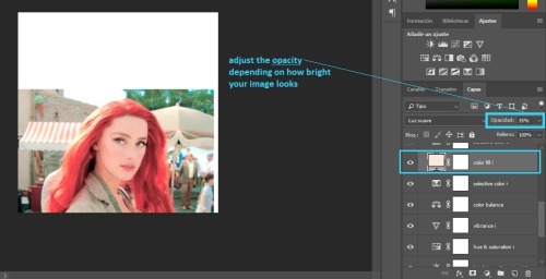
you can now add all the layers up to the gradient map.
you will need to lower the opacity of the gradient map depending on what you think looks best in your image
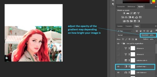
at the end, i have two vibrance layers. you will not need both, so check each one to see which one looks better and delete the other one
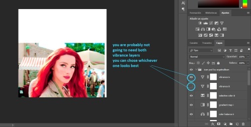
we are pretty much done with the icon psd
i like to edit the skin a bit, to make it look smoother. this is optional so you can skip this part if you don't wanna do it.
anyway, i add a new layer and chose a skin tone. (i used #ebcdc9)
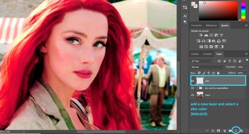
i set the layer to COLOR and i paint over Mera's skin
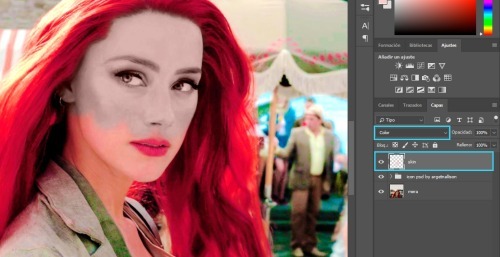
then all you do is adjust the opacity. somewhere between 10 and 50% should be okay.
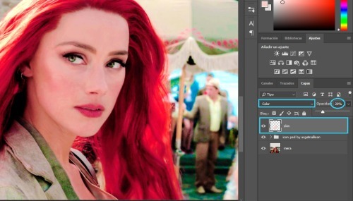
i add another layer, and i paint over her skin with pink (#ce2c64), i set it to SOFT LIGHT and lower the opacity to somewhere between 10 and 50%
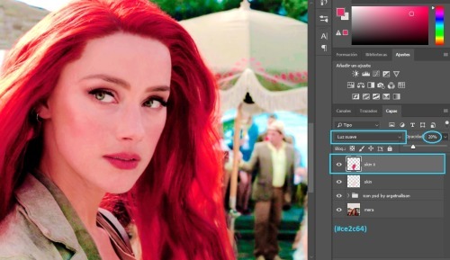
i am all done with her skin
then i add another layer, set to SOFT LIGHT and paint over Mera's cheeks and lips with a pink or red color. (i used #ce2c64).
i lowered the opacity to 26% but this is optional
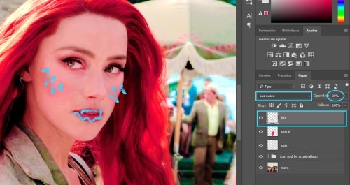
next i edit the eyes
i add a new layer set to COLOR and use a small brush to color over her eyes with white.
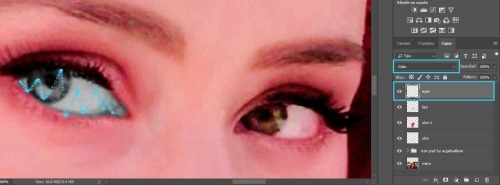
then i duplicate the layer and set it to SOFT LIGHT
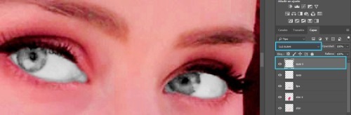
in that same layer, i color over her iris with green (´cause her eyes are green, but you could use any color you wanted)
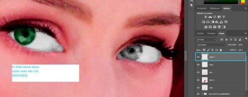
then i use a very small brush to paint around her eyes (sort of like eye-liner) with black or dark brown
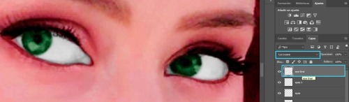
i think it looks bad, so i add some gaussian blur
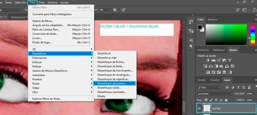
with these settings:
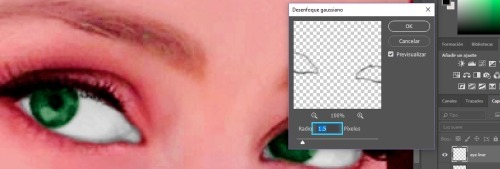
i zoom out
i add a new layer set to COLOR and i use an orange color (#d96932) to paint over Mera's hair. after, i lower the opacity to whatever i think looks good.
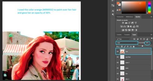
i duplicate the layer, set it to SOFT LIGHT and change the opacity again.
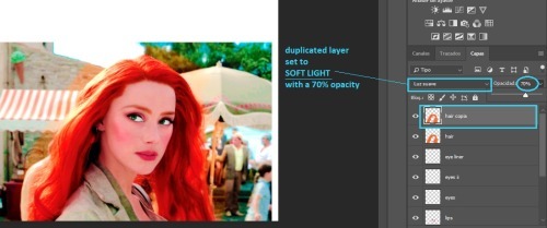
this step is also optional
when i color over her clothes i usually chose whatever color i want, paint over her clothes, set the layer to COLOR or SOFT LIGHT
but, i will show you a trick i use, so instead, paint over her clothes with white and set the layer to COLOR
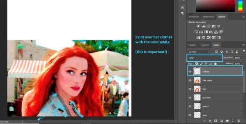
when you are done, duplicate the layer and hide it from view for now.
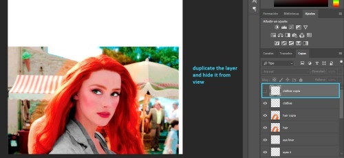
merge your image again, but make sure you merge the visible layers so your clothes layer doesn't get deleted!
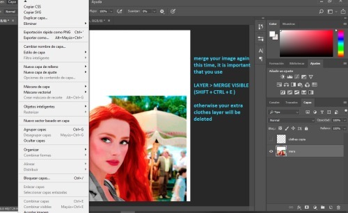
iii. CUTTING OUT
at this point i like to add my background. i use pre-made gradients made by me (you can learn how to make them here). but you can use a normal color fill background or you can find gradient packs to use.
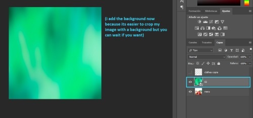
that layer goes behind Mera
now we have to cut out our icon. if you guys have a preffered method, you can go ahead and use that. i have some methods here. but i will show you what i like to do
we're going to add a layer mask on our image
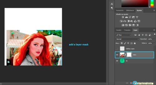
i select the eraser tool, with a small brush, and 90% hardness
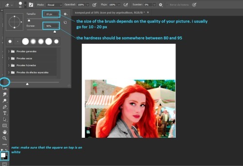
i zoom in and i paint an outline around Mera.
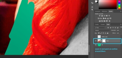
when you are done, you should have something like this:
note: the outline's thickness doesn't matter much, but the thicker it is, the easier it will be to do the next step
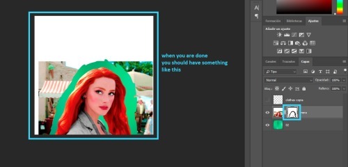
we change the size of the brush
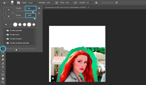
and paint over the rest of the image
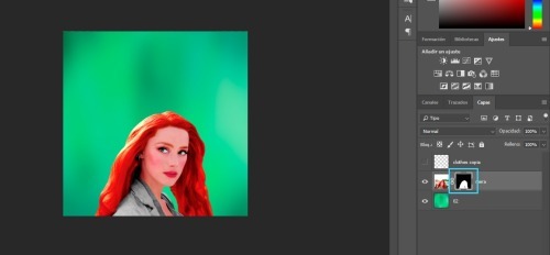
we will duplicate the Mera layer
and drag the layer mask to our clothes layer
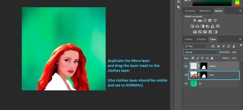
now we add a color fill layer
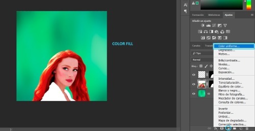
set to black (#000000)
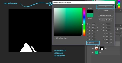
then we merge the black color fill layer with the clothes layer
(you select both of them, right click and select merge)
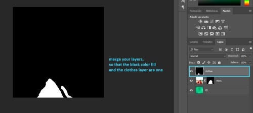
next, click on CHANNELS and then click on the dotted circle at the bottom, this will select the white in your image (but it only works if the image is black and white).
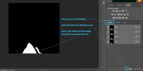
then go back to layers and clik on the layer mask
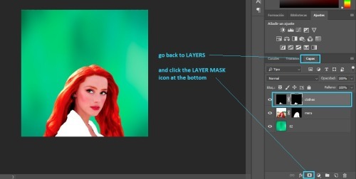
finally, i duplicate my background drag it on top of Mera and add the layer mask we just created, like so:
note: you can set that layer to SOFT LIGHT or COLOR depending on what you think looks best, and you can adjust the opacity as well.
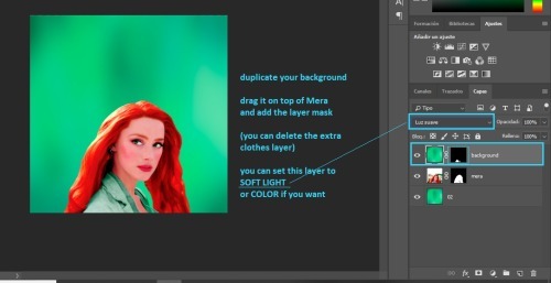
now back to our Mera layer.
i like to convert it to smart filter
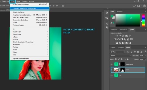
and i duplicate the Mera layer
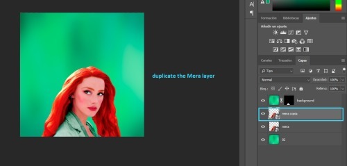
then, i add vibrance to the duplicated layer
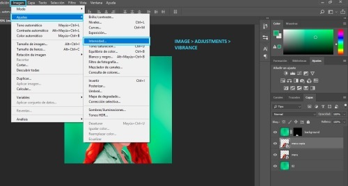
i add all of the vibrance
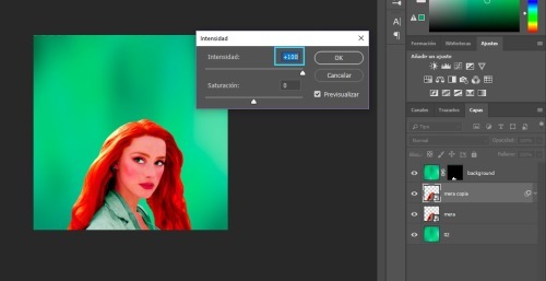
next, i add gaussian blur
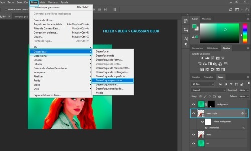
you should chose the settings
i usually go for 15px, but it depends on your image.
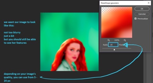
and i adjust the opacity
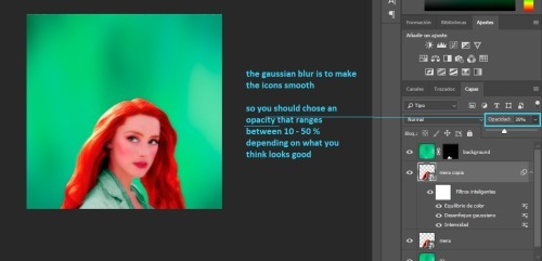
at this point, the icon is pretty much done.
i like adding a few final touches. first, i add a gradient map layer
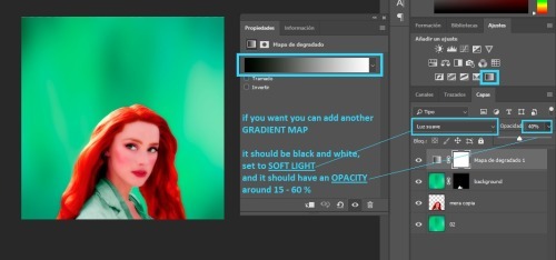
then, i add a new layer set to SOFT LIGHT
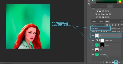
then, add a gradient
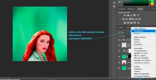
next, you will get a pop up.
you can select the same color as your background if you like
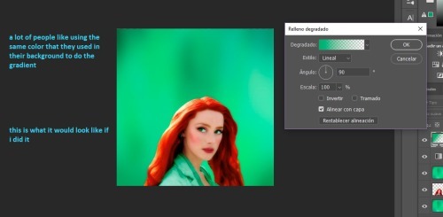
but, i like for my gradient to be black and white, so...
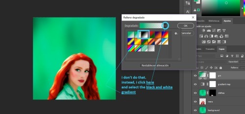
then, once you chose your color, you can change the angle here
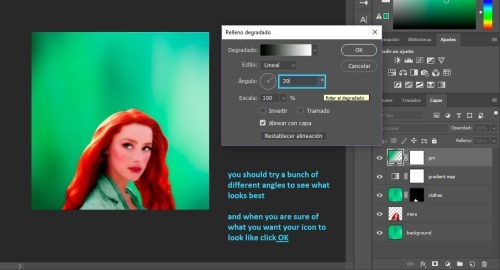
and the last step is adjusting the opacity
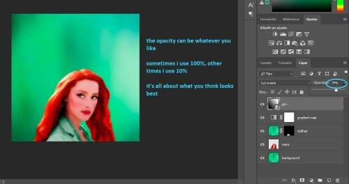
we are done! the last step is to merge your layers.
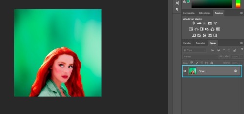
iv. SAVING
to have the best quality, you need to save your icons for web.
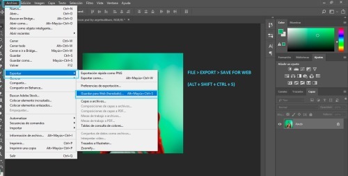
these are the settings i use:
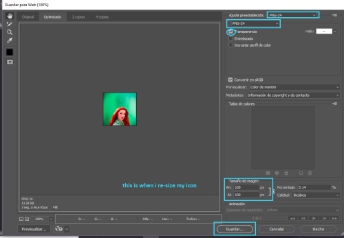
v. CHANGING COLORS
now you might be thinking. "Michell, why the hell did you make me do all that stuff for her clothes? Like, what's the point?" well... having that layer mask makes it so easy to change the colors
all you have to do is add a new background, duplicate it, and drag the clothes layer mask to the duplicated background layer
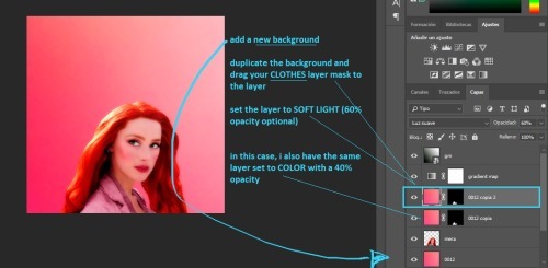
vi. TEXTURES

there are two ways to add textures
the first one is if the texture is the same color as your background. all you do is set it to SOFT LIGHT or SCREEN or whatever else you want and you are done! like this:

and the second one is if you want to use a texture that is a different color than your icon, like this:
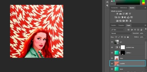
what i do is, i select that layer and go IMAGE > ADJUSTMENTS > VIBRANCE
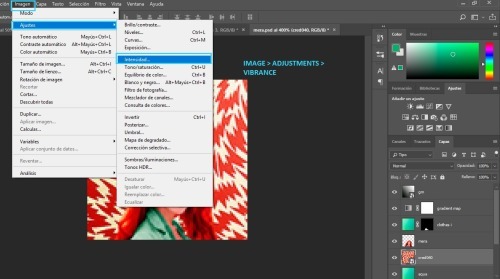
and i get rid off all the vibrance
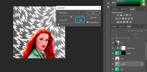
and now i can set it to SOFT LIGHT (or anything else i want) and it will look awesome!
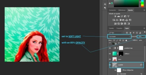
note: here are some of my favorite textures and here are some of my textures
vii. DOODLES

adding doodles is super easy. all you need to do is drag them over your icon, change the size and maybe rotate them a bit
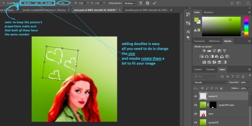
you can leave them as they are, or set them to SOFT LIGHT or SCREEN
note: i don't use doodles much, but you can find some here
viii. TEXT TEXTURES

for text/lyrics textures are very easy to use. i mostly set them to SCREEN. and as you can see above there's a bunch of different styles you can do, which i really like
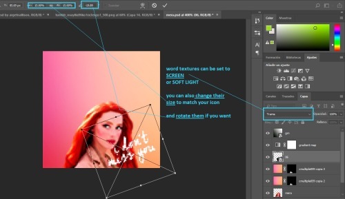
for these, the most important thing is the size. remember you can make the textures smaller or larger to fit your image
ix. SHAPE ICONS

these icons are really easy to make. all you need to do is add a layer mask
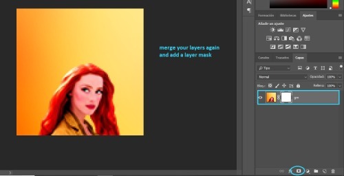
you add your template over the icon
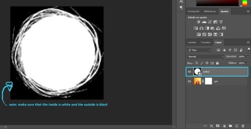
you click SELECT > ALL and once the image is selected press CTRL+C to copy the layer
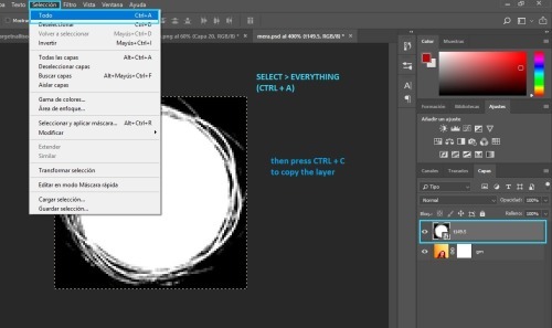
then press ALT and click the white square on the layer mask
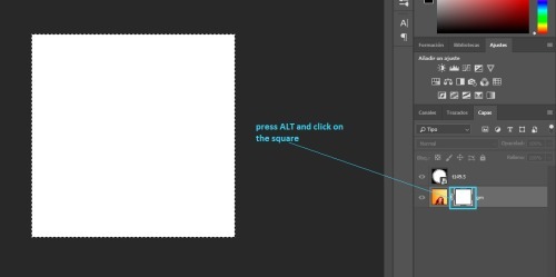
press CTRL+V to paste your template
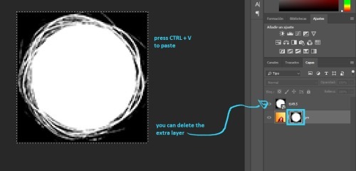
finally, convert your image for smart filters
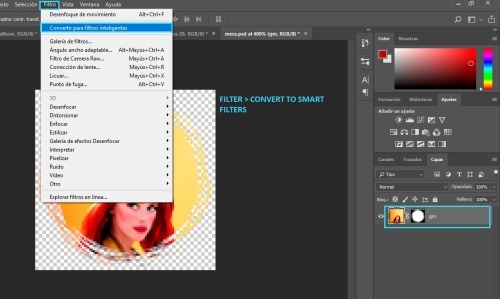
note: here's a template psd i made
p.s. here's a full tutorial in case you need more help
x. CIRCLE OUTLINE ICONS

these icons are really easy as well! first, you need to make a circle icon (with the tutorial above) and you will need some circle outlines or flower crowns. (i googled them to find the ones i used)
anyway, you place it on top of your icon like so
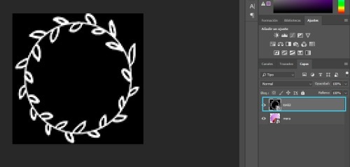
then we go to CHANNELS and click the dotted circle
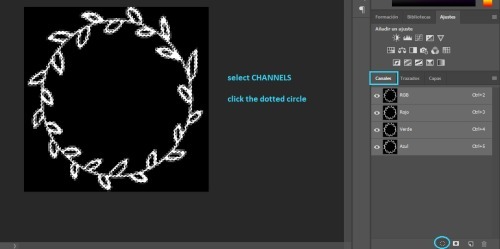
go back to LAYERS
next add a color fill layer, with whichever color you want (i use white always)
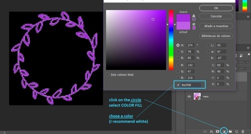
and then you get this.
(you might need to re-size your circle icon a bit, just press CTRL + T and change it in the squares at the top)
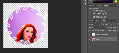
that's all!
if you have any more questions my askbox is open!
544 notes
·
View notes
Text
GIF-Making Tips and Tricks
Hello guys, today I’d like to try tackling something different from the usual skating… things because the skating discourse recently has got a tad wearisome "how do you make GIFs” is a question I’ve been receiving quite a lot. If you have never attempted nor have any intention of one day tinkering with GIFs, feel free to scroll past this. If you are interested in GIF-making, especially for Tumblr, or are just curious to discover something new, read on.
So there are 3 main steps in this GIF-making process: (1) find the footage (2) edit the footage and (3) convert the edited footage into GIFs. For ease of discussion, I’ll organize my tips and tricks into these 3 buckets as well.
The software I used are:
4K Video Downloader for video download
Adobe After Effects CC for editing
Adobe Photoshop CC for conversion
You can substitute 4K with any other video downloader of your choice, or you can use one of the many web-based tools out there, like this one for example.
If you’re not familiar with After Effects (and you don’t want to have to learn it from scratch), you can use any other video editing app for this part. You can also skip this altogether and do your editing in Photoshop - though I personally would not recommend it. PS is simply not very efficient as a video editing tool.
I’m not sure if there is any viable substitute to Photoshop in the final step. If you know of any app that could replace PS, do let me know in the comments.
STEP 1: FIND THE FOOTAGE
#1: YouTube is your friend.
#2: The video quality plays a big part in deciding the quality of your GIFs, so I’d recommend going for a video of at least 480p, ideally 720p or more - keep an eye out for that HD sign. So let’s say if I want to GIF Yuzu’s SP Otonal at GP Helsinki, I’d go for this version (thanks, @muffinlorando, you are the best).
#3: As a caveat to point #2, if you don’t have a video editor and opt for editing with PS, you might want to pick videos of not more than 30fps. PS is not great at adjusting the frame rate and you really don’t want to end up with a raw import of 60fps, for reasons I will get to soon enough.
STEP 2: EDIT THE FOOTAGE (with AA)
#4: Learn After Effects in 20 minutes. Seriously, that tutorial is awesome. It covers all (or most) of the basics, the explanation is easy to understand and follow along. The only complaint I have about that video is that it is actually 23 minutes and 24 seconds instead of 20 minutes as promised (#fake news???).
#5: Re: the dimensions of your Tumblr GIFs
The maximum width allowed for Tumblr GIFs is 540px and that’s what you want to aim for, especially if you’re making an in-line GIF, i.e., a GIF to be inserted into a text post, like the example above, or this:
If you are making a standard Tumblr gifset with 10 GIFs arranged in two columns, like this, aim for 268px in width for optimal display.
For a gifset with 3 columns, like this. the optimal width is 178px.
Three notes:
I only mention width because it’s the limiting factor, the length of the GIF is entirely up to you.
For full-width GIF, you can make do with something smaller than 540px, but I wouldn’t recommend going below 480px as it’d make the GIF quite grainy/blurry in display. Same for 1/2 and 1/3-width gifs, I would suggest a minimum of 250px and 160px, respectively.
For 1/2 and 1/3- width GIFs, you can go over 268px and 178px if you want your GIFs to look bigger in single view (i.e., when people click on the GIF to view them separately). In my examples, I used 270px for both gifsets. Don’t bother going over 540px with the big GIFs though, Tumblr will force-resize it to 540px.
For reference, most of my full-widh GIFs are 170px to 200px in length, my 1/2-size GIFs are usually in a 4:3 aspect ratio, and my 1/3-size GIFs are 1:1.
#6: Re: the duration and frame rate of your Tumblr GIFs
These are important factors because Tumblr has a size limit of 3Mb on GIFs. If you exceed that limit your GIFs won’t play at all on your blog, so there is a trade-off you need to consider in terms of the GIF’s dimension, duration, frame rate, color quality (which we’ll get to later), and size (in Mb).
My rules of thumbs are:
Frame rate: don’t go lower than 24fps, otherwise your GIF won’t look smooth, but don’t go for something as crazy as 50-60fps either, otherwise you won’t be able to condense it to <3Mb without some serious sacrifice on the color quality.
Duration: don’t go longer than 5-6 seconds for the small GIFs and 3-4 seconds for the 540px stuffs.
#7: Make your footage slightly bigger than the composition. The reason for this is sometimes, in some footage, depending on the broadcast’s quality, there’d be some fuzzy pixels around the edges of the video. If you leave them in they can make your GIF look a bit messy. What I like to do is, first, fit the footage to comp width (Ctrl+Alt+Shift+H), then bring up the Scale property and slightly increase the automatic fit, usually rounding it up to the nearest percentage.
#8: Re: color correcting the footage.
Use an Adjustment Layer to keep the color correction separate from the footage. That way it’s easier to turn it on and off to assess the effect of the correction, and it’s easier to copy that layer to a new composition if you’re making a gifset.
I like to start with Curves to adjust the brightness and contrast to my liking. You can use other effects such as Levels for this. My note here is that you might want to err on the side of brighter and more contrasting for your footage, because when it is converted to GIF, it will lose quite a few colors and the result is often less vibrant than the footage. Here, for example, is what happened to a GIF I made from Mao’s Sochi FS when I was done converting:
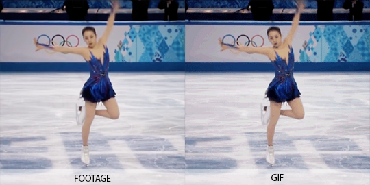
To quickly enhance the brightness of a somewhat dark footage, duplicate the footage, change the Mode to Screen, and reduce the Opacity to around 20%.
Use Selective Color to target-correct the color you want to focus on. For example, in this GIF, I dialed up the Cyans / Blues and lightened the Reds / Yellows to accentuate the color of Yuzu’s outfit:
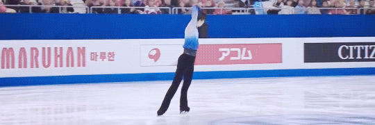
Use Leave Color if you want even more pop, like what I did here to make the red of Nastya’s dress stand out.
Some skating footage can have a yellow tint to it because of the light reflecting off the ice surface. If you don’t like that tint (I don’t), top the adjustment off with a Photo Filter. Pick one of the Cooling Filters and play around with the density until you get the desired look. I used this effect on the Yuzu spread eagle GIF above too.
STEP 3: CONVERT THE FOOTAGE INTO GIF (with PS)
#9: Usually, either of these two settings will give you the best result, i.e., the maximum preservation of colors and depth from your edited footage.
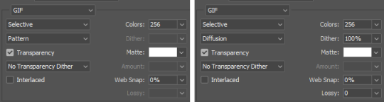
One drawback of these optimal settings is that they can make the GIF quite heavy. In case you have to compromise, I would recommend not going lower than:
Pattern with 128 colors, or
Diffusion with 128 colors and 80% dither
Anything lower than this can make your GIF look very washed-out and/or blurry.
FINALE: BRINGING EVERYTHING TOGETHER
#10: There are certain exceptions to all the rules of thumbs I mentioned so far. Since, as said, making a GIF and wrestling it into Tumblr’s size limit is always a four-way compromise of color integrity, video quality (frame rate), dimension, and duration, there are a few cases when you can make a 10 seconds+ GIF or a huge 540x540 GIF without sacrificing too much in the way of quality. Most of those are when the footage does not have a lot of different colors to begin with. So this one for example is a pretty big GIF (540x250) and yet only ~2.6Mb:
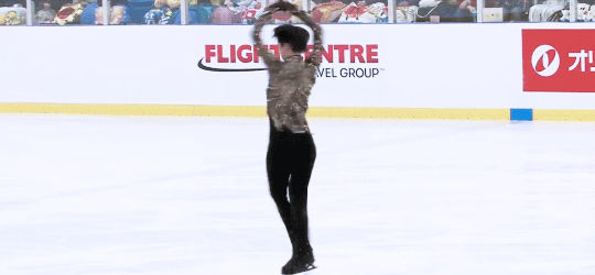
And this one is a full-width GIF that actually lasts 4 seconds (though I did have to reduce the dither a bit to make it <3Mb):
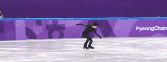
At the end of the day though, I’d say GIFs are for capturing the moments, so I usually would not go for too long of a footage. If you want to point out something that lasts more than 10 seconds, it’s much more convenient to just direct the viewers to the video itself :)
Aaaand, that’s it for the basics. Hope this was useful to at least some of you, If you want to see more posts like these, let me know in the asks / comments. I can also go into more details of how to make fancier GIFs with text overlay:
or layer masking, this sort of stuff:
Happy GIF-making!
300 notes
·
View notes
Text
Version 377
youtube
windows
zip
exe
macOS
app
linux
tar.gz
source
tar.gz
I had a good week. I mostly caught up with my smaller jobs queue, just pushing on work that had piled up.
Qt
Thank you for the continuing Qt bug reports. I fixed a variety of typo-broken buttons this week, mostly buried in less-used UI, and if you have set a browser launch path override in the options, hyperlinks across the program should obey that again. I also believe I fixed the annoying issue where media viewer hover windows that needed to shrink (because of switching to a new media that had fewer info lines or known urls) would linger too tall for one frame. EDIT: I'm still having slight hover window resize flicker in my IRL client when I keep my mouse over the top-right hover, I'll give it another go next week.
Furthermore, all non-menubar menus across the program now open on right-click release instead of press. This sounds trivial, but there was a mix of down/up click handling here, now unified, and some things like thumbnail and tag selection are handled more naturally in the initial click down. This also fixes an issue where users who had menu styles with no significant border were sometimes accidentally activating the first menu item on a slow click (the click down would show the menu, the click up would activate it).
Last week's support for styles and stylesheets for Qt seems to have gone well. There is more to do here, but this week brings better error handling for unusual situations, better 'we already have this set, no need to waste CPU re-applying it' detection, and fewer hacky colour overrides, so custom stylesheets should be able to colour regular panels without lots of unintended grey or white boxes.
the rest
The shortcut system should now be able to support any text key. This includes extended characters like ø or æ. If you need to apply a modifier to get these keys (e.g. ctrl+alt+e), these modifiers are likely to show up spuriously in the shortcut's label (e.g. ctrl+alt+æ), but everything should nonetheless line up in the program correctly. Let me know if you discover any new bugs here!
There are also some new shortcut commands this week, for the 'media viewer' set. They are 'pan_top/bottom/left/right_edge' and 'pan_horizonal/vertical_center'. They move the whole image around to edges, or center it again, and should be helpful if you often look at tall or wide comics at 100% zoom. There will be more to come here in coming weeks.
The work on making the UI smoother is also continuing. Session saving and a variety of 'media refresh' events that occur on file import or maintenance are now significantly faster and do the bulk of that work in the background. Users with very large sessions should experience less juddery behaviour during both idle and heavy work periods.
full list
qt:
all non-menubar menus across the program now launch on click release. some previously launched on click press. a variety of related click event behaviour is cleaned up, particularly with thumbnail/tag selection on the click down. this also fixes some users' menus immediately activating the first entry on slow clicks in some ui styles
I think I fixed the annoying single-frame delayed size-down resize on media viewer hover frames when changing media!
the vast majority of old wx panel background colour hacks are removed, so custom stylesheets should now cover much more of the UI
improved the new custom style and stylesheet setting, resetting, and error handling code, particularly for not re-applying the same style or stylesheet twice, and for handling un-re-settable styles (seems to be defaults initialised by third-party OS-wide Qt style) gracefully
fixed hyperlinks not using the custom web browser launch path as set in the options
fixed the 'migrate entire db' and 'set thumb location' buttons in the migrate database dialog
fixed a typo bug when launching the url selection tree after adding an ipfs directory to download
fixed two typo bugs when editing regex favourites and simple downloader formulae
fixed an issue where custom shortcut sets could not be deleted
fixed a typo in the edit account type panel
fixed sorting the login listctrl when there are session logins mixed with non-session logins
removed some old media viewer hover window display/raise hacks
retired the 'always show hover windows' debug mode
the media viewer will no longer perform any drag calculations on anything but left-click drag
misc Qt code refactoring/cleanup
.
url searching:
the database now stores 'known url' domain information more efficiently. it will take a few moments/minutes to reshape the db when updating
system:known url's exact url search now runs extremely fast. this will only affect new predicates of this type, not those in existing sessions
system:known url's domain search now runs much faster and matches subdomains of the given domain. this will only affect new predicates of this type, not those in existing sessions
system:known url's url class search now runs much faster. this will only affect new predicates of this type, not those in existing sessions
when entering a regex system:known url predicate, the dialog will now not OK (throwing up an error dialog) if the regex is invalid
.
the rest:
the shortcut system now allows all text characters. if it has text, it should work, but it is the wild west in terms of modifier labelling. anything unusual on your keyboard like ctrl+alt+e to make æ will _display_ as ctrl+alt+æ, but the same key combination will match up in the program all correct
added shortcut actions 'pan_top_edge', 'pan_bottom_edge', 'pan_left_edge', 'pan_right_edge' to the media viewer shortcut set that will move the current image so the respective edge is aligned with the larger canvas's
added shortcut actions 'pan_horizontal_center' and 'pan_vertical_center' to do as above but center on that axis
session save now hangs the UI significantly less, whether triggered by user command or auto-saving 'last session'
saving of last/exit sessions on client close is a little faster
the call to refresh thumbnail file info (and redraw if needed) when a file is imported or has metadata-regenererating file maintenance done will now only call for files that are actually loaded, run faster per file, run faster when the client has large collections in its session, and not hang the ui thread when waiting for the new media info to arrive
like regular popups, modal popups (like those created when big vacuum/analyze jobs jump in) will now only appear if the main gui or an on-parent child has OS focus
the main gui/on-parent child OS focus test now includes misc child windows like the autocomplete results hover window
network jobs that fail for one reason or another will now be more reliably cleaned up, and their connections returned to the connection pool. this may fix the 'too many open file handles' errors some users were seeing after long term unreliable network traffic
fixed an issue where some thumbnails that were trashed or physically deleted were being removed from 'all known files' and file repository views when it was not appropriate
connection and downloader retry time options now have a wider min/max range when in advanced mode, with an accompanying warning label for the connection panel
checker options times now have a wider min/max range when in advanced mode, with an accompanying warning label
cleaned up some shutdown reporting text
misc debug improvements
next week
The holidays are coming up. As 379 would normally be due on Christmas Day, I will postpone that to New Year, which means next week's 378, on the 18th, will be the last release of the year. I am due for a 'cleanup' week, which will also make for a nice 'safe' release before the break. So I will clean up code, do some more Qt neatening, and otherwise catch up on smaller jobs like I did this week.
I never strictly marked down the day when I started working on hydrus, but December 14th, 2011, the date of the first non-experimental beta, has emerged as a decent birthday. This week marks eight years. It has been a lot of work and a lot of fun. There are a couple thousand things I would still like to do, so if I can, I would like to keep going as I have into the 2020s. I deeply appreciate all the feedback, help, and support over the years. Thank you!
If you would like to further support my work and are in a position to do so, my simple no-reward Patreon is here: https://www.patreon.com/hydrus_dev
1 note
·
View note