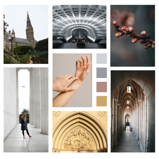
#alt text: from top left (clockwise)
Explore tagged Tumblr posts
Visit Tumblr Blog
Explore Tumblr blogs with no restrictions, modern design and the best experience.
Last Seen Tumblr Blogs


Fun Fact
Tumblr has 4 main sources of revenue.
Text
ignite the stars mood board
read on AO3 here
#alt text: from top left (clockwise)#georgetown uni's healy hall clocktower#DC's metro brutalist underground ceiling#frozen cherry blossom buds#hallway of washington national cathedral#facade of washington national cathedral#young woman with blonde hair standing at the lincoln monument#two hands intertwined
12 notes
·
View notes
Text


2024 dan and phil sketchdump
[Image Description: Digitally cleaned up ink sketches and doodles of Dan and Phil in 2024. Alt text is provided and copied under the cut. End ID]
Copied Alt Text
Image one: Sketch note reads, "Dan + Phil 2024. doodles with angie." Sketches clockwise from left: Phil looking back at a laughing Dan in their TIT ending pose; photocard portrait redraw; Dan looking at Phil as they stand back to back. The last one is captioned, "absolutely devastating follow up to the TATINOF look."
Image two: Sketches from left to right: Dan and Phil peace signing - captioned, "Terrible Influence Tour"; Dan and Phil posing with Ranboo - captioned, "Ranboo met D+P."
Image three: Sketches clockwise from top left: Dan talking into the Q&A mic; Dan and Phil flipping off the camera; Phil talking into the Q&A mic with the Phlit; Phil talking into the TIT hiatus mic; Dan and Phil cheek to cheek during the TIT song; Phil talking into the Q&A mic.
Image four: Sketches clockwise from top left: Dan and Phil posed in their Halloween costumes - captioned, "Sister Daniel & Demon Phil"; Phil sitting in a hoodie on his phone at the beach; Dan facepalming and with crossed arms respectively - captioned "Dan warm ups"; Dan dancing for the camera - captioned, "wiggle, shake."
Image five: Sketches clockwise from left: Sister Daniel tousles Phil's hair during TIT; Sister Daniel bends over during TIT; Dan and Phil with a tiny hours in emo and skater clothes - captioned, "emo Dan & skater boi Phil & a Tiny Horse (Teddy!)."
Image six: Sketches clockwise from top left: Dan in a horned patterned hoodie and platform shoes - captioned, "Dan selfie"; Dan posing with heart sunglasses - captioned, "lethal face card wtf"; Dan portrait with new hair - captioned, "Australian baby mullet."
Image seven: Sketches of Dan's face cradled in Phil's hands in 2017 versus Phil tugging Dan's ear in 2024.
End Copied Alt Text
#dan and phil#dan howell#daniel howell#amazingphil#phil lester#phan#phanart#terrible influence tour#tit spoilers#dnp#artists on tumblr#doodleswithangie#500#1K#referenced from tweets and photoshoots and photocards! done whenever i needed to warm up or just doodle
1K notes
·
View notes
Text
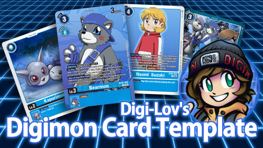
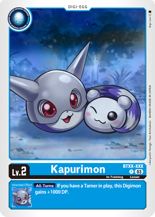
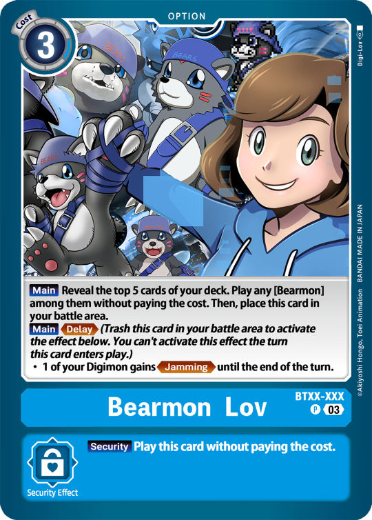
Digimon Card Template->
Hey guys, I finally finished the templates! A few words to read before using, and more words under the cut if you will. I'd love to see any and all cards you create, so feel free to leave me an ask or DM! Also if you feel like supporting me a little, feel free to stop by my ko-fi->
First off, all fonts you need for the template are in the "Card Template Fonts" rar file. Remember to install them first before opening the files. Second, I recommend working with the PSD file in Photoshop, if you can. It has more and easier customization. If you use CSP, do use the CSP files. The PSD Text layers don't work in CSP, as well as certain other settings. I did my best to adapt the file to CSP, and it should work fine!
The Files have "HELP" layers in certain folders, I recommend reading them! Some of the Information I will repeat under the cut.
HAVE FUN! I wanna see lotta cards!
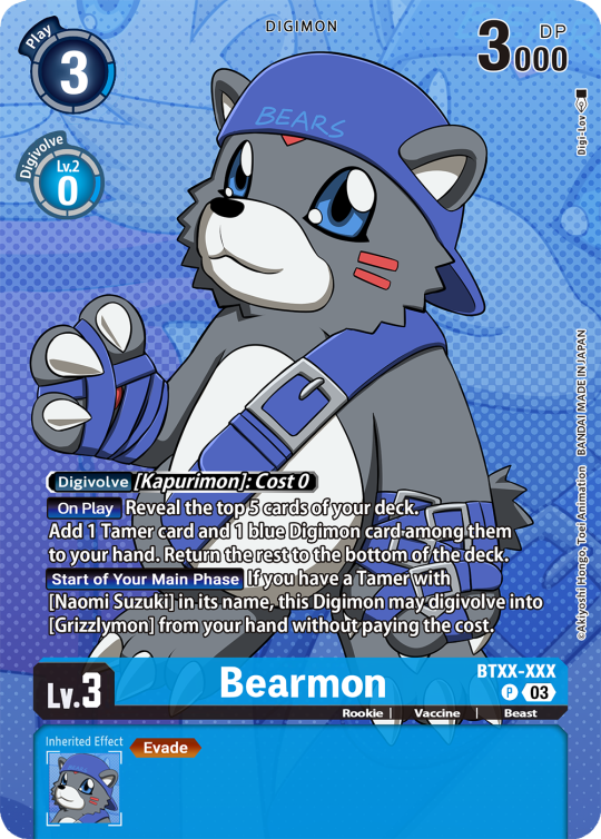
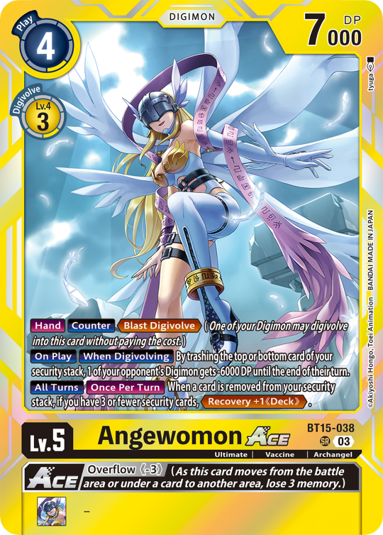
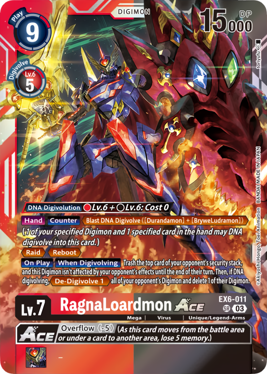
Okay, below the cut I'll leave some notes on how the Digimon cards are designed, as of the num <03> era at least.
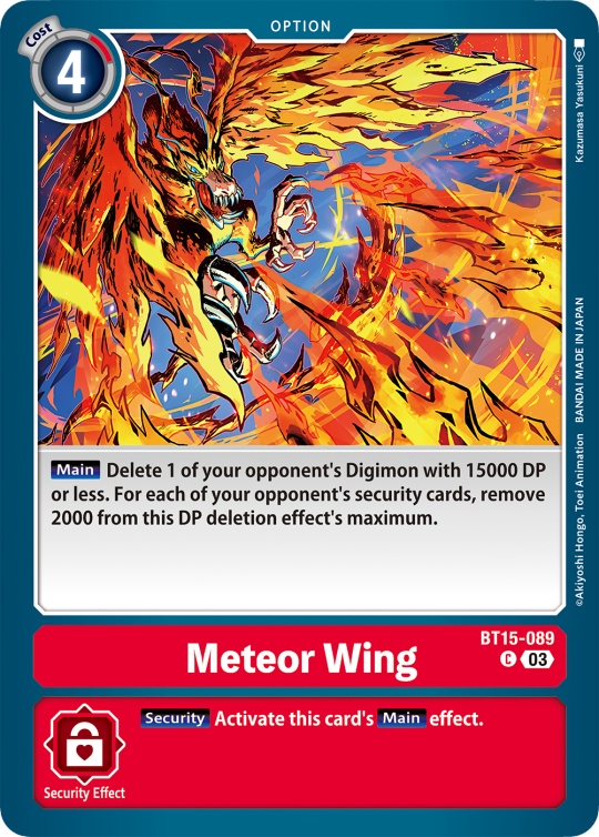
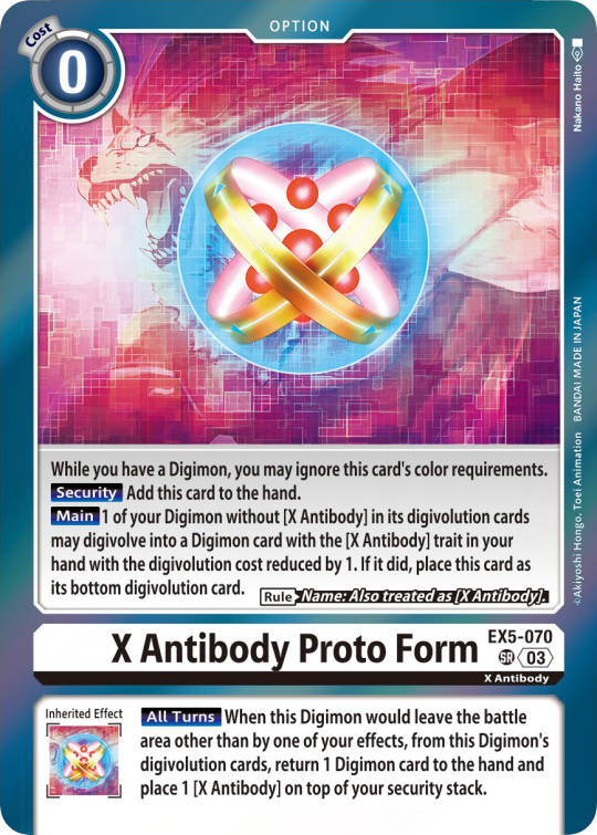
Digimon cards have seven different colors. Red, Blue, Green, Yellow, Black, Purple, and White. White cards are rare and reserved for special Digimon/Tamers, and usually don't interact with other colors. For easier reading, Yellow and White cards have black text in their colors, instead of the usual white text. On multicolored cards, card including Yellow (or white) have white text with a black outline. (before <03> if Yellow was the first color, the text was black with white outline instead, but they unified it with the update) The color on the left is considered the first color. Since the design update, the Card color is displayed in a color wheel around the Play cost. The digivolution cost bubble also recieved a color wheel, as well as the buble being split into the differen colors. Imagining it like a clock, the top color is the first, and then circling clockwise. Digi-Egg, or Lv.2 Digimon are always single color.
[tricolored cards have been introduced just recently and super rare. use sparingly]
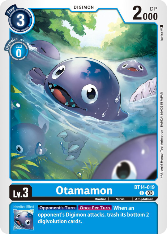
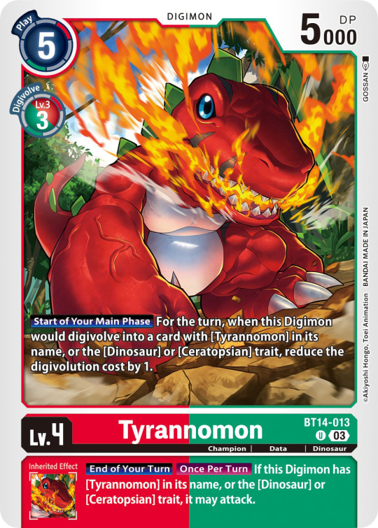

Now to the Effects. The main effect is in white color with a black outline (also outlines on the keywords), while the Inherited Effect doesn't have outlines (unless it's a Yellow double color). If the Digimon has no Inherited Effect, there will be a small dash in the box.
Only white cards have black text in their main effect.
The effect text will start in the lower bottom of the image, not all the way at the bottom, and go down from there. If the Effect is too long it will move up.
Besides the regular evolution requirements, Digimon may have special "Digivolve" rules in their effect. This can make an evolution from a specific digimon cheaper, allow X Antibody Digimon to evolve from their normal counterparts, serve to overlook color requirements, or to allow evolution from certain traits, etc.
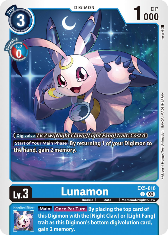
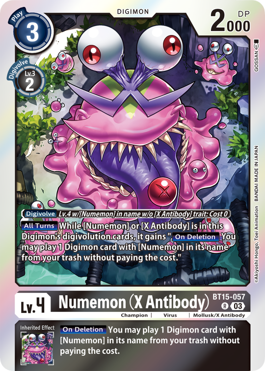
Some Digimon may also have an extra "Rule" in the bottom corner.
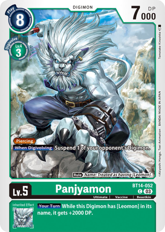
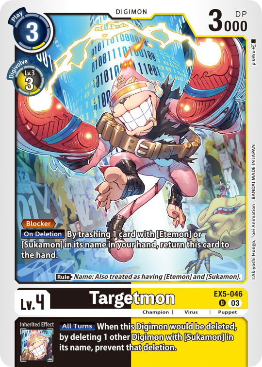
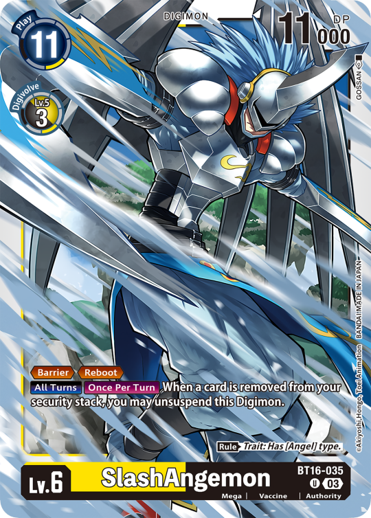
Ace Digimon will always have [Hand][Counter]<Blast Digivolve> effects. Most of them have no inherited effects. They also have a significantly cheaper play cost than comparable Digimon, but in turn have the Overflow mechanic. EX6 introduced Blast DNA Digivolution, which specifies the required Digimon by name, and not just Level and color.
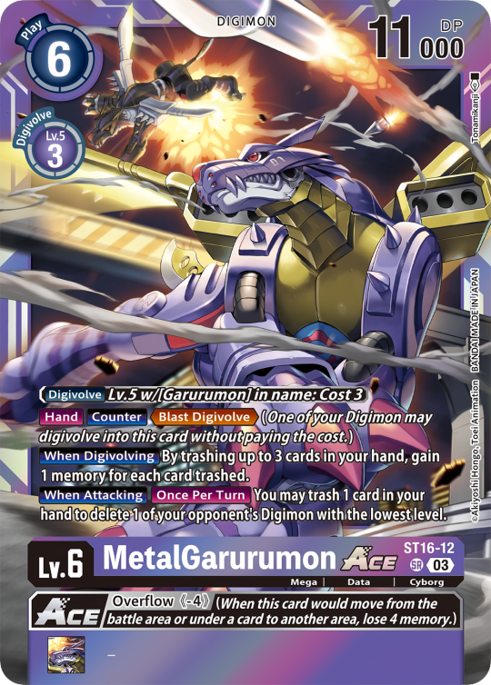
Lv.6 Digimon usually don't have inherited Effects, some might though, if they were made with Lv.7 evolution in mind. Furthermore Lv.6 Digimon pop out of their frame, even on the normal arts.

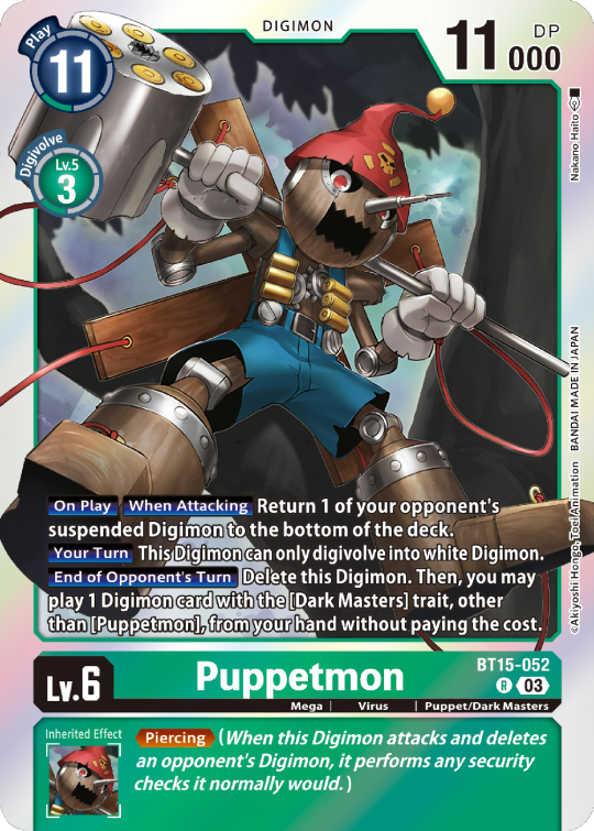

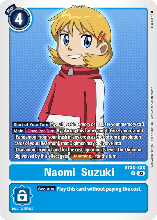
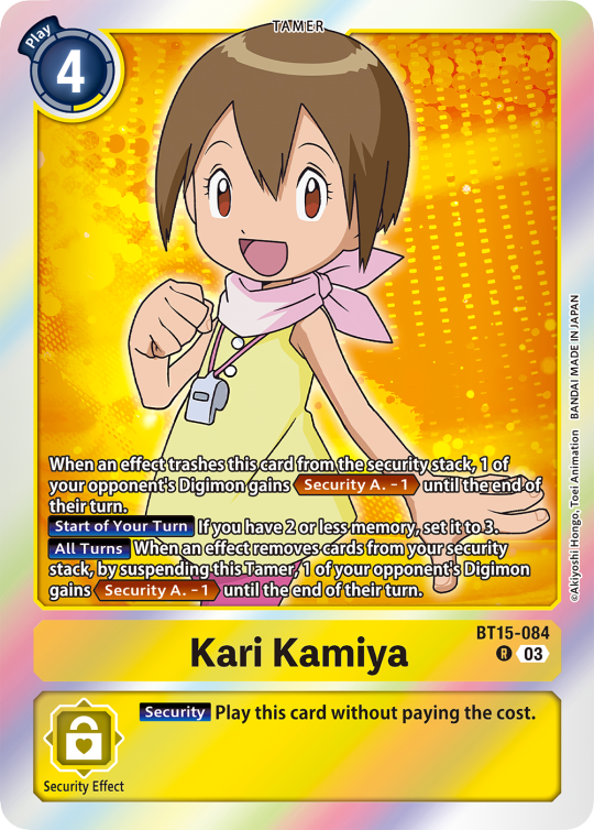
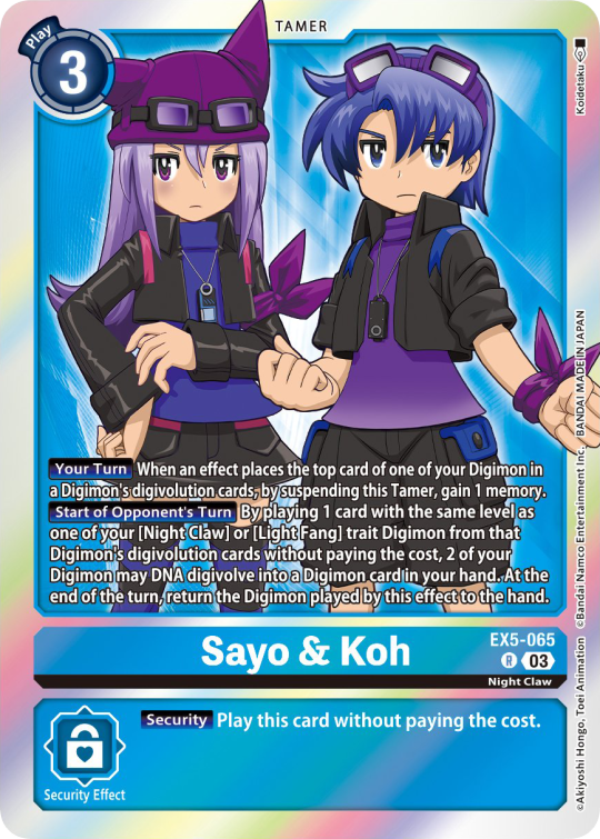
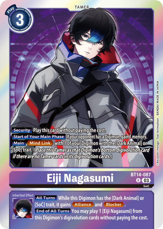
Now Tamers originally had neither traits, nor inheritence effects. But certain Tamers now do! Tamers with Mind Link effects, or the kids from Frontier for example, will have Inherited Effects.
Option cards have a grey backdrop for their effects, and the effect text is black. This black effect text carries over to full/alt arts, regardless of color. The have a (use) cost instead of a play cost. They can also have traits or rules, but it is rare.

#digimon#digimon tcg#digimon card game#digica#digisafe#デジカ#digimon card#digimon template#template#digi community#digi lov edits
372 notes
·
View notes
Text
Gem presentation system
Pt: Gem presentation system :End pt
A presentation system like the beverage presentation system (Link) and the food presentation system (Link).
This is a presentation system where one presents their Identity (Gender, alterhumanity, orientation, chronosan, desirdae, etc) through a certain color(s).

Ruby | Citrine | Sapphire


Ruby: An individual who presents their identity through the color red.
Citrine: A individual who presents their identity through the color yellow.
Sapphire: A individual who presents their identity through the color blue.
Coined for day 4 of @page-of-void-mogai coin war event! with the prompt choose being gemstones obviously! Hehe-
Others can coin for this system, or if others show interest, I can coin more!
Mentions / tags: @presentationflag-archive, @radiomogai, @aspectsofidentity, @smilepilled, @rwuffles
+ @liomogai
Banner transcript: This term was made by an Endogenic. Anyone can use it however (So don't repost or recoin, ask before adding to wikis) :End Transcript


Written flag ids under the cut, same as alt text.
Ruby flag id: a flag made of seven horizontal stripes. From the top down, they are red, very dark red, dark red, bright red, desaturated red, very dark red, and red. In the center left is a round gem with a square facet cut, with the square in the center of the gem being a pale red. Clockwise from the top, the colors are desaturated red, red, bright red, and dark red. The gem is outlined in very dark red. :End id
Citrine flag id: a flag made of seven horizontal stripes. From the top down, they are yellow, very dark yellow, dark yellow, light yellow, desaturated yellow, very dark yellow, and yellow. In the center left is a round gem with a diamond facet cut, with the diamond in the center of the gem being a pale yellow. Clockwise from the top right, the colors are dark yellow, desaturated yellow, yellow, light yellow. The gem is outlined in very dark yellow. :End id
Sapphire flag id: a flag made of seven horizontal stripes. From the top down, they are blue, very dark blue, dark blue, light blue, desaturated blue, very dark blue, and blue. In the center left is a round gem with a triangle facet cut, with the triangle in the center of the gem being a pale blue. Clockwise from the top right, the colors are desaturated blue, light blue, and dark blue. The gem is outlined in very dark blue. : End id
#like sleep like death. you wake up again.#Gem presentation system#ruby#citrine#sapphire#flag making#mogai flag#liom flag#liom coining#liom term#mogai coining#mogai term#coining#coining post#flag coining#term coining#mogai terms#label coining#liom terms#presentation term#Ruby presentation#citrine presentation#sapphire presentation#presentation flag#queer presentation#presentation ruby#presentation citrine#presentation sapphire#normascoinwarjan2025#teamapollo2025
54 notes
·
View notes
Text
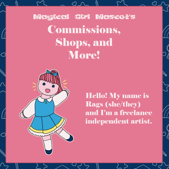


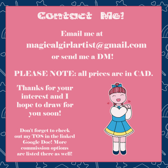
[ID: a series of square images, all with white text on a pink background. Full descriptions are in alt text and under read more. End ID.]
New year, new pinned post! I have art commissions open, including character sheets, comic pages, and fully illustrated backgrounds! You can find more info by sending me a DM or checking [my Google Doc.] The doc also has some more options for commissions, like additional characters or minor background elements.
I also have some shops open! [Ko-Fi] has all the merch that I sell at conventions available to be shipped to you. Stickers, prints large and small, charms, sticker sheets, and hopefully more as the year goes on! You can also use it to leave me a tip if you like. [Redbubble] has various designs that I don't have physical merch of myself for one reason or another, as well as types of merch that I don't make, like clothing or notebooks.
Send me a DM or email me at [email protected] for more information or to get started! Reblogs of this post are also greatly appreciated. Thank you!
Image 1: a small rag doll with pink ponytail and blue dress smiles and waves at the viewer. Text in the image: "Magical Girl Mascot's Commissions, Shops, and More! Hello! My name is Rags (she/they) and I'm a freelance independent artist."
Image 2: a young woman in a black leather jacket and red tank with a skull on it glares at the viewer, holding a scythe of bones behind her back. She's divided into three sections showing the distinction between types of commissions with bright blue lines. Text in the image: "Commissions. Bust (shoulders up): Flat colours $15, Fully shaded $20. Hips up: Flat colours $20, Fully shaded $25. Full body: Flat colours $30, Fully shaded $40. See linked Google Doc for more info and TOS."
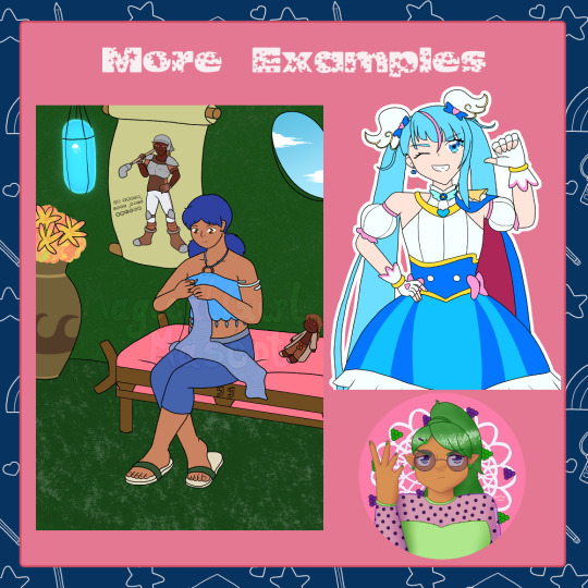
Image 3: text at the top reads "More Examples." Under are 3 images: a young woman in a blue outfit with pigtails sits on the edge of a bed, knitting a blue scarf with a large scroll on the wall behind her of a young man in an athletic uniform. Cure Sky from Hirogaru Sky PreCure from the hips up, winking and grinning while pointing at herself with her thumb. A bust of a young woman with a green ponytail, round purple glasses, and a green top, looking away, annoyed, raising a hand dismissively, with a background of green and purple grapes.
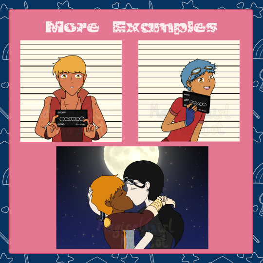
Image 4: text at the top reads "More Examples." Under are 3 images: a humanized Jaller from Bionicle, blonde and with a red vest, holding a board that says his name in the Matoran font, looking scared and scandalized. A humanized Takua from Bionicle, blue haired in a red shirt with the sleeves rolled up, holding a board with his name on it in the Matoran font, smiling cutely at the viewer. Two young women kissing, seen from the side. One has her arms draped around the other's neck while the other cups the back of her head.
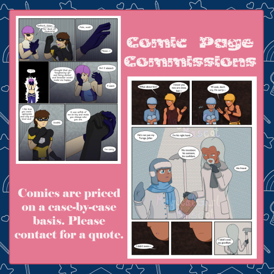
Image 5: two comic pages. The first depicts Setback and Expatriette from Sentinel Comics having an argument, where Expatriette is apologizing for demanding Setback change for her and Setback thinks she's a Fleshchild. The second depicts human versions of Matoro, Jaller, and Nuju from Bionicle. Jaller asks Matoro about Nuju, nearly making him cry, and Matoro admits that Nuju means a lot to him and he regrets not saying goodbye to him before they left. Text in the image: "Comic Page Commissions. Comics are priced on a case-by-case basis. Please email for a quote."
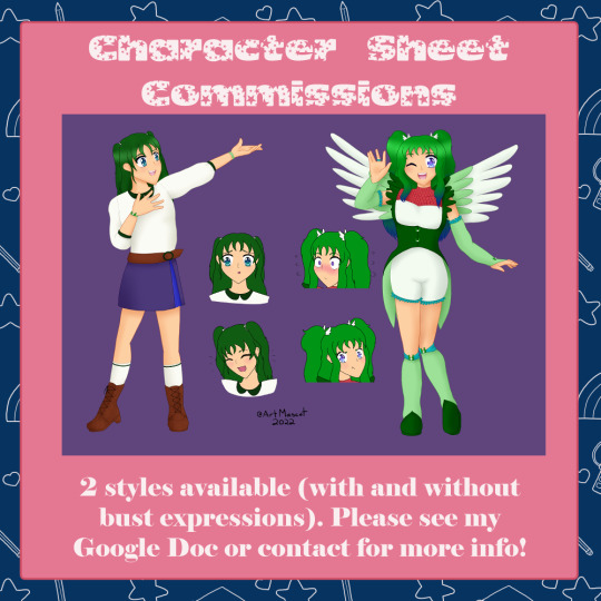
Image 6: two drawings of a teenage hummingbird themed magical girl in her civilian and magical forms. As a civilian, she wears a plain top and skirt, holding her hand out dramatically and smiling. As a magical girl, she winks and waves at the viewer. Between them are four bust expressions: civilian upset and laughing, magical mortified and pouting. Text in the image: "Character Sheet Commissions. 2 styles available (with and without bust expressions). Please see my Google Doc or contact for more info!"
Image 7: four photos of different types of merch. Clockwise from top left: 5 acrylic charms of the Tokyo Mew Mew New protagonists, 6 stickers of the transformation sweets from Kira Kira PreCure a la Mode, 6 postcard sized prints of characters from Mob Psycho 100, Animal Crossing, Ghost Trick, Dragon Ball Z, and PreCure, and 6 stickers of the original Kanohi from Bionicle surrounded by flowers. Text in the image: "Shops! My Ko-Fi shop (linked below) has physical merch like charms, stickers, and prints! Printed, packaged, and shipped by me."
Image 8: screenshot of a Redbubble shop featuring a variety of prints, mostly of magical girls. Text in the image: "Shops! My Redbubble shop (linked below) has fanart and original art on all the Redbubble staples (but especially prints)."
Image 9: mostly text with a single circular logo with a bow inside. Text in the image: "I love to draw: original characters, fanart, TTRPG or MMO characters, frilly/fancy/detailed outfits, fantasy/magical girl outfits/characters, anime styles, simple armor. I will not draw: NSFW/sexual/suggestive content, bigoted or otherwise hateful content, incestuous or pedophilic relationships, excessive gore (subject to discretion). Ask for more info or check my TOS if you're not sure!"
Image 10: the same doll from image 1 smiles and clasps her hands together. Text in the image: "Contact Me! Email me at [email protected] or send me a DM! PLEASE NOTE: All prices are in CAD. Thanks for your interest and I hope to draw for you soon! Don't forget to check out my TOS in the linked Google Doc! More commission options are listed there as well!"
#commissions open#commissions#art commissions#artists on tumblr#commission work#digital artist#freelance artist#it's not tag spamming if it's all relevant right? right???#anyway. commission me please :3
50 notes
·
View notes
Text

my headcanons about gideon/the way i draw him!! i really enjoy doing it i just wanted to put all of them in one spot. transcription of all the text under the cut, it feels too long to include in the alt text but obviously it's important and also my handwriting is bad anyhow lol
the text, in clockwise starting from top left: he's 5'6"-ish, trans + bisexual. he has 3 little "antennas" (tufts) in his hair, and little scars from fights/sword practice. he is a cane user who uses subspace to hide a sword in his cane while retaining functionality as a cane. he has a large surgical scar from a semi-botched knee replacement surgery (why he uses a cane), a "big stupid fuck off belt buckle" like his concept sketches, is skinny/scrawny with a "primordial pouch" (referring to a slight belly), and has moles everywhere.
beside the smaller sketches: he had orthodontic relapse after braces in high school, resulting in uneven/funny teeth. his eyes are always obscured by his glasses, and his expressions are drawn by changing the shape of the lenses. after respawning, he has huge X scars.
loose bullets: his voice is naturally high and squeaky (like jason, his voice actor), he lowers it on purpose to sound cooler. has a weird chimera of his comics+movie hairstyles. he started transitioning in highschool and kept his first chosen name (gordon) as a middle name in adulthood.
#gideon graves#sp#yayyyy ok . since i posted those other ones of him where he has his cane i figured i should post this one too!!
23 notes
·
View notes
Text
Part 8 of A Treatise of Embroidery, crochet, and knitting with illustrations
By George C. Perkins, Anna Grayson Ford, and M. Heminway & Sons Silk co circa 1899


Please note, this book was written in 1899, and as such uses a racist term to refer to the dyes that were used for the thread. If you'd like to read more about this period in time, the term, and the stereotypes that the Victorians had, I've actually linked the wikipedia article here that goes more in depth. It's not the end all be all of it, but it's a good starting place for anyone wanting to educate themselves on the topic.
The alt text for the page on the left containing the actual embroidery pattern is written below:
Page 31. Lessons in Embroidery.
This is the chart for the embroider by letters/numbers diagram on this page.
La France Rose. (Pink.) Flower: 580 is shade number 1, 581 is 2, 0582 is 3, 582 is 4, 583 is 5, 584 is 6, 585 is 7, 586 is 8, 0432 is 9, and 432 is 10.
Leaves and stems.
Green:
570 is Shade letter A, 571 is B, 572 is C, 573 is D, 436 is E, 437 is H, 438 is I, 439 is K.
Old Red: 233 is M, and 234 is O.
Rose Design.
Materials. — M. Heminway & Sons' Oriental Dyes, Japan and Spanish Floss.
La France Rose. — 580 to 586, 0432, 432, a645, 0645. Leaves. — 570 to 573, or 0428 to 430, or 436 to 439 Japan Floss ; 233, 234 Japan Floss. Scallop. — 691 Spanish Floss ; also 370 Japan Floss.
Description. — Work the top petals of rose with 0582, 582, shading darker underneath where the leaf turns over with 584, 585. The turn-over leaves make of the lighter shades, 580, 581. A very little of green, 0432 and 432, can be used with effect in one of the lower petals, running the green into the light pink. Also in the fallen petals of rose use these greens with yellow, a645, 0645.
Leaves. — Shade the same as Design No. 138 on page 37, using the red-brown, 233 and 234, for thorns and stems.
Scallop. — Long and short buttonhole with 691 white Spanish Floss, shading with 370 Japan Floss.
In any La France design containing buds just bursting, use darkest shades of pink, 585, 586
There is an illustration of a doily captioned Design No. 239— Double Rose. 22 inch. It has three large roses and one small one paired with one of the larger ones flowing clockwise around the doily. there are also some petals shown scattered from one of the roses as well.
There is also a diagram for the rose captioned Spray of Design No. 239. Showing Slant of Stitches. The stitches curve in the direction of the leaves and petals. I will list off the shade letters/numbers as follows:
The stem begins in D with a thorn done in O emerging on the right, and another one a ways above it emerging on the left. A small sprig of three leaves emerge from the right.
Starting from the upmost leaf which is curled and emerges from the leftmost side of the sprig, we will go row by row.
1st Row, the furled underside of the leaf: A 2nd row onwards, the upper side of the leaf: C, B. 3rd Row: B, C. 4th Row: M, D.
Next leaf, Sprig tip leaf, rows from tip to base:
1st Row: C. 2nd Row: B, A, B. 3rd Row: B, A, A, C. 4th Row: M. 5th Row: C, D, D.
last leaf, bottom leaf but the rightmost leaf on the sprig.:
1st Row: D, A. 2nd Row: C, D, B. 3rd Row: B, B, B, A. 4th Row: A, A. 5th Row: M.
Back to the main stem, we go upwards and there is a thorn done in M just before another sprig emerges from the left. This one does not have any lettering so I would go by the previous pattern or improvise. It does show the lines of the stitches curving with the leaf.
The Stem continues in D with two more thorns on the right side done in M. The receptacle of the flower, aka the green part where the petals emerge from, starts in M and then transitions to C.
There are sepals, the tiny leaves around the flower base, with one on either side. The tips are twisted to reveal the underside and done in A, while the bases are done in B.
Onto the actual rose,
Right bottom outer petal which is opened and nearly totally sideways, done in rows working upward from the bottom to the top.
Row 1: 10, 4, 2, 2. Row 2: 9, 3, 5, 5, 3. Row 3: 5, and the curled over top part of the petal is 3.
Left Bottom outer petal:
Row 1: 2, 3, 7, 6. Row 2: 5. Row 3: 2, 4, 4, 7.
onto the next set of petals, there are three this time emerging from the bottom two:
Left outer Petal:
Row 1: 3, 7, 6. Row 2: 2, 5, 6. Row 3: 2, 4, 3. Row 4:3. Row 5: 3, 5. Row 6: 5. Row 7 has just a slight furl to it which is done in two.
Center Outer Petal:
Row 1: 3, 2, 3, 4. Row 2: 3, 4, 4, 3, 5, 6. Row 3: 5, 6. Row 4 is alternating furled and unfurled bits: 3 unfurled, 3 furled, 2 unfurled, furled and has no number but is likely 3.
Right Outer Petal:
Row 1: 7. Row 2: 5. Row 3: 4. Row 4: 3, 2. Row 5: 2.
Next row of petals, we'll be going right to left this time because the rightmost petal is actually sort of cutting in front of the previous petal and the center outer petal that we just did.
Right Center Petal, both sides furl and join at the center in a point, the left furl says 2, so I would guess the right one is also done in that as well even though it's not numbered.
Row 1: 6, 5, 7. Row 2: 5, 4. Row 3: 2.
Center Petal:
Row 1: 6, 7. Row 2: 5, 5, 4. Row 3 2 is a furled edge that goes diagonally upwards towards unfurled 3, 4, 3 is the unfurled tip of the petal, 2 furled rightmost bit diagonally upwards towards unfurled 3.
Left Center Petal. The edge of this one is completely furled and goes diagonally upwards to a point and comes down. It is done in shades 3 and 2. For the rest of the petal:
Row 1: 5, 6. Row 2: 3, 5. Row 3: 4. Row 4: 4. Row 5: 3.
Now there are three petals left to do and they emerge at a diagonal offset from the previous 3. With the next set, each petal is wider than the previous one, and the first petal is the small centermost petal of the rose while the next two are the outer petals, with the last one emerging from the center of the second to last petal and the corner of the Right Outer Petal we did earlier.
Center Petal: Row 1: 5. Row 2: 3, 4. Row 3 is furled but has no number, I'd go with either 2 or 3 judging from elsewhere in the diagram.
Center Outer Petal:
Row 1: 2, 2, 3.
Outermost petal:
Row 1: 4. Row 2: 3. There is some slight furling around the 3 which is unfurled, one of which is labelled 1. *******
The next few updates will be single page updates since the alt text is very long!
21 notes
·
View notes
Text

walking.on.wheels on Instagram
[ID: A cute cartoon on the topic of access needs. In the centre are the words “accessibility is more than a ramp” which is then surrounded by examples of access needs. Starting from the top left corner and working clockwise… “flexible time constraints” with a drawing of an alarm clock. “camel case” with a drawing of a hashtag. “noise levels” with a drawing of musical notes. “Braille” with a drawing of the word Braille written in Braille. “image description + alt text” there’s no drawing with this one. “font choices” with a drawing of overly decorative font. “hearing loop” with a drawing of the hearing loop logo. “colour combinations” with a drawing of two examples of combinations, one clear and one very unclear. “subtitles and closed captioning” with a drawing of the closed captions CC logo. “lighting levels” with a drawing of a ceiling light and light beam. “sign interpreter” with a drawing of an arm demonstrating the way to say hello in BSL. The background of the slide is pale blue.]
#disabled#inclusion matters#disabilities#disability awareness#disabled lives matter#the future is accessible#disability support#accessibility#accomodation#disabled community
1K notes
·
View notes
Photo

I will continue to make dumb graphics until I learn to make less dumb graphics
[ALT: Infographic for UNRIVALED, Hockey Ever After - Book Three, by Ashlyn Kane and Morgan James. Graphic shows the book cover, with two hockey players battling for the puck and tagline “Love doesn’t pull its punches.” Cover is surrounded by text indicating tropes from the book, clockwise from top left: Grumpy/Sunshine; Rivals to Lovers; Enemies with Benefits; Accidental Feelings; Nasty, Disrespectful Sex]
#is tumblr gonna add an alt text function though#my books#mm romance#ashlyn kane#hockey romance#morgan james
6 notes
·
View notes
Photo

As someone with a disability, accessibility is something I’m passionate about. I know that my building isn’t great, but working on developing techniques and ways of work to be more accessible is important. AWN posted this graphic, and I think it illustrations ways that we can be more accessible. While making our buildings more accessible isn’t something within my control (no matter how much I pester), some things, like working on monitoring noise levels, providing subtitles at virtual programs, and looking into tech like a hearing loop can also be good steps.
Image ID: A social media graphic of different kinds of accessibility measures by @walking.on.wheels. The Instagram post’s Image ID reads: A cute cartoon on the topic of access needs. In the centre are the words “accessibility is more than a ramp” which is then surrounded by examples of access needs. Starting from the top left corner and working clockwise… “flexible time constraints” with a drawing of an alarm clock. “camel case” with a drawing of a hashtag. “noise levels” with a drawing of musical notes. “Braille” with a drawing of the word Braille written in Braille. “image description + alt text” there’s no drawing with this one. “font choices” with a drawing of overly decorative font. “hearing loop” with a drawing of the hearing loop logo. “colour combinations” with a drawing of two examples of combinations, one clear and one very unclear. “subtitles and closed captioning” with a drawing of the closed captions CC logo. “lighting levels” with a drawing of a ceiling light and light beam. “sign interpreter” with a drawing of an arm demonstrating the way to say hello in BSL. The background of the slide is pale blue. End ID.
Source
8 notes
·
View notes
Text
This has been quite a month for About Him!
Earlier this month we learned Signal 23 TV and Brandon Karson parted ways and that the second season would be moving in a different direction. Then, oddly and surprisingly, we thought the second season would be aired with Tyson Anthony (creator of Pharm The Series and Entercourse) at the helm after he announced via Facebook that Signal 23 TV and its affiliates would not be airing the series; and that Brandon would be reprising his role of “Damien”.
Then, yet AGAIN we were left in shock, surprise, and a little confused when just last night Signal 23 TV released a teaser trailer for their own second season of About Him, “The Revolution.” Thus, we now have two separate second seasons of About Him to be aired tentatively on two separate networks!
#gallery-0-5 { margin: auto; } #gallery-0-5 .gallery-item { float: left; margin-top: 10px; text-align: center; width: 33%; } #gallery-0-5 img { border: 2px solid #cfcfcf; } #gallery-0-5 .gallery-caption { margin-left: 0; } /* see gallery_shortcode() in wp-includes/media.php */
Tyson Anthony’s “About Him”
Signal 23 TV’s “About Him Season 2: The Revolution”
You can catch the trailer for About Him Season 2, “The Revolution” below:
For many fans of the series, the teaser trailer has been interpreted as a war cry, that Signal 23 TV is not releasing the web series without a fight. We reached out to both Tyson and Signal 23 TV last night for official statements. Tyson had the following to say:
“Only statement–if it’s not written or based on a novel by Tyson Anthony it’s not an original product and most likely will be removed due to copyright violations.”
Henderson Maddox, the CEO/showrunner of Signal 23 TV, released a simple statement as well via Facebook:
“Let the work speak for itself…#done“
However, Henderson disavows any malice in releasing his teaser, stating nothing is personal and that he is about business. In actuality it is not uncommon for a show to diverge in different directions and with different creative teams. Take a look at Single Ladies, black-ish, and BET’s The Game. Either way this is a very interesting turn of events with About Him and we cannot wait to see what both networks will do with their respective second seasons. We will definitely be watching both, and wish both parties much success!
We want to hear from you! What are your thoughts on this development? Comment below!
Written By: Michael “Hey Mikey” Fanning
[VIDEO] What’s Up w/ “About Him” Season 2? The Showrunners Release Separate Official Statements! This has been quite a month for About Him! Earlier this month we learned Signal 23 TV
#about him#Atlanta blogger#Henderson Maddox#Hey Mikey#Hey Mikey Atl#LGBT#Michael J. Fanning#Mikey#official statements#Season 2#Signal 23 TV#The Revolution#Tyson Anthony#web series
1 note
·
View note
Text
Peridot, Amethyst, and Sunstone
Pt: Peridot, Amethyst, and Sunstone :End pt


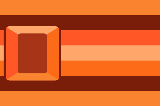

Peridot: An individual who presents their identity through the color green.
Amethyst: An individual who presents their identity through the color purple.
Sunstone: An individual who presents their identity through the color orange.
For the gem presentation system, these will last ones I personally will coin! But others are more then welcome to coin other terms under this umbrella! Have fun!
Mentions / tags: @radiomogai, @presentationflag-archive, @presentation-labels, @liomogai, @en8y
Banner transcript: This term was made by an Endogenic. Anyone can use it however (So don't repost or recoin, ask before adding to wikis) :End Transcript


Written flag ids under the cut, same as alt text
Peridot flag id: a flag made of seven horizontal stripes. From the top down, they are pastel green, dark green, light green, very light green, green, dark green, and pastel. In the center left is a round triangular green gem. The gem is outlined in dark green.
Amethyst flag id: a flag made of seven horizontal stripes. From the top down, they are pastel purple, dark purple, bright purple, light purple, desaturated purple, dark purple, pastel purple. In the center left is a round gem with a hexagonal facet cut, with the hexagon in the center of the gem being a pale purple. Clockwise from the top, the colors are light purple, blueish purple, purple, dark purple, desaturated purple, brighter purple . The gem is outlined in dark purple. :end id
Sunstone flag id: a flag made of seven horizontal stripes. From the top down, they are light orange, dark orange, bright orange, pastel orange, orange dark orange, and, light orange. In the center left is a rounded rectangular gem with a rectangular facet cut, with the rectangle in the center of the gem being a desaturated dark orange. Clockwise from the top, the colors are pale orange, orange, light orange, and bright orange . The gem is outlined in dark orange. :end id
#like sleep like death. you wake up again.#Gem presentation system#flag making#mogai flag#liom flag#liom coining#liom term#mogai coining#mogai term#coining#coining post#flag coining#term coining#mogai terms#label coining#liom terms#presentation term#queer presentation#presentation flag#Peridot presentation#presentation Peridot#Peridot#Amethyst#presentation Amethyst#Amethyst presentation#Sunstone#Sunstone presentation#presentation Sunstone
52 notes
·
View notes
Text
The neverending quest for Absolver’s ultimate martial art • Eurogamer.net
You’ve heard of the Way of the Dragon, but have you come across the Way of the Magic Right Arm? As you’ve probably guessed, it’s a martial art were every move has to involve the right arm – effective at rattling jaws, less so at sweeping ankles. It’s not, you’ve probably also guessed, an actual combat discipline but one of thousands dreamt up by players of Sloclap’s Absolver, the unbearably stylish fighting game which lets you pick from over 120 beautifully animated kicks and punches to create a bespoke martial art, or “deck”, of up to 16 moves.
Launched in 2017, Absolver’s idyllic open world and RPG trappings such as looting are a little deceptive. This is a duelling simulation above all and as such, many player-created decks are works of painstaking optimisation, born of hours spent weighing up frame counts and hit ranges. There are plenty, however, that are more whimsical than competitive, and the game would be much poorer without them.
Some decks are purely about showing off, stringing together high-stakes moves like the MeiaLua, a grandiose kick which begins with you pointing your arse at your opponent’s head. Others trade on creative handicaps, such as boxer decks that keep your feet firmly on the ground. There are monkish decks that seek to recreate as closely as possible the martial arts (including Kung Fu and Jeet Kune Do) from which Sloclap took inspiration. At the sillier end of the scale are decks which only use moves that spin you clockwise, and “Chad decks” – as lovingly described by r/absolver member Morklympious – which chain together meaty hits with wind-ups so exaggerated you might as well be fighting in slow motion. They’re guilty pleasures for veterans looking to blow off some steam.
There are quite a few of those veterans knocking around – still writing guides and sharing tips on Discord and Reddit for a small but dedicated playerbase now split across PC, PS4 and Xbox. This is heartening given that Sloclap ceased support for Absolver in spring last year, a few months after shipping the game’s first and final expansion, Downfall. A tiny French outfit helmed by Ubisoft alumni, the developer is hard at work on its second, unannounced game (not, its co-founders tell me, an Absolver sequel), but Absolver soldiers on thanks to the brutal alchemy of deck-building, which has fostered an atmosphere of good-humoured rivalry and experimentation. Returning to the game three years after my review, I was curious to learn what the community had made of it all.
First, though, a quick primer on what makes Absolver’s combat so gripping. The game gives you a selection of fictional martial art “styles”, to begin with, each with a different defensive ability on top of regular blocking and evasion. The Kahlt’s style Absorb ability lets you park health loss and win it back by counter-attacking, for example, while Windfall is about sliding around and hopping over blows. You’re free to mix and match moves regardless of style, however: the real heart of deck-building is the stance system. Strings of up to three moves – each gradually mastered by defending against them – are mapped to one of four stances in the editor. You can change your stance manually, but it’s more efficient, and elegant, to do so by performing attacks, which begin and end in a certain stance.
Thus, a combo launched from front-right that ends in a low kick might spin you into a backward-facing stance, opening up a string of ankle sweeps and elbow strikes. This might then rotate you back to front-left, giving you the opportunity to tenderise your opponent’s ribs with a flurry of straight punches. You can also set one move per stance as an alternate attack: these break up your regular combos, and serve as a shortcut through your combat deck. If that punch combo seems ill-advised, for example, you could unleash a big guard-breaking alt and switch back to front-right stance in one move.
Locking move strings to stances introduces an engrossing “latency” to Absolver’s fighting, and as such, puts the emphasis on foresight and building momentum. Alts aside, you can’t just pull out the exact move you need at the touch of a button. As I wrote in my review, the fun of deck construction is working out what any given opponent is likely to be doing when, and plugging in a countermove. Just as important, however, is the resulting sense of flow. In many action games, character models blink noticeably between states unless committed to a combo animation. In Absolver, each move carries you organically to the next, the cleanness of the transitions emphasised by highly readable character designs that rank bold shapes and colours over detail and secondary motion. It’s breathtaking stuff, all the more so for knowing that players are free to mash together those punches and kicks as they see fit.
It’s also entirely hand-animated, much to my shock. “We couldn’t really afford motion capture so we didn’t work directly with any martial artists,” says Sloclap’s co-founder Pierre Tarno. “But we were lucky enough to have very talented animators who had a great sense of body dynamics.” It helps, of course, that Sloclap is a studio populated by fighters. Tarno is a lapsed ninjitsu student, while co-founder and combat system designer Jordan Layani is a practitioner of Pak Mei Kung Fu. Absolver’s two main animators are themselves both martial artists and hip-hop dancers, reflecting one of the game’s three taglines: “combat is a dance”.
A few of Absolver’s currently active players also have firsthand martial arts experience to draw on, as I discovered when I put out a call for interviews on the subreddit. Many are also expert fighting game players. “I’m an amateur boxer and a competitive Smash Bros player so the idea of every fight being unique because everyone has their own moves was thrilling to me,” says lidofzejar. Another redditor, xXTHEMVGXx1, has found that certain Absolver moves, though “absolutely ridiculous”, can have some applicability in real-life taekwondo.
Absolver at launch didn’t always do the best job of tutoring the player, but it is very accessible for all the arch-complexities of deck-building – just two attack buttons, a block, a dodge, and each Style’s unique defensive options. This lured in dabblers like Morklympious, who was discouraged by the high skill floors of other fighting games – “I just need to track a few things instead of a million things” – but it was no less attractive to genre devotees because it allowed them to get into the meat of strategy faster.
“Fighting games are hard, and the easy execution of Absolver allows mindgames very early on,” comments SomeAVALANCHEguy. The game’s relative shortage of equipment variables or auxiliary powers, meanwhile, appealed to spartan-minded players irked by such features in the likes of For Honor. “Every move is technically breakable, adds xXTHEMVGXx1. Every move is dodgeable. Every move can be absorbed by a full stamina bar. It doesn’t restrict your skill due to stupid gimmicks that are just no fun to fight against.” You can perform a handful of healing or stun spells by spending “tension shards” that accrue in combat, but these only delay the inevitable if your opponent has your measure.
So what’s the trick to crafting an effective martial art in Absolver? I put the question to the subreddit one evening, went to bed, and awoke to a wall of text, which I’m going to do my damndest to break down here. NanoHologuise, author of the subreddit’s mammoth deck-building guide, notes the importance of a safe opener – a cheeky kick that doubles as an evasive jump, perhaps, or a rushdown punch that can be initiated while out of reach. xXTHEMVGXx1 preaches the value of “50/50s”, meaning that a move and that stance’s alternate attack should hit from different angles to catch the opponent out – especially important against fans of the slippery Windfall style. Regardless of style, Absolver players can block anything while they have stamina, so you need to force opponents to open up, either by overwhelming their stamina reserves with a combo that leaves few countering opportunities or, more likely, baiting them into striking back.
To all this, add myriad exploits that are designed to grease the process of moving around inside your deck, overcoming the constraints of the stance system. One is step-cancelling, the trick of making a fractional movement after an attack to reset the combo and perform that attack again. Players have also learned to manipulate the game’s lock-on – releasing and relocking in order to switch stances a second or so faster.
Much of which was a world beyond Sloclap’s expectations for the game. “Very quickly after launch the game doesn’t “belong to you” any longer,” notes Layani ruefully. “The studio’s best player gets dominated online by advanced players. You see players break apart the mechanics and tell you ‘actually, this is your game’, this is the meta.” The studio had balanced Absolver before launch using a mixture of Excel formulas and old-fashioned hands-on time. “We regularly did internal tournaments to give ourselves a feel for potential balancing issues,” Layarni explains. “We also set up a tracking system to see which attacks were most used in ‘winning combat decks’, which allowed us to get specific information during the beta test.”
All this fell through the floor after launch, however, as the Absolver team – around 30 people at its largest – realised the scale of the task it had set for itself. Sloclap’s founders had worked on multiplayer games at Ubisoft, including Ghost Recon games, but they had little experience of live ops, to say nothing of tweaking something as fiddly as a competitive fighting game.
“It was complicated for us to determine whether the changes we implemented were going to create other issues for advanced players,” Layarni goes on. “We didn’t have test servers and we had a reduced testing team, focused on bugs rather than balancing. It was never catastrophic, but we went through phases of the game where players would spam fast attacks, and others where players could play turtle, tanking attacks and waiting for their opponent to lose stamina, in order to violently punish them. This was a stressful period for us. We had just finished a rather exhausting marathon to ship the game, and we continued sprinting for a year after the game was released.”
The stresses were offset by the knowledge that they had put together something special – an approachable yet in-depth fighting game that soon attracted a lively audience. “Every time [we updated the game] we were impressed with how fast and how articulate the feedback was, from top players in the community,” says Pierre Tarno. “Three days after the patch is out, they’ve got detailed, structured analysis of all the changes, consequences, side effects.”
One of his great regrets is that Sloclap wasn’t able to maintain a steady conversation with the community, though the developer did run pre-release content by certain more dedicated players. “I think the community may have felt that we sort of ignored them, that we were in radio silence mode, because we just didn’t have the bandwidth to really interact with them. We were reading the Reddit daily [but] communicating takes a whole lot more time than just reading”. Sloclap did hire community managers, but they were tasked with “general community wellbeing and manners” rather than discussing the game’s direction.
The Absolver players I spoke to on Reddit had plenty to say about Sloclap’s post-launch support, good and bad. There are complaints about promised weapons like the Bo staff (barehanded by default, Absolver players can equip wargloves and swords that are fuelled by tension shards – only swords have distinct moves, however), and complaints about the balance of power between Styles. Some players remain confused by certain development decisions – why release a PVE expansion for a game that thrives in PVP? Others lost interest thanks to long delays between updates and certain unresolved bugs. There is particular frustration about the game’s current state. “Absolver at 1.30 is literally one patch away from ending on a sweet note,” says Morklympious. “It’s like listening to a chord progression that never resolves.” Another user, Dsamuss, suggests that Absolver’s pre-Downfall 1.14 update represented the fighting system at its best.
One thing everybody seems to agree on, however, is that Sloclap has always tried to do well by the community, despite its limited resources. They definitely listened to the community and changes what needed changing,” says NanoHologuise. “They did stuff like implementing frame data for attacks in the deck editor, they ran a closed beta for [Faejin] and actually listened to a lot of the feedback and implemented it. And while the tug of war between Styles remains a sore spot – Stagger is currently considered overpowered at lower skill levels – few players think there’s an unbeatable combat deck. Most opine that even the most devastating moveset is only as good as its wielder. What keeps people coming back isn’t the hope of achieving supreme master status, but the pleasure of never quite getting there.
“Meta decks aren’t even really a thing,” NanoHologuise goes on. “There’s certain attacks or arrangements of attacks that are strong or commonly used, but most people like putting their own spin on things. I’m very much a player who wants to be ‘optimal’, but there’s plenty of hilarious galaxy-brain decks that aren’t great on paper but work beautifully when you have a read on your opponent.” KurlySaav – a glutton for fighting games whose replies are packed with granular talk of frame advantages – confesses that they sometimes open a deck with a move called One Inch Punch – one of Absolver’s slowest guard breaks, and thus a terrible way to start a brawl – purely for the joy of it.
“Something I do personally is play with range in my decks,” adds xXTHEMVGXx1. “Some moves can hit well over three meters, and some moves send players flying over three meters, so I make sure those moves are easy to access.” Johnfiddleface23, meanwhile, would rather roleplay a Style than optimise a deck to the gills. “Sure, you can stay meta and go with jabs, avoid moves and certain Faejin moves like Low Back Fist, but the best deck is finding a solid middle ground between practicality and how much you love the way your deck looks, and plays.”
For me, this spirit of playfulness represents Absolver at its best. There are more practised competitive fighting games, but few make such a point of relaxed tinkering in the company of like minds. Discussing the game’s score, a simmering medley of percussion and guitar, Tarno notes that Absolver was designed to be “a combat game about making friends” – it’s more of a practice bout at your neighbourhood gym than a fight to the death. Hence the school system, which lets players who’ve graduated to the hallowed rank of Absolver share their decks with disciples. And hence Absolver’s gorgeous networked open world, a landscape of gold, green and scarlet where AI hoodlums lounge like cats, awaiting the next challenger.
It might seem rather gratuitous for a game that comes alive in separately loaded 1v1 arenas. Certainly, as NanoHologuise suggests, it’s hard to square the world’s opulence with the absence of features like a tournament mode, a network/ping indicator or spectator options. “I personally think Sloclap couldn’t decide whether they wanted this game to be a fighting game, or an action RPG, and a lot of the things that affected the community were related to that.” Read as a creative hangout space for dabbling pugilists, however, the ornamental-seeming backdrop makes a lot more sense. If the developer has punched above its weight with Absolver, the fact that decks are still being invented and debated today indicates that where it really counted, Sloclap struck true.
from EnterGamingXP https://entergamingxp.com/2020/05/the-neverending-quest-for-absolvers-ultimate-martial-art-%e2%80%a2-eurogamer-net/?utm_source=rss&utm_medium=rss&utm_campaign=the-neverending-quest-for-absolvers-ultimate-martial-art-%25e2%2580%25a2-eurogamer-net
0 notes
Text
#gallery-0-5 { margin: auto; } #gallery-0-5 .gallery-item { float: left; margin-top: 10px; text-align: center; width: 33%; } #gallery-0-5 img { border: 2px solid #cfcfcf; } #gallery-0-5 .gallery-caption { margin-left: 0; } /* see gallery_shortcode() in wp-includes/media.php */
Fast Raise to the Jacking Point
Blackhawk B6350 Service Jack is a three-half of ton (7,000 lbs) Capability service jack that includes the original design of Speedy listing Era to Speedy Raise to the jacking element and not using a load.
It options the swivel saddle that will provide you with the simple jack positioning and user protection. Its heavy duty Metal Building additionally supplies you the secure use and long run sturdiness.
Blackhawk B6350 Service Jack additionally options the bypass Software that combating the wear and tear from over pumping.
Blackhawk B6350 Service Jack additionally options the integrated inner protection valve and vent plug to guarantees the secure operation.
– 3½Ton (7,000 Lbs.) Raise Capability – Speedy Lifting Era – Heavy Duty Metal Building & Swivel Saddle – Constructed-In Safty Valve and Bypass Software
Blackhawk B6350 Service Jack is subsidized through the entire three hundred and sixty five days guaranty from the date of the acquisition.
Click the purchase button now to get your lengthy lasting skilled sevice jack
Lifting Vary: 5.5 inches – 22 inches Note:Before it makes use of, it wishes to ensure the discharge valve must be became clockwise till the firm resistance is felt. That is the ?closed? free up valve position for use to lift the saddle Note:Because the hydraulic jack is designed to boost, to not give a boost to the thing. Instantly after lifting, quite a bit will have to be supported through a couple of correctly rated jack stands 3.5 Ton lifting Capability (7000 pounds) [amz_corss_sell asin=”B0054WGRBA”]
Blackhawk B6350 Black/Red Fast Lift Service Jack – 3.5 Ton Capacity Fast Raise to the Jacking Point Blackhawk B6350 Service Jack is a three-half of ton (7,000 lbs) Capability service jack that includes the original design of Speedy listing Era to Speedy Raise to the jacking element and not using a load.
0 notes
Text
Part 7 of A Treatise of Embroidery, crochet, and knitting with illustrations
By George C. Perkins, Anna Grayson Ford, and M. Heminway & Sons Silk co circa 1899.


Please note, this book was written in 1899, and as such uses a racist term to refer to the dyes that were used for the thread. If you'd like to read more about this period in time, the term, and the stereotypes that the Victorians had, I've actually linked the wikipedia article here that goes more in depth. It's not the end all be all of it, but it's a good starting place for anyone wanting to educate themselves on the topic.
The alt text for the page on the left containing the actual embroidery pattern is written below:
Page 30. M. Heminway & Sons.
This page contains the embroider by letters/numbers diagram and chart. I will be Posting the tables in the format of thread colour number and then shade number or letter.
Cherries. Berries: 08 is shade number 1, 011 is 2, 013 is 3, 015 is 4, 017 is 5, and 019 is 6.
Blossoms: 691 is 7. Unripe: 682 is 8. Pollen: 647 is 9.
Leaves and Stems.
Green: 428 is shade letter A, 429 is B, 429 1/2 is C, 430 is D, 437 is E, 438 is F, 439 is G, 439 1/2 is H.
Brown: 230 is I.
The diagram shows a drawing of the image from the colour plate, which is a sprig from a cherry tree. The branch begins in the lower right corner moving diagonally upwards before splitting and then running under two cherry blossoms, one above the other. It is done in the shade of D.
The cherry blossoms are 7 at the tip and 8 closer to the centre. The pollen is done in shade 9.
Beyond the upper blossom the branch continues into a set of three large leaves that are arranged with one facing diagonally upwards and the other two emerging at right angles from the base, one on either side.
Starting with the leftmost leaf, In rows from base to tip: D, D, D, C C, C B, A as the tip in which the leaf edge curls to reveal it.
Middle Leaf, in rows from base to tip: D, C D D, D, C, B C B, A B, A. The edges of the leaf have a soft serration and end in a delicate point facing upwards.
Rightmost Leaf, in rows from base to tip: G H, F, I H G, F E, E as the tip in which the leaf edge curls once again to reveal the underside.
From behind the Middle leaf 4 cherries emerge on stems.
Starting from the top left cherry and moving clockwise:
The stem is done in D and the cherry, moving clockwise from the top: 6, 6, 6, 5, 5, and 4.
Top right Cherry, the stem of which is done in B and C, with B being the part closest to the cherry:
Moving clockwise: 3, 2, 1, 1, 2, and 2.
Bottom right Cherry of which the stem is done in D: 6, 6, 5, 4, 5, and 6.
The bottom right cherry, with a stem done in C, is done in rows from left to right starting from the top: 1, 1, 1, 2, 1, 2, 3, 1, 4, and 4.
From behind the cherries we have a small sprig of something that looks like a different type of plant with tiny pointy leaves that have lots of pointy edges.
The stem is done in C and forks from the very beginning where it emerges. The right fork ends in two leaves, the bottom done in C, and the top done in D.
The left fork goes upwards and there is a leaf on the left done in C and B, and then the stem continues for a bit before having another three leaves, one on the left done in B, and two on the right, also in B. Then the stem goes up and waves a little bit before being topped with a final leaf. The stem and leaf for that portion are done in B as well.
Spray of Design No. 154.
Cherry Design (see Colored Plate).
Materials. — M. Heminway & Sons' Oriental Dyes. Japan and Spanish Floss
Frtut. — Red — Yellow: Red — 08, 011, 013, 015, 017, 019 Japan Floss. Yellow and Red— 645, 646, 648, 605, 606, 607, 011, 015, 017. Leaves. — 428, 429, 429 1/2, 430; also 436, 437, 438, 439, 439 1/2, 230. Scallop.— 691 Spanish, 682 Japan Floss.
Description. — First fill the cherry with Heminway & Sons' white Persian Floss. Always fill in a contrary direction to what you embroider. Keep the shape of the cherry round. Start with two strands of red, 08, on tip of lightest cherry, shading with one strand of on, 013. To vary them use 017 on tip, shading lighter with one strand of 015, 013. In the ox-heart and honey cherry use the yellow and red shades — 645, 646, 648, 605, 606, 607. In another use 646, 648, 607, on, 015, 017.
Blossoms. — See cut above.
Leaves. — On the outer edge of the leaf use two strands, shading with one, putting in brown, 230, for old leaves.
Scallop. — Button-hole in white, 691, Spanish Floss. In the scroll use 682 Japan Floss in the " long and short " stitch.
There is an illustration here of a doily captioned Design No. 154 — Cherry. 18 inch. See Colored Plate C 11.
The doily has the scalloping that is seen on the coloured plate repeated over and over in a circular formation. The bottom has several sprays of cherries, one of which is shown in the diagram and the others able to be improvised as again it's just cherries, blossoms, and leaves in different arrangements.
The top has random cherries, some with leaves still on them some not, and a few wayward blossoms decorating it.
--------
Once again I'm taking a short break and posting another pair sometime next week. It's easier for me to break up the dumps like this in order to be a bit more regular. We shall see if I can maintain it.
6 notes
·
View notes
Text
#gallery-0-7 { margin: auto; } #gallery-0-7 .gallery-item { float: left; margin-top: 10px; text-align: center; width: 33%; } #gallery-0-7 img { border: 2px solid #cfcfcf; } #gallery-0-7 .gallery-caption { margin-left: 0; } /* see gallery_shortcode() in wp-includes/media.php */
Use Guide: To open the safe, you first need to enter a four-digit password. Safe default password is: 0000. Follow these steps to use safe: 1. Enter the four-digit password, and green lights. If you enter the wrong password, the red light will be lit, and will issue “PLEASE TRY AGAIN” voice tells you. 2. Clockwise knob, opened the door. Green light for about 10 seconds, you will hear the creak of the door opening. If the door is open for longer than 10 seconds, the green light is off, and beep sound once every 20 seconds. To stop the beep, you can close the door. 3. Banknote banknotes into the mouth, the bill can be directly admitted. Then press the password can withdraw money. 4. When you are finished, close the door lock is good. Change the password, follow these steps: 1. Enter the current password (default 0000) to open the safe door. 2. Hold the “*” button down, both green and red lights flash. 3. Within 15 seconds, enter the new 4-digit password, press “#” to confirm to store the new password. Light stops flashing. Note: If the new password is not entered within 15 seconds, the program will stop, you must restart the program. 4. Release the “*” character button and close the door. Important: This “MONEY SAFE” is recommended for the ages 6 and up, not suitable for under 3 years old as the toy is electrical and mechanical. More detailed information ans cautions, please read the use manual carefully. Package includes: 1* Panda Cantoon Piggy Bank 1* Detailed English Use Manual Note: Dear customer, this listing is created by Jhua seller, so all the listing information is corresponding to Jhua seller. Please kindly selet Jhua seller. If you received the item is different from the image, please report to Amazon. This “MONEY SAFE” guards your personal stuff. Use the sale to store things like your paper money, play jewelry, baseball cards or playing card. The coins slot at the top lets you use the safe as a piggy bank. Automatic Paper Money Scroll: Put the paper money on the Scroll, it can be rolled into the machine automatically.(But it doesn’t work if the paper is too old or too soft) Rotary Switch: Enter the correct password then the light turns green, the ATM can be opened. (You CAN NOT rotate the switch if the password is wrong) Password Key: The default password is 0000 ,you can change to another 4 digits password. If you forget the password, just take out the batteries and restart, the password returns to 0000. Material: Environmental ABS plastic Size: L*W*H: 13.5*12.5*19.5cm Product net weight: 0.56kg Power by Battery: 3 AA batteries (Not Included) [amz_corss_sell asin=”B01HRKZJ9W”] Jhua Cartoon Electronic Password Piggy Bank Cash Coin Can Use Guide: To open the safe, you first need to enter a four-digit password. Safe default password is: 0000.
0 notes