#also while coloring i tried to limit my palette as much as i could
Explore tagged Tumblr posts
Visit Tumblr Blog
Explore Tumblr blogs with no restrictions, modern design and the best experience.
Last Seen Tumblr Blogs


Fun Fact
Tumblr has a 66 index score for customer satisfaction in the US.
Text

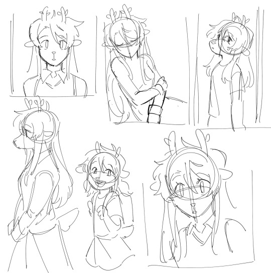
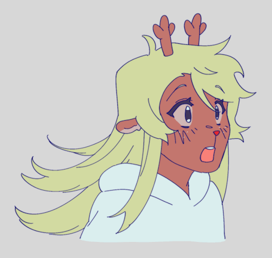
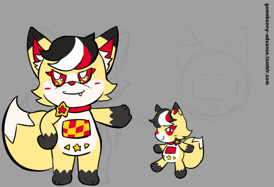
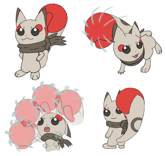
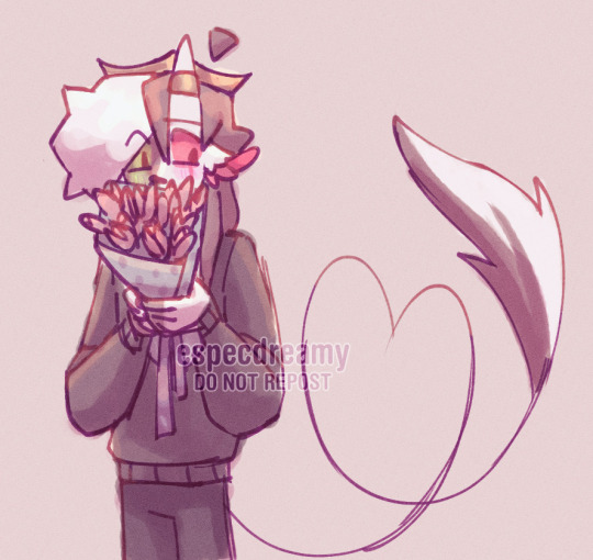
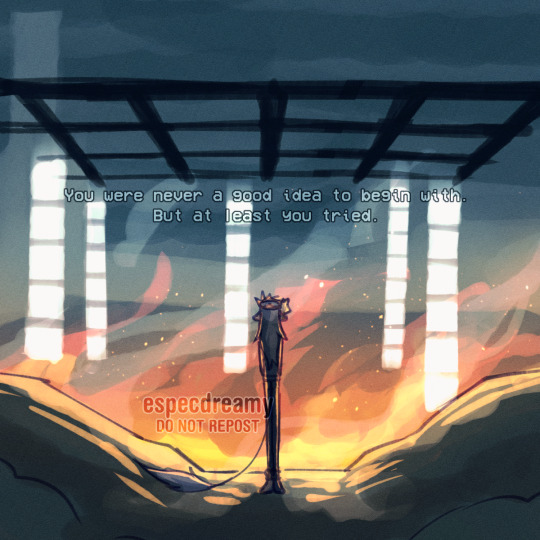
little red riding hood but there's no hood and the big bad wolf is a cat and I don't think there's anything to ride in the forest and ringo could be littler so really it's just. red.
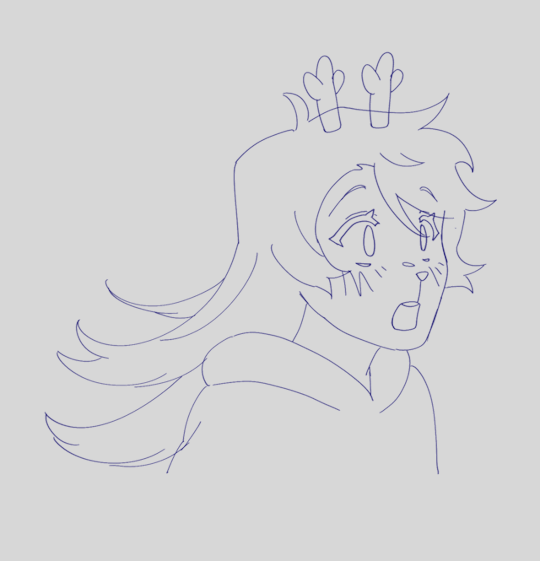
#puyo puyo#ringo ando#ecolo#necolo#i guess i can tag necolo separately lmao even if its the same chara#took part in the eppc drawpile n drew ringo! ive been wanting to draw something little red for such a long time#ever since i properly listened to drama 3-3 and clocked ecolo saying 'the uniform's nice but the dress is a nice change of pace!'#and i zoned in on it immediately. as someone given access to working hands i am able to draw ringo in more dresses and by god im doing it#(even if technically this is a blouse-skirt combo. shh)#also while coloring i tried to limit my palette as much as i could#so everything that shares a color is the same shade and all#much easier to color and it looks cool so win-win!#took artistic liberty with ecolo by making him grey instead of blue but such are the perils. of self-imposed limitations#i traded that out by making the green more blue to fit his original palette as opposed to ringo#(since she got the majority of first color decisions anyway)#anyway it was fun. i love drawing what i personally want to see and making it everyone else's problem#my stuff
84 notes
·
View notes
Note
What was your process for making the Noelle amv, if you don't mind sharing?
hii! im not sure how eloquently or clearly ill be able to explain it but i definitely have some pictures you can look at!
(the video)
i actually got the idea while i was away on a trip with very limited wifi -- it wasn't Trust Me that i got an AMV idea for first, but instead it was one of 4syu's other songs, There's Nobody. for such a happy sounding song it really made me so sad, to the point where if i tried to sing it to myself id get choked up by the chorus LMAO. it was baddd
but basically i was rapidly trying to find both songs on spotify so i could listen to them offline, and it only took me a few loops of Trust Me and thinking about the original MV to make me go "ohhhh. how can i make this about noelle." And so i did .
i was thinking about doing a storyboard, but in the past, i've found that doing storyboards for animations/AMVs lowkey... kills my motivation altogether... SAD... but i saw the whole video so clearly in my head, and i didnt want to make the same mistake i made before... so i went right to doing quick sketches (while still on my trip...) just so i could get the ideas out of my head
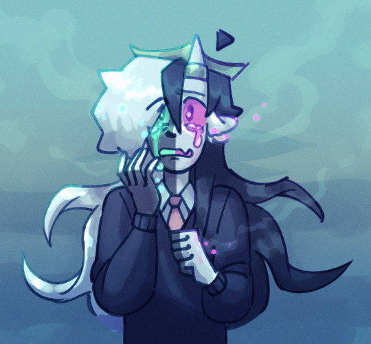
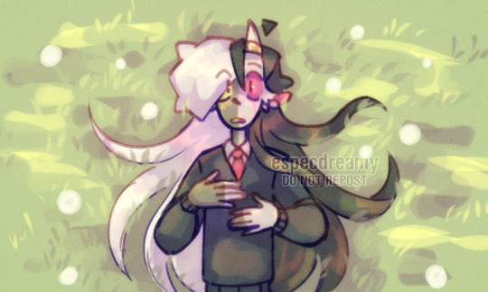
i was torn on what to do with my style at the time, whether i wanted to make it more similar to the original video, or to her canon appearance, or to MY style and how i draw her. i think it kind of ended up as an amalgamation of all three...? at the very least, her light world color palette definitely was more bland and desaturated, like i purposefully wasn't trying to do anything special with her colors.
after that point, and getting maybe a few of the actual drawings done, my motivation crashed again, and i left it all to marinate for nearly a week. it was baking, guys, it wasn't abandoned, listen to me, why are you throwing tomatoes at me,
i had up to about the "I dreamed about that again" animation done and stopped, and it wasn't until i decided to sit down and start editing it anyway that i really got in my groove again. i got all my little assets into a workable state so i could really try to sit down and make the video come to life and all
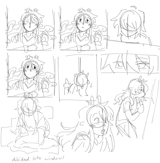
the really fun part was honestly working on the desktop backgrounds. i really wanted to limit colorpicking from the original video as much as possible, but i decided that making look as similar as possible to the original could help with the contrast i wanted to add later.

i drew these two backgrounds first. i was hoping i could somehow fit the bunker into the second one, but decided to do something different anyway. the second one's ui didn't actually change until later in the editing process.

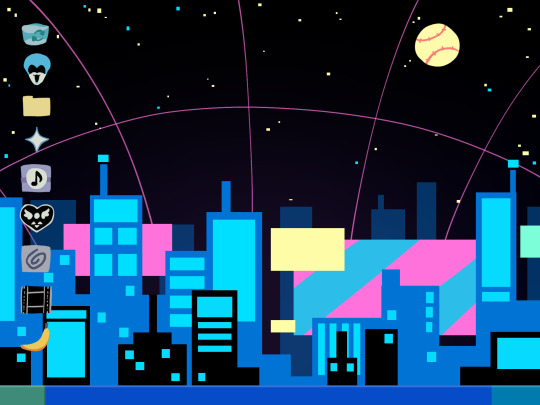
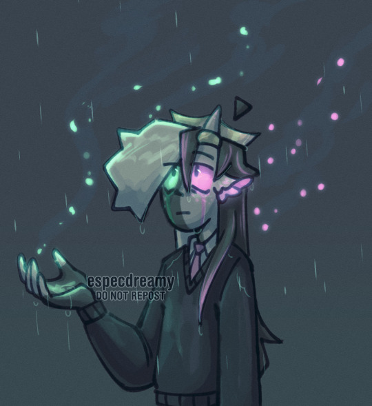
drawing THESE were fun especially, and im happy with how they came out. i think the dark world icons are really cute still. one thing i really did know i wanted to do from the beginning was to turn the soul/undertale icon into the deltarune one.
i was worried if the shift from the Windows Field Background to the dark world would be too sudden, like you would just blink and suddenly it was all different, but i think it ended up all right...?
the not so fun part was drawing all the different boxes, lmao. it go really tedious by the end, so i tried to reuse as many of the same ones as i could.
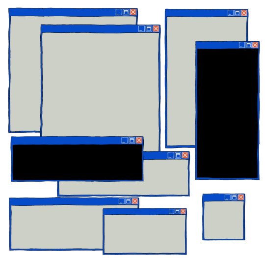
a lot of copy-pasting and tracing rectangles for sure.
i also had to make sure the animations didnt Suck. i brute forced those things and used every last braincell i had in order to make those pictures move bros


fun fact. ive never animated hair like this before. or in any complex manner really. i had to use sooo much brain here... heres how it started vs. how it ended up
had my animator gf hype me up thru the whole thing... i was having a great time based on the filenames alone

aaaand then ummmm i edited it. i learned after effects like 1 month ago. never touched it before. i learned it for internship purposes and then used my newfound powers for evil it seems
i split the whole thing up into multiple compositions of course, but i probably could have split things up more... im sorry for having 84 layers on comp 3 its not my fault
editing a video in 12 fps was a fun change though -- very easy for my brain to go frame-by-frame, and yet still some of the timing ended up being off... tis the goomy way
like i said before, i started editing when i barely had half the drawings done, but seeing it all start to be in motion really pushed me to finish it up. and i mean Really. like i finished the whole thing maybe 48 hours after i first started editing.
and...i think that's it? i do a lot of discord art streaming to friends lately but i kinda kept this one more under wraps compared to usual, i think i just wanted to surprise everyone... look guys i remembered how to make a video! and it's three minutes! waow
sorry if this is way more than you asked for LMAO
also, the AMV hit 5k views on youtube today! ive never had a video do well like that so quickly! thank you!!
130 notes
·
View notes
Note
That clip of Lara saying she's gonna get a full sleeve on her arm keeps putting thoughts in my head about her meeting a tattoo artist reader who she ends up going to almost every time she wants new ink.
They'll spend a lot of time together planning the design she wants. As they get more comfortable with each other, a lot of that planning happens after they've gone out to eat on totally platonic, definitely professional, lowkey flirty '''friend''' dates.
When they finally get into the sessions, on Lara's request, reader does house visits for her (which they usually never do).
The tension between them slowly builds session after session. Reader is especially attentive and caring with her, and they try to stay as professional as possible. Meanwhile Lara is just--- trying to breathe and resist jumping their bones every time she feels reader's hands against her skin.
The last session somehow ends up being less than professionally intimate, with Lara on reader's lap as they finish the upper section of the tattoo by her shoulder/collarbone. Reader's barely put the machine and supplies aside before they're making out with each other. The reader becomes Lara's personal tattoo artists and something more, and they lived gayly ever after- amen ✋🏾
(Hi!! Hope you're having a great day- I love what I've seen on your blog so far and also the colour palette is veryyy pretty 🙂↕️🙂↕️)
(I know you said to drop some thoughts in your inbox, but I didn't expect myself to write this much. I'll probably ask if you could do a longer story in the future but for now it would be nice to see your own thoughts on it--if you're up for it, I think I just needed to let my gay thoughts out frrrrr thank you for the opportunity✨️)
- ✨️
OMG I LOVE THIS
I often think about lara getting a full sleeve too. the idea of a tattoo tour is always in the back of my mind, maybe I will write about it someday...
anyway, back to your ask, lara would definitely be the type to initiate those "platonic" dates, asking reader to design the tattoos together while grabbing coffee.
reader and lara would totally forget the original purpose of these hangouts and end up talking about their lives and interests for hours. not to mention the number of flirty remarks exchanged, with lara always praising reader's ability to draw while flipping through their sketches.
when lara asks reader to tattoo her in her living room, reader feels a bit taken aback by the request but accepts anyway, having developed a soft spot for lara.
these sessions are filled with tension as reader tries to keep things professional, avoiding touching lara too intimately, while lara's breath is just so unsteady, biting her lips to suppress the little gasps she lets out every time their hands brush against her overly sensitive skin.
by the final session, all the tension that had built up until now finally erupts when lara, after reader finishes the tattoo on her shoulder, makes a bold move. she straddles and kisses reader, pulling their face closer by the neck, while reader places their hands on her thighs, slowly making their way to cup and squeeze her ass. 😳😳
you didn't include it in the ask, but I can already visualize how beautifully the tension build-up could evolve into something intimate and steamy, oof... 🫣
btw I'm so happy that someone appreciates the aesthetic and the visuals of my blog. I really put effort into making the pictures and the colors look nice and cohesive, so knowing that at least someone likes them is really heartwarming, thank you anon 😭😭.
also, I actually really enjoy longer thoughts so don't feel limited, write as much as you want, and feel free to share all of your gay thoughts, I will gladly read them and share what I think.
#marty talks#marty anons#answered#katseye#katseye imagines#katseye x reader#lara raj#katseye lara#✨️ anon
34 notes
·
View notes
Text

more of these guys :] (part 1) (part 2)
classpect thoughts under cut! yippee
these absolute fools gave me SO much trouble. i changed each of their classes and/or aspects like twice while drawing this lmao.
pearle was going to be a rage player initially! i had her down as one for the chaos — yknow, ‘red’s my favorite color’ and all that. but the catch ended up being that in this au, as rage represents in-game chaos and bloodlust, it only exists while the game is in effect, and so rage players don’t have much dominion over stuff that happens after that period ends (which has all sorts of delightful implications for grienn’s character, but anyways). meanwhile pearle definitely continues playing and also grows as a character even in times of peace. i was thinking in terms of comparing her arc in double life to secret life in particular — ‘she left the tower’ and all that, yknow? she went from being terribly isolated and functioning on a completely independent scale, winning only for herself, to being a key member of a team and finding a purpose in helping them. which is pretty incredibly space-coded, in my mind! my personal qualification for space players is that they’re destined to be lonely, often physically separated in some way from others, for a while but not forever — because space is about creation, after all. and if you look at being a witch from the perspective of reinvention — what pearle manipulated or reinvented here was herself. she found her place in the story and the person she wanted to be. witches are also some of the most powerful characters in terms of specifically manipulating their aspect, i think, which is great because i’ve heard she's pretty great at pvp lol
ignore that martyn’s color palette is not particularly great it’s hard to unify the design of a character who is super rustblood-coded but also inextricably linked to the colors green and yellow of all things. i’ll redesign him later. anyways! at first i had thought there might not be any light players in this session — since light is about sort of seeing through the laws of the game and often deliberately defying them, as well as having a certain degree of control over narrative agency due to this. and because, yknow, the life series is a minecraft youtube roleplay series, realistically the ccs aren’t going to be playing any characters that go out of their way to completely ruin the game or refuse to play it by the rules altogether. but then i started thinking — and i don’t know an awful lot about martyn’s character so forgive me if i’m going a little bit off the rails here — does martyn want to understand? because if he as a character tries to understand and affect his destiny even though he’s ultimately limited by the nature of the story itself, then he could totally be a light player. so that’s where i was coming from here. think about how he won limited life in the end, for instance — not by playing into what the game itself had been leading up to, but by acting on and finishing his own story. he’s a knight because i do think knights are a certified Narrative’s Little Guy class — they persevere through so much pressure and often also have that sort of dual persona thing, both of which are particularly endearing to an audience. it’s hard work, keeping up with the narrative and fulfilling his own quest for understanding while he’s at it!! but he does it!!
renn is Such a blood player guys he is such a blood player ohhh my goodness. playing the game in terms of your relationships with others, right? basing how you go about it on allies and interactions, and being a leader above all else? i’d say that’s pretty ren the dog coded tbh. i don’t have too much to say here because i think seer of blood renn is pretty self-explanatory — he sees the entire game as a game of relationships and ties. he has a lot of knowledge about this field specifically, and shares it with his allies in the way he helps direct them and keep them alive. the reason he’s blood instead of light is because he puts his allies over knowledge, i think — he’s far too busy dealing with all that stuff to speculate for too long what the purpose of it all might be, and that would detract from his goal (of winning alongside others or dying nobly), anyway.
again questions abt them are open forever always :3
#(<TOTALLY SELF-IDENTIFIES AS A SPACE PLAYER BTW. can u tell lmao)#pearlescentmoon#inthelittlewood#rendog#trafficblr#secret life#lifestuck au#love how u can just slowly watch the quality of the character lineup drawings deteriorate because i want to get to all of them fsfjhjf#i have soooo many thoughts abt how these characters would interact in the context of the game but will save that for another post so this-#-does not become any longer than it already is#(also i know i'm probably coming across as super pretentious abt this au just know i am excited ok! i am simply having fun!)#aurie's art
91 notes
·
View notes
Text


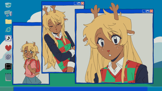
Developing S0-R0 (Sketches)
I just feel like drawing Kun3h0-likes lately, so I decided to work more on developing a "rival" character for her. Right now, I'm whittling away at this design that I'm calling "S0-R0" for the time being.
The 2 pics are the latest drawings, then I have the progress of getting to that point in chronological order. You can see the very first "rival" sketch in the last Misc doodle dump.
When I first went into this project, I didn't have any strong direction for where I wanted the character to go. Since Kun3h0 isn't fully developed as a character either, it was kinda hard to think of a foil to basically nothing. However, I did know that I at least wanted the rival's theme to be "stars" to contrast Kun3h0's hearts. So whatever I did was gonna drift towards sharpness.
The first chronological sketch is almost a straight inverse of Kun3h0's design in terms of palette. I wanted the silhouette of their arms and legs to be roughly similar so that it's more clear that they're supposed to be connected and not (just) that I have a limited amount of body-plans that I default to. I do like the black/green color scheme, but they've got a real "XBox" and "Monster Energy" vibe to them.
The outfit itself was heavily based on these clothes, just to give me a little direction, but the current design really drifted away from this.
(I added spinning bulborb just so the clothes wouldn't stretch out the post too much)
I also borrowed an old idea from my "Digital Idol Kayane" design, where she had some of her elements floating around. I figured since Kun3h0's ears/antenna just kinda "float" that I could apply the same logic to the whiskers. That detail would persist through most iterations of the design, but I eventually dropped them.
But, I was still pretty unhappy with that design, so I made another sketch and started working around it. The first iteration was mostly a palette swap to get away from Monster Energy, so I went with cyan since it's a kinda futuristic color that I thought would go great with the black base. Eventually it evolved into the second iteration where I went back to giving them the pants of the very first rival sketch and working from there. I'm not quite sure where the idea for the spikes came from. I think I just wanted to add some more "sharpness" to really work in the star motif, but then that kinda became the "main" motif beyond the stars.
I thought the black/cyan/red color scheme was really cool, but it kinda works against my established symbology where stars are yellow and moons are blue. In the event that I design a moon-motif character in the GAB universe, it would be odd for them to now not be able to use blue because the star-motif character got to it first. So, I did another palette swap, this time exchanging cyan for yellow and gold.
While I was working on that, I also got the idea to design their mascot to help with the design process. Since Kun3h0 was originally based on GAB, I thought that it might help me come up with ideas to solidify the mascot design first and that would help me design the rival proper. So, I made this little fox fella and have been designing S0-R0 around them since. I made several other palettes for the mascot, but in the end I went with my first design.

Finally, I took another stab at the outfit and landed on this minidress and made the collar comically large. I really liked the idea of this slim body being covered in large, overbearing spikes. I also took out more of the red accenting since I wanted to limit their palette as much as Kun3h0's, which is a neutral + 2 shades of the same color + a pop of one other color for small details.
It's not perfect yet, but I do like this direction. I went with this for some rough characterization: While GAB sought out someone with a strong heart to help them, FOX (name not final) sought someone with physical strength. Unlike Kun3h0 who is more emotional than a robot ought to be, S0-R0 tries to complete tasks as efficiently as possible, which leads to them using physical force to address most of their problems. They're not evil per se, they just don't consider the greater ramifications of their actions if they still ultimately complete their original task.
I haven't drawn it yet, but I think their weapon would be a morning star/flail.
15 notes
·
View notes
Note
I'm so sorry if it's too long but I just did a reread and decided to take a look at the designs on Toyhouse and it reminded me how much I love IHS.
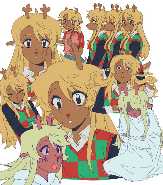
I love all the designs of your characters, they are so deliberate. Take the Golden Grove family for example. Their fur colours perfectly match the name of this pride - all characters from this place are golden/have fur that's a certain shade of gold. Just by looking at them you can tell that they're related. But that's not everything.
I looked at the designs of three sisters and their parents and I noticed how some of the traits of their parents can be found in their daughters. Vicious is almost a copy of her mother Watchful, while Clever looks so much like her father Wild. They all have respectively a similar coIours and face shapes. In all of that Careful, the middle child here, is a perfect combination of her parents - she has her father's muzzle shape and eyes shape but her colour palette is more like her mother's. All marks are placed with so much thought that they help to recognise a character. The funny thing about the similarities with parents is that you probably created sisters first and then their parents - so you actually had to take a look at the sisters and then create their parents. While making sure everything made sense.
I tried to find similarities with Hope, Adamant and Quiet but I find it a bit harder, maybe cause they're still young. But older Hope definitely reminds me of Clever and Careful, rather than Vicious. Maybe it's the fur on her cheeks. I noticed that Adamant has the same fur colour as her grandfather, Jasper the First and I find it cute. And of course, how could I not mention Breccia and her freckles that she gave to all of her grandchildren. I love them <3
What I mean to say is that I adore how much thought and effort you put into your story. Every time I reread I find something new to adore. I love the plot and world, but I really like how you also put effort into your designs. You manage to make all characters stand out and be easy to recognise but you also find a way to make sure that audience can tell who is related to who. Thank you so much <3
And tbh I really like the new schedule with a page for week.
Well first of all, I do love a good wall of text, so don't apologize haha
Second, I'm glad you like the new schedule. It's actually activated the speculation part of the fandom, which we also love LOL
Third, THIS MAKES ME HAPPY! I love when people go back and notice the details we included. I did work backwards from the sisters to the parents, just because we had no intention on showing the grandparents, but people asked and I thought they'd be fun to design too. And they were! (This is to go with a previous ask, but this is also part of why we did away with color-coding, just cuz Wildfire looked great as a blonde, but maybe he's from somewhere sandy, who knows.) And it was interesting distributing all the different characteristics of them. Still not satisfied with Careful, I wish I'd thought on her a biiiiiiiit longer. I just didn't think anyone would care about her LOL
Hope will look more like Clever when she gets older, so once I can properly elongate her face, it'll be more obvious. I'm slowwwwwly gonna show them aging, Storm's hair will get longer, Adamant will be more buff, stuff like that. Right now (and people will see this on next week's page) Hope actually looks pretty similar to Careful. Careful just has to pull some more... Hopelike faces first for it to be obvious haha
Overall I'm happy with the designs and it brings me much joy to have people analyze them. Character concept is one of my favorite things to do, and I like being creative while being limited at the same time. Lions are a good way to practice that. So thank you again! - Cat
#ask#ask us stuff#cat answers#golden grove#vicious#careful#wild#watchful#clever#hopeful#adamant#jasper the first#breccia#thundering mountains
35 notes
·
View notes
Note
Hi!
I just wanted to say....
I really love your Gentle Hands comic!! It brings me a lot of joy because I'm a history nerd and I love war and pride history, so seeing the two combined makes me feel happy!
I love your art style in the comic and I've already begun to love the characters! The colour schemes you've chosen have a really wonderful effect and I just love it!
If you have any lore you want to spill, or even just explain it more, I would love to hear it!! Your story is swell and just ARGH-
Anyways, sorry for the rant. Keep being awesome! Can't wait for more!
OMG THANK YOU SO MUCH 🥺🥺🥺🥺
And thank you for taking the time to reach out to me!! This just made my day! 😭😭💝
Thank you so much for the rant, I will absolutely give you some random lore 🥰
Ordinarily, I'm not so great at being put on the spot, I fare best with specific questions. But because you mentioned the color palette, I guess I'll start there. 😅
I chose a limited palette because I didn't want to stress with full color, and it just made the process a whole lot easier. But I HATED the idea of doing a black and white palette because they just feel so boring and two-dimensional, in my opinion. So I opted for a sepia color palette to emulate the vibes of old yellowed photographs and to give the colors more depth. This also turned out to give everything this sort of metallic glow, which I quickly ended up taking advantage of.
The lighting itself is very strong, also intended to mimic the harsh contrast of early photographs. There's a lot of glares and bright lights that most artists would tell you to use only in moderation. But I can't be bothered.
The story starts out from Dmitri’s perspective. Since he is an injured soldier in a foreign place, I wanted the reader to subconsciously feel that through the art. Which is why I withheld backgrounds for nearly half a chapter, used Russian in the onomatopoeia, make the lines shaky and the light so strong. If you look closely, you'll see that the blurred lines disappear as Jadyn and Sonya are introduced, and the glares seem to only follow Dmitri, especially around his head or things he's looking at (and they even dissappear when the story shifts to Jadyn’s perspective).
I actually wrote and did the art for most of issue 1 while concussed after a car accident, and I tried to emulate that foggy dream-like feeling as much as I could. Unfortunately, it does mean some of the art is a little jank 🤣
But uh, yeah. The "shojo glitter", as people have been calling it, has an actual significance and isn't just me going crazy with the shine filters.
That's maybe enough for now. I don't want to bombard you lol.
But thank you so much, again! Never apologize for rambling at me, I LOVE people in my asks and I love talking about my work ::]

One of my favorite panels as a treat. Lol. Idk. Felt like I needed to put an image here.
#gentle hands#leonardo eats carrots#lets try artemy#webcomic#comic#history hyperfixation#webtoons#tapas#my art
2 notes
·
View notes
Text
rambling about art struggles (sorry)
i think what's limiting me during drawing is that im thinking too much about line art / not knowing how to combine line art and color in a manner that im satisfied with
really sorry for how rambly this gets forgive me (this is also barely edited and im barely conscious)
95% of the art i made in my life has been done traditionally and in monochrome; usually i dont bother to ever color it bc i only had access to shitty colored pencils and everytime it would always fuck it up, constantly smudging into each other
4% of the time was like when i was in middle school and discovered how to fucking pirate paint tool sai and i blindly did whatever i could with a mouse (read: i gave myself carpel tunnel a lot lmao). i think i still have access to like 4 drawings i did thanks to google photos and the only ones i can really look back on positively were the line art ones and even then thats cause i used deviantart bases lol
heres the literal 1%: i did an art class back in late 2020 - early 2021 (can't remember what level it was? or what it specialized? it was the third art class i ever took. it might be intro to painting?) and i got to use acrylic paint for an assignment! i fucked up using it because i painted it with the goal of filling up the insides of the lineart instead of using the palette knife to create texture. my subject was an otter in the water (fun thing to say) and the assignment was to create some form of pop art, depict contrast w color (otters are brown i know, wanted to use orange highlights against the blue water) and to show i know how to depict varying textures (fur, liquid).
i did not know how to fucking do that!!! couldnt get any help either due to covid fucking happening and my poor ass's only connection to the internet was my fucking phone data and it was draining fast LMAO
the reason as to why i was so poor was because back in October 2019 my life fucking got flipped upside down and i had to give up a lot and had to desperately try to find a job while being a student. (will not go into specific detail due to me not wanting a pity party about it and it being too personal. im only going to say that caregiver burnout is fucking hell)
a prior assignment to that class had us practicing on depicting textures on some sort of paper (it was stiff yet bendable iirc) with a white and black color pencil (white for fur, black for eyes). i was watching aggretsuko at the time and fenneko is a fav of mine so i picked that type of fox as my subject. im really proud of the way i depicted the fur but fucking hated how i fucked up the eyes. was supposed to show the "glossiness" of it and i dont have a pet irl to reference so ahhhHHHH it ruined the piece for me. pretty sure i have it saved somewhere but since its not fandom related im hesitant to post it.
overall the class made me realise that regardless of skill i rlly like drawing textures and i dont really understand why? tried to reasoned it out to be that i just really like textured blankets and that theyre comforting. i purr like a fucking cat when i like hug one and i hate it
i feel like nowadays with how scatterbrained and stressed i am i visualize blobs of color in my mind instead of clear subjects with clear outlines. i feel like i need to embrace that side more (or at least try starting with that when doing digital art). maybe now i wont be so fucking stuck and pressing ctrl z all the time lol
#wow an actual post from me instead of a reblog#rambling here#might delete it or keep it idk lets see what post work me will say in like 12-18 hrs#im damned and screaming out of embarresment
3 notes
·
View notes
Note
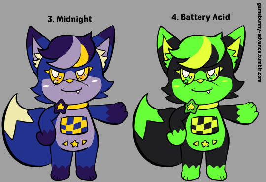
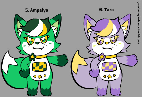
Talk Shop Tuesday: what's your process for designing a new character? How do you determine things like their color scheme or what animal they're going to be? Do you usually spend a while refining your characters, or do they come to you all in one burst?
Okay so it's been a while since I last designed a character, but there is some method to my madness lol
For Mist and Spark, I wanted there to be a lot of contrast between them while also having stuff that ties them together - hence both of them sharing an accent color (yellow) and being dogs, while their main colors are complementary and their other species are very different
For the rest of the main six, I just asked my friends for two animals they like lol (with the stipulation that apart from Fern all of them had to be mammals)
Their colors... I don't remember how I did that part. I think I was going through the color wheel trying to pick something interesting for all of them, but I do know there was a lot of tweaking involved - Rowan's color scheme used to be a lot lighter, Dew used to be purple instead of orange, and Fern took quite some time to get the pink and black color scheme. For the girlie ever Basil, her color scheme came about just from her species, since she is a coral snake
For the side characters, most of them are just one-off archetypes that I end up messing with until they're something unique; like with Basil, I wanted her to be this sort of really sporty person and gave her a slightly more butch appearance than my female characters at the time, but that developed into her current style that I *think* can be categorized as punk, with the leather jacket and combat boots and all that.
Believe it or not whether I go with the first draft really depends on the character LMAO like with Dew and Via I had three separate design phases for each (Dew especially took a lot of tweaking and experimenting to get his hairstyle and color palette right), meanwhile Mist has been pretty much stagnant design-wise if you don't count his outfit changing as I got more and more experience with drawing clothes
The amount of designs I do also depends on a lot of stuff, like I did a whole burst of eight side characters at once (and haven't drawn any of them in months lmaooooo) but sometimes I just don't come up with anything for a while, especially right now that FGCC has hit a point where it has a good amount of characters and the other stories are mainly developing dynamics between characters I already have established
Now, with all those messy ramblings out of the way, here's how I would design a brand new character right now:
Think of a role that needs to be filled. Like, uhhh, the Calculus teacher.
What sort of basic premise can I go for here? I already have a concept for the Chem teacher (he'll show up for a bit on Rowan's Birthday) and he's a really chill teacher that doesn't mind if the students' methodology isn't perfect as long as they understand the concepts and get the right results, so I could go for the polar opposite: a really strict teacher that wants every aspect of the subject to be done perfectly, with little room for error
In terms of species, I think I could go for some more non-mammalian characters, as a way to make my lineup a tad more diverse, so how about an owl? It's a tad stereotypical, but I think it could work to kinda show their more strict and stern nature. Plus, there's a ton of visual variety in owl species irl, so there's a lot of design potential both if I limit it to a single species and if I mix and match them
Then I'd actually draw the design, mostly paying attention to their build, clothing, and animal features (I tend to forget stuff like wings at this point so it'd probably involve a ton of tries lol)
After I'm satisfied with how the design looks, I take a picture of the final sketch and draw over it on my phone, and this is where I actually choose the color palette. For this one, I'm thinking a simple palette is best since they'd be a very minor side character, so maybe something like a mix of grey and either blue or red. Blue for the usual color theory associations (and also tying them to Mist a bit since they're both rigorous) or red to tie them to Via, since Via's plot has a few ties to Calculus specifically
And done! After that I'd probably draw the character a lot until they've ship-of-theseus'd into something unrecognizable (like Dew who has changed almost everything in his design lmao)
Thanks for the ask! Sorry for the really rambly answer akjsdhaskjhdjkas
2 notes
·
View notes
Text
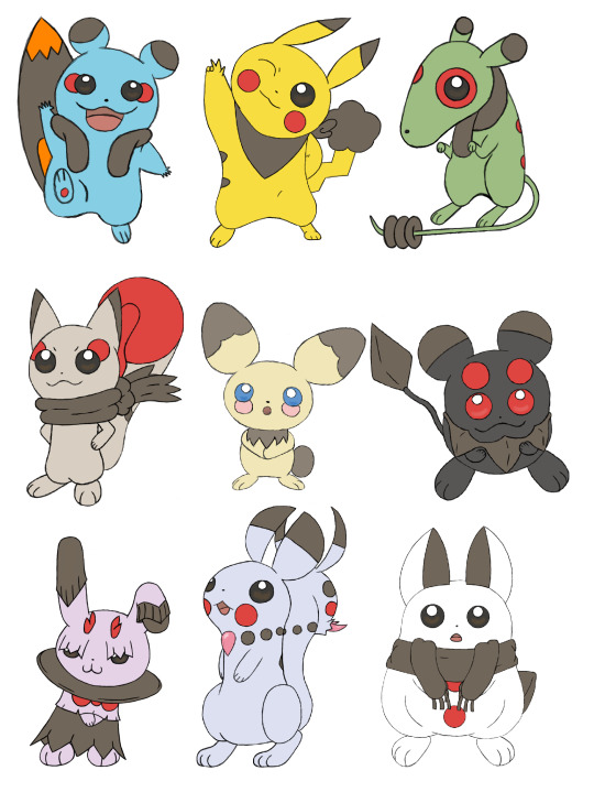
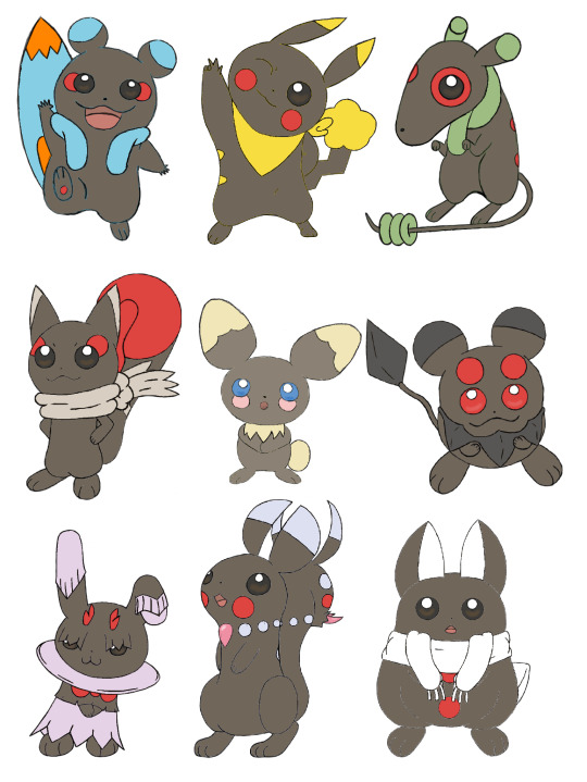
So, on October 19th 2021, exactly two years ago as of posting this, GinjaNinjaOWO over on the YT did a very fun video discussing swapping the concepts of Pokémon's two mascots, Pikachu and Eevee. That was also when I was really getting into the swing of character/creature designing, so I wanted to try my hand at it myself. I did the original pass in about a month, but recently looked over them and went "I can do this better," so here we are.
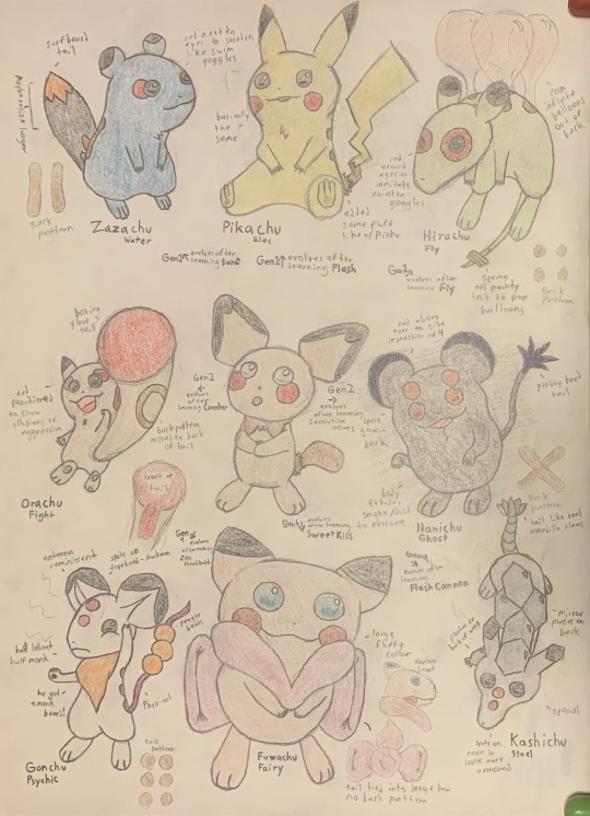
Here's the first pass from 2 years ago (before I got my tablet). I kept the first few designs I worked on, adding new concepts and motifs while scrapping the final 3 designs I did. When I did them originally, I think I was feeling a bit of burnout by the end, and was just going with the first things that came to mind, rather than coming up with something really creative.

Pichu was the first one I went back over. Originally, I just tweaked June's Pichu concept designs as I was more interested in designing its evolutions. The one thing I did keep from that first draft was the cheek placement under the eyes. All baby Pokémon reference something babies do, and having these faux-tear marks that then further evolve into other things as it itself evolves was something I liked and wanted to keep. As for the patterns, I wanted to go with something very generic, or template since it was going to evolve into 8 different rodents. I also drew it in multiple poses (something I did with every design), as movement is very important to modern Pokémon.
Zazachu was the third design I worked on (we'll get the the second later). With aspects like the surfboard tail and life vest fluff, it very much informed aspects I would add to all the other evolutions. I also tried to keep the colors in mind. I imagined this being one of the three Gen 1 evolutions, and Gen 1's color palette was very influenced by being sprites first, so I tried to choose colors that would be distinct when grayscale.
The second new Gen 1 design is Hirachu, a Flying-Type. One of the things I was trying to keep in mind was to not limit myself to the Types Eevee uses, and instead use ones that fit either Pikachu or the gimmicks I wanted to use. Since Pikachu was well known for learning Surf and Fly in Gen 1, I thought I'd incorporate that not only into its Types, but into its evolution method, having Pichu evolve into Pikachu, Zazachu, or Hirachu based on whether you teach it Flash, Surf, or Fly (all of which are HMs and have infinite uses). In Gen 1, I imagine it would evolve immediately after learning the move, but this would change in Gen 2 for reasons we'll discuss soon.
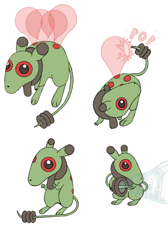
As for design elements, its spots and fluff are meant to invoke an aviator scarf and goggles, and I think I did a good job of illustrating how it uses its tail. I imagine the balloons are created by it secreting a sticky substance from the spots on its back to mimic how Pikachu would summon balloons when it used Fly in games like Pokémon Stadium.
We now move onto the Gen 2 designs with Orachu (which is a Jojo reference). Most Pikachu-like, and all Eevee designs are used to demonstrate a gimmick introduced in its introductory game. Pichu is breeding, Plusle and Minun are double battles, Pachirisu is the physical-special split, Dedenne and Sylveon are Fairy-Type, Pawmi is movement-based evolutions, Espeon and Umbreon are the day-night cycle, and Glaceon and Leafeon are location evolutions.
I wanted to keep with the breeding theme Pichu used in Gen 2, as well as the evolution method I started using in Gen 1, so Orachu evolves by leveling up while knowing Counter, which Pichu could only learn through breeding in Gold and Silver.
But then, if Pichu evolves by leveling up while knowing one of four different moves, what would happen if it knew two or more? That's where our second Gen 2 design, Nanichu, comes in. This was a design I had a lot of fun with. It's a Ghost-Type, and I thought it'd be cool to make its eyes and cheeks match and glow in the dark (similar to Umbreon) so that it looks scary if you came across it in a dark alley (or your pantry). As I evolved the design in the second pass, I added the scruff and changed up the tail to add even more to that theme.

As we move onto Gen 4, I wanted the two designs to be based on the physical-special split. Originally I had a physical Psychic-Type and a special Steel-Type, but I wasn't happy with either of them, so I scrapped them both and started fresh. The first new Gen 4 design I made was this special Dragon-Type, Ukichu. I liked the idea of a rabbit coming out of a hat, but to tie it more into the magical elements of Dragon-Types I incorporated a lot of elements from the Jackalope and Wolpertinger. I moved the cheek spots to below the collar to mimic a bow tie, but also made the horns on its head red to keep that visual element present in the face. This one feels a little busier than all the others thanks to the fluff, but it still feels like it fits.
And as Ukichu is special, its partner in Gen 4 had to be physical, hence the Ice-Type Sharichu. I feel like there isn't a ton to say about this one. I made it very snowman-y, and had it so it could freeze over the brown parts of its fur for attacking or defending. I think I did a good job of illustrating how it works.

And as both Dedenne and Sylveon were Fairy-Type, it stands to reason my Gen 6 counterpart should be as well. My first take on Fuwachu was very just-Sylveon, so I really wanted to break away from that on this take. As Fairy-Types are heavily associated with both being tricksters and gemstones, I tried incorporating both those elements into this design, with the necklace motif, crystalline tail claw, and its tail resembling itself from the back to trick others.

And the last design we'll talk about is Pikachu. Of course. This is actually my third pass on Pikachu, as I wasn't happy with my second. It stuck too much to the original and didn't incorporate some of the elements I used in the other designs. I still didn't change a lot, adding the tail cloud on the second pass so it would have the brown element and functionality all the other evolutions I made have. And on the third pass I gave it an adventuring bandana, which felt on-brand for Pikachu in any universe.
Overall, this was a fun experiment, and I can imagine how easily you could expand upon it. If Pikachu and Eevee are swapped, then is that true of the show? Since Meowth is a cat chasing a mouse, would it be swapped out to match Eevee? What Eevee evolutions would replace the Pikachu clones? How would all these things domino to affect the series? etc. I drew 43 Pokémon for this in total (not all pictured here), so it was a lot of work, and I hope you enjoyed this little design doc, or at least the pretty pictures if you didn't bother reading. And here's the crappy shiny edit, if you're curious.
9 notes
·
View notes
Note
[Ni/digitalgate02 here] See, this is what i've been thinking for ages and i don't like to limit myself into what is stated on wikimon and other fansites' databases to make lines... They're not a mandatory rule, and with things like the new TCG DigiCa they just embraced the wild combos you can make and evolution rules are by card color and not by specific lines (tho they do have some... suggestions now on the cards, i think?)
i also like the wild combos like Tailmon's OG Adv/02 line?? Which is slime → cat blob → puppy → cat → angel woman → PINK FLUFFY DRAGON
I wish we had more things like these... At least consistent theme, but not like Agu → Grey → MetalGrey → WarGrey sort of line... (and look, i love this line, it just... I love the design + shapes to change a little... ya got me?)
i love most of the main kid/protag mons and their forms, tho...
Like to be fair to Toei/Bandai, there is partially a reason to why the main partners especially tend to have such linear, specific evolution trees; not only because it makes the Digimon easier to sell, but also because the characters need to be easily recognizable to small children. Like the main character(s) having really bizarre evolutions could make it hard for a child to keep up with who's who (especially if they missed an episode), while having very consistent and strong thematic and color coding (etc) will make it always super easy for kids to keep up with. So I understand WHY the main partners tend to be the way they are, it just is the way it is. (It's also why I really loved the evolutions in Survive because aside from Agumon's Vaccine-line, that shit was WILD and I was LIVING for it, Dracumon alone had me losing my fucking shit, Floramon too)
Also I do feel like the emphasis on evolution lines is something the fandom tends to enforce more than Bandai/Toei. And, much to my shock and horror, a lot of people do kind of dislike wild evolutions, some people prefer the Pokémon-esque strict evolution lines. (See: every person who has ever made fun of Tailmon's evolution line for "not making sense") So often I see people share their Tamer OCs and their partner Digimon with full evolution lines and more often than not it's just a known partner Digimon with their default evolution line. Everybody has their own comfort food, and strict evolution lines are just that for some people. Which is fine, I'm just a little 🔪 if anybody tries to enforce strict evolution lines in places they don't belong (aka any space for creativity)
But indeed, I wish we could see more Wild Evolutions in canon more often, or at least have the main partner's evolutions change things up a little more than they tend to (honestly probably the best protag evolution is Gumdramon -> Arresterdramon, like despite the mostly identical color palette and many key visual elements, they really do look nothing alike and yet the evolution feels like a natural progression and is still easily recognizable, really love that.)
#Part of me wants to defend Agumon because I feel like the issue is more with the Greymon line than Agumon#Like Agumon is basic enough that you could easily see the baby evolve into a fuck ton of other things (like Tyrannomon or Seadramon etc etc#And I kinda feel like Greymon is still like Different Enough since the baby gets stripes and the horn and changes from yellow to orange#(Compare to like Guil -> Grow where Growmon has like. A pair of horns and a mane. And extra toes.)#(Like honestly I feel like the bare minimum is that if the design otherwise stays super similar at least change the main color!!)#(Even just a little just change the color!! Like I love ExVeemon but COULDN'T HE BE A DIFFERENT SHADE OF BLUE FOR THE LOVE OF GOD)#(Same for Growmon. Just make him a different shade of red for fuck's sake)#(Unironically BlackGrowmon would make for a more interesting default evolution for Guilmon that vanilla Growmon)#But then MetalGrey (MY BELOVED) DOES LIKE. Very little to add to the mix. WarGrey does change things a bit more but now that much in the en#Text post#Again if anybody reading this prefers strict evolution lines that is perfectly fine#Everybody got their preferences
11 notes
·
View notes
Text
so i've been extremely overwhelmed by....... i guess everything online lmao, it's really hard to focus on things when you're constantly bombarded with things you don't really need at the moment
i'm trying to get back into journaling but damn it's so hard. i know my head isn't empty, i spawn walls of texts almost daily, but my mind goes blank when i'm in front of an open notebook because i don't know what's truly worthy of writing down? it's kind of like with drawing at this point. i'm stuck with the art block because i don't know what's worthy of drawing. and guess what made me feel this way? the social media lmfao. i hate that literally every idea i consider cool i never depict because my brain immediately goes like, "who cares about this?", "this won't get noticed and also you're too late, so don't be cringe", etc
i hate this so much idk. anyway, i think i'm going to make a list of things to focus on, both personal projects/artistic inspirations and fandom related ones. i do have things i overfixate on for years, so why am i letting myself be distracted by some random content ideas that only matter to me for like a day or two...?
i should also start limiting inspirations in general, looking at my folder rn and realizing that there are just WAY TOO MANY things i want to incorporate into my work and it really overwhelms me. reminds me of various artists saying that "less is more" and holy crap i should start limiting myself. this is something i slowly started to realize on my own when i did some pixel art, which is limited already due to its nature, with some color palettes instead of randomly staring at a color wheel for half an hour, not being able to decide which one to use.
also i found out about artfol, social media for artists, and so far it seems promising? haven't tried it yet, maybe i will upload some stuff there later. also maybe i'll finally sort everything here on tunglr dot com and make a separate art blog and will use this one as my "main"-diary-esque blog where i won't post much. it's not like i'm on here anyway, my dash feels overwhelming so i don't even scroll past 3-4 posts a day anymore on here. i'm tired of social media. it doesn't feel personal anymore, it's not fun, not interesting...
fomo effect used to fuck me up before something clicked and i stopped scrolling things. because due to nature of the modern internet, i have more chances of stumbling across useful/interesting information if i just keep scrolling through junk. since as you know, google is dead anyway, shit is hard to find these days, and indeed, every cool thing i managed to find was through random braindead scrolling (post 2016 i mean, i miss mid 2000s era when stuff was actually GOOGLEABLE and you didn't need to scroll long ass feed to stumble across cool things, you could get there at your own pace while just surfing the web). so the habit was made worse by "damn what if i miss some obscure post that features obscure cool thing that will matter to me once i get to know it??" but i'm just so fucking exhausted... everything i love about the internet because so dormant, niche even. the internet, as i define it, is dead to me. it's really heartbreaking
5 notes
·
View notes
Text
More thoughts on Persona 3 Reload below. This is gonna be a long one.
I'm gonna start with the gameplay because everything I know about game design comes from watching videos. So I am a dilettante at best, and my opinions pretty much come down to "did it feel good to play?" And God, did this game feel good to play. I've seen some criticisms about the shift mechanic and how it trivializes difficulty, and the capacity for very high damage even on the highest difficulty. I played on normal, so I can't speak on that, but this comes down my fundamental philosophy on difficulty in games. To grossly oversimplify, games rely on mechanics and story to keep players engaged. Difficulty falls under mechanics here, and great games will use both to give players a good time. But you can sacrifice one if you make up for another. Some visual novels and almost no gameplay, and almost no one is playing Mario for the story, to give two extremes. As such, I think Persona 3 is more than engaging enough on a story and characterization front to make up for a rather easy time.
I think the boss fights are where the combat suffers, because I don't feel any inclination to use interesting strategies. It's just buff, debuff, and attack. The one time I used an interesting strategy was after I died to the Hermit, and decided to switch up my team, bringing Shinji, Ken, and Aigis. I kept Aigis' weakness safe with Makarakarn, buffed with her and MC, and then just let loose. Every time I tried using a status, it would be blocked (which also made Mitsuru feel limited in her usefulness, since that's her Theurgy characteristic), so I just stopped trying. I find it weird that resistances to status effects aren't included in Fuuka's scans. Also, the Monad Corridors provide opportunities for interesting strategies, but unless you want to die once to scout or consult a guide, it's really unlikely that such strategies will work. All that said though, I think the combat and gameplay was engaging enough. It just relied on being a power-fantasy often, between chaining 1-Mores and Theurgy skills. And even then, I did have tense moments while traversing Tartarus, so it's not like difficulty was completely absent.
All in all, though, the game was immensely fun, and holy crap, everything felt so satisfying to navigate. Menuing was instant and load times were practically non-existent. I can attribute some of that to playing on PC (mine has decent hardware), but even older games aren't as instantly responsive as this one was. This leads me into design. Every aspect of this games design is gorgeous and cool as hell to me. I've seen a lot of praise for it already, and with Metaphor on the way from Atlus, it seems they've picked up after P5 that people love stylish menus and want to continue that. That said, I do have incredibly slight reservations about it, precisely because P5 did it first. Everything being off-kilter fits with the game being about rebels, and P3 doesn't share that identity. However, asymmetric design doesn't have to be restricted to only being a thematic reinforcement; it can also just look cool because. I actually think P3R does a good job of retaining the look of OG P3. It had pretty standard, inoffensive menus, and it's primary way of making it look cool was through the color palette. P3R manages to retain the streamlined blockiness of the original while introducing asymmetric elements in a nice balance. For instance, compare how the date looks in Persona 5 as compared to P3R. I won't harp on it too much longer, because I could pick a ton of details to focus on (I will bring up the Theurgy menu though. So cool). The game is also just overall gorgeous. The models, sprites, animations, effects, everything is great. It's notably more saturated than the original, which I thought was an interesting decision, but ultimately it doesn't affect me either way. I think it suits the overall art direction, but had it been different then a desaturated palette would've worked fine.
The voice acting is great and I think suits each of the characters very well. Since I played a bit of P3P, it took some getting used to Yukari and Junpei's voices (since I was used to Michelle Ruff and Vic Mignogna). I've gone back and listened to some of the original dialogue and I frankly think some of the voice acting from back then was bad. Fuuka and Aigis especially sound very awkward. That was intentional for Aigis, but even then, it sounded to me like someone doing a robot voice poorly, and I can't quite place what's off about it to me. In any case, I think her new voice is a marked improvement, and I like that she still manages to make her sound like a robot because, while she has no problem with inflection anymore, she always speaks quietly and extremely evenly. It's the evenness of her speech that gives the robot vibe this time around, I feel. Also, Ken actually sounds like a kid, which I appreciate. As someone who wasn't really familiar with the original cast, I think they nailed the casting this time, no character's voice felt off.
Speaking of the cast, though, I love the characters so much, every one of them, in the main cast, at least. I enjoyed a great deal of the social links as well. Ignoring the ones with party members for now, I think my favorites were the ones with Maiko, Hayase, and Akinari. Although I'm looking over the list now to refresh my memory, and it's really hard to pick favorites on this. Akinari's is peak, of course. I think I went into it with too high of expectations, because my friend told me if I did any, I had to do his and that it's the best in the game. Ignoring those with party members, I agree that it's the best, but my expectations were placed too high. In any case, it's an incredibly touching story with an excellent message. I didn't end up doing Yuko's, Hiraga's, or Bebe's all the way through, but I almost finished Yuko's and got a few ranks in to the others. As for the main cast, I could be here forever if I got into every character. This post has gotten long enough as is so I think I'll make a separate one giving my thoughts on each member of SEES, Strega, and Ryoji. I think I'll also discuss the plot and themes in that post as well, or I might separate it again.
1 note
·
View note
Text
Taking you on a journey about it. Okay? Skipping around a lot. But bear w me.
Moe Color Theory. There are a few Stages of it. Offshoots.
1) I choose a typically non-gendered color (geen 💚)
2) In a project I never finished, vaguely ballroom scenario focused on Moe and Sharena. Both are wearing pink. Moe is still presenting masc. This is significant. There's gender in here.
2 and a half) Red vs Pink. This is also significant. Something something Sharena's peachy light blonde into pink vs Moe's rusty red roots growing in into the worst at home bleach job you've seen in a while. There is also gender in here.
Enter my first concept.

Okay. We got pink. We even got red. I liked the idea of the pink becoming saturated into red, almost like blood. Kinda epic kinda cool absolutely fits that theming. Okay.
The Problem: I'm just not vibing w it. I complain a lot about the color palette overlaps in the fairy designs. I'm basically just reusing my Mirabilis ideas.
Moe Color Theory. Again.
3) It feels a bit cheap to put it in blue as a gendered statement tbh. Like... when I use pink as a gender color for Moe, it's never in the sense of dysphoria. It's about honoring something. Take what you like, leave the rest. Craft what you've taken into something new.
That said, due to color palette restrictions, and just fucking around. I came up with this

Okay. I feel like I'm onto something actually. I'm liking the blue rose theming (something that doesn't exist). I'm liking the blue with the gold accents, a tie to Alfonse in a way. I've also Realized Something. Somewhere in here I've had the thought of mixing both sweet dream/nightmare fairy motifs -- the pastels/bright colors of the light fairies, and the thorns of the dark fairies. So color theory time. I mix a little pink in there. Okay. We got blue with a hint of pink. Okay. We even got purple. A classic go-to accent color for Moe palettes but also a combination of pink/blue (red/blue if we're being pedantic). What now?
I veer off into something else entirely.

I spend way too long looking up butterflies and moths. Obviously the luna moth and rosy maple moth are Right There in the forefront of my mind bc have you SEEN them........ but sifting through different lists I find something promising. Yellow pansy butterfly. I did feel like I could lean heavier into the pansy motif. Hell I could lose the rose petal bloomers and make them pansy bloomers. The shirt is rose petals anyway.
MOE COLOR THEROY. ONCE MORE.
4) I've found, multiple times, the hard way, that Moe color pallets work best when they're largely neutral/natural colors, with limited pops of color. I have to use these pops of color So Sparingly.
It has all built up to this.

... No, that's too much color. Plus the pink/yellow is giving Mirabilis again.

Alright. Well. There is no going back from that. Trust me I tried. I DO think this is the right direction, but I'm still not entirely satisfied...........
I'm kinda attached to the purple accents, as the color theory goes. But for a few other reasons as well -- literally none of the fairies have significant purple in them. Mirabilis and Peony have purple eyes but that's about it. I also just think. Imagine a pansy in your mind. It's probably purple. They come in a lot of colors! A part of me wanted to see If I could still have blue on the bloomers... but a part of me worries it would no longer be recognizable. One part of me wonders if I should do yellow pansies, or if that would be too much yellow. I do think the purple/yellow is a good combo that compliments everything. In the way back of my head I'm thinking about dandelions, but how in the hell am I gonna fit those into this design I barely found a place for the forget me nots.
IDKKKKKKKKK I JUST FEEL LIKE IT NEEDS MORE REFINING.......... AND IT IS A BIG DEAL TO ME......... AND I DO HAVE LINES/DIALOGUE CONCEPTS AND LIKE A DOZEN OTHER THOUGHTS AS WELL........
But.

I am in So Much Pain.
I'm not making it out of this resplendent concept alive.
#moe tag#i. am so split on sharing this bc i am so halfsies about it. like if i share this will this be the end of it#will my perfectionsim and deep need to capture my exact vision win#or will it just be Gone as soon as i release it from my brain. no object permanence. i forgor.#still i am so mad about it. an entire day. wasted. overworking the hell out of my pencils.#just had like a deeply unsatisfying day about it. no progress was made. in my art AND my shiny hunt.#ALSO. ALSO. IT IS SOOOOO HARD FOR ME. LIKE MIRABILIS JUST KEEPS HAPPENING TO ME#but i Love Pinks.............#i'm getting too tireds i need to sleeps. goodb ye forever you piece of shit (this concepts)#my art#moe alts
15 notes
·
View notes
Text
Devlog #8: QA and Q&A
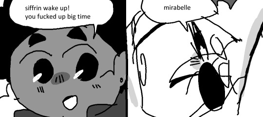
(all the screenshots i have left are spoilers. while i take more, have a meme)
Hello everyone! Welcome to this month’s devlog!
If you just stumbled upon this, I am Adrienne, also known as insertdisc5! I’m the developer, writer, artist, main programmer, etc of the game. The game being In Stars and Time, which is the next and final game in the START AGAIN series, following START AGAIN: a prologue (available here!). You can find out more about In Stars and Time here!!!
LET’S GET TO IT
With the game’s alpha finished, I didn’t do anything much worth talking about this month. QA is underway! I’m fixing bugs! I’m writing changelogs that say stuff like “At the hallway before that one room, getting to the edge 2+ times wont softlock anymore if you do it between the wall and a column”!!!! I’m also resting because September was a LOT!!!
So, since I have very little to say, I asked people on Twitter to ask me questions, so I could answer them. Q&A time!
@ItsMeLilyV asks:
1. I really have been in love with monochrome & limited palette styles recently :3 How did you figure out the art style for ISAT? Are there any distinct challenges or walls you've run into?
2. did you get to take any good naps. how would you rank the naps on a 10-pt scale
1. The TLDR is: it’s more fun to draw in black and white. And it’s faster. And it looks cool as hell!!!
I did run into some challenges especially when it came to UI- how do you draw the eye of the player to a selection, or something they need to interact with, when you can’t use an eye-catching color to draw them in?!? I ended up relying a lot on level design to do that… And animations, too, especially in the House where everything is frozen! Keeping a very limited palette also helps, I think I mostly used black, white, and maybe 5 shades of grey in between… It’s all about contrast! And not having a big muddy grey mess!!!
2. I got some good naps in, yeah. I’m a big fan of naps after lunch, so I eat, wait for the sleep to kick in, and sleep for 2-3 hours. Solid 8/10 naps. That’s heaven babes!!!
@gertritude asks:
I am curious about what your writing process is for the game!! Like, what is your planning process (if you have one) and how do you approach actually writing for it?
My writing process… It’s a little all over the place to be honest!
I had the big strokes of ISAT figured out from beginning to end before I even finished the prologue, but then I had to really sit down a bunch of times and really figure out how to get from point A to point B. So it involved a lot of writing, and also rewriting, to Foreshadow some Cool Stuff. Also, early on I was really struggling with some plot points, so I sat down for a whole day and wrote down the entire plot from beginning to end, and tried to get really granular and write down those middle point A to point B things! If I didn’t know what would happen I just invented something on the spot! As long as the whole story was written!!! It took a while, but I’m really glad I did this, because this saved me a lot of time later on hehe
Apart from the big plot events, the smaller events that are conversations between the characters usually just come out of nowhere, like “ok I have a table here and I put cookies on it. How would everyone react?”. I try to strike a balance between “this is how people talk” and “does it say anything new about those characters”, whether it’s a character’s favorite food, or a nice foreshadowing moment that you’ll reread later and go “OH DAMN… ALL ALONG THIS WAS HERE…”
My big go-to technique to actually write is that every day 1. I decide I’m going to work for 15mn and I start a timer 2. I put my headphones on 3. I start my concentrate playlist, which is full of instrumental electro/dubstep/wub wub adjacent music 4. ????? 5. Writing accomplished. The 15mn goal is just because it’s easy to write for 15mn. I always write for longer, but I just need to get started with an easy goal!
@_blade0fgrass_ asks:
Is it hard coming up with such immaculate puns
I would like to thank punpedia from the bottom of my heart. And also google. Thanks punpedia thanks google!
@kayleighdotjpeg asks:
keeping spoilers in mind, who are your favorite characters to write? which character dynamics are your favorite? did any of them surprise you?
This is THE question. Thank you so much.
I loved to write Siffrin (especially when they’re all depressed teehee), but Odile ended up being my Actual Favorite to write. Most characters are either 1. Full of secrets or 2. Pushovers and/or oblivious, so it’s very nice to have Odile be the one to say “Alright, enough of this. We will talk about the elephant in the room Right Now”. She’s very blunt and doesn’t care about anything and she is so useful as a plot device and I love her.
Siffrin and Odile is my favorite dynamic, followed closely by Siffrin and Loop! As for surprising character dynamics, I reaaaaally enjoyed writing Odile and Isabeau… I didn’t get to write them often, but they are so fun to write together. Please ask me this question again once the game comes out so I can say more.
@novvclutchmate asks:
How do you go about finding a balance between levity and seriousness? Would you say your story tips more in one direction than the other; if so, was it on purpose and why?
What a good question! Hmm, for me and my writing style personally, it’s less about finding a balance, and more that One Cannot Exist Without The Other. It’s like adding sweetness to a savory dish- adding them together elevates the whole thing!!!
If I have a serious scene, I like to add some levity to kind of bring the characters back to earth. I don’t know about you, but when I have a serious conversation for too long, I automatically laugh or tell a joke to break the tension! I get uncomfortable when it’s too serious! It’s normal! I’m normal!!!! It’s also a way for the audience to breathe out- don’t worry player, we’re good! We’re back to the usual stuff! Plus, I find that funny scenes right after a serious emotional scene hit harder.
As for seriousness to levity, I think it’s fun when you have a funny slice of life scene and then the story reminds you that this scene is Serious Actually. Like having everyone talking happily and the narrator saying “it makes you sad when your friends keep repeating the very same lines every time.” :)
ISAT tips more towards levity I’d say, because of the reasons listed above! If you’re used to funny cute scenes and then I give you a Serious Emotional scene it makes you go Σ(っ °Д °;)っ
@gala_ksyz
is there any words youd like to tell aspiring/young indie devs?
Just make the dang thing!!! Stop putting it off!!! Just do it!!! Buy a simple game maker thing like rpgmaker or renpy or whatever and make the thing!!! Yes it’ll take time!!! Yes it won’t be as good as you imagined in some ways!!! Yes making games is hard!!! But you gotta just do it!!! It’ll be so much better than you imagined in other ways!!! It’ll be real!!! You’re the only one who can make it!!! It’s yours!!! It comes from your heart!!! It IS your heart!!! No one else can make it but you!!! So just make the dang thing!!! I believe in you!!! JUST MAKE IT!!!!!!!!!!!!!!!!
That’s all I have to say for today! Let me know if you have any questions, or if there’s any aspect of the game development struggle you’d like me to talk about! See you next time!!!
AND DON’T FORGET TO WISHLIST THE GAME ON STEAM ALSO IT REALLY HELPS BECAUSE STEAM’S ALGORITHM IS MORE LIKELY TO SHOW OFF GAMES WITH A HIGH AMOUNT OF WISHLISTS THAT’S THE REASON WHY GAME DEVS ALWAYS ASK TO WISHLIST!!! OKAY BYE!!!!
204 notes
·
View notes
Text
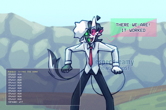
My personal favorite Daily c!Ranboos, in order of posting!
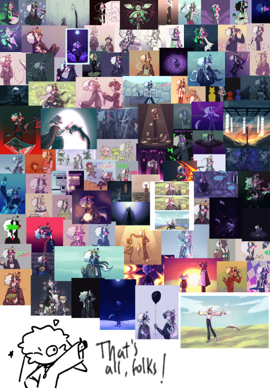
Now that it's finally over, I feel like its appropriate to share all the daily c!Ranboos I'm the most proud of, and the reasons why I like them so much.
I'll probably redraw some of these in the future!
Under the readmore bc its long and has lots of pics!
Day 5 - Brain Fried
Looking back to it, this one isn't all that great compared to other Daily c!Ranboos I have done, but it's the first one I did in which I tried to make an actual composition rather than just. Drawing c!Ranboo. So it's kind of an important one!
Day 13 - Allium
Kind of similarly as Brain Fried, this one is kinda rough in the edges when looking back on it, but I loved the eerie vibe of it, and the effort of using a more limited palette!
Day 21 - Bouquet
It's just cute. He looks so squishy! Not much more to add tbh :)
Day 22 - Under the Weather
I personally love how I made the effect of them "disintegrating" due to contact with water look! I like how the particles flow :) I love how I made the effect of the water dripping, how it could kinda look like tears running down their face. I used "Under the Weather" in both a literal and metaphorical sense!
Day 28 - Tears
I like the expression and colors :) tbh the tears could be better but otherwise I like it.
Day 32 - Awake
It's soft, comforting, bright, warm, I love the way I did the colors SO MUCH! The expression is everything to me, I like how their hair looks. Also you might notice that I have 100% used the same colors for Revival and Freedom.
Day 34 - Arrival
I just like their goofy expression and how much of a twig they look. Silly lad
Day 38 - Butcher Army
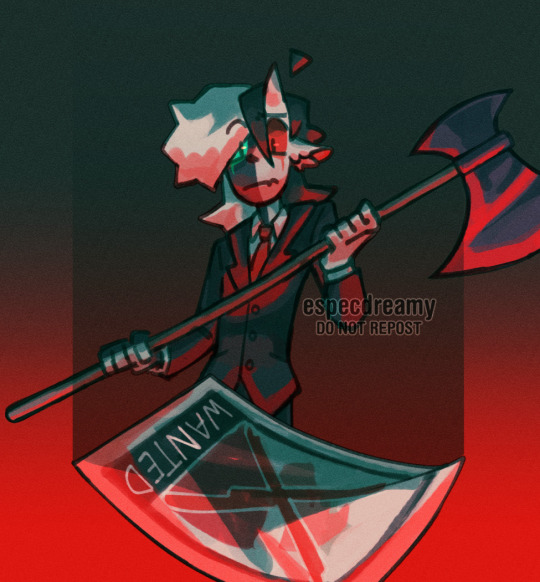
I LOVE the expression and the limited color palette! While theres bits that could be improved upon this is one of my best compositions here.
Day 39 - Apprentice
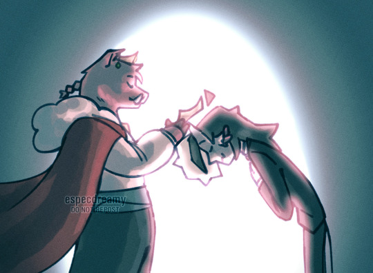
Technoblade.
Day 41 - Memory Book
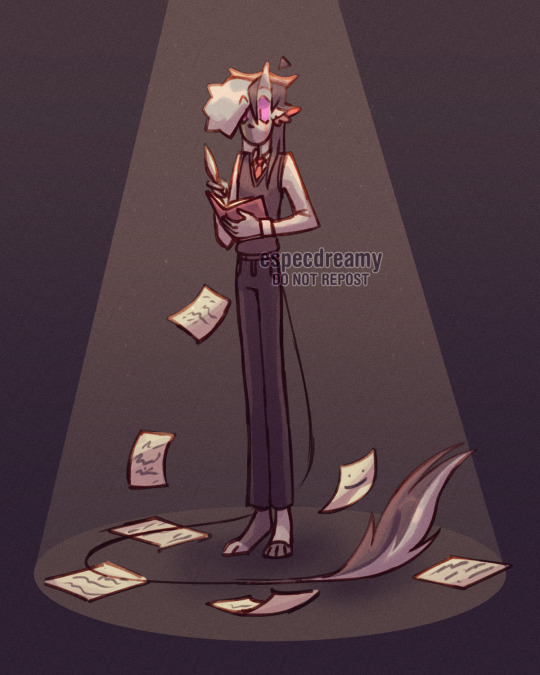
I like how the anatomy looks here! Looks very sleek and natural I guess? I love how the tail lies on the ground. I just can feel the weight here a bit.
Day 44 - Doomsday
The blue sky with the bright red flames, the lighting, c! Ranboo's silhouette, idk this is just very pleasing to look at!
Day 64 - Revival
I can't even elaborate on how much I love this one, it's probably The Best drawing (drawings?) of Daily c!Ranboo! I used the same color palette as Awake bc I wanted to give it the same comforting and soft vibe, I love how fuzzy it all looks, how quiet it seems...Also its a comic too! I speedran that in 3 or so hours and im so damn happy with it.
Day 67 - Light
The colors are very nice, I like the lighting!
Day 76 - Dance

I like the poses! I tend to struggle to draw c!Tubbo but he looks very cute here. I think I made c!Ranboo a bit too short but tbh it was a challenge to make the pose work!
Day 82 - Windy
I like the colors, the expression, AND THE HANDS!! Its fuckign wimdy!
Day 89 - Void
HORROR VIBES! I wanted to do at least one creepy-looking drawing for this challenge that I liked and this is the one for sure!
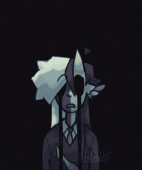
Day 90 - Stars
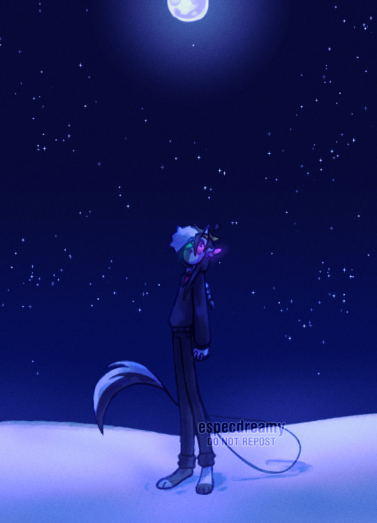
I like the colors a lot here! The way he looks up to the sky with the big ol' eyes and his pose feels so natural.
Day 91 - Birthday
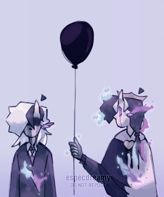
I may have speedran this in like an hour and a half but GOD I just LOVE the symbolism in this drawing! The balloon because birthday! But its black because death! Ghostboo is the one holding it because they're the one in the overworld after all. How c!Ranboo looks down while Ghostboo stares at them!
Day 92 - Freedom

I used the same palette as Awake and Revival, it just felt right! I tried my best to do a piece that'd be forth of being the "sendoff" for the daily c!Ranboo series, and I do think it holds up!
#dreamy talks#daily cranboo challenge#i spent a solid hour arranging all of the daily cranboos on clip btw.
111 notes
·
View notes