#also using the lasso fill tool here is really fun and i like drawing with it teehee
Explore tagged Tumblr posts
Text
I felt left out. I wanted to do it too.
antonblast(s your balls) sona
I wanted to be urple

and a bonus thing I giggled at
@oddpizza

I guess it's okay
#my art#antonblast sona#whjjhhffhdgdgddggdg#i still have my winter coat though (my copius amounts of body hair 🙏)#its just a little less here#whatever#also using the lasso fill tool here is really fun and i like drawing with it teehee#l#i like the logo i did#do you?#maybe not idk...#what the fucking fuck#im turning 18 in TWO DAYS FUCK 😭#i am turn 18 soon...
31 notes
·
View notes
Text
Art style breakdown /tutorial(??)

Some friends asked so here we go : disclaimer im bad at explaining (so feel free to send an ask or smth)
Final art (long read so theres a timelapse at the end)


If its not for something important (commissions), i dont usually make a lineart for a drawing but just clean up the sketch , it wont be used anyway

I usually separate them by colors , mostly so i can Alpha lock them and not worry about coloring over parts
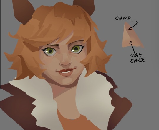
When coloring i use a soft airbrush to have gradients within the shading , so its not one solid color . How i shade is very blocky , lots of triangles lol (if im using CSP i love using the lasso fill tool ) but there are parts especially in the skin where I keep it smooth and blended, usually nose and cheek area . Using an asaro head is usually a good start to learning how to shade faces with planes in mind

Depends on the character, but I like adding shadows on the lashes/brows itself , make it look solid and 3d , it makes the eyes pop more imo

Using multiply layer to make the shadows darker for more contrast
At some point I’d merge everything together so i can just paint in one layer, easier to fix things with liquify too ; if im in CSP i keep the separate layers in one folder just in case i need em later but i cant really do that in Procreate cos of layer limits

This is the part where i make the shading more painterly .,To make the shading look sharper , i like adding lines on the edges .
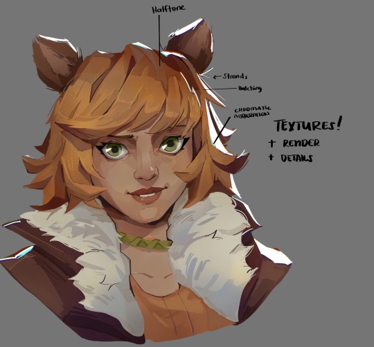
The fun part : adding the ✨
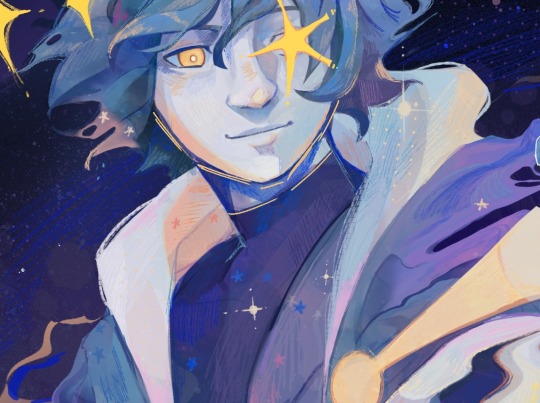
This is the part where I add textures , either from texture images or with screentone/hatching brushes. This is also around the part where i add the character’s accessories and stuff like scars and freckles (its just easier to add smaller things near the end than having them accidentally painted over at the start)
Whenever I feel like the drawing looks too much of a similar shade / temperature , I use a gradient map+layer effects (masked) on parts to give it variety . Technically you can do this by just having a layer effect on and manually adding colors but gradient maps make me go “ooooh didnt think of that color there “
CSP also has a posterization filter that i like using when i feel like some part looks too smooth to me.
I sometimes add in sketchy lines , and seeing how cool it looks in Marvel Rivals art ive been adding it more lol
Artists that influenced me are : Nesskain, Toni Infante , Valorant’s 2d art(their main artist is Suke) ,Arcane , Spiderverse and the most recent one ive been obsessing over is Marvel Rivals ( its got everything i want my art to be when it grows older lmao )
564 notes
·
View notes
Note
I am a bit jealous of the way you paint. Do you have some tutorials or ways to improve? I love paint, I try my best, but my colors end up always muddy 🥲
here's a bunch of miscellaneous thoughts... I hope this helps!!! I've never really written tutorials before so it's a bunch of different tips collected together
whenever you see something that inspires you, save it somewhere! then look at all your inspirations every once in a while and analyze what made you like them - like certain techniques or colour usage or something. then when drawing, try to incorporate it! (i've saved finished pieces, sketches, half-done stuff, speedpaints, lots of different things as inspiration)
using more saturated midtones for shading could help in making things not look muddy (like this tutorial). of course having more desaturated colours could also be a vibe you're going for
don't be afraid to use desaturated or bolder colours!
I love underpainting (tutorial on it)
I also love using the lasso fill tool. I don't do lineart so whenever I need to plop down a big bunch of colour (like for people) it's lasso fill time! on procreate it'd be select -> freehand -> color fill
some people will be like don't overuse blending tools and soft brushes and! while I do think it's super important to learn how to rawdog just blend things, eventually you'll find that reintroducing them into your workflow could be useful! I guess it's more of an advanced tool?
granted I just use hard brushes to blend everything anyways. if you feel like you're overusing blending/soft brushes then try using a harder textured brush, or the good ol round brush with opacity and size being controlled by pressure. or alternate between the two
my painting workflow is changing refined sketch layer to a multiply layer + making it a different colour -> underpainting colour -> lasso fill in shapes (with the underpainting) -> laying colours down at a lower opacity or with a textured brush -> sometimes using a multiply layer for quickly putting in shadows -> some minor painting under the sketch lines -> painting over everything (sometimes I merge a bunch of layers together). here's a video of a wip!
I don't know how to describe this... colour constancy... so, colours look different in different lighting conditions but the brain still recognizes them as the same local colour. one thing I had to really figure out was how to choose colours under different lighting conditions (instead of using a multiply layer for everything)(I still use multiply layers for some things though) bc I found that outright picking them made things more interesting? since style is all about your own choices. like in the above video Paradox's skin is actually a dark grey-purple and his labcoat is dark grey-blue but the brain recognizes that's a white guy with a white labcoat in a different lighting condition. uh. Color and Light by James Gurney has better explanations of this
thumbnailing colours are useful. also don't be afraid to restart your colours over and over if they don't feel right - kinda like a warmup
I like having a brush with minor colour jitter on stroke (like 3%) I can switch to for some colour variation
change your pen's overall sensitivity to be something like this so you don't have to press as hard to get to the ~100% range

get funky and experimental with it! break the rules once you've learned them!
tutorials I liked:
the book Color and Light by James Gurney
importance of values and contrast (pics)
mini rendering tutorials (pics)
underpainting (pics)
colour tips (pdf but the sample tutorials are already helpful)
anatomy quick tips: skin (video)
how i paint skin/light by niro (video)
the fastest way to learn to draw color & light (video)
3 techniques for incredibly realistic portraits (video)
I also find speedpaint videos to be super useful to get a sense of other people's workflow!
brushes I'm using
verkomy's fun marker for sketching + textured painting
moss' sketchy sketch for some sketching
an edit of a default round brush to have a uniformed glaze rendering mode, and variable size (40%), opacity (50%), and flow (max) based on pressure. I think there's other edits too?
default soft brush for quick soft brush needs, like putting down some colours for tinting something with an overlay layer
a square-ish textured brush with 3% stroke color jitter. copied it from a CSP brush that I use (PX paint)
#I had this typed up and then I accidentally refreshed the page so hopefully I have everything captured again#really hope it helps!!#EDIT: added some brushes
5 notes
·
View notes
Note
Thank you everyday for your art!! Your lineart work is absolutely gorgeous, and especially on calligraphy pens?? 😭 It's amazing!!
I used to do calligraphy, but I 'm now trying to practice a calligraphy pen with lineart, and I'm hoping to get lines as clean as yours. What type of nibs do you use? Do you switch them for different line thicknesses? Any tips you can offer? 🥹
I hope you have a great day 🌟
omg thank you so much!! as much of a struggle it can be, i do enjoy doing lineart a lot when i draw (mainly digitally but i’ve been having fun with these lil traditional drawings too) so it makes me happy to hear you say that 🥹
also im still super new to drawing w the gpen/calligraphy pen as i’ve only just gotten one for the first time about a month ago so i’m still slowly experimenting with them (and i’m also partially winging it to be really honest) but this is the pen/nibs i got! It came with a set of five different nibs, two each. Since this is my first time getting and using this kind of pen, i don’t really have anything to compare it to in terms of quality and such but it’s doing what i expected it to do for the most part LOL (also the bottle of ink that i got if anyone was interested)
(the rest is under the cut since it's kinda long haha)
My first initial drawings were drawn with the 004 nib from the set, whereas my more recent drawings were drawn with the 003 nib. (For filling in the solid black areas, i just used a micron brush pen)
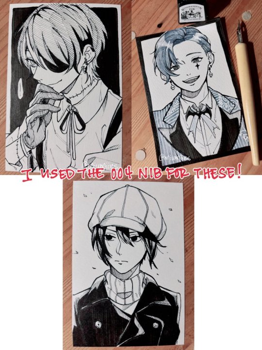
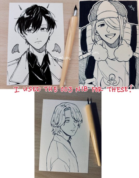
For the most part, i pretty much used the same nib throughout the entire drawing for each one. Part of it is just me being lazy about changing it, but also, because these are postcard sized (about 6” x 4” / 148mm x 100mm) and not very big drawings in the first place, i didn’t really feel the need to switch nibs too much. If i was working on a larger canvas/paper, i might switch between nibs more often for more variety in line thickness, and if anything, i definitely would use one of the smaller nibs (like 001) for finer details
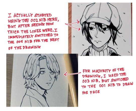
(also here's the paper i got that i drew all of these on. keep in mind that i ordered it off amazon jp but it was a set of five packs so now i have plenty to practice on LOL)
As far as tips for clean linework, a lot of this is stuff i do for digital art but i’ve been more or less applying the same logic to the stuff i’ve drawn traditionally recently (some of these might be really fundamental/obvious and you might know this already but it is kind of what helps me a bit):
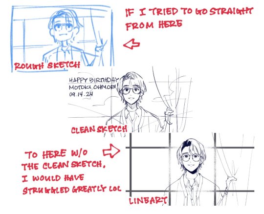
▷Having a clear sketch of what you want to draw and where you want to place your lines is really helpful, both for digital and traditional art, but probably especially so for traditional art.
As someone who honestly avoided doing traditional drawings for so long, my biggest struggle was honestly getting a clean rough sketch down on paper and getting past the sketch stage to do anything more with the drawing. Part of it is, again, laziness on my part, as it’s a lot easier for me to do sketches and clean them up digitally since i heavily rely on undo as well as the lasso and transform tools to fix proportions and whatnot (plus, not being able to undo once you start inking also held me back, because i know that my hands aren’t the steadiest and will occasionally move unexpectedly when inking sdlkfg). That said, using my ipad as a light table and tracing my digital sketches onto paper is what got me past that hurdle so that i could experiment with more traditional art (though i know i should eventually work on just starting from scratch on paper too haha).
But having a clean sketch gives you a clear guide of where and how you want your lines to be, rather than just having a vague idea of how you want it to look and having to think on the spot about the placement of your lines at the same time as inking your drawing.
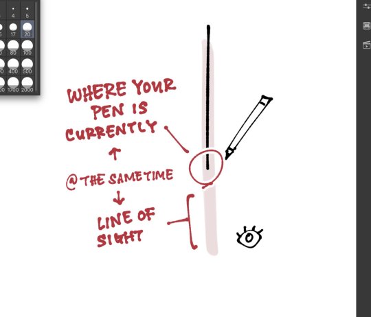
▷This is something i saw someone else point out in their tutorial once and i never really took notice of it until i saw it, but as you line over your sketch, keeping your line of sight on the path slightly ahead of where your pen is currently at kind of gives your brain a heads up of where your pen needs to go and your hand will naturally follow. It’s probably something that the more you draw, the more it comes to you subconsciously, like i kind of do this but i’m not super conscious of it, so you probably don’t need to get too hung up about keeping this in mind.
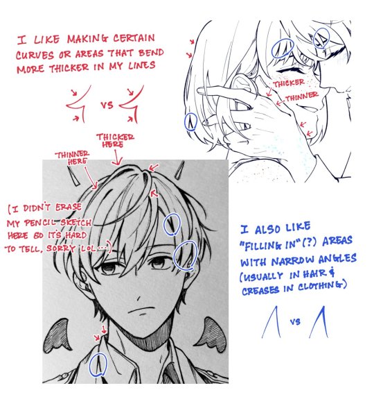
▷this is moreso a tip on line thickness rather than clean linework, but even without changing the nib or brush size, i like to manually vary the line thickness in various areas! This can be achieved by applying more or less pen pressure, and even if you can’t do it in one stroke, you can draw the initial line and go over the areas you want to thicken.
▷rotate your paper or canvas as necessary! When i draw digitally, i rotate my canvas a lot, as well as heavily rely on the flip canvas function. Obviously you can’t flip your canvas and continue to do lineart with traditional art, but rotating your paper can help with how you draw your lines. Sometimes it’s hard/uncomfortable for me to draw lines that go inward towards my drawing hand, so rotating the canvas so that the line flows outward makes it a little easier and more comfortable for me to draw.
▷draw with quick(ish) strokes! The slower your hand moves when you draw each stroke, the more wobbly your lines might become. Of course, if you draw each stroke too quickly, your lines will end up in a direction that doesn’t follow your initial sketch. This comes with time, and the more you draw, the more confidence you’ll gain in your lines once you have a grasp of how you draw them and you can adjust accordingly.
▷if watching natsume-sanchi’s videos has taught me anything, when you ink your traditional drawings, always start from the top-left (or top-right if you’re left handed) and work your way down and right so you don’t risk accidentally smudging the ink with your hand before it dries (i still somehow end up smudging the ink one way or another though LOL)
I’m not the best at putting how i do things into words since a lot of it is just based on feeling/in the moment but i hope any of this is helpful!
#anon#ask box#sorry for my handwriting it's hard for me to write nice digitally i've had to rewrite some of it multiple times sldkfjg#also it's cool that u used to do calligraphy!!#that's smth i wanna try out eventually but ohh my shaky and unreliable hands
4 notes
·
View notes
Text
Digital Character Illustration - Class One
For the first part of this class, we pretty much just went over the basics of drawing on Photoshop with a drawing tablet. We learnt/relearnt many commands and learnt new techniques to better our drawing and colouring.
Commands include: B = Brush E = Eraser CMD + Z = Undo Shift + CMD + Z = Redo OPT + Delete = Fill selection with foreground colour Number Keys (1 - 0) = Opacity CMD + A = Select All
There are even more helpful commands, but these are the ones we used the most.


First we did some page setup, distinguishing between layers and background. The layers are created by clicking the plus icon in the lower right of the layers menu. The background is the only layer present when a new file is made, and has a solid white background, unlike layers created afterward which are transparent.
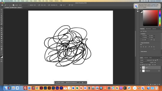

We then tested lots of brush and eraser types. For example, there are hard and soft brushes, which refer to the rigidness of the lines edge when drawn. There are many other types of brushes, but we just used these for the example. We also played with the sizes of the brushes and erasers, as shown.


Next we tried changing the opacity of the brushes and eraser. I found this very interesting, especially the eraser, as it led to some cool gradients by just making very simple strokes. I think I'll keep this technique in mind when designing my characters.

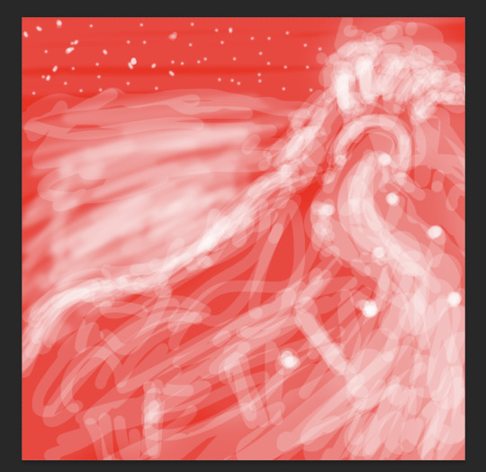
After that, we messed with the colour wheel, and did some more of everything else over again, just to see how everything meshed together.
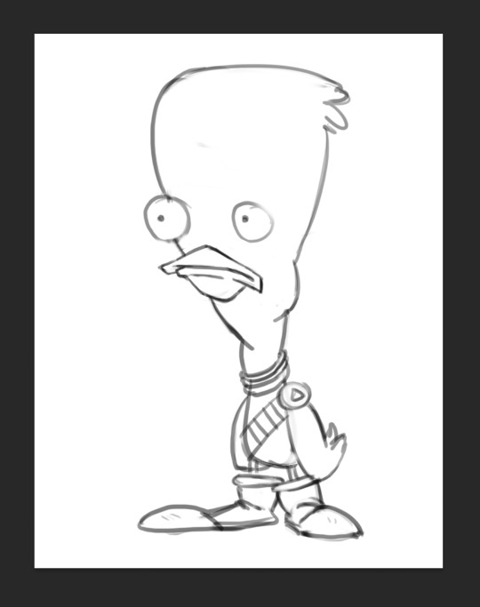
After we had finished getting used to Photoshop, we got our first character template to practice drawing over.

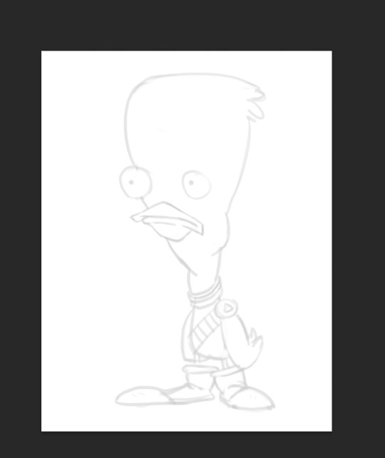
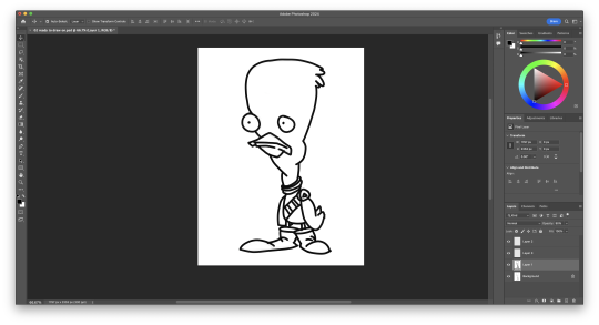
We then setup our layers, so we could draw overtop on a white layer whilst still being able to see our template. We did this by creating a second layer that was filled in with white, and dropping its opacity a little bit, so we could see the template. I drew my first outline, was happy with it. I think I'll be able to get used to the drawing tablet pretty soon.

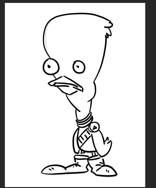
Next, we started using the pressure brushes, which change thickness depending on how much pressure you put on the drawing tablet with your pen when drawing. I like this brush type a lot, it looks more like a manual drawing, which I think is really cool.
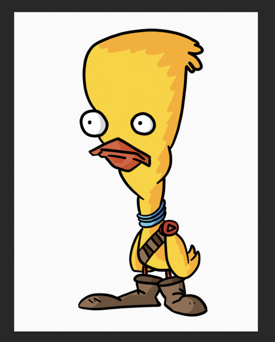
I also coloured it in for fun.
We then learnt a process for designing characters and colouring them, the process was made by Tom Garden, or at least that's what the slideshow said.
It pretty much consisted of choosing a design, drawing line art over your sketch, filling that line art with a base colour in grayscale, then making a new layer for each section of the design that needs a different colour, and adding a different grey to it depending how light/dark you want it, then adding colour to each section, and then adding shadows and highlights on individual layers as well.
Here's my attempt below

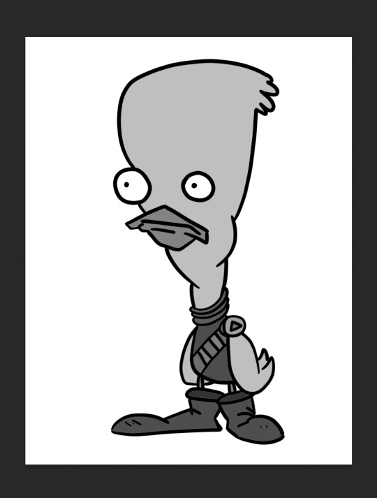
Here is my greyscale of the duck character. Each different type of grey was on it's own individual layer, so I could colour each section individually.
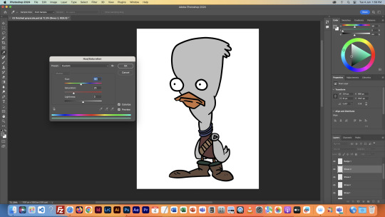
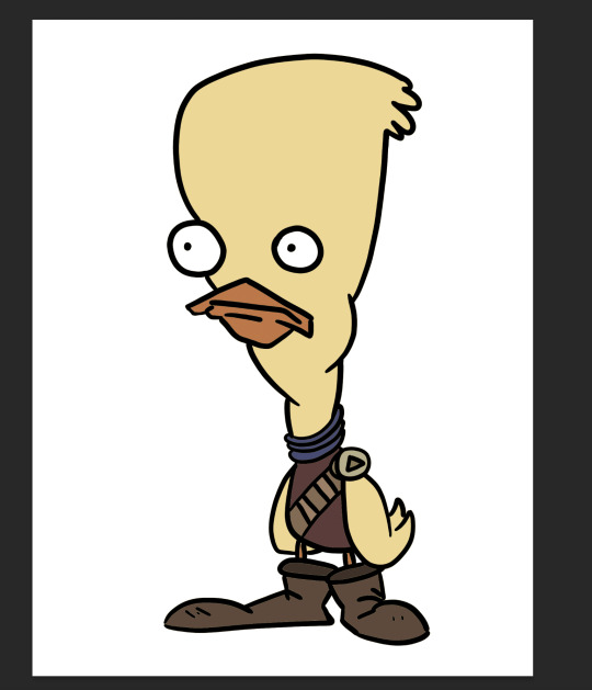
I then used the hue menu (CMD + U) to colorise each section of the design.
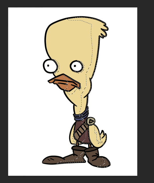
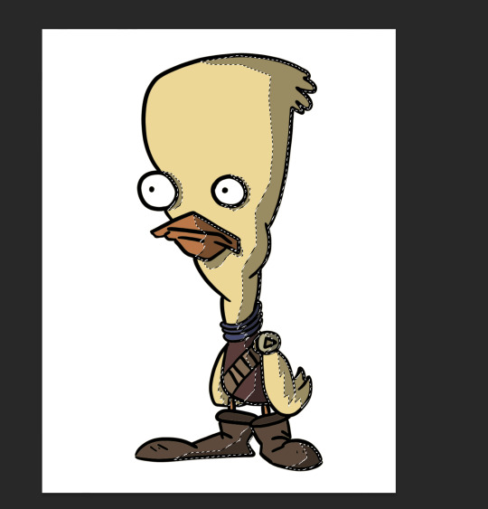
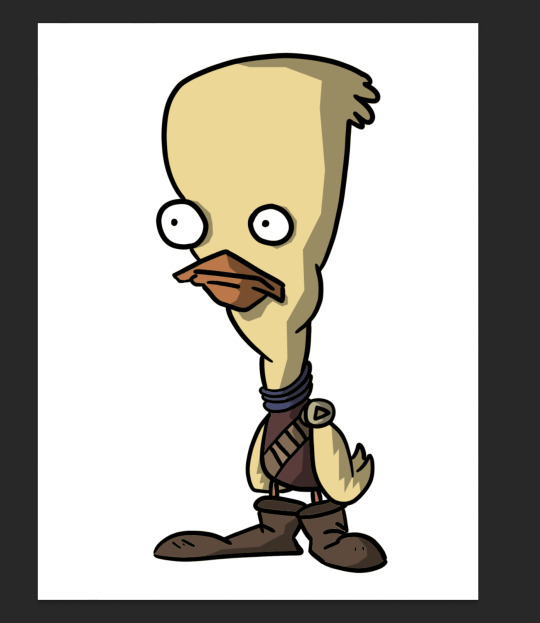
Next I used the polygonal lasso tool to select areas I wanted to add shadow to, on an individual layer, I filled the final selection with black, and made the opacity of the layer 35%, as it said in the instructions.
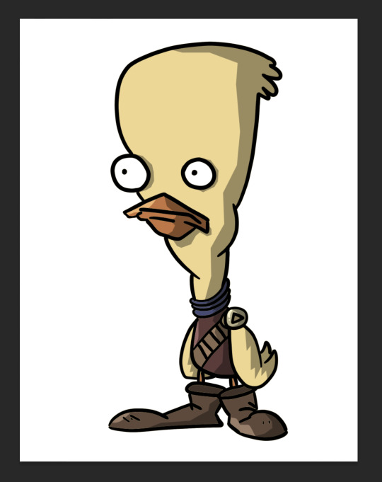
Finally, I added a couple highlights to the design, such as on the badge, shirt, shoes and beak. This added a little extra tone which I thought was nice. Overall I'm way happier with this one than the original one I coloured, so I'll definitely be using this process in the future.
I did this process again for another template we got:
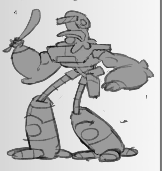
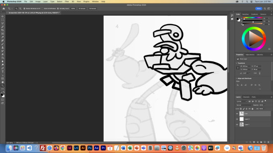
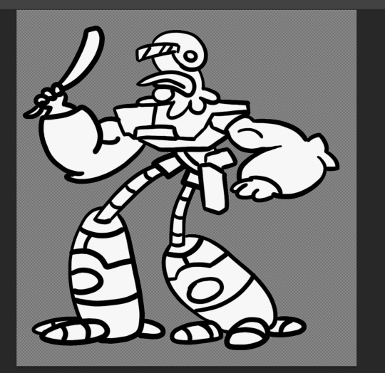
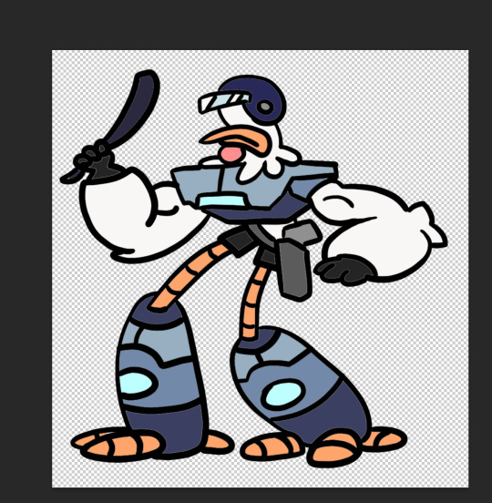
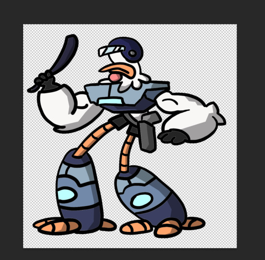
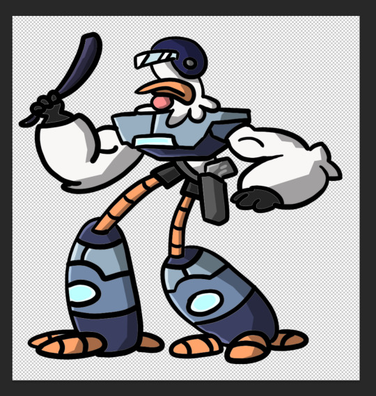
This was a little more intricate of a design than the duck was, so it was a nice step up to see how I would do. I think it turned out pretty good, since I''m doing pretty much all of this for the first time.
Overall this first class was very helpful, I learnt a whole bunch of new things and I can already see the improvement in my digital art compared to my previous stuff.
1 note
·
View note
Note
How do you draw Idia’s hair so good?? I struggle with the basic shapes so much!
Sorry for the late reply! Your ask got us excited because Idia’s hair is such a pain to draw, but also such a fun detail, and I’m very happy that you like the way I draw it <3
Katsu suggested to me to record a speedpaint, and uhh, here it is. Please, don’t mind the wonky anatomy and me horsing around with zooming in and out randomly. As you can see, I struggle with Idia’s hair myself and constantly redraw it until I’m satisfied or at least tired enough to say “eh, that’ll do”. In case you’re wondering, it took me ~25-30 minutes to do the hair, and the original video was 59 min long lol I always spend a lot of time moving, reshaping and redrawing details when I draw Idia…
youtube
I’ll also list some tips and thoughts about it based on the way I draw it…
The shape of Idia’s hair is not at all consistent. Even in Toboso’s art it looks slightly different sometimes, which makes sense, because Idia has magical fire hair and technically you could do whatever you want with it.
But some rules tend to apply each time. For example, even though Idia’s hair is long and seems naturally “heavy” because of it, the individual strands tend to be turned upwards, like fire would. Not every single one, but the shorter ones and the ones closer to Idia’s head tend to do so.
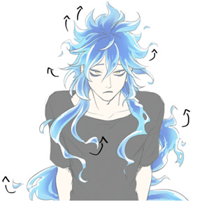
It’s wavy, but not too wavy. If the hair starts looking too “soft”, add sharp edges, random strands sticking out, rough shapes, etc.
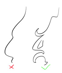
Oh, and it’s important to remember that it floats. This means, it doesn’t just go straight down, it does this weird “S” shape. It’s also hella long, I always forget just how long Idia’s hair is. If the magic fire logic didn’t apply to it, it would reach the ground easily. The volume of his hair is much bigger than I tend to remember too: it's quite thick and luscious lol So please give him lots of hair!

Tiny little flames + “holes” in the main ehh body of hair (wow there must be a way to phrase it better) make everything look good and more believable. Have fun with it. You might’ve noticed, I draw and redraw and move them around a lot in my speedpaint.
Obviously, I am no expert, and every artist I know draws Idia’s hair a little bit differently. The speedpaint doesn’t show it, but I always have some of Toboso’s artworks of Idia open when I draw him, just to make sure his design is not too off. I would definitely recommend looking at refs while drawing Idia (or anyone), and maybe even trying to redraw the hair from Toboso’s artworks once or twice as a study, it’ll probably make it easier to understand how Idia’s hair works.
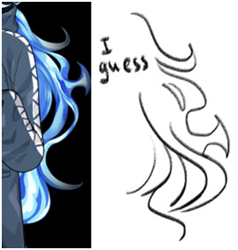
You haven’t asked about the colouring, but I love colouring Idia’s hair, so I’ll talk about it a little. Colouring Idia’s hair is simultaneously the most fun and the most tedious part of drawing him lol 15 minutes of my hour long video is just me filling Idia’s hair with the base blue colour with a lasso (I refuse to use a bucket tool…)

But once you’re done with the base, this is where the fun begins. Because at this stage you can be pretty rough, just add in darker and deeper blues near the middle/core(?) of the hair mass. It doesn’t have to be very even or pretty, add some smaller dark spots; we personally really love it when Idia has this round little blob on his bangs. In the video you can see that I added it later on because I forgot about it lol
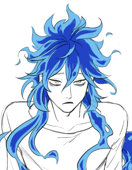
After the dark part is done, erase the ends of it a little bit with a soft brush. Not too much, we should still be able to see the shapes.
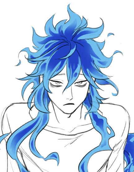
Then, on a separate layer set on overlay mode, with the same soft brush add some additional brighter spots, to make the hair look glowy. I used the same light blue as the base colour, and the overlay gives it a pretty hue.

And finally, add some white highlights at the ends of the strands. This is the stage when everything stops looking wrong and weird and starts looking like Idia, at least to me.
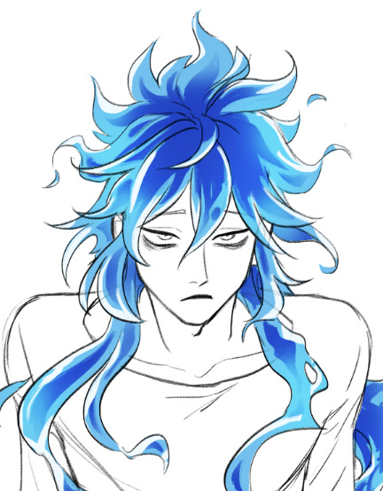
Phew, I think this is everything I wanted to say… I hope it was at least somewhat helpful.
Sorry for the long post, I just love talking about the drawing process. And about Idia too!
Once again, thank you for your kind words; I’m very happy that you like my art.
Have a good day!
274 notes
·
View notes
Text
@nyctoclad ah thank you! i was on the fence about posting them here since edits are not something i usually do, i’m glad you enjoyed them. luckily i was updating friend on my progress so i can share some wip states

i started with colour correction which is the easiest part, i grab a section i want to change with lasso tool and first i try hue/saturation adjustment, some places may also require brightness change, here in particular i think collar needed it to get to white, also those stripes of yellow cloth needed additional layer of yellow colour set to overlay on about 30% opacity because it’s hard o make murky brown look vibrant with adjustment alone

then i copy pasted all the extra elements i wanted, base for hair comes from Tav's Hair Salon mod, the hairstyle is called ‘Wavy Astarion Mix’ but i made it somewhat shorter, i also really wanted that curly, puffy feeling to be pronounced so i lassoed the curly strands and repeated them in a couple more places, the piercings and earrings are just png photos i found on the internet (i think i tried like three different earrings before i settled on these)

and it all ends with the most tedious/difficult but unfortunately important part: making sure added elements don’t stick out like a sore thumb - for hair it was mostly about reintroducing some details so it looks realistic again, i used a coarse line brush to draw those little hairs that follow already established hair shape - with earrings it was important to make them match light and colour situation in the screenshot since the original photo was very bright, it was mostly achieved with colour adjustments and overlays but on that earring i’m showing above i also lassoed parts of it on the right and filled with this blueish colour to link it to the secondary light you can see on the right side of the face - for piercings a useful trick was using shadow in layer styles, it’s probably not the most graceful way of doing that but it’s easy and helps with your objects looking like they are part of the scene and not just awkwardly added stickers

the other edit had considerably less changes, his pupils i simply painted over with a brush, but i used a cool trick for the freckles since it’s always my goal to make them look somewhat like stars i literally just added a photo of starry sky and changed blending mode to screen since it makes black/dark colours invisible, i learned that from ‘Blending modes* explained for digital colorists‘ video on Color with Kurt channel
i hope there is something useful in this whole essay i just wrote haha or at least that it’s fun to see that every art process is a little messy and often involves winging things to see what looks good :)
8 notes
·
View notes
Note
Whoa I really love your lineless art! How do you do it?
:”ooo thank you so much, it really does mean a lot to hear that— usually bc I don’t go lineless often, it takes me forever lmao
And here’s a lil tutorial- this is just how I do lineless art. It is by no means the correct way, so feel free to mix and match w other artists! Personally, when I do lineless art, I do my best to keep it sweet and simple— i think that’s when it looks best, but if you want to go for a more detailed piece, that is okay too!
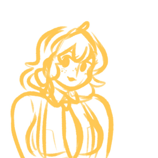
1. As always, start off with your sketch. It doesn’t have to be super detailed; as long as you got the basics of your drawing down you’re good. (Eg, I’ll add in the seams of the clothing and hair partitions later on).
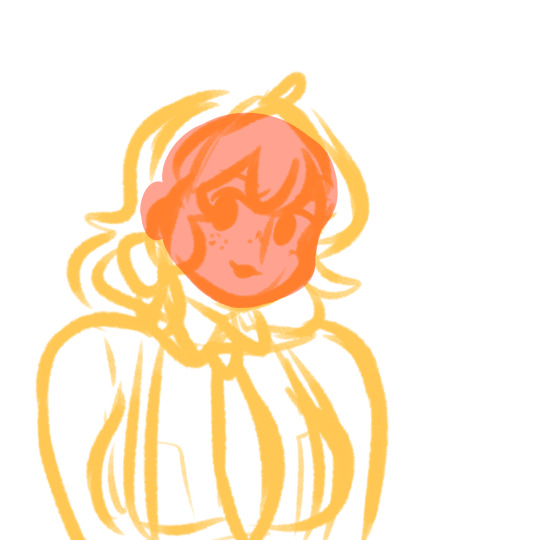
2. Set your sketch layer to Multiply. Create a new layer under the sketch layer. This’ll be your first lineless layer. I usually start with the face and work from there. And another thing I do (that I find helps) is just use random colors for each layer to get the shapes of the layers down, and then go back and properly color them later. This helps me see the shapes I’m working with and refine them if I need to (I usually go with various shades of red and pink).
Some tips about layering:
-It’s easier if you divide your hair into 2 layers— a front (where the bangs usually are) and a back layer. The back hair layer is usually under all the other layers.
-Separating the face layer from the other skin layers helps make shading easier as well.
-It might seem like a pain to separate your clothes into different layers (eg for the collars and sleeves and main body), but it’s a huge help when it comes to the final shading (I’ll admit I’m a little guilty of not separating them myself when I’m in a rush :”) ).
This is what your first layer will look like when you hide the sketch layer:
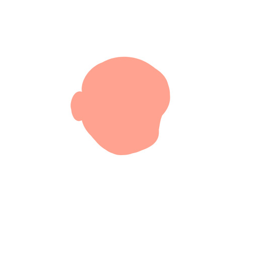
It’s a little messy, but that’s okay— you can refine it if you want, but don’t get too caught up in refining before you actually get your shapes down.
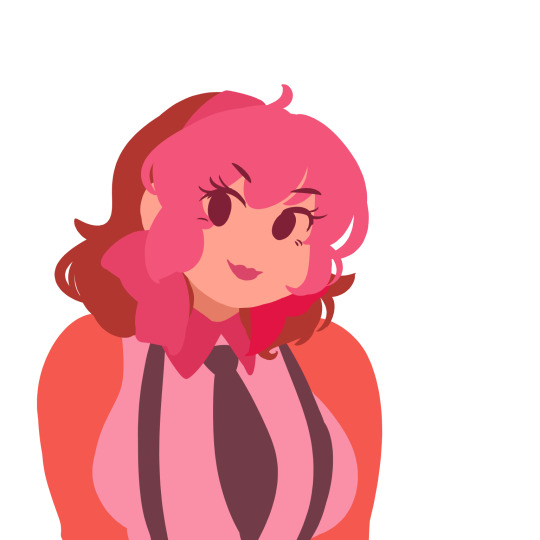
3. Fill in the rest of your lineless layers. The colors look kinda weird, but that’s just to show that each color is a different layer. Note how the hair, clothes and skin are split into different sections. There’s also breast pockets on her uniform, but those’ll be added in later on. Refine your shapes if you need to at this point.
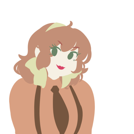
4. Now, go in and recolor everything to the colors you want them to be.
Now, it’s time for the fun part— shading!
So usually lineless art has a combination of gradients and hard shadows, yes? Do the hard shadows first. (At least, it’s what I do.)
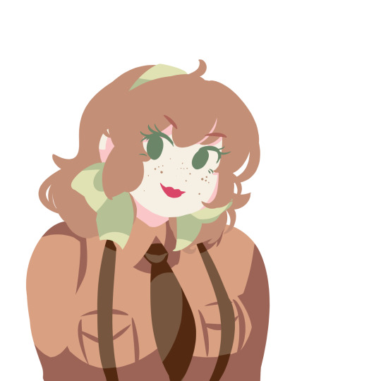
There’s some parts that aren’t shaded yet, they’ll be colored w mostly gradients. Also, you don’t need to create a new clipping layer to add the shadows— you can just do it on the same layer after locking the transparency.

9. Make a new clipping layer over each different layer, and add gradients as you see fit. It’s really up to each different person how they go about adding the gradients. For the eyes, I usually make it graduate from dark to light, and then add a light shine afterwards. I didn’t do the hair yet, bc I have a different technique for it.

10. For the hair, create a new clipping layer over the hair layers. Then, using a default pen at different opacities, draw hair strokes— just enough to not seem overly detailed.
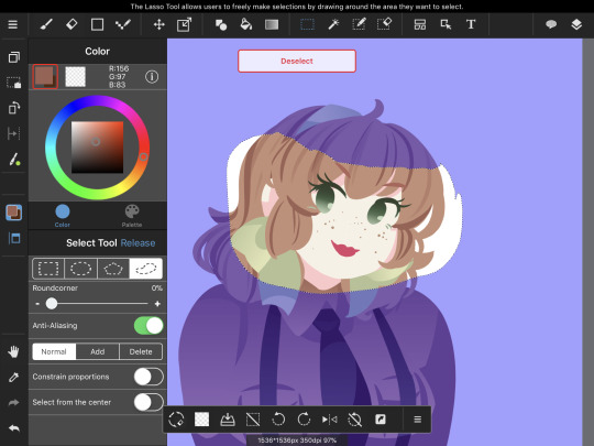
Using the lasso selection tool, create a selection where you want the hair shinies to go. Then, using the Gradient tool, make a gradient with the darkest part on top. After you do so, it should look like this:

Now, repeat the process for the back hair.
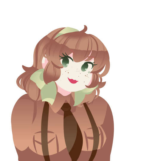
Almost done!

11. Now, create a new clipping over the shading layer. This’ll be your highlights layers. Set the blending mode to add, and add a couple spots of shine along the gradient you made.
And you’re done! ❤️
OPTIONAL STEP: Merge all the layers down, and create a new clipping layer over your merged drawing. Find a paper-like texture and overlay it over the drawing. The blending mode should be set to Overlay for best results.
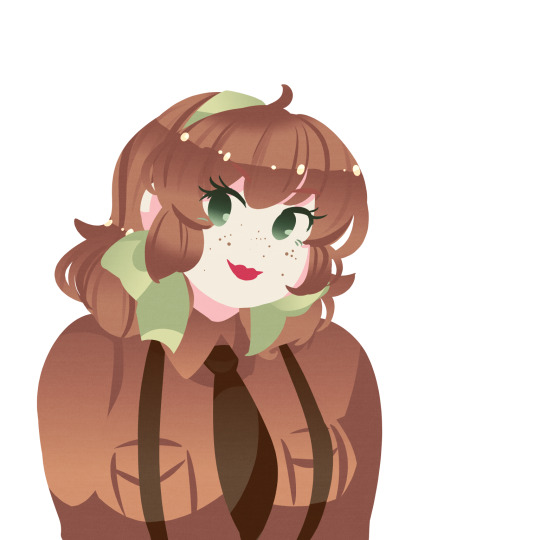
I really hope this helped you a little bit, anon! Lemme know if you have any questions!
208 notes
·
View notes
Text
AntiSepticEye Edit Tutorial (PhotoShop)

I’m sure a lot of you out there need some help making Anti edits, or just never knew where to start, or just want to know how other people do it. I like to think I’m pretty handy with PhotoShop, so I made up a little guide for y’all.
There’s also a tutorial on coloring eyes at the bottom!
Step One: Find your image.

Yeah, I know, we’re starting here. Bleh. But it’s really important that you get the right resolution for a picture, okay? So I’m just gonna make sure you get it.

When you search for your image, make sure you’re using the tools and that you’re searching for a fairly large image. Larger than 2MP is the best option, but sometimes doesn’t have what you’re looking for.

When you find the image you’re looking for, hold on - it might not be the biggest size you can find. Make sure you Search by image first.
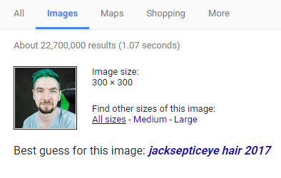
This should pop up underneath the search bar of the new page. Click on All sizes, it’ll take you to another page with just that image.

Clicking on the first usually brings up the biggest one, but sometimes they’re of bad resolution and you have to click through. If it takes a second to load, chances are it’s nice and big. But wait! Don’t just click and drag.
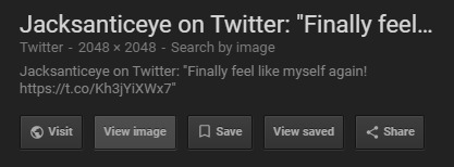
Make sure you View image to get the highest resolution! It’ll open in a new tab.

You’ll need to right click and Save image as…. This will allow you to save to the desktop, or whatever work folder you’re using. Hooray! Now you have the best possible image to use for this.
Step Two: Prepare the image.
Okay, so you have it now. You need to get it into PS. But before you open a new canvas, hang on.

OPEN. Yes. I’m literally showing you how to open a document. Deal with it.
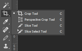
Now that you have it open, it’s best to crop it to whatever size you want. Just so it’s easier to work with.

It was pretty okay as-is, I just wanted it a little more tight around the shoulders.

Now, duplicate your layer. You can do this by pressing Cmd-J or Ctrl-J.
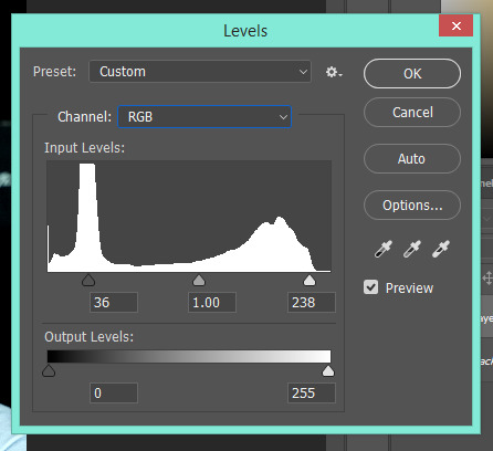
On this layer, we’re going to adjust the levels (Cmd-L or Ctrl-L). If you don’t know how to do that, just bring the black and white arrows in closer to eachother with preview on. It’ll look right eventually.
Step Three: Basic Overlay.
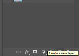
Start by making a new layer. Simple.
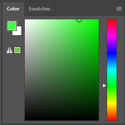
Pick a shade of green. Make it bright, but not infinitely saturated to oblivion. I picked this lovely shade, but it doesn’t really matter in my opinion.
On your new layer, fill in the whole canvas with your green. Ta-da.

In order to actually see Jack under it, you’ll have to change the layer style to “Color.”

It’s still way too bright and saturated, so we’ll need to dull it down a bit by lowering the opacity to... about 50% in most cases.
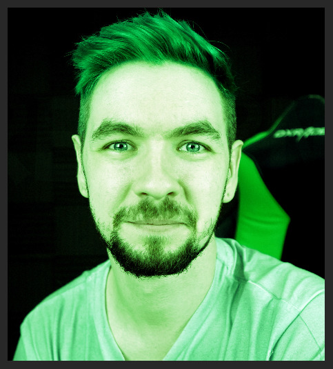
There, that looks better.

So now, with the color layer still selected, let’s mess around with the Hue/Saturation menu a little bit (Ctrl-U or Cmnd-U) with preview on until it looks good. I settled on this, which was -15 Hue and -45 Saturation.
Step 3.5 (Optional): Using Filter Gallery.
This part is completely optional, but it allows for much more playing around - if you are using a program similar to PhotoShop but don’t have the actual thing itself, such as Gimp, you can skip this step.
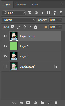
So now, we need to make another copy of Layer 1, and place it overtop of the green layer for the moment.

On this layer, we’re going to open up the Filter Gallery so we can mess around with it.

For Anti, one of the best filters is Film Grain. Crank that up to max and you have yourself something pretty cool. Messing around in these can take up hours of time just seeing what horrific creations you can make, but don’t take too long or you’ll forget what you’re doing.

Especially when you discover this button.

Now, what I’ve done is added some maxed-out Rough Pastels overtop of the film grain, giving it a sketched and blurry look.
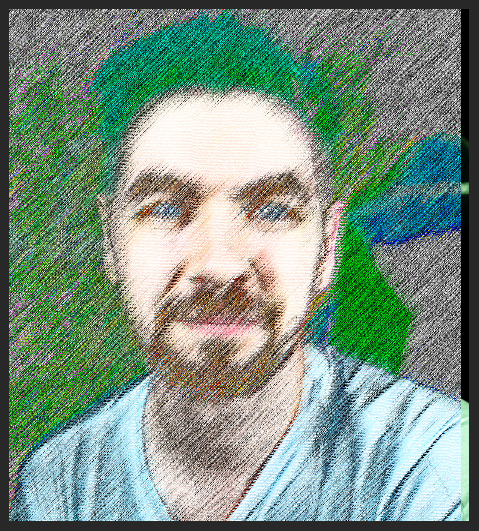
After bringing that in, I decided I wanted it offset to be more noticeable - but there’s a gap.

So I copied that layer and left it in place, tuning them down to 25%.

There’s still a gap.
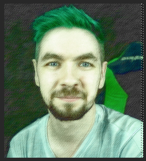

To get rid of it, I just select that gap and place a layer mask on the second effect layer.
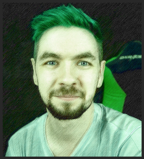
There’s a bit of a glitch on the edge, but who cares - it’s Anti.

So now, I’m gonna move the green to the top, so it affects everything.
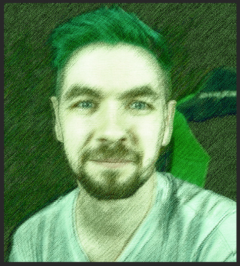
Much better. It kinda looks like a watercolor painting.
Step Five: Adding Glitches.
Now, if you’ve looked over Robin’s edits of Anti, you know his glitches are somewhat subtle and more auditory than anything.
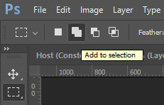
Making sure to use the Add to selection tool, select some bars over the entirety of the image. Just three or four.

Make sure to avoid areas like the eyes and face aside from a few small bars. Now, all we need to do is invert selection (Ctrl-I or Cmnd-I) add a layer mask to the green layer.
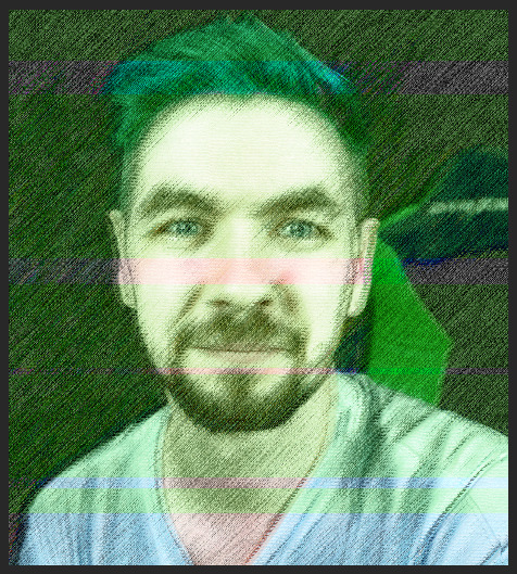
Good, that lets a few more normal parts peek through.
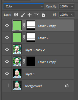
Now duplicate that layer, we’re going to do something cool with it.
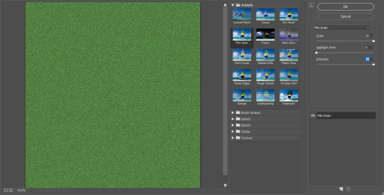
Turn that entire layer into static, the easiest way is to use Filter Gallery but you can also just tint an image of static green.

Now it’s starting to get a bit more of an Anti feel to it.
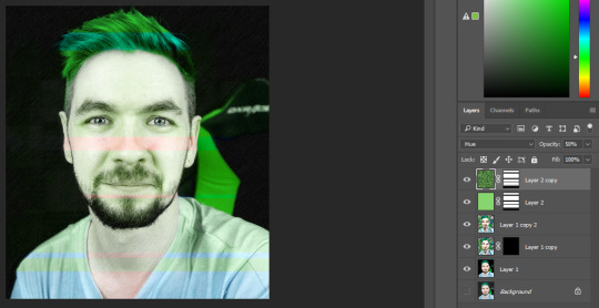
I switched the static’s layer style to Hue just so it would pop more, and look just a bit less flat.
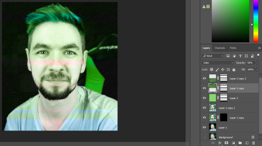
Now, because of the hair problem, what I did was chop the layer in half. Turning the top one back into Color and leaving the bottom part in Hue.

Yeah, doing stuff like this requires a lot of layers. It makes things easier to tweak in the long run, especially if you did something wrong in an early step.

If you’ll notice, Anti has a bit of a glow around him sometimes. To replicate that, we need to select Jack - but not just any old way, no. This is the only time I’ll recommend use of this, but we’re using the magnetic lasso tool. Copy the layer of Jack, and do this on the copy.

Just draw around him, it doesn’t have to be perfect and if it looks choppy or messy, good.
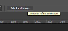
Now, select and mask.
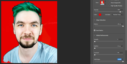
Crank up not only the Edge Detection and Smart Radius, but also Shift Edge. That gives it that weird, off look. Use this selection to create a layer mask.

Now comes the glow. Double-click on the layer and you’ll be brought to this menu, where you can add an outer glow.

Mess around with it while you have preview on, just have a little fun. The jankier, the better. If you want to use Divide, make sure the color you’re using is the exact opposite of the color you want it to come out as.

When you’re done, make sure you put the full green layer all the way on the bottom.

Now, all the way at the very top, we’re going to add an adjustment layer for Hue/Saturation.

Adding +50 makes the whole thing just a bit more saturated, which gives it an Anti vibe.

You don’t want to oversaturate the bits of Jack, though, so make sure you add that same layer mask to keep it inside the Anti part.
Step Six: The Eyes.
It’s coming along pretty well, I’d say. You can stop here, or keep going, make tweaks and add more glitches. It’s up to you, really. Have fun with it. However, if you want to know how to do the eyes, well then. I’m absolutely here to teach you.
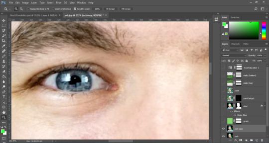
First, we need to get real up close and personal. Turn off all the layers except the bottom one, and duplicate that. This is what we’re working with.

You can use the lasso tool first to get a rough approximation of the eyes, then make a layer mask around that, but you need to use the brush tool to refine the layer mask by hand until it’s only the eye.

When the other one’s done, you should have something horrific staring back at you. :)

Now, the first thing we’re going to do is oversaturate the eyes. That’ll make them pop even more.

Turn on the layer beneath it, and you can see it’s just a subtle change but it’s crucial.
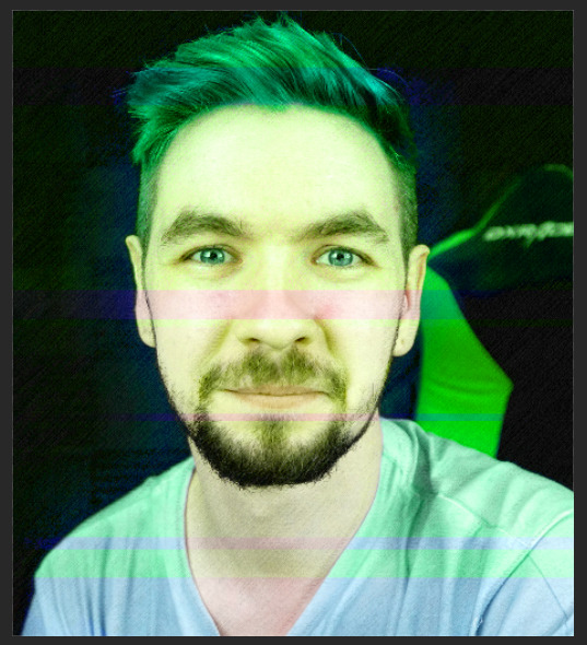
Once you turn the other layers back on, though, it’s like we’ve done nothing at all.

So, to fix this, we just move the layer up.

I actually oversaturated them again after that, and it’s such a small difference but it really stands out. Now, if you want to make black demon eyes, it’s really simple.

Just make another duplicate of your base layer, add the eyes layer mask, and then turn down the levels almost all the way until you’re satisfied. Make sure they still shine a little! That’s what makes them look good, and not just painted black.
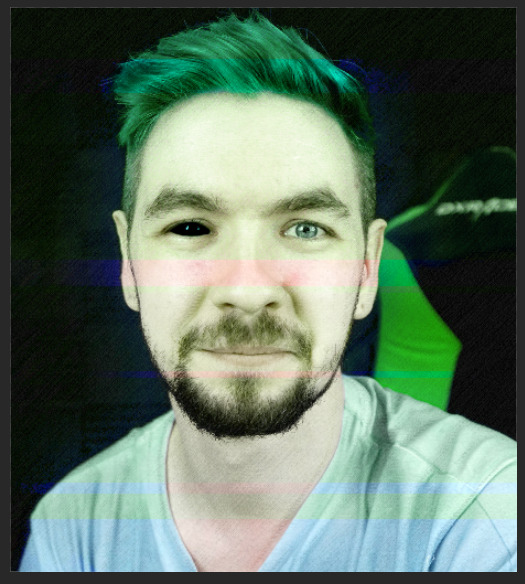
See? Now we’re really getting somewhere. The last thing is, of course, the Septic Eye. on a new, blank layer, set your brush’s flow and opacity down to 20-30%, and color in the sclera green and the iris a much brighter blue.

It might be a little rough around the edges, so don’t be afraid of using a soft eraser to touch it up.
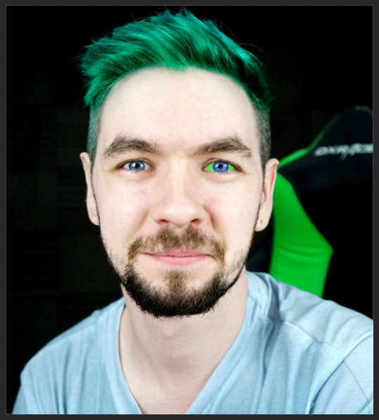
Don’t worry if it looks bad up close, either. No one can tell from a distance.
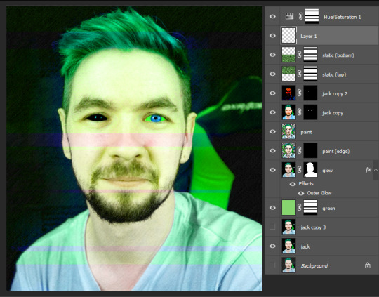
Now, just turn all the other layers on, and voila. Pretty neat, huh?
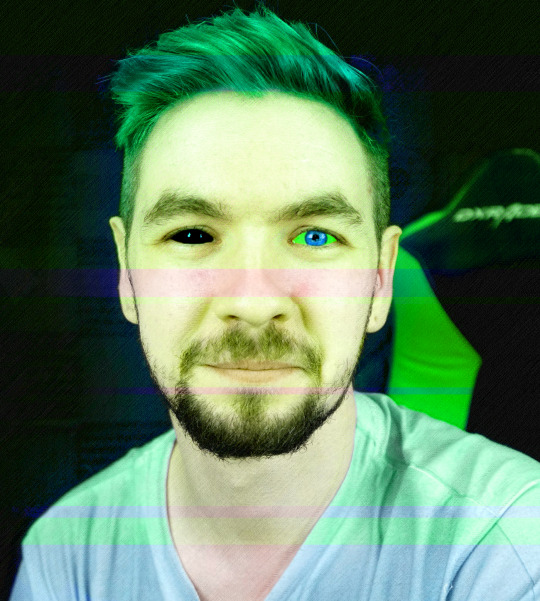
Here’s the full, finished image. I had a lot of fun making this! Might make a Darkiplier tutorial too, if y’all want that. Let me know if there’s anything you’d like to know how to do, I’d love to help out.
#jacksepticeye#antisepticeye#septicart#photoshop#tutorial#edit#my edit#artorsomeshitididat3amwhilebeingstalkedbyantisepticeye
101 notes
·
View notes
Photo
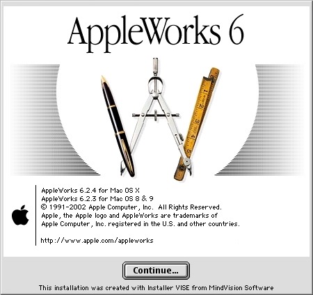
Back to childhood with AppleWorks
Hi everyone! Today I'm going to tell you about a very old software that kept me busy for many, many hours during my teenage years and that I've had the pleasure of rediscovering these days. Apple fans will have glitter of nostalgia in their eyes, others will have the opportunity to discover a beautiful tool that has not forgotten to be compatible with Windows. It is AppleWorks! AppleWorks was an office suite, installed on all Apple computers of the time, which, in addition to the classic word processor, spreadsheet and Power Point presentation, also offered a vector drawing tool and a bitmap drawing tool. It was my first experience in digital drawing and photo manipulation and with a bit of inventiveness, I was able to get some amazing things out of it. Behind its apparent simplicity, this little soft hides an unsuspected power. Let's go for a little trip back in time!

Small overview
The painting module
Gallery of illustrations
Install AppleWorks (Yes! It still works! )
Small overview
AppleWorks is 6 softwares grouped into one. When you launch it, it offers you the possibility to create 6 types of documents: word processor, spreadsheet, database, presentation, bitmap drawing, vector drawing.
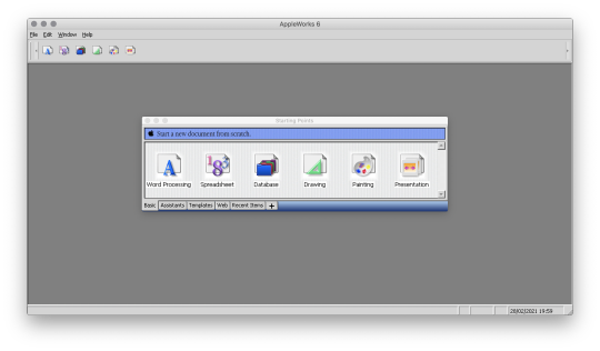
I quickly talk about Spreadsheet, Database and Presentation because I never used these modules. Anyway, know that with Spreadsheet you could make like with Excel, with Database, create databases and with Presentation, make like with Power Point. (You can click on the images to enlarge them to full size.)
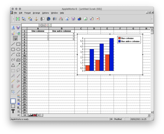
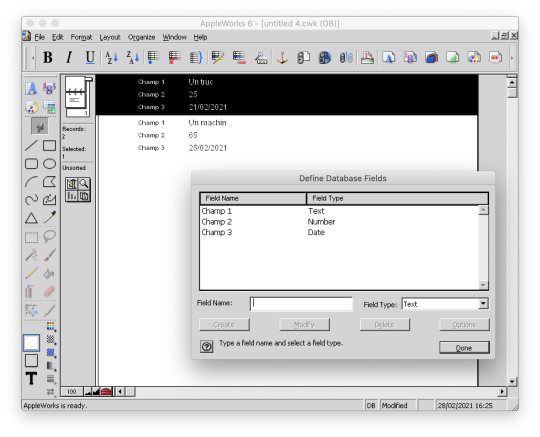

And here are, then, the 3 modules that I really used!
The word processor

I wrote all my comics scripts, presentations and internship reports there when I was at school, until my dad bought Microsoft Office. Hard to compete with the Word arts. 8D Except that Microsoft Office did not offer vector drawing software, nor bitmap drawing software. So it was not about to dethrone AppleWorks.
The vector drawing module

This module helped me a lot to make diagrams to integrate in the word processor, draw dungeon plans for our Donjons and Dragons sessions, make some logos or paste editable text on images like my comics pages. I particularly liked its ability to generate gradients that roughly matched the shape in which they were applied, and there are recent vector drawing technologies that still can't do that and that's a little bit annoying to me. And finally, here is the module where I really spent the most time!
The bitmap drawing module
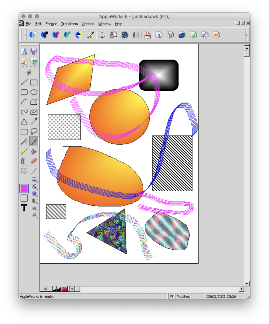
Well... Some geometrical shapes, a pencil, a brush, a filling tool, an eraser... So far it doesn't look much different from Paint. Wait until you see what it is capable of. :p
The painting module (bitmap drawing)
To begin, AppleWorks 6 is not the first version of AppleWorks that I worked with and already at that time, I had my little habits and what a disappointment for me when I didn't find my favorite features !! Looking for a little bit it turned out that they were just a little hidden and just needed to be tidied up a bit. Because yes! This small software already had a customizable interface by drag and drop as on a modern Photoshop!
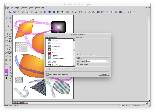
Now all is clear, we can get to the heart of the matter: drawing! :p I've already mentioned the toolbar on the side earlyer, which is already familiar to you if you've ever used Paint. Now, let's move on to the area just below: the palettes. AppleWorks offers a limited palette of colors.

You can combine the selected color with a pattern to apply. Some of them look like manga screentones.

Some fun colorful patterns are also available.

And finally a small palette of gradients is also available.
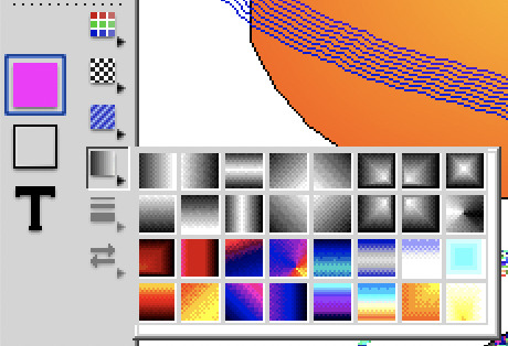
Well... A few funny patterns, some gradients. It's enough to have fun for 5 minutes, but nothing special. We will going not very far. That's where the real work begins. :p Do you remember? A few moments ago I added buttons in the horizontal bar at the top, including this one.

And this is what it opens!

A customization window! :D Not enough colors in the default palette? Never mind! You can create as many color palettes as you want.

Not enough patterns either in black and white or in color? You can create as many pattern palettes as you want!


The default gradients palettes is too poor? No problem! You can create as many gradient palettes as you want! And for the moment, I spent a lot, a lot, a lot of time on this section! You can make circular gradients.

Linear gradients.

And gradients that fit the shape in which you apply them. Well, it's far from perfect with concave shapes, but it already allows for interesting things.

And to give the coup de grace to Paint, with AppleWorks you could even create your own brushes! :p

There are even some effects available such as blurring.
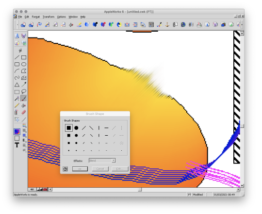
This AppleWorks is a piece of cake in the belly! :D Now that we know about its possibilities, I propose to show you a small gallery of what I was able to do with this software from end of nineties to middle of 2000s. :D
Gallery of illustrations
Let's start with the very first drawing I made with AppleWorks in 1998. We didn't have a scanner at the time, so I had to do it entirely with the mouse. It was also a time when I didn't have much notion of saving the original files and I considered that as soon as I had printed the drawing, it was no longer worth keeping it on the computer to save space (the hard drive was 4 GB). So this is a scan of the printed version you see here. x)
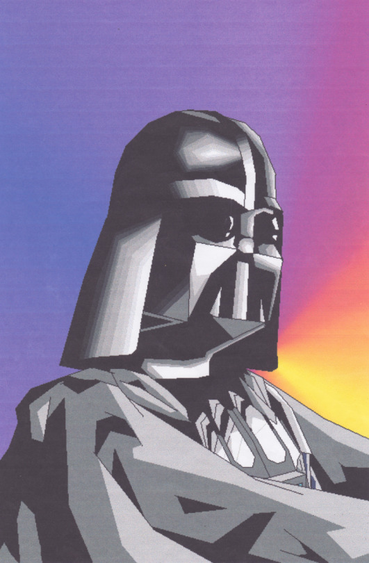
A good old Darth Vader! (1998)
Well, making a drawing from A to Z entirely with the mouse was laborious, so I also used AppleWorks to create backgrounds and print them. Then I would do my drawing by hand and cut it out and paste it onto the printed background. I was able to make interesting effects by understanding the limitations of the software and exploiting them. By understanding that gradients were composed of a series of solid color bands, I could make focus line effects by filling them with the filling tool with a different patterns or gradients.
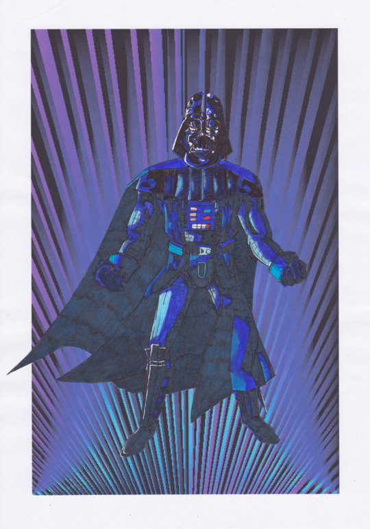
This posing remind some Dragon Ball character (Between 1998 and 2000)
It is also with AppleWorks that I made my first attempts at photo manipulation. I used photos from an encyclopedia we had on CD-ROM and manipulate them by tinkering them and copying and pasting small pieces here and there. Then I printed my montages and paste them onto the comics pages.
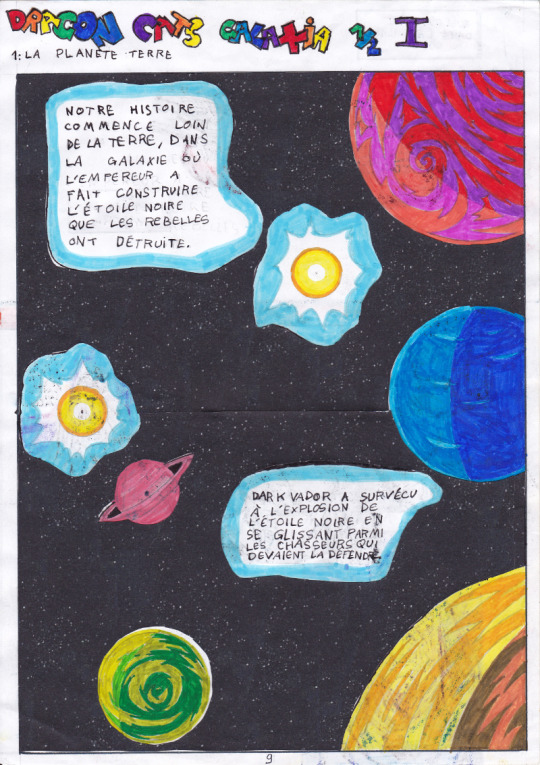
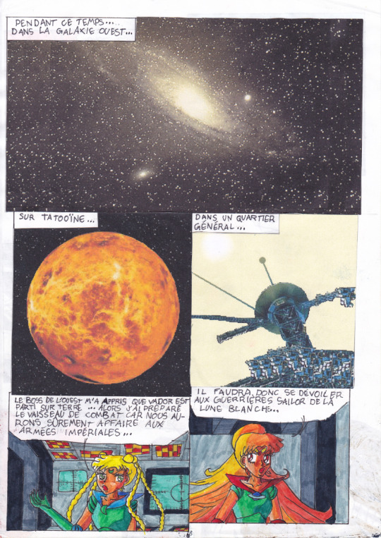
My montages were mainly used for space scenery. (1999 - 2000 in collaboration with my sister)
This software really pushed me to be creative to get what I wanted out of it. I had even managed the tour de force of pasting a white lineart over a photo.
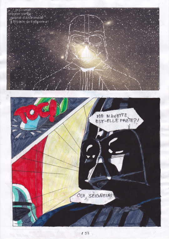
(2000 - 2001)
In the absence of layers, I had to work on 2 files in parallel and with the lasso select tool. And then one day, our first scanner finally arrived home! There the serious things could begin! I was able to stop trying to make drawings with the mouse and use AppleWorks to put in color drawings made with the traditional way. So I was able to go further from the end of nineties. It obviously started with Saint Seiya. x) (You can always click on the images to enlarge them to full size.)
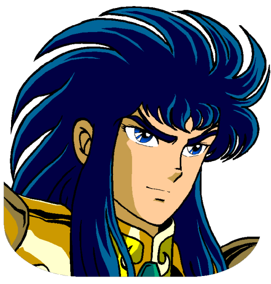
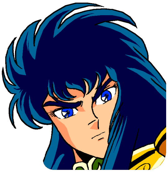
I loved the Aquarius saint. He was my favorite character from Saint Seiya. ^^ (2000 - 2001, this way)
At the beginning I was just doing solid colors, but as I experimented with the features and learned how to combine them, I ended up getting more and more advanced renderings.
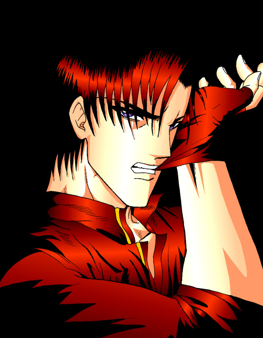
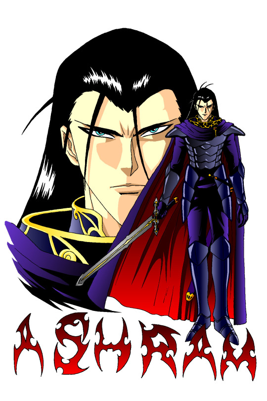
Aoshi Shinomori from Kenshin and Ashram from Record of Lodoss War. These two were also my favorites characters at one time. (Between 2004 and 2006)
If you have enlarged the images you must have noticed that the line is particularly crenellated. There was no antialiasing, no layer system with opacity levels, no tolerance threshold for the filling tool. So it had to be black, or white, but not in between. As a result, AppleWorks was not really adapted to work on drawings with small details, hatching or heavily detailled backgrounds...
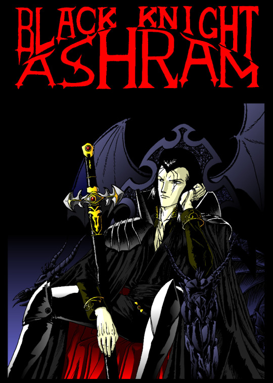
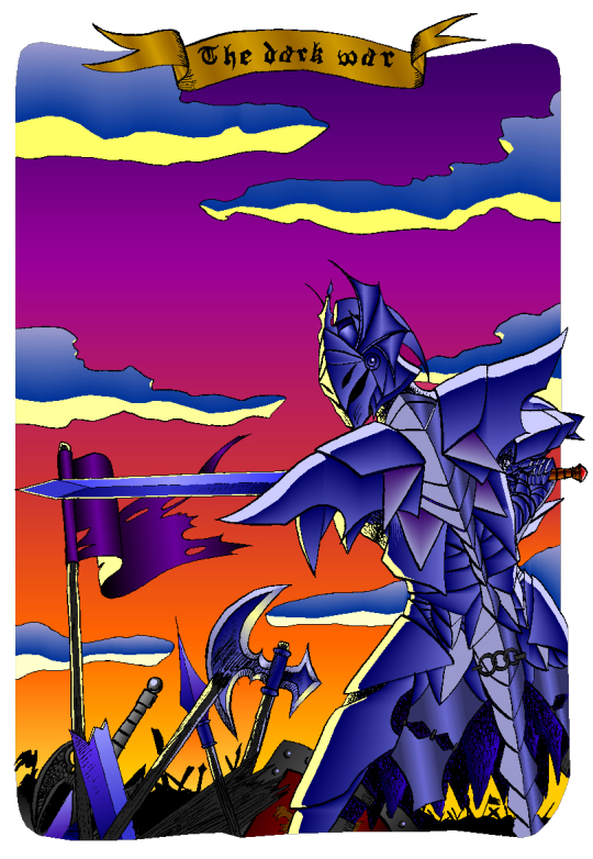
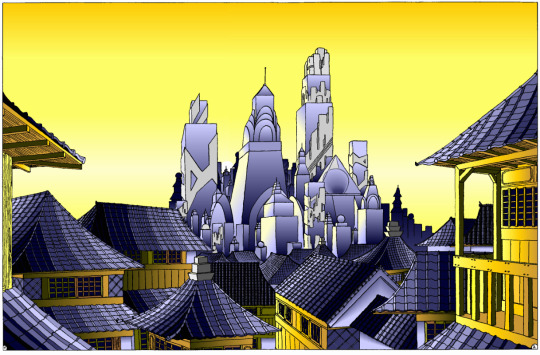
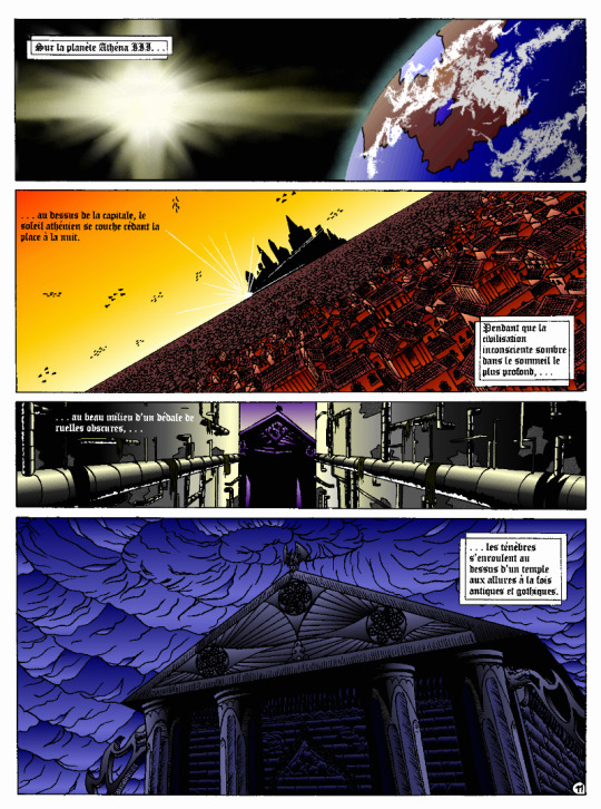
I tried anyway. :p These last 4 examples I think I made them between 2004 and 2006. The comics pages come from the first version of the Nécrotech project which is currently in a dormant state (but which I intend to resume one day). You'll notice on the first image of the last page some effects whose style stands out a bit from the rest. It's normal, I made them in another old painting software, Art Dabbler, but this is another story. :p In 2007, I got tired of suffering, I started to use The Gimp, in 2008 I bought my first graphics tablet, in 2009 I embarked on the Photoshop adventure and you know the rest: I sold my soul to Promarkers and Clip Studio Paint. And then there are days like that, we fall back into childhood. (Click on the image to see it at full size and distinguish the pixel patterns. I know, I repeat myself, but the devil is in the details. :p )

Last week, I decided to make a theme of the Drink'N'Draw from A to Z with AppleWorks to see what I could get out of it with 15 more years of experience in drawing and illustration. 8D With some tips you can get a pretty amazing result! I am happy with the result, especially the colors. It wasn't done without pain. The feature I wanted to take full advantage of (customizing color patterns) is buggy on the Windows version of the software, so I had to set up a Mac OS X Snow Leopard virtual machine to be able to do the finishing touches. What an adventure! In any case, AppleWorks is always well adapted to make pixel art and this experience has allowed me to learn new things applicable in recent and professional softwares. I had never really tried pixel art, which I love, by apprehension of the execution time. I think I found the trigger to get serious about it. I will explore it further. :D Well, well, well! But in fact, calculating gradient patterns for pixel art with shaders shouldn't be complicated. I think I will add such an effect in Péguy ! :D
Install AppleWorks
You've read it right! You can still install and use AppleWorks in 2021! :D
Windows
I did the test with Windows 8.1 on my Cintiq Companion tablet from Wacom, and in the comments it seems that it also works very well on Windows 10. To do this you will first install the latest version of QuickTime 7 which you can find on this page. You double click on the installer and you do next, next, next... Even when you are asked if you have a product key. It is not mandatory and useless for our needs. Then you go to this page and download the first file. You unzip the file and double click on the installer, then same procedure as before: next, next, next... You can do retro digital painting now! :D
Mac OS X
Apple computers have changed so much in 20 years that it is now impossible or at least very complicated to run the original programs on today's machines. The manipulation therefore consists in using the Windows version with the Wine emulator. If I had no problem with the procedure, it may seem a bit complicated for non-technical profiles so I simply propose you to download the final application I created myself via this link on Google Drive. You just have to download it, unzip it (with a double click) and launch it. If you're a computer geek and want to get a version of AppleWorks without the color pattern bug, you can get the .dmg here and install it in a Snow Leopard virtual machine.
Be reasonable about the size of your files. This is an old software that will have trouble supporting surfaces exceeding 2000px by 2000px. There is a way to cheat a bit, it is by creating a vector drawing file and creating a bitmap drawing surface inside.
That's all for that nostalgic moment. I think I will come back with some illustrations made with AppleWorks in the future. :D Have a nice day and see you soon! Suisei
P.S. If you want miss no news and if you haven't already done so, you can subscribe to the newsletter here : https://www.suiseipark.com/User/SubscribeNewsletter/language/english/
Source : https://www.suiseipark.com/News/Entry/id/308/
0 notes
Text
The Progression of the Jack-o-Lantern Sauropelta

Remember this guy? This was one of the most detailed digital paintings I’ve ever made, and I thought it might be interesting to show you guys the different stages I went through while making it.
Stage 1: Finding and Posing References

I try and use skeletal diagrams and references as much as I can when reconstructing a dinosaur. Finding this one was a bit difficult, since most skeletals are put in a profile view so you can see the legs and stuff. Luckily for me, ankylosaurs look really weird from the top, so there’s more top-view diagrams of them than most dinosaurs. This skeletal in particular comes from GetAwayTrike on DeviantArt. They do some really good diagrams, and often put reconstructions of different specimens side by side for comparison, which is really useful. You can find the Sauropelta skeletal here. I then reposed the skeletal into a curved shape using the Lasso tool on Photoshop (I’m pretty sure the Lasso tool or some variant of it exists on almost every digital painting program, which is handy).
Stage 2: Sketching


For the sketch stage, I started out with the muscles and shape of the body, in red. The tail in the reposed skeletal seemed a bit too strongly curved, so the sketch’s tail has a gentler curve to it. After the muscles it was time for the osteoderms (the spiky bits). It was really fun, for a sarcastic definition of fun that actually means it completely killed my hands. Only a person who has drawn an ankylosaur before can understand the torture that is drawing osteoderms. I didn’t even really need the ones in the middle.
Stage 3: Base Colours

The first stage of colouring was fairly easy, since it was just filling in the main shape of the dinosaur. I had the brush opacity set to something like 80% to make it a bit more varied and not just a solid chunk of colour.

Second stage, I made the background black because black backgrounds are cool, and put in the basic colours that I wanted it to have. I had the brush set to a really low opacity for this, and built up colour in lots of layers which I then merged into one. I also did some stuff with layer styles, painting the middle bits white and then setting the layer style to Overlay to brighten up the orange.
Stage 4: Patterns

For the pattern layers, I started off with just a straight yellow brush and laid out where I wanted the mouth and stuff to go. It was originally a lot brighter but I turned the layer opacity down.

Next I did the darker lines on the back. It looks pretty complicated when it’s small, but it’s really just a bunch of really tiny lines and dots, some of them more spread out than others. I added some extra stripes and stuff onto the head and neck because I thought it looked a bit boring as it was.
Stage 5: Osteoderm Shading (DEATH)

This is the step that took the longest because there’s just so many osteoderms. For the highlights I used a white brush, then set the layer style to Overlay. When you use white on a layer set to Overlay, it basically brightens whatever’s underneath it, so that’s what I use most of the time when I do highlighting. I think it looks much nicer and more natural than just plain white. The shadows are just black.

I wanted to make sure the face pattern was easily visible, so I had to erase a bunch of the osteoderm shading in the middle. In hindsight, I could have just stuck to shading the ones around the edges so I didn’t have to erase like an hour’s worth of work. Well done me.
I’ll close off this post-that-got-way-too-long-for-its-own-good with a gif of all the various stages, because gifs are fun.

#dinosaur#art#sauropelta#palaeoart#dinoween#palaeoblr#digital art#tutorial#sort of#it's more of a step-by-step progress log really but eh
79 notes
·
View notes