#also tested out a new brush for lineart
Explore tagged Tumblr posts
Text
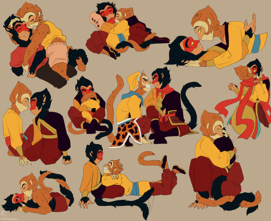
Finished versions of a bunch of Shadowpeach sketches I've done over the last few months
#swiftart#lmk#lego monkie kid#Sun Wukong#Monkey King#Six eared Macaque#Liu Er Mihou#shadowpeach#I can see the style changes in how I draw them#also tested out a new brush for lineart#I like the lineart#but the brush stuff makes it hard to colour like I'm used to#they are just really fun to draw cuddling together#entwined tails everywhere!!!
534 notes
·
View notes
Text
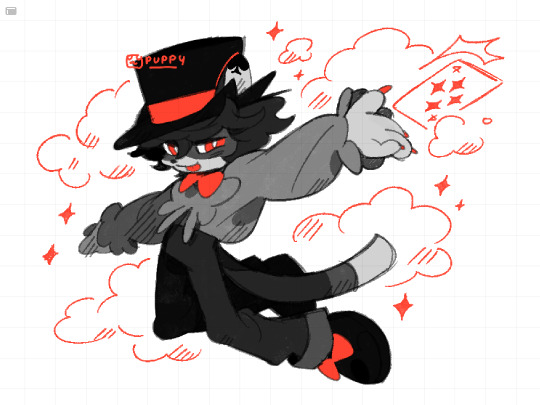
is this your card? ♦️♣️♥️♠️ it isnt but you dont wanna hurt his feelings
#this was supposed to be a warmup but i got carried away.... i havent drawn in so long that its been hard to focus orz#im testing a new brush for fun. again.. i think i can use this for clean lineart..?? im surprised i went as long as i did with the#narinder brush honestly... but i wanna try something new so here we are again#if i could get my shit together id love to draw a model of his van because i have smth really cool in mind..i was looking at pictures#of old wooden caravans like the horse drawn ones and i wonder if i could combine that with the shape of an RV#i like the ones with a door at the rear bc it kinda lookslike a train caboose.. maybe he'd get someone to weld him a custom ride!!#idk how intricate and detailed i can design it without making it a pain in the ass to draw every time BUT i have a general idea#it would probably have a door on the side but idk if itd flip down to make a stage or upwards to make a roof?? and then theres a#curtain behind it where he would come out and do his show methinks.. ive been looking at pictures of camping vans on pinterest for ideas#i dont think he LIVES in the van since i mentioned his home is an old run down theatre when he isnt on the road. i wanna draw that too#but the RV should have enough for long travels like a bed and cabinets..? maybe a net hanging on the ceiling where all his props go#id like to think of ideas for a hometown.. toronto has a huge entertainment district so it would make sense for him to live there#although id also love to base parts of it from vancouver since id love to go back and visit </3#..would there be furth names for those places?? nyancouver... clawronto... whinnypeg (like a horse whinny)...#pawson creek.... purrlington... otterwa.. i love coming up with names lol#my art#myart#my oc#oc#sleight#laikas comet oc#fan character#fur#furry art
369 notes
·
View notes
Text

My current avatar, drawn for Pride this year!
#pyro draws#pride 2023#furry#fursona#i think i was also testing out my new favourite lineart brush#i like the sketchy look of it#pyros little head guys
2 notes
·
View notes
Note
For the WoF requests, Peril or Glory pls

glory!! about three seconds from magical death spit. i referenced the graphic novel colors from when scarlet was holding her prisoner.
also tested out a new scale brush and some other technique stuff, like colored lineart (which i think turned out pretty well!)
#digital art#mag art#wof#wings of fire#glory#queen glory#royalty#rainwing#dragonets of destiny#headshot#request#wof headshots#anon
77 notes
·
View notes
Text

testing out new lineart brushes with cyrus :3 also updated his design a tad bit
#my art#artists on tumblr#art#fanart#my fanart#oc#spg#spg fanbot#fanbot#steam powered giraffe fanbot#spgiraffe
25 notes
·
View notes
Text
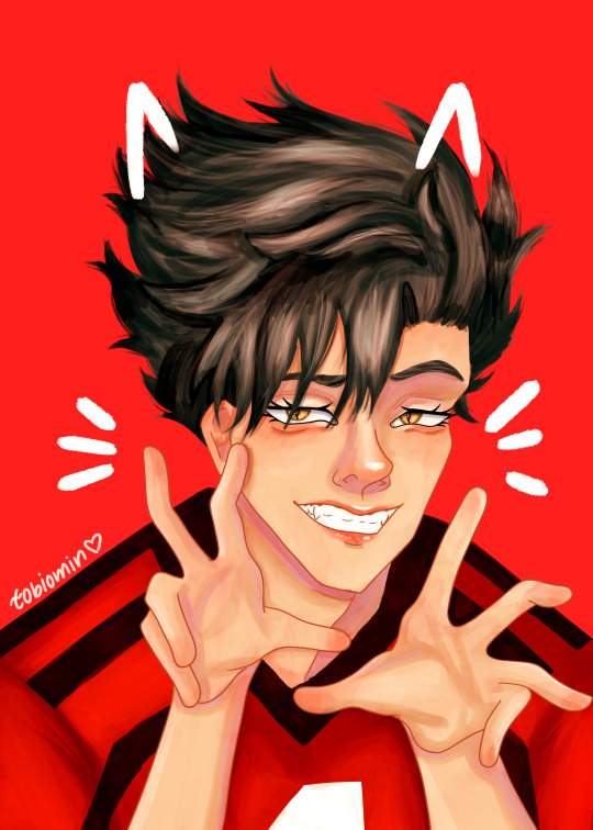
kuroo is here!!!
i had this sketch for like a month and finally had the courage to color it, also tested out a new brush and made this whole drawing (besides the lineart) with it
#kuroo tetsurou#haikyuu kuroo#haikyuu!!#haikyuu#haikyuu fanart#hq fanart#kuroo#digital art#drawing#illustration#digital artist#digital illustration#fanart#anime fanart#art#artwork#myart
18 notes
·
View notes
Note
Hey! How do you do lineart & Sketches???
You’re one of my biggest inspirations for drawing and I really love your art style!
UM??? THANK YOU?? I 🥺🥺🥺
I’ll try to word this as best as I can but I am honestly terrible at text descriptions/explanations sometimes, so I’m sorry if anythings unclear or odd. My process also varies sometimes depending on the artwork
Sorry for somewhat long answer ahead!
Usually for any artwork that I know will take a longer amount of time, I start with a really quick 1 minute sketch to get the proof of concept down. It doesn’t have to look good and the proportions may be very off and really messy but thats ok, my main goal is just to get the whole idea down and interpret it again later. I write notes next to the sketches sometimes if I have a specific thing I want to include later like for the coloring or lighting.
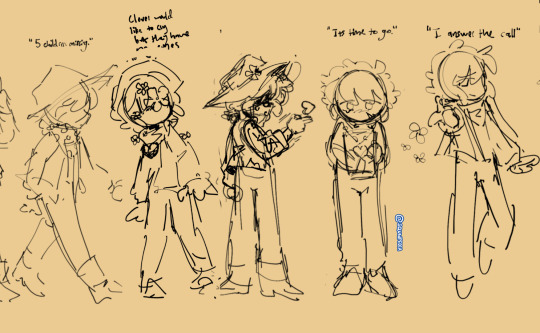
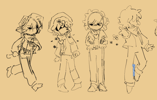
After that, I usually make a revised sketch on top of that and keep tweaking or redoing the sketch until I get something I like. This is also where I reccomend you start checking proportions and flipping the canvas. The first and third image had to be revised before I was able to make lineart I was happier with. Some other times I just jump straight into the lineart if I think the sketch already looks ok (but this is kinda risky as I usually end up having to resize a lot of the lineart later when doing this, which can end up dropping the quality of the selected area and making it slightly blurred compared to everything else. Sometimes I just end up redoing the lineart entirely for the selected area when this happens).
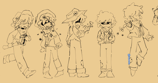
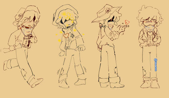
When coloring the lineart I try to mostly color lines that exist inside the silhouette of the person, but I’m also kinda loose with this rule and also will color anything on the edges if I think it looks better in a certain instance.
I’ve been trying to keep my lineart much thinner and enjoy using Procreate’s ballpoint pen for lineart. For sketches I usually use whatever feels most satisfying or convenient or just try a new brush for sketching to spice up my process every now and then.
In worst case-scenarios, if I’m really struggling to get something I like when sketching, then I just keep redoing the sketch and trying to figure out what I don’t like about it. The undertale the musical gif had something around 6 redo’s before I finally liked it enough to give it lineart
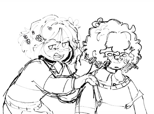
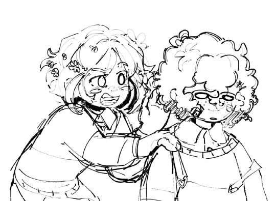
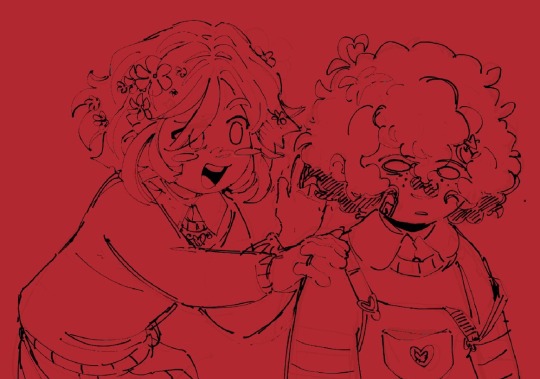
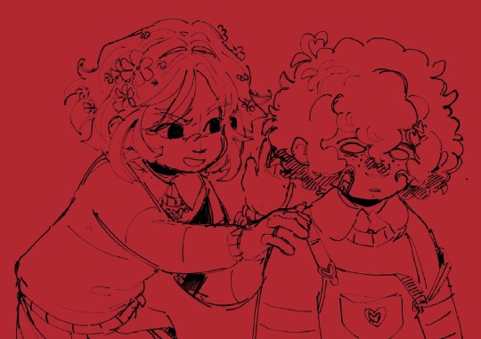
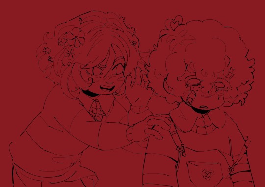
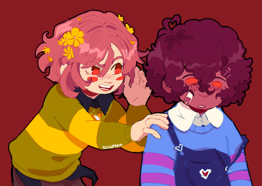
Sometimes I also try making quick messy color mock-ups of my sketches to plan out colors or specific effects for later to test what colors I like and what I think would look good for later. I also might write notes if there’s any extra details I think of that I want to include later
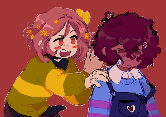
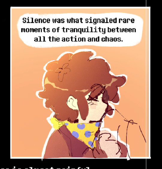
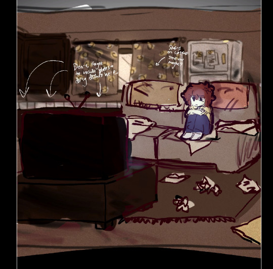
Thats everything I can think of, I hope this helps and sorry again for this being a pretty long answer, its the best way I could think to explain my process, but I hope its a bit helpful at least!
51 notes
·
View notes
Text
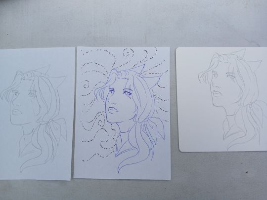
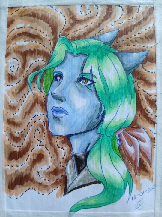
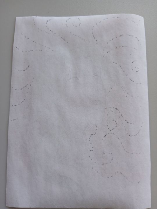
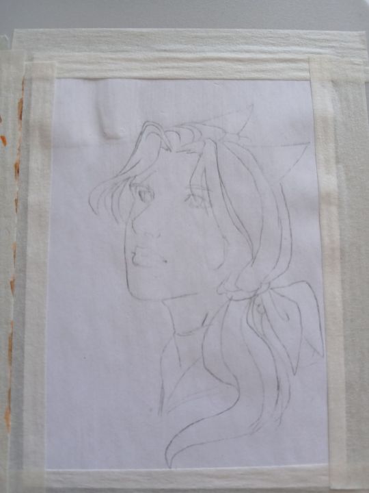
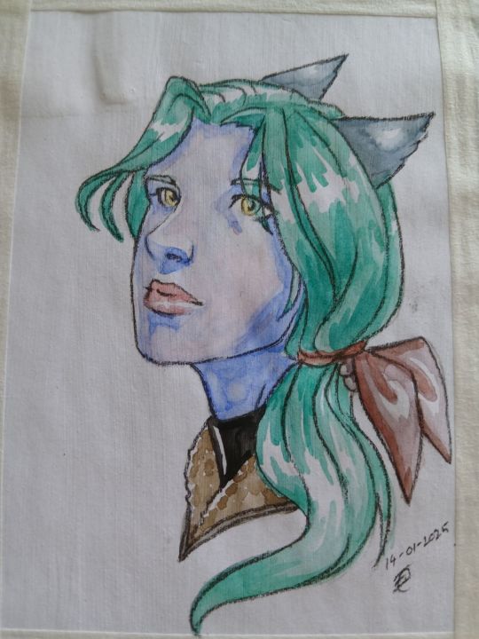
My new art supplies arrived! So, several days ago I saw something about being able to use clear gesso to stop markers bleeding through paper. Even thin paper. Google said something like printer paper would still be no good, because it would warp etc. However! I am incredibly cheap when it comes to paper... Because its one use. Even when I get more expensive paper I'm afraid to use it and waste it. So I often prefer to use... Printer paper :P Anyway, I wanted to test whether using clear gesso on something as thin as printer paper really would be doomed. I also wanted to see whether it needed several coats as videos suggested, how the texture was, and whether the clear gesso would cause ballpoint and normal ink pens to smear. 1. The first image is my prepared tracings, two on printer paper, one on super cheap supposedly watercolour paper. Unfortunately I didn't think to take a photo after the gesso was dry, but the normal ink pen definitely smeared, and the ballpoint smeared a bit too I think. The printer paper curled a little with the gesso at the corners, the cheap watercolour paper initially curled a lot, then flattened itself. 2. At any rate, the second picture is colouring with my new Ohuhu markers. Bad colouring is down to me, it has been a long time since I last coloured something. Regarding the texture of the gesso, it definitely feels slightly rough/gritty compared to the normal printer paper. And as you can see there are fine lines in the direction that I applied it in with the sponge brush. When I went to draw in the pupils of the eyes with ballpoint pen the texture made it very tough to draw/write on, as you can see with the date. Definitely pays to have your lineart/sketch under the gesso if you want it to be smooth.
3. This is the reverse of the previous image, so you can see that the normal pen which was used before the gesso went through the paper slightly, but nothing got through after the gesso had dried. I was especially pleased with how it let me blend the marker colours together a bit without any worry of ruining the paper.
4. As you can see, the gesso did fade some of the pencil sketch on this one quite a bit.
5. Applied watercolours, like the markers it allowed me to have some freedom in blending them and even layering some colours. I did not try to wet the paper at all however and was using cheap watercolours that come in those little dry circles and the brushes that have water in them. Like the markers you can see the lines of the gesso on it, but I don't think it turned out too bad. I went over all the outlines in pencil and as you can see the rough texture made all the pencil lines very dark. (I'd also applied a thick coat of gesso in the top left corner of each picture to test if the single coat hadn't been enough to prevent things bleeding through)
Overall I'm pretty pleased with how this turned out. Using it on printer paper definitely seems viable, with the main drawback being the line texture. I have read people mention potentially sanding it because they had concerns about wearing marker tips down for the same reason. It should provide me with something useable to practice on though until I feel confident enough to actually use my fancier paper.
5 notes
·
View notes
Note
hi i hope this isnt weird to ask but i dont know who else to ask this to so
how do i stay positive about my art? or at least not hate it? and how did you get into painting because i want to try that but i dont think im good at art enough to do that
dw anon this isn't weird in the slightest LMAO very normal compared to some other things i've gotten in my inbox
"stay positive" is tricky because well. puts my hand on ur shoulder. ur not gonna 100% always be positive about ur own art. and thats like. well its fine. everyone gets frustrated and mad at their own craft, even if they absolutely adore it. sometimes theres a piece that frustrates you beyond belief; it's not the being positive u gotta look out for, its realising When ur getting to that point of frustration, and pulling back. if ur working on a piece and its going all wrong? pull away, stop lookin at it and take a break !!
(also theres a difference between "i should scrap this and start over" and "i just need to take a break", i dont have a solid answer for where the line is but if a piece is repeatedly giving me grief? even after ive had a break? yeah time to hit the bricks)
for hating ur own art. see to me, this one is personal and i dont think theres a cure-all tip that'll help? but i can tell you right now: allowing urself to get frustrated, And negatively talking about your own art does you zero favours. curbing those might not be the fix but it'll help; point out things you like! things you thought you did well! test out new brushes and experiment and see what you like to do and do it some more!
in terms of painting: okay well see the thing is. i dont know? i've been on and off painting digitally for years, never really got into it until late last year where i just. randomly decided i wanted to give it a shot (scary!). but it was a lot of fun to do and i enjoy the process WAY more than i enjoy fiddling with lineart. and!!! none of that negative talk. give it a go! see how u like it!! (do some fun studies as well, studying gives you something u can be proud of because its something ur learning)
hope all is well anon i may not have like. this-will-absolutely-work advice but i do have personal experience !
#asks#jora art explaining#heavy on the dont let frustration get to you thing#kinda ends up feeding into making u hate ur own art#srry if my answer for hating own art bit wasnt great? the reason i started loving to draw and whatnot is personal to me LMAO#but i hope the advice i was able to give is something
2 notes
·
View notes
Note
sorry if this has been asked before, but i was wondering what brushes you use for your painting pieces? they look really nice!
hi bestiiiie ok yknow what let me make a list
i use Procreate almost exclusively these days so all of those are procreate brushes. i also use many brushes depending on the vibe the mood the intended effect etc etc. ones with * my most-used these days.
i use a lot of procreate defaults + i have downloaded the Jingsketch Basics and Nadiaxel Basics sets, both of which can be gotten for Free, one of them is a pay-what-you-want (including Nothin if you can't afford it), the other asks you to sign up to the artist's newsletter but you can unsubscribe from it directly after
for sketching:
Sketching > Narinder pencil*, HB pencil, 6B pencil Nadiaxel basics > Pencil
for lining:
Inking > Mercury, Tinderbox, Dry Ink Drawing > Gloaming, Eaglehawk, Moorilla Calligraphy > Water pen* Sketching > HB pencil, 6B pencil Organic > Hemp Nadiaxel basics > Sharper lineart Jingsketch basics > Sketch round, Clean sketch
for filling in:
Nadiaxel basics > Standard airbrush*
for painting/rendering, texture:
Nadiaxel basics > Dry brush and blend Jingsketch basics > Flat square* Painting > Wet acrylic, Spectra, Tamar, Old brush, Turpentine
for fucking around and finding out/adding a lil bit of spice:
Painting > Wet acrylic, Jagged brush, Spectra, Tamar, Old brush Charcoal > Charcoal block Artistic > Plimsoll, Old beach, Larapuna
my advice: don't hesitate to test out new things and be yourself <3
13 notes
·
View notes
Note
Listen here you beautiful golden lion looking being *cracks knuckles* I am prepared to do more than 250+ words, don’t test me(I don’t count my words I just ramble them off)
But i’m sure all my messages together is 250+ words so I win >:D
Also! Take all the luck you want and Twst mag not be an otome game(dating style) but it doesn’t stop the simpingness
And I love Floyd and his unhinged behaviour
Now it’s complementing Art time
The way your lines look soft is amazing, like even with sketches and full arts, the lines look soft somehow(probably the brushes you use)
Also your shading is so good! Soft in some areas and bolder in others and how they blend together is just *chefs kiss*
Also the egyptified Savannahclaw boys are super pretty!! And I love what you did with Leona and how you styled him and 10/10 would smooch the grumpy lion
Also back to the lines, you make them seem huggable as well, it’s a really nice thing! Also looking back at the comic where Fort Max is holdinh Sunstreaker like an angry cat is quite funny and his face promises death but can he? Probably not
And Sunstreaker deserves better than what he got in the comics, someone give the boy a hug
Also Fort Max deserved a lot better
A lot of bots deserved a lot better
🗣️Let 🗣️war 🗣️criminals 🗣️get 🗣️therapy 🗣️2023🗣️
Also I love the way you drew the Elite trine! They all look so good and the way Starscream’s wings wiggled/fluttered was adorable and I had the mighty need to hold him gently in my hands
-Sunny Simp Anon
And the word count goes up again hehe
I actually worked hard on softening my lineart. So I'm very happy to hear that you think it worked!
It's not just the brushes actually (though I obviously have special ones I prefer) I have a few secret techniques that I use to soften my artwork. (careful use of the blur tool mostly)
The same thing goes for my shading, I use airbrush+ink and/or watercolor brushes primarily.
I never expected anyone to think my robots were huggable/kissable, but I am thrilled that you see them that way.
I keep meaning to draw more Elite Trine pieces, I love them a lot. And I want to maybe come out with some new content for Fortress Maximus and Sunstreaker that may or may not feature more angry cat Sunny hehe
And of course, I'll keep interspersing my robots with TWST fanart too, I have another Leona picture finished already.
Thank you so much for the ask. I'm glad for the feedback~
#sunny simp anon#today is very busy#but I managed to answer my ask quota for the day#mission completed#thank you for the ask
8 notes
·
View notes
Text
My personal views on art software as a hobby artist
So lol the next art post is text based.
But considering this is my art account and art related I figured that this post should go on this art blog.
But aware these are my own views and other artist views may vary.
Ok I swear I'll try to upload some art on this blog soon!
So what I look for in a art program (free or paid) when I draw stuff
For colored illustrations
Be able to draw straight into the program or process lineart from tranditional media well
To be able to fill color with the bucket tool on different layers with ease
To be easily blend/render coloring
For manga/comic panels
Make panels easily
Apply tone easily
Have a lot of free use/references/assets (ie backgrounds) to be able to be used
Have a good text insert tool
General
Be able to transfer illustrations back and forth easily (ie from ipad to laptop)
Have a good basis of tools, ie brushes, line tool.
Bonus points if they have a good intergrated soical media platform.
So I was going to go through some art software (free and paid) that I currently use for my illustrations, go through some postives and negatives.
Before that..
Software I am not mentioning
Photoshop (because I think it's too difficult to render plus I mostly use it to alter image sizes)
Gimp (never used)
Krita (Never used)
Sketchbook (hardly used)
Many other programs I don't mention
Medibang Paint (Mobile + Desktop, Free + paid)
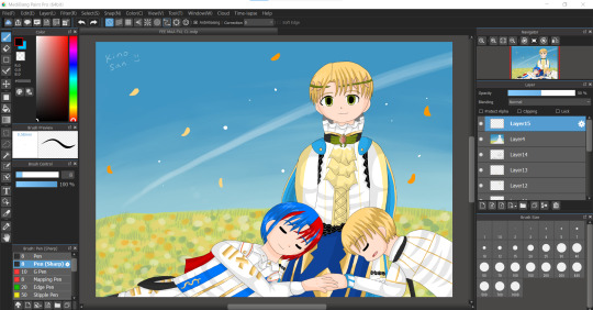
I feel like this program does'nt really get a lot of attention. It's free and always requires so many "updates" but it's a program I use a lot currently. Mostly on ipad I use this program.
Positives
Really easy to draw on and simple to color on
Bucket tool is the best in this program works on every layer
The text tool IS AMAZING to use (I use it currently for my fancomics)
My artwork looks really bright and colorful when I finish coloring on this app
Negatives
The uploading on to their soical media platfrom is bad
Cloud upload is a little slow/glitchy
Text tool needs online/internet to work
The desktop version is not as good as ipad version
Not good for drawing manga/comics
When online, ads are really annoying
Color blending/rendering is not really good apart from using the watercolor brush
Even though there's so many things I don't like about this software. I USE THIS PROGRAM A LOT. I think it's been 3-5 years snice I've used this program up to this day. Still very under-rated this program is.
IbisPaint X (mostly mobile but there is desktop, free + paid)
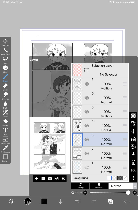
The "alternative" to procreate for android users. I don't see many users talk about this program neither.
Positives
AMAZING for manga/comic drawing. It's my current default program to draw my fancomics right now
Screentone layer is amazing
Really good bucket tool, works on different layers
Good resources/assets for manga/comic creation
Negatives
A pain to transfer files back and fourth, snice this program is mobile exculsive (unless you pay for desktop)
It's not really good to do colored illustrations on (no good blending tools, no dual colors can be used)
Text tool is not good.
A new program I came across and I honestly was SO IMPRESSED with the manga tools that I bought the ad free version. I honestly recommend this program for manga/comic creation over clip studio paint.
Procreate (paid and on ipad only)
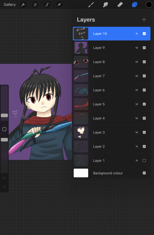
Speaking about Procreate I have it! I also don't use it as much as Medibang + Ibispaint lol. I honestly think procreate is over-rated.
Positives
Animation is the most simple and easy to use (I did my own test animations on them)
Good customisation with brushes
Good blending tool
I like the timelaspe function
Amazing color palette creation
Negative
THE AUTOFILL/BUCKET SUCKS BAD (the main reason I hate drawing on this app, every drawing I do I have to color in manually like a 5 year old and it takes me ages to finish a drawing on this app)
For some reason every drawing I do on this app my colors are dull and washed out compared to medibang
Transfering files back and forth is a pain as well
I mostly don't use procreate because for me the bucket tool NEVER works on my lineart (even setting reference on the layer) which results on me keeping the drawing simple because I have to manually color every section myself. I don't understand why it's so popular. I rather use medibang than procreate for my drawings.
In my view apart from it's animation features it's not really worth the price. Considering I bought it and hardly use it.
Paper by WeTransfer (Free + paid, on ipad only)
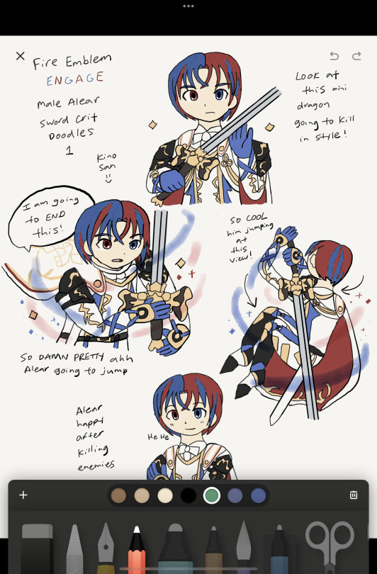
I BARELY see any artists use this app, I think I might be the only person who uses this app lol. It's got good/bad features and I still use this app for rough ideas/doodles
Positives
AMAZING organisation of art (can make unlimited journals with pages to add to them)
Can hold unlimited art pieces, don't have to name files.
Good color mixing/color picking
Takes little space on your device so I hold all of my doodles in here
Negatives
Barely/never updates
Outdated/limited tools
BAD AT MAKING FINISHED COLOR PIECES OR EVEN COMICS
NO LAYERS
Color palette is REALLY BAD
washed out/dull look when doodles are finished
So because I DRAW A LOT, I use this app to draw rough doodles/ideas. I mostly use it as a art reference for my OC designs or dumb doodles like the one above. But yeah I understand why it's not popular, no layers is like art mode HARD. But I enjoy drawing on it.
Clip studio paint (mobile and desktop ,paid + limited free?)
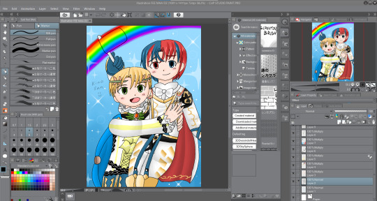
I recently got this program because I heard so much about it from soical media. So..I acutally think this program is over-rated lol!
Positives
AMAZING for colour illustrations, bucket tool is great, color picker good, great blender/render
MASSIVE online/asset resources the most I've seen so far
My finished drawings look bright and colorful and just as good as medibang
Negatives
You have to pay monthly for ipad version/ newer version (which I don't have)
I don't think this program is good for manga/comic drawing (restricted screentone layer, limited material layer, bad text tool)
I am disapointed with the manga creator, I think it's BAD! I can't FIGURE how to add panel or even draw on a manga page, I had an headache trying to figure out the way screentone works. I personally think Ibispaint is WAY more simple and better program to create manga than CSP.
But I understand why it's good and worth paying for. The blending tools are amazing as well as resources/assets. I have yet to test the animation feature.
Programs I don't use much/anymore
Paint Tool Sai (paid, desktop only)
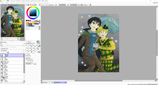
A program that existed before procreate or clip studio got popular
Positives
Working Bucket tool
Good blending tools
Amazing color palette creation
Negatives
limited assets/resources
only good for colored illustrations
I honestly did use paint tool sai for a number of years before moving on to medibang. I think this program is good, but it felt outdated as I moved on to other art software.
Overall
I just wanted to say this is my own view and so please don't get angry lol. I mean every artist is different and have their own program they like to use. This is from my own view.
I am not saying to use medibang more and use procreate less. It's just in my view sometimes I don't see why certain programs are more popular than others.
Don't take this as advice on what art program to use either. I don't know just use the one you like.
#artviews#clip studio paint#procreate#medibang paint#ibispaintx#this is not really advice on what art program to use I just wanted to share my views ok lol#paint tool sai#paper wetransfer#art software
1 note
·
View note
Text
hi!! i used to struggle with this too so here's how i combat line pixelation
for the sake of not clogging my page info is under the cut
1] canvas size
when you press the new canvas button you have a couple of different options, "for printing" or "for illustration". "for printing" includes dpi (printers use this, it basicially means dots per inch, more dpi more ink) so a higher dpi = higher quality. 300 dpi is a good quality without canvas lag. "for illustration" is for artwork you don't intend to print out.
I usually go for the "2k" or "3k" options on the presets. 2k means that at least one of the sides is over 2000 pixels, 3k means one side over 3000 pixels- so if you're using the slider at the top keep that in mind! you CAN use 4k canvases of course, but they do tend to lag the app (even 3k can do this with too many layers)
2] brushes
I cannot stress enough how much grief the default dip pen on ibis paint gave me! it took me ages to find a pen that suited me, which certainly could be the case for you. I recommend looking around at different community made brushes as well as testing the ones built into the app. my main brush is soft falcon pen (bleed) but if not that, typically any textured brush works for me.
Having a textured brush makes lineart look cleaner as wobbles are less obvious without a clear cut edge but it also negates some of that blurring visible when you zoom into lineart. that being said! as an artist you will always be more aware of flaws in your lineart than the people consuming it, the likelihood is that to your followers your art looks cleaner than it does to yourself.
practice also makes your lines cleaner, along with the stabiliser (but of course, we ibis paint plebs only get up to a 10 power stabiliser unlike firealpaca users going up to 40, so there's that)
i hope this helps :']
Yall I need help so I'm begging for comments/reblogs
If you use IbisPaintX, what brush/canvas sizes do you use to get smoother lineart?
4 notes
·
View notes
Photo

lou doodle!
#mun art. ◜♣ / ❛ 𝐝𝐨𝐨𝐝𝐥𝐞𝐬 𝐨𝐟 𝐛𝐮𝐧𝐧𝐢𝐞𝐬. ❜◞#i absolutely ADORE her#i was testing out a new lineart brush!!#it's good it just needs more Texture#also i have a bigger lou piece in mind and i'm aaaa#i might get to it after i finish the one i'm working on now!!
10 notes
·
View notes
Text
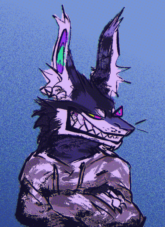
hrrng pixel brush good
#stalling and testing the new brushes im making :) theres like 60+ rn and ill make them public soon#also testing out this kind of 'mixed media' style bc im still working on my slugcat's ref and the way i drew it just#its rubbing me the wrong way. im getting worried ill have to redraw the lineart bc it looks like shit#so instead of solving the problem im making brushes. yipee kayay#myart#oc:daron
6 notes
·
View notes
Text

Middle of a fight
#thanks to a friend's suggestion#snorpy and chandlo's designs have been changed slightly#Bugsnax#warrior cats#bugsnax warriors au#Snorpy Fizzlebean#Snorpington Fizzlebean#Turtleleap#Chandlo Funkbun#Cedarclaw#Floofty Fizzlebean#Fuzzytail#page wip#also testing out a new lineart brush! i think it's better
31 notes
·
View notes