#also some choices were just for the color pallet too
Explore tagged Tumblr posts
Visit Tumblr Blog
Explore Tumblr blogs with no restrictions, modern design and the best experience.
Last Seen Tumblr Blogs


Fun Fact
US Tumblr user growth rate is estimated to slow down to 4.1%.
Text

Fanart for @cremdotexe’s fic Be My Fate, Be My Fall
It’s such a good fic fr and I cannot wait for the next chapter. Also sorry if their outfits aren’t exact to the fic I took some liberties lol
#ik their designs aren’t exact to the fic but the vibes are there#I couldn’t remember some stuff so I made it up#also some choices were just for the color pallet too#my art#art#tdi fanart#raj tdi#bowie tdi#rajbow#rajbow tdi#total drama#total drama reboot#angel demon au#a03 fanart
99 notes
·
View notes
Text

zeno's ultimate pokemiku tierlist ⁉️(it's all his opinion and he loves them all regardless⁉️)
#like arrfgggdiakaktmcksmsama this was literally all for me like they knew what they were doing#i love character design i love pokemon i love miku. and then you put ALL THREE TOGETHER....#i will explain some of my choices here#poison miku is just too good but also i am a big sucker for freaky scientists with constant “worry” eyebrows#her design is just so out there and crazy (this is about the shoes. some understand the greatness of the shoes and some dont. and thats ok.)#every other miku in peak i think establishes their theme exeptionally well especially ghost bug and fighting#for ghost i already love spooky and gloomy looking characters and that miku delivers tenfold (of course shes designed by the GOAT take)#esp with the mix of ghostly and electronic/digital regarding the glitchy parts n the 01 hologram#she looks like shell invade my computer and give it a virus if i dont send the chainmail about her tragic file corruption to 10 friends#(in the best way possible)#for bug miku the big dress is a huge plus but also i just think shes adorable nuff said#for fighting - i love a delinquent character and she fits that really well. the half coat thing is a big highlight for me#also the leek theme is absolutely iconic#for the ones i didnt like as much - i honestly just think the koraidon one is a leeeeetle bit boring#dont get me wrong. it has really cool aspects like the hair and the koraidon like cape but idk#it feels like theres a lot going on but not that much at the same time? its still a really nice design tho esp the hair color#for the ones in yellow tier - i just dont like the color palletes very much . theyre still really nice designs esp fire miku#but all in all these are genuinely all amazing designs and i dont want to be too critical or mean to any of them esp seeing im not a pro#but this was really fun to see unfold!!! cant wait until the songs start dropping#in the topic of miku as well - hey muse dash where's my miku on the switch version....#please dont make us wait too long 🙏🏿🙏🏿🙏🏿
51 notes
·
View notes
Text
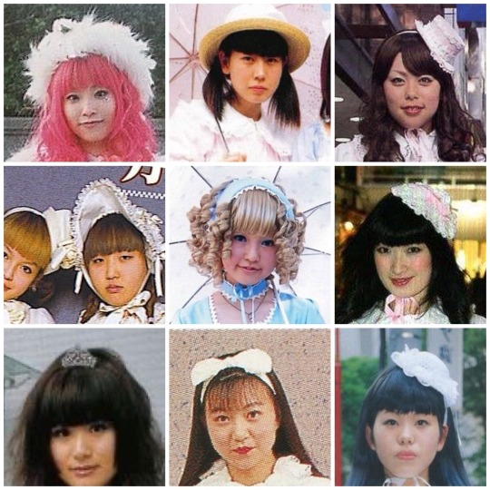
Sweet Lolita through the years
Part 1: Late 90s-2005 (ish) “Oldschool”
Oldschool sweet is the first truly recognizable form of sweet Lolita
Though during the Oldschool era the substyles had far more crossover and less individual traits I think there’s just enough that you still label coords from the time. When most people think of Oldschool they think of a solid color main piece with lace topped otks and a rectangle headdress… but Oldschool is so much more than that.

Oldschool in general was simpler, though some brands like Metamorphose Temps De Fille , Emily Temple Cute, and baby the stars shine bright were already making prints
Printed fabrics of fruits or florals were very common, but you did see a good amount of screen printed and appliquéd pieces coming out at the time too. Some very common sweet motifs in the oldschool era were:
•cats
•fruit
•alice in wonderland
•bunnies / rabbits
•bears
•alphabet / letter prints
•music notes
•hearts
The closer to the end of the identifiable oldschool era the more prints became popular! Though through most of the 2000’s prints would remain more minimal with the focus being on more structural elements like lace, bows, construction, and interesting fabric choices.
Due to the image limit on tumblr here’s a link to the correct sorting to see examples on lolibrary with examples of some early sweet prints and patterns. If you click the link on any of these items you’ll be able to view their lolibrary entries as well if available
Color balance wasn’t considered as highly as it is today, the overall vibe of Coords was more chaotic and experimental. A very make do attitude can be seen in many street snaps.
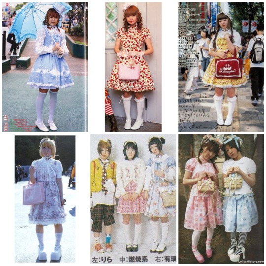
Patterned main pieces were another popular alternative to prints, things like gingham, stripes, tartan/plaid.
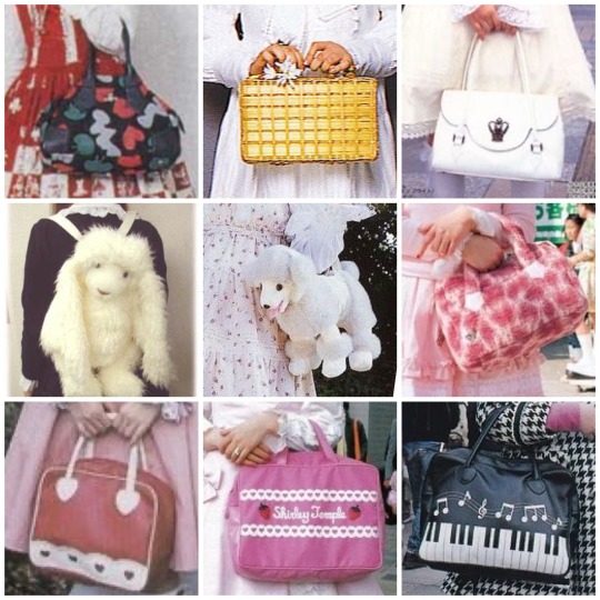
Bag choices were pretty varied, honestly in a lot of oldschool sweet coords people would use unique bags as the visual interest / focal point. You can already see that in someone of the coords above. Faux leather shaped bags like btssb’s heart bags weren’t very popular yet. A few brands had put out heart bags, such as milk, but they were much simpler and often real leather in limited colors. You also didn’t see usakumyas in their modern iteration until well into the 2000’s towards the 2010’s. Plush bags of the era did not have the same clean marketable look. Some common / popular bags were:
-basket / wicker purses
-plush animal bags
-tote bags
-matching fabric bags
-leather handbags
-designer handbags
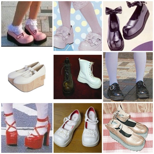
Shoes at the time were much chunkier and much less cutesy even in sweet styles. Tea parties didn’t exist until a good deal past this time period- honestly most popular modern Lolita shoe styles weren’t really seen. Real leather was far more common, in a much more limited pallet. When you did see colored shoes they typically weren’t used to color balance a coord like we do now a days. A lot of different styles were worn though, including:
-Mary Jane’s
-Platforms
-Rocking horse shoes
-Boots
-Oxfords
-sandals
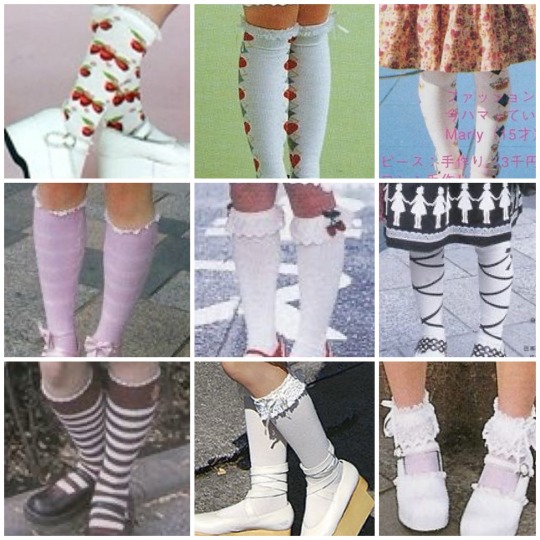
Socks are often overlooked in oldschool. I’ve seen so many people say printed socks weren’t worn even though they absolutely were and many brands made them. Sure, lace topped otks were the trend and the most popular option but simple motif printed socks absolutely existed and were worn!
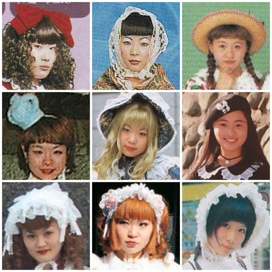
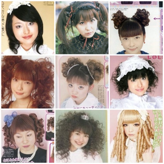
Headpieces were one of the most varied category. So many different styles and kinds were worn.
-mini crowns
-hair ribbons
-hats
-bows
-canotiers
-mini hats
-lace headdresses
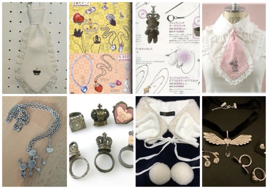
Jewelry / Accessories were one area that Oldschool definitely was simpler. However brands were absolutely making both jewelry and other accessories. Plain metal necklaces with various motifs were common, lace chokers, faux collars, capes, ties, and though extremely uncommon you do sometimes run across wrist cuffs. Hopefully there’s more of an effort to start documenting jewelry and accessories from this time since it’s quite lacking
Makeup and hair were something that like all eras of Lolita followed the over all cultural trends of the time. More minimal make or simple 90’s - early 2000’s makeup is seen often. As for hair there’s so many different styles that really it would be impossible to list them all. In older magazines there’s often sections with hair tutorials and makeup tutorials!
Common lace styles included Torchon, Cotton, Eyelet, and Raschel. Many different trims and such were used in addition to these.
Part 2 and part 3
Scan credits @obscuredesireofbourgeoisie
If you want to see more old magazine scans
Lolita history
Internet archive
#sweet lolita through the years#oldschool lolita#old school lolita#sweet lolita#lolita fashion#egl history
384 notes
·
View notes
Note
I love the octodeck SO SO MUCH, would you be willing to share your design choices?? Like I would've expected the noble/rogue classes to be the basis for separation by suit, on top of the black/red divide between octo 1 and 2 characters
sure! i’ll actually go card by card and explain all my choices tbh, so strap in for a long post

first up, spades! my girlfriend was the one who suggested the games be the split between red and black suits, so starting from there we hashed out out placements for suits. honestly, we didn’t choose for much reason other than vibes, so the design choices weren’t much about classes/gameplay. spades is the higher ranked suit, as well as having a symbol with a sharper motif. for this, it felt like olberic and primrose were good fits, with olberic being the oldest/most battle hardened of the OT1 cast, and primrose having a sort of rightful queen motif (and she’s dangerous with a dagger.) with ophilia and tressa being chosen for jack, we decided to put tressa as spades (this one is very slightly gameplay related, she is kind of the best so we gave her the higher suit) and therion got the ace. i explain a lot about the card placements here, so following this paragraph i’m not gonna rehash it too much.
anyways, now here’s some of the design thoughts about these guys!
Tressa: for these earlier spades cards, which were the first suit i sketched, they definitely started with the lightest backround elements. i went in on a second pass and added some more detail, but tressa was the first card i drew and she had no backround at all at first. decided that a pirate ship/sea and treasure were good motifs for her
Primrose: i absolutely loved drawing her card, but then again i love drawing primrose in general. for primrose, i decided her backround elements would be birds and petals. birds are a prevalent symbol in her story, with the crows being her enemies, and primrose herself is a kind of caged bird. initially, i wanted to give her an asymmetrical card that had one half with 3 black birds (crows) while the other half had white birds (freedom). i didn’t end up liking any of the sketches for the black birds, so i decided to just do the white birds instead. still really love this card!
Olberic: olberic was a tough one to pick a backround for. i ended up going for just some vaguely mountainous shapes, but also decided to add in the gate of finis, since it’s located in hornburg. my goal with this card was to make him look regal without looking royal. i think the sword also came out really good, i really like the way the mirroring on this card came out
Therion: Therion was the first ace i drew, and i decided that since ace cards aren’t face cards, i have free rein to do whatever i wanted. and what i wanted was to not have to worry about the mirroring. so all of the aces ended up with this kind of “guy floating in space” idea, which i think is pretty fun without being overly complex. i didn’t want to over complicate the ace cards, since typically they’re pretty minimal looking. my original idea was to have each of our aces holding or interacting with their suit symbol in some way to make it interesting. the spade kind of looks like a dagger, if you stretch it out, so my original idea was to have him wield it as such. however, none of my sketches read clearly, so instead opted to have them instead present their suit as a kind of compromise. since ace cards are not face cards i also opted not to define their faces.

here’s the clubs! when i was getting to the coloring stage, what i decided to do to make things interesting visually was to use a different palette for each suit, while still keeping it clearly black suit/red suit. for the black suits, Spades got the cool grey palette, and clubs got the warm gray pallete!
as for individual notes…
Ophilia: oh boy she gave me a lot of trouble. this was mostly due to the lighting on her lantern, and trying to convey it in grayscale. i think i did a pretty decent job!
H’aanit: decided linde counted as a backround element for the hunters. i don’t have too much to say about this card other than it took me a while to grayscale it so that everything was silhouetted to an acceptable degree to me lol
Cyrus: i had a lot of trouble picking out a backround for him. i thought maybe a library or something similar, but i ended up going with this pretty generic sunny pathway to represent the bright lands in general. the big chunky brush makes rendering small details in the backround difficult (not impossible) so simpler is better if i can swing it.
Alfyn: going back to the interacting-with-suit-symbol idea, my original idea was that the clubs symbol kind of looks like a clover, so alfyn could be kind of inspecting it like an herb or something. however, the pose i first drew was too similar to cyrus, and again the symbol did not read clearly, so i scrapped it lol.
one fun thing about the way we ended up sorting the suits was that each set had 2 pairs that had team up attacks in the ot2 extra battles (olberic/tressa, therion/prim for spades, alfyn/ophilia and cyrus/h’aanit for clubs.) this was by complete accident.

now we reach the red suits! for hearts, i opted to use warm/orangey shades. onto the individual notes!
Agnea: i wanted her braid to be nice and visible in the composition, so i kept her backround elements light. just fluttering petals to fill some space i just love drawing agnea in general tbh
Partitio: i got a good way through coloring this one and decided i absolutely needed to make his coat yellow. it’s too iconic to the design. luckily, the warm red pallete accommodates it pretty well. it’s definitely a more orangey shade but with all the red it reads quite yellow. i gray/redscaled everyone specifically to avoid having to figure out color palettes for everyone that were cohesive and read well, while also making clear distinctions between suits, but partitio had to be a little bit of the exception. i did decide on warm red for hearts for him specifically perhaps….
Ochette: this was the first card i actually executed an asymmetrical design on! one side has akala in the background, the other side has mahina. they’re both right side up, but they can’t coexist. thought it was fun! this is also one of my favorite cards now that it’s finished. i did NOT like it at the lineart stage, but loved it after the color!
Osvald: osvald as the ace of hearts has been a fav placement according to my sources (tumblr tags, comments, etc) my original idea was to have him more ready to start blasting one true magic love super mega laser with the heart at the center of that, but i think having him hold/present it a little more gently is also fitting. maybe like it’s more fragile, even tho being the ace makes him the strongest card of his suit (love can make you blast lasers)

diamonds! these guys got the cooler red/pink palette.
Throné: i’m sure the snake motif needs no explanation, but the idea here was that she was entangled by the snake, like it’s holding her down.
Castti: castti also got a unique color added to her card, though it’s much less noticeable than partitio. the raindrops in her card are purple! (uh. should i exclamation point that? three cheers for horrifying evil super mega toxic rain?) i added clouds to go with the rain, but also a vine that deteriorates or recovers as it goes, whatever way you want to look at it.
Hikari: another asymmetrical card. one side hikari, one side his shadow self. i also offset the mirroring on this card a lot more, and allowed the drawings to extend down into each other more than than the other cards in this way, hikari and his shadow self intersect, but aren’t quite mirror images as much as the other cards. (does that make sense?) as for his backround, i put the castle town of ku. this one was difficult to get to read right, but i think i got it pretty decent.
Temenos: my original idea for this one would be that temenos is interacting with the diamond like the mirror shard, but again, i scrapped that idea. instead, he presents it like the other aces. not too much to say here

jokers! i got a couple suggestions for what to do for jokers, (kit, al, lyblac, oboro, arcanette) but definitely most common was people saying to incorporate caits/octopuffs in some way. i liked this one the best because jokers are wild cards, and they’re also kind of silly, so making them villains or major story characters didn’t quite feel right. with these cards, i decided that i could use any colors i had previously used to color them, so they get to be both gray and red tones. due to the variety of warm and cool tones, i actually had a ton of color to work with, and they almost even look like didn’t i gave myself color limitations on them!
for the cait card, i stared with a more accurate orange cait, but decided that i’d rather make it gray since the octopuffs were gonna be orange (or pink). besides, the cultured cait is gray so it’s fine. as for the octopuffs, i ended up just picking two that i liked and using those. i tried adding more smaller ones as backround elements, but didn’t end up liking how it looked.

and then finally, the backing! there’s a couple things going on here, and this was definitely super fun to draw because doing something more ornamental like this is outside of my usual wheelhouse. i started with the concept of the circle with the 8 base class symbols, in OCTOPATH order of the first game. in the middle is 4 flames, like the 4 that protect solista in OT2. on either side i drew octopuses, because. octo. i ended up giving them the little horns too, making them massive octopuffs. then, to round it out, i added little chubby caits to the corners, and then a smattering of stars to fill out the space, since i liked the way it looked. surrounding the flame, the stars indicate night, a sort of subtle nod to the nightfall endgame in OT2, while the stars being out imply that at least for now, it’s a normal night. the chubby caits have some teeny tiny jewels and treasure surround them, and the sparkles ended up looking like more stars, so i just added more. as the the border, it’s basically just random ornamentation lol.
and that’s it! (for interesting cards, at least. doubt anyone cares about the unchanged number cards) hope you liked the long read, i just like talking about drawing lol
55 notes
·
View notes
Text


Sonadow fankids i made :) i have some pen on paper sketches of them as newborns but dunno if i wanna post them yet
Updated Spiral design
More thoughts and alternative Spiral designs under the cut ↓
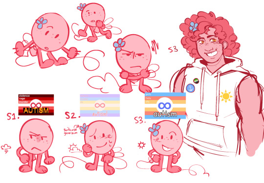
Spiral was the first one i designed and i very much like the idea, but now atfter making the twins, Spiral's design seems the odd one out here and I'm thinking of redesigning them again. I mostly don't like the pallet, as i was struggling between a half and half light/dark tones and mostly light tones. Making them intersex was an easy choice since i hc shadow as intersex, i mean he is an ultimate life form after all, so like father like child.
The twins were so easy, it scared me actually. When i learned that hedgehogs can birth from 1 to 7 hoglets i just knew there had to be at least twins after Spiral. Then i remembered that albinos exist and i also didn't remember seeing any albino fankids/sonicsonas/ocs, so i decided to make one. First i thought making them boy/girl twins as it's the most common type of twins, but then i thought, "hey i don't have any trans characters yet and as i don't hc sonic as trans this is a great idea", so Snow is transfem!
In my sketches of them as kids i (and sonadow too) refer to Snow as he/him since she doesn't break the egg until like 8 y/o. Also yeah Astera's quills are very messy and they get better as she grows up, she's also the strongest one of all the siblings! Snow being the weakest since her albinism gives her some health problems, especially as a kid, sonadow were very worried about her and became a lil bit over protective
Also yeah all of the kids have unnaturally long tails, i just thought it would be neat
Spiral's alternative colors! The "final" design is a combination of both of these


#saltstext#saltsart#sonadow#sonadow fankid#sonic fankid#fankid#sonic the hedgehog#shadow the hedgehog#fanart#i guess?#fankids#sonadow fankids#my art#art
36 notes
·
View notes
Text
V (Cyberpunk 2077) mod for Bomb Rush Cyberfunk!
Thought it would be funny to post this on Cyber Monday! I was taking a break from some personal projects and though I might revisit the BRC modding tools to take a crack at V. Really proud of how they both turned out visually, though there aren't any complicated physics elements on either of them which made it a bit easier.

Originally I was just gonna do fem V, but then I realized a lot of masc V could just use the same textures and slightly adjusted meshes from fem V.


This time around all of the themed skins are from the same franchise, since there were plenty of cyberpunk characters I could pay homage to with the color swaps.


For the Graffiti I blocked out a shape based on the C from the Cyberpunk logo, which already is basically just a sideways V, and then I swapped the colors in case you want to have both Vs in your game at the same time. I also included some tricks where one of the characters is named "V" and the other is named "V " - so they look about the same but don't conflict with each other.

As always I had fun making stickers for them, lots of text this time around, but Cyberpunk is full of logos and icons, so I was not hurting for choice on inspiration for pixel art! (Jackie's shirt was likely the hardest, trying to make the guns show up in the limited color pallet proved difficult).
Voice lines were also a bit difficult, mostly because V goes through a lot of shit and doesn't take a lot of time to celebrate or cheer, so finding phrases that sounded appropriate when doing skateboard tricks took a bit of work. Huge thanks to the cyberpunk sound database tool - wouldn't have known where to start with extracting those otherwise. Masc V's lines aren't very well documented over there, but I did discover that for most of V's voice lines, the file name includes either a "_f_" or a "_m_". So when I found a voice line I liked for one of them, most of the time I could change that tag and find the same voice line for the other, even if it wasn't documented on the sound database, so that helped a lot.

I had a lot of fun making them, so I hope y'all have fun playing with them too!
#cyberpunk#cyberpunk 2077#female v#male v#fem v#masc v#2077#judy alvarez#panam palmer#rebecca#rebecca edgerunners#cyberpunk edgerunners#edgerunners#johnny silverhand#v cyberpunk#jackie welles#david martinez#david edgerunners#bomb rush cyberfunk#brc#cyberfunk#3d art#blender3d#blender#3d artwork#my art
18 notes
·
View notes
Text
Uhhh, hey y'all, I found this in my drafts and it's basically completely done(I think?). So I've decided to let it loose.
This is also from approximately two years ago? So I think some of my opinions have changed, but whatever.
Anyway my here are my opinions on the usage of color and color psychology in the ever after high kids outfits! This is gonna be unreasonably long, so sorry ahead of time <3
.
.
.
.
Sorting them by their primary colors btw!
.
.
.
Let's start with warm colors!
Warm colors are ment to be exciting and stimulate reactions. Warm colors are stronger, bolder and more powerful, they're essentially the main characters of colors.
Red- power, sensuality, anger, urgency, heat, passion, confidence, warning, and danger
Apple white: to be honest I don't think using red as her primary color was the go. Red is a very strong passionate color and the feelings the color is ment to evoke aren't super present in Apple? I understand why the choice was made to give her red, as the apple in snow white is red. And often red is used to represent royalty and power, which are things snow white is shown to have, And Apple aspire to have. White is another one of her primary colors. White usually represents elegance, purity, and goodness and I feel like it could've good color for her to lean into it! Her last color is gold, gold is usually used as visual shorthand for wealth, wisdom or courage. Another color I feel is more in tune with Apple's personality. It's a color that can have two very vastly different meaning and I feel like that could be a fun thing to explore with her!
Cerise hood: it is very obvious why red is Cerise's primarily color lol, But it's a very good choice nonetheless. She very much represents a lot of red's traits, and honestly that's pretty interesting considering she has one of the more subdued personalities in eah. Despite this Cerise shown to be very confident in her abilities and genuinely a strong and confident character without being super gaudy about it. Her other main color is black, and to be honest before going back to check her character design I thought it was brown? Anyway, black is also color Cerise does a good job of representing. She has the dark intrigue and mystery of black while also encapsulating the strength and resilience! Her color pallet is definitely one of the more straightforward ones haha. Both colors also work when considering about her wolf side too. Cerise is just a very well rounded character, which is a little odd for eah lmao.
Lizzie hearts: yeah, she absolutely embodies red. As the future queen of hearts Lizzie has shown almost all these qualities, and because of the nature of the character she's Destined to be red fits(she also has love and heart motifs which I think really sell it). Overall lizzie is a very passionate and headstrong character, leading to her ability to embody such a bold color. Black is her other predominant color. black is most promently used to symbolize evil, and it definitely works in the context that she is In fact her mother’s daughter leading to her antagonistic spot in her story. Lizzie is not evil though, and a part that can come through in black is mystery! Lizzie herself is not particularly mysterious, but with wonderland being a place not super readily available there's a sense of mystery that comes from that.
Orange- excitement, confidence, vitality, energy, hope, wit, concentration, encouragement, and caution
Holly o'hair: Ok, so yeah, maybe orange isn't the most present color in her pallet, but I feel like it does a good job at representing her! Holly's character isn't the most fleshed out, overall both the o'hair twin were treated more like a unit as apposed to separate characters, but from what we got she does give orange vibes. Holly is the more outgoing, energetic twin and she is shown to be incredibly supportive of her sister and friends. She's also a very passionate fan fic author storyteller, and clearly pays a lot of attention to the things she's passionate about. Which is why I felt she fit here best! Another one of her colors is pink, pink is usually associated with softness, care, and femininity. A choice I think was very interesting is giving Holly (& Poppy) a stronger pink, stronger and brighter pinks give vastly different emotions from softer ones. For Holly specifically I think this was more so used to show her friendly nature, and seeming exitable nature. Lastly purple! The usage of purple in Holly is probably once again to tie her in with Poppy (they're the only two-piece siblings set with different sides chosen, so they were definitely going for a royal/rebel thing they have with Apple and Raven's color pallets; but more low-key), but it still can work in her color pallet. Overall the purple can be used to symbolize Holly's ambition, creativity, and royalty.
Yellow/gold- vibrant, energetic, joy, optimism, childish, attention, irresponsible, and unstable/ compassion, wisdom, charisma, wealth, success, tradition, greed, and extravagance
Daring charming: dude manages to completely encapsulate every trait of yellow AND gold, and you know what, good for him. Daring has got to be one of the only characters that manages to so blatantly represent their main color. He's the school's golden boy, and yellow/gold definitely encapsulates the energy and emotions a character who is held on such a high pedestal should. One thing that was done pretty well, but I feel could be done better, would probably be the extravagance and showsman-ship of Daring's character. Like, I feel like Daring would be very into the whole outward performance of the prince charming persona, if that makes any sense? His other main color is blue; out of the three charming siblings, Daring wears it the least. This could be used to show the separation of the other two, and more specifically, the higher level Daring is held, too. His lack of blue could also be used to his lack of empathy and self centered-ness or the lack of acknowledging his own true feelings. Dispite being incredibly self centered, often when the story centered on him Daring is shown to not be a bad person, he can be empathetic and vulnerable it's just hidden under layers of shitty lessonand morals he was taught. I haven't mentioned this so far, but another thing blue represents is masculinity. Daring is basically the masculine ideal, both at his school and the wider society of ever after, so its fitting.
Rosabella beauty: something I always found interesting about Rosabella's color choices is that her color palette is completely warm. So I find it strange thats she's such a dull character. I just think diving into a part of her that's more strong and charismatic could've worked? Anyway, there's potential in both yellow and gold for Rosabella. Yellow is very energetic, attention grabbing, and vibrant, gold is a color of success, wealth, and charisma. Both have surprisingly contrasting meanings, and both sides were used very little in her character. Side note but I absolutely hate how Rosabella's epic winter outfit is an absolute betrayal of her color pallet AND style direction! Most of the other central characters from epic winter have colder color palettes so the winter them lends more naturally to them. But they still could've done a better job on Rosabella's epic winter outfit!!! Her other color is brown, which I feel her charcter leans into a little bit more. Brown is a color of stability and honesty, which were communicated pretty well with the characterization we got, but brown can also be very boring and unmoving. Again, i feel that was shown, but over all I feel like her characterization was overall very boring and uninventive, Much like brown. Rosabella could've all around been done better, and I feel her connections to her main colors show that. I'm also 100% neglecting mentioning that stupid rose color they gave her on purpose. Just give her red you cowards!!! Are you scared of a girlboss or something mattel???
Neutrals!
Neutral colors are usually thought of as boring, they're used to tone down or bridge the warmer and colder colors of a pallet. Neutrals are often the safest choice went it comes to color as they are very uncontroversial and traditional.
Green- growth, hope, healing, balance, relaxation, safety, abundance, jealousy, cyclical, and guilt
Green is usually considered a cold color but personally I think it's a bit more of a neutral. It takes way to much of both Yellow and blue to be anything else.
Bunny blanc: having bunny here Is really funny to me for some reason?? Anyhow, her primary color is green, I thought it was blue, but that's not the point- Green! in general, Bunny doesn't really seem to fit in (visually) as well with the other Wonderlandians. It's probably because she uses the meekest form of green, compared to the other Wonderlandians who have very bold and present colors. Being completely honest, I don't actually like bunny in green? It seems like a weird choice, kinda. I understand the connection, but it results with bunny sticking out like a sore thumb. Also, bunny doesn't really represent green all that well? She doesn't really have much of a personality to begin with, but most of the secondary characters don't either, I work with what I have. Wow, look who created themselves a segway! Onto grey! Grey is everything conventional and boring, grey is the color of giving up, the visual representation of bla. of course, only when it's used wrong. Using it well isn't all that exiting(or revolutionary) either, but it has its caveats. More positively, it can mean; neutrality, balance, respect, wisdom, my hate for sportswear , and... sensibility? Yeah, grey isn't really a fun color, but it's a good accent color. It has the ability to look good when put in the spotlight, but I'm firm on my stance that it wasn't the go for bunny. Lastly, white! I'm of the opinion that white was criminally underutilized for bunny. She meant to be the next WHITE rabbit,so why white wasn't used more is a mystery. Not that much of a mystery because this was in fact a kids show, and using white as a main color is basically a no go for kids shows, but my point still stands, white would've been a better choice. So I conducted a little ✨️experiment✨️ to test it, and low and behold, I was right, white looked better. All this to say, I don't hate bunny or anything. I just think her portrayal was bland and underdone, and it happened that part of that stems from her color(and clothing) choices.
Hunter huntsman: green/tan/brown
Sparrow hood: green/black
Brown- earth, comfort, warmth, reliable, genuine, wholesome, boring, dull, and conservative
There's no brown font color, so forgive me.
Ginger breadhouse: ok, so idk If this is a controversial opinion but ginger should've had a brighter color pallet. Like I love her, but she definitely needed a brighter pallet. Anyway, brown! Its an earthly color that signifies nostalgia and warmth. Much like grey it's a safe choice, doesn't rock the boat much, like Ginger. She's very shy and generally trys to not be noticed much. And the way brown is used in her color pallet could be used to show that. Generally the use of brown in her encapsulates all of browns significance. it's a boring ordinary color, it very much contrasts one of her most noticeable traits; her bright pink hair! Yes, we're talking about pink next. Pink! It's another color that she manages to fully encapsulate. Pink is (more modernly) used to show vulnerability, and sensitivity, and weakness. It's a color heavily associated with feminity, often it's used to be unalarming (or innocent). So the fact that pink is one of her most prominent color makes such a fun little oxymoron when you remember she's ment to be the next candy witch! Another thing that I mentioned before is that brighter warmer pinks often are associated with louder, bolder, things. and Ginger is quite frankly, is none of that. Pastels probably would've fit her better, they would've also create a nice contrast to her hair! Idk I just think Ginger would rock pastels, that's all lol.
The cold ones!
Cold colors are often characterized as being mopey or sad, and too often people forget the power cold colors can hold. Historically cold colors have been seen as regal or holy.
Blue-greens/ teal- renewal, individuality, clarity, friendliness, protection, envy, morality
Didn't know where to put these two bc they have very mid-toned blues. Having them in the blue section would've also made it wayyyy to long for my liking.
Faybelle thorn: tbh Faybelle's color pallet is definitely one of my favorites purely for how visually appealing it is lol. It's a very different take on the dark fairy too. Usually the dark fairy has a more traditional villain-type color scheme, so giving her tones of blue was a very interesting choice. Also, putting her in blues and similar jewel tones puts her in direct opposition to Farrah, which is really smart tbh. Faybelle and Farrah are the two only prominent fairy characters, so putting them in direct opposition creates a, honestly, beautiful visual divide between "good and evil". I also find it funny that they're a royal and a rebel, which again creates another royal/rebel divide. Faybelle definitely embodies both the good and bad of teal, it's very fun putting characters that are ment to be villainous in traditionally un-villainous colors. It gives a very indivalistic look, which is often is more memorable. I'm also tired of seeing the same four colors being used for antagonistic characters. like, come on dude, I'm sooo tired of meeting a series' mega-villain and them being dressed in black??? It's so boring and makes otherwise non-threatening characters even more unlikable. like, ok edgelord, we get it, you want to destroy the word or whatever, maybe stop dressing like a stagehand and we'll take you seriously. Faybelle just manages to be a good charcters through and through, what else can I say.
Madeline 'maddie' hatter: teal/magenta/yellow.
Blue- tranquility, sincerity, intelligence, trust, empathetic, loyalty, coldness, fear, masculinity
Alistair wonderland: blue/brown
Ashlynn ella: blue/pink/gold
Blondie locks: blue/yellow
Dexter charming: Something overall the character designers did a surprisingly good job at, was making the Charming siblings look very distinct dispite other characters still wearing blue. That being said, Dexter's color choices are actually super interesting. Him having the most "technically royal" choices of blue is very interesting... Dexter is definitely middle child syndrome personified, being constantly treated as second fiddle(or third rather). Overall Dexter somehow hits almost every meaning blue has, It's really fascinating tbh. It really depends on the portrayal though, usually the show shows him more unremarkable and wimpy way. Whereas the books tend show him being overlooked dispite being as physically talented as Daring. Both do a good job at shining light on certain meanings of blue while still showing other more dimly. Next color is grey! Grey is a color of boredom, neutrality, balance, formality, practicality and innovation. I've said my peace on grey, but I think Dexter manages to be a good example of greys usage. It highlights his position in his family as resident second choice and nerd. Meanwhile not making Dexter stick out that much, it's nice to see grey being used in a less after thought-y way. And overall Dexter's character design is surprisingly well thought out.
Darling charming: Using a lighter pastel view was such a good choice for Darling! Like I said before lighter colors often emote children and innocence. So with Darling being Darling it creates such a fantastic oxymoron!!! And during dragon games her main outfit being a darker blue is just soooo, *chefs kiss*. Light blue is a also classic choice when designing princess characters, both because of blues connection to royalty and innocence, it's the quintessential classic damsel in distress color. Dispite this Darling is also very good at representing blues good qualities. She's shown to be very smart, insightful, and fiercely loyalty. Darling also represents a lot of masculine ideals in ways Daring does, and because of this she later becomes the white knight. Connecting to this, Darling's other color is silver. Silver representing glamor, grace, dreams, strength, and insincerity. This is facet of Darling character I feel could've been explored more. Because of the way Darling was, raised she is shown to bottle her feelings to show a constant perfect facade. The way silver is used in Darling could be used to show the image of perfection and glamor the Charming are supposed to represent, Along with Darling's more negative traits. Again, silver could've definitely been used more, but something I've noticed a lot is the kinda phenomenon(?) Of making Darling sway too far one way or the other. Darling manages to be a strangely middle ground character in a way? I probably can't explain it all that well, but an aspect I feel gets kinda ignored about Darling is that she enjoys certain aspects of the "performance" that comes with being a princess? Of course I'm not trying to ignore the heroic and knightly side of her, I just want to mention the lapse of inclusion when it comes to Darling's portrayals I guess? One of the better examples is probably her destiny. She's placed in a traditionally masculine role, but in the end still gets her heroism and prince(ss)- hood. She really gets the best of both worlds lol.
Purple- creative, independent, wise, ambitious, mysterious, magic, sophisticated, royalty, arrogant
Cedar wood: although purple is Cedar's most prominent color in her main outfit, pink is actually the color she wears most promently in other outfits. And tbh she absolutely rocks both. Anyway, Cedar does a fantastic job at representing purple! I think inherently, pinocchio is a story that matches purple, like, incredibly well. She's a character that has a lot of growing to do narratively, so her also being able to grow into the color goes great with her story. Let's talk pink next! Pink as a color represents generally very good things. It's a color that can have a lot of nuance, and like Cedar isn't often taken seriously. Again, pink lends very well to her story. it's a color that's often thought to be immature, fragile, and feminine, so it can be a good stand in for the more negative traits pinocchio has in the beginning of the story. A little off-topic, but Cedar as a character isn't a great Pinocchio? Which definitely leads to some questions regarding how she's supposed to complete her destiny. Cedar's kinda narrative fucked in a distinctly different way than the others... a detail I didn't mention before, is most of Cedar's colors are secondary colors. The reason I mention this is to point out the pink Cedar uses is actually peach! Which again, lends very well to Cedar and pinocchio as a story. It shares more meaning with pink than it does orange, and once again, was a great opportunity for Cedar to have a more dynamic character!!!
Duchess swan: her color pallet includes the usage of the lightest purples, which helps create the illusion of innocence as lighter baby shades are often associated with children. As the white swan she's supposed to represent a lot of the positive traits purple is meant to show. Purple has historical been a color that is hard to create and get as it doesn't naturally occur often. So the fact that Duchess wears purple, but only lighter shades, is ment to represent her 'not princess princess' status. Not to mention, she is the only royal with purple as a predominant color. The other predominant color she uses is white. Like I mentioned before, white is a shade that mean innocence, purity and elegance. White is chic and easy to soil, both things Duchess can represent, But she doesn't show many traits white is associated with too. I think its a little weird white isn't as prominent in her color pallet as she's quite literally ment to be the WHITE swan. Then again, it's a kids show and using white as a primary color for a character probably wouldn't pop as much. The last color of Duchess' I wanna talk about is black. Its actually not prominent at all in her clothes, but is in her overall color pallet because of her hair and often her accessories. Black mostly prominently means evil, death, and mystery. All things that Duchess' character heavily alludes too. The mystery of the whereabouts of the black swan, the possible near-death in her future, and Duchess' not so nice demeanor and the fact that she was put In General villainy, and what's associated with that...
Kitty cheshire: purple/grey/back
Poppy o'hair: purple/pink
Raven queen: I really love the use of purple for Raven. She has the darkest purples and it apposes the use of purple in Duchess, and the use of red in Apple. which create some funky little parallels i love so dearly. Raven is partially ment to represent the regal evil of purple. The evil queen is meant to be menacing and evil but still regal and classy. In reality Raven shows the more positive traits of purple, she's very independent, ambitious, and creative! Raven is also the only character with purple as a main color to show the mopey-ness of the color being cold. Her other main color is black! Black again, like I said before, is used to represent evil, death, and mystery. Black can be both nothing and everything at once, back is incredibly versatile. It's a very classic choice and can show things like Power, drama, and elegance. All traits Raven doesn't really have, leading to another fun oxymoron in her color choices. Raven obviously had a lot of thought put into her considering she's one of the two main characters. So I don't really have all that much to say lol.
Pink- love, caring, sweet, playful, beauty, inspiration, sensitive, weak, immature, feminine
Pink is actually a warm color but I realized a little too late that I placed it wrong lmao. I also don't feel like fixing it, this is taking me way too long to write already
Briar beauty: pink/black briar has such a different pallet from the other royals and princess'. like, they were definitely going ham with the (not so subtle), "she doesn't actually want her destiny, she's just going with it because it's what's expected of her," idea. Through and through briar is a character filled to the brim with life. So her color pallet being relatively limited is honestly very interesting. Like i mentioned, like three sentences ago, briar's color story is more reminiscent of the villain students than the princesses, and that's really fun! Anyways, colors! Again, we're going to mention brighter pinks. they have different feelings and emotions associated with them, and bla bla bla... y'all have heard this like five times already, so let's get to the point. Hot pink and similar bright pinks are big staples of some alternative styles. as y'all may or may not already know, (most) alt styles are birthed from rebelion and upset. funny enough, briar is mention to be very experimental with her fashion. So her color pallet being oriented in a sorta, rebellious(?) Path makes yet another, funky oxymoron! And also ties in with her character journey. Now onto, black! Most of what I said about the usage of pink can apply here, mostly because, the usage of black is similar to the usage of pink in briar. But there also are some things that can only be expressed through black, Primarily, tragedy! Briar is one of the three royals who wears black. (not so) coincidentally these three are the ones with the most, inherently, tragic stories and(or) ends. Her reasons to be dissatisfied with her destiny can be considered another inherently tragic aspect. Generally I see briar's style going down a very untraditional route. Maybe veering into a non-mainstream type style like... gyaru perhaps?
C.A. Cupid: pink/cream I love that both of the characters in this category have such contracting styles and color pallets. Like, that is beyond entertaining to me. Anyhow, I feel like a lot of Cupid's original charm was lost in her main outfit, overall her outfits really don't feel cohesive to me? It's probably because it seems they gave up on her original character directon early, and with that her color palette became a bit of a mess. But it kept its core color, pink! Cupid is apparently the only main character that uses light pink? But that definitely goes towards making her more distinct among the other characters. It's very fitting that she is very visually different, considering she's the only outsider, and the only character without a destiny to follow. This is actually a super great choice that managed to stay the same in both her monster high and ever after high appearances. Keeping with lighter pinks was a great choice as Cupid is a very sweet kind character. She intentionally keeps her personality very soft as to better understand the vast topic of love her life centers around, and obviously pink ties in with the whole theme of love. There's really not much to say about pink that isn't restating what I already said lmao. But Cupid was kinda done dirty is the main take away here.
.
.
.
.
.
Final thoughts~
Overall, this was just the tip of the iceberg in regards to my opinions on the design choices in ever after high. I've spent what is years at this point developing my ideas on what these kids would wear, and am very deeply passionate about this now lmao. But this was a very stupid thought exercise I spent way too long on haha. One of my favorite ways of visual storytelling is color, because it doesn't take a genius to figure it out. Usually my go to for visual storytelling lies in clothing silhouettes, but it's often not really a thing that your average person would pay attention to, and/or understand :/ leading into my love for color psychology! in general I'm just super fascinated with the idea that different colors can evoke different things! I love using color on characters considering I essentially only wear black and white irl haha. As a very visual person the choices in a characters colors can affect a lot, so I tend to pay more attention to it! I also have a weird interest in the human experience, more so in the emotions aspect? I really have no other way to explain it other, than like, a scientist studying bacteria and seeing what makes it react lmao?
Moving on... For the most part the colors choices the eah design team made are good, but I feel that there are some bigger tweaks i would've made. Them Being~
adding yellow and green to Apple's color pallet. Both are common apple colors and I feel would suit Apple's personality and character better. I still feel like red could still be included just not as prominently.
Having orange be more prominent in Holly's color pallet, I think this could work both as a means to make the O'hair twins more distinct from each and to show Holly's personality better, also tuning down the purple for a warmer color.
Making red a more prominent part of Rosabella's color pallet. this goes again with my idea of making Rosabella lean more into the inherent strong, and charismatic, parts of her character. red is brighter than the other colors she frequents, but I feel like it adds the necessary contrast while still being very visually appealing, it also would make for a more striking look which I feel would suit Rosabella's potential new characterization better. It also suits her better that that stupid pinky-rose color she has in her main outfit.
And the last two changes being!
making Duchess lean more into the white and black of her character. this, of course, coming to show more of her internal struggle with good and evil. By addition, maybe including grey? grey is the color of cygnets and the middle of black and white, it could be used to show a type of rebirth in her character or be used as the beginning point before her internal struggles to show a blank slate.
And finally! using the transition from black and purple to show the journey Raven goes through as she finds herself. while separating herself from her mother, and forging her own path as she denounces her legacy (Also maybe expanding her limited pallet a bit to?). Both of course, are more narrative focused than the others, but I still feel could add a layer of depth to these characters!
#apple white#cerise hood#lizzie hearts#holly o'hair#daring charming#rosabella beauty#bunny blanc#hunter huntsman#ginger breadhouse#faybelle thorn#madeline hatter#maddie hatter#ashlynn ella#alistair wonderland#blondie locks#dexter charming#darling charming#cedar wood#duchess swan#kitty cheshire#poppy o'hair#raven queen#briar beauty#ca cupid#c.a. cupid#sparrow hood#ever after high#color psychology
10 notes
·
View notes
Note
yes obviously
ok omg yayyyyyyy. Also im gonna be rating them.
So starting off simple we have


Legolas in the LOTR (not the hobbit). I thought he was a girl as a kid. I was so into him. I’d have to rewatch the lotr movies to find out if he still does anything for me, but still, the influence cannot be understated. I really think he is why my type tends to be blonde femmes.
7/10 on (current) attraction (if we were talking to 6 year old me, 11/10, but 6 year old me thought he was a woman so I guess now that I know the truth the spark has faded)
7/10 on me wanting to become him
10/10 on influence
NEXT


Shen from kfp2. Not much to say, hes hot hes irredeemably evil hes a bird. He dies. Hes pathetic. Hes so pathetic and horrible and I love taht. He even gets a chance to redeem himself and he refuses anf then he DIES by getting crushed BY HIS OWN STUPID CANNON. I still fw him so hard, I love his eyeliner and his fuckng stupid bird neck and the self important way he struts arounf and his color pallete. I think i could make him worse, and if i could I would. Hes a peacock? Good. Is this a good time to come out as an avian furry. Lets move on.
10/10 on attraction and the more i think about him the higher that number goes
7/10 on me wanting to become him. I do want to be a sexy bird man, but I dont know if I want to be this sexy bird man. He is very much evil and not in the sympathetic way at all.
11/10 on influence, made me a furry and made me into villains so double whammy
NEXT also the “influence” rating is being removed bc we have left the realm of my childhood everyone else is recent.


Brad Bakshi from MQ. Between his horrible personality, various mental health problems, S tier outfit choices, and the fact that hes played by Danny Pudi (who I believe to be the only sexy male actor). Yeah. Especially in Everlight like that is definitely his best look. If you scroll back far enough on my blog some of my first posts are about him I think. Or you can just search his name. Not much else to say, I still love him. I was in my insane “DIY conversion therapy via punishing myself for being into boobs by forcing myself to watch the all male performance of cell block tango on repeat until I stopped thinking about boobs” era when I was super obsessed w him but thats gone now and I still like him and find him pretty so thats goiotta mean something. Hes my onceler.
8/10 on attraction. Whenever he has stubble it goes down to about a 4/10.
10/10 on wanting to be him. I want to be him. I need to be him.
NEXT


Guillermo de la Cruz from WWDITS but specifically him in later seasons when he leans into being a vampire killer and gets all mean and confident and shit.
GODDDDDDDDDD. GOOOOOOOODDDDDDDDDDDDD!!!!!!!!
9.8/10 on attraction. Goes down to a 3/10 when he has stubble. The gloves. The gloves the gloves. And the rolled UOP SALEEEVES. THE SLLEVEEVESSSSSS !!!!!!
7.9/10 on wanting to be him. Our personalities are too different for me to connect with his soul the way I do with Brad.
NEXT


This specific Chilchuck look. Listen. Generally I am not into Chilchuck like that, my obsession with him is way weirder and entirely nonsexual. He’s like a bug in a glass jar to me. My relationship with Chilchuck is the relationship a 7 year old future serial killer has with small defenceless animals unfortunate enough to wander into their family’s lawn.
I make an exception for whenever hes dressed like this. I don’t know what it is. Maybe it’s the rolled up sleeves. Who’s to say. Maybe it’s the slutty slightly opened shirt. Whatever the reason I do hate myself for it.
8/10 on attraction
100/10 on wanting to be him lets move on before you have time to think about that scoring
FINALLY!


KABRUUUUUUUUU !!!! KABRU OF UTAYA! Do i even need to explain. He is actively turning me bisexual as we speak probably. Literally the sexiest male character of all time. Sexiest man of all time. His looks, his personality, his baggage, his underlying freak, his mannerisms, his charm, his rolled up sleeves, his turtleneck. He’s got it all. You know how straight guys have one man who they can confidently say they’d make an exception for? Kabru is my version of that. I cannot overstate how much i want him. Its dire. I’d give up my lesbian card for him. I’d give up maybe my life for him. I’ve been banging my head against a wall for five minutes now. Im crazy im insane. No man has forced me to question everything i know about myself as much as him. I wont elaborate any further but seriously I cannot overstate how much of an effect he has on me. Sometimes i see him drawn with arm hair and my brain short circuits.
100.5/10 on attraction and honestly if you showed me some of the Kabru with arm hair stuff that number would go up
110/10 on wanting to be him. I think I literally am him. We think the same. I get him like no one else. We have the same genre of autism. I too think in 4d chess everytime I interact with someone.
this is my list i am drunker than I was when I started writing this ive just been slowly nursing a beer throughout. Also the sexiest KFP character is by far Tigress but shes not a male character is she. Whatever here’s some photos of her to close out Whatever this is .


If you had to find out I was a furry like this then im sorry but if we think about it all humans are ape furries so if you judge then you’re a hypocrite.
#ask tag#Me and Kabru also have the poc wirh ligth eyes thing going on except hes Indian and im Ndn Hahahahahahahaha ahaha ahahahahaha ahahahahahaha#And in my case its just bc im half white
13 notes
·
View notes
Note
I love the ideas you have! <3 <3 <3 Are there any keywords or a way to explain how some of your classes and aspects work?
I understand that it must be difficult to invent all these conventions but I had to ask out of curiosity
thank u sm!!! and thank you for giving me the PERFECT opportunity to talk about these!!! Hope ur ready for a yapfest, because that's what you're getting!!! I'm gonna break this down into two parts to make it a bit more coherent: How they would work in a session, and how I go about naming and combining them
First: How do they work in a sburb/sbgrub session???
While my original intention was for these to be classpects for sprites, I could see them being assigned to regular players too! Sburb works in funny ways, after all.
With powers, combined god tiers would have the abilities of both their classpects. For example, a Parasite (prince/thief) of Unity (blood/light) could steal and destroy both light and blood. They'd have the powers of a thief of light, prince of blood, thief of blood, and prince of light all at once!
Same goes for personality. Of course, personality mostly depends on the specific player, so this is harder to explain. To put it simply, someone with a combined classpect would have traits from both their classpects. That same Parasite of Unity from the previous explanation would act like a thief of light, prince of blood, thief of blood, and prince of light all at once.
Second: Behind the scenes on creation!!
So for the naming, I actually had some help from my bffsie @diehardpaleontologist !! Because of this, I don't have an explanation for every single name, since half of them weren't done by me :P And as much as I'd love to post the explanations behind every single combo name I did on this post, that would make it 3029204820 years long :,) So I'll settle for a more general explanation about them.
For the classes, a lot of them are just titles that we thought sounded cool or funny. Some of them were actually thought out, though!! Like the Supernova, the Gatekeeper, the Hoarder, etc.
For the aspects, we actually did think most of them through!! Some of them are guilty of being less creative... but they sound cool, soooo!!!
My main goal for creating these was making titles that sound interesting. Ones that are either really cool (The Puppeteer of Dreams) or ones that are funny. (The Beholder of Birth)
Now, the design process!!! For each class, I have a specific aesthetic I look to for inspiration. While actually designing them, I try to not only include elements from both classes but also some unique elements as well! I dont want them to just feel like combinations, I want them to feel like actual classes. That's where those inspiration aesthetics come in :3
The same goes for creating the aspects. I do mix the two color palettes as a base, but I typically change around the colors a bit to make a nicer palette (especially in cases where the mix just ends up... blegh (looking at u psyche pallete.)) When I make the aspects themselves, I try to keep them simple while ensuring they have elements of both symbols. The biggest thing I keep in mind with them is, "Would it cause me mental pain to draw this 3028392 times on an outfit?" If the answer is yes, I change the symbol.
While I would love to yap up a storm on every single design choice I made, this post is already getting long, so I'll spare yall.
If you have questions about any specific class or aspect, I will GLADLY answer them!!! A lot of thought goes behind each one of these, and I'd love to share it if yall r curious :) Thanks for reading this far, and I hope u enjoyed my thought dump!!
#sorry if this isnt too coherent#im not the best at putting thoughts into words#especially with such a general and big topic#but yeah yapfest WOOOO#questions
22 notes
·
View notes
Note
I have been thinking about your art recently, and the types of colours you use frequently 🤔 There are a set of documentaries on the BBC that I love to revisit - 'They got to have us' and the other one about Billy Cosby but I forget what its called. Anyway - I watch them for the content obviously, but also the director has used some very beautiful hues to light each person being interviewed. The majority of interviewees are people of colour, and the backgrounds and lighting are all dark sands, blues, burgundy, dark teal, yellows, oranges. AND I REALISED that this is the pallete scheme you use for most of your artwork 😍 is this intentional or just a happy coincidence??
I have to check out the BBC documentary, it looks super interesting! I do think that color palette speaks a lot to me---I grew up watching Black sitcoms and films via reruns, and that muted, sandy orange and yellow color scheme definitely stuck with me. A lot of those 70s, 80s-centered design choices in clothes and architectures included more earthy tones with limited pops of colors. They remind me of my grandpa’s house is the best explanation lol.
Then into the 90s, 2000s you would get more bright, funky colors like in A Different World, Fresh Prince of Bel-Air, That’s So Raven, Class of 3000 etc. I feel like when I was younger these images spoke to me because they were bright with high saturation. But they are also an evolution of that muted palette from the 70s and 80s. There’s still a lot of muted orange, brown, yellow but now with pops of blue, lime green, pink, etc.
I think my palette is a combination of these inspirations. I tend towards the orange, red, purple hues (so the right side of the color wheel).


I took a digital illustration class last year that broke down color theory, mood, saturated vs desaturated palettes--and it really helped me put the pieces together. Why some images feel familiar or "right" per say.
Honestly , I want to experiment with dark teal and jewel tone colors, they are so pretty and rich!! I have too many projects floating around my head😭
4 notes
·
View notes
Text

Neon Frights review:
Okay so Neon Frights aka the most anticipated Skulltimate Secrets line up and I finally have them all, so what do I honestly think of them? overall I would give this Skulltimate line a 7 out of 10. I loved this line a lot and it's personally my favorite of the 3 that have released but there are a few glaring issues that bring it down for me as a whole. Anyway let's get into it!
The positives:
▪ The SHOES omg I love them so much I love how some of the pairs are comparable to Demonias which feels like a callback to MH's more alt fashion staples while keeping G3's new choice of styling of bold colors intact
▪The pet themed hoodies were so adorable I love the mesh sleeves on them especially my only issue though is I wish they were more detailed and they were easier to get over the ghouls heads
▪Loved the bold designed pleather skirts all of them looked cool
▪Love the overall bold color schemes on the dolls and their lockers were even masterfully done
▪All of the character jewelry and accessories were super cute and showed off the element of each characters personalities super well
▪The makeup looks were soo fierce and cunty they added so much to the entire line
The negatives:
▪The poly hair every ghoul is cursed with in this line. I loved the bold cuts and colors but oh my gosh the hair quality is HORRIBLE. This line is $30 dollars there is no reason a doll worth that much should have worse hair quality than the MH budget dolls.
▪I'm more neutral on this but I personally did not like the harness gimmick they were very cute on Frankie and Draculaura but over all they don't match or really add anything to this line? idk I would have scrapped that for a different accessory.
▪Absolutely hated the two tone pleather shorts. They were totally boring and lifeless compared to the rest of the boldness of the line and doesn't really read as a relaxing considering how stiff they are on the dolls. I think if they were fabric and more styled they may have been cuter.
▪Another reoccurring issue I don't like about Skulltimate Secrets is how they managed to make the earrings all hang sticking out to the sides so awkwardly when the other dolls don't have the earrings set in like this.
Doll rating:
Twyla: ☆☆☆☆ I thought this doll was gorgeous from the dark makeup to her entire outfits and accessories the only thing I despised about the doll was the horrid dry poly hair quality it fell out and broke so badly everytime I brushed it to the point I am considering commissioning a reroot it bothers me that much :/
Ghoulia:☆☆☆☆ I just loved the gamer girl aesthetic they went with for Ghoulia and the shade of green on all of her accessories and clothes though her pixel glasses were bent from how they packaged her and so they wouldn't stay on and also I hated the two tone shorts and blue harness that didn't match.
Toralei: ☆☆☆ I loved her bold makeup and short hair and most of her clothes however I don't think they balanced her colors very good it was just too much orange and I didn't like how her tail was removable instead of having the clothes have the hole for it.
Frankie: ☆☆☆☆☆ I think Frankie knocked this line out of the park the bold colors suits their character so well and they did not disappoint! I love the hot pink color pop on the side shave and eyebrow piercing it stands out so well with all of the other colors. I am inlove from head to toe Frankie pops out being totally in their element :)
Draculaura: ☆☆☆ I was probably most disappointed with Draculaura honestly I think they half heartedly slapped a doll together of her to be included in just because she is a fan favorite and big seller (especially true since she is in every SS line up even the upcoming Ballerina one). I loved her shoes, the pink bat top, and the black skirt with yellow straps but aside from that the design falls kinda flat. I think with the reintroduction of yellow in her color pallet giving her full neon pink hair would have been better suited.
To sum it up I think this line is still one of the best G3 has come up with but as a whole I wish they would do away with polypropylene and put more effort in the clothing pieces for $30 dollars it feels a little disappointing when you pay a lot for a doll and aren't satisfied with the obvious cheap quality.
#doll collecting#monster high#monsterhigh#doll collector#draculaura#frankie stein#twyla boogeyman#toralei stripe#ghoulia yelps#neon frights#skulltimate secrets#my dolls
35 notes
·
View notes
Text
Guys I’m so normal about him I’m so normal guys I swear I swear guys please I’m normal!!
Balloon doodles + gijinka!
(Explaining my design choices because I LOVE symbolism!!)
In my mind Balloon has always been represented by a sun, s1 has a little thundercloud on his button up shirt, implied that the cloud is hiding the sun (him hiding his true self through acting) I tried to fit a bit more 2000s-ish fashion into the s1 design just cause I think it would be funny, couldn’t find too many good refs though and I don’t think he’d go over the top with an aesthetic soo yeah! Short hair and less saturated eyes
S2 the sun is peaking out from behind the cloud, they’re showing their true self more and more even if he does revert back to acting a few times (yelling at Pickle in Everythings-A-OJ). Both the flower and bracelet are from Suitcase, the bracelet is in her color pallete, the flower is one the two collected during the baking challenge. I don’t know what the original flower was meant to be (with a bit of research it has the shape of a balloon flower but not the color), the one I drew is a Blue Flax (symbolizing wisdom, freedom, growth, devotion, commitment, and maturity). He is still wearing the same button up from s1, but over it is a soft cardigan. This is intended to represent how they’re trying to show how they’ve grown and become something new, but people still see who they used to be. Something about staying in the past, accepting the past, not letting it define you while also accepting it as someone you used to be. Hair is longer, eyes are more saturated and pulling in oranges and reds into the shadow bits
S3 is a Beach Outfit! They were going to a vacation so I assumed they’d dress more vacation-y, so they’ve got on swim trunks and a sleeveless hoodie thing I’ve seen around. Suns out! Guns out! Along with being in a more confident pose, the sun is finally away from the clouds on their hoodie. This Balloon has a accepted his past and is trying to show who he truly is. Swim trunks are teal as a little nod to his aura. Aro pin + sinkers pin for funsies. Hair is much longer, and eyes are bright, adding fun pinks in!
Aside from design interpretation, headcanons!! I added some of my design headcanons and other headcanons to the doodles. Most if not all of my hcs for them is just me projecting in some way
#<- not normal#inanimate insanity#inanimate insanity invitational#balloon ii#ii balloon#object shows#object show community#osc#balloon is autistic bcs I’m autistic and I say so#I LIVE for hair growth representing character growth#I just HAD to add it to balloon#using both he/him and they/them pronouns for them#bcs i love a mix of canon and projection#finding meaning in the meaningless and adding details and a ton of meaning to character design is my passion#I’ve show my balloon humanization b4 but this is way updated and shows all three of my designs for them#ii gijinka#inanimate insanity gijinka#inanimate insanity humanization#balloon ii humanization#balloon ii gijinka#long post#whoops#star’s art
126 notes
·
View notes
Note
Love seeing your art on my dash, been following u for a while and i enjoy seeing your stuff from other fandoms too. Do you have any tips on picking colors?
hi anon! first of all, thank you so so much for this! i'm happy to know that there are people who don't mind my inconsistent posting habits lol. i have such a hard time staying still and the same can be said for my fandoms HAha for your question-- prepare for rambling!! as an educator, i simply can't refuse the opportunity to talk about art!! (you have been warned!!!)
i don't wanna make assumptions about your own art experiences, but i love to talk and for the sake of other people seeing this, i'm gonna rip the band-aid off RIGHT NOW.
the best thing you could ever do for your artistic practice is
LOOK AT ART ALL THE TIME.
it doesn't matter what era of art history, if it's contemporary, what medium it's in, none of that! just keep looking at art, you'll pick up on things naturally as you gain familiarity with different artists and experience in close-looking. you'll find what jives with you best based on your own aesthetic and thematic preferences.
(to talk about myself VERY briefly) i'm a painter-- most of my formal art training is in oil painting, so a lot of my influences for specific technique and color language come from painters. i bring this up so that you understand that what i'm saying is malleable and also so you trust what i'm gonna say! you don't have to look at the specific artists i'm gonna bring up, it's just so you can get a sense of thought process.
(read more for the best advise you'll ever hear)

REFERENCES ARE YOUR LIFE-BLOOD
nothing is original anymore, and it never was! not even in 1200 BCE or whenever else. when thinking about a piece, i try to consider as much as possible at the beginning, and then i start pulling references. people have been studying and experimenting with color since the dawn of time, why make things harder by forcing yourself to figure everything out on your own? having a repertoire of images to pull parts from can be extremely helpful and make things move much more smoothly.
my work is very influenced by historic christian art and more recently, a fuck ton of sci-fi shit. finding specific artists that make this type of work was important to me, because i had something i could concretely look into if i needed to solve a specific problem with a painting, or if i had a question that needed answering. for example: because of common trends throughout art history, certain lighting conditions and certain color choices already have certain associations! you don't need to memorize anything like that, but a quick google search (after you sort through the AI bullshit) can take you a long way!
off the top of my head, here are some really great artists to look at if you're interested in the kind of color fields that i explore!
Paulo Veronese
a 16th century italian painter (boring i know!! pls don't run away!!)
if you spend some time with his work you'll notice that his use of color feels very contemporary for someone born in 1528. a fun fact: green is notoroius for how difficult it is to wrangle in a painting. this guy, however, was SO good at painting with green, that they named a shade of green after him! it's aptly called Veronese Green!


Zdzisław Beksiński
"I wish to paint in such a manner as if I were photographing dreams"
a must-know if you are interested in creepy sci-fi landscapes and eerie color pallets! he was a 20th century polish painter who worked in a lot of thin layers, building up these super wonderful and atmospheric pieces. he kept painting over and editing his works until he was satisfied- he had a bit of a weird attitude towards painting lol. he also had an extremely interesting life- i recommend everyone look into him just for the sake of hearing about the most tragic man ever


Sleeping By the Mississippi - Alec Soth
a lovely photo book from 2004 that uses vibrant color and funky composition to represent places visited by the artist on a series of road trips along, well, the Mississippi! to me, the book feels like a Nutcracker-esque exploration of the American Midwest, and does a great job of chronicling the connections formed while on his journey. everything is very quiet, but the use of color makes the world feel lived in and whimsical. each subject has their own soul. even if there's no person present in a photo, the energy of the image is palpable.


Reconciliation - Billie Mendel
an AMAZING study of light and color. this artist spent hours of her time in the confessional booths of churches taking long-exposure photographs. the delicate way the light reflects off of different surfaces, pierces through cracks and holes, and washes over walls makes the spaces feel inhabited by actual spirits. there's an eerie, yet comfortable, feeling i feel when i look at these photos. it does an amazing job of visually portraying silence. this book was so important for me in helping with color pallets and lighting conditions!


i chose these example to show that looking at artists who use different mediums can also be a great way of seeing how people approach things from different perspectives!
anyways, sorry for the rambling! this was a long and convoluted way of telling you to just take color pallets and lighting conditions from other artists hAHA-- but hopefully this was helpful to you! if you want to reach out to talk about art or finding artists to look at, I would be more than happy to! the beautiful thing about the world is that there are millions of makers that exist RIGHT NOW, and you can find them at the click of a button!
thanks again, anon! best of luck with your creative journey :)

#anon ask#are you rambling yet?#artist talk#art history#using my soap-box to recommend some amazing artists!#this goes for everyone#if you wanna ask about artists or you need some people to look at#hit my line!#i was also gonna bring up hyman bloom but i didn't wanna go on too long#ALSO THIS IS IMPORTANT:#most of the artists listed here are white guys and thats just because of the specific themes and techniques im looking at with my work rn#but please please please look into international artists-- there are so many amazing people all over the world#shoutout to the red and white monasteries in upper egypt#the alien painting is mine btw lol#anyways ill stop talking now#i gotta go to work....#bye#art tips#art advice
2 notes
·
View notes
Text
My Thoughts (and suggestions) on the critiqes on Hazbin Hotels's Character Designs
One of the many complaints about Hazbin Hotel (mostly its character designs) Is that the charaters often use the same color (red) in their pallets. And to be honest I agree with these complaints on some level.
But I don't think completely removing red from the pallets is the best choice. I think using alot of red is sort of a given when creating charaters in such a hellish setting, and it's not like this world is limited to one color.
Helluva Boss explores the other rings of Vivzipops "hellverse." All of which are dominated by a single color.
The Pride Ring is red. The Wrath Ring is orange. The Lust Ring is blue.
Asmodeus, for example, is the embodiemnt of Lust and ruler of the lust ring, and his design empasises that.

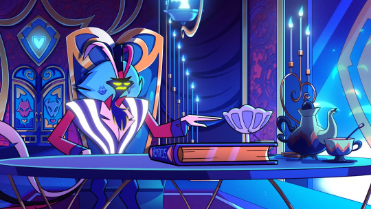
Not just the charateristics of his design but the pallet as well. His fur (feathers?) is a similar color to the lust rings sky. His suit and his face have a neon glow to them that a lot of the buildings in the lust ring have. His design isnt just a reflection of his flamboyant yet fluffy nature, it's also literally made of the same building blocks that the ring he rules is.
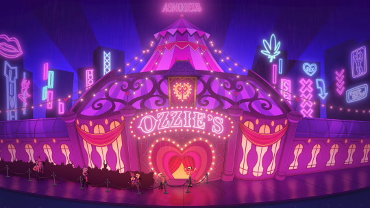
And yet even in this setting he doesn't bleed into the background. In OZZIE'S when he reveals himself his entire club becomes OVERRUN with his pallet yet he manages to stand out against it.


I think the reason why it's easy to notice Asmodeus in this setting is because, well for one, he's big and the scene is focoused on him, but also because this setting feels built around him rather than him being built for the setting (like the sinners are). It might just be my obsession for this character creating a bias but when I watch this episode I feel like Asmodeus came first and the Lust Ring centers around him, whereas in Hazbin Hotel, the characters sometimes feel hard to miss.

In this frame in particular I genuinley didn't notice Nifty or Alastor in this shot. I mean I rendered in my mind that they were there but It took a couple watches for me to actually notice that they were here. But I will give this credit because my attention was more focoused on Angel Dust than anything else and it was a very short couple of seconds compared to Ozzie's minutes of screen time, but I still think theres a point to be made.
I tried my best to pull from places of equal lighting. The two colors in the top right are the most basic forms, the two on the bottom left are the lighest, and the ones in the center are from the darkest.
While the three examples do varry slightly, the most important ones (being the flatest examples I could find on these images) still look insanely similar to each other. This is MY main complaint about these characters. It's not that they're "too red." I think using red for their pallets is great, but I think using different kinds of red would benefit these designs greatly and help thems stick out against the red backgrounds and other characters.
I think that giving Husker a more deep, dark red, almost like red wine, would empasise his character more. He likes alcohol, wine. He's cynical, depressing, always has a frown, dark. It doen't take away from his character or already estanlished design in any way but does something to help him be more unique.
As for Alastor, I think giving him more muted reds rather than vibrant ones would make him seem more like an oldtimer talkshow host. These reds don't have to be outright pale or grey, but give the red in his suit and hair more fade like they're being seen on a shitty color TV from the 50s. (I don't know what era Alator is from cause I see a lot of different theories but my main guess is from the 1920s-40s since thats when radio became popular) This would, again, empasise his character without outright changing his pallet.
Lastly I want to talk about Charlie
I don't think there's much to change about Charlie's design. I think it works well with her setting. Her suit being a similar red to hell Is a good way to represent her heritege as hells princess, and her blonde hair and pale skin are inherited from her father, who's a fallen angel. One thing I will suggest about her design would be to add something in ger pallet to represent how she likes angels and heaven or at the very least her desire for goodness. Perhaps adding some gold to her design in the form of trimming or a pin or even a simple headband would do wonders for her character and bring some variety that is noticable but not distracting.
I don't have much else to say about the other characters. One thing I will mention is how Sir Pentious sticks out like a sore thumb against all of these main characters who have reds within a similar hue as one of their dominant colors, while he's over here with his piss yellow stripes. Granted he still has red in his design but its more secondary compared to the primary focous of most other characters.
In conclusion, this is just my personal rant about suggestions and ideas and observations. I'm in no way saying that Vivzipop SHOULD do these things. I just think that changing up the pallets and using more variety in the shades and tints of reds she uses for her characters would benefit the show and its characters. This ended up being longe than I thought it would be but I really wanted to get my point across. Please do not point out any spelling mistakes I have made or I will cry and scream and shit everywhere.
20 notes
·
View notes
Note
iiiif you'd allow me to add to your responce to the character design ask as a character designing artist myself-
the chatacter design isn't truely awful, i really don't like alot of them but they aren't bad, they just miss for alot of people. now- depending on your art background you'll prioritize different things, but one thing anyone who'd gotten into character designing will know is that regardless of style a design should always reflect who the character is (ie, if you can't tell at least the general vibes of a character's personality by their design, something is wrong), and this is where the designs miss for alot of people.
for me, i prioritize the character themes and the the ability to clearly read the design elements. If a design has choices that don't make sense for who the character is, lack a proper theme/have choices that don't match the theme, or prioritize elements that don't lend to understanding the character, i consider it's theming bad. if a design has too many small details and a color pallet that is either too samey or uses colors that don't work well together i consider bad to read.
this isn't as important but I also look for General game aesthetic being secondary to chatacter's theme and readablitiy. raincoad is really bad about this because so many characters have the neon aesthetic prioritized over any character themes, leaving a lot of characters to look really lackluster. Halara in my opinion is definitely the biggest victim of this, like monarch why did they put THAT shade of yellow on you and give you glowstick glasses???
Anywho this is just how i read it tho, and other artists will have their own criteria for how a design is supposed to reflect a character. and for non artists you guys don't really consciously notice that kind of thing because you're not trained to look for it, but without it it can cause the readability the character to be weaker.
I greatly appreciate the insight from an artist experienced with character design (it makes the inner journalism major in me very happy heh, yay for different perspectives)! I can see why the emphasis on neon colors may take away chances to showcase other elements of some character's appearances in Rain Code. It could be an unfortunate case of tunnel vision where that aspect of some of the designs were so focused in on that it meant other details to provide tidbits of theming were lost or sidelined in the process. Makes me all the more interested in seeing the new art book releasing in, what, two days now (man, time flies)?! I'm definitely curious about what the early concepts for the characters looked like, so I'm hoping that'll be a part of the book.
Anyway, I agree that people who aren't experienced in character design may tend to not see how appearances reflect a character directly, yet it's definitely still a subconscious thing! Appearance is usually the very first impression a player, viewer, or reader may get of a character, so it's important for artists (and writers too to a certain extent, but I believe voice/dialect tends to make for better first character impressions in writing-... I'm gettin' off track) to take that into consideration.
7 notes
·
View notes
Text
had a dream that during hs prom they took you to a warehouse and removed you from your body, killing the body. unsure why or how this was a survivable process but it was and you got to keep your new, but identical body. anyway, i was very upset about it. everyone's bodies then got frozen in ice and then revealed in a big show in the warehouse display room. employees of the building went out in protective suits and stomped on buttons in the ground until a red spot of blood burst to the surface of the ice. then, the body would float up and the room would be all like "wow beautiful!" mine came up last, needing multiple employees to try and get up, and it looked wrong, like it hadnt frozen properly. the body kept twitching at the arms and legs. everyone was really scared and grossed out, but the event moved on from that since the weirdness was between us and a thick layer of glass. the boss came up to me and tried to scold me, and i explained to him why it was--i had minor tremors in my body when i was stressed--the body was stressed, so it had tremors. the boss grabbed my face and said that the process didnt work because i wore a bad outfit that interfered with the freezing process and that i didnt have enough color contrast on my person or a part in my hair. i told him that he never specified outfit choices, that i didnt even want to get frozen, that it was hypocritical to say my color contrast was off/too low when there were white blonde girls in white who were frozen perfectly, and that my hair shouldnt affect the process that bad anyway. he got mad and told me that i should buy the frozen me as a memento of graduating high school. i told him it was ridiculous to do that because i didnt have enough money nor the proper place to store it. he got mad and forced me to become an employee of his warehouse. the rest of the graduating class left with their bodies and i told them it was a scam, but they ignored me. eventually, my body in its ice was boxed up and placed on a wooden pallete, before getting surrounded by other things to get picked up by a crane. while i working at taking inventory, i started to tell the other employees to start a union. we, stupidly, met in the basement of the building during work hours, and while we were doing some paperwork to apply to/as a union, the boss called us over the intercomms. our supervisor who was also our ally in the union stuff hid us all in a bathroom and turned off the lights. she kept us away from security cams and then snuck out to deal with the boss since her keys had a tracking device on them and hiding with us would give us away. we snacked on some food from vending machines inside the bathrooms. a little while passed and we were surprised when someone came in and passed out some sledgehammers and told us to help demolish the building. we werent sure why but felt threatened by the sudden request so we just went along with it. eventually we got bored and walked out of the bathroom. we realized we were the only ones in the building so we just packed up, stole whatever we wanted, and left. i wasnt happy leaving the snacks and frozen bodies to rot, so i tried to figure out what to do with it when i was suddenly jumpscared out of this dream "map" i was on and into a different one. i was in a phone booth with an ipad on a side table. i moved the fabric cover for the ipad and it showed a death screen with some stats. i pressed the respawn button and it happened again, nearly immediately, but this time it showed me the specs of what killed me: a "wendmalgamation" of three highschoolers. i cringed at the name for being culturally and spiritually insensitive and decided not to bug that map for now.
#dreams#horror#?#probably horror#dream posting#note: all my dreams occur in the same place and i can travel from map to map through doors for the most part#this was a unique door for me but not unheard of since usually death does teleport me anyway
4 notes
·
View notes