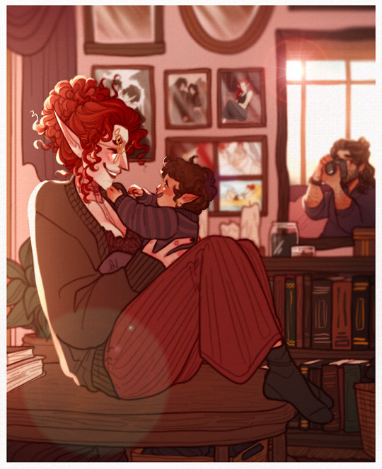
#also i'm trying new texture/shading things
Explore tagged Tumblr posts
Visit Tumblr Blog
Explore Tumblr blogs with no restrictions, modern design and the best experience.
Last Seen Tumblr Blogs


Fun Fact
The KCSC sent more than 20K requests to delete posts related to prostitution and porn to Tumblr from January to June 2017.
Text
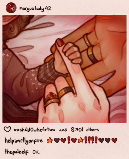
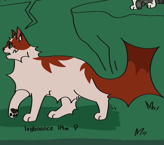
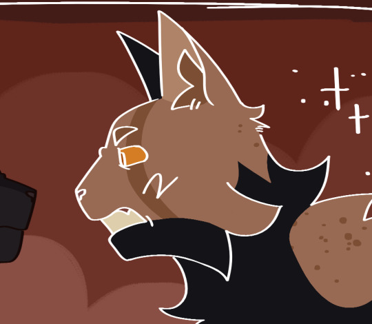
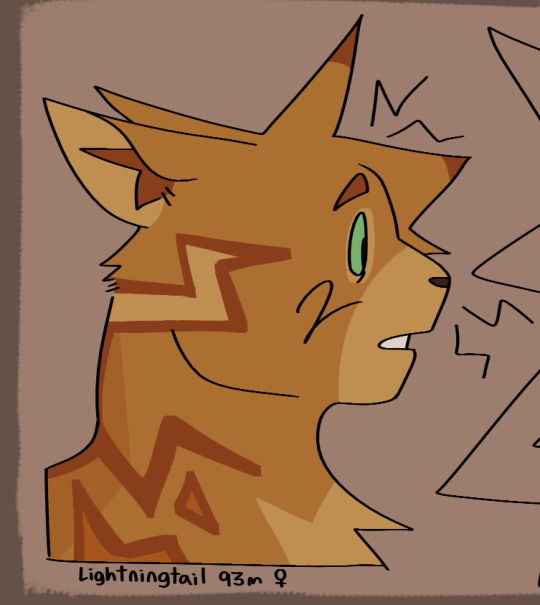
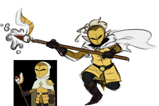
modern au gale+cyra/dadkarios for soul healing <33
cyra should not have a phone her internet history would have her on a watchlist
#bg3#baldur's gate 3#galemance#gale dekarios#dadkarios#tav#this whole thing was just to give shart that name#also i'm trying new texture/shading things#dying that cyra would have more 'parenting' experience than gale bc she raised her snakes from hatchlings#that's frightening#i feel like for the wedding they would do contacts for one (1) day so they don't have to spend the whole thing cleaning them#that's my plan anyway i'm a face toucher#i think gale needs to be more domestic. look at he with his laundry
3K notes
·
View notes
Note
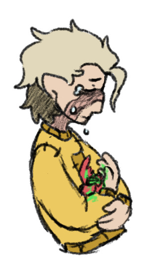
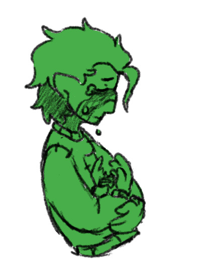
i really admire how judicious and meticulous your hatching is!! as a self-taught ink artist, i get frustrated with how messy my inking gets when i try to darken large areas of shadow, especially when inking complex textures with lots of value variation (rumpled clothing, rocks, extremely shiny things etc). do you have any tips for balancing image clarity and values contrast when working with ink?
this is really flattering but also funny to me because i've long thought that one of my own biggest weaknesses as a fellow self-taught artist is my inability to be judicious with hatching and texturing, and i feel like much of the time i end up flattening things by applying too much texture everywhere. my current workaround for that is usually to apply ink washes or watercolors over the linework to rework the contrast.
i don't think i'm in a position to give any kind of authoritative artistic advice, but since you asked i think a lot of my own method comes down to trying to vary the density and orientation of my hatching based on material, lighting etc. maybe not the ideal example but here's a recent doodle that i think illustrates this.

moreover though i think ultimately it comes down to building up your hand's muscle memory so that you can lay down the lines at all different densities, distances, and orientations, and there are tons of drawing exercises and guides out there to help with that. after that it's largely just experimenting a lot and seeing what you like the look of. if you look back through my archives you can see all kinds of different drawing and shading techniques i've tried, sometimes just for a single piece, others i've kept and refined for years--and often then gotten bored with and moved on from. that's the fun thing about art! not to get off topic but i really don't think anyone should ever feel shackled to a single art style; you gotta always be playing around and trying new things.
anyway i have genuinely no idea if any of that was helpful. if anyone wants to put in their two cents or link to relevant resources they like, feel free.
#not sure what to tag this with#art tips#i guess?#you really shouldn't take art advice from me i'm just a bug scientist with too many side hobbies
171 notes
·
View notes
Text
CC Creation Tutorial: Smooth Seams in Blender

In this tutorial, I will show you how to make your mesh seams smooth inside Blender (no Milkshape required!) and walk you through the process step by step. We will make a perfectly smooth mesh and transfer the normal data from that mesh to our main mesh using the Data Transfer modifier.
I am using Blender 3.6 in this tutorial (though you should be able to follow along using other versions as well)
You do not need to have much previous knowledge to follow this tutorial, but I assume you know some basics in Blender like how to select, things, navigate around, etc, and know how to import the meshes and put them into Blender.
For this tutorial, I exported the Sims 3 afbodyEP4DressPromBigBow mesh with TSR Workshop. You can use any clothing mesh you like though, and works on any meshes, not just Sims 3 ones.

This is our mesh. You can already tell that it has the dreaded seams on the neck and the rest of the body.

First, we need to make a copy of the mesh (in Object mode, select the mesh and hit Ctrl+D Shift+D to duplicate it, then hit Esc to stop it from moving around).
Rename the mesh (I added Seamless to the mesh name).
Make sure the original mesh is hidden (click the eye symbol) and select the Seamless mesh.
Press the Tab key to go into Edit Mode.

Now we select the parts that we want to have smooth seams. Let's select everything that is skin (you can select a litte piece of the mesh and then press Ctrl+L to select the entire piece)!

Now, press M and in the menu, choose By Distance. (in older versions, this is called Remove Doubles).
This will remove all double vertices at the seams on the selection we made.

It will show you how many vertices it removed. The skin looks nice and smooth!
Let's switch back to our original mesh: Make sure you deactivate the eye on the Seamless mesh and activate the eye again on the main mesh. Then, select the main mesh.

Now, let's add a data modifier to our main mesh. Click the blue wrench icon in the vertical list of the properties panel and then onto Add Modifier, then choose Data Transfer from the list.

As the source, we choose our Seamless mesh.

Also toggle on Face Corner Data and click the Custom Normals button.
Hold on, there is a message saying that we should enable Auto Smooth in Object Data Properties. Let's do that next! (if the message does not appear for you, maybe Auto Smooth is already on).

Click the green inverted triangle button and in the Normals section, toggle on Auto Smooth.

Now we can switch back to the modifier tab by clicking the blue wrench icon again.
But hang on, what happened to our mesh? There are now black spots over the dress and shadows on the legs!

This is due to the Data transfer modifier's Mapping setting. If we change it to Topology, our mesh goes back to normal again. Phew!

Now that the normals look good, we can start the transfer of our new smooth normals from the seamless mesh to our main mesh. To do that, we hit the Generate Data Layers button. This button works destructively, so you cannot undo what it did, just FYI.

Note: On newer versions of Blender, Generate Data Layers may not be enough to transfer the normals and you may need to apply the modifier instead.
You can toggle the modifier's visuals on and off with the little screen icon to see the results after you click Generate Data Layers to see if it stuck. If it did not (and you see the seams of your base mesh when toggling it off), try to apply it instead.

I switched from textured to solid shading because the differences are just more noticeable in this mode. This is how our mesh looks now with the modifier turned off.
Because we clicked the transfer button, the normals have been permanently applied to our mesh. The skin is smooth now, and so is the dress (even though we did not smooth that one, hmm...)

If we toggle the modifier back on, suddenly the dress has seams again! What's going on there? I'm not exactly sure why, but Auto Smooth seems to be doing some smoothing on the dress mesh as well.
I am not sure if this is normal behavior or not, but let's pretend that this did not happen and the modifier in fact did not smooth the dress.
Maybe we just forgot to smooth some areas on the Seamless mesh that we noticed only later on. That's no problem. We simply modify our Seamless mesh again!

So let's swap back to the seamless mesh and select it (remember to click the eye icons so only the Seamless mesh is visible).

Let's select the main dress parts and press M -> merge by distance on them. We cannot smooth the whole dress all at once, because then that would remove some seams that we want (like those for the backfaces and the middle section of the dress where the bow is attached).
If we remove the wrong seams, we ruin our normals and will have black splotches.

Now, let's select the backfaces and areas we left out before and repeat this process: M -> merge by distance.

Look at how perfect our Seamless mesh is looking now! Now, let's transfer those beautiful normals to our main mesh.
Select the main mesh and toggle the eye icons again, to hide our Seamless mesh and reveal our main mesh.

Once again, we will use the Generate Data Layers button in our Data Transfer modifier. If you have previously applied the modifier, just add the modifier again to the main mesh and use the settings shown here.
And that's it, you are done! You have a perfectly smoothed mesh that you can export now.

Final Note: it is best to transfer the normals at the very end of your meshing process because any action that recalculates the normals can reset our custom-made smooth normals again.
Of course, you can simply use the Generate Data Layers button again to re-add them, but it saves you time to only do this step at the end.
I almost forgot to say: You still have to use Mesh Toolkit to fix the seams on the edges of your mesh and do the usual shenanigans.
178 notes
·
View notes
Note
Got any tips in shading stuff in black and white digitally?
Hi Anon!
You're in luck! I'm currently wrapping up a book which is shaded digitally, so I've been thinking a lot about this recently.
How I do this is by no means the only way, so take from these tips as much or little as you want! When I add grays and shadows to a line art drawing, I try to think about these things:
Preparing the image
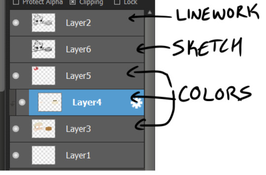
I like to work with a file that has a white background and a layer with only line art on top of it. Between these two layers I add new layers where I use the pen tool and bucket to fill areas with black, then I lower the opacity for that layer to get a value that I want.


This method works well for me, and for simpler pieces I don't need more than 3 layers with different values - light, medium and dark grays.
I work in Clip Studio. Here's a picture of the layers of a recent drawing. Each layer is actually completely black but you can see the opacity percentages by each layer. Lower percentage -> brighter value. This makes it super duper easy to change the value of a layer, no need to repaint it, just change the opacity!

Value composition
For the best result, do a couple of value sketches with a limited set of values and find something that works well for the image. Getting the values right is what will improve the image the most! Here's a quick tutorial on muddycolors. Muddy Colors is a very nice art blog to check out. Looking at grayscale storyboard drawings or value sketches are great ways to pick up on this too.
I try to group values when working with grays. Take this image for example:
The character in the foreground has mainly dark grays, which separates her from the background, which has mostly light grays. Then the windows are white and the roof black.
Value composition is a huge and complex area and I recommend anyone wanting to learn to be more conscious about their values and to do value sketches. Analysing art you think has good values is great too.
Shadows
Not every piece needs shadows, but they can add a lot to an image! I use three kinds of shadows when I work in grayscale.
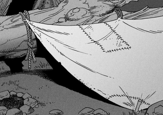
Inked shadows - these shadows are added during the inking stage and usually show areas where light would have almost no way of getting there, such as under this tent.
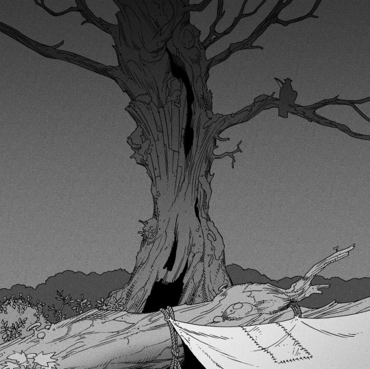
Gradient shadows - these shadows usually represent something getting further and further away from a light source or an area that would bounce light. This tree receives a tiny bit of light from a campfire on the ground and moonlight that bounces on the ground and up, fading as we get higher up in the tree. But mainly I add these gradients in ways that look cool and will help the overall composition.
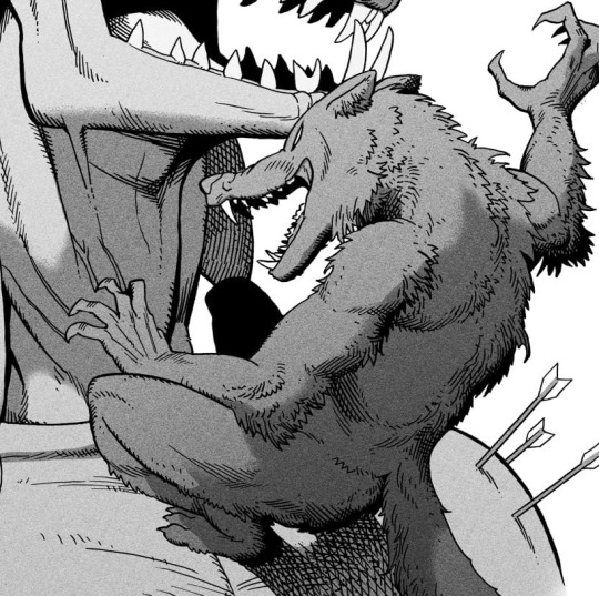
Hard shadows - these shadows appear when a strong light casts shadows and can be used on a shape or to cover something. Here's a werewolf with shadows on its back, which gives it a better sense of mass and is interesting visually!
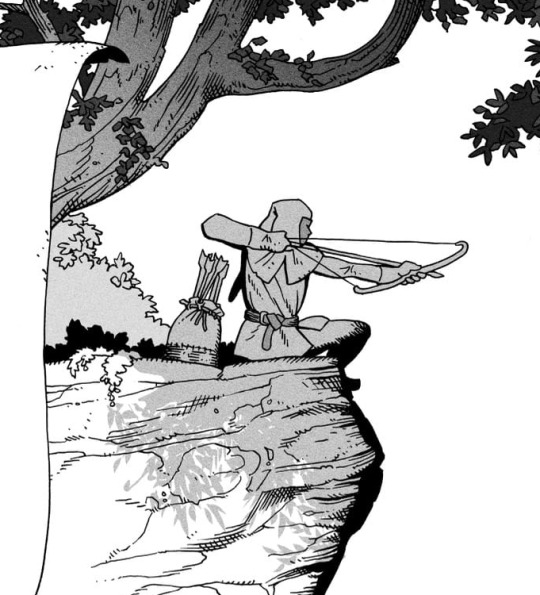
You can also cover an area in shadow like this, where the tree casts a shadow down on the archer and the cliff.
Texture
I like to add a layer of noise as a finishing touch. In Clip Studio you can create a noise layer with Filter->Render->Perlin noise... Find a balance of scale and amplitude that works for the image, then change the layer mode to "Vivid Light" and lower the opacity of the layer to around 30%. I like how this looks, it's not super visible usually but helps make the drawing feel less artificial and digital.

I hope that helps! Here are some nice links too:
Muddy Colors
Android Arts
Gurney Journey - Read his books!
Happy drawing!
351 notes
·
View notes
Text

Now that S2 is almost over, I wanted to finally get out that post talking about all of the insights and things I did, learned, or other fun stuff about the countdown pieces I made. I still have something in mind for the S2 finale, so maybe if you read (or skip) to the end I'll have a preview for you?

Oh god here we go One day I was coming home from work and decided to check how many days there were until the new season released and I found it was 7 days. So I did all of these in 7 days. Literally everyone was worried about me because I did nothing but draw for those 7 days.
... Except for when I went back to work. I worked I came home and then drew until I literally couldn't anymore lmao. I remember being dazed and exhausted after the Clock Keepers and my dad came up to my room literally right as I finished and asked, "Have you gone to sleep?" And I said, "NOPE! :D" I was living on energy drinks
I'm also 90% sure this started the "ren you're doing too much you need to chill the hell out" thing with me and my friends now
When I was doing these, I had only read the first ten volumes of Hanako-kun at the time, so I was stopped right in the middle of Picture Perfect. I had the second box set, but I just hadn't gotten the time to read it since I got it for Christmas. That means I didn't know Shijima's full deal, and I didn't even know Hakubo's name, so I was winging it hard.
All of the full pieces are linked by clicking their names :)
NO.7 HANAKO
You can tell from the speedpaint I was struggling hard with the pose lmao. I honestly felt like the one I chose was a cop-out and didn't feel energetic enough, but the time crunch got me. At this point, I was also really unsure about how I wanted to treat the colors, because I'd only just started dipping into seriously studying how Aida does it. So many references. And him wearing basically all black didn't help I wanted to scream. I was TRYING to keep everything as solid colors without falling back on overlay and multiply layers, but I got desperate. Still looks pretty good I think.
My favorite part was probably the hakujoudai and the detailing on his collar/shoulders! If I were to edit anything, I think I'd put more on the bottom half of the background because it feels a touch empty. kinda killed it on this pant leg and his hat tho


NO.6 HAKUBO
Like I said, I had no idea who Hakubo was. For the first half of things, I couldn't even find his name, I was just calling him "Shinigami-sama..." I wasn't going to go trampling into spoilers just for references either, so I was freaking out on what to do for the background. All I knew was that there was something to do with lotuses or bugs, and already having an idea of where I'd take Tsuchigomori, I took the lotus route. I uh also hope I didn't make his face too feminine. I don't know why but when drawing male characters who are larger or more built (even if it didn't turn out obvious in this piece) I somehow keep making them look like butches.
Shading his hair was the most fun part out of all of this, I usually never draw characters with hair as short as his, so it was a fun challenge! I'm also just a sucker for kimonos and flowy clothes. He was probably one of the most fun ones for me, even if he was so early on. I LOVE the texture I got on the skull. (even if it's technically too small.)

NO.5 TSUCHIGOMORI
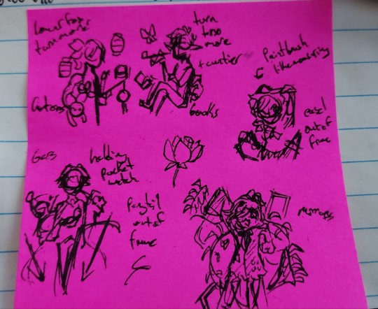
Tsuchigomori onwards ALL used this sticky note full of thumbnails I drew at work for reference. Yes that is a note next to him that says + cuntier. He was also drawn on the same day that I did Hakubo, so I managed to buy myself some extra time.
I was so excited for this one because I could see it so well in my mind's eye, until I realized how many hands I'd need to draw. And then I sucked it up and locked in because I love Tsuchigomori. I'm so pleased with how I worked in more of the blues into the shading and his hair. It was at this point that I think I was understanding how I wanted to take the colors for all of these pieces! I enjoyed doing the fun trick I learned with the weave on his sweater and the spiderwebs where I drew a thick like and then erased the middle. Nearly forgot the markings on his forehead too lmao.
I wonder whose black book he's reading?

NO.4 SHIJIMA
Oh Shijima. I truly had zero real clue about her, and I managed to dodge spoilers about Mei even when I was looking up references. That's why she's painting using her paintbrush clone haha. It's still cute though, so I'm keeping it. Her hair kept giving me trouble because it's the kind of hair you draw and don't really realize just how big you're drawing it until you have to fix it. Actually, I'm having that exact issue on what I'm working on right now, and I'll fix it after I take a break.
I dug up a comment I made while I was working on it and I still stand by this.

There's also something a little odd about the positioning of her chin that I was too exhausted to fix, and I SUPER fudged the coloring on her hair. Also I really didn't know what to put in the background OTHER than the atelier, but I can't really draw buildings! So uh! The exhaustion was beginning to set in after 3 days of this. (Since Hakubo and Tsuchigomori were done on the same day. I didn't keep that time advantage for long though.)
think i fudged it okay, though.

NO.3 MITSUBA
I was struggling on Mitsuba some because that thing where you see/read something and then forget about it only for it to arise as something you think you did happened. That pose I thumbnailed on the sticky note was WAY too close to the official Hell of Mirrors standee/art. Luckily I contain extreme Mitsuba bias (shocker) and I was able to figure it out. I had a ton of problems shading his coat just like I did with Hanako. It's so hard to keep things from melding together when you've mostly got them wearing black.
It's an odd thing to be proud about, but I feel I did the best on the.. Legs of his pants, the chains and lockets, and the eyes and teeth on his jacket. That and the ribcage scarf. I'm really disappointed in myself for the background and his hair, if I'm being honest. I wanna fix his eyes. I STILL haven't figured out his hair either too. Which makes me even more surprised that my friends said, ren, your bias is showing on this one because I was like IS IT??? ARE YOU CERTAIN?
his hand turned out nice too and did i mention i had fun on the ribcage

NO.2 YAKO
I sketched the first initial draft for Yako on the same day I drew Hakubo and Tsuchigomori, but when it finally came time to sit down and draw her? I realized there would be so much empty space where I couldn't have fun with colors and it'd just be the white back of her kimono, so I turned her around and scrapped the idea of her fox form curling around her. I couldn't fit fox Yako in, and I'm STILL kind of bummed about that.
The flow of her hair was so much fun to figure out, as well as the patterns on her kimono. I'm really happy with the background, combining the aspects of the Misaki Stairs' original version and the one after she's been removed from her seat with the spider lilies. The lilies themselves are a little fudged if you look too close, so... Don't look too close? :3
loved the kimono. every bit. can't believe i had her turned around.

NO.1 AKANE/MIRAI/KAKO
MY FAVORITE PART ABOUT THIS WAS THE COGS IN THE BACKGROUND SORRY AKANE'S FACE BOTHERS ME I NEED TO FIX IT ONE DAY HE LOOKS TOO OLD I WAS LOSING MY MIND AND THE EXHAUSTION WAS KILLING ME IT BEGAN MY HATE OF DRAWING AKANE'S HAIR BECAUSE *GESTURES VAGUELY*
Uh okay some good things to say about this one... The colors were a ton of fun to figure out how to place, and I think I at least did a good job on that part. Shading gold things is always really fun! And at least Akane's ponytail was fun to make flow, I was riding the high from Yako's hair here. I think I got a lot of that fun flowy movement in here, which I'm pleased about. This was another one that my friends say turned out the best, again that I'm ??? about.
these cogs are my everything

FINAL THOUGHTS + EXTRAS
All of the kanji's colorings for their numbers were taken directly from the anime! I don't really wanna get rid of that fun reference even if in like, Tsuchigomori's case the colors are REALLY different from the main piece.

Most of the first day was spent on, Hanako of course, and then setting up the frames for everyone else to go into. I spent money to get the patterns to go on the colored part, actually. Constraining everyone to the frames helped a LOT in terms of balancing myself and made it fun to choose what elements would stick outside of them. If I pushed for entire full backgrounds, then I would have been doing even worse.
I was on the ropes at the end. I was half dead and drawing like I was possessed. And the catharsis of it being done and it all looking acceptable just. Ough. I don't know if I'll ever have a high like that again. There's an evil, evil part of me that says, ren! redraw all of them for s3 under the exact same constraints! And shit I might but I'll complain about it. I think it's more likely though that I go back and doctor them up some so I can print them as standees. Probably just for myself, but I do want to build a stock for artist alleys.
I had so, so much fun overall even if it was so much it really could have put my already bad health in more danger. I learned so much about coloring, lineart, framing things, and I really attribute my gauntlet to the explosion in my art progress. That, and my sheer adoration for this series. Am I rambling? I just love TBHK. It's only been 5 months since I first discovered it and it's done so, so much for me.
Even if you went and scrolled through all of this nonsense, which I don't blame you for, here's a little preview of what I'm trying to finish by next week for the finale.

I can't believe we're on the final episode! It's so close now, and it keeps flooring me how little time has really passed. I'll try and push to get SOMETHING else done before then, but we'll see. I've got so much I want and have to get done.
#myart#fanart#ren rambles#(technically lol)#tbhk#toilet bound hanako kun#jshk#jibaku shounen hanako kun#hanako kun#amane yugi#hakubo tbhk#tsuchigomori#shijima mei#mitsuba#yako tbhk#akane tbhk
97 notes
·
View notes
Note
Hello hi I just found out you're the artist of my favorite pic of Jamil from all time 🥹 I absolutely LOVE LOVE LOVE LOVE LOVE LOVE LOVE LOVE LOVE LOVEEEEEEEEEEEEE SO MUUUUCH his bday art from 2020!! It's my favorite one from every art and he looks so pretty and hot and cool and like he's in a music clip and about to drop a fire verse!! I LOVE your painting style so much, as a baby artist, would you one day show us how you color? I'm sure you put so much blood, sweat and tears into your hard work and it would great to get a little bit of that wisdom. Please keep drawing, keep doing what you love because it makes the world a better place to live!
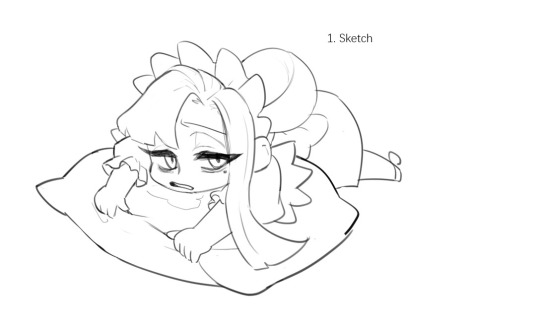
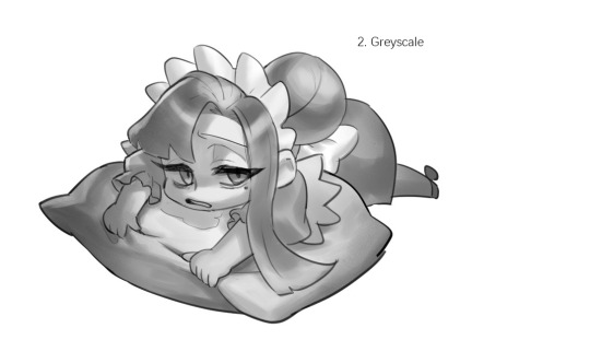
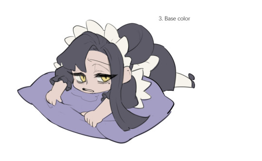
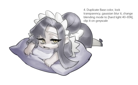
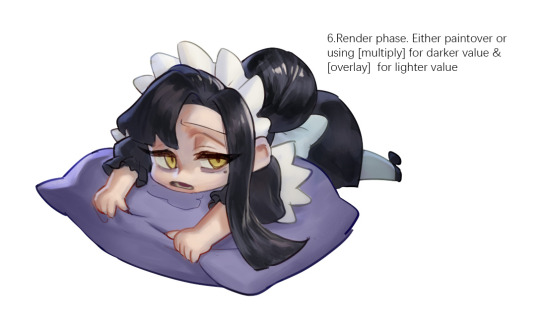

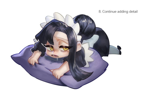
Sketched my sleepy and tired oc to do a very quick demonstration but it covers how I color when i render things:
Start with rough greyscale first, it's a good start to roughly decide light direction and value of your overall work. Especially if you have no idea on your shading.
Next, apply base color to greyscale. I'll use gradient map if I want to keep the details of my greyscale. But if not, I'll just start with a flat base color, and try whatever I can to apply color.
Rendering phase. Add layers and just paint on top to refine it. Merge all layers if it's too messy. Then add layers again. My rendering really depends on how much time taken because it's just a loop of paint over and refining. Thats why i do more simple fanart cuz I sometimes get bored of rendering Also at this stage when doing lineless style, I merge lineart with layers and cover up the lines.
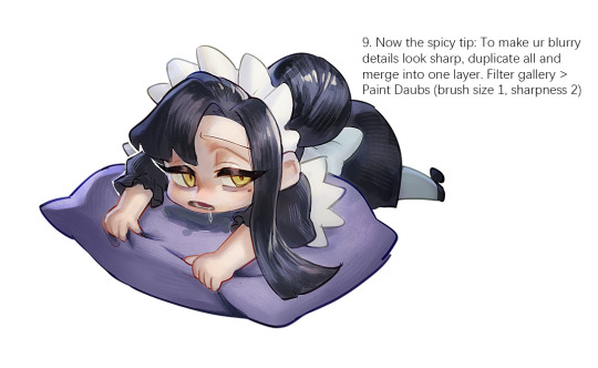
Final touch. Merge all layers and use [filter gallery > paint daubs (brush size 1, sharpness 2)]. It will sharpen your work and look detailed. Or add some very fine noise texture, it will look detailed too.
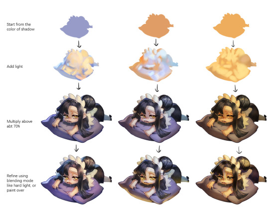
Another very rough demonstration on how i apply color mood. This will be after step 2. And same will be more refining and even paint over to ensure the colors look ok.
Other tips:
Add warm and cool colors especially on skin.
Use pinterest. Always find more than one reference for a subject if you want to draw better than yesterday. Pure ref is a nice tool to gather reference on your pc. When i draw a single hand I had a lot of ref. (pose, color temperature, lighting, photos, artwork, all diff ref)
Color theory is so important I still struggle a lot. I highly recommend beginners start from practicing Marco Bucci's ball practice. After that slowly change to adding character into movie scene and photographs, the purpose is to adapt different color moods and learn the lighting from the image. Learn more from famous movie and cinematic. They did their best to nail the colors.
Anyway,
this is a long answer about how I color. My previous job influenced me so much on coloring so there's a lot of thinking and struggle on my colors.
So, I suggest you be more experimental and try new ways, at the end what remains is what fits you.
139 notes
·
View notes
Text
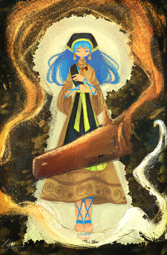
Starting off the 2024 season with Keiki because I've been thinking about her a lot lately
Artist's Note:
I decided to experiment a little more with my rendering style via using a more traditional approach to drawing in the shadows. I like how much texture this piece has as a result, my friend told me it looks like something out of a storybook and that was the look I was inspired by so I'm glad it turned out that way.
Also, when it came to doing the front view of the nose, I just went "fuck it" and made it a dot because why learn anatomy when you can just default to what 5 year old you did when drawing faces?
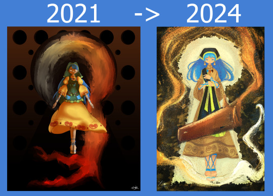
I also had an idea of how to draw Keiki's dress as that has always been something I've struggled with since it's kinda confusing to draw lol. I also gave Keiki some earrings in the shape of a kofun tomb because we need more Keiki with earrings (I could have also taken from IRL but I'll save that for when I draw Keiki next). Speaking of Kofun tombs, I made the thing she's laying down on the shape of a Kofun tomb, because this is also kind of a redraw of some old Keiki fanart from 2021 that I will show right here.

I liked the concept of it (i.e. Keiki in the middle of a Kofun keyhole with the fire thing she has surrounding her) so I decided to try at that concept again just for fun. Back then I was very adamant on staying as close to canon as possible, but now I'm a lot more lenient with how I draw the characters. The pose in the 2021 drawing was inspired by that one Shinra-Bansho records MV where Keiki showed up for 5 seconds and the rest of it was Yachie but yeah. Also I always thought Keiki's apron was a dark green BUT NO IT WAS JUST A DARK SHADE OF FUCKING TEAL ZUN WHAT IS THE COLOUR THEORY BULLSHIT YOU HAVE CONFUSED ME FOR SO LONG-
anyways, I would say this is a pretty strong start to 2024 art wise, I'm gonna keep experimenting with this new rendering style because I like it a lot!
Below I put a comparison between the two drawings in case any of you wanted to see the two drawings side by side
#touhou project#art#fanart#touhou fanart#touhou 17#wily beast and weakest creature#keiki haniyasushin#re draw#illustration#digital art#artists on tumblr#東方project#東方#haniyasushin keiki
366 notes
·
View notes
Text
Had issues with layout in the ask post so here's the rest!
However 1 artist comes to mind for now and that's Murata Yusuke; I'm rereading Eyeshield21 (again lol) and each time his art makes me go "wah so damn good".


From colours, to how dynamic and alive pieces can feel, to lighting/shading, to textures, etc. Lot of the pieces also have this feel of mundanity in it which I really like, and I also how at time I feel like I'm there as well. I love the mixture of realism in lighting/shading (and at times anatomy) with the manga/comic style!
The last image also was a bit of an inspo for my latest Luffy art!
As for tutorial, I might elaborate in another post at some point (cus it's quite a broad thing to go about). Like I've mentioned before, I'm soaking up things along the way! Which includes things like colour theory, lighting/shading, composition, etc. But I personally don't recommend forced research/practice; art needs to be fun after all, take things at a time but it might be nice to try something new with each piece, however how subtle.
I can recommend Saito Naoki's YT channel! I watch his 'whimsical correction' videos during lunch at times haha - Each 'correction' (more like professional advice) has a certain goal/theme which can be improved upon, which can be story wise, appeal, anatomy, etc.
--
Anyway, some advice I have for now are kinda my 'cheats' will follow now! [Disclaimer: these are things that work for me and are by no means the 'correct' way of doing things. So if I say things like "avoid this", it's something I personally do.]
My strength lies I think mostly in my lighting/shading at this moment!


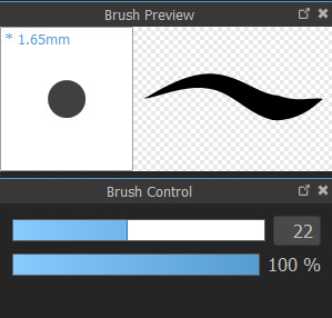
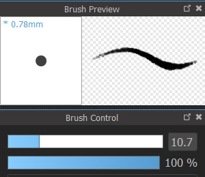
My flats aren't bad or anything, but I feel like it really comes alive after shading. And the first thing to do is to establish where the light source is. Try to avoid 'pillow shading', work in bigger shapes and don't be afraid to do so. Working digitally, I can recommend to take a big brush and just put it very roughly on your character. You have the means with digital art to easily erase parts that are too much and to refine shapes afterwards.
One cheat is bouncing light.
(This was a Multiply mode layer set back to Normal mode for sake of visibility.)


You gotta have a bit of understanding of volume of where to apply it, but it's light that's been reflected by e.g. the ground back up again. This little variation in shading can add a lot. Note that it's better to go from the OG shading colour and sliding it on the colour wheel (hue) to be either warmer or cooler and then sliding in the square/triangle (saturation and value).
More examples of bouncing lights:


It depends how intense the light is reflected; the more, the harsher the contrast is compared to the OG shading colour.
Second cheat is 'light terminator' and 'substance scatter', not sure if it's really the correct terms but oh well.


This reddish tone (again on the Multiply shading layer) is kinda the border line from light to shade. It's reddish on skin (if you have red blood haha) but you apply it on other things with other colours too!


Make sure you don't overdo it and put it everywhere, also note if you use harsh or blended brush strokes, maybe even both for variation! Try it out and see what works best for you!
--
That's it for now; this took more time out of me than planned 💀 you better appreciate this anon! /jk
My main motto regarding art is "fck around and find out". This mindset also helps with keeping art fun!
#hopefully it wasn't too overwhelming lol#this became kinda lengthy after all#with 'cheat' I meant something quite easily achieved to add an extra oomph to your art btw#ask kawaii
59 notes
·
View notes
Note
How do you do your Final Fantasy edits?
The hard way, my friend. No AI is used here, I do it all by hand. 🥰 I assume you mean the screenshot manipulations I create? I'll try and give a simple summary... First, I boot up Remake on PC and use a "free camera" mod(you can find the links to the mods I use on my archive pages for manipulations, which is on my pinned post) to take a couple screenshots that I think will work well together. Sometimes I change my mind and choose a different one. It can be hard to match the camera angles and lighting, so sometimes I have to mess with that later, as well. But it's easier if they fit together from the beginning. We'll take my current WIP as an example. I started with these two screenshots:


I open them in the free program GIMP (GNU Image Manipulation Program), which anyone can download at gimp.org. Then the first thing I do is choose the base image. In this case, they're both facing the same way, so I choose to flip Sephiroth(you can't really do that with Cloud easily because of his earring, and his hair is less symmetrical). Since the camera was closer up on Cloud, and he's the smaller one, I usually choose Sephiroth's to be the base image. With that decided, I roughly cut Cloud from his background and paste him onto Sephiroth's image as a new layer. Then I position him, resize him, rotate him, whatever I need to do until he seems to be in the desired place, which ends up looking like this: (I ended up adding snow for this preview, so it would look more complete than it is when I showed it to my server, haha)

If you look at Cloud, you can still see a thick outline of his old background around his head. Once he's positioned properly, it's time to remove the rest of his background(I use a size 10 eraser with 100% hardness and zoom in about 5 times). Then I need to think about where they're connected, and how to make them look like they're touching, as well as layering to make them seem intertwined, as if they're truly occupying the same space together.

I cut away some of Cloud's shirt, and the rest of that effect will come with shading later. If I wanted Cloud even closer, I would make a duplicate of Sephiroth and erase his background, so that his lock of hair would appear to go over Cloud's face. I could also make it semi-transparent, so you could see the outline of Cloud's face through his hair. You can see I have some small game defects to fix, such as Cloud's hair clipping through his ear. I leave those tiny details for later, typically. Sometimes, because of their height differences, I have to "rebuild" missing parts of them from scratch, such as I did for this other manipulation:


It's a delicate process that's mostly the clone tool(to keep the textures) and some freehand drawing, but I don't have an art tablet, so I use my mouse for everything, which can be quite challenging. I've had a lot of practice from translating doujinshi, where I'd erase the words, rebuild the missing part of the image, and then place the translated words over that spot.
In any case, I decided I wanted more out of this manipulation than just leaning against each other. I wanted Cloud to be reaching up towards Sephiroth, and perhaps for Sephiroth to be pulling him closer. To do that, I needed pictures of their hands/arms like so:


I've taken hundreds of shots, so I looked through what I had first, but it wasn't the right angle, or was the wrong outfit for Cloud, so...then you open up those images and cut out the parts you want. After that, you work on positioning and things like that again. I haven't finished with that part yet, so it looks a little awkward. (And when you're doing these kinds of things, color matching is very important, but that's a bit advanced.)

I'm not fully satisfied yet, so I'll probably remove the rest of the background from the arms and then mess with the placement. As for Sephiroth's hand, I intend to thread it in Cloud's hair, so Cloud will need to be duplicated in order to create that layering effect, as mentioned previously. Which should end up looking similar to this one:

(I had to draw in most of Cloud's hand because I didn't have the camera mod back then, and the Sephiroth shot was provided to me by Coeurlwhiskers.) After that, it's a matter of shadows and highlights, remaining details, and finishing up the colors, etc. It's a long and difficult process, and can take many hours to complete, depending on how ambitious I get with it. Most of that stuff would be a much longer tutorial, and I did used to do some actual artwork a long time ago, so I...kind of know what I'm doing?? I probably do a lot of stuff the hard way(like not using layer masks) because I just don't have the time to teach myself more than the basics. 😅I know it may seem daunting, but it's really fun! I hope I managed to answer your question properly. Feel free to ask follow ups~
20 notes
·
View notes
Note
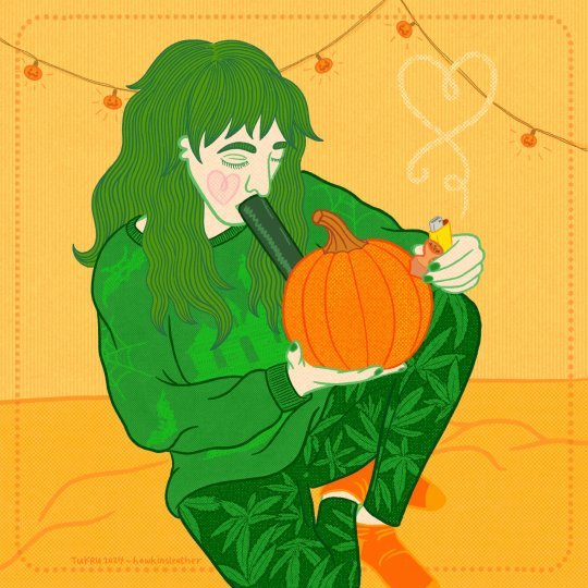
I want to nominate hawkinsleather (on Tumblr and Bsky) for their art!
Some of the pieces I really love by them - https://www.tumblr.com/hawkinsleather/769804322781511680/hi-its-my-version-of-fae-daddy-eddie-from?source=share; https://www.tumblr.com/hawkinsleather/763350765646561280/p-is-for-pumpkin-bong?source=share; https://www.tumblr.com/hawkinsleather/755198310866993152/stevieweek-day-two-gender-euphoria?source=share
I love that their art style is so unique and colorful! The faces always look so cool. Also love the frequent trans rep.
Questions for them - what is some inspiration for your style of art? who's your fave ST character to draw? have you done art in any other fandoms?
This week, we're highlighting @hawkinsleather!
Here's the pieces that @fkinkindagauche highlighted. Their art tag is here
see the original post here, here, and here HawkinsLeather answered some questions about their creative process and inspiration under the cut
Why Stranger Things?
i could talk about how i’ve been faithfully watching the show from the start, like i think i watched it the day it came out. rewatch every new season and so on, but let’s be honest, the reason is Eddie Munson. that’s why i got involved instead of just watching the show like a normal person. but i genuinely have loved the show from the start cos it’s that 50 shades of brown real 80’s, and i was actually alive in the 80s so i vaguely remember that and recognise stuff despite not being american. we often joke that it was still the 80s in like 1995 in finland where i grew up.
Who's your fave ST character to draw?
it’s that bitch Eddie Munson. they say that artists should find a blorbo to draw a million times and he’s that guy. I do try to draw other things too but i keep going back to him. and Steve with his huge square head. there’s a reason why I draw them a lot. but i've also found myself drawing a fair amount of Carol Perkins. i have a secret stash of unpublished Carol art because it's for something that's currently on hold. her hair is just… fun!
What's your typical drawing process like? Are there any tools you like to use?
the process is: i have a stupid idea, find a reference, do a crude doodle, draw over it again and again until it stops sucking, have a meltdown and cigarette, redraw the hair at like 5 times and have a crisis about whether it’s gonna be all pink again haha. i use procreate. i have a go to brush but it changes about every four months, but at the moment i’m obsessed with chromagraph pencil brush from true grit texture supply that i got in their black friday sale. i very much take advantage of any free sampler sets that brush designers/companies have available. (retro supply also has a good sampler set)
What has been your favorite project so far? Why?
i think my favourite is the page i made for Transger Things zine back in 2023, i rammed so much detail into that bad boy and i was really happy with how it turned up and i bet you won’t notice all the references or silly things i included. i'm also really proud of what i drew for Sapphic Things zine, it's similarly busting with details, i just like doing that. that's why i give Eddie so many silly tattoos and then curse myself when i have to draw them again and his limbs are in awkward positions and it's hard. i do have a ’my personal favourites’ tag on my tumblr for my favourite pieces.
What has been your hardest project so far? Why?
there’s a lot of things i’ve abandoned cos they’re not working but i don’t think those count. there is a Tom of Finland inspired piece i’ve been working on since probably early 2023 and it’s working but i’ve also not had enough practice in certain things so i’ve not managed to finish it but i also refuse to give up or half ass it cos it’s important to me. i was just thinking about picking it up again once i’ve finished my stommy bang fic, as a treat.
Have you ever had a creative block? How did you get over it?
oh god all the time, but usually it’s a few days of bad mental health or task paralysis and then i’m back but… you know what. actually i think i might be in a bit if a block right now cos i feel like i've not finished a single thing this year (but maybe there's like one) i'm still figuring out how to actually get out. it'll just happen on it's own, i gotta trust the process no matter how slow and annoying it is.
What is some inspiration for your style of art?
This is weird but the original inspiration to my art style was the doodles in the cover booklet for le tigre’s self titled album all the way from 1999. i remember getting my copy and thinking they were neat and i just started giving all my drawings that weird nose and the big eyes, i think even the hair. i've made all of those elements more mine over the years but that’s how that started. i’ve tried drawing normal noses too but it’s just more fun this way! though side profiles are a nightmare! unfortunately i think i’ve lost my copy over the years and you can’t find good quality pictures online. (ps. listen to deceptacon!) punk music and zines have just in general always been a big influence on everything i do, i’ve been making zines since the late 90s so it makes sense. other things: moomins, other children’s illustrations, vintage ads, album art, horror movies and old b-movies. oh and straight up vintage pornography.
Have you done art in any other fandoms?
not really. this is kind of the only fandom i’ve been properly involved in since the early 2000s when i was involved in some livejournal fanfic communities i don't want to mention by name but if you’re that curious you can find crumbs in my ao3. THOUGH i did edit a Faith from Buffy the Vampire Slayer a few years back and i drew a couple of things for it including her sick af dagger. so i guess that counts?
Is there an upcoming project you're particularly excited about?
i always have a gazillion WIPs on the go, but i'm just adding finishing touches to my stommy mini bang fic which is exciting, cos i'm usually on the artist side and it's been fun! i've also been organising the bang. it's only little but we've had fun and i'm really proud of what we've been up to 💘 i'm also doing steddie bingo this year and it's my first time doing a bingo. i'm also cooking up something secret maybe with one of my past bang collaborators and i'm helping with Stranger Things March Mating Madness and Stranger Tales. and i've signed up to Steve Harrington bang and I'm sure ill do too many bangs again and I'm also doing some art for the Steddie Classic Art Zine 😅 always doing too much. oh yeah and Sapphic Things zine is currently in production, not sure when the pre-orders for that will be opening. i'm really looking forward to people seeing it.
Is there anything we didn't ask that you'd like to add?
idk but i suppose i should promo myself a bit and tell you where you can find me / support me if you so wish, including financially:
bluesky: https://hawkinsleather.bsky.social
ao3: https://archiveofourown.org/users/hawkinsleather
tumblr: http://hawkinsleather.tumblr.com
pillowfort (for nsfw archives I think) https://pillowfort.social/hawkinsleather
just the tip: www.ko-fi.com/tukru
zines & stickers straight from me:
print on demand t-shirts etc merch:
print on demand prints:
or just go to hawkinsleather.carrd.co cos these might change or update at some point ¯\_(ツ)_/¯
14 notes
·
View notes
Note
Related to FallenClan designs! All your designs are super amazing, what’s your simplifying process/how do you decide design for cat pelts? Cause I always struggle with simplifying/deciding how they look especially bengals and cats with white patches… thanks if you respond!
I’m ADHD and struggle with consistency and simplifying lol, though more complex designs are pretty, I lean more towards what you do w/ you’re cats as they are simple but still super pretty + it makes it easier to consistently draw them all for stuff like this! (These comic like moon updates :])
(Also hope none of this came off as offensive, it’s all meant positively! I really really admire you and your designs :])
ty for the compliments!!! very sweet ask and I shall do my best to give a good response o7
generally my method with designing characters/drawing is to just wing it. fuck it we ball basically. but i DO take a lot of inspiration from other people's warriors art, taking the time to analyze what i like about their styles and what different sorts of patterns i can use
(i also regularly consult the Clangen Sprite Guide for better looks at white patches/tortie patterns and such, highly recommend)
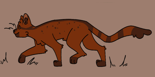
the first thing i decide when i'm designing a new cat is what fur texture i want them to have. i have four that I pick from (pictured below, in order), wavy, spiky, curly, and square.
i decide the fur pattern based on the cat's personality (a more stoic cat might have square fur, while someone more bubbly might have curly, or someone more excitable have spiky, so on and so on), and also based on their parents/how many cats i've designed with that fur pattern recently.
after that is snout shape, which is probably my favorite part. i love to draw cats with a very pronounced snout, not unlike an oriental shorthair, but i generally slide around between that and a more typical, stubby snout, occasionally veering off into the very square snout of a maine coon. this is also a great spot to determine how sharp you want their jaw to be, which is something that can really help set a design apart! (a couple of snout examples below)
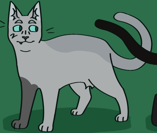
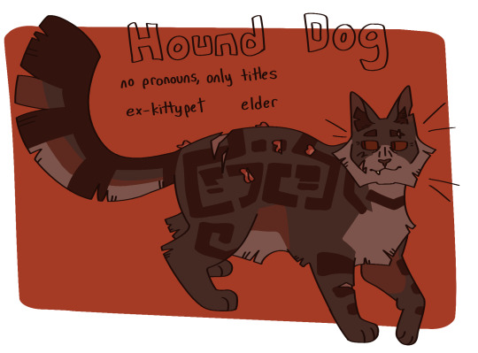
then i usually move onto colors. i like to pick an undertone for the cat first, so i know what sort of pallate to work with. as you can see in the pictures below, ravenstar has a purple/blue undertone, and toadbelly has orange/red undertones
this helps me make all the colors look nicer together, so i don't end up doing something like making a very warm colored cat with blue-toned white patches (which would make the white patches look super cold/too bright), which can be a really cool stylistic choice, but isnt what i tend to go for
once i've drawn out the cats fur shape and picked my colors, i'll move onto the base coat. over my time of having the fallenclan blog i've discovered that having a very simple pattern underneath the normal pattern can add a lot of visual interest to a cat, and make them look less plain.
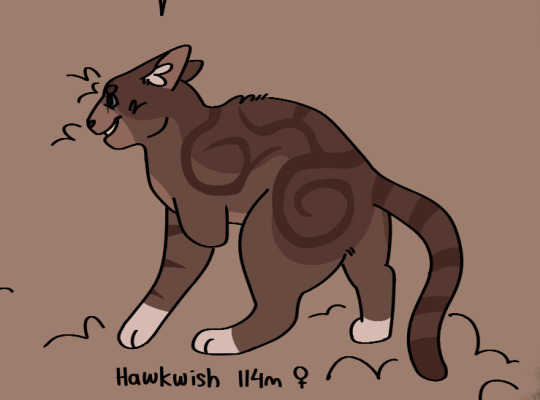
here's a good example! one of the first cats i designed, oaktuft. their pattern was super basic--one base color, plus the inside of the ears, and then the color of their patterns.
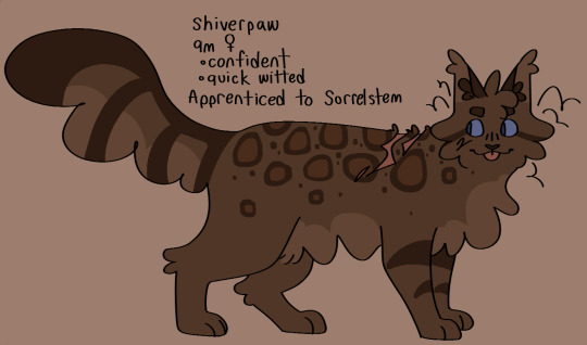
and here's another cat that i designed a little more recently--Shiverspots! you can see that even just the small change of adding a bit of a lighter color to her underbelly made a world off difference. plus my style got a lot more defined lol
i have a couple of different base patterns that i use. here's a few more examples. i've even started to experiment with more than two colors!
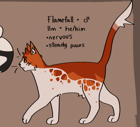
once i've got the base done i move onto patterns. this part can definitely be tricky; trying to make a dozen brown tabbies with short fur be distinct can be . a challenge. i like to follow the steps of what i've already designed--a cat with spiky fur might have very sharp, angular stripes, and a cat with curly fur might have much rounder ones.
i think a good rule of thumb for if your pattern feels a little too basic is just to throw some more colors in there. another shade of orange, a more pale tint to some of them, whatever. and don't be afraid to erase it and start again! sometimes a design just won't work, and thats fine :)
the final thing i do is to add little design quirks. a particularly sharp jawline, downturned eyes, a crooked smile or a gap tooth, whatever! little things can really give your cats character.
i really hope that this helped!!!
#fallenasks#fallenreferences#<new tag i guess???#looking back at this i suppose i lied at the beginning . i do have somewhat of a method
65 notes
·
View notes
Text
Art Advice: How to Deal with Art Block
Welcome to my Art Advice Articles series! In this issue, we'll talk about the different types of art block and how to break through them.
TYPE 1: I want to draw, but I don't know what!
TYPE 2: I want to & know what to draw, but it doesn't come out right.
2a) I've never been able to draw the way I want
2b) I used to like my art, but not anymore
TYPE 3: I have ideas but no motivation
TYPE 4: I want to draw, but I'm scared my new art won't measure up to my last good piece
Choose your type of art block from the list above the cut, and skip to the corresponding section below:
🌟TYPE 1 - I WANT TO DRAW, BUT I DON'T KNOW WHAT!
This is the easiest type of art block to deal with. DRAW ANYTHING! It doesn't have to be something spectacular; drawing an object on your desk or in your room will do; it will help you break out of this art block. Here are some ideas for you:
Ask people for suggestions. You don't have to draw all of them; just do the ones that appeal to you, in any way you wish.
Draw random objects: decorations, an insect, a slice of pie...
Close your eyes, draw a doodle/random shape. Open your eyes, try to make a creature out of it. Now redraw the creature with purpose.
Draw a scene or character from the last movie you watched / book you read / song you listened to.
Experiment with a different art form, like photography, crafts, dancing, etc. or a different medium (acrylic, pastel, pencils, etc.). This will shift your focus while still keeping your mind thinking creatively. Working with different art forms will: 1) loosen you up, and 2) give you ideas that you can apply to your main form/medium.
The last idea has another benefit. While working with a new art form, you will hone different skills, that will help you with your "main" medium if you have one (or the media you normally do). For example, if you draw and are stuck, working on photography can help you with composition and depth of field, among other things. Scrapbooking or making collages can help you with textures, color palettes, and also composition. Sculpting can help you with volume and angles. Dancing can help you with poses. You see things in a different light and can come up with new, fresh ideas. :)
🌟TYPE 2 - I WANT TO & KNOW WHAT TO DRAW, BUT IT DOESN'T COME OUT RIGHT
This type can take two forms:
a) You've never been able to draw the way you want; or b) You used to like your art, but now you no longer do.
The good news is: both are temporary!
⭐ 2.a - I'VE NEVER BEEN ABLE TO DRAW THE WAY I WANT
Many, many people who are starting with art are under the misconception that art learning is a relatively quick process, that you can get good at art in just a couple of months, whereas the fact is, it takes years to get to the level we want, with art as with anything else.
Exercise what I call The Three Ps:
Patience
Practice
Perseverance
We must have patience! It's important to give yourself time; focus, don't rush, and don't get exasperated when things don't go the way you wish they would. They will, with time.
In the meantime, practice! Do studies (from life or photos, not from others' art so you don't accidentally copy other artists' mistakes). Learn how to use shading to convey volume. Practice different light sources. Learn and practice anatomy. Learn about lighting and colors. Try different subjects, styles, genres - experimenting and learning to draw different things is super important! Branching out will not only aid in building your skill-set, but can also help you find what you like.
Keep going and don't give up! You must persevere!
While you're doing that ...
Focus on the journey, not just on the end goal. It is important to enjoy the process for its own sake. This attitude will help with patience and perseverance, and will keep you happy longer.
While you're doing this, don't feel discouraged when things don't turn out the way you want! EVERYONE makes mistakes! And everyone has had to go through a learning process. Just because you don't see others posting things with mistakes doesn't mean they didn't happen. Take mistakes in stride, have a little humor with yourself, and learn from them.
⭐2.b - I USED TO LIKE MY ART, BUT NOT ANYMORE
Usually, when you feel you've hit a wall, when you feel like you're no longer happy with your art, it's right before you begin to improve again, so don't let that feeling make you quit.
What happens is that your brain (your inner art critic) is no longer satisfied with your current work because you've seen things you like better, and, subconsciously, you're going "my work would be better if I could do _." The thing is, once you become aware of what that blank is (which will happen), you'll start working toward achieving it, and you'll be moving forward again.
Sometimes it's helpful to take a short break to clear your mind a little, like when you've been working on a project/paper too long and need a break from it because you can't think anymore. Take a few days, maybe a week or two, but don't quit entirely! In the meantime, you can use your creativity in other media. Try photography, crafts, decorative cooking, anything! Give yourself some time and approach things with a fresh perspective. Give your brain a break from what's bogging you down.
When you come back, you can do three things:
Try again. Sometimes things just "click" after you've taken your focus off of the matter for a while, like how you can better spot errors in an essay after you've laid it down for a day or two, than right after you've finished writing it
Go back and review the basics again. You don't need to spent ages doing this; it's just a refresher. Sometimes, we get hung up on our methods and forget something we once knew we should be doing. A refresher's always good. Personally, I make it a point to go back and briefly review the basics every couple of years.
You can try approaching things in different ways. Experiment! Do things in ways you didn't do them before. Try different types of lighting, coloring, shading, for example. Maybe you'll find something you like better than what you were doing before.
The important thing here is to realize that this sudden dissatisfaction with your work is a GOOD THING! It means you're about to make a leap and get even better! So, embrace it and don't feel discouraged by it!
🌟TYPE 3 - I HAVE IDEAS BUT NO MOTIVATION
This one might be brought on by other things going on in your life, maybe things that are making you feel down. Sometimes, even music or books or whatever used to get you in the mood to do art doesn't work.
Force yourself to draw -ANYTHING- (See TYPE 1 for ideas). This will help jump-start you, and then you can get back to drawing cool things. The same applies to writing - write anything! A poem, a haiku, an anagram. Do a few and you'll get back in the mood. If you do photography, just take your camera and head out. Take pics of ordinary things from different angles; try a type of photography you don't usually do. Don't worry about the results being good. Just focus on doing the thing.
When I've had this type of art block and did these things, I got out of it fairly quickly. When I didn't, and sat it out hoping it would go away on its own, I stopped doing art for five years, and in the process forgot many things I already knew about how to make art. Different people work in different ways, but I do recommend that if you feel this type of art block has been going on for too long, actively do something to try to get out of it, like the examples I mentioned above. You don't want it to drag on long enough to set you back in your progress.
🌟TYPE 4 - I WANT TO DRAW, BUT I'M SCARED MY NEW ART WON'T MEASURE UP TO MY LAST GOOD PIECE
Lastly, I want to address the mental cage that is choking under pressure. You can feel pressured by external sources (other people, social media) and by internal sources (yourself). Sometimes, you might feel like you have to perform at a certain level, and that pressure may make you perform below what you usually do. In worse cases, it may make you freeze and scared to even try! Don't let pressure play you wrong. Breathe deeply a few times and clear your mind… and draw without worrying about it! Just draw!
It's like how, sometimes, doodles on lined paper come out better than things you draw on a white sheet or on a canvas… it's because you're not putting pressure yourself to come up with a masterpiece.
Draw without worrying about how good or bad the outcome will be. If it's not as good as your last piece - nothing bad happens! Honestly! But you know what does happen if you freeze up because you're afraid you won't measure up to your previous works? You will not create equal or even better works at all! So, let go of the pressure, don't worry, and just draw. You WILL make better works; it's natural and makes sense. More practice and time leads to improvement, no matter what level you're improving from. Just give yourself the opportunity to do so!
Let go of pressure and expectations and just draw for the sake of it! You'll do fine.
Yes, it's important to challenge yourself and break out of your comfort zone to learn new skills, but sometimes (like when you're in this type of art block), going with your own personal strengths will give you the morale boost you need to draw again, and then you can keep moving forward and tackle challenges and new things with more confidence.
Believe in yourself! And remember: don't stop or you won't create the next awesome artwork you didn't know you would make, because your future pieces will always be better than your past ones. Don't forget that!
🌟CLOSING
I hope his article can give you some ideas and motivation to help you plow through your art block, whichever type it may be, and you'll be back on your way to creating beautiful works! 💟
~B~
You can find the index to all Art Advice Articles [here]
227 notes
·
View notes
Text
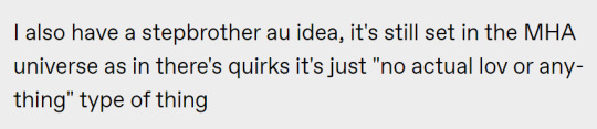
Ask of me debauchery....
...and you shall fucking receive.
Step by Step: A Gecko’s Guide to Becoming a Really Bad Person
Part One
Rating: Explicit - Minors DNI!!!
Summary: In which, Bully!Reader manipulates Step-Bro!Spinner sexually in increasingly demeaning ways. And eventually, he asks his good ol’ pal Tomura Shigaraki for help.
CW: Step-brother, Dub-Con, Blackmail, Bullying, Mean Reader, Male Masturbation, Oral Sex, Spinner has two dicks, Step-cest, Monster-fucking, AU - No League of Villains
A/N: I predict people are gonna be maaaaaad about this one and I'm all for it lol
Like my work? Please consider commissioning me or contributing to my Ko-Fi!
Read Full Chapter on AO3

[excerpt]
Her step-brother, Shuichi Iguchi, was a fucking loser. She knew it from the moment she saw him. And not in a prejudiced way or anything, it wasn’t because he was a heteromorph. After all, she has plenty of heteromorph friends (none quite as extreme as him, but still!)
No, it was all the other things she noticed about him when he walked into the family restaurant with his Dad the first day they met. The way he carried himself, slouching and fidgeting endlessly, unable to decide if he should cross his arms, put them in his pockets, or keep them at his side. The way he dressed, a ridiculously faded crewneck, baggy cargo pants, and a freebie League of Legends snapback that only served to further curtain his greasy long hair in his face. When she actually managed to grab a glimpse of his eyes through the locks, it was only for a second, and they were constantly shifting, dropping, unspeakably nervous.
Even in a casual setting, he looked completely out of place. He practically jumped anytime anyone asked him the most basic of questions like “how’s school”, “what do you want to drink”, “can you pass the soy sauce”. It was like he’d just been dragged out of his bedroom for the first time in five years — and she wouldn’t have been surprised if that was the case.
She also wouldn’t have been surprised if this was the first time he’d ever been this close to a girl before, as he always looked especially panicked anytime he realized she was glancing at him, so she didn’t even really bother trying to talk to him that night, focussing instead on getting to know he future step-father — who seemed like an overall decent guy.
At the very least, Iguchi seemed to understand his status well. When she entered high school — the same one as him — he didn’t try to walk with her to or from school, didn’t try and talk to her, basically pretended like they didn’t even know each other, which she appreciated. She would’ve hated to have to be a bitch and tell him to get lost in front of all her new high school friends and potentially be reprimanded by her Mom to prove a point (of course, she would’ve if she had to).
Yes, her new step-brother was a fucking loser, someone she wouldn’t be caught dead talking to, let alone spending any meaningful time with in public.
And yet somehow, she was completely infatuated with him.
She loved the way his skin looked, the different viridescent shades it took on depending on what angle or lighting she saw it in. She loved even more the way it felt, the times when his hands brushed against hers when he handed her a bowl or she bumped shoulders with him, cool and impossibly smooth with a texture so different from her own. She’d wanted to run her hand across every inch of it, to feel every difference. Just imagining it pressing and rubbing all across her own body had her gasping into her pillow for hours.
She didn’t know how the fuck it happened. It would’ve been great if she did, because maybe she could make it unhappen then. But nope, the harder she tried to understand it, the further away the answer seemed to get.
Maybe it was because he was so different from her or anyone else she would ever actually consider dating. Had their parents not gotten married, she never would’ve let herself give Iguchi the time of day. But within the walls of this family home, she was able to enjoy and explore him to her heart’s content. She was inquisitive by nature. Her friends called it sadistic, but she saw it as just wanting to see how far she could take things. And the desire to do so to Shuichi Iguchi was no different. He was so sweet and so shy, so eager to please or be invisible to everyone around him.
She wanted to see where that ended, what exact buttons she could press to get him to actually snap at her.
It started with little things at first, innocent things. Asking him to do her chores, her homework, even her shopping, yet he could never say no to her. Not even when she asked him to go buy her a set of lacy lingerie she was wanting. He actually fucking did it — handing the little pink boutique bag out to her without looking her in the eye, his skin flushed all the way down to his neck. Oh, she knew then that he was going to be fun .
That with him, she could really get… creative.
Flirting with him shamelessly, hanging out on his bed in nothing but a pair of panties and a tank top she’d stolen from him while he played video games, throwing her legs over his lap during family movie nights, pretending she didn’t notice how warm and fidgety it made him while she continued to move her calves back and forth across his crotch.
There came a point when she thought that maybe the guy was just unbreakable, that he really didn’t have a single impure thought about her in his head and that this wasn’t a game, but just an infuriating (not to mention insulting ) exercise in futility.
But then, late one night, through the thin wall they shared, she heard it. The sound of flesh against flesh, muffled grunts.
Her name, breathy but distinctive, on his tongue.
Shuichi Iguchi, her dear, perfectly behaved, and endlessly timid older step-brother, was in his bed, jacking off.
Imagining her .
And it wasn’t a one time incident either. She listened closely in the following days, and discovered that it was a nightly occurrence, that she was a nightly occurrence to him. And it wasn’t long before she joined him in his fantasizing, spending night after night pressed as close into the wall as she could get, imagining that that stupid piece of plaster dividing their beds was gone, as she fingered herself to sleep.
It should’ve gotten easier after that, she should’ve been able to extend her patience knowing that it was an actual possibility now. But if anything, it made the burn within her even worse, knowing that it was so close yet so far out of reach. She didn’t just want this, she fucking needed this. But it’s not like she could let him know that. She couldn’t let him think that she wanted it, that she wanted him . She needed it to seem like mercy.
She needed to have the upperhand.
So, she started setting traps. Things she could use against him, to get him into the palm of her hand, a place where he didn’t say no just because he didn’t want to say no, but so that he couldn’t say no. She asked him to get things from her room and left sex toys out, wore skimpier and skimpier outfits that she could catch him staring at her in, left her phone out so that he could read her lewd messages to other boys at school.
Yet still, nothing.
Iguchi didn’t step a single clawed toe out of line outside of the four walls of his bedroom. He was the perfectly polite older brother that she knew and hated to love.
It wasn’t until she wasn’t even trying to trap him that he finally took the bait.
Continue on AO3
#shuichi iguchi#shuichi iguchi x reader#iguchi shuichi x reader#iguchi shuichi#smut#mha#my hero academia#bnha#boku no hero academia#cw dubcon#cw stepcest#cw bullying#darkfic#mha x reader#bnha x reader#my hero academia x reader#cw monsterfucking
100 notes
·
View notes
Note
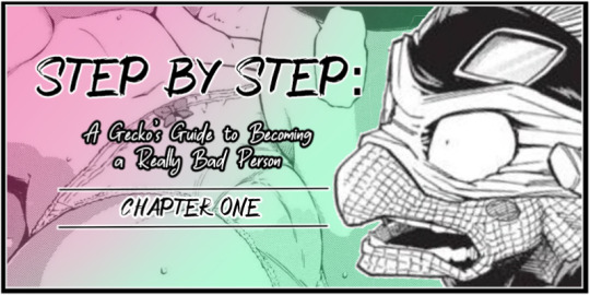
How do you color in your art?? I can never make mine look right, i’m still relatively new to procreate and I just wish I could instantly know how to use it because AGEGGS
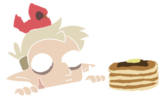
I don't use Procreate and I'm not sure what you're personally having problems with, so I'll just go through my process using some of my old drawings and try to give some general advice that might help
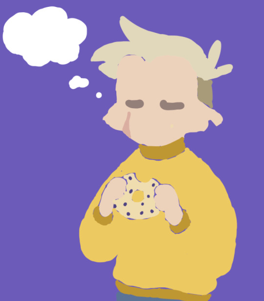
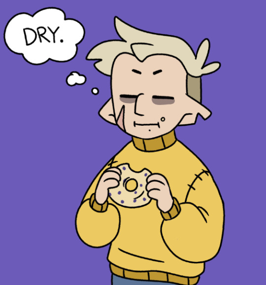
So I have the line work of "Hunter wants pancakes" here. I usually copy images from screenshots of the show and paste them onto the canvas so that I can eyedrop the colors, but I probably had it on a different canvas there.
Sometimes I'll change the colors a little bit for clothes to make them a bit brighter or less saturated (depends on what I think looks better), but really for fan art of characters that already have a color scheme, I just copy the colors.
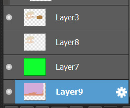
But your line work is going to be your topmost layer the majority of the time. All the coloring stuff should be underneath the line work so that if you do color into the lines, the linework isn't impeded
I typically put all my colors on the same layer, but feel free to use layers in whatever way is more convenient for you. (When I'm doing lineless, I'll typically make a new layer for each color so that I can shade them individually later on. Idk if that's at all smart or convenient but it's just a thought)
As for the actual act of coloring, I pick a large, textureless brush. You could use whatever you want depending on what kind of look you're going for, but for my finished pieces I usually like the coloring job to look cartoonishly clean. Like you can see that the second brush changes opacity as it reaches the end of the stroke (or with lighter pressure, since I use a pen), which I don't want, since I prefer the colors to be uniform in shade and texture. So I use the first one instead. Also less texture helps keep the color in the lines from my experience.
I don't use the paint bucket tool very often because it typically won't fill in all the white space, especially when your work is more detailed (which would lead you to have to go back and go over all of the edges again with a brush anyway), so I color most everything manually now. But for "Hunter wants pancakes" I think I did use a paint bucket and then probably went back to fill in some of the gaps since there are clean white gaps where the line work would be.
That is to say you should color with your line work visible (I don't know who wouldn't but I'm trying to cover all the bases here). You made yourself a coloring page, now you get to enjoy it. Without the lines it can look pretty silly and very messy, but it doesn't really matter if it's going to be covered up by your line work anyway.
Sometimes when you're coloring with lighter shades on a light background, it's hard to tell if you're missing a spot. I like to use a really REALLY saturated color like neon green or red to see any gaps in the color. Put the layer of neon green under the color layer and it will become very obvious where you missed haha. Sometimes I'll look at the neon color for too long and will need to change it to refresh my eyes
This colored sketch isn't very clean but it shows that you can also make a clipping or masking layer (if you don't know what that is the Internet could honestly probably explain it better than I could), color over the whole thing with a different color, and lower the opacity to give it a cool-looking tint
I don't know what your specific issue was but hopefully I was able to clear at least something up for you
19 notes
·
View notes
Text

Raren demonstrating a suspicious spell in front of the royal court.
visual storytelling notes:
The bg was left blank until I started painting and the elements added to the bg were designed around the character. I didn't go into this with a little synopsis of what I wanted to convey. Only an abstract idea that Raren was going to be talking to someone, figure it out later. I decided he'd be presenting a new spell in front of a political chamber because he wears a crown and a blue crystal. So he has to be of some form of nobility and magical prowess. He also has blue eyes meaning he is an ice dragon and thus its a blue spell wow. The monarchs he's addressing are left dark and disapproving in the corner while Raren powers a statue beneath them. He could be demonstrating how the spell effects the world around them, maybe it freezes the stone? maybe it brings the statue to life? Either way its primed to eat Raren's opposition. Two of the bg guys are red one is blue maybe he's an arch nemesis who knows.
Art process and wips under the cut
I'm trying and failing to get better at visual story telling while keeping things simple. My long term goal is to have a frequent and consistent posting schedule. Most of the art would be stylized and simple like this and the rest could be fully rendered.
Art has been more of a "draw what's in you head and make it look pretty/ cool to hang up later" thing to me w/ the benefit of being a good source of self reflection as I create. Writing has more so been my go to for expressing that meditation. Writing I don't share because im unnecessarily cagy abt my emotions and my harshest critic lol. I want to tell stories with my art , convey tone, feeling, etc. and right now my paintings don't do that. I don't have the technical skill yet. This painting is the first of many to come that will hopefully change this.


The texture in this is chaotic and the line work is rough. Raren is the only part of this with a full sketch. All other line art was added to create the illusion of detail. There is less attention on rendering each section and more being put into the placement of characters and props. I had hoped this would make the painting go faster and...it has the potential to do so in the future. Sooo a piece that could have taken a couple hours took a whole day.
While im not overly thrilled with the final image im still happy about the process. Normally the dragon would be the only real focal point in my painting with the bg being a gradient, or a simple theme added last second. Conveying a message is more work but it gives more cool things for the eye to look at and the mind to ponder. So in theory even if the final result is aesthetically unappealing the theme can still salvage the work a bit.
what this taught me:
sketchy line work is passable in the final image
it can even add character to the art
plants are a great way of filling space without actually doing so
(hence the wip of the room looking empty af with out them)
the more clothing and eye candy you put on your character the more clutter you have to add to the bg to balance it out
the main oc was sketched the bg was painted on the fly
doing so saved time but harmed the natural flow of the piece
all of the storytelling is happening in quarters and it is almost abrasive to look at
what ill try in the next piece:
perspective guides
less shading and rendering
find a color palette to stick to
or work in greyscale first
write a little picture synopsis
or pick a theme
just find something that acts as a story guide
sketch out bg elements
toy around with the sketch more before moving to painting
#flight rising#artists on tumblr#fantasy#digital art#oc#flight rising art#imperial dragon#my art#photoshop#dragon#dragon art
26 notes
·
View notes
Note
Happy Fan Friday 💚 who are three blogs you really like and would recommend?
#more hype less hate
This is a great idea!
And also so bloody difficult XD There's so many I could tag and recommend.
I'm just gonna tag some amazing artists, I wish I could tag everyone! I want to say I appreciate all my mutuals, followers and folks I follow.
@dxncemxcabre does fantastic portraits and scenes, their most recent Pied Piper Copia is so cool, with amazing shading and composition!
@chapghost2 Digital painter, their texture work is beautiful.
@anamelessfool Fantastic artist and a great fic writer. Their prose is so good!
@probably-impossible A wonderful cartoonist/artist with an impeccable sense of humour!
@ghouliebabies-art A traditional artist who does glorious portraits and paintings. Even their sketches look amazing!
@thegreyswan66 A great artist who deserves way more reblogs, their art has some of the best lighting and smoke textures I've seen for a while.
@raven-ovs Paintings so realistic it takes a moment to realise their not photographs! They're so talented!
Also shout out to @cityofmeliora 's blog of properly sourced Ghost history, which is so useful to me as a new-ish fan.
I'm trying to get better at reblogging and commenting but I can struggle to think of interesting things to say / put why I like a thing into words.
20 notes
·
View notes