#also i mentioned stylized artstyles
Explore tagged Tumblr posts
Note
I absolutely love your art and how detailed it is! If you don't mind me asking, how do you draw/break down faces? Your style is like exactly what I'm hoping to get close to when I draw them


OKAY so huge disclaimer. im self taught and i dont know what im doing most of the time! frankly i have a long way to go with shape language and character design so i will always suggest people to go to actual professionals and masters LMAO.
i am NOT qualified whatsoever, but, i tried to breakdown my thought process in how i currently draw things!!! for my mcyt designs, obviously i take huge inspirations from the actual ccs.
tango has similar hairlines and beard patterns to cc!tango. joel's hairstyle is very much inspired from his younger hairstyles, and pearl has a similarly long oval headshape from cc!pearl.
all of which are completely personal preference. some people take shape inspiration from personalities, voices, or whatever prophetic visions they have in their heads!
this would be the case for my cleo and etho designs. Cleo to me has a sharper voice & personality so i tried to incorporate that into what id think their face would be! etho is kind of . wet cat, but his voice for some reason gives me... round?? shapes?? so he has floppy hair and rounder eyes and ears in my design.
(another disclaimer: looks does not equate to personality, but like. its a lil easier 2 draw. and theyre shorthands and associations)


^ cleo has a higher eyebrow arch, sharp inner eye corner. etho has ears that stick out, uneven haircut, and his roots are darker :D
so its basically 2 big steps! Picking the face shape and then picking out details that would be unique to that character. to make characters different, i try to always pick something different between each person. so more contrast!!!
pearl and gem are easy since theyre opposites visually -- oval vs square, sharp vs round. for skizz and tango, i draw their eyes very similarly. but i decided my skizz would have a longer face and rounder cheeks, whereas tango has a bushier mustache and flatter face.
i am personally very fond of super stylized artstyles,,, i think cartoony / stylized artstyles take a lot of skill and a lot of character design thought into creating unique silhouettes that are still very recognizable! (for instance, huge fan of @/wasyago and @/alienssstufff)
unfortunately my artstyle isnt geared towards that lol, and alot of my face shapes tend to be very similar. so instead, i try to change up eye shapes (very common method of separating characters) and hairstyles! i have a long long way to go and i have a lot of bad habits lol but i hope this shows a little bit on how each of my characters are detailed differently.
#also i mentioned stylized artstyles#but shoutout to heavier on the realism which requires alot of skillsets that i do not have myself. massive respect to u guys#this also definitely wont help anyone.#so i turned it into a post where i can blab about my miniscule design notes for some of the hermits LMAOOO#alot of my design choices are based on pure vibes. so i picked out some more concrete examples here of deliberate design choices#hermitcraft#my art#eydireqs#hc#misc#mcyt#genuinely i could go on and on about my thoughts behind each of them. especially tango heheeee#i wish i could exaggerate features more#but ill get there one day!!!
285 notes
·
View notes
Note
VFX ask! You've mentioned before that Jessica the Liberated has notably good bullet and glass shattering VFX, would you be willing to break down what makes them stand out?
Okay yes absolutely I will, and in order to do so, I am going to briefly talk about Arknights' history of guns because this is my feed and you can't stop me. This one will probably be long. I wanted it to be short. But it is not.
Guns in AK's worldbuilding are extremely rare, with only Blacksteel, Lateran, and collab ops wielding guns. So there's a sort of weight towards making the rare gun wielder... feel like they're using a gun, making them feel distinct from a crossbow.

Early on, AK did this in a very very simple way. Simple, single color muzzle flash, impact spark, no visible projectile. All the guns worked hitscan, which did really help to sell the illusion of a gun, it hits instantly.
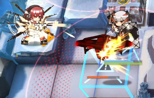
Exusiai even amps it up a little and adds a visible bullet trail when she's in Unloading Mode!
But for a time, because of how rare guns were, that was kinda... It. After Nacho Cheese Executor, the next wielder of a traditional gun was the Rainbow 6 Siege Operators?? Really??
R6S is extremely important. Being from a shooter-ass shooter game, they had a lot of reason to make them feel like real guns. So what does Ash do? Well!
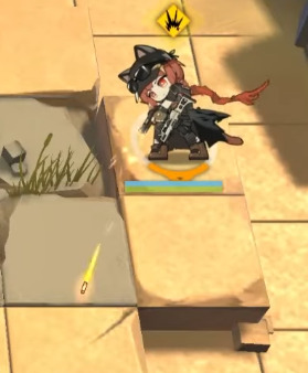
That's a VISIBLE BULLET baby!
It's WILD that removing the single biggest trait about guns - that they are instant - does a LOT to actually help sell that it is a Real Gun.
But on top of that, they do a few interesting things. The muzzle flash isn't just a single flash, it's a semi-realistic looking muzzle flash that also releases sparks. The bullet trail emits sparks as well, eschewing AK's stylization for the sake of making it feel like a Real Bullet Trail. This really helps sell the
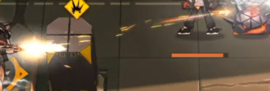
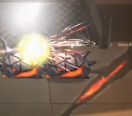
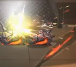
Even on the impact, there's no Textures or traditional bursts to be found - instead it is black, white, and red sparks alongside a very very layered flash of light. This is really unique in AK, and it serves brilliantly to juxtapose the R6S ops within the world of Terra, while still being over-the-top enough to fit in within the game's cartoony artstyle.
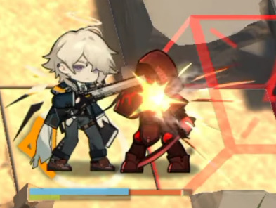
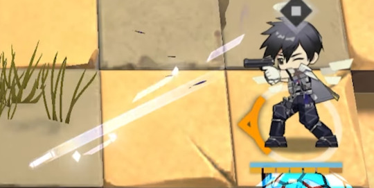
What's interesting is that these choices carried forwards in the future! Enforcer has very realistic-looking muzzle smoke with Ash's black/white/red sparks. Meanwhile, Insider has a visible bullet and sparks coming out of the muzzle flash!
Also I just barely noticed while writing this but all the Lateran use the shape of their wings as part of their effects! Exusiai's bullet trails are triangular like her wings, Ezell's impacts are dark iregular polygons with a lip like his, Insider's trail is rectangular like his, and Cool Ranch Executor's shots are shattered diamonds that fade to black as they get closer to him. Neat!! That's SUPER fucking cool.
(Also notable is that Exusiai and Ezell's effects are the only lateran guns that don't have a predominantly white aesthetic. Just a little treat for Exu Errari Believers)
So, with a history of four ops with Real Guns and a bunch with weird magic guns, how do you make an operator whose gimmick is that she is definitively Terran who also uses a fuck ton of Guns?
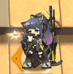

Jessica's muzzle flash is a realistic-esque flash that quickly fades into a burst texture. She gives off a few sparks like Ash does, but there are few of them, and they're really large for stylization. Also her bullet is much larger, but is distinctly a realistic bullet.
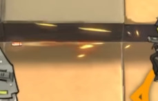
I wish so badly I could get footage of this one properly but an image will have to do. The trail of the bullet is a rotating mesh spiralling like the bullet is rotating. Also the bullet itself is glowing, allowing it to stand out better against the background.
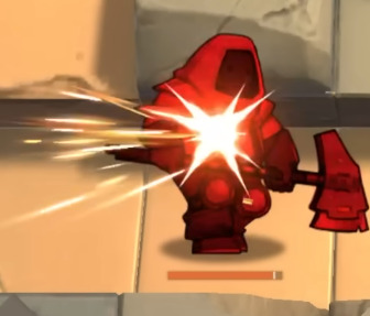
And when it hits, hooooly shit. There's blurry, semi-realistic looking light textures flying off the enemy, sparks, and the same hitflash she has on her muzzle flash (cool asset reuse there!) They went all out to show the impact of her shot, since it is a Real Ass gun.
AND ALL THIS FLAIR AND DRAMA FOR JUST HER NORMAL ATTACK. THIS IS OFF-SKILL. When she's on-skill...
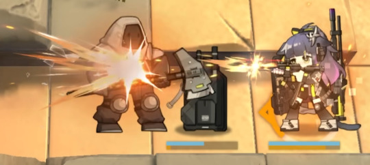
WHOO. WHOOOO. WHOOOO.
The muzzle flashes become longer to sell a BIG impact, but they last MUCH shorter (this muzzle flash lasts one single frame), since all her skills are rapid-fire, making it feel like bigger shots in less time. The impacts become ABSURDLY BIG. And then. My absolute favorite part of the whole thing.

(These are Not The Texture, but a similar, oft-mistaken cousin of The Texture.)
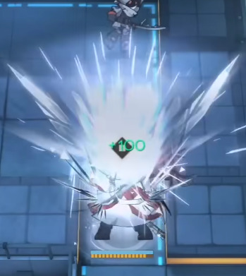
This fucking followthrough. Every hit on an enemy creates a burst of shattered glass and fire. I would not have thought of adding EITHER of these, but I love it. It's a great call to her art, it's unique and distinct, and even though it can be "where is the glass coming from" it's so cool i don't care. I literally saw it and gasped and went "I have never seen this before." It adds great color contrast, conveys the armor-piercing nature of her bullets, adds unique shapes, makes it look more chaotic, I can't praise these glass shards enough, I love them, they're so cool.
Fortunately for you, Jessica's skills all kinda look the same, so I don't have much more to say about this. I like that her S3's muzzle flashes create more chaotic sparks, creating the look of a wild, uncontrollable spray and pray strat. I like that she fires multiple shots and muzzle flashes but only shoots one bullet, but you rarely ever notice it because of the weight of the impact.
But I have one final thing to say.
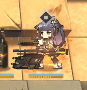
BEHIND HER IN HER S3 SHE HAS AN ACTUAL ROILING, BURNING, MOVING FLAME. WHY IS HOEDERER BEING SHOWN UP BY JESSICA. WHAT THE FUCK.
79 notes
·
View notes
Text

@cowboyeulogy i know that artstyle. points at you!!!!! have i ever mentioned your faces are really nicely stylized
listened to the whole thing just now and i didnt mind it at all its goated
the guitar is really crisp its like a quintessential electric guitar. the funny muted synth also .. super nice mood and a pretty consistent style, ngl id listen to them normally. despite having relatively few instruments the composition is rlly textured.. droning synth and guitar loops do wonders, plus the singers voice is so nice. i actually really like rhe album grins
#HI!#id play this while driving in the evening .if i could drive#my favorites were sudden death/no one has ever looked so dead/brother#ochi asked#hannibal lecter#others art
17 notes
·
View notes
Note
12 and 19
Your art style is fire, I need to know the secrets of your "meschanicesh/blockish/shape-ish" (idk how to describe it???) artstyle
thank you very much, thats nice to hear! im going to do these questions out of order though because the first one will take a bit longer to talk through
19. where do you find inspiration?
many places! sometimes i take pictures of cars with face-like headlight designs or normal objects that look like they could be creatures if i worked at them. if anything in the open catches my eye ill snap a picture of it. traveling and seeing new kinds of architecture is usually really good for my creative juices too so i like to look around a lot whenever i go somewhere out of the ordinary. a lot of the pictures that inspire me can be found in my #alien insp tag as well, even though thats to help me worldbuild my stellaris-fic-turned-spec-bio(?) thing its also usually filled with arrangements of shapes and colors that tickled my brain and that i hope to replicate the feeling of. i also take a lot of inspiration from how music makes me feel. more often than not though its just a random lightning bolt idea or a recycling of an old concept
12. describe your process while drawing
if i wanted to go in full depth this would be a very long response that would go all through how i color and do lighting and decide certain things and what i hope to achieve in character designs as a whole but to give you the answer in short, ill just talk about my sketches and how i use shapes, because i consider those two things the most important parts of my process. first of all my sketches are terrible. oftentimes theyre so vague that if i never make progress on them and then return a week later, i wont understand whats happening.


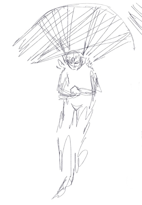
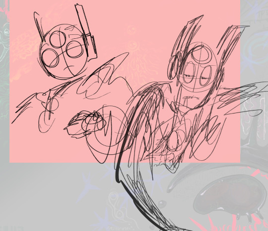
i mention this because i feel like i see people get wrapped up in making their sketch look good too often, and to that i say NO! an adequate sketch to me is something you could wipe your ass with! besides it helps me get the idea on paper while focusing on what i know i want to be the important part(s) of the piece.
for shapes:

yes, part of the reason why this ask took a little while to get to is because i was whipping up this and glass arena (the spikey one) was not cooperating with me and its sort of haphazard i know i know
but the gist of it is that generally what i will do is pick one or a select few dramatic shapes to dominate their design and then focus on accentuating that particular shape. sometimes as im creating a character, what that central shape is will change midway. i will also usually design the head of a character before the body, A, because its more fun, and B, since the head is small and also usually heavily reflective of the central shape, understanding exactly what shape i want makes it easier to make a body that works with/mirrors it (and then possibly make some tweaks to an already established head) instead of trying to figure out the head and body at the same time. i get that is not the ideal way to do it but i am also not a professional and sort of just winging it through everything ive ever done
im also at least somewhat attentive about the curves of lines which is what all of those red lines are for, the blue circles on glass arena and zmeu are to show where the lines concentrate. interestingly enough this sort of focal point usually isnt on the face but instead the neck because what happens most of the time for humanoids is that the (stylized) slopes of the eyebrows to the sides of the nose (or at least the form of a shape that represents this) creates a downwards arrow, which usually works well with an "upwards arrow" on the chest to sort of "pinch" the lines together at the point in between the head and chest. this is exactly what happened for them both, though for zmeu his downwards arrow is just his entire head. i dont usually draw the "focal point" but i see it in my head and try to make adjacent lines feed into it. some characters like am (semi-circle head) dont have one though, but there is still a general trend in the lines, you can see in her headshot i tried to make the lines be "parallel" or to flip/mirror the curvature of her headdress.
again i could go more into depth about my art process if anyone'd be interested in a fuller detailing, but it'd have to be a separate post. thank you for asking though, i like talking about my process!
#and sorry again it took so long X( but to be fair answering asks late is my trademark#my art#ask#oc: zmeu#oc: gl.a#oc: am#poor girl her design changes so often
10 notes
·
View notes
Text
I mentioned in a previous post about how I had a headcanon that Dinopiggy and Parasee used to just be normal pig people [and also Penny and George's aunt and pibling] before the infection. But then a bit after the infection had started, the two ended up somehow getting exposed to prototype versions of Substance 128 and then turned into the creatures that they are now.
So anyways here's Dinopiggy and Parasee before the infection [their real names are Dani and Paisley /hc]

[also experimenting with my artstyle a bit, it's not all too different from before but I think I'm improving quite a bit ^ ^]
I was gonna draw my stylized designs of Dinopiggy and Parasee [y'know, what they looked like after they were exposed to the prototype substances] but this first drawing ending up taking WAYYYY longer than I was expecting, so I'll just leave this here and draw the two again some other time :>
12 notes
·
View notes
Text
[ MEET THE ARTIST. ]
i'll be updating this as i get more ideas because i'm very very slow on what i want to say about myself
you're always welcome to send me asks about myself/my interests and i'll answer them seperately! (and, if relevant enough, i'll probably also edit them onto this post)
- - - - - - - - - - -
id: jhariah/zachary (aka. @salesmnan (/salesman), or SALE.) pronouns: he/him lvl: 7teen languages: english | polish | german + swiss dialect portfolio: linked in my carrd (i haven't been updating it much recently lol)

about me: i'm a neurodivergent trans man and a self-taught, constantly improving artist from poland. i illustrate whatever i have interest in and post independently of any schedules or expectations. i'm here for the fun and to hopefully grow a following of.. well, whatever - numbers do not matter to me. i tend to act awkward, but it's usually not your fault: i'm just a little hard to talk to. feel free to ask for tone indicators if necessary. i have a strong interest in art, games, mythology, roleplay/writing, music, computer science, a handful of horror media, and rats (i'm a rat-dad!). other (oddly specific) things i enjoy: researching & analyzing things | video essays | computer science | bones | charybdis (the greek myth) | character design | psychology | musicals (only a select few because i'm insanely picky) | (the colors:) red, yellow, blue, and green | giving & receiving (constructive) criticism | spamming my friends' dms with lyrics | the number 11 | EPIC! Hermes, Odysseus, Eurylochus, Apollo, Circe, Scylla, Polyphemus, and Antinous (not for his actions) things i do not enjoy (and things you should avoid speaking of on my page): excessive alcohol-talk (mentions and lighthearted jokes are alright) | substance abuse | "quirky-fying"/romanticizing/villainizing mental illnesses | "headcanoning" LITERAL deities (headcanoning their fictional iterations is okay, we all do it (@ the EPIC fandom)) | please do not use insane typing quirks if interacting with my posts, i cannot read those! (example: 3X@|\/|P|_E)

artist of..: approximately 7 years traditional/digital?: digital artstyle: i'd say very stylized comic-esque? i'm not sure what to label it as (suggestions for this are welcome) art program: procreate i want to start making animatics at some point (making fluid/full-blown animation would send me into cardiac arrest)

do not interact: under 13 | basic dni criteria | proshippers | nsfw accounts | ai "art" creators/defenders
14 notes
·
View notes
Text

wanted to see how all of the non-canon/pseudo-canon baldi characters would look in my style
various notes down under:
the text is pretty unreadable, but it says "SCHOOLHOUSE TROUBLE ARG" in the top-left, "BALDIMORE COMICS" in the right, and "OTHER GAMES" in the bottom-left.
i consider null to be canon but the schoolhouse arg characters feel wrong without him there.. and i ended up drawing a shrunk baldi in the baldimore comics panel anyway. the characters there are susan, andrew, and tim-tom, incase it wasn't clear. i had to do the most stylization with them (including making andrew and susan somewhat geometrical like baldi since the idea of artstyle being genetic is kinda cute)
also idk how well known she is so i might as well mention mimi. mimi is joe's wife, and we have barely any images of her lmao
i had to extrapolate her design a lot, attached below are the few images we have of her

yeah. we have blurry images of her mii from screenshots of Joe's Ultimate Bus Ride, and also two tiny sprites of her from Roguebots, a smilebasic game mystman made before diving into the world of unity gamedev
also crazy baby is there and this list isn't comprehensive notes over now yippee
#cosmics silly thoughts#digital art#my art#baldis basics#bbieal#baldi's basics#joe bbieal#joe's ultimate bus ride#susan baldimore#idk how to tag any of these guys actually. idk if anyone cares#andrew baldimore#tim tom baldimore#timtom baldimore#revenge of the crazy baby
16 notes
·
View notes
Text
money rock is definitely the most divisive season of schoolhouse rock. chances are you haven't seen it if you don't have the series on dvd or didn't tune into disney to watch, but the people who have seen it seem to hold a similar opinion.
on one hand, there's songs like tax man max and the check's in the mail that are top 10 material for songs in the whole series(which is ironic since they're both the most outdated in the season). a lot of them have very distinct instrumentals that hold an even wider array of instruments than songs of the original series- a good example is the steel pan drum in this for that. they really toy with fun musical genres, such as a bossa nova/elevator music vibe in 7.50 once a week that features a strange but catchy cowbell breakdown, or the showtuney feel of tax man max, or the country twang that adds some nice spice to dollars and sense. they were really willing to stretch their horizions a bit here, and that's also obvious with their experiments with the schoolhouse rock artstyle. you have the ones that stay faithful, like this for that, tyrannosaurus debt, and tax man max, but some slight departures that feel true to the originals yet very fresh. 7.50 once a week and where the money goes are stellar examples of that. the character design is still very shr, but the lines are cleaner and the animation is a little more adventerous due to their slightly bigger budget. becky sue of dollars and sense as well as her animals on the farm are good examples: still obviously schoolhouse rock, but a little more stylized in a different direction. then there's walking on wall street and the check's in the mail, which have extremely distinct animation that barely harkens to old schoolhouse rock. it's choppy, lineweight is played with lots, and character designs take larger departures from the old seasons. and it looks stellar. especially in the latter. everything feels fresh but familiar.
however, it's not without it's drawbacks. there's more forgettable songs than a normal schoolhouse rock season; i watched all the episodes in a big blend when i was little(i owned the dvd, hah) and couldn't tell the difference between old and new shr since i was a dumb lil baby. however, i could hum at least a few motifs or mention at least a couple interesting moments in the animation for every single song in every season. except this one. the only ones i could give you more than one thing on were dollars and sense(obviously, since that one was the big episode of the season), 7.50 once a week, and walking on wall street. and as much as i sing the praises of tax man max, it is the only shr episode i watched when i was younger and as of a month ago, before i rewatched, i could tell you nothing on. gun to my head i could at least remember the tuba opening to where the money goes or the first chorus to the check's in the mail, but i wiped tax man max from my memory. it's just not a sticky season, and i think that just comes down to the fact that it's teaching money. it's literally called money rock. those lessons have to be taught far more straightforward than any of the other subjects. it's very tough stretch it into anything really cool or revolutionary, a problem similar to a few songs in america rock. you can't personify the concept with a character like bill or verb or the prepositions, and you're hard-pressed to be able to twist and morph the concept like in telegraph line or conjunction junction. tyrannosaurus debt does it well enough with equating national debt to a dinosaur monster eating the money, but there's not too much wiggle room. this is little fault of the creators and just comes with the subject matter, however it negatively impacts the season. some instrumentals are also really bland, too. tyrannosaurus debt is a big offender, and while the steel pan drum in this for that is cool for a few seconds, it gets unimpressive quickly. the characters also aren't super memorable. like, i've not seen people putting the caveman from this for that or lester the investor from walking on wall street on a pedestal like lots of other characters(though becky sue and tax man max are icons). sometimes they get a little boring.
in conclusion: i yapped for about 30 minutes? holy crap. this is a long post. anyways, money rock good(but not great). feel free to tell me what you think.
10 notes
·
View notes
Text
Makinata Mondays: A Hakumei & Mikochi read-along
This is going to be a weekly series called Makinata Mondays, where i re-read my favorite manga: Hakumei & Mikochi! I'll try to give a brief plot summary, along with some screenshots and my thoughts on the chapter.
Chapter 1: Yesterday's crimson
Plot summary: This chapter sees Hakumei and Mikochi looking for the "Sunset Hawk"; a mythical creature that is said to grant people's wishes.

I won't tell too much of the the actual plot of this first chapter, because i think it's more satisfying to read if you go in blind. If anything in this post seems interesting to you, you should really give this manga a chance!

I love how stylized the bird is in the newspaper, reminds me of the icons from the Monster Hunter series. (On second thought, the outfits for the people in the manga also look like palico outfits)
As is the case with many serialized manga, the first few chapters still feel a bit different to the later sections, when the artstyle and characters had more time to solidify.
I really like this chapter as an introduction to the series, because it has all the features of a typical Hakumei & Mikochi adventure.

We see the contrast between the plucky Hakumei and the more quiet, reserved Mikochi. After already living together for a while at this point in the story, they know each other's habits and stregths and know how to look out for each other.
To me, the story focuses on the most important things in life: spending time with people you love, taking in the world around you and enjoying a good meal.

It never reaches Dungeon Meshi levels of cooking, but there is always these little moments of rest; when characters sit down and share a meal together.
I feel like each chapter has at least one mention of food or cooking and it places emphasis on really slowing down and enjoying eating in somebodys company, which is basically a core tenet of Dungeon Meshi.
Most people (myself included) regard Hakumei & Mikochi as an Iyashikei, or "healing manga". I watched the anime during a very troubled time in my life and feeling that sense of calm and community really helped me. Not to mention that the emphasis on actually enjoying mealtime instead of just wolfing down my food was something that i needed to learn.

Last but not least, i love these gorgeous full-page spreads. I'm always in awe when one of these comes up. The contrast and the realistic way animals and plants are rendered (compared to the "cutesy" artstyle of the rest of the manga) always takes my breath away.
See you next week for chapter 2!
Alright, thats my thoughts on this chapter! I hope you liked reading and if there is any way I can make this more entertaining to read/digestible; let me know!
Edit: In the manga there's these little addendum sections called "walking underfoot". I didn't have space to fit them in these posts, so i planned to make one big post with all of them at the end the volume. But on second thought, it would be better to post them week by week, so please look forward to those!
#hakumei to mikochi#hakumei and mikochi#makinata mondays#manga recommendation#anime and manga#hakumiko
5 notes
·
View notes
Text
does anyone remember a honestuck video using this song? currently there’s a lead that a homestuck video may contain this, tho unfortunately the source watched it years ago and isn’t a homestuck fan so a lot of details are vague
what we currently know about the video:
video may be on either tiktok or youtube (if the former, the user watched the tiktok in 2021-2022, if the latter, the user watched the video from 2019-2022, though the video itself may be older)
featured a character with long black hair
artstyle was “pretty stylized, possibly lineless”
video contained stylized text that got bigger as the music got louder
EDIT: source says they “only remember one character, but [they’re] sure there were others in it because it felt angsty”
if any of this sounds familiar to you, please reply/reblog this post providing detail (or even a link to the video you think it is!). do this BEFORE checking the read more, since the read more is a theory, and i don’t want my theory to influence your recollection at all.
and, even if none of this rings a bell, please reblog!! the more this spreads around, the more there’s a chance someone remembers something important.
current theory:
my current theory is that, if an hs video using this song does exist, it’s a lyricstuck from the 2010s uploaded to youtube. the mention of lyrics, plus the earliest link to this song being from 2007, definitely makes me think this is an early 2010s lyricstuck. this lyricstuck probably wouldn’t have many views (since, if it did, someone would’ve pointed to the specific lyricstuck by now, though maybe it was popular but a lot of the people who watched it are no longer interested in homestuck/don’t know about this song being lost).
due to the lyrics + sound of the song, i think this lyricstuck could’ve featured either feferi or vriska, but i could also see jade (specifically grimbark jade) and maybe aradia. though my main two picks are still either feferi or vriska
17 notes
·
View notes
Text
Yeahh and also I wanna mention
NO, I am NOT leaving the shrek fandom behind
Yeah it feels kinda for me to start posting Parappa the Rapper stuff out of nowhere, but Im not out of the Shrek fandom
My minds justa little burned [I have to pass some subjects [is that how you say it right..?], I got robbed including my sketchbook and all my traditional art stuff, someone really close to me is sick.. its a hard month! Please be patient! ]
Im also trying to figure out better ways to stylize the Shrek characters. As much as I love my silly simplified artstyle, I gotta admit it doesn't really blend well with the iconic cgi caca realism of Shrek. Im trying to go for a "in between",, blend those two together. Ive already seen some artists who manage to make Shrek characters cartoony and stylized without loosing their essence.. im trying to archieve that!
8 notes
·
View notes
Text
youtube
I love this game
I REALLY love this game
If I had to choose a favorite game of all time then I feel it would come down to either Sonic 3 & Knuckles or this one, the former shaped my gaming tastes during my childhood while the latter did the same for my adolescence
I have a lot of great things to say about this game, but also some negatives as well because no game is perfect and this is very important to remember especially in the case of games that have become so universally beloved that people have come to believe they have no flaws or areas to improve, which is never truly the case
I think the first thing to note about Super Metroid, and one of its most beloved aspects, is its atmosphere and general aesthetics
It's often said that Metroid has a dark and foreboding atmosphere and nowhere is this more evident than in Super Metroid
This game's spritework is detailed, grotesque at times. Its locations dark, eerie, grimey, organic. The colors are dark yes, but not washed out, in fact I'd say the color pallette is rich just enough to keep the game from looking dull while not compromising the element of general creepiness and darkness
The music is booming, melodieìc, creepy, cavernous, everything in this game is meant to make you feel like you really are going deeper and deeper into the inner bowels of an alien planet
I especially love how the overall artstyle feels like an evolution of Metroid 1's: the old Tourian looks like an SNES upgrade from the original, as does the beginning of Brinstar and the returning enemies from that game, though of course guys like Ridley and Kraid have been given massive redesigns. It really drives home the idea that this is Metroid 1 but MORE, it tells you "hey remember this place on the NES 8 years ago? Yeah here it is now like you remember it but looking better than ever". It truly is SUPER Metroid. Just compare this with how Zero Mission just completely altered the artstyle for something much more stylized and cartoony
The beginning acts are just a masterclass in atmospheric setup: from Samus narrating the prologue while mostly encased in shadow while the game's unnerving theme plays, to the Ceres Colony being all dark and lifeless with only the low humming of machinery keeping you company, to how deserted and foreboding Crateria looks at first before springing to life. A true masterpiece
I mentioned before that no other game after the original trilogy managed to truly recapture this kind of atmosphere and I believe it's true: no other game feels this ominous, so foreboding, so cavernous, so....dark. All the other 2D games after this usually go for a more....generic kind of atmospheric feel, the kind that checks a box off a list
Fusion can be creepy and unsettling yes...but the actual areas themselves are pretty standard
Zero Mission barely even tries to feel atmospheric, mostly just being really energetic and adventurous
Samus Returns and Dread, again, are a bit generic in the atmosphere department, save for specific moments such as the EMMI zones.
The Prime games on the other hand are indeed very atmospheric, even more than Super, but they mostly go for a different kind of atmosphere than that of the OG trilogy, which is all fine of course
I think a good way to illustrate what I'm saying is to compare the various versions of the Theme of Super Metroid that have been made over the years: they're all good versions in their own right, but none manage to capture that sense of pure menace, of sheer foreboding that the original has, rather mostly focusing on the more upbeat parts of the track
To change the subject: poor Kraid. He was the toughest of the two main bosses in the original game but now, despite having received a literally colossal redesign and looking more menacing he's actually much easier now and has been reduced to "first boss bitch". Unfortunately for him this is only the start of his misfortunes :P
9 notes
·
View notes
Note
I adore your artstyle. I feel like I'm never happy with my own cause it looks so boring and unstylized. Got any good tips?
AHHH THANK YOU ANON!! <<333
And believe me, I’ve been in your shoes. Seriously. Even now, I still have 26474885 new things I want to try with my art and things I want to change. But I DO have some tips for you- hopefully theyre good tips!
So, I think one of the key things is looking at other artists and pulling their art apart.
Practice and spending the time actually creating art is important, but I’d argue that spending time analyzing art is equally important. I spend a lot of time looking at art, and then instead of just staring at it, I try and figure out what EXACT elements of it that I want to incorporate into my own work. For example, if I like the way somebody does lineart, and the way another person does their rendering, I’ll try and figure out how they did it & why I like it & try to combine it with the way another artist does rendering or lines/the way I want to do them. I spend a LOT of time pulling at apart, seriously. I send various pieces to my own private discord server channel & literally talk to myself about them and what exactly I like about them and how EXACTLY I want to change my own work. I do probably as much typing as I do drawing when it comes to art.
Also, a good question to ask yourself when you see a piece of art you like is “I like this art, BUT- do I want my art to look like this?”. There’s artists whose styles I ADORE, but I don’t want my art to look like theirs- for example, I love looking at people with super heavily stylized art with only flat colouring & no rendering, but it’s not how I want my art to look & isn’t the type of art that I enjoy creating.
So, being able to pull apart various pieces and go “okay, WHY do I like this piece and DO i want MY art to look like this?” is something that’s definitely helped me.
I also think it’s super important to set actual, solid goals and figure out what you want your art to do.
What I mean when I say “figure out what you want your art to do,” is in terms of “okay, well, do you want everything more flat and visible with less rendering and less volume? or more rendering and more volume? Do you want to focus on design/concept work? Do you want to be able to do complex poses or complex lighting or both? What matters more to you- having a painting with dramatic, heavily contrasting lighting, or having a style where everything is easily visible & not obscured by shadow, or some combination of the two? Do you want to be good at drawing couples? Complex backgrounds? Both? HOW do you want to draw those couples and complex backgrounds? Lots of volume? Minimal volume? Focus on lighting? Focus on lines? Somewhere in between? tc"
Personally, I try and visualize it as a give and take situation/a sliding scale with tradeoffs when it comes to stylization. On one side of my scale, I’ve got super linework-focused, flat colours art that’s more focused on shape and less focused on volume and minimal lighting. On the opposite side, I’ve got super rendered, painterly art with complex lighting. And I’ve been trying to find an ideal combination of the two, and that’s where the tradeoffs I mentioned come in.
My work used to be even MORE linework heavy than it is now/flatter (which is great, just not the direction I wanted to personally keep going), and I had SO much trouble doing painting/rendering and it frustrated me and I couldnt figure out why. But then, I realized I had to make a tradeoff- my complex linework didn’t work well for heavily rendered styles, because the sketches/drawings/lines for paintings on that “super rendered basically no visible linework” side of the art scale are generally meant to be more for function rather than form.
My lines weren’t serving the function they needed to, they weren’t doing the heavy lifting that they needed to, so the rest of the painting would collapse & wouldn’t work and I would get frustrated as all hell when trying to paint.
What I mean when I talk about the lines doing heavy lifting is what I said earlier with the sketches in painterly styles generally being more function over form. I needed to think of my lines as supporting the painting and acting more as a *map* for things like the lighting (see: shadow mapping) & as using fewer lines to make room for more volume (the tradeoff). My lines weren't doing that, I wasn't really thinking about where I was putting them/how I was using them/how they interacted with other elements of the piece (such as the lighting & how that affects the way I do lines).
I also highly highly highly recommend the book/resource "anatomy for sculptors"- you can find a bunch of excerpts from it on pinterest/all over the internet, but it really is a phenomenal resource and a unique resource IMO because it does a really great job of demonstrating the link between the anatomy vs the planes of the face/shapes that make up that anatomy, and bridging the gap between 2D shapes and 3D forms.
Also, just some basic tips that help me in general: -Your areas of detail should also be your areas of high contrast. This sounds more complicated than it actually is, but basically, it doesn't matter how much detail you put in a low-contrast area of a painting, because it won't show up (because it's low contrast). So, keeping your high contrast areas as your detail areas is a good thing to keep in mind, esp when working on more complex paintings. -General proportion "rules". I try and keep in mind some general rough tips like "the eyes should have the width of one eye between them," and "the face should be roughly the sized of a splayed out hand".
-Straights vs curves. I think about the straight lines vs the curved lines a LOT in my art.
-What works for me may not work for you. Different people think differently. What works for other artists may not work for either or us. What works for other artists may work great for you but not for me.
Also, experiment with different brushes. They DO make a difference. No brush will fix a lack of understanding of the fundamentals, but a brush that works for you will make those fundamentals easier to learn/apply. Personally, I draw with a combination of the default photoshop pressure opacity tapered airbrush and one of Ruan Jia's free textured square brushes.
And also, experiment with overlay layers/all those different types of layer. Seriously, that was a gamechanger for me, especially in terms of stylization and giving more of my art that warm feeling/look that it has. My art actually usually starts out very cool toned and I slowly warm it up via colour changes and various yellow (or other colours) overlay/soft light etc layers.
And I don’t say any of this to box you in/overwhelm you, just to give you a list of things I wish I knew sooner.
Also, I think people focus too much on having one consistent style. I 10000% understand needing to have a consistent style for commission purposes, but as far as just developing your art goes. just experiment and figure out what you like and what works best and the style WILL come.
ANYWAY! Hope this helped, I'm like half awake rn so it's not as coherent as I'd like it to be.
2 notes
·
View notes
Note
Hey, I've quickly become a bit obsessed with your sword of fate au, and I had like a couple questions about what it would actually be like as a game. First off, open world or linear style quest like the old games? Also, what style would you want art-wise? Botw, or more cartoony, or something else? And is zelda a princess, and you go to the castle, or not? Just curious, thanks!!
yeahhh ok so i think it would be linear quest style, more similar to like wind waker almost where the world is TECHNICALLY open but certain things have to be done in a specific order to progress the story. i've got it set up like the older zelda titles with 3 dungeons/inciting incident/6 dungeons/final boss fight.
artstyle wise.. i mean i would like it to be as similar to the style i draw in as possible tbh since i just cant picture the characters any other way. idk how well my style would translate to like. 3d models tho. in terms of like environment artstyle i think i'd like to find a happy medium between skyward sword and botw, with the brighter colors and more cartoony solid shapes of skswkind of merged with the realism botw has, if that makes sense? i think most zelda games really benefit from bright colors and stylized art so i'd definitely want some of that vibe in sof.
zelda is a princess!! sof takes place fairly close to the beginning of hyrule's existence (around 200-300 years after sksw i think) so this zelda is actually the first reincarnation in the line after sksw zelda. She is a princess in title, but since hyrule is still a really young nation at this point the royal family's authority isn't super absolute and hyrule is really just kinda a scattering of human settlements that like. technically recognize the royal family's authority, but there's not a ton of governing power.
you do spend some time in the castle, but the castle isn't the final battle's loaction--that's the temple of time, where the secondary antagonist brings zelda and the 6 sages in order to revive demise. the game would actually start in the castle, with link as a stablehand and zelda as his bestie. you learn why link's there--he's trying to get information on his missing (kidnapped) sister--and that he's been there for a few months with no luck, and our inciting incident happens; another kidnapping. there are a lot of kidnappings in this story because, as i mentioned, it's structured like older zelda games and those games fucking loved kidnapping women. i can go into more detail about the actual story of the game if you're interested but it's basically standard zelda structure lol. the beauty of this franchise is that a lot of the story is written for you via the nature of the lore
75 notes
·
View notes
Note
I was wondering what if anything you thought of B-mask's P2 analysis on youtube! he brings up points of thematic dissonance about the way the maliks were handed (as well as wishing the interns/the P1 gang were better included which I think we all concur on)
ooh, LOVE a good video essay! i hadn't seen this one before but it was great to have on while i was sculpting this morning. i'm gonna link it here for anyone who hasn't seen it, if you've got the time it's a good watch:
youtube
i'd say i broadly agree with it, although i think the analysis loses me at the end. imo he tries to read in much too literally to the parallels between the Maliks and the real-life case of Tsar Nicholas II/the Romanov family. to me that's always been a much more allegorical reference, and i'd actually specifically point to '60s-era Cold War tensions between the USA and the USSR as a much closer thematic parallel to the whole Maligula thing, which is mentioned but not really dug into properly in the video. (in fact, i think that comparison makes the themes of propaganda in the game much clearer, especially given how the Psychonauts are so clearly American in all but name.) it's a shame, because i think everything else is pretty good stuff, but the last 20-or-so minutes feel pretty weak to me.
the video kind of pulls double-duty as an analysis of PN2's themes, and also a comparison and in some ways a critique of it versus the first game. that's something that i've been chewing over since... basically the moment it came out, haha, because i'm in the exact same boat of someone who's absolutely in love with the first game and doesn't quite feel like the sequel was as good (although it's a fantastic game in its own right and i love it a whole lot). so i'm gonna take this as an opportunity to dump my own thoughts on it! this is gonna get long so i'm putting it under a cut: tl;dr, the conclusion that i've basically come to on the game is that while it's not perfect, Psychonauts 2 is, in my opinion, probably the best possible version of what it is, given the circumstances around it and the nature of it as a crowdfunded sequel to a 2000s cult classic and a clear passion project by everyone involved.
the video brings up three main points of comparison/critique: the visuals, the structure/novelty of the gameplay, and the depth of the ensemble cast. i'm gonna borrow that structure, and then go into a little more of why i think certain decisions and compromises were made. overall, i think there were a lot of difficult decisions that had to be made during the development of PN2, and the more i dig into each one the more it seems like a lot of these decisions were made the only way they could be.
in terms of visuals: i can't disagree that the new game looks absolutely great, although i personally wish they'd gone just a little weirder with it. the stylized ugliness of the first game is one of my favourite things about it, and i know that part of that was due to the low poly count... but i dunno, i think there was still the opportunity to make the designs in PN2 a little less cute and a little more grotesque. it feels like the edge has been filed off, pun intended, and a little of the gloomy gothic feel of the first game is gone. i do love the look of the second game, but i can't help but feel that a little something was lost from moving from the deliberate asymmetry and exaggeration of the first game to something a little more... i guess i'd say 'clean' and palatable.
i can't lie, i think that's kind of a shame! but i also definitely get it, especially from a marketing standpoint. the style of PN1 is deeply mid-2000s, calling to mind properties like The Nightmare Before Christmas (which was cited by Tim as a direct inspiration for the game's artstyle) or Invader Zim (iirc, Jhonen Vasquez is a friend of the studio). there's definitely an argument to be made that that kind of angularity would feel dated in a modern game, and certainly similar games that have recently gotten refreshes (take Spyro, or Ratchet and Clank) have also moved towards a cleaner, cuter, more doe-eyed look. maybe that's just the aesthetic upgrade needed to make the game more appealing to a modern audience. (similarly, i think a lot of the tone shift between the games also has to do with being a product of their time. the first game feels a lot meaner, and the second more sincere, in a way that i think is in service to the shifting conversation around mental health. i think it's appropriate, but i do also miss some of the zingers from PN1, hahaha.)
gameplay: yeah, the lack of innovation in the structure of the mental levels is something i absolutely agree with. PN1 did a fantastic job of making every level feel deeply unique, and tying that into the themes of each level as well (ludonarrative!). even when these levels were a little frustrating to actually play, it always felt in service to what the game was trying to do. take how the Milkman Conspiracy is confusing and convoluted and even a little nauseating to navigate, all deliberately designed to create that uneasy atmosphere; or how Black Velvetopia literally traps players in a loop, constantly being forced backwards and only able to make forward progress in little steps before it all comes crashing back down again, as a reflection of Edgar's anger issues. in comparison, other than the noteworthy exception of Compton's Cookoff, most of the PN2 levels are just 'big platforming area that branches off from a hub'.
but i think the video stops short of diving into what i feel is the reason why some of these levels are less innovative. imo it comes down to the shifting market. 3D collect-a-thon platformers aren't really a thing any more, not like they used to be. the genre feels like it's stagnated in a lot of ways; it's not being innovated upon or moved forward, and it's also not something players are really used to any more. again, i think there's an argument to be made that designing a level that's unique but a little obtuse and clunky (take Gloria's Theater - which is great, but by god does it seriously suck to play the first time round) would be a huge turn-off to a lot of players. i sympathise with the devs feeling like they needed to prioritise a smoother platforming gameplay experience, rather than getting a little weirder with it.
story and ensemble cast - yeah, it probably won't surprise anyone to hear that i really wish the interns had gotten more screentime and depth hahaha. i know not everyone loved them, but also, anyone who didn't love them is wrong. they're the best. give me one million new intern voice lines please now
anyway, i think my biggest critique of PN2 (esp. storywise) has always been that it feels like it has one more cast of characters than it knows what to do with. it introduces the interns and the Aquato family and the psychic 6, and between everything it feels like no individual group is given quite enough focus and screentime and room to breathe to really make them shine. so the obvious answer becomes, hey, why not just cut some of the characters?
but on the other hand, like... think about what this game is. this is a sequel from a studio that really doesn't do sequels (and afaik is never planning on doing another one, certainly not a PN3). this is a passion project 16 years in the making. it's a follow-up to a beloved cult classic, and it's something Tim and the others were only going to get the chance to do once, and from that perspective i absolutely can't blame them for wanting to put everything in it. it's clear the team were bursting with ideas and themes they wanted to touch on and plot threads to resolve and cool new characters to introduce, and this was their only opportunity to do so. in their position? i would've done the exact same thing every single time.
a related point that i see brought up a lot, and that i also agree with, is depth - something that's there in spades in PN1, but feels a little lacking in PN2. i think comparing the interns to the campers from PN1 is a pretty obvious way to compare the two games, and yeah, i'll wholly admit that they're one of my favourite things about the first game. they just make the whole summer camp setting feel so alive. there's a huge amount of depth and care given to them; each one has their own little drama that plays out, and while i think there are a few obvious standouts each of them is still interesting and compelling in their own way. that's the kind of depth that has fans coming back a decade after the came first came out. Tim famously got super sidetracked making MySpace pages for all the campers over the space of a few days so that he could really get into their heads and understand their characters. it's great.
most people who play the first game casually will never see any of that. heck, i barely saw anything from the campers on my first playthrough. it was only on subsequent plays, when i went digging and started diving into the fandom and the discussions, that i realised how much there was. i still find new cutscenes and bits of dialogue and interactions every time i play. hell, the fandom is still digging up cutting-room-floor stuff that suggests there was going to be even more interaction with them. i love that depth, i really do. but is it worth putting that much dev time into something that most players will never see? especially in a game when something as fundamental as the boss fights was nearly cut for lack of time and budget?
actually, cut content is something that's pretty interesting to talk about in itself. there's a ton of stuff that's been discovered through datamining: sidequests (like finding Nona in the forest), stuff from early story beats (like the whole Mentathlon - an early version of Hollis' mind?), a whole Gruloky minigame (which presumably would have helped flesh out the Aquato family), and new mechanics (like Otto's bottled emotions - the lines related to which give what is, to me, vitally important insight into some of the characters. i'm not kidding when i say that Norma's bottled sadness line is load-bearing for like 80% of the way i characterise her, it drives me nuts i swear.) in this cutting-room floor content are glimpses of a game that was even more ambitious - dare i say overambitious - than the final product ended up being. we'll never know how much of it actually had a chance of ending up in the game, and how much was cut early due to various reasons, but...
games are made differently now than they were in the 2000s. an AA title like Psychonauts 2 takes more hours, more manpower, and a lot more money than the original. (this isn't adjusted for inflation, but PN1's budget ended up being $11.5mil; in 2012 a projected Psychonauts sequel was ball-parked at $18mil, and i can only imagine that number's gone up.) like i said, i deeply love the depth of interactivity in PN1. but is something like that really feasible, or worthwhile, in the current climate? PN1 was made on some pretty serious crunch. it was a passion project from a small, dedicated team who worked themselves to the bone on it, and due to a number of factors it ended up being a commercial flop that almost ruined them. for PN2, the team were committed to eliminating crunch, which i think is really laudable, especially given the wider state of the industry. in terms of the scope and the cast, PN2 is broader in just about every way than its predecessor. if that was the decision made in favour of added depth to character interactions that only a small number of players would see, was that the right decision to make?
when i look at PN2, what i see, above everything else, is a series of compromises that were made in order to bring a game that a lot of people really cared about to life as best they could. in a lot of ways, it's nothing short of a marvel that the game exists at all. seriously, before the whole campaign dropped if you'd asked me whether i thought Psychonauts could ever get a sequel, i'd have thought you were playing a practical joke. it was a one-in-a-million shot, and they made it, and i kind of think that given everything Psychonauts 2 is actually a hell of a lot better than it has any right to be. there's a lot of factors to the story of its development - it's a sequel, it's a collect-a-thon platformer that released in 2021, it was crowdfunded, it's a passion project through and through, oh yeah and there was a global pandemic midway through development - and i don't think any of those things necessarily hold it back, but they definitely shape it in ways that i don't think can be ignored if you're talking about the game as a whole.
i don't think it's a perfect game. i don't think there is such a thing as a perfect game. but the more time passes and the more i think about it, i think this is... maybe the only version of Psychonauts 2 we could have gotten? i dunno if it's the best game it could have been, but i do think it's the best Psychonauts 2 it could have been, if that makes sense. and the game that it is is, in my opinion, really damn good.
#psychonauts#psychonauts 2#we had a power cut while i was trying to post this but it's back now#so everybody gets to see my essay on my favourite video game and its sequel! unsurprisingly i have Thoughts#but yeah the video essay's definitely good. i might make a separate post that goes into more of what i see as the Themes of PN2#because i agree w a lot of the video's points but i also think it misses the mark a few times#also would love to hear other peoples' thoughts on this!
48 notes
·
View notes
Text
Things abt Trailer park boys I dislike. Disclaimer that it's completely okay to disagree with these takes! I'll make a counterpost to this as well with things I like abt the show
-Susan being outright abusive to Ricky and no one stepping in or mentioning it. They could've written something meaningful abt Ricky's need for a partner in his life and that blinding him to toxic relationships but instead it's just played for laughs
-the lack of T screentime 💔
-Bubbles never getting a love interest (to clarify I don't think any character needs a love interest, but it seems unfair that Ricky and Julian have multiple romances and Bubbles is the only one in the trio who doesn't. I personally see Bubbles as prioritizing his friendships much more over romance but it's very specific that he's the only one who has absolutely zero chicks interested in him)
-the artstyle of the animated series I'm sorry like it's not ugly but it's just so bland and uninteresting. I would've loved to see an Ed Edd n Eddy type artstyle or just something more stylized and dynamic
-Julian being continuously sexually harassed and it being, predictably, played for laughs. Like in the early seasons Sexian jokes and Lahey being like "you sexy shitbird....." are really funny but then it just becomes fucked up. Like the scene (can't remember which season) where Lahey forces Julian to let him kiss him on the lips so he'll sign the contract for the park made my skin crawl (he doesn't actually end up kissing him but it was super fcked up that Julian looked massively uncomfortable and no one showed him any sympathy)
-Jacob's character became super bland and was dumbed down so much in the Netflix seasons. He was such an interesting character to me in season 7 because we saw him have an actually fleshed out personality and his admiration for Julian was super cute. We don't see any of that post season 7 and it's just so frustrating because I rlly felt like he was a good addition to the cast
-on the topic of Jacob his relationship with Trinity came out of nowhere. Not to mention the weird age gap between them no one in the show seems to be bothered by.
-the awful celebrity cameos 🤦♀️🤦♀️ They added absolutely nothing valuable or funny to the show
-the main trio getting treated like absolute garbage by the Swearnet crew during the Out Of The Park series. They're constantly put in uncomfortable situations for laughs, are starving and dehydrated half of the time and absolutely none of their efforts ever pay off. It was funny at first but then at some point it just became "watch these men get tortured by an evil company with no consequences for 10 episodes straight" and just,,nah. I can't even say I blame the boys for acting out of character and acting like dicks
-Donna's entire character....yikes 😬 I think the only way a trans character in Trailer Park Boys would work is if it was just mentioned and no one rlly cares abt it (like Randy and Lahey coming out as gay during that one episode. Everybody already knows and knows abt their sex shenanigans but they don't give a shit because they hate them anyways lmao)
-Julian's characterization specifically in the Netflix series. Like y'all know I fcking love Julian but I hate how extremely selfish and greedy he becomes. In the Out Of The Park series he never wants to try anything, while Season 1-7 Julian would absolutely sing karaoke with the boys if it means getting paid. He's done much much worse things for money than just singing Stayin' Alive lmfao. And there's also a moment in the later seasons where Sarah asks to stay in Julian's trailer (I can't really remember why?) and she literally asked to stay I think for like a night or two and he was immediately like "no👺👺" until she said she'd compensate him with something.
Like my man, she's asking to sleep on ur couch for 2 days max what is the issue here 🤦♀️ I know Sarah can be a bitch to him sometimes but he gives her the same energy and they've known each other for decades.
-the boys generally just becoming worse people as the show progresses. They've never been even close to Saints but they were regretful of their actions and did what they could to make up for their wrongdoings. Nowadays they do progressively terrible things, apologize, but then do the exact same thing again the next episode.
That's what I can think of rn but lemme know what u guys don't like much abt the show I'm curious
74 notes
·
View notes