#also his scrapped concept sketch outfits
Explore tagged Tumblr posts
Note
Have you ever used concept designs for one character to make a different character?
A couple. I remember I originally had a succubus sibling duo, one was an asexual brother and his more sexually active sister, but the bit was that her brother was very out there and extroverted and the sister was super off putting and shy. Scrapped the concept because I was worried about having too many succubi characters at the time and decided I'd just move forward with one character, so i picked the sister since I had more ideas for her.
I do want to introduce an ace succubus character though (I actually thought about reworking "Dogboy's" design so you can see his visible white hair.

Another example I can think of is proto Lili's outfit being given to Junior, before I later tweaked it since I felt like it was unfitting for Junior's character. Junior is more cute than sexy to me.


And finally, though not really a "concept" design, I actually repurposed two of my hazbin hotel redesigns for my own characters (tweaking them obviously)
I already shown an example with Beelzebub and my character Bea who is one of Beelzebub's daughters


But I ALSO wanted to repurpose my Alastor redesign for my demon character Furfur. Furfur was originally going to be a more somber type, someone who was jealous that Lili fell in love with someone who wasn't her, but I felt like a goetia falling for a succubus felt too... i dunno, gimmicky? like "the handsome rich CEO wants me" felt too silly.
So i changed it to a guy who is well intended and sees himself as a good person but is completely unhinged and went "oh hey, that old alastor design is perfect for him". Since my original approach was that I wanted a design that could be intimidating and goofy at the same time.


I've been tweaking and reworking his design since I didn't think the business suit worked for him (he's not a 1920s deer anymore he's an ancient demon), so I worked on some sketches for his new outfit. Plus his "non-threatening" form when interacting with demons and humans he doesnt want to intimidate.


(also yes sketch is very rough, I was drawing these in a park with no references, he'll look closer to that initial redesign)
933 notes
·
View notes
Text
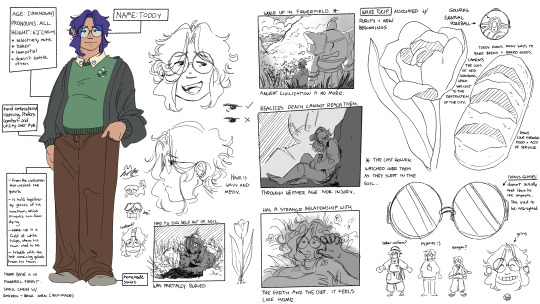
hehehe. new ref for my pokemon oc Toddy, with some lore bits sprinkled in here and there. They've grown over the time I've had them...
TRANSCRIPT OF ALL THE WRITING UNDER THE READ MORE:
Name: Toddy Age: [UNKNOWN] Pronouns: ALL Height: 6'2" (188 cm) - selectively mute - baker - immortal - doesn't battle often [Toddy is a taller, slightly chubby person with wavy dark purple hair and round glasses. They have olive skin, and are wearing grey socks, brown baggy pants, and a green sweater with a collar. On the green sweater, there are little white tulips embroidered on the righthand breast of the sweater. Over the sweater, Toddy is wearing a dark grey cardigan.]
Notes on Toddy's Visage and Background:
Hand embroidered clothing. Prefers comfort and utility over style.
From the civilization that created the golurk
is held together by ghosts of his hometown, which prevents him from dying
woke up in a field of white tulips, where his town used to be
travels with the last remaining golurk from his town.
Home Base is in Pinwheel Forest. Small cabin w/ garden + brick oven (self-made)
[Toddy has] homemade socks.
[her] hair is wavy and messy.
[ There are two sketches of Toddy's head, one facing forward, smiling and one in profile view. There are also two tiny doodles of Toddy's eye, one drawn correctly and one drawn incorrectly as a guide.]
OTHER SCRAPS OF LORE:
Had to dig self out of soil, was partially buried. [ Image of Toddy, disheveled and covered in mud, crawling out of a pile of dirt and rubble, grass everywhere.]
Woke up in a flower field. Ancient civilization is no more. The last golurk watched over Toddy as they slept in the soil. [ Image of Toddy and Golurk looking over a valley covered in white tulips, the flowers going even over the silhouettes of the mountains on each side.
Realizes death cannot reach them through neither age nor injury. [ Image of an injured Toddy leaning against a rock, bloody and holding their wounds tightly. the silhouette of Golurk can be seen behind them.]
Has a strange relationship with the earth and the dirt. It feels like home. [ Image of Toddy lying in the flowerfield again, but this time on top of the grass. His hair is splayed out under him, as he reaches his hand over his face. [There is also a sequence of small doodles of toddy's face, one with a headband and a confused expression, and then a smaller doodle of toddy with dog ears matching the location and shape of his bangs. The last doodle is a tinier sketch of a tiny dog with round glasses, supposedly Toddy once more.]
White Tulip: associated with purity and new beginnings. [ Sketch of a white tulip in full bloom.]
Golurk's Eventual Pokeball: [ Image of a typical hisuian pokeball, with a stone top and wooden base. There is a crack running through the top of the pokeball.]
Toddy knows many ways to bake bread + baked goods.
Laments the loss of her cook book, which was lost to the destruction of the city. (READ: I meant recipe book not cook book.) [ Image of a loaf of crusty bread, in the style of a sourdough loaf.]
Toddy's Glasses: doesn't actually need them to see anymore. She used to be near-sighted. [sketch of a pair of round glasses.]
[ there is a set of small sketches, each sketch depicting Toddy in a different outfit. The first is a baker's uniform, complete with a hat and an apron with a rag tucked into the back. The second is Toddy in a oversized t-shirt with a lemon on it, and a pair of boxers. The last is a concept for a younger Toddy, with longer hair tied into a braid, and a loose hanbok-style top. Her pants are loose as well, however they are cinched at the ankles, right above her sandals. She is still wearing her round glasses in all of the sketches.]
[The final sketch is a simplified version of Toddy's face, crinkled into a huge, happy grin. There is a grinning emoji sketched underneath it, and a small notation that says "grins" above it.]
#my art#my ocs#toddy#golurk#pokemon#pokemon oc#LIKE BARELY#but still#ok actually not barely but like#ekekekekekekekekekekkek.
63 notes
·
View notes
Text
2 Arms Left Masterpost (Part 4)
(Part 1) - Main Comic Masterpost
(Part 2) - Mini Comic Maserpost
(Part 3) - Bonus Drawings
(Part 4) - More Bonus Drawings
(Part 5) - Crossovers, tags, references and misc sagas
Below the cut is just fun little bonus drawings after major plot hit!
- - - - - - - - - - - - - - - -
Bonus drawings #43 - New Leos!
Bonus drawings #44 - The new Leo is also huggy~
Bonus drawings #45 - Little aggie doodles
Bonus drawings #46 - Shell Shenanigans
Bonus drawings #47 - Beach day!?
Bonus drawings #48 - "Why is F!Leo fat?" - anon
Bonus drawings #49 - Have I always been this annoying? (GIF)
Bonus drawings #50 - Wiggly (GIF)
Bonus drawings #51 - Sleepy
Bonus drawings #52 - Wings....
Bonus drawings #53 - Sketches
Bonus drawings #54 - Poptart.
Bonus drawings #55 - Hard to tie a mask with one hand..
Bonus drawings #56 - Get dangled.
Bonus drawings #57 - Where did the name Sprout come from?
Bonus drawings #58 - Funny outfits
Bonus drawings #59 - Pondering them
Bonus drawings #60 - Immobilize.
Bonus drawings #61 - National throw short people day.
Bonus drawings #62 - How tall is Sprout?
Bonus drawings #63 - Ducklings...
Bonus drawings #64 - Poptart arm concepts (SCRAPPED)
Bonus drawings #65 - Big Leo..
Bonus drawings #66 - Squish squish squish (GIF)
Bonus drawings #67 - Poptart nickname privileges
Bonus drawings #68 - Color Swap!
Bonus drawings #69 - That Beach Dad meme (nice)
Bonus drawings #70 - Prosthetic thoughts
Bonus drawings #71 - Uppies (GIF)
Bonus drawings #72 - Guess who bought CSP (GIF)
Bonus drawings #73 - Dance dance dance (GIF)
Bonus drawings #74 - He fell........ (GIF)
Bonus drawings #75 - Poptart outfit concepts
Bonus drawings #76 - Tall Sprout
Bonus drawings #77 - Colors for everyone!
Bonus drawings #78 - My Arm! (Video)
Bonus drawings #79 - Sprout.. Sprouting....
Bonus drawings #80 - Poptart shell!
Bonus drawings #81 - Toast him in a toaster (GIF)
Bonus drawings #82 - Average 2AL update in a nutshell
Bonus drawings #83 - Futrue Poptart!
Bonus drawings #84 - Hand practice... nail painting!
Bonus drawings #85 - What if Poptarts hand gets sore? (GIF)
Bonus drawings #86 - Poptot
Bonus drawings #87 - Poncho Poptart
Bonus drawings #88 - de-ages your huggy leos*
Bonus drawings #89 - Future Poptart!
Bonus drawings #90 - Traditional drawn hug
Bonus drawings #91 - Poptart swag
Bonus drawings #92 - Poptart gets custom sewn clothes :)
Bonus drawings #93 - Sprouts... sprout
Bonus drawings #94 - Make a huggy leo!
Bonus drawings #95 - Evil Artstyle!
Bonus drawings #96 - Put them in my outfits!
Bonus drawings #97 - How does Poptarts steeve work?
Bonus drawings #98 - FMA Cosplay!
Bonus drawings #99 - FMA Cosplay Part 2
Bonus drawings #100 - Way of Life (Animation!)
Bonus drawings #101 - Dont kick Future Tart....
Bonus drawings #102 - Future Poptarts Pants <3
Bonus drawings #103 - Hey Big Leo....
Bonus drawings #104 - Poptart + Little Sprout!
Bonus drawings #105 - His wiggles (GIF)
Bonus drawings #106 - Scoop
Bonus drawings #107 - Hug with no arms?
Bonus drawings #108 - Hug with no limbs?
Bonus drawings #109 - Stacked
Bonus drawings #110 - Floating
Bonus drawings #111 - Textposts
Bonus drawings #112 - Kintsugi
Bonus drawings #113 - Stickers!
Bonus drawings #114 - Here comes a thought
Bonus drawings #115 - Blue eyes
Bonus drawings #116 - Microwave him, cook him
Bonus drawings #117 - Stats
Bonus drawings #118 - Shirts!
Bonus drawings #119 - What if.... Loop
Bonus drawings #120 - Glowstick
Bonus drawings #121 - Loop continues
Bonus drawings #122 - Poptarts little leo?
Bonus drawings #123 - Burrito
Bonus drawings #123 - I have too many Leos...
Bonus drawings #124 - Future tart has eyebrows!
Bonus drawings #125 - Orange eared slider
Bonus drawings #126 - Outfit Swap!
Bonus drawings #127 - Pregnant....
Bonus drawings #128 - Pats for Sprout (GIF)
Bonus drawings #129 - Poptarts Halloween Costume
Bonus drawings #130 - Back scratcher (GIF)
Bonus drawings #131 - Young Sprout and Poptart?
Bonus drawings #132 - Rather not have the arm
Bonus drawings #133 - Dont mess with Poptarts fam
40 notes
·
View notes
Text
More Cyberpunk au details + details of the RGB desings + earlier concept drawing
(Before that please let me know if you want more info on the au because I have a couple drawings planned but with school and stuff I can't draw much and Idk if I can stay motivated that long. So my next posts could be mostly au lore with maybe some sketches, tell me if you'd like that)
In general terms, to give the Cyberpunk aesthetic to all of their designs I try to avoid symmetry by adding belts or patterns to break it. And for the colors, I focused on darker hues and neon tones. This way, the designs have a “punk”/dystopian-ish vibe while representing the high-tech elements of their society (which is like Cyberpunk in a nutshell).
As for the young versions of RGB, each one has their own color palette: Kai's is Red and orange with shades of black; Nya's is Blue, pinkish red and light shades of gray; and Lloyd's is light Green and also dark blueish green. Kai and Nya get a few details (shoes, arm or jacket) of each other’s main color as a wink ;).
Kai's outfit is meant for moving around comfortably both in the city and outside, Nya's is like a mechanic uniform for tinkering, and Lloyd's is for running as fast as possible; he also has a puffy sleeve similar to Kai's (le wink again). All three of them have a letter of RGB in some part of their outfit and share a tech pattern, each positioned differently (Kai in his inside shirt, Lloyd in his sweatshirt and Nya in her leggins)
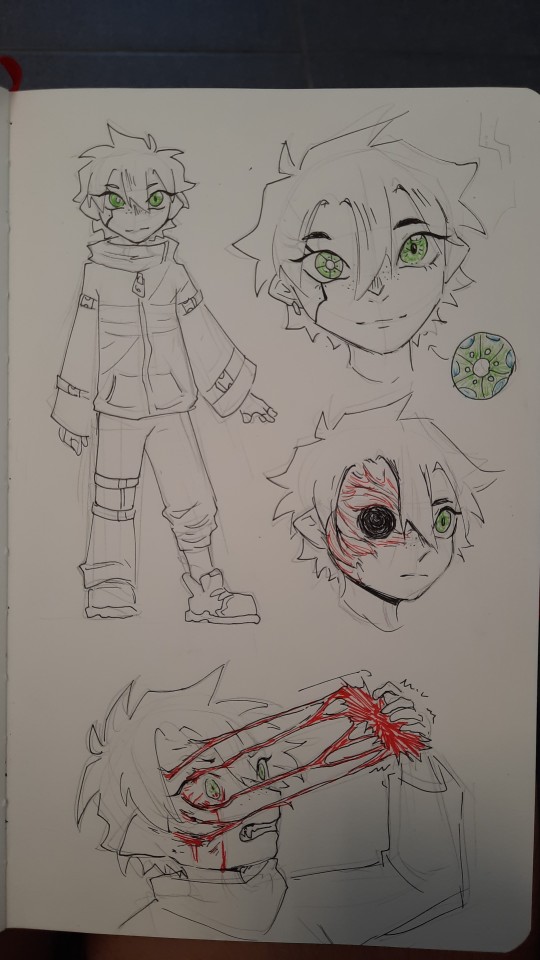
As for Kai's eye:
One day, when they were exploring around the danger zone of the outskirts of the city, Kai accidentally activated a trap set by one of the last survivors of the Outside that unexpectedly still lived there (a paranoid rancid sociopath). The violent trap had become infested with Red plants with time and made Kai get in contact with it too: it instantly dug its roots deep within his right eye socket and Kai was unable to pull it off. Since it was such a sensitive spot where the plant was sucking all the nutrients out of him, he was so weak that Nya had to slowly and painstakingly carry him back through the ruined suburbs to get help inside the city walls. After getting around the border control with the plant still stuck to Kai’s eye, all thanks to Echo’s help (who also carried the kid the rest of the way), they got to the doctor’s. Luckily, he was able to cure Kai, but he was forced to remove the affected area, which were his eye and part of the skin of his face; however, if he had waited any longer the plant's roots would have reached his brain and killed him.
Nya then started looking for a biomechanic while Kai rested with little Lloyd, who’d followed his sister all throughout the loaded trip back but could do nothing but keep her company due to his size. However, when the girl finally found one who agreed to make the prosthetic eye for them, a fellow demon named Ronin, he set them the condition to seek out a strange artifact for him as payment, giving them a total of eight years to find it. With no money and no choice, they were forced to accept, but Nya managed to get a picture of the prosthetic’s plans; this ensured that she’d be able to fix it and not depend on the guy too much, but four years later they were found out and their deadline was cut down to only another year.
In the end, Ronin will be Ronin, and the mysterious artifact was in fact a collectionist piece of
Garbage.
Apart from that incident though, as kids they don’t really spend that much time in the city, and they generally only come there to visit their friends/acquaintances and sell stuff Nya finds. For example, they do both of those things in Ed and Edna’s junkyard, where Nya trades her scraps for their more useful scraps while visiting their friend Jay. She and her siblings (who always need to stick together inside the city walls just in case) like telling stories about their adventures in the Outside to the oblivious inhabitants, so obviously Jay is no exception. The girl is very energetic and much more of a little unhinged rascal in this au, so her stories are usually really exciting and filled with funny acting for the little boy. Additionally, as they are both mechanics in the making, whenever the siblings come around his parent’s workshop, Nya and him show each other their latest creations and sometimes they even discuss how they could improve on their work.
But the one who most often talks to people, especially strangers, is Kai. Because even though they are feared as demons, the boy is much more chill and charismatic than his siblings, and is usually in charge of being the friendlier face (although he does like staring at the people who get scared of his dragon ears a little too hard hehe). In fact, they use that awkward fear to their own advantage: due to Lloyd’s much more obvious demon features (his ears are even pointier than the other two’s and his eyes are straight up red), he is often the distraction whenever they need to steal food, either in times of need or if they just wanna cause trouble. People just cannot stop staring nervously at the little boy, who is great at drawing the wrong kind of attention, and when the act is up, he’s so fast following his siblings that no one can ever catch him.
Overall, they don’t really give a single damn about society and think too many of them are just as parasitic as the plants in the Outside, so they don’t often bother as kids to get into the city. That, paired with the fact that they are just three tiny outcasts who somehow miraculously keep coming back from the “deadly” Outside, means that people in the city just tolerate and more or less respect them (out of being kinda spooked by them), so they tend to get away with their shenanigans without much repercussion.
But in the future, they do change their habits a little bit.
When it comes to their designs, they do keep the same purpose but with variations in their shapes. Kai still uses casual comfortable wear but his color palette changes a bit, with a more pinkish Red with blue highlights instead of orange, but he does keep the shades of black. His outfit now consists of a thin bodysuit cut at the chest and hips to make sort of a hexagonal fishnet pattern, trousers and boots, along with a ton of new accessories (more slutty in general).
Nya keeps the mechanic vibe but with more of the gray and blue colors and barely any red. She has huge trousers with bigger pockets and her tools attached under her belt, a sports bra (for the ladies ;)) and mech gloves. She keeps her goggles, which are a different color now.
Lloyd has a sports outfit similar to the previous one in the shorts and leggings. He keeps the puffy sleeve on his left arm, although it is now a standalone piece, and has bigger trainers. His color palette is black and white with neon/bright greens. He lost his arm in an accident with plants too: the affected area was on his upper arm so they had to remove the entire thing, and Jay made his prosthesis.
They all have more small details of their other siblings’ colors (for example Lloyd has the pins on his casual vest); also, and instead of having their respective RGB letters on a random part of their outfits they are now matching at the back of the three jackets. Some other details on them are the fire symbol in blue on Kai's bomber jacket and on Nya's military jacket, the label on the chest that reads "samurai", complete with its X on the arm sleeve.
Their more mature personalities make them live around more in the city, although practically nobody knows their true names still, while also not leaving behind the Outside or Echo (in fact, their expeditions tend to be longer now that they have more experience and overall strength and abilities).
Nya (still just known as “Blue”) actually works in her own workshop now, selling her works on her own. However, her stubborn, energetic and blunt personality has now matured into pure badass and she’s constantly looking for a fight, but nobody can touch her or at least seriously hurt her because she’s insanely strong.
Also, even if they do manage to actually harm her she has her brother Kai (“Red”) looking out for her, who can basically destroy anyone’s private life if they mess with any of their siblings through blackmail :). In fact, he’s usually seen hanging around in the Red district (they even mistake him for a prostitute sometimes lmao), which is where most of the juicy information is flung around, so he has no trouble getting sensitive information about anyone and anything in the city. In addition, he’s developed a calm and charismatic personality that lures people into their manipulative tactics to take advantage of virtually anyone he wants, but his temper can be frail sometimes, especially when his siblings are hurt in any way. But, when it comes to them, even though he is more protective of them as the older brother and can explode if they are treated badly, he still fully trusts them and their abilities and they all rely on and fiercely fight for each other like a team whenever necessary.
In contrast to his siblings, though, Lloyd tends to avoid conflict as much as he can: despite looking like a human neon sign with his jacket on, he always manages to scurry out of sight whenever he’s in trouble as the speedy, witty little monke he is. And the reason he gets caught up in so much drama is because he is extremely curious and, as they aren’t kids anymore, people now care about the demon trio’s meddling in their business quite a bit more.
In conclusion, as they grow, Kai, Nya and Lloyd become more intelligent and fleshed out in their own ways, and even though they still have no respect for society as a whole, they do keep some friends close to them. They love each other and Echo as the unique family they are, and always make sure they have each other’s backs no matter the situation.
Here is Kai's early design + scar (TW: gore)
#ninjago#ninjago cyberpunk au#sketch#ninjago kai#kai smith#ninjago nya#nya smith#ninjago lloyd#lloyd garmadon#rgb siblings
124 notes
·
View notes
Text

Zoru + Beam: Mage!✨
Just like the rest of Kirby's animal friends, Zoru also can gain Copy Abilities with Kirby and give it his own flair! Since this is also in line with how modern abilities function, Zoru will also get different appearances for these abilities, just like how Kirby does nowadays!

For the first ability concept, it's Beam (which is very fitting because it is technically the first ability you can encounter in Adventure, where the Copy Ability debuted). With Zoru, that copy ability becomes Mage!
Mage is sorta like a simple introduction to how Zoru's abilities function and look. Some abilities may extend Kirby's original moveset with some neat additions, such as this one, while others may offer much more different and wilder takes revolving the source ability.


Additionally, Mage Zoru also gains the ability to fill up spell slots, which are filled up as attacks and moves land. You can have up to 3 at a time, and they can be used to cast tome attacks! These are special moves that can help Kirby and Zoru in a pinch or open up the door for massive damage, such as Starstorm, a controllable screen-wipe-like attack.


On a more personal note, I've had wanted to give Zoru some copy ability concepts for so long. It was about a few months ago that I finally started to sketch up some ideas, and it has been incredibly fun for me to do on the side.
Mage especially has had a lot of ideas laid out, to the point of me having a full-on document describing all his moves and intricacies of his design. I have thought about this ability for way longer than I should've, hah.
To wrap this up, I like keeping a record of some ideas, so here were some alt outfits I was considering for the final design for his concept, as well as a scrapped move I was thinking on expanding on, but thought it was gonna go against the intention of making a simple enough ability. Also gonna take the chance to say merci to @heysye, @dokotroopi, and @theguffbin for basically helping with a few ideas for this magical bean (and also somewhat sorry and somewhat not sorry for the double ping, ahah)


51 notes
·
View notes
Text
Early Wizard School Mysteries Concept Art Pt. 1: 2017 & 2018
Wizard School Mysteries Book 3: Wicked Witchcraft has been available for purchase in paperback and kindle editions for about a week now, and to do my due diligence as this series' author, editor, and marketing executive, I've gotta make a post about it to annoy you all with so that maybe more people read it and build up a bigger audience for the next one.
So! To accomplish that in a way I find palatable, I've dug up some very old concept art for the series, and am going to parade it out for your enjoyment! Come, look upon my old art and despair be inspired to buy my books!

We're going to start with the earliest sketches I could find, which is from 2017. I kind of adore how ridiculously enormous I made James's hat in this early sketch - it's so huge that he actually has a strap to keep it on his head (look close, you can see it!). His design has a lot of touches from Wizardmon that didn't make it to the final product, namely the abundance of stitches and false faces on his outfit. He's also got a sort of ascot which I'm pretty sure is an homage to Fred from Scooby Doo, because he's in the same role as Fred in our Mystery Solving Teens group. Jesus, that's a big hat.

2017 Ivan doesn't seem too different on a surface glance, though his outfit feels too clean/new to me. It looks nice, but doesn't convey a lot of his character to me.

Ew, 2017 Gretchen, why are you white? Well, ok, the clear answer is because you're just Wizard Velma Dinkley at this point, but hey, at least you've got your iconic scarf!

Jesus Crumbs, I really did not give my human characters enough skull above the eyes to contain a proper brain, did I? A lot of Margot's key visuals are still present here - the gauntlet, the high collar, the partially armored boots - but just, you know, a bit worse, a bit less uniquely designed. She's called Joan at this point because hey, it's from 2017, when the author who everyone associated with wizard schools whose first name happens to be Joanne hadn't gone fully mask off about being a TERF yet, and I could name a wizard character I like "Joan" without worrying that people might think it's a reference to said writer (when it was intended as a reference to Joan of Arc instead).

2017 Rodrigo is pretty recognizable, actually. Kinda weird to me that I had his look pinned down so early compared to the others - though his staff here definitely doesn't fit his status as the most well-off wizard of the bunch, so I can see why I changed it to something more sleek later.

By contrast, 2017 Serena is basically a completely different character on every level. No magical girl trappings, no pigtails, I don't think she was even Asian yet. The name "Cerrigwen" had been given to at least one other character I ended up scrapping for a different project before this, and I'd thought I found a home for it here, but obviously not (though a Cerrigwen did get mentioned as a historical important wizard in WSM Book 2, so maybe I'll find a story for her eventually). Serena's role in the Mystery Solving Teens dynamic is "the weird one," but for whatever reason I wrote "the Joy and the Laughter" here instead. I do think Serena's personality is shining from this design, even if none of the actual details are recognizable - the manic bubbliness here would carry on in all future designs.

Charlotte also looks recognizable at first glance, and I think in some ways she's more explicitly monstrous/nonhuman here. I don't know if that's to her benefit, though? The gangly limbs feel very awkward, like they don't quite fit her frame, and her face is a bit too inexpressive (also holy shit that hat is hilariously too small, it's the opposite of 2017 James's hat). I like the hairy feet and fingers, but it does kinda bog down her design with unnecessary detail.

Holy Christ 2017 Polybeus, you're a fucking nightmare. What's going on with your face? And why are you so skinny? Why are all these people so goddamn skinny?
Let's move to the next year, I don't like looking at this guy. He looks like he'd be voiced by Pauly Shore or Andy Dick. Awful.


2018 James takes the 2017 design and refines it a bit - still has the ascot, has even MORE Wizardmon style false faces and stitches, still has the enormous hat, just all tightened up a bit. I think the problem with this look comes through when comparing the polished design with the sketches I abandoned halfway through above it - namely, the freaky Wizardmon look just doesn't fit with the quiet, deep-thinking personality James is supposed to exude. It looks rad as hell, yes, but it's flashy and chaotic in an attention-claiming way, which doesn't fit James's analytical nature. Good design elements that just didn't fit the character they were slapped onto.

2018 Ivan is also a refinement of his 2017 self, and I like his wacky little pose here - it really communicates his accident prone nature. But he still feels too polished, the outfit can be pushed farther.

Gretchen's looking a bit more like herself now - she's got more layers draping over her body, longer hair to cover her face, and the little tassels on the end of her scarf. Is she still white, or was I just a coward who thought I could just give her a dark skin tone while still drawing her with a straight bob cut and call it good? Not sure.

Margot's getting closer to her current self too - slightly longer face and nose, a bun where her pony tail will eventually go, and I think she's got broader shoulders than her first design? The gauntlet still doesn't feel like it's got the right personality but it's a bit more unique than the first take, and that's progress.

The only big differences I see with 2018 Rodrigo and his current self - beyond the fact that I got better at drawing humans (still not enough room in this drawing's cranium for a human brain) - is that I kinda toned him down from here. This Rodrigo's more or less his current self, but more flamboyant.

Alright, Serena's definitely Asian here, and her costume feels more distinct than her 2017 self, but still doesn't really match her personality. I definitely wanted her outfit to showcase her energetic nature, but the big bulky layers just don't fit. She needs bows and ribbons!

Ok, Charlotte's coming together better too! Still a bit too awkardly gangly, but her face is getting that sweet, friendly look a bit better.

oh thank god
2018 Polybeus is such an upgrade. His outfit's pretty close to what he'd end with, and he's beginning to get that onion-esque hairdo his modern self has, although here it's a bit more like devil horns, befitting his status as an antagonist-turned-ally. Still too thin, though, you gotta start weight training Poly!
That's it for part 1! Next we're skipping to 2020, because for whatever reason I don't have any sketches from 2019.
12 notes
·
View notes
Text
TIS BE THE NYM!


I have redesigned the Nym! Look at him, he is beautiful. He has gained earrings, earcuffs, a neck collar thing, and short somewhat messy hair! His outfit has also changed quite alot. However I have not drawn it yet, so I can not show it off yet to you. I also fonally decided to take a long hard look at his hair as Oren. It had been bugging me for ages, so I played with the colours and hues. I have settled on making him a ginger kid with a less dramatic difference between the two colour sections. I also tried out a fully red version which will be included below. Though this is the one the DM thinks would be most accurate to Lore.


Working backwards here for some reason. However these two images above are of my 2nd and 3rd sketches. The 3rd was to get the shape out better and in bigger slightly more detail. The 3rd is the digital one and was me just trying to make a digital version with the same vibe. However it did not pass the vibe check and was promptly scrapped.


These next two are sketches are the same one, the first one, just one is lined and the other isnt. Back when I made these ones I assumed that is all I would do. Hence why I lined the sketch. However I ended up likijg it alot and felt it was a good direction to take Nym in so I wanted to follow that concept through to completion. I did emd up doing so clearly and I love it. You have to admit he does look cooler now.


Finally here is just some bonus colourings. The first is him somewhat returned to his former self but still broken. The second is him with red hair instead of orange. It still isnt red red but you get the idea! I thinknit also looked cool but the DM said the orange was better so eh.
You are gonna see alot of my ace boy here for the next few posts lol. I am having Nym brainrot.
#dnd oc art#dnd oc#dnd#dnd art#dnd character#dungeons and dragons#d&d#d&d character#d&d oc#d&d oc art#aasimar#art#artwork#my art#oc#oc art#pheoblitz oc#my ocs#original art#ocs#original character#original drawing#digital art#ibispaint#drawing#digital#my oc#my artwork#ace#orange
10 notes
·
View notes
Text

Doc Montagne Rough Pass
~~Design commentary and partial lore under the cut
I went through a STUPID amount of sketches for Montagne before settling on this one--most of which I had scrapped. The original concept for him was to have his outfit resemble something close to an axolotl since I wanted to keep with the trend of having some of the Lords of TOoDL be based on MC mobs. However....all the outfit concepts I had came out entirely too frilly and out of place for his personality.
I was really partial to keeping teal in his outfit somewhere as that's his personal color code, but that thought kept me cornered when it came to anything clicking. Luckily when I was able to see past the original concept, I found that the Elder Guardian actually worked MUCH better than anticipated! My reasoning originally for the axolotl motif was the regeneration aspect which i thought could fit well for him as a doctor, however I came around to the Elder Guardian more for not just the color scheme and keeping the underwater theme, but also for its fatigue and how it depends on status effects to defeat its enemy as its not a very strong boss mob otherwise. Montagne is also infamously the weakest of the seven Lords and depends heavily on his support role within the group. I'm excited to getting around to cleaning up his ref and using this concept more in the future projects I have in store.
#digital art#original characters#artists on tumblr#original character#TOoDL#character concept#character design#minecraft#elder Guardian#he had such a tricky design until it all fell together and CLICKED#kinda toying with the idea of giving him a cane that extends into a trident
22 notes
·
View notes
Text
And since I'm like, not entirely satisfied w her design, I have. Some scraps I made after
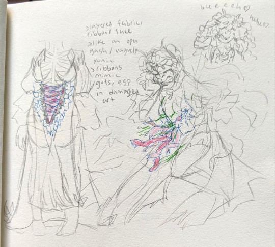
I highkey wish I stuck to my main vision, that's been with me since day one. Which is, the layered ribbons. In the main piece, I tried reducing them so you can see more bones and some more Hel-like "armor" underneath (though it's generous to call it that lmfao). It was an impulse decision, and like... idk, you kinda miss the point without it.
Point being, there's like... A Lot, going on here.
> The white dress? Completely imagined. I could have fucking SWORN she was wearing a white dress in the Book 3 key art. But one thing about me is I'm a sucker for the symbolism, behind the white dress. So it's a staple of her design, still. Not to mention, something that was always a strong vision was being able to see through the dress, somewhat (ghostly glowy effect)
> The Biggest Thing though. Again, I regret changing last minute LMFAO. Is that front piece. Like an open wound, as if she was slashed and split down the middle. Messy layered ribbons, in pink and flesh tones, to mimic "guts" (ESP strong in her damaged art, where the ribbons would "spill out"/come undone). The ribbons also are keeping the dress tied together -- as if it were mended. Then, there's the frills! The torn fabric! I'm always iffy about How heavily I want to lean into it, but in the back of my mind. It has a vaguely yonic shape. But Mostly, it's meant to also just look torn open LMFAO (and then decorated 🥰)
Everything else is just vague and experimental. Like nods to a variety of chara's designs (the shorts/thigh highs lifted from her base art, the shape of her dress/the tattered ends lifted from Lif, the sleeves kinda lifted from Henriette, and also the hairstyle VERY much lifted from Henriette -- with just the tiiiiiniest hint of Alfonse in there, with a long strand of bangs to the side, opposite of his). Also experimenting with sharp teeth like accents on her outfit... (hard to notice here, but. Thinking about it)
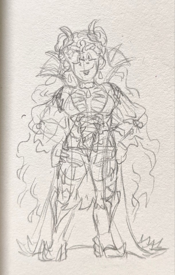
Another sketch I did afterward, again. Just. Fucking around/finding out. Though I do like the shapes here, more.... and it does have a closer resemblance to Henriette, actually (in dress shape). Not sure where that collar connects to, though LMFAO
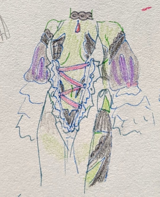
In the final piece you don't even see much of the armor I designed anyway... some parts I just ended up omitting regardless, due to the complexity/business. There was a concept for it to be like. Winding around her body. But like. Her design is already so complicated. It really wasn't worth it to fuck it up more 😔💔 (and yet......... that's what I did................. I should have just stuck to my guns.............)
@sharenaweek
#sharenaweek2024#bonus post. bc i have Regrets LMFAOOO#overall i think she just needed more time in the oven. maybe i'll rotate her in my mind some more#also let it be known. cause i have been SO annoying about this in the past and i'm NOT about to go back on my word#i honestly don't even see this design as being sexy/fanservicey. she's serving cunt. there's a difference. to me.#like obvs you can have both but like. to me she's just slaying here. literally. as well. girl STOP HE'S ALREADY DEAD#but also like...... i guess part of why i'm so self-conscious about her is cause i'm. tapping into Something. here#not telling you what.#you get it.#sharena#helena au#my art
13 notes
·
View notes
Text
SUOL-nim Season 4 Livestream recap!
Note: This will only be the English portions since I don't speak Korean or Japanese (ノAヽ)
Reminder: DO NOT SHARE IMAGES OR SCREENSHOTS OF SUOL-NIM'S STREAM. WE AREN'T ALLOWED TO DO THAT.
Season 3's recap
Thank you to @eloise-writes-things, @leila-lirui, @bluebutterflyrose, and @karmablacks for helping supplement some of this information when I was outside or when I was sick ^^

This time she's streaming on Youtube instead of Twitch! However, the VOD will still not be saved afterward.
As speculated, the cover is Winter and Siyeon(our transmigrator FL), with the necklace Winter gave her in the caves :)
volume 6 will be out this summer(approximately)
Unfortunately, she doesn't know when the English translation will be licensed since it's between Gyeoeul-nim and the publisher,,
Her voice is so nice... she speaks Korean, English, and Japanese too!
Return of the pink underlayer for the magenta hair!
She talked a little about the Alice in Wonderland dress! The color was specified in the novel as "sky-blue", and SUOL-nim thought it would be fitting for Siyeon to wear such a dress while adventuring with our White Rabbit, Winter
Ahh I had to leave the house for a few hours so the stuff below are all my panicked notes. Some of these are out of order, sorryyy
SUOL-nim showed us the concept arts of the characters individually.
Fun fact, Siyeon and OG!Penelope's concept art has them wearing the same colored shoes, but Siyeon's shoes have low heels, almost like flats.
She says that out of all the characters, Callisto is the hardest to draw. This is especially since his golden hair has narrative importance and the aesthetic is hard to nail down.
The webtoon is mostly SUOL-nim's own work! She doesn't really speak to Gyeoeul-nim about work matters or help in adapting some scenes.
It takes her a week to finish a chapter, so she doesn't really have a "backlog" of progress. This is also why there's an extra week of break after four weeks.
One of the most memorable changes she made in the adaptation was changing the Empire's name from "Inca" to "Eorka". She reasoned that because "Inca" is the name of a real Empire, it would be confusing. Thus, she changed it.
The anagram of "Eorka" to "Korea" was completely accidental.
She has an Instagram for her SUOL account(like how she has a personal and a work Twitter) but has no plans on using it since her Twitter is overwhelming.
She doesn't have a favorite dress, but one of the ones she's especially attached to is the white Goddess dress since most of Penelope's wardrobe is dark.
She shows her folders occasionally, and we get little peeks of concept art for characters like Ivonne, the assassins, Penelope's male disguise, Cedrick, Emily's Hunting Competition dress, Winter's layered clothing, and minor characters, as well as the tiny bird monsters.
She also showed the dress concepts for Season 3!
In addition, we got to see a rendered concept of Penelope(think the promotional portrait) as well as a version of that style for Reynold and Penelope's faces in her folders.
There was also a WIP with Eckles and Penelope, perhaps a small illustration she scrapped, hasn't released yet, or just a concept.
We also got to see a silly doodle of Penelope, a redraw of a Crayon Shin-Chan frame(it's a popular kids manga/anime in East Asia).
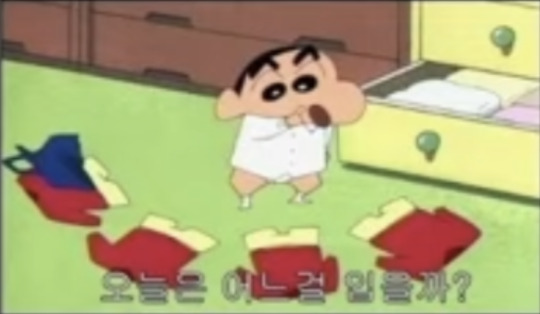
The original was Shin-Chan trying to decide between a few identical outfits; the VADD version is the one where Penelope is surrounded by objects representing each ML.
The ointment from Reynold, the scroll from Callisto, Winter's mask, Eckles' collar, and Derrick's bird cage.
Her rendering is immaculate; Siyeon glows off the page.
The info after this is second-handed since I'm still sick and I fell asleep an hour before it ended ;-; but my throat is killing me and my ears were ringing
The Eckles Penelope art is the preliminary sketch for the physical Vol. 6(from my calculations!)
She moved to sketches around this time ^^
For the top row, SUOL-nim drew a Penelope, an Eckles getting dressed, and a sulky baby Reynold in a onesie. To the right of him is a doodle of him and Derrick in high chairs, with the Duke and a heavily pregnant Duchess watching over them.
On the bottom row, we have Emily in a noblewoman's dress and a fan with her hair pinned up(with feathers!), the head butler Pennel, and an overworked salaryman Cedrick on his phone.
Edit: He's chatting about Callisto with his feet on the table while thinking about strangling Callisto loll.
The stream was approximately 6 hours long!
Also, something she reiterated for a bit: Season 4 is planned to come out in August/September. The dates are tentative but she wants to get it out to us by that period.
It was nice seeing a lot of the discord and tumblr crew!!
Also, the stream tea: SUOL-nim requested that we translate our comments that weren't in Korean, English, or Japanese since she has to moderate the chat still and she doesn't want to feel left out of her own stream. Even if it's conversing amongst themselves, they should still translate.
A group of Arabic-speaking viewers actively ignored her and there were small fights in chat, and she even addressed this issue TWICE.
And in the end they still didn't do it, so... PLEASE RESPECT SUOL-nim's stream rules! At the end of the day, it's still HER stream! She has to moderate it! Don't make it unnecessarily difficult for streamers to stream!
This is basic chat etiquette.
#lysia's posts#lysia recaps!#villains are destined to die#vadd#death is the only ending for a villainess#death is the only ending for the villainess#ditoeftv
55 notes
·
View notes
Note
🍀 for gawain
🍀 - What originally inspired the OC?
alot of gaelic/celtic patterning, fighting bulls, and the color phalo green. i have Thoughts.
heres some of his old concept art! in order of earliest to finished


his first sketches and initial ideas! i outlined the ideas initially wanted in his design (fighting bull/matador themeing and clothing, no armor, practical but royal). i did a few more digital concepts to really outline what i wanted with his outfit (scrapped the matador themeing and focused heavily on the royal but practical soldier aspect) and then moved onto coloring


initially i came up with a very basic under-clothes drawing and dicked around a bit before going back to focusing on headshots and landing on basic colors inspired by fighting bulls, (the grey concept looked weird + looked too similar to another oc i have) with darker brown fur/skin and paler horns. i really wanted to emphasize that hes a fighter and a barbarian
once i got his clothes down i only had to do a few color concepts since i already had a really solid idea for what i wanted in his pallette (phalo green and gold specfically, earthy but clean and rich looking pallette) and landed on the left concept and tweaked a bit to end up with this !

his first reference! ive been updating his reference sheet as Things Happen and its been really fun to keep up with party shenanigans and kind of document his physical changes (putting on a cursed gauntlet and forgetting to take it off. giving away his Very Nice Cloak. getting blessed by his ancestors who he thought he hated. etc etc)


also the throat scars are a reference to gawain and the green knight. i like to think hes had them since he was found in the woods as a baby. aaand tumblr wont let me add more images so i guess i am done :) theres more on his toyhouse if anyones interested in looking as well as a pinterest board that initially helped me suss out some Vibes and ideas for his design
character design is a really big interest and passion of mine and i tend to really dig my claws into designs i make. his general silhouette is meant to be a Big Square/rectangle since hes a very protective and tanky character who tends to put himself in harms way for other people . i love him and hes been a very fun pc
#harker.txt#i went way overboard but ive been itching to talk about character design but i am terrible at talking to people about my interests#oc#original character#character design#dnd#dungeons and dragons#firbolg#barbarian#ancestral barbarian#dnd pc#dnd character#gawain
13 notes
·
View notes
Text
uhh more concept art of Zack. i'm so hyperfixated on him.

scrapped this one. i might use it as a dress up doll idk yet.

his outfit situation is such a fucking mess rn omg. but i must persist.

and these ones are the more messy sketches. exploring if i wanted him to have regular legs or more animalistic ones and tail designs and yea


also i'm giving up on the ai disturbance thing and watermark cuz i literally have like 10 followers on ig and tumblr combined so idgaf i luv all 10 of u.
never passed 130 followers EVER on any platform throughout my time on the internet so i think i'll be safe
#osmosis jones#osmosis jones fanart#osmosis jones oc#osmosis jones self insert#self insert#self insert fanart#self insert art#self insert oc#concept art#concept artwork#color concept#character concept#character design#character art#my (f)art
4 notes
·
View notes
Text
designing the cast of asphodelium
Asphodelium was a visual novel made pretty fast from initial concept to first demo, meaning all of the character designs (as well as the rest of the project) were done in about 2 1/2 months. I normally like to give myself a lot of time to figure out character designs (like several months), but that didn’t happen for this project.
The character I focused on the most for getting the right design was naturally Aster, the love interest. He’s on screen for a majority of the time and is the character you’ll be falling for, so it’s important to get his design right.
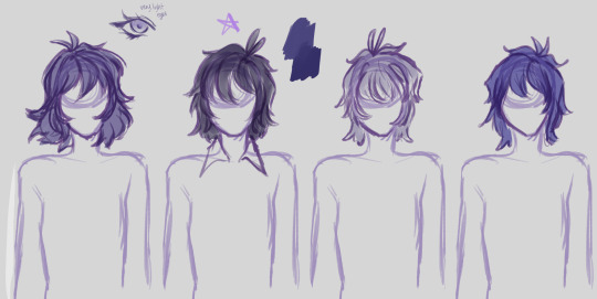
I wanted his hair to be messy and wispy, like it floated in the wind. I also wanted it to be something purple-ish, but I couldn’t decide if it should be light or dark. I went with something similar to the 2nd one here, though I ended up making it longer.

The next step was deciding on an outfit! Aster is a traveler who has spent the last several months roaming the country and the game is set during winter, so a jacket was a must. I went through several different styles of coats for him, ranging from something with a tight waist to bulky, oversized jackets. The oversized jacket on the far right is what won—it felt cozy while not exuding high confidence like the far left jacket does.

After another redraw of the outfit, all that was left was….the hair, again. I still hadn’t decided on a hair color for him, so I made quite a few tests. It wasn’t until a few people suggested mixing a few of the colors to make a duotone hair for him that I came upon the final design for Aster.

Next is Charlotte! She was the easiest to design as I already had an idea for her—a bob haircut with a fluffy pullover jacket.
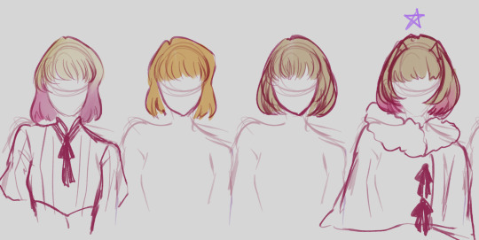
Getting the shape of the hair was a bit of a challenge as well as the right shade. I wasn’t planning on making most of the characters have duotone hair, but by this point I realized it was inevitable.
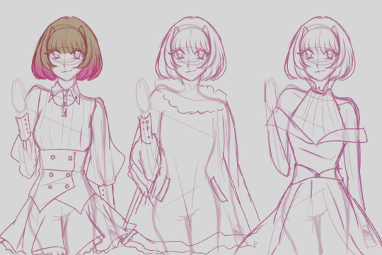
Charlotte isn’t shown much with her coat which is a shame, it’s my favorite part of her design. I considered making her an extra outfit as well, but no one else would have as many outfit customizations as her (as she also has an apron) so I scrapped it.
Next is Bryn. Their design was somewhat hard as they’re the most energetic of the group and an ex-soldier, but I wanted something more modern for them. I had tried to design the cast around fantasy Victorian aesthetics, but Bryn threw that out of the window.

I knew I wanted them to have long hair and was leaning towards a red/brown hue for it. I ended up going with a hair style similar to the 1st, where it’s a messy short brown with a longer ponytail over the shoulder.
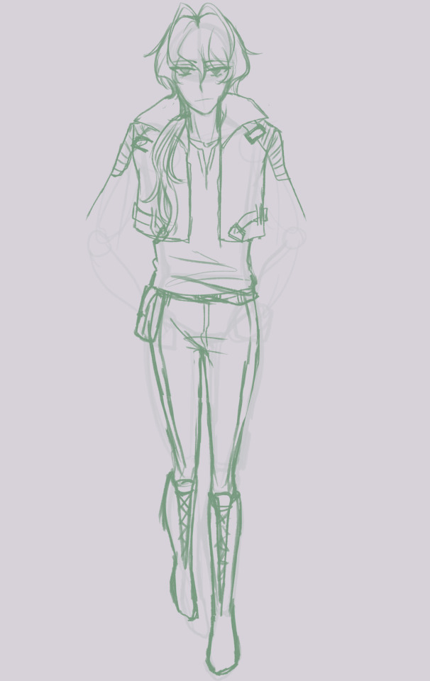
Last is Alexei, Charlotte’s younger brother. He’s a hunter who keeps to himself a lot, not talking much and preferring to be out in the forest.

Because I associate forests and fishing with him, I was originally planning on giving him a green color scheme, but I ended up giving Bryn a green-ish color scheme and a blue color scheme would be too close to Aster’s color scheme.
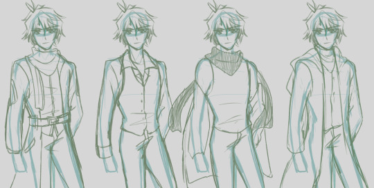
I had no clue what to do with his design! I wanted it to incorporate a scarf (again, winter) but had no clue what kind of jacket to put him in. After some more tests, I ended up putting him in a turtleneck and vest/jacket.
And here’s the final lineup!
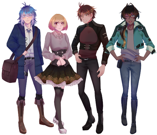
What do you mean I’m missing a character? This is the entire cast! ...That’s designed.
I actually didn’t finalize the main character Hazel’s design before finishing the first demo, as they don’t have a sprite and only show up in CGs (the first demo didn’t have any CGs).

What will he look like in the full game? Something similar to these, namely the bottom right sketch. You can see Hazel’s design soon in the full game, coming out at the end of January 2024.
#visual novel#visual novels#indie game dev#visual novel game#boys love#gay games#my games#asphodelium#my art
18 notes
·
View notes
Text


Commission from Twitter for @/travels1160 of his character, Jenny, on a much needed vacation. Honestly, one of my favorite commissions I have ever worked on. I had never done a piece with this many elements and details in it. Had some rough days while working on this, but I still look back on it fondly.

Here are the outfit designs for the piece before going through with the final.

The original concept had umbrellas that took up a good bit of the scene. I decided to later scrap these as they took away from the overall subject and I just couldn’t find a good angle that helped them read better. The umbrellas would be replaced with beach towels. I also removed her see through jacket (?) because I didn’t think she would wear it sunbathing, but it also just didn’t lay well anywhere on the beach chair.
Also she has two right feet in the sketch. Ignore that.
2 notes
·
View notes
Text
Major Study: Pre-Production
Post #6
Concept Designs
I began some concept art sketches exploring the magneto-aurora storms in my game design mechanic.

This is just speed paint at the moment, in order to develop it further, I would clean up some artifacts in the aurora effect and focus a little more of the background making sure to brighten it up as well and add some unique features.
I've also begun conceptualising the Dark Solar Nomad. I based his outfit on traditional Inuit attire.

I think the bone sun shades in the third iteration match the solarpunk look particularly well. I may create a version between the first and last before designing solar and scrap accessories.

A reference board of tradtional Inuit cothing
0 notes
Text
hello nsr community!! the “let’s check out the zine stream: the sequel” gave us some new concept art, mostly focused around the christmas edition, and i went and grabbed them all like i normally do. props to that anon for tipping me off, i would have completely forgotten otherwise lmfao. under the cut!
again, i’m wrapped up in some other stuff rn and kinda just rushed through and grabbed i think all of them. if i missed one or if there was some commentary you wanted me to mention, hit me up and i’ll stick it in!
EDIT: an anon wanted me to mention this clip of creative director daim dziauddin talking about eve being demisexual. thank you for the link!
also: tumblr has a 10 image limit, so i’ve put some of the concept arts together in one image so i can fit them all in the same post. if you would like the individual versions, feel free to send me an ask, dm me here or dm me on discord (snazzyclassyjazzy#3024). without further ado!!

concept art for the layout of vinyl city (left)
ddaddystar’s concept for the mural in tatiana’s office (right)

concepts for christmas mayday and zuke

old concept of dj subatomic supernova with a human head. his beta name (dj galaxy) can be seen in the top left

concepts for djsub’s christmas skin


concepts for sayu’s christmas skin, as well as scrapped outfits designs for her crew (+ one kliff)

very different looking concept art for dk west

concepts for christmas yinu and mama

old 1010 sketches. i believe these were ellie’s?

two concepts from daim dziauddin for eve and tatiana. the eve one can be found in the artbook (left)
concepts for kliff (right)
#no straight roads#nsr#nsr ama#mayday nsr#zuke nsr#dj subatomic supernova#nsr sayu#team sayu#kliff nsr#dk west#yinu nsr#yinu’s mother#mama nsr#1010#eve nsr#tatiana nsr#nsr concept art
221 notes
·
View notes