#also hello i have not used this brush for lineart in about................... 4 years?
Note
Heyyy i FREAKING love your art style and i wanna get into digital art but i have no skills whatsoever in drawing :(((( Can you tell how you learnt drawing and some tips for a beginner thankssss
hello hello!! honestly it’s weird giving advice for digital art i still feel very new at it myself!! i’ve only been doing it seriously for a little over a year so i feel like kind of a beginner still ajhdjsjd
but i can definitely give any advice i have!!! hopefully something will be helpful but i don’t think i have anything revolutionary to say lol
1. everyone says it but it’s true, you just have to be okay with making bad art. half the time i make art that i hate and its never shown to anyone lololol. you’re going to have off days where it feels like you can’t draw literally anything, and that’s okay! just don’t be discouraged by it :) it’s practice and its the only way you’ll see improvement!
2. i use pinterest a ton!!! for photo references ofc but i also have a board of references for character art that i like the style of! if im feeling like im missing something in my art or i dislike a specific way im drawing something, i go find art and i’ll try doing what works for others! that’s what art is all about, being inspired by other art!
3. don’t aim for consistency. your style will come naturally eventually (mine still isn’t consistent though haha so it might take a long time)! but just try and focus on making art that you like each time. art style really isn’t that important as it feels like it is
4. if you’re struggling with colors there’s lots of different things you can do! best route is to go and learn color theory, but i know that can be hard to absorb without actually just figuring it out yourself. so i’d say either use premade color palettes or color pick from art you like!! colors really have a massive influence on the style and appeal of art :)
5. random stuff: use colored lineart, find brushes you like (customize them!!), learn anatomy (i suck at this LMAO)
I HOPE SOMETHING I SAID WAS HELPFUL,, GO HAVE FUN!!!!!
5 notes
·
View notes
Note
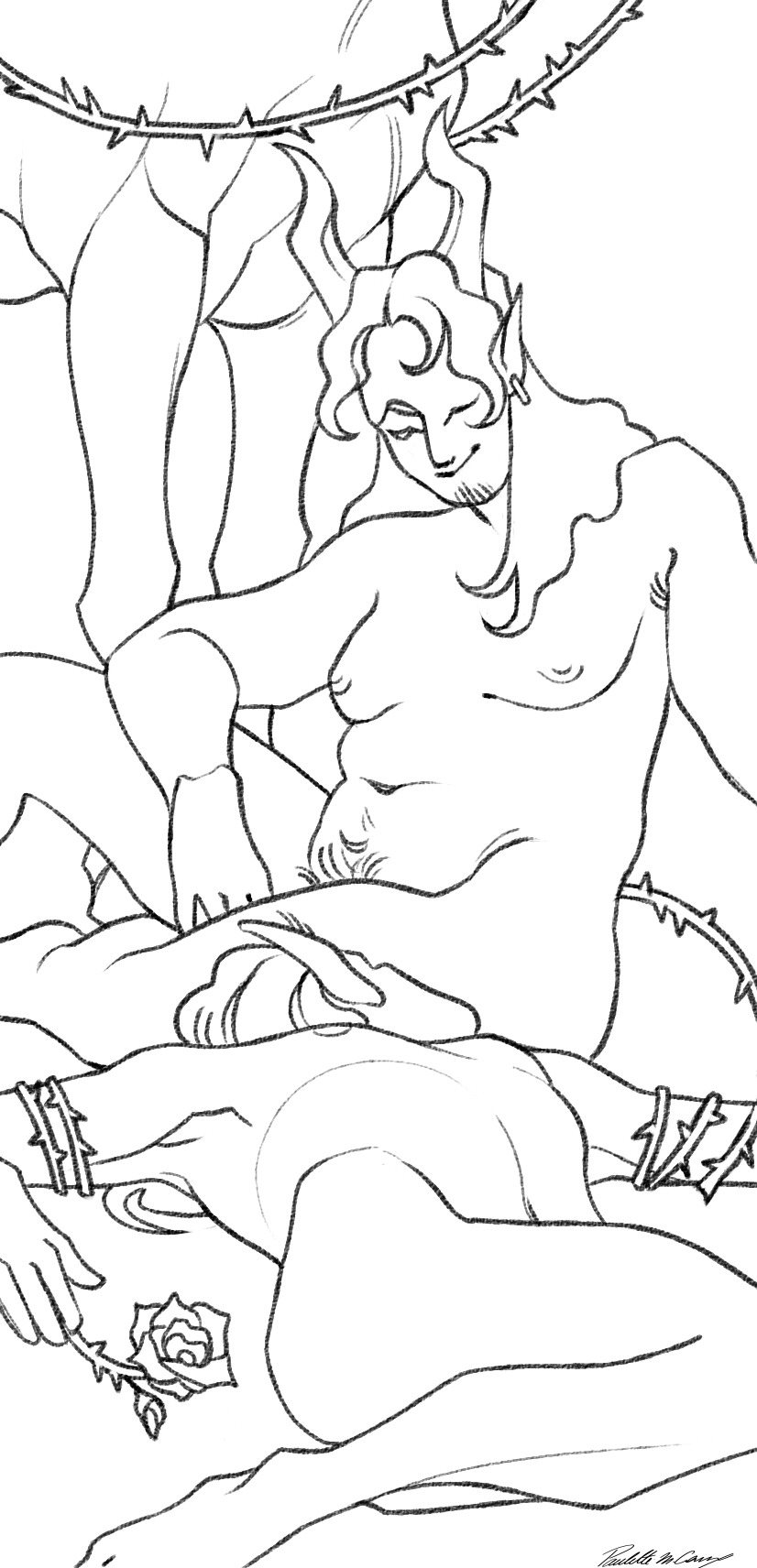
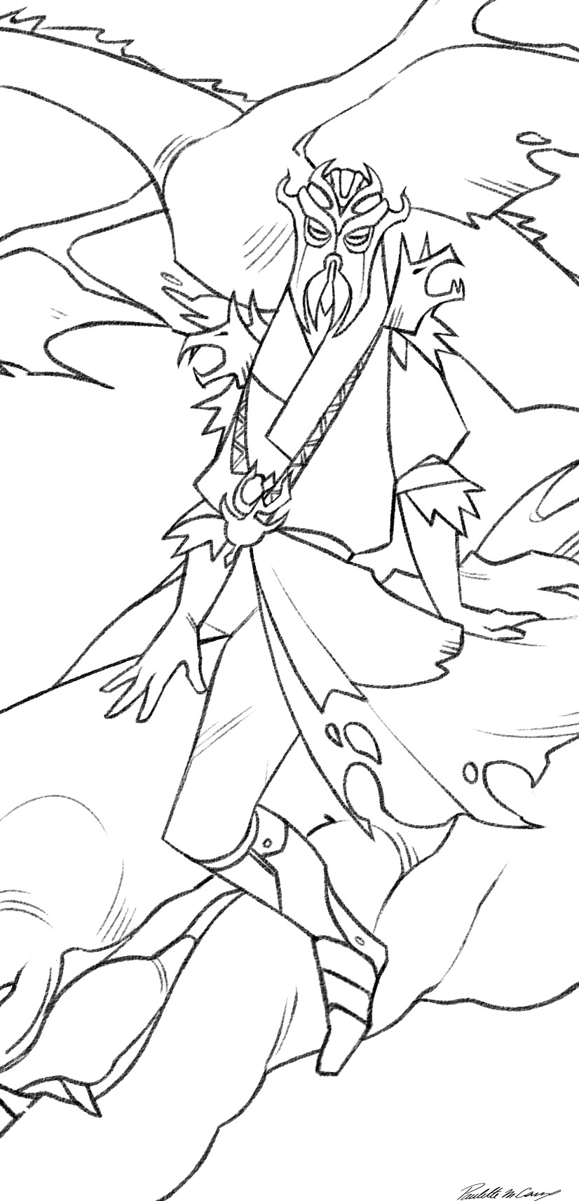
Hi there! I am obsessed with those TES tarot cards you made. The shapes, the lines, the colors . . . I think The Devil is my personal favorite.
If you don't mind, could you talk about your compositional choices for those? Like layout, structure, arrangement/placement, visual hierarchy, color decisions? Seven years of art school and no composition lessons . . . I'm taking things into my own hands.
Hello !
First of all, omfg thank you so much ?? I'm so glad you like my silly tarot cards :D
I'm really flattered you asked me this question, so I'll try my best to answer it (I'm no teacher and english is not my first language so I hope it will be comprehensible lggklflfifkf)
When you say your an art student who never had any real composition class, I feel you- I've been an applied art student for 4 years (7 if you count design), and apart from really basic and classic stuff like dividing by thirds, the different shots used in cinema, using a little window to help frame what you are trying to draw from life (witch are all very useful), I never really had many composition tips ?
So yeah idk what I'm doing, but that's art baybee
I'll share my process when it comes to designing my cards and hope it'll help lhgktlgofk
I begin by doing little thumbnails (3-4 cm long maximum) with a non erasable pen (or if I'm doing it digitaly, I dezoom a lot, use a big brush and don't erase what I'm doing)
It helps me coming up with big shapes and an interesting compisition (if your doing this on paper, never draw the borders first, it limits your creativity by "putting your drawing in jail" (wisdom from one of my best teachers))
And I personnaly don't use black lines when doing this, because the uglier the lines the less precious I am.
And because I associate dark lines with clean lineart, and this step is about being messy ! So the uglier colors the better :) (for me)
(I'll use two cards as exemples, one I did by doing thumbnails on paper, and the other on my art program)
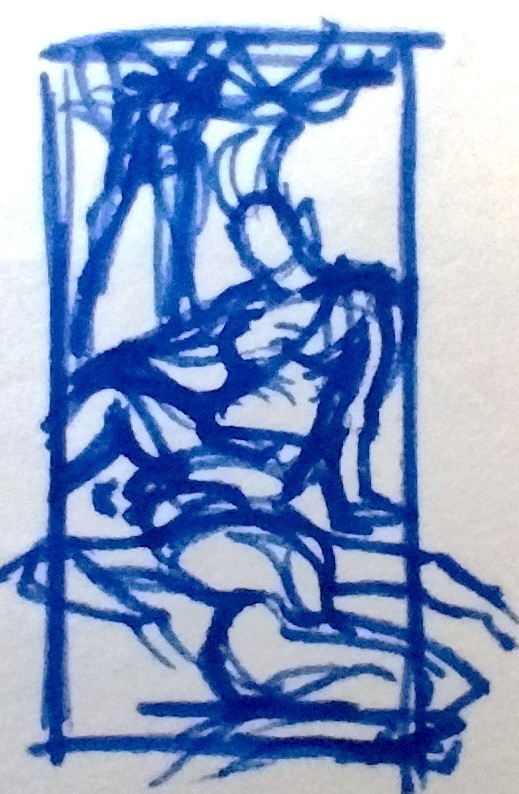
(And sorry I could not use the devil as an exemple, it was one of the three cards I did in class and so I skipped the thumbnailing for time saving :/)
Next step is sketching, still using my ugly colors :)
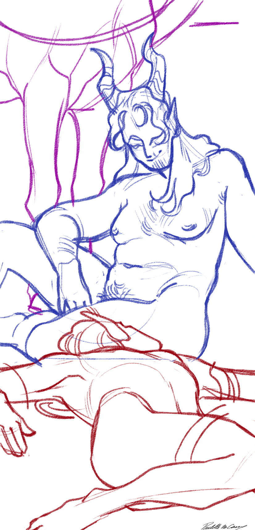
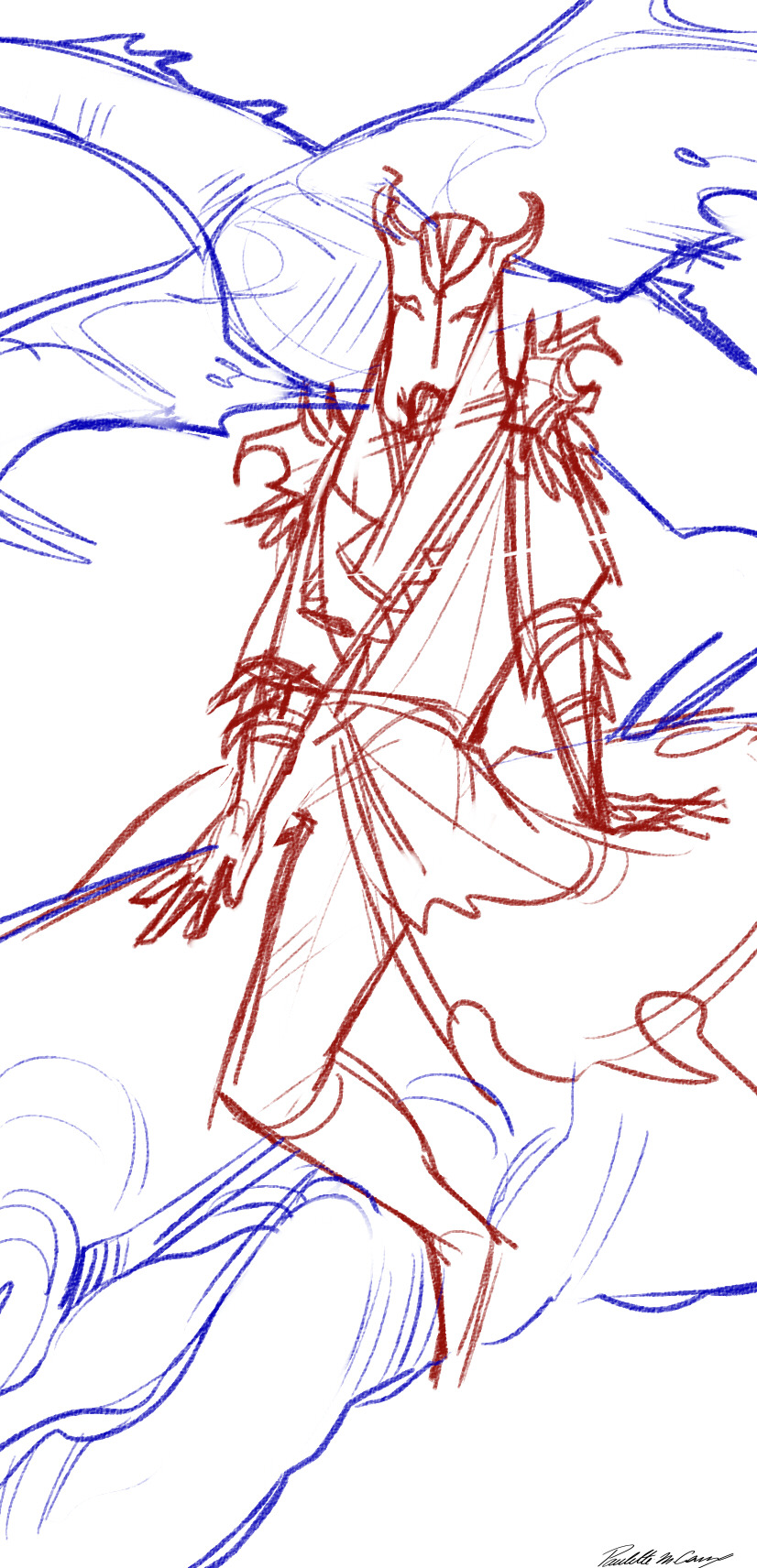
But to talk a bit more about composition, for these I always have the important element of the card near the middle (sanguine's face and his lovers head, and miraak as a whole) (I know trick of the year glgjorlfifjl)
And to help with dynamism, I use a lot of diagonal elements (sanguine's shoulders and hips, his right arm and leg, his is leaning back slightly, and his lover is laid a bit to the left. For miraak he is also laying back, his shoulders are not straight, and his to dragons are going on two different diagonals)
Next comes the line ! For this project I chose to use a pretty simple-ish and stylised look (mainly for time saving since it began as a school project)
The colors are really simple, I just do a grey scale version then apply an overlay on top :)
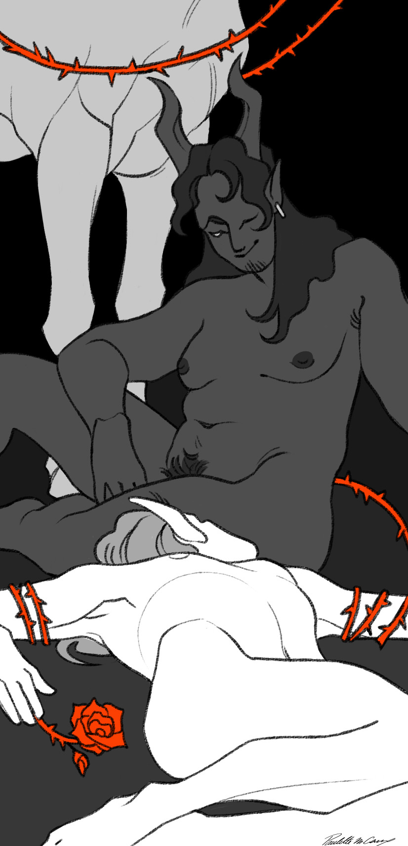
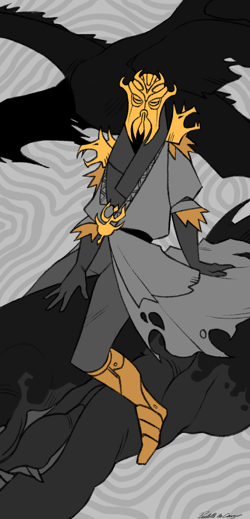
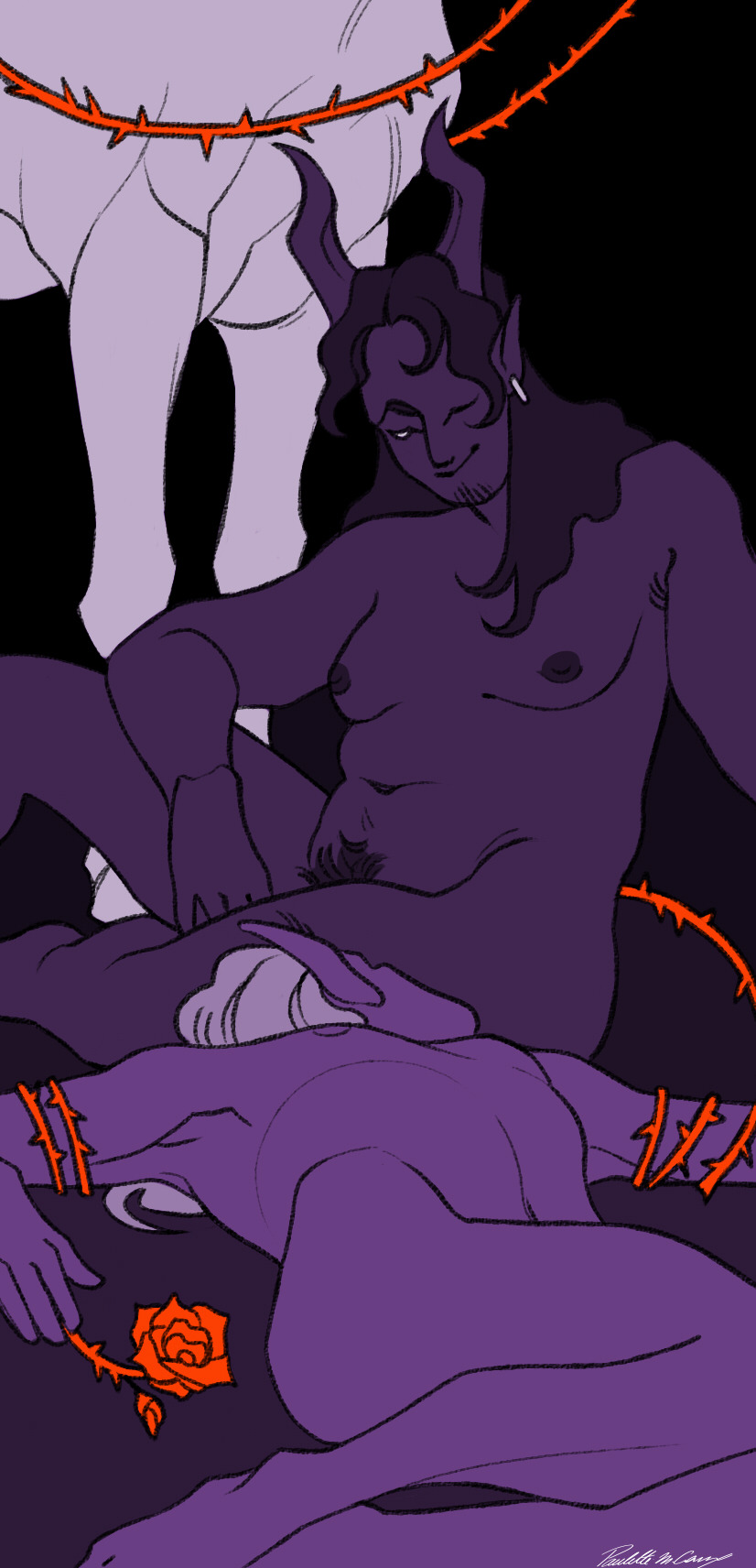
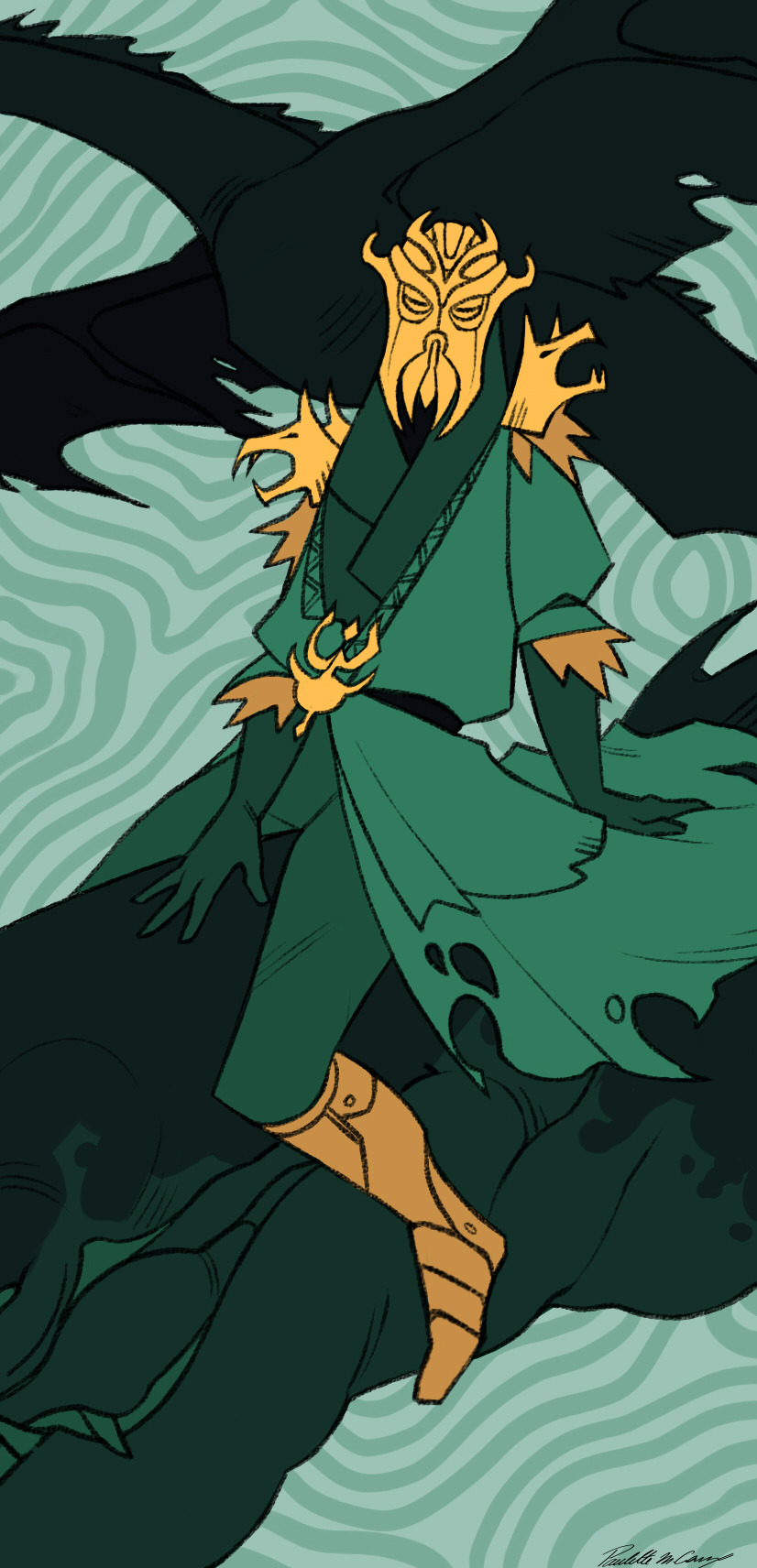
And as a final touch before adding the title, I add a white frame, that I always put behind the foreground to try give them a bit of depth :))
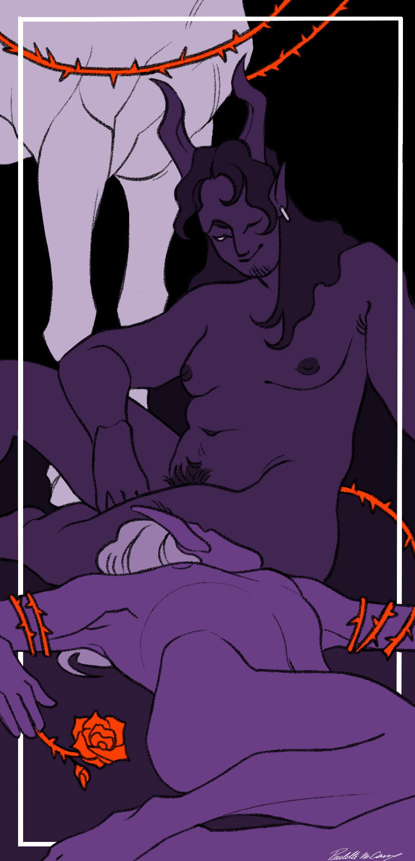
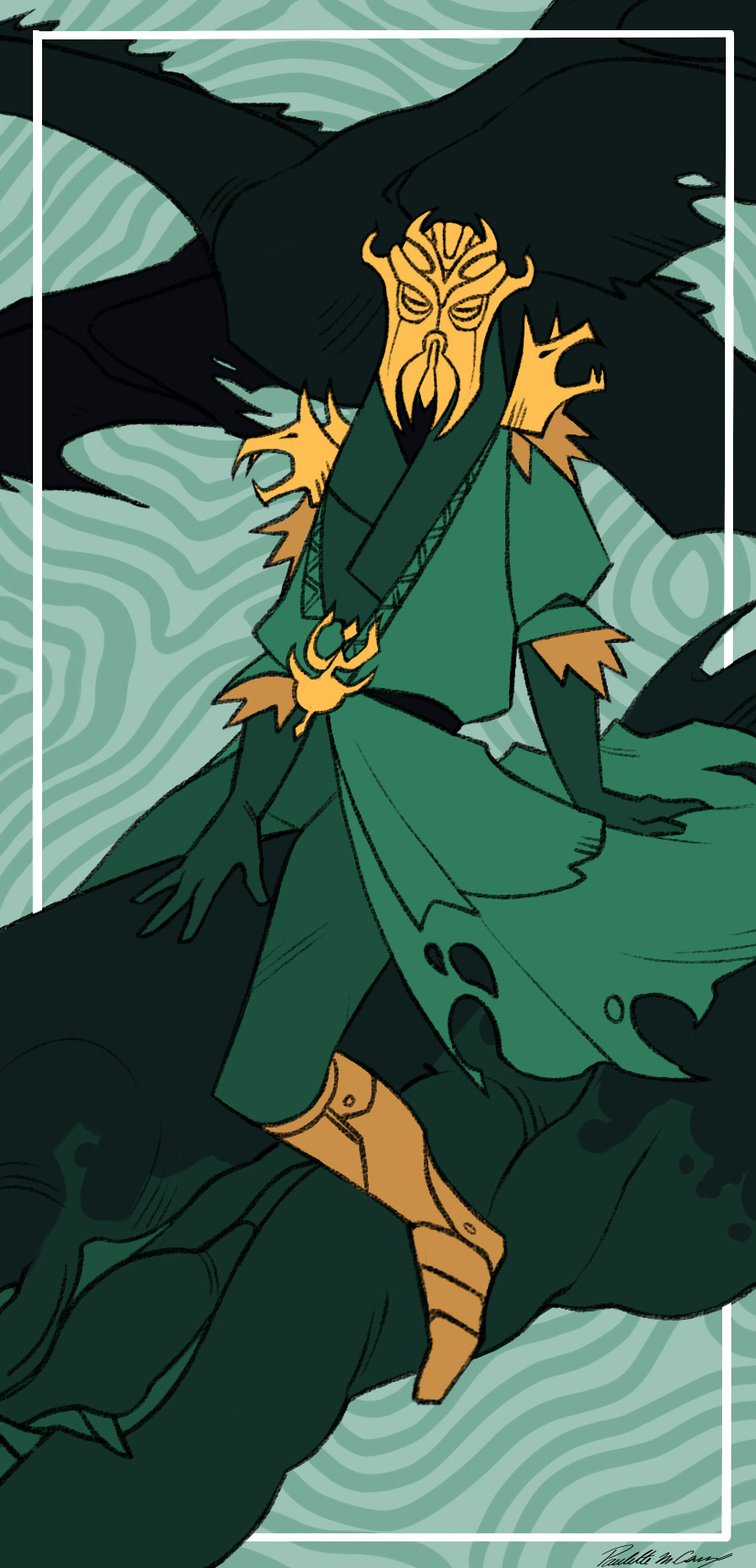
So to sum up my design brief for these :
- clean and stylised lineart
- one color for the whole illustration (exept for the devil because it was the first one I did and I did not know what I was doing glg'goflf)
- a second very saturated color used to highlight important elements (in either yellow, blue, purple or red)
-always have black somewhere
-white frame behind the foreground
-the numbering alternate between the top right and top left (exept once angain for the devil gmgkfnfon I'll have to change that someday)
-the title is always in the middle on the bottom, on top of the white frame
Hope I answerd your question ^^'
thank you again for the very kind message :)
30 notes
·
View notes
Photo

im like 99% sure that one of the first things bliss did when her and rowan started dating was look up y/n fanfiction and read it aloud (when they could still see it as a joke instead of a horrible invasion of their privacy)
alternate caption. rowan’s hate for the fangirls origin story (real)
#this came to me while cooking i was thinking about how there's definitely self-insert ark fanfic out there#and i was like oh i should write that. i should make an in-universe fanfic and post it to ao3.#and that's how i realised that isolation was getting to me<3 thank god todays my last day i wouldve written it too#i was born for this#osemanverse#alice oseman#op#doodles#mine:iwbft#iwbft#bicci#ao#also hello i have not used this brush for lineart in about................... 4 years?#welcome back old friend#personal
829 notes
·
View notes
Note
Hello! May I ask how you draw? I'm currently learning how to myself and would be highly interested into a step to step process by you! Like from sketch to the done thing (no color necessary)
Hello there!
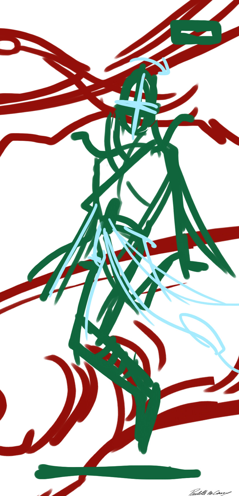
I dunno how I feel about showing how I work/giving advice to someone who’s learning (and I say it as a pro artist who went through years of traditional art education) because when I do the illustrations you see here on my tumblr I BREAK THE RULES you’d learn though life drawing routine, and give in to bad habits, and my methods are rather unplanned and chaotic which makes it difficult to pinpoint significant stages. But I used my portable potato to take some photos during working on my last piece, so I’ll throw it here with a bit of an explanation of what’s going on.
Before I begin - and because you’re about to look at a mess of a WIP - I’d like to give you some general advice that generally makes life easier when you draw (again, things that I learned in traditional arts education - another artist might advise you the complete opposite, dunno!)
Work holistically. Forget them satisfying-to-look-at clips on instagram showing someone produce a hyperrealistic portrait starting from an eye, with each and every element emerging being finished before they proceed to another part. It takes a lot of talent, yes, but these are ppl redrawing a photo in a kind of a mechanical manner. Most artists don’t work this way. Especially if you’re working without a reference, or if you’re doing a life drawing - your process will be layering and changing and finding what works best to give an impression of what you’re drawing rather than reproduce the exact image, and your artwork is likely to look messy most of the time.That said: don’t start with the details. Don’t spend too much time on a particular part while neglecting others. Your goal is to keep the whole piece at the same level of ‘finished’ (even though it’s unfinished - do I make sense?) before you’re confident that everything is where it should be and proceed to the details. So sketch out the composition first. See how things fit, what’s the dynamics. You’ll save yourself from limbs sticking out from the frame, odd proportions etc etc.
Because it’s a game of relationships between different parts of the picture/scene. I ask you not to worry about finishing a single element before laying out the rest because you’ll find that said element will look different once the other part appears! For instance - you might think that the colour you picked for a character’s hair is already very dark. But once you’re done with the night sky background, you’ll find that it’s in fact too light, and doesn’t work well with the cold palette. You’ll have to revisit different parts of the image as you go to balance these relationships and make the picture work as a whole.
Give an impression of something being there without actually drawing it ‘properly’- because details are hard, mate. You’ll see that my lineart usually has hardly any, and my colouring is large unrefined stains, but the finished thing looks convincing. Like, fuck, I can never focus on how Crowley’s eyes are really shaped. So I just turn them into large glowing yellow ellipses crossed by a line, and heard no protests so far.
Don’t panic if you messed up (you probably didn’t anyway). It might turn out to be a completely unnoticeable mistake - because, remember, things work together to balance each other, so another finished off prominent element will probably drown that badly placed line that looked so visible and out of place a second ago.
It might not look good before it’s finished. I’m mostly immune to it after years of drawing, and my recent illustrations all follow a specific method (ykno, my sunset glow effects and all that) so I can kinda predict the next stage. But I do my linearts on a specially picked crap paper, I don’t bother erasing the smudged graphite, and it looks messy af until I make the background white in Photoshop. Conclusion: you might have a moment of doubt as you work through a piece, but try to break through it - I often suddenly start to like what I cursed a minute before! - and try to finish it even if it’s meant to be bad. This way, looking through your past pieces, you’ll see the progress. And trust me, I can’t even look at my art from literally three months ago. It’s normal.
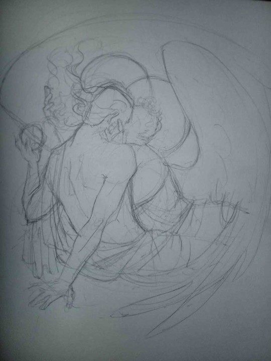
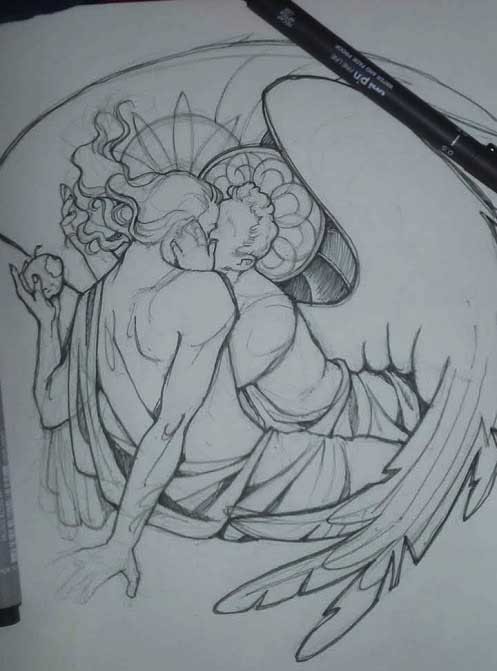
Now, pics! The sketches are paler in real life, but I increased the contrast a little so you can see something.
1. Laying out the composition!
I wanted to just show them kissing, but I got carried away due to some Art Nouveau inspiration. As you might have noticed, most of my illustrations are quite self-contained (ykno - they look like a sticker on a plain background). So I wanted a tight swirl bordered by Aziraphale’s wings creating a sort of rounded, yin-yang like bubble around them. Consequently I made the whole composition revolve around their heads.

2. Adding more details to the sketch. It’s messy af. It will be messy until I’m done. It’s fine.
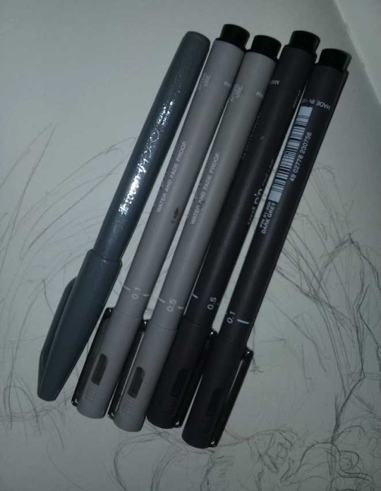
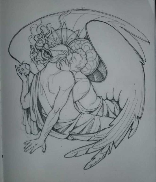
3. These are the fineliners I use for the linearts! They are made by Uni-ball and come in light and dark grey. I also sometimes use the guy on the left - ‘Touch’ sign pen by Pentel, when I want more brush-like, wider strokes. I work in grey because when I scan it and do my usual boring trick with sunlight highlights - which is an Overlay mode layer in Photoshop - the highlights ‘burn out’ the lines too and make them vanish a little, and the lighting effect gets more striking. I also like to use the light grey ones to make something look pencil-y without actually using pencil, because pencil fucking smudges.
4. It smudges! So because I am right handed, I start inking from the right hand side, no matter how tempted I am to do their faces first.
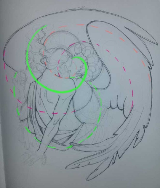
5. You can see the composition directions here. I made it intuitively, but ofc some ppl actually use grids etc to lay out their drawings.
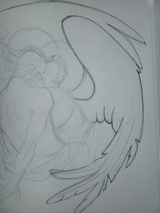
6. See how pale ans thin the lineart was at first? I kept adjusting it as new inked parts were appearing. It starts to look nice and consistent now!
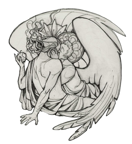
7. Finished lineart? There are some mistakes which I later corrected in PS. Notice that Aziraphale’s face has hardly any details on it - I tried to make the drawing suggest his expression rather than risk overdoing it.
8. Photoshop time!! You can totally do what I did here even if you don’t have a graphic tablet. I used Curves tool to enhance the lineart, then Quick Selection Tool to select the background around around my sticker-like piece and filled it white (on a new layer ofc). I keep this white layer on top of the layer order so it works as a mask as I colour. I decided I did not like the hatching shading underneath Aziraphale’s halo, so I erased it with a Stamp tool (because I wanna keep the textured grey fill my crap paper naturally gives me!). It’s done roughly but won’t be visible once the thing is coloured.
9. And the reason why I keep the grey shade instead of easily getting rid of it by using Curves/Levels is because when I set this layer to Multiply mode and colour underneath, it gives me this nice desaturated look like from an old cheap paper comic page. It works as a natural filter! But of course I can’t do bright colours this way, so all my glowing highlights happen ABOVE the lineart layer - on a separate layer in Overlay mode!
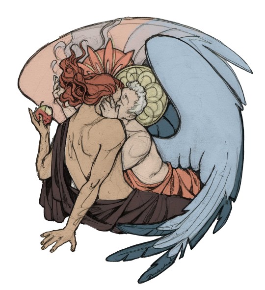
Finished thing here!
_____
Commission infoBuy Me a Coffee - help me with my transitioning expenses!Prints and stickers and things on my Redbubble!
#ask the buckwheat#long post#tutorial#drawing advice#drawing tutorial#good omens#ineffable husbands#good omens fanart#good omens art#my illustrations#doodles#toastedbuckwheat
1K notes
·
View notes
Note
i have the Vergil motivation to start doing digital drawing. But its kinda intimidating. I mean I've always done things traditionally and I do know how to make designs on Adobe software but not drawing. I was wondering if you have a software that you prefer or would recommend; or just tips in general.
Hello anon! how are you doing? :D
Thank you for asking, I’m not en expert, but I’ll try to help you as much as possible :D. Also, bear in mind that english is not my mother tongue, so there may be some mistakes (ans I’m also a idiot who types really fast without re-reading xDD).
First of all, I assume that you own a graphic tablet, this tool is essentioal for digital art, as they have pen pressure and helps a lot to create unique effects! The brands I’ve seen people recommending the most latelly are Wacom and Huion. I can only give you my opinion about the first one though, I’ve owned a Wacom Intuos 4 for over 6 years and it has never failed me ♥ not even when I accidentally threw the pen inside my tea xD.
Now, speaking about software, I have tried 3: Paint Tool Sai (1 and 2), Clip Studio Paint and Photoshop. Each one has their pros and cons, and you also have to bear in mind what your computer can handle.
1. Paint Tool Sai:
This is the one that I use and like the most, the interface it’s quite simple and the only thing that may cause you trouble may be the brushes settings, but once you have created you own ones, the only preset you’d probably need to change is density.
This software comes with a pen stabilizer, which is very handy if you do linework, I always set mine to S-3 so it’s easier to get more accurate and less “crispy” lines, you may also notice that the pressure works a bit different, like it’s a bit more sharp.
For colouring I always set my flats with selections and the bucket tools, and then I add layers for shadows ans highlights. I always start with flat shadows and blend them using both the Brush and the Water tool. I may share my brushes presets for Sai 2 if you like. This software also includes a “transparent” color, which is really useful when you need to fix some blended areas or softly remove part of the colour.
I have used bot Paint Tool Sai 1 and Paint Tool Sai 2, I have noticed that in the second version brushes work a bit different, specially when it comes to using the transparent color. But Sai 2 comes with many enhacements which makes it more enjoyable, thing such as:
Elipse Rulers
Linear Rulers
Perspective Rulers (they work wonders even if you know 0 about perspective)
Text
Shapes
Gradients
Better compatibility with Photoshop’s layers
It seems that Sai 2 is going to be on Beta forever, but you can still download (illegally, lol) and use it, It’s my fave one, so I really recommend this one.
If you want to see more about its interface, I highly recommend you to take a look to my youtube channel, I tend to upload there some of my drawings speedpaints, I hope they can help you to understand hot it works.
2. Clip Studio Paint
I haven’t used this one that much, I only made my first V drawing with it, as well as some headshots for practicing.
This also comes with a pen stabilizer, but I noticed it didn’t worked the same way as Sai’s, it took me a while to get a level of hardness that I liked. The good thing is that it comes with a wide variety of pens, and I really recommend G-pen when it comes to making linearts, it has a nice and sharp finishing.
It also comes with poseable 3D models to use as references, I don’t really like to use them as they have anime-ish proportions and such, but some people may find them handy I guess. CSP also has a wide variety of resources such as premade images (grass, dust, floers, manga panels, halftones…) so this one may be a good option if you also plan to create comics and such.
If you are going for the paid version, you also get access to a marketplace in which people uploads their resources, and you may find some interesting ones there for free.
CSP also has rulers and perspective tools as far as I remember, but I haven’t tried the new ones (this software used to be called Manga Studio, and that was the first time I used it xD).
You can see me struggling with it in this video.
3. Photoshop
I think this is the one that everyone knows the most, right? xD. Though the use of Photoshop has been widely spreaded, we have to keep in mind that this software is very heavy to handle for some cumputers, you’ll probably need over 8GB of RAM memory (I have 16 GB and it still crashes some times) to make it run “properly”. I am isung CC 2015, since I don’t have enough space in my HD for CC 2019, and I would probably need an SSD to make it work smoothly.
I find it really difficult to do linework with Photoshop, it doesn’t have a pen stabilizer (unless you pay for the lazy nezumi plug-in), so the pen usualy “slips” more, I don’t really know how to call this, but I don’t like the feeling I get when I do linework with it. On the other hand, I find it really funny to sketch with it, don’t ask me why xD.
When it comes to colouting, you have to find the brushes that appeal to your style the most, and it’s also really easy to make your own, you can also make patterns and such. Bad thing that you have to use the sampler a lot, in the end you have to use 3465654 tools to blend properly in photoshop, when in either Sai or CSP you only need two, and this is depending on your style.
I have seen many people doing wonders with realist style in PS (you may take a look to @i-have-no-name-v‘s works, they are awesome!) though!
Other thing I don’t like about PS is their color wheel…It works totally different to Sai’s or CSP’s, and most of the times I find it hard to pick the tone I really need. You may also need a plug in tho swap your color wheel too.
I like to use Photoshop when it comes to adding effects to a drawing, be it lightin, particles, color corrections, etc. It’s very handy for this, and it’s also a good thing that both Sai and CSP allow you to save in .psd format.
I hope this long post has been helpful to you or to anyone that needs it, as I said, I have no problem in sharing my Sai 2 brushes presets if you want, you can either reply here or send me another ask ;D
8 notes
·
View notes
Note
The artist questions, all of them.
Hello there! (ノ´ヮ´)ノ*:・゚✧
1. Favouritemedium or technique?I like both digital and traditional. Honestly, I am not very good attraditional art since it does not allow you to make all those mistakes andadjustments digital does but I really enjoy it, especially little randomdoodles or watercolours. Occasionally I just draw something in digital, printit and then trace it onto paper so I could watercolour it later. I will workhard on my skills in both fields but for now, I prefer digital sketching andlineart (I utterly despise colouring in digital, haha).
2. Doyou have a specific place you like to create at?I usually just draw at home because it’s the most comfortable way for meto do it.
3. Doyou value quality or quantity more?Quality, 100 %. I am always envious of other artists who can produce alot of art pieces very quickly but that comes with practice I think. I mightget to that point sometime in the future as well but for now I like to take mytime (please read as WAY TOO MUCH TIME) with my creations and work on themuntil I am at least somewhat satisfied with them. That’s basically why I createlike… a single picture a year, ugh.
4. Whatwould you consider the best approach towards improvement?Definitely inspiration, be it from others, music or whatever you findinspiring. Never ever treat other artists as threats or anything in that tonebut rather as an inspiration and try your best to learn from them and theirtechniques. For example livestreams or speedpaintings are a great way ofstudying someone else’s working process. Something that really helps me as well is constantly trying out new things, beit new brushes, colours or techniques. Always try to push yourself a bitfurther with each piece – try something you haven’t done before. A lot ofpeople tell you to draw every day which is wonderful, yes, but very tiring aswell, so don’t be afraid to take breaks. Honestly, I don’t draw every singleday, usually I make a veeeeeeeery long pauses between my drawing sessions andthat is alright, too, I still notice a certain degree of progress. Art is notsupposed to be forced, it’s predominantly supposed to be fun. Pauses can behelpful, too, of course. They can help you notice those little mistakes youmake in your pieces and allow you to fix them. Don’t worry about not having a particulardistinctive style or anything, that all will come eventually, just don’t loseyourself to the machine of constantly produced content – take your time and trynew things every change you get.
5. Doyou ever feel pressured to create?Oh heck yes and it really flippin’ sucks. However, it’s not like… fromthe outside but more of an inside process I guess? But honestly, if you feelpressured to create, just take a break from it because that is definitely notgood for any sides – you, your work, your health or your followers/fans.
6. Doyou have a specific time your creative side is the most prominent?Not personally I think? It really depends but occasionally I can stay upuntil ungodly hours drawing which feels really good, to be honest.
7. Asmall sketchbook or a big canvas?I actually prefer small sketchbooks when drawing traditional. Big canvasesmake me quite overwhelmed in real life but when drawing digital, my canvasesare usually A4 or A3 format (so it would look pretty if printed, hehe).
8. Doyou ever feel like giving up? What do you do to fight this feeling?Way too often, actually. I get very envious when it comes to otherartists but not in a vile way, I am very happy for them and thankful forsharing their gorgeous creations and I like to let them know but I envy theirenergy and creativeness and it really beats me to the ground sometimes. I don’tfind myself or my work unique in any way and therefore I don’t even share mydrawings online anymore, I just create for myself or my own enjoyment, althoughoccasionally I would really love to show them off and probably embarrass myselfimmensely, hah. However, the other day I was going through my art folder withall the WIPs and I went through some serious emo hours so… I guess that’s what keeps me going – the sheerlove for the craft and creating new things. Hey, maybe one day I’ll be braveenough to show my work off again, who really knows.
9. Doyou enjoy sharing your ideas with others?Yes, I really do and I do that WAY TOO MUCH to the point I start hatingthe idea and never progress with it… basically. Sigh.
10. Howdoes the treatment of artists make you feel?Upset, usually. I mean it depends on the point of view. Some people arereally nice and kind and some are just a fucking pain the in the ass, to be honest.Recently I’ve noticed how entitled some consumers of artwork feel and literallybully artists when they do not provide the desired content and that’s… prettyhorrifying. I’ve witnessed way too many artist close their accounts due toexcessive bullying and that makes me incredibly sad. I honestly feel like weshould be grateful that they even feel like sharing their work with us for free.Also, if you don’t like something or don’t agree with it, there is always ablock or mute button somewhere. That’s the magic of the internet, for some areally hard concept to grasp as I’ve noticed.Oh and also commissions. A lot of people tend to say they are overpricedbut never really care to consider all the time and effort an artist has to putinto the piece. Just… stop, please. And on the other hand, if you feel like theartist is undercharging, feel free to tip them.
11. Doyou think art has the potential to change the world?You see, I am a big fan of the Korean group BTS and they just finishedtheir series called Love Yourself which carried an incredibly sweet andimportant message, making millions of people around the world truly see thepositives and love within themselves, so yeah, I really think so. We consumeart every single day in any shape or form you can think of so if the medium is usedin the right way, it has the potential to do great things. Sadly, art is used tohurt, too, but as long as your intentions are kind, don’t be afraid toparticipate as well and make the world a better place for everyone.
Thank you so much for asking!! ♥Have a lovely day!
-lilajs
0 notes
Last Seen Blogs

cabulosopb-blog
Aguinaldo Mota

stpetersburginsixmonths
St. Petersburg in Six Months

jualpupukkayaintubban
Untitled

carorps-blog
through the mist

amiliablog555
Untitled