#also good fullbody practice!!
Explore tagged Tumblr posts
Text
back at it again with more transfem arthur bennett. Have a good day
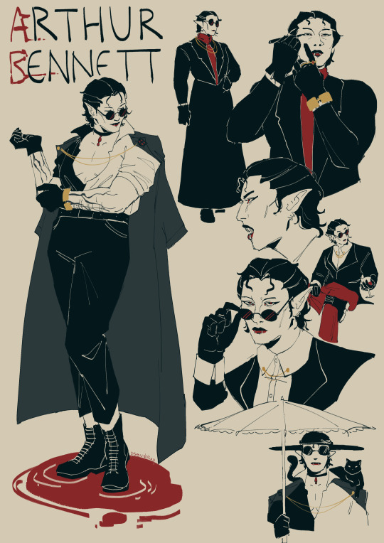
also happy suckening saturday
#jrwi fanart#jrwi#the suckening#arthur bennett#pseudokart#my art#spreading my propoganda#we can make her a gorgeous woman together#looking forward to the day we get more transfem pc/npcs#had a lot of fun drawing these doodle pages kind of. might do more#also good fullbody practice!!#the eyeliner drawing was funny to me because i was gonna give her a mirror then i remembered
2K notes
·
View notes
Text

Trying a different shading style than usual and drawing Joey Wheeler!
Hope you enjoy, and have an AWESOME day!!
#yugioh#joey wheeler#katsuya jonouchi#duel monsters#this shading style is HARD#also trying to work on fullbody because I'm not that good at it - so its double practice!
561 notes
·
View notes
Note
can i requeeeessstt edgar rescuing scriabin from something |D

Day 6 - There are consequences out here
Bonus, of what he was doing to get stickers in his hair:

#My art#Requestober#Vargas#Scriabin#Edgar#I really wasn't sure what to do with this one at first! Or rather - I immediately had this and another idea but wasn't satisfied either way#I opted for this one because The Feelings and the bonus - additions oddly energizing!#I think it's that at first I was too strongly reminded of the one I made of Edgar cutting Scriabin's hair#Poses too similar! Feelings too similar! Not new or shiny or sparkly or anything!!!#But then the bonus came to mind and cute Scriabin is always nice <3#And then the pose expanded as well! Different! New challenges!#I've been trying to attempt more fullbodies this year :3 I don't make them that often! It's good practice all round!#Anatomy and consistency and more dynamic posing!!!! All good things :D#And also parts that I'm not as used to drawing - their feetsies turned out nice I think! Ah! Feels like a level up love when that happens#And then the Feelings of it all <3#I love Scriabin impulsively enjoying his body So Badly gah#Being extant in private and getting to fully revel in sensation with no filter no interruptions#Consequences now - new fallouts of his own actions - but the immediacy just Feels so much he can't help it#Edgar chides him of course - he's (had to) grown out of such childish impulses! Aren't you an adult!#Really he just worries neither of them would do well with either gone for long stickers least of all haha#And he likes being useful <3 They're so similar haha Scriabin loves to complain and Edgar loves to fret ♥#They balance each other well for what a handful they are#Scriabin especially of course hehe
26 notes
·
View notes
Text
How I deal with shapes


@spadefish @kobothesmall So for shapes, the way I work with them is from studying how things break down individually, instead of following a broader ruleset for character design that you see a lot in tutorial posts (the triangle, square, circle theorem basically).
The way shapes work in humans is different from other animals (which also differ from each other), which is different from objects. The same shape can be used for different goals depending on what you're drawing. So there's no one size fits all, and especially in styles that have a bit more of realism going on, those shapes will behave differently than extremely cartoony styles.
Process wise, a lot of it ends up happening in my head than in the canvas, because I spent years dealing with this shape philosophy of "just bang your head for each thing you're drawing", which I understand is very tedious to some people, but I love studying individual things vs following tutorials because it teaches me 1. how that thing works in a context 2. gives me a new book to my visual library which I can pull from, which is often what happens! That, and a lot of it is just staring at references too. Still, I'll try to draw something up for this.
There are 2 ways to approach shape design. You either start with the shapes and then apply a concept to it, or you start with a concept and apply shapes to it. The former is much harder to do without practice (and also comes more in concept art which is rough, unfinished and meant to be done and redone dozens of times by design). So, I tend to do the latter: I start with a concept of what I want. This can be as simple as "I just want a character that's fat/standing" or more abstract like "I want a character that feels like a river/I want this to feel like an outburst".
Let's start with a concrete concept: I want a design that looks like a pacman frog, and just a standing pose that isn't too stiff.
I grab some pacman frog references, and sometimes if the pose is complex, I'll find references for that too. Pacman frogs are pretty pudgy, and their legs aren't that long compared to most frogs, even when unfolded, and their faces have a nice triangle-ish forehead with a nice shape for the mouth.

The result is that i use large shapes for most of the body. Curves contrast with sharper lines, giving the sense of something geometric but still organic. The line of action here helps me pose these shapes in a way that gives some movement to something as simple as standing (and you'll gain a lot of mileage from learning how to rotate shapes! this is how you're able to position them in different ways and create more dynamic poses).
For something more abstract, like a crouched pose meant to be angry, I take some references when i can and start doing something like this:

Note that these shapes seem weird because I'll have a naked fullbody wip below any clothed characters to have some anatomical guidance, but for actual final shapes and silhouette, what matters is the final elements, and that includes clothes! so i try to build shapes that emphasize this droopy, closed off feeling. This sketch isn't even that good really, there's plenty of errors, but I hope it gives an idea of whats going on.
I hope this weird rambly nonsense helped LOL
249 notes
·
View notes
Text
youtube
I remade the trailer to Robot Monster, to serve as a trailer for a hypothetical remake of... you guessed it, Robot Monster.
Destruction has come, hu-mans, and its silliness will not protect you.
My thoughts and how-to process blog post under the fold.
I made Robot Monster's Trailer Remake primarily with Vidu and with Midjourney.
For most shots I started with a photoshopped midjourney gen (or stack of them), which was used either as a prompt image or starting frame.


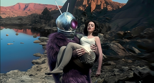
Some shots, like the earthquake, were done with start-and-end frames.
Vidu has some quirks for my Roland Emmerich Christ-the-Redeemer shot. I attempted the image several times as a direct image as start frame, but it would reset to a new camera angle each time, rebelling against my inaccurate version:


As the AI could recognize the statue, but not it being in inaccurate surroundings. I eventually used it as a prompt and not a start frame got a good enough shot.
I tended to go for 8-second shots on quality mode, to give me more to cut around and edit. Almost no shots play without some cropping, speed adjustments or other edits in this, and anyone using AI for a larger project is going to find much the same.
While 90% of the shots are from Vidu a few I used Hailuo's Minmax to accomplish. Mainly things like a few low-motion Ro-man talking shots, the computer-communication device, and the motion title card for "electrifying", etc.
Vidu likes to move, a lot, and for stuff that needs subtle movement I sometimes find it helps to mix things up.
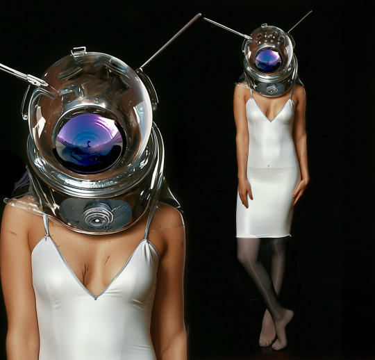
I've found that when image prompting for a character, like Ro-Alice, it sometimes helps to do a fullbody and portrait two-for-one. This helps keep the character design consistent, and you can kinda tell which Ro-Man shots I made before I figured this trick out.
I also reused shots of the dinosaurs from my other AI video projects for meta reasons.
Right now it doesn't make videos so much as it makes shots you can weave into videos.
I'm actually impressed at how well it understood the concept of Ro-Man, only giving him a full ape face or a weird tail or the like a couple of times.
My general approach to the concept was "What if you kept the premise the same but had a budget." Whereas in reality you'd never actually get that combo, since if they had money, they wouldn't have made Robot Monster.
It also let me play with a fanon idea I've had for awhile that the Ro-Men were the helmets, and the ape-creature was some biological organism used as a conveyance.
For the audio, I took the audio to the trailer and used Suno's cover-features to both clean up the sound and change the musical style. The back half of the original track was completely warped by the cover process, but I used another bit of trailer-style music to cover that bit, and to extend for the longer ending shot, since my version of the trailer is about 20 seconds longer than the original.
Some prompts utilized:
in a sci-fi lab in a cave, a furry alien monster wearing a spherical helmet with reflective faceplate walks around aubrey plaza in a white sleeveless slip-dress and dark pantyhose in a glass tube, the tube pulses with green light. She is in a glass cylinder, he is walking around it, with curiosity. The scene is menacing, slow movement, pensive. horror movie scene, the tone is tense and frightening. professional lighting and cinematography. Oscar winning, 2003, practical lighting, effects, and costuming.
the robot spider-robots with spherical heads walk around as though searching for something. horror movie scene, the tone is tense and frightening. professional lighting and cinematography. Oscar winning, 2003, practical lighting, effects, and costuming.
the alien ape-creature wearing a space helmet (the robot monster), in a modern city. He throws green lightning from his hand, disintegrating a policeman into ash. Monster-movie sci-fi scene, dramatic camera angles and lighting. Practical costuming and special effects. High budget and high concept.
slow motion fly-through footage, the air is full of slow-moving glowing bubbles. green electric sparks arc from one bubble to the next producing an ominous mood. The scene conveys spreading menace and fear. One long, unbroken shot. filmed on location, effects by weta digital, ILM, stan winston studios, believable and hyper-realistic. Shot on location. trailer shot. high-speed film
All-in-all, a fun project, and one that came along when I really, really, really needed something to concentrate on for long stretches of time.
Make something fun, folks.
#robot monster#the robot monster#unreality#fan trailer#my art#video editing#movie trailer#science fiction#mst3k#ai video#vidu ai#minmax#suno ai#ai music#midjourney#midjourney ai#ai tutorial#Youtube#vidu
38 notes
·
View notes
Text

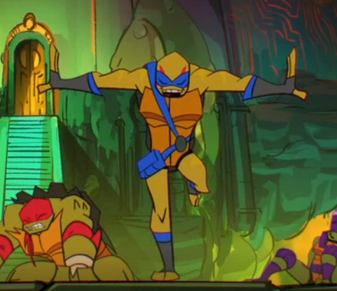
Practice sheet and a Leo doodle for good will
I did one run where I traced over and tried to build with shapes more (in red) right over the screenshot then after I moved the screenie to the side and tried to do the same without a direct trace and going freehand instead. This also was supposed to help with me drawing without zooming in an insane amount, since I have a problem with doing that and would like to get better at zooming out at least during sketches. Also I need to get better at fullbodies if I want to do the comics and even just basic fanart I want to make in the future. So I'm putting effort in trying to learn.
Uh, if anyone has any tips for practice let me know, I'd love to find more ways to try and learn!
Screenshots used under the cut incase anyone wants them idk.

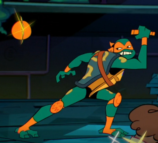
#rottmnt#rise of the teenage mutant ninja turtles#rise of the tmnt#rise leo#rottmnt leo#rise mikey#rottmnt mikey#rise donnie#rottmnt donnie#practice makes perfect!
58 notes
·
View notes
Text
Making your own career/NPC outfits (and attaching them to custom and default careers)
Tutorials I’ve used that helped me understand this a little bit more: SuperFly’s „Attaching custom clothes to careers” @rio-sims „Adding extra options to NPC and Career Outfit Templates” @itsdiamondeyesuniverse mini-tutorial on random clothes and hair and some general knowledge from Hat’s Simpe Tricks
I’m just compiling them and adding results of my own experimenting. It will be pretty long, so everything is under the cut.
Download Template files [SFS] or [Google Drive]
First step is to understand what makes an outfit template.
Looking at my empty template (OutfitTemplate-Empty.package), you can see 4 files. You don’t touch the BHAV and OBJf, they control the behaviours and functions and such. Good practice is to change the name of the OBJD and NREF to something unique. For custom outfits, you will have to change the GUID in the OBJD, but I will touch on that later in the tutorial.
But that’s just an empty template to fill with your own outfits. Every variation of an outfit is made of 2 files:
3IDR (3D ID Referencing File) - This one contains skeleton resource and hair/clothes property sets. AGED (Age Data) - This one pretty much contains instructions on how to read the 3D ID.
In my 3D ID template files you can see the first line is a Resource Node - that’s the skeleton. It always has to be there, don’t delete it. Second line is a property set - that’s the outfit that you will be replacing. 3D ID can have many lines of property sets in particular order, depending on what Age Data is saying.
(My SimPE shows Age Data in CPF, which reads hexadecimal, but sometimes can also show it in XML, which reads decimal. If some lines are different in decimal, I will put it in brackets.)
If you open up any of my Age Data templates, you can see a lot of lines that may make sense intuitively, and some that make no sense at all. Here are lines that are actually useful and how to change them:
AGE 2 - Child (also 2 in decimal) 4 - Teen (also 4 in decimal) 40 - Young Adult (64 in decimal) 8 - Adult (also 8 in decimal) 48 - Young Adult + Adult (72 in decimal) 10 - Elder (16 in decimal) 58 - Young Adult + Adult + Elder (88 in decimal)
I think it’s better to always include Young Adults with Adults. If for example you don’t use mods that enable jobs for YA, then nothing happens and nothing breaks. But if you do, then your YA can wear their job uniform.
GENDER 1 - Female 2 - Male 3 - Unisex (only for children!)
STRETCH It’s only important in teens - they use adult skeleton, but smaller. For adults/elders stretch will say 1, for teens - 0,94. Children use their own skeleton, so their stretch is also 1.
VALIDPARTS 3e4 - If you want to add hair to your outfit (996 in decimal) 3e0 - If you don’t want hair in your outfit (992 in decimal)
LISTCNT Number of elements in your 3D ID. Technically counts from 0, but as the first item is always a skeleton, for ease of counting - it’s the number of property sets used. For only fullbody outfits it will be 1, fullbody + hair or top + bottom = 2, hair + top + bottom = 3.
SKELETONKEYIDX Position of the skeleton in the 3D ID. Always 0, as it’s the first item, counted from 0.
LS, LK, LE All 3 needed together. They are counted from 0. So the first 3 lines will be named ls0, lk0 and le0_0. If you add another item to your outfit (eg. hair + fullbody clothes), next 3 lines will be named ls1, lk1 and le1_0, then ls2, lk2 and le2_0 etc.
LS Always 1.
LK The numbers are already in decimal, so the same in CPF and XML. From what I’ve tested and I’m sure of:
65537 = Hair/hat 65544 = Fullbody 65540 = Top 65552 = Bottom
LE Which line in 3D ID corresponds with this item, counting from 0. As line 0 is always a skeleton, and dealt with in the „skeletonkeyidx” line, you can just count property sets.
If you use my Age Data templates - you don’t have to worry about all that, but I made this tutorial only because I really wanted to know that. So maybe someone else would want to know too :P
Now that you can understand what makes a working outfit, lets make one! This will be split into 4 parts: part 1 - making a new, custom outfit; part 2 - replacing existing outfits; part 3 - attaching outfits to careers; part 4 - testing if it works.
Part 1 - Making a custom outfit
In this example I will make an outfit for adults only, for the sake of shorter tutorial :P
First step: Open „OutfitTemplate-Empty.package” in SimPE. I will change my OBJD and NREF names. In the OBJD you have to change the GUID (the one with all zeroes in the template) - how to make a GUID? Click here to generate 8 random characters in hexadecimal (refresh for a new string), delete any spaces, then put „0x” at the start. Then check with this spreadsheet if it conflicts with any Maxis objects. My new GUID will be 0x1234ABCD (only for tutorial purposes, yours should be more random to avoid clashing with CC objects too). Save the file as a copy.
Now we’re going to add actual outfits. First, one for female adult sims. You have to add a 3D ID template (in this case for teens/adults/elders) and an Age Data template that includes your preferred combo. For this one, I will get AF-Hair-Fullbody.
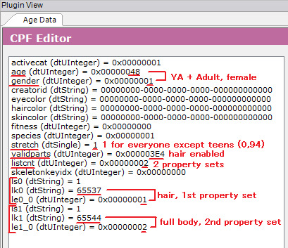
If you look at the Age Data, you can see here that it’s for Young Adult and Adult female sims (age = 48), it has hair (validparts = 3e4) and contains 2 property sets in 3D ID (listcnt). In the ls/lk/le lines you can see that it contains hair (65537) in the first property set and full body (65544) in the second one. (Though the order of the property sets is in the names of the template files, so you don’t have to check every time!)
Now we go to the 3D ID. If you want to attach Maxis clothes or hair, use Scenegraph Resource Finder. Set it to Property Set Search and type your hair/clothes name there (found through the default database or the debug mode in CAS). I’ve chosen afhairupdoweddingveil_black. Doesn’t matter if you choose _black, _blond, etc, your sim will automatically wear the hair in their own hair colour (for CC hair - only if it was binned correctly). Let it search. When you’ve found what you’re looking for, note the group and instance. Now open the 3D ID. Select the property set in it and change the group and instance to the ones of your chosen hair/clothes. Commit and save.
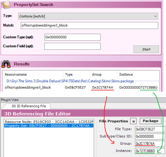
For the fullbody outfit, I’m gonna use CC clothes (AF Lolita Dress and Boots by animera at MTS). First, make sure you have a mesh and a recolour in your Downloads folder so the game can access it. Then open the recolor and find the corresponding property set. Write down group and instance and close the file. Open up your outfit template file again and go back to your 3D ID. Click on the property set line that you set up before and click „add” to clone that line. Now change the group and instance as you did before. Commit and save.
Remember that any hair and clothes used in an outfit has to be enabled for Everyday!
That’s all for the female sim, now onto the male sim.
As before - add the 3D ID template and Age Data template. I will choose AM-Hair-Fullbody.
As you can see, my new 3D ID and Age Data have the same instance as the previous ones - they will clash. So we have to change each new 3D ID and Age Data’s instance to one higher. So change instance to 2 and click force commit on both.

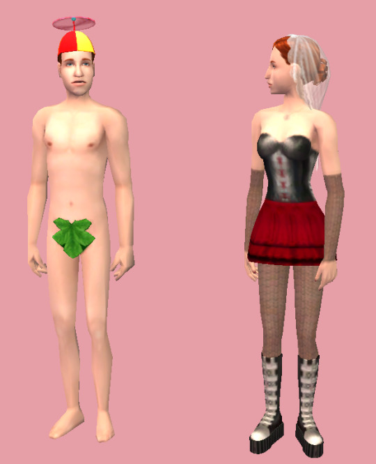
Next steps are the same as before - add property sets. I’ve added a propeller hat and a fig leaf, classy! Commit and save.
That’s pretty much it. If you want to add other age/gender combos? You can, just each new 3D ID and Age Data pair need to change their instances to one higher. You want to add like 20 options for every age and gender? You sure can, same thing as before - instance number goes up (remember, it’s hexadecimal so after 9 you got A - F, then 10 etc). You can have one outfit with hair, other without hair, one top and bottom and one full body, one for female adult and 10 for male adult, doesn’t matter, all combos work, as long as the property sets in the 3D ID are in the same order as in corresponding Age Data.
But right now, my custom outfit is done.
Part 2 - Default replacing existing outfits
While you can attach custom outfit to any career, default replacing outfits is the only (known to me) way to change NPC outfits without digging into BHAVs (which I don’t understand lmao).
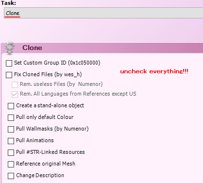
First step is to clone the outfit you’re replacing. Open Object Workshop, click Start and wait a bit as it loads. Then go to Other > Outfits and find your chosen outfit. I’ll use „Outfit_NPC_Maid_test”. Click Next. Then if it says Recolour, change it to Clone. Uncheck every box!!! Click Next. Save the file.
If you look into the Age Datas and 3D ID - they almost always look like a mess, so we’re going to replace them entirely.
Doesn’t really matter which age/gender combo you replace with which, but I’m going to check. In my example, instance 1 is for an adult female, instances 2, 3 and 4 are for an adult male.
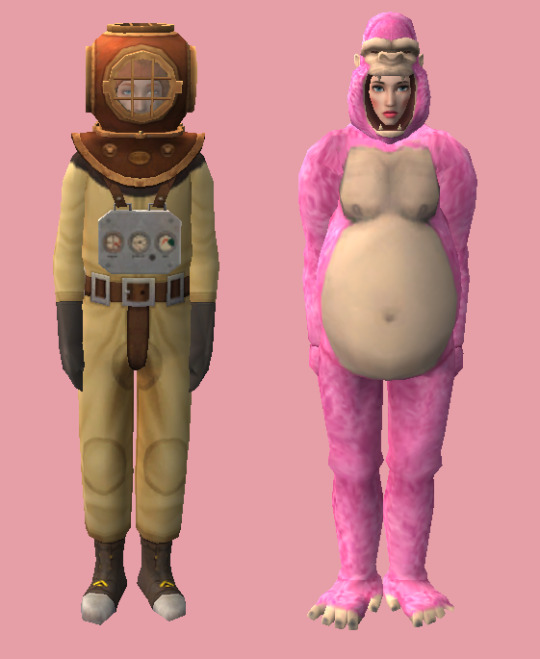
Right click on the 3D ID, instance 1, then click „Replace” and choose my 3D ID template. As you can see, group and instance remained unchanged, this is very important! Now right click on the Age Data, instance 1. Replace it with an Age Data of your choice. I will use AF-Hair-Fullbody. As I explained the process in part 1, I won’t go into detail here. I will also replace instance 2 with a 3D ID template and Age Data AM-Hair-Fullbody. I will replace female outfit with pink gorilla suit and male outfit with diver suit, because why not.
If you want to add more options: as stated in part 1 - when you add new 3D ID and Age Datas, instance numbers go up, but in this case you also need to change the group to the same as your default (in my case, the maid outfit has group 0x7FE81E93).
Maid outfit has 1 version for an adult female and 3 for an adult male. Of course you can add more, but what if it has more, and you want less? I want to have only 1 version for each gender. How to go about that? You need to replace all of the 3D IDs and Age Datas, but nobody said some of them can’t be identical. So I will replace my instances 2, 3 and 4 with the same outfit - diver suit. If I only replaced instances 1 and 2, I would have a chance to get a diver sut man maid, but also a chance to get 2 variations of vanilla man maids. Now I have 3 variations for male sims but they are identical, so all of them will spawn in diver suits.
You don’t need the OBJD, OBJf, NREF and BHAV, as we didn’t edit anything there. You can delete them from your package.
Save the file and you’re done!
Part 3 - Attaching outfits to custom and Maxis careers
If you replaced a default career or NPC outfit, you don’t need to do anything else, it just works. But for a new, custom outfit - you need to attach it to a career. Remember the GUID that you set in the OBJD? Mine was 0x1234ABCD. Write down yours somewhere.
For a custom career, open it up in SimPE and open Bidou’s Career Editor. Choose the level you want. On the bottom left, under the description, you can select some of Maxis outfits, or just type your own GUID. Do that, and your selected outfit name will change to Other. Close the Career Editor and save your file. You’re done :P

For a Maxis career, use Object Workshop. Choose Other > Sim Type, then select your career. Be sure to pick the one you need, as most careers have an Adult and Teen/Elder version, and in Object Workshop it just shows 2 identical names. I’m choosing the adult version of a Criminal career and clone it (with all boxes unchecked!!!). Save the file!! Now the steps are identical as in custom careers - open up Bidou’s Career Editor and change the outfit GUID for your chosen level to your own GUID. Close the Editor, but don’t save the file yet. Now you can see one little file that has been changed, as indicated by the italicised name. This file is named „Outfit GUIDs” and it’s the only file we need - delete the rest. Save the file and you’re done!
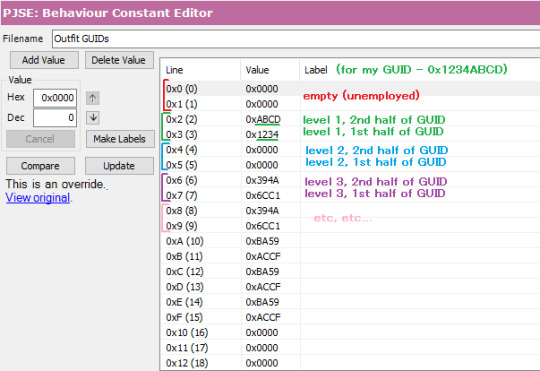
You can also edit the „Outfit GUIDs” file manually (if you, for example, don’t want to clone a career and start from scratch every time you need to make an edit). Lines 0x00 and 0x01 have to stay empty (0x0000), as they are reserved for Unemployed. Level 1 is represented by lines 0x02 and 0x03. You put your GUID there, but split in 2 halves and in reverse order. My GUID was 0x[1234][ABCD], so it will look like this: Line 0x02 - 0xABCD (level 1, 2nd half of GUID) Line 0x03 - 0x1234 (level 1, 1st half of GUID) Next lines work the same - 0x04 (2nd half) and 0x05 (1st half) for lvl 2, 0x06 (2nd half) and 0x07 (1st half) for lvl 3 etc.
Part 4 - Testing!
When all your needed files are in your Downloads folder, open the game and choose a testing hood. Make sure your boolprop cheat is on! Open a lot with at least 1 sim (we will be spawning more of them).
For testing careers, make sure you have enough sims to see your desired results. My career outfit had 1 version for adult females and 1 for adult males, so I only need 2 sims. If your outfit has more variations for the same age/gender combo, you will have to spawn a lot of sims to make sure you will get all of them! As you know, this game is famously not very good at being random, so you can have two variations of an outfit and you can get 10 sims with the first version and only the 11th will spawn with the second :P For spawning new sims, shift click on a sim and select Spawn > Tombstone of L and D. I clicked „New Adult Male” and got a random dude.
Now to get them jobs easily, I shift click on a newspaper and choose a job. You can also set their job level. For my sims, I need to test Criminal career level 1.
Now give them a wardrobe (or a few, if you have a lot of sims to change) and make them dress for work. As you can see - my sims are wearing their new pretty outfits! (Excuse my "I use lowest possible graphical settings so my laptop doesn't explode" ass screenshots)
To test NPC outfits, shift click on a sim and select Spawn > NPC and Townie Maker. First choose a gender, then find the EP of the NPC you want to create, in my case it’s the basegame, so I select Make NPC > Maid. It will spawn a random NPC of your chosen gender. You can cycle it a bit, clicking on the NPC maker again and selecting Repeat Last. If your outfit has many variations, cycle as many times as needed to make sure all your options appear correctly. When you’re done, click on the NPC maker and choose Kill. Now choose the other gender and repeat. Cycle as many times as needed. I only needed to see 1 female maid in a gorilla suit, but I needed to cycle a bit to see if nothing slipped through the cracks with the male maids. Everything works great and they were all divers :P
After all that testing we’re done! Have fun with making all of the outfits your heart desires! ♡
59 notes
·
View notes
Text
Robin Fire Emblem is the best gender separation in the series.
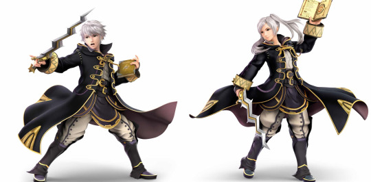
Excuse the smash render, this is the only fullbody I could find that had both of their full outfits.
Look at these cunts. These genuinely look like the same persons but with different gender expressions. I do think the character creator leaves a bit to be desired, as does any character creator with gender-locked features, but on their own merits, with regards to the base designs, the two robins are the perfect gender select. They are wearing the exact same outfit, and they didn’t force F!Robin to show way more skin. I genuinely believe these are the same character. Considering what’s to come, I’m amazed at a design this good in a Fire Emblem game. There is the Gacha game, and the distribution of alts between these two is, Not Great, but that is a topic for another post. Please take a moment to appreciate these designs before we continue. Things will get worse, quickly.
In contrast, look at the Corrins.

While their outfits are very similar, there is one glaring difference. F!Corrin has to show off her thighs, while M!corrin gets to wear much more practical tights. There is literally no reason for this to be a gender difference, aside from the notion that there is something inherently sexual about femininity. I don’t even necessarily think F!Corrin needs to cover up, I just want the designs to show the same amount of skin, because they’re the same person. Corrin is a weirdo, they walk around barefoot in impractical armor, if they want to show some skin, that’s fine, I just want some equality.
Byleth, however is where Fire Emblem *really* shits the bed.
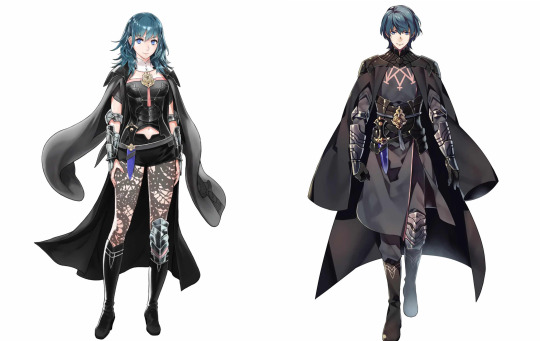
Excuse my use of Gacha game art, but the poses in their Three Houses renders are so different it makes comparing them there very difficult. (Which is probably a conversation to be had in itself.)
That being said, what the fuck is this? What the fuck is F!Byleth wearing? The difference in skin shown is fucking STAGGERING. While certain elements of the outfit are consistent enough to make it clear these are intended to be the same character, holy shit are these outfits different, and as a direct result, they communicate the characters very differently. M!Byleth looks like the stoic, ruthless mercenary of few words they’re supposed to be, where F!Byleth looks more fun and quirky in exact fucking opposition to the way they are characterized. And for fucking what? F!Byleth’s outfit isn’t even hot, it’s a category 5 Disaster of Fashion.
And to round off this conversation, I’ll mention Alear.
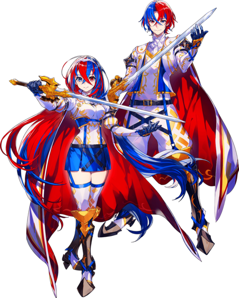
Comparing these two is surprisingly difficult, for me at least, because their fits are so fucking bizzare and nonsensical they’re difficult to even parse. That said, there are similar ideas going on in both outfits, but F!Alear feels a lot more like a sexy cosplay of M!Alear, than a more feminine take on the same design. Replacing the shorts with stockings is already an odd, yet predictable choice, as it continues the pattern of female characters showing thighs, but here it especially feels like it hurts the design, as the weird baggy shorts of M!Alear alter their silhouette, an element that F!Alear loses out on entirely. Much more egregious, however, is what happens to M!Alear's Jacket. It becomes some kind of miniature corset that removes an entire dimension from her design. I don’t think it’s as god awful as what F!Byleth has going on, because I can at least compare the two outfits directly, but it’s really not great.
Anyway, this is why Robin is the best My Unit, and nobody even comes close.
Also why gender is a fucking scam.
23 notes
·
View notes
Note
armor and wardrobe <3
thank you <33
armor: What kind of armor does your OC wear? Is it well kept? Bonus: where does it come from? Is there a story behind it?
Ok, so I do have some thoughts about an experimental armor that our boys would wear--a fullbody suit made from a durable, cut-resistant fabric (to keep those fangs away). Quinn's would be designed to mute his heartbeat while wearing it, covering his whole body and head (with some sort of cool mask). Vince's would complement his enhanced abilities, flexible enough to facilitate his speed and strength, and to protect him from sunlight (also a cool mask). Coincidentally, this new armor is being produced by a subsidiary of Quinn's horrible ex's private security company...interesting. I'll probably come up with a prototype at some point...
wardrobe: How big is your character's wardrobe? Do they wear things threadbare, or can they afford new clothes often? Are they any good at mending and repairing their own clothing?
Quinn doesn't have a very extensive wardrobe--mostly basic items that he tries to get a lot of use out of. He's got a few decent pairs of jeans, some older than others. If some of his shirts get too worn (or bloodied), he usually just replaces them with a cheap variety pack. Every once in a while, he'll buy something more expensive, but a lot of his clothes are more practical. I don't think he'd make an effort to mend his clothing either--just scrap 'em and replace as needed.
Vincent is the opposite--he has a large variety of clothing, as he likes to keep his vintage items from previous decades. He's grown fond of certain styles, even if they're outdated, and swears that they'll come back into fashion eventually. Lots of outerwear--leather, wool overcoats, old flight jackets. He's also partial to sweaters. While he can afford and does frequently buy new clothing, he tries to get as much use out of his items as possible. That being said, he likes to keep up to date, so he'll often splurge on some fancy items each year. As for mending, he's pretty good at keeping his stuff in decent condition, and is more than capable of sewing up a loose button or fixing a tear.
27 notes
·
View notes
Text
Let’s talk about male bonding rituals and the way that physical touch in the locker room can be a comforting outlet. Like how the team hugs and jumps on each other after they score a goal. Or how they casually lean against each other in the locker rooms. Or Roy’s little fist bumps to each of the lads to hype them up. You can use words or actions for your anger, but there’s a protocol for kindness.
And then there’s Zava, who’s an interesting bastard in his own right, because as people have pointed out he accepts touch from others but he doesn’t reciprocate. Dani fullbody hugs the man (after a goal, of course, the most acceptable time to do so) and the most he does is try to shake him off. If Richmond is reaching hands, then the most Zava has done is beckon them in and allow them to worship, like when he took over the huddle before the match- he allowed everyone to put their hands on Zava.
And Richmond is an especially sweet team under Ted’s tenure. So again we have Zava performing in a way that on surface level is inoffensive.
Except that there is one person that Zava makes a point to touch - and I do think he’s making a point about it. Even if we only saw it a few times, I think it was a good extension for showing us how Zava viewed Jamie.
I’ve talked before about how interesting the little one-two shoulder brush/ass slap was in that first match, because on the surface that is totally normally sports antics. It’s only Jamie’s little ‘wtf’ face that lampshades the true weirdness of a moment: this may be a teammate, but this is a dude he just met, someone he has no rapport with (compared to Dani, who created rapport through excitement and touching). But hey- new teammate, first match. As off of a moment it was, Jamie’s a team player now, so he did what he was told to do and passed the ball to Zava. And what a slap in the face that was, with Zava repeating one of the best goals we’ve seen from Jamie this who show.
Actual fucking mind games, this time. A pattern of them, in addition to singling Jamie out and asking if he’s the kitman when they first meet. Despite the fact that he already had his kit on. Despite the fact that he was in the middle of love-bombing everyone else.
And stealing Jamie’s goal. Which was so petty that even Roy Kent thought it was a bit too mean.
It’s not insidious, it’s not like he’s being bullied- but he is getting frozen out. Singled out by a player who walked in and made himself at home in Jamie’s spot.
Zava walks a careful, practiced line. He’s got a ton of experience on and off the pitch, and he knows where to give in and where to push. Dani can follow him around and touch him- he’ll allow it because Dani is harmless.
But I don’t think he thought Jamie was harmless. I think he saw Jamie as a threat, one that needed to be neutralized so that Zava could play in the manner he was accustomed to. Jamie is the ONLY one on the team that seemed to be trying to score - even the fucking announcers could see it.
So yeah, anytime Jamie stepped up a little too high, or seemed like he might be putting Zava’s reputation of #1 at risk, he would find these little footholds that he could use to climb over Jamie.
I think his grunt Zava gave when he lifted up the weight was the closest we got to Zava actually verbalizing his frustrations (also great metaphor, him lying under the weight and then shoving it off one last time. Good comparison to Colin ‘got-stuck-under-the-weights-that-time’ Hughes benching without a problem these days, like a strong and capable man). Richmond was on a losing streak, Jamie kept trying to button in on what should have been Zava’s goals, and now Jamie was also butting in on the leadership side as well.
The openly condescending thing to do would be to pet the top of Jamie’s hair like a dog, mussing it up. That’s a proper bully move. Instead he went for the back of the head and did that weird…..whatever that was. Was he combing his fingers through Jamie’s hair? Scratching him like a cat? Playing with his headband? Whatever it was it was out of focus, even though it was in front of a crowd. The same way that the first time was in the middle of a stadium, and yet so far away from anyone being able to see and hear what was happening. The only thing you could see, if you could be bothered to look away from Zava for a second, was how completely uncomfortable Jamie was with it. And I’m not sure the guys in the locker room noticed, not just because it’s Zava, but because on the surface nothing he’s done has stood out as a red flag.
‘Zava made a goal’ sounds better than ‘Zava stole that goal from Jamie’
‘Zava made a leader speech to motivate us’ sounds better than ‘Zava saw that Jamie was stepping up to encourage them, and felt the need to reassert himself by doing the same thing’
And ‘Zava is physically touchy with Jamie a few times’ sounds better than ‘Zava uses what should be perfectly safe locker room contact as a way to put Jamie in his place’.
#anyways I’m looking forward to how fucking juicy the fic harvest is gonna be after this season#ted lasso spoilers#jamie tartt#zava#what an interesting facet we’ve been given this year#also fuck me this is long
329 notes
·
View notes
Text
GW2 Gold Commissions
I'm opening GW2 gold commissions.
Prices:
Fullbody 140 G (The whole thing)
Halfbody 120 G (Up to around the waist)
Bust 100 G (Up to the shoulders and some of the chest)
Headshot 80 G (Floating head for icons and such)
More details, things like items, shading & backgrounds = more gold. Simple colour or two for the background as part of the regular price. Prices are per character for any multiple character pieces. Other options & prices can be negotiated. Tips also welcome if you're very satisfied with your piece.
Process:
Gold paid upfront. I start with a traditional sketch that I will send for approval before moving to make the piece fully digital. Things can still be fixed once the piece is complete, but only for small adjustments at that point (colours, small details etc). I'll likely post the finished piece on my tumblr as well unless asked not to do that.
What I can draw:
I'm the best at asura. I have a specific style I tend to draw them in a little different from their in-game look. Let me know if you want to draw your asura in this style or more like they look in-game.
Sylvari I usually draw them simplified.
I need more practice on charr, but I should be able to do headshots just fine. I can do fullbodies of charr as well, but their anatomy might end up being a little off and more of a standard furry-looking. If you're fine with that I can do your charr as a fullbody piece as well.
I'm mot very good at human faces but I can attempt them. So human and norn might end up looking a little strange.
I can also draw non-GW2 characters: furries, monsters, animals and so on. You can view my art tag for many examples of things I've drawn.

Ref sheets also possible, price depends on what goes in them, referencing the regular prices
Examples Below (& more in my art tag)


10 notes
·
View notes
Note
𝓱𝓲 💖 (sorry for this asdkjfhjijhj)
im back and i have returned (to everyone's dismay) and i come bearing gifts - i have found the pages where i had my vendetta sequel mc drawn in!! 😈
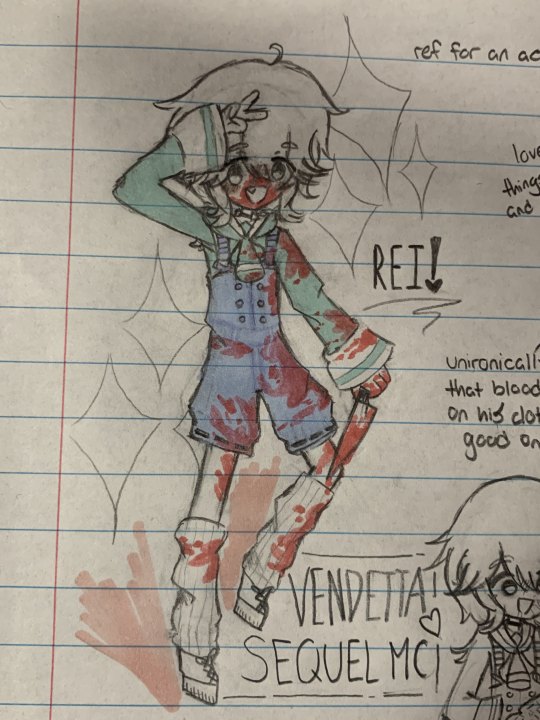
here's my first doodle of rei when i was designing him - i didnt have the proper markers to colour him in but i used what markers i could get my hands on at the time lol but i did fuck up his face :( (closeup)
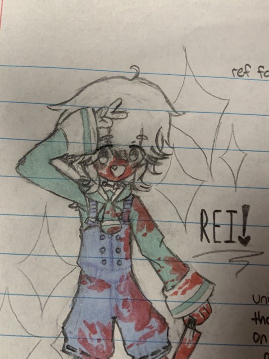
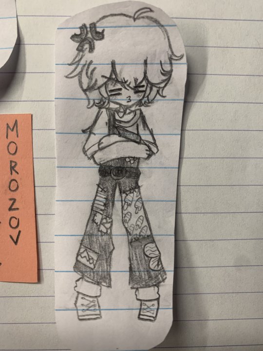
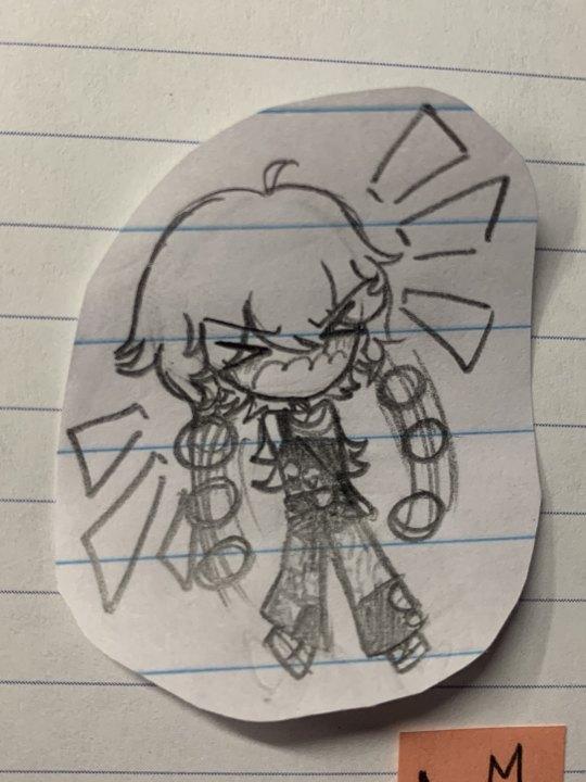
now i have lots of doodles i drew alongside this fullbody design of his and without further ado >:)
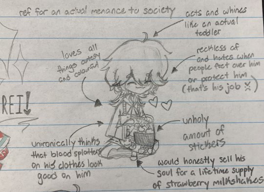
here are some facts i wrote about him 😊 as well as rei decorating his helmet :D though i'll write it down here if you can't read my messy ass handwriting (sorry about that hsjdhsd) »»————- ★ ————-«« FACTS ABOUT REI 2: ELECTRIC BOOGALOO: ➭ loves all things cutesy and colourful ➭ acts and whines like an actual toddler (because it forces his family to give him attention whenever he's being an actual pain in the ass 💞) ➭ reckless af and hates when people fret over him or protect him (that's his job. 👺) ➭ unironically thinks that blood splatters on his clothes look good on him (rei doesn't care if he's seen covered in blood in public, he can make millions of excuses why it isn't blood >:D) " NO this isn't blood this is paint 😇" " tf did you think this was?? i spilled my kool aid all over my clothes 😪" just to name a few, lol ➭ would honestly sell his soul for a lifetime supply of strawberry milkshakes (this is totally not me projecting myself onto rei when it comes to taro milk tea 💀) »»————- ★ ————-««
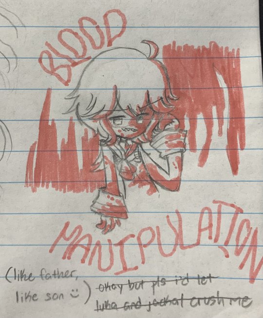
now here's another doodle of rei using his blood manipulation powers 😋 also ignore the pencil text below LMAO
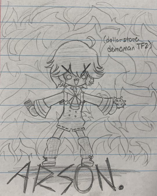
so i did mention in my first ask about rei that he loves to explode things- yeah um idk if luka and jackal would give their menace of a son explosives or a grenade launcher if they knew that this is how he'd act with them LMFAOO
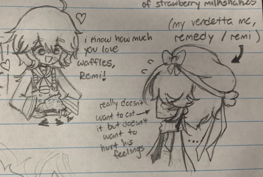
i also mentioned that rei makes the best belgian waffles! (send help hes holding me at gunpoint and forcing me to say this) here's rei offering a divine dish of waffles to my vendetta mc, remedy / remi 💕💕 and look at his face! his mouth is practically watering in anticipation to gobble up the waffles! 💗💝💘💓
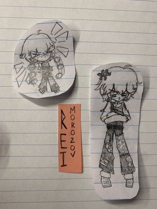
okay on a side note- i made some small drawings of rei in a different outfit and was actually gonna include this in the ref but i didnt like it because it looked ugly 😭 so i made a poor life decision to cut these two abominations out and now they're on my phone 💟 (closeups)
anyways now here have a drawing of rei as demoman from the hit game tf2!!11!1!11!! 😲😳

(he really looks like a dollarstore demoman lol)
(reference used):
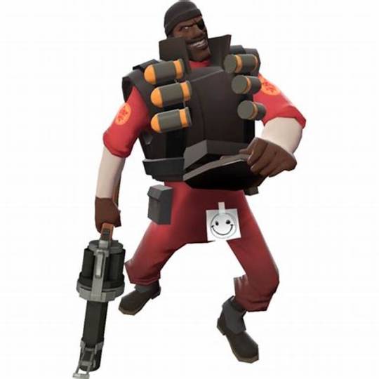
now if you have been on the internet during its baby phase im sure you may understand the reference i used for this doodle 🤭
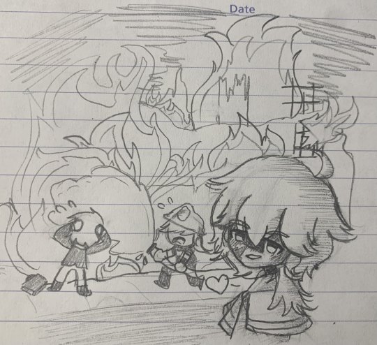
yknow looking back at this downgraded rip off drawing of the original this is actually a shit drawing LMAO (how tf do you draw flames and smoke pls help 💔) now one thing i like to headcanon about rei is that whenever he starts to get frustrated or is having a hard time with carrying out an assassination he decides to do fuck all and blow everything up with literally anything flammable he could find because no target survives being blown to oblivion! (which happens more often than you think...) i like to think while this is an easy way out for rei, it is an absolute nightmare and a headache for the rest of his family 😌 (they probably would have to deal with unwanted attention because rei doesn't give a shit about keeping a low profile and people may tie him to the Morozovs 🤗 they also may struggle to come up with cover stories as these arson incidents become more frequent - because rei is the type of person who values quantity over quality, where he challenges himself to complete multiple assassinations so he can receive praise from his family 😂🤪 and it also doesn't help that he would rather cut corners and take the easy way out when it comes to his work) luka and jackal: " these fires are getting out of hand, we can't keep doing this... " fucking rei: " DAD 1 AND DAD 2!! LOOK!! THATS ME!! THAT BURNING BUILDING, I DID THAT!! :DDDDDDDDDDDDDDD " (reference used):

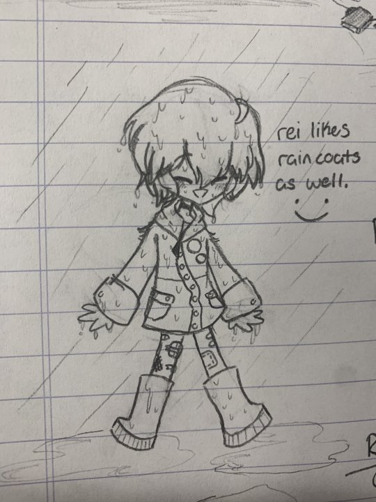
now moving on to a somewhat ironic drawing, here's a doodle of rei in a raincoat vibing in the rain ✨(aside from overalls, rei loves to wear raincoats - and would rather wear them instead of wintercoats when it's cold LOL) rei is the type of person to prioritize fashion than comfort :(
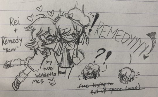
now here's a crappy drawing of cousin bonding time (rei and remedy) tbh i dont really like this scribble lol - this is just filler because i hated empty patches in my paper 🤡
now, a word from our sponsor; rei himself!! he is presenting his aforementioned homemade waffles in greater detail :) and now, cue the advertisement that totally is not completely false and not just rei's delusional and stubborn ramblings on that he creates the best waffles and that waffle makers are inferior to him ☺️
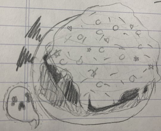
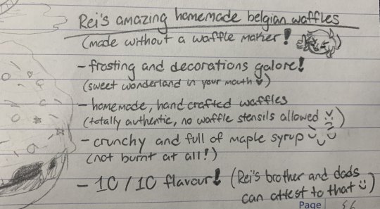
(っ◔◡◔)っ ♥ Rei's amazing homemade Belgian waffles! ♥ (𝑀𝒶𝒹𝑒 𝓌𝒾𝓉𝒽𝑜𝓊𝓉 𝒶 𝓌𝒶𝒻𝒻𝓁𝑒 𝓂𝒶𝓀𝑒𝓇!) ♥ 𝗙𝗿𝗼𝘀𝘁𝗶𝗻𝗴 𝗮𝗻𝗱 𝗱𝗲𝗰𝗼𝗿𝗮𝘁𝗶𝗼𝗻𝘀 𝗴𝗮𝗹𝗼𝗿𝗲! (𝙎𝙬𝙚𝙚𝙩 𝙬𝙤𝙣𝙙𝙚𝙧𝙡𝙖𝙣𝙙 𝙞𝙣 𝙮𝙤𝙪𝙧 𝙢𝙤𝙪𝙩𝙝) ♥ ♥ 𝗛𝗼𝗺𝗲𝗺𝗮𝗱𝗲, 𝗵𝗮𝗻𝗱 𝗰𝗿𝗮𝗳𝘁𝗲𝗱 𝘄𝗮𝗳𝗳𝗹𝗲𝘀 (𝙏𝙤𝙩𝙖𝙡𝙡𝙮 𝙖𝙪𝙩𝙝𝙚𝙣𝙩𝙞𝙘, 𝙣𝙤 𝙬𝙖𝙛𝙛𝙡𝙚 𝙨𝙩𝙚𝙣𝙨𝙞𝙡𝙨 𝙖𝙡𝙡𝙤𝙬𝙚𝙙 >:( ) ♥ ♥ 𝗖𝗿𝘂𝗻𝗰𝗵𝘆 𝗮𝗻𝗱 𝗳𝘂𝗹𝗹 𝗼𝗳 𝗺𝗮𝗽𝗹𝗲 𝘀𝘆𝗿𝘂𝗽 >:) (𝙉𝙤𝙩 𝙗𝙪𝙧𝙣𝙩 𝙖𝙩 𝙖𝙡𝙡!) ♥ ♥ 𝟷𝟶/𝟷𝟶 𝚏𝚕𝚊𝚟𝚘𝚞𝚛! (𝙍𝙚𝙞'𝙨 𝙗𝙧𝙤𝙩𝙝𝙚𝙧 𝙖𝙣𝙙 𝙙𝙖𝙙𝙨 𝙘𝙖𝙣 𝙖𝙩𝙩𝙚𝙨𝙩 𝙩𝙤 𝙩𝙝𝙖𝙩 𝙖𝙣𝙙 𝙖𝙧𝙚 𝙩𝙤𝙩𝙖𝙡𝙡𝙮 𝙣𝙤𝙩 𝙡𝙮𝙞𝙣𝙜! :) ) ♥
i feel like im trying too hard to be funny here, lmao 🤡💀 anyways, here are the full pages of all of the drawings :D
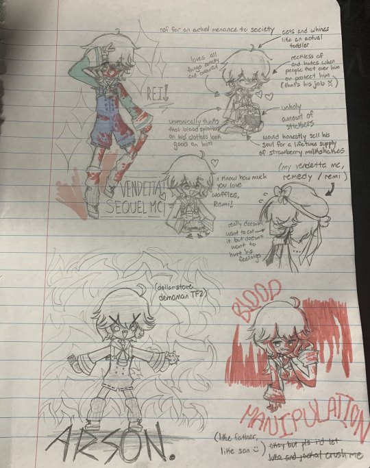
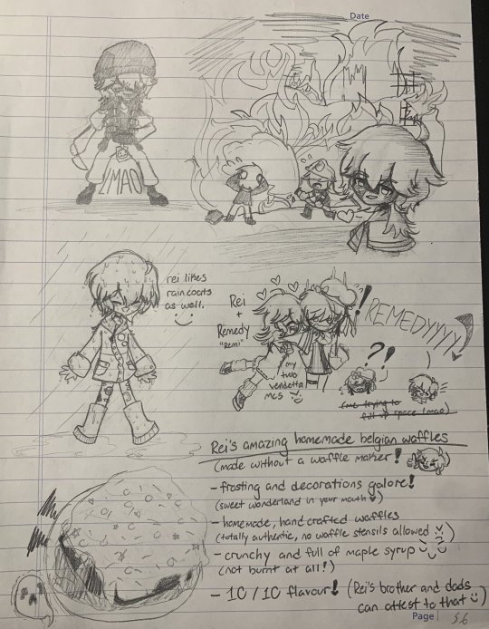
alright so thats finally all i have - if i somehow get my motivation to draw or do literally anything productive ill start working on my vendetta mc's (remedy) ref sheet 👹 (im sorry for this cesspool of cringe again btw LMAO)
Rei sounds so chaotic and kinda sweet at the same time 😆
Also, I love the lil headcanon about the waffle. You can bet that big bro will boast about how his lil brother can make really good waffles to his friends whenever he hang out or has breakfast with them 🥺
Thank you for sharing all these lovely drawings and headcanons about your upcoming sequel MC 🥰
#vendetta fanart#vendetta fanworks#mc art#if: vendetta#if vendetta#vendetta if#if game#if wip#dashingdon#choicescript
59 notes
·
View notes
Note
Ur strength is definitely color and line work. Something I would say needs some work is definitely your full body drawings and poses. Your poses are always static and rigid and (especially when in motion) it takes me a moment to figure out what the character is supposed to be doing. Your anatomy is fine, its the stiffness of the over all pose thats the issue. It makes your pieces lack energy and any real umph. Your beautiful use of color and line usually covers for this but for me (someone who also struggles with this) it pops out like a sore thumb.
To practice, id suggest doing gesture drawings (1 minute sketches of action poses) to really understand how the body moves fluidly and to practice capturing that energy. Id also suggest doing 5-10 minute studies of full body figures in which you specifically observe how the pose affects the distribution of weight. How the torso curves in relation to the pose (your torsos are often very vertical and stiff) and how their muscles, fat, and clothing stretch, bulge, or fold depending on the pose.
Try to keep things loose during these studies and focus on capturing the energy of the pose over perfect anatomy. Focusing on anatomy can often be a distraction and can actually detract from capturing the fluid movement of a pose when you are first learning. You dont want to be thinking about anatomy during a 1 or 5 or 10 minute study if that is not what you are trying to learn.
While doing gesture drawings, its important that you move fast and dont get hung up on details. Get the line of action in there and the general shapes of the figure. Focus more on the movement of the figure over anatomy or details. Feel the rhythm in the pose and do your best to capture it. Id suggest doing 10 or 20 of these at a time. Sites like Line of Action are great for studies like this.
For 5-10 minute studies you want to build on the rhythm you developed during the 1 minute studies. Again, you want to focus on the movement of the pose over the details. Keep shapes simplified and force yourself to think in the abstract. A vibe i get from looking at ur art is that you get focused on the small details while losing sight of the big picture (might be wrong bout this but its something i also struggle with lolol) so during studies its important to keep ur mind on the bigger picture. Focusing in on small details adds to the stiffness of a piece as instead of one singular piece, it’s made of many smaller pieces. Idk if that makes sense lololol. Id do 1 hour of these 5-10 minute studies.
But yea id say this is really the main thing holding you back right now. Once you figure out how to capture the rhythm and energy in a pose id say ur golden lololol good luck! I hope this helps XD
oh gods yeah I need to whip some referencing for poses and specially dynamism, I tend to make things a bit too stiff. I think I cornered myself into making very static poses since I do a lot of character ref oriented work, and showing the design and outfits is a priority over the dynamism, and like, I need to get working on that.
It sucks to realize how I've let social media performance guide a bit on what I draw and I practice. People like their fullbody character designs with a grey background, and I've let a lot of What Isn't That fall apart, and it's bad! I gotta get better!
I need to find a way to maybe get a way to do these practices and still post it, bc even when I've done them, they stay in a folder and never get to see the light of the day. (Also, I saw the other ask and I'm gonna check that one soon! I struggle so much finding good refs for that!)
13 notes
·
View notes
Note
Hii! I wanted to say I love ur art :3 -Vampire ocs r so cool, and give me a lot of inspo for stuffz. I like their cat too :D Fluffy looks adorable -I'm practicing art, and wanted to maybe also ask what r some tips for full body? As a beginner ofc as well. Anyway, just wanted to pop in and say Hi and that I love ur art! <3
Hey there and thank you so much! Well, I don't think I'm a good teacher because I still have problems with fullbody (and anatomy) too haha! But I think I can advise you the standard things - consider the body as a mix of simple shapes (I think you can find many tutorials/tips on the Internet about this) and sketch from photos or life (and I myself should do more of this). ^^
14 notes
·
View notes
Text
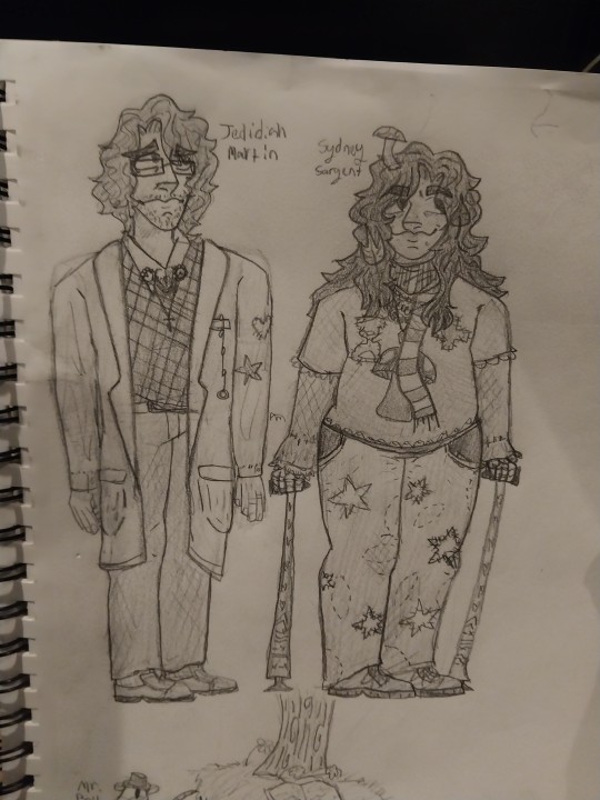
Would any of you lovely folks care to do an art trade? I'm practicing fullbody drawings. I do it for the practice, so I'm not particular on art styles. Just message me if you want to trade pals. Love you all. Also, I don't care if you don't think you have "good" art or not, trading to me is just I get to practice drawing features I might not have experience drawing and then I make someone happy by doing that practice. Then I get to hoard a new piece of art of my oc as a little treat, like it's a shiny pebble. We're all just artists figuring out how to art. Sorry, I stretched a post asking if people want to art trade into a paragraph, haha. Here's some examples for people who haven't seen my style. Under the cut so I don't take up a lot of room.
I'll be doing it in my sketchbook because I really like doing trad art rn





13 notes
·
View notes
Text
TTRPG Questionnaire

GENERAL
Name: Olivier Sroka
Alias(es): Also has his Mother's last name Vastervoort, but father insisted on his last-name for the prestige of having sired an Aasimar son. Very rarely, Berith will call him Oli.
Gender: Male
Age: 19
Place of birth: Vasterland
Spoken languages: Celestial, Common, Elvish
Sexual orientation: Gay
Occupation: Doesn't really have one?
Class: Beast Barbarian
Ancestry: Aasimar; Very rare, highly sought for. Most, if they are even found to be aasimar, don't have much in the way of ANY obvious traits... But Olivier is very obviously aasimar.
APPEARANCE
Eye color: Gold
Hair color: Blueish/black base, with streaks of gold. Underside is a gradient of orange to yellow to white
Height: 5′7"
Scars: no; but lost his wings (Pinioned, in essence. So only has half of his wings.). Appearances and all...
Burns: no
Build: Decently muscular, but strength is deceptive. Much stronger than he looks.
FAVOURITE
Color: Gold, blues, The colors of a sunset, a sunrise.
Hair color: No preference.
Eye color: None either, although gold's nice.
Music genre: Operas. Full of emotion.
Entertainment: Used to fly and explore, but ever since he lost his wings does much of the pastime favorites.
Pastime: Cataloguing birds; he has a book he made filled with images! Sewing, Studying, Fencing, Reading.
Food: Stew (Any type of meat).
Drink: Ginger tea
Books: Any. Man is a voracious reader (It helps ground him).
HAVE THEY
Passed university: Currently IN university!
Had sex: Yes
Had sex in public: NO
Kissed a man: Yes
Kissed a woman: No, not interested
Gotten tattoos: No
Gotten piercings: No
Had a broken heart: No
Been in love: Hahah, Yes. With a certain tiefling...
Stayed up for more than 24 hours: Possibly, getting lost in sewing, or reading.
ARE THEY
A cuddler: BIG cuddler, extremely touchy.
A kisser: Yes
A smoker: No
Scared easily: Normally, no. But against certain subjects...
Jealous easily: Yes and no; not worried, but does get a little jealous if attention is elsewhere at times.
Trustworthy: Extremely. He always tells the truth.
Dominant: If he's in his Serious mood, Yes.
Submissive: But generally, very passive/submissive.
Single: No, courting a tiefling noble named Berith.
RANDOM QUESTIONS
Have they harmed themselves: No
Wanted to kill someone: Yes
Actually killed someone: Yes (to his great regrets)
Ridden a horse: Yes, various creatures actually!
Have/had a job: No.
Have any fears: Ah. Well. A severe fear of heights; an airship ride rendered him practically useless. Also his father; There are a LOT of tangled emotions there, but he both fears him and still loves him, despite what he's done.
FAMILY
A bit of a mess:
His mother is Joanne Vastervoort, a mostly solitary monsterhunter. Was not considered a noble, had a child with Raymond (Olivier's Father), Lunera. Raymond came back years later and demanded another child now that Joanne was considered a noble; This one produced the Aasimar he wanted.
Olivier was raised mostly by his Dad, with occasional visits to his Mother. It was Not a Good Time with dad, who exerted extreme control over Olivier.
His stepfather is named Furness, a gnome commoner who loves making guns. Firness has 3 half-gnome children with Joanne: Juno and Charme (18yo), twins, and Novis (16yo).
Olivier adores his siblings (Full and half) greatly, and equally... But Olivier is considered the only Noble, and heir, of his family.
And Olivier has no idea where ANY of them are at the moment.

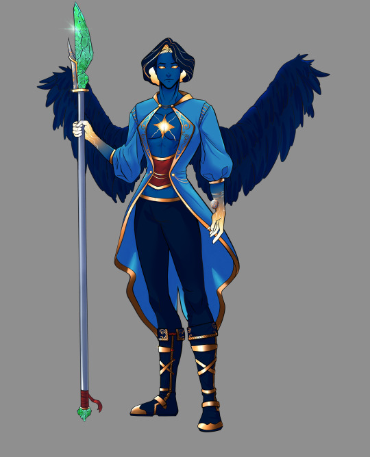
A snip of a picture I did of his Serious side vs his "Radiant Revelation/We're gonna get them" rage side. .....Ignore the fact his hands don't have the gradient fade, I literally forgot cause I got absorbed in just shading skin LOL.
The fullbody is by 0LHA0 on Deviantart!
7 notes
·
View notes