#Anatomy and consistency and more dynamic posing!!!! All good things :D
Explore tagged Tumblr posts
Note
I ADORE your art and how well you match the ISAT artstyle. I've been being alot of studies to try replicate the style and draw characters 3d but stylised. Are there any tutorials that have helped you, studies you do, or things you keep in mind whilst drawing to make the characters look so 3d?
Oooaaahh thank you!!! This is a really good question. I say that because I feel like I "2D cheat" ISAT art a lot. It's very comfy to draw bc my normal art is like that too, with angles that shouldn't be able to exist but look right bc it's 2D so your brain forgives it. Design of the art > accuracy of the anatomy, y'kno?
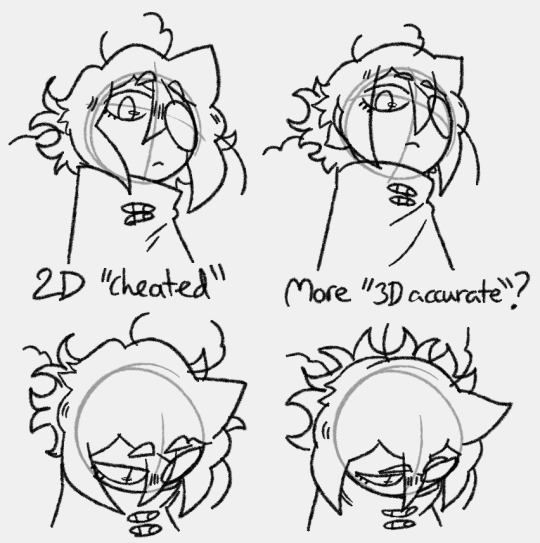
The hair kind of gives it away in most cases. It's meant to be such a specific shape, it kind of stops looking like the character if it gets too 3D? But drawing it more 3D has huge utility too, especially for animation n stuff. It's just something I've noticed about the style! It's very designed for 2D. It's very "the shape of the lines" > "the shape of the 3D object"
It's helpful to remember that ISAT characters are all made up of really simple shapes. Like Siffrin's head is just a ball from nearly any angle but the side. Their body is a cylinder but one end is wider than the other. Odile's face is a ball but the bottom is long, like an oval. Isa's is a ball but his chin is square, it has soft corners. Even Bonnie's face is a ball you just add a cheek bump. Etc etc.
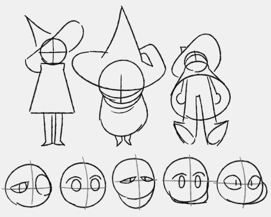
^Notice how i can't simplify the hat down into a consistent 3D shape bc otherwise it just. kind of. doesn't look like Siffrin's hat LOL
If you have the simple 3D shapes down then the rest of it is all 2D cheating and focussing on details! Having character refs nearby at all times especially when ur tryna figure out how to draw the character is KEY so you can keep looking at it and comparing. Try to pay attention to the little quirks of the art style that differ from yours and try to mimic them. But don't be afraid to let your style infect it a bit if it helps you to create something more dynamic looking.
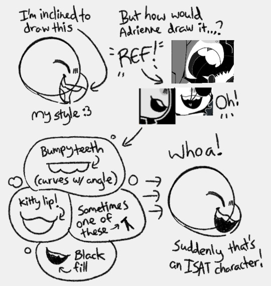
It helps that i've been drawing for ages. I know 'practice' is the age old advice but here's my spin on it: just draw, keep drawing what u want no matter if it looks bad or if some professional artist tells you you're doing it wrong. So long as you keep drawing you are learning. Indulge and draw what you want so you get to keep all the motivation and keep going.
oh and PUSH YOUR POSES/EXPRESSIONS!!! By this I mean, draw it once, and then lower the opacity and draw it again on top but pushing everything a little bit further. If a pose feels stiff this tends to fix it.
uhmmm i rambled on for ages but i hoped it helped u Tea (or anyone else reading)! thank u for the excuse to draw a bunch of funny isat doodlies :D keep going you have GOT THIS!!! THERE IS NO WRONG WAY TO MAKE OR ENJOY ART! YAY
2K notes
·
View notes
Note
HELLO :D I have a few questions regarding your art-
First off- how do you render? Specifically when choosing the differences in material lighting? There’s just a sort of dramatic lighting that your art has that always makes it look extremely epic
Second off- What’s your method for anatomy? Like, Do you use a much of ovals/rectangles, wing it like a madman, or etc? And how do you define each part of the body? (Or separate hair segments?)
And Thirdly- how do you add volume and consistency to your work? Every design that I see of yours just looks like it jumped straight from a 3D movie screen, and really curious as to how you do all that!
Also- holy cow I freaking love your art so much- like I just found out you drew like half of my favourite art pieces out there. And I just love looking at it. It’s kind of like a golden caramel apple, if that makes any sense!!
And thank you for your time!!!
Thank you so much :DDD <333
Hoo boy where do I begin :'D
The first statement I need to make is that my main method is 'fuck around and find out'. Literally. Also sorry if some of the explanations don't make any sense, English is not my first language.
Here's kinda step by step of how my drawing process looks like.
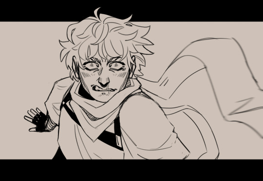
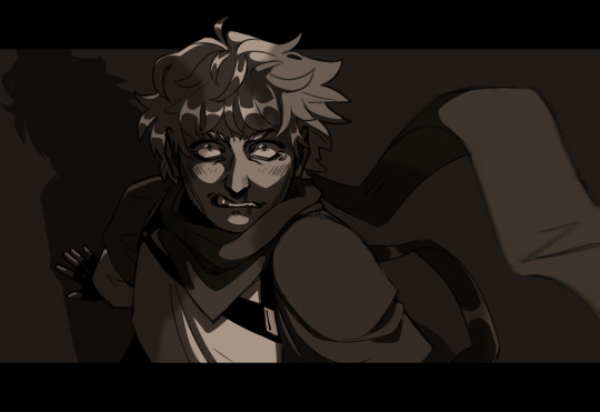
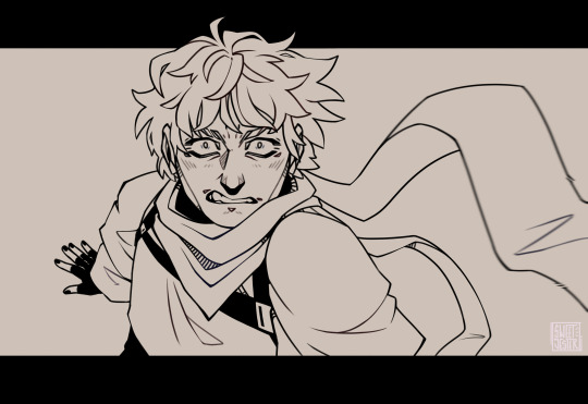
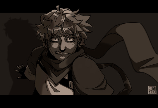
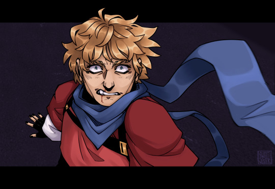
Sketch, then rough cleaning and adding monochrome colors, it's totally unnecessary, but I like to do it just to see how the drawing would look later with dynamic lightning. Then move onto lineart, used to draw it on another layer on top of the sketch, but I switched to just correcting the lines and eareasing what I don't want from the sketch. It's kinda more fun and takes less time. Then come the base colors and adding shadows. What I most often do is add shading on the color layers and then on top of all of them draw a full shadow.
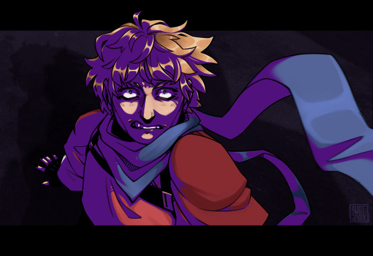
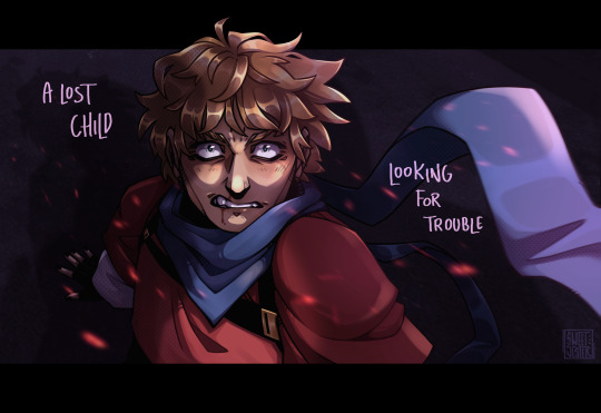
Like this, then multiply and fuck around with opacity. This makes the characters pop out even more and adds depth to them. Then add lightning, and sometimes effects from saved pngs. For example, I often use this site for material textures: https://www.transparenttextures.com/
2. When it comes to anatomy, I most often use existing pose references, not fully copying them but like putting them together like a collage. A head here, hands there, I have full boards on Pinterest dedicated solely to different body parts. In the past I was heavily using whole sketches and body pose references, but over the time I was able to somehow figure out the anatomy on my own. To some degree. I still have no idea how to properly draw hands. What I'm saying is that it's good to base your art on existing references (NOT COPY THEM) but use as a guide, until you get a hang of it.
3. Lately to do something more stylistic and to bring out the volume I started doing this notion in the shadows:
(also a sneak peak of next piece ;3)
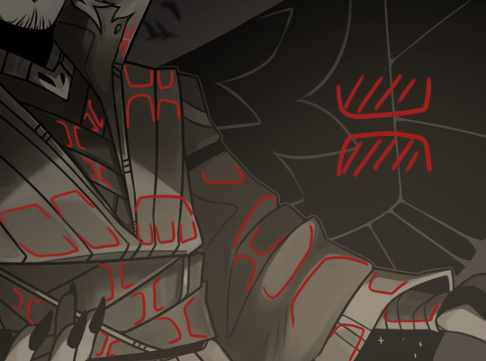
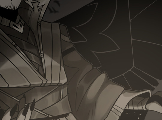
I have no idea how to call it, but it makes things pop out.
Anddd I finally got around doing more dynamic poses and dramatic positioning. Bringing parts of the drawing forward, and leaning some further, going wild with blur filter and using black as guides and contrast.
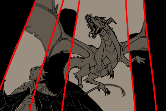
So that might be why it looks more like screenshot of some movie, which is such a big compliment to me imma cry.
So, yeah that's kinda how I work :') Hope it helped and made sense to some degree.
#i literally dont know what im doing most o f the time i draw#thank you again :>>>#asks#fan art#my art
17 notes
·
View notes
Note
I don’t have any real presentable art yet, but I want to learn to be a comic artist since I have an idea I’d love to make, but would only work in comic form. Where should I start?
I think comics and graphic storytelling is potentially one of the most demanding disciplines to master since it relies on so many different skillsets. Especially if you want to do your own comics. So, I will always recommend you get a strong grasp on your fundamentals. Anatomy, light, shadow, construction, perspective, pose dynamics, etc. But on top of that, you’ll also be relying heavily on a few other skills that’ll help you convey your story clearer. Such as composition, cinematography, pacing and acting. Other than that, to create interesting and innovative visuals, you’re going to look into world design, character design and prop design.
In terms of technical crafts, you ‘d want to look into the art of thumbnailing/storyboarding and style-consistency. Storyboarding is a method that ‘ll help you crank out previews for your frames quickly, whereas the style-consistency is nearly self-explanatory: it ensures that you can produce visuals that follow a certain style consistently.
Finally, you got skills beyond that of your draftsmanship such as storytelling and writing - which should help you construct good, solid narratives and interesting characters.
^That list is pretty long and daunting I admit. There’s a lot to learn and a lot to get involved with. But no one ever said that you have to go through the list methodically and learn every single topic in chronological order. Many of your draftsmanship abilities improve over time as you just keep drawing and studying your craft. The Design aspects take a bit of abstract thinking and up-there learning, but it’s nothing that you can’t manage from your home with a few online courses or free videos. Same with writing and storytelling, there’s plenty of sources that can help you improve yourself on said fields. All you got to remember that this kind of thing takes time, and you need to be good to yourself - and hold on to hope. Personally, I’ve been drawing dedicatedly for about 12 years, and only now am I in the progress of making my first graphic novel.
Now for some places for you to start: I can provide you with a couple of sources for some of the topics you’d want to look into. Take a look and see if it’s something for you. :) These are topics more specifically aimed at making the jump from illustration to comics, so keep in mind that it’s only a fraction of the material you’ll be going through on your journey. ThumbnailingDeveloping a comic styleCharacter costumingA note on character designAvoiding same-faceDrawing character turnarounds
There are also numerous books on the art of comics. I can personally recommend the works of Scott McCloud! ( Making comics, Understanding Comics, Reinventing comics )
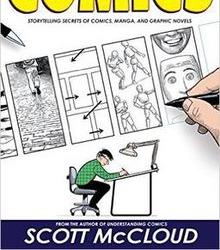
And of course, read a lot of comics. Get yourself acquainted to a broad range of styles and stories, and get inspired by the masters in the field :) I hope this was somehow useful to you. There’s a lot I know, and I wish you the best in your journey onward! - Mod Wackart ( ko-fi )
#thekinotion#ask#mod wackart#comic#comics#comic books#graphic storytelling#tutorial#theredlinestation
151 notes
·
View notes