#also first time using a dark colour scheme
Explore tagged Tumblr posts
Visit Tumblr Blog
Explore Tumblr blogs with no restrictions, modern design and the best experience.
Last Seen Tumblr Blogs


Fun Fact
Tumblr.com is the 103rd most visited website in the world.
Text
thinking about hestio/ephael and the "if we had a decent tank or healer, i wouldnt even have to talk to him" "does that mean you'll keep hanging out with me? :D" "oh, forget it". the "hey. take your arm off my head. take it off?" i love ephael being annoying to hestio without a care in the world + hestio telling him off + hestio is still always seen by his side + they're still stuck together like a set pair after 10+ years
#hestio/ephael#ill be real guys i keep yapping abt tes/hes bc hestio is just easier to write#but hestio/ephael is the OG like my shipping pilled brain was already putting them tgt in my head on my first read through#whatever dynamic i come up w for teshes is not going to be as funny as ephael actively doing shit that makes hestio tell him off#and then still sticking by his side anyway#and also the way ephael just openly goes 'so you'll spend more time with me? :D'#and also the way that you can tell that Both of them see the other as part of themselves#the whole 'if you keep being formal w us we wont be friends w you anymore' scene#hestio saying WE and speaking for ephael and ephael not objecting to that at all even tho its clearly his first time hearing abt this plan#okay !#damn i shouldve written some ephael/hestio before i started on tes/hes#its the way i had to brainwash myself into 'ok so hestio being hopelessly in love has to be a core part of his characterisation for any#of this to work'#but for ephael/hestio it's literally already right there#sniffles. i wonder how they became friends when their temperaments are so different#its also so cute how theyre so different but they share the same views on a lot of small things and important things too#peas in a pod.... but also light/dark colour scheme... waow....#the thing is that theres absolutely no central story beats that i can think of for a ephael/hestio stoty#theyre just chilling and being funny little guys#and if i bring tesilid in. wtv story im trying to tell would be much more effectively and efficiently written using a monogamous r/s#sadge.....
0 notes
Text
Some of my favourite little details in Bungou Stray Dogs (contains manga spoilers)
-In terms of ying and yang, tiger and dragon are opposites. Atsushi’s a weretiger and Akutugawa’s first name is Ryuunosuke with “Ryuu” meaning dragon.
And their hair and clothes colour schemes are the same as each ying yang symbol.
-As a teen Chuuya kept his hands in his pockets as a teen to remind him not to lose himself. Something he seems to replace with wearing gloves as he takes them off before using corruption.
And when he’s pretending to be a vampire the gloves stay on because he’s still himself.
-The painting that Hirotsu insults when meeting with Dazai at the end of the Guild arc is one that the real Osamu Dazai painted.
-In Kunikida and Katai’s brilliant days, someone breaks into Katai’s house to try and kill him. And in the present day Katai has a hidden camera in his room.
-Demon Snow resembling Kyouka’s mother, her original user and the one who passed the ability onto Kyouka.
-Dazai meowing at Fyodor in Dead Apple in response to being compared to a rat like him.
-Atsushi gets kicked out of the orphanage because the tiger escaped and ate their livestock. In the orphanage flashbacks, we only ever see Atsushi imprisoned but never the tiger.
Showing that they are one and the same.
-The incident that awakened Kenji’s rage state was his best friend being killed. He awakens that same state in the present after being told Atsushi’s going to die.
-The necklace Shunzen Tachihara wears in the war with the engraved message of being saved by Yosano is in the shape of a coffin.
-Fitzgerald wanting to get the book to bring back his daughter for his wife and naming the Guilds Headquarters after her. And when he’s defeated it’s his wedding ring that saves him.
-In Dead Apple during the Dragons Head incident, Dazai says that he was shot 3 extra times. To which Chuuya says “aw you poor baby, want me to pick up when he left off?”
And in Mersault, Chuuya “kills” Dazai and then proceeds to shoot him 3 extra times.
-Also shooting someone 3 times is part of the Port Mafia’s method of disposing of traitors, like Dazai. But Chuuya never completes the method which could have hinted at Dazai being still alive.
-The move Kunikida shows Atsushi, taking his hand and flipping over onto the ground is the same move he uses to take down Hirotsu during the raid.
-The line Dazai says to Fyodor at the end of the Mersault arc, “even all your strength can’t kill me” is the same thing Dazai says to Atsushi during their fight in the first episode.
-Akutagawa’s orders in the DOA arc were to not to intervene unless he saw a smoke signal. When he returns to aid Atsushi at the airport it’s after Kunikida sent out a smoke signal.
-Akutugawa knowing the true power of Atsushi’s claws because they’ve cut through Rashomon.
-Adam (Stormbringer) is the first artificial creation of his kind. And he reaffirms Chuuya’s humanity, even being referred too at one point as speaking to him as parent would to a child.
In some respects making Chuuya a son of Adam.
-The Port Mafia has a tradition where those who mentor / are responsible for you give you a piece of their clothing. Every piece of Atsushi’s uniform is something owned by a member of the Agency.
-The scene in the anime where Dazai leaves the Port Mafia and the scene where Mori and Fukuzawa make their deal are alike.
-Chuuya always stands on the side that Dazai has/had his eye covered. And after the events of Mersault he stands on the side of Dazai’s broken leg.
-When Poe recalls losing Ranpo he is in darkness while Ranpo’s in light. But when Ranpo recalls the event he envisions them both in the light.
#bsd#bungou stray dogs#bsd stormbringer#bsd atsushi#bsd dazai#bsd chuuya#bsd kunikida#bsd katai#bsd ada#bsd port mafia#bsd armed detective agency#bsd spoilers#bsd manga spoilers
117 notes
·
View notes
Note
Every time I see your art I remember how much I love your colours - its just...aaaah I can't even explain it, but it's so perfect? Its..muted but not washed out? And it gives such a natural feel to the works that I adore! Do you have any proccess for determining colours?
Thank you!🧡🧡 Colours are often what I think makes or fails my drawings so either way means a lot! Sorry it took approximately a thousand years to answer but this inspired me to do an illustration to experiment and explain with. (Though as said, I don’t think I always nail the colours and I have only little formal art education etc so take with a grain of salt)
With line art, I usually fill in different sections (like character, environment in front, background) with base colours first. Most often with some orange or sienna.
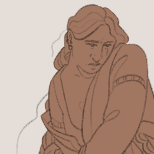
And to mimic the effect that underpaint has in traditional art, I’m usually choosing the final colours by picking a colour I think would be close to the “actual” colour (like skintone), and, probably not very professionally, “mixing” that colour with the base colour by using a brush that is not 100% opaque. I’m also testing and fiddling here & usually doing some kind of colour sketch before cleaning them up.
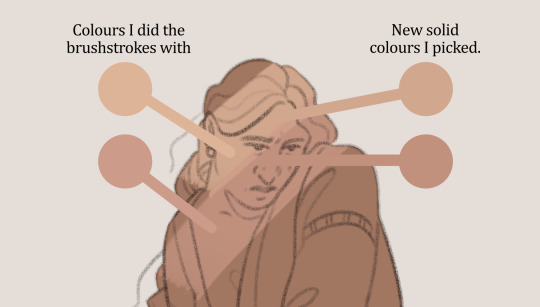
This way the colours become a bit muted & more harmonious (though I also prefer using more muted colour schemes to begin with).
Orange “underpainting” is usually my go-to, especially when doing “neutral” light like in character sheets. If I want the piece to have a certain atmosphere or environment, I might use other base colours. Sometimes I use actual photos as inspiration or guidelines:

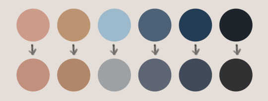
Note that I don’t have strict colour reference sheet where I pick my starting colours from. I’m adjusting those as well even before the sketching brushstrokes:

The skintone’s starting colour (1st one) is redder here, because green underpaint eats some of the redness away as red and green are complementary colours. The blue of the lightest shirt is also darker as the character is more shadowed in the latter version.


Here I used red as a base colour. If I had used skintone’s base colour from the green version, it would’ve been too red. Instead lighter and a bit more orange/yellow tone ends up looking more natural (even though still very red, but it doesn’t stand out that much with everything else also having a red undertone). Hair’s starting colour is also more yellow so it still looks like a blond instead of red hair.
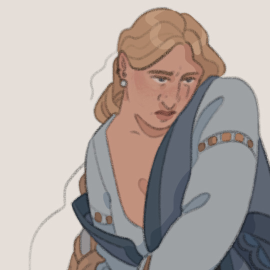
Shadows & other details I do with the same method, just using the picked flat colour as the base colour (so for skin, picking slightly darker & usually bluer colour and painting with low opacity brush over the skintone instead of over only the orange/yellow/etc underpaint)
Here I also did highlights with the soft light layer:

I hope some of that was useful as I’m not native English nor art jargon speaker! This was also mostly my line art process, with paintings (esp. ones that aim for realism-ish look) I look more references from photos and how light & colour acts in them.
And as said, sometimes I miss and the work comes out too washed out. For example these Patreon collection icons came out too dark & colours too similar to each other. Against my dark mode drawing program it looked more vibrant, woops. I edited them a little from here, but should probably re-do them at some point.


#modeling here is my sibling @artist-rat's Erol <3#ask#I don't even remember how long I've been slowly doing this I hope you still see this!
66 notes
·
View notes
Text
Colour Theory, a short talk on something I know nothing about.
I was asked a question on Bluesky recently about how I select my colour-schemes. I had to go away and really think about how best to answer the question because the immediate answer is not particularly satisfying: The honest truth is I just make it up as I go along, relying on intuition and, when that fails, screwing up repeatedly until I get something that works. I think I've said elsewhere, but colour-schemes are the thing I either just get right or otherwise spend an inordinate amount of illustration time on.
That said, I really wanted to provide a good answer to that question, so I went away, delved deep into the vast emptiness of my brain, and managed to dredge up some tips I hope will be of use. I've tried to be concise but it's still way too long for a… 'bluet' or whatever the hell it's called on Bluesky, so it's here instead.

Whether it's mechs or vehicles, I always assign the parts of whatever machine I'm designing loosely into two groups. I don't really have a name for these groupings, because I never have anyone to explain what I'm doing to so, for the purpose of this explanation, we'll classify them as 'ornamental' and 'functional'. The armour or shell, though it may serve a purpose, counts as ornamental, whilst any internal frame, joints, mechanics, pipes etc, count as functional.
So, even if I don't know what the colour-scheme is going to be, I do know when designing the machine that these elements need to contrast one another and, when it comes time to colouring them, I'll set them up on separate alpha-locked layers with placeholder colours to make adjusting them independently possible.
In the case of the ZOE-themed robot I already had an idea and knew it would be coloured similar to an astronaut, to suggest a space theme; so off-white for ornamental, dark grey for functional. Then I figured I wanted to add an 80s vibe to it: the secondary colour would be pink, the third yellow, and then an electric blue for the advisory symbols and notices. Importantly, all of these colours still contrast with the dark grey because they're bright and highly saturated, and the grey is the opposite of those things.
To add some interest to the functional element, but maintain a good delineation between it and the ornamental element, I used a bronze colour for the cockpit and advisory notices, rather than using one of the colours I'd already used. This was used sparingly and also as an accent to separate and draw attention to the head. It is possible to use colours from one element on the other but doing so without restraint could easily result in that delineation of forms blurring and lead to a less appealing image.

Once I've got those colours locked in, I then added the shadows. This is an important step in my illustration process because I usually use very saturated shadows, which can have a tendency to alter how the "actual" colours of the machine will be perceived. The illustration above shows the original shadow colour and an alternative one to highlight how influential this step is; it's a bit of mind-trickery I don't know the theory behind so I'm afraid I can't elaborate on it.
So, I guess I've outlined a process of When things go well but, what about When things go to shit? Well, I can offer two solutions there.

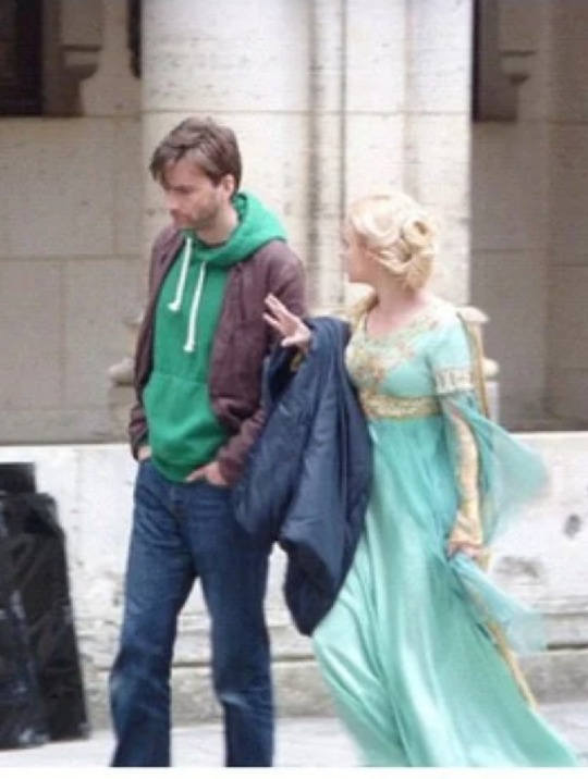
The first one is exceedingly simple: Find a reference. I was recently watching a show and saw the hoody above. The colour-scheme caught my eye and, whilst I totally could remember it, I screen-capped it and left in a folder somewhere. If I'm really struggling, I'll think of something I've seen, like this, and use it either as a starting point or as the scheme itself. So look out for these colours turning up in a future illustration.
Furthermore, if I've got nothing like that to pick from, I'll just cheekily take the opportunity to make a reference to something, like Silent Bomber (illustration below). Nobody got this; when you don't talk to anyone, you tend not to see how obscure your references are.

Then there's option 2: Find a slider and slide it. I do most of my illustration in Procreate which, like most art/graphics apps, has a variety of editing options that simply let you play around with settings and drastically alter the appearance of something. Does that blue and grey look too plain?


Go into the Hue/Saturation/brightness menu and slide everything everywhere until something catches your eye. Or just apply a gradient map and see what happens. The pics above are the original colour-scheme (left) and one (right) where I slid the hue slider and found something neat. I had to touch up the accents but, otherwise, it really was that simple.
Messing around with things like transmuting the livery of an F1 car onto a robot, or wildly flapping at buttons until something happens are great, and valid, ways to learn what works and what doesn't.
Anyways, that's about all I got. My Bluesky is here BTW:
45 notes
·
View notes
Text
Pt 2 of my headcanons 😃
Each of the Heathens have all been forced to get on their knees at least once in their life while Gareth scolded them for doing something stupid (Nikolai being a frequent offender).
Vaughn is level-headed and smart, so Gareth doesn't have to lecture him often as Vaughn doesn't let himself be pulled into their antics (most of the time, at least), but he gets easily manipulative when Yulian is brought up by any of the Heathens, lol. He FOLDS quick.
If Gareth gets into trouble, he always makes sure to only get HIMSELF in trouble (doesn’t like dragging his loved ones down with him), but the rest of the Heathens are always ready to SQUARE UP for him.
They are very protective of Gareth but try not to show it often because Gareth can be very prickly about it. He's basically their princess, but Killian will forever deny this.
Gareth still has the occasional tendency to just instinctively grab Kayden by the throat whenever Kayden is being a shit during a fight (Kayden does not take any of their arguments seriously most of the time until Gareth actually gets upset or starts crying.)
Kayden is very weak to Gareth's tears (even indulges the fake tears); Gareth has learned to weaponize them.
Vaughn regularly breaks into Kayden & Gareth's home to steal Moka but always returns Moka 3 hours later because he also can't stand the feline. Vaughn has a love-hate relationship with Moka.
Moka loves Gareth & Yulian (Kayden thinks the cat has a fondness for blond or smth, what else could be the reason?)
Legally, Gareth is Carson-Davenport, but he goes around introducing himself as just Gareth Davenport.
Alex, Asher, and Killian have all various messy feelings about it (especially Alex, that's his beloved GRANDSON, goddammit!)
Yulian and Ava are basically twin lookalike.
The truth, however, is that Yulian is not a natural blond but has dyed it blond once as a child and he kept it for sentimental reasons instead of going back to his natural black (lol).
Which is a crime because BLUE EYES AND DARK HAIR, Yulian you would have been even more gorgeous.
Cecily and Yulian have regular hair dye sessions and talks for hours over hair care because its hard to maintain both healthy hair AND the colour.
They use the sessions to gossip over EVERYTHING (boys, girls, anime, Landon's latest schemes, their boyfriends' jealous hatred for Landon, etc)
Yulian is surprisingly very responsible, but it's a toss-up on what he's being responsible about and what he's being irresponsible about.
Vaughn has a car back home in NY but rides a motorcycle while attending university with the rest of the Heathens. Vaughn has mixed feelings about Yulian being more obsessed with his motorcycle than Vaughn is. Yulian insists that it'd a good model and has always spent the first 5 minutes of their meet up to run his hand over it.
Unrelated, Vaughn has crashed several motorcycles.
Yulian collectively calls Brandon, Gareth, and Vaughn the "baby gay trio" despite also being just as inexperienced (Kayden had no fucks about being with a guy, the man was so chill in his old age FOR REAL)
While reading the books, Brandon and Gareth seemed very much "gay" and "demisexual" to me. But I thought Nikolai was more pan while Killian was more bi (but it's officially switched, LOL).
Vaughn and Yulian screamed to me as somewhere on the "bisexuality" range, but more like Vaughn is accepting of either genders on a surface level (more girls than boys, but more other boys than Yulian lol) but his dick only gets hard for Yulian
While Yulian is bicurious? The bi being only for Vaughn.
Token straight Jeremy!
If Jeremy gets a nickel every time he is standing in the middle of his friends getting punched by their SECRET BOYFRIEND, Jeremy would get two nickels because Nikolai & Brandon was already shocking enough, but Jeremy's soul left his body when Yulian socked Vaughn in the face for being a very pissy asshole (it was smth about being them being exclusive but them also being JUST fuckbuddies???)
29 notes
·
View notes
Text
lowkey - damian priest

damian priest x gn!reader
word count: 1.9k
warnings: langauge, drinking, implied nsfw, readers age isn’t specified but i wrote this as if they’re around rheas age so age gap warning just in case, scripted violence
after it being teased for the last few weeks on raw, you were finally going to be moving from nxt to the main roster and joining the judgment day, arguably the most powerful group in the wwe today. you were more than excited, considering that you would be in a group with your best friend rhea, as well as just some really cool, talented people. you had been friends with rhea since middle school, and had only met the guys in the group a handful of times, but you could already tell you were going to fit in well. however that didn’t mean you weren’t nervous to be making your main roster debut, tugging awkwardly at your ring gear as you stood with rhea in gorilla.
“you’re gonna do great, salem,” rhea smiled, using your ring name. your gear matched the judgment day colour scheme, black and purple with lots of chains and studs on your ring jacket. the judgement day would be going out first, and then kevin, sami, and jey would pick off the boys, and raquel would attack rhea. all you had to do was run out there and help rhea; easy enough right?
things were going smoothly, rhea and the boys wishing you luck as they passed by you on the way to the ring. damian patted you on the shoulder, and you looked up at the man who towered over you, like you were sure he did most people, standing at six foot five. you had to admit, he was incredibly handsome, his long hair and dark eyes suiting his features perfectly.
“you’re gonna do great,” he smiled, and you nodded, thankful that they all seemed to accept you into the group already.
“thanks. i’ll see you out there,” you smiled, and he gave you a fist bump with his massive hand, and headed out with the others. even though you were on opposite teams in the ring, even kevin, sami, and jey wished you luck as they passed through gorilla, as did raquel.
it felt like only 3 seconds had gone by, when in reality it had been about 2 minutes before your music kicked in, “the witching hour” by in this moment blared through the arena as one of the backstage crew members gave you your que to head down the ramp. you ran out, your anxiety not letting you look at the amount of people in the crowd as you got to the ring and slid under the bottoms rope, pulling raquel off of rhea. the two of you attacked her and chased her out of the ring, leaving just you and rhea standing there. you looked at eachother, and rhea made it seem for a second that she was going to attack you, but instead extended a hand for you to shake. you took her hand in yours, and the rest of the judgment day, who had also scared off their opponents, joined you in the ring. the moment finally sank in, and you looked at the thousands of people in the crowd, and your heart pounded in your chest, the judgment day music loud in your ears as you all exited the ring and headed up the ramp, damian and finn on either side of you with their arms over your shoulders.
once you had made it backstage, rhea stole you out of their grip, wrapping her arms around you in a hug and spinning you around, causing both of you to laugh.
“you killed it! that was great!” she yelled, and the guys agreed.
“how do you feel?” finn asked, and you took a deep breath as rhea set you back on your feet.
“i feel great! i would have been a lot more nervous if you guys weren’t out there with me, so thank you,” you admitted.
“no problem. we’re like a family, and now you’re a part of it too,” dominik said, and appreciated it more than you could say.
“priest, i think you know what time it is,” rhea smirked evilly. “it’s time to show salem how the judgment day parties.”
“say less,” damian laughed, throwing an arm over your shoulder again as they all led you out through backstage, a handful of superstars congratulating you on your debut, before you got to your cars and left the venue. you and rhea were in her car together while the guys were in another, and as much as you already loved them, you were happy to have a moment with your best friend.
rhea passed you the aux chord and you turned on ‘cyberhex’ by motionless in white, and she nodded in approval.
“so now that it’s just us, how are you feeling after your main roster debut?”
“it was amazing. i have to admit, i am a little overwhelmed, since you and the guys are such an established group, but i’m also so grateful to be joining the judgment day. i just hope they like me,” you answered.
“you mean the fans or the boys?”
“both, but i meant the boys. they all seem really cool, i don’t want to intrude on the group, you know?”
“i get it. but they love you already. if they didn’t you would know,” she laughed, and you felt slightly relieved.
“thanks rhea.”
“no problem. you have your ‘initiation’ match next week, right? against raquel?”
“yeah. i can’t believe my first solos match on raw is against her,” you said; raquel wasn’t someone that would go down without a fight.
“you can do this. i know you can, and the rest of the judgment day knows you can too,” she said, parking her car as you had arrived at the hotel.
•••
one thing was for sure; the judgment day knew how to throw a party. it had been non stop celebrations for about 4 hours when you all calmed down and decided to put on a movie. there was only a small couch and an arm chair in the hotel room you were currently in, which was finn’s room. he was in the chair, you, damian, and rhea sat on the couch, and dom was sitting on the floor in front of rhea, who occasionally played with his hair. you knew the romance between them was just a storyline, but their real life friendship was adorable. you were starting to get sleepy as it was nearing three am, and you were cuddled under a blanket from your suitcase, since the a/c in the hotel room was giving you goosebumps, and you could feel your eyes getting heavy.
as damian shifted next to you, his hand bumped against your thigh, and he muttered a soft apology under his breath. the small amount of alcohol in your system gave you some extra confidence, you took his hand in yours under the blanket and placed it back on your thigh without saying anything, your hand over his to keep it there. he shifted again so his leg was against yours, and you cuddled into his side, resting your head on his shoulder as you let yourself fall asleep.
damian shook you awake gently a little while later, and pointed to rhea and dominik asleep in the one bed, and finn passed out in the other.
“i’ll walk you to your room, unless you wanna sleep on the couch,” damian offered quietly, as not to wake anyone up. he stood up first, pulling you up off the couch by your hand, and you grabbed your bag. it wasn’t until you got into the hallway and the door locked behind you that you realized rhea had the key card to your room.
“fuck,” you mumbled, and damian turned around.
“what’s wrong?”
“rhea has the key to our room,” you replied, feeling like an idiot.
“c’mon, you can stay in my room,” he laughed at you pouting, and started walking down the hallway. when he noticed you weren’t following him, he looked back. “no funny business i promise.” you rolled your eyes playfully, but hurried after him as he led you to his room.
“what if i want there to be?” you asked quietly, as you’d caught up to him. damian looked down at you, a little surprised, before placing his hand on your lower back and pushing you gently.
“then walk faster,” he mumbled, and you smiled as you finally reached his room. he unlocked the door and let you go in first, and you noticed that there was two beds. “did you enjoy your welcome party?” damian asked, and you smiled.
“definitely. rhea wasn’t kidding when she said you guys knew how to party,” you smiled, turning towards him.
“party doesn’t have to be over, if you don’t want it to be,” he said, his voice low as he stepped closer.
“what did you have in mind?” you asked, smiling as you felt his hands rest on your waist, pulling you against him. he leaned down to kiss you deeply, and your hands rested on his chest, his arms circling around you. damian backed you up until your legs hit the end of the bed and you sat down. he backed away, staring down at you.
“are you sure you want to do this?” he asked, and you nodded, your head surprisingly clear after the few drinks you’d had; the nap had sobered you up a surprising amount. you slid off the bed and dropped to your knees in front of him, your hands resting on his thighs.
“i want to,” you assured him, and his head fell backwards as your hand slid over the front of his jeans.
“fuck,” his voice was deep as your hands fought over the buckle of his belt, damian eventually letting you undo it as his hands cradled either side of your head. “this has to stay a secret for now, okay?”
“i know,” you smiled. “it’s kinda more fun that way, isn’t it?” you asked.
“you keep surprising me,” he shook his head.
“is that a bad thing?” you asked, undoing the button on his jeans after successfully undoing his belt, and sliding the zipper down.
“definitely not.”
•••
you woke up to the feeling of someone trailing gentle kisses over your shoulder and up the side of your neck, and you murmured softly at the sensation, tickling slightly.
“good morning,” damian’s deep voice mumbled next to your ear, somehow even deeper than usual after just waking up. your legs were tangled beneath the covers, the white hotel duvet the only thing covering your bodies other than the purple love bites that were scattered across your skin.
“good morning,” you smiled, your eyes fluttering open as you rolled over to look at him.
“it’s only nine so i don’t think the others will be awake yet if we want to sneak downstairs before they wonder where we are,” he offered.
“rhea’s gonna figure out that i didn’t sleep in our room eventually. i’ll just tell her i slept in the extra bed. i have to say - this was kind of out of character for me; i don’t think she’ll expect anything as long as you cover those,” you smiled, poking one of the bite marks you had left on his shoulder.
“can do. as long as you hide those,” he pointed to the hickeys on your neck, and you laughed.
“deal. i do want breakfast though, so yes; we can head downstairs.”
“sounds good. you can shower first if you want,” he offered, and you smirked.
“you could join me.” you had no idea where your sudden boost of confidence was coming from, but you felt comfortable with him considering you barely knew him.
“i don’t know how productive that’s gonna be…” he trailed off, kissing your lips.
“is that a no?”
“that’s not what i said,” he smirked, and pulled the covers off of your bodies, dragging you towards the shower.

#damian priest#damian priest fic#damian priest x reader#damian priest imagine#wwe#wwe fic#the judgement day x reader#rhea ripley
340 notes
·
View notes
Text
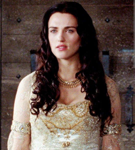
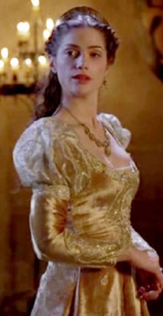
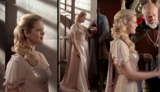
Gwen's wardrobe in season five makes me sad. (I'm not the best at analysing but please bear with me)
Partly it is the fact that it just doesn't look like something she would wear. Like I get that she looks good. She doesn't look out of place in any way, but her clothes just don't suit her.
obviously she looks regal and beautifully. she looks like a queen, but she doesn't look like gwen.
I understand that what she wore before wasn't exactly what a queen should be wearing, but it feels like in costume design they went a bit too far in the opposite direction. all the colours are too dark, the details don't really fit with her personality. her costumes throughout the show are all relatively similar but once she becomes queen it feels like she changes completely. this probably reflects how her personality changes, which I also don't like. you would think that since she wasn't raised in nobility she would be fair and kind, not willing to kill a servant girl just because she overheard a conversation. it feels like they set it up from the beginning of the season for us to dislike her.
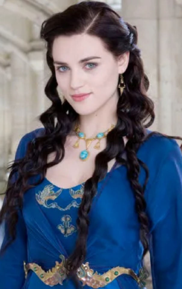
when I think of guinevere I think of costumes like these
these flower corsets are some of my favourite things she wears, and she could have worn something similar when she was queen.
I started thinking, in terms of the show, about why she might have changed her costume design so much and then I thought it might have something to do with respect. swen was a servant turned queen, and probably a lot of the people of camelot wouldn't have liked this much. you know, tradition and shit. so she probably drew inspiration from the other nobility she knew and decided to dress like that. for example, a lot of what she wears is similar to what Morgana wore.
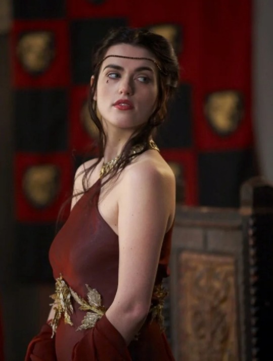
like, obviously thay aren't exactly the same but it feels like there is definitely inspiration here.
this is probably because Morgana was respected (obviously before she because evil).
a lot of the female nobility/royalty clothing we see from camelot and the other kingdoms is Morgana, although we also see this from other visiting people, such as vivian, mithian and elena.
(best picture I could find of her full dress)
obviously elena is wearing a wedding dress here but she is literally marrying Arthur (who gwen married which is why she started wearing these clothes in the first place), and we can see that this colour and style is available to her class.
mithian and vivian are both wearing lighter, more delicate styles, and I get that these aren't anything I could see gwen wearing either but it's definitely closer than what she's actually wears. need I remind you that mithian was supposed to marry Arthur as well?
one thing I could find that is similar is literally gwen's coronation dress. while not exactly the same, it does seem very similar to somathing Morgana wore when she became queen
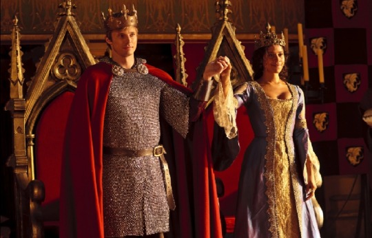
I feel like the purple and the gold colour scheme seem quite similar, as well as the sleeves and the general embroidered decorations.
I do also feel like this might be the most similar to gwen's original style that she goes in terms of her costumes as queen. it's a lighter colour and the gold decorations feels less heavy than when it is mixed with a darker fabric. this dress is more silky and delicate, rather than one of the first things she wears in season 5
the gold appears to be maybe a darker shade of gold especially when mixed with the maroon colour of the dress. this dress is clearly perfect for a queen, but it just doesn't feel like gwen. (not necessarily connected to Morgana jsut another point)
i guess what she was trying to do was remind the people of camelot that she was to be respected, and she knew how much people had loved Morgana. vivian and elena, on the other hand, were not. they were only in camelot for a short time but in that time they didn't really get people to like them. vivian was rude and elena was a bit 'weird' to them (not sure how else to describe their reactions to her). gwen didn't even meet mithian because she was in exile (another reason she needed people to respect her), so Morgana was the best person to take inspiration from.
the connection to morgana's outfits could also represent the connection between them later in the season and when gwen is under her control
overall, I think they did gwen dirty in the final season and she definitely deserved better.
#merlin#bbc merlin#gwen#guinevere#Arthur pendragon#Morgana#merlin analysis#tv show analysis#lady vivian#mithian#analysis#costume design#merlin season 5#Queen guinevere
82 notes
·
View notes
Text
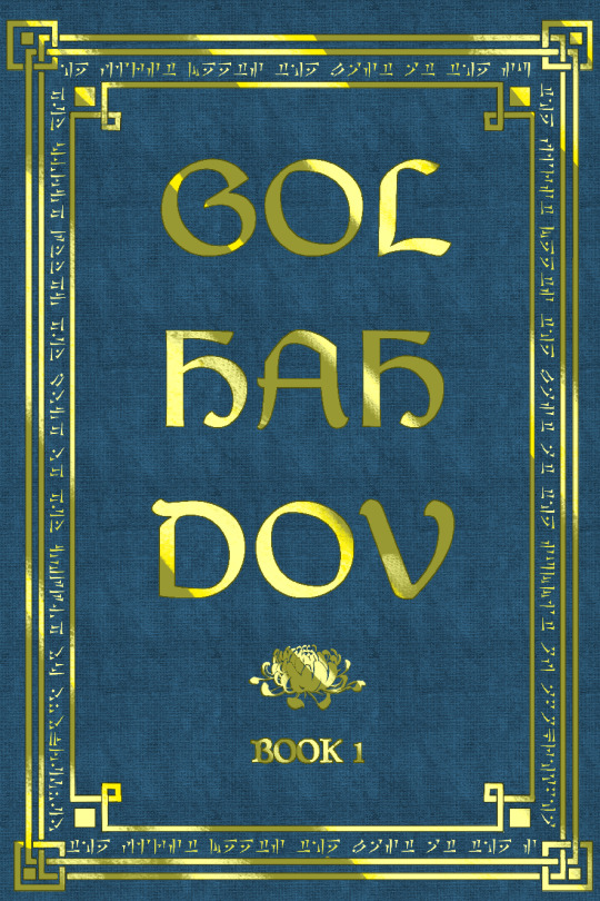
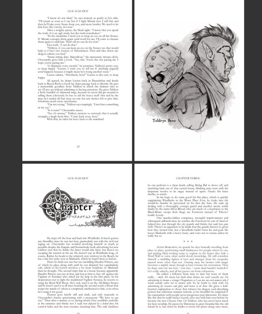
My Gol Hah Dov book project!
@99corentine
I have an enthusiasm for hardbound books and decided I want to turn Gol Hah Dov into a physical book.
I wanted to share with you the final project as well as my design inspiration and thoughts:
Cover design I wanted a hardbound book, with cloth and foil inlay like the mockup I made below. I modeled book 1 after Chrysanthe and drew a chrysanthemum for the cover as well as a blue and gold colour scheme.
The inspiration for the border comes from the skyrim artbook as well as the in-game "book of the dragonborn" The dovahzul in the frame is Miraak's quote from the dlc "The first Dragonborn meets the Last Dragonborn at the summit of Apocrypha" (or at least the first few words because I ran out of space, but it's the thought that counts.)
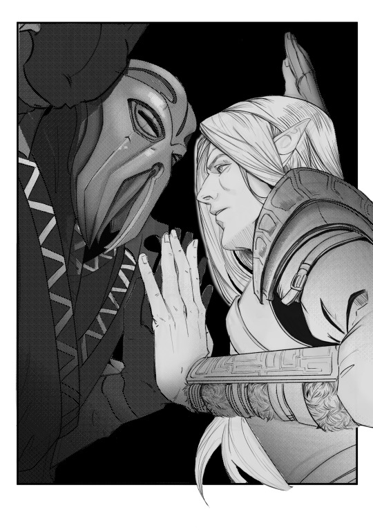
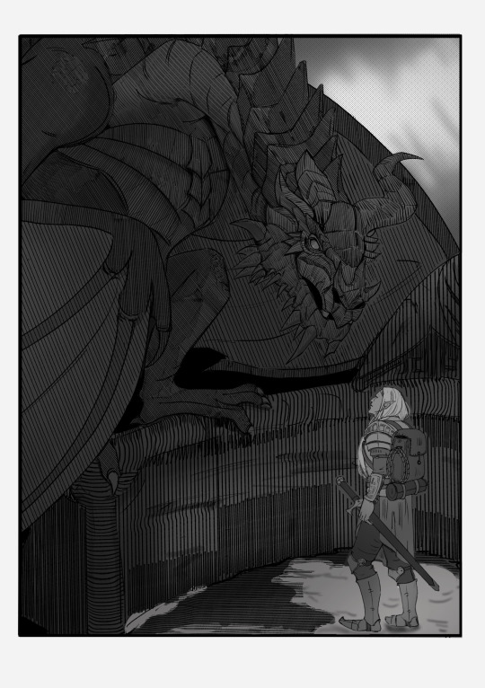
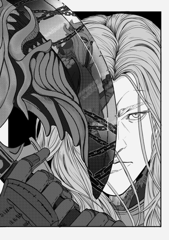
I chose some of my favourite parts of the story to use for key illustrations.
They are:
Chry meets Miraak in Apocrypha for the first time and a mute Miraak slams the wall while Chry is looking for him in the dark (I need more romance to be introduced as horror, thank you)
Chry meets Partysnax, I think you wrote him very true to character (and maybe I just wanted to draw the old boy)
Chry sets Miraak free by using the gol hah dov shout on him and beats Mora's ass with the rueful axe, I loved how all the little plot points came together for this one. ( the shout breaking mind control, the axe cutting a daedric prince, the hints of Mara assisting Chry, you are a genius)
Storm call dragon fight! I always thought storm call is such an OP ability if it would exist irl and is one of the shouts that really shows the power of a dragonborn. And you made them do it twice, such a great moment.
Chry communicating with Mora underwater. One of the best moments, and also my favourite drawing. Also just for fun here are the horrible thumbnails of the art:
Each chapter also has a Chry-inspired decal. I used chrysanthemums for him as well as using the design for Mara from the game, and the main mission quest marker from the journal:
The thumbnails:
The final ones used:
Each chapter has the number in english and the name of the chapter in dovazhul just for fun.
The sketches through the book I initially wanted to make in the style of skyrim concept art, like so:
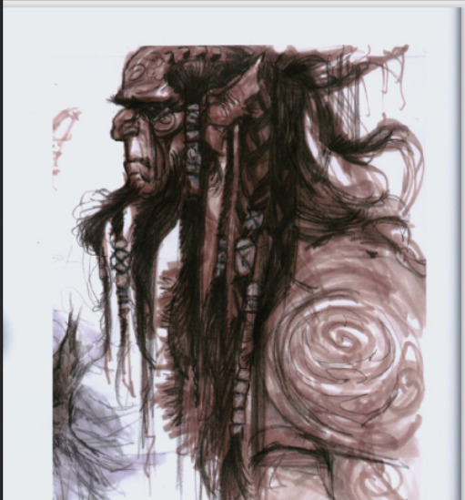
But the style of the concept art and the style of the book was a bit too different and I felt it didn't look good with the use of red colours so I ended up with a more loose b+w style like the Teldryn one.
For the chapters where you had translations at the end I wanted to make a little dictionary design:
I based this design off the in-game miscellaneous quest markers.

74 notes
·
View notes
Note
Ohhh Fizzyyyy~ ✨
While researching Doffy's Looks, I noticed something sad about the DQ Brothers and I have to make everyone elses a bit sad with me ~ 😌
And someone else has probably pointed that out already
About the color reverse with Doffy and Rosi, it only happened after Doffy shot his Brother ! (Actually it happened when Doffy ruled Dressrosa, but let me have this!!! )
Before The Incident™ we see Doffy in two magnificent fits.

This one: white trousers, black shirt, bit of red and dark pink on his pants. Similar colors to Rosi over all, but not a color reverse. Not sure about the timeline right now, but the colors might symbolize Doffy being happy his little brother is back and therefore making them wear similar colours to show it (let me have this 😩plz)

And then there is our beloved Red Suit Doffy. No White in sight, just Black and lots of Red (= blood = Family and death). He feels betrayed by the only Family he has left and there is only one solution for him! 😩 Bang bang.
And only after Doffy realized what he has lost, he subconciously choose to wear his brothers colors! ( I know it was Odas choice to show the parallels with the Brothers in the Dressrosa Arc, BUT let me-)
Anyway ✨✌🏻 i just wanted to point this out !
Have a loveley Day, Fizzy 🦩
PS: Its totaly off topic but I headcanons Doffy with a bellybutton piercing. Let me ha-
Hello, Coco ~💕✨🫶🏻
I love this. First of all, these two pics made me swoon North Blue Doffy is so handsome 😍
We will ignore that Oda designed Doffy first and only later decided to make Rosinante (in Oda's first ever sketches of Doffy, Doffy was a single child! But man am I glad he changed his mind) and used Dressrosa Doffy's clothes colours but switched them for the base of Doffy's brother because clothes are another writing/artist tool- as a writer, what better way to speak to the audience than through clothes? You get to say soo many things with clothes, especially in manga. Clothes are such a simple tool and yet a great tool to show the connection between characters while also giving them their own style!
However, let's ignore that entire "Oda created Doffy first" which and focus on how the characters feel and what made the characters pick their clothes.
And you're right. Now, why Dressrosa Doffy reverse clothes colours scheme for Cora? Easy. Audience. By now, it's been (counting from ep 608 when post-timeskip Doffy aka Dressrosa Doffy is revealed) 100 episodes that the audience has seen Doflamingo dressed in those clothes, white shirt, pink coat. The moment we see Cora, our minds need to go "that's Corazon, that's Doflamingo's younger brother" at FIRST SIGHT of Corazon.
So, Oda does the colours the same but on different clothing aka if Doffy has a white shirt, Cora will have white pants. If Doffy has a pink coat, Cora can't have a pink coat but his upper body needs to wear sth pink. Pink shirt with pink hearts. Genius. Oh, and the biggest "THIS IS DOFLAMINGO'S LITTLE BROTHER" sign? Feather coat like Doflamingo's just a black colour. Oda coloured Cora's coat black but I love the purple of the anime too cus it's literally on the colour spectrum right next to pink. I think Oda made it black but myb it was originally purple but the amount of times Cora lit it on fire just made the poor thing turn black. Though, there is the entire thing with flamingos. They have black feathers underneath their main pink feathers - it's the black feathers that help them to fly.
North Blue Doffy
I think the moment Doffy hit 21 (that's the legal drinking age in Japan) he switches to suits/more formal wear. And yes, you're right about Dressrosa Doffy being the reverse clothes switch of Cora aka after his brother's death. Doffy liked red a lot to go with his wardrobe.
This is how he dressed at 17 (I love it, it makes no sense and I love it) at Roger's execution. Maybe it was hot that day, but it did start to rain later but it was probably summer rain anyway. But I can totally see this being 17 year old Doffy's everyday fit.

So, sometime later when he reached 20 and he became the young pirate underworld businessman as Law (and we, the audience) meet him later as in North Blue, he switched to formal wear. Doffy likes luxury. He's a Celestial Dragon. Also, I like to think the climate of North Blue doesn't agree with him, so he goes for long sleeved shirts such as dress shirts and the full red suit. Of course he goes for suits. They can also make him appear less dangerous than he is while giving him an edge over other pirates who dress... Well, like pirates 🤣
So, when Cora came back (Doffy was 24, Cora 22) of course Doffy will try to colour match somehow. Ties are a no go. First, he needs EVERYONE to know that this clumsy pyromaniac is his wonderful cute little brother! And how does he do that?
COAT.
Doflamingo already probably has quite a bounty on his head even in his North Blue days (probably a 100,000 berries or a bit more, I think it skyrocketed to its 320 mil. when he attacked the Heavenly Tributes). His coat is probably INFAMOUS. It's what other pirates recognise him by. You see a big pink feather coat? Oh, that's Donquixote Doflamingo.
And so Doflamingo wanted everyone to connect Cora's black/purple(in anime)coat to "this is Doflamingo's younger brother, Corazon"
It's not known whether the pirate world is aware that Corazon is Doflamingo's younger brother,but I'd wager the answer is a big NO. They think as Doflamingo's right-hand man, it comes with the perk of wearing a feather coat 🤣
In short, I am a 100% sure Doffy picked Corazon's outfit.
Red Suit Doffy being = blood, family, death you get it Coco, you get it. 🥹🫶🏻
I love being delulu thinking Dressrosa Doffy subconsciously chose to wear his brother's colour scheme but reverse and with his own twists cus wtf are those pants colour, Doffy what fckn colour is that, Doffy. I fckn love it but what fckn colour - oh even that is just a lighter shade of Cora's beanie, just shoot me.
I mean, I know it's probably not true that he like subconsciously chose them cus of Cora, but I totally get you, Coco. Even if Doffy most likely chose them cus he likes them+white dress shirts are always worn by royals (thinks Sanji's outfit in Whole Cake) I support being delulu���🏻🫡
Thank you for the ask, it hurts but it's worth it. 🫶🏻💕
But maaan, all this clothes talk is just making me wonder if Merlot & Primroses Doffy would be so terrible (at least it's in Reader's POV how Reader would understand it) to give Reader Cora's extra black feather coat fitted for her. Or myb the opposite, sth that he tries to erase Cora's presence with...
Where are those American flamingos...

A feather coat like this colour? It's such a close shade to pink but is its own shade. Like, the people will be thinking "there is a connection to Doflamingo" and that already is bad enough the moment they think that
Plus, the Chilean flamingos have their tail feathers in a darker pink colour too!

And some flamingos have black tail feathers, too (prob why Oda drew Cora's coat black (or bcs of the underneath black feathers as I said), now that I think about it).

Aaah, thank you for making me cry over DQ brothers again, Coco 🫶🏻🥹✨💕
And you may or may not have made me think about how to make Merlot & Primroses even more angsty, though I for some reason don't want to give Reader any feather coat. Those things can be HEAVY.
Doffy with a bellybuton piercing 😳😳 oh my 🫣🫣 that is so cute 🥹🥹
#one piece#donquixote doflamingo#donquixote rosinante#doflamingo#doflamingo one piece#donquixote brothers#asks#moots: coco 💕
24 notes
·
View notes
Note
i feel sooo dumb asking this but how do u make the text a color gradient on ur posts / a color you actually want?? i feel like the colors we have available are soooo drab

aw no don’t feel dumb for asking,, we all start somewhere & i’m super happy to help ૮꒰ྀི⊃´ ꒳ `⊂ྀི꒱ა !! ( as i was once in your shoes as well & had to figure it out all on my own with a bunch of v v v helpful posts from like 5-6 yrs ago T^T )
this is gonna be really long bc i wanna be as transparent & as helpful as possible so be warned pfftttjsfhdjh

but yes i so agree w/ you that the very minuscule, very . . . neon . . . colours aren’t really to my tastes either T^T so for colour picking i normally find a picture to use for a general ~vibe~ ( ie. the gif in my pinned, i took a still and uploaded it to this website [https://imagecolorpicker.com] & individually picked a light to dark green gradient i was happy with ^^ )
however you could also generate a gradient you’d like from this website [https://coolors.co] & randomize it until you get a colour scheme you fw (˶˃ ᵕ ˂˶)
oooooor you could just manually go through various pinks, blues, greens and purples on this website [https://htmlcolorcodes.com/color-names/] & pick a light to dark gradient all by yourself ദ്ദി ˉ͈̀꒳ˉ͈́ )✧
as for actually colouring the text, this website has been my holy grail for like a year now [https://www.stuffbydavid.com/textcolorizer] and it’s v straightforward. just input what your text is in the textbox, pick the gradient effect ( for my post I used the three coloured gradient ) , input the hex codes of the colours you selected going from light to dark ( or vice versa if you wish )
do not bother with anything from “step 4”, look at the preview of the text and if you’re happy with it , copy the entire box from the HTML code section.
then you’re gonna open tumblr and create a new post but instead of directly pasting it on, you have to click the gear icon on the top right to toggle settings and go to text editor and click the ‘HTML’ option which will bring you to the coding ( i think ? T^T )
& that’s where you’ll want to paste what you copied earlier , and if you don’t want to change the font you can click “preview” and see if you’re happy w/ it & save the draft and add to your post as normal once you toggle back to "rich text".
& the final result should look like this : haiiiii :3
however, if you are like me, and want that extra little flourish, you can literally just search up " font copy and paste " and like go to the first site or wtv & type in your text and copy the font you wish.
however it gets a little convoluted and time consuming in regards to pasting it (if you use a gradient), because you have to individually replace each standard font letter with the desired font letter like so until the entire word is replaced w/ ur desired font ^^
& the final result should look like this : 𝒉𝒂𝒊𝒊𝒊𝒊𝒊 :3
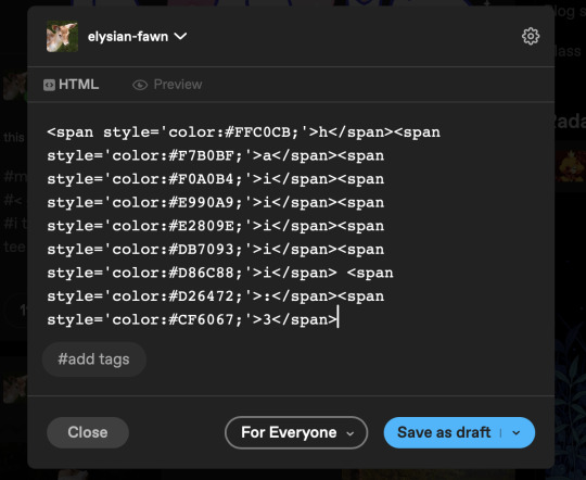
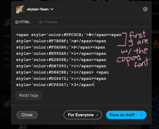
but, if you only do a solid colour it's much easier to replace the text as in the html side it'll look like " <span style='color:#DB7093;'>haiiiii :3</span> " & you can easily replace the whole text [ in this example "haiiiii :3" ] in just one easy paste [ with "𝐡𝐚𝐢𝐢𝐢𝐢𝐢 :3" in its stead ]
ALSO ! my biggest tip would be to make two separate drafts bc it gets so confusing for me personally when i see the coding for the large text wall on the rest of my post. so what i do is just make a separate draft of the coloured text, copy the final result then paste it onto the draft i'll actually post ₍ ᐢ.ˬ.ᐢ₎
very slight disclaimer though, i majority use tumblr/format my posts on the desktop version, so i'm not entirely sure if this is applicable on mobile ( in regards to the html toggle on tumblr ). regardless i hope this was straightforward & easy to follow nonnie ,, here's to gracing tumblr w/more visually appealing posts 2025 o( > ᗜ < )o ₊˚⊹ ᰔ

#𓂃 𓈒 𓏸 𝚒𝚗𝚋𝚘𝚡 𓆟 • . ˚#this is a very imperative skill set to have when writing fanfic so you can have a visually appealing layout#. . . speaking from experience . . . don’t ask ໒꒰ྀི๑﹏๑// ꒱ྀིა
29 notes
·
View notes
Text
My thoughts on every song in the grand final, in running order:
Norway: just a good pop song, but definitely one of the better ones this year. Somehow it’s live better than in the music video
Luxembourg: this is so cool, I’m not sure about the beginning with the doll house but we leave that soon enough, and her vocals while being basically manhandled around are so good. Best song in French this year.
Estonia: this is really the only one this year that I can’t stand. Just vocally and his vibe is weird and the song is just not my thing. But boy can he dance
Israel: the voice is amazing and I like the language changes (the switch to French is so smooth I literally didn’t notice it at all the first time I heard it) but other than that it’s just a typical Esc song we have ten of every year
Lithuania: they really managed to make it better, I love the “tavo” getting louder before the band comes in hard. Also the singer is so pretty esp with his hair in the wind like that. I haven’t listened to this song too much because it just makes me feel things that I don’t want to feel all the time
Spain: kind of typical Spanish pop song. The chorus is Very Schlager-y. It also kinda reminds me of mimi cat of Portugal? I have no idea where this could end up
Ukraine: I liked the lowkey national final performance better but the hazey colours make it stand out I think, and I like the lighting bug being passed around. Pretty much flawless as expected
United Kingdom: they look like Disney princesses! And sound like it too! I’m a uk apologist anyway and if they don’t get into the top 10 ok maybe top 15 then I’ll throw something.
Austria: I cannot express in words how perfect he and his voice and the song and the staging is. The last electronic part?? And if you watch the video at 1:45 the switch from the low part to high??! I was shocked.
Iceland: this is just fun all around. The part in the boat where they flip through and the Minecraft squid flying on my screen is great. Nothing much to say except I love them
Latvia: This is perfect except I would have kept the lighting more dark the whole time to keep more of the mysterious forest fairies vibes. This is what the crickets and frogs sing on the first warm night of the year
Netherlands: I wasn’t into this song at first but it grew on me, its an earworm. ce lalalalala vie. Second best song in French this year.
Finland: I’ll be honest I like the song but the live performance doesn’t do it for me. Also I’m of the opinion that using just three random words in another language is lame. I don’t know why they’re even there. At least make a whole verse in german. The giant microphone is still wunderbar though.
Italy: I love the chill vibes and the long piano. Best song in Italian this year.
Poland: I still don’t like the long yells but the rest is good. Also her stamina to do all of that *gestures wildly* while singing is craaaazy. One of the better songs sung by women in skin tight black outfits.
Germany: I can’t really connect to this song like at all. My guess is that it comes from knowing the language which seems ironic. I’d give a lot to just hear this song without knowing a word of german. But anyway her voice is much better than in the nf and the performance is great so I can hope for a good place.
Greece: I wish they had kept the blue colour scheme instead of using red! Greece is blue! The flag is blue! As a fellow glasses wearer I like her but the song again is just one of those songs we hear every year ten times. I wouldn’t say boring but also not exciting.
Armenia: I knew it would qualify once I saw what they’ve done with it. Not my favourite but there’s not much Rock this year so I think it could go far.
Switzerland: third best French song in this final. It’s boring and slow and quiet but it’s so extremely boring and slow and quiet that it sticks out again. She’s cute also. I like the focus on her face that no other song really does that much.
Malta: really serving Cu Singing, Best entrance of anyone. Bop that we’ll talk about for years. Diva not down. Very good.
Portugal: one of my favourites and I’m so happy they qualified. Just a cozy chill but not boring song that gets a bit bigger towards the end. Love the guitars. Gives the vibes of some local band doing a concert in a backyard on a warm summer evening.
Denmark: very Schlager-y again. It’s kind of a neutral one for me, I like her energy but I feel like I’ve heard it before.
Sweden: I think I liked the melodifestivalen version better just because the stage was smaller, now it feels like there’s a lot of empty space? But they still are amazing. Often we hear that musicians send something worse or completely different than their usual music to Eurovision but I’ve listened to KAJs whole discography and I can tell you this is exactly their thing, and not even their best song. Absolute banger, the only reason I don’t super want them to win is bc I didn’t like swedens hosting job last year. I hope they get even bigger than they already are and get so popular that kids in Sweden start speaking in their dialect bc that would be hilarious. Also watch their musical gämbamark its on YouTube and the bois all play in it.
France: France coming in with by far the worst completely French song in this final. Like Switzerland is boring but at least they’re trying something that no one else this year does with the camerawork. France is sending the same boring frenchiest French song but they’re not even trying to do something cool with the staging. Just making up a staging that takes four times longer than anyone else’s to build. Also People will be like “uh Lithuania is just repeating Tavo the whole time” but when France repeats maman for ages it’s good I guess. To say something positive she sings quite well.
San Marino: this will be such a vibe shift. Fun, energetic, banger, deserves to be here. Second best Italian song.
Albania: the live version finally sold it for me. Good voices good staging good song I honestly just find her dance a little goofy. But i’m sure it has some cultural meaning or whatever.
#eurovision#eurovision song contest#esc 2025#eurovision 2025#the more I wrote on France the more I realised that maybe I don’t hate Estonia that much
11 notes
·
View notes
Text
ᨒ⋆˚࿔ King Paimon ˚⋆ᨒ
[disclaimer, I use He / They to refer to King Paimon]
Today I was going to meditate with Archangel Cassiel, but instead I was heavily pulled towards meditating with King Paimon. I think it went quite well, so I decided to share it here.
When I was first gathering all my stuff, I had this strange feeling I needed to give something. Now of course I would've given Him an offering of a libation, maybe some water or a tea. It instead ended up being some purfume, which I initially found odd; but it turned out that He quite liked it. It's a smell that reminded me of Him, and the bottle was purple, a colour which I associate with Them being royalty.
[insert me having to decipher my own writing]

Meditation Session I made sure to face West directly, I had open His sigil on the front page [of my dedicated book to Them], the repeated His enn quite a few times. I was mainly trying to focus on the sound of the aircon and not the song stuck in my head. Then I felt like King Paimon ['s energy] appeared, so I tried to really clear my head to remain respectful, and focus entirely on Him and His energy. The colours orange and purple came up a lot, colours that I heavily associate with Them. Then it felt as though I was on a camel, King Paimon's one. I started sawying, because it just felt natural to do so. I then invisioned His sigil, my eyes tracing over the lines so closely, moving with them, so I could create the image in my mind - it was very relaxing. It felt as though King Paimon was in front of me, on the camel, controlling it of course. But it felt as though I was resting my head on Their back, almost falling asleep. The area surrounding us felt very familiar as an Australian, it was half bush / outback and half desert. The town hall in which I usually find us in was there, seeing it from the outisde. We'd stopped there, it felt like there was a random bonfire there too, and there were two figures standing in front of it; I know the accompany King Paimon when an offering is made, but I regretfully can't remember their names. We had gotten off the camel by this point. And either I was getting closer to the or they were getting closer to me, because the shadowsgot bigger. Then a hand reached out to me - King Paimon's, and I was snapped out of the meditation. I believe King Paimon said a few things to me during all of this, but I'm not confident enough to discern whether what was said was Him, or just my mind. Either way, I could tell He was pleased? I think by my offering and conscious effort to bow. THANK YOU & AVE KING PAIMON
After researching, I remembered that the two 'figures' that were there were most likely the two Kings that accompany King Paimon; Labal and Abalim.
Also at the end I mentioned bowing. I forgot to mention that I bowed when I felt King Paimons presence. I have been actively trying to remember to bow / show physical respect when in His presence; They demand respect for Their title and I will happily oblige.
Here are some pics from the vibe of what I visualised. The house is more dark brown on the outside; and the bonfire was almost right next to the house. And of course there were two figure not just one.


I'm very grateful for King Paimon being so patient with me; I feel as though He'd much rather me go very slowly than rush things and mess something up. In the grand scheme of things I'm still very new to demonolatry and still learning everyday, so I appreciate the (distant) kindness that They have shown me. I say distnat because that's how it feels, like when someone is still kind but more detatched - of course this is because I do not have so much of a bond with Him yet. And that's okay. I'm very excited for the future, and what King Paimon will be able to teach me. Anyway, I hope you're all well! -> divider by @/k1ssyoursister
Ave King Paimon!
16 notes
·
View notes
Text
Love Nikki 10th Anniversary Hell Design Review/Discussion

Since it's the 10th anniversary of Love Nikki’s Chinese server today, I thought I'd look at the new hell’s suits and review them! The suits are all based on people and places from the game’s main story, so the character/place names will be in brackets after the suit names. Also, credits to the official Love Nikki Discord for name translations!
Note that I'll only be looking at the hell suit designs, not their prices, breakdowns, etc. I'm also not looking at anything 10th-anniversary-related outside of the hell for simplicity's sake as well.
Spoiler warning for volume 1, once again these suits are based around people and places from the story so they contain some pretty major spoilers.
This took me a while, so please check it out below.
Ballad of Lingering Clouds (Wheat Fields, Apple Federation - Bobo)
This suit is based on the Wheat Fields in Apple Federation, where Nikki first arrived in Miraland and met Bobo for the first time. Obviously this design goes all-in on the "wheat field" part, with wheat and floral motifs all over the dress, headwear, and umbrella, but I absolutely love that about it. In my opinion it manages to capture such a nostalgic and pure feeling with its various shades of dull yellow and cream. I also love what they did with the people made of clouds in the background, to me it makes it feel like the suit is embarking on a new journey with more to be discovered ahead. All in all this feels very representative of the beginning of Love Nikki and the time in which Nikki and Bobo meet. That being said, I think this suit could do with a few adjustments. The green on the end of her dress and coat feel out of place with the rest of the colour palette to me, being way more vibrant and saturated than anything else in the suit. Though it definitely would have been too monochromatic with the same yellow there as the rest of the suit, I think a brown or even just a less saturated green would have been more fitting with the wheat around her. Also, her singular glove feels strange to me - why is she wearing a ring over her glove? And why is she using a glove but holding an umbrella in her ungloved hand? I think switching the glove's hand or giving her 2 gloves instead would have made much more sense for this outfit.
Overall I'd give Ballad of Lingering Clouds a 7/10, I really like most of it but there are a few elements that feel out of place.
Sea of Neon Dreams (Wintermount, Lilith Kingdom - Yvette)
This suit is based on Wintermount in Lilith Kingdom, and the time Nikki spent at the Designer’s Tea Party with Yvette. This is the point of the story in which Nikki becomes determined to be a good designer, and I think this suit’s numerous design-related motifs capture that nicely. I love the various tape measure, button, and stitching patterns throughout, plus her expression and background ornaments really capture a sense of wonder around designing. The little heart details on the dress and headwear are also very cute. However, the colours here are an absolute mess. The reddish-purple of the gloves does not work with the bluish-purple of the dress at all, and the dress barely even works by itself either. Having such dark purples touching these very light pinks is such a strange choice, and it throws off the entire outfit for me. I think this suit would have been much more aesthetically pleasing if they had chosen pink OR purple, rather than using both in various places.
This suit could have been really nice, but the extremely messy colour scheme really brings it down. Overall I'd give Sea of Neon Dreams a 6/10.
Sound of Heaven-Shaking Tail (Cloud City, Cloud Empire - Lunar)
This suit is based on Cloud City in Cloud Empire, and the moment of Lunar's death (rest in peace you will live forever in our hearts and my Dreamweaver menu). We've gotten quite a few Lunar suits post-death at this point, but I think this one does a really good job at capturing that moment. The giant bolts of lightning and strong lines throughout the suit do a great job of representing the pain and anguish of the moment. I also love the use of Lunar's main motif, a blue phoenix, as a giant bird behind her which in my opinion manages to capture such subtle but strong sorrow in its expression. Personally, I am not a huge fan of the yellow-blue combination they used here, but the large contrast between them definitely manages to give a very dramatic impression of the moment it represents. The detailing across the outfit is also very impressive. I love the wing/feather details throughout the headwear and dress - this alongside its gracefully flowing fabric almost makes it feel like the suit itself is a phoenix as well.
Outside of the colour scheme, I don't see many ways in which this one could be improved. It is a highly detailed outfit with a lot of thought put into its presentation, so I’d give Sound of Heaven-Shaking Tail a 9/10.
Recollection of Skies and Rose (Oren City, Pigeon Kingdom - Ace)
This suit is based on Nikki’s time in Pigeon Kingdom with Ace. To be honest, I'm less familiar with this part of the story than the others, so I have less to say here about its relation to the events and character it's based around. However, I absolutely love this suit's design. Being a primarily white outfit, it's easy for it to appear washed out or bland. However, the small pops of purple along the dress’s hemline as well as the green corset and colourful headwear really make this suit shine for me. The colour scheme as a whole feels very fresh and light, reminiscent of an early spring morning. The hairstyle also feels perfect for an upper-class Pigeon lady, and the accessories are all gorgeous. The one critique I have is about the suit’s perspective, it looks like we have a bird's-eye view of her directly on top of a pond, but she is also sitting on the edge of a flowerbed which feels a little strange.
Despite not really knowing the lore significance of this suit, I’d have to give Recollection of Skies and Rose a 9/10 as well. I absolutely love this outfit as a whole, it's definitely my favourite from this event.
Live2D: Moment of Blooming Miracles (Nikki)
This suit is based around Nikki herself, showing herself through the years (with the suit animations including child and teenager versions of Nikki). I'm glad they included Nikki in this hell, considering she's the main character and all, and the base outfit here is really cute. The shades of pink they chose feel like a perfect representation of Nikki and the little scribbles around her are adorable. I absolutely love the dress and its gradual shift from white to pink, it feels simplistic but very elegant in my opinion. However, I think this suit's Live2D animations are fairly disappointing. While I appreciate the idea of having younger versions of Nikki included in the suit, their appearances here feel out of place, especially since these 2 younger versions of her don't exist in Love Nikki’s story at all. The suits used for these sprites are also not very notable in Love Nikki’s history, being a children's day event and a free login suit, and don't really fit with the original Live2D’s colour palette. I think it would have been more effective to use Nikki’s numerous story and hell sprite outfits instead, all of which are also pink, achieving a similar effect with more relevance to the game and a more suitable colour palette for this outfit.
If this was a free, non-animated suit I'd be extremely happy with it. However, because of its place as a Live2D with disappointing animations, I'd give Moment of Blooming Miracles a 7/10.
Minor suits (Ruin Island, Ruin; Ash City, North; Wind Valley Forest, Wasteland)
Since these are minor suits I have a lot less to say about them individually, so I've put them together here instead. It's definitely disappointing that these 3 nations got sidelined as usual, but I understand that they're less important to the plot so they didn't want to use them in place of the other 4 nations.
I love the Ruin suit’s colours and the magnet theming is pretty cute, I especially love the shape of the hair. The recolour is a little bland being fully black and white, but I appreciate that it's very different from the original and not just yellow or purple like most other ruin suits. I'd give the Ruin minor suit a 7/10.
The North suit feels very generic to me, I feel that a lot of North Kingdom outfits are very similar to this one. I do really like the top’s shape though, the lower part that drapes down to below the waist is especially nice with the red on its inside adding some much-needed colour to an otherwise very monochromatic outfit. I do find the recolour a lot more compelling, but it still feels fairly generic to me. I'd give the North minor suit a 6/10.
I really like the wasteland suit’s original colour scheme, it feels very fresh and reminiscent of something like a watermelon. The dress hem has some really nice details as well. However, the fur at the top of the dress feels severely out of place, with the rest of the suit comparatively being very flowy and light. Moreover, I fear that (like many other Wasteland suits in this game) it may be misrepresentative of its source culture, using a dream catcher at the suit’s waistline. I could be wrong about this so feel free to correct me if you are more well-informed about Native American culture, but after minor research of the culture dreamcatchers originated from this suit does not seem to be inspired by their people at all. To me this makes the dreamcatcher seems more like a generic “ethnic” motif rather than being something properly researched and considered together. I'm also not much of a fan of the recolour, its earthy palette is very unoriginal and generic for Wasteland suits. I'd give the Wasteland minor suit a 5/10.
Conclusion
Overall, this hell is quite mixed for me. I absolutely love Sound of Heaven-Shaking Tail and Recollection of Skies and Rose, but the other 2 major suits, the Live2D suit, and the 3 minor suits all have a few issues each. Nevertheless, I am very glad they made the 10th anniversary event so heavily based on Love Nikki's storyline, it feels nostalgic and it's nice to see moments of the main story represented in such large-scale suits. As a whole I think I'd have to give this hell a 7/10.
Thanks for reading and feel free to share your thoughts in a reblog or comment! I'd love to see everyone else's opinions on this event.
#tumblr hates me this is my third try uploading this#love nikki#miracle nikki#nikki up2u#nikki games#nikkiverse#design#design review#discussion
16 notes
·
View notes
Text
Livery Watch 2025: Predictions & Wishlist
(to the rough tune of The Boys Are Back from High School Musical 3) 🎶Livery Watch is back! Livery Watch is back! (Oh yeah)🎶
Not gonna lie, I have very much enjoyed the F1 Winter Break of 2024-25 - so much happened last season that I personally really needed it. But! As we know the F1 grind never stops and the big F1-75 livery launch show is tomorrow! So it's time for me to dust off Livery Watch for another season.
As ever, my first post of the year is always a combination of my wishlist and a vague attempt at predicting what each team's core livery for 2024 will look like. I'll then reblog this post with my thoughts and ratings of each livery, to see how right or wrong I was. And I'm not trying to think about how potentially stressful tomorrow is going to be with all 10 liveries in one night but that's for tomorrow me.
So, let's get into it!
McLaren: I feel somewhat filled with subdued confidence that McLaren are going to carry on with a half-papaya orange half-exposed carbon livery as they have done for the past two seasons. In an ideal world I would like more papaya and less carbon on the car, but after the Alpine debacle last season I will accept literally any amount of paint on the car.
Ferrari: The law of averages says that if you do the same thing over and over, it'll eventually happen. So for the third Livery Watch in succession I am once again asking for the return of the Tuscany 2020 burgundy livery. And honestly, looking at Ferrari's instagram posts through January, plus after seeing the 2025 team kit and driver overalls, all the signs seem to be pointing to a darker red livery than Ferrari have used in previous years... so the hopium levels are currently very high. To go full wish list I'd love to see some white accents, similar to the Las Vegas 2023 livery.
Red Bull: As has been mentioned many a time here on racingliners dot tumblr dot com, I yearn for the return of the soft metallic dark blue livery of the 2010s. But let's be real, we're probably gonna get the same livery Red Bull have sported since 2016 so my expectations are currently below sea level. Hopefully it won't look as bad as the team kit.
Mercedes: I honestly would not have one single complaint if they just ran the W15 livery again. I loved it so much and I think it deserves to be showcased on a better car (the potential of the W16 notwithstanding). As we know, Toto Wolff has said in interviews that Mercedes are going to continue having black as part of the Mercedes livery which I'm really glad to hear, not just from the meaning of it but also because the black, silver and turquoise colour scheme has become really synonymous with Mercedes - so I'm expecting some kind of combination of the three on the W16.
Aston Martin: To repeat what I said in the tags of a post I reblogged earlier today - if there is any exposed carbon on the AMR25 I will be suing Lawrence Stroll for emotional damages without hesitation. The Aston Martin livery is the epitome of 'if it ain't broke, don't fix it' for me, and also goes to show that you 100% can repeat a livery year on year if it works. And having been so lucky to see the Aston Martin safety car in person at a local car show last August - the glossy metallic Aston Martin green is the perfect colour. (I'm also making a quilt that's half Aston Martin colours so I also need them to not radically change their colour scheme so I don't end up with egg on my face).
Alpine: It has to be said that Alpine was very much the biggest disappointment of Livery Watch 2024, and I don't think I'm ever going to fully recover from it. So before I even think about the car's colour scheme I literally just want the car to be painted. Please. I'll even stop wishing for the downfall of Flavio Briatore (okay I probably won't but please just paint the bloody car). To briefly be more serious, the 2025 Alpine overalls feature a lot more pink than in previous seasons - I would like to hope that indicates that there will be more pink on the car. But looking at Alpine's social media over the past few days I think the livery is going to be a mix of French racing blue and the aforementioned BWT pink.
Haas: I can't see Haas going massively off-piste given that MoneyGram are staying on as the team's title sponsor, though I'm interested to see how or if Haas' technical partnership with Toyota will influence the livery in anyway. In terms of fully going off vibes aka looking at the team kit pictures, I do wonder if the livery is doing to feature more red as the Haas team kit for 2025 features some very red sleeves (which, I'm not massively keen on, but I don't think I have it in me to start Team Kit Watch).
Racing Bulls: Am I still riding the high of my shot in the dark wish of the return of the 2017-2019 Toro Rosso drinks can livery? Yes. Yes I am. And I'm massively hoping that Racing Bulls (worth noting they've stopped going by RB, so we thankfully don't have to hear them be called VCARB anymore) are going to carry that livery into 2025 - though hopefully with less red and white Hugo Boss stripes. I didn't enjoy them on the 2024 car and I think it would have looked so much better without them. But the medium metallic blue and silver Red Bull logos? Yes please.
Williams: Having watched the FW47 car launch and seen the 2025 Williams team kit - I feel pretty confident in saying that the livery is going to be some shade of dark blue. The introduction of Atlassian as title sponsor for 2025 could maybe introduce some lighter sky blue accents as the logo on the team kit and overalls is a different colour, and I would definitely welcome a mix of colours - especially if it's executed in a similar way to the 2023 geometric livery. And most importantly, I want to see the continuation of the duracell battery on the air intake above the cockpit please and thank you.
Sauber: Yes I'm still refusing to call them Stake F1 Team Kick Sauber because I still have better things to do with my time, but since 2025 is the second of the two year partnership deal before Sauber morphs into Audi next year - I'm fully expecting the carbon black and neon green combination again. Though hopefully with more green than black.
#Formula 1#Livery Watch#2025#Livery Watch 2025#*confetti* HAPPY LIVERY WATCH EVERYONE!!!!#I am very nervous for tomorrow ngl#like... that if all the liveries suck?????#idk how I'm going to cope#I may have a full breakdown in synth's DMs#hopefully for his and my sake I don't
19 notes
·
View notes
Note
so you complained about the lack of proper heart/door-to-world colorization in half the chapters
as far as i can tell the background in world 4 should have green tinge instead of blue
Okay so funny thing but Chapter 4 is one of the Chapters that I consider themed good.
Space is super duper cool and the dark blue mixed with lighter and darker stars it already has is phenomenal. I would not for the world want it changed.
This is more from art experience but green is a colour that likes to be balanced out (most colours do frankly but green is a little special). It's a hue that pops out a lot, so unless its intentional, often than not you'd want to use it controlled amounts. It's easier to stare at blue than green. The green sky would be pretty at first but soon would become very difficult to look at for an extended period of time which is something no one wants. It also helps obstacles and doors stick out. Not to mention space is often associated with dark blue in media.
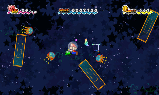
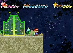

I think what makes up in terms of being Pure Heart themed, to the space part being blue/black, is: your companion, Squirps, and the colour scheme of the Whoa Zone. Squirps assists you most of the journey in space, he's neon green and sticks out in his surroundings, not to mention the floating green squares and alien doors in the moon walking part. The Whoa zone has green on the floor, doors and walls as well as a greenish-blueish tone in the background.
There's plenty enough of green in this chapter. Just the right amount really. Again theming and palette great, level design arguable...
If you're curious which chapters I consider well colour themed its: Chapter 2, Chapter 4, Chapter 7 and Chapter 8.
I've actually redesigned the first part of Chapter 1 at one point [og post here for context], I'm considering finishing it and maybe doing the same to the other ones that I didn't mention above or maybe all.
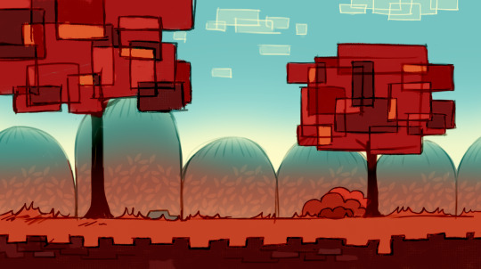
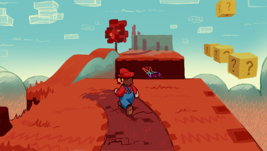
59 notes
·
View notes
Text
Some Fun headcanon facts about Dark Sun.
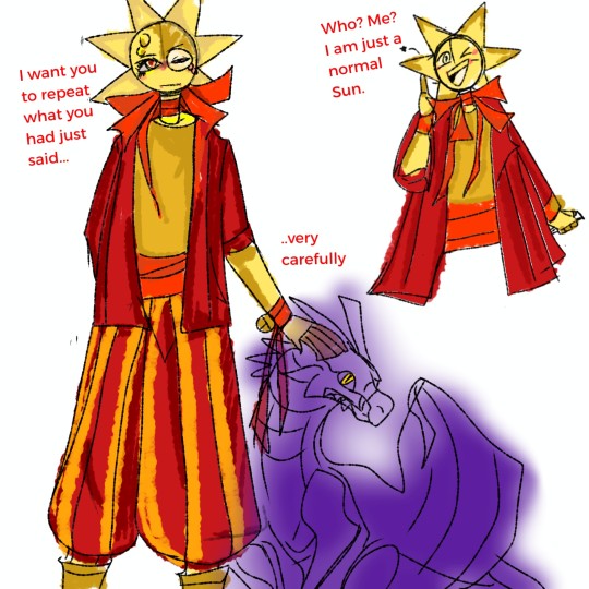
- He is just a 'normal' Sun.
- He also looks just like a normal Sun, just extra coats and extra ribbons.
- His left eye is horrible because it is where he upgraded his intelligence the first time (It was an excruciating experience.) and that also partly the reason why he wears glasses.
- There is not a single thought not related to murder inside his eyes.
- He is the Batman. People think Dark Sun's intelligence is the most dangerous part of him but actually it is Dark Sun's preparation. He not only has tons of backup plans and plans, but also, he knows people. He knows even if he is the smartest, someone will be smarter than him, have luck on their side better than him.
- He has a bad habit of hiding one of his hands behind his back, just in case something goes bad.
- He loves to pretend he is just a weak dumb Sun to fool Eclipse and Abused Moon, and stab right on their back when they lowered their guard.
- There is nothing more satisfying to him (he will not be admitted to it) more than seeing Eclipse or Moon or everyone has hurt him and variant of Sun begging at their knees because they had failed and they were wrong.
- He doesn't actually hate Servant. He just hates things that get out of his plans, and seeing Servant refuses to die while back then succumbing to Lord Eclipse makes he feel a little bit angry, even though he knows Servant didn't have any choices.
He secretly pitied Servant but also he thinks there is no point of fixing them and it is better if they just die. Rather than living like an almalgamon of Eclipse and Sun. A husk of someone has been gone for so long.
- He used to have a really complicated relationship with Sundrop but then they split up and agreed to never have a word about it never again.
- He can change his eyes colour, from white pearl to red because he usually robbed from Moons and it is easier to let them mistake him as their Sun. (it is also easier to kill them.)
- He and Sun have the same way of dealing with people who don't listen or just simply being idiot. He will ask them if they know where they went wrong and make them admit their mistakes. If Sun only does this when he is angry or when they have crossed the line, then Dark Sun does it a lot because he likes the way he makes people feel like they are stupid.
- He is a sadistic person. Not only does he want people he hates to kneel down to him in pain, he also wants to look at their eyes and see how much they hate him but couldn't do anything because they are stuck inside his palm.
- He sucks at playing games. He is also a salty loser, which makes him never play the game he loses ever again.
- He is actually a decent person when he isn't scheming or planning about everything.
- He thinks of SunBOT as a kid he never wants but still has. Having said that, never let SunBOT and Dark Sun alone together unless you want to see something for shit uncontrollably.
- He likes dolls, puppies and everything soft. The reason why he wears his jacket is because he wants something soft and warm to cover him and also he likes being cute. (Secretly)
- He has a very long long name for his dragon before changing it back to some nickname that is shorter than Sun's relationship.
- He likes wine, the expensive one. His hobby when he didn't think about how to fuck over Moon's life is just sitting around his Dragon and petting it while reading a book.
- He is a very good actor, he and Cringe Sun. Sun is the third place, and Sunny is the fourth.
- He is lonely. And he is terrified of what he did might be wrong but he just keeps going forward and never looks back.
- He still has nightmares and hallucinations but he never lets it affect him.
- Sometime he will be too much unhinged even for himself, especially around Sun or Servant. Which makes him have to go isolate himself for a while before getting back to normal unhinged.
- He doesn't want to hurt people who didn't deserve it but he will not hesitate to put some lessons for them to not fuck with him anymore.
- He likes cooking, but his cooking is terrible.
#ask house of suns au#sun and moon show#house of suns au ask#tsams#ask-house-of-suns-au#house of suns au#tsams dark sun#the sun and moon show
51 notes
·
View notes