#also everything but the background is one layer
Explore tagged Tumblr posts
Visit Tumblr Blog
Explore Tumblr blogs with no restrictions, modern design and the best experience.
Last Seen Tumblr Blogs


Fun Fact
If you dial 1-866-584-6757, you can leave an audio post for your followers.
Text
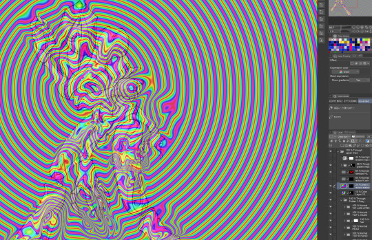
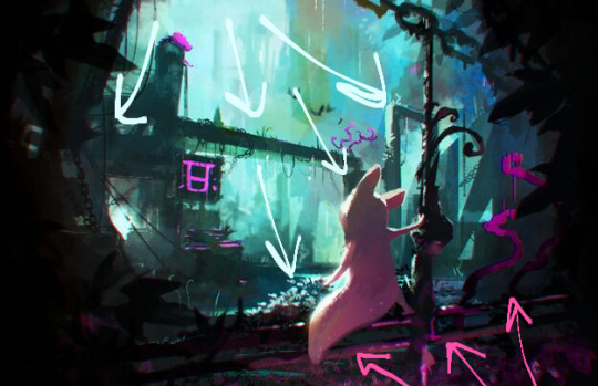
okay i'm back from the movies let's talk about screen and multiply layers

you can read part 1 of this series of tutorial posts where i mostly talk about gradient maps here.
now we're going to talk about the other layer effects. i feel like these ones are already pretty commonly known, but i've also been using them for like 15 years so it's very easy to assume everyone knows everything but actually i'm just old. anyway.
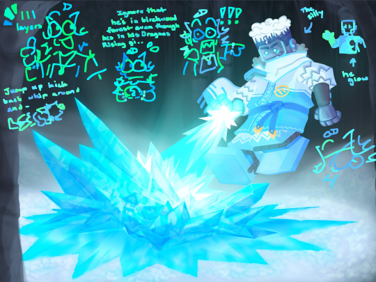
the panel up top is where we're starting from. i've got a nice blue color gradient applied, and everything looks a bit more harmonious. but...... those inks are pretty harsh, especially in contrast to the background, where there's no black inks at all. i'd like everything to come together a little more.
you can do this with a gradient map, if the darkest value is set higher than black. but since we're not using the gradient map at 100% (it's just 30%) the black isn't really affected by it. so it just stays black.
what a screen layer will do--and this is in practice, i don't know what it's actually mathematically doing--is turn your darkest value into whatever color is on the screen layer. so this is what a screen layer set to 100% would do to this panel. (NOTE: all the layers applied in this post are clipped to a folder containing just the characters. they are not affecting the backgrounds, they'll just affect the characters. the gradient map does affect everything)
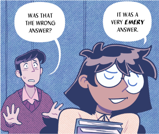
That's Pretty Blue! the color that neeta's hair currently appears is the color of the layer. everything else is lightened up and also made a little more blue. and this doesn't look terrible, but screen layers will pretty much always make your art a bit lighter, because it's trying to make its color the darkest color. tbh it's great for fog effects and making your blacks light enough that a texture can show up in them. but let's turn it down a bit, to 40%.

hey nice. everything is still a bit lighter, but neeta and emery's hair isn't as sharp against the background. still enough that they stand out as the most important things in the panel, but not so much that they feel pasted overtop. it's a bit like putting some atmospheric perspective between you, the reader, and the characters. there's air in the image. (and why it's good for fog!)
but i want it just a little darker to make up for the lightening up that happened. i don't think i actually need to explain multiply layers, because everyone has definitely used those for shading at one point or another. but here i'm using a very very light blue over the entire characters. i'm not using it for shadows, but to make everything a bit blue.
now it really feels like they're in a room. the only pure white is the speech bubble and gutters. their eyes/teeth/glasses will still read as white, but they are not white. everything is at least a Little blue, so everything is unified.
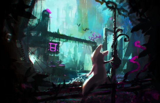
and that panel above is what the final looks like! let's look at it side by side with just the gradient map.

neat! it would be perfectly acceptable to stop with just the gradient map, if you value high contrast black inks and characters popping off the page. i... don't! i like the air that's generated by going a little bit lighter overall. it has a nice matte effect, which is why i'm very glad my book was printed on matte paper.
and that's why hunger's bite looks so good. you should buy it and read it
132 notes
·
View notes
Text
System Overview: Caltrop Core.
For three weeks, I’m exploring various ttrpg systems and what makes them tick, as per what was voted on in this poll. This week I’m going to dive into Caltrop Core!

Caltrop Core, by titanomachy (also known as Lex Kim Bobrow), is a genre-neutral SRD that uses d4's. It's flexibility sits in how you use the layered result system; from dice, to dice & tokens, to a pack of cards.
Let's take a look at the core pieces of this SRD!
Cybercore-Revelation, by Xelsius @ Forward Lightning, & A Night of Possibilities, by Vinicius de Souza.
The Results Table.
The actual SRD document for Caltrop Core is rather concise, and that's because pretty much everything in the game revolves around the Result Table.
When you describe an action by beginning with the words "I want to…", you roll 1 or more d4's. Your result is determined by the highest roll, and each level of the result is different.
Absolute Failure - You don't get what you want; things get worse.
Partial Failure - You don't get what you want (but possibly gain a benefit).
Partial Success - You get what you want, but with a complication.
Absolute Success - You get what you want, and more.
This is the centre concept for Caltrop Core: once you know this, you can iterate on this as much or as little as you want! I think this is why Caltrop Core can be such a great option for a first time game-maker: you can add some flavor to the core roll, use some basic modifiers built into character creation, and you're good to go.
That being said, there's more layers that can exist in a Caltrop Core game if you want there to be. One way is how you get to the results listed in the table above, and the resolution tools available have some interesting options.
Let's take a look at some of the examples available in the deep deep pool of Caltrop Core games!
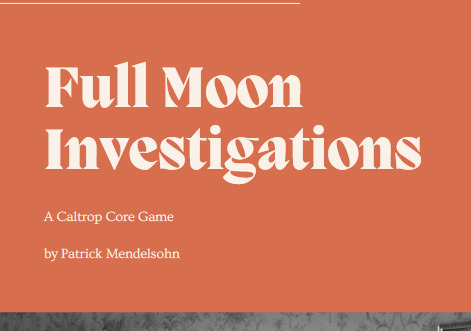
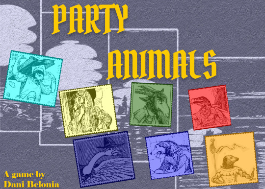
Full Moon Investigations, by Patchster0730, Party Animals, by Dani Belonia, & Ceremony in Shadow, by tlando.
Stat Pools.
The most common resolution method uses dice pools pulled from your PC stats. These stats often are built out of an array, and then modified by a character class or background, such as in Full Moon Investigators: in this game, you have Bark, Bite, Brains & Bullets. You assign a 1, 2, 3 and 4 to each, and then gain modifiers to certain stats in certain stages of the game, depending on the background that you take.
Alternatively, you can create your character from a number of different pieces, like the options available in Cybercore Revolution. Since this game has 12 Skills instead of just 3 or 4, you have an opportunity to build a more highly specialized character. Instead of choosing a single character class, you can build a character out of Traits, Vocations, & Specializations, allowing you to hone in on just a few abilities, or allow yourself a generalized advantage in as many as you can.
In Dead Armour, your character has a stat array, but they don't have any backgrounds to improve their skills. Instead, this game introduces an additional mechanic: Tokens.
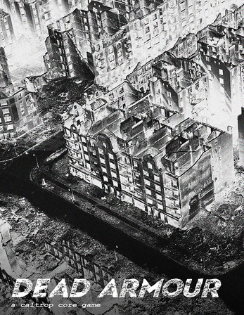


Dead Armour, by tim zee, I'll Be Taking That, by porchlightdusk, & Ghost-Fi, by aghostofeli.
Tokens
Tokens are a form of player currency that can be spent in a number of different ways in Caltrop Core. In Dead Armour, tokens are currency earned through role-play in Downtime between scenes, that can then be spent to avert disaster or find some crucial resources.
Similarly, in Hexfall, tokens are used to adjust the outcome of a roll, provide a narrative boost, or activate character actions assigned to your character class.
In The Stars Will Not Go Out and Party Animals, players gain and spend tokens through various prompts, which then fuel their dice pools. These prompts are often tied to character backgrounds, allowing your character abilities to remain unique and specialized.
There's also a fun twist you can add to Caltrop Core games by adding another form of resolution or randomness: Cards.
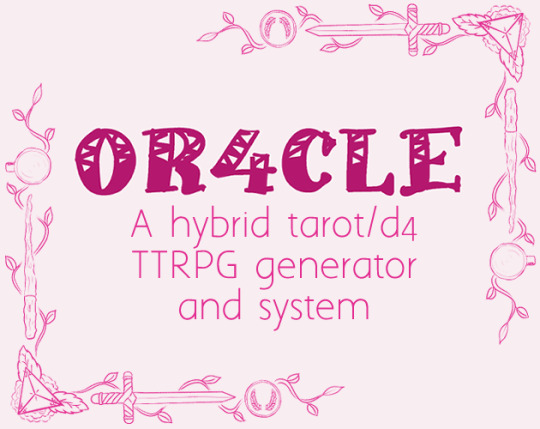
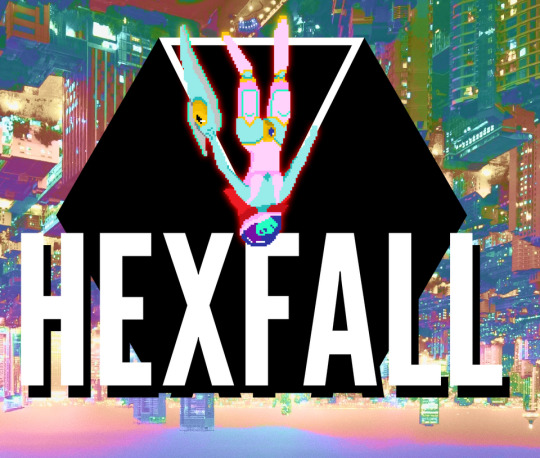

Or4cle, by 1eona, Hexfall, by titanomachyrpg, & The Stars Will Not Go Out, by RJKGames.
Cards
In the SRD, Lex mentions that Caltrop Core can also accommodate other toys in its game design, such as playing cards or tarot cards. Cards are often a great way to add randomness into a game that allows the group to play without a GM, or to provide results that don't map onto a success/failure matrix. Here's a few examples of how designers have decided to include cards into their Caltrop Core creations.
Or4cle, by 1eona, is a game that combines the d4 rolls with tarot cards, which are used for character & story generation, and might allow the game to become GM-less in the process. The Major Arcana are used to determine the hook of a story: such as investigating someone's lover if you draw The Lovers card, or a world-ending threat if you draw The World. The Wands are used for plot twists, Cups for a patron, Swords for Antagonists, and Pentacles for rewards. When it comes to character generation, each of these decks are also used to give you details about your character, allowing randomness and interpretation to both have a role in the game.
Meanwhile, Ghost-Fi pairs a pack of playing cards with the dice to determine details that connect ghosts to the world around them. The suits are categories of Tethers: things that keep the ghost connected. The symbols on the cards can occasionally offer up unique encounters, such as increasing Spite - a corrupting currency that could affect your ghost's ability to cross over to the afterlife. Since Ghost-Fi can be played solo, these cards allow for unexpected obstacles to face your character, even if you don't have a GM to come up with NPCs and enemies to stand in your way.
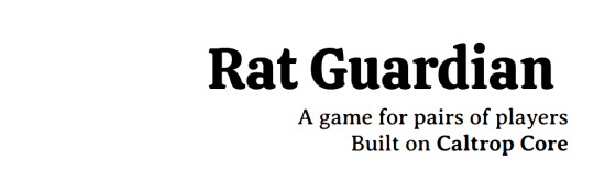

Rat Guardian by FiloHazard, & Space Taxi, by gothHoblin.
The Playground.
All of the examples I've talked about so far are just a small taste of what you can do with Caltrop Core. The basic mechanic is very simple, which means that you as a designer can take a lot of ideas from other games that you like and weave them into the basic rules to create an incredibly unique and inventive game.
For example in I'll Be Taking That, you wager items from your goblin hoard (read: inventory) to increase the number of dice you roll. This replaces the stats, although it doesn't have a token economy like Party Animals.
In Hexfall, stats are not even included in character creation; you simply roll 3d4 for every interaction, but the rules change depending on the kind of encounter you face.
In Rat Guardian, players have to pair up: one Rat player for every Resident player. The game's pacing happens through a series of Beats, which involve goals that the guardian Rats need to work to help their fellow humans achieve. In order to achieve these beats, Rats and Residents can sometimes pool their dice in hope of increasing their odds.
Caltrop Core is an excellent option for folks who want a fairly easy-to-understand resolution system that can be modified to fit a broad number of genres. If you're a new designer who wants an easy system that will allow you to try your hand at this hobby, or if you're a designer who wants to play with a neat mechanic and watch it interplay with a basic system, you might want to check out Caltrop Core.
Let's take a look at a few more Caltrop Core games that might interest you!
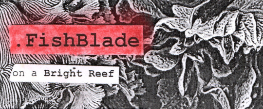


FishBlade on a Bright Reef, by PlaceHead Here, is a game about FishBlades helping human souls escape a Reef and move on to the afterlife.
NIGHTHAWKS is a game about lonely people in a Diner, who have to make a choice between risking rejection or succumbing to isolation.
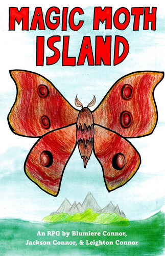
Magic Moth Island, by LeightonConnor, is a game about animals defending their magical island from human invaders.
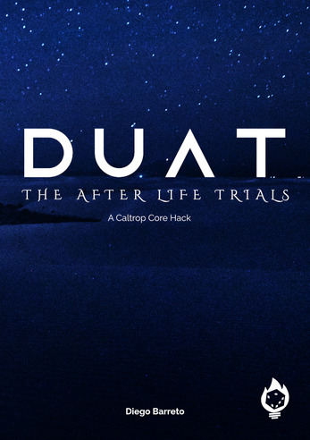
Duat, by Deep Light Games, is a game about recently deceased souls overcoming trials in the afterlife.
OK See You, by Bebop Tabletop, is a game about immigrant families and convenience stores, inspired by shows like Kim's Convenience.
Wardens of the Sundered Realms, by Groovy Dad Games, is a game about beast hunters in the service of the High King.
Final Notes...
You can check out my folder of Caltrop Core games on Itch, if you want to see what I've found so far.
If you like what I do, you can always leave a tip at my Ko-Fi!
22 notes
·
View notes
Text

feeling silly so i turned grian into a digimon. griamon. pesky bird digimon.
#art#hermitcrap#hermitcraft#grian#fun fact i did not use the eyedropper on anything other than the background#i had the thought of challenging myself like that the other night and it was fun#was a fun experiment#also everything but the background is one layer
343 notes
·
View notes
Text
the silly ever the when [how do people decide what to put here]
Silly Extra headcanon + my doodles under the cut
[decided to switch the scarf last minute]
I have a little headcanon that his right arm and most of his body glows when he uses his powers post Season 11 I find it very silly
Doodle I did of it a bit ago along with some for Cole and Nya [I thought it would be cool if Cole’s legs also lit up like his arms did since uhh, you know, standing on the ground and such]
also one with my first attempt at a more “humanoid” design:
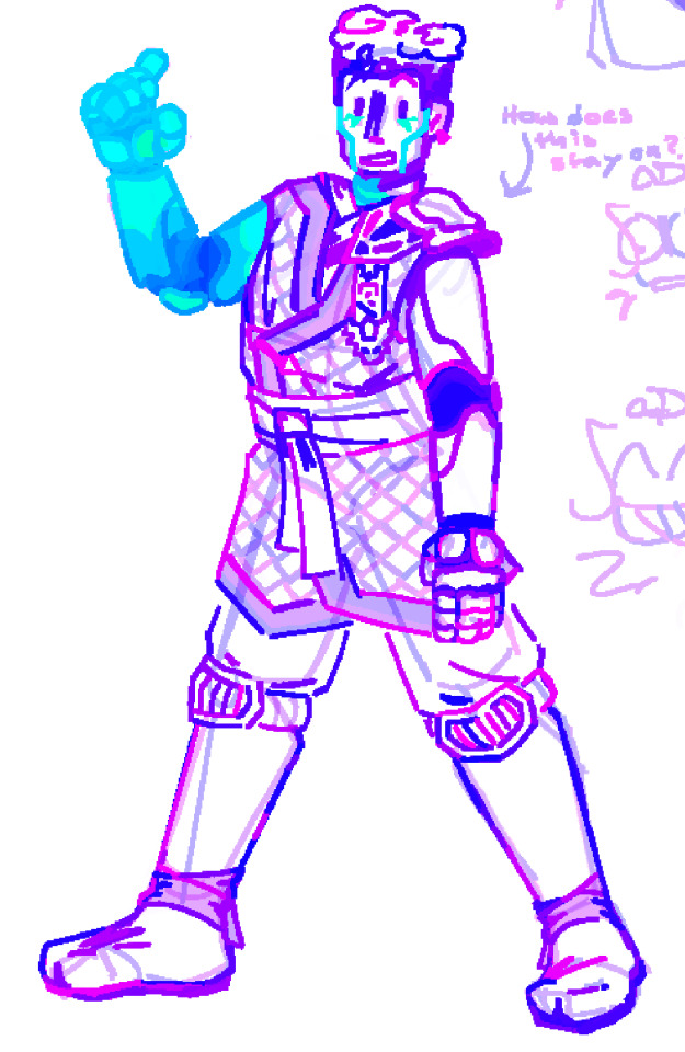
#Yippieee I finally fished this thing holy shit#Also I took a long pause in the middle of making this#So I came up with the headcanon AFTER I had already finished doing most of it#So I had to go in after and change everything#The one good thing about my many-layered method of art is that it allows me to change any tiny detail I want anytime#Ignore if the last one looks wonky I do NOT normally draw people any more realistically than my doodles#I just wanted to see if I could#Anyway#zane julien#ninjago#art#digital art#ninjago headcanons#Also ignore my half assed background I just wanted to put something there#I also put a treehorn back there for anyone who keeps their brightness as low as I do
91 notes
·
View notes
Text
im really normal about them <- lie
#ace attorney#mia fey#diego armando#miego#lorillee.png#THATS RIGHT BABY. AFTER -um . hold on. *checks notes* - SIX MONTHS. LORILLEE IS BACK WITH PHOTOSHOP ART 💥💥💥💥💥💥💥💥💥💥💥💥💥💥💥💥#every now and again i like to put effort into something just to remind everybody that i can actually draw#well i say that but to be honest i put a lot of effort into those ms paint ''diego fey REAL'' doodles#but half of that is just because humans are a . something. to draw. and urban backgrounds are my worst nemesis#and also trying to work with ms paint to like slightly transform things is an incredible pain in the behind#anyways. yeagh 😎👍 behold the power of miego. getting me to actually finish something in photoshop for the first time in months#anyways. ive discovered the secret to getting me to draw stuff on photoshop. prepare yourselves accordingly#what i need to do is sketch & line something in ms paint. and then directly trace it over into photoshop#and then i can go ham#see because the reason i never did this before was because i would sketch things in ms paint#and try to line them in photoshop and it simply Wouldnt Work.#so i had assumed that if i wanted to draw in photoshop id have to sketch in it first. yknow. which i cannot do for some reason#something about the way the pen feels and the . its like the smoothing setting is on even when its on 0 percent. you know. anyways#but with this one i drew mia in ms paint as per usual . and i wanted to mess around with color & light#and i triedddd to do it in ms paint but unfortunately as you can probably imagine. doing stuff like this without layer filters#can get a little difficult. if you know what youre doing its obviously going to be easier but that being said i do not#when i pick colors i am literlaly just wildly guessing 😭🙏 which is fine for more straightforward coloring/shading#but not quite here. which is why i wanted to take a stab at it in the first place#so anyways i was like FINE WHATEVER and tried tracing the lineart in photoshop so i could take a stab at coloring in there#and i was . enlightened. (no pun intended). it WORKS#so anyways . you may actually be able to expect. some photoshop art from me#well ok thats a lie never expect art from me. but we can all dream together#anyways they really are the star-crossed doomed by the narrative romance ever. everything to me
187 notes
·
View notes
Note
i cannot overstate how in love i am with the way you do colour
AAAAA THANK YOU<333
I love doing colors so so much, color theory my beloved and beloathed
#I think one of the big reasons I’m good at it is just I almost never use fully white backgrounds and I like using really low contrast colors#so I have to adjust every color to make it look correct#It’s made me really good at knowing how different colors will look next to each other#And makes the colors look more cohesive#Also a recent discovery: textured overlay layers are your best friend#It makes everything look so neat :D#Any way rant over thank you so much#rambling
25 notes
·
View notes
Note
Do you think some Mikado citizens ever figured out they could get their original works published as long as they threw King Aquila in there somewhere? And how much of it was actually fanfiction about Aquila, Mikado's state-designated blorbo? It'd be really funny if Aquila also got "and he'll return in Mikado's darkest hour" like King Arthur. Like technically he did!
@thonkphonk
OK......... THE FAERIE QUEENE IS AN INTEREST OF MINE. I read Books 3 and 4 for a class called 'Violence and Romance in Renaissance Literature'. We spent a lot of time on it, because iirc the only other thing we read in the class at all was some Shakespeare. So it was actually mostly a class on the Faerie Queen books 3 and 4 lol (and all of my papers were on the Faerie Queene instead of Shakespeare lol).
The whole deal with the Faerie Queene is that the titular Queene is the goal of King Arthur's quest, and yet Arthur himself only has cameos in the stories because he is the 'main plot' where all the books have different main characters (and focuses on elaborating on various virtues that each main knight upholds--Arthur is the perfect knight, who extols all virtues, whereas all the characters in the books exist to define specific virtues--ex: Britomart represents Chastity, Artegall represents Justice, etc). And Spenser never actually finished the Faerie Queene, which is why Arthur's quest never gets full attention.
To apply this to SMTIV would be extremely fun.
Absolutely I could see so many stories about King Aquila's times. Especially since Mikado is trapped in this sort of medieval stone-age ('holy times' as viewed by angels) so its not even like stories about Aquila would be dated, it would be so easy to write stories of modern times with Aquila present. Or, even easier, would be his inclusion in these 'fairy-stories' the Luxurors know.
Aquila means so much to people despite having lived so long ago, I would assume his knights are known the same way Arthur's are (with people inventing new knights all the time, as with Arthurian legends as well). So people would toss Aquila into all this often while writing their own stories about the various knights (with a focus on those knights because, like Arthur's presentation in the Faerie Queene, Aquila would be the 'perfect' character, meaning that the stories are more interesting if they can be about the flaws of the others).
But 100% Aquila would always come in to save the day, or to approve of the resolution the story reaches, etc. I am so on board with that idea.
That being said, this would mean the angels likely erase much of this when they take over Mikado, Aquila' name remains on the Obelisk, but his statue is destroyed, so I imagine many of these books are just straight up burned. A few would survive though, less objectionable ones,but the angels hate the influence Aquila still has on the people, and how he is still venerated.
Also you are SO RIGHT about the 'once and future' thing. Like. This has no support in the game because the game is so nebulous about Nanashi's birth, but I do somewhat theorize he was born in Mikado? He's literally just found in Sky Tower, so I'm like, okay was he born there and brought down somehow? I would KILL to know anything about this because like. Ok, they found a baby. How did they find him? In the hands of a demon, dead humans, or just like, on the ground? Hello? Can I have some information please?
But I've always assumed Nanashi was born in Mikado and then SOMETHING was a reason for him to be carried below, and then discovered. Because like. we don't even know why the HUNTERS were in Sky Tower--most people knew about Medusa back then and wouldn't want to go, and people even assume Medusa works for Tayama (which is false--I theorize she worked for Akira but that isn't confirmed anywhere). but if people just assumed the Sky Tower was controlled by the Ashura-kai, I don't know why anyone would approach--they KNOW Medusa kills everyone up there.
and Nanashi of course is randomly discovered after Medusa is there, he's only born well after Akira establishes Mikado, so the Hunters have long-withdrawn from Sky Tower and like. what. is happening.
But yeah a prophecy about Aquila's return and somehow that also including the need for Nanashi to go below rather than above, there's some sect of people somewhere that know something, this is just, one of those many holes left open in the SMTIV world. so we are free to make theories and headcanons and I am so with it.
Thank you for sending this, this was so fun omg. I went on a bit of a ramble.
#shitpost#ok sorry you unlocked faerie queene excitement there#i have books 3 and 4 in one collection on my bookshelf#also Spenser never finished the Faerie Queene like. king shit really.#Arthur's quest is just ongoing background to the rest of everything#also. the Faerie Queene was written as a sort of weird funky fan letter to Queen Elizabeth with SO many allegories and references to her#and like its implied Britomart is directly related to her and like theres so much going on like. there's a layer of analysis here#of like. Spenser was totally a bit in love with his patron and here's an interpretation of Faerie Queene with that lens#it was one of the points we discussed a LOT in the class but it isn't one I looked into too deeply#I was too focused on Britomart and Chastity themes. and Amoret and Scudamour and just all that's happening in Book 3 and Book 4#also if you take why the Faerie Queene was written and apply that to SMTIV that means like#someone is in love with the current King and is just dedicating this fairy-story style poem about Aquila to him lol#OK IM DONE RAMBLING#also putting this in my#smtiv replay#tag though
14 notes
·
View notes
Text
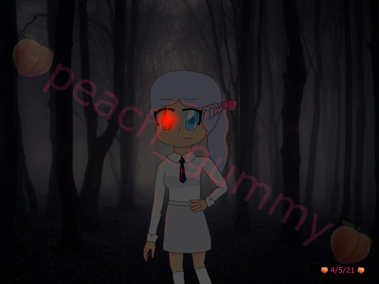
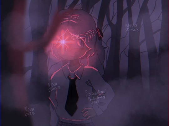
Week 12 of drawing Harelight until Softpaw isn't sick anymore

[Image ID: A scene of Harelight and Softpelt as apprentices. Harelight, currently Harepaw, is looking into the RiverClan medicine den where Softpelt, currently Softpaw, rests in a nest. The medicine den is inside a hollowed out space beneath a rose bush. On the far end of the den, another smaller hole opens out to the lakeshore. Harelight is a mostly white cat with brown splotches. On his left is a text bubble reading "Hi" with a smiley face next to it. Softpelt is a dark grey tabby with white ears and belly. She has a white splotch on the right side of her face, white freckles above her nose, and light green eyes. Softpelt has an expression of discomfort on her face. Slightly above her is a speech bubble reading "Hey" with an ellipses and a question mark at the end. Her speech text is written slightly wobbly, and the speech bubble itself has its outline broken up. /End ID]
...don't you remember this?
#shading definitely was a bit of a mess on this one but at this point i'm not terribly interesting in meddling with everything again#remember kids: put your foreground and background elements on separate layers or else you will Not Survive#also yes i did not actually draw the roses. we're just going to pretend that it's not the season for them or something. idk man#harelight#softpelt#warrior cats
6 notes
·
View notes
Text
on today's episode of 'acaica's background thoughts for the dess raises kris au': okay but lets be serious do dess and chara actually stay together in the end--
#drkau#chatter#i debate over this point SO OFTEN LOL#they are BACKGROUND characters. like medium at best.#dess (or asriel or both you can argue any way) is the catalyst for everything but at the end of the day this is a kids story#and noelle IS still going to be the main character#but. man. does desschara work it out#their dynamic will be by far one of the hardest ones to write it think#it is very messy and very complicated and neither of them make great choices#and ive been writing a test piece of them for a WHILE#which. was good to get a decent nail of their characters as they stand in this au#but introduced SO MUCH MORE MESS. bc chara is aroace and 100% has some trauma and fucked-up feelings around sex#but xe DOES have sex with dess. and its like. does xe fully consent to it? yes!#does dess check in to be sure hey you're down bc she knows chara is ace while she isnt? also yes!!!#by the books they do everything right its just. chara is very very very good at rationalizing things.#and xe is. not actually as okay with this as xe is trying to be. and in fact this is very unhealthy for xir#(and then theres this whole OTHER layer of dark worlds and prophecies and everything that leads to frisk being born)#and its like. man. Man. this is so much to juggle#just everything between desschara is jngdfg they are trying their bests but it really is not going that well#bc they meet at like. 19-20 i think and chara's had nobody at all and sorta keeps chasing being someone's most important person#and dess has never had someone who has understood her on a level like chara#who really truly gets what shes about as a person and how she operates in the world#and its just a perfect storm really. and they both have kids and dess did technically kidnap hers just a little bit#and she never tells that to chara. and she tries but she cannot stay in place with xir#and chara couldnt hate her bc. again. has never experienced unconditional love#or love at all really </3 so instead of ever having hard conversations xe will brush it all under the rug#and sorta just enable dess's worse impulses. even sometimes at the expense of their literal children#ITS MESSY YALL. AND LIKE.#at the end of the day we'll see lol maybe they work it out maybe they dont. i have no idea. ive gotta write the thing#and if dr chapters 3&4 come out that could complicate things even FURTHER--
5 notes
·
View notes
Text
May 2021 vs November 2023
#my art#digital art#artists on tumblr#art improvement#i hate the old one so much but also it's what motivated me to actually do digital art so ehhh#i have mixed feelings about it ig#i love the new one though#cause i can see the improvement with literally everything#improved anatomy - check#improved composition - check#improved background skills (aka not getting the background off google) - check#improved clothing folds - check#improved drawing hair - check#improved using layer modes - check#maybe i should redraw this in another 2 years to see how much i've improved by then 👀#side note ignore how inconsistent my watermark is I havent done digital art for a while bc of exams n stuff
3 notes
·
View notes
Note
Not everything needs a meaning There's a reason for the existence of the term idling, while I prefer getting stuff done recreational breaks are important, and I wouldn't say we have been arguing now have we? More of a civil discussion.
I'm called on-your-side anon or Oys for short btw nice to formally meet you,l I'm the one sending those lengthy/ier asks.
as for this place since its a multiverse there is an abundance of info, be it alters of yourself or people you know or entirely new ones, that you can use if you are willing, sure takes a while to get to that info but I believe it's rather gratifying to find what others do wrong and process this info as so to not do the same. There's a lot to be learned here if you are willing
//I'll definitely check them out if they pop up again thanks I love collecting new blogs.
Also for you tell me one thing about your version of the siblings you added to them, or in Russet's case created, that you absolutely adore.
Also I'm sorry I keep writing Russet's name differently every ask, I kinda use the qwerty and the qwertz layout, and multiple language packs on my phone so autocorrect fuddles Sometimes and I don't notice
... I guess. I just prefer to stay busy - there's always something that needs to be done in the club, or I could be training...
Oys. It's... You aren't awful, at least. You seem sensible. I can appreciate that.
... I guess I can see the merits of that. Information is a form of power, of strength. ... Though I doubt most are as sensible as you seem to be, from what I've experienced here.
#pkmn irl#kieran takeover#kieran replies#russet's kitakami trip#//yeee no problem! i love promoing my friends :D#//ooh there's so much. i think my favorite thing to add was each of these characters have a small percentage of pokemon blood -#//specifically they have dragon blood! we have kieran with hydreigon. carmine with garchomp. and russet with noivern!#//it adds another layer of nuance and complexity to their actions that i like to manage on top of everything that's wrong in the family#//for example why this kieran is so prone to lashing out AND why he's so wary about the idea of forgiveness. part of it is instincts!!#//plus with the siblings in general i'm really delving into what things were like for them in kitakami which is SUPER fun#//as for my favorite thing about russet... oh that's a hard one.#//i think. his worldview is really interesting. he doesn't like to lie but also ends up lying to himself a lot. saying he's fine with thing#//-when he really isn't fine with them. reducing himself to a background character in his own life.#//russet is JUST as mentally ill as its siblings it is simply in a less obvious way. imploding instead of exploding.#//because of that he's flown under the radar and really hasn't gotten the help he needs. he's been the family therapist for his whole life.#//also no worries! i get it. i spelled ninetales wrong for like. i think almost a month before i realized. i'm not stressed about typos#//especially since i can tell what the meaning was#oys anon
1 note
·
View note
Text
gonna show u guys a little opalescent highlight hack i threw together today
rainbow gradient above your main figure (i usually have all my main figure folders/layers in one big folder, so i can clip gradient maps + adjustments to it!). liquify tool to push the colors around a bit. STAY WITH ME I KNOW IT LOOKS STUPID RN I'M GOING SOMEWHERE WITH THIS
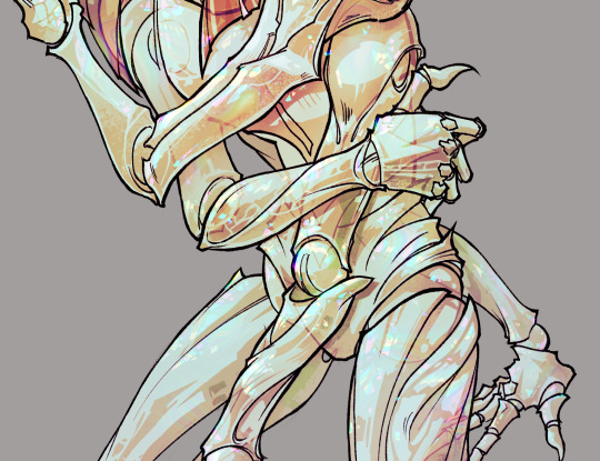
THEN: set it to add/glow (or the equivalent in ur drawing program), lower the opacity a bit, and apply a layer mask. then u can edit the mask with whatever tools you like to create rainbow highlights!!
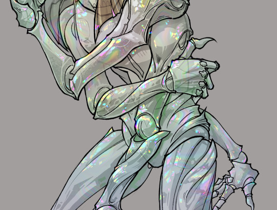
in this case i'm mostly using the lasso fill tool to chip out little facets, but i've also done some soft airbrushing to bring in larger rainbow swirls in some areas. it's pretty subtle here, but you can see it better when i remove the gradient map that's above everything, since below i'm working in greyscale:
more granular rambling beneath the cut!
u could also just do this with a brush that has color jitter, but what i like about using layer masks for highlight/shading layers is how simple and reversible it makes everything. i can use whatever brushes i want, and erasing/redoing things is super low stakes, which is great when i often approach this stuff with a super trial-and-error approach.
example: have u ever thrown a gradient w multiple colors over an entire piece, set it to multiply etc, and then tried to erase it away to carve out shadows/highlights? it's super frustrating, bc it looks really good, but if u erase something and then change ur mind later, u basically would have to like. recreate the gradient in the area u want to cover up again. that's how i used to do things before figuring out layer masks!! but masking basically creates a version of this with INFINITE undo bc u can erase/re-place the base layer whenever u want.
anyway, back to rambling about this specific method:
i actually have TWO of these layers on this piece (one with the liquified swirls shown above, and another that's just a normal concentric circle gradient with much broader stripes) so i can vary the highlights easily as needed.
since i've basically hidden the rainbow pattern from myself, the colors in each brushstroke i make will kind of be a surprise, which isn't always great -- but easily fixable! for example, if i carve out a highlight and it turns out the rainbow pattern in that area is way too stripey, i can just switch from editing the mask to editing the main layer and blur that spot a bit.
also, this isn't a full explanation of the overall transparency effect in these screencaps! there's other layer stuff happening below the rainbow highlights, but the short version is i have all this character's body parts in different folders, each with their own lineart and background fill, and then the fill opacity is lowered and there's multiply layers clipped to that -- blah blah it's a whole thing. maybe i'll have a whole rundown on this on patreon later. uhhh i think that's it tho! i hope u get something useful out of this extremely specific thing i did lmao
12K notes
·
View notes
Text
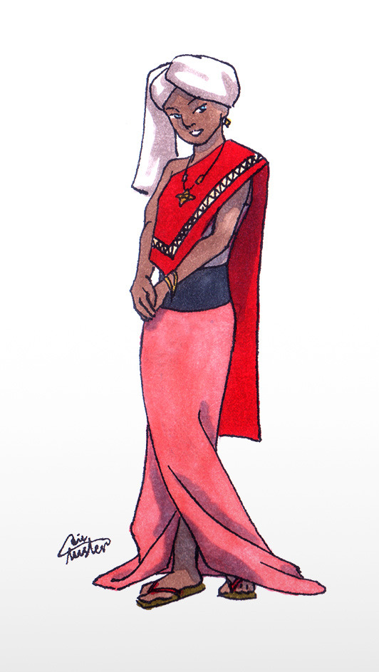
Some "if Yue is alive and went travelling with the Gaang" designs
With a ton of text about cultural inspiration.
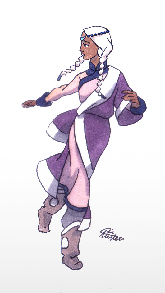
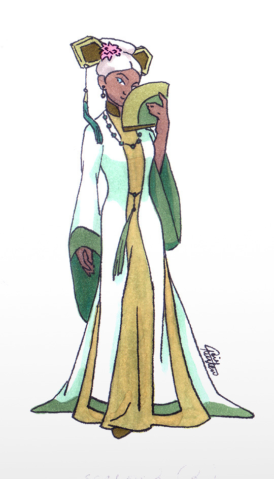


The main book 2 look
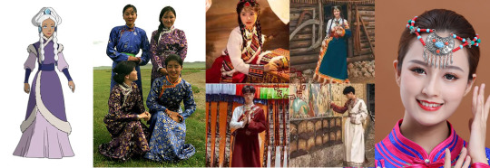
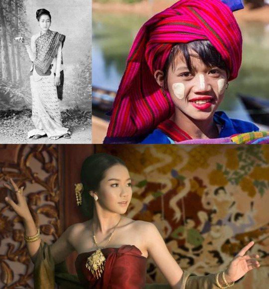
I wanted to show cultural differences between the tribes, so Yue's look is sort of Mongolian. There were Mongolian-styled hats in the Northern tribe, and Yue's dress under the coat looked like a Mongolian deel (thanks @atlaculture for all these posts about clothes and everything else!), so it's not much against the canon information.
So she's wearing a deel again with a second layer - there are chinese actors on photos as far as I know; I hope it's okay. One-shoulder silhouette refers to later Aang's clothes because Yue is still kind of a spiritual person (she wasn't a fighter, so I want her to have some other useful talent – not a bender or healer like Katara or a non-bender warrior like Suki). Violet, pink and white were originally her colors, no changes here. Three blue characters would be too much for a group of five, and total white is not practical at all. I like to think that violet color shows high rank in the Avatar universe; in the original series it was only worn by princess Yue, Kanna, the chief Hakoda's mother, and by king Bumi.
Yue's boots here are mongolian gutals/gutuls (the collage is already big, but I used them again for one of Book 3-looks).
Her hair become simpler – just two braids and a hairpiece, to match her previous decorated hairdo. I guess if she's travelling with the Gaang she's not that much of a Moon Spirit anymore (maybe she returned the part of the moon spirit that saved her and was healed other way?), so I decided to forego the moon-referring part. Also it will be easier to do by herself since she has no servants now... The headdress I took from modern Mongolian dancers; the front part is crescent-moon-shaped.
The Ba Sing Se dress
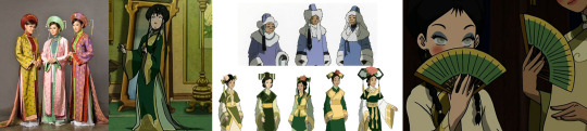
I fell in love with this Ao Dai dress, it's simple, long and elegant. But... it's mostly Vietnamese… and I'm afraid that it's modern and not historically accurate. Also it does not really go together with other Ba Sing Se dresses :( because I did not want to just copy-paste some background look. But there is at least one dress with a tail, thigh high slits and a standing collar on the dress underneath, so... I guess my choice is not that bad? The tail makes her look more royal. The fan is the same which Toph and Katara had. For the palette I chose Yue's white color with EK greens and warm yellow/ochre to match Katara and Toph. The hairdo is copied from the series; I chose one with the tassel on the right, to refer the NWT/Korean accessories.
The Fire Nation disguise
A confession – I don't like FN clothes. I wasn't sure if I would be able to do it properly, so I almost copied that attire (left one) – asymmetry, as a Thai touch, which again matches Aang's Invasion Buddhist-like clothes. The palette keeps Yue's signature white, with some pink of a warmer shade, as they wear it in the Fire Nation. And the "royal" long skirt, 'cause she's still not a fighter. The look is simplified so I could not keep zigzag ornament on her longyi skirt, therefore I moved it onto the top part.
I used Thai dancers jewelry and... flip flops? idk how they are called in Southeast Asia (don't like Sokka and Katara's FN shoes at all, why the design is so complicated?).
For covering her hair I used a turban, inspired by Myanmar turbans; a white one, so if some hair will show, it won't be too noticeable. Also Yue could still be easily recognised on screen/page by her white head. The long end of the fabric on her right resembles burmese hairstyle silhouette.
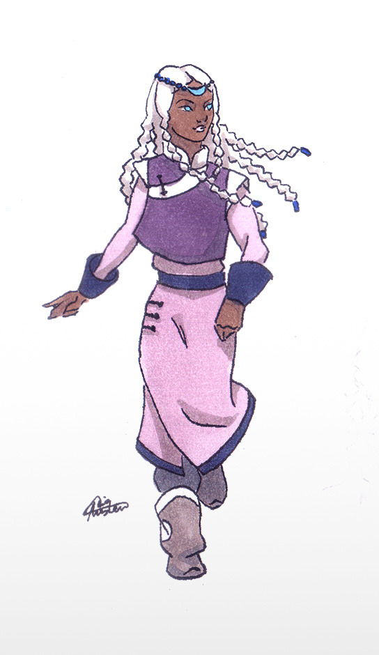
The Invasion-and-till-finale look
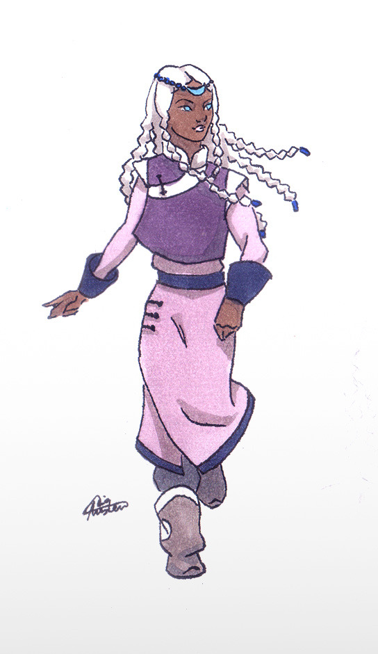
For her dress I used a deel (again); the sleeveless jacket is an hommage to her original design and has some Korean vibes, like Toph's Ba Sing Se dress (at least I hope so). Katara and Sokka's season 1 looks have Korean influence, so I guess it's okay. Gutals are from her Book 2 main look. I have a soft spot for them.
My favorite thing is her hair :)))) It's a mix of Inuit/Mongolian braids and a hairpiece, also from the Book 2 look. This time there will be more braids. Two on the front – I wanted to keep them from her original hairdo, but now they are braided together (I saw this on the Alaskan Inuit/Eskimo women photos). On the back there are five, inspired by a Mongolian hairdo for young unmarried girls, who wore multiple braids. I decided to make five, because Alaskian Inuit language uses this amount for counting and with two front braids it'll make seven, which is a lucky Mongolian number. And in theory a limited number should be easier to animate.
The post-canon noble look
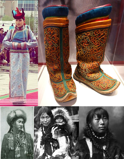
After the final battle I thought Yue will come back to Agna Qel'a and become a more active political figure. I chose a white kuspuk (blue color is still for Katara and Sokka), showing that she is ready to lead her tribe after this journey, not the passive perfect princess she was before. "She is associated in canon with the masculine yang of the yin and yang and the moon which, in most Inuit and Eskimo cultures, is considered masculine as well. While white kuspuks are associated with men and specifically family patriarchs, a feminine kuspuk in white makes plenty of sense for Yue's character" – @mostly-mundane-atla helped me a lot with the cultural meaning of the clothes (I am so grateful!). Also it's an hommage to her total-white Moon Spirit look. And I changed her hair again to Greenland updo with two tied braids on the front – more complicated than the simple braids she wore during the journey. It looks formal.
NWT is less Inuit-inspired and has a strong Mongolian touch (to make them look more "modern"? dunno) but I guess the formal wear for the spiritual princess could refer to older traditions. Which should be the same with SWT, 'cause SWT was originally a part of NWT – or so I heard. For example, Kuruk, the NWT Avatar who lived about 400 years ago, has nothing Mongolian in his look.
All the looks are simplified to match the style of the original cartoon. I know there should be more details and embroidery, but my goal here was to draw something (at least theoretically) applicable for animation. And no Hahn's betrothal necklace of course.
Also I want to mention here other great Yue designs, since they are the inspiration behind the overall idea of the post – the moon looks and "Yue joins the Gaang" outfits by amazingly talented @chiptrillino.
P.S.: an important note
This is my first attempt ever to design outfits that could fit the world of A:tLA. I am not Asian or ingenious, not an expert in their cultures or costume history at all, not a professional character designer. I am just a fan who tried to create designs with respect to real cultures and people. Nothing here was supposed to be offensive in any way. If something still is – please inform me so I could fix it as soon as possible.
I hope, as a fan, I have the right to draw fanarts looking for an inspiration in the cultures that inspired the original cartoon.
If you see mistakes in my post, be it in drawings or a text, also feel free to tell me. I will deeply appreciate it.
#avatar the last airbender#atla fanart#princess yue#yue#yue's alive#yue redesign#yue atla#yue avatar#all these links almost killed me...#i am a nitpicker#bad alt text#sorry i'm so done
1K notes
·
View notes
Text
Colour circles connect the dot...

Alright, I couldn't resist not posting something bout my art wip but this is so vague anyway that it's fine and also I find it so funny how it looks like a vaguely shaped tiny t-rex.
#aria rants#am doing smth different for this one as i usually do with my art cuz experimenting on it is fun! this time tho... im trying out#the blending modes of the layers. im using multiply cuz i need muted shades for this piece and i remembered that multiply#is used for shadows during rendering by other artists so im like: well then. put this on the folder cuz i need ALL LAYERS#but at the same time... cuz the colours are muted via a setting and not cuz i specifically chose it i cant colour pick it easily anymore#so i just put all those base colours in my eyestrain reducer background like that so i can remember which colours are for which#also colouring took me lil longer cuz my initial plan was to make everything monochrome but it looks too dull#so im just making things coloured FOR NOW cuz i still wanna test out the monochrome look i just need to colour pick#outside the black white and grey shades and start colour picking on rgb. maybe itd look less dull then but yea!#might make two versions of this cuz of that since am curious how the monochrome would look so first things first: colour vers!
1 note
·
View note
Text

Actually let's make a separate post for this one. Look at this piece of official rain world art.
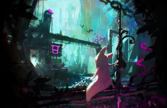
It's sick af it might be my favorite rw piece. So I'm gonna ramble about technical art stuff that it does that I think is neat.
First let's look at the layout. It's got a very distinct foreground middle ground background layering that you can break down like this
With these layers you can put a lot of Stuff in the background without any of the important parts getting lost. If you look at any small section of the piece you'll see Ten Billion wires, plants, metal sticking out, shadows, anything and everything. But since it's all grouped together on the same layer, it sorta fades into the background as Background and you don't lose the main shapes.
The scant use of purple/pink is also very neat. The purple is eye catching. The artist wants you to look at the purple stuff. But some of it isn't important at all, like the curling plants - they aren't supposed to be looked at directly, exactly, but they still lead the eyes around where they're wanted.

Your eye goes from the pink lizard at the top to the dragonslayer symbol to the slugcat, where it lingers for a moment, framed by the purple plants, then you eventually follow the plants and the pole up, the chain left, back to the lizard. The path your eye is supposed to follow is highlighted for you.
Okay last thing I want to talk about. The thing the tags at the beginning of the post actually mention. The secondary light source.
It's pink yeah like I was saying about eye movement. But also. It defines the slugcat. Look at this edited version without the pink light.
The tail gets lost. The foot gets lost. The slugcat becomes part of the scenery instead of the focus. The intended focus is so much more boring to look at then the little lizard.
So yeah I'm obsessed with rain world art I'm obsessed with this piece in particular. Study it and break it down ok <3
#tia posts#rain world#i like talking about art idk man#ummmm look at rain world art. do paintings. goodnight everybody#this rw art IS my phone background btw
3K notes
·
View notes
Text
Creator Spotlight: @themetalhiro
Hi, I’m Metal! I’m a freelance artist from good ol’ New Jersey. My favorite things to work with are a lot of bright colors, exaggerated poses, and candid scenarios. I try to farm sensible chuckles whenever I can, so I’m also big into comics. I love making them about my life, and the media I’m into, and one day I’d like to publish my own series! Thank you to everyone who has gotten me this far!!
Check out Metal's interview below!
Did you originally have a background in art? If not, how did you start?
I guess so! It’s funny, I don’t remember a single time in my life that I wasn’t drawing as a hobby… somewhere in middle school (a little late, I know.) I put the pieces together that animated movies were made by artists, and that it wasn’t just for fun, they were paid to do it. The moment I discovered people could be paid to make art, I decided I would do that, too. Now I’m here!
How has your style developed over the years?
I think the best way to answer this would be with an example! Over the last few years, I have made more of an effort to draw more intentionally, which sounds silly. Now, I put more thought into my poses and step out of my comfort zone with shape language and composition. I had a phase where I drew everyone with a huge, perfectly circular head and no nose. That definitely did not lend much variety...
Which 3 famous artists (dead or alive) would you invite to your dinner party?
Ack! I’m so terrible at history! I’d love to give a well-thought-out answer about fine artists of old, but I don't think we’d have much in common… Most artists I admire and who have driven me forward creatively are the people behind comics I’ve read. Andrew Hussie, Bryan Lee O’Malley, Eiichiro Oda... these guys have inspired me greatly and had a heavy influence in developing my art style and sense of humor. I’d love to ask them questions about their processes and upcoming projects. I think it would make for an entertaining night!
Over the years as an artist, what were your biggest inspirations behind your creativity?
Outside of pure aesthetics like searing bright colors, layered clothing, and loud noises…. the best and most inspiring moments in my life were those surrounded by friends and loved ones! I cherish the hell out of memories of hanging around in fun locations, trying weird food together, and impromptu midnight walks... so I try my best to capture that atmosphere and my own memories in my work when I can, even if I’m imposing fictional characters on top of them. That’s always the core of it.
What is a medium that you have always been intrigued by but would never use yourself?
I would never permanently refuse a medium, but every time I pick up clay, I’m like a baby using its hands for the first time. Absolutely dreadful. If one day I could make and paint a figurine like the ones I admire in videos, that would be awesome... But for now, I’m not counting on it.
How do you want to evolve as a creator?
I’ve had an absolute blast drawing fanart over the years, and it’s certainly played a massive role in my growth as an artist. But my dream has always been to publish my own stories for y'all to enjoy! I have lots of worlds I want to introduce to you before I’m old and gray. I want to get faster, work harder, and get better at drawing interesting settings so I can get the wheels turning as soon as possible. I also want to stop avoiding the color blue like a coward.
What do you wish you knew when you first started out creating art that you know now?
Pay your taxes quarterly. Tablets will break at the exact moment you need them most, so have a spare. Wear your blue light glasses. You’re going to need to wear a brace on every joint on the right side of your body. It can be lonely sitting at your desk all day. The car on the side of the road that costs $1000 cash….. don’t trust it!!!
Who on Tumblr inspires you and why?
@cranity—They use absolutely beautiful colors and weighty line work. Everything looks so sharp and clean! I wanna put it all up on my wall!
@vewn—Their ability to crank out quality short films and illustrations packed with detail is incredible. The off-kilter perspective they use really sells disorientation and catches your attention like nothing else.
@nelnal—They have absolutely banger character designs again and again, I can’t believe one person’s mind can come up with so many creative ideas!
@jinx88kc—They have a beautiful and recognizable style, and the way they incorporate animation into their illustrations sometimes is SO cool!
Thanks for stopping by, Metal! For more of Metal’s work, follow their Tumblr, @themetalhiro! If you haven't seen their Meet the Artist piece, be sure to check it out here!
3K notes
·
View notes