#all lineart was done on the day of but i really wanted to color the second one
Explore tagged Tumblr posts
Text
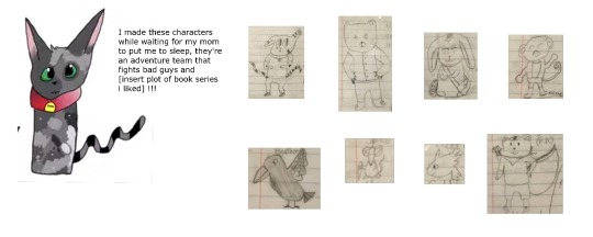
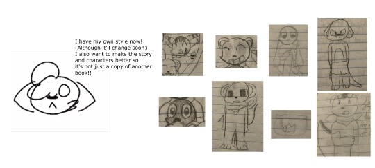
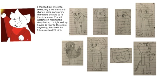
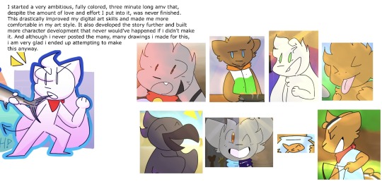
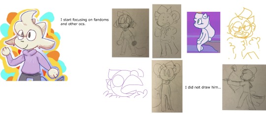
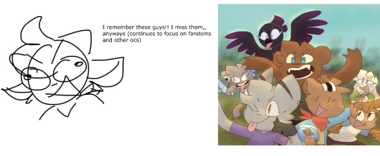
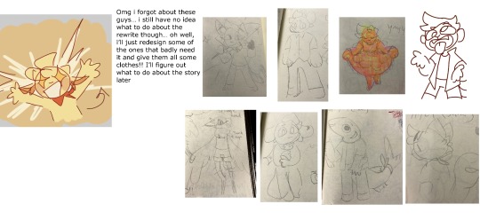
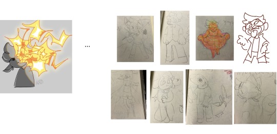
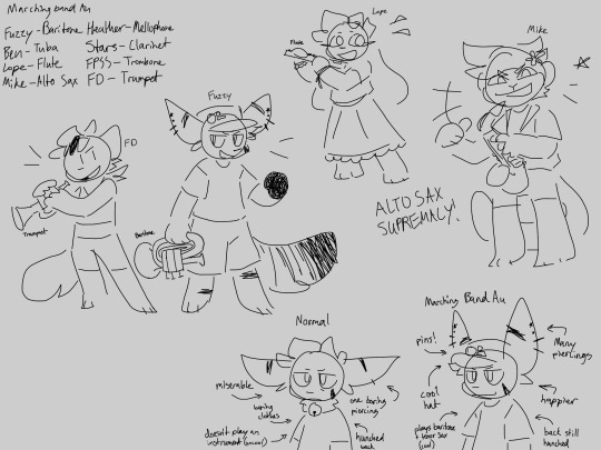


Yayyyyyyyy
#paper’s art#Oc#wheeze.#As much as i liked drawing this and liked how it turned out idk if i ever want to that height chart ever again#Honestly its my fault it was so inconvenient to do#At first the canvas was way too skinny for it like twice#And my drawing program doesnt just let you extend the canvas you have to just make a new one so i had copy and paste each character twice#And then since i just cropped the pictures instead of just copy pasting from the og things the lines were attached to the gray background s#I couldnt color them#And then i thought why not just trace over them again so we dont have to deal wiht the sketch lines or the different line thicknesses#So i started doing that i got ben done but i hated doing that so i stopped#So then i was like screw it im just gonna copy paste the lineart from the og drawings#So i did that but since they got smaller/ bigger i had to manually size the new backgroundless lineart over the old ones and also some of#Them i stretch a little so i also had to do that#And then yeah i clored them. Thats it#Also finding the old drawings was kihnda hard#But that was afew days ago so i forget idk#Also as much as i love this au already i hate drawing those instruments#THE BRASS INSTURMENTS!!!!!#The woodwinds wre fine i guess since i already knew how to draw saxophone and flute and clarinets are just sticks#But wtf why do brass instruments looks like that#Also i know that even though i named this a marching band au and not a wind ensemble au i know theres no perc but consider.#I am not in battery or pit so i dont really know what goes on over there#Also theres only like 8 of them i cant get all the instruments#I liked giving them summer clothes though#Idk maybe i draw this au again if i get the motivation#WHEEZEEEE…#< jsut described all the pictures…
8 notes
·
View notes
Text
this blog is awesome for me, actually
#the comic i posted recently is very experimental for me#if you've seen my prev art. they're usually very quick sketches#or the lineart is smooth#but i had such a specific vision for the comic that i wanted to give this particular style a shot#so i really went all out on it#and i'm proud of what came out!#the reception has also been really positive and it's very very nice to see#i'm glad we all love these weird shapes <3#i'm hoping to do more soon when i'm not thinking too hard about things i gotta do#already got a concept in mind but i want to take a little more time thinking about it#the comic dialogue was written in maybe 10 minutes. and the art was done a day later and i only planned out maybe 2 panels at most#but who knows. maybe the quick thinking makes it easier for me to let ideas flow!#also considering using only 2 colors this time...but i'll have to test it out#anyway i just wanted to yap here heehee
3 notes
·
View notes
Text


goretober day 23: circus
iris' shenanigans have gotten out of hand!
goretober day 24: beast
method acting
goretober day 25: hanahaki
ruby's unrequited love is suffocating...
prompts by @l0vely-w0undss @shocked-collar
#goretober#my art#ruby gloom#iris#scaredy bat#skull boy#misery#yea i had a busy week#all lineart was done on the day of but i really wanted to color the second one#but i didn't finish the first one😭#male guro#male whump#guro#whump#also all were done with different pen types😁
4 notes
·
View notes
Text
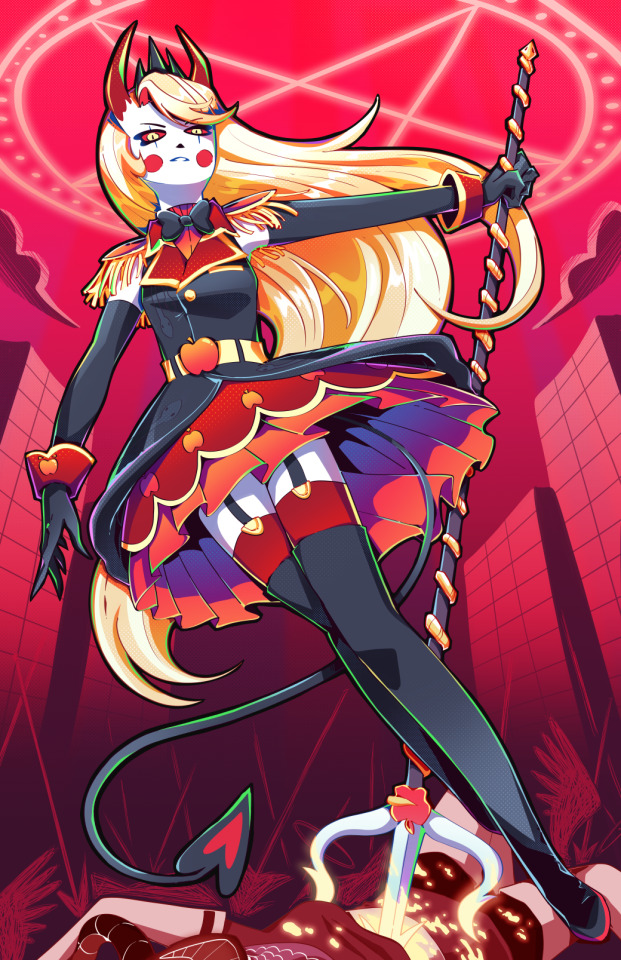
Holy SHIT am I proud of this. It took a day and a HALF to work on it. I really just wanted to draw a cool badass picture of Charlie in a cute dress, and somehow I ended up with my best piece I think I've ever done!!
To see the process, click the 'read more' below!
Otherwise:
Main blog over here
My Etsy Shop!
Originally, I wanted it to look more like a royal portrait, a good excuse to draw a pretty dress.
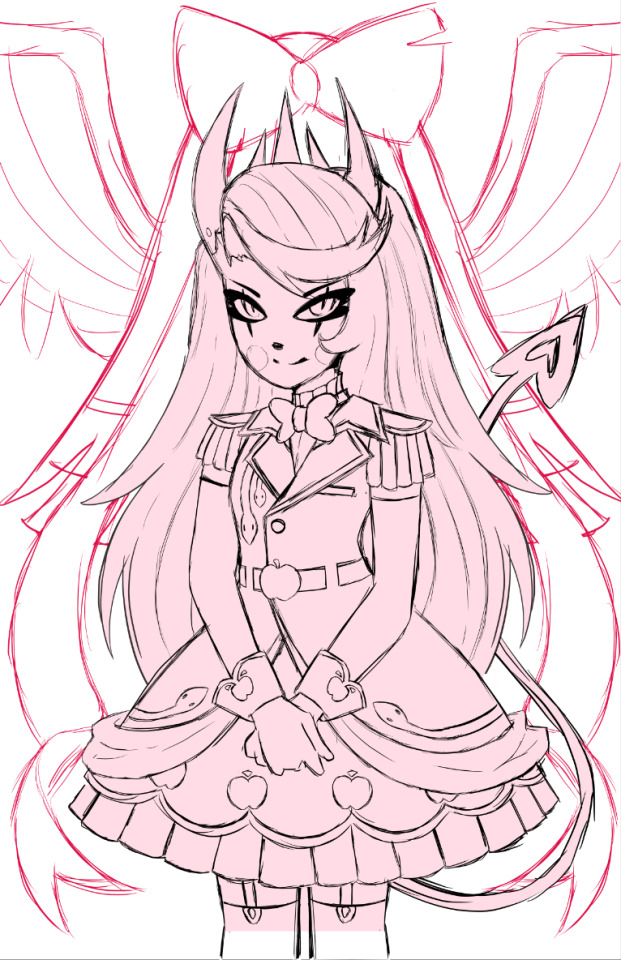
I adored the dress design, but it was an extremely flat image, so despite taking like. 5 hours to design it and work on it, I rethought my plan, switching to a far more dynamic pose.
I also made sure to add tons of flow lines, both from her hair, to her tail, to help bring the eye all around the canvas.
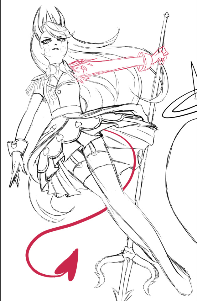
I did a billion sketches, but this is what I ended up on! Originally I had her right arm holding the pitch fork behind her back, but it just never looked right. I also took a risk and did a facial angle that has always been extremely hard to get right, and somehow I managed to make it look nice!
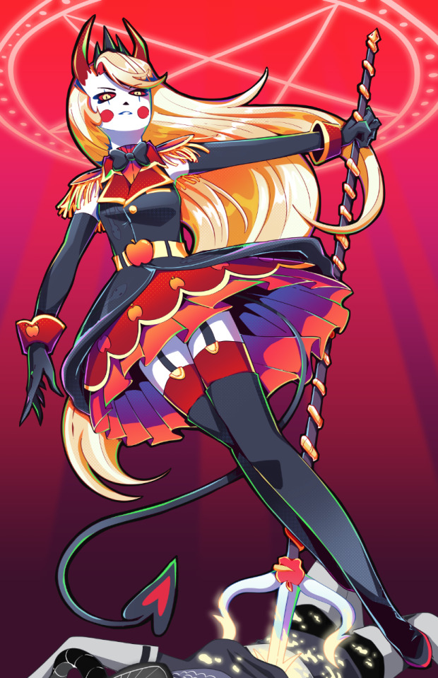
After adding the lineart, colors and all of that, I knew quickly I didn't want the angel to stick out as much as she did. I wanted her to fall into the background instead, since she was just on the border and I didn't want any attention really taken from Charlie. So I changed her shade to red, and from there I added more of the background details!
Okay I did leave some inbetween screenshots out but it's past my bedtime. I hope this was fun to look at, at least!
Final product once more!

#charlie morningstar#artists on tumblr#hazbin hotel#hazbin hotel fanart#hazbin hotel season 1#hazbin#vivziepop#cqart
1K notes
·
View notes
Text
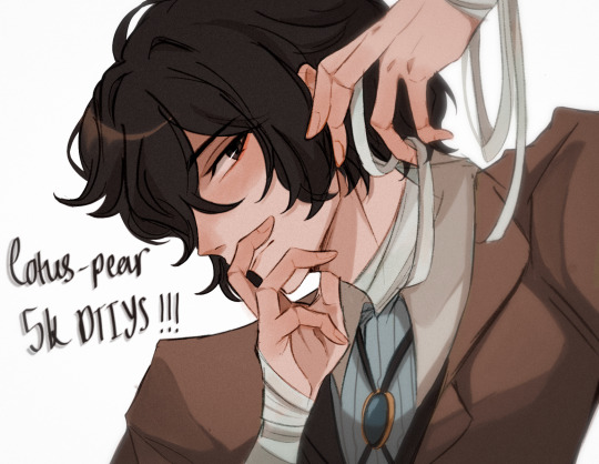
YAAAAAYYYY ITS FINALLY HERE!!! ty guys sm again for 5k i rly appreciate it <3
rules and guidelines under the cut!
rules and due date (i've never done this before so bear w me ok!!):
-due date will be march 1st! i will accept entries a few days late dw i'm nor ur professor or smth BUT I WOULD RLY PREFER IF U GET IT DONE BY THEN (just dm me if u need more time)
-pls tag ur finished piece under #lotuspear5kdtiys and dont forget to mention my user @lotus-pear! if i neglect to reblog ur piece then pls lmk even though that probably won't happen bc i'll be checking that tag every day for new entries👹
-pls don't trace the art.. i'll be really sad if u do that :(((( if u need help at all w the posing or hands then shoot me an ask or weed ur way into my dms bc ik this is kind of a complicated piece
-anyone can participate!! u don't have to be following me or anything and it's fine if we've never interacted before
-colors and expression are completely flexible and i'd even encourage playing around w it since the final product isn't meant to mimic my style. if u can then pls try to keep the pose relatively similar although i don't mind if it's changed a little bit. whatever is most comfortable to u as the artist.
-if u guys want to see the piece without any shading or rendering then pls dm me, ik it might be easier for some ppl to just see the bare sketch or the lineart w base colors
prizes🤩 (ik this is what u guys are rly after /j):
-alr so ik everybody's all like "well what's in this for me🤨" oh my god if u would just let me explain 😐 i'll be choosing three winners and two honorable mentions amongst all the contestants
-the top three winners get a follow (yea ok kinda sucky but wtv) AND they get to commission a fully rendered piece from me of a single character of their choice for free >:) (i'll discuss the details w the winners in two months)
-the two runner ups will also get a follow from me AND they get to commission a sketch of a single character from me (again, i'll discuss what this entails in further detail when the honorable mentions are selected in two months)
————
ermmm yea i think thats it for now i'll come back and edit the post if i feel the need to add anything.. HAVE FUN GUYS I CANT WAIT TO SEE WHAT U GUYS DO🫶🏼🫶🏼
1K notes
·
View notes
Note
Do you have any advice for people looking to learn how to do color like you? I've been drawing for nearly 13 years but I've never been good with color and feel like my pieces always look rather over blended or that I can't pick good color pallettes.
Just to preface: coloring was fairly new to me just up until recently. I've always done color here and there but it was never my favorite (I very much felt like I had the same problem you're describing) and for a long time my style was largely based around grayscale because of it. When I started doing BG3 art it kind of felt like a necessity to learn, though, since its such a colorful game. So, take my advice with a grain of salt!
My biggest struggle with color was that the style I wanted to do never seemed to match my lineart. I eventually realized that was because my style itself wasn't done with color in mind at all - like I mentioned above, I mostly did grayscale and let the linework carry the art entirely. This also skewed the way I distributed my efforts; I would get really exact and over-detail things with the lineart like I was used to doing, and then felt like I also had to overdo the coloring as well, because the slightly "rougher" rendering I was striving for didn't seem to match the style.
The solution I arrived at was changing the way I approach lineart entirely, purposefully making it sketchier and less "exact", not letting myself be boggled down with details. In this way, I feel like I have far more freedom in how I apply colors and approach the rendering. It has also been extremely beneficial to learn how to push simplification (both in regards to lines AND color) as far as I can before the art stops looking good to me, and that has allowed me to backtrack into more detail again while feeling far more in control of their application. The more you breach out and experiment, the more ways you will have to approach your work when you feel as if you've hit a wall.
Obviously, I don't know if any of this applies to you 😅 but it's info that's been super valuable for me to realize.
Something else that might help is hunting down for tools that don't let you be precise - staying away from sharp liners and brushes and picking stuff that looks more graphical.
Also, not letting yourself zoom into your work too much so you're forced to achieve the shapes you're trying to achieve with rougher strokes and lines, and hence avoiding overworking small details that will ultimately get lost in the final picture anyway.
And assuming you have a good grasp on the basics - put a cap on your rendering time. Try drawing as fast as possible so you're forced to look for alternative solutions for making stuff look good without spending days on it. (I do NOT suggest doing this regularly if you're just starting off learning things like anatomy and perspective though; take your time!)
As for color palettes - I feel like I have a horrible eye for color LOL so I can't offer much wisdom there. I will often be adjusting hues and depth well into the finalization of the piece and ultimately just throw my hands up and say GOOD ENOUGH before sending it off. Taking breaks from looking at the screen so you can take it in with slightly fresher eyes tends to help me, though.
186 notes
·
View notes
Text


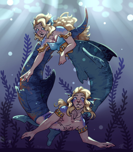
goodbye Mersmp
Super long message below!! (Funny story!)
and a message to the CCs at the end! <3
This is a piece that means so much to me. 21 months ago the designs for Theo and Faye got released. That day, i drew them! On paper with the supplies I had laying around, in a sketchbook smaller than my hand. At this point I was proud of my art but still very nervous about it. I had no idea how to draw them. I struggled a lot.
The second time I drew it, a year had passed. I felt I had been able to grow a lot as an artist and was excited to show how much I improved, so I redrew it! I loved how the lineart turned out and was so so excited to see the finished piece! But guess what? I hated it. I colored it in and still hate it to the point that I don’t even have the final version saved to my phone. It makes me feel ashamed.
But now, Mersmp has come to a close and the characters I have grown to care about so deeply have gotten their happy ending. So I wanted to give this piece that as well.
And finally, I think I can finally say I did.
I started drawing this final piece as soon as I was able to screenshot their epilogue designs. I was determined to make it right. So I sat down and drew, and drew, and drew, only taking an hour break to have dinner with a friend (don’t be like me). Finally, at 3am, eleven hours later, I was satisfied.
In this final piece are things that show just how tired I was. There are countless freckles on both characters, even under their scales! That’s a lot of dots. But wait… not the smallest. If you zoom in close enough they have pores! Much smaller than their freckles. That’s really a lot of dots! My freckle brush must have really come in clutch, right? WRONG! I dont have a freckle brush! All of this was done with one single smooth brush and I made Every. Single. Dot. Individually. That must have been pretty hard on my stylus, right? ONCE AGAIN WRONG! I don’t have a stylus! All of this was done on Ibis Paint x, a free art program, on an old janky ipad I got for free because it was so broken, all drawn with my finger. Even if I got a stylus, my ipad is too old to connect to any of them, including apple pencils.
The moral of this story is to never give up and not to let your resources limit your creativity. It doesn’t matter what medium you use, just do something to learn and keep pushing to improve. You will get there. Despite everything, you can do it.
And to the Mermp crew: Thank you for everything you have done. Through the story you have told and the community you have built, you have helped myself and others to grow in many ways. I myself learned a lot from Theo, learning that I do in fact go nonverbal at times and that does not mean there is anything wrong, and that I can feel conflicted and unsure about gender and expression. I learned I don’t need to be fixed. Just like I have now learned to look at the first redraw. I may not like it, but it is an expression of who I was at the time. Similar to Cella and Bite. Those characters may not like what they did in the past, but they are able to look back and recognize that it made them who they are today. If I always was proud of my first redraw, I may have never pressed myself to make this third one as beautiful. Thank you for the stories and lessons you have shared with us and allowing us to grow along side you and your characters.
And maybe, one day, a year or so from now, I can return to this and redraw it again, seeing what other things I enjoy in the future and how they may shape me to change.
With love, Turtle.
#artists on tumblr#fanart#my art#mer smp#mer smp theo#mer smp faye#mersmp theo#Mersmp finale#redraw#i love them sm#A message to the Mersmp creators
160 notes
·
View notes
Note
Hello!
I just wanted to tell you that your art and way of storytelling is AMAZING. You're one of my biggest inspirations, and one of the people who got me into LMK (which I am very grateful for! Thank you so much)!!
I also have two questions for you (if you're not too busy! I dont want to bother you-)
What's your process for making illustrations? Yours look so pretty and they are so wonderful to look at!
And, what's your tips for anyone who wants to make a LMK fan-comic, but is a little scared to get something wrong? (Like good representation and cultural no-nos for example. I've done research, but the internet can be a little confusing and messy about topics like this, so I wanted to ask for help!)
I do hope that I'm not bothering you in any way!
Have an amazing day/night!
This is an oldie ask, apologies, but I do have a better way to answer this now! Typically, when I work on my pieces, I have 4 main phases: Roughs, Lines, Flats, and Renders! I'll use this Nezha piece as an example!
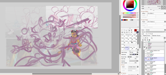
My Roughs stage includes getting references, color themes I may want, and feeling out the general vibe I want out of a piece! For this one, I really wanted to push Nezha's face expression (my main) as well as try to emphasize the speed at which he was moving.
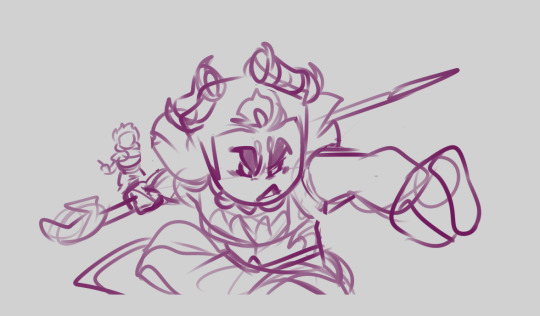
Once I do that, I try to space out everything in the background, and refine the sketch with one more rough draft before moving on to the lines!
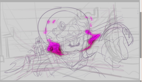
The Lines stage is pretty self-explanatory: this is when I line everything and make additional changes I may not have thought of from the Roughs stage: For this one in particular, I remember wanting to add details of more wear and tear, such as the sash being a bit damaged, or his bracelet getting cracks, or his face being a little scuffed up.
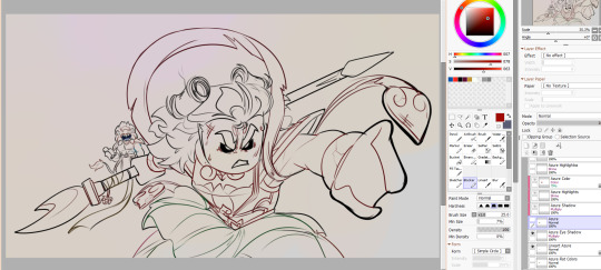
Next up: Flats! This is when I would flat color, as well as adjust the lineart to have colored lines (its already colored in the prior screenshot, but my lineart starts out all black) I find coloring the linart helps make the colors feel more "lived in" for lack of a better phrase
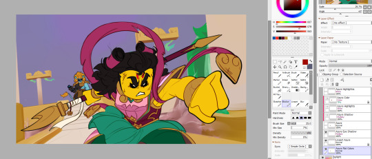
Finally, the render portion, which usually starts with the BG for me most times; I find if I know the environments colors/lighting it helps concrete where light is affecting the characters
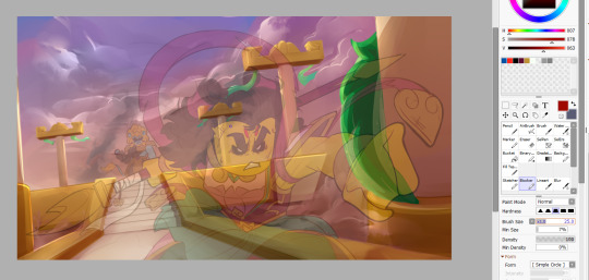
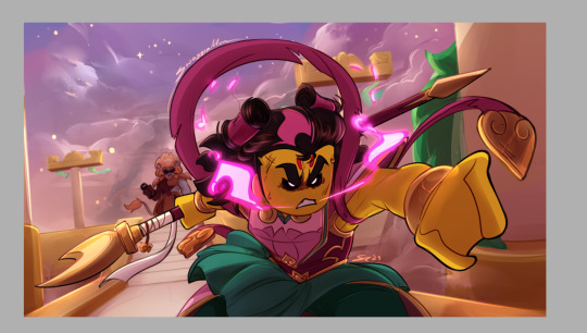
This is your overlays, mutiply, and shine layers in action! Flat coloring makes my soul itch, but rendering really helps quell that pain for me; esp if I get to work with gold/hair shine! I hope that was helpful! And as far as advice for respecting cultural-related things, honestly, as an American I don't know much in the realms of specifics, but I do know to try to have basics understood, which I gather from what has been made thus far within LMK, reading the source material/fact checking information I come across, my own experience of being black in America, and reviewing travel advise funny enough. I wish you a good luck with your artistic journey homie!
74 notes
·
View notes
Note
Hi! I finally got the chance to read Aurora a bit ago. It's a wonderful story--all I was expecting and better! I was particularly amazed and delighted by the artwork and visual mechanics used to tell the story, so I wrote a post to yell about how cool it is and break some of it down. (No criticism, just praise.) I'm mostly a hobbyist, so I'm hoping I've done it justice.
That said: zero pressure to read it or respond to this ask. Normally I wouldn't send it since I tagged, but I know Tumblr's notifs are a mess and things get lost very easily. I've been in both the "one (1) word of praise will feed me for a year" and the "oh gods don't talk about my writing/art because anything that seems Off will break my brain" modes before, and I absolutely don't want to push or make you uncomfortable!
If you are comfortable, however, I wanted to ask about your use of what I'm assuming are Screen and blending modes in sound effect words. (I'm only guessing that's the technique, though, so I could be totally wrong about how it's done! I'm mostly experienced in image manipulation in Photoshop.) Making them semi-transparent over the actions is genius :) What inspired you to do that, and are there specific techniques you use to make it work?
Same questions go for using specific colors to distinguish different characters' words and actions. I really noticed it in the cave sequence with Falst and Dainix, since their colors are so vivid in the dark (ex. Falst's little swats and Dainix's swooping kick at 1.20.9). It lends excellent clarity to busy scenes.
Thanks! Have a lovely day, enjoy your break, and happy holidays <3
You're correct about the technique! "Screen" is the blend mode I use most often for sound effects. I stumbled on it mostly through trial and error - I love how sound effects add depth to a comic panel, but it's very easy for them to obscure the art in a way I find counterproductive, so "Screen" lets me put the sound effect directly over the origin of the sound while still letting it be visible through the word. Early chapters didn't have it as much-
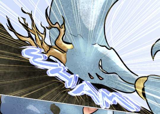
Most of the sound effects in early chapters are just solid colors with reduced opacity if I'm feeling fancy. But I started figuring it out around chapter 8 and 9, because Falst is kind of a sound-effect-heavy guy, especially in his fight scenes.

In order to make sure they don't impede the visibility of the action, I'll often soft-erase the top or bottom half of the SFX to reduce its opacity while still leaving it readable.
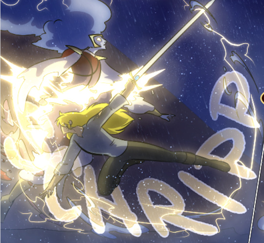
I'll usually double that up with an outline on the SFX so it's still readable. This is an especially important consideration if the SFX goes over an area of the background that's very bright or glowing.

Color-coding the speed lines and SFX to the character or force causing them isn't a hard and fast rule, but I like using it (in part because it's a habit from the OSP illustrations, where every character has a single pop of color in their lineart) mostly because it sort of codes every sound to make it clear where it's emanating from, or the general feeling of the sound. Since I normally do character-colors for SFX, something like this stands out more jarringly-

Which it's supposed to, but a big lightning strike doesn't register as anything too worrying because it's just Tess up to her usual shenanigans.

It's also very useful for magic effects, because each form of magic has its own associated palette.

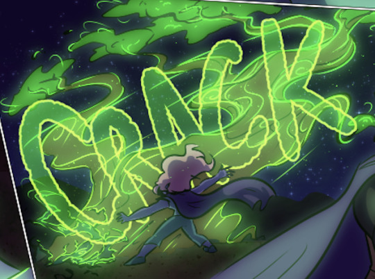
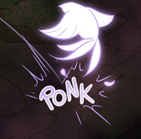

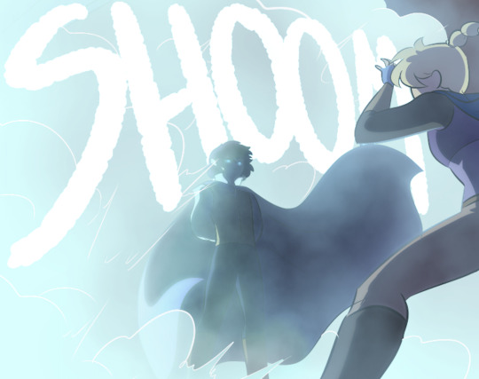
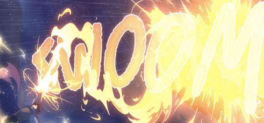
And when I had a very complicated fight scene in a dark environment, I used the texture pattern I'd already made for the monster to color its SFX, so when I Screened them onto the panels they didn't obscure too much while still communicating "this is something else."

Changing the weight, lined-vs-not-lined, and opacity of the SFX words also helps to communicate that not every sound has the same feeling. A strong motion is solid and aggressive, but a crackling, unstable sound is more ephemeral and staticky.

It's definitely been a process of learning as I go - looking back at the earlier chapters I can actually see when I first tried various tricks I now use regularly, like doubling and distorting an SFX to produce the effect of a camera-shaking impact. I haven't really seen any other comics that do it like I do, probably because most other comics follow a more traditional production pipeline where text bubbles and sound effects get locked into the composition early, before the inking stage, because traditional physical comics don't have digital-art layers to play with. Adding sound effects to a page is almost the last thing I do before exporting them, and that only works because digital art and layers allow for a ton of flexibility.
378 notes
·
View notes
Note
You probably have already made a post about this (in which case I apologize for bothering you) however I really love how you render and color! Do you have any tips?
Hiiii so I probably indeed already answered something like that but it’s probably time for an #update + realized i can put pictures and it would probably help actually. Slay okay.
THE BASICS: have brushes you like. I have my faves, they’re in my #brushes tag (click below), you might also see them on the screen of my paintings in wip lol. Typically i thicken them up for rendering AND, now this is integral to my liking of rendering these days + the look: COLOR JITTERING. In procreate that’s tap brush -> color dynamics and i adjust the stamp & stroke jitter in the « hue » category. I have my fave brushes quadruplicated as thicker No Hue, 3% color jitter, 5%, 13% depending on the desired look. What this does is give intrinsic interest, variation and depth to your colors, and that way you can have more fun when colorpicking. This will come back again later.
STEP 1: a lineart you like. Doesn’t have to be clean tbh some of my fave linearts from current works were quite messy. ALWAYS colored.
STEP 2: on a layer underneath the lineart, put down flat colors. See what % of color jittering brings you the most #joy. I will do flat colors or i will sometimes already define some areas of light and shadows.
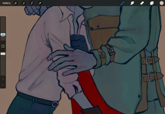
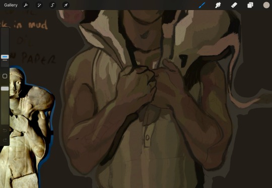
^ you can see the subtle color jitter in the « white » of the shirt and the green of that first image. Second is to show the already defined areas; if i know i want a different hue on here. something else for some pizzazz: tint a color with an adjacent one. not really visible in these screenshots but in matador, at some point, i added an orange tint to burakh's sleeve, the one closest to the red cape.
STEP 3: the shadows. On the same layer as above (you can duplicate it before this so you can always come back to it later if you need to redo), put down your shadows; the trick: COLORPICK FROM A PIXEL WHERE THE COLOR OF YOUR LINEART AND THE COLOR OF YOUR FLATS INTERSECT. You might have to recolor your lineart (use the « alpha lock » feature of your layer or something of the sorts) until you’re satisfied; i typically redden it in the face and hands.
STEP 4: put down the highlight. I typically do highlights the complimentary color as the shadow: if shadow bluer, the highlight is redder (-> pinker), etc.
STEP 5: now this is the scary part. Before proceeding if you’re #scared, group your lineart and colors, duplicate the group and merge one of them so you can always come back to them unmerged. MERGE YOUR LAYERS. You heard me. Merge lineart and color. From then on…
STEP 6: render. Render, render… PATIENCE… est mère de sûreté bien sûr. Here’s my secret: I NEVER BLEND. I ALWAYS COLORPICK. COLORPICK where two colors meet and you’ll have the perfect transition color.
tip: always have an all-black layer set to color mode above all layers that you can toggle on and off to check your values.
This is more of a fun thing i like to do even if i haven’t done it often: use some hints of a geometric brush to add interest when using an « organic » brush (or vice-versa, I’d guess, but i rarely render with geometric brushes). Exemples again:
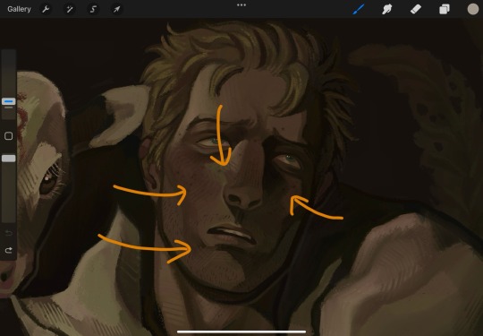
And well Das Preddy Much It… Your Turn Now….. and because i realize a short demonstration is better than a long speech, have a speepvideo of the two pieces I’ve used as exemples one after the other (matador first to 44 seconds in, moschophoros second). the very beginnings are cut because we’re focusing on the above steps.
Your turn……. To play.
#allô (answers)#anonymous#faq#<- we'll guess...#brushes#<- the ones i use in there#rendering#tutorials#<- eeeeeh........
76 notes
·
View notes
Text
300 Followers Special!
AGH IT HAPPENED AGAIN

was legit just checking through my blog and realized but at least i caught it in time!!
Thank you all so much! For this and for all the support everyone gives on the silly things I make. I know the last like, several months of this blog have been chaos (from posting often to nothing while I was sick to semi-daily in December etc. etc.) so I appreciate everyone sticking with me through it all very much <333
I'll admit there's.... a LOT going on right now (looks at my wips and at my research to-do list) BUT, i don't mind adding something to the list! It just might take a bit of time to get to it lol
Pulling from the 100 follower milestone celebration ideas that didn't get picked, as well as a few other things I came up with, will do the top two if results are close :D
BUT feel free to pick the 'other' option if you have soemthing else you'd like to see! I will do whatever since this is me saying thanks ^^
Little bit of info on each thing below the cut, excited to see what you pick!
Q&A/Ask the Cast: a classic, I know my ask box is open but here's also a clear chance to ask something that you've been really curious about! I won't share spoilers for the story, but everything else is on the table, including stuff about me, writing etc. Just no super personal questions is all! Additionally, you can ask the cast questions and answers will be in character, perhaps with a little doodle as well ^-^
Writing Requests: same as all the other request things I've done, same rules apply (no nsfw, suggestive is fine, be specific if you want specific) and will be about 500-1000 words each
Doodle requests: I provide you with a little drawing I made with tender love and care (would be lined, colored, shaded, etc.)
A peek into the drafts: I do in fact have a couple other fic ideas floating around in my brain that I simply haven't started so that I don't get bogged down/focus on CS. I would share those and a little bit of concept art
AU Oneshot/Continuation: I take a oneshot I've written and add MORE to it in some way, anything that I've written is up for grabs (besides my multi-chap stories ofc) This includes my Promptober responses, DCA December, 'Secret' gifts I've done, and any other drabbles or such. Examples of times I've already done this would include Holiday Spirit (continuation of DCA December Day 7), and Restart (continuation of Promptober Day 29)
DIY the DCA: silly idea I've thought about where using my knowledge as an MechE I determine the costs of materials, equipment, etc. for what it would take to build the daycare attendant yourself, would it be completely accurate? probably not I am not an expert, would it be fun? yeah I fuckin love deep-diving on mcmastercarr for shit
Chekov's Gun Analysis Post: i explain and go line by line about ch. 15 of Confused Spirit and explain all the little callbacks, hints, etc., why i love it so much, and so on
Other: explained above, don't be shy to tell me if none of these sound interesting! Won't hurt my feelings :)
#fnaf dca#dca fandom#fnaf sun#fnaf daycare attendant#fnaf moon#dca fic#confused spirit#again have a lot going on#and it MAY take some time#but i will make something eventually#probably in march im gonna need it oof#anywho thank you all again#i still dont know where you keep coming from but it's great <333#milestone celebration
34 notes
·
View notes
Text
OFFICIAL ART COMMISSIONS POST!!!
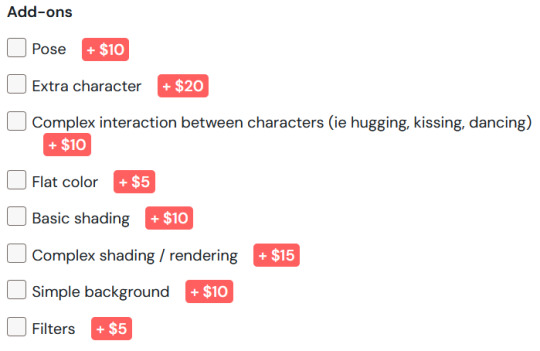
BASE COSTS
SKETCHES / SMALL DOODLES -- $10
BUSTS / PROFILE PICTURES -- $15
HALF BODY -- $20
FULL BODY -- $30
FULL PIECE -- $38
Communication will be over Discord, or Tumblr DMs if necessary. DM me here or use Ko-fi to start!
previews + more info under cut (blood/gore warning for one of the previews (its part of a screenshot, so not detailed))




WILL DO:
Humanoids
System alters
OCs
Fanart
NSFW (with limits)
Gore (probably not anatomically accurate)
WONT DO (with exceptions):
Super high detail designs (unless you have a detailed ref/are okay with less detail)
Animals
Complex scenes with over 3 characters
GENERAL GUIDELINES:
ALL OF WHAT FOLLOWS, AS WELL AS PRICES, IS SUBJECT TO CHANGE.
Payment via Ko-fi or Cashapp.
Costs are loosely based on an hourly wage. I'm open to minor negotiations, but don't expect discounts.
Payment is up front. If either of us needs to cancel at any point, I will provide (NOT FULL) refunds depending on where I am in the process.
Timeframe is around a week, give or take a few days, depending on the complexity of the ask. My ADHD is awful, so PLEASE pester me!
I need a ref! I'm not great at visualizing from text descriptions, so if you could provide references and a general sketch of what you want, that would be great! It doesn't need to be good at all--what I have in mind is really nothing more than a stick figure scribble. It just needs to get the idea across somehow.
I will work with you and talk back and forth as I work on the sketch! I will also check in throughout the process to make sure everything is going as you wish.
You can ask for a specific style! Simply provide an example of a piece I've done in the past. You can see my art on my tumblr -> https://moonstandardtime.tumblr.com/tagged/my%20art
PLEASEEE COMMUNICATE!! Thank you!
SPECIFICS:
REFUNDS:
- If you commission a piece and you cancel it, you will be refunded for what I haven't made significant progress on. For example, if you cancel a full-body with color, simple shading, and a simple background, and I've finished the lineart and started flat colors, you will be refunded $20 out of $55. You will recieve the unfinished piece.
- If you cancel a commission before I start it, you will recieve a full refund.
- If you cancel a commission before the intial sketch is finalized, you will recieve a 90% refund and the sketch.
REVISIONS:
- You can change as much as you want during the initial sketch. Anything after may come with a fee.
- If you want something changed late into the process, the fee will be increased.
- If it's too late, I may not be able to change it.
COPYRIGHT & USAGE:
ON MY SIDE:
- I reserve the right to cancel and refund the order at any time for any reason.
- I retain all copyrights over the commissioned artwork.
- I will NOT claim the intellectual property (IP) of the commissioned artwork (your characters are still yours, etc.)
- I will NOT profit further from the commissioned artwork unless you (the customer) break any of the terms.
- I reserve the right to post the commissioned artwork online and in my portfolio..
ON YOUR SIDE:
- You may upload the commissioned artwork on any website and social channels.
- You may NOT make profits from the commissioned piece (reselling, redistributing, uploading to POD-services, making prints for selling, etc.)
- You may NOT alter the commissioned artwork without my consent.
- You retain the rights to the intellectual property (IP).
- You may NOT use the commissioned artwork for commercial purposes.
- The following is considered copyright infringement:
- Reproducing/using the copyrighted artwork commercially - means making money off it in any way not excluded from these terms.
- Claiming the artwork as your own.
- Altering the artwork without my consent.
64 notes
·
View notes
Text


Behold, the Manglewood Machine
MAN this one was a massive doozy, I've been stuck on this one for a while and I'm so glad to have finally finished it, maybe I'll redo the colors cause only the lineart really came out how I wanted it to.
Anyways I had this idea that like, the titans kind of ruled over Bunkum long enough for it to have long term consequences. Like with Manglewood, the idea was that people just couldn't think of new ideas so previous movies they made were just chopped up, rehashed, and just spat back out, and what's the biggest enemy of creativity? Over-consumption, a never-ending satisfaction for more and more.
I also have like this little writing blurb that elaborates a bit more if anyone's interested
The worst time in Manglewood History, forced on its knees when the titans came for the industry.
Writers overworked, actors tangled in strings, the fruits of their labour a terrible thing.
Those awful movies came out day after day, what happened to those behind the scenes? The gleam in their eyes simply began to fade away.
It wasn't until the heroes sealed the titans away, did the endless day finally relent. The terror, the agony, everyone down and up had gotten a glimpse of that terrible torment.
Manglewood was done for, the party is over. A party so grand, so bright and full of glimmer. Who'd have known its hosts were parasites all full of bitter?
Nevertheless, word got around, a new place just a world away. Tinsel Town was its name.
The newest hot spot, oh didn't you hear? You can make your movies here! Land so cheap, it's practically a steal! So come on down and let us see your film reels!
#littlebigplanet#little big planet#lbp#littlebigplanet 3#little big planet 3#lbp3#i want to tag marlon in this but uhhh#he's not the focus of this lmao so NO#hmmm#golden age of manglewood au#pyro plays with pencils#sorry i forgot to include felica--gustavo--and irene in here </3#i'll be honest with you I didn't know how to fit them into this considering this mostly focuses on people who work on movies#i mean i probably could've snuck felica in with the writers but#it was too late#i would like everyone to know that she and marlon are old friends in this :3
20 notes
·
View notes
Note
I love your art style so much. 😅
Do you have any tips for coloring/shading or just tips to draw bodies (I can't do any without them being weird) ??
Have a nice day, :)
I’m glad sweetie
And of course I can give some tip I use!
I have to say I have many ways of shading and lighting so I will share my usual and then add some new one I have been experimenting
First: don’t do shadow on multiply ,that’s for later, shadows and lights are made on a mask layer and they are not just the darker shade of the colors, but a different color entirely
Same with lighting.
Some colors are easier than others for me tbh, like I love shading red and purple but blue not that much.

I also usually put blue everywhere cuz it looks pretty but it’s on me honestly
(Obviously I decrease the opacity of some layers, there is not really a rule, I just go as I like)
If it’s a style choice I also do shadow in light blue multiply, but just if I am in a rush or working with flat colors
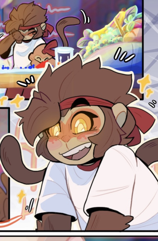
Second: choose how you want to smooth your shading and light.
Over the years I picked up my own way to do it but lately I have been a little experimenting.
Anyway i always start of with defining shadows then get to smoothing, it’s tempting but I don’t advise the use of the airbrush, just use it for lighting maybe.
( I want to be clear. This is my style, other artist may say the contrary)
I am one of those artists that clears the shadows from the inside to the most exterior part

Just how you can see here.
All the cleaning is made with a soft brush cuz it doesn’t have to be too definite.
In my latest comic tho the shooting was made the other way around with a water color brush to give this kind of 3d effect.
You essentially have to make some tests and find the one that you prefer.
Third: apply a layer of shadow in multiply to give more volume .
Usually when the work is done I add another layer of multiplied shadows that won’t be smoothed, just in the places that would cast a neat shadow, like a cape on the body, some fabric folds and some body shadows.
It really make things pop.
Four: don’t exaggerate, simpler is better, in both shadows and lighting, experiment , find your way but don’t rush , there is no need to exaggerate
Five: the subject of your drawing should be affected by the atmosphere.
For example if it’s night you can put a blue multiply layer over and erase where the soft light is, or don’t be afraid of adding some gradients of light is it’s a bright day outside, make the character be a part of the backgrounds
Six: you can color your lineart, it make the drawing very fine
That’s it mostly, I mostly go on the flow and I always test and try new stuff and you should try too to find you preferred way to do this stuff.
I want to say again that THIS is MY WAY of doing stuff, you can totally disagree and have your own way, I hope this way useful
265 notes
·
View notes
Text
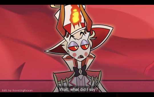

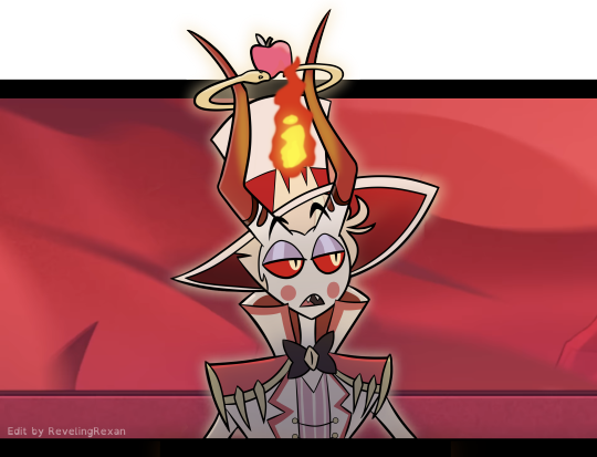
a silly screenshot edit i made of one of my favorite moments :)
...because i organized my bank accounts and wanted to give one of my cards a special cover!!
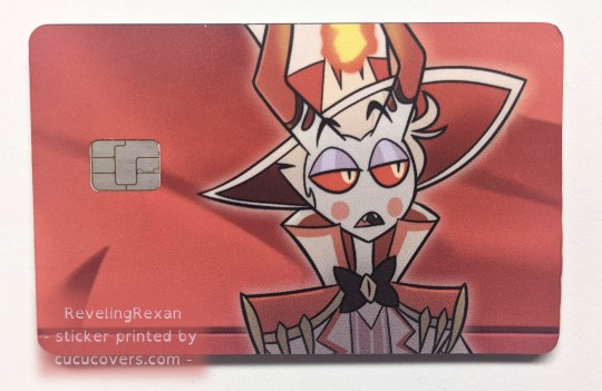
a brief note about applying the sticker to the card: the directions said to line up the sticker to the opening for the chip, but it went better for me when i lined the sticker up to one of the long sides of the card. (but of course make sure the sticker would be in the right part for the chip)
bonus behind the scenes on my making the pic under the cut :)
_____

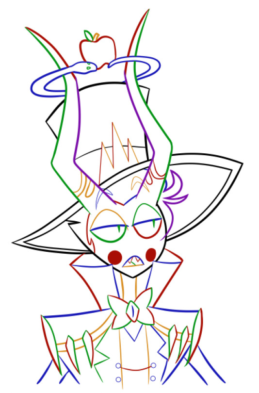
i tend to make several lineart layers when doing REALLY CLEAN lineart so i can more easily erase overlapping lines. (the first screenshot has lines that "overshoot" because that gives nice sharp corners and line width variety, but i need to erase the extra parts of the lines)
(i like these screenshots because Lucifer looks extra clowny with the outlines' colorfulness)
i realized on this project, since the final lineart is just going to be black anyway, that i can use different colors for each layer and then LATER make the lineart black. (realized it after already making some lineart, so you see some black here) that way, i can easily know what layer everything's on, instead of going through a bunch of layers and clicking them off and on to find a specific part

SO, RIGHT. VERY EASY TO THEN GET BLACK OUTLINES: JUST SET BRIGHTNESS TO ZERO. i usually use a program called FireAlpaca, and the way you do that there is: Filter > Hue… > drag the Brightness cursor all the way to the left

in this screenshot, you can see some of the effects i added to Lucifer to give him the nice shadowed look that Hazbin Hotel has, as well as where i covered Charlie at the tip of Lucifer's hat lol
i included my layers on the right of the screenshot to show how i set up the outline layers in the final version: as you saw above, i named my outline layers with the color used for them, then, once i was done with the outline, i placed the "outline before color change" folder above the base black "outline" folder. that way, if i later notice a mistake, i can simply turn on the colored outline folder and i'll see what color that part of the outline is and jump to the necessary layer, rather than going on a quest turning off and on a bunch of layers each time
since i duplicated my outline folder before changing the outlines in one of them to black, the base outline folder already has the color names included in the layer names
NOT ALL DIGITAL ARTISTS USE AS MANY LAYERS AS I DO LOL. I GO WILD WITH THEM SOMETIMES. MANY OF MY PROJECTS HAVE WAY MORE THAN 80 OR EVEN 500 LAYERS. people just tend to figure out what works for them. i wouldn't be surprised if i end up using fewer layers in the future. or a lot more. or go either way depending on the project
so, yeah, this is a screenshot edit, so i traced the main part of Lucifer's body. for the background, i used two screenshots. had to cut together and cover some stuff. here's the two screenshots unedited followed by a scribbled version to make things work lol and then the scribbled version that includes some extra touch ups/covers
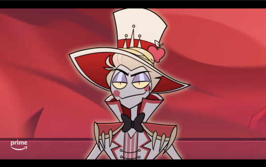

and some screenshots i took while working on this, when i unexpectedly got some cool-looking versions :3 first one reminded me of Day of the Dead looks (he DOES need to be more colorful to be more accurate) and the second is just rad


ANYWAY probably the most helpful thing to most people would be the colored outline thing talked about at the start lol, the stuff i bolded. that was IMMENSELY useful and i love black outlines more than ever XD
#hazbin hotel#hazbin lucifer#lucifer morningstar#hazbin hotel lucifer#screenshot edit#i feel like there's something else i wanted to mention under the cut but i'm forgetting lol#oH. IT WAS ABOUT CHANGING THE IN-PROGRESS COLORED OUTLINES TO BLACK LOL. GOT IT WOO#rexan's art#i got the sticker like two months ago and i STILL sometimes take my card out only to look at it XD#one of my best purchases ever lol#(it was about $15 in the U.S. and that includes shipping. i really wanted a Lucifer card)#(so worth it)
68 notes
·
View notes
Note
Love your art work, especially how you draw Obi wan! You draw him so perfect, what is the process of drawing him?
Thank you so much 🥹 This made me so happy 💜
Hm, my process is very much the devil is in the details.
But above all:
Reference pictures.
It all starts with an idea in what situation I want to put Obi-Wan this time. Either clothes, pose, or a movie screencap with an expression where I’m like, oh hell yeah let’s make him cry 🫶
After that it’s figuring out what I actually want to draw and the sketching begins. During which a backstory develops that helps me with the details to ground him more.
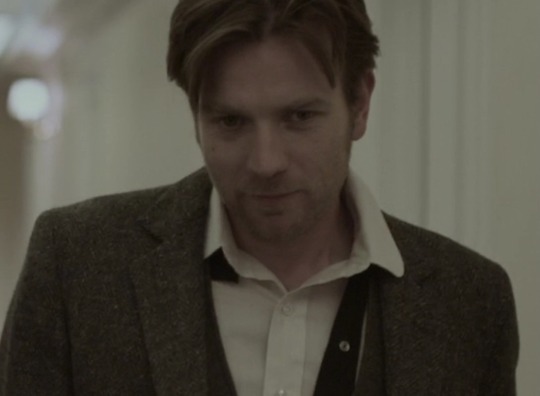
For AU deranged Sithywan where he wreaks havoc with evil!Cody, I wanted him evil looking (unlike IGMHC Sithywan where I wanted a sweet smile with the Sith eyes doing all the work for me to make him unsettling). I found a scene in Beginners where he’s rather sweet and bashful looking, and has a slight smile. Good enough.
I changed the eyes so he’s looking in the other direction and up, and then had some more fun fucking him up. So it ended but like this:
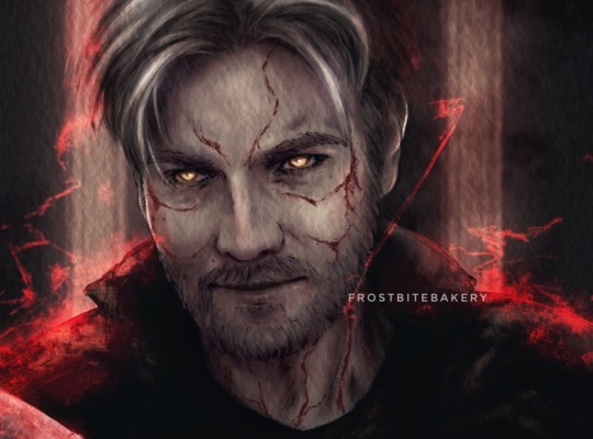
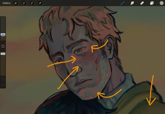
After putting more effort into the sketching to actual lineart, I put down base colors. Usually I roughly shade the face so I got some light direction, and then it’s Hair Time. I put hours into his hair. I want it soft and fluffy and I need it perfect.
Once the hair is done, I turn to my first love: shading eyes. It’s just so much fun and if I could get away with it (meaning if I really just stopped in the middle) I’d draw eyes all day long and the rest of the art would be sketch lines and color blobs.
In the end it’s the years and years of experience I’ve gathered that shape the result. The process just happened along the way.
78 notes
·
View notes