#all hdrs made by me
Explore tagged Tumblr posts
Text

4 notes
·
View notes
Text


Sådana dära ting
#ffxiv#final fantasy xiv#ff14#final fantasy 14#ffxiv glamour#gpose#midlander#hyur#nabaath-areng#ieeha de verral#ieeha#ffxiv screenshot#i got ffxiv to work after all!! whats weird is that its run way smoother now lmao?#and the graphics no longer look like they had the worst HDR filter slapped on them#aint complaining honestly#btw i was listening to malice mizer which made me think of moi meme moitie which led to this glam#just felt like pointing that out#which isnt out of the ordinary with him like... aesthetically#but this one is def more on the nose with the inspiration so to speak lmao
18 notes
·
View notes
Note
hi i'm sorry to bother you but do you have any tips on giffing dark indoor scenes? yours always look so good!
hi there! not a bother at all :) i can definitely try to explain the steps i usually take under the cut!
this tutorial will assume that you already know the basic steps of gif-making — if you don't, there are lots of great tutorials floating around on this site that can help you out! :)
here's the gif i'll work with to explain my steps, the bottom being the original and the top being the coloured/brightened version.
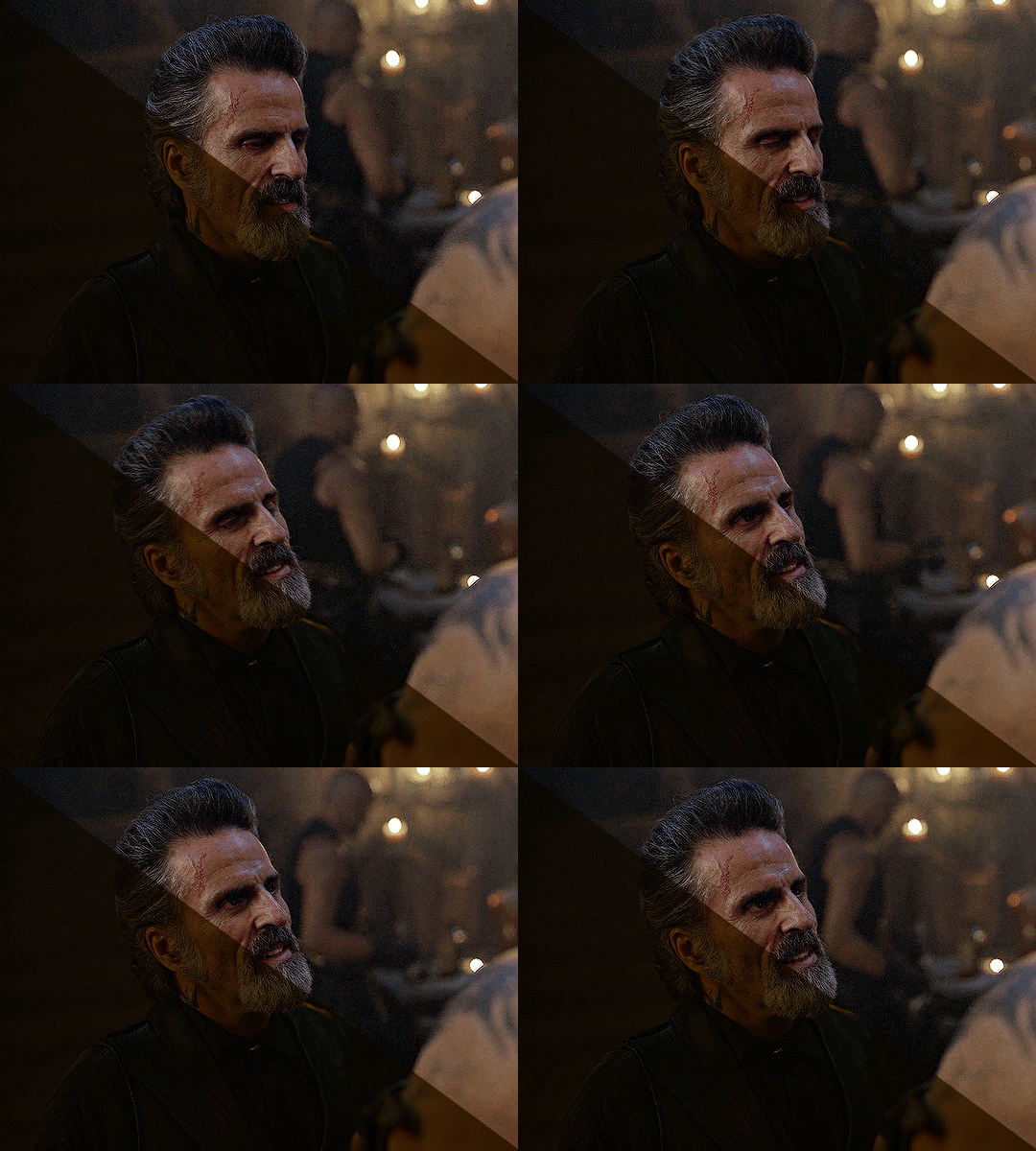
before we start, a general tip i recommend keeping in mind: if you want to brighten a dark scene, you'll want to get your hands on the highest quality download you can find. 1080p is decent, but if your laptop can handle 2160p 4k hdr files* without sounding like it's about to explode, that'll get you even better results!
(*colouring hdr 4k files requires a different set of steps — the scene will appear washed-out on photoshop, so you need to make sure that you don't end up whitewashing anyone if you do choose to work with this type of file.)
since most of my downloads are 1080p, i'll use this type of file in this tutorial.
the first step of my gifmaking process with 1080p files is almost always the same no matter what scene i'm giffing. i make a brightness/contrast layer and set the blending mode to screen:
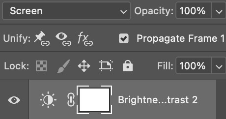
now my gif looks like this:
depending on the scene and how washed out it looks after this layer, i'll play around with the opacity. for this gif, i didn't touch the opacity at all. use your best judgement for this, because every scene is different!
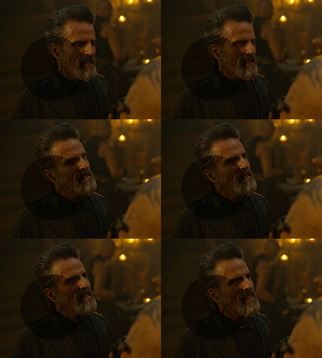
i find that dark indoor scenes are usually tinted in yellow or green. one of my first goals is to try to fix the undertone of this scene before focusing on brightening it any further. i go to colour balance for this, and play around with the midtones, shadows, and highlights.
again, every scene is different, so the amount to which you use colour balance will differ, but for this specific scene, my goal was to neutralize the yellow. i focused particularly on the midtones and shadows of the colour balance layer, moving the scales to the opposite of the reds.
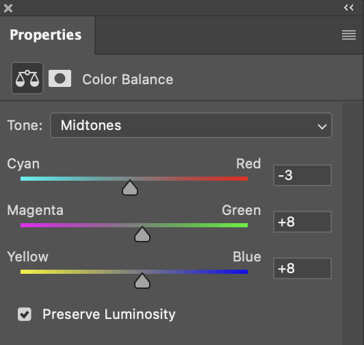
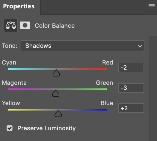
doing so will help with neutralizing the yellow. the only reason i moved the scales towards magenta and blue (therefore making it a bit more red than less) rather than green and yellow in shadows was because i wanted a darker contrast in the blacks. moving them to green and yellow made the overall scene more yellow since there were so many dark spots that shadows affected. (you'll see what i mean when you start experimenting with your own gif — this part of the process really just depends on your preferences!)
our gif might not look that much better yet, but it will soon! our best friend channel mixer is gonna help us out. for an in-depth post about how to use this adjustment layer, i recommend checking out this tutorial.
i'm someone who prefers to make more than one layer for the same adjustment layer for a reason i can't even explain (i just find that it helps me stay more organized). so don't think of this process like i can only use this layer once so i MUST fix it NOW. you can create multiple layers of the same adjustment layer, because every layer on top will affect the ones underneath it.
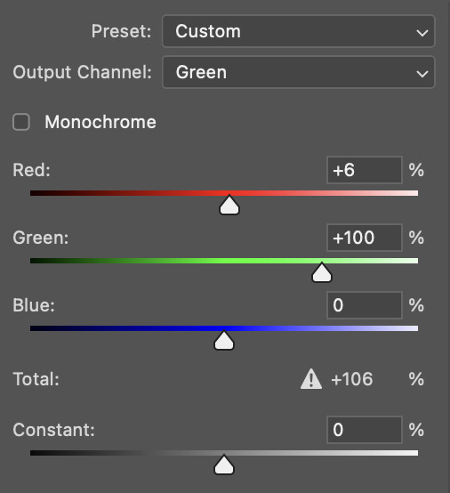
since my priority is getting rid of the yellow tint, i went to the Blue section of the channel mixer and increased it in all of the scales:
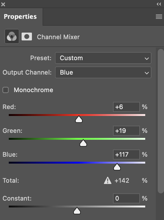
this step alone has helped us out so much, because look at our gif now!
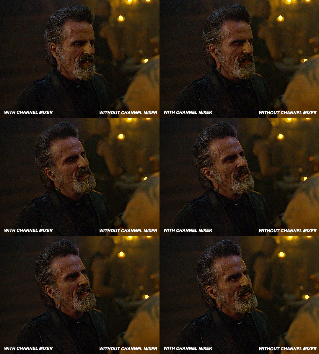
not only does the background look less yellow, but so does izzy's skintone.
now i'm going to focus on trying to brighten the scene even more without destroying the quality. the levels layer can actually help out a lot with this.
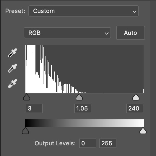
the amount to which i move each toggle differs per scene, and i think experimenting depending on your gif works best for this layer.
side note: i prefer not to use the ink droppers on the side because the contrast in the result usually ends up feeling too strong for my preferences, but if you find that this works better for you, then go for it! basically, the first dropper with the black ink should be clicked before you select the darkest part of the scene that you can find, and vice versa for the third dropper with the white ink — click it, and then select the brightest part of your scene.
curves is the next layer that does fantastic work! unlike the levels layer, i do actually use the ink droppers for this. it's the same concept, with the first dropper being used on the darkest part of the scene, and the third dropper on the brightest.
try to think of curves as something that not only further brightens your scene, but also helps with the colour neutralizing process.
i grab the first dropper, then click the darkest parts of the gif that i can see. depending on the undertone of the blacks that you're clicking on, the tint of your gif might actually change significantly. this is why i prefer to click once, then undo the action if i don't like what it gives me. izzy's leather jacket was the sweet spot for this gif.
when i'm satisfied, i make another curves layer and use the third dropper to click the bright/white parts of the scene. for this gif in particular, the lights in the background were a good fit because they carried a yellow undertone — this meant that my curves layer actually helped to further neutralize the yellows in the scene as a whole!
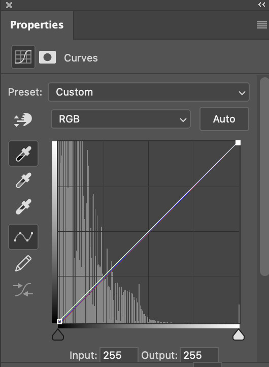
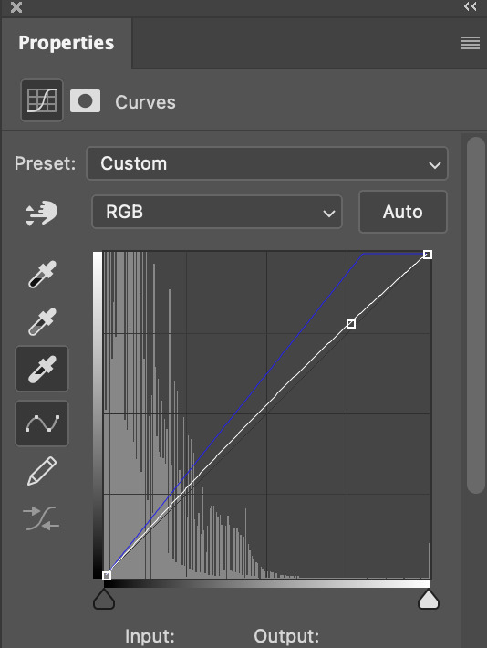
(i manually dragged the curves graph upwards for the third dropper to make it brighter. i don't need to do this if the dropper does this for me automatically, but since the lights were pretty bright, it only changed the tone of the scene and didn't increase the brightness — hence the manual step.)
pat yourself on the back, because this is what our gif looks like now!
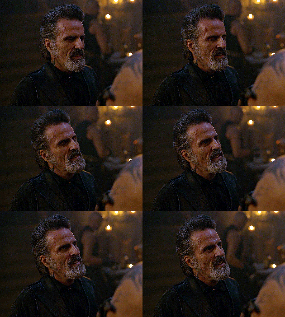
this is good, but it's not great — there's still just a bit too much yellow in the scene for my liking (sorry, i'm picky! :P)
i created another channel mixer layer and played with the toggles until i was satisfied:
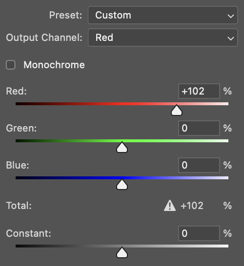
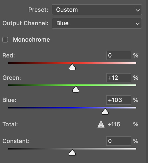
ta-da! the gif as a whole is much less red/yellow now:
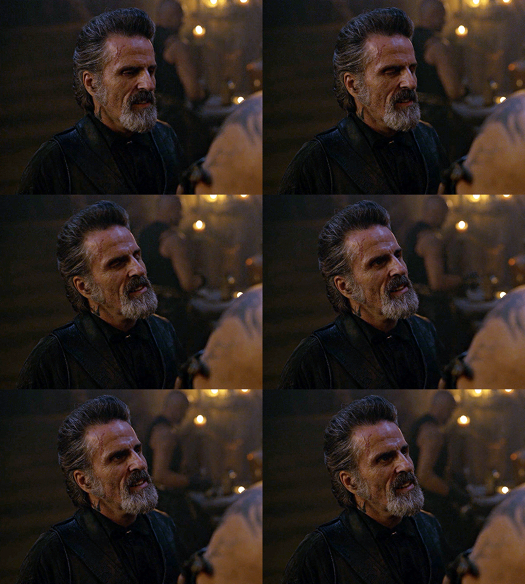
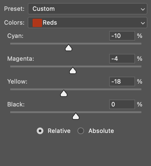
this is when i start fixing the colouring now — namely, his skin tone. selective colour will be your best friend here. i wanted to make his face just a tad brighter and less of a yellow-ish magenta shade, so i focused on the reds and yellows.
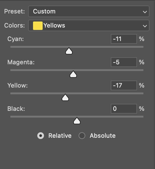
then, out of habit, i created another selective colour layer and took out more of the "yellow" in the whites to make them whiter, and increased the black (just by +1, since the contrast is pretty good enough already).
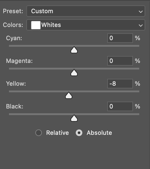
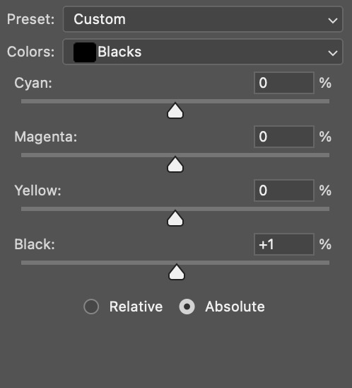
note: i switched to "absolute" for these two colours. basically, relative = less vibrant colour manipulation, and absolute = more vibrant/stronger colour manipulation. i prefer to stick to "relative" for fixing skin-tone since "absolute" can be a bit too strong for that.
our gif looks like this now!

his face looks brighter and much less yellow, so i'm satisfied!
this next step is not mandatory at all — again, i'm just picky and despise yellow-tinted scenes. i personally believe that indoor scenes that are yellow/green tinted make them look more dark than they actually are, so i do my best to get rid of these colours.
i also don't always do this, but for this gif, i just simply went to hue/saturation, selected the yellows from the drop-down menu and decreased its saturation.
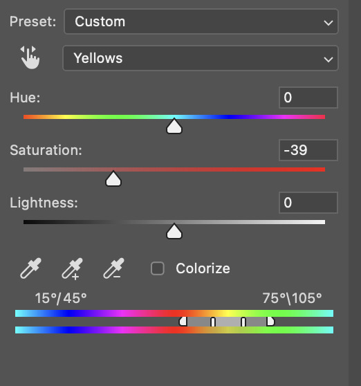
be careful not to do this too much. depending on the quality of your download, this can significantly decrease your gif quality. i tend to worry less about this when i'm working with 2160p files, but again, those files require an entirely different set of steps when it comes to brightening/colouring.
since this was a 1080p file download (and one that was actually less than 1GB, oops, don't do that), i played it safe and decreased it by -39 only.
note: you also want to be cautious of colour-washing skintone when it comes to this step. i find that another selective colour layer can help perfect the skintone in case the yellow drains out of it too much, but skip the hue/saturation step if it's too difficult to work with — better to be safe than sorry.
anyway, this is the final gif!
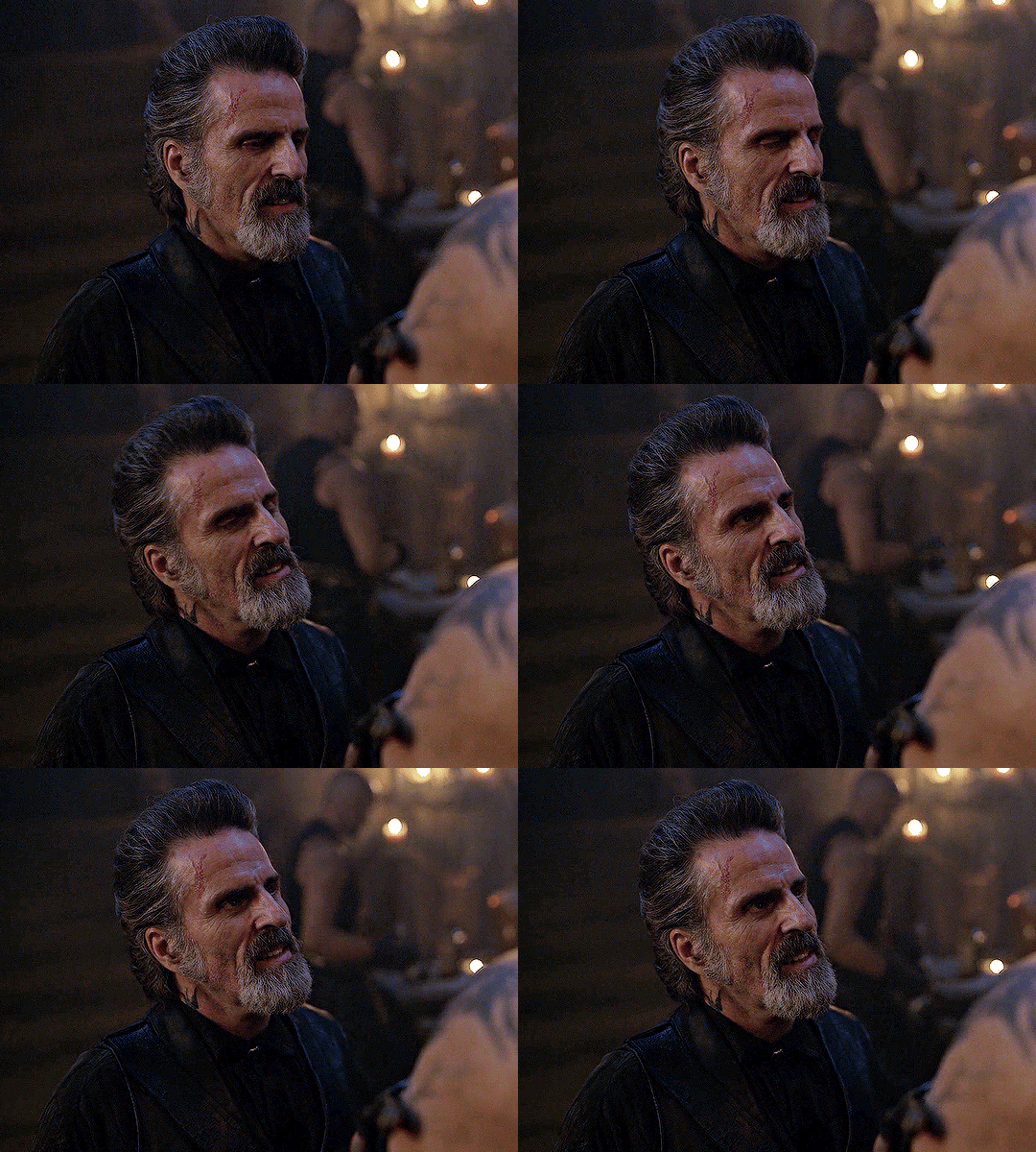
that's usually what i do when it comes to colouring dark indoor scenes! i hope this tutorial makes sense, and if you have any further questions, don't hesitate to reach out! :)
#tutorial#gif tutorial#resources#completeresources#coloring tutorial#allresources#dailyresources#userraffa#userdean#uservivaldi#alielook#usercats#usermoonchild#usernaureen#userbarrow#userabs#useraish#useralison#userisaiah#*mytutorials#i am so sorry if this is incoherent#it’s so hard to explain things coherently 😫
712 notes
·
View notes
Text


❁ ˚ 🌈⊹ ❶ trolls: the event. ࿐

ʚ(˵╹ᵕ╹)⊃━ ⊹ ˚ ✧ thank you all so so so much for 500+ followers! i never thought I would’ve made it this far, but thanks to you all I have made it halfway to 1,000! you guys are so sweet and supportive and I appreciate each one of you! thank you all for following me on my tumblr journey, and being super supportive and amazing people! anyway, let’s cut the small talk and continue with the event!

❁ ˚ 🌱⊹ ➋ how to enter. ࿐
ʚ(˵╹ᵕ╹)⊃━ ⊹ ˚ ✧ like + reblog this post and tag 1-4 people who you think would enjoy this event! and comment “joining”!
✿ ⁺ ❑ ✧ message me a number 1-12 to receive your trolls character + kpop idol to make a moodboard out of! (you do not have to use the idol that is provided, it is optional ♡)
ʚ(˵╹ᵕ╹)⊃━ ⊹ ˚ ✧ make sure to use the hashtag ↓ 、 ✿ ˚ 🌺⿻ ⊹ i8maya trolls: the event!
✿ ⁺ ❑ ✧ your moodboard must be at least 95% made by you, using f2u locs, dividers, and images are allowed. copying other moodboards entirely will result in a disqualification.
ʚ(˵╹ᵕ╹)⊃━ ⊹ ˚ ✧ this event will conclude on august 15th, please let me know if you need more time to complete your moodboards!

❁ ˚ 🦋⊹ ➌ winner prizes. ࿐
✿𓂃 ˚ ❏ 1st place: 150 reblogs, custom fg, custom hdr, custom mb, follow back, custom loc, and layout of choice.
✿𓂃 ˚ ❏ 2nd place: 80 reblogs, custom hdr, follow back, chnl set, and a custom loc.
✿𓂃 ˚ ❏ 3rd place: 55 reblogs, custom fg, and a follow back.
✿𓂃 ˚ ❏ 4th place: 30 reblogs, and custom hdr.

❁ ˚ ☀️⊹ ➍ special mentions. ࿐
ʚ(˵╹ᵕ╹)⊃━ ⊹ ˚ ✧ @yericvlt @eliatopia @hyefilms @hyelita @hyetart @nakv @j-eongs @baesol @mwahaddy @7hyein @puduieu @chaewebs @chaefltr@chaetopia @yujiwebs @keketopia @haesite @minjuszns @hyerify @hyelita @luckygrls @narciscupid @niniszn @hyetori @hyemine @chroumie @dahyas @kyeins @eundior @yuzchaes @yeritos @komiwebs @iwuht @yuzchaes @tripleseu @haesite @iuyunji @umiena @02nakyy @y-ukikia @kistearis @hanitos @jwivity

#、 ✿ ˚ 🌺⿻ ⊹ i8maya trolls: the event!#i8maya moodboard#alternative moodboard#kpop moodboard#clean moodboard#messy moodboard#vintage moodboard#colorful moodboard#aesthetic moodboard#floral moodboard#cute moodboard#trolls moodboard#trolls dreamworks#dreamworks trolls#trolls#trolls world tour#tumblr event#red moodboard#orange moodboard#yellow moodboard#green moodboard#blue moodboard#purple moodboard#pink moodboard#cignature moodboard#rainbowdash moodboard#rainbow moodboard#dark moodboard#white moodboard#snoopy moodboard
165 notes
·
View notes
Text
BLLK relationship firsts: who was interested first, who confessed first, & who initiated the first kiss.
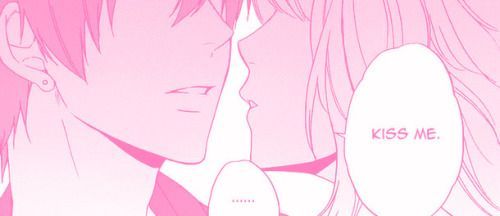
❥ Headcanons for: H. Chigiri, M. Bachira, R. Itoshi, R. Mikage, S. Nagi, Y. Isagi
❥ Notes/Tags: Implied time skip ages, SFW, gn!reader, spoiler-free
❥ WC: drabble (~350w each)
❥ PC: HDR ♡
♡ Yoichi Isagi
❥ Who was interested first: you
Isagi would be too in his head to notice your growing crush on him. He’s lucky you’re attracted to his ambition and talent, because he’s definitely the dense type to let flirting fly over his head. Hang in there.
❥ Who confessed first: him
After (finally) picking up on your (heavy-handed) cues, he tries to strategize the perfect way to step up your friendship and ask you to go on a date with him as a partner. He had it all figured out. Where he’d take you, what he’d say, what you’d say, etc. He ran the outcomes like the true strategist he is. But you show up in an outfit that makes his brain melt and he gets so anxious and tongue-tied in the moment that he basically just blurts out “will you go out with me?” instead of the rehearsed speech he had in mind. It’d be easier for him to play in a tie-breaking internationally-streamed match than try to be suave. Luckily for him, you already had him all figured out (he was sweating bullets and acting so stiff, after all) and was just waiting for your opportunity to say ‘yes’.
❥ Who initiated the first kiss: you
Once again, he had this masterful plan that crumbled to pieces when he actually had to put it into action. His nerves just aren’t adapted to dealing with you. Something about you makes him short-circuit and go blank, and it’s adorable to have Yocchan in the palm of your hand. While he’s stuck on the details of trying to direct the perfect first kiss, brow furrowed and quiet in his thoughts, you lean over and gently press a kiss to his cheek. He basically explodes, before getting shy and upset that you beat him to it when he wanted to kiss you. He doesn’t realize that you’re smart enough to know how to play him; you just need to make it a competition, and he immediately plays along. He’s inexperienced and you’re his first, but he learns quickly… about how to ‘devour’ you.
♡ Seishiro Nagi
❥ Who was interested first: you
He’s popular amongst the masses because of his height, good looks, athletic talent, academic smarts, and other wildly impressive traits. You never thought you had a chance in high heaven with him, so you settled for having a crush at a distance. You nurtured your feelings privately and had fun in your daydreams of dating the pro athlete. It was already enough for you to even meet him, but to imagine that he actually wants you to stick around?! That definitely made you feel shy, but he reassures you (and makes you fall even harder, dammit) by telling you that you make him feel comfortable.
❥ Who confessed first: him
Nagi probably assumes that the two of you are together without actually establishing it because he thought it was obvious that he liked you back. He ends up announcing your supposed relationship during a live interview, which blows up your phone to the point where you have to delete your apps because they kept crashing. He properly asks you to be his partner after the misunderstanding, sheepishly offering flowers and a plushie of your favourite Pokémon as an apology. He looks like he feels genuinely bad about it, so how could you not forgive him? He isn’t a smiley person, but he can’t stop grinning when you tell him you’re happy to be his significant other.
❥ Who initiated the first kiss: him
It would be very casual. He’d give you a sleepy peck on the cheek that flusters you because of how out of the blue it is. He’d have the nerve to look confused about why you’re so worked up about it and does the temperature check thing with his hand while peering deep into your eyes to see what’s making you so nervous—as if it’s not him. When you mutter that you were expecting him to ask, he asks you point blank if he can kiss you again. This is the moment where he realizes he’s addicted to making you blush because of him.
♡ Meguru Bachira
❥ Who was interested first: him
He basically saw you and immediately went “I want that one”. He does everything he can to get your attention and get close to you. He’s not shy about pestering you to spend time with him and asks you specifically to cheer him on. This strategy backfires. His attempts to court you are so direct that you end up not taking him seriously, assuming he’s joking around like usual. He complains about this to anybody that’ll listen or tolerate staying in the same room as him as he whines about you not getting the hint.
❥ Who confessed first: him
Bachi’s impatient and confesses way too soon. Even though you kindly reject him the first time, he persists. You end up becoming friends first despite knowing about his romantic feelings for you, and over time you start to develop them too. After all, he’s so nice to you and genuinely cares about you and making you smile. It’d be impossible not to fall in love with him. When you finally tell him that you’re starting to feel the same way and can return his affections, he’s over the moon. He never gave up.
❥ Who initiated the first kiss: him
He was so desperately touch-starved for physical touch that he asks to kiss you, his voice actually quiet and uncharacteristically serious for once, maybe some few minutes after you officially become his significant other. He opens an eye to peek at your expression after leaning in, which makes his heart stutter like it always does whenever he’s around you. It’s like he can’t believe this is actually happening even though he’s been trying to get you to fall in love with him like he fell for you on day one. He holds you so tightly it’s like he’s scared you’re going to vanish and he’ll realize it was fake—the way you lean into him tells him that you’re not.
♡ Hyoma Chigiri
❥ Who was interested first: you
He has a striking look that caught your eye immediately. He’s used to getting confessions and is exceedingly popular, so you didn’t think you were special for liking him and never entertained the notion that he would like you back. It was important to you and him that you maintained a good friendship, but that platonic bond was quick to blur into something that was intimate in a different way.
❥ Who confessed first: him
Chigiri has seen a lot of shoujo anime and knows the tricks and tips inside out. He gives you a picture perfect confession. The two of you go out in yukata to attend a matsuri/summer festival, your hair both tied back in ornate styles that complimented each other’s look. You play games together (where he wins you all the prizes you ask for) and share street food. He wipes powdered sugar off your lip with a thumb and laughs at your expression. When the fireworks burst out over the night sky, he reaches for your hand and squeezes it tightly. After all the noise has cleared, he asks you to be his partner. It’s romantic, and maybe it’s cheesy, but you happily say yes.
❥ Who initiated the first kiss: him
You cannot tell me he wouldn’t try a kabedon on you. Though he is very gentle with you and never aggressive, he does know exactly what to do to make your knees weak. He presses a fist on the doorframe above your head, simpering down at you, hair falling over his face, the pink only accentuating the burning look he gives you. He leans in slowly, giving you a chance to back out or ask him to stop, but you don’t. The kiss is very passionate and befitting of somebody that values chivalry and caring for your partner as much as he does.
♡ Rin Itoshi
❥ Who was interested first: him
You first piqued his interest by making a sassy quip when he accidentally ignored you. He’s still getting used to the whole “be nice” concept but still doesn’t care much for people who aren’t involved in the soccer world. You’re one of the first to be noticed by him, even though the two of you are so different. He’s rarely this curious about somebody that isn’t a sports rival.
❥ Who confessed first: you
Rin would rather die than show somebody that he’s vulnerable, so even if it’s quite evident that he has romantic feelings for you, he simply pretends he doesn’t. You basically have to sit him down and say, word for word, “I like you and want to be with you” before he can work up the nerve to face his own feelings. He’s so used to people he loved leaving him that he’s terrified of going through the same hurt. He thought it’d be better off never even trying than having it fail or get rejected. The last thing he wants is to drive off another person he’s starting to care about. But then he looks at you and feels like a total idiot for denying himself the chance to be with you in the first place. He starts to bet on faith and love again. Even though he’s still scared of rejection or having a falling out, he’s willing to risk the heartbreak if he can have the chance to be with you.
❥ Who initiated the first kiss: him
He lives by philosophy. He doesn’t lose, and he doesn’t waste time. Inefficiency is worthless to him. Your first kiss with him is surprisingly not awkward; he drops you off at your place after a quiet date and chastely presses a goodbye kiss to your lips with his finger guiding your chin up. He steels himself to sprint away after such an out of character display of affection, but is shocked (and surprisingly cooperative) when you grab the collar of his coat and pull him in for a deeper one.
♡ Reo Mikage
❥ Who was interested first: him
He did not want to like you at first. You always teased him and never took him seriously; it was an emasculating experience for him since he was so used to having his way. But that annoyance meant he never stopped thinking about you, and sure enough, in true enemies to friends to lovers fashion… that “I hate them” began to morph into the panic of “Oh god, wait. Do I like them?”
❥ Who confessed first: him
He, delulu, definitely ruined more than a couple of flowers (and toothbrushes) to try and divine if “they love me, they love me not”. If the last pull ended up on “not”, he would immediately find another one and keep going until it landed on “they love me”. He’s so emotional and almost pathetic when he asks you out, a hot mess of a tsundere if you’ve ever seen one. He moreso declares that the two of you are together instead of really asking. He fully expected you to make fun of him like you always did, but you treated him with a lot more gentle patience which only sealed his fate of being head over heels in love with you.
❥ Who initiated the first kiss: you
Even though Reo’s obsessed with you, you’re the one who kisses him first, mainly just to see his reaction when he’s caught off guard. He gets so flustered so easily and demands, stuttering, that you “explain yourself this instant!” Your explanation is another kiss, which just about makes him pass out. You kiss him when he tries to retaliate, cutting off every attempt of his to start a sentence until finally he gets the cue to shut up and accept your love. His face is so petulant when you’re done, but he’s too proud to ask you to kiss him again, so he ends up taking a leaf out of your book and moving in to take what he wants.
#blue lock#blue lock imagines#blue lock x reader#blue lock headcanons#blue lock x you#blue lock x y/n#bllk imagines#bllk headcanons#chye's hcs#isagi yoichi#nagi seishiro#reo mikage#itoshi rin#bachira meguru#chigiri hyoma
2K notes
·
View notes
Text
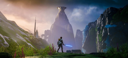
The Best Movie Versions of Jedi: Fallen Order
As someone who has made too many videos about these games, figured I'd share my favorite "movie" editions of Fallen Order. It's the best way to meet the Mantis crew and experience Cal's journey if you don't have a gaming PC/console or want to relive the adventure in a condensed format. Also a great resource for making edits!
STAR WARS Jedi: Fallen Order - Movie Edition by MovieEditionGames
[2K, no HUD, YT CC captions available] My favorite viewing option for FO. It includes relevant gameplay mixed in with cutscenes, along with custom camera shots that showcase the environments during traversal. Clean music transitions and intentional character movement elevate it even further.
Star Wars Jedi: Fallen Order (The Movie) by Andy Gilleand
[4K HDR, letterboxed, no HUD, YT CC captions available] A very close second for FO viewing. The high-res, detailed textures really showcase how beautiful this game is. Along with relevant gameplay blended with cutscenes, this version also includes chapter markers to find different sections more easily.
Star Wars Jedi: Fallen Order - Game Movie by Video Game Player
[4K 60FPS, letterboxed, no HUD, no captions] Another 4K option with chapter markers (this time with on screen titles!) but doesn't use HDR.
STAR WARS: JEDI FALLEN ORDER All Cutscenes (Cal Mod) by Gamer's Little Playground
[4K 60FPS, includes HUD and in-game captions] Cal takes a nap and wakes up with a beard! If you want to revisit the story with a new look, here's a good option.
Hope this helps! As of now I have not found a comparable version for Jedi Survivor. There are cutscene-only options and full 13-17 hour gameplay options, but nothing in between. If you have seen one let me know! Otherwise I may try to make it myself, eventually.
[header photo from u/D3athtroop3r on Reddit]
#star wars jedi fallen order#jedi fallen order#fallen order#game movie#video game movies#cal kestis#cere junda#greez dritus#merrin#nightsister merrin#trilla suduri#star wars
288 notes
·
View notes
Text
Analyzing and reviewing all the updated models in the SOUP update for SJSM
Because why not?
Specimen 2 / Gel


The guy who wants to give you your wallet. Dude is mad skinny and more skeletal now. Although, unlike the other skinny redesigns (which I will get into later), I actually don't mind how Gel looks here. Considering the fact he was most likely a human at some point, a human who most likely was on the verge of dying from starvation and thirst, I can see Gel looking like this.

Not to mention, his new animations are pretty cool too! The animation with him rising out of the goo puddle looks more interesting now and I like how his attacking animation is much more animalistic and aggressive compared to his awkward and kinda stiff attacking animation in the original HDR. My only complaint is that his rising animation should be more slower and less choppy. Otherwise? A pretty solid model.
Specimen 3 / Subject 5


The cutie patootie spiderpede. Another decent one. He has been given a bit more texture to his body and he has a much more rounded appearance overall such as his body segments and head. His legs are a bit more thinner which looks more unnerving imo. A cool little detail that was given to him is that his pincers now move! A very unnerving sight to see. I'm not a fan of how he's more bright in color and the animation on his legs looks quite janky looking. Also maybe it's just me, but he doesn't seem as big as his previous model. Other than that, this model is pretty solid and is a bit more scarier than the previous model, but it has some downsides.
Specimen 4 / Ringu

Vore ghost woman. Ngl, I was pretty scared when I saw little snippets of Ringu's new model. I thought she was going to be made into a skinny stick like some other models. While that ended up being somewhat true, like in her upper torso region, her arms, and neck, it's not too noticeable or atrocious.
Her hair has become longer, her skin has a bit more texture to it, her breasts are more pronounced, her arms are a bit longer, her hands are bit longer and sharper, her clothes are a pastel purple color, and the blood on her hands are more brightly colored.

My favorite new detail however is that instead of her legs being a solid black color, her legs are now half white half black. Giving off this cool little effect, like the black part is engulfing her legs or something.
What I'm iffy on is the color of her clothes. Why change it? Although I suppose it doesn't look bad, I prefer the old gray look. I also prefer the more dried blood look on her hands with her older model. Other than that, I actually enjoy this model more than I thought I would, especially taking into account the new floating animation that was given to her, which is a very good and smooth animation that is a huge improvement from the last one. I really like this one!
Specimen 5 / Bab


Jesus christ! We were having a decent streak going. What the fuck happened here? What were they thinking? Let's see... so they made Bab go from looking like a mannequin to looking like a stick, alright... Her head is less humanoid and looks more like a deformed cube... She has this weird texture given to her legs for some reason... Her sword is pointing downwards which makes her lose some intimidation... The holes in her face which were only visible in her death screen are now fully visible in gameplay for some reason... and because of her whole body and textures being drastically changed, you can no longer tell she's supposed to be a reference to Silent Hill... AND THEY GOT RID OF MY GIRLS CURVES!
Yeah... there's nothing redeeming here. The model just sucks in pretty much every single way. Definitely the worst model this update has to offer.
Specimen 6 / Ben


Stabby puppet guy. Now I've seen a few folks crapping on Ben, but I don't think he looks too bad. He definitely got a massive change in terms of textures, but otherwise he looks mostly the same to me. I personally like the shading that was done to his face. Makes his facial expressions really pop out and he looks a bit more intimidating overall. I especially like this shot from the trailer where the room is dark and the flashlight is shining solely on him. Was pretty unnerving on my first viewing.

Is this my idle version of Ben? No. I still prefer the original model due to the Ben Drowned and Happy Mask Salesman references being more clear and although I find the redesign to be more intimidating, I also think that it tries a bit too hard. One thing that I liked about Ben was that he seems like an ordinary and somewhat friendly looking puppet at first, before you start making a run for it once he goes after you. This one is more on the nose. Decent model nonetheless.
Specimen 8 / Deer Lord

"Deer" lord! (sorry, I had to). Funnily enough, while everyone else got the skinny treatment, it seems like the deer man got a bit wider. He also had his textures changed a bit, his snout angled more downwards with more blocky and yellow teeth rather than sharp and white ones, his height slightly decreased, and his eyes look slightly bigger.
Other than that, there's not much to say about Deer Lord's new model other than it looks great. Especially with the new textures he was given when he opens his cloak.

I still prefer the old model due to it looking more scary, thanks to the height and more thin look, but the new model is still pretty good.
Specimen 10 / Parasite

Annnnnndddd back to trash... Yeah this model sucks. I still remember first seeing this thing from Ryan J's video and laughing my ass off. The ridiculous walking animation, the over exaggerated and way too floppy arms, and the overall terrible and bland textures. Just a trash model all around... until...

They listened to the community and updated the textures! And I'm pretty sure they mentioned somewhere that the animations would be slowed down too. I still prefer the original model, but this is a massive improvement from what we previously got and I feel like I could potentially get used to this model and even start to prefer it to the old one if they get the animations correctly (not sure about the ass cheeks, but those are there too, I guess lol).
Specimen 11 / Beef Demon


Funny beef man. This one is a mixed bag to me. I really like the goat legs, the creepy arms, and horns, but everything else screws it all up. Yet again, bro has been made skinny for no apparent reason and has lost his intimidating bulky build. His head also looks too small and his eyes look too big and odd. If he kept his bulk and his head was changed up a bit, he would probably look a lot better, but for now, this model is unfortunately kinda bad. Not much else to say.
Specimen 12 / The Sickle Man


Weird ass lonely old man. We haven't gotten a full glimpse of him yet, but we do have this screenshot. He seems darker in overall color and he looks a lot more detailed with some nice shading going on. From what little I can see, he looks pretty good!
Specimen 13 / Siren

Piano keys for teeth lady. Her model seems to be the same. So not much to say there. Although we do get to see her swimming in the water! Which has its positives and negatives. The fear of the unknown factor is lost now that she's visible, but at the same time it's really cool to actually see her instead of just only seeing her model sitting on a box and then disappearing once she goes into the water.
Unknown Specimen 2 / Otto the Otter

Har Har Har Har Har. Okay. This one is definitely a step up and is the 2nd best new model from this update. The more detailed textures, the added grim, the bits of metal, his new walking animation... it's all so great! The only negatives is that his eyes don't glow and you could say that his older model being so low quality was apart of the joke and what made him so charming. So although I really like this model, there is a sense of charm that is lost from the old one. Still very great though!
Unknown Specimen 3 / Spooper


Mpreg parasite. We hadn't got to get a super close look at Spooper yet, but from what I can see, his model looks great! Mostly just the same, aside from more detail and having different colored shoes.
Other things
The specimens weren't the only things that got an update!

The subjects in the test tubes now have 3d models which look pretty great.

The old Specimen 10 has a new model and it looks amazing! Easily the best model from this entire update.

And to wrap things up, the White Cat finally has a 3d model now. Although her fatass head makes her look like she got stung by 1 million bees, it also makes her look adorable and squishable, so I don't mind. Plus I like the little transparent effect on her lower body. Makes her come across as very otherworldly.
Verdict
So, I honestly don't think the SOUP update is downright horrible like some people say. However, I will say it's definitely a mixed bag in terms of quality and I can see what people mean when they talk about how these models diminish Kira's vision and thus their charm is lost. The only models I prefer to the old ones are Specimen 2 and 4's along with the test tube subjects, the old Specimen 10, and the White Cat. All the other ones are either equal to or downright worse than their old models.
I'll wait and see until the update comes out. Maybe I'll warm up to some of these more (except for fucking Bab. All my homies hate the new Bab). Anyways, thanks for reading and have a great day.
#sjsm#shojs#spookys house of jumpscares#spooky's house of jumpscares#spookys jumpscare mansion#spooky's jumpscare mansion#soup update
53 notes
·
View notes
Text


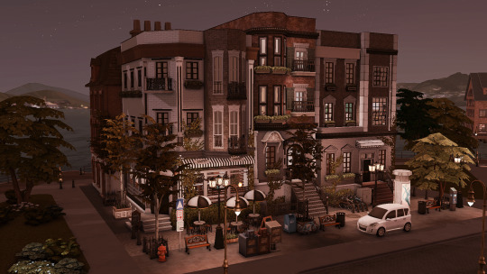
[oyasufeng] maple haze ✧.* a gshade 4.2.2 preset
—
maple haze is a gshade preset that mainly focuses on the theme of autumn, but disabling a few shaders also provides an alternative realistic look.
—
a week after releasing my new preset, i somehow impulsively ended up making another new preset. i initially wanted to release this a month ago but i was shadowbanned (still am, cause support ain't answering me at all). while adding builds based on autumn, i wanted to give a look that accentuates the orange vibe and the season.
i'm living in a country that doesn't have any seasons since childhood — only hot, hotter, haze (thank you, neighbouring country, for burning your bloody forest every year), durian, and monsoon season. so i actually have no idea when each season starts and ends, but coincidentally, it turns out that it's autumn now (it's monsoon season for me sobs).
the primary reason for making this preset is for autumn, but while testing around the shaders since it sometimes appeared too bright, it also gives a realistic look. this would be suitable for both gameplay and screenies!
click below to read more about it and for download links!

important
made on gshade ver 4.2.2, not tested on previous or future ver
since this is a gshade preset, i do not know if this will appear the same on reshade and i couldn’t help you with that
disabling some shaders will give you a different look and make it more realistic, it is also advised that you should make some edit to your own liking
may not appear the same as yours because of the changes i made in game files like graphicrules.sgr and the below
lighting mods used in this preset: better in-game lighting mod (bright pale), gentle cas lighting, sunblind
before using any of my presets, please make sure you have read this!!!
if you use any of my presets, consider tagging me, i would love to see how they look like in yours! ヽ(*´∀`)八(´∀`*)ノ
—
requirements
amoebae's summerdream & drift multiluts
—
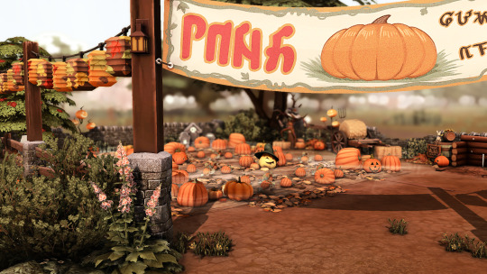
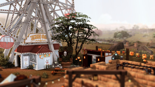
presets showcase - cas, gameplay & screenies
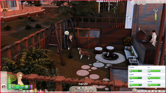
—
shaders + toggles
regarding tint, it's highly recommended that you adjust the colour in "edit global preprocessor definitions" based on your preference. it is best to test it around, depending on whether you want to use it just for gameplay or screenies. toggling this off will give it a more realistic look but less of the autumn theme.
all three shaders with toggles makes the preset brighter, so toggling off one or two makes it dimmer with different looks. this would also give a realistic look.
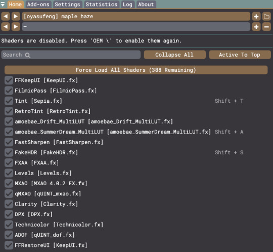
—
more showcase
the following shows alternative looks which provides a variety of more realistic looks:
with vs without keepui.fx (optional, can replace it with clear ui of shaders)
with vs without hdr
with vs without tint
with vs without summerdream
with vs without tint & hdr
with vs without tint & summerdream
with vs without summerdream & hdr
(i forgot to take before vs after pics sobs)




patreon ✧ kofi
92 notes
·
View notes
Text
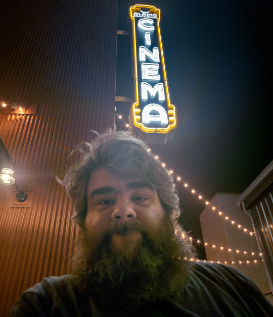
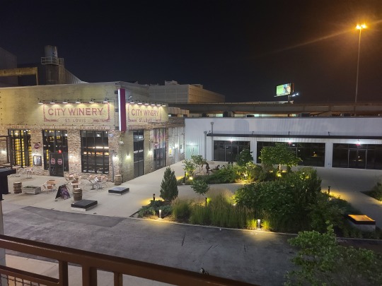
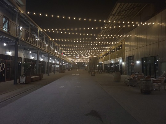
Just got back from the movie. The theater was in the middle of this hipster village type deal. Trendy shops and a wine bar.
I walked into the Alamo Drafthouse and the people at the front just kinda looked at me as I walked by. I had my ticket ready on my phone, but no one scanned it or looked at it. I don't know if it is always like that, but maybe next time I should try not buying a ticket and see what happens.
The large format fancy theater was as far away from the entrance as possible. I should have brought my cane. But I made it okay. It was indeed large and fancy. The seats were very comfortable and had electric reclining. There was also a button to summon a waiter which felt very high tech. And he would duck down super low as he walked in front of everyone. He looked like a penguin scurrying along. I ordered a pizza and it showed up just in time for the movie. It was pretty tasty.
The video quality was fine. I honestly didn't see a huge difference with the 4K laser projector, but the large screen was nice. I might be spoiled by my fancy HDR, 2000 nit TV. Projection just can't do that.
The front audio was much better than the last theater. Very clear voices. But the bass was a little boomy. Unfortunately I think they calibrate the audio for when there are more people there. 100+ humans in a space add a lot of absorption and diffusion. But there were maybe 8 people total and there wasn't anything to suck up the bass.
The Atmos was not even noticeable except in one or two scenes. That was disappointing. Atmos was one of the main reasons I chose that theater. I don't know if they skipped getting a Dolby calibrator or something. The side speakers were audible, but the ceiling speakers never made themselves known. Not even in the thunderstorm scene.
The ceilings were extremely high, so I'm wondering if the speakers were just too far away. Inverse square law would dictate they would need a lot of power and volume to cover that distance. This is probably why Dolby officially certifies theaters and this wasn't one of them.
This is what a front speaker in a theater looks like. There are usually at least 3 of them. Bigger spaces might do an array of 6--all behind the screen.

That is 7 feet tall, 200 pounds, and takes 3000 watts of power.
And you'll usually have 3 of these dual 18" subwoofers.

These beasts require 4000 watts of power and are also 200 pounds.
A typical theater Atmos speaker is like this.
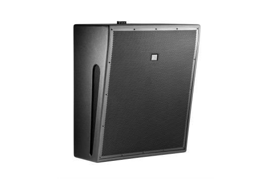
About 30 inches tall and handles 350 watts.
All of those speakers have to cover about the same distance. Meaning the ceiling speakers were at a major size and power disadvantage.
So I think the theater was too big and too tall for Atmos to work effectively. You probably have to trade off a big screen or good sound. I'm going to try an official Dolby theater next time to see the difference.
The movie itself was okay. Maybe a 6 out of 10. A few good laughs, some fun action, but the humor was very hit and miss.
Now, I'm not just saying this because they are a creep, but Ezra is just... a lot. They do their funny jokey thing and it gets old very fast. It was okay when they were a side character, but when they are leading a movie, it fizzles. And then there is a second Ezra in the movie and they do the funny jokey thing turned up to 11.
Way too much Ezra.
But then Michael Keaton enters and he's just fantastic. I got such a rush of nostalgia from the 1989 Batman. That was probably my favorite movie for a good 3 years. 8 year old me was so happy to see my first Batman again. They even forced him to do some super cringe fanservice lines--and he nailed them.
He was like, "I'm going to take this bullshit line and make it awesome. Because I'm the goddamn Batman."
And Sasha Calle as Supergirl was also excellent. Though she was very underutilized. But if they can keep her, I think she could be a fan favorite.
The big complaint about The Flash has been the CGI. And I would say 75% of the CGI was great. There was a reveal of the Batwing that looked stunning. Supergirl flying was great. The vehicles were great. All of the invisible effects like backgrounds and set extensions were flawless. There was a big car chase that looked decent. There were plenty of top notch VFX in this movie. And I think the artists should be proud of those.
The stuff that didn't work was mostly just because the situations were unrealistic or the art direction was poorly done or they just didn't spend enough time polishing the effect.
When they animated Micheal Keaton doing jumpy flippy ninja moves, it didn't sell perfectly. And the speed and power of the Kryptonions was not nearly as well done as in Man of Steel.
But I know why people said the CGI was terrible. Though I don't actually think it was the CGI that was bad. I'm pretty sure they just made a poor aesthetic choice. Flash goes into the Speedforce and they cleary wanted to make it trippy and otherworldly. I don't think they were going for photorealism. I think they intentionally wanted everything to be in the uncanny valley. Unfortunately the style they chose looked more like a video game.
They were trying to do a Dr. Strange type effect and it just didn't work. It ended up being more... Lawnmower Man.
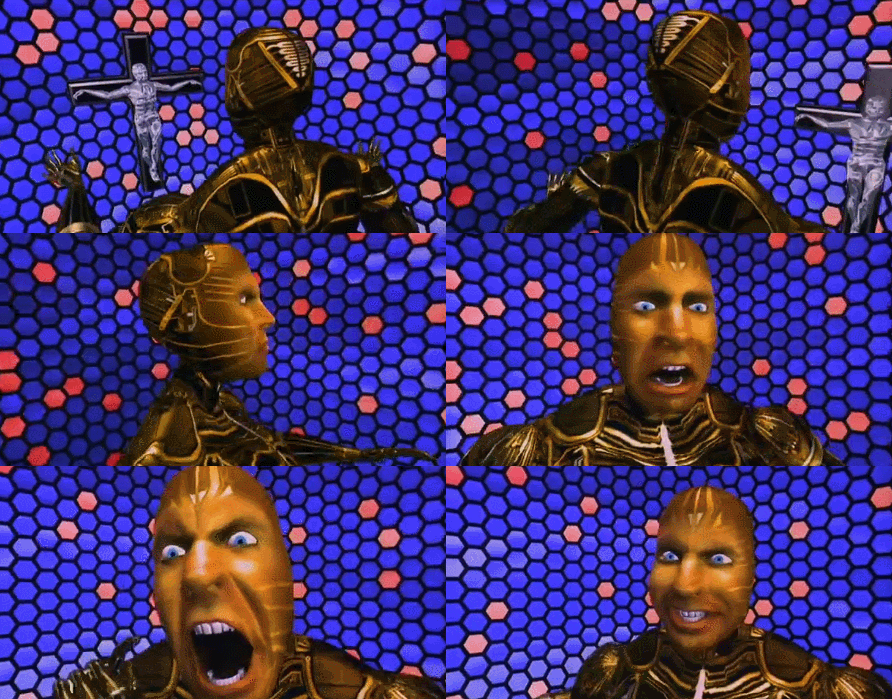
The only truly terrible effects were CG renders of people they couldn't get to do proper cameos because they were fired or were dead. Usually you need a 3D scan to do a CG double and it's hard to do that on dead people. The best was Admiral Tarkin in Rogue One, but they spent months and months on that.
CG Henry Cavill was probably the worst effect in the entire film and I'm guessing that really pissed people off.
The Flash running also looked bad, but that was 100% because Ezra Miller runs like a goof.

I have no idea why they run like that, but it looks so dumb and ruins the speed effect. Like, if you took them out and put someone running normally into the effect, it would have looked super neat.
And the only other VFX that didn't quite work was these slow motion falling babies. They looked photorealistic, but something about animating a falling baby in slow motion did not look right. Again, I don't think this was bad CGI. I think it was just a visual that was impossible to make realistic.
I know that sounds like a lot of bad effects, but that was every bad effect out of 2000+ total. Maybe 15 shots out of those 2000 were memorably bad. But the bad shots are always the most memorable and I guess that is why you don't hear folks talking about all of the flawless ones.
If you do see this movie and you haven't heard Kevin Smith's Superman story, you definitely should watch that first. Because the best gag in the movie will go over your head otherwise.
Sooooo, yeah... that was my night at the movies. On the drive there I got to see the Arch and downtown and it was beautiful. And on the drive home, Google decided to take me through every spooky ass neighborhood in St. Louis at midnight.
FUN!
76 notes
·
View notes
Note
First off, I love your blog and admire the lifestyle you've made for yourself. 😊
Do you have any advice for getting into real estate photography if you don't have a portfolio? I enjoy taking photos and I have a nice camera that I haven't picked up in a long time, but I'm not sure what all the job entails. I'm not sure if it offers the sort of freedom I want without having eggs in multiple baskets, ya know?
My spouse said to me that judging by the photos you see when apartment shopping, they assume I'm qualified (lol), but I don't know the ins and outs of my camera like I could if I were serious. Of course there's obviously people like yourself who are actual artists in their craft, but do you need to know a lot before you get into it?
Thanks! ❤️
So I was already very experienced with my camera when I applied for the real estate photography job(s) I work, I knew how to bracket, change the exposure/WB, etc. From there I just had to learn the way they wanted things photographed (from the corner, 4' tripod, 5 shots 2 ev). I didn't have a real estate photography portfolio but since I knew how to use a camera and had the proper gear, they were desperate to hire me.
There is a bit of freedom, I get to travel a lot and set my own schedule, but I still have to photograph things the way they want. Personally, this is perfect for me. I still get to do some artistic shots, especially if the homeowner requests them, but I know what is expected of me (unlike with portrait photography which can be so open ended and ambiguous, also working 1 on 1 with people - oof).
Anyways you should know how to bracket, how to edit those photos (I personally recommend Photomatix - LR + PS suck at HDR), how to change the white balance as needed (bathrooms with no windows tend to look very yellow). It's also ideal if your camera has a virtual horizon (mine is horizontal only but I am very good at getting the vertical one perfect by hand). Then from there it's just knowing basic photography things like aperture etc. My job doesn't require a flash but some companies will (Flambient is a very popular way to shoot photos, IMO it looks like dogshit but people like it)
Anyways I hope that helps and isn't too rambly
8 notes
·
View notes
Text
Brad's Food Pellets: the HDR?
Statement of the Problem: C-PTSD and Orthorexia
Most Recent Experiment: Military-surplus Humanitarian Daily Ration packets?
I have recurring bouts of pervasive anhedonia, probably related to C-PTSD and definitely made worse by the texture sensitivity of my autism-spectrum disorder. One of the major impacts of this on my life is that I have severe difficulty staying fed: I have days, sometimes multiple in a row, where the thought of eating anything makes me gag. Eventually, when I'm on the point of collapse, I'll choke down some of the fattiest, most sugar-sweetened food there is just to keep from getting falling over or passing out, if that's all I can stomach. But that ends up making things worse, because it's not satisfying and it's even more depressing.
This has been made worse in recent years by seemingly non-stop pressure to lose weight, despite the absence of any scientifically demonstrable way for me to do so. In the last year or so, this has manifested as what I recognize to be the symptoms of orthorexia, food-avoidant behavior driven not by desire to get thin but by fear of "eating something that's wrong."
One way that I've been trying to manage this is by experimenting with what one of my closest friends calls "Brad's food pellets." These are food solutions that are as nutritious as I can make them while meeting several criteria: high shelf stability, low price, and perhaps most importantly, lowest possible prep time, cooking time, and cleanup time. If food's going to be gross no matter what I do, I need to at least get it over with quickly.
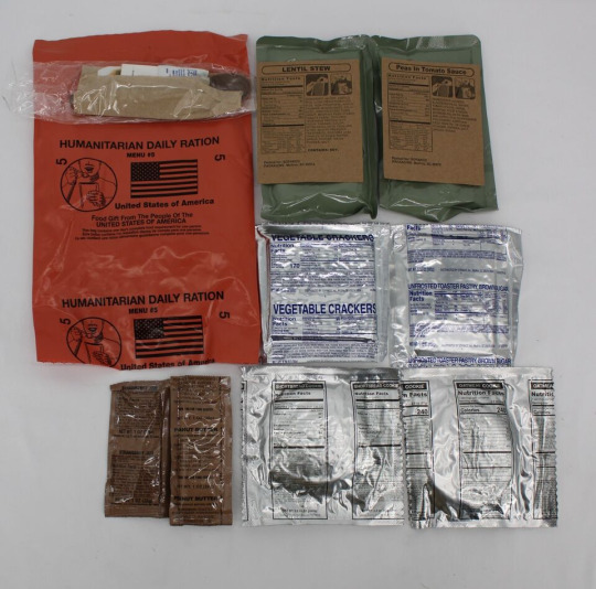
I found out via a Reddit blog post that there is a now 20+ year old collaboration between the big-three military-ration companies, at least three US government agencies, and at least two big disaster relief charities to continuously improve something called the Humanitarian Daily Ration: a salmon-pink nigh-indestructible self-padded heavy Tyvek envelope containing 2200 calories' worth of vegetarian, kosher, halal, nutritious, varied food that can, if necessary, be eaten with no additional preparation, for a maximum of $5 per day.
The collaboration hasn't settled on "good enough" and based on user feedback, they've revised the menu at least three times that I can find evidence of, not counting the one that's in progress right now. Because there's a new 2023 formulation (more infant-friendly food in every packet, substitution of sesame for peanuts), huge stocks of the 2011?-2022 formulation are being dumped onto the military surplus market right now. The State Department, the Army, FEMA, the Red Cross, and the UN High Council for Refugees are rushing to stock up on the 2023 formulation as fast as the big-three "MRE" companies can make them.
So it's trivially easy, if you search online, to find multiple vendors offering to ship a crate of ten 2022-model HDRs for $50 or less, including shipping, even though they're explicitly not intended for general civilian use. I decided to see if these would make acceptable "food pellets" and ordered what turned out to be "menu B," the one that primarily comes from the vendor Sopakco. Which crate you get is deliberately random, they're not labeled on the outside, and online reviews suggest that "crate B" is the worst of the three, so this makes a good worst-case experiment. It came with:
10 packets of unfrosted brown sugar Pop-Tarts, two per packet
10 peanut butter packets and 10 strawberry jam packets (bread not included)
16 packets of ultra-concentrated mildly-spicy tomato soup in three different flavors: lentils with rice, black eyed peas with rice, and lentils with potatoes and mixed vegetables (or as I said after adding the red and black pepper, "three different flavors of vegetarian chili")
4 packets of ultra-concentrated mild yellow curry with rice & lentils
10 packets of large saltine crackers flavored with powdered mixed vegetables, two per packet
10 large shortbread cookies
10 large cinnamon-oatmeal cookies
20 ingredient lists printed on heavy card-stock, and
10 "accessory" packs, each of which contains one plastic spoon, one napkin, one wet-wipe, one salt packet, one ground black pepper packet, one large red-pepper flake packet, two sugar packets, and a pack of paper safety matches.
Yes, the breakfast and both deserts are identical every day and, frankly, not great. The cookies and the Pop-Tarts are astonishingly dry and crumbly for the crate still having more than two years left on its "best used by" date. The Pop-Tarts and the shortbread cookie are also awfully bland for something that's going to be eaten every day. (Which is why they've been replaced for 2023 with tastier options.) At least the cinnamon-oatmeal cookie, dry and crumbly as it is, is very flavorful.
Each daily packet includes two of the concentrated-soup entrees, with a predictable rotation, but guaranteed not to be the same two days in a row. I can reconstitute one in a small saucepan, with half a packet or so of water, on an induction cooking plate in not much more than a minute, and once I crumble in one of the two daily crackers, it's an astonishingly tasty meal, enough that it cuts through both of my food-aversion issues, with zero cognitive/emotional load on me -- just grab one of the two that the packet chose for me.
2200 calories a day turn out to not be enough to satisfy me on some days, but I have previous "food pellet" experiments that I can pad out a menu with. I can write those experiments up, if there's any interest in the reblogs or comments?
But for now, I think I have, if not a solution, a reasonably well-tolerated treatment. As long as they're available on the military-surplus market, I'm going to re-order a crate every time I drop below four packets left. And, specifically:
On any day where it takes me longer than two hours to persuade myself to eat something, anything, for breakfast, it means I'm having one of "those" days, so I'm going to open another HDR packet and eat whatever it gives me.
9 notes
·
View notes
Text
While I wait for Living Presence....
As I have this rather good audio system I should listen to it. Xmas is coming and I needed something other than another loop of Michael Buble' xmas songs.
So Fleetwood Mac. Oh not just any album. TUSK. It is idiosyncratic. I recall being disappointed when I got it in the late 70s or was it early 80s. Whatever, the disks (2) are over 40 years old. And I enjoyed this listen. It has been years since the last and I did not recall how good the recording was. It is good.
Very few notes on the production beyond it being the most expensive album ever made to date. Apparently an early Soundstream digital recording. So low noise and HDR stuff. For the first time I heard the little things they hid in the mix. I think I last listened three preamps ago. I was pulling stuff out of the vinyl that surprised me. Weird guitar licks and Mr Buckingham pretending he was a genius song writer. Sorry the girls did that job, but he could play.
But the songs were all better fully resolved. Nothing hiding. Those little Sotto Voce bits from Mr Fleetwood, "real savage like." Apparently the group founder Peter Green played on one song, and he is different. Damn what would it have been like if he hadn't done so much acid. So many little secrets.
So even though it is not an audiophile album it is worth giving it a close listen. I enjoyed reacquainting myself with it. Oh there are some semi-hit songs, but hey retrospective is a way of looking at things too.
2 notes
·
View notes
Video
20090513185237(7)c3(1)rszX tag by Jim Via Flickr: This is a cropped frame of a visual sighting in the night sky of Australia on May 13 2009 as videoed in super night shot on a Sony HDR SR12e camera. Slight enhancement made for better visual viewing, nothing added or altered. UAP / UFO all the same to me, it is a craft of unknown entities maybe not of this planet. But also may be of this planet, just a different dimension... keep that in mind. - Something NASA cannot show you, eh!
#Research Dimensional Entities truth Disclosure Australian UFO sightings Australian UFOs Dimensions Quantum Physics ignorant lost science#Australian Night Sky#Australian Research#Australian Sky#Australia#UAP dimensional craft#UAP#UFO / UAP#flickr
0 notes
Text
I have to let out my feelings somewhere.
What an absolutely mean ending.
Such a mean ending.
Why this ending?!
WHY
A videogame rarely made me cry as much as this one did.
This hurts as much as Lufia.
This is even WORSE than Lufia. Jill and Torgal have to live without Clive! Seeing them cry hurt so much. And Clive crying so much over Joshua?! HELLO?! WHO FUCKING DARES
I thought they were done with the sad endings after FF15. But noooooo, they were INSPIRED by that sad ending. And they wanted to MAKE IT EVEN SADDER BY GIVING THE BONDS EVEN MORE TIME TO UNFOLD
I did all the side quests except the DLCs. It's very much a coherent story on its own. Harpocrates' library and Vivian's charts help a lot to keep track of stuff and especially to process all the happenings in a softer pace.
Speaking of pace... I think FF16's pace was perfect. It had so many highs after which making a break just felt really nice and exciting.
Also the Esper fights are SO DAMN COOL. I think I'm gonna replay some of them in Arcade Mode. Or maybe I just jump right into New Game+ lmao. It was talking about ADDITIONAL CONTENT. Whatever that means.
But I had a blast playing through FF16. It felt very enjoyable. But I def felt how the story difficulty curve wasn't made with Sidequests in mind. When the masses of sidequests popped up, the story quests started to become quite easy because I basically outleveled everything.
Although I gotta admit that I did die a few times against Barnabas. But it was cool how they focused less on the Primal fights there, and more on executing technique. Felt very fitting for a fight between these two.
Also I encountered that damn Level 50 dragon hunt at Level 40 and wondered why I took so much damage. Took me a few deaths to realize that it's 10 level over me. Oops. Managed to defeat it on Level 45.
But damn, I love Clive as a character. I really like broody characters and their character development. I think it was so well done by giving him so many emotions.
The end was just so devastating.
I wanted him to return to Jill and Torgal and everyone else.
I really wanted him to.
Why is this game doing this
I was PREPARED for more NPC deaths. I was prepared for Cid's death. I was prepared for Jill's death even. I even thought that Clive's uncle was gonna die! I actually even was prepared for Joshua's death! But Clive's devastating reaction?! Hot damn. It hit me so hard in my feelings, I just... AAAAAAAAAAAAA
Oh and... some negative points:
While I usually love Soken's soundtrack, I feel like FF16's soundtrack was a bit lackluster in some areas. Especially speaking of areas, I can't tell you which track belonged to which areas. No matter how often I visited them for Hunts or how much time I spent on them looking for those Hunts. I missed some noticeable distinction. Not only in areas, but also certain cutscene music to set the mood and such. I think the only tracks where I get all excited and remember scenes are the Fighting tracks. Ifrit's and Phoenix' theme are SOOOOO GOOD. But most of the time, when I listened to a new Orchestrion Scroll ... I had a really tough time to identify its origin. I knew I heard it before, but I just couldn't make out where and that's a bit disappointing from Soken.
Nonetheless, such an epic game. 100 hours well spent. So damn worth the wait. Even with some technical difficults of a slow memory leak which I managed to circumvent by changing my swap file settings in Windows. Otherwise, the game was running smoothly between 80-120 FPS with FSR3 enabled, without frame-generation. HDR is eeeeeeeeeh most of the time in this game, but really popped off for some scenes. I feel like the dull (or natural?) calibration throughout most of the game very much wears Yoshi-P's cape tho, when I think about his opinions that he shared when people asked about FF14's colour fidelty.
In general, this game has so much Creative Unit III energy. I could very much see all the inspirations. Not only from FF14, but from various FF titles. While FF14 was supposed to be the theme park, FF16 kinda was too. A very enjoayble ride from many perspectives.
I fucking miss this game already lmao. If I wasn't going to bed soon, I might as well just jump into New Game+ already.
0 notes
Text
Google Pixel 9 Pro XL Review – Is this the best Pixel ever made?

Google’s Pixel 9 Pro series is the new flagship range of camera phones from phone camera reviews Google, but does the larger Pixel 9 Pro XL do enough to justify sitting with the best camera phones for photography. I find out the pros and cons of this phone in this detailed review.
Pros Additional AI features like Add Me are great Consistently good photos Updated selfie camera New panorama mode works well Larger 6.8inch screen Cons Macro performance is average at best (lacking telephoto macro) Puny 128GB storage, more storage costs more Only 4K video recording, 8K requires Cloud upscaling No 4K 120fps video
Google Pixel 9 Pro XL. Photo Joshua Waller At a glance: 50MP main camera, f/1.68, OIS (1/1.31inch) 48MP ultra-wide, f/1.7, with macro AF (1/2.55inch) 48MP telephoto, f/2.8, 5x telephoto, OIS (1/2.55inch) 42MP f/2.2 selfie camera with AF 4K video recording, up to 60fps
Cloud based upscaling powered by Video Boost should provide 8K video 6.8inch screen, 1-120hz, 2000/3000nits, Gorilla Glass Victus 2 5060mAh battery Google Tensor G4 processor, 16GB RAM New colours: Porcelain (off-white), Rose Quartz (Pink), Hazel (pale grey), Obsidian (Black) There was already a large Pixel – the Pixel 8 Pro has a 6.7inch screen, the Pixel 9 Pro XL has a slightly larger 6.8inch screen, and the new 9 Pro is a new “mini” Pixel Pro model, with 6.3inch screen.
× How we test phones We review smartphones from the perspective of choosing one for its photography and camera performance. We look at what the Google Pixel 9 Pro XL offers, and the features included for photography and video, paying particular attention to the cameras on the phone, photo editing capabilities, as well as the output from each different lens, and features offered.
Features, Hardware and Design Google say the build quality has been improved with a stronger aluminium construction, and they say this makes the phone 2x more durable. There’s Gorilla Glass Victus 2 on the screen to provide scratch resistance.
In terms of the cameras on offer, the Pixel 9 Pro XL offers the same camera setup as the Pixel 9 Pro, which is the new “small” flagship phone from Google, with a 6.3inch screen.
The cameras feature an ultra-wide-angle (0.5x) camera, a main wide-angle camera (1x) with optical image stabilisation (OIS) and a 5x telephoto camera, also with OIS. In addition, the main camera offers a 2x zoom that Google say gives the same image quality as a real 2x optical camera, and they also say they offer the same image quality as a 10x telephoto camera from the 5x camera, let’s find out if that’s true.
This zoom feature uses Google’s hybrid Super Resolution zoom multi-shot technology, which Google have been offering for many years now, and as long as you don’t use too much zoom, then the results have been impressive, even giving Google’s phones without telephoto zoom, like the Pixel 9, 8, 8A etc, a good 2x zoom option.
The ultra-wide-angle camera is now brighter with an f/1.7 aperture, compared to the Pixel 8 Pro’s f/2.0 aperture. This also features auto-focus, and can be used to close-up macro photos.
Selfie fans will be pleased to hear that the selfie-camera has been updated, and this is now a 42MP f/2.2 selfie camera, with focus (PDAF), compared to the 10.5MP camera on the Pixel 8 Pro. It’s also wider, with a 17mm equivalent rating, compared to 20mm on the 8 Pro.
This camera uses pixel binning to give you (you guessed it) 10.5MP images. The hope here is that they’re using a larger sensor, giving improved low-light performance, however, Google don’t specify the sensor size in the specifications.
The HDR+ feature has been updated, which Google say has been ‘built from the ground up’ but also based on Google’s 9 years of experience. Google say this results in improvements all-round, with better tones, (including more accurate skin tones), improved exposure (including shadows), sharpness, detail, contrast, tone mapping, white balance, and more.
Google say this means there are also improvements in low-light performance, and Google has added the ability to take Night-sight panoramic photos, which gives up to 50MP panoramic photos.
Best Take, as introduced on the Pixel 8 series, lets you take photos of people and then select from different options for the best shot of the subject’s face, with the phone automatically replacing the face in the image. This works well, and can be really useful for group shots. There are more AI features, which we’ll cover shortly.
Hardware and design There’s a 5060mAh battery and the phone supports up to 37W charging, as well as wireless charging. Google say that the new phones should deliver nearly 20% better battery life compared to the 8 series.
There’s a larger screen, at 6.8inches, compared to the 6.7inches on the 8 Pro, and you’ve also got upgraded RAM, with 16GB instead of 12GB. Google say this helps them run more AI features on the phone, rather than having to send it to the cloud so much. However, some AI features still require an internet connection, and cloud processing.
In terms of storage, the base model has 128GB, which feels like a small amount for a flagship phone, especially as it’s only 109GB available for your photos and videos etc, due to the Android OS taking up some of the space.
You can get 256GB, 512GB, and 1TB versions if you’re prepared to pay more, but it’s a shame it doesn’t start at 256GB or 512GB as standard.
If you’ve used a Google Pixel phone before, then the camera app layout should be familiar to you. If you’ve not, then it’s not too different to other phones, except a little bit more simplified compared to Samsung phones. It’s generally easy to use, and doesn’t take too long to get used to.
The number of shooting modes available continues to increase, and it means it can take a little bit longer to find the shooting mode you want. These are found along the bottom of the camera app, and you’ll find Photo in the middle, as the default mode.
1 note
·
View note
Text
The PS5 Pro announcement is making me question if I should return to PC gaming
The PS5 Pro announcement is making me question if I should return to PC gaming To give a little context; A few years ago I did a lot of PC gaming, and I mostly really loved it. Until i bought myself a cheap, second-hand PS4 to play it's exclusive games which i was really interested in because i mostly play story driven games, I also really liked going for all of the achievements a game has and the PS4 really made me fell in love with it's trophy system, so much so that later on I managed to get myself a PS5 and now I've pretty much only been playing games and going for platinum trophies on the PS5 for the last 3 years. I personally enjoy this way more compared to PC gaming and going for Steam achievements.Until recently when I got myself a new 4K, HDR, 240 Hz monitor, which I absolutely love for watching movies and TV-shows, but I don't really feel like the PS5 is showing me all of the monitors potential. So I was really hoping the announcement of a PS5 Pro could fix that problem for me. But after the announcement, it sadly doesn't really seem like it will.This is making me really skeptical of the current and upcoming PlayStation hardware and it's really making me question if I should just buy a new GPU for my PC (which currently has a RTX 2060 and a Ryzen 5 3600XT) which can give me the most out of my new monitor, and to be fair, most of PlayStation's exclusives are also on PC now.But on the other hand, I really love the simplicity of a console, no troubleshooting, no tweaking settings, no game launchers. Also the trophy system is just so much better and really got me addicted to trophy hunting which made me play some games I never expected I would enjoy or even think about in the first place. It would be really hard to let that hobby go.So because of all this, I'm really torn between sticking with my base PS5, or upgrading my GPU and returning to PC gaming. Based on what we know about the PS5 Pro, going for that doesn't seem like a good solution.Any tips or comments on this would be really appreciated. Submitted September 12, 2024 at 09:28AM by Derpguy04 https://ift.tt/eWf3IAt via /r/gaming
0 notes
