#aka same as my default but using a smaller brush
Explore tagged Tumblr posts
Text
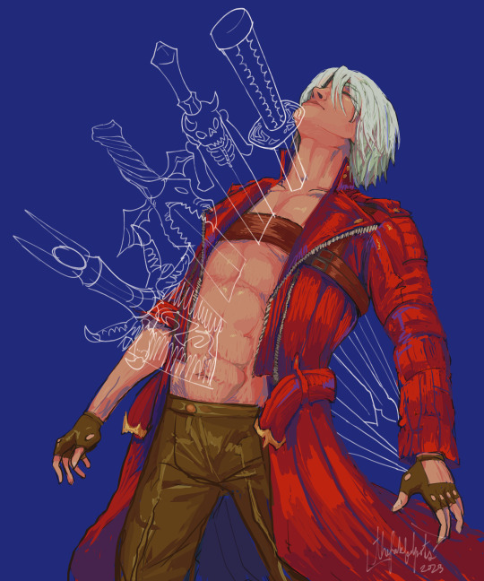

It's going to hurt every time
#DMC'S FAVORITE PINCUSHION!!!!!!!!!!!#devil may cry#devil may cry fanart#dmc dante#dmc dante fanart#dante sparda#pretty difficult to draw this one!! i'm new to drawing faces from this angle#and a different rendering style#aka same as my default but using a smaller brush#please excuse all the style experimentation...... trying to find something that sticks :)#beanie art#dmc fanart
3K notes
·
View notes
Text
how to make a simple & fancy header and trick people into believing you have photoshop skills
aka photoshop for dummies
warning: this is so fucking long idek
a lot of people have been coming into my inbox and dms asking me about my headers-- and while i always take requests! (and still do!) i wanted to offer a tutorial because it’s SUPER easy to make. it legitimately only takes 10 minutes.
now take in mind, to any pro or expert reading this tutorial: my experience with photoshop is basically me fucking around with it since i’m 13. so please don’t be mad if i commit any photoshop crime.
i’m going to explain step by step and as basic as possible, i’m assuming whoever is planning to use this tutorial does not really know how to use photoshop; and in my opinion, in these things, the devil is in the details! very minor easy things that become an habit quite fast make the difference between a shitty header and a good one.
1. first of all, the version i use is photoshop cs6. i wouldn’t know to tell you if some particular things in this tutorial can be done in another versions: i’d say probably yes, definitely in latest versions, and older versions have most of this settings anyway. now what we’re going to do is open our photoshop and directly open a new project. there are other ways to do this but this is the easiest for me. we’re going to change the size of the canvas to 640 x 360, since it’s the recommended size tumblr gives us for mobile headers.
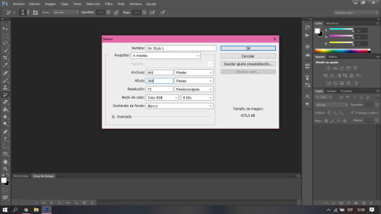
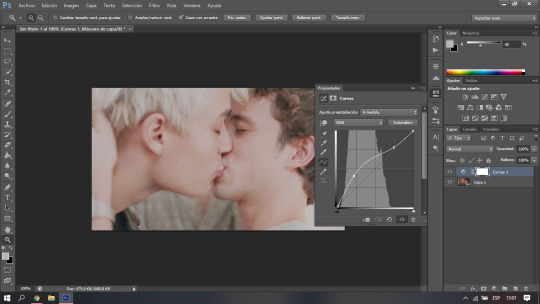
2. now most people would directly open the picture file and resize the canvas, i personally just think this is easier. what i do next is to go get my picture, and simply copy and paste it in photoshop. in this case, i’m going to use robbe and sander from wtfock. you’re going to notice that naturally your picture is wayyy bigger than the canvas, but don’t worry, the whole picture is still there. you’re just going to click the arrow button, the first one in the left toolbar. make sure the layer of the picture you just pasted is selected, and then you’re going to press ctrl + t. after that, you just have to resize it, make sure to hold down shift while making it smaller or bigger, that way it wont lose the aspect ratio. after you have the picture where and how you want it, just press enter. (the canvas is very zoomed out because the og picture was really big, but dont pay attention to that)

3. now this is where you just get to play until it looks fancy and you trick people into thinking you’re like a top notch tumblr edits blog. the first thing i’d tell you to take in mind is the placement of your icon in the actual header. make sure to position your picture so it doesn’t cover any important part of it (like, you know, their mouths in this case.) it’s something that you can just tell by eye so don’t go too far to test it either. you can add effects, filters, color it like a real photoshop expert would, whatever you want, but what i do here is simply to play with the ‘curves’ which change the lighting and make the picture look a lot better. (i told you, i’m a scammer) here’s where the tool is and there’s no secret to it. just move it around until you like how it looks. ctrl + z is your best friend. i personally like to go brighter to make it look softer, dreamy-like.
4. here it gets a LITTLE bit trickier if you don’t know how to use photoshop at all. you’re going to need to download torn paper brushes, you can find the ones i use here. you’re also gonna need a tutorial on how to install brushes, which you can easily find on google... there’s like, a thousand, i promise. you’re going to create a new layer by clicking the small little button in the bottom, next to the trash one. after you finally have your brushes ready to use and you have the tool already active, just choose the color you want for the header, take in mind this is the color you’re going to use as your background on tumblr, as well. here i’m going to go with plain white, but i’ll add an extra explanation for this later in case you don’t want white, because as you have seen so far, i love talking. the brush is going to look super big compared to your picture; don’t worry. you can either resize your brush, or simply resize the layer the same way we did with the picture earlier. it’s a lot of trial and error until it looks how you want. i personally like the paper to take as little space as possible, some people like it to have enough space to add text, it’s all about your personal preference.
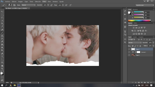
in case instead of white you wanted, let’s say, pastel yellow, all you need to do is copy and paste the hex color later when choosing your background while customizing. for some reason, when you first do it, it doesn’t look the same, but i promise you when you save it does. if you actually do know a bit of photoshop and you’re asking yourself, “isn’t it easier to just make it a transparency?” the answer is yes, it is, but for some reason it doesn’t work. at least for me.
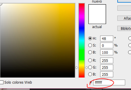
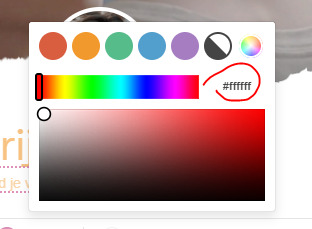
5. and finally, we get to the text. this again involves a lot of trial and error, and personal taste, playing around with the tools. there’s no right or wrong, but i’m going to tell you how i do it. i like to do a minimalistic / caligraphy font sort of contrast, which is pretty basic but it makes things look HELLA fancy for some reason that is unknown to me. so that’s all you do! click the text tool, and write what you want. i recommend you use separate text layers for the different fonts, so you can play around with the placement instead of being set to the default spacing between lines. the fonts i’m using here are signatrust and telegraphic. i’m pretty sure the later is a default one, but you can find signatrust or any font you want on dafont. finally i just added a shadow, you can also add outline, glow, play around with any effects by right clicking the layer and choosing the first option in the menu. use the arrow tool to find where you want your text to go... i’m sure you got the gist at this point.
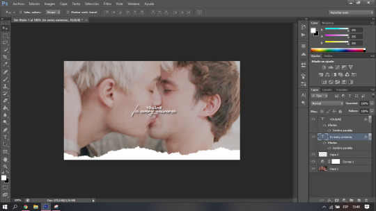
last but not least, don’t forget to save it as “png” when go to “save as”!
here’s our final result, which i beg of you to not use, since it was a request from my dear @driesen-demaury! i trust you can make your own now, or you can ask me to make one for you!

graphic design is my passion
( @asksander, here’s what i promised! )
#tumblr headers#headers#header tutorial#this is like the most pointless tutorial ever im sure but if it somehow helps#i feel like its like a tutorial on how to reset your computer like not to offend anyone i just feel like im making a big deal over nothing#djkhdhdkd
24 notes
·
View notes
Note
Hi! I'm sorry to bother you but I was wondering if you've ever done an icon tutorial? Your icons are really the most beautiful I've seen, and I'd love to know your secrets 😊. But if you aren't interested in posting them I totally understand. I hope you're having a great day!!
EXTENDED ICON TUTORIAL
Hey sorry this took so long to get around to but I finally felt inspired to make this. A couple things first. I want to give a special shout out to argetnallison cuz I learned how to make icons from her tutorials here. I picked up a few tips and tricks that aren’t included in other tutorials so we’re gonna call this an extended icon tutorial. I’ve also been told I explain things well but if there’s anything from this that needs clearing up later just send me a message and i will be happy to help guide you through it. This Is my first time making a tutorial so bare with me if I ramble.
we will be going from this:

to this

to this

Ok so things you willneed..
photoshop (i personally use the 2014 CC version or something like that but that’s just my preference for layout and stuff)
kmplayer (kmplayer is how i get most of my screencaps. Sometimes I go to google or screencapped.net or other sites that have precapped content when i feel lazy)
Alright so we start off with figuring out which screencap to use.
so basically here i open whatever movie/tv show episode file i want to use and skim in kmplayer till i find a scene that works. Then I hit start and play it until i have the scene i want and then stop,

these are my capture settings for kmplayer.
Alright so I picked this scene of Hermione in HBP (aka the hardest movie to color.
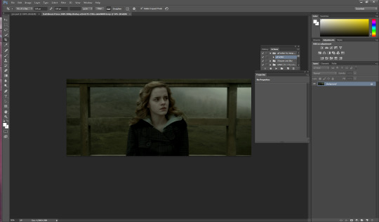
Okay disclaimer here, I don’t actually use anything on the left and rely totally on shortcuts on the keyboard so that’ll be how I explain things here.
People do this step differently but what i tend to do is crop my image before i mask it. I hit “c” on my keyboard. I set my w x h at the top to 100 x 100. Then what i do is I take my mouse and click on the top bar of the crop box and extend it till Jyn is a more icon like size.
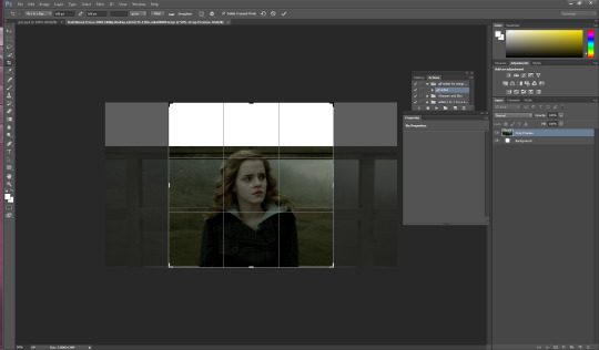
after she is at a size I think is ok for this icon i hit enter and it looks like this

alright now for the fun part. this is honestly the hardest part of icon making, the rest is simple if you’ve used photoshop before. Its time to mask the image and get rid of the background around Hermione. So we start by pressing “p” on our keyboard, p for pen is how i remember, and then we start at one end of her shoulder and work our way around. Basically how this works is u click around the image of her and keep clicking until u have an outline around her like I have below. this does not need to be perfect because we’re gonna have to use the eraser tool anyways.
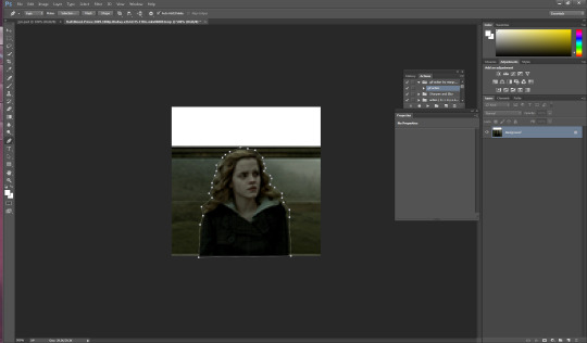
you should have something that looks like this. Also tip here is that you can use ctrl + and ctrl - to make the image bigger or smaller when doing this part.
ok so now we have a rough outline of hermione and we wanna create this mask so we right click within the image somewhere and we hit “create vector mask” which should be the first option (i donno what its like in other versions of ps sorry)

ur image should now look like this
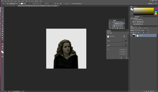
be sure your starting dot and your connecting dot come together at the end or it won’t let you do this part.
Alright so here is where i add my psd and my fancy textures and things. I use argetnallison’s psd (no claiming as ur own, give her credit if you use this) and adjust it as needed because i am really bad at making my own (seriously props to everyone who makes their own psds its hard and i salute you).
so how I do this next part is i take my psd file (this also contains my textures and stuff to make it easier and quicker to do stuff) I take the jyn file with the psd and i ctrl/alt/a toselect everything quickly like this and then drag it onto the hermione image.
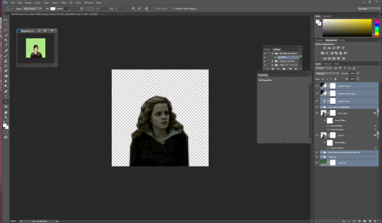
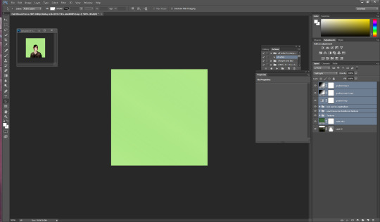
i move some of my layers under the hermione image like the solid color layer and the texture pack so she’s visible again and keep going.
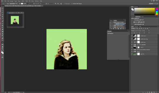
alright so another thing to note is if u click on the mask next to hermione you will get a box that has the vector mask and density and feather
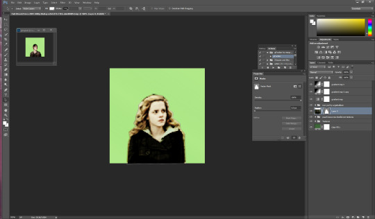
you’re going to want to go to feather and where it says 0.0 make it 0.3 (some people do 2 or 1 just mess with it till it suits you).
so i have set mine to 0.3 and now its time to erase the stuff around hermione that’s still visible. i press e on my keyboard and zoom in on it a little Here it is also really helpful to create another layer mask so that it doesn’t mess with the mask of her you already have (ps weird and it’ll get messy trust me) so i go down to the bottom right and hit add layer mask its the third one from the left

the white square between the hermione picture and the mask is where you’re gonna wanna click and then start erasing.
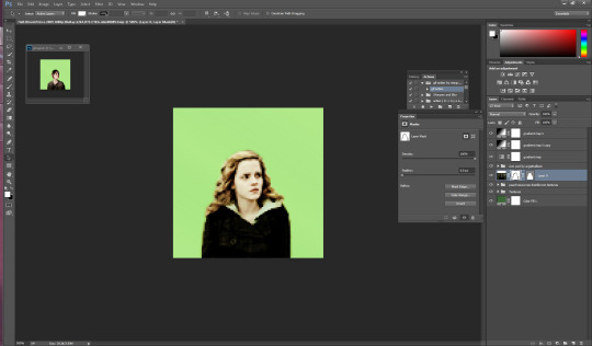
if you mess up along the way and erase too much you can press b on your keyboard for brush and it’ll bring it back.
ok now its time to sharpen the image. i have an action i really like but its from a blogger who’s changed user since then and i donno her new one or i’d 100% credit. I will try and find it and add the link here. anyway I convert the hermione picture to a smart object (right click on the hermione picture and its on the left towards the middle) hit play and add the action to the image Mine looks like this now

so for this next part i usually have green as my default layer but i wanna change the color so i’m gonna double click on the dark green box

i’ve settled for this pink. Now if you follow my icon making at all you know I like to match my background and clothes together so that’s what i’ll show you next.
so next its time to use the eyedropper tool (which was very confusing for me initially so if you have questions don’t hesitate to ask). We start by hitting “i” on our keyboard and finding a spot in our picture that we want her to match so I’m going to click some of the lighter pink in the top left corner.
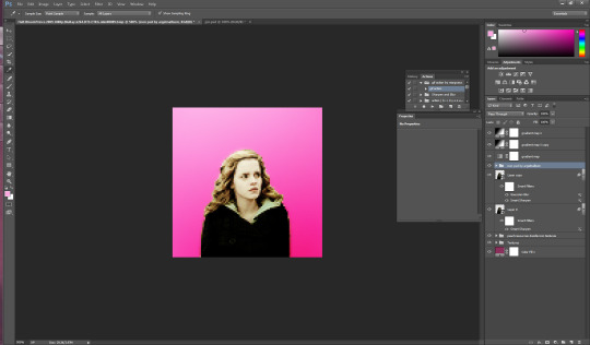
as you can see in mine in the top right it now has that pink we just selected so now we get to add it to hermione’s jacket.I usually do it right above the psd so i make sure i have that clicked and then i make a new layer for the jacket by hitting ctrl/shift/n on my keyboard. with that layer selected, I hit ‘b’ for brush on my keyboard and set this new layer to “color” then i hit enter and begin to brush over the jacket (in my ps its the second to last one down). The default name is “normal” and its right next to opacity”)
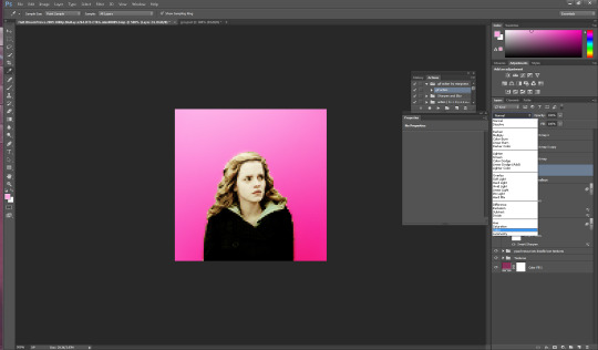
now my picture looks like this: (you can use the “e” to erase if you brush over her skin by accident as well)

now its time to do the same with her hair so i do ctrl/shift/n again to create another layer but this time we’re going to set it to “soft light” instead of color.
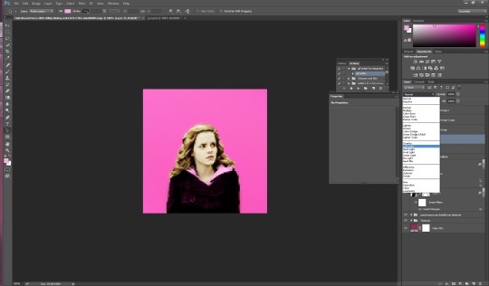
just like with the jacket we are going to use the eyedropper tool again but we’re gonna click on a lighter part of her hair.
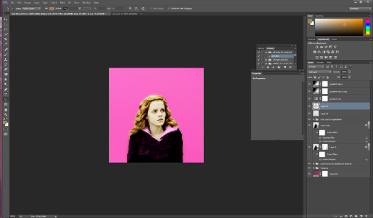
you can change the opacity here if you would like but for this image i am going to keep it at 100%.
You could honestly leave this image here and have a perfectly good icon but a lot of people have asked me how i do the circle ones like my current one so I will take this one step further. (i learned from this tutorial here in case that helps you better).
First i’m gonna add a texture by checking one of the boxes in my texture stash (feel free to hunt on yeahps and deviantart for some seriously amazing textures that’s where i get all of mine from).
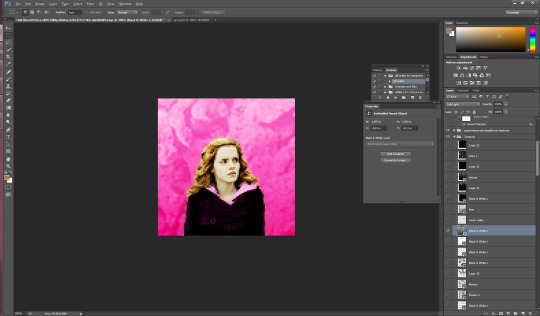
now i’m going to do a duplicate image (so that i can use the original to edit it in different colors). to do this i go to “image” at the top (third option after “file” and “edit” and then i go down to where it says “duplicate”.

i hit ok and then i begin to make my circle icon
What i do here is i convert everything to a smart object so i hit ctrl/alt/a and right click and convert to smart object.

then i hit ctrl/shift/n and create a new layer where we create our circle.i make sure that the circle is white by going to the top right and setting it to white. Then i hit “b” and right click on the hermione picture
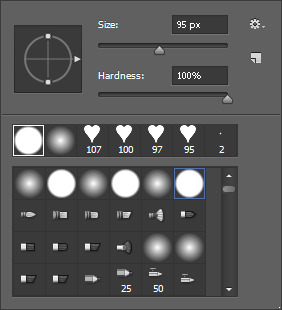
i use the selected brush and have the size at 95 px. Then I click in the middle of the image and it looks like this
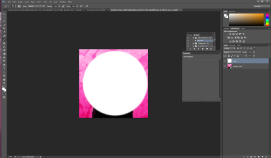
now what I want to do is make sure that the white circle is centered so i’m going to hit “m” on my keyboard Then i wanna right click and hit “free transform” in the middle. you’ll know its in the middle because there’ll be these two purple ish lines that create a plus.

now you hit enter and you have your circle. Now what I do is hit “w” on my keyboard and click your mouse in the circle somewhere (very important to stay clicked on the circle layer here). now that you’ve selected the circle, select the pink hermione image. go to the bottom and click “create layer mask” which again is the third from the left, and you should have a circle next to the hermione picture. You should have something that looks like this

now i just click on the circle layer and delete it and it’ll look like so:
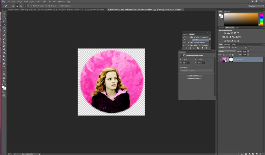
again. you could ctrl/s and save it here and leave as is but i’m a bit on the extra side so we’re gonna take it a step further and add little designs cuz it makes it look more fun.
So what I did in the beginning is I googled a ton of different types of brushes and used search things like “heart brushes for photoshop, deviantart” or “star brushes” or whatever i wanted and i just dug around until ifound what I was looking for. its a fun scavenger hunt but you can deff check out yeahps too or itsphotoshop for resources. Then you go to “edit” and all the way down to “presets” and a drop down will show up and you click “preset manager”. you will see something like this pop up
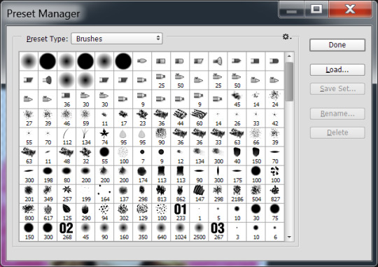
go to the right and hit load and then click on the file you’ve extracted from winrar (if you need help with this part just message me). Ok, once you’ve loaded some brush presets into your ps you can start the next part. once again you have to create a new layer ctrl/shift/n, i then click my star brush and set it to 14 px.

alrighty so before we start clicking and creating stars I want to make them the same color as the background so its time to bring out our “i” for eyedropper again and click somewhere on the pink, then hit “b” again and you should now have pink stars when you click. So Here i go to a transparent corner and i just create my star on the new layer. Sometimes i click it twice so that its more visible ut now i have something like this:

now I’m thinking i want it situated a different way so I use the “m” tool and use “free transform again” to adjust (using the corners like with cropping) to where i want the star to be.
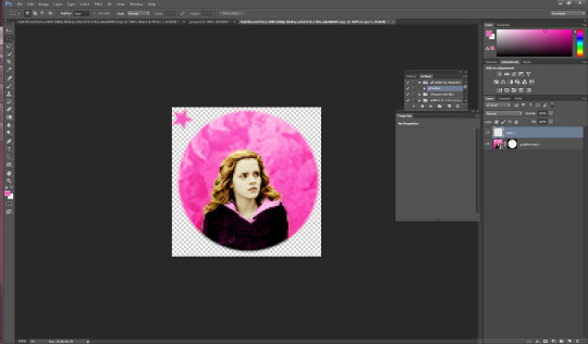
now i have it here and i use the arrows on the keyboard as well sometimes to adjust it. Now what I usually do is create another layer for the smaller stars so i hit ctrl/shift/n again and then i set this new star to 9 px by right clicking on the picture. Then I repeat the steps above and have something like this

Now i just hit ctrl/j and duplicate the little star. then i hit “m” on my keyboard once again and move it to the opposite side of the big star.
now you have this picture:
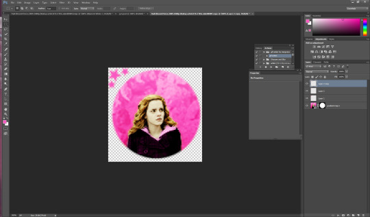
Now what i do is i select all 3 star layers and right click and convert them to smart object so theyre easier to deal with. Then i hit ctrl/j and duplicate the stars.

now i hit “m” on the duplicate layer and click “free transform once again” now right click and hit “rotate 180″ and the result is like this

move the rotated stars to the opposite side of the picture with the mouse. Now it should look like this
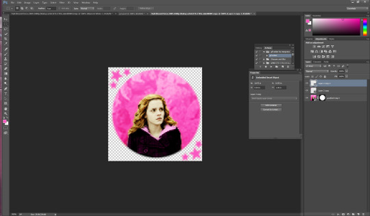
and that’s it! just hit ctrl/s and save as a .png and you have yourself an icon. I hope this helps. If i need to clarify anything please don’t hesitate to ask me. This is my first tutorial so I hope I explained things ok. Feel free to tag me in ur new icons I’d love to see them!
1K notes
·
View notes
Text
Do You Know Grog and Thor?
In celebration of the upcoming release of my new book, “The Tapping Solution for Manifesting Your Greatest Self”, I’ve pulled out Chapter 2 for you to read. Enjoy!
Day 2 - Negativity, Hardwired: A Look at the Primitive Brain
Grog and Thor sit perched at the edge of their cave.
You know Grog, your great-great-great-great-great-great-great-ancestor. You’d recognize him; you both have the same nose. He’s waiting patiently but alertly with his friend Thor. They’ve been hearing some saber-toothed tiger sounds, not too far from their lovely abode.
Grog says, “Ughr all ogg ogg ralf woomr.” Oh, you don’t speak caveman? I’ll translate for you the rest of the way.
“I’m pretty nervous about that tiger. It sounds like a big one, and it’s coming our way.”
Thor, twiddling his thumbs, half meditating in a lotus position, says, “Brother man, there is nothing to worry about! The sun is shining, we’ve discovered fire and some basic tools, and this cave is luxurious. Bask in gratitude and the joy of life!”
Grog looks around nervously. It sounds like the tiger is getting closer, and quickly.
“Thor, I’m going to higher ground. We’re tiger meat in this spot, and I don’t think the two of us are going to be able to handle this guy.”
“Grog, you are so negative! Always talking about what could go wrong, always ‘moving to higher ground’ or worrying about this or that. You know, you’re just not going to attract what you want in your life with that attitude!”
Sensing the tiger’s approach, Grog scampers away at a full sprint toward higher ground, where the tiger can’t climb. He makes one last desperate call to Thor, “Please! Run!”
Thor continues his peaceful meditation.
And is swallowed almost whole by one of the largest saber-toothed tigers to roam the ancient world.
Well, at least Thor seemed happy until his untimely death.
Grog lives, and with him, his DNA. And partly because of his negative, pessimistic, cautious attitude, he survives.
Thor has vanished, along with his “happy” genes.
And so it goes, again and again and again and again . . .
And thus, the human brain evolved, literally clinging for dear life to something we call the “negativity bias.”
YOUR BRAIN’S PRIMITIVE PANIC BUTTON
Yesterday we looked at peace and panic, and we began using tapping to have a new experience.
Ever wondered why we even need to do that? Why there always seems to be something — or several things — standing between us and happiness, us and peace, us and fulfillment, and so on.
Why is it so much easier to choose panic over peace?
Sometimes it seems like our “default” setting is to be negative and fearful... and that’s because in large part it is.
For our own protection—cue Grog and the “negativity bias” that saved his life — the brain evolved to assume the worst. It’s biased toward negativity. In his book Hardwiring Happiness, Rick Hanson, Ph.D., explains this concept in more detail:
Our ancestors could make two kinds of mistakes: (1) thinking there was a tiger in the bushes when there wasn’t one, and (2) thinking there was no tiger in the bushes when there actually was one.
The cost of the first mistake was needless anxiety, while the cost of the second one was death.
Consequently, we evolved to make the first mistake a thousand times to avoid making the second mistake even once...
In general, the default setting of the brain is to overestimate threats, underestimate opportunities, and underestimate resources both for coping with threats and for fulfilling opportunities. Then we update these beliefs with information that confirms them, while ignoring or rejecting information that doesn’t. There are even regions in the amygdala, which an almond-shaped part of the mid-brain that’s intricately connected to the body’s “stress response” that’s specifically designed to prevent the unlearning of fear, especially from childhood experiences. As a result, we end up preoccupied by threats that are actually smaller or more manageable than we’d feared, while overlooking opportunities that are actually greater than we’d hoped for. In effect, we’ve got a brain that’s prone to “paper tiger paranoia.”
Most of us can recognize this experience in our daily lives. We get an e-mail or text that feels unclear, whether in meaning or tone. Immediately, we go to the negative. Or we get a call, and someone says something vague like, “Hey, do you have a minute? We need to talk.”
For most of us, it takes only a second or two to assume the worst. Without thinking, our brains translate “we need to talk” into “something’s wrong.” Similarly, rather than noticing that the text message we just received is unclear, we default to the negative—deciding, for instance, that it’s hurtful or insulting.
We then feel fearful, angry, sad—any number of negative emotions that reinforce our need to defend ourselves from (yet another) attack. Before we’ve even considered that the person may have been in a rush and carelessly worded the text message, we’re ready to retreat and/or attack him in return.
And because of how our brains have evolved, this process is so automatic that we often don’t even recognize when it’s happening.
When you really think about that, it’s pretty extreme. It’s also the reality of the human brain, which defaults to a negative lens so powerful that it easily and quickly taints our entire experience.
TRICKY, SNEAKY, AND SUBVERSIVE, TOO
Sometimes the “negativity bias” is even subtler and harder to notice. For example, in the off-kilter morning I shared in Day 1, my negativity bias might look like me deciding that I can’t control my mornings, even if I don’t love how they feel.
Oftentimes we brush off these decisions casually.
“What are you gonna do?” we ask.
“It’s just life,” we say as we return to our to-do lists.
While it’s true that we often have limited control of the external world around us, these reactions can, at times, support us in lowering our expectations.
In tiny ways we don’t consciously recognize, we then give the brain’s negativity bias room to thrive.
Best-selling author Brené Brown sums it up this way: “We think if we can beat vulnerability to the punch by imagining loss, we’ll suffer less.”
We see this tendency to focus on negative experiences more than positive ones in research studies, as well. The psychologist Daniel Kahneman received the Nobel Prize in economics for showing that most people will do more to avoid loss than to benefit from an equivalent gain. In intimate relationships we typically need at least five positive interactions to counterbalance every negative one. And for people to begin to thrive in life, they usually need positive moments to outweigh negative ones by at least a three-to-one ratio.
I would argue that these numbers might be even larger than the research suggests. I know that one negative review of my books on Amazon can easily overwhelm 100 positive reviews — if I don’t tap on it, that is!
For people to begin to thrive in life, they usually need positive moments to outweigh negative ones by at least a three-to-one ratio.
So how can we reverse this “negativity bias” in the simple everyday ways that allow our greatest selves, and then our greatest lives, to emerge?
It starts with cultivating simple awareness about how those three pounds of gray matter that you’re carrying around (aka your brain) actually work. Just being aware of your brain’s negativity bias is a huge first step in overcoming it.
That basic understanding encourages us to view positivity as a practice rather than an attribute or personality trait.
Being positive then becomes a skill we can consciously choose to hone every day.
DAY 2 GREATEST SELF CHALLENGE: REDIRECTING YOUR BRAIN
So how do we actually bring positivity practice into our lives?
On a day-to-day, week-to-week basis, how can we reprogram our brains to recognize and accept positivity without becoming so detached from our surroundings that, like Thor, we’re prematurely devoured?
Start by simply noticing when you default to the negative.
Start with the little things, like that e-mail or text that feels unclear. Your brain’s natural bias will lead you to assume the worst. Your brain’s innate negativity bias will support you in feeling judged, accused, and so on.
Starting today, make a point of simply noticing when your brain’s “negativity bias” is being activated.
Remember, it’s a hardwired response that we all experience, so there’s no need to blame or shame yourself for it. Don’t stress or worry about it. Just notice it.
And once you see your brain’s negativity bias at work, pause and ask yourself: Could this be my brain’s negativity bias talking?
That’s it — just notice it for now, say hello, maybe introduce yourself, and we’ll use that awareness to build from in the coming days.
Make sure to take time to use the Day 2 Tapping Meditation: Turning toward the Positive to begin reorienting your primitive brain to notice and value the positive. (I've included a link to it below so that you can already start using it)
(audio link coming soon)
You’re beginning to create an important foundation for choosing peace!
Can you relate to any part of this chapter? Please leave your comments below - I'd love to read them!
The post Do You Know Grog and Thor? was originally published to: The Tapping Solution
0 notes