#airbrushing lesson
Explore tagged Tumblr posts
Visit Tumblr Blog
Explore Tumblr blogs with no restrictions, modern design and the best experience.
Last Seen Tumblr Blogs


Fun Fact
In Q3 of 2020, 31% of US users access the Tumblr app daily.
Text
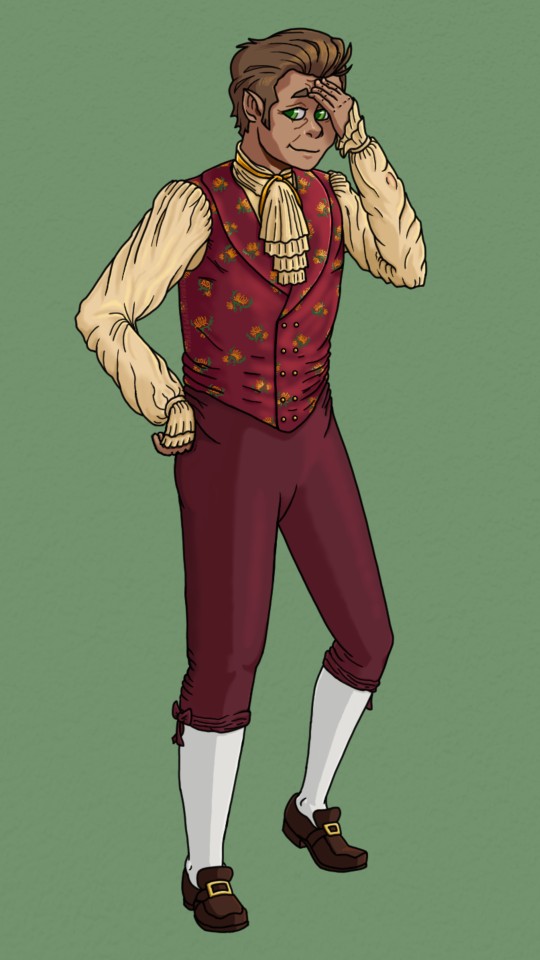
Hobson Heckled into Historical Haute-Couture
Continuing the Dan Jones & Dragons gala parade with Hobson, the Flower Crowns' oft-harried Halfling Warlock (played by the ever-wholesome Dan Floyd). Is he trying to massage away the realisation that letting his literally-half-brained patron choose his gala attire might have been a mistake? Is Valse giving him a headache over something else entirely? Did he use Detect Magic in a room full of powerful items and accidentally flash-bang himself? Yes.
More Flower Crowns Gala Outfits: Morenthal | Gelnek
As always, design talk under the cut:
But before that, a short story: I've been following Dan's content on Youtube for... oh jeez, that sure is almost a decade now, both on his current New Frame Plus/Playframe channels and back when he was the primary founder and narrator for EC. His old games education videos helped me get one of my earliest jobs in project work and introduced me to a bunch of media production concepts (like scope management) that would go on to inform some of my own storytelling analysis posts. It was a startling little moment of artistic ouroboros to realise I was mentally running through key points from Dan's own Pose Design 101 video as I was drawing his DnD character. Never expected things to come full-circle like that, but if you're seeing this, Dan: here's to you 🫡 If you're not Dan and haven't already, do go check out his stuff - it's all super well-produced, informative, funny and he's just an overall stand-up guy.
Now: onto the tiny little nerd and his passé party attire
This was a really fun costuming challenge, with a bunch of interesting curveballs thrown in the mix. Unlike the rest of the Flower Crowns, Hobson didn't choose his own party outfit: it was picked out by his patron after Valse kibbitzed him into giving up and letting a heroism-obsessed Fey call the shots. Dan cited Valse as having the fashion sense of Stede Bonnet-as-depicted-in-OFMD, briefing a vaguely 19th century-style outfit that had frilled sleeves and 'would have looked gaudy even when it was in fashion a century earlier'.
Actually dating his outfit was the first challenge. D&D settings are kind of an anachronistic uchronia, with classic swords-and-sorcery fantasy campaigns potentially pulling inspiration points from anywhere across the Arthurian era up to pre-war modernity. Which leads to the question: how do you make something seem dated in a setting where most everything looks vaguely ye-olde-fantasy? The other challenge was that, IRL, the 19th century (i.e Victorian era) was when menswear started taking on a lot of the shapes that would eventually become modern suit and top-'n'-tails fashion. Since Trilby was already going to be wearing classic top-'n'-tails formalwear, I decided to set Hobson's style earlier in the 1800s-1820s and pull in some 18th century Stede Bonnet flourishes to visually set them apart. This article provided some great reference images, and once I hit on the figured silk waistcoat I knew I had a potential starting point.
Colour-wise, I stuck with the burgundy-and-gold palette the Dans gave Hobson in his official gala stream art, since those looked good together and matched up with Dan J's tendency to draw Hobson wearing greens/earth-tones and Valse in reds/jewel-tones. The combination is a lot more colourful and richly saturated than is typical for this style of Victorian-adjacent clothes, which felt appropriate for Valse's gaudy tastes.
Fabric-wise, I figured a fun way to gaudy things up even further would be to lean into the silks and satins that were fashionable at the time, but make all of his outfit shimmery rather than just a single feature piece. As a bonus, silk and satin clothes tend be hot, inelastic and have horribly itchy seams if worn unlined, which felt like exactly the kind of thing Valse's all-form-no-function sensibilities would inflict upon the small, long-suffering fellow. Both these fabrics also have a habit of behaving hideously and ripping themselves apart when worn wet, which makes this a great outfit to, say, accidentally fight an Aboleth in. Poor Hobson.
Some other details, just for fun: 1. Hobson's sketch layers include a drawing of his un-removable cursed left bracer. He's pulled the frilly, puffy sleeve over it but you might spot hints of the shape and the gem if you squint. 2. The reference waistcoat I used had floral embroidery on it. Had this actually been a Hobson outfit, I would have converted them to his garland flower (Forget-Me-Nots), but since it was a Valse pick I decided to make them Senaliesse chrysanthemums; a flower given out to friends of the Feywild's Summer Court as a sign of protection and favour. (It also adds extra layers to Pocket mistaking Hobson for a denizen of the Fey, which is fun).
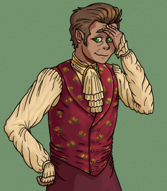
Close crop on the details because I'm very happy with how they turned out:
#my art#Dan Jones and Dragons#DJ&D#The Flower Crowns of E'lythia#Hobson Bunce#Hobson (Forget-Me-Not)#A Party to Forget#Very fun challenge to communicate the character of someone posing in an outfit defined by a different character's style sensibilities#After so long learning from Dan's content it was really nice to end up using some of those lessons to draw his DnD guy#Albeit somewhat ironic as Hobson's pose is the one I've been the least confident about to date#Dan J. was *very* kind to Hobson with his official gala art#I have been less kind but considering what the 1800s had to offer I could have done MUCH worse to the poor small man#Me and my program's airbrush tools got VERY well-acquainted rendering all that silk and satin#Valse very nearly bedazzled the poor fellow#Pretty funny that my motivation with designing Gelnek's outfit was: this could be fashionable#And then with Hobson's it was: this could ABSOLUTELY be worse#Luckily Trilby was there to stave off the impending threat of a 1800s beaver hat and wasp-waisted jacket combo#In my earliest concept sketch he was going to be wearing some Elizabethan/ Shakespearean-era nonsense#which very much would not have been a good time for him#Another challenge with trying to put Hobson into something unfashionable is that Dan J drew him real cute with nice eyes#He could be wearing a potato sack and he'd still have terminal baby disease#This man's smallness absolutely destroyed me mentally (in the best way)#I put him next to Morenthal in a to-scale drawing and spent the next 30 minutes being VERY NORMAL about it#DnD#D&D#Halfling#Warlock#fanart#3WD
7 notes
·
View notes
Text
One of the gundams i bought is a 20 year old Guntank which was literally £5 to practice fucking around with detailing and painting and as it happens, no, basically none of the skills I developed on approximate thumb sized high detail organic mans (infinity) are transferable to the comparatively gigantic inorganic metallic slabs of approximately action figure sized giant robots... Like thankfully the models which aren't 20 year old mcdonalds toy motherfuckers look pretty nice with just a little superficial detailing but this poor chunko bastard guntank is going to get disassembled and scraped clean so many times until I get the hang of a god damned airbrush (my nemesis.... but brush looks like garbage on like Large Vehicles which I have previously mercifully avoided by not giving a rats ass about military vehicles and not being Really Into Trains or anything) because even if they look Pretty Nice they'd probably like Sick As Fuck with a lil airbrush work yknow...
#this is of interest to nobody#my trouble with learning airbrush is i spend hours fucking up and then fixing the mistake and it feels like a waste of time#then im so demoralized that by the time i try again half the lessons learned have flown out my brain
17 notes
·
View notes
Text
In a challenge that tests many skills
Daily writing promptWhat skills or lessons have you learned recently?View all responses Currently I feel many of my skills put to the test as I continually work on a project that has taken me months to get to the point I am at now. It hasn’t been from a lack of trying. I’ve added paint, shades and highlights only to end up almost at the same spot I was when I started. Or sometimes worse. So if…
0 notes
Text


Make up lesson for Ann from @cedarhurst such a sweet young lady💋
#makeup #events #weddings #prom #sweetsixteen #lashes #onset
#asofttouchbymaria
#longislandmakeup
#airbrush #makeupandbeauty #makeuplife #videoshoot #crew
#nycartist #longislandmua #instabeauty #events #mua #makeupartist #ootd #ootdindo #makeup#makeupartistonlocation #production #makeupartistlongislandny #commercial #bestmakeupartistonlongisland #freelancemakeupartist #theknot #weddingwire #bridesoflongisland #longislandmakeupartist #longislandbride
#makeupartistonlocation #nassau #LongIsland #NassauCounty #SuffolkCounty #RockvilleCentre #Hempstead #Babylon #Oceanside #Baldwin #Freeport #Lynbrook #EastRockaway #ValleyStream #Malverne #FranklinSquare #GardenCity #Queens #Bellmore #manhasset #northshore #howardbeach #Hewlett #Plainview #roslyn #FloralPark #longbeach #lidobeach #woodmere #cedarhurst
www.asofttouchbymaria.com
516 770-3007
#makeup#make up#longislandmakeup#asoftouchbymaria#weddings#airbrush#travel#maccosmetics#makeupartistonlocation#makeupforever#dollupyourface#dollup#wedding makeup#makeup lesson#learning#learninghowtoputonmakeup#findmakeupartistnearme#makeuponpoint#makeupstudio#makeupgirl#teenager#teenmakeup#15minute#thebridesoflongisland#mother of the bride#bridetobe#prom24#high school#College girl#lancomusa
0 notes
Text
Long Post Abt World Eaters

Working on some World Eaters now. This guy is ready for oils and enamels. I did the armour by stippling with an old brush I have cut specifically for stippling. I did a grey primer and then stippled Celestra Grey, Celestra Grey/white, and then white in limited areas. Then I glazed some blue in the shadows to make the white more vibrant and strictly on the cool spectrum (more colour information is usually more interesting). Difficulty with this method is making sure moisture of brush is removed after thinned paint is applied to brush.
This recipe only took maybe 30 or so minutes to do a majority of the work. Usually my airbrush hits the executive dysfunction part of my brain and makes actually completing a miniature difficult. Taking it from airbrush station back to painting station back to airbrush for varnish back to painting station for oils. Well I've been using oils without varnishes and fine so far.
If I were to do a warm white I'd do less steps on the basecoat and really more on Burnt Umber oil wash. I wonder if I can do something similar with Paynes Grey. Could be an experiment.

This is the same mix but done with drybrushing. It's alright. Not sure which I like better. This one looks more like typical drybrushed crap texture so maybe I'll try tapping the actual brush on a damp sponge.
This is what it looks like as a wip, that horrible texture is less apparent. Still gave trim and blue glazing to do.
Both these look better than my older stippled WE imo
The one on the left is stippled. There is a big contrast in the shadows to the light areas. Just a diffe4ent look that I don't prefer. The one on the right is done with the airbrush.
Looking back a lot of those World Eaters I did don't spark too much joy. Maybe it's just the place in my life I was in at the time. Just bad feelings about them. Learned a lot about painting white though. And hey that Cataphractii on the right above is quite good imo and one of the only Cataphractii I've done that looks good. Those models are not fun to paint for me. They give me the ick. Don't like their shapes. Not friendly to my autism.
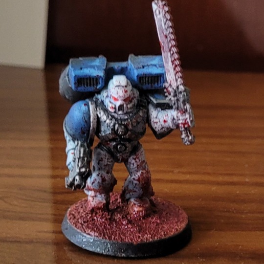
As a throwback here is my test model for my World Eaters, the first one I did ever as well as the first model where white was the main colour. The second model I did was greatly improved and was a gift for the girl I just started dating at the time and ofc us being still together I credit to my amazing skill in painting.
This of course in an amazing way fits the grimdark styling of 30k and I quite like it overall. I used a burnt umber/lamp black oil wash and learned the lesson of just how much an oil wash can darken a colour of a piece and progressively over many minis learned to push the white highlights higher and higher to fit my preferences. The Chainsaw is orange because of Chainsaw Man.
I think I'll start posting more of my old minis and projects and such. I have many pictures saved up.
I've been in a good groove with my hobby lately. Time away from painting has given me space away from my habits and a new perspective, learning to detach from old ways and learn new ones.
#warhammer#warhammer 30k#kitbash#horus heresy#3d printing#3d model#model painting#mini#tabletop miniatures#miniature painting#mini painting#miniart#my crafts#world eaters
29 notes
·
View notes
Text
lesson O2: eye shape and coloring.
Eyes are arguably the most important part of a piece of art. Mostly because they are usually a focal point of most drawings. This is especially clear in Project SEKAI! It's one of the things that define the art style. Let's look at some examples, so we can get a feel for what we need to recreate.


Let's look at these two card trims! As you can see, both Saki and Honami have different eye shapes. To get a better look at this, let's break these two down into basic shapes.


Here, you can see some differences in how their eyes are drawn. Saki's are very round and full of life, while Honami's are a bit more curved. This is done intentionally to convey character personality. So, we want to be sure to capture that when drawing. This comparison can be made with everyone in the cast. Using this chart below, one can notice all the different eye shapes in the game.

So, for this particular example, I wanted to redraw the eyes of the Nene card below. First, we need to determine a few things.

We need to determine where it is she is looking, so we can get a better idea of where her line of sight would be.
We can assume that Nene, in this card, is looking to the left.
After erasing the eyes from the card, I began to decide on where the eggs should be locating, loosely referring to the card when needed.

To determine where I wanted the eyes, I split her face into fourths, sketching the eyes according to these new guidelines.

This is ultimately my rough placement of her eyes. I focused on two things with this sketch; placement and eye shape.

I then refined this basic shape, mapping out the eyelids more, and getting a basic idea of where the eyelashes would go.

I then added in these eyelashes, following the line of her eye to make them look natural.

Then, I refined the bottom of her eye, as well as adding the crease of her eyes.

Then, it was time to sketch out where the pupils would be. Keeping the line of vision in mind, I also loosely placed the area I wanted her irises to be.
Notice here that the pupil sits neatly on the bottom of the eye. This is something that is usually done in the art style to define where the bottom of the eye is.

I then added a clipping layer, going in with a lighter redd-ish brown color and coloring the edges of her eyes with this color. As for her pupil, I colored it with a darker version of her eye color, just to make things look smoother.

Then, I made a layer under my sketch, filling in the pupil with the base color of her eye, which is usually neither the slightest nor darkest shade of the eye.

I then added in the darkest and lightest parts of the eye. The darkest part usually forms a crescent above the iris, while the slightest part of the eye forms a circle near the bottom of the iris, extending down to the bottom of the pupil, while still keeping a circular shape.

Then, I added the most noticeable highlight, which is usually next to the pupils on both eyes. It can be either to the left or right, but because of her line of vision, it would be to the left in this case because of how the light would be hitting her face.
I also added a half circle around her iris, which changes from a more light saturated purple on the light part, to a darker purple on the base color.

I then made a line of white under the half circle by doing repeated strokes in a downward motion to mimic the look of light reflecting on the eye.
Also, using a color close to that purple, on the color wheel (which in this case, was blue), I added highlights to the darkest part of her eye.

After that, I made a layer under this one to do the white of her eye. The top part almost always is shaded by a blue or purple color in most Project SEKAI cards. I used a blue here, seeing as her eyes were purple. The rest was colored in white.

After adjusting the position of the eyes a bit, I added a clipping layer on top of the sketch, coloring the crease of her eyes a pink color to match her skin. I also lightly airbrushed her skin color over the bottom of her eyes to make it appear "softer".
To compare, my eyes are on the left, and the original eyes are on the right.
This tutorial can be applied to eyes of any character of any gender, as long as you know the base shape of their eye!
My next lesson will be on hair, as I myself struggle with it at times. I hope this lesson was able to help you! If it did, please consider reblogging this post so I can reach more people!
If you have a question, shoot me a message through the askbox!
#pjsekai art style tutorial#project sekai art#art study#art tutorial#art lessons#artists on tumblr#pjsekai#pjsk#illustration#kusanagi nene#nene kusanagi#honami mochizuki#saki tenma#proseka art academy
17 notes
·
View notes
Text
So. Uhm. I did end up picking up my graphic tablet again, after all.
Disclaimer: I do not consider myself an artist, I have not received (nor sought out) proper technique lessons and the few that I have received were on traditional media only.
I did trace out the reference pic and I'm the first to admit that this is just fan art and with poor creativity involved too (so don't be mean).
That being said, it was so joyful and relaxing to spend time on gimp with the airbrush tool, adjusting the skin tone and playing with the highlights in the hair...all the while looking at a beautiful reference, so I am happy about it.

Thank you @imprincipalweemspet for encouraging me to get out of my comfort zone.
#dianneking#dianneking draws#fanart#Gwendoline christie#Gwendoline christie fanart#i am an amateur#don't @ me
90 notes
·
View notes
Text
Over and over, fandom after fandom, I look at artists around me and the work they make and so often I'm envious of their skill, their lighting, their poses, their facial consistency, how smooth and lovely their work is, and I feel like I'm failing. That 30+ years of lessons and self study and I'm stagnant and can't reach this level that seems so easy to others.
And then over and over, fandom after fandom, I find the photos they traced, the artwork from other artists they copied without credit, the faces copy and pasted over from one piece to another, and I remember how much of it is a smokescreen show of gloss and airbrush and not actual work.
I will not retain this.
15 notes
·
View notes
Note
Car for 5 OCs of ur choice!
CONTINUING TO PLUG THROUGH OLD ASKS. this one was sent on my birthday this year thank you luke <3
🚗 CAR — does your oc have a driver's license? can they drive/operate any automobiles/machinery besides cars?
picking the ones with interesting answers to this one.
lyssa does not have a driver’s license. unfortunately, this does not stop her from driving. 0 dots in drive simply means you can’t drive fast or safely, baby! she is the designated driver for The Malkabus, a brightly coloured minibus with airbrushed ferret decals owned collectively by the malkavians of her domain. it is decked out like a disco limo on the inside for no godforsaken reason. despite its style and class, the Malkabus is not a particularly subtle vehicle, so when the domain had problems with the si and the malks needed to lie low, lyssa also acquired a Very Generic People carrier. i no longer recall the model but it was grey and heartbreakingly boring
quintus does have a driver’s license! it’s in his mortal name and about fifteen years expired, but he did at least pass a driving test. he’s too broke to have a car of his own, but he’s driven ianthe around in the past, and has occasionally been allowed to drive his coterie mate lily’s bmw. he nearly drove it into a tree once but let’s not talk about that
hellebore has a fake driver’s license. they can drive, and spend quite a lot of time in their car (which i think is a rusty minivan of some description, i can’t remember what model i picked)
lachlan has a driving license and can, technically, drive. he was given a car by his parents as an 18th birthday present and totalled it within six months. now he has to walk or uber everywhere… which indirectly led to his embrace. SHOULD HAVE BEEN A MORE SENSIBLE DRIVER, BOYO
hye-seong has a driving license and is probably the character on this list that most enjoys driving. she likes old cars and fast cars, and owns an old fast car that i haven’t decided on yet. it IS bright orange whatever it is. she also likes motorcycles, and can drive them very well! her bike is a 1995 kawasaki EX 400R, which is cherry red and possibly her favourite object in the world. i don’t know enough about cars or bikes to really do it justice but she IS a cargirl and loves her vehicles very much.
characters who do not and honestly probably should not drive: red (walks everywhere), desdemona (gets people to drive her places), isa (deeply suspicious of modes of transport more complex than a horse and cart), ever (never finished driving lessons 🥺), secretary (old)
characters who probably can drive but i don’t have anything to say about: laurie, harrow, scriv (never finished driving lessons but can certainly move a vehicle)
#everyone’s in this one#lyssa#quintus#hellebore#lachlan#hye-seong#answered ask#thank you for asking!! so long ago!
3 notes
·
View notes
Text


This is the HG GM Quel, which is supposedly an acronym "Qualified to Use Earthly Law". It's a 2007 kit which is mostly a remold of the 2005 HG Hazel Gundam. It's so the most effort I've put into color correcting a kit but I actually enjoyed that part more than the build. In universe its an evolution of the GM Custom and it's thought to be overall similar in design, but the 2 kits don't actually share any parts except the visor piece (same runner) and maybe the shield, even the rifle is a slightly different mold because it has a hold for a rectangular peg for the later HGUC hands. It's limited posing compared to modern kits, and slightly worse than the GM custom because it doesn't have double jointed legs. It also has that federation bullpup assault rifle that's inconvenient to pose with.
If anyone is curious, for color accuracy it doesn't have any red plastic so you would need to paint all the thrusters (backpack, legs, feet, butt), the shoulder vents (which the color varies for depending on the sources I looked at), the giant screw things on the sides of the knees and ankles, head vulcans and the yellow upper chest vent because I hate the sticker it came with.
I also learned the trick to paint the inside of the visor silver to get it to show under the light, but it doesn't show on camera. I also could have painted the collar area gray but after it showed up as black on the plastic I gave up on that.

The most important lesson I learned from this however is that if/when I invest in airbrush, the first color I want to use for a custom is Titans blue.
#gunpla#hg gm quel#gm quel#zeta gundam#advance of zeta#gm custom#RGM-79Q#I actually took the pictures 3 days ago but I've had this sitting as a draft#I also cut the border on the stickers as much as I could because it would have showed really badly on the dark plastic
4 notes
·
View notes
Text
I uhhhh just kinda accidentally volunteered to be part of my haunt's team for the costume/makeup/dance-off competition at the East Coast Haunter's Convention tomorrow. I'm doing the makeup.
I have never done haunt makeup before and I got a crash course lesson on how to use the makeup airbrush tonight. Wish me luck.
#all of our actual makeup artists are running booths or doing demos or are not going to be there#so uhhhhhh improv partytime i guess!#personal stuff#scare acting
4 notes
·
View notes
Text
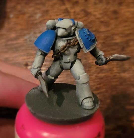
The tyranid combat patrol is done. Soon I can move back to the space marines.
The Barbgaunts’ design annoys me so much. Outside of being a pain to paint(maybe should’ve sub assemblied), I realised half way through that they only have 3 legs. I get that it’s holding a giant parasite thingy but I only imagine these things moving really stupidly across the battlefield.
The psychophage was more fun to paint. I tried to blend a bit for the first time with the airbrush and am happy with the results. My greenstuff in the gaps leads a lot to be desired. My girlfriend is a god at sculpting and ceramics so maybe I’ll ask for a lesson.
For basing, I wanted something jungly. I had just bought a box of green tea with matcha so decided to use those for leaves over Strickland Mud. I also had those funky bushes from model trains and little foldable plants. Need super glue for those though. My basing is sometimes very scatter shot but am somewhat happy.
Space marines coming again tomorrow.
P.s don’t know how it works on tumblr but feel free if there are any questions or advice


#mini painting#warhammer 40000#warhammercommunity#space marines#terrain#diorama#miniature#warhammer 40k#warhammer#wargaming
10 notes
·
View notes
Text

rough painting of a shot for a silly ides animatic i wanna do. i really liked the way the sketch came out, so i self indulgently blocked out colors. for once in my life ever i am super happy with the way the hair looks. a single win for me
lesson learned tho that if theres even a chance i might use airbrushes to blend a background, i should absolutely put the background on a second layer
7 notes
·
View notes
Text
Lessons I'm Learning In Painting A Plastic Model Kit:
1.) You should absolutely do a base coat with some kind of primer. It may sound unnecessary, but paint really does bond better to primer than untreated plastic, and it looks nicer
2.) It's probably better to paint something after it's been assembled rather than before. Painting before assembly allows you to hit all sorts of nooks and crannies that would be difficult/impossible to get after, but those nooks and crannies won't be seen. Plus, if you paint over a part that joins to another, it'll screw up how they fit because the kit doesn't accounts for the extra millimeter of thickness paint adds
3.) Just Buy A Fucking Airbrush, Holy Fucking Shit. God Damn Me For Not Just Buying An Airbrush And Painters Tape Of Varying Thinness, Jesus Christ. I Could Have Just Blasted This Fucking Thing Once When It Was Done And Saved Roughly 4 Hours Of Paintbrush Experimentation, Fuck Me Running
4 notes
·
View notes
Photo

I was so very bored & felt creative, then my dear wife came home with a kids model set of the venerable old Tiger one. It's a boxy little cat, with a powerful main gun & a fiddly engine, but for a modler with a brand new airbrush to play with, it's the perfect first victim, I mean project! The model is very simple, with a few well moulded parts & it went together very simply. The turret can turn & the main gun can move up & down. The plastic though was a grim shiny orangey brown, so out came the airbrush. The kit came with paint & I filled the cup. Only the airbrush is very economical with paint, so I had to pour it back out again, which made rather a mess. Lesson learned, I discovered that a few drips of paint go a long way & the tank was looking as fresh as a a year seven on the first day of school! Along came the airbrush again & this time we added filth, grime, dirt & mud. Perfect. The base was a little more complicated. I wanted to try modelling with expanded foam blocks. This base was my 3rd attempt & when given a skim of plaster & gravel, with a dash of Bermuda sand, it was ready for the airbrush. Applying washes is so much easier & the colours are so delicate. A huge thank you to those involved in supplying equipment & model. #modelmaking #airbrush #womanartist #lgbtq🌈 #tigertank #airfix #scalemodelling #painting #diorama #tanks #panzer https://www.instagram.com/p/Cnjqm2xoWDs/?igshid=NGJjMDIxMWI=
#modelmaking#airbrush#womanartist#lgbtq🌈#tigertank#airfix#scalemodelling#painting#diorama#tanks#panzer
3 notes
·
View notes
Text
Creating Happiness: Balancing Work, Family, and Passion
Daily writing promptWhen are you most happy?View all responses Hoy! El presente. The present gift of being present in this very moment now and doing what I am guided or prompted to do today. Every day is a new challenge, a new lesson or a new change to celebrate. I cannot dedicate myself to writing or blogging every day on a consistent schedule. Sometimes I’m better off not touching an airbrush.…
0 notes