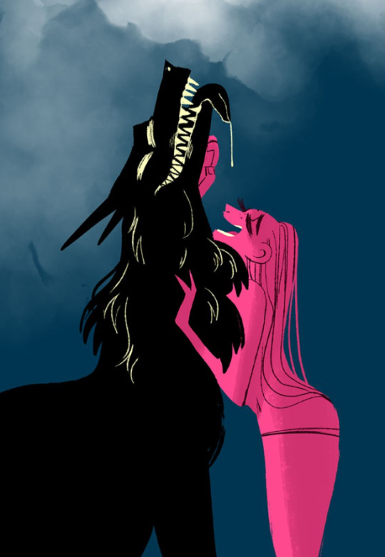
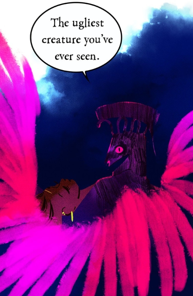
#actually there's a lot of space for like. using the actual art/ comic framing to convey stuff like this
Text

Cool meta-design thing or whatnot I think would be cool for some sort of cosmic horror manga or smthn
9K notes
·
View notes
Note
Hey, I love the comic! I love how the storywriting stays true to the original series but also adds its own fun spin on it! You've actually inspired me to write my own Blue diamond AU, lol.
Anyways I have a question for making comics just in general. How can you make dynamic compositions in such a small space. I honestly love how intricate all of your panels fade into one another!
So, if you're okay with it, I was wondering if you could give me some tips on how that would work?
Anyway, I love the comic and stay awesome!
:D
Your own comic - that's awesome to hear! It's always exciting to start something like that. I wish you the best of luck in your goals!
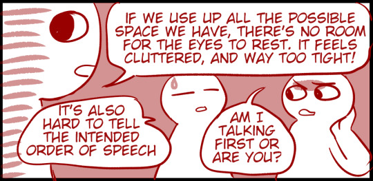
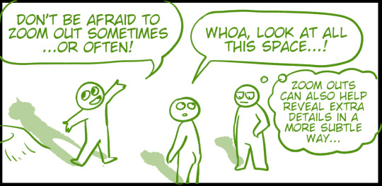
As for the paneling - honestly, the first step is to stop thinking of it as a 'small space'! The truth is, even on a small mobile screen, we can fit a lot of detail. And as long as we know how to use the space wisely, it's not ever going to feel small.
Ironically, cramming MORE into a panel makes it feel smaller.
Drawing less on a panel makes it feel larger. Weird, isn't it?
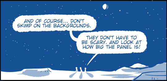
My more general advice is... STUDY MOVIES!
Don't just WATCH movies. But study them. Movies are like comics for dummies because there's only one size and shape of a panel and all the characters do the hard work of acting for you. (It's a joke, don't kill me.)
Anyway, the paneling in movies is versatile and interesting BECAUSE they're putting that single wide panel to the best use. If you already drew some comics, compare them to a movie screenshot and see what's different! Then, ask yourself why a certain angle, or a certain cropping of an image works better.
You'll find that there's some awesome ways to cram fun details into even the smallest corner of a panel. :)
There's also some awesome art resources by more talented comic artists than me out there. I'm sure others will link them in the comments, but for now, here's one I found:
383 notes
·
View notes
Text
So, I had this idea as I'm getting close to finishing the Election arc of my Roleshuffle AU to go through my previous comic pages and point out everything I did wrong :)
This is all for funsies, and I feel like my art has gotten a lot better with the Election arc. Plus, I think it's very important to go back and critique yourself to 1: see how far you've come and 2: to better understand where you tend to make mistakes. So, let's get critiquing!
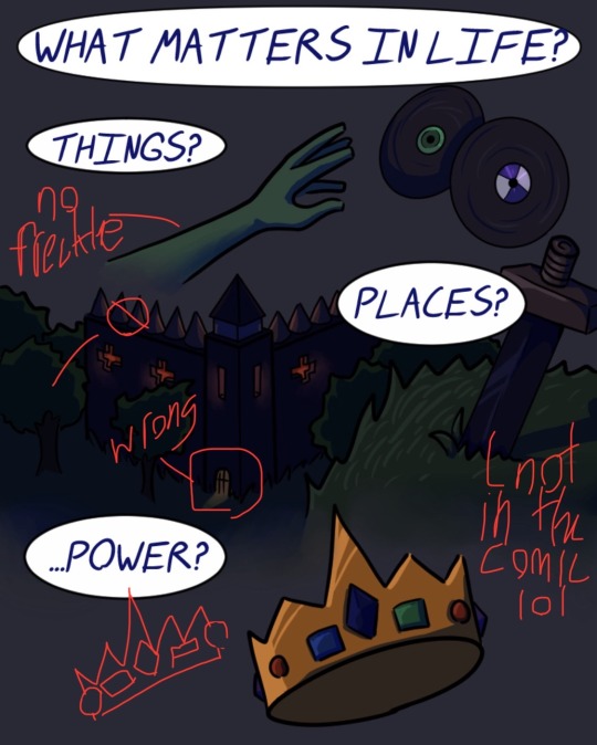
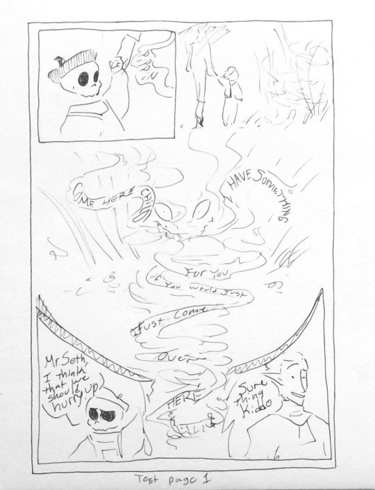
Soooo starting off, I really didn't know how to make a comic. I had only done very brief, minor comic making before, so this was a completely new field of art that I wasn't used to. You can immediately see that problem in the first and second panel, since they. They aren't a panel. Nothing about them (minus the speech bubbles) indicates that this is a comic. I think the first would have benefited from each item being properly separated, and the other would have benefited from an actual image behind it; not a gradient.
Speaking of the items, that's supposed to be Sam's hand at the top, and it is freckle-less (no clue why I forgot to add those lol). Some other consistency things that are weird is that L'manberg has no tower entrance, and there aren't any trees surrounding it in any other drawing. On notes of consistency, the sword there is supposed to be Techno's, but the design changed later to have a gold hilt. I guess that change never reached this panel, so now that just looks like a random sword stuck in the ground. Nobody's sword in the comic looks like that haha. Similar deal with Techno's crown: the spacing of jewels is not consistent with how I draw it in the rest of the comic.
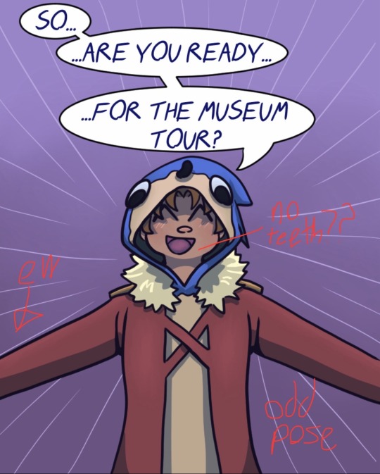
Moving on! The next two panels of Connor aren't bad, per se, they just aren't good. (I'm mainly bothered by the fact that he doesn't have teeth in the first one.) Also, because I didn't want to draw hands and cut his arms off, it just looks like the framing of the panel is all wrong. Plus, I don't think I've seen anyone pose like that in real life. He looks like he's about to hug you, which is not the vibe I was going for.
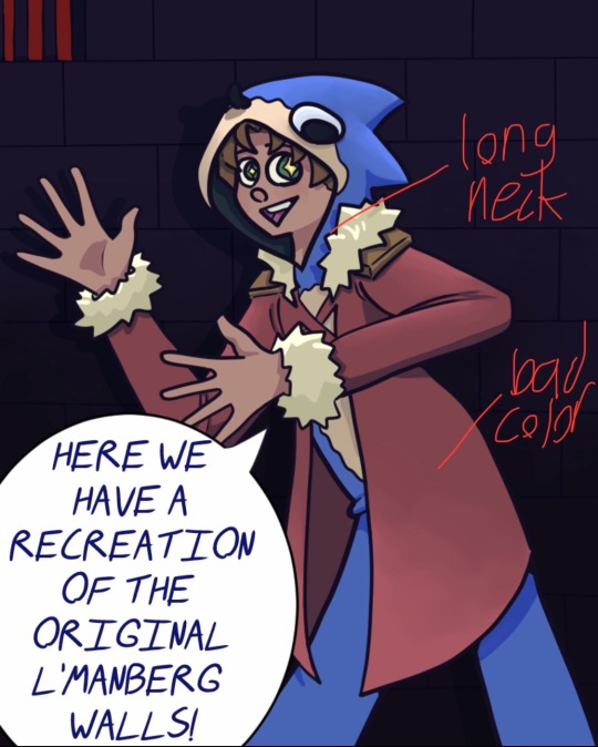
In both of these panels, we have what will become a reoccurring problem throughout: loooooong neck because I didn't draw a base figure before drawing the clothes. Connor's face should either be longer in these panels, or his shoulders should be higher. Either way, the neck does not look right. Another reoccurring problem you'll see is dull coloring/shading. I'm still working on this, to be frank, but these images all look rather dull. There's nothing unique about the lighting/colors, so it doesn't really pop like it should. Either I needed to add more dynamic lighting or be better at highlights.
Yet another case of long neck. Oh, and weird positioning on the facial features. The eyes feel stretched across his face instead of, well, where they should be. I also think in these opening panels I really fail to encapsulate Connor's personality. I was really banking on the fact that he's a silly little comic relief character in the canon dsmp, but his delivery is very dry/flat whenever I watch old clips of him. Therefore, in the early bits, he just seems a bit off because of the high energy I gave him.
Next up we have a bad case of something that looked good in the sketch but did not come across after coloring. What I wanted to happen was his face to gain some anime-type shading that screams "oh no", but it just wasn't strong enough, so the end result just seems like I copied and pasted the same panel for no reason. Also, in the lower image, Connor's face does not look right. I can't really put my finger on why, but it's either because his eyes are uneven or that the facial features, once again, kind of stretch across the face.
aaaaand I originally wanted to go through the whole first part of my comic, but this is turning out to be very long. So that's a tomorrow project. Hope you enjoyed my critique!
#dsmp#dream smp#dsmp au#dsmp roleshuffle#dsmp comic#mcytblr#artists on tumblr#dsmp fanart#mcyt#mcyt tag#dsmp connor
21 notes
·
View notes
Text
How we got here from there
Or, the long journey of a longform long-running webcomic about a long man with long wings.


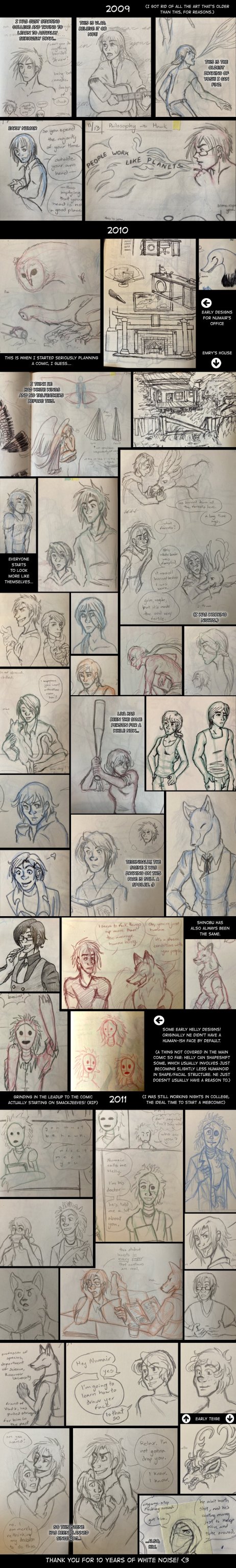
In the spirit of @feathernotes and @phantomarine who have been talking about just starting your webcomic and not worrying about being "ready", I was inspired to do a post about White Noise's origin! I'm a little limited by the fact that I either left behind or destroyed a lot of the art I have from prior to 2009, so you'll have to take my word for it.
Cringe Truth below the cut!
The Cringe Truth of White Noise is that it has its roots in a Pokemon x Yu Yu Hakusho x self-insert(s) roleplay thread I used to do with an internet friend I made on Neopets guild forums way back in 2002-ish. We would come home from school every day and RP over AIM, and then when we had to get offline, whoever left first would email the other one, and we would continue via email until we were back on AIM at the same time.
Liya was my self insert.
This isn't even remotely the earliest art of her, it's just the earliest I have on hand. I was drawing her for almost a decade by the time I drew this one. Imagine the earlier drawings as being like I traced over Sailor Moon characters that I printed out from deviantART and gave them a brown ponytail.
The funny thing is Liya really hasn't changed much from her original form! I also had loose brown curls that I kept in a ponytail 24/7 to the point that it showed when I had it down (which is why her hair is 'dented' like that). I did it because I was trans and didn't know it; she does it because she hasn't realized she can just cut it off and be butch yet.
Other characters that date back from this time period: Yoshi (originally an InuYasha/Rurouni Kenshin pastiche), Hawk (I don't remember when he got wings but they were white at first), Numair (named after the Tamora Pierce character and filling a Koenma kind of role), Helly (sort of--I had an elf character named Kamui who had the same temperament, and he was eventually transmuted into Helly) and...Kurogane.


I've never named Kurogane but he appears in the background of the comic a few times, as my own personal inside joke.
Vlad came along somewhere between this RP period and planning the comic, but I can't remember when or why. I don't have drawings from that time (~2004?) but he was the first character I drew when I got a tablet for the first time.
Everyone else came along later when I started actually planning out the comic.
All this said: the reason I started White Noise as a weekly webcomic is because I wanted to learn to draw better.
At the time I was in college majoring in animation, but I didn't feel like I was learning very much at all (the program was badly structured; I had more art history classes than anything else. It was a mess.) I was also working nights in order to feed myself, and so had a lot of downtime. I had this story rattling around in my head from my RP days, so I figured, why not just give it a go?
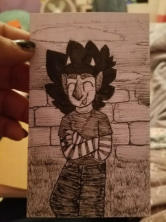
For posterity here's a photo of a chapter 1 panel in progress, back in 2011 with my typical college diet in the bg:
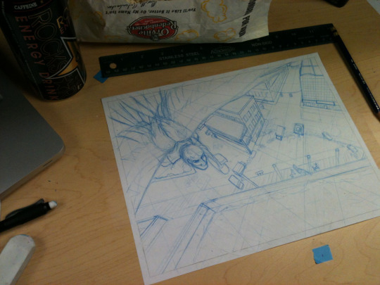
(Chapter 1 was originally pencil on paper, scanned in and colored in PS. I later re-drew it to make it fully digital to match with the rest of the comic.)
There's been a lot of talking about not waiting until you're 'ready' to start a webcomic, and I agree with that sentiment. Try framing it like this: making a comic every week for years and years will improve your art way more than any prep work you can do before starting the comic. It's like learning to swim. You can read about swimming all you want, but you're not going to really figure it out until you do it. If your early comics are bad, well, that's normal. It used to be an expected part of doing webcomics; I blame the shift into expecting webcomics to be polished from start to finish partly on commercialization in the space, but that's an angry rant for another time.
With this background, here's the collage I posted for WN's 10 year anniversary back in 2021:
And now we're here.


So do your webcomic. Put it on ComicFury or make a janky little site for it. Be okay with imperfect pages and be prepared to shout into the void for a while. Even if it's always a hobby, if it never makes you a dime or wins you any awards--that's fine! You'll be a lot happier if you learn not to worry about that stuff, and just make something that will help you grow and make you happy. We could do with a lot more work like that in the world imo.
#webcomics#comics#wn comic#white noise#comix#indie comics#webtoon#comic history#webcomic history#web comic#original comic#also I'm not going to tell you to not destroy your old work but...#it IS nice to have around so you can look at it and feel good about how much you've grown#can't say I regret losing all that stuff but whatever
121 notes
·
View notes
Note
I find that a lot of conversations around dick and barbara as a couple are held in bad faith, period. in fandom spaces i feel like most of the time it's due to how ntt/wolfman is highly revered vs the distaste for other nightwing writers (interestingly i do not think the flaws in wolfmans runs are as criticized) and the allegedly all-powerful, hateful Bat Editorial who don't want the "good" relationships to thrive
Like, I have no problem with people shipping whatever they want to ship. I have my own non-canonical ships that people have issues with. Generally if I don't like a ship I just avoid its content, because I have been in online fandom for over two decades and my patience ran out on shipping wars years ago.
That said: acting like Dick and Barbara, a couple who have been a default relationship shown on page and used as 'endgame' in potential futures and in multiple tv, cartoon and video game adaptions for decades now is out of the blue writing for DC, and a writer people don't like (Tom Taylor) is 'forcing them together' is so ludicrous I can't help but laugh.
Like, you can think NTT is the highest form of art DC has ever produced (I don't, personally; it's way too soap opera for my tastes) and still realistically face Dick and Kory broke up in main DC canon in 1994. When they were 21/22 years old.
It has been THIRTY YEARS.
They have not got back together since. There have been hints and jokes in various Titans-associated titles, here and there. Dick slept with Kory immediately after breaking up with Barbara AND having been sexually assaulted by Catalina, and so on. They have not been in a serious relationship again.
(It's actually interesting if you're reading comics, because Kory very very very rarely appears in Dick's titles apart from in flashbacks, but if it's a Titans title the writers are more likely to joke about their previous relationship. Which means depending on what you're reading you can get a different impression of how seriously it's still taken)
Occasionally stories reference possible futures where Mar'i Grayson exists. (I'd say the DickBabs futures probably outnumber these now but you know, Mar'i turns up every now and then, probably because she has a canonical name unlike the DickBabs red haired moppets you also get in other stories).
The relationship features in a bunch of adaptions, mostly ones centred during the NTT time frame.
I get it! There is content around!
But if you're talking about what's a realistic story to see DC Comics put out? DC is quite happy to take your money for a variant cover. They also clearly have absolutely no intention of having Dick and Kory dating on page while Dick has an ongoing solo that sells that is under Bat Office editorial, and Nightwing (or an alternate title like Batman or Grayson) has consistently sold since 1996.
Solos rank higher than team books in almost every metric.
13 notes
·
View notes
Note
This isn't meant to be a hateful ask, but you should probably stop saying you've 'fixed' Rachel's art whenever you redraw comic frames. At first, I could see why your posts were titled that, considering they were just edits made onto a frame, trying to keep in mind the style of the comic alongside it (and let me say, you absolutely nail colors when it comes to your gLOw series, I use your notes for my own art all the time). But it seems like for your more recent posts, you're redrawing panels in your own style and saying that you've 'fixed' the frames. I'm not saying that you can't do that, redraws are a core part of the LO community. But it feels as if you're putting Rachel's art style down in favor of your own. For example, your recent post. Smaller necks and 'googly eyes' (big eyes with small pupils) are usually apart of LOs more cartooney style, they aren't something as bad as LOs men's shoulder to head width, or awkward hand and feet positions, etc. The point I'm trying to make is that you should probably start titling frames you redraw in your own style as that, a redraw, not 'fixing' someone else's art style
EDIT: oh god I totally went off with this, BIG apologies for the essay dump in response to a very simple ask, it's just a topic I'm very passionate about and am willing to talk about at really extreme lengths. I appreciate your takes on this even if I do disagree with them, I just don't make shit easy and I apologize for that 😖 😂
Oookay, so I'm gonna try and answer this as best I can, with as little curtness as possible, because I know you're asking it genuinely, but please understand that this is a topic that comes up a LOT in artist/LO spaces and I'm sorta exhausted with having to talk about it. Often times because it's approaching the argument with a very misconstrued idea of what 'style' is.
Ironically enough, before I get into this, I actually do have a post queued up for tomorrow already that's called a 'redraw' because unlike the panels I'm assuming you're calling out, I actually painted the upcoming ones for tomorrow entirely from scratch. I'm still trying to replicate the LO style, of course, but it's not trying to remain quite as faithful as my edits tend to be because it's meant to be a redraw in the true sense of the word like you're referencing. My edits are often just a normal layer on top of the original that I paint over, which is what the last few posts have been. My redraws are drawn from the ground up, backgrounds, faces, poses, etc. often times with the goal of re-compositing the scene entirely. The ones from the last couple days were not drawn from the ground up, simply altered over the originals - but the unfortunate reality is that some of them simply can't be accurately edited entirely due to the original composition being such a visual mess. That includes this one which was a struggle to edit faithfully without my own anatomical stylizations bleeding into it due to how janky the original was (IMO). Like, the original panel didn't even "look like LO", it's godawful, and it's a stretch to say I'm dissing Rachel's "style" when I'm fairly certain Rachel didn't even draw any part of that original panel, it's INCREDIBLY obvious two different people from her team drew it and there's no way of knowing whether or not Rachel was one of them. I did not touch Hades because he's not the problem with the panel. Hades as you see him in that panel is exactly how he was in the original, I merely tried my best to edit Persephone to look more consistent with Hades and less creepy.
Disclaimers over, let's get on with this.
So here's the thing - if it were a simple matter of "style", I'd agree wholeheartedly with you. I'm not about pitting artists against one another, we're all different people with different takes and inspirations making our own thing.
However, there's a difference between style and execution.
With full disclosure, I do not accept the argument that because LO has a more "cartoony style", then it's "fine" for it to very blatantly lower its quality in technical execution or turn into a cheap copy of what it once was. LO was never 'cartoony', it was more akin to storybook art, like something you'd find in old Disney concept art pieces or in children's illustration books. 'Cartoony' as in 'not realistic', sure, but definitely not cartoony in the way most people envision it or market it (like what you'd see in legitimate cartoon shows). The use of color was vibrant and had thought put into it, compositions were dynamic, lineart was only used where needed to create depth, and overall, there was a vibe to it that many of you can still recognize, it's what a lot of my blog talks about.
When I do these panel "fixes", my goal isn't to go "hey, my style is superior to Rachel's! Fuck Rachel!" Far from it. My goal is to analyze what made the original LO art so special and unique, and help preserve those elements in newer panels through key elements such as color choice, glow layers, composition, texturing, etc. many of which are elements that are outright missing from S2 of LO onwards.
Because, full bluntness, LO has zero effort being put into it anymore.
LO never had perfect anatomy and it's always struggled with creating a cohesive visual narrative, but it hid its issues well with a good balance of color choice, mood/tone, and lineart-less rendering. It wasn't meant to be some hyper-realistic comic, what set it apart were the colorful panels and vignettes and use of 'cutout' style backgrounds and foreground elements.
Stuff like this:
I have spent literally hours dissecting LO's art style, researching and hunting down its brushes, crawling the best and most recognizable color palettes, drawing and redrawing old panels in attempts to replicate Rachel's style and techniques as best I can. I'm not doing all that just to try and be like "I can do it better", more so to preserve what once was and could have been. Because I genuinely miss how old LO looked and so do many others. It's my own way of participating in a fandom that's being torn apart each week by the new episodes that only seem to further degrade the comic's original presentation and why people liked it.
Trust me, if I wanted to just draw LO in 'my style' as some sort of self-gratifying flex (because everyone in the art world nowadays thinks the only point in creating art is to have a "style" that they can pit against other "styles" as if styles are collectables like fucking Pokemon lmao), you wouldn't even recognize it.
THIS is my "style", y'all. The only elements that I've purely taken from LO is the background and how I did the lighting effects along the side but everything else is my standard 'style' when I draw anything that's NOT LO, especially with my own comics and my day job.
"Style" is not a tangible thing, at least not in the way people nowadays tend to define it. Style is an accumulation of everything that's influenced an artist over years of practice, learning, refinement, and mastery. It is not something any one person can 'own' nor is it something that can or should be 'fixed' in and of itself. Just like how Rachel has adopted elements of her style from inspirations such as Glen Keane and Mary Blair, I've gotten my stylistic inspirations from anime, manga, video games, and other webcomics. Our styles and why we create art and who we create art for are completely different.
I have zero issue with Rachel's 'style'. At its core it's actually freaking gorgeous, when she puts in the effort. Not even just LO, take a look at her even OLDER art that's still available to sift through on her DA:


The issues I'm bringing up have to do with the execution of said style, how it's blatantly obvious Rachel doesn't put any effort into the art anymore and often has her assistants picking up the slack in a very disorganized manner that leads to disjointed, bland, weird ass art that often can't even maintain consistency between SINGLE PANELS, like this:


The magic is gone. These are not reflections of Rachel's capabilities in the slightest. She is far capable of so much more, this is beyond being a 'stylistic choice' and falls more under the implication of laziness or lack of care.
What's wild is that she's outright stated that she's "streamlined" the LO creation process to make it easier for new assistants to acclimate - which would be fine, if it weren't for the fact that 'streamlining' shouldn't mean 'downgrade'. There are plenty of ways to streamline the LO art style that can still retain the original charm of LO that drew people to it in the first place without cheapening it. It's not like LO is the only webtoon under strict deadlines, Rachel has more assistants than most working for WT and yet everyone else on the platform seems to only improve in their comic's production workflow and its presentation whereas LO has only declined.

(The Kiss Bet, 2019-Present)


(Tower of God, 2014-Present)
Not every comic needs to make improvements this drastically, and technically LO didn't even have to make improvements in its original execution - but it's so far gone in the other direction that it begs the question, "Why do other creators and comics with less prestige and as many or less assistants compared to LO seem to make such bigger strides in the technical execution of their work?" Regardless of whether the style is erring more towards anime or cartoon or realism, 'style' doesn't make up for poor technical execution and lack of consistency. That's the same energy we get all the time from newcomers to the craft who reject any form of criticism towards their technique and understanding of the fundamentals with "THAT'S JUST MY STYYYYLE". Even many animators who predominantly work on cartoon productions still understand their fundamentals and utilize them in the creation of stylized pieces of work. This isn't even me questioning how much of the fundamentals Rachel knows because, again, she clearly has understanding of it in her older work, she just seems to have stopped caring or isn't doing a proper job directing her team.
I criticize the stick necks and googly eyes the same way I do the inconsistent body types, refrigerator shoulders and same-face syndrome because they're all things that are detracting from and lowering the quality of LO's art as a whole. They didn't always shade whites in the old episodes of LO, but they did often tint them to make them less jarring against the more vibrant colors. They didn't always color in the irises back in 2018/2019, but at least when they were just solid black pupils, they were actually drawn EQUALLY, vs. the solid pupils nowadays which feel like they're each on their own schedule and are never the same size or facing the same direction. They didn't always draw perfect necks and faces, but nowadays it feels like the heads are being stuck on sticks and attached to separate bodies that aren't even consistent with the characters' body types. All of these things are issues, there's no 'hierarchy' of problems, they're each a part of a much bigger lackluster whole.
When it comes to my own panel fixes/redraws/whatever you wanna call them, if they don't look enough like Rachel's 'style', that's either because we're failing to recognize what makes Rachel's art unique due to it being so watered down over the years, or because I'm just not doing a good enough job replicating it. Undoubtedly a little bit of both. I'm still 'adjusting' to a workflow that accommodates the LO style and how it looks. It's not exactly easy to just jump from one style (my style) to another without my own usual biases bleeding in (trust me, I'm not happy that there are people who know my usual art style who can still 'see' it in my LO art, because that completely defeats the purpose of what I'm trying to do lmao)
All that aside, we can't pretend that S1 LO's signature style is still being executed to its fullest potential in S3.
If I can be really brash here, there are WAY more egregious panel 'editors' out there who straight up are drawing stuff legitimately just in their own style. And they're still all great in their own right and get to the point of what they're trying to say even if they don't fit what you would define as a "fix". Don't bug me about mine.
Rachel's style in and of itself is gorgeous and unique. It's the lack of effort in the execution as time goes on that is the topic here. I can never hope to fully achieve that 'vibe' that so many people miss about 'old' LO because that was all Rachel and I can never fully capture the spirit of her work because it's hers, it's the accumulation of everything that's inspired and influenced her in her artistic journey.
What I can do is point out and design alternatives to the many errors, inconsistencies, and technical issues that tries to get it closer to that original look and feel of S1 LO that better reflected Rachel's original efforts. It's what it could potentially look like if modern LO art wasn't so disjointed among its scattered assistants and rushed with as little visible effort possible. It's what could have been if it didn't feel like Rachel has essentially given up.
Does it really matter how I specifically word my posts between 'edit' and 'redraw' in this context when both things are attempting to accomplish the same goal?
#thanks for the discussion#i'll always take a good essay op#i'm genuinely not trying to be a dick#i'm just tired of 'style' being conflated with effort and visual appeal#this is another ask that turned into a fundamentals of art rant#lore olympus critical#antiloreolympus#lo critical#ask me anything
86 notes
·
View notes
Text
HI HELLO BOOKCLUB.... i have a late addition to week 1 bc i uhhh, got very sick and didnt have coherent thoughts for several days, wahoo, yippee (I am doing better now thank god)
ANYWAY i wanted to talk about a couple panels I really enjoyed (one of em is technically a page but shhhh). I really love the Bad Lads story arc, especially the art in it! The designs for BDN and the Bad Lads are GREAT, every shot with the sand steamer in it is just so... awe-inspiring in such a fun way. I think it was a great first bigger story/set piece to start the manga out with tbh!

FIRST UP, this page! I was originally just going to talk about how much I liked the panel with just the sand steamer in it but I feel like its stark contrast to all of the other panels AND its placement on the page spread adds a lot.
So, this takes place immediately before Vash passes out from the drugs Kaite puts in his drink, and is also before Vash has figured out Kaite is helping orchestrate the attack (supposedly), but Kaite certainly thinks he's onto him! This tension is portrayed well in the shots chosen for each of the panels- all the ones with Kaite have him avoiding eye contact and/or having his back turned to the viewer (Vash), and Vash is placed very claustrophobically in all of the panels- his face is either cut off by the borders or covered by the speech bubbles. There's also TONS of negative space here, and in comics the closest you can get to making something take Time is space on the page, so the empty space here implies it's a slow moving, uncomfortable conversation. Which makes sense!
The sand steamer caught my eye because it's just... such a striking visual for How Fucking Dark it is and how isolated they are here. They're way out in the middle of nowhere, and in DANGER, and Kaite is very deeply aware of and haunted by this. It's also a HUGE panel - it takes up about 2/3 of this two page spread, which I imagine in actual book form rather than a nice digital scan, chokes out the other panels some for an even more intense claustrophobic effect. VERY COOL ALL AROUND ....
I am finding more and more on this reread that Nightow is really great at using negative space especially in how he lays out pages. In fact! There's another page in vol 1 that comes to mind for this (The bit where Vash pretends to be asleep so the sex workers sent to him leave ), that @pancake-breakfast analyzes in this post here! I recommend checking that out!

I KNOW others have posted this panel but. C'mon. This Rocks. This is like, the perfect composition for this- everything down to B.D.N.'s hat detail to Kaite's hairline is lined up perfectly, the sand steamer windows and B.D.N's Shoulder Things are framing everything so nicely, and Vash fading in from the dark is just soooo.... chefs kiss. THE DRAMA OF IT ALL!!
#I HOPE you dont mind me tagging you in this i just had a hazy memory of reading your post and went to hunt it down again jksdhdg#TrigunBookclub#ghostts thoughts
15 notes
·
View notes
Text
"Something completely different" continues, as I was about to throw away a comic reading challenge sheet that I snatched from Keski-Suomen Sarjakuvaseura, but decided to think through the prompts before doing so. So under -read more- you'll find some musings of mine about comics I ended up reading this year. There's some pics too!
I'll start with some comics that were the topic for book talk meetups arranged by the aforementioned comic group. I've never attended such meetups before, and these turned out really interesting! Even I babbled away my thoughts despite usually being on the silent and shy side. Way to go me!
The Life and Times of Scrooge McDuck - Don Rosa
Prompt: The protagonist gets older during the events of the comic.
Donald Duck comics were a part of my childhood, and I especially loved the works of Don Rosa. It's been ages since I read any though, so it was neat to jump back to this big chronicle and read it properly in its entirety. This time I read it in English, which was something with the different accents.
Valotusaika - Avi Heikkinen
Prompt: Features a pet/other house or farm animal.
I had read this before but had another go for the session. Interesting comic that uses edited photos, yet not in any stiff way I think - the posing and expressions are great! It tells a story about a man who's been kicked to the head by life a lot, who finds a camera that can show the past. The first part of the comic has quite heart-wrenching climax ;u;
Anne Frank's Diary - Ari Folman, David Polonsky
Prompts: People oppose the leading powers & the comic tells of loneliness.
This was my first touch on Anne Frank's Diary, and I think the comic form works well here and helps to visualize things such as how cramped the attic space really was. The art is really pretty too, and many panels look like frames straight out of an animated movie (which there later was).
Now onto comics I read outside of the book talk sessions.
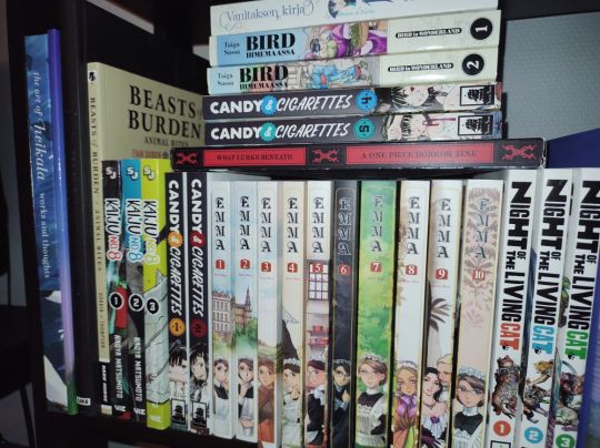
This shelf used to contain art supplies...
4. Bird in Wonderland - Taiga Sassa
Prompts: Comic is a travel story, comic is relaxing, comic where people are nude, comic where sweets are eaten, comic where something embarrassing happens, comic where a celebration is held.
Many prompts... They started releasing this in Finnish this year, and I thought to give it a go! This year in general has felt like I wanted to try out more comics, and find new ones to follow to fill slowed down schedules of some. I hadn't heard of this series beforehand, but it's been a nice travel story to read, based on real journey by Isabella Bird. So far emphasis is definitely on comic is relaxing, as it really is joy to read.
5. Emma - Kaoru Mori
Prompts: Includes a speech or public performance, comic that's been on your reading list for long, comic includes cleaning or laundry (definitely!), visit in a park or garden, includes hugs or kisses, includes travel by train.
Many prompts again! This got a new release this year in Finnish, and I wanted to catch that because I was too much a teenager in its first run. I actually just today read the last two books :D This was another comfy read. Emma as a protagonist is fairly odd and distant as we hardly get to see her thoughts, her antics are rather followed from the view of the myriad of other characters. Yet I was still as invested how her love story develops as her maid colleagues and others :'D I was suprised to find out the later volumes were mostly side stories, some quite whatever but couple more interesting.
6. Night of the Living Cat - Hawkman, Mecha-Roots
Prompts: Released 2023 (started 2022 but on-going... :D), series has an interesting name.
A comic that I ran into here on tumblr, just from seeing one page with cat paws, that intrigued me enough to seek where this art was from. Amazing zombie parody, where people turn into cats upon contact. I love this, probably my THE COMIC of 2023. Apparently someone who's worked on the English publication is here on tumblr too *waves*
7. Hevosjumala - Sami Makkonen
Prompts: The events aren't told in chronological order, interesting name.
The name means 'horse god'. This randomly caught my eye in a book store, and on first glance I was little sceptic about the art style if it looked little too messy to comprehend, but took it with me anyway. Aside couple character mess-ups, the art didn't prove a problem after all, fits the feeling and themes definitely! And by that I mean it's a paranormal horror story with some nice folktale twists.
8. Candy & Cigarettes - Tomonori Inoue
Prompts: Protagonist is a child/youngster, includes a crime.
This was actually a recommendation at a panel in Tampere Kuplii. I'm not normally one for crime genre, but the art style spoke to me in this. Some of the goons remind me of early Toriyama's work :D Protagonist duo is made of a child assassin and an elderly ex-cop who has to join forces with the former to earn money for his grandson's treatment. Graphic violence and heavy themes, but also a lovable protagonist duo trying to help each other out.
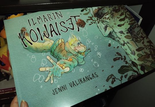
9. Ilmarin Koijaiset - Jenni Välikangas
Prompts: Features rainbow family or couple (is that term commonly used in English?), less than 100 pages, features pet.
I got interested in this comic after seeing the original pages up on an exhibition - the paintwork is GORGEOUS. Tells a story of a guy who moves onto her aunt's island to take care of it and the dog while aunt is away. Turns out the island isn't quite what it seems!
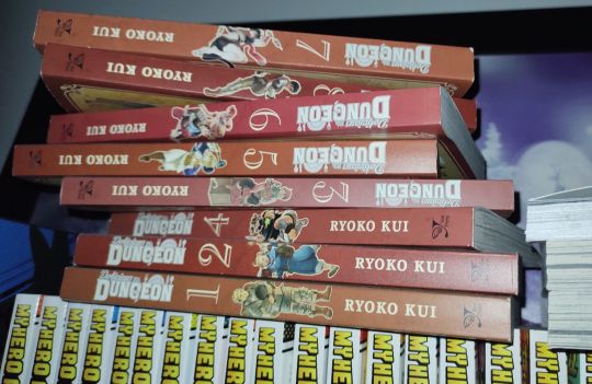
10. Delicious in Dungeon - Ryoko Kui
Prompts: Includes hunting/fishing/foraging, something surprising happens in the comic.
Yep, been reading this too, and the volumes 11 and 12 are ordered. Idk what to say here, great and interesting story and worldbuilding, lovely and distinctive characters and great art! Even with the rather "monster of the week" style the chapters often have going on, the in-depth approach makes it interesting.
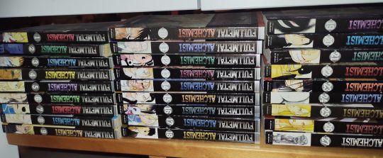
11. Fullmetal Alchemist - Hiromu Arakawa
Prompts: Comic features a border, travel via train, features a pet.
A classic that I re-read again this year after scavenging all the books from my folks' attic :D But I.. sure don't like... how the title is upsidedown when stacked like that... and it doesn't make sense to me to have the back up.. augh.
I read other titles too as well, but these listed here were the ones that came to mind for the prompts. Annnyway, congrats I guess if you read all that? Feel free to comment and babble your opinions if you will~
#marsu musings#text-heaviest post i've ever done#comics#kessinlukuhaaste#night of the living cat#bird in wonderland#emma#fullmetal alchemist#etc
5 notes
·
View notes
Note
YOU!!! I WAS DISTRACTED BY SPACE GAME BUT
1. Your first OC ever?
4. A character you rarely talk about?
13. Do you have any troublemaker OCs?
43. Do you have any certain type when you create your OCs? Do you tend to favour some certain traits or looks? It’s time to confess (i bet i can guess something for that one kldgj)
ME!!!!! >:3
1 - I think my first ever OC that i can remember was this little dinosaur fella I would draw all the time in paper margins way back in middle school, I don't actually have any pics on my computer but I doodled him real quick for ya
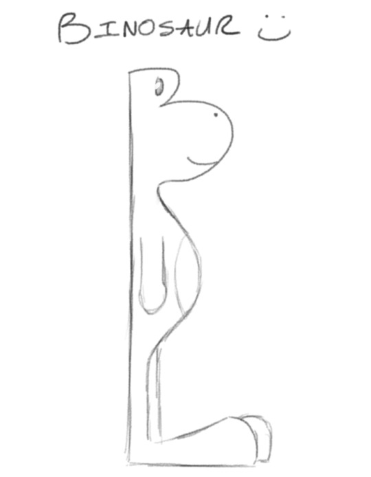
Binosaur cause his head is just the letter B fdkjgjhgfdkfdg
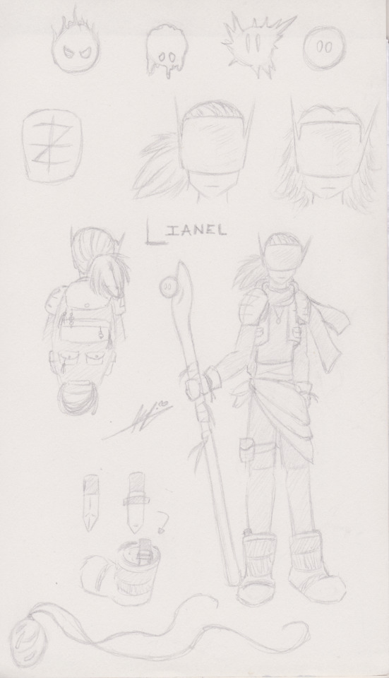
4 - Lianel!!!!! I don't think I've ever shared them anywhere?? I made them back in highschool (hence the old signature, I went by a different name back then), I actually made a short little comic of them exploring this ruined world that I can't find >:( It's hiding in a sketchbook somewhere i hope and I just haven't scanned it. But anyhoo! Lianel is on the run for space crimes!! Jury's out on whether or not they actually committed said crimes or were framed though. They found their ancient armor from the ruins of a resistance organization that died out a long time ago, but when you're on the run you take what you can get. They've got a funky staff that an even funkier little magic blob lives in, so long as Lianel takes them on adventures, since the little blob can't travel on their own. In return the blob lets Lianel use some of their magic when they get into trouble. I don't think I ever named the blob??????????
13 - Hehohoho!!!!! >:D This is Calcifur!!! They look small and unassuming but they will steal your wallet fhgjhkgfjklhgf

Cal loves being gay and doing crimes, especially graffiti in places they're not supposed to, although after they met Lato they toned it down a lot and now stick to mostly silly pranks. Calcifur is one of the main three fellas I used to draw a whooooole lot before I fell out of doing art for a good while, and i will definitely be using this as an excuse to talk about them gjhfijhgfd but first, more about Calcifur! Cal's skin glows and changes color with their mood, (neutrally they're blue) and they've got a nifty pair of headphones that can transform into a stylish neck kerchief. They can speak, but can only be heard by people they want to hear them. And now the trio!


MY MAIN BLORBOS..... I LOVE THEM
Ok so the other two are Lato and Cube (bet you can't guess who's who lmao) Lato is my fluffy puff ball sweet boy, friendliest fella you'll ever meet. He's naturally very curious and aims to be pals with everyone he meets. He's semi aware of his being an artistic creation, though he's pretty chill about it. Cube on the other hand, is fully aware and somewhat peeved at me about it jhgdkhgdjkjhgfd Cube is a straightforward know it all with a short temper and vast knowledge. Originally I made him to be a companion to Lato, to keep him company in the void (since I was very bad about never drawing any sort of backgrounds lmao) and to answer Lato's many ceaseless questions for me. He often shows up doodled in the margins of whatever I'm working on to make snide jokes about something or other or yell at me to stay focused. Now a days the three live together in a nice house out in the forest and have fun domestic style shenanigans. I could talk about these three for a thousand years so I'll stop here because this whole ask has already gotten slightly out of hand kgfdhlkdjgfhgj
43 - (Looks at my crew of just the silliest lil guys. Jokesters and pranksters abound) Idk can't think of anything
dkhfjhlgdgljgfh I do really like silly characters, and characters with more simple designs that are easier for me to doodle here and there without taking too much time or energy. Cube is VERY popular in my notes and sketchbooks. Funny enough a lot of sillier characters are more recent creations, characters I made in highschool and earlier had more tragic / serious backstories. Oh, I also draw a LOT of little creatures, just strange monster things. Not sure if they count as OCs, most aren't even named or I only drew once or twice, but I do love me a creature


#oh whoops I've been making this post for. over an hour djhkfghfdjfdg#those image IDs man#but if i dont do them right away i forget about em#anyhoo thanks for the questions :D my brain blorbos. i love them dearly#holding them out in the palms of my hands#waugh i want to draw my main trio now but it is past bedtime kfdjgkgjhfdf#eyndr does art#OCs#♥️mutual shenanigans♥️#♥️kibbits♥️#grah tags idk i'll come back and fix tags later i gotta go to bed before Moon gets my ass jhgfhkgfjd#paper airplanes#oc cube#oc lato#oc calcifur#oc lianel#oc binosaur
4 notes
·
View notes
Text
@freeddead 𝑠𝑒𝑛𝑡 : ❝ what does cora's bedroom typically look like. ❞ ——— ( RANDOM HEADCANONS ‣‣ ALWAYS ACCEPTING )
CANON 01 :
a mattress on the floor ( twin, 39x75 ) the covers are typically dark - black on black - a duvet is folded at the bottom of the bed for her to reach over and pull it over, but mostly she uses her chequered blanket, thin and super light.
walls are painted dark grey, carpet is a light. though there is a positive in all this, leaned against the walls and the extra space, there's canvases, blank, half painted and fully completed works. there's her own drawings hung up on the walls in a clustered pile, these papers will soon become the ground works for her future graphic novel series - blueprints. there's a white desk in the far corner, the surface stained with multi colours of paints, sketches scratched into the wood with a knife ( rough, but she really loves those ) - it looks more like an art room than an actual bedroom.
she has two piles that move around a lot ; a comic book, book and a record pile, they're a little frayed in places, but she loves them. they're one of the few ways where she spends her money on items deemed luxury ( including art supplies in this.) her comics are mostly filled with horror concepts, though does have subjects in fantasy - as for regular books - while there is fiction, it's mostly non fiction : history based around greece, egypt, china - all that good fun, its a growing pile depending on what she feels like learning about. there is a possibility where if you walk in there, you're going to kick a book across the room.
there's a blue case under her desk that she sometimes uses it to up her feet up, inside is records ; not a lot, just focusing on her most favourite artists ; NWA, D12, fugees, 2pac, biggie, cypress hill, guns and roses are the ones that i feel like she really focuses on. where's her record player ? how about you mind your own business ( she doesn't own one:( )
at this point, she's still getting over the trauma of living on the streets - her apartment really represents that. she finds her place really overwhelming and even subconsciously is waiting for the whole place to get ripped from her, getting comfortable isn't something she's good at - but she really, really tries because she wants to have somewhat of a normal life moving forward, which is why she makes it safe in the way she knows best ; littering the space with art.
CANON 3 :
finally my rich girl has realized her worth and realized she doesn't need to live in a hobble… she has treated herself to an alaskan king bed, cushioned white frame, even has those curtains that hang at the top with a rich royal blue - has a mix of colours available for them - bed is covered in decorative pillows, vintage looking ones to modern ones that are different shades of blue, grey and purples - her duvet covers can be very traditional at times, sheets that are very reminisce of a rich girl in the 18/1900s - she really leaned into her vintage heart when it comes to her bed, it's very comfortable, fluffy, jump on it and its like falling on a cloud; don't lay in her bed you wont ever want to leave.
dark wooden flooring with a fluffy white rug that spans across the floor, a gas fire on the right side of the room, the room is large, open, and very bright - its a clear representation of her headspace and how much she's grown.
she has some white shelves, filled with photos of vacations, new friends made, as well as awards that she's gained during this time - antiques, too ; authentic greek and egyptian pottery that she bought, sculptures from her favourite artists through the years, gifts gained from work partners - look on the bottom and you see some out of place cthulhu statue with some horror stuff from in the middle of this, truly living her best life.
coraline also absolutely has replicas of greek paintings, and while she can't hang them all up in her bedroom ; she has one wall where she puts a new painting up every month ( or week, depending on her mood ) - you could walk in and see the painting the fall of phaeton, the next time you do you'll see the lament for icarus - it really is a lucky dip.
#i wasn't sure where to put this so add on. she has a circle window because i said so <3#looks out into her back garden and its all just so bright and cozy:(#so much better than her shitty lil bedroom before#she actually has an art room and a study so no longer is her shit just laying around.#and yes. you will find her record in the study and it does go walk about around the house SOHDFOSIFS#freeddead#inbox.#absolutely not formatting this get fucked actually LMSODFSOIFSH#headcanon.
2 notes
·
View notes
Text
WEEK FIVE_RELFECTION STATEMENT
INTRODUCTION
Exploring the depths of photo manipulation i dive deeper into the practice with my image “blooming tide”. I aimed for a surreal and dreamlike vision for my concept, something evoking in the depths of your mind to see something ordinarily strange. I wanted my images to be convincing in their composition like they could’ve been physically there.
CONTEXT & CONCEPT
Approaching the subject of photo manipulation comes with a lot of conversations and debates over the topic. Art is subjective and in most cases, there is no such thing as a wrong or right. In my perspective, photo manipulation like most things is a spectrum, starting from the simplest of framing a shot to collage. A quote by Geoffrey Batchen says "the absence of truth is an inescapable fact of photographic life." In essence, we are all human and the basis of oneself can not be truly separated from the art that we make. all that we show is subjective truth in context.
Where i stand on this spectrum of photo manipulation for this project, i believe would be closer to ‘heavy’ manipulation. Stylized/noticeable effects, colours, almost fantasy-like aspects and an aim for the unreal. There is no specific truth in this idea more of a interpretation of my perspective.
At the very beginning of this project, i knew i wanted to head towards a more interpretive style with a clear concept and idea. In my first iterations, i played around with unconventional gradients and a style akin to collage but as i further developed in Photoshop i was paving my way to a surreal style/genre of photo manipulation.
My concept is based on surrealist photography, where a space is placed in or cut out to subdue expectations of reality for example the giant cat leaning on a 10-floor building. I based my concept around the idea of entering reality or breaking reality, and i show this by utilizing the door as a portal to another world.
I found a lot of inspiration in KangHee Kim’s work in her collection called ‘street errands’. Focusing on landscapes and clouds she manipulated them into windows, reflections and doors and emulates this dreamy and bright atmosphere. Her methods are seamless in blending and merging different elements partially the lighting and colours. I try my best to replicate these methods to fit my concept.
Another photographer is Cho Gi-Seok, he is mainly a portrait conceptual photographer and can make extremely fantastical and sometimes even collage-like images, depending on the concept of the collection. I was interested in his style of manipulation as some of his photos look almost painted on, or more akin to illustrations than actual photos. I found this to be a difficult route but does include elements of this style in my photos but is more subtle in use.
To achieve these effects i explored the many tools in Photoshop, including gradients, lens blur and different types of layers like screen and multiply. My process was push and pull, really just constantly adjusting the settings until i found that sweet spot. The comically large flower reminded me of alice and the wonderland, giving an empathisis in otherworldly scale. Placing it next to the door felt like a sign to the entrance.
I wanted to evoke an emotion of eerily calm, maybe abnormally simple to the audience when they viewed my photo. There’s a vague feeling of suspension, with the position of the door opening but the other elements of the flower and beach are still. The colours are all muted with the saturation and vibrancy lowered, creating this cohesive palette and adding to the element of the ordinary.
REFLECTION
I believe i was effective in creating my desired concept, with a surrealist lens that captures the oddity of simple things like doors and flowers like a dream. I hope i was able to provoke a sense of calm nature and emotion in the piece.
0 notes
Text
evaluation
During this term I had created a comic book page and a dreadful pie which turned out much better than I had expected it to but as for how I created them was a tedious process well more of the pie was the longest to do.
The pie I had chosen to create was that of a human face with an eye missing and their mouth open to give the effect when the person was murdered they were kicking and screaming to escape from the murderous pie maker that has only one goal to kill those who did them wrong. Although there were some issues that came with creating the actual pie itself was trying to work around the super sculpey not sticking to the tinfoil pie cases and to get the stretched face effect also took a while to get as I wanted it to look realistic with the blood leaking out the open cuts.
The pie was the only project that didn't use much to create as the main things I had was the super sculpey a knife tool and paints that I mixed up to get this beige/orange colour once that had been achieved I was able to fully focus on it making it the best it could be.
As for the comic book page I started it by hand drawing it before I scanned it in and continued it's development on the computer which sounds easy but when it came down to colouring it a new problem came up where the colour was not staying where I wanted it to be before I found another way around it by making boxes around each frame before I used a brush and did the colouring in zigzags with lined paper behind it making it look fully done on paper like how most art is done but doing it this way was my best shot getting it done on time so the comic could be completed in time.
Overall for this term a lot was done in such a small amount of time but fairly spaced out but I do think I could've done much more but for the next term I want to do better
0 notes
Text
Aaauufghh
So I feel bad about infodumping all at once about the weird things I noticed; but I do want to say this so I don’t sound like an idiot compared to everything else I post about
Okayyyy, so you may have noticed when I started picking through the deep-internet info and trailers on Don Bluth’s previous attempt to reboot the series that Dirk without his chainmail looked like this
Whicchhh is kindof like a mix between a bob a short-cut and mullet sort of. But also the 80’s movie started looking like this

That looks nothing like him, idk who that man is
To which my art looked more consistently like this
So, what am I doing exactly? Am I ignorant? Am I going against the flow for the fun of it?
If you listened to anything relating to the scrapped movies or anything I said about it, you would know that the movie plots center more around adding in typical kingdom drama (like making Dirk a lost prince-and making Dirk and Daphne grow up like siblings but then turn around and say they were supposed to get married at 6) and doesn’t actually explain game canon and rather retcons and complicates it 🤷
So either way we say it’s not canon!
But at the same time; other media like the comics sort of do the same thing I do

In the comics, it shows Chad Dirk having a shorter cut, likely more suitable when wearing chainmail; but somehow retconning the canon style by designing the front a lot shorter like it’s singed for some reason????
But at the same time he has a brief cameo in the Space Ace series and they somehow made it look more accurate
Anyways, my final point is to rather trust the main series rather than anything Don Bluth or anyone else gets to excited about and runs off with, because I based mine around the three frames that allow you to actually see it

Okay. That’s it. Hope this gave you useful knowledge or some kind of drawing tip.
Thank you for listening to my nonsense. Bye now ✌️
#art guide#model guide#infodump#I don’t get it#I think they’re trying to gruff him up and make him more of a typical masculine protagonist#(which shows in the writing and sudden casting of Ryan Reynolds)#but like#????#he’s literally just fine without it#a skinnier-jumpy-and silly character can still be considered masculine or valiant#also separate him from ace-stop trying to make them the same guy
1 note
·
View note
Text
Here are some thoughts/reflection/process things re: the Tallahassee comic. Since this is my art blog, I figured this was the best spot to put it! Lots of images and pretty long, so I've thrown it below a cut.
This is the first time I've seriously worked with Microns and a lot of 'em since... oh, lord, 2020. I'm pretty sure I've done some other stuff along those lines, but here are examples and an emulation of the style digitally:


(Respectively, May 2020, March 2020, and September 2020. Apologies for quality on the first two; I had to rely on old photos.)
Compare with this spread from the comic:

I'm still not super comfortable with backgrounds (or cars; all the shots at the beginning are framed VERY carefully so that I do not have to draw one), but you can see that they've gotten a lot better. The sparseness of the floor was intentional - I wanted to create the effect of an infinite-looking space, with the ceiling fan to provide depth. There's a bit more depth and weightiness than in that drawing of Karkat or the seagulls.
That's partially because the house is as much of a character in Tallahassee as its narrators. Aside from the space in the liner notes devoted to describing their environment, there's also quite a bit in the album itself. There isn't much physically happening in the notes, either, so I had to rely on shots of the house in order to fill panel space. Three cheers for symbolism and vivid imagery!

To pull up another page, I've also gotten A LOT better with natural environments in particular. I'm quite proud of that rose bush and the fence, although I could've taken a little more care while filling it in and the lighting leaves something to be desired.
Speaking of, my attempts at lighting are quite a bit more solid, but still not perfect. Consistency isn't great, and I have some qualms about the Alphas' hair and the shadow cast by the Alpha Male sitting up, but what can ya do? At least I'm drawing shadows being cast by things, haha.
I think the attic, the window shots, and "knocked down" panels look the best light-wise. I was trying to convey bright moonlight, and I think I did a pretty good job! I adore the curtains. A solid runner-up is the open door; I wanted to use it as a reverse light source, of sorts. In retrospect, I could have spaced the door shots out a bit more to make it feel more ominous.
Craft-wise, there's also a lot of improvement. Normally, I'd do a longform, easy-to-fuck-up project like Tallahassee digitally. However, I forgot my drawing tablet stylus in a very stupid place that I won't return to for a few months. So, I've been going back to pen and paper again.
I felt very confident right out of the gate, which is very strange considering it was the first time I'd used many of those pens for art in a hot minute! I actually did another casual-ish piece with Microns and gel pens in my sketchbook a few weeks before this, shown below:
but while I was VERY excited about my use of color, I wasn't super fond of the ink work. That's because I fucked up before I even started.
My sketchbook is, er, a sketchbook. The pages are pretty rough. I learned while working on the comic that technical pens are meant for use on smooth paper, and will often appear spotty/inconsistent on the rougher stuff. You can REALLY see it on the frame around the magpie. I switched to standard-issue copier paper in the comic, which plays much nicer with them. Sketch paper also frays brush pens. Oops! Guess that explains what happened to one of those poor, poor souls...
I got my first set of Microns in 2017-ish. I was really only interested in the fixed-width pens; I'd tried a brush pen earlier on and HATED. IT. With a burning passion. My hands have always been pretty unsteady, but it was worse when I was younger, so my lines looked godawful. The set came with a brush pen, though, and I made many valiant attempts to use it. In my sketchbook. Which inevitably frayed it terribly and rendered it unusable for most purposes.
I used the set quite a bit, but infrequently enough that I've still got most of them! My 005 is going strong, but the 05 is lost, and the 1 and 03 are not long for this world. I've known the 03 is on death's door for a while now, but the 1 just started giving out on me while working on Tallahassee. I tried to replace both, but instead ended up with a 2. It worked out, though; I used it to fill in large, dark spaces. I really should've been using an alcohol marker, hence the streakiness.
Back to the brush pen, I ended up getting another set in 2019 that was all brushes, but this time with colors! "It will be different now," I told myself. "I'm a better artist. I'm stronger, and I do colored lines digitally. So I will use a brush pen, and I will like it." I did not use those brush pens and I hated them. But I did end up with a mercifully unspoiled black brush pen thanks to those, and also a red.
All three of the brushes I've named make an appearance here. I used the frayed pen to texture the grass and the Spanish moss; it ended up perfect for soft, fluffy things. I used the healthy and whole one for the tree branches and the Alphas on the "knocked down" page to lend them a more organic feel. The red makes its appearance on the last page.

It's the staircase on the left. I drew the lines with the red brush, then VERY, VERY, VERY carefully colored around them with the black. The red lettering was done by writing it out in pencil, writing over them in red gel pen, then VERY, VERY, VERY carefully tracing around them with a black pen and filling things in. Do not do that. It is stupidly time-consuming. If I pull a similar trick next time, I'm just going to write with my white gel pen and then go over it again with my red brush.
For the sake of my sanity and yours, I will not discuss that process in any more depth. I will also abstain from telling you about the hellish nightmare that was trying to print copies to distribute as zines, because DEAR FUCKING LORD.
I've already spent an hour writing this, and I've got quite a bit to do today! So I'll end it off here. Thanks for reading this!
1 note
·
View note
Note
Okay first of all...your artstyle is AMAZING and the story elements and details are great! But lord the angst is SO good, dude it's no joke giving my daily dose of angst lol. I do have a question...I really want to make my own comic on paper but have no idea on how to do the panels right, any tips??
YES!!!! The first collage course I did in comics and comic design I had to do on paper so i can absolutely help you!!
Use a ruler.
So whatever width you want your boarder to be around the frames, always mark it with a ruler (this is if you're going for a more clean look, but i would also suggest using a ruler for the baseline sketches on a messier panel)
Thumbnail!! Always thumbnail!! It's a good idea with comics to like, lay out the foundation before you start to sketch the actual drawing and go all in, because you wanna see how it flows best. I'll show an example of the last 6 pages for It Runs in The Family (the FA comic)
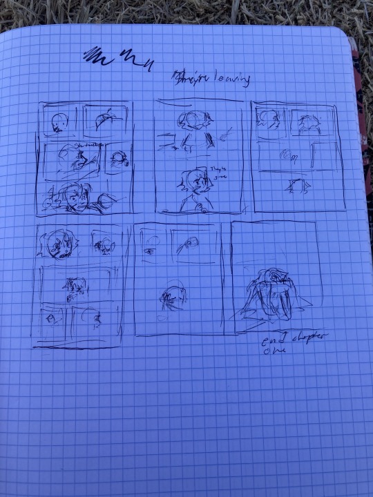
And you can see that I changed some thigs but generally its helpful to go in with a plan, cus you don't want to have sketched out and ruled out all the panels on the actual one and then decide that it looks goofy and you want to change it, its a lot of work lol.
Use whatever pen you like, comic's don't have to look nice to do well. It's more about the story and how you emote lol!! Use the frames to your advantage too. Don't be afraid to go beyond the normal square and rectangle ones.
the way you do the boarders is really really important in expressing the urgency or the feel of the page. Don't be afraid to take and place the character outside of the boarder and coming into the gutter (the gutter is the space in-between frames on a comic)
I don't normally like using Onomatopoeias (fancy word for sound descriptors I just like saying haha) but they can really ad a lot to a frame, espessially if you're going for impact. ie WAM, SLAM, BOOM, etc
(these are some of my OCs)
You can colour comic pages you drew traditionally digitally.
One, you want to make sure your lines are clear and dark enough. So mess around with the contrast brightness and make sure there's no saturation when you take a photo of your page lol. Two, put it into your art program, I use CSP but I used to use sketchbook autodesk so I know at least that has the layer mode you're going to need.
You're going to need to take the Photo you put in and change the layer mode to "Linear burn"
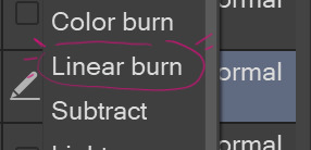
Linear burn make's it so that the lighter the shade in your drawing, the less opaque it is So, that means you can use the lineart you did digitally, if you have it edited so that its basically black and your paper is almost white, works just as normal lineart
(now i'm pretty sure there's a way in CSP to take all of one colour and change it to a different one, which means you can take all of white and make it transparent but I am a big dumby and don't know how to do that)
And the final piece of advice I can give you is littarally just start drawing your comic if you want to. Because we all have to start somewhere. Don't go waiting to start it because you want "to be able to do it right" or "you're not good enough yet" because FOOL!! THERES NO RIGHT WAY TO DO IT AND YOU ARE GOOD ENOUGH RIGHT NOW!!
It may not come naturally to you at first, but keep at it and you'll get there. Everything takes time. Have fun!!
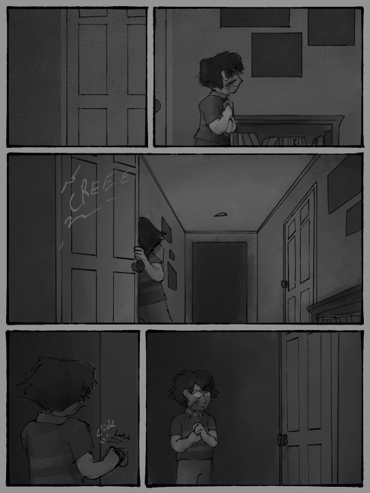
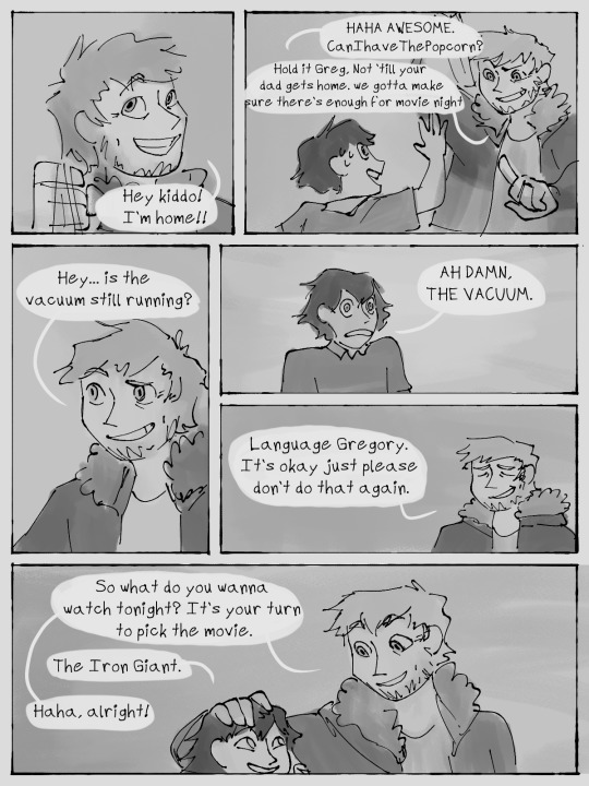
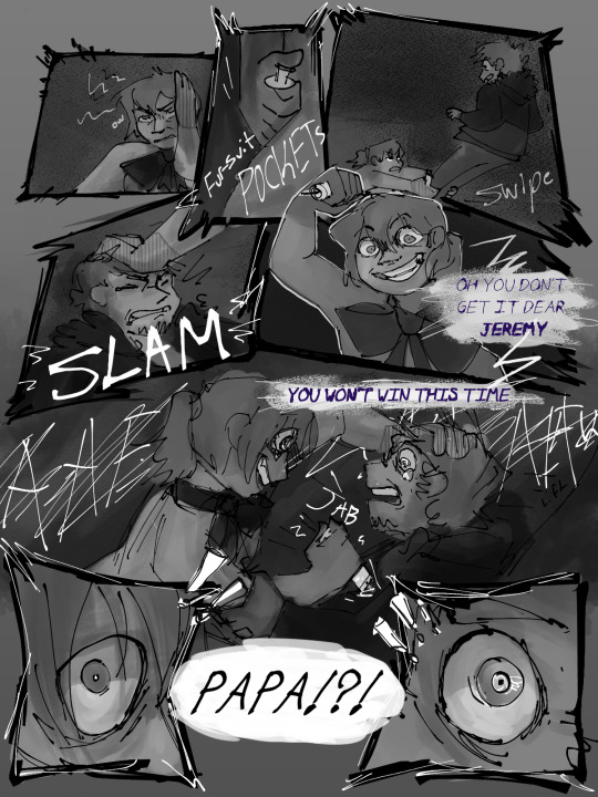
#birdieghostalks#ask#answer#gregory fitz afton au#comic#comic page#birdieghostart#my art#doodle#art tips#comic tips#comic pages#hahahha#it runs in the family
203 notes
·
View notes
Note
What do their bedrooms/living areas look like? I'm going to use all 3 of my asks to request this for all of the boys if that's ok! ❤
Man, I’ve had this one in my secret notes for a good while now!
Undertale:
Both the tale brothers live in a nice little gated community. Their house is one of the smaller ones and has the same layout as the one in Snowdin. The house is pretty basic with some cozy throws and wall tapestries to spruce it up
Sans: his room actually has a proper bed and frame this time. The sheets and blankets are still bundled up in a pile on the floor though. Sans also has his homemade trashnado in the corner. There’s a desk on the wall adjacent to the door which has his laptop. And several folders stacked next to it. Other than a dresser, there’s literally nothing else in there. Sans doesn’t care much about stuff
Papyrus: his room has bright orange walls. He left the race car bed behind underground but has a race car blanket to make up for it. His walls are covered in superhero and comic posters. He also has a display case for some old figurines and his comic collection. Papyrus’ desk is one of those nice fancy drafting ones where he can adjust it to tilt upwards. He has a ship wheel attached to his door for some reason.
Underswap
The swap bros home is only a few blocks from the classic brothers neighborhood. The only thing basic about it is the cream walls. All the furniture and decorations are bright colors. The kitchen especially is real nice. The oven and stove are top notch, and the counters are filled with mason jars full of goodies.
Star: his room can blind a lesser man when you walk in. The walls are bright yellow, the bed (which is a bunk bed by the way) is neon orange. Galaxy posters decorate the wall. Besides the clashing colors, the furniture is pretty basic. Only the top bunk actually has a mattress. The bottom bunk is used as a storage shelf. He also has a shoe rack by his door
Honey: you can practically feel the nerdy aura as you enter his room. The first thing you see is a display case housing some neat figurines of characters from his favorite shows. He’s also got a pretty nice bookshelf on the opposite wall that’s nearly full. Honeys bed has a curtain around it for extra privacy with a nice little wall lamp above the pillows
Underfell
They have a home a little closer to the city center but still far enough to be considered suburbs. It’s a very sleek and modern house with white walls, tile floors and sleek black and metal furniture. The only thing that doesn’t fit the rest of the theme is this nasty old patched up sofa in the living room. The thing is absolutely hideous but is sooo comfy.
Red: his room has soft grey walls and smells like miter oil. Makes sense since one wall is just a long basic table covered in machine parts that red tinkers with in his down time. He actually doesn’t have a bed. Instead he sleeps on this giant leather bean bag. He likes it that way. There’s a few car posters decorating the walls
Edge: he obviously put a lot of thought into his rooms decorations. Everything is pretty black marble or a sleek white wood. His bed covers are blood red with a nice geometric designs on top in silver. He has a beautiful black desk with some pretty jars filled to the brim with nothing but novelty pens. If you looked in his desk drawers you would find notebooks and even more pens
Swapfell
They don’t own a house and instead live in a two bedroom one bath apartment on the third floor of one of lords complexes. The furniture is pretty minimalistic but very nice quality. Most decorations are metal
Mal: the first thing you’ll see in his room is a large wooden drawing desk where pencils and watercolors are neatly arranged on the side. There’s also a vanity with a light up mirror and a nice collection of makeup. Also a huge slanted hunters knife. He uses it to make sure his eyeliner is extra sharp.
Cash: his bedroom is the perfect definition of organized chaos. It looks messy but for cash, he knows exactly where every thing is. There’s a small tv in there with some old game consoles hooked up to it. The bed is never made.
Horrortale
Their home rests in a neighborhood bordering the forest of ebott. The houses there all have a lot more yard space than most houses in the city. The horrortale home is super cozy with lots of knit throws and pillows scattered around. The back patio has a little dog door and there’s a 50% chance of seeing a chicken walk through lol
Oak: his room is also pretty basic. The bed however has so many blankets. Like way more than any person should need. Oak is a blanket hoarder. There’s a lot of notebooks stacked on his wooden desk along with a file of patterned paper for scrapbooking.
Willow: his room has a raised bed with a cute little ladder on the side so that his dog can jump up. You can tell a lot of the furniture has been homemade or refurbished. The room is larger and in the middle is a circular stone table that’s stained with paint. It’s usually housing his latest craft
Underlust
They used to live in the same neighborhood as the classic brothers but have recently moved closer to the inner city because of work. Their home is still in the process of being unpacked mostly, but their rooms are done! The house is actually pretty conservative looking with grey walls, white wooden furniture and soft pastel decor. They do have a stripper pole in the living room though lol
Charm: his room looks exactly how you expect from him. Dark walls with lots of bright rave type decorations. On his dresser is a large pretty cake display that stands out from the rest of the rooms theme lol. His room is always on a state of organized chaos with his desk and bed covered in nick knacks but the floors staying oddly clean
Sugar: his room has light lavender walls and black furniture. It’s a big difference from the soft feminine style people expect from him. Instead sugar has a more sleek modern style to his room. He also has a standard mannequin in the middle that always has a new dresses pinned to it.
Fellswap (red)
They own a pretty two story house only a block away from the two apartment complexes that lord owns. The front lawn/garden is in top shape with lots of those metal flower decorations stuck in the ground along the dirt outline. Inside the house is most worn but comfy looking furniture. Nothing special
Lord: his room is pretty basic with mostly brown and grey accents. He does have a large mostly filled bookcase. There’s also two white bean bags and a deep red rug that covers nearly the whole floor of the room.
Mutt: he actually has two rooms. The first is pretty simple with just his bed, a writing desk and a rack for some shoes. Also his bird cage for KFC (pet pigeon). The second room has a sink, and several cages and boxes for the injured animals that he rehabilitates. The second room is slightly larger than his actual room.
Fellswap gold
They actually live in a studio apartment above wines antique shop. The apartment used to be an unused storage static until wine bought the building and repurposed it. The living space itself is a little small, but they also have access to the roof which the gold bros use as a potted garden and dining area.
Wine: his room is very classy with silk curtains on the window and a silky cream canopy above his head. All the furniture is a dark grey wood with pretty carvings and designs. The walls are decorated with beautiful floral paintings from his brother. It’s a pretty well planned out room. Very cosy and luxurious
Coffee: he has two rooms as well. The smaller of the two is just his bed, dresser, closet and a tv with some consoles hooked up to it. The second room has shelves lining nearly every wall except for one which is just a big collab mural. On the shelves is various art supplies and projects. There’s one large sketch desk on one wall. And finally in the middle of the room is a tarp attached to the floor housing whatever piece of furniture coffee is restoring at the moment .
Dancetale
They also own an apartment, one of the flats in lords buildings on the ground floor. It’s the other building from the swapfell brothers. The walls are painted a cheery yellow and the house is mostly decorated with spring colors. There’s always a huge bowl of fresh fruit in the kitchen.
Pop: his room is mix and match of completely different furniture and gadgets. Pop isn’t someone who cares about themes so he will keep whatever catches his fancy. Instead of a bed, he has a hammock attacked to the ceiling with a pillow and some throw blankets casually tossed on top lol.
Rhythm: his room is pretty sparse with just his bed, a shoe rack, and a dresser. On the dresser are pictures of each of his face classes right before they graduate. Rhythm doesn’t really care all that much about decor so the walls are pretty bare too
Outertale
They live in the same gated community as the classic brothers! The outertale home has high ceilings and lots of windows. The living room is the real centerpiece of the home. It has several large antique bookcases and display cases. Inside the displays are various rocks and crystals and the occasional fossil. It’s really neat.
Pluto: his room is comprised of mostly blues grays and greens. He has a small bookcase on the side of his bed where he keeps the things he’s currently reading. There’s also a large fish-tank with an assortment of saltwater fish inside. Pluto’s room also has a large circular fluffy rug in the middle of the floor. The floor itself is hardwood
Jupiter: his room has a similar color scheme except instead of greens, Jupiter has gold instead. He has some exercise equipment stacked nicely on the side of his bed including weights. There’s a wall tapestry with a printed picture of the asteroid belt the outertale monsters used to live in.
Gastertale
The gaster brothers also live in the same neighborhood as the classic and outertale bros. They’re at the very end in the little cul-de-sac. The interior of the house is almost all white with cream carpet, metro grey walls, and white furniture. A few of the small decorations add a bit of color. There’s a lot of potted succulents.
G: his room is probably the only dark room of the house. His walls are a charcoal grey and the furniture is mostly jet black with a few mustard colored decorations. There’s a metal wire bookcase hanging on the wall. G also has a plastic anatomy dummy that he dresses up in his motorcycle gear when he’s not using it. G thinks he’s funny
Green: like the rest of the home, his room is also mostly white. He has a pretty pale green rack for all of his glasses on his dresser. Green also has his several degrees framed in silver on the walls. his room is always spotless
Farmtale:
The farm bros have an old Victorian home that they fixed up themselves. They’re home borders the acres of farmland they own and is about a 45 minute drive from ebott city. The inside is decorated with mostly wooden furniture. There’s like four rocking chairs on the porch lol
Peaches: his room fits the theme of the house with mostly wooden furniture and a lot of quilts and rugs to add color and soften it up. Peaches always has a vase of fresh wildflowers on his dresser. The walls have photographs of plants and animals taped to them that peaches took himself.
Rancher: this mad lad has a large moose skull hanging above his four poster log cabin bed. He also hangs his favorite hunting rifles just below the moose lol. His bedroom is mostly wooden of course but is also decorated with lots of red and orange plaids.
Horrorfell
They live in the same neighborhood as the horrortale and horrorswap brothers. Their home is literally right in between the two. Inside it’s decorated in a mix between sleek modern metals and frumpy cozy style. Somehow the horrorfell bros still have their original sofa from the underground. There’s a lot of little homemade staircases for their cat doomfanger who’s too old to claim on top of things herself now
Rust: his walls are painted a soft heather grey and have some basic wooden decorations that noir painted for fun. The furniture is pretty normal with the exception of a large treasure style chest next to his bed. Open it up and you’ll find a collection of drawings and gifts from the kids he’s watched over the years. Rust didn’t have the heart to throw them away.
Noir: unsurprisingly, his room is littered in canvases and paintings on the walls. It’s divided into two sides: the messy paint side and his nice neat living side. He even has a line of tape going down the middle to complete the divide. On his living side is his bed, closet, and a low bookcase that he uses as a second dresser. The actual bookcase is in the living room
Horrorswap
As y’all all know, their house is right next to the horrorfells and one house away from the horrortales. They like bright colors and have a sort of summery themed house. The best part is the back garden which is filled with garden boxes of veggies, fruit bushes, and fruit trees.
Lilac: his rooms main color is a pretty powder blue along with canary yellow and some bright green. He has a yoga mat on the floor in place of a rug. The walls have some neat sunrise posters
Basil: his room is pretty cosy with lots of knit blankets and fluffy pillows. He has a massive poster of Pixar’s ratatouille that rust got him as a joke. Basil has like five coconut planters, each housing a different herb plant making his room smell like an Italian restaurant
The Mafias (tale, fell, swap)
The mafia brothers live in an apartment complex masquerading as a warehouse. The ground and top two floors are working area while there were three secret basement levels. The mafia bros home consists of the whole bottom level with all their rooms connected to a hallway. At the end of the hallway is a living space and the kitchen.
Snipe: his room is the one closest to the living area. Inside is sage walls with a few house plants that can survive in low light. His bed is almost never made lol. If one was to tear the room apart, they would find at least six different guns stashed in hidden compartments
Bruiser: his room is the closest to the staircase. Inside the room somehow looks super messy but is actually spotless. Bruiser decorates the walls with all kinds of gifts people randomly give him during his vigilante escapes. Stuff from pocket mirrors, to foreign currency to even a small collection of sea shells. He drilled holes into them and hung them up on strings. Other than his walls, the furniture is pretty plain
Butch: his room is a mix of greys, blacks an silvers with the basics of furniture and a small black leather sofa. On the walls are some pretty hand melded metal decorations that butch made himself. He smokes in his room so it reeks of cigars
Boss: his room fits him perfectly with clean white plaster walls, sleek metal furniture and black and gold marble decor. Everything in that room has a specific place. If anyone moved his stuff, he’d know. It’s the only mafia bro room that doesn’t caught smell like smoke somehow. There’s a male model mannequin that he uses to practice designing clothes on
Ace: the most eye catching part of his room is a large vanity with several lamps attached and a very extensive makeup kit. I’m talking professional grade. Ace isn’t the spy for nothing. He also has an open closet so all his clothing is out on display. The main color of his room is mauve funny enough
Slim: his room is a drab grey and has a large desk taking up a whole wall. It’s filled with screens and monitors. He also has a few tv screens hooked up to the wall. It almost looks like a security room. On the other side is his bed with a canopy curtain for privacy. There’s a few anime posters on the wall as well
#undertale imagines#undertale headcanons#undertale#underswap#underfell#swapfell#horrortale#underlust#fellswap red#fellswap gold#dancetale#outertale#gastertale#farmtale#horrorfell#horrorswap#mafiatale#mafiafell#mafiaswap
155 notes
·
View notes
Last Seen Blogs
strip-weathers
I Love Weathers Family

master-class-bodybuilding
Masters Bodybuilders
bjd-resinrome
Land of Immortals is Resinrome

baladash
Bal'a dash, malanore.

xladystoneheart
Lady Stoneheart