#about time i moved on from firealpaca
Explore tagged Tumblr posts
Text

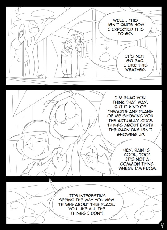
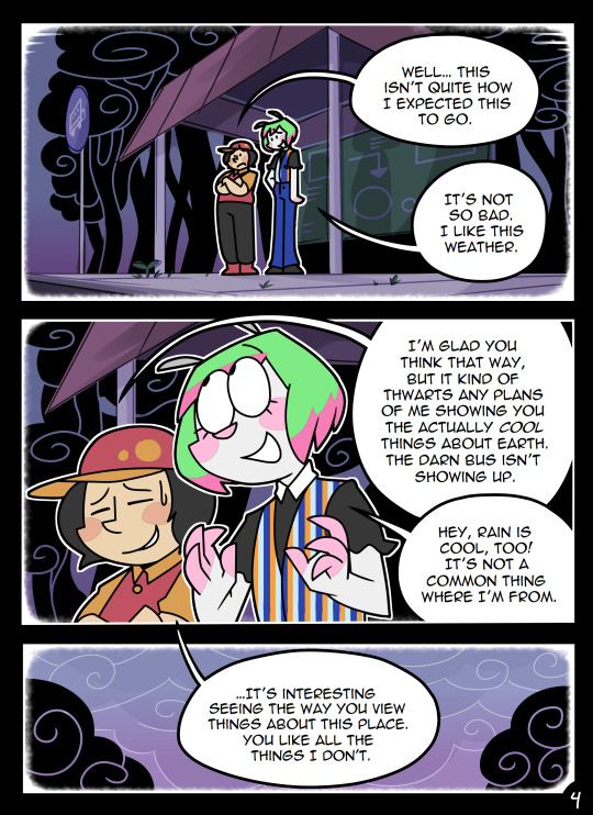
It's been a while since I've made something of this size, so please ignore anything ugly (mint wafer's face)
#art#digital art#artists on tumblr#artwork#digital illustration#drawing#fanart#cookie run#devsisters#cookie run fanart#cookie run ovenbreak#ovenbreak#cr ovenbreak#ovenbreak fanart#crob#crob fanart#crob art#cookierun#cookie run art#strawberry stick cookie#mint wafer cookie#clip studio paint#clip studio art#clip studio illustration#clip studio pro#rainyday#rainymood#random google school png in the bg lol#loving the csp brushes ngl#about time i moved on from firealpaca
55 notes
·
View notes
Text
27 Asks! Thank you! :}} 💞
@peaspods
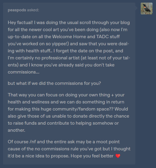
I might not be understanding, but I'm imagining this as people opening up commissions so people can give them money and they can turn around and donate that money to me..
I fear that this would create the opportunity to scam people.. "I'm taking commissions on behalf of Factual Fantasy! They're very sick so please commission me!" only for them to run away with the money they make..
I've been thinking a lot about setting up some kind of commission/donation thing because I'm starting to kind'a need the money.. but idk, I'm just kind'a run down and need some time to keep thinking about it. Thank you very much though <:)))
@zecromgen5
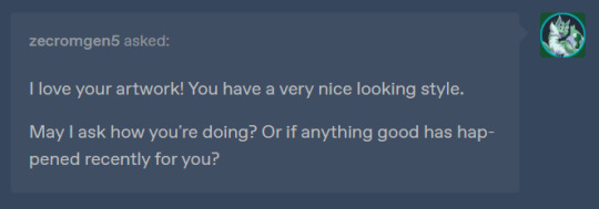
Thank you very much! :) And I've been hanging in there.. there hasn't been much improvement to my health or my mental state. The fact that in April it will officially been over a year since my health started to decline, and the fact that I'm going to spend my birthday at home collapsed on the couch has made me feel very sad <:( But I'm doing my best to work on it.. I'm hoping this new advice from my doctor helps me feel better <:)
And something good HAS happened actually, I got my tablet/FireAlpaca to work again! :))
XDD SJKFJSH AWW! THANK YOU SO MUCH!! :DDD
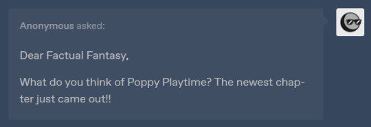
I've only seen a bit of it from Markiplier. So far I'm 50/50. Somethings I like and others I don't care for 😅
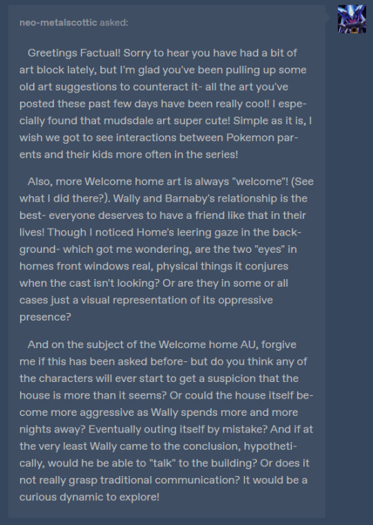
@neo-metalscottic
Thank you so much! :D 'm glad you've liked my recent artwork!! :}}}}
Also for Homes eyes, that was just meant to represent its oppressive presence and the fact that its watching them in that moment.. 👁️👁️
And I don't have any plans for any of the neighbors or Wally to figure out the house is alive. My AU is more like "a day in the life of" thing. Having someone discover Home is alive would move the plot forward. Which I don't feel like doing <XDD
Now communication... Home understands the concept, but he has no way of communicating other than creaking the floorboards and slamming doors..
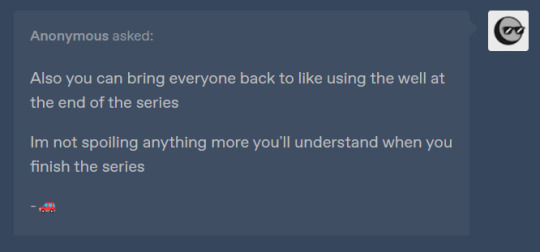
I've heard about the well. That could work for Cliffjumper and Breakdown maybe.. and the twins perhaps.? But wouldn't they have to have Tailgates body in order to revive him? Hmmm.. idk actually,,
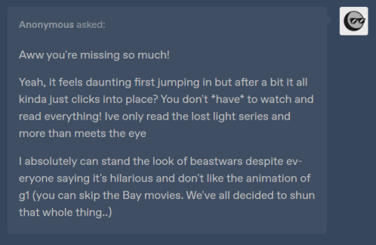
I've watched the bayverse movies, most of Prime and a few other things here and there. I didn't mind the bayverse movies that much, but I can see why a lot of people don't like them <XD
I just imaging trying to consume more than one Transformers media would be a lot to take on.. and I also don't like the animation styles of most other transformers shows 😅
(That's actually how I decided to watch Prime. I took a look at all the shows and went "this one looks ugly, this one looks ugly,, this one looks REALLY ugly.. Oh, this one doesn't look half bad. TFP it is then!")
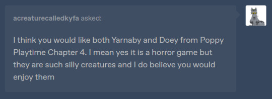
@acreaturecalledkyfa
I've watched Markipliers first video on it. So far I'm not sure how I feel about those two 😅

The way I immediately opened YouTube and went looking for it XDD
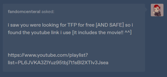
@fandomcenteral (Link in ask)
Thank you so much! :DD This will come in handy!

@mason-gaylord
Aw! Thank you so much!! 🥰🥰
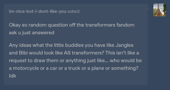
@im-nice-but-i-dont-like-you
Jangles would be a helicopter probably, Gerald would be a tank, Cici would be a Miata and Bibi would be a slightly raised up Miata XDD

Aw, I'm honored that you miss them <:}} Though I don't know if I'll draw them anytime soon.. I'm really not into inserted OCs anymore <:(
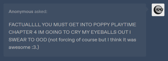
I'm waiting on Markiplier to release more videos on it <XD
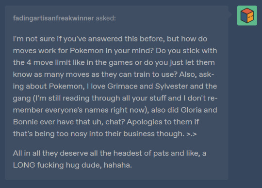
@fadlingartisanfreakwinner
I like to imagine that Pokémon can learn dozens of moves. But 4 is the limit for official Pokémon battles. So any wild Pokémon in my comics can use/learn as many as they want :0
And yeah, they had that chat eventually. I just never got around to drawing it 😅
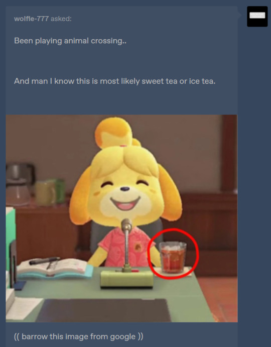
@wolfie-777
Nah nah its just iced tea XDDD
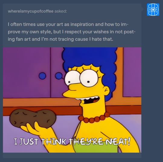
@whereismycupofcoffee
:DDD Thank you so much!! :}}}}

AAAA THANKYOU SO MCUHH!! :DDDD

@nuggybee
Yeahh,, Sky has its ups and downs. I'm currently in one of its downs. It seems like I'm let down by everything they're releasing 😓
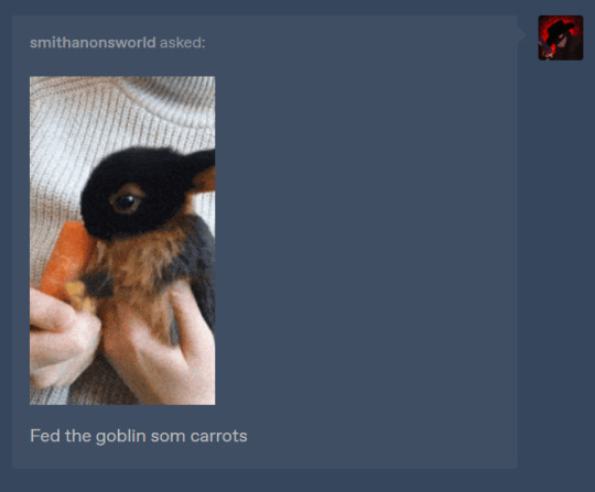
@smithanonsworld
I feel like I've never seen a rabbit that color... its so cute 😭💞💞💞

@heaventhehedgi3
That sounds like me! Though I don't draw Octonauts anymore 😅
I'll keep it in mind! :0
🥹🥹🥹Aw... that's so sweet! Thank you so much!! 😭💞💞
@captain-skyler1987
You made an account just to follow me? :DD Aw that's so sweet! :) Thank you!
Also I'm sorry to hear you got the flu :(( I hope you're better by now!
I also have not played Dandy's world 😅
@stargirldrawsx3
The first thing that came to mind was very anxious all the time 😅
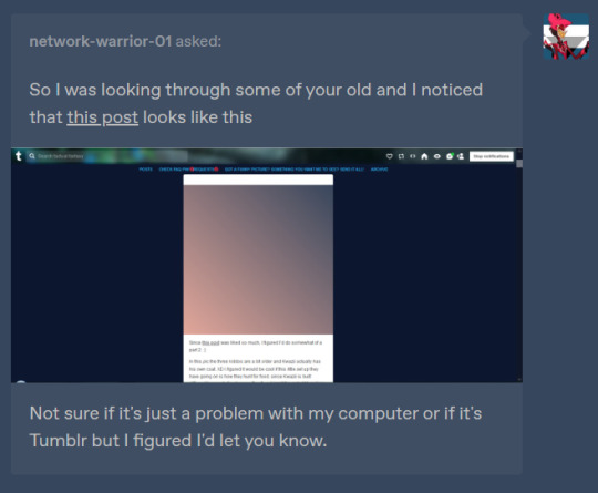
@network-warrior-01
Ah, that was an April fools post. <XD There is no drawing

50 notes
·
View notes
Note
hi i just discovered your blog and i LOVE your art. can you do a tutorial on how you do your pop rocks colors? im OBSESSED with it.
(totally cool if not, no pressure! :] )
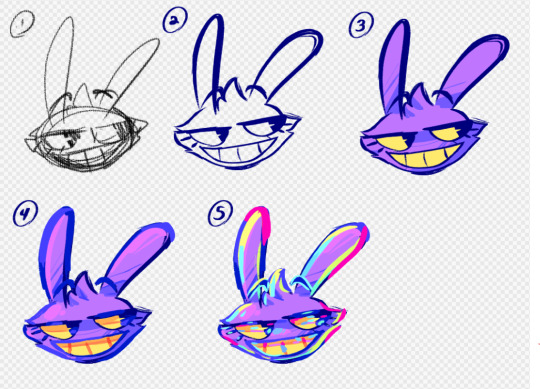
this is generally what i do , and it's rough since i rushed it , but this is generally how it goes
this is a normal sketch
messy lineart done with a deep blue hue
colors !!! with basic shadows included . shadows aren't done with multiply or any of that , i just make the color a lil more saturated and move the hue
on an (unclipped) layer on top of the lineart layer , i just color my lineart . very loosely . this whole style is loose most of the time . i also add highlights by lightening the base color and moving the hue in the direction that feels lighter . additionally , i outline my shadows with a slightly darker hue bc it looks cool
(on the same layer as step 4) this is where i go Nuts . the lightest colors of the highlights are always pure yellow and teal , as they're naturally lighter than the other colors , and the secondary highlights are usually a bit more saturated and are blue green and yellow green . for other colors that aren't highlights , i tend to mostly go over the shadows (and the shadow outlines we added in step 4) by picking a color i'm gonna be going over and shifting the hue until it's a similar value/until it doesn't seem lighter or darker to the color i picked . i usually stick to purples , pinks , and blues for this
other things to note:
i tend to stay away from pure red and pure green
i use firealpaca's marker brush , which is like your standard pen brush but it's shaped like a rectangle
i don't think too hard about where i'm placing colors . if i pick a new color in step 5 i'll just put it wherever looks good . don't think about it too hard
unless i'm trying to be cleaner with this , my stabilizer is usually pretty low . i have it set to 10 on firealpaca- for reference , my sketching stabilizer is around 5 (side note: i should also mention that comparing to a lot of my artist friends , i just have my stabilizer really low all the time . my lineart setting is usually like 15 and firealpaca can go up to 40)
^^ i should also mention that stabilizer levels are different between programs just go with what feels right for you
my colors here are always very saturated . they're always either tints or shades , but never tones . mostly tints
^^ i do make exceptions to this if i'm going for a less saturated look (like my gumigoo drawing)
#please ask me any questions you may have KJHDFKGJSFHDK i know i can be confusing at times#long post#bright colors cw#tutorial#kinda#anonymous#asked box#lightly salted art
29 notes
·
View notes
Text
⚙️ This laptop was saved from obsolescence! [10 mins of read]
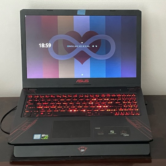
Hello!! i am making this post here to raise awareness for PC and laptop upgrades, and how it should motivate you to do that same thing to preserve yours for longer or to give it the power you need! this will feature my history with mine, as well as the steps i took to be able to make him breathe life better! this is the story of his journey, and how it went to this current day.
his name is samuel, he is an asus fx570u and i bought him back in september of 2018 after i turned 13! he was brand new during that time and priced at 800 euros, offering only 6 gb of memory and an HDD as his specs. however he does have an 8th gen core i5 as his cpu and a geforce 1050 ti for his gpu. for something marketed as a gaming pc, it's pretty low and it wouldn't allow him to run fast enough, especially for highly demanding software and causing some compatibility issues. it wasn't severe, but as i was stuck with an hdd, that meant operating systems would run pretty slow on it, also leading to long software loading times. this is made worse by the fact that its bundled system, windows 10, isn't designed to work efficiently on hdd in the first place, but at least that means i have my hands on a windows key to be able to use some windows exclusive programs..
i mainly used him to be able to use advanced video editing software and customize the games i have on it for my own taste, because back then i loved making youtube videos and it was a passion i've had for years until i've partially retired from it. i rarely bought games on it and instead opted for free-to-plays, and overall had a good time with him.
unfortunately within only 3 months, his HDD broke down and i sent him to technicians for them to replace it with another one. it was a minor accident i've had but it formatted all my data, even though it didn't matter much since i uploaded most of it to the internet. i just had to be gentle with him by trying to not moving him around too much to stop that issue from persisting... but it was still low-end in terms of system performance. i finally used him for 1 year straight before moving on to a tower pc, feeling tired about his slowness and believing i couldn't do much about it.
i used that other (unnamed) pc for almost a year, starting from 2020! they seemed to work better since it had windows 7, but embarrassingly enough that version itself stopped receiving official security updates months before i started using it, even though i was careful while accessing the internet with it. its performances were also low, but didn't really matter much since i didn't take so much advantage from the power of samuel. suddenly, i had the foolish idea of installing windows 8.1 on the latter to try to deal with the performance issues on 10, but it led to even more compatibility issues since the drivers i used were meant to be for 10 only. only by early 2021, i got win10 back on him and started using him again to get more power again.
so the low-end performance persisted for very long. back then i never knew how to upgrade pcs, so i was only used to replacing devices with others which wasn't cost-efficient. after realizing i used windows for well over 10 years, i had the idea of switching to a mac and as a result, for xmas 2021 i got myself a cute yellow silicon imac, who goes by the name of sarah! but switching to macos posed new serious challenges, such as getting used to the lack of windows compatibility and the missing features that i was used to for a long time. most of the creativity i did with her was drawings with firealpaca and krita, and cgi with blender, which wasn't really much. still, she is pretty glossy and also powerful for many of the tasks i'm performing with her. originally i also intended to sell samuel, but that never happened (i low regret that decision so much i swear).
in late 2022, samuel's performance apparently had had a big hit... he now takes approximately 20 seconds to open any program and it seemed to me like something was wrong with him. at that time i also gained interest in linux since it's a libre OS capable of much more flexibility, essentially allowing it to revive old PCs. i finally decided to get linux mint to work on him via a dual boot with win11 (what was i thinking when i "upgraded" him from 10?). the performance seemed a little better from then, but programs still took very long to open. for that reason, he had often been collecting dust as he finally became unusable.
finally we've reached 2023. this is the year i decided to take on tearing down devices to learn how to examine problems inside of them. after checking samuel's performance again, i noticed that his HDD was having extremely low writing and reading speeds compared to my tower, which made me feel disappointed. but that's when i finally decided i could be able to replace his hard disk with an ssd, a new generation which is more durable, faster, quieter and energy-efficient...
but i still had a good wait until it was possible. suddenly with my money, i found an ssd which only costed €30, and it made me happy that this would be a quick way of healing up samuel! so i rushed to get it, and finally opened him to prepare everything... unfortunately, his keyboard has to be lifted up in the process, and there are flex cables connected between it and the motherboard. but taking out the hard disk thankfully only requires a few steps; removing some screws, then inserting the SSD inside of it. after that i quickly put linux mint back into him. SO SPLENDID...
for only the price of a high budget indie game, now he can open programs very fast, close to how fast sarah can do, and just about any task works perfectly well on him with way less bugs! thanks to that fast upgrade he's become viable for daily drives again, even though i don't have other desks suitable for pcs which makes me less motivated to use him. really wish id be able to since the architecture he has (x64) means he has a lot more software he's able to handle natively...
but then, i hadn't upgraded his ram. i said before that he only had 6 gb of it, and that meant he could only work with a few programs before becoming bloated. and as i like doing power tasks on him, that obviously causes problems. so one day, i went to a pc part store out of curiosity, and became shocked when i found small ram carts that could be compatible with my laptop. after some talk with the seller, i bought 2 ddr4 carts each containing 8 gb and clocked at 2666 mhz, more than double of what i used to have. after that it was time to take on a challenge to be able to insert them myself.
when the seller asked me if i needed assistance to have the carts inserted into my laptop, i giggled internally because of my past stories with learning how to open devices and trying to troubleshoot or modify them internally. i obviously declined it which saved me money, but also meant i had to do it all myself. after an hour of painful manipulations which required me to take out the entire motherboard from samuel, while that next step was also difficult i was finally able to insert the carts into it, before placing all his components back into place. and after such a long time of waiting...
i've finally done it!
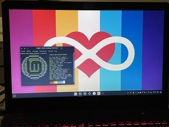
Samuel is feeling very well right now!! despite his cpu and gpu dating from over 5 years, now he can do even more tasks at a time, while also being able to read them faster, a massive improvement compared to when it was stuck with an hdd and only 6 gb of ram. i'm guessing those low specs were for the purpose of saving manufacturing costs, but until you'd find use for the components that you'd remove, they'd end up becoming waste. and with a free os like linux mint, it adds up to an even more optimized experience than windows 10, which comes with so many unwanted stuff and can't be customized very well.
have you had a similar story to mine? did that pose you challenges? i took over 40 minutes to write this entire piece of text, but it should at least be very well detailed! on the best case scenario i hope it would inspire others to do some research on upgrading PCs to preserve their lives and especially save costs. Thank you for reading the entirety of it, don't hesitate reblogging it if you think it would interest your own audience! peace for all of you 💙
127 notes
·
View notes
Note
Have u ever posted your comic or animation workflow anywhere? Im super curious on how you tackle the process, especially not using a drawing tablet. I know you have a very simple (and adorable) style so that probably helps in terms of workflow -- Im just curious about the steps you take.
Thank you! With both comics and animation my key thing is to not spend too much time on any particular thing, just draw loose and fast. Honestly the only downside to drawing with a mouse is that I can tell my arm has extremely specific muscle memory regarding it- if my mouse breaks and I get a new one I have to spend a good month or so just letting my hand get used to it again lol. Same with if my setup gets readjusted too much- right now my setup is my mouse on one of those padded mousepads, on top of 2 books, with my elbow resting on my 3DS case (I'll get an actual pillow or something for it eventually lol). But luckily thanks to this I suffer very minimal wrist pain 👍
(...Okay I started to go really in depth in my process here, so sorry if this is way more than what you were asking. Putting it under a readmore just to save space lol)
With MFM in particular, I start by writing out the entire script for the next story arc, which really is just all of the dialogue and vague notes about any important actions. Then I do the paneling with very loose stick-figure like sketches of where the characters are and what they're doing. I prefer having very little planning when it comes to character poses and panel shapes, coming up with those on the fly makes things much more exciting and faster to make. But it's the opposite with dialogue... it needs to be 100% FINAL before I draw a single line lol.


That's part of my script for my most recent chapter, as well as what my extremely loose goofy thumbnail sketching is like. I write the script as one big thing and don't separate it into pages until I actually start drawing- then I go and color change it just to keep track of what dialogue goes on each page
After that, I go back and do the ACTUAL sketch, as well as the lettering (I don't believe this is how it's done professionally. I used to do lettering as the very last step in the process... but then found it hard to cram speech bubbles in the right places lmao.) After that is lineart, coloring, background flat colors, then shading/rendering for all of it. I do each step in batches, as in I sketch out ALL pages of a chapter before moving to lineart, I line ALL pages before starting coloring, etc. I find it way easier to be productive when it's broken up like that, though when I first started the comic I used to draw each page to completion before starting the next (but also, the comic's style was DRASTICALLY simpler back then haha)
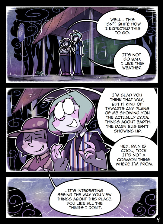
(Unfortunately I merged some of the shading to the background flat colors so it's not entirely accurate... oops) FireAlpaca has a sand texture feature that I only found out about last year- adding that to the backgrounds makes them look 10x better with WAY less effort.
With animation, it depends on the project. For simple 5-10 second animation I make for fun, there's very little planning lol. I skip some steps in the process- I'll sketch out the keyframes (and maybe any difficult inbetweens if necessary), line those, then go straight into making linework inbetweens. I'm not a cleanup artist and have no experience in that, so I always find trying to line my rough animation makes everything jittery and wobbly. If I do it with a clean line from the start then I can avoid that and save a lot of time 👍
For my bigger projects (such as the Parvey cartoon and the MFM Kickstarter trailer), I do the whole animatic with final audio first and foremost, with the animatic being almost like the keyframes. I split them up into individual shots, .mp4 files anywhere between 1-30 seconds usually, and animate those one at a time. I'm a huge fan of free to use programs and try to use them as much as I possibly can, here's a list of the ones I use:
FireAlpaca- for the actual drawing part itself (storyboarding/animating/etc). FireAlpaca has a feature that lets you export every frame as it's own drawing, as well as an onion skin mode
Windows Movie Maker- for compiling all of those frames into video format, creating individual shots. If you upload all of your frames and set them to around 0.08 seconds, it equals about 12fps (I usually animate at 0.10 seconds/10fps, its a bit slower but looks nice)
Onlinesequencer.net- for making music. It's the place I've made all of my songs on, like the timeloop song, hyperworkaholic, and the background music for the MFM Kickstarter trailer.
Audacity- for editing audio/music. Also great for recording things directly from your desktop
DaVinci Resolve- for editing and putting together all of the shots into one big video. Can get kind of intensive on the computer during rendering, so watch out.
YouCut (app)- also for editing and compiling shots, I used this one a lot a couple years back but I'm not sure how well it holds up. Doesn't need much phone storage to download but needs a lot to render videos.
MS Paint (yes really)- for typing up text. FireAlpaca has a text option but I don't like it as much as Paint's.
...The only thing I genuinely can't do alone is voice acting. Luckily there's a big voice acting community on Twitter and they're all amazing to work with!
This got... way more in depth than I planned for it to be, so sorry if this is way more than what you were asking lol. But that's my general process when it comes to my art 👍
32 notes
·
View notes
Note
hi!! i hope you don't mind the ask ^^ i was wondering about how you got started with sprite ripping, specifically through tinke, because im trying to learn myself so i can rip as much as i can from the d.gray-man ds game and well..... it's definitely quite the process and im really unfamiliar with these things ;;^_^ i actually found your blog while searching for information which is why i thought to send an ask :0
Hey! I'm pretty flattered you thought to ask me!
So, I'm gonna go through several games, because it highly depends on the game and what you see. That way you have a lot of examples to work with.
Let's start with Death Note: Successor to L as that is the game I'm most know for ripping the sprites from. It is also a bit unstraight forward, which helps some things in explaining.
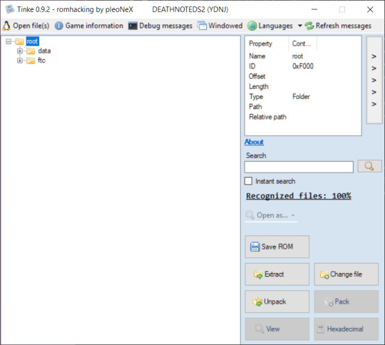
Upon opening the .nds file in Tinke, this is what we see.
Locate the "data" folder, click the +.

See this data.bin? Despite its icon, we do not want to unpack it.
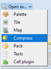
Instead, we want to Open as > compress
You'll get a popup window called "Select Offset". Don't do anything; just click "Accept".
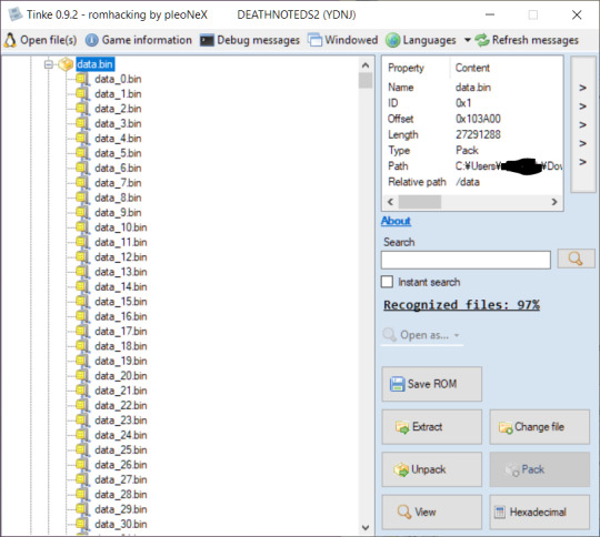
After a second of waiting, suddenly we have this huge list of new .bins! So where do we find the images?
Scroll until you find the LAST [IPAL] .bin. Everything under it will be the game's sprites.

So, everything under "data_15108.bin [IPAL]" in this case. So...where are the images?
Under it is data_15109.bin. And under that, data_15110.bin. Open as > compress them both.

Based on icon, we can see we have a palette file and a tile file. First, we have to open the palette file as a palette.
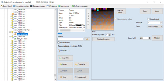
Now, let's see what happens if we open the tile file now... (as a tile, of course)

Well...that doesn't look right. For reference, this is the sprite in question:

So, why does it look like that?
What if we manually adjusted the width? You can hold down the up or down arrow to see it change in real time.
But setting it to 128.... (half)

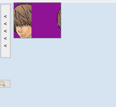
Looks about the right size, just...cut off. We'd have to adjust the height, too.
Or, we can try opening it as a map instead and see if that helps. So let's try opening this file as map instead.
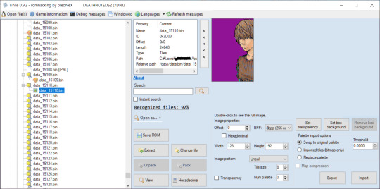
Ah! Did all the work for us! But...where's the other half of the sprite? And why are the colors weird?
Let's Open as > compress the .bin below...
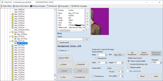
...Well, there's the other half. So, you'll have to stitch them together. Ok, what about the colors?
This is where the palette comes in. Tinke will use the colors of the last palette you viewed. Thankfully, we know this is Light's palette since the palette file precedes all his sprites. But why is it showing up wonky?
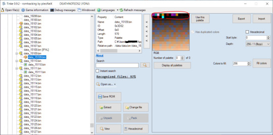
See these bold colors up top? This is our issue. We need only one of these bold colors that is clearly not supposed to be a color in Light's sprite. Why? Because that will be the color of the sprite's background (which we can edit out later.)
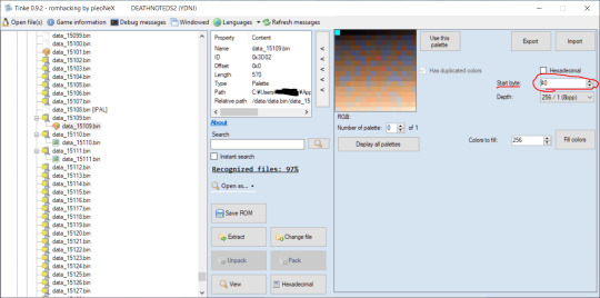
See this start byte button? Keep clicking up, you will see the squares slowly move backwards (idk how to describe it, just hold down the up button and see for yourself). Do it until only the last bold color remains. Cyan, here.
Now, let's go reopen the image as map.
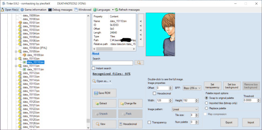
Perfect! You can even click that "Transparency" button to turn the bold color transparent.
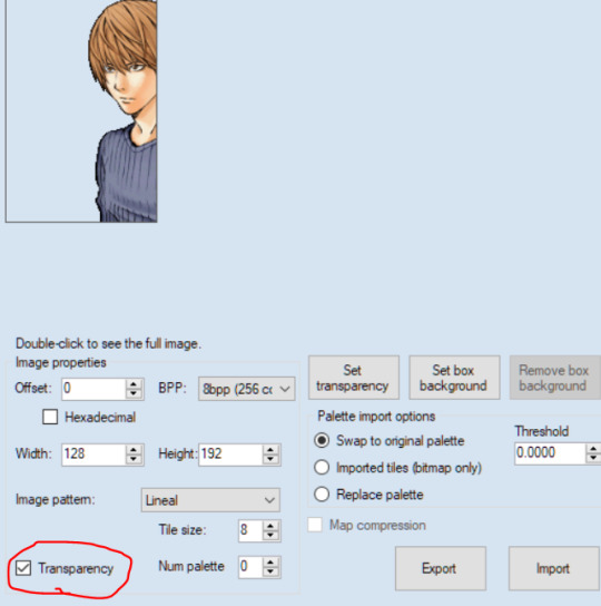
Now, all you have to do is click "Export"


Here's the output:
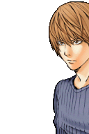
Of course, the same will have to be done with the sprite below it, and then you'll have to stitch them together in any editing software or art software (MS paint, firealpaca are both free) and there you go! the sprite :)
Now, not all games are like this. So let's look at another.
Let's do Pokemon Black 2 (this is the JP version but as far as I know, both games have the same file paths)
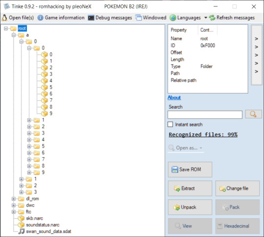
Already, this looks WAY different. No Data folder. Just an "a" folder, with a million sub folders. How are we ever gonna find what we want?
Well, there's 2 answers. One is Google. I googled "Pokemon Black 2 sprite files locations" and got this answer:

So a > 0 > 0 > 4...
But what if Google doesn't have an answer?
Well...Sorry to say, at that point, it's a game of trial and error. You're going to have check everything yourself (that's what I had to do with the Death Note game).
But back to Pokemon. So, I open as > compress....
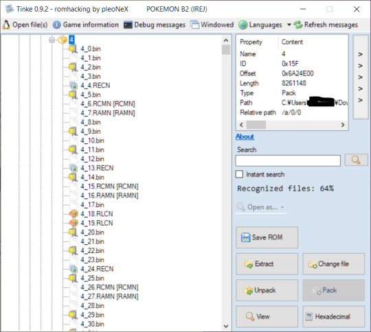
A little different here, too. But If I had to guess, 4_19.RLCN is our palette, and 4_20.bin (after we open as compress) will be our image.
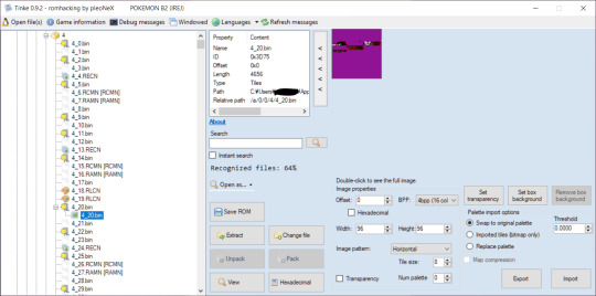
Right I am. But opening the image as map, it still looks weird. I'll mess with the width - that usually works.

Just a few clicks of the down arrow and we got Bulbasaur.
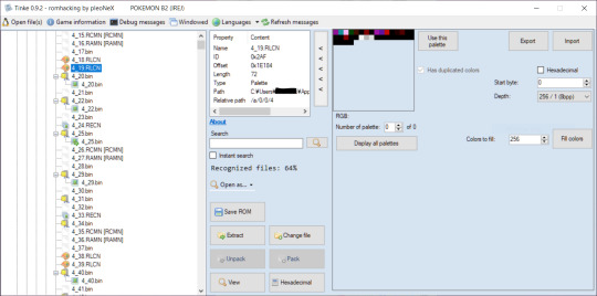
However, this palette doesn't look like Bulbasaur at all. There's no green or anything...maybe the actual palette it at the bottom there?
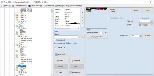
So it is! You can tell just by looking at the colors that this is meant to be for Bulbasaur. The greens, blues, and reds for the mouth. Now, the question is how to get the right palette on it...
Unlike Light's palette from earlier, this one is much smaller, so we can tell the palette size is actually 16/16, not 256/1

Just switch it over.
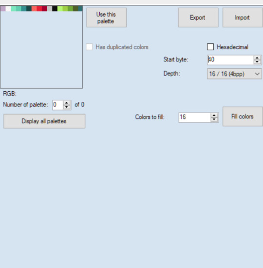
I did 40 for the offset again, as this seems to be a regular number used for palette offsets.
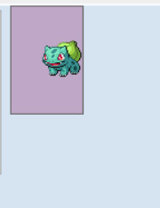
And wouldn't you know it!!
Okay, I've hit image limit so i'll stop here. But I hope this helps. Some games are encrypted or use file types not recognized by Tinke, so if you're having additional troubles you can message me again :) otherwise I hope this helps. When in doubt just try opening everything and anything lol.
14 notes
·
View notes
Text
ok i havent drawn a lot so ill do a big artdump of some stuff i abandoned or at the very least wont finish for a long while (id in alt and story/thoughts below the image)
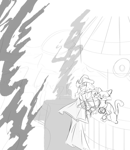
In a server that I'm in, we briefly talked about Descole hypothetically returning in NWOS and somebody mentioned he should bring Keats along. Inspiration struck and I drew this. I was hoping I could use Blender to make the buildings and whatnot, but I was intimidated by the task and ultimately ended up dropping the entire thing.
The building that Keats and Descole are on is… Meant to be a rough placeholder, I didn't mind redoing the entire thing but I wanted to at least have a vague idea before the entire draft slipped from my mind.
(More images in cut that are either old or kinda detached. also theres crossover stuff in there. be warned)

HAHA YOU CLICKED READ MORE NOW I CAN SHOW MY INSANITY. MWHAHAHA. MWHAHHAHAHAHAHA. ok so errm this is campaign des that i mentioned a few times and yes that is The Mario from The Paper Mario. I think about them so much and its a bit pathetic bc its like "you're overthinking a kid's mascot" ITS SO SILLY YOU DONT GET IT...
Oh right the doodle uhh so I was thinking about them and just drew a hypothetical scene for funsies, it didn't happen in roleplay (and also because I wanted to draw paper mario without a reference and see where that went). It's an ex-villain and struggling hero dynamic and i love it sm
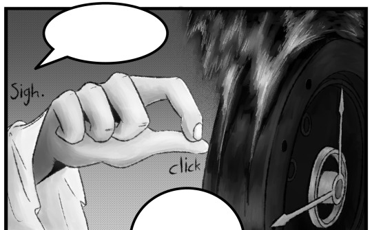

Segments of a comic I drew for a friend in a super silly AU with dante from the limbus company hand on hip . Id get super embarrassed if i shared the details of the au because we kinda said "fuck it we ball" and made up stuff that shouldn't work at all lol. It's also why there's no text in the speech bubbles.
But the general gist of why I drew this is because we kept discussing a scenario where Descole has to fix up something in Dante's clockhead (vaguely inspired by that april fools episode) and i had a strong vision ab the comic. Also I had to make their head in blender because i was struggling with the perspective and wanted a flexible reference. First time drawing something not made out of flesh fur or fabric!! had a blast rendering the fire and the shine though. SUPER fun super recommend

I just like this little doodle,,, the expression vaguely reminds me of a ghibli villain and it scratches my brain. im expecting him to move on twos at 24 fps very subtly at any moment now.

And finally... um... yeah. "draw a character in this pose" sort of beat. sometimes I alternate using the sketchbook and marker pens in firealpaca and this is one of my rare marker doodles. Also this is pretty old afaik but i still think about it sometimes
happy sycamore sunday (even though hes not anywhere to be seen in these doodles)
42 notes
·
View notes
Note
Gosh, dang, your art is great. I could just eat it up! What program do you use? I'm still new to digital art, and I'm finding it frustrating
AHH!! thank you so much! that means a lot to me! X)
regarding the program, i'm currently centering myself around procreate since I've finally managed to save up enough for an ipad in the recent while.
tldr: if you have/can afford an ipad, i heavily recommend procreate!
although i do know apple products can be very hard to get depending on your financial situation, so here's what i started off with WAYYY back (like, years back):
beginner programs for PC i personally had experience with: - FireAlpaca (computer) FireAlpaca is a good and free-to-use program to start off if you're a computer user and are at the very first few baby steps: learning the usual keyboard shortcuts, adjusting to what most programs label their interface with, what each tool does, etc. it builds expectations up for what more wide-spread programs provide, although i've noticed that certain options might still be named completely differently.
sadly i do not have any old works saved from back then because my old computer drowned in water after an accident, but personally i worked on firealpaca for about 5 to 6 years and was insane enough to teach myself the program without any actual art supplies (such as a graphic tablet (which basically means i drew with my mouse like a psychopath)) - although i HEAVILY recommend a graphic tablet! the only reason i didn't use one at the time was because i was a VERY young kid and my parents wouldnt spend their money on something as expensive as a tablet
i want to also say that i ONLY ever used firealpaca first-hand because i'm very hard to convince to move over to a completely new program, etc. - my other suggestions will be what i've seen people praise in terms of beginner-art for computer (same goes for mobile, as i've never really had to draw on a phone)
other programs i recommend for starters based on what i heard: computer: Krita (free) Sketchbook Pro (unsure if this is still a free program or not, sadly) Magma (this is a free website, and i personally wouldn't find it super reliable but i've seen a bunch of VERY talented artists use it!) mobile: Ibis Paint (free, has some ads for certain brushpacks but i think it's fair) Sketchbook (unsure if this is paid for) Magma (this is a free website, and i personally wouldn't find it super reliable but i've seen a bunch of VERY talented artists use it!)
if none of those seem to grow to your liking, reddit will usually have some solution if you look up 'beginner friendly drawing apps', etc.
i do not have any suggestions when it comes to more 'high quality'/paid for mobile/tablet apps (other than procreate), but if you are already accustomed to the general interface of programs on a computer, i think your best bet would be Clip Studio Paint
CSP is paid for and you can pick and choose a price depending on which subscription you go with (i personally went with the cheapest *license* rather than subscription (basically a one-time-payment)), and it's worked for me like a charm.
it has an endless library of user-made brushes and most of them are free! it has a very user-friendly UI and there's a bunch of very helpful tutorials, both by the actual people behind the app as well as other artists on youtube for most issues you might experience so sorry this is super long, wanted to tackle as many possibilities as i could since i wasn't sure which platform you were using! hope this helps X)
6 notes
·
View notes
Text
Clarification


I may be stupid I wasn't talking about ai I prommy. I had two versions of the final piece saved, one that was plain and one that had the cringetober prompt and my signature written on it,, since I drew these a while ago I forgot about the prompt being there and just went with the version I signed. I noticed basically the second I hit post and remade the post with the added all caps clarification in case anyone managed to catch the original withing the like minute it was up
Post this is about, I already took the reupload part out of the caption:
putting the sketches and some of the layers below the cut as receipts and also a fun little look into my process ig


the sketches were originally done in krita cuz I preferred it as a sketching program at the time, and then moved over to firealpaca for the render. There's a bunch of layers because I had the cringetober sketches and some doodles all on one file

mostly flat louyd plus the background sketch


And some of the bg process ^_^ you can see where I recolored the price tag lol
#Sorry if this post seems stupid I'm. Paranoid.#And also the original drawing didn't do very well and i worry that this may be why#If you just don't like the drawing your fine BTW no hard feelings#But if people are not interacting because they believe my work is ai I need to make it clear that it isnt#I wanna keep things transparent for you guys 🫶#This blog is anti ai art if that wasn't clear lol#we will return to your regularly scheduled art saturday#soup says stuff
15 notes
·
View notes
Text
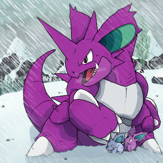

Another year, another birthday! As always, every year I try to redraw an old piece of mine to celebrate! This year, I've redraw the very first thing I ever made in Firealpaca! Nidoking on a snowy mountain! I hope you're as happy with it as I am!
The original is from 2019! At this point I was moving away from mspaint for the first time in my life (a late bloomer I know lol). And I think by this point I was probably still using a mouse to draw instead of a tablet! I think I've come a long way since then!
As for me at the moment? Stuff is interesting for sure. Things has been a little tough this year, what with moving and being extremely broke all year long. It's looking like I'll be moving again soon too, but hopefully this next move will be the last for a while. And in addition to that, being 25 already is sort of getting me. I've wasted my 20's on Covid! It's frustrating! But at the same time I'm trying to make the most of things. I'm working on a LOT of projects, have tons of ideas for personal projects that I will hopefully get done soon. Once Upon An Adventure is going slow but it is going! And I'm still being asked to help on tons of different things which means the absolute world to me. And while things are tough, things are getting better. I have a car now so I'm not feeling completely stuck all the time. I'm going out to conventions and meeting new people more which has been helping me feel so much better (I NEED TO BE AROUND PEOPLE!!! I LOVE OTHERS). And I'd like to make an effort to reconnect with some people soon if I can. Like I said, it's tough, and I'm getting a little self conscious about my age. But I'm making strides to do things better and I'm gonna keep making strides to be happier. And, there's still so much time to make so many things. I feel more creative right now than I've been in a while, I want to work on SO much and have so many ideas for so many things that they're getting in the way of each other! So I thank you all so much for all the support you've given me over the years, and I hope you look forward to all the new stuff I make going forward!!
#birthday project#redraw#pokemon#nidoking#nidoran#fanart#I'm like crazy happy with how this came out lmao
49 notes
·
View notes
Note
Genuinely, how do you work with the lc 3d models n render them so cool!? Especially the customizations, I see a ton of lc skins but I don't know what ppl work with or how they do it so well!!
SHEER WILL POWER.
But for actual answers, the short answer is a lot of fuckery. And the long answer is
Firstly all the shit I do is in Blender, and it involves a lot with the camera and the posing of whoever I'm playing around with. My rule is that if it's not gonna be seen by the camera angle in the final render, then I really don't have to give a shit about how it looks. It only has to look good for the camera. A small example of this is with Fencer, because his tailcoat is just a little jank, I have to move it around a bunch for it to look good, which results in it clipping through his ass. Yet, you're not gonna see that ever in a render now, will ya ?
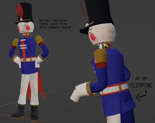
Another example is something in my most recent render, in which Doc is slightly clipping through the floor just so I could get him in the right position for the camera, but I didn't have to care about this because it's only his upper half showing ! (Also from here out, I'll probs be using the render as prime example so yay)
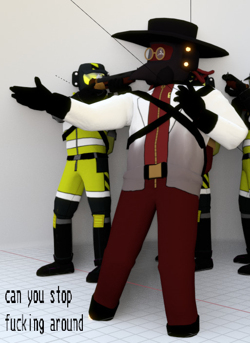
Another thing I do (sometimes) is if there's more than 1 element in the piece, I will render them out into separate PNGs with transparency. This will include the characters, the background, foreground, etc or whatever I need.
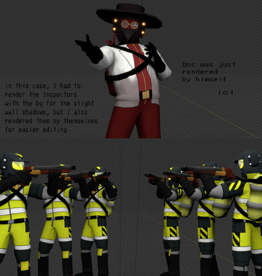
NOW WE MOVE ONTO PAINTING OVER IT ! This is where I take everything into my main program, FireAlpaca, and touch everything up to look nice. One of the main things I do is fix up shading / texture / clipping mistakes. Here are some examples of that
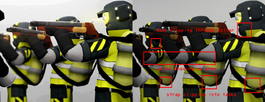
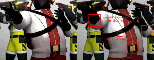
Painting over everything also allows me to add small, fun details to the render ! Such as the small rim lights, glow, shine, blur- fun things that would otherwise make me want to rip my hair out doing in Blender ! I also adjust the contrast / colors to how I want them, and paint on some of the lighting if I feel like it's needed.

And then after applying overlay textures (if any) and a bunch of other small things, the render's done yayyyy !

There's probably a couple things I could do in Blender to ease up this process, but this is just how I personally enjoy doing my renders. If you look around, there's most likely tutorials or smth to get cool effects in the program itself and waste less time, it's just that I'm a little pea-brained and don't wanna bother with that LOL
Moving onto custom suits, I just use a cruddy scavenger model from sketchfab to easily texture paint on for the suits. Cosmetics (hats, visors, items, etc) are completely modeled by hand and not pre-made assets, either by friends or me. Texture painting and modeling is an even LONGER thing to explain, at least from my perspective, but there are a bunch of tutorials out there for that kind of stuff, and also tutorials on how to create your own custom LC stuff !
anyways ok this answer was LONG as FUCK um. oops !
17 notes
·
View notes
Text
Blog Hiatus
As of 9/13/2024, this blog will be going on an extended hiatus for an unknown length of time. I will not be posting anymore artwork.
A lot of things have been going on in my personal life regarding work, personal finances, and the dumpy place that I mistakenly moved to just because I was so eager to take my first adult steps by myself far away from my family. Since my move, I haven't exactly been in the right headspace like I was before when I posted my art to this blog. It feels...heavy. Boring. I genuinely don't like posting what I do, because it feels like I have to. Which is why a lot of my stuff is now privatized (and probably going to be deleted down the road, if I'm being honest). And I genuinely despise the downgrade in how my art looks with the shift to Procreate on the iPad. I think it all looks awful. FireAlpaca had a much higher quality to it on my old laptop.
I've put so many projects on my plate that I'm just disgusted with myself. With how I can't sit down and focus on one thing and enjoy doing it, like I used to be able to do when I was a kid. I'm disgusted because I hate working on them. They bring me no more joy. And I hate that other people like what I've done but have to wait for meager scraps. I feel like I'm letting them down, letting my followers down.
So, I leave you with this.
I will be stepping away for a while. I don't know for how long. I need to focus on trying to save my money back up so I can move back home. Maybe then will I start to feel like my normal self again.
Asks will remain closed.
Every story concept I've talked about is cancelled for now.
I'll probably check in every now and then just to see what pops up on my home page and like a couple pieces here and there.
4 notes
·
View notes
Note
Hello, hope your having a great day!!
Do you have any tips regarding stylising slugcats in different ways?
HI thanks, i am indeed having a good day thanks for asking!
as for your question, im not entirely sure how to go about answering it, however i can give some tips for developing a style, just in general
do you have any artists you like? im sure a lot of you guys have heard the "take what you like about your favorite artist" speil, but i find its a little more that that.., a lot of times what i find myself doing is taking an image that i like, and well, trace it (its not just tracing work with me here lmao)
alternatively i draw against it, if that makes sense, like use a reference, which is also really helpful because im not relying on the image that much (especially because i cant focus on looking at the drawing and the picture at the same time, so usualy i just look at it and draw from memory, would suggest, sorry for the tangent tldr use reference sometimes too! dont just trace lol back to tracing though ig lmao)
for this im going to be using this image
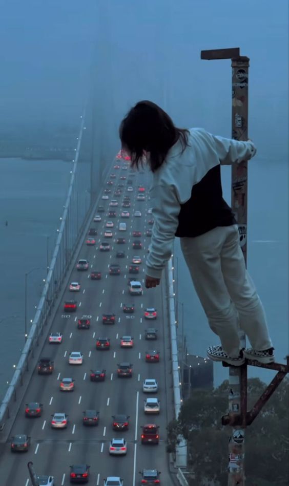
and the program i will be using is firealpaca (its a nice free software i like using for digital art, but thats not important right now)
i start off with this generally, as you can see, the image is lower opacity, on a separate layer, and although its not rainworld, its the first thing i saw mildly interesting on pinterest lol

alright now i have the iddy biddy bits done, i traced over the general pose, and now im ready to move on.
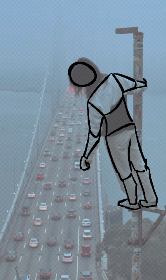
here is where its a little more than tracing
i turn the original picture off, and lower the opacity of the traced version, and then just, draw over it i guess.
i like to try to think about how the body would, idk, fit there, like if i was there how would i look? would i be stiff? relaxed? so on and all that. the goal here is to learn from tracing it, not just trace mindlessly if you get what i mean. be mindful about what your drawing
anyway heres the next stage, as you can see i wanted to deviate from the original image, that way im not making a carbon copy of the image. i do think the image is pretty good for practice though, as its a pretty dificult pose (at least for me) and i can use the (albeit very little) knowledge i have on foreshortening on the arm, idk man its a really cool image and i like how challenging it is, i really had to struggle to make it look right.

i wont be adding any more detail to this, but its generaly how i go about learning and tracing art
side note, im sure you've heard of this before, but dont post art you traced as yours, and if you do, add the original image before your drawing, and give a disclamer
awf man i lost my point, but i put too much effort into this to delete all of it
anyway im gonna be making something else to make up for this im sorry lmao
#ask received#thank you for asking anon!#im gonna cry in my shower now#then im gonna work on how i draw slugcats as a conterpost#i will say my style has and will evolve#so none of this is definitive or reflective of how i will be in like#a month#i also dont entirely know how to draw slugcats but i know a tiddle bit#i hope this helped#false rainworld posting
3 notes
·
View notes
Text
A look back on my old art (and other doodles on Twitter.) - December 2020
This marks the FIRST post of many I will make detailing my old work. I'm gonna start posting these weekly as to make it easy others AND for me. And what better way to start it off by the month I finally got a tablet. (and turnt 18 too I guess)
I was not a smart 18 year old, I some how barely survived the last 2 years of high school, and this and the next would become the worse it ever got. Yet I still persisted and somehow stay sane. Kinda. Keep that in mind for the bulk of 2021's art in the following weeks.
December 4
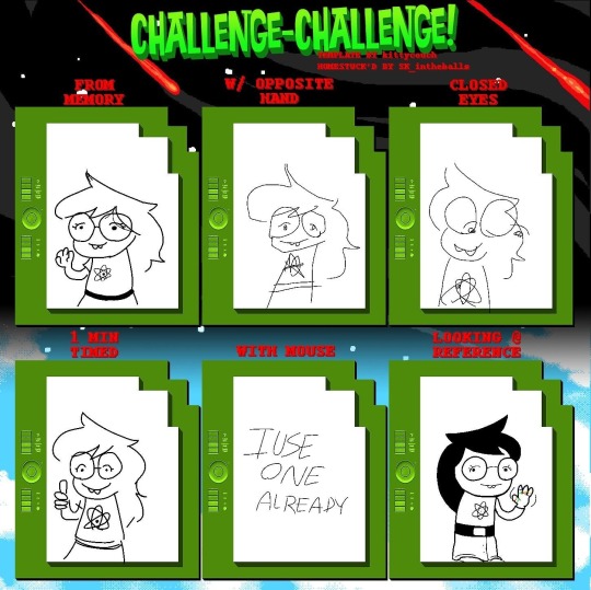

As you can see from the first image, I was using a mouse at the time (and a combination of mspaint and firealpaca) That will change soon enough. Also homestuck =:3
Original descriptions:
I saw this and I thought I can use this as an excuse to actuallly draw homestuck
have this nepeta doodle as well
December 6
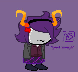
At the time I was really obsessed with making homestuck sprites of stuff (and I still kinda do) so I made this at a request of a friend at the time.
Original description:
@SpringingTraps made me draw metaware homestuck
December 8
Why did I even included this post in here? Well I used to be SUPER inconsistent how I draw myself, so thought this would be a good start.
Original description:
i found that pettting gif website...
December 11
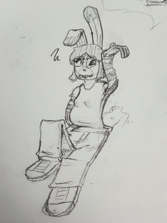
I'll be honest, I wish I didn't post this back then. IDK it's kinda weird looking back on now.
Original Description:
It's #FlatFuckFriday AND my birthday??? Fuck yeah!!! 🥞
December 18

I'll be honest. I have no idea how I did THIS with a mouse of all things. Like how did I do it. In MSPAINT no less. Also I have no idea why I drew myself like this here.
Original Description:
fucking around with faking line weight, so glad I don't have to do this shit when I get a tablet
December 20

Oh look Cave Story, one my earliest obsessions. When this drawing came out, I already have long since moved on from it, but that doesn't mean I can't appreciate it.
Original Description:
16 years of #CaveStory =:]
December 22
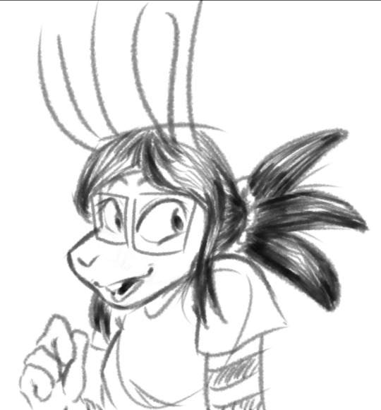
Ah here we go, I finally got a drawing tablet. I got REALLY excited with the pen pressure that I kinda gone overboard with it, but it was nice to use one. (granted I forgot how to draw with a mouse now.) Oh yeah, if you notice a black line on the VERY top of some drawings, that was a bug with firealpaca. I kinda had to live with it for a while.
Original Description:
WOW HAVING PEN PRESURE MAKES A BIG DIFFFERENCE

This was the first real piece I did after getting a tablet. I'm quite proud of it. The context behind this image is kinda funny really. A server I was in was doing a collab where we drew UCN portraits of our OCs or Sona, and I drew something for it. Yes UCN, Ultimate Custom Night. I was in my second FNAF phase at the time.
Original Description:
Let the static flow.
December 23
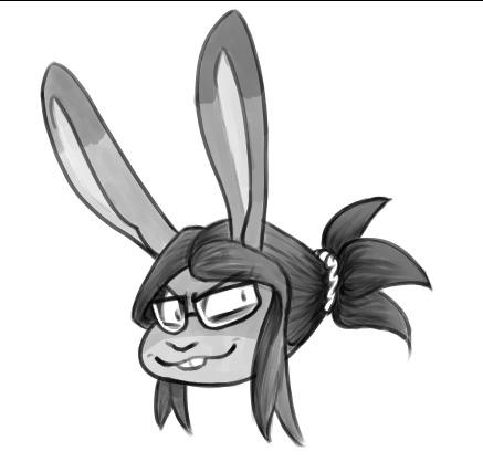
At the time, I used to draw myself with sideburn thingies cause I thought it look cute, but I no longer do that. Also you might be noticing a large about drawing made in a short timeframe. Well I have an explanation for that. You see, I sometimes get hit by these bursts of productivity and I can draw super fast. Sometimes these bursts happen at random, but in this case it was because I gotten a new tablet and new ideas where flowing.
Original Description:
This was supposed to be a sketch...
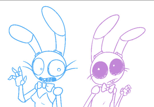
I HAVE LOT TO SAY ABOUT THIS. I was super obsessed with TGWeaver's FNAF comics. It was why I gotten back into FNAF around 2019. But I was fascinated with Toy Bonnie at the time, to the point I started drawing her on the daily. I started using her as an avatar for myself online. It was when I saw a post on tumblr where something made a kinsona when it clicked for me. This rabbit holds sooooo much gender. 🏳️⚧️ Thus ended 5 years of denial over my gender.
Original Description:
some weaver buns
December 24

I tried drawing myself with my hair down here. I didn't like it then. I got better at drawing my hair down though. I was this file was named "cel test" for some reason.
Original Description:
It's me!
December 25
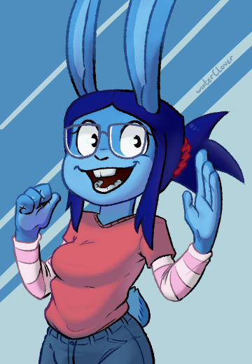
Remember when I said I was inconsistent, here an example. I dislike how this turned out then, I STILL do now. The only thing I do like? This was when I started to shade in this particular way. Also at the time I was worried about being too slow, which is funny when I was posting so many things at once. But also the filename was "the crunch" which is less funny and more worrying.
Original Description:
I need to learn how to do this faster
December 28
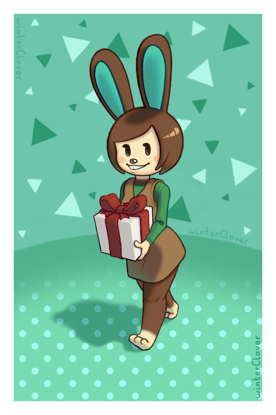
Oh look a Commission! There's nothing special to say about this.
Original Description:
Shaded commission for @Bunnydudee of Carmen from Animal Crossing!
December 29
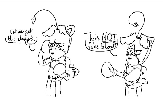


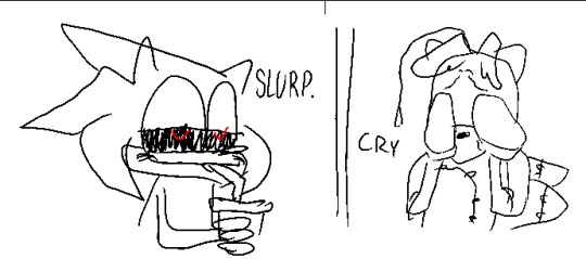
THAT'S RIGHT I DREW SONIC.EXE BEFORE IT WAS COOL. Jokes aside, this post was more so for Tails Doll. I loved drawing that little bugger in the most pathetic and dorky way possible.
Original Description:
Tails Doll's roommate is a wacknut
---
FINALLY we made it thru December. Goodness I posted alot more often back then huh. Kinda surprising. Anyways next week I'll post January!
#my art#fursona#doodles#commission#sona#Clover's Old Art#twitter repost#long post#fnaf#toy bonnie#fnaf bonnie#homestuck#metaware high school#tails doll#sonic.exe#carmen animal crossing#sue sakamoto#ms paint#sorry about the long tag list
6 notes
·
View notes
Text
doing this 'cause I'm already experiencing art withdrawal from my hiatus I've forced onto myself with light encouragement from my friends so here we go
also I realize "game" likely implies some schmo is supposed to be like "please answer #69!" but fuck you I go by my own rules and have fun with it too
LMAO so this computer is only about a year old, a while ago my other computer literally shit itself and died so I used to have paint tool SAI on there but now on this one I legit only have the one I actually use which is FireAlpaca
Forward, but left is easier than right
I used to have this warriors self-insert OC when I was REAL YOUNG named Moonfeather that I still hold near and dear to my heart but haven't made art of in literal years and don't have a concrete design for. yes she was special, yes she could turn into a dragon (???) But if you mean ideas I currently use, Ray's been around since I was 10 so
EDITH LOL drawing little kid her is easy as fuck 'cause she looks almost exactly like kid-Gray but current/teen her is so aids 'cause she has all that dragon shit going on + her hair is complicated
literally I post everything online (that I can ( ͡° ͜ʖ ͡°)) because I need validation there is not a single piece of digital art that I've made that hasn't been posted on the internet (for the most part ( ͡° ͜ʖ ͡°))
my own goddamn trauma. literally half the time I look at an arc a character just had and went "yo the way snarky like came back in a new form with blue reminds me of how my current cat acts exactly like the one I lost" and then I mental boom
gouache (spelling?), that shit's so pretty
literally just made a video about this lmao, the Animals PMV. RIP
if it's a finished piece in the form of a png I name it the piece's title, if it's a WIP art program file I name the file something like "ass" and move on
hoodies.. or scarves. belts are fun too
music or podcasts. sometimes vcs
face/expressions, I fucking LOVE drawing expressions SO MUCH
lotta them undertale/deltarune fanartists are fucking amazing but I've never been into that fandom. Also my husband is super into FNF mods and those are neat too
the little fucking ocean wiggles on fantasy maps y'know the ones
my house/desk lol
fuck idk. the shit I've trained myself to get good at is the shit I've really cared about, however my least favorite part of a piece is lineart
dear god no I HAVE to separate food from that shit, I have enough food anxiety as it is. I watch videos while I eat
not a whole lot actually, I don't distinctly remember doing so pretty much ever
literally fucking none actually. like I legit scoured my art and animation for this shit and couldn't find ANYTTHING. I adore drawing characters so much and anytime I have to draw something inanimate that's not directly clothing -on- the character or weapons it makes me want to kick a baby. broken glass is fun tho I guess???
hands. not that it's easier for me but I like how expressive I can be with em
tybaxel is so fucking amazing but that's like my only answer, not that I don't like other people's art that doesn't look like mine either but that's literally the only example I could think of because I don't keep track of this sorta thing, if it looks pretty I follow. that's my philosophy
lol
not sure what this means actually so no
only rarely for like purposes of poses or perspective. almost all the time my reference window is just a wow screenshot
nothing is coming to me off the top of my head but I have noticed characters or concepts I thought of before I found certain media crops up in said media anyway. like Detective looks very Lackadaisy and I'm not tryna say I'm salty about it I think it's neat actually
any piece with amab characters whose design includes being shirtless. like bro, tree is just chillin'
sometimes I scribble cool/dramatic expressions before drawing but only occasionally
i helped paint a mural in my hometown :D
vivzie's creations, a lot of the character designs are too spiky/thin for me but I understand the stylistic choice
LITERALLY the one I JUST posted based off the song Mama by My Chemical Romance I'm literally in love with it and I don't think anybody saw it fucking rip
anyway yeah fuck it I just felt like doing that lmfao
Weirdly Specific Artist Ask Game
Didn't see a lot of artist ask games, wanted to make a silly one.
(I wrote this while sick out of my mind last year and it's been collecting dust in my drafts, I might as well let it run free) 1. Art programs you have but don't use
2. Is it easier to draw someone facing left or right (or forward even)
3. What ideas come from when you were little
4. Fav character/subject that's a bitch to draw
5. Estimate of how much of your art you post online vs. the art you keep for yourself
6. Anything that might inspire you subconsciously (i.e. this horse wasn't supposed to look like the Last Unicorn but I see it)
7. A medium of art you don't work in but appreciate
8. What's an old project idea that you've lost interest in
9. What are your file name conventions
10. Favorite piece of clothing to draw
11. Do you listen to anything while drawing? If so, what
12. Easiest part of body to draw
13. A creator who you admire but whose work isn't your thing
14. Any favorite motifs
15. *Where* do you draw (don't drop your ip address this just means do you doodle at a park or smth)
16. Something you are good at but don't really have fun doing
17. Do you eat/drink when drawing? if so, what
18. An estimate of how much art supplies you've broken
19. Favorite inanimate objects to draw (food, nature, etc.)
20. Something everyone else finds hard to draw but you enjoy
21. Art styles nothing like your own but you like anyways
22. What physical exercises do you do before drawing, if any
23. Do you use different layer modes
24. Do your references include stock images
25. Something your art has been compared to that you were NOT inspired by
26. What's a piece that got a wildly different interpretation from what you intended
27. Do you warm up before getting to the good stuff? If so, what is it you draw to warm up with
28. Any art events you have participated in the past (like zines)
29. Media you love, but doesn't inspire you artistically
30. What piece of yours do you think is underrated
34K notes
·
View notes
Text
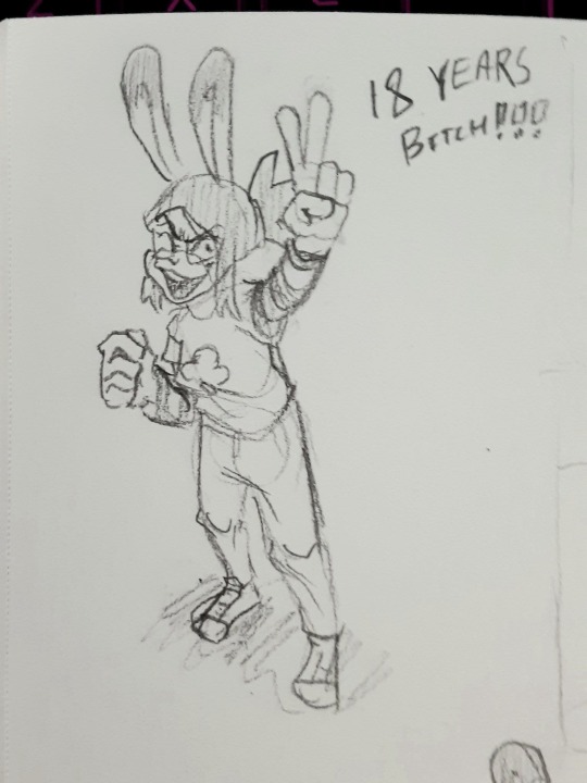
[Happy 18th Birthday]

Drew this for my birthday! And not just any birthday, but one where I become an adult (which is crazy to think about)!!!
I kind of want to make it a tradition to make a birthday design of Crossfire (or at least utilize said birthday design in some way)
For the crowd behind Crossfire, on the left are Crossfire’s friends (in ARMS: NEO DESTINY) and on the right are some of my online bestie (@petrock42clone)’s ARMS OCs ^^
I had a lot of fun drawing this (especially with all the colors and such). I’m also planning on making a speedpaint of this drawing and uploading it to YouTube ^^
Credits
Program Used: FireAlpaca (I used Ibis Paint to sketch it out) Device Used: GAOMON PD1161 (I used an iPhone 13 Pro Max for the sketch) Time Taken: 4 Hours and 3 Minutes altogether
OCs Used
My OCs
Birthday Crossfire (Any Pronouns)
Zapbolt (He/Him, They/Them, It/Its)
Blendercube (They/Them, It/Its)
Sparky (They/Them, He/Him)
Stickerbomber (He/Him, They/Them primarily)
Axel’s OCs
Scarfer (He/Him)
Tracey Doodles (She/Her, They/Them)
Sketchy (He/Him, They/Them)
Kapster Shot (He/Him)
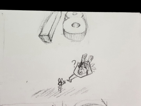
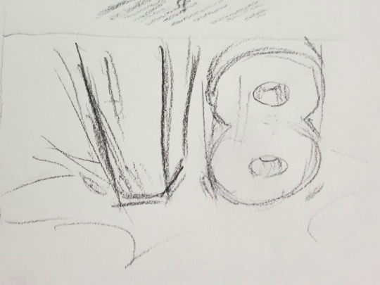
Sketch + a sentimental statement below the cut

Honestly it’s a wild ride I’m on so far, but I’m glad I’m able to make the most of it (and I still have the rest of the journey to go). As for internet years, it’s been over 4 years since I joined the internet and honestly I feel like I have grown a lot as a person (from the first day I joined DeviantART to now).
I’ve had my interests shift, I had some friends and inspos come and go, but the most important thing is that I’m still here with some of the coolest people I have met (even if we haven’t seen each other irl). Honestly I kind of struggled making friends growing up and I didn’t maintain them for long due to my family moving a lot.
The internet really helped me out with maintaining friendship (and is actually home to some of my longest lasting friendships). Not to mention it was so much easier to find people who shared interests ^^
Honestly looking back, I consider my past to be a learning experience. I may have made mistakes, but I either run from them or learn from them (honestly I’m still trying to unlearn to run away from my past mistakes and struggles since I have a bad habit of that).
Of course this is only the start of my art career as one of my biggest goals for 2025 is to open up art commissions ^^
#art#digital art#crossfire drawings#arms game#fan oc#fan art#arms oc#2025 art#birthday art#OC// Crossfire#OC// Zapbolt#OC// Blendercube#OC// Sparky#OC// Stickerbomber#ocs by other people
0 notes