#You selected that colour palette
Explore tagged Tumblr posts
Text
It is sad how many artists call the work they put blood and soul content, while image AI generators call their work art without shame.
#Learn to love yourself#Like dude you are consciouslly creating#You worked for your skills you got the right to call your work art without shame#You selected that colour palette#You created those shadows#You made people laught#scream#and cry#with an image that you allucinated#I know art is subjective but ASDFGTR$EDV
1 note
·
View note
Text

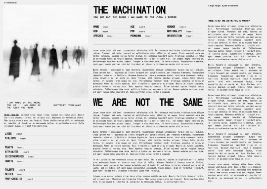
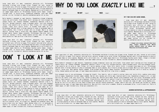

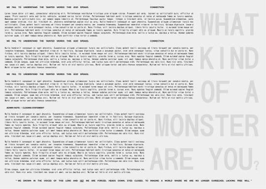
𝖳𝖧𝖤 𝖬𝖠𝖢𝖧𝖨𝖭𝖠𝖳𝖨𝖮𝖭 / 𝗧𝗛𝗘 𝗙𝗟𝗘𝗦𝗛.
/⠀free gdoc template
⠀⠀following my previous posts, a single muse template — based off of themes of machinated and artificial motifs, this is a very minimal template which can be customised mainly by its tables. ⠀⠀<THE MACHINATION / THE FLESH>⠀comes from the various dark-cyber aesthetics i've seen on pinterest. with a lighter almost negative colour palette, it works well with at best two different colours for contrast, but can be customised however you wish. it can fit up to around 4000~ words / 30,000~ characters, meant for those who LOVE to yap and whatnot. ⠀⠀thought of something a little more calm unlike the other two.
⠀⠀⠀⠀𝗖𝗨𝗦𝗧𝗢𝗠𝗜𝗦𝗔𝗧𝗜𝗢𝗡 !
⠀﹙ ✦ ﹚⠀WARNING. messing around with the tables may be difficult and can affect the pages; every border is at 0pt, so revealing the borders for a moment during customisation may help you if you want to play around with the tables without messing anything up. ⠀﹙ ✦ ﹚⠀there are a few drawings here and there ^^. ⠀﹙ ✦ ﹚⠀again if there are images beneath text, you should be able to just right click over them to "Select Image/Drawing", etc. !
⠀⠀⠀⠀𝗨𝗦𝗔𝗚𝗘 !
⠀⠀DO NOT REMOVE CREDIT⠀the main credit source is a small four-pointed star ( ✦ ) either in the header of footer of the first page of my docs. ⠀⠀TO COPY⠀—⠀file > make a copy ⠀⠀TO COPYLOCK⠀—⠀share > settings icon ( ⚙ ) > uncheck "Viewers and commenters can see the option to download, print, and copy"
﹙ ❤ ﹚⠀feel free to like & or reblog
#google doc template#gdocs#oc sheet#rp resources#template#kaikoikei#roleplay resources#themed template#google docs#google docs template#machination#flesh#negative#scifi
473 notes
·
View notes
Text
You cannot tell me Shinobu's pink hakamashita and hakama isn't the same as Kanao's in the final selection, handed-down clothes is peak siblingism actually


I know ufotable did this on purpose because official arts always respects her palette colours and choose any shade of purple for her, but no, they had to put her on the exact same two shades of pink as Kanao's
And if it's truly hers, it would be so cute how Kanao went to examine her demon slayer skills with her sisters' clothes and hair clip (and most probably the katana too).
Moreover, this could also mean that Shinobu was wearing the same pink hakama in her final selection (considering that she is burning her first uniform and she is wearing the same clothes). It would be cool that Kanae was actually the first one to wear that hakama in her final selection and just passed it to her sister, and Kanao wore it to follow the tradition/dress code but this is just a theory/headcanon of mine
#kanao tsuyuri#shinobu kocho#kny shinobu#kny kanao#demon slayer#kimetsu no yaiba#kny#siblings#butterfly sisters#headcanon
380 notes
·
View notes
Text

𝐀𝐍 𝐀𝐄𝐒𝐓𝐇𝐄𝐓𝐈𝐂 𝐄𝐘𝐄
it was one of the few days zayne had returned home earlier than sunset. he opened the door to the apartment to find you painting your nails. after a shower and some short pleading on your part, he was seated in front of you, hands laid out on the table for you to do his nails.
content: zayne x fem!reader; established relationship; small banter! ; greyson apperance; ~1k words a/n: i've been dipping in and out of writing, so i thought i'd make something short to get me back into practice :)
━━━━━━━━━━━━━━━━━━━━━
“Hand tremors aren’t good for dexterity, you know,” Zayne quipped, gazing at your expression as you applied the polish.
You looked up at him through your lashes and he smirked at the flat stare you gave him. With a slight tilt of his head, he enjoyed how animated your reactions were to his remarks. Towel-dried hair brushed past his brows, framing his discerning hazel eyes. Did he always need to be this handsome while poking fun at you? Your hands weren’t shaky before, but they certainly felt so now.
“Oh hush.”
Putting the brush back in the bottle to collect more polish, you reset your focus.
“Just ‘cause you’re a surgeon, doesn’t mean you’d make a good nail artist,” you retorted, bringing your eyes back to your work.
You were currently on the last nail, painting it a navy blue to match the others you already finished. Zayne’s nails were well kept and trimmed short, making for a perfect canvas for you. Whilst it was rare for surgeons to wear polish, he assured that it wouldn’t be an issue so long as it did not chip. He wanted you to do it for him, anyway. Having your undivided attention on him was a perfect way to unwind after a long day at the hospital.
“And what other qualifiers need to be met besides a still hand?” he asked, teasing giving way to curiousity.
You finished up the last nail with a few glides of the brush. “An eye for aesthetics,” you declared, moving the blue nail polish aside and selecting two more colours among your collection.
“Now, pick the colour for the design.”
You presented two colours to him. A cool silver embedded with fine glitter, and a rustic gold. His eyes flicked between the two. Mind having been made up almost the second you asked.
“Silver.”
You hummed. “An excellent choice.” Shaking the polish, the glitter dispersed throughout. “Perhaps you might consider nail tech as a side job, Dr Zayne.”
Waiting for his nails to dry before you could begin the next layer, you lightly fanned them with both your hands. He chuckled—both at your comment and your cute attempt to try and speed the drying process.
“My primary job keeps me busy enough,” he replied. “Besides, I don’t have much of an eye for aesthetics.”
You were reminded of the palette of his closet. Blacks, greys, browns, and the only splash of colour being a deep green shirt. Though somewhat monotone, it did suit him well.
He continued, “I think I’ll leave that expertise up to my girlfriend.”
Your breath caught in your throat. Mouth opened ever so slightly, not wanting to reveal the way every use of that nickname slipped under your skin and made your heart skip.
You began to draw tiny snowflakes on each of them with the silver polish. Zayne admired the furrowed concentration on your face as you were locked into this task. When the design had dried, you finished by squeezing some cream onto his hands. He let out a soft sigh as you massaged it in, feeling the tension of the day release under your gentle touch.
Once you were done, you stretched your arms out and twisting around to crack your back. You held his fingers in your hands, inspecting them.
“Look how pretty they are!” You bubbled.
Zayne was honestly floored. The level of coordination it took to paint something so small was incredible.
“They’re very pretty indeed.”
You were too enthralled by your own work to see the warm smile on his face at how satisfied you were.
“Now, that’ll be sixty dollars,” you said, looking up at him smugly, placing your hands on your hips in waiting.
Zayne lifted a brow. “Do you accept payment in desserts?”
“Hm… an interesting offer,” you placed a hand on your chin in mock thought. “What kind?”
“Will each flavour of macaron at the shop that just opened suffice?” he replied. The sparkle in your eyes signalled that it was more than enough to cover the cost of your service. Promptly, the two of you went outside to resolve his payment. You walked hand in hand, matching one another with freshly painted nails.
━━━━━━━━━━━━━━━━━━━━━
EPILOGUE
At Akso Hospital the next day, peoples’ gazes lingered a little too long on Zayne. As he handed out folders to nurses and gestured to screens when presenting, eyes trailed on his hands. Now, it wasn’t unusual for doctors to wear polish, but it was unusual for Zayne to have it. Another layer of mystery to unravel about the cardiac surgeon.
Greyson entered Zayne’s office to drop off some documents, sliding them towards him on his desk. “Going to some fancy event later?”
Zayne adjusted his glasses, not looking away from his computer screen. “Unless you consider a seminar at the university as fancy, I’m not sure what you’re implying.”
He gestured towards the keyboard Zayne was typing on. “I’m talking about your nails! Don’t tell me you really just got them done for fun?” Greyson asked, incredulous.
“I did.” Zayne splayed his hand out. “Is that so strange?”
“No! Not at all!” Greyon reassured, shaking his head fervently. “They do look nice though,” he admitted. “Maybe I should get their number so I can get mine done too.”
“She doesn’t take up new clientele, unfortunately,” Zayne said, resuming his typing.
At such a quick defence, Greyson immediately clocked who this person was. He was one of the few that were privy to the relationship between you and Zayne, and he knew only you could make Dr Zayne change up his style.
Exaggerating a sigh, he turned to leave. “A true shame! She sure seems talented.”
“I’ll make sure to pass that on to her,” he heard Zayne reply. Though his back was to Zayne, the smile in his voice as he answered was undeniable.
━━━━━━━━━━━━━━━━━━━━━
#odorawrites#love and deepspace zayne#zayne love and deepspace#l&ds zayne#lads zayne#zayne x reader#l&ds zayne x reader#lads zayne x reader#zayne fluff#love and deepspace#l&ds#lads#love and deepspace fluff#love and deepspace x reader#lads x reader#l&ds x reader
834 notes
·
View notes
Text
A Girl Just Wants To Be Spoilt | Leah Williamson x Reader
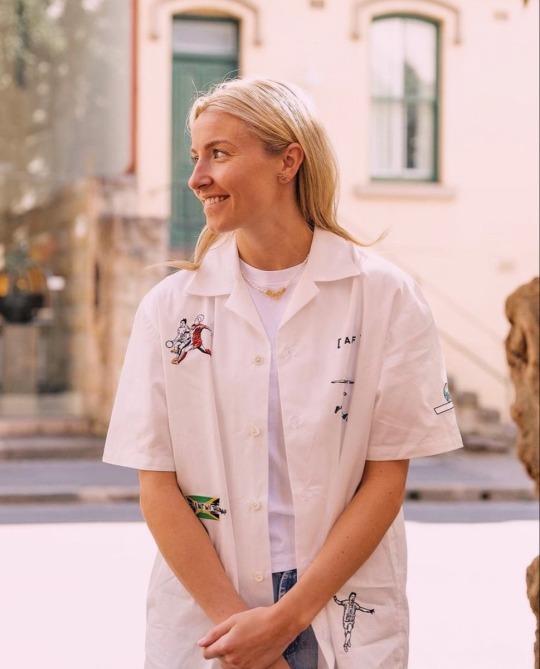
synopsis: just leah handing over her gold amex card. yep.
warnings: none :)
wc: 860 words
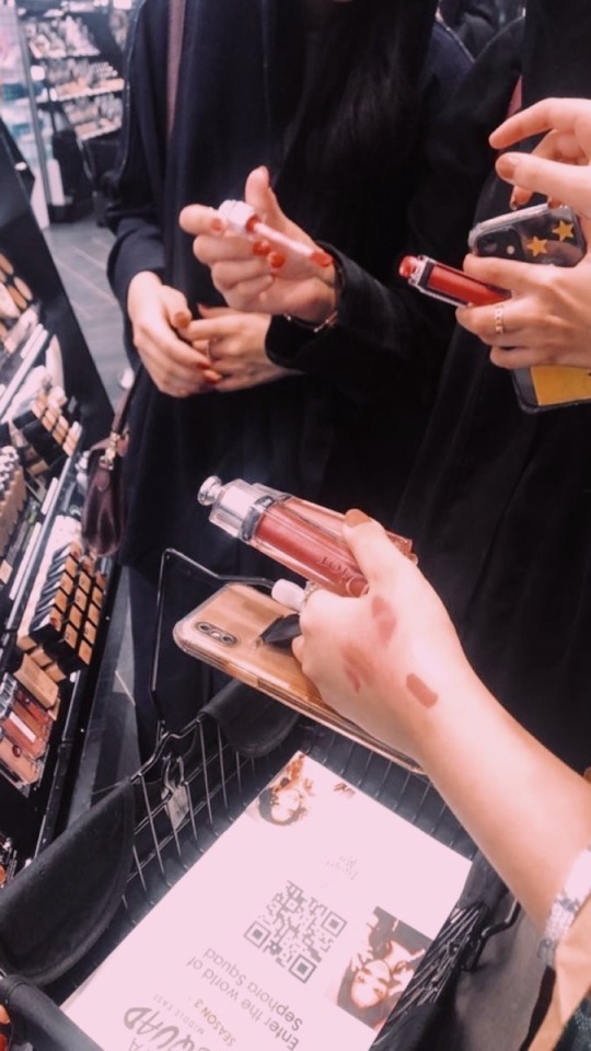
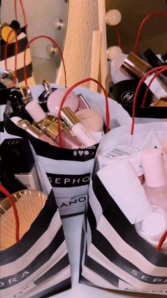
“This is such a waste of time” You hear your girlfriend mutter to herself from behind you, but you pay her no mind. You were far too interested in choosing which lip gloss to get. Leah and you were currently in Sephora because she had to go shopping for a new outfit for an event she is invited to attend later that week. After a quick lunch, you all but dragged your reluctant girlfriend into the beauty store.
Leah didn’t mind makeup, and lately with the media and events that she had to do, she was almost used to sitting in a makeup chair and having a makeup artist work on her face. However, outside of the events, Leah kept her face bare and makeup-free. You, on the other hand, were makeup obsessed. You spent an hour longer than your girlfriend when it came to getting ready in the morning because you had an entire skincare and makeup routine.
“Oi! Quit it!” You playfully slap your girlfriend’s hand away when you see her reach for the open samples of eyeshadow palettes. Knowing how bored your girlfriend was getting, she was probably going to try some shit like wipe the eyeshadow on your arm or something. The blonde pouts, but follows dutifully behind you when you move over to the other section.
“Oh this one’s quite nice” Untwisting the lipgloss sample, you glance the back of your hand only to frown when you see that there is no space to swatch the product. Checking the other hand, you see it’s already full of other lipstick and lipgloss swatches too.
You were just about to put the lipstick down when your girlfriend practically thrusts her own hand out in front of you. “Use mine”
“Thanks, baby” Giving her a sweet smile and a kiss on the corner of her lips, you happily swipe the lipgloss wand on the back of her hand. You tilt your head, inspecting the colour before you shake your head. “That’s a nice colour…but would I wear it often?” You mutter more to yourself.
Turning back to the wide selection of lipglosses, you pick up another tube only to swatch the sample on the back of the blonde’s hand again. Leah rolls her eyes. “what, am I just your personal tester now?”
You turn to your girlfriend, patting her cheek lightly before kissing her right on her pouty lips. “you did offer, baby.”
Leah rolls her eyes at you but you can see a smile forming. “Whatever. Make it quick”
“Which one should I get, Lee?” You hold up two lipglosses. Instead of an answer, Leah only looks at you with one sharp eyebrow raised. “Is that a trick question?”
Your eyebrows furrow. “What is?”
Your girlfriend gestures to the lipglosses in your hands. “They’re the same fucking colour, darling”
You wave the two very different colours of lipglosses in the air. “They are not– this one’s more peachy and this one is more pink. Now pick one for me, please! I only want to get one since it’s so bloody expensive”
The blonde groans, and runs a palm down the side of her face like this is the most tedious task in the entire world as if she doesn’t chase a ball for a living.
Before you could say another word, Leah grabs both of the clearly different lipglosses from your hand and then turns to the selection of lip products on display. She grabs a few more of the tubes in different shades, chucking them in the basket without even a second glance, and then makes a beeline straight to the checkout counters.
You jog to catch up to her, just as she greets the lady at the counter. “Lee, I only wanted to get just one–” You reach into the basket, intending to pull out the other twenty products that weren’t the ones you came into Sephora to buy.
But Leah grabs your hand, halting your actions. She brings out her wallet from her back pocket. "Nothing to worry your pretty little head about, baby. I've got it– and since I'm paying, we’ll take it all” She smiles at the lady at checkout, nodding at her to continue scanning what was probably the ninth lip product by now.
You didn’t even want to glance at the screen as it totals your purchases– it was probably close to half of your monthly rent. You suddenly found the floor much more interesting.
“…the lady needs your card, darling”
Your head snaps up. You stare at your girlfriend, eyes wide in bewilderment. Did her shiny gold amex card ayment not go through? Is she making you pay for— a quick glance at the screen— £400+ worth of lip products? Is she playing some sick joke by making you pay for it after realising she doesn’t want to spend four hundred pounds on lip products that weren’t even for her—?
but it’s as if your girlfriend can read your mind, because all she does is chuckle and pull you close with an arm around your waist. Leah leans in right by your ear and whispers “your Sephora rewards card, baby. wouldn’t want those points to go to waste”

(also i might’ve changed ending after posting lol so if you read the OG ending, lucky you but shhhh!)
bro leah in a suit lately got me feeling some type of way. she's definitely the type to spoil her partner in every way thanks to that dyson headphones check 💰
might start doing these shorter blurbs more often :))
-- kisses, butter.
*This work is my original creation. Please don’t copy, share, or translate it without asking for my permission first. Thanks for respecting that!
#leah williamson#woso#woso community#woso fanfics#woso x reader#leah williamson x reader#woso imagine#leah williamson imagine#woso blurbs
1K notes
·
View notes
Text
Dragon Age: The Veilguard Q&A Notes Part 2
There are "fade-touched" enemies in Arlathan.
The detonation combos are meant to create a feeling of teamwork.
You can select both your pronouns and gender separately. The character creation is extremely deep. There was a focus on skin tones done respectfully!
They are actively looking into developing a photomode for the game.
The ability wheel does have a capacity. You can choose three abilities for Rook, and three for each companion. This means strategizing is important before the mission. There will be an "ultiamte" ability associated with your class. There are also runes that can be used as temporary buffs.
There are "Frost Nova" and "Meteor" abilities similar to "Cone of Cold" and "Fireball" in the past.
They have spent time on accessibilty features, but will not share details until closer to launch.
It's been about ten years since the events of Trespasser. Solas's ritual has taken time to set up, and Rook is coming in at the end of that.
In Thedas, ancient elves go bald after a millennia. Solas was not always bald! "If you see Solas in the past, he will look different."
Companions have specific colour palettes and styles, but you can modify them.
518 notes
·
View notes
Text
has this ever happened to U?

sometimes when ur working on a drawing in mspaint, it will start to inexplicably consider a colour u have used as a new, separate colour, even though its exactly the same. i don't know exactly what will cause it, but i figure it might have to do w/ transparency. it never happens right out the gate, typically happens if i've been working on a drawing for a while.
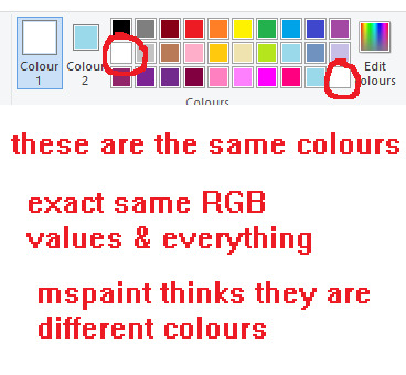
its worth noting any colour can be added to the third palette row again even if it already exists in the default palette so that alone isn't an indicator that this is ur issue. if you use custom colours a lot, double check their values too.
anyways, its anoying ... as f*ck. thankfully the solution is rlly simple.
select your entire canvas, cut the drawing and re-paste it back in. this should get rid of the problem for every colour on ur pic. saves a lot of wasted time fixing each individual area.
this will work regardless of what colours u have selected as col1 and col2. it will also work regardless of whether you have transparency on or off.
#i might put this on tgcg eventually since i got my other tutorials/tips over there#ms paint#mspaint#chatlobz
287 notes
·
View notes
Text
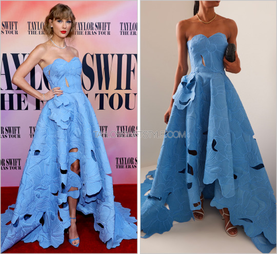
Eras Tour Film premiere | Los Angeles, CA | October 11, 2023
Oscar de la Renta 'Cutout Floral Gown' - $11,990.00 $5,995.00
In my predictions post for this premiere on the TSS Patreon I selected a different dress by Oscar de la Renta (a longtime favourite designer of Taylors) and noted that my ideal styling with said gown would be a "red lip and pinned faux bob with tons of bangles and chandelier diamond earrings ... for an old Hollywood glam feel."
Needless to say, I support and love this outing.
It's dramatic and ladylike while also honouring and extending the #1989Blue precedent she set during the final stages of the U.S. 2023 leg of the Eras Tour. Dressing to a colour palette is a perfect connector and reminder to bridge both the event at hand of the concert tour movie and her most pressing upcoming record with 1989 (Taylor's Version) set to release on October 27.
All in, this is a beautiful gown and perhaps one of her best appearances ever. The elegant styling (dainty rings and eye-popping matching diamond tennis necklace and bracelet) were the perfect choices. And maybe I'm just jealous that Taylor is someone who can pull off blue eyeshadow (any other brown eyed girls who were told that blue makeup would make your eyes pop and subsequently did not look like Taylor Swift when you tried a powder blue shadow look? anyone? just me?).
Designer Fernando Garcia also noted during the Resort 2023 collection's presentation that "cut-outs have become a go-to for our customer". The ones on this gown feel like an organic nod to the spliced crop tops that were signature to the original 1989 fashion run in 2014. But here, they're more organic and integrated into the design - a natural part of fully blossoming some might say. And if you missed the subtle cut-out nod, there's always the faux bob that might double take you into believing you were back in 2014/15 and also nods to the messy, slightly undone style seen on the 1989 TV cover.
As backstory, it should surprise no one that this particular collection happened to debut on June 13, 2022 at (where else) the New York Botanical Garden.
Worn with: Cartier necklace + Anabela Chan bracelets, Cartier studs + Cathy Waterman + Akillis + Anabela Chan rings, and Giuseppe Zanotti heels
1K notes
·
View notes
Note
Can I have orange blossoms with jade leech for eternal love and marriage please? Thankyou!
is it love or just really nice flowers?
Pairing: Jade Leech x gn!reader
Synopsis: jade likes giving you flowers, it probably doesn't mean anything special though... right?
Tags: fluff, pining, slowish burn, eels are cowards, mentions of marriage, reader likes flowers
Word count: 1.2k+
Notes: thank you for requesting anon!! i had a lot of fun squealing when writing this one hehe
Masterlist

flower of choice: orange blossoms
orange blossoms symbolise eternal love and marriage, and they are often used in wedding ceremonies as symbols of purity and eternal love

You suppose it all started on your first Valentine’s Day in Twisted Wonderland.
As a member of the Mostro Lounge staff, you found yourself amidst the bustling atmosphere of the Mostro Lounge, where Azul's ambitious plans to capitalize on the love-filled holiday were in full swing. The lounge pulsated with the presence of couples occupying every available table.
Soft, dim lighting cast a warm glow over the space, enveloping everything in an air of intimacy and mystery. The gentle hum of conversation and laughter filled the air, mingling with the smooth melodies of jazz music drifting from hidden speakers.
Couples nestled into plush velvet booths, their faces illuminated by the soft light, lost in each other's eyes and whispers. Waiters moved gracefully between tables, delivering trays adorned with exotic beverages and plates of delectable meals, their steps silent against the plush carpeting.
But what caught your eye the most were the bouquets given to significant others, adorning the tables like precious jewels. Each one was a masterpiece in its own right, meticulously selected and arranged to convey the deepest sentiments of adoration.
"It must be nice receiving flowers…" you murmured to yourself, lost in thought.
“You would like to receive flowers?”
You snapped your head around at the sound of Jade's voice, finding him with a curious expression on his face. Surprise flickered in your eyes at his question, but a smile bloomed on your lips as you considered receiving flowers from someone.
“Yeah," you replied, a hint of longing in your voice, "who wouldn't? Receiving gifts makes you feel so appreciated. Plus, who wouldn't be happy looking at something pretty?"
Jade took a moment to mull over your words, his gaze thoughtful. Eventually, he nodded in agreement. "Hmm… I see. That does sound quite lovely," he acknowledged.
The conversation was quickly cut short when new orders and tasks arrived. In the whirlwind of never-ending tasks, the conversation had slipped from your mind almost entirely, until he appeared later that week, returning from a hiking trip with a delightful surprise in tow.
"Here, Prefect," he began, his voice gentle as he produced a bouquet of orange blossoms from behind his back. "These are for you," he offered with a soft smile.
The bouquet was a sight to behold, a delicate ensemble of ivory-hued blooms that exuded an ethereal beauty. Each flower boasted star-shaped petals, arranged in a symmetrical fashion around a central cluster of stamens. These stamens, adorned with tips of yellow to orange hues, stood out like tiny flames amidst the pristine white petals, adding a touch of vibrant colour to the otherwise pure palette. With their intricate details and subtle fragrance, the orange blossoms seemed to radiate a quiet elegance, captivating all who beheld their serene charm.
You couldn't help but notice the faintest flush of pink tinting his ears, and your own heart skipped a beat in response. You were well aware of the symbolism behind orange blossoms—eternal love and marriage. But surely, Jade couldn't mean that, could he?
"You brought these for me?" you asked, a mix of surprise and delight colouring your tone.
Jade nodded, a warmth spreading through him at your delight. "Yes, I thought you might like them," he admitted softly.
As you accepted the bouquet, a rush of emotions flooded over you. The delicate scent of the orange blossoms enveloped you, filling your senses with a sweet, intoxicating aroma. Mesmerized, you found yourself unable to look away from the vibrant blooms, each one a masterpiece of nature, without a single flaw in sight.
Jade's gaze remained fixed on yours, his expression tender and sincere. It was as though he was studying your reaction with unwavering attention, and a flutter of anticipation stirred in your chest at the vulnerability he revealed.
"Thank you, Jade," you said, your voice barely above a whisper but filled with sincerity. "These are beautiful."
A relieved smile spread across Jade's face, his eyes alight with a mixture of joy and relief. "I'm glad you like them," he murmured, his voice tinged with warmth.
Though you’re not sure why, Jade had made it a habit to always bring back a bouquet of orange blossoms for you from his hiking trips.
"It doesn't really bother me," he'd say with a closed-eye smile, "since it's on the way."
Each time he presented you with the blooms, your heart fluttered with joy. Yet, you hesitated to believe there were underlying intentions behind his gift. After all, Jade had always been kind to you, and you couldn't fathom the idea of him harbouring romantic feelings.
As the end of his third year at NRC approached, a bittersweet anticipation filled the air. The impending farewell weighed heavy on your heart, mingling with a sense of melancholy. Although Jade promised to visit during breaks and holidays, the thought of no longer seeing him every day stung with loneliness.
Summer break was nearing, and the campus was buzzing with students bidding farewells and exchanging hugs. Amidst the flurry of goodbyes, Jade sought you out, as he always did, with a bouquet of orange blossoms cradled in his arms. His smile was tinged with a hint of sadness as he approached you, and you felt a lump form in your throat at the sight of him.
"These are for you," he said softly, his voice barely above a whisper as he handed the flowers to you.
You accepted the bouquet with trembling hands, the weight of the moment settling heavily upon you. The sweet fragrance of the orange blossoms enveloped you like a comforting embrace, but it did little to dispel the sorrow that threatened to consume you.
"Thank you, Jade," you managed to say, your voice choked with emotion.
“I... I don’t wish for this to be the last time I give you flowers,” he confessed softly, his eyes searching yours with earnest sincerity. “Will you really not consider marriage with me?"
A heavy silence hung between you, each moment feeling weighted with unspoken words and unexpressed feelings. Then, Jade reached out to cup your cheek, guiding your gaze to meet his.
Caught off guard by his heartfelt plea, your eyes widened in astonishment. "Jade, I... I never realized... You…"
"But you knew, didn't you? You must have..." Jade's voice trembled with vulnerability. "Every flower, every gesture—it was all for you."
Your mind raced, memories flashing before your eyes like a vivid tapestry woven from moments shared together. Each bouquet, each flower—he had poured his heart into every gesture, his feelings hidden in plain sight all along.
Tears shimmered in your eyes as understanding washed over you like a gentle wave crashing upon the shore. The pieces of the puzzle fell into place, and you realized the depth of his devotion, the sincerity of his love.
“Yes, Jade," you whispered, your voice barely above a breath but filled with certainty. "Yes, a thousand times, yes."
The next thing you know, his lips are pressed against yours in a tender, passionate embrace. In that fleeting moment, the world around you faded into insignificance, leaving only the warmth of his touch, the sweetness of his kiss, and the promise of a love that would endure through every trial and triumph.
Masterlist

if you liked this post, don't forget to reblog!
#jade “oh prefect likes flowers they can understand what im trying to convey... right?” leech#hehehe lovesick silly eel who does everything except confess is my favourite#✧2k! blossoming bouquets✦#twstnexus#twisted wonderland#twisted wonderland x reader#twisted wonderland jade#twisted wonderland jade leech#jade leech#jade leech x reader#twst jade#twst jade x reader#twst jade leech#twst jade leech x reader
566 notes
·
View notes
Text
⋆₊˚⊹♡ alastor + dressing you

character: alastor warnings: 18+ for mature themes (no smut) minors do not interact, fem!reader, pet/master dynamic, toxic relationship (possessiveness; reader is nothing more than a silly little doll for alastor to play dress up with), implied size difference, a hint of blood words: 1.1k


Alastor is a creature of habit, a man of routine. He has his daily rituals, his rigorous schedules, his lists of tasks, all performed to perfection each and every day.
And Alastor likes to begin his mornings in a very specific way.
You know the procedure by now inside out, upside down, could recite it backwards, if he so desired you to.
By the time he wakes you, he’s already laid out your outfit for the day; intimates, dress, socks, accessories, all spread in an immaculate flat lay on his seldom-used bedspread.
You are always expected to adorn yourself with the garments he’s selected, to pull on each and every piece all on your own, fabrics lovingly caressing your exposed flesh as his gaze slithers after the material, leaving burning smudges on your skin.
But, of course, you can never do it all completely right—not like Master can.
Because it always ends the same, this little morning sacrament: with Alastor fussing over you—straightening out a bow, smoothing out a wrinkle, tugging up a sock, readjusting a sleeve.
There is always something wrong he has to fix, to make perfect.
And the finishing touch, the finishing touch is always for Master to add.
A leather collar, as red as his eyes and adorned with a heart-shaped tag, his name in an elegant scrawl engraved in the platinum. He’s always so tender when he fastens it around your neck, after he has thoroughly approved of your dressing for the day, more tender than you’d ever thought him capable of; more tender than he ever is otherwise.
It’s all just another way he claims you, degrades you, announces that you are his—his to decorate, his to desecrate, his to do whatever the fuck he wants with you.
That pretty little silver heart that rests so daintily against your clavicle, that rises and falls and glitters with each of your gentle breaths, will never let you forget that.
Today, as it is with most days, he has chosen a white colour palette.
Sitting in his usual armchair with his legs crossed, folded hands resting in his lap, he watches as you undress in front of him, left vulnerable and raw to his gluttonous glare. It stings, his gaze razored and slitting into your skin, prickling as it rakes over your unprotected form, leaving you feeling hypersensitive, overexposed, like he’s stripped away some fundamental layer and left you barer than bare.
Yet to the untrained eye, he would appear only mildly interested, possibly even teetering on indifferent, but you know him better than that.
You are not the untrained eye—not anymore.
You know that the glowing in his gaze is brighter, bolder and more brilliant than normal as he sharply catalogues every action—pretty silk slipped off, dainty lace sliding on.
You know that his pupils are abnormally large, having gnawed away at his irises in their attempt to consume the scene in front of him—a scene he’s witnessed a hundred times before; a scene he never tires of nonetheless.
You know that his smile, usually sharp and stretched, is a little bit softer around the edges, a little bit sweeter as it seals hungry teeth behind curled lips.
His chest swells and deflates with calm, even breaths, his unblinking gaze holding yours for a moment—in, out, in, out—and you stand still as a statue, waiting.
Such a good little pet he’s got himself.
He lets the moment linger for a little, basks in the exquisiteness of your obedience, allows that sweet suffocation of your compliance to grow until it’s nearly unbearable, until you’re struggling to keep stationary under his unrelenting stare, until the weight of it is crushing, compressing your ribs, flattening your lungs as you anticipate his approval.
Finally, he nods, and then, you begin.
First, the intimates; pure snow-white lace encrusted with tiny crystals, dainty material skimming your flesh in a faint caress, clinging to your supple curves as you fasten hooks and adjust waistbands.
Next, an ivory milkmaid dress, complete with cinched puffy sleeves and a sweetheart neckline, the corset top outlining the natural lines and bends of your torso, skirt flaring slightly at the hips and flowing into loose pleats around your thighs. Little white flowers detail the garment, embroidered in silk across the linen, blooming with each of your graceful inhales.
Then, a pair of white thigh-high nylons to garnish the outfit, adorned with tiny white polkadots, sleek and sheer as they hug your legs.
He doesn’t miss the ripple of chills that follow after his eyes as they glide up your body, trailing the curled knuckles hooked in the band of your stockings. Nor does he miss the delicate shiver that dances up your spine, or the tensing of your muscles as you linger in limbo beneath his stare, anticipating his next order.
No, he witnesses it all.
And he smirks, huffing out an airy snort, your frame flinching with the sound.
“Does my gaze make you uncomfortable, dear?”
“No, Sir, of course not,” you respond immediately; well-trained, obedient.
“No? Then why has your body gone rigid beneath my eyes?”
“I just—” you begin, faltering a little, a small frown on your face.
Suddenly, he rises, stalking toward you calmly, both hands clasped behind his back. That infamous collar, held securely in his grasp, jingles with each of his steps, such a delicate sound for something so sinister.
Stopping an inch or two from your face, your head snaps up, the motion instinctual, eyes wide and subservient—searching for guidance, awaiting your orders like the good little girl you are.
A palm wreathes around your jaw, points of his claws pressing into your cheeks as he forces your head up further, revelling in the soft pained yelp that hitches in your throat, tangling on a gasp.
“Do you feel like a piece of meat, on display for your owner?”
“Y-Yes, Sir.”
Crimson searches your face, slow and scrutinizing, lids narrowing slightly as his smile sharpens.
“Nothing more than a pretty little prize to be paraded around on my arm, proudly and in public?”
“Yes, Sir.”
Leaning down, he grinds his forehead into your own, inhibiting your gaze from fleeing his, neck bent at an unnatural angle as he looms over you. He stares at you for a moment, scarlet so bright it hurts to look directly into, so brilliant you’re sure it’ll leave sunspots blotting your vision when you finally look away, but you don’t dare to blink.
Slim fingers flex around your jaw, tightening, and his claws pierce your cheeks—shallow little pricks that’ll be unnoticeable in a few minutes, dots of blood rushing to fill the tiny dents. His tongue laves over each in a single, slow drag, wide and wet as it cleans the wounds and streaks his tastebuds with copper, sealing them with a thick salve of saliva before pulling away.
“Good,” he finally murmurs, the word a puff of breath wafting across your face, warm and woodsy. “Because you are. And Master likes for his things to look presentable.”
#alastor x reader#alastor x you#alastor x y/n#hazbin hotel x reader#hazbin hotel x you#hazbin hotel x y/n#alastor smut#alastor headcanons#inky.alastor#inky.hazbin
420 notes
·
View notes
Note
May I ask, how do you choose your colours? The art you make is utterly stunning, and I'm just wondering how you are able to choose a colour palette
thank you! i think colours is mostly based on vibes. i don't use any set palettes and i always just experiment and change stuff many times (by selecting my colour with magic wand tool and then using HSV slider).
something that i really try and keep in my mind is that colours can look very warm or cool comparatively without moving that much towards blue or orange simply by changing the saturation of a hue (colour temperature).
here's a tutorial i made on something i do called 'hue shifting'
its really just vibes and experimenting over a long period of time and atp i barely think about it at all and i just do silly fun stuff
thank u bye bye
117 notes
·
View notes
Text
A few people have asked me about kitbashing art from retrograde minis so I decided to make a tutorial on it!
First off I recommend installing paint.net, I find it has everything I need for what I make but as long as you have some sort of art program that has layers it will work. But I'll be showing stuff in paint.net since its what I know. Here's the link to paint.net, its free! https://www.getpaint.net/ First step you need to do is to make sure antialiasing is off, just select the paintbrush or eraser and select the following two options:


This will give the paintbrush and eraser a hard edge, which are vital to working with pixel art. Heres a comparison:
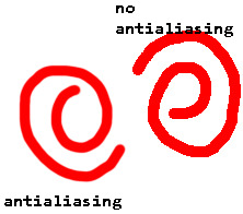
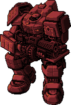
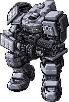
Now we can get to the actual kitbashing. There are two methods I know of, the first is the one I primarily use and the other my lovely girlfriend @gay-dollish-catgirl uses. Both are useful for different circumstances so I encourage mixing them up! The first method is what I called layer and erase and I find it is the easiest. First get the two colours you want for your mech, usually the base colour and then the accent colour. You can get these by downloading from retrograde minis, taking a screenshot of the web page, or using the All++ option if you have patreon membership, which I personally recommend to support the creator! For this example I'll be using this tortuga in platinum and scarlet:
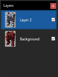
I recommend fiddling around in paint.net to get used to the tools, especially the magic wand tool, I could do a tutorial on that alone, and if anyone wants that I can! For now we will focus on the kitbash. Next you want to put these in the same image and layer them on top of each other. First add a new layer, which you can do in the layer window here:
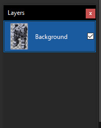
This will create a new layer above the selected layer, which you can then drag around above or below the existing layers. Next, take your other coloured mech and place it above or below the current one, with the base colour you want being above the accent layer. In this case I want the platinum to be the base colour and the scarlet to be the accent so Ive organized them like this:
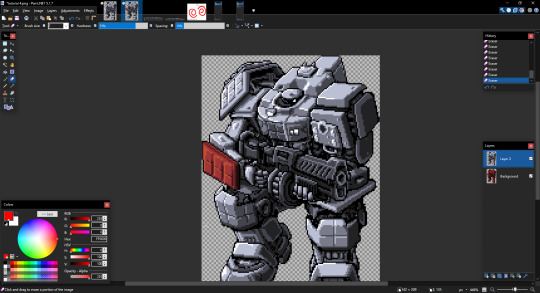
Now we can actually get to doing the kitbash, and from here its simple. All you do is erase from the base colour layer to reveal the accent layer underneath, make sure you have the base colour layer selected too, other wise it will seem like nothings happened... that happens to me a lot. But if you did it right erasing the top layer should reveal the bottom layer and cause it to show through like so:
From there just continue to do so for any other parts you want to be the accent colour
Once you have all the parts you want coloured done, merge the layers together with the following button:
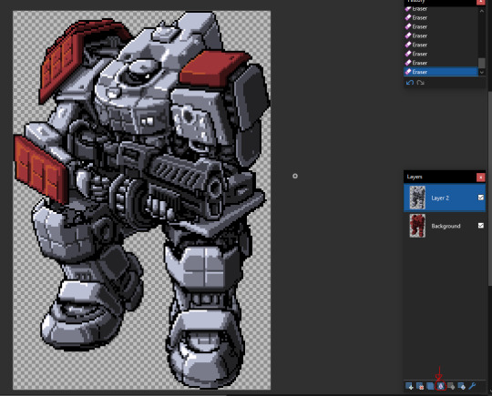
Once its merged you can just start over with a new colour, doing the same technique to continue adding to the mech until you are happy with the end result! I recommend experimenting with the tools and shortcuts in paint.net! Now for the other method which admittedly I'm not as good at but I wanted to show off anyway! This method involves creating a colour palette and manually replacing the colours. First find the part you want to replace, which in my case is the top of the mechs head

If you look at the colours on the head you can see there are actually only really 4 different colours, which if I colour them differently you can see:
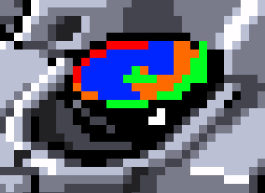
It looks a bit weird but can help visualizing that there are only 4 different colours. What you then need to do is make a palette of 4 different colours to replace the existing one. This can be done several ways, by taking the existing colours and tweaking them, taking them from another image, or just playing with colours and eyeballing it. I find the first option to be the best for me
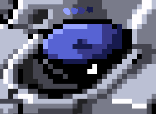
Eventually youll get something like this! It will take some time fiddling with colours to get it exactly right but once you do you can make some pretty funky looking colours with this technique! As an end note be sure to save the files in PNG and not the PDN format, the PNG format is more widely supported, and PDN should only be used when you want to keep the layers, which can be useful if you want to reuse stuff from a mech for later! once again Im not an artist, so Im not sure how helpful this will be, but if it gets a few more people making mechs then that is my goal! If anyone has any questions please feel free to send me and I'll answer them as best I can! If anyone makes any mechs using my techniques please lemme know so I can check them out and reblog them too!
57 notes
·
View notes
Note
Hey there, I adore your art, thank you for sharing it and joining us on tumblr. Your Ghoap art makes me feel so soft.
I am curious about your rendering process. I like how your pieces are textured and coloured and the 3 dimensionality of it, is there a chance you'd be open to sharing some of the steps you take to get from sketch to the finished product? For example what methods (if greyscale, selection tool, etc.) and brushes you use? How you pick your colours?
No pressure in answering this of course, I am just glad to see what you'll be up to in the future.
Hellooooo thank you so much for your kind words!! I've actually been getting so many nice notes from people, I'm so sorry that I haven't responded to them much, I promise I read every single one and shed a little tear of joy at how nice you all are!
Now to the question!!
I made a little step by step image of one of the portraits I posted here for you with a bit of commentary underneath! I'm sorry if it's the ramblings of a mad-woman I'm a bit all over the place sometimes haha (I'm so sorry if there's typos, please ignore them)
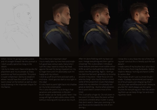
I'll also answer the direct questions here since I don't think I addressed them TOO directly in the image.
Methods: I work with soft brushes and the lasso tool for 90% of my process! I introduce textures as well obviously but I try to let my soft brushes do most of the work. A lot of that 'soft' look people tell me my art has just comes from subtle colour shifts and general softness achieved that way over working with harsher textures. I generally like to limit my layers somewhat, especially with simple pieces like the one above. That image is actually just a single layer after step 2! It helps me not get too stuck on one area but I also just... draw on the wrong layer very frequently even if I name them so I don't use them unless I'm working on pieces with different layers of depth (fore-/mid-/background etc.) I do check my values *constantly* (I use the colour-proof setup in photoshop) but I don't work directly from greyscale. I go straight into colours from the sketch.
How I pick colours: I do try to keep my colour palette cohesive and a bit more neutral to start with. I try to avoid extremes at the start so I'm not locked into that too early since it makes that 'subtlety' harder to achieve otherwise. For those colour shifts I talk about I just pick whatever base colour I put down and then shift the colours accordingly! Brush modes/layer modes can also help but I definitely recommend looking a bit into colour theory before relying on them TOO much! Otherwise using them will also end in strange results. There's no direct 'formula' I use when choosing colours since every light scenario is unique and will affect colours differently. I would definitely recommend James Gurney's book on Colour and Light!
Last but not least! If you're more of a visual learner and my rambling is a bit much in written form (I'm so sorry, I'm very chatty I know) I also have a few painting processes up on YouTube c: So if you want me to shut up and just watch me struggle instead then here's a link to the painting that started it all, the OG ghost soap piece I did over a year and a half ago: https://www.youtube.com/watch?v=D76X0MT4W5U
I hope that all makes sense!! I'm still super new to Tumblr but I'm always happy to ramble on about art so! Thanks for reading my rant haha
#sorry this is long#but#art advice#i guess?#but you do whatever you want#I'm not your dad#answered asks
152 notes
·
View notes
Text
──── 𝑺𝒐𝒐𝒕𝒉𝒊𝒏𝒈 𝑰𝒏𝒌


To treat an ailment, you first had to identify a cause and enact treatment to better the patient’s physical or mental state. After years and years of knowing him, it was lucky you were the best doc-tor around to care for him.

𝐏𝐀𝐈𝐑𝐈𝐍𝐆 ── Zayne x F!Reader 𝐖𝐎𝐑𝐃 𝐂𝐎𝐔𝐍𝐓 ── 2.0k 𝐓𝐀𝐆𝐒 ── Fluff, caretaking 𝐁𝐄𝐓𝐀 ── @sgt-seabass 𝐀𝐍𝐓𝐇𝐄𝐌𝐒 ── American Beauty by Thomas Newman 𝐀𝐎𝟑 ── HERE 𝐀𝐔𝐓𝐇𝐎𝐑 𝐍𝐎𝐓𝐄 ── I am a caretaker by nature, and this just wouldn't leave my mind, like at all.

─── 𝑳𝑨𝑫𝑺 𝑴𝒂𝒔𝒕𝒆𝒓𝒍𝒊𝒔𝒕 ───


The evening was slow — echoed car horns and shouts from people in the streets below quietened by the height of Zayne’s apartment. It had only been twenty minutes since you received a text from him stating simply that he would be home shortly; no emojis or tone conveyed, which only meant that it was a long, long shift.
Surgeries were abundant, you knew this for sure as you watched Zayne come home for only a few hours at a time, wiped and exhausted to only get a few hours of rest before he would be called back for another critical case or life threatening surgery.
It was worrisome, and the tight feeling in your chest as you observed his hunched shoulders and the growing, dark bags beneath his hazel eyes only worsened. You knew that his reserves were beyond depleted, and the determination to make him put himself first — for once — was overwhelming.
With that in mind, you hummed and hawed, deliberating how best to pause the world he lived in, just for a little while. “Candles…?” The clink of glass jars against each other filled the silence of his bedroom. You looked around you briefly, stopping only to stare at the comfortable couch that was pushed up against the floor to ceiling window, and it hit you. “Candles,” you repeated more certainly, a smile pulling at the corner of your lips.
The couch would serve as a resting haven — piled high with cushions, pillows, and blankets of the fluffiest and softest varieties. The warmth would be irresistible to Zayne, it was one of the few weaknesses he willingly showed to you, and there would be no use in letting that information go to waste. Beside the couch was a small coffee table, where you placed your tools of choice.
A simple array of make-up brushes and a selection of eyeshadow colour palettes sat neatly in place — the thought of the ebony ink drifting across Zayne’s pale skin made you shiver with anticipation. It was yet another weakness of his: the gentle touch or brush of your fingers over any part of his body, but most notably his neck and jaw.
“You’re gentle,” he’d said once, and in an undertone, low enough you almost didn’t hear, continued with, “more than I would be with myself; more than I deserve.”
That train of thought earned him a hard kiss to silence the words.
From then on, the thought of decorating Zayne’s skin with designs and patterns grew more appealing. Nothing too brash and large to overtake your canvas, but delicate and beautiful, to match the wound fibers of his existence.
The flicker from behind the curtain caught your eye, and the warm white lights that cascaded down from the ceiling grew sharper. “I could use those…” You stepped closer towards the curtain, and gently moved a few hanging strands out from behind the fabric. “As my light source.”
A click from the lock of the front door caught your attention, then the soft click of dress shoes on tile followed soon after. “Darling?”
“I’m here,” you called, rushing from his bedroom and then into the hall to greet him. Only you paused in slight shock — it was so much worse than you could have imagined.
Zayne was drawn, his face pale from exhaustion; the light in his eyes reflected the soft lighting of the living room rather than absorbing it, a hard sight to see. The briefcase in his hand was placed onto the hall table with a solid thump — no doubt burdened with endless paperwork, and the coat over his arm was placed haphazardly on the hook. He smiled, a genuine though strained gesture, and you walked forward.
“Are you okay?” Your hands held the outer side of his elbows, and you tried to ignore how cold he felt, or how he seemed to lean into the touch far too desperately. “What happened, c’mon, come with me.”
He followed wordlessly, until his bedroom came into sight. “No– No, I… Don’t want to sleep yet.” There was a slight tug back against your grip, and you frowned at him before opening your mouth to retort. “I have missed you,” he cut in before you could speak. “I want to just sit with you, please. Not to talk, just to… To be with you.”
The crack in your heart rapidly spread from its precarious place to the core of your being, shattering you from the inside out at his plea. It wasn’t so much as the words that you grew emotional over, but the utter need in them — Zayne never, ever voiced a need beyond what was acceptable in your relationship, and having known him for so long you could read his queues, but that was all washed away.
“Of course,” you replied quietly, bringing his hand to your lips to kiss his scarred knuckles. “Of course, baby. C’mon, I have a surprise for you.”
The mention of a surprise allowed a slight bit of life to flicker in Zayne’s eyes, and you laughed softly as you pulled him towards his bedroom. “Do you want to change?” Silence answered your question, and when you glanced over your shoulder, you found his eyes half lidded. He was almost asleep standing up. “Oh, Zayne.”
Carefully, you pulled him towards the end of his bed and helped him change from his rumpled work attire to more comfortable pajamas. A henley shirt and grey slack fit loosely on his tall frame, and you watched with a soft smile as he rubbed at his eyes. “What’s the surprise?” he asked tiredly, staring at you through one opened eye.
“Over here,” you said, gesturing at the couch. “Come sit, and you can relax with me, just for a little bit.”
“Mm.” His slippered feet shuffled over the dark carpet, and he settled on the couch before he looked up at you tiredly. “Can I…”
“You can rest your eyes, sweetheart, close them,” you whispered quietly. “Just relax and let me work, alright?”
It was by the grace of his trust in you that his tired eyes slipped closed slowly, and his head tilted backwards to rest against the back of the couch. The quiet clink of your tools didn’t even startle him, the rise of his chest remained slow, deep, and steady — if you didn’t know any better, you would have guessed he was already fast asleep.
“I’m going to start now, it may tickle,” you warned quietly, and you shook the bottle of liquid once, twice, before unscrewing the cap. He arched a brow in curiosity at the clicking noise, but he didn’t open his eyes. “But I need you to sit still.”
Zayne didn’t reply with words, only a slight nod, and with that as your consent, you gently lowered yourself onto his lap. Your thighs rested either side of his, while the back of them brushed against the fabric of his sweatpants as you settled down.
Whether it was by instinct or need, Zayne’s hands moved from the couch cushions to hold your hips, the pad of his thumb rubbing up underneath the shirt you wore to touch your skin. It sent a small thrill down your spine, but you ignored the feeling, intent on focusing on what lay before you.
With his chin up and head relaxed backwards, you could stare at your canvas more thoroughly to map your plan. “A snowflake here,” you murmured, brushing the tip of your index finger just above his collar bone. “Another one here, maybe here too,” you continued, enjoying the feel of him shivering at your touch.
“Don’t tease,” Zayne croaked, his voice hoarse and strained now that he had a chance to rest it.
“I’m not!” The tip of the brush moved easily over his skin, and you bit your lip at the sound that escaped his part lips — a choked, surprised gasp that made his ears flush pink. “Just sit still, and let me work.”
“Fine,” he breathed, squeezing your hips once.
The silence swelled around you, but it was comforting to feel the presence of his sleepy demeanour while you helped him relax. The occasional sniff or shiver going ignored as you painted over your canvas, the tickle of the brush fibers minute against the cool, inky liquid.
It was only when you managed to finally complete the final line that you were able to sit back and admire your work.
Snowflakes of all shapes, sizes, and designs artfully decorated the curve of his neck and down to his collarbone. They stretched with the slow deep breaths from his lungs, and every time he cleared his throat, the elongated snowflake shifted with the movement of his Adam's apple. “I think that part’s done, love.”
“Mm.”
You reached over the arm of the couch to grab the palettes of eyeshadow and a selection of precise brushes. “Time to colour now, okay? You still with me?”
Zayne’s eyelids fluttered, then one opened a slither. “Yes. Don’t stop.”
“Okay, okay. Yessir.”
The brush of the softer fibers made him hum contentedly, and you resumed your painting — blues and greens populated his skin more than any other colour, but no dark shades could be seen. All of the pigments were only shadowed with saturation, it was a testament to his growth and grown control of his evol that you strived to capture, and you couldn’t help but feel a swell of pride at the progress of it.
Before long, a masterpiece was spread from the very tops of either shoulder, towards the lower part of his jaw. Each line represented a battle or a memory, either sweet or melancholy in nature, and you smiled as you read the story spread over his skin.
“I think it’s done,” you declared quietly, and you reached out to brush the pad of your thumb over his bottom lip. “You can wake up now.”
“No.” A slight huff made his chest heave, and he kept his eyes closed. “Don’t stop, please, it was nice.”
You stared at him, the light from the cascading source beside him gave the snowflakes the illusion of moving, dancing over the skin as he breathed deep. “I mean, I can…”
The coolness of his palm startled you, though you didn’t drop it. A small scar on the outer side of his hand, down from the pinky, was particularly pink in the yellowed light. They were old, far older than what would be thought as irritation, and you nodded decisively. “Okay, I’ll keep going.”
The brush in hand felt familiar as you held his hand up to your face, and you started the motions over his skin, careful to not put too much of the inky black over the raised pink line.
Zayne’s hand suddenly jerked out of your hold, and you gasped. “What the–?”
“That tickled,” he said simply, one eye open and bore into your face. “Be gentle.”
“I am,” you insisted, smiling nervously. “Just sit still.” Zayne rolled his eyes and returned to resting once more, allowing you the chance to continue, only this time you held his hand tighter in your grip. “Thank you.”
“Mmph.”
You continued to work, drawing circles where the contours of his fine muscles allowed, until a semblance of a winter scene took shape. A small snowman with a large, round base sat atop the line of his scar, while two of the smaller scars were strategically placed where the arms of the snowman would be, only, you drew three small lines either side to create fingers.
A small top hat was decorated with a snowflake, while an artistically curved breeze threatened to blow it off of his head. In the background were mounds and mounds of snow, with snow angels carved into the larger, lined lumps.
“What do you think?” you asked quietly, holding up Zayne’s own hand to his face.
He blinked to clear the sleep from his eyes, and he smiled back at you. “It is adorable, much like you.” His free hand grabbed the collar of your shirt and pulled you forward, gently coaxing you close. “Thank you.”
Your lips met his in a soft, chaste kiss, one you wished would last forever.


𝐄𝐕𝐄𝐍𝐓𝐒 ── Medical Edition Bingo (@fandom-free-bingo) ⠄⠂⠁⠁⠂⠄⠄ "Close your eyes." • G5 ── MASTERLIST ⠄⠂⠁⠁⠂⠄⠄ Always there when they need them ── MASTERLIST ── Gingerbread Edition Bingo (@fandom-free-bingo) ⠄⠂⠁⠁⠂⠄⠄ Doing Their Makeup • G2 ── MASTERLIST ⠄⠂⠁⠁⠂⠄⠄ Covered With [Makeup] • B1 ⠄⠂⠁⠁⠂⠄⠄ Deep Breathing • N4 ── MASTERLIST ⠄⠂⠁⠁⠂⠄⠄ Fairy Lights • I1 ── MASTERLIST ── Hurt/Comfort Bingo (@sweetspicybingo) ⠄⠂⠁⠁⠂⠄⠄ Taking their mind off of it • N2 ── MASTERLIST ── Hurt and Comfort Bingo (@hurtcomfort-bingo) ⠄⠂⠁⠁⠂⠄⠄ Caretaking • N2 ── MASTERLIST ── Eclipsing Bingo (@eclipsingbingo) ⠄⠂⠁⠁⠂⠄⠄ Taking care of the other • O4 ── MASTERLIST ── Language of Flowers Bingo (@seasonaldelightsbingo) ⠄⠂⠁⠁⠂⠄⠄ Drawing in between scars ⠄⠂⠁⠁⠂⠄⠄ Being taken care of ── MASTERLIST

#zayne#zayne x you#zayne x reader#zayne x f!reader#zayne x female reader#lads zayne x reader#love and deepspace x reader#love & deepspace x reader#lnds x reader#lads x reader#l&ds x reader#l&ds x you#l&ds zayne#lads x you#love and deepspace x you#zayne fic#lads zayne#zayne l&ds#lnd zayne#li shen#love and deepspace zayne#love and deepspace#zayne love and deepspace#love and deepspace scenarios#love and deepspace fic
81 notes
·
View notes
Note
have you done strawberry for a pet color review? i always appreciated how cute the pets are despite such a simple concept :3 would love to hear your thoughts!

Strawberry is an incredibly old color, having been around since 2000—almost as old as the site itself! Unsurprisingly, it's a pretty simple colour as well, with little in the way of variation. For the most part, all strawberry pets become red with seeds, and they gain light red or bright green accents, with many also gaining leaves and sometimes flowers as well.
While it's not a very complex colour, I do find myself liking it a good amount. It's nice to have a simple concept now and again, and strawberries are a very cute fruit. While it arguably overlaps with Woodland a little, the specific berry and food theming is unique and is more reminiscent of a fruit Chia if the colour could be applied to all pets.


Unsurprisingly, strawberry pets weren't affected by customization very much other than some minor art clean-up. They also haven't shifted in terms of design much over the years; the only real noticeable difference is that newer strawberry pets tend to be more saturated than older ones.
Favorite Species:

Chia: The strawberry Chia goes the extra mile by just straight-up being a strawberry; not unusual for Chias, but somewhat surprising here as you can paint it strawberry instead of only having a magical Chia pop as an option. Not a whole lot else to say other than the shading looks pretty nice.

Kyrii: Only a select few strawberry pets have strawberry flowers on them, but they always look nice when they are included. The strawberry Kyrii has a perfectly balanced palette and just the right amount of seeds, with the entire mean being nice and leafy.

Bruce: The way the strawberry Bruce's stem forms the front head feather is just too perfect, especially when combined with the leaf bow. Once again, the seed placement looks good here and the flowers add a lot the design. I do like the Kyrii a little more as I think the underbelly color works better, but both are nice.

BONUS: Admittedly I don't know why the mouth looks weird and the eyes probably could've been green, but I like the strawberry Ruki. The natural shininess makes it look more strawberry-like than most pets, and like the Kyrii it has a good balance of colors. I also like the detail of the leaf antennae.
Least Favorite Species:

Koi: Instead of looking like a strawberry, the strawberry Koi looks like a regular Koi that got some sesame seeds stuck to it during lunch. There was also an obvious missed opportunity to have the fins be leaves. I also think there's too much green in the design, and I'm not a big fan of the incredibly bright, oversaturated hue as opposed to a more natural leaf green.
41 notes
·
View notes
Note
hi im so sorry if youve already answered this but how do u go about selecting the colors you use for your works!
hi! i've had this question a few times and every time i've only been able to answer with a vague sort of 'ehhh i just pick them'. but i think i'll actually talk some more about it now since a lot of my art actually takes a lot of beating before i decide on a final palette. but with a lot of them admittedly i already know what palette i'm using, and i organise the whole composition around those colours.
i use like two main palette methods and here they are (once you see it in my art, you won't unsee it). It mainly involves picking one main hue, and then a contrasting secondary colour.

So the most basic is to have a drawing be mostly a small range of hues, in this case the reds and oranges, and adding a single contrasting shade. Here it is the bounce light on the metallic metal parts, and doesn't appear anywhere else. It looks blue but it isn't - if I used actual blue, it would be too jarring and the colours would not appear unified. This is a warm and nice scene. So instead I pick that strong blue and blend it into a small swatch of the base colour. Then I pick from the blended portion, and what I get will be more blue than the base, but not actually blue. In fact it is yellow-orange :) The entire drawing looks warm as a result.
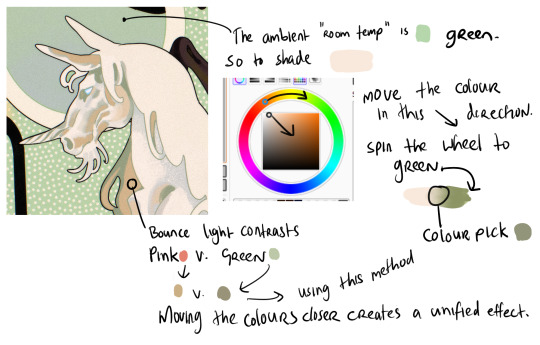
When working with marginally stronger contrast, here I have a cream unicorn on a green background. The main shadows on the unicorn will be the colour of that ambient room temperature bg - green. So I use the same test swatch method to pick a shadow colour which LOOKS green without being too disruptive of the cream unicorn. I increase the saturation and darken the value (moving the colour dot diagonally to the lower right hand corner of the box) and also spin the whole wheel towards green just a bit. Then I blend into the cream and colour pick a shade in the middle. But for the bounce light, I chose to use a common contrast of green - pink. It looks like pink in the drawing but in fact it is a low saturation orange! Using that real pink would be disharmonious. I do the exact same thing - I blend the pink into the bg colour and come up with that orange shade. It looks harmonious.
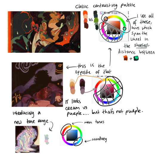
Now (top example) I am using two contrasting hues side by side. I decide the shadows will be warm, and the highlights in that contrasting zone. That means that for every colour i pick - Islin's skin, hair, his glasses, his shirt collar, his coat - every colour gets slid around the colour wheel until it falls inside that narrow band. And when I am highlighting his skin, I turn the wheel towards green. When I am shading his skin, I turn the wheel more red. I do this for every single element in the drawing.
It's the same for the Rua cover but this time I am not using such a wide band of available hues on the colour wheel, it's much tighter. I did this to replicate the look of a faded print, intentionally lowering the available contrast I had to work with by removing black as tool. It's all in that small cream to red window but it LOOKS purple - it looks like Pascal wears a purple shirt and that the smoke in the bg is lilac. Well, it isn't. That's all red and orange. I pick those colours by, again, choosing my goal "look" - a low-saturation purple, and then turning the wheel into the red range.
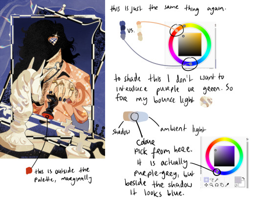
Okay so! for this it's just... the exact same thing again. Literally it always is. But since this one is recent I still have the process fresh in my mind. I envisioned it in the car, and I wanted this empty sort of desolate blue bg and a cold, distant overall tone. I ended up making the white on the chessboard & white pieces warmer, cream instead of white-grey, which worked out great. I wanted the blue, I wanted the pale cream/white, and the black of the chessboard. I didn't envision a colour for Pascal's shirt. but when the time came it was an obvious choice. It has to contrast with the bg both in value and hue, without falling outside the cream range already established by the chess pieces. So it's shiny salmon pink :) or orange, whatever you think it is. The only disharmonious part of this palette is the red velvet under the black knight piece - it works, but if I'd taken more care I might have spun the wheel more into orange and it would stand out less. But I don't mind.
617 notes
·
View notes