#Web Design & UI/UX Design
Explore tagged Tumblr posts
Text
Honestly, the thing that really burns my ass about mobile web design these days isn't even the bloated ads – it's the pages where there's nowhere that's safe to touch to scroll because every single pixel is a clickable hotspot that whisks you away to somewhere else, including the text. I truly believe the owners of websites that do this should die.
#life#computers#technology#internet#web design#user interface#user experience#ux#ui#grumping#death mention#swearing
4K notes
·
View notes
Text
Hey, everyone! I've been experimenting with some ideas I had for improving Myspace's mobile navigation. These are just personal thoughts and prototypes—not official changes—but I had a lot of fun reimagining the experience. Would love to hear your thoughts!
477 notes
·
View notes
Text
“My Dream Is Still Alive Despite the Rubble”
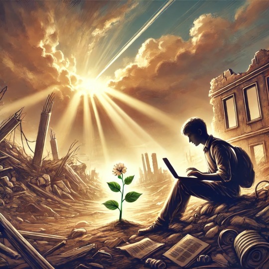

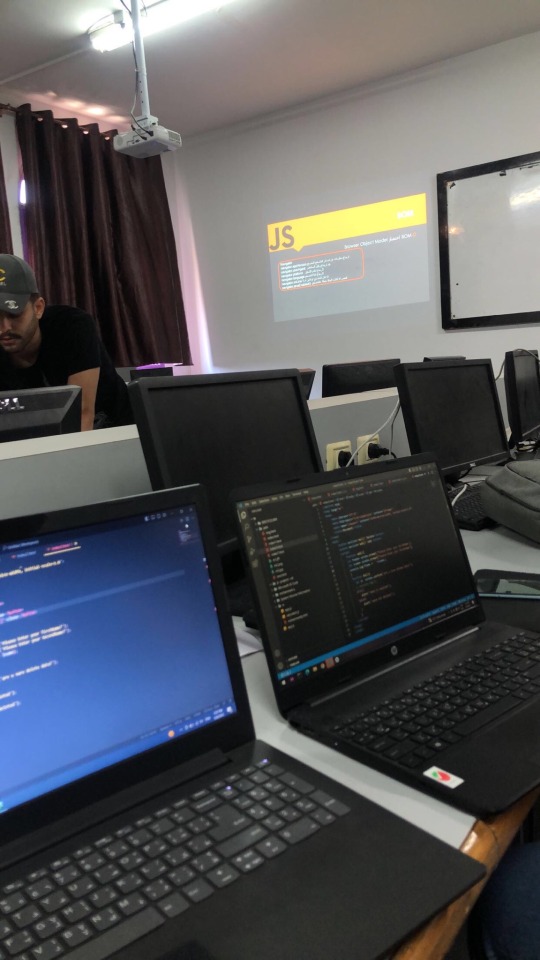
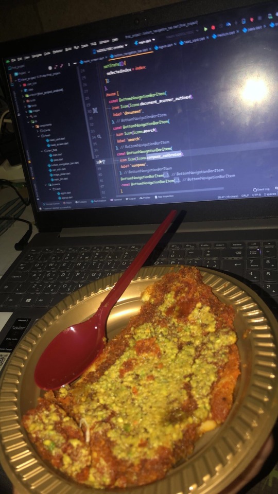
My dream has always been to become a UX/UI designer and a web developer. This dream has been my compass toward a better future for me and my family, giving my life meaning and hope despite the challenges.

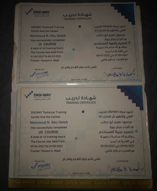
But the war in Gaza turned our lives upside down. We lost our home, my university, and even the laptop I relied on for learning and work. We were displaced to the southern part of Gaza, where we suffer daily from power outages and limited internet access. Despite these circumstances, my heart still clings to hope, and I refuse to give up on my dream.
I am not just asking for support to acquire equipment; I am asking for a chance to rebuild my future—not just for myself, but for my family as well. I believe that every challenge holds an opportunity, and I am determined to turn this hardship into a story of success.
Why Do I Need Your Support?
To continue my education and pursue my dream, I need some essential tools to help me learn and work under these harsh conditions:
• Laptop: $2,000
• Solar Panel: $2,000
• Power Inverter: $1,000
• 100Ah Battery: $1,000
Total Cost: $6,000.
So far, I’ve managed to raise €975 through my GoFundMe campaign, but I need to reach €7,000 to cover all costs.
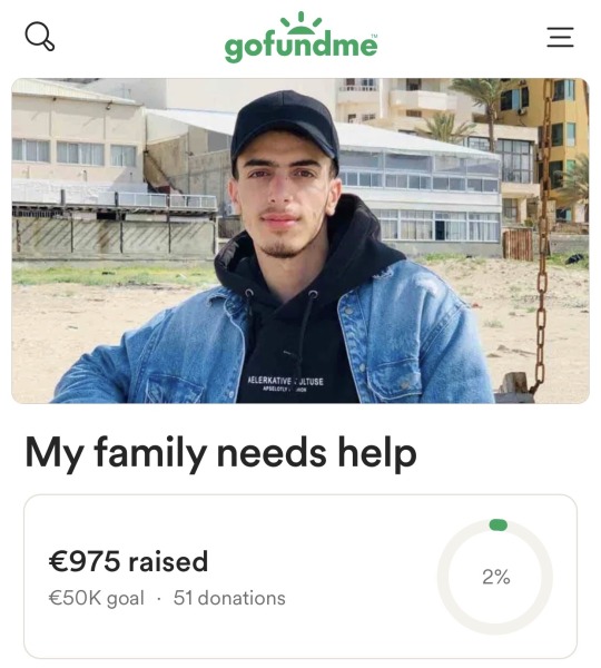
My Vision for the Future:
My ambition is not just to complete my studies but also to use my skills to support my community in Gaza. I aim to train young people in programming and design so we can contribute to building a better future despite the challenges we face.

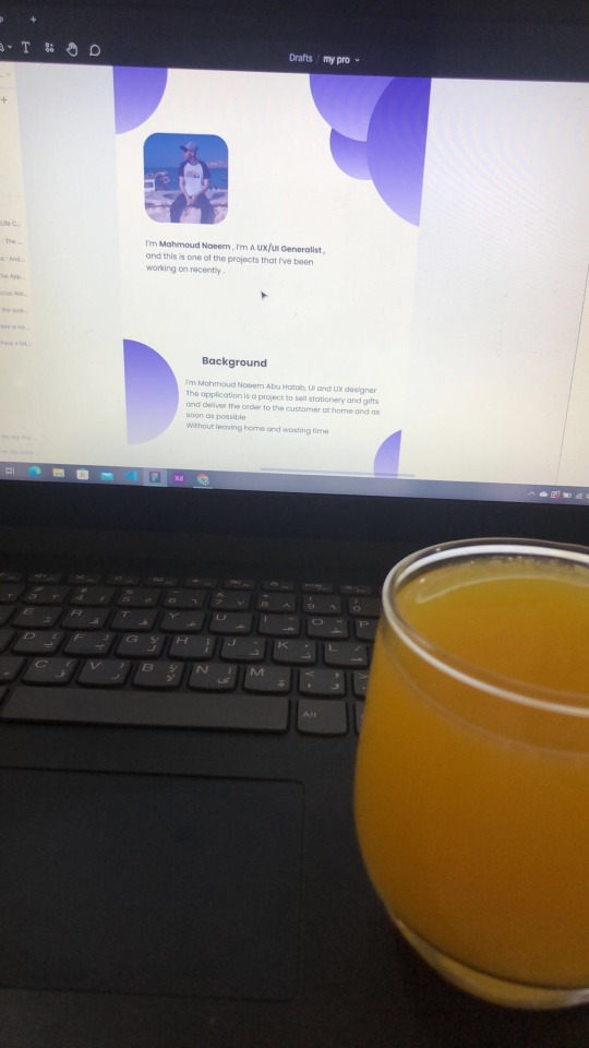
Why Your Contribution Matters:
Your donation is not just helping me personally but is an investment in a young man determined to empower his community. I aspire to become a role model for Palestinian youth, showing that resilience and creativity can overcome any obstacle.
A Heartfelt Thank You:
I live under difficult conditions, but I believe that goodness exists everywhere. Every person who contributes to my dream brings hope back into my life and gives me the strength to keep going.
How You Can Help:
1. Donate to the campaign:
GoFundMe
OR USDT

TLns8czyFHsJQWkaAEeza3of5cgEH7vi3n
2. Share my story with your friends and family. It might reach someone who can help.
3. Offer advice or opportunities that could help me develop my skills and achieve my dream.
Finally:
I promise to share every step of my journey with you—from acquiring the equipment to completing my education and realizing my dream. You are part of this story, and your support is the light I need right now.
“In the darkest times, there is always a ray of light. That light is you and your support, which gives me the strength to carry on.”
Special Thanks:
I would like to extend my heartfelt gratitude to everyone who has supported me so far. A special thanks to:
@gaza-evacuation-funds @gaza-relief-fund @wellwaterhysteria @ayeshjourney @nabulsi @catnapdreams @vetted-gaza-funds @vetted
#gaza#free gaza#save gaza#palestine#free palatine#save palestine#help my family#ui ux design#programming#web development#web design#vetted fundraiser#vetted#university#figma#design#gaza gofundme#palestine gofundme#gofundme#gfm#palestine gfm#gaza gfm#vetted gfm#gaza fundraiser#palestine fundraiser#fundraiser#help gaza#help#please help#christmas
313 notes
·
View notes
Text
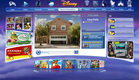

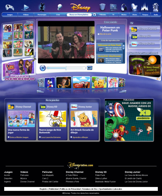
Disney Channel Website (2008)
Disney Latino - Disney.es
#2008#2000s#08#00s#art#design#disney#disney latino#frutiger aero#graphic design#graphics#internet#old internet#old tech#old web#screenshots#technology#uidesign#ui#ui ux design#vector#webcore
237 notes
·
View notes
Text
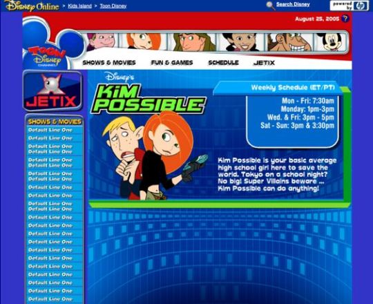
Kim Possible Webcore Y2K
#2000s#00s#art#blue#cartoon#childhood#cybercore#cyber y2k#design#disney#graphic design#graphics#illustration#kaybug#kim possible#old internet#old web#tech#screenshot#technology#uidesign#ui#ui ux design#webcore#website#y2kcore#y2kore#y2k aesthetic#y2k core#y2k cyber
208 notes
·
View notes
Text
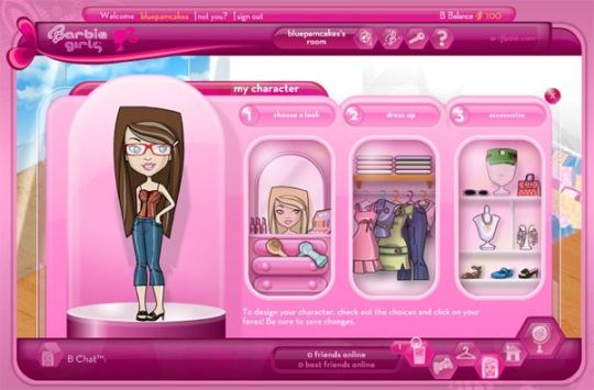
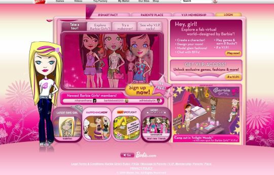
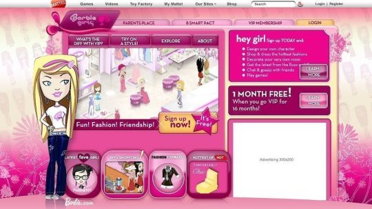
BarbieGirls Website
#2000s#00s#art#barbie#fashion#girly#graphic design#graphics#internet#old internet#old web#pink#screenshots#ui ux design#webcore#website#vectorbloom
109 notes
·
View notes
Text
JavaScript Fundamentals
I have recently completed a course that extensively covered the foundational principles of JavaScript, and I'm here to provide you with a concise overview. This post will enable you to grasp the fundamental concepts without the need to enroll in the course.
Prerequisites: Fundamental HTML Comprehension
Before delving into JavaScript, it is imperative to possess a basic understanding of HTML. Knowledge of CSS, while beneficial, is not mandatory, as it primarily pertains to the visual aspects of web pages.
Manipulating HTML Text with JavaScript
When it comes to modifying text using JavaScript, the innerHTML function is the go-to tool. Let's break down the process step by step:
Initiate the process by selecting the HTML element whose text you intend to modify. This selection can be accomplished by employing various DOM (Document Object Model) element selection methods offered by JavaScript ( I'll talk about them in a second )
Optionally, you can store the selected element in a variable (we'll get into variables shortly).
Employ the innerHTML function to substitute the existing text with your desired content.
Element Selection: IDs or Classes
You have the opportunity to enhance your element selection by assigning either an ID or a class:
Assigning an ID:
To uniquely identify an element, the .getElementById() function is your go-to choice. Here's an example in HTML and JavaScript:
HTML:
<button id="btnSearch">Search</button>
JavaScript:
document.getElementById("btnSearch").innerHTML = "Not working";
This code snippet will alter the text within the button from "Search" to "Not working."
Assigning a Class:
For broader selections of elements, you can assign a class and use the .querySelector() function. Keep in mind that this method can select multiple elements, in contrast to .getElementById(), which typically focuses on a single element and is more commonly used.
Variables
Let's keep it simple: What's a variable? Well, think of it as a container where you can put different things—these things could be numbers, words, characters, or even true/false values. These various types of stuff that you can store in a variable are called DATA TYPES.
Now, some programming languages are pretty strict about mentioning these data types. Take C and C++, for instance; they're what we call "Typed" languages, and they really care about knowing the data type.
But here's where JavaScript stands out: When you create a variable in JavaScript, you don't have to specify its data type or anything like that. JavaScript is pretty laid-back when it comes to data types.
So, how do you make a variable in JavaScript?
There are three main keywords you need to know: var, let, and const.
But if you're just starting out, here's what you need to know :
const: Use this when you want your variable to stay the same, not change. It's like a constant, as the name suggests.
var and let: These are the ones you use when you're planning to change the value stored in the variable as your program runs.
Note that var is rarely used nowadays
Check this out:
let Variable1 = 3; var Variable2 = "This is a string"; const Variable3 = true;
Notice how we can store all sorts of stuff without worrying about declaring their types in JavaScript. It's one of the reasons JavaScript is a popular choice for beginners.
Arrays
Arrays are a basically just a group of variables stored in one container ( A container is what ? a variable , So an array is also just a variable ) , now again since JavaScript is easy with datatypes it is not considered an error to store variables of different datatypeslet
for example :
myArray = [1 , 2, 4 , "Name"];
Objects in JavaScript
Objects play a significant role, especially in the world of OOP : object-oriented programming (which we'll talk about in another post). For now, let's focus on understanding what objects are and how they mirror real-world objects.
In our everyday world, objects possess characteristics or properties. Take a car, for instance; it boasts attributes like its color, speed rate, and make.
So, how do we represent a car in JavaScript? A regular variable won't quite cut it, and neither will an array. The answer lies in using an object.
const Car = { color: "red", speedRate: "200km", make: "Range Rover" };
In this example, we've encapsulated the car's properties within an object called Car. This structure is not only intuitive but also aligns with how real-world objects are conceptualized and represented in JavaScript.
Variable Scope
There are three variable scopes : global scope, local scope, and function scope. Let's break it down in plain terms.
Global Scope: Think of global scope as the wild west of variables. When you declare a variable here, it's like planting a flag that says, "I'm available everywhere in the code!" No need for any special enclosures or curly braces.
Local Scope: Picture local scope as a cozy room with its own rules. When you create a variable inside a pair of curly braces, like this:
//Not here { const Variable1 = true; //Variable1 can only be used here } //Neither here
Variable1 becomes a room-bound secret. You can't use it anywhere else in the code
Function Scope: When you declare a variable inside a function (don't worry, we'll cover functions soon), it's a member of an exclusive group. This means you can only name-drop it within that function. .
So, variable scope is all about where you place your variables and where they're allowed to be used.
Adding in user input
To capture user input in JavaScript, you can use various methods and techniques depending on the context, such as web forms, text fields, or command-line interfaces.We’ll only talk for now about HTML forms
HTML Forms:
You can create HTML forms using the <;form> element and capture user input using various input elements like text fields, radio buttons, checkboxes, and more.
JavaScript can then be used to access and process the user's input.
Functions in JavaScript
Think of a function as a helpful individual with a specific task. Whenever you need that task performed in your code, you simply call upon this capable "person" to get the job done.
Declaring a Function: Declaring a function is straightforward. You define it like this:
function functionName() { // The code that defines what the function does goes here }
Then, when you need the function to carry out its task, you call it by name:
functionName();
Using Functions in HTML: Functions are often used in HTML to handle events. But what exactly is an event? It's when a user interacts with something on a web page, like clicking a button, following a link, or interacting with an image.
Event Handling: JavaScript helps us determine what should happen when a user interacts with elements on a webpage. Here's how you might use it:
HTML:
<button onclick="FunctionName()" id="btnEvent">Click me</button>
JavaScript:
function FunctionName() { var toHandle = document.getElementById("btnEvent"); // Once I've identified my button, I can specify how to handle the click event here }
In this example, when the user clicks the "Click me" button, the JavaScript function FunctionName() is called, and you can specify how to handle that event within the function.
Arrow functions : is a type of functions that was introduced in ES6, you can read more about it in the link below
If Statements
These simple constructs come into play in your code, no matter how advanced your projects become.
If Statements Demystified: Let's break it down. "If" is precisely what it sounds like: if something holds true, then do something. You define a condition within parentheses, and if that condition evaluates to true, the code enclosed in curly braces executes.
If statements are your go-to tool for handling various scenarios, including error management, addressing specific cases, and more.
Writing an If Statement:
if (Variable === "help") { console.log("Send help"); // The console.log() function outputs information to the console }
In this example, if the condition inside the parentheses (in this case, checking if the Variable is equal to "help") is true, the code within the curly braces gets executed.
Else and Else If Statements
Else: When the "if" condition is not met, the "else" part kicks in. It serves as a safety net, ensuring your program doesn't break and allowing you to specify what should happen in such cases.
Else If: Now, what if you need to check for a particular condition within a series of possibilities? That's where "else if" steps in. It allows you to examine and handle specific cases that require unique treatment.
Styling Elements with JavaScript
This is the beginner-friendly approach to changing the style of elements in JavaScript. It involves selecting an element using its ID or class, then making use of the .style.property method to set the desired styling property.
Example:
Let's say you have an HTML button with the ID "myButton," and you want to change its background color to red using JavaScript. Here's how you can do it:
HTML: <button id="myButton">Click me</button>
JavaScript:
// Select the button element by its ID const buttonElement = document.getElementById("myButton"); // Change the background color property buttonElement.style.backgroundColor = "red";
In this example, we first select the button element by its ID using document.getElementById("myButton"). Then, we use .style.backgroundColor to set the background color property of the button to "red." This straightforward approach allows you to dynamically change the style of HTML elements using JavaScript.
#studyblr#code#codeblr#css#html#javascript#java development company#python#study#progblr#programming#studying#comp sci#web design#web developers#web development#website design#ui ux design#reactjs#webdev#website#tech
391 notes
·
View notes
Text
hey font nerds
[ does anybody know any good fonts for a lil my "pc as a website" project? ]
pwetty pwease? >:3 # this is a threat
REQUIREMENTS: - Kinda like Android Material UI but more suited for a "modern" PC desktop [ I like Inter ExtraLight for example :3 ]
or: - something good for icons. tray, notifications, you get the gist [ - i know nerdfonts and i can guide myself through their patcher so combining them with a "sleek" main font should be no problem. Wanna get more into python stuff anyways. ]
[ but wait, there's more: - i'm getting cozy with a mono font on my current setup, so if there's any that give of a more like "coffee house vibes and today is cocoa day" vibe, they're also very much appreciated OwO # ^> again, a threat.]
[ oh and also: - access to adobe-fonts is not a problem, i have a adobe license from work # ^ sharing is caring 💚 ]
⬇️ ⬇️ ⬇️ OBLIGATORY CONTRACT INFO DOWN BELOW ⬇️ ⬇️ ⬇️
SERIOUS ENQUIRIES ONLY! (middle click)
[ oh and plz many thanks :3 # < this time i really mean it :3

💜
]
#linux#196#kthxbai#fonts#free#adobe#design#graphic design#web graphics#ui#ux#ui ux design#portfolio#uidesign
25 notes
·
View notes
Note
You're so right abt all these websites looking freaking the same. Too polished, corporate typa style bs. And it's not only websites, it's applicable to books too. Everything looks bland and the same. I honestly miss early 2000s style. I don't care if it was tacky or anything. At least they were interesting and each one was unique in it's own brand of quirk lol
Hiya! 💗
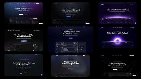
I agree! I love different styles shown in websites! Everything nowadays are following this trendy of "spacey subtle but a lot few colours" and they say it's all for user experience so I wonder is it the users' fault or are the designers just following a trend they got from another designer and so forth and not really what the user wants? I mean, I bet now the users who view the websites are noticing, like we have, that oh the same style again. I don't know as I'm not a UX/UI designer so I can't judge entirely but from a user perspective I am tired of websites all looking the same, I mean even those old government websites look better than this gradient spacey look that's going on.
But just as they're a trend, they will die out soon. I remember when glassompishm was super duper trendy, when I started learning how to code websites around 2021-2022, it was everywhere and now it's not as popular, I see less of it now, so we'll see what's next 🤞🏾
On that, this is why I like neocites with it's diversity and uniqueness! Also check out mine hehe~!
#my asks#codeblr#coding#progblr#programming#studying#studyblr#learn to code#comp sci#tech#programmer#ui ux design#uidesign#web design
59 notes
·
View notes
Text
ohh!!! i had a really good idea. a social media site with a circular timeline called samsara
#ideas#codeblr#social media#web development#philosophy#graphic design#game design#game development#game developers#game dev#web dev#javascript#nodejs#html#web site#web design#ui ux design#ui design#ux design#samsara
25 notes
·
View notes
Text
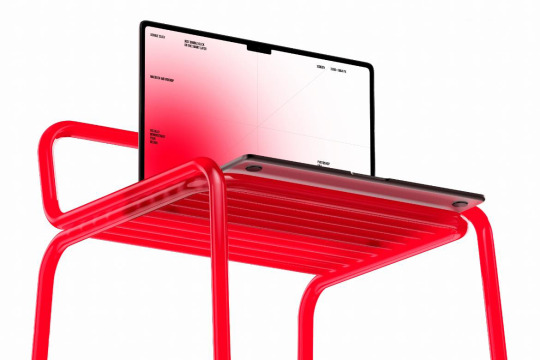
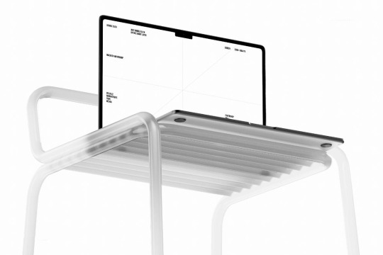
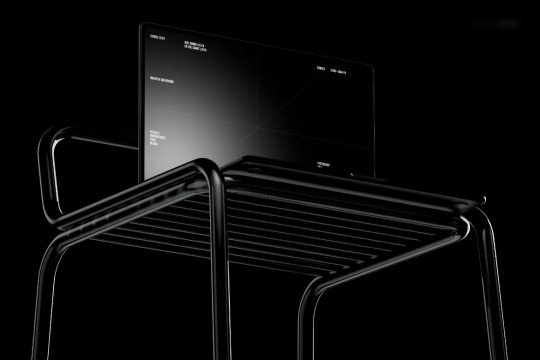
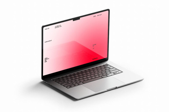
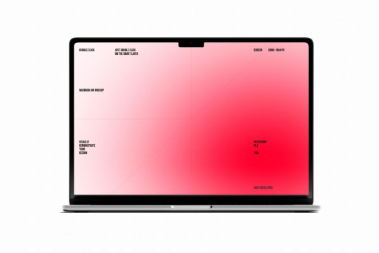
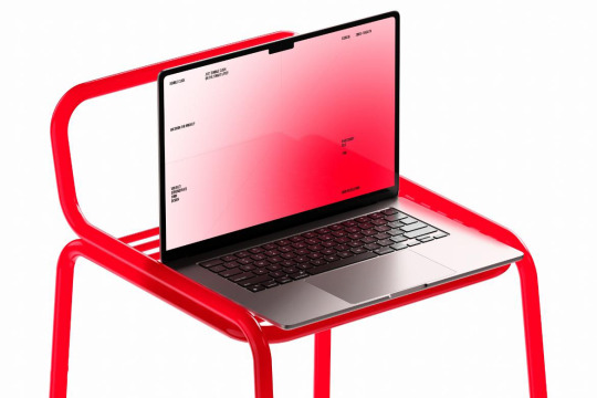
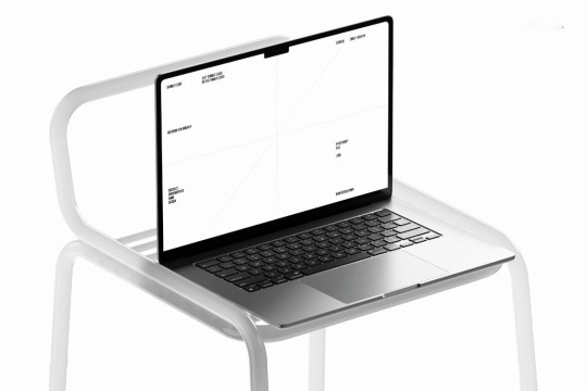
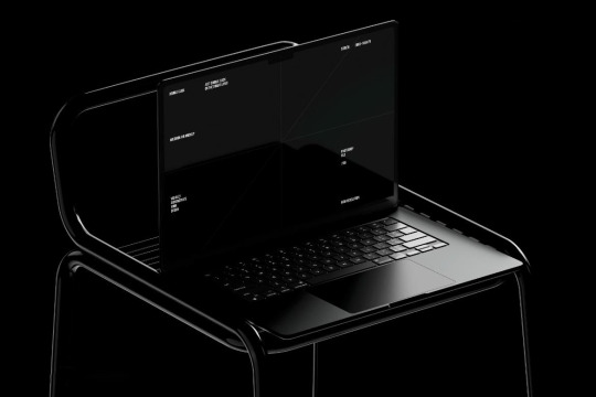
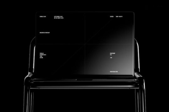
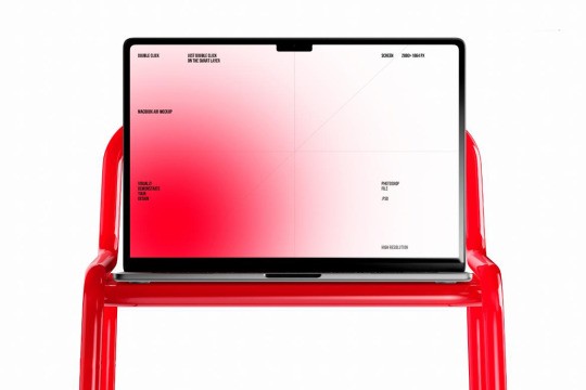
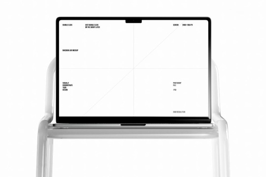
New MacBook Air mockups, where you can change every detail and apply your design via the Smart Objects layer.
Available now at ⚡mockupcloud.com
#mockup#branding#psd#template#showcase#mockupcloud#brand#download#macbook#laptop#apple#devices#screen#3d#digital#ui ux design#app#web
8 notes
·
View notes
Text
That post from like a month ago (I was planning to write this the day after and then immediately forgot and this has been in drafts since lol) about web devs not having some basic knowledge of the web has been stuck in my brain for a while because they are correct as I said in the notes but it's the landscape of web dev right now that's causing it and I don't see it stopping anytime soon.
I've been a professional Front End Dev for just over 7 years at this point (now a UX Dev working on a design system), and while I have a good chunk of experience under my belt, I've gotten to the point where I realize just how much shit I do not know and it's a LOOOOT.
The current landscape of web dev is that most projects and products are robust web apps that, in the absolute best case scenario, are gonna require, at minimum:
User experience research and work (UX)
User interface design (UI)
Front end with accessibility and mobile responsiveness (I am here)
Front end interactions and state management (JS engineers)
Backend database and API work
Backend infrastructure work (including setting up the dev and QA test environments)
QA testing
Developer experience to make sure devs/engineers are working efficiently with the tools they have
I'm sure I've missed some roles here, but you can see why people end up specializing when they work on bigger projects and products. The web is so unbelievably JavaScript heavy nowadays that all these specializations are Kind Of Required™, but that's absolute best case scenario. A lot of companies simply do not have the budget (or desire) to fill all these roles. So then you have a bunch of people who are kinda okay to mediocre at multiple of these things instead focusing on being good at one or two things. And then put in timeline requirements. AND THEN you have some companies who have different philosophies on how to build their core product: some are very UX focused and will put time into making sure that's present, others are not and will not care about UX in the slightest and thus those roles may not exist there at all. And...well things aren't going to be as quality as you expect when you consider all of those points.
The web is full of applications now that require a lot more expertise in different fields than just a basic static site with no data. That's not to say static sites don't exist or have no place anymore, tho. But this is where we are. It sucks.
#web#web dev#web development#front end development#back end development#ui design#ux design#html#CSS#JavaScript#career
9 notes
·
View notes
Text
The Perfect 3D Icons for Your Projects 🚀
Looking for the perfect 3D icons to elevate your web designs? We know how challenging it can be to find icons that match your vision and enhance your projects.
Common Problems:
Inconsistent Styles: Icons that don’t match your design aesthetic.
Limited Customization: Difficulty in tweaking icons to fit your needs.
High Costs: Quality 3D icons can be expensive.
Solution with Stockiphotos.com: Stockiphotos.com offers a vast array of 3D icons in various styles and themes. Our icons are designed to be versatile and fit seamlessly into any project. And the best part? They’re affordable!
Why Choose Us?
Wide Variety: Explore a diverse range of 3D icons to suit any design.
High Quality: Professionally designed icons that enhance your projects.
Cost-Effective: Access premium icons without the premium price.
Transform your web designs with Stockiphotos.com 3D icons today! 🚀🎉
#school#elearning#education#ui ux design#graphic design#3d printing#3d art#3d illustration#web design#35mm#accounting#academia#adobe
7 notes
·
View notes
Text
“I Need Your Support to Continue My Studies and Build My Future from Gaza🍉🍉

My name is Mahmoud Naeem Abu Hatab, from Gaza.
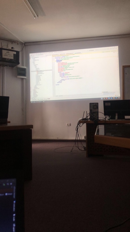
I am a university student majoring in Software and Databases at Al-Azhar University. Since the beginning of my academic journey, I have been passionate about User Experience (UX) and User Interface (UI) design, as well as website development. These fields inspire me, and I dream of advancing my skills and building a professional career in them.
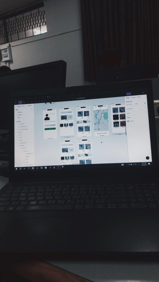
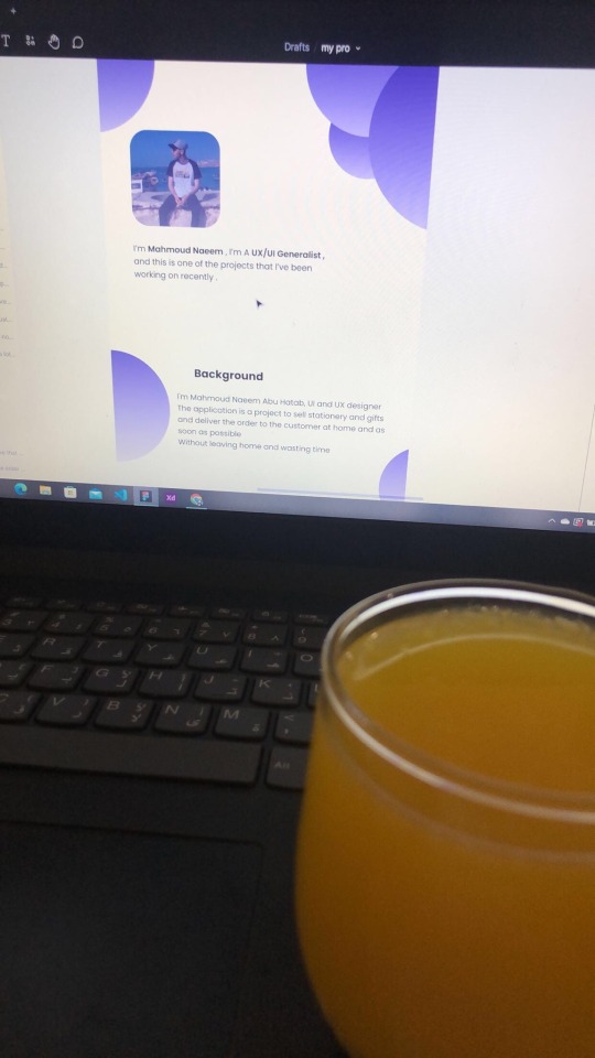
Unfortunately, during the recent war, I lost my laptop, which was essential for both my studies and work. I was forced to flee my home and relocate to southern Gaza due to the difficult circumstances. Despite my efforts to replace my laptop, the financial situation has made it impossible to afford a new one.
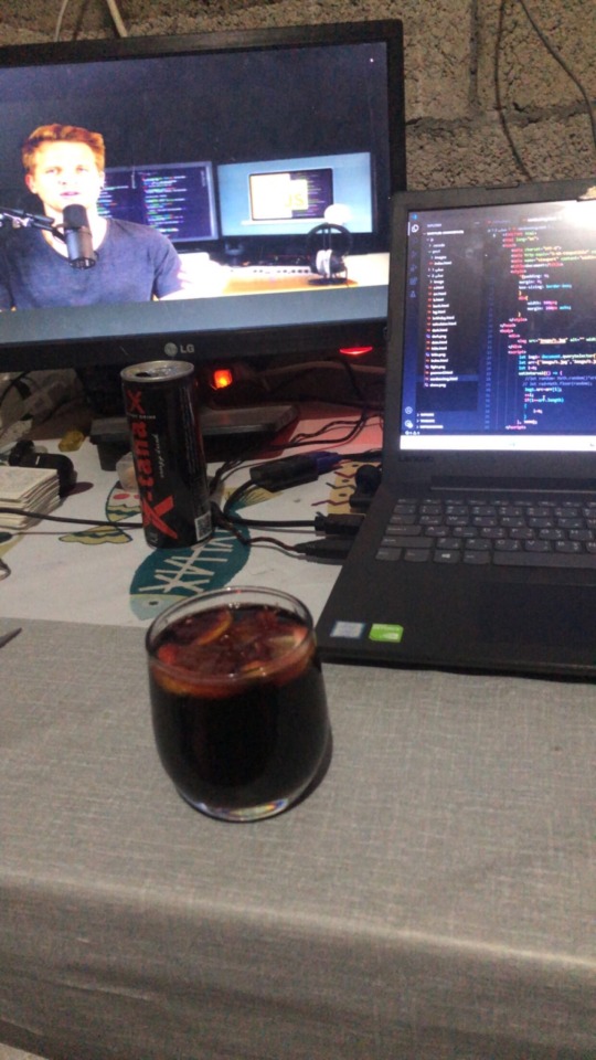

Without a laptop, continuing my studies or seeking job opportunities in programming and design has become extremely challenging. This directly affects my academic progress and future career.
Today, I am reaching out to ask for your support to help me purchase a new laptop. Having a laptop would allow me to resume my studies and work on programming and design projects that are crucial for improving my skills. It is a vital step towards completing my education and pursuing my dream of becoming a professional in programming and UX/UI design.

I know that the situation in Gaza is difficult, but I believe education is the only path to building a better future for myself and my family. If you are able to contribute any amount to help me get a new laptop, it would be a real opportunity for me to get back on track academically and professionally.
I am determined to keep learning and working despite the challenges, but I need your support to achieve this goal. Every donation or act of help, no matter how small, will make a significant difference in my life.
If you’d like to support me, you can donate through:
GoFundMe
OR
USDT

If you can assist in any way, please don’t hesitate to reach out to me.
Thank you for your support and kindness! 🌿
@gaza-evacuation-funds @appsa @nabulsi27 @palestinegenocide @orblesbian @palebluebutler @pallasisme @fallahifag-deactivated20240722 @vakarians-babe @sayruq @ @plomegranate @riding-with-the-wild-hunt @queerstudiesnatural @tamamita @apollos-boyfriend @riding-with-the-wild-hunt @queerstudiesnatural @palestinegenocide @sar-soor @akajustmerry @annoyingloudmicrowavecultist @feluka @marnosc @flower-tea-fairies @flower-tea-fairies @tsaricides @tsaricides @belleandsaintsebastian @ear-motif @brutaliakent @raelyn-dreams @troythecatfish @4ft10tvlandfangirl @90-ghost @paper-mario-wiki @nabulsi @prisonhannibal @beepiesheepie @walcutt @schoolhater98 @commissions4aid-international @sar-soor @zigcarnivorous@tododeku-or-bust@turtletoria @brutaliakhoa @flower-tea-fairies @schoolhater @baby-girl-aaron-dessner @sayruq @omiteo777 @malcriada @neptunerings @bat-luun @kaneverse @nightowlssleep @staretes @friendshapedplant @soon-palestine @aria-ashryver @heritageposts @magnus-rhymes-with-swagness-blog @khangerinedreams @kordeliiius @mazzikah @feluka @dlxxv-vetted-donations @girlinafairytale @a-shade-of-blue @vakarians-babe @babygoatsandfriends @self-hating-zionist @mangocheesecakes @dlxxv-vetted-donations @gazaboovintage @gazavetters @wellwaterhysteria @sar-soor @applebunch @irhabiya @sayruq @xxx-sparkydemon-xxx @junglejim4322 @reptilianspecies @dr-lapdance @tamamita @cantsayidont @fairweathermyth @dear-indies @eruthiawenluin @katealot @lenasai @stalinistqueens @ayeshjourney @gaza-evacuation-funda @el-shab-hussein @irhabiya @nabulsi @ibtisams @dlxxv-vetted-donations @tododeku @a-shade-of-blue @gaza-relief-fund @catnapdreams @northgazaupdates @buttercuparry @stuckinapril
#voic of gaza#gaza#free palestine#palestine#free gaza#save gaza#save palestine#help gaza#help palestine#programming#studying#uxdesign#ui ux design#uidesign#ui#ux#user interface#user experience#figma#xd#web design#web development#web developers#mobile design#html#css#js#javascript#java#front end development
293 notes
·
View notes
Text
youtube
Is your website accessible? (Beginners Guide)
Making your website as accessible as possible is not just a legal or ethical requirement, it’s also a practical concern—allowing everyone to benefit from your content. Here are four areas to review.
#beginners guide#ui ux design#ui design#youtube#ux and ui design#web design#education#free education#How to Design Accessible UX#web accessibility#ui design inspiration#ux design process#ux research#ux designer#ux ui design#breaking barriers#accessibility#accessibleliving#accessible design#accessibility for all#website accessible#app developers#Youtube
4 notes
·
View notes
Text

Ravenwork in 2002
#2002#2000s#02#00s#art#cybercore#cyber y2k#design#future#futuristic#futurism#graphic design#graphics#internet archive#internet#kaybug#old internet#old web#ravenwork#screenshot#uidesign#ui#ui ux design#vector#y2kcore#y2kore#y2k aesthetic#y2k art#y2k core#y2k cyber
75 notes
·
View notes