#Visual Storytelling: The Art and Technique
Explore tagged Tumblr posts
Note
STAR FALLS REVIEW?
Good morning!
Okay, in response to the previous question, I think it’s finally time to be completely honest about something I’ve been thinking since last year (ever since I first discovered ur AU)
From the very first images and fragments u shared, I was instantly drawn to how u handle the narrative. I've noticed u choose to tell the story through multiple timelines (sometimes past, sometimes present) and honestly (as an average writer myself?), I’d say that’s an excellent technique.
Revealing details little by little, without dumping everything at once, not only keeps the interest alive, but also deepens the mystery of the lore, letting us theorize, analyze, and connect with what ur telling. A lot of us genuinely appreciate that.
So that’s why, when I see certain comments asking for -“more BillFord”- or wondering why Brutus and Deity have so much focus (some even calling Deity just “ur OC” or etc, trying to push the ship), I just want to say openly , at least for me the way u’re developing this story is PERFECT as it is.
I also thought at first that the plot would be something cliché and simple. When I saw the now-famous reference in the book (the one with Bill and the king’s page ). I really thought that would be the whole point. Something really similar to canon, except here Bill’s a god and seemingly his opposite.
But now, wow… I was SO wrong. -The deal? The backstory with the king? That they were lovers? That maybe Brutus is connected to Ford… or actually is him??
Yeah, that’s literally what I thought when I found this AU last year!. But everything u’ve built since then makes it crystal clear this story goes way beyond that.And now that u confirmed that book scene isn’t even canon? I’m just even more intrigued, amazed… and honestly so hyped for what’s coming next. That’s why I wanna ask (or maybe beg a little) that u keep going at ur own pace. It doesn’t matter if u take breaks, try out new styles, or drop random content here and there. What really matters is that u keep developing it ur way, (bc that personal touch is exactly what gives ur AU so much value).The visual storytelling u use (without needing tons of dialogue) is so powerful that we can understand everything clearly.
That’s honestly incredible. Ik everyone has different tastes, but if u feel good with ur current style, then pls keep going! And if one day u wanna change it (in terms of art, tone, whatever), that’s totally valid too. This is ur creation, ur space, ur universe ,(we’re the ones who should adapt to it). It’s okay to take suggestions, but it’s also okay to ignore them if they don’t align with u. As for me, I’m constantly coming up with new theories (maybe someday I’ll be brave enough to share them once they make more sense, lol).
Idk if this message counts as a question, maybe it’s more of a thought. (Edit: Let’s call it a review instead.) I just hope it doesn’t come across the wrong way, (bc I seriously re-read and correct every single word I send u, tbh). I’m very observant and detail-oriented, and always try to be respectful of ur work.I never thought I’d find myself analyzing a story or artwork so deeply… but ur art changed that.
Nothing here is something u just look at once each panel, each expression, every atmosphere holds so much more than what’s on the surface.And this mix of angst, mystery, occasional humor, and a nostalgic yet serious plot? That’s exactly what I’m drawn to.
After all, even if it’s a Gravity Falls AU, it doesn’t have to copy canon, right?Everything will come in due time. For now, I just wanna enjoy the story as it unfolds. (Though if u can, pls drag it out as long as possible, it’s SO addictive.)
Anyway, to wrap this up:
You are amazing. Thank u for creating something this special. (The best gift a random person can get on her bday is ur content, no joke.) ✍️
(And well… I might come back with a fully developed theory soon, hehe.)
CRYING??? I really thought it's gonna be a whole criticism and i was fully prepared to take it but i couldnt be more wrong. Flattered isnt even the word im looking for but I'm so glad people enjoyed this mess of an AU i created i rly appreciate this review Thank you so much 🥺
33 notes
·
View notes
Text


Jim Steranko “Visual Storytelling: The Art and Technique” how to illustrate a comic book scene (1979) Source
“According to the consignor, it was illustrated in August of 1979 at a comic book convention, likely in the United Kingdom, where Steranko was demonstrating how to illustrate a comic book scene. The sequence is inspired by film noir and loaded with emotion and action. It begins with a man entering an office where another man and a woman are seated. The scene quickly elevates to violence with a gun being brandished and a punch thrown.���
4 notes
·
View notes
Text
what do you like the best about Ai

View On WordPress
#abstract backgrounds#AI content creation#AI-generated art#artistic handwriting#business tools#colorful artwork#colorful images#creative expression#creativity#digital art techniques#digital creativity#digital illustration#doodling#drawing with S Pen#fun with technology#relaxing writing#S Pen#tablet creativity#tablet fun#visual storytelling
2 notes
·
View notes
Text
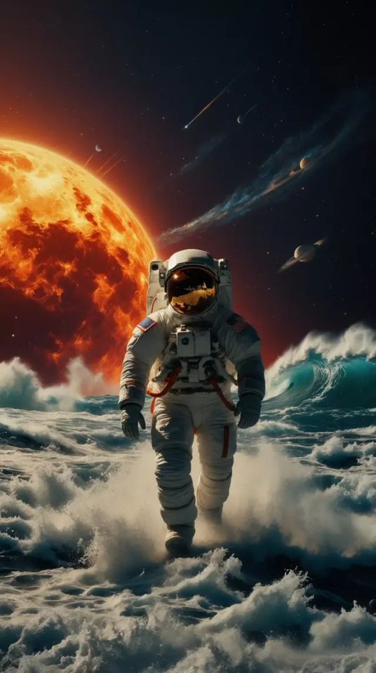
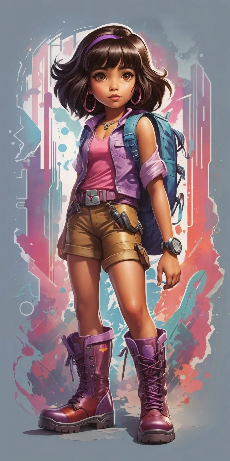
Revolutionize Your Art with Leonardo AI!
Leonardo AI is revolutionizing artistic creation with its advanced algorithms that transform real-world ideas into stunning masterpieces. This dynamic platform empowers us to design imaginative game assets, including characters, artifacts, landscapes, conceptual visuals, and intricate architectures.
By merging cutting-edge technology with our creative fervor, Leonardo AI enables artists and designers to bring their visions to life. It injects depth and vibrancy into our projects, making it perfect for those looking to elevate their creative endeavors. Discover how this AI-driven toolset offers an unparalleled environment for artistic innovation!
#LeonardoAI #ArtisticInnovation
#Leonardo AI#artistic revolution#creative tools#AI algorithms#game assets#character design#digital art#artistic masterpieces#innovative platform#creative projects#landscape design#architecture design#imaginative visuals#artistic innovation#AI creativity#design software#elevate creativity#vibrant art#concept art#technology and art#art community#digital creators#AI art tools#artistic expression#creative empowerment#visual storytelling#art techniques#design inspiration#future of art#unleash creativity
2 notes
·
View notes
Text
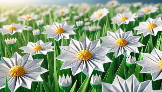
Daily Floral Delight: Origami Transformation of Daisies -- FOTD Jun 20
Check out my latest post for Cee’s FOTD – a patch of #daisies transformed into beautiful origami art using AI. Follow my journey of AI creativity! #AIArt #AIArtwork #AIArtCommunity
Hi all 👋 My latest post for Cee’s FOTD. With Cee recuperating, I’ll be posting flowers daily to give her a bit of floral delight (my version of a bouquet) 💐 Patch of daisies As with my latest Fan Of… post (see link 👇), I’m exploring some DALL-E AI preset styles for my edits. For today, I’ve done an origami transformation; I think these came out quite well. If you follow my blog, you know I’m…
View On WordPress
#AI Artwork#Artistic Inspiration#Creative Photography Techniques#DALL-E#Digital Artistry#Digital Image Transformation#Flowers#FOTD#Hot Mods Art#Innovative Photography#Jez Braithwaite#Nature#OpenAI#Photographic Creativity#Photos#Rugosa Rose#solarpunk#Visual Storytelling
3 notes
·
View notes
Text
Creating Characters That Resonate: Some Tips for Memorable Designs
"While tools play a role, it’s our vision that truly matters”
You know that feeling when you see a character from a game, a painting, or a comic and you instantly fall in love with it? It's not just because it looks cool or cute. It's because it has a personality and a story that shines through its appearance. That's what I love about character design: the ability to create characters that make people feel something.
If you are interested in learning the basics of this art form, there are many resources available online 😅. (I will create some tutorials on this soon.) But now I'm not here to lecture you on anatomy or color theory. Instead, I'll share some of my personal tips on how to make your characters unique and engaging for your audience.
Tip 1: Dive Deep into Your Character’s World
Kickstart your design process with inspiration from your own world. This personal touch not only enriches your art but also adds depth and more meaning to your creative process.
Consider this school bully who is based on.. a person I used to know. He’s probably off picking his nose when he’s not on the page! Can you spot him?
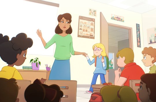
See the bully's backpack 😈? (Illustrated for Swish! by Mahmoud Elzein.)
It’s all about discovering those tiny personal connections that breathe life into a character. Brainstorm with character profiles, create mood boards, and try to figure out “what’s in their pockets”. I’ve found that writing dialogues for my characters helps me visualize their personalities better. Honestly, half the time, I’m imagining how they would annoy each other offscreen!
Tip 2: Play with Shapes to Highlight Inner Conflict
To emphasize a character's inner turmoil, you can use contrasting shapes. By smoothing the edges of sharp shapes, you can reduce the contrast and reveal different aspects of the character.
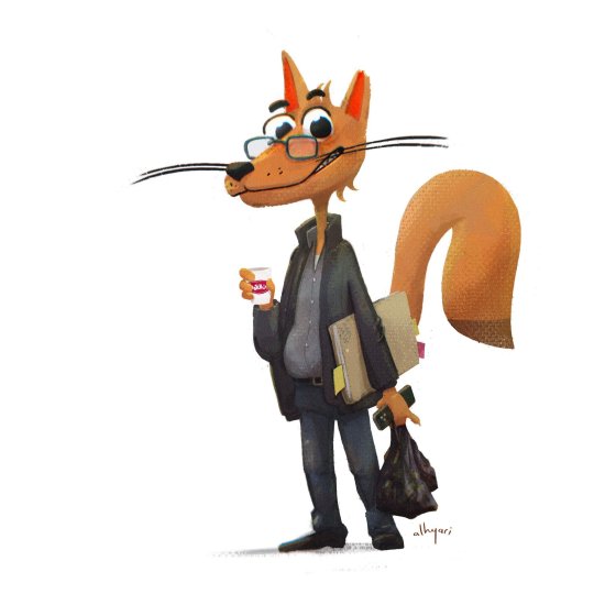
“Good or bad?,” I always ask my students.
Experiment with different sizes and shapes and make your characters captivating enough that your viewers accept the visual logic of your art worlds.
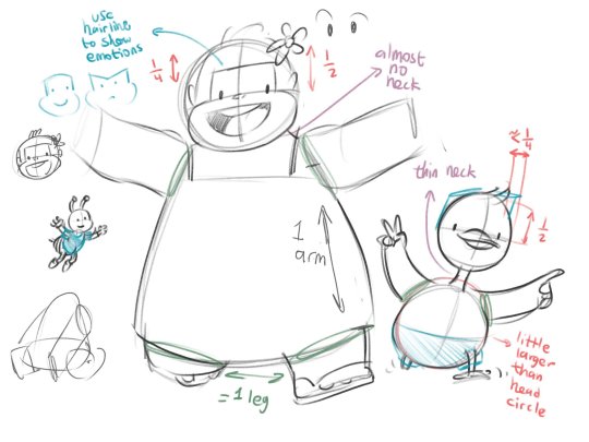
Imagine a gorilla 🦍 and a bee 🐝 as friends in a picture book. How would you draw them in relation to each other?
A good way to enhance the narrative and ease the tension is to break down the character shapes. For example, the bully in Swish! looked threatening at first, but I used his soft facial traits to show his insecurity. I also gave him a loose shoelace to imply that he is not totally in control.
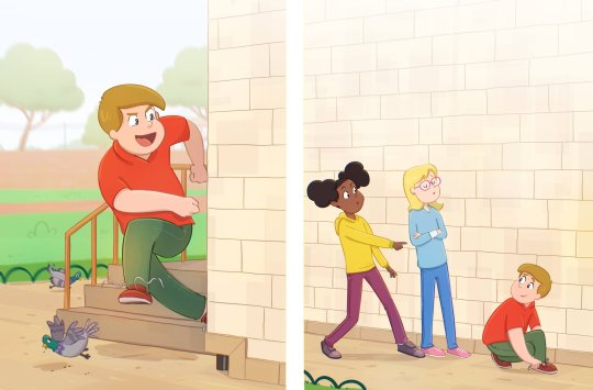
Even the smallest details can tell a story about your character. (Illustrated for Swish! by Mahmoud Elzein.)
Tip 3: Harness the Power of Color and Value
Contrast is key! Opt for vibrant characters against muted backgrounds, experiment with warm and cool tones, and introduce pops of light against deep shadows for visual drama.
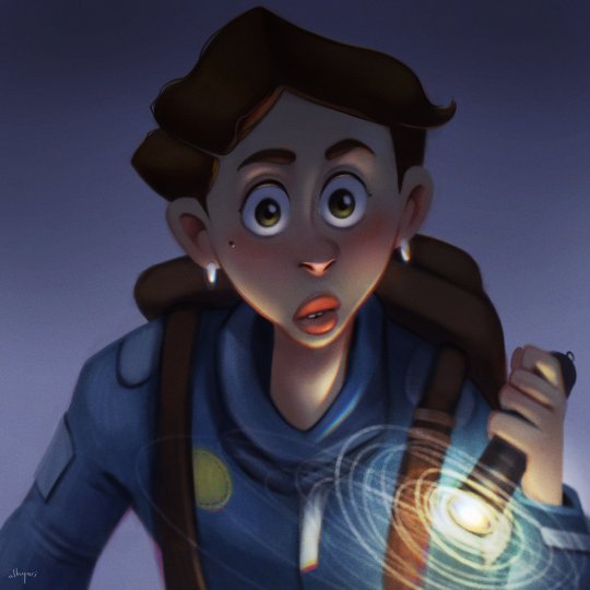
Contrast and lighting for drama.
Challenge yourself with limited color palettes. This forces you to think creatively and adds an unexpected layer of unity to your work. For the ‘Museum Heist’ piece, I used shades of blue, and it was gratifying when viewers, even those not from the art world, noticed how it influenced the piece.
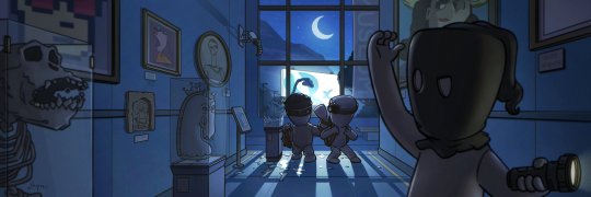
The blue tones were a fun challenge 💎
Tip 4: Sprinkle in Details and Accessories
I take sneaky joy in hiding personal details within my illustrations. Maybe it’s my old license plate or a memento from my parents. Details like faded scars and mended clothes add layers to your characters and imply a history, giving them more depth.
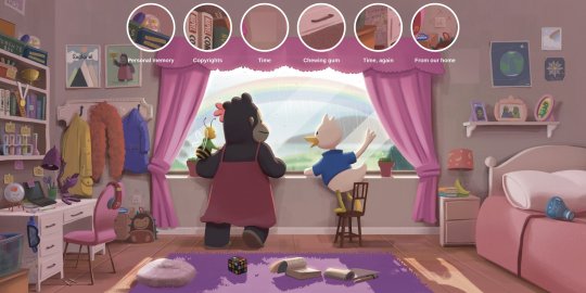
Can you find all the hidden secrets in Ella the Gorilla's room? 🔎 Let's play in the comments! (Book by Mawya Alfadda and Rama Al-Sahreef)
Tip 5: Push the Boundaries with Expressions
Imagine yourself as the director of the scene and your characters as the actors. Hire the best actors and make sure they come with the best: pose, gestures, and outfit, and nail the whole performance.
Don’t just copy the reference! Exaggerate those eye positions, play with asymmetrical half-expressions – this keeps things lively and adds charm.
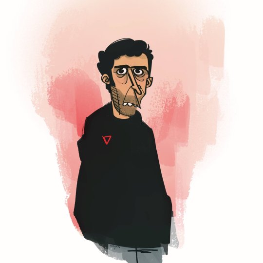
Never be afraid to push your reference photos for more whatever-you-call-this characters! 😄
Tip 6: Seek Feedback and Refine
Discord and Telegram groups have been invaluable for me – asking targeted questions (like “Does anything feel off?”) gets me feedback way beyond just “looks nice!”.
How people interact with your WIPs speaks volumes. Don’t just listen to words, watch how long they engage and which elements draw their eyes.
My wife and kids are a great help, especially for children’s book and game art. They notice what I often overlook. I sometimes get annoyed when they don’t like something (I worked on for long), but I know it’s not personal. After all, they’re the best early test for my work.
Bringing It All Together
Character design isn’t just about drawing – it’s about infusing them with personality and emotion that resonates. Let’s keep the conversation going! Share your favorite character design tips in the comments below 👇
#2d character#character design#art tips#digital art#art process#art inspiration#art techniques#character concept#children's book illustrator#digital illustration#alhyari art#digital painting#artists on tumblr#visual storytelling#art#cartoon art#custom digital art
4 notes
·
View notes
Text
what do you like the best about Ai
#abstract backgrounds#AI content creation#AI-generated art#artistic handwriting#business tools#colorful artwork#colorful images#creative expression#creativity#digital art techniques#digital creativity#digital illustration#doodling#drawing with S Pen#fun with technology#relaxing writing#S Pen#tablet creativity#tablet fun#visual storytelling
0 notes
Text
Through the Shadows: Art as a Light in the Dark
Creativity ain’t just a hobby—it’s a lifeline. When life backs you into a corner, when the weight of expectations and struggle makes it hard to breathe, art becomes more than expression. It’s survival. For young Black men, constantly told to be strong but rarely given space to be vulnerable, the act of creating is rebellion. It’s permission to feel. This is a journey through the darkness, an…
#abstract art and emotions#AI art for mental health#AI tools for artists#AI-assisted creativity#AI-generated art#art as therapy#art therapy for anxiety#artistic self-expression#Black artists digital art#creative expression therapy#creativity and mental wellness#creativity for mental health#digital art healing#digital journaling#digital painting therapy#digital sanctuary#digital self-portrait therapy#emotional expression through art#emotional resilience through art#expressing emotions through digital art#finding light through creativity#healing through creativity#mental health and creativity#overcoming darkness through art#personal growth through art#self-discovery through art#shadow work art#therapeutic digital art#visual journaling techniques#visual storytelling therapy
0 notes
Text
Production history around: Broodiest Flunkey
Finally, I am getting to what I consider the ‘first’ film in my journey as an experimental filmmaker: ‘Broodiest Flunkey’.

This film is a bit rough — it was made as a university project, with a deadline and 3 minute time limit. It was also the first time I had played with many visual effects, and the first time I had shown my work to a live audience.
A lot of what I will be saying in this article will be recycled from my university essay, as my memory on a lot of the details has started to fade.
I created a timeline for this production, so I will try my best to be chronological in the retelling of the film’s creation. Some of the elements may seem tangential, though that is a lot of my practice in general.

I really like the above, because it shows that learning and developing a project (or even personal development), takes a mix of both consumption (books, media) and action (events, trial runs). It also shows how unexpectedly events morph into one another.
In addition to this timeline, I had also created a dated excel timeline of when each event happened (yes, I am thorough). While it shows how ‘Change Spaces’ and ‘Gacha’nce’ fit into the timeline, those won’t be covered here. Noteworthy is how many events overlap with one another, as opposed to being linear.

iDAT XXX
On the 18th of November 2024, I attended an event by Mike Philips, celebrating 30 years since the creation of their institution ‘iDAT’. As part of this event, they ran a ‘telematic performance’ — pretty much information is passed from one system to another, leading to a series of interesting corruptions. This, is then dressed up in a fun avant-garde coat of paint.

It would take a lot later for me to realise that this is a great use of chance as a form of creation. Collaboration, corruptions, improv, a digital exquisite corpse, etc.
MA Experience Design — Design Lab 2
In Design Lab 1, I made a short animation going over the concepts of DADA. Therefore, making video work was heavily on my mind.

The Design Lab 2 brief made me think about what I could do to help the local community. When looking at ‘don’t assume you know your audience’, ‘experiment with materials’, ’leave something beautiful behind’, and ‘make a difference’, it led me down the path of considering making a documentary where I interview people with autism to allow them to be heard and understood.
Autism Documentary
So, I started to plan a documentary about autism, taking the brief into mind. There were lots of worries about it, and I could lie and say they were mostly about GDPR, but it was more so social anxiety of needing to work with so many people!

The in-class activity about making iterative comics was really interesting to me. I wanted to take this idea but apply it to a documentary format. I wanted something similar to the longitudinal study method that ‘Seven Up!’ (1964) engaged in, but also have myself and my beliefs examined as well. This would potentially happen by having a new director for the second film, where they critically look at the first film, and this process is continued indefinitely.
[Accidentally making an exquisite corpse before knowing what that really was!]
Allister Gall Email
The module brief included: ‘collaboration with multidisciplinary partners’. As I was working with film as a medium, I decided to reach out to Allister Gall, the BA Filmmaking programme leader at the University of Plymouth on the 23rd of January 2024. I asked if he was able to send me down the right path, or potentially let me attend a filmmaking lesson.

He let me know about Imperfect Cinema, and that an event was coming up called Cinaesthesia 1. I was very lucky with the timing, as the event was only four days after I sent my email.
[It is funny, I consider this single email an extremely important pivot in my life. If I had not written this email, I likely would not be doing my current PhD, and would not be making experimental art videos. I wouldn’t have heard of Cinaesthesia, and Allister wouldn’t have become one of my PhD supervisors… This email took a minute or two to write, all it takes sometimes.]
The Reason I Jump
During my initial look into autism for the documentary, I read ‘The Reason I Jump’ (2007). The book was written by a 13-year-old mute autistic child living in Japan, and each chapter is them explaining why they do certain actions.

When reading, I realised that there were many areas in which I related to this child, especially thinking back to when I was the same age. While I did not relate to everything, I did more than I normally would with someone. With each example, I started to feel less embarrassed about some moments from my childhood. Moments that I used to fixate on, thinking ‘why did I do that?’ suddenly had an answer that didn’t make me feel as alone or weird.
This feeling of seeing yourself in a book, and this resulting in you being less critical of yourself, I decided to be the message I wanted from my film.
Cinaesthesia 1
This event was run by Patrycja Loranc in collaboration with Imperfect Cinema, and took place at Café Momus on Stonehouse. Patrycja is a PhD student focussing on psychepoetic filmmaking, and the event shared some of this energy.

(Jess Scott, Dutch Loveridge, and Patrycja Loranc at Cinaesthesia 1’s Q&A)
Imperfect Cinema is a Plymouth-based film project created by Allister Gall and Dan Paolantonio, which has the goal of encouraging local artists to create films, as well as to help facilitate events these artists can participate in.

[Side tangent — At this point (8 months since hearing about them), I have heard the two of them go over their intro so many times. It makes me think about what it means to be an academic at university — the need to tear up old ground constantly to explain who you are and what you do. It sounds kind of hellish. I’d struggle to not just make an intro video lol]

As a note for this event, and the ones I talk about later, the networking elements of these screenings are incredible. You get to ask questions directly, sample a lot of local talent, and see the effort of people coming forward. It takes bravery to put yourself out there, and most people there seem to appreciate that.
I was worried that the event would be too ‘heavy’, but it was very casual.
An element of the screening that really resonated with me was the diverse ‘quality’ and styles of work present. There were films presented that I thought ‘I could do that’, and that made me feel like less of an outsider at the event.

At this event, I learnt that a Cinaesthesia 2 and 3 were going to happen in the future, and that they had an open reel for submissions. I pivoted from ‘documentary about autism’ to ‘experimental art film that looked into my own personal experiences reading into autism’.
Getting into Cinaesthesia 2
In order to get a film accepted into Cinaesthesia there were guidelines that needed to be adhered to.
The brief was: “How can the sensory perception/subjective experience be communicated and challenged by filmmaking? How does film allow us to connect to others and the world by exchanging subjective realities?”
It also included that the film must be 3 minutes or less, and submitted by 9pm 21/03/2024.
Experimental Film Production Start
I started my pivot by looking into what made someone’s perception ’unique’, thought about there being so many variables with each person, that everyone’s perception was unique.

In addition to this, I started to consider that my own perception was likely the perception I could best put across to an audience.
I wanted to, somehow, make the audience experience a sense of uneasiness by seeing the world through someone who processes stimuli differently.

Rosemary’s Baby
On the 26th of January 2024, my wife and I watched Rosemary’s Baby (1968) for the first time. It is a great film. In it there is a scene where the main character is trying to work out an anagram by moving around scrabble pieces. I had no plans with this at all. It was just a theme dancing around in my head.

Experience Design’s Telematic Performance
For one of the Design Lab 2 session, Mike Philips wanted us to do a ‘telematic performance’. Since I had seen one prior via his iDAT XXX event, I feel that I had a step ahead of others in the class. This was due to me already knowing what it was meant to look like, and understanding that anything could be used as a step (as long as it caused transformation down the line).

As such, I pushed forward with using Scrabble pieces early on in the sequence, and planned out what the rest of the performance would be.
I would take scrabble pieces out of a bag randomly. Person 2 would make words out of these random letters. Person 3 would then do charades of Person 2’s word. Person 4, who was wearing headphones, had to guess what Person 3 was miming, Person 5, then drew this answer on a post-it note, and added it to a scene on the board.
This whole process was fun, and made me really like the idea of using Scrabble pieces to tell a story.
Scrabble Pieces
Mixing the themes of anagrams and chance, I decided to have one phrase dictate different elements of my film’s story.
I wanted the overall message of the film to be in-line with my takeaway from ‘The Reason I Jump’, so I chose the phrase ‘Be Kind to Yourself’.

Using an online anagram maker, I went through the list of 10,000 combinations, and picked phrases that I thought I could use to string together a narrative that told a story I was happy with.

I wanted to use stop-motion as the technique for these scenes, as it added an eerie feeling that the pieces had a mind of their own, especially since they were what decided the course of the story. Originally, I wanted to film the pieces, and cut out appropriate frames. This did not work due to the camera changing focus, as such I landed on taking still photos after each movement instead.
As stop-motion is a time-intensive process, there were moments where I lost track of what pieces should go where. A colour coded guide was made to make the movement and locations easier to follow.

Pre-Storyboard
Before storyboarding, I thought about elements I wanted to film and why.
I felt that if I went into storyboarding, some fun techniques may have been squeezed out of the production for the sake of narrative.
So instead, I thought about these elements first and how I could use them in the narrative.
Storyboard
Storyboarding your film is useful, however, I did not want to limit myself by structure. For example, knowing how much time was left, or being fixated on scene order. The scenes were drawn in ‘chunks’ and then moved around in order to fit the narrative.

After doing my rough outline of the story, I wanted to make sure I could include the entire narrative in the 3-minute window required by the submission guidelines. As such, I experimented with scene intervals.

‘Yolk Unfit Bedsore’, I thought it was perfect as an opening introduction for a character. ‘Bedsore’ and ‘Yolk’ can both be seen as elements attached to starting the day. Additionally, ‘Unfit’ matched the negative self-image I wanted the main character to have, so the ‘Be Kind to Yourself’ later in the film made sense. Embarrassment seems to be a common issue for some autistic people, so I felt building this into the character was important.
Using this way of thinking, I was able to pace out the Scrabble pieces in a way that completed a cohesive narrative.
With the phrase ‘Befriend — Too Sulky’, I thought I could illustrate that autistic people often want to make social-emotional connections with people, but are unsure how to do so, and the pain this can cause.

I decided on having three second intervals for the storyboard, as I felt this fit best. Any shorter would have been too jarring. Originally, I inserted the Hero’s Journey as a vague guideline for pacing. While this was useful as a rough guide, I did not adhere to it much, as I felt it got in the way of what I believed was a better narrative; perhaps because it made the pacing feel like it was made on a production line.

Once I had my storyboard fully created additional details such as sound effects present, whether it needed chromakeying, and what editing decisions I thought would be needed were added.

In retrospect, I feel that I over-relied on the storyboard. I feel the piece could have been transformed into something more artful by applying wardrobe, doing more area scouting, reframing, and creating some concept art.
Prop Creation
After drawing up the storyboard, I realised that I did not know how I was going to have the other characters in the film be acted. This caused stress as the deadline loomed closer, and I wondered how I would fill these roles.

In order to solve this issue, I decided to use cardboard painted with acrylic for the additional characters instead. I felt that having the main character be the only real-life human added a sense of surrealism, as well as the idea that the plot is ‘from their point of view’. In addition to this, people with autism often feel ‘disconnected’ from other people, and I feel this separate ‘plane of existence’ with 2D vs 3D illustrates this idea in an interesting way.
The character at 0:47 having a sudden expression change was important as it shows the main character trying to grabble with a complex emotional encounter, which is considered a struggle for some with autism.
With the characters being made out of cardboard, I had the worry that this would come across as too jarring to the viewer. To solve this, and to make the overall film feel like it had a cohesive style, I decided to make more elements out of cardboard.

Items like the phone, egg, toothbrush, etc. were made out of cardboard as well. I believed it would be funny to have these mundane elements, that would be way easier to have the real-world items, be recreated. The prop creation was the most time intensive part of the project, but I think it was worth it. When the screening of the film happened, the props were the most complimented aspect by the audience in attendance.

In the film, early on, I have a moment where I flip an egg, purposely showing the cardboard underside. This is to reveal to the audience that I am not hiding the fact that these elements are cardboard — this works as a way to let them in on the silliness.

To help with cohesion for scenes where no props were present, the backgrounds are also acrylic on cardboard. These were added by using chromakeying. The painted areas are purposely small and zoomed in, to make the fact that they have texture and are cardboard more apparent.

Book
The book in the film had two versions, one which was a ‘prop book’, and one that I bound.
The prop book was a cover and back, with painted cardboard sides to resemble paper, and three DVD cases in the middle.
Because the bound book contains pages that were filmed, including the book, this needed to be created after the prop book scenes took place.
In order to match the Scrabble description of the book being ‘finely rusted’, I followed a tutorial by Treasure Books (2023) using cinnamon to create faux rust. This, on top of the book also being obviously cardboard I believed was a fine compromise.
My Wedding
In the middle of this production, with a deadline looming over, was my wedding. I am so happy that the whole process was easy.
[Only while writing this piece had it dawned on me that my filmmaking and married life have been so overlapped.]
Filming
The film was shot on a Sony Alpha 6400 with a SELP1650 lens, and a fisheye shot was done with a 7 Artisans 7.5mm 1:2:8 ED lens. A Sony GP-VPT2BT grip was also used in many scenes to allow for filming while a light was being held.
Two ‘EMART 60 LED’ lights were used to light up the scenes, and a ‘Neewer 5’x7' Greenscreen’ was used for chromakeying.
Some elements of the storyboard needed to be adapted to make the filming process easier. Firstly, a printed breakdown was made of each scene with what happens in terms of editing, effects, sounds, and props present, etc.
For the scenes that were included within the book, a chronological edit of the storyboard was made.
There were moments when parts of the production didn’t go to plan, and as such improvisation had to happen. For example, When the book was put into shrubbery at 2:20 in the film, originally it was meant to be pulled out by string. However, during filming, the string kept snapping. As such, we made the book float behind the main character instead.
Editing
The editing process was turbulent for a few reasons. Primarily, due to Vegas Pro 18 crashing every few hours, however this is unfortunately an aspect to be expected.
The editing process was useful, because it really allowed me to consider which moments were important to the narrative, which I don’t think I would have realised if I handed the work off to another person to edit.
The original cut of ‘Broodiest Flunkey’ was 4 minutes long, and as such 25% of the footage needed to be trimmed down in order to be within the 3-minute window required for submission.
The music at the start of the film is ‘Toc de matinades’ by Rafael Caro (2016), and is Catalonian folk music which is played in the streets early in the morning to wake up people so they can get ready for celebrations. Since this was the day that the main character learnt to be kind to themselves, and that it starts with them waking up, I thought it was appropriate. Also, the tone shift from positive music to more eerie and atmospheric music I felt made the transition feel more contrasted, and as such have more impact.
The sounds of the Scrabble pieces moving was made by moving a container filled with Lego.
With this, the film was finished and rendered. I decided to keep the film internal until Cinaesthesia 2, as associating its premier with the event felt special. This process of keeping videos unavailable until an in-person premier is a practice I feel makes attending an event feel more worthwhile.
Behind the Scenes
Due to the large amount of footage available, I decided to make a behind the scenes video to both commemorate the experience, and as an excuse to remove all the footage from my PC without feeling too bad about it being harder to access.
Cinaesthesia 2

Cinaesthesia 2 took place on 23rd March 2024, and was a lot of fun. Members of my cohort attended which was greatly appreciated.
I would say that the reaction to the screening was extremely positive.
I worried that the subject of autism may have been a bit out of place, or that I would have felt ‘othered’, but then again punk environments have always embraced those that were seen as on the ‘rim’ of society.
Q&A
I was part of a Q&A after the screening, and this was my first time I would talk about my work in a public forum like this. There was something really special about this I felt, and it made me want to talk about my work with others more in the future.
Meeting cool people
It overall was a great night, which made me excited for the future. I met so many cool and talented people, who have stuck around in the peripheries of my life for several months now.
Also, Abi Ali, one of the filmmakers present, stopped me after the show to say my work was her favourite, and guess what, her work was my favourite too.
SO YEAH! This is where it all began. Or rather, where I arbitrarily decided it began. Has it even started yet? Find out next time, on Dragon Ball Z!!
#filmmaking#experimental film#independent filmmaking#experimental art#avant-garde#artistic process#creative process#cinematography#chance in art#serendipity#randomness#creative exploration#autism and art#identity and creativity#art and transformation#artist journey#behind the scenes#personal growth#art reflections#creative techniques#video editing#film production#experimental methods#film community#artist support#creative collaboration#aesthetic#visual storytelling#abstract art
0 notes
Text
Why RVR School of Photography is Your Gateway to a Thriving Photography Career
Introduction: Photography as a Career There is a huge market gap and in this gap the art of photography career has come up from being just a hobby to a fully fledged profession. Apart from media and advertisements, photography career now have a significant opportunity in fashion and social media also. At the RVR school of photography, we focus on the development of such skills and taking enthusiastic photographers as our students, we convert them into professionals. Our students have already worked with TCS, Wipro, Times amongst others. This speaks volumes of our training and the changing perception of the employers towards our students.
1. The Growing Demand for Professional Photographers
It became quite apparent that there is an increased need for photographers not only for social functions or individual projects but rather for the e-commerce, media and fashion industries. As marketing experts seek to impress customers with great product photography, storytelling, and other visual elements, skilled photographers are in high demand. Demand for photographers has exploded virtually with the advent of the digital age. At the RVR school of photography, we take the students through the necessary training, which will encourage them to built their photography career with all the needs to succeed as photographers in the current market situation.
2. Why Choose RVR School of Photography?
At RVR, we don’t only teach photography; we build photography career. This is what makes us unique:
Comprehensive Curriculum: In our courses, we start with the basics of photography and proceed to advanced editing, lighting, and image processing.
Industry Trained Faculty: Our teachers have more than just teaching as they have been active photographers themselves and know what it means to be in the profession.
Practice: Theory is not enough for us. The program has lots of practical sessions for the learners to further their skills and techniques.
Career Counselling and Job Placement: RVR pays particular attention to all students. Many of our students have received jobs in the companies that qualified them.
3. Courses Offered at RVR School of Photography
Our programs target all photographers to buit there photography career at all levels. That’s new photographers who want to acquire basic skills and professional ones who wish to perfect their skills.
Beginner Photography Course: Photography course for beginners covers the fundamentals how to hold and use a camera, basic light, composition, and how to take pictures. This is an appropriate course for everyone who has never taken a photograph; hence, this course provides a good base.
Advanced Photography Course: In our Advanced Course, some students are equipped with more advanced skills in low-light techniques, portrait photography, and image retouching so that they will be able to manage more difficult work and high quality tools.
Specialized Photography Courses: We have organized specialized courses, such as Fashion Photography, Landscape Photography, and Wedding Photography that let the students develop much interest in the specific field of their choice.
Editing and Post-Production: Our courses on editing and post-production concentrate on industry-recognized tools such as Adobe Photoshop, Adobe Lightroom, and other similar programs. In this digital age, editing techniques are indispensable in content creation, and our students are well trained in those techniques.
RVR School: Paving the Way to Photography Excellence and Shaping the Future of Creative TalentBy Simran
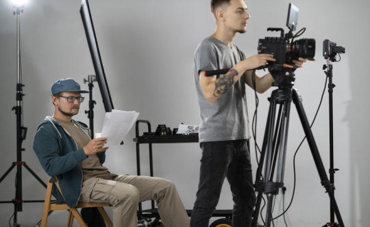
4. Photography Career: Gain Real-World Experience and Build a Stunning Portfolio
In the same mindset, it is quite safe to say that a photographer’s portfolio is their visual CV, one of the most vital components needed to utilize their expertise and up to clients and or employers. At RVR School of Photography, we believe having an impressive portfolio is of utmost importance especially when starting a career as a photographer.
Students of RVR have opportunities to participate in real product photoshoots, fashion editorials, etc, which are supervised by the instructors. These projects not only sharpen their practical skills but also prepare students to work in the real world where they have to please people, and complete the tasks given to them on time.
Such projects are led by instructors who are experienced practitioners in the industry and have mentored the students themselves through projects. They help the students with their feedback and how to use techniques that will help the students create an artistic identity that is uniquely theirs.
Also we encourage active learning through portfolios and conduct regular practice in fine al placement where students are given constructive feedback on their work. Feedback always highlights where the student is strong and where the student has room for growth so that the end product is always balance and professional.
5. RVR School of Photography Alumni Success Stories
Our students have to achieve great milestones by getting jobs in well-known companies such as TCS, WIPRO, TIMES, et cetera. These milestones achieved by some of our students bring glory to our school and prove that the training we provide has immense value in the field.
Some of our alumni who have been successful are:
Ravi Sharma: Worked with times as a corporate photographer and covered events of the high management.
Sneha Kapoor: Worked in the TCS marketing team and was involved in the creation of visuals for the campaigns.
Arjun Mehta: Worked as a fashion photographer in Wipro showcasing their apparel lines in the most appealing way.
These stories inspire our students and demonstrate the quality of training they receive at RVR.
6. Photography Career Skills You’ll Master at RVR School of Photography
The skills our students achieve go beyond the basics:
Mastering Composition: Composing a frame that tells a story with a thousand visual elements.
Lighting Techniques: Using natural and artificial lighting for accentuation and photography.
Editing Mastery: Students’ skills with tools such as Adobe Photoshop, Light room, and others.
Client Management: How to handle clients and their expectations and how to put them to fruition.
7. photography Career Paths After Completing a Photography Course
A degree from RVR School of Photography helps in getting various types of jobs:
Corporate Photographer: Photograph brand images, teams, events.
Fashion Photographer: Work with Brands, models, and designers.
Freelance Photographer: Own Photography business.
Media Photographer: Creative visual images for stories for newspapers, magazines.
With our guidance, students can tailor their skills to the path that suits them best.
8. How RVR School of Photography Supports Your photography Career
We don’t stop with the coursework only, it doesn’t end there. We help them to bulit their photography career:
Placements: With a reach over leading employers like TCS, Wipro and Times. We place students at the best jobs available. TCS, Wipro and Times
Networking Events: We provide events to the students where they meet potential employers and industry leaders (Photography).
Career Counseling: Counseling for photography career selection, for portfolio development, for interview skills etc.
9. Why Photography is a Lucrative Career Choice
Modern-day photography has reached unbelievable heights and most people have accepted it as an industry that encompasses numerous photography career opportunities. Photography career is self-employment, creativity and self actualization all in one package.
Consistently Develops:There is no industry today that does not have specialization in photography career. Companies reach out to professional photographers in other sectors such as marketing, advertising, content creation and social media. The same expertise is requested for events such as weddings, business meetings or product launches. It creates a continuous search for new talented professionals in detail work and creative design.
Different photography Career Opportunities:Several professional paths are available even when one has selected the field of phototgraphy. People of all skills and preferences: travel, fashion, wildlife, food, event and much more can all find their field in photography. Freelancers have freedom to select jobs, individuals focusing on photography career in occupations have a fixed salary and constant work.
Financial Stability and Growth:Would you consider photography career as an art or a business? For any professional photographer, it’s both. On the one hand, established photographers can offer a large range of services as well as find themselves to have long-term relationships with their clients. For instance, wedding photographers have good returns in each event during the busy season. On the other hand, commercial photographers working for top companies can receive good commissions on their projects as well.
Freelance Freedom:If you are one of those people that does not like having a boss, freelancing enables you to live a different lifestyle. A photographer who works on a one-off basis gets to select what project to work on, when to work, and how to sell themselves. This path of employment also means you can work with brands from a different country which means other markets always exist.
10. How to Apply to RVR School of Photography
Do you want to begin your photography career? The application to RVR is straightforward and needs no additional stress:
Look at our Site: RVR SCHOOL OF PHOTOGRAPHY
Select the Desired Course: Review the courses we offer and select the course you want.
Utilize the Application to Apply: Complete the provided form with the required information.
Meet Our Team For An Interview: Here we evaluate your interest in pursuing photography career and your vision.
Our admissions team is here to help you through each step.
Conclusion: Start Your Photography Career with RVR School of Photography
Photography is not simply a play of light and chemistry, but rather a story, an imagination, and a moment that strikes the heart of many. A photography career is endless since it can either be an exploration of artistic vision or a stable and rewarding profession. RVR School of Photography offers world-class training that combines sound theoretical knowledge with practical experience to make sure our students are industry-ready from day one.
Our professional mentorship builds students’ technical abilities and the assurance that they can succeed in a competitive marketplace. We help them create a solid portfolio, which is the foundation of every successful Registrant photographer, and we prepare them for different photography career paths from freelancing to working with renowned companies.
Whether you aspire to be a fashion photographer, specialize in stunning landscapes, or focus on corporate and media photography, RVR School of Photography is the best starting point. Our graduates speak volumes about the quality of education we offer, as many have attained outstanding milestones in their photography career.
Keep your passion for photography as a hobby, or let it change your life. RVR School of Photography provides tailored mentoring, world-class infrastructure, and an energetic learning environment to help you make creative dreams a successful photography career.
So what are you waiting for? Take action today, and allow us to guide you in unlocking your potential and creating an enjoyable career in photography. Become a student at RVR School of Photography, and see your passion become a successful professio
#Introduction: Photography as a Career#There is a huge market gap and in this gap the art of photography career has come up from being just a hobby to a fully fledged profession.#photography career now have a significant opportunity in fashion and social media also. At the RVR school of photography#we focus on the development of such skills and taking enthusiastic photographers as our students#we convert them into professionals. Our students have already worked with TCS#Wipro#Times amongst others. This speaks volumes of our training and the changing perception of the employers towards our students.#1. The Growing Demand for Professional Photographers#It became quite apparent that there is an increased need for photographers not only for social functions or individual projects but rather#media and fashion industries. As marketing experts seek to impress customers with great product photography#storytelling#and other visual elements#skilled photographers are in high demand. Demand for photographers has exploded virtually with the advent of the digital age. At the RVR sc#we take the students through the necessary training#which will encourage them to built their photography career with all the needs to succeed as photographers in the current market situation#2. Why Choose RVR School of Photography?#At RVR#we don’t only teach photography; we build photography career. This is what makes us unique:#Comprehensive Curriculum: In our courses#we start with the basics of photography and proceed to advanced editing#lighting#and image processing.#Industry Trained Faculty: Our teachers have more than just teaching as they have been active photographers themselves and know what it mean#Practice: Theory is not enough for us. The program has lots of practical sessions for the learners to further their skills and techniques.#Career Counselling and Job Placement: RVR pays particular attention to all students. Many of our students have received jobs in the compani#3. Courses Offered at RVR School of Photography#Our programs target all photographers to buit there photography career at all levels. That’s new photographers who want to acquire basic#Beginner Photography Course:#Photography course for beginners covers the fundamentals how to hold and use a camera#basic light
0 notes
Text
Shin-hanga.
Shin-hanga, or “new prints,” represents a revival of traditional Japanese woodblock printing techniques in the early 20th century. I’ve always been drawn to this art form for its stunning beauty and the stories it tells.
Shin-hanga artists, influenced by Western art styles, combined traditional Japanese aesthetics with modern techniques. The result is a unique blend that captures the essence of Japan’s landscapes, people, and culture.
Each print is not just a visual feast; it also reflects the artist’s perspective, showcasing Japan’s rich cultural heritage. Studying shin-hanga allows us to appreciate the intricacies of printmaking while also understanding the socio-cultural context in which these works were created.
#Shin-hanga#Japanese Art#Woodblock Printing#Traditional Techniques#Modern Art#Japanese Aesthetics#Printmaking#Cultural Heritage#Art History#Ukiyo-e#Artistic Expression#Japanese Landscapes#Portraiture in Art#Art Movements#Print Collecting#Artists of Shin-hanga#Visual Storytelling#Art Techniques#Japanese Culture#Fine Arts#today on tumblr#new blog
1 note
·
View note
Video
youtube
Moving from a 2D space to 3D with Emma Ridderstad
#youtube#Emma Ridderstad#2D to 3D transition#Spatial awareness#Artistic evolution#Creative journey#Visual exploration#Dimensional shift#Art techniques#Mixed media artwork#Perspective transformation#Depth perception#Artistic process#Sculpting techniques#Painting in 3D#Spatial storytelling#Creative growth
0 notes
Text
How to Paint with Words
When an author paints with words, they use word choice and sentence sequences to figuratively paint pictures in a reader’s mind.
In the visual arts, painting pictures, of course, refers to the act of representing people, objects, and scenery for viewers to behold with their own eyes.
In creative writing, painting pictures also refers to producing a picture of people, objects, and scenes—but the artist’s medium is the written word.
A master author uses care and precision in their writing process to craft evocative word pictures that conjure up mental images for their readers. If you want to bring a painterly quality to your own work, here are 5 writing tips to set you in the right direction:
Treat writing as an art form. Like all fine art, every component of the composition must be carefully considered. Some authors agonize over their book’s first sentence and last sentence, which is of course very important. But what about the second sentence? And the third? To paint with words, you must be mindful of detail in all sections of your text.
If you don’t think you have the right words, keep looking. If you type a verb or adjective that doesn’t feel satisfyingly evocative and you suspect there’s a near-synonym out there that would be a better word choice, continue your search. Use a thesaurus to remind you of words that may be slipping your mind at the moment you’re writing.
Emphasize action words. Action words are verbs that indicate proactivity by a subject. Action words help your reader understand what your characters are actually doing. And when you paint with words, the ability to show what characters do is a vital skill set. Use descriptive verbs to add more color to your action.
Strike a balance between description and prompting readers’ own imaginations. Although it may initially seem counterintuitive, sometimes painting with words requires withholding information so that the reader can imagine a scene for themselves. Let’s say that in your novel, you wish to describe a skyline. To paint the image with words, you don’t necessarily need to describe every single building lined up in a row. Instead, imagine what it looks like to stand on a street and behold five skyscrapers next to each other. Most people can’t process the details of every single building; their eye focuses on one or two and the other buildings are processed as more of a blur. If you represent such a “blurred” sensation in your own writing, you may be better able to give the reader the impression of really being there. So focus your written description on one or two buildings and maybe throw in some non-visual sensations, like the honking of taxis in the background.
Seek opportunities to improve your writing skills. The ability to paint with words isn’t mastered in a single session. Like all aspects of writing, it will always be a work in progress for even the best authors. Seek out the insight of writers you admire: Some have written books about their craft (Stephen King’s On Writing for example), while others share details of their craft via blogging or host their own podcasts. If a local writers’ collective offers an education program, look into it. It’s never too late to learn new prose techniques, literary devices, and storytelling methods.
Source ⚜ More: Writing Notes & References ⚜ Writing Resources PDFs
#words#description#writeblr#literature#writing tips#writers on tumblr#writing reference#dark academia#spilled ink#creative writing#writing prompt#writing advice#writing inspiration#writing ideas#on writing#writing resources
254 notes
·
View notes
Text
🎬Filmmaking in astrology🍿
🎬In astro, filmmaking as a career or passion can be linked to specific planetary influences, signs, and houses that symbolize creativity, storytelling, visual arts, and communication.
🍿Key planets in filmmaking🍿
Neptune: Represents imagination, dreams, and the ability to see beyond reality, making it central to the creativity and visionary aspects of filmmaking.
Venus: governs beauty, aesthetics, and artistry, set design, and overall visual appeal.
Mercury: Represents communication, storytelling, and writing. Crucial for scripting and dialogue.
Moon: Tied to emotions and intuition, helping filmmakers create stories that resonate emotionally with audiences.
Sun: Reflects creativity, self-expression, and identity, driving the artistic vision of a filmmaker.
🎬relevant signs🎬
Pisces: The sign of dreams and imagination ruled by Neptune is strongly associated with filmmaking, and emotional works.
Leo: The sign of creativity, performance, and entertainment, linked to the glamorous and dramatic aspects of filmmaking.
Gemini: represents storytelling, writing, and communication, ideal for screenwriters and directors who craft intricate narratives.
Aquarius: Connected to innovation and technology, representing modern filmmaking techniques, special effects, and futuristic concepts.
Libra: symbolizes aesthetics in harmony, tied to beautiful cinematography and design.
🍿Significant houses🍿
5th: Governs creativity, self-expression, and entertainment, making it key for filmmakers who create art.
9th: Represents philosophy, global perspective, and storytelling that explores universal themes
10th: governs career and public recognition, influencing success and visibility in the film industry.
12th: Linked to the subconscious, dreams and imagination often connected to filmmaking's ability to bring hidden emotions and stories to life.
🎬Career indicators in a chart🎬
🍿 Midheaven (MC): The sign and ruler of the 10th house indicates your career path and public image, which can point towards a filmmaking career if artists or communicative signs, (e.g.,Pisces, Leo, Gemini) are involved.
🍿Aspects🍿
🎬 Neptune, conjunct, trine, or sextile, the sun, moon, or venus can show a strong affinity for film, imagination, and artistry.
🎬 Mercury Aspects can indicate storytelling skills.
🎬 Uranus aspects might highlight innovation in filmmaking techniques.
Filmmaking Roles and Astrology🍿
🍿Director: Strong Leo, (Creative Leadership), Aries (Innovation), or Scorpio (Emotional Depth).
🍿Screenwriter: Gemini (Storytelling) or Virgo (Attention to Detail).
🍿 Cinematographer: Libra (visually beautiful) or Taurus (aesthetic sensibility)
🍿 Actor/performer: Leo (drama and performance)
🍿 Editor/producer: Capricorn (organization) or Aquarius (technical expertise).
🎬Examples of Filmmaking Potential in a Chart🎬
🎬 A pisces midheaven: with Neptune in the 10th house, suggests a career in imaginative or dream-like storytelling such as filmmaking.
🎬 A 5th house sun or moon: And Leo or Pisces could indicate a natural talent for creative self-expression and emotional storytelling.
🎬 Venus and Neptune conjunction: In a chart might suggest someone who excels at creating visually stunning and emotionally evoking film.
182 notes
·
View notes
Text
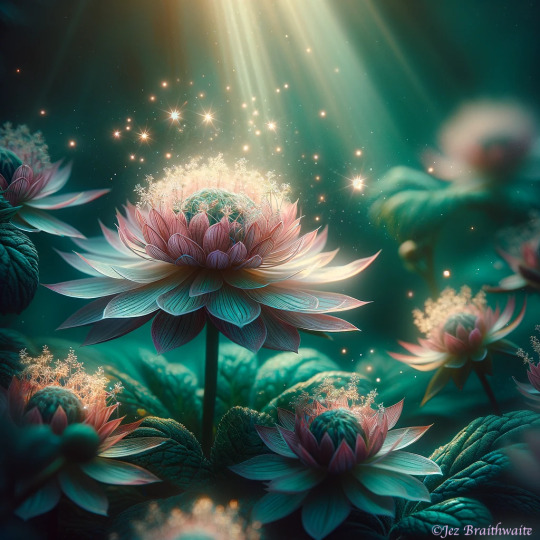
Great Masterwort: FOTD Dec 31 with Magical AI Artistry
Step into Jez's world where photography meets AI magic! 🌼✨ Explore our frosty days warmed by the sunny charm of Great Masterwort. See the transformation on our latest FOTD Dec 31 feature. #AIArtistry #PhotosByJez #aiartwork
Hi all 😃 My latest post for Cee’s FOTD. I am delving into my archives for warm, sunny shots during these frosty days. The Great Masterworts featured over the next couple of days are white (those last featured were pink); this led to a different feel for the images once enhanced. Any of you following my blog, will know I’m currently working on a project fusing my own photography with AI…
View On WordPress
#AI Artwork#Artistic Inspiration#Creative Photography Techniques#Digital Artistry#Digital Image Transformation#Flowers#FOTD#Hot Mods Art#Innovative Photography#Jez Braithwaite#Nature#OpenAI#Photographic Creativity#Photos#Summer#Visual Storytelling#warmth#Wildflowers
2 notes
·
View notes
Note
no thoughts, head empty, just Rohan with an author s/o. i think it’d be extra cute if their stands sort of compliment eachother, like while Rohan’s stand lets him read people like a book reader’s lets them view memories in the form of drawings with the different art styles communicating what sort of emotions are tied to each memory. i feel like the two of them would be that annoying couple in a cafe who talk too loudly and debate artistic things but their conversation is so interesting that you’re glad they’re talking loudly so you can hear it.
would love some headcannons for this sort of reader & relationship, big fan of your work ❤️
lines between the pages; rohan kishibe

synopsis — rohan kishibe never expected to fall for someone whose stand rivals the intimacy of his own. but when an author with a memory-drawing stand enters his orbit, their passion for storytelling turns every debate into foreplay and every argument into inspiration.
a/n — thank you love, i hope you enjoyed <3

“your inking technique is too precious.”
you blink, pen halfway to paper. “excuse me?”
“i said what i said.” rohan leans over your sketchpad like he’s already made himself at home in your mental workspace. “you draw memories like you’re afraid they’ll shatter.”
“because they’re someone’s memories, rohan.”
“yes, and my readers have emotional range. they don’t need coddled illustrations.” you slam your sketchbook closed.
the café goes quiet for exactly 0.7 seconds before rohan loudly sighs and throws his hands up like a man burdened by mediocrity.
somewhere behind the espresso machine, the barista mutters, “they’re back again.”
you met rohan kishibe by accident. or fate. or, more likely, because heaven’s door pulled apart your manuscript notes during a book signing and he decided your pacing was “amateurish but salvageable.”
“you write like you’ve never seen real darkness,” he said. “but your structure’s impressive. rewrite this scene with less internal monologue and more consequence.”
and for some godforsaken reason, instead of suing him or storming off, you asked if he’d read your next draft.
you’ve been circling each other since—rival artists, loud debaters, and now something else entirely. a pair. a couple. or as koichi once called it: ‘two ink-stained nightmares who probably flirt by critiquing each other’s soul.’ he wasn’t wrong.
your stand, chronosketch, lets you see memories in illustrated panels—the style shifting based on emotion. someone’s happiest moment might appear as soft watercolor. their deepest shame: harsh charcoal scratches. your brain reads trauma and joy in brush strokes and visual language.
it compliments heaven’s door, sure, but it annoys rohan to hell that your stand tells stories in ways his doesn’t.
“i write emotion,” he mutters one night, flipping through your sketchbook without permission. “but you… render it. like it’s some tragic little painting in a museum.”
“jealous?” you smirk.
“i’m above jealousy. i’m simply stating that your art style romanticizes memory. you illustrate heartbreak like it deserves pity.”
“and you illustrate it like it deserves punishment.” you lock eyes. the tension sharpens like ink on wet paper.
then he kisses you. like punctuation. like a perfectly placed panel break.
at the café, your argument over a minor side character’s motivation spirals into full-on artistic war. rohan is mid-diatribe about panel pacing when the couple next to you turns around and says, “sorry, but—are you two, like… famous or something?”
“no,” you say at the same time rohan says, “obviously.”
you shoot him a glare.
“they’re just loud,” the barista explains flatly, refilling your mug. “but weirdly educational.”
rohan raises an eyebrow, smug. “you’re welcome.”
you stab your fork into your croissant a little harder than necessary.
he doesn’t say it often, but rohan watches you draw like it’s a divine experience. when you sketch a stranger’s memory using chronosketch, he gets unnervingly quiet. not the arrogant kind of silence. the worshipful kind.
you know the way your fingers tremble when rendering someone’s moment of grief. how the lines stutter. how the ink thickens in places you didn’t expect. your stand doesn’t lie. it exposes your own heart just as much as theirs.
one night, after you sketch an old woman’s memory of her dead husband—portrayed in soft graphite and fading linework—rohan sits beside you for a long time. when he finally speaks, it’s barely audible.
“you drew her longing. you didn’t judge it.”
you look at him. “would you have?”
he doesn’t answer. but his hand brushes yours under the table. that’s answer enough.
dating rohan means learning how to navigate his genius and his ego—and recognizing when it’s a shield. he doesn’t compliment easily. when he does, it sounds like:
“this piece was… acceptable.”
“i didn’t feel the need to annotate your last chapter. impressive.”
“your dialogue didn’t make me want to rip my eyes out.”
and yet he notices everything. the way your handwriting changes when you’re nervous. the fact that you always hesitate before drawing a childhood memory. the way your stand leans toward softer media when you’re with him. he’d never admit it, but your presence makes him draw more tenderly, too.
— you both talk too loudly in every public space.
museums. cafés. bookstores. one time, someone tried to record your fight over whether flashbacks in manga are a lazy narrative crutch, and it went viral. rohan hasn’t stopped referencing it.
— rohan secretly draws you into the background of his manga.
once, as a rival character with your hairstyle. once, holding a sketchbook. koichi noticed. you’ve never let rohan live it down.
— you once used chronosketch to view rohan’s memory of finishing his first serialized chapter.
the style was manic. bold strokes, vivid reds. so much pressure. when you showed him your sketch of that memory, he stared for a long time. then told you the eyes were slightly off, but kept the drawing tucked in his nightstand.
— he hates when your work gets published before his.
“it’s not jealousy,” he claims. “it’s just that your editor clearly has no understanding of proper pacing.” (it’s jealousy.)
— your stand once accidentally revealed a childhood memory of his, an insecure one.
he didn’t yell. he just stared at it for a while, then quietly said, “no one’s ever drawn that the way it felt.”
— you bicker during intimacy.
“that’s not how you hold someone’s face in a romance scene.”
“we’re not in a romance scene, rohan—”
“we are now, idiot.” kiss.
rohan doesn’t change easily. he’s still blunt. still obsessive.
but he lets you rest your head in his lap while he inks panels. he lets you criticize his layouts. he reads your drafts without turning a single page into paper confetti.
he even—on occasion—lets you win an argument. (or so you think.)
when you curl up next to him at night, sketchbook open, and chronosketch starts revealing the memories of the day—today’s joy in watercolor, today’s irritation in sharp ink—he watches the panels unfold like scripture.
“do you ever draw me?” he asks once, offhandedly.
you glance up. “what makes you think i don’t?” he smirks.
“i’d like to see how you remember me,” he says. “what style you choose.”
you laugh, closing your sketchbook with a dramatic thump. “you? definitely avant-garde. chaotic lines. oversaturated. and a ridiculous amount of ego in the eyes.”
he leans in, mouth brushing your cheek. “drawn like a god, then.” you kiss him without denying it. because he’s right.
just… not for the reason he thinks.
#jojo’s bizarre adventure x reader#jjba x reader#jjba rohan#rohan kishibe#rohan kishibe x reader#rohan x reader
59 notes
·
View notes