#Vertigo 1958 US Movie Poster
Explore tagged Tumblr posts
Text

An older addition to the Mini Movie Poster Project. And that spiral was a bitch! Lol.
Vertigo, 1958.
Use code JUSTBECAUSE for 20% off!
Check out the shop: https://teashopcrafts.bigcartel.com/
7 notes
·
View notes
Text
Horror Movie References in Scream (2022)
A youtuber named Zack Cherry whose a big scream fan made a 4 videos where he list movie reference that were mentioned or payed homage for a scene in the scream franchise. He has done one for Scream (2022), So I decided to make one for my self. I found only 25 movie references in Scream (2022). I also notice one tv show reference.
1. Vertigo (1958): directed by Alfred Hitchcock. There's a poster of the movie behind the couch in living room at the meeks-martin home
2. The Blob (1958): there's a blob poster in the meeks-martin home.
3. Psycho (1960): directed by alfred hitchcock. Wes taking a shower is reference to the shower scene. There's a poster of psycho in the meeks-martin home.
4. Last house on the left (1972): directed by wes craven, which was his first movie he directed. Vince has a tattoo of symbol in reference to the movie. There's a photo of a movie theatr in the meeks-martin home.
5. The hills have eyes (1977): directed by wes craven. There's a photo of a movie theatre in the meeks-martin home.
6. Halloween (1978): Tara and Sam's last name is Carpenter which is a reference to John Carpetner who directed Halloween. When Mindy is watching Stab, where Stab Randy is watching Halloween.
7. Friday the 13th part 2 (1981): Richie mentions Jason Voorhees by saying that killer got their inspiration from horror movies. Vince also has tattoo of Jason.
8. A Nightmare on elm street (1984): directed by Wes Craven. In Dewey's contact list, there are names Nancy T (Nancy Thompson) and Tina G (Tina Grey). Vince has a tattoo of the number 1428 which is the number address in elm street and a duck dressed up as freddy krueger. Tara mentions Sidney use to live in elm street.
9. Shocker (1989): directed by Wes craven. Vince has a tattoo of a person in an electic chair getting shocked.
10. The people under the stairs (1991): directed by wes craven. In Stab, there are two vhs tapes. The people under the stairs is one of them.
11. Scream (1996): directed by wes craven. Because the movie's topic is requels, there are a lot of references in the first film.
- the macher house is in the third act.
- the opening sequence is similar to the drew barrymore opening scequence
- Gale's red suit is similar to the one she wore in the original
12. Scream 2 (1997): there are references in the second movie.
- richie and amber targeting legacy characters is similar to mickey and mrs loomis targeting characters who have the same names as previous Woodsboro victims
- Richie plays the supportive goofy boyfriend who is pretty similar to Derek
- Judy saying she prefers Musical and animated films is similar to Randy saying show girls is his favourite scary movie
13. Scream 2000 (2000): there are a few references from the third movie.
- amber wearing a bullet proof vessel is similar to how roman wore one
- sam being Billy's daughter is similar to sidney finding out she has a brother name roman. Roman and Billy are ghostface killers.
14. Scream 4 (2011):
- Sam mentions that last ghostface murders happened 11 years ago.
- Scream 5 talking about requels is similar to Scream 4 talking about remakes
- final girls (sidney and sam) saying this isn't a movie where ghostface (richie and Charlie) replied by saying it will be.
15. You're next (2011): one of deputy officers, Deputy Vinson could be a reference to actress Sharnie Vinson who played final girl Erin in the movie.
16. The Babadook (2014): Tara says this is her favourite horror movie. What interesting the movie is about a grieving mother and son who are in a strained relationship which is like Tara's family issues.
17. It follows (2014): tara mentions this movie.
18. The VVitch (2015): tara mentions this movie. The movie is about a family being banished, where strange things start to happened and Thomasin whose the oldest is being blamed. This is another movie that goes through a lot of family issues.
19. Flatliners (2017): Mindys mentions how remakes don't work like they use to and mentions flatliners as being one of them.
20. Hereditary (2018): another movie that Tara mentions and another movie feels similar to the family issues.
21. Halloween (2018): Mindy mentions how the killers are making a requels where she mentions Halloween which is a long-awaited sequel to the first movie.
22. Childs play (2019): another remake that mindy list as how remakes don't work. Ironically there were positive feedback from this movie despite the low expectations.
23. Black Christmas (2019): another remake that mindy mentions.
24. Ready or not (2019): the other deputy, deputy Farney could be reference to actress Tara Farney who stars in the movie. Ready or not shares the same production as scream 5 and 6, Radio Silence.
25. Spiral the book of saw (2021): mindy mentions it as a requel.
The tv show I was talking about Riverdale (2017-2023). Betty Cooper is similar to Sam Carpetner. Where they both have fathers who are killers that wear a mask during the killings. They also wonder if they may end up like their fathers because of the darkness in them.
#scream#sam carpenter#tara carpenter#gale weathers#dewey riley#sidney prescott#billy loomis#mindy meeks martin#chad meeks martin#amber freeman#richie kirsch#wes hicks#vince schneider#liv mckenzie#horror movie reference#judy hicks#stu macher
28 notes
·
View notes
Text
graphic design: artist research, Saul bass
For graphic design, I decided to look at Saul Bass, an American graphic designer and Oscar-winning filmmaker, best known for his design of motion-picture title sequences, film posters, and corporate logos.
Saul Bass was born on May 8, 1920, in New York city to Jewish immigrant parents. He graduated from James Monroe High School in the Bronx and studied part-time at the Art Students League in Manhattan until attending night classes at Brooklyn College.
Bass became widely known in the film industry after creating the title sequence for Otto Preminger's The Man with the Golden Arm (1955). The subject of the film was a jazz musician's struggle to overcome his heroin addiction, Bass decided to create a title sequence that reflected the films subject matter, The titles featured an animated, white on black paper cut-out arm of a heroin addict.

He also did other posters for films such as "Anatomy of Murder" (1959) by Otto Preminger and "Vertigo" (1958) by Alfred Hitchcock.


I decided to look at this artist due to his colour-block style for movie posters and title sequences. similar to the album cover I did the previous week, I want to use a lineless art style again for my own graphic design. Others have used bass style to recreate other well known movie posters aw well.


6 notes
·
View notes
Text
RESEARCH - Saul Bass

- Saul Bass was a prominent American graphic designer of the twentieth-century. He largely designed motion picture title sequences, corporate logos and movie posters. He was a pioneer of the modern title sequence designing.
- Amongst his very best work is the legendary design for Alfred Hitchcock’s 1958 film Vertigo, which incorporated a distinctive spiral graphic element, to convey a dizzying sense of disorientation.
- Bass had designed the film's full US campaign using slight variations on the placement of the figures in relation to the spiral artwork, according to size. This means this poster is a true rarity. Coupled with the classic design, condition and sheer size, this is one of the ultimate film posters of the 20th century.
Saul Bass book:
BEST QUOTES
Simplicity of posters:
““he maintained the modernist belief that it is possible to strip away layers of complexity and arrive at a single visual essence.”
“In all his work, Saul said that he “looked for the simple idea”. But Saul’s work in film was more than just simplicity: his designs shaped complex ideas into radically simple forms that offered audiences a set of clues, a sort of hermeneutic key into deeper meanings under the surface of the movie.”
“a simplicity which also has a certain ambiguity and a certain metaphysical implication that makes the simplicity vital. If it’s simple simple, it’s boring”
“I began dealing with titles in terms of setting mood, creating an atmosphere, an attitude and a generalized metaphor for what the film was about. And setting up the subtext for the film”
“titles were not limited to summarizing what was already there, but could serve as a lens through which to view film in a different light”
About Bass:
“Saul Bass was the person everyone in the agency admired. He was the ��hot’ designer… we all aspired to that beautiful simplification.”
“Saul truly shaped the vision of our time”
“Saul understood and harnessed the power of images, and his energy and ideas transcended the boundaries that have traditionally separated design, film, architecture and art.”
“by the late 1950’s Saul was probably the best-known graphic designer in the world.”
movie posters book:
BEST QUOTES
Importance of posters:
“Now part of larger marketing campaigns, poster images are required to be reusable in a number of formats and for the most part they have lost any stand-alone quality. The need to appeal to the eye flicking along the shelves of the video store has led to uniformity and blandness.”
“film may be alive and well, but film posters are in a state of limbo.”
“By and large, even the most experimental of films are promoted with the blandest of graphic devises.”
“Posters in general are the wallpaper of urban life, and film posters in particular create the environment of anticipation I which new releases are best enjoyed.”
Why we have movie posters:
“the independent trajectory of the film poster reflects the changing nature of the audience. Posters are primarily advertisements, and their task is to connect with the people on the street, not with the images on the screen”
Famous faces:
“it became apparent that nothing attracted an audience more surely than a familiar face”
“the twinned emergence of feature films and recognizable stars promoted the development of the movie poster”
“focussing on a single, well-known figure, became an established part of the cycle of movie promotion.”
Complexity:
“he maintained the modernist belief that it is possible to strip away layers of complexity and arrive at a single visual essence.”
0 notes
Photo
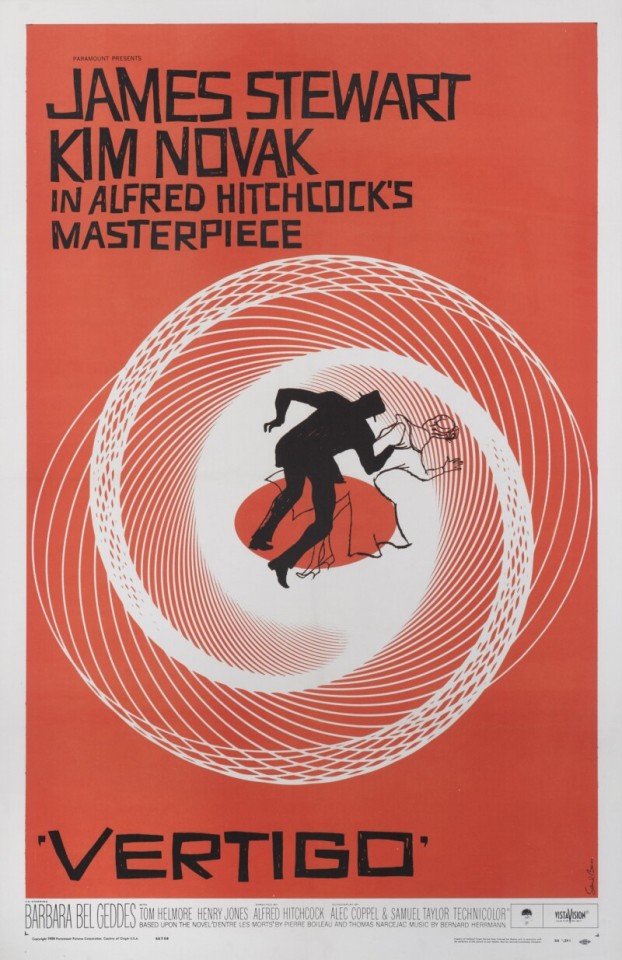


Vertigo (1958), US Movie Poster
Artist: Saul Bass (1920-1996).
Unframed: 41 x 27 in. (104 x 69 cm). Framed: 47 1/2 x 33 in. (120.6 x 84 cm).
The image on this poster is the most recognisable and iconic of all Saul Bass's designs. This is one of the best examples of this poster to surface in many years, as the colour is exceptionally vivid. The majority of pieces that have surfaced are more orange in colour, and not as red as this piece.
This is the fourth and final time that James Stewart would work with Alfred Hitchcock, in one of his best loved thrillers. The mood of the film was greatly enhanced by the score, which was written by Bernard Herrmann.
Vertigo is a 1958 American film noir psychological thriller film directed and produced by Alfred Hitchcock. The story was based on the 1954 novel D'entre les morts (From Among the Dead) by Boileau-Narcejac. The screenplay was written by Alec Coppel and Samuel A. Taylor. The film stars James Stewart as former police detective John "Scottie" Ferguson, who has retired because an incident in the line of duty has caused him to develop acrophobia (an extreme fear of heights) and vertigo (a false sense of rotational movement). Scottie is hired by an acquaintance, Gavin Elster, as a private investigator to follow Gavin's wife Madeleine (Kim Novak), who is behaving strangely.
#Vertigo 1958 US Movie Poster#1958 film noir#alfred hitchcock#james stewart#kim novak#1950s#1950s style#1950s hollywood#1950s movies
10 notes
·
View notes
Text
Research: Storytelling project
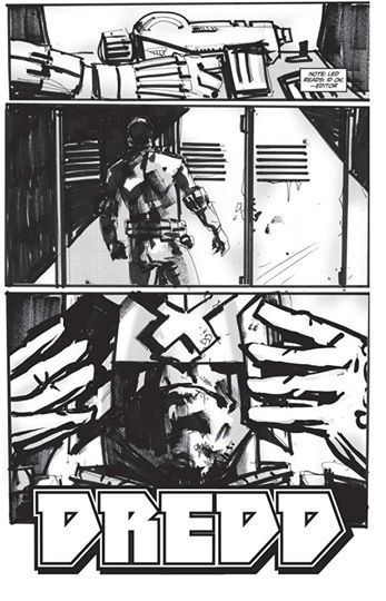
JOCK
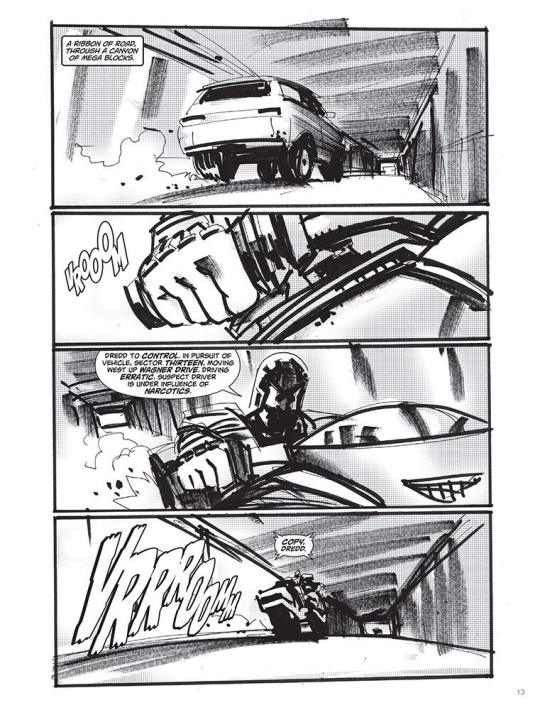
Mark Simpson, best known as Jock, is a Scottish comic book artist and illustrator. He began his career in 1999 working on the British comic book publisher 2000 AD (where most of the British artists and writers, began their career, before going to the major leagues like DC and Marvel), and started working with characters like the Judge Dredd.
The artist began his career in the USA with The Losers, at Vertigo (a subdivision of DC comics), and some issues of the Green Arrow.
He also have worked with conceptual arts for various films such as Iron man 3, X-men days of the future past, and Star Wars episode VIII.
I have known Jock for a while, I have seen many of his works in the comics, and he is known for working mainly with covers, where he does extremely surreal works, mixing various types of colors, and always uses a lot of shading, not worrying if the characters are in the correct proportion, because that is not his proposal.
But I know he did some works as a sequential artist, like The Losers, for example, where he makes extremely tight pictures, always focusing on the expressions of the characters, and especially on the hands that he most likes to do.
His storyboards or sketches are very different, because his drawings do not follow the traditional way of being centered on the pictures, many of his characters are jumping over the pictures, to show the size of the action scene that Jock wants to do.
It is worth remembering that he mixes his drawings made with pencil and nanquin, with digital, often taking pictures of different landscapes or scenarios, and drawing over them, and mixing with his drawn character to make an interesting composition.
Despite all this, he has a very peculiar style, which many people complain about the lack of movement and poses that his characters does. That his lines are also very dirty and dark. But Jock says, that this is his way of drawing, that he likes to have a not so commercial style, like many other artists. He likes to play with colors and likes to draw his characters, in a little more simple poses, and glorifying the background.
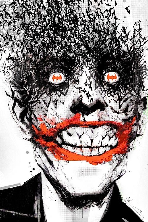

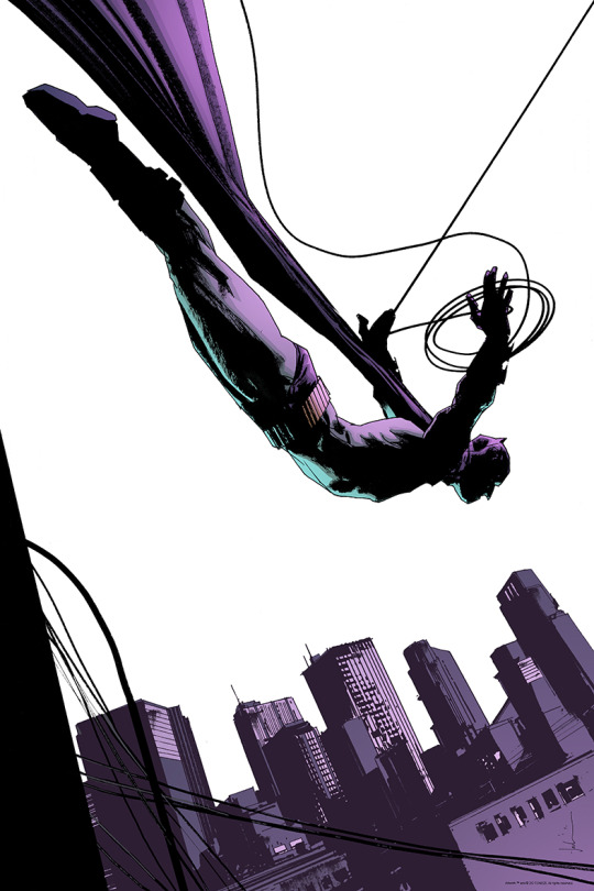
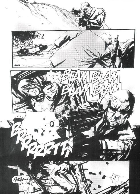
Saul Bass
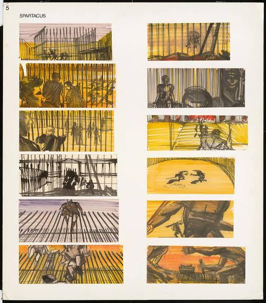
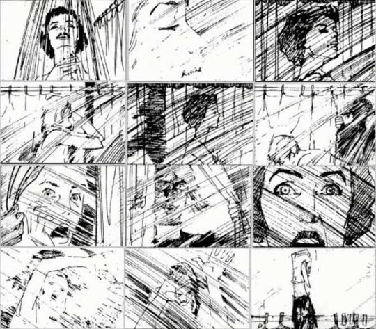
Saul Bass was an American graphic designer and filmmaker, he’s known for designing movie posters and title sequences.
For 40th years, he worked with Hollywood greatest filmmakers, such as Stanley Kubrick, Alfred Hitchcock, Martin Scorsese and Billy Wilder.
Bass was born in New York in 1920, to a Jewish family, he was all ways drawing when he was a child.He graduated from James Monroe High school in the Bronx. He studied part time at art students league in Manhattan, and moved to Brooklyn College, where he had classes with György Kepes, a famous Hungarian painter and photographer.
He began in Hollywood in the 40’s, designing prints for films like champion (1949), death salesman (1951) and the moon is blue (1953).
He became widely known for creating the title sequence for Otto Preminger’s The man with the golden arm (1955), which’s about a jazz musician, addicted to heroin. Bass decided to create a poster which dialogues with the controversial subject, so he chosed the arm as the central object, as is a image which relates with heroin.
For Alfred Hitchcock, he provided memorable posters, like Vertigo(1958), North by Northwest(1959) and Psycho(1960).
For Martin Scorsese he had done the posters of The Goodfellas(1990), Cape Fear (1991), the Age of innocence (1993) and Casino (1995).
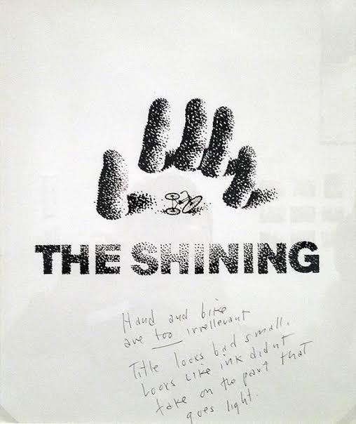
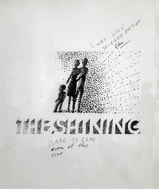
For Stanley Kubrick, he designed Spartacus (1960), and probably the best poster in his career, which is the poster from The Shining (1980).Kubrick, however, wasn’t amused. On the sketches themselves (which were later discovered in his personal affects) he wrote “Looks like science fiction.”Title looks small, looks like the ink didn’t take on the part that goes light,” and “Maze too abstract and too much emphasis on maze,” and, the most scathing of all, “Don’t like artwork.”
More discussions followed, and Bass agreed upon an illustrative approach of a large head peering through the title.As Kubrick instructed, the poster evokes both “terror” and the “supernatural.”
Bass once told,that his main goal for his titles sequences is “try to reach for a simple, visual phrase that tells you what the picture is all about and evokes the essence of the story".

James Cameron
James Cameron is a famous film director, which is for having two of the greatest box office films of all time, which are Avatar and Titanic. In addition, he is always revolutionizing in special effects, always bringing something new and revolutionary, but it all starts on his drawing desk, with his sketches and storyboards.
James Cameron has always been known for creating extremely interesting worlds, and completely out of the ordinary. Starting with the film Aliens, the sequel to Ridely Scott's film, where he expanded this world by creating an ecosystem for the aliens, in addition to showing futuristic equipment, for the space army that faces the aliens.
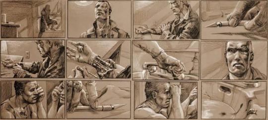
He also created concepts, for the Terminator films 1 and 2, where it was an idea never before seen of a robot that travels in time to kill a person. Its detailed perfectly drawn storyboards show one of the most interesting scenes in the film, where the terminator does a self surgery, revealing his true form.
And finally, once again creating a whole world, with a fauna and flora never seen before in the movie Avatar.
Cameron always wanted to create worlds, so he putted everything on a piece of paper when he was a child, where later, he took courses of drawings and did art colleges, to get a clearer idea of how his worlds and characters could be.
Before being a director, he wanted to be a writer and an artist, but he never thought his ideals could be just in a book, he wanted to expand these ideas in a way never seen before.
Perhaps what impresses me most about James Cameron, besides being a creative force, is all the care he takes with his works, he said in an interview, which he always preserves all his storyboards, even from those films that he never made or did not work, and said that almost every day, he sits at his drawing desk and tries to come up with possible scenes for any film he is making. And when he creates an interesting scene, he tries to invent a whole story, to get to that specific scene.
https://issuu.com/dteditore/docs/spidercameron-screen-eng/1?ff


Glen Keane
Glen Keane was born on April 23, 1954, in the city of Philadelphia, United States. Early on, he became interested in art while watching his cartoonist father Bill Keane draw. After finishing high school, he turned down a scholarship to play football and signed up for CalArts- California Institute of Arts.
Keane signed up for the painting program, he wanted to be a visual artist. However, his application was accidentally sent to the animation department, then Film Graphics. The college vetoed him to change course, so he stayed there.
Glen’s passion for painting helped him tremendously in animation, since the first skill an animator must have is knowing how to draw. Do not simply draw, but really know anatomy and how to give the illusion of weight.
His first work was Bernardo and Bianca in the kangaroo land. In the following years Keane worked on other features such as the Hound and the fox, Oliver and his gang , treasure planet, and the list goes on.
But it’s was at the time called the Disney Renaissance that Keane stood out. He animated Ariel the little mermaid, Beast from the beauty and the beast, Aladdin, Pocahontas, Tarzan, and most recently, was Rapunzel (Tangled).
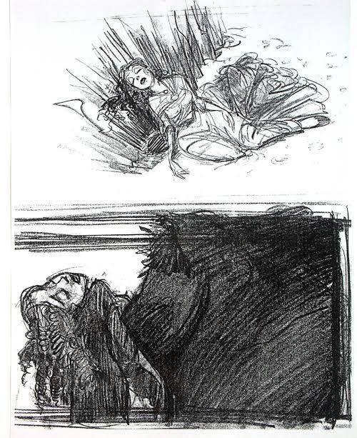
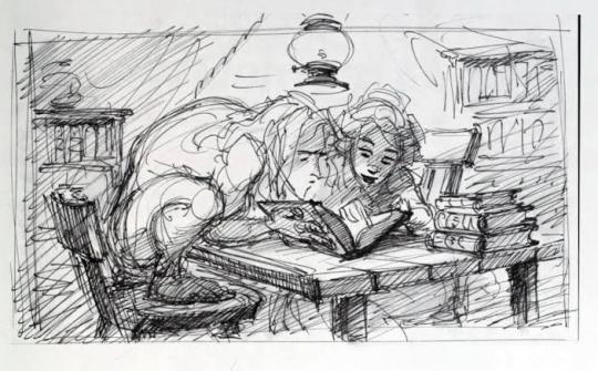
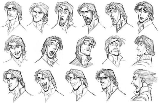
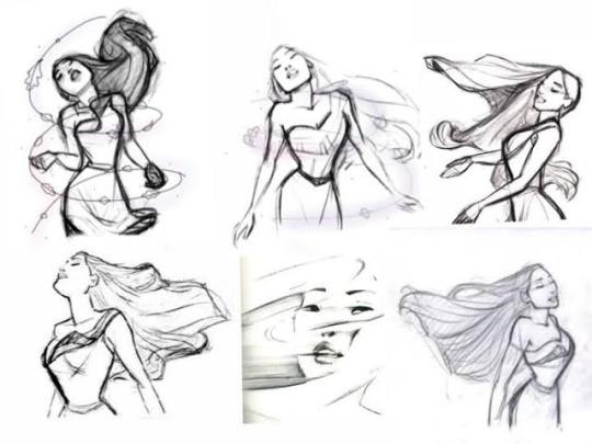
At the time, Keane and the animators, had to use the traditional animation (by using paper), so him and his crew had to plan, all the scenes and poses, by doing storyboards, and later drawing on the paper frame by frame (the frequency to project a film in the cinema is twenty four frames per second, twenty four drawings in total were needed for each second of animation seen on screen).
There is no professional on the animation field, who does not know the name Glen Keane. He is the reference to all of them. What sets him apart, is his passion for his characters. During the production of the animations, Keane understands them and is thus able to perform better.

4 notes
·
View notes
Photo

The Captive Lover – An Interview with Jacques Rivette, Frédéric Bonnaud
(September 2001)
Translation by Kent Jones
This interview was originally published in Les Inrockuptibles (25 March 1998) and has been republished here with the kind permission of the author.
* * *
I guess I like a lot of directors. Or at least I try to. I try to stay attentive to all the greats and also the less-than-greats. Which I do, more or less. I see a lot of movies, and I don’t stay away from anything. Jean-Luc sees a lot too, but he doesn’t always stay till the end. For me, the film has to be incredibly bad to make me want to pack up and leave. And the fact that I see so many films really seems to amaze certain people. Many filmmakers pretend that they never see anything, which has always seemed odd to me. Everyone accepts the fact that novelists read novels, that painters go to exhibitions and inevitably draw on the work of the great artists who came before them, that musicians listen to old music in addition to new music… so why do people think it’s strange that filmmakers – or people who have the ambition to become filmmakers – should see movies? When you see the films of certain young directors, you get the impression that film history begins for them around 1980. Their films would probably be better if they’d seen a few more films, which runs counter to this idiotic theory that you run the risk of being influenced if you see too much. Actually, it’s when you see too little that you run the risk of being influenced. If you see a lot, you can choose the films you want to be influenced by. Sometimes the choice isn’t conscious, but there are some things in life that are far more powerful than we are, and that affect us profoundly. If I’m influenced by Hitchcock, Rossellini or Renoir without realizing it, so much the better. If I do something sub-Hitchcock, I’m already very happy. Cocteau used to say: “Imitate, and what is personal will eventually come despite yourself.” You can always try.
Europa 51 (Roberto Rossellini, 1952)
Every time I make a film, from Paris nous appartient (1961) through Jeanne la pucelle (1994), I keep coming back to the shock we all experienced when we first saw Europa 51. And I think that Sandrine Bonnaire is really in the tradition of Ingrid Bergman as an actress. She can go very deep into Hitchcock territory, and she can go just as deep into Rossellini territory, as she already has with Pialat and Varda.
Le Samourai (Jean-Pierre Melville, 1967)
I’ve never had any affinity for the overhyped mythology of the bad boy, which I think is basically phony. But just by chance, I saw a little of L’Armée des ombres (1969) on TV recently, and I was stunned. Now I have to see all of Melville all over again: he’s definitely someone I underrated. What we have in common is that we both love the same period of American cinema – but not in the same way. I hung out with him a little in the late ’50s; he and I drove around Paris in his car one night. And he delivered a two-hour long monologue, which was fascinating. He really wanted to have disciples and become our “Godfather”: a misunderstanding that never amounted to anything.
The Secret Beyond the Door (Fritz Lang, 1948)
The poster for Secret Défense (1997) reminded us of Lang. Every once in a while during the shoot, I told myself that our film had a slim chance of resembling Lang. But I never set up a shot thinking of him or looking to imitate him. During the editing (which is when I really start to see the film), I saw that it was Hitchcock who had guided us through the writing (which I already knew) and Lang who guided us through the shooting: especially his last films, the ones where he leads the spectator in one direction before he pushes them in another completely different direction, in a very brutal, abrupt way. And then this Langian side of the film (if in fact there is one) is also due to Sandrine’s gravity.
The Night of the Hunter (Charles Laughton, 1955)
The most seductive one-shot in the history of movies. What can you say? It’s the greatest amateur film ever made.
Dragonwyck (Joseph L. Mankiewicz, 1946)
I knew his name would come up sooner or later. So, I’m going to speak my peace at the risk of shocking a lot of people I respect, and maybe even pissing a lot of them off for good. His great films, like All About Eve (1950) or The Barefoot Contessa (1954), were very striking within the parameters of contemporary American cinema at the time they were made, but now I have no desire whatsoever to see them again. I was astonished when Juliet Berto and I saw All About Eve again 25 years ago at the Cinémathèque. I wanted her to see it for a project we were going to do together before Céline and Julie Go Boating (1974). Except for Marilyn Monroe, she hated every minute of it, and I had to admit that she was right: every intention was underlined in red, and it struck me as a film without a director! Mankiewicz was a great producer, a good scenarist and a masterful writer of dialogue, but for me he was never a director. His films are cut together any which way, the actors are always pushed towards caricature and they resist with only varying degrees of success. Here’s a good definition of mise en scène – it’s what’s lacking in the films of Joseph L. Mankiewicz. Whereas Preminger is a pure director. In his work, everything but the direction often disappears. It’s a shame that Dragonwyck wasn’t directed by Jacques Tourneur.
The Big Sleep (Howard Hawks, 1946)
It’s Chandler’s greatest novel, his strongest. I find the first version of the film – the one that’s about to be shown here – more coherent and “Hawksian” than the version that was fiddled with and came out in ’46. If you want to call Secret Défense a policier, it doesn’t bother me. It’s just that it’s a policier without any cops. I’m incapable of filming French cops, since I find them 100% un-photogenic. The only one who’s found a solution to this problem is Tavernier, in L.627 (1992) and the last quarter of L’Appât (1995). In those films, French cops actually exist, they have a reality distinct from the Duvivier/Clouzot “tradition” or all the American clichés. In that sense, Tavernier has really advanced beyond the rest of French cinema.
Vertigo (Alfred Hitchcock, 1958)
Of course we thought about it when we made Secret Défense, even if dramatically, our film is Vertigo in reverse. Splitting the character of Laure Marsac into Véronique/Ludivine solved all our scenario problems, and above all it allowed us to avoid a police interrogation scene. During the editing, I was struck by the “family resemblance” between the character of Walser and the ones played by Laurence Olivier in Rebecca (1940) and Cary Grant in Suspicion (1941). The source for each of these characters is Heathcliff in Wuthering Heights, which brings us back to Tourneur, since I Walked with a Zombie (1943) is a remake of Jane Eyre.
I could never choose one film by Hitchcock; I’d have to take the whole oeuvre (Secret Défense could actually have been called Family Plot [1976]). But if I had to choose just one film, it would be Notorious (1946), because of Ingrid Bergman. You can see this imaginary love affair between Bergman and Hitchcock, with Cary Grant there to put things in relief. The final sequence might be the most perfect in film history, in the way that it resolves everything in three minutes – the love story, the family story and the espionage story, in a few magnificent, unforgettable shots.
Mouchette (Robert Bresson, 1966)
When Sandrine and I first started talking – and, as usual, I didn’t know a thing about the film I wanted to make – Bernanos and Dostoyevsky came up. Dostoyevsky was a dead end because he was too Russian. But since there’s something very Bernanos-like about her as an actress in the first place, I started telling her my more or less precise memories of two of his novels: A Crime, which is completely unfilmable, and A Bad Dream, a novel that he kept tucked away in his drawer, in which someone commits a crime for someone else. In A Bad Dream, the journey of the murderess was described in even greater length and detail than Sandrine’s journey in Secret Défense.
It’s because of Bernanos that Mouchette is the Bresson film I like the least. Diary of a Country Priest (1950), on the other hand, is magnificent, even if Bresson left out the book’s sense of generosity and charity and made a film about pride and solitude. But in Mouchette, which is Bernanos’ most perfect book, Bresson keeps betraying him: everything is so relentlessly paltry, studied. Which doesn’t mean that Bresson isn’t an immense artist. I would place Trial of Joan of Arc (1962) right up there with Dreyer’s film. It burns just as brightly.
Under the Sun of Satan (Maurice Pialat, 1987)
Pialat is a great filmmaker – imperfect, but then who isn’t? I don’t mean it as a reproach. And he had the genius to invent Sandrine – archeologically speaking – for A nos amours (1983). But I would put Van Gogh (1991) and The House in the Woods (1971) above all his other films. Because there he succeeded in filming the happiness, no doubt imaginary, of the pre-WWI world. Although the tone is very different, it’s as beautiful as Renoir.
But I really believe that Bernanos is unfilmable. Diary of a Country Priest remains an exception. In Under the Sun of Satan, I like everything concerning Mouchette [Sandrine Bonnaire’s character], and Pialat acquits himself honorably. But it was insane to adapt the book in the first place since the core of the narrative, the encounter with Satan, happens at night – black night, absolute night. Only Duras could have filmed that.
Home from the Hill (Vincente Minnelli, 1959)
I’m going to make more enemies…actually the same enemies, since the people who like Minnelli usually like Mankiewicz, too. Minnelli is regarded as a great director thanks to the slackening of the “politique des auteurs.” For François, Jean-Luc and me, the politique consisted of saying that there were only a few filmmakers who merited consideration as auteurs, in the same sense as Balzac or Molière. One play by Molière might be less good than another, but it is vital and exciting in relation to the entire oeuvre. This is true of Renoir, Hitchcock, Lang, Ford, Dreyer, Mizoguchi, Sirk, Ozu… But it’s not true of all filmmakers. Is it true of Minnelli, Walsh or Cukor? I don’t think so. They shot the scripts that the studio assigned them to, with varying levels of interest. Now, in the case of Preminger, where the direction is everything, the politique works. As for Walsh, whenever he was intensely interested in the story or the actors, he became an auteur – and in many other cases, he didn’t. In Minnelli’s case, he was meticulous with the sets, the spaces, the light…but how much did he work with the actors? I loved Some Came Running (1958) when it came out, just like everybody else, but when I saw it again ten years ago I was taken aback: three great actors and they’re working in a void, with no one watching them or listening to them from behind the camera.
Whereas with Sirk, everything is always filmed. No matter what the script, he’s always a real director. In Written On the Wind (1956), there’s that famous Universal staircase, and it’s a real character, just like the one in Secret Défense. I chose the house where we filmed because of the staircase. I think that’s where all dramatic loose ends come together, and also where they must resolve themselves.
That Obscure Object of Desire (Luis Buñuel, 1977)
More than those of any other filmmaker, Buñuel’s films gain the most on re-viewing. Not only do they not wear thin, they become increasingly mysterious, stronger and more precise. I remember being completely astonished by one Buñuel film: if he hadn’t already stolen it, I would have loved to be able to call my new film The Exterminating Angel! François and I saw El when it came out and we loved it. We were really struck by its Hitchcockian side, although Buñuel’s obsessions and Hitchcock’s obsessions were definitely not the same. But they both had the balls to make films out of the obsessions that they carried around with them every day of their lives. Which is also what Pasolini, Mizoguchi and Fassbinder did.
The Marquise of O… (Eric Rohmer, 1976)
It’s very beautiful. Although I prefer the Rohmer films where he goes deep into emotional destitution, where it becomes the crux of the mise en scène, as in Summer, The Tree, the Mayor and the Mediathèque and in a film that I’d rank even higher, Rendez-vous in Paris (1995). The second episode is even more beautiful than the first, and I consider the third to be a kind of summit of French cinema. It had an added personal meaning for me because I saw it in relation to La Belle noiseuse (1991) – it’s an entirely different way of showing painting, in this case the way a painter looks at canvases. If I had to choose a key Rohmer film that summarized everything in his oeuvre, it would be The Aviator’s Wife (1980). In that film, you get all the science and the eminently ethical perversity of the Moral Tales and the rest of the Comedies and Proverbs, only with moments of infinite grace. It’s a film of absolute grace.
Twin Peaks: Fire Walk with Me (David Lynch, 1992)
I don’t own a television, which is why I couldn’t share Serge Daney’s passion for TV series. And I took a long time to appreciate Lynch. In fact, I didn’t really start until Blue Velvet (1986). With Isabella Rossellini’s apartment, Lynch succeeded in creating the creepiest set in the history of cinema. And Twin Peaks, the Film is the craziest film in the history of cinema. I have no idea what happened, I have no idea what I saw, all I know is that I left the theater floating six feet above the ground. Only the first part of Lost Highway (1996) is as great. After which you get the idea, and by the last section I was one step ahead of the film, although it remained a powerful experience right up to the end.
Nouvelle Vague (Jean-Luc Godard, 1990)
Definitely Jean-Luc’s most beautiful film of the last 15 years, and that raises the bar pretty high, because the other films aren’t anything to scoff at. But I don’t want to talk about it…it would get too personal.
Beauty and the Beast (Jean Cocteau, 1946)
Along with Les Dames du Bois de Boulogne (1945), it was the key French film for our generation – François, Jean-Luc, Jacques Demy, myself. For me, it’s fundamental. I saw Beauty and the Beast in ’46 and then I read Cocteau’s shooting diary – a hair-raising shoot, which hit more snags than you can imagine. And eventually, I knew the diary by heart because I re-read it so many times. That’s how I discovered what I wanted to do with my life. Cocteau was responsible for my vocation as a filmmaker. I love all his films, even the less successful ones. He’s just so important, and he was really an auteur in every sense of the word.
Les Enfants terribles (Jean Cocteau, 1950)
A magnificent film. One night, right after I’d arrived in Paris, I was on my way home. And as I was going up rue Amsterdam around Place Clichy, I walked right into the filming of the snowball fight. I stepped onto the court of the Théâtre de l’Oeuvre and there was Cocteau directing the shoot. Melville wasn’t even there. Cocteau is someone who has made such a profound impression on me that there’s no doubt he’s influenced every one of my films. He’s a great poet, a great novelist, maybe not a great playwright – although I really love one of his plays, The Knights of the Round Table, which is not too well known. An astonishing piece, very autobiographical, about homosexuality and opium. Chéreau should stage it. You see Merlin as he puts Arthur’s castle under a bad charm, assisted by an invisible demon named Ginifer who appears in the guise of three different characters: it’s a metaphor for all forms of human dependence. In Secret Défense, the character of Laure Mersac probably has a little of Ginifer in her.
Cocteau is the one who, at the end of the ’40s, demonstrated in his writing exactly what you could do with faux raccords, that working in a 180-degree space could be great and that photographic unity was a joke: he gave these things a form and each of us took what he could from them.
Titanic (James Cameron, 1997)
I agree completely with what Jean-Luc said in this week’s Elle: it’s garbage. Cameron isn’t evil, he’s not an asshole like Spielberg. He wants to be the new De Mille. Unfortunately, he can’t direct his way out of a paper bag. On top of which the actress is awful, unwatchable, the most slovenly girl to appear on the screen in a long, long time. That’s why it’s been such a success with young girls, especially inhibited, slightly plump American girls who see the film over and over as if they were on a pilgrimage: they recognize themselves in her, and dream of falling into the arms of the gorgeous Leonardo.
Deconstructing Harry (Woody Allen, 1997)
Wild Man Blues (1997) by Barbara Kopple helped me to overcome my problem with him, and to like him as a person. In Wild Man Blues, you really see that he’s completely honest, sincere and very open, like a 12-year old. He’s not always as ambitious as he could be, and he’s better on dishonesty than he is with feelings of warmth. But Deconstructing Harry is a breath of fresh air, a politically incorrect American film at long last. Whereas the last one was incredibly bad. He’s a good guy, and he’s definitely an auteur. Which is not to say that every film is an artistic success.
Happy Together (Wong Kar-wai, 1997)
I like it very much. But I still think that the great Asian directors are Japanese, despite the critical inflation of Asia in general and of Chinese directors in particular. I think they’re able and clever, maybe a little too able and a little too clever. For example, Hou Hsiao-hsien really irritates me, even though I liked the first two of his films that appeared in Paris. I find his work completely manufactured and sort of disagreeable, but very politically correct. The last one [Goodbye South, Goodbye, 1996] is so systematic that it somehow becomes interesting again but even so, I think it’s kind of a trick. Hou Hsiao-hsien and James Cameron, same problem. Whereas with Wong Kar-wai, I’ve had my ups and downs, but I found Happy Together incredibly touching. In that film, he’s a great director, and he’s taking risks. Chungking Express (1994) was his biggest success, but that was a film made on a break during shooting [of Ashes of Time, 1994], and pretty minor. But it’s always like that. Take Jane Campion: The Piano (1993) is the least of her four films, whereas The Portrait of a Lady (1996) is magnificent, and everybody spat on it. Same with Kitano: Fireworks (1997) is the least good of the three of his films to get a French release. But those are the rules of the game. After all, Renoir had his biggest success with Grand Illusion (1937).
Face/Off (John Woo, 1997)
I loathe it. But I thought A Better Tomorrow (1986) was awful, too. It’s stupid, shoddy and unpleasant. I saw Broken Arrow (1996) and didn’t think it was so bad, but that was just a studio film, where he was fulfilling the terms of his contract. But I find Face/Off disgusting, physically revolting, and pornographic.
Taste of Cherry (Abbas Kiarostami, 1997)
His work is always very beautiful but the pleasure of discovery is now over. I wish that he would get out of his own universe for a while. I’d like to see something a little more surprising from him, which would really be welcome…God, what a meddler I am!
On Connaît la Chanson (Alain Resnais, 1997)
Resnais is one of the few indisputably great filmmakers, and sometimes that’s a burden for him. But this film is almost perfect, a full experience. Though for me, the great Resnais films remain, on the one hand, Hiroshima, mon amour (1959) and Muriel (1963), and on the other hand, Mélo (1986) and Smoking/No Smoking (1993).
Funny Games (Michael Haneke, 1997)
What a disgrace, just a complete piece of shit! I liked his first film, The Seventh Continent (1989), very much, and then each one after that I liked less and less. This one is vile, not in the same way as John Woo, but those two really deserve each other – they should get married. And I never want to meet their children! It’s worse than Kubrick with A Clockwork Orange (1971), a film that I hate just as much, not for cinematic reasons but for moral ones. I remember when it came out, Jacques Demy was so shocked that it made him cry. Kubrick is a machine, a mutant, a Martian. He has no human feeling whatsoever. But it’s great when the machine films other machines, as in 2001 (1968).
Ossos (Pedro Costa, 1997)
I think it’s magnificent, I think that Costa is genuinely great. It’s beautiful and strong. Even if I had a hard time understanding the characters’ relationships with one another. Like with Casa de lava (1994), new enigmas reveal themselves with each new viewing.
The End of Violence (Wim Wenders, 1997)
Very touching. Even if, about halfway through, it starts to go around in circles and ends up on a sour note. Wenders often has script problems. He needs to commit himself to working with real writers again. Alice in the Cities (1974) and Wrong Move (1975) are great films – so is Paris, Texas (1984). And I’m sure the next one will be, too.
Live Flesh (Pedro Almodóvar, 1997)
Great, one of the most beautiful Almodóvars, and I love all of them. He’s a much more mysterious filmmaker than people realize. He doesn’t cheat or con the audience. He also has his Cocteau side, in the way that he plays with the phantasmagorical and the real.
Alien Resurrection (Jean-Pierre Jeunet, 1997)
I didn’t expect it as I was walking into the theater, but I was enraptured throughout the whole thing. Sigourney Weaver is wonderful, and what she does here really places her in the great tradition of expressionist cinema. It’s a purely plastic film, with a story that’s both minimal and incomprehensible. Nevertheless, it managed to scare the entire audience, while it also had some very moving moments. Basically, you’re given a single situation at the beginning, and the film consists of as many plastic and emotional variations of that situation as possible. It’s never stupid, it’s inventive, honest and frank. I have a feeling that the credit should go to Sigourney Weaver as much as it should to Jeunet.
Rien ne va plus (Claude Chabrol, 1997)
Another film that starts off well before falling apart halfway through. There’s a big script problem: Cluzet’s character isn’t really dealt with. It’s important to remember Hitchcock’s adage about making the villain as interesting as possible. But I’m anxious to see the next Chabrol film, especially since Sandrine will be in it.
Starship Troopers (Paul Verhoeven, 1997)
I’ve seen it twice and I like it a lot, but I prefer Showgirls (1995), one of the great American films of the last few years. It’s Verhoeven’s best American film and his most personal. In Starship Troopers, he uses various effects to help everything go down smoothly, but he’s totally exposed in Showgirls. It’s the American film that’s closest to his Dutch work. It has great sincerity, and the script is very honest, guileless. It’s so obvious that it was written by Verhoeven himself rather than Mr. Eszterhas, who is nothing. And that actress is amazing! Like every Verhoeven film, it’s very unpleasant: it’s about surviving in a world populated by assholes, and that’s his philosophy. Of all the recent American films that were set in Las Vegas, Showgirls was the only one that was real – take my word for it.I who have never set foot in the place!
Starship Troopers doesn’t mock the American military or the clichés of war – that’s just something Verhoeven says in interviews to appear politically correct. In fact, he loves clichés, and there’s a comic strip side to Verhoeven, very close to Lichtenstein. And his bugs are wonderful and very funny, so much better than Spielberg’s dinosaurs. I always defend Verhoeven, just as I’ve been defending Altman for the past twenty years. Altman failed with Prêt-à-Porter (1994) but at least he followed through with it, right up to an ending that capped the rock bottom nothingness that preceded it. He should have realized how uninteresting the fashion world was when he started to shoot, and he definitely should have understood it before he started shooting. He’s an uneven filmmaker but a passionate one. In the same way, I’ve defended Clint Eastwood since he started directing. I like all his films, even the jokey “family” films with that ridiculous monkey, the ones that everyone are trying to forget – they’re part of his oeuvre, too. In France, we forgive almost everything, but with Altman, who takes risks each time he makes a film, we forgive nothing. Whereas for Pollack, Frankenheimer, Schatzberg…risk doesn’t even exist for them. The films of Eastwood or Altman belong to them and no one else: you have to like them.
The Fifth Element (Luc Besson, 1997)
I didn’t hate it, but I was more taken with La Femme Nikita (1990) and The Professional (1994). I can’t wait to see his Joan of Arc. Since no version of Joan of Arc has ever made money, including ours, I’m waiting to see if he drains all the cash out of Gaumont that they made with The Fifth Element. Of course it will be a very naive and childish film, but why not? Joan of Arc could easily work as a childish film (at Vaucouleurs, she was only 16 years old), the Orléans murals done by numbers. Personally, I prefer small, “realistic” settings to overblown sets done by numbers, but to each his own. Joan of Arc belongs to everyone (except Jean-Marie Le Pen), which is why I got to make my own version after Dreyer’s and Bresson’s. Besides, Besson is only one letter short of Bresson! He’s got the look, but he doesn’t have the ‘r.’
* * *
7 notes
·
View notes
Photo


Saul Bass
Saul Bass was an extremely well-known American Graphic designer, in which with the help of his designs in film posters, title sequences and even corporate logos during the 1950s made him a household name during his era. During his career in which spaned over 40 years, Saul Bass helped in aiding Hollywood’s most iconic filmmakers by designing their movie poster.
Most honourable mentions to Saul bass’s name was to design the movie posters and motion picture title of: Psycho (1960), Vertigo (1958), The Man with the Golden Arm (1959), North by Northwest (1959), and Spartacus. Bass did title sequences, film titles and credits that were usually played in the theatres that had movie curtains. These movies during the 1950s are still highly in influence today and are mostly reviewed as classic movies that generations will learn to love each time, they watch it. Saul Bass burst into the film industry when famous director Otto Preminger personally asked him to develop a poster for the hit action film Carmen Jones in 1954. Not only was Saul Bass a successful Poster designer, he was extremely accomplished as a logo designer, having designed an abundance of noble corporate logos in America such as: The United airlines (AT&T) Logo, Kleenex tissues Logo, Girl scouts and the Continental Airlines. Saul Bass legacy expanded the field of graphic designing stupendously and challenged all aspects of visual boundaries. He will forever be remembered as an inspiration to today’s generation of graphic designers and motion graphics artists.
3 of Saul Bass Best art can be seen above:
I have chosen these three works because of the abundance of Saul’s bass’s presence throughout America. Recurring visual elements are strongly represented in his movie poster vertigo and his logo design of AT&T and give the canvas an abundance of display. Multiple use of different colour and indirect design are represented in nearly all of Saul bass’s logo artworks, however a positive sense of eccentric design is displayed in his movie posters. This is where the tiniest details have been included to expand our imagination and enforces us to fill in the gaps ourselves.
16 notes
·
View notes
Text
There are 6 designs elements that must be included to make a good poster that will attract the audience's attention. The 6 designs elements that we need to use are line, shape, size, colour, value and lastly texture.

The first example let's take a look at this movie poster. This movie poster is from the movie Vertigo (1958). As we can see the designer of this movie poster use circle or curved (line) over and over again which makes the line create a spiral (shape). Besides the spiral shape, the designers also use human figures in the middle of the poster. The elements that are used successfully make the audience focus on the middle of the poster which again, the human figures. Other than that, I think the (size) of the spirals is the biggest in the poster but it does not make it the focus of the poster because the (value) contrast of the spiral is not that bold. The (color) pallet red, white, and black of this poster is also great considering it is a thriller movie, red can deliver a mysterious image to the audience. However, I do not this poster has a (texture) for the background.

Moving on to the second poster, there is a curved/ crooked (line) under the word Arkansas. The line resembles as grass that the 2 people are walking through. For the (shape) there are shapes such as alphabet on top of the picture to create the ''double exposure'' technique. The (size) of the picture at the back of the word ARKANSAS is really effective because it really helps to fit the layout of the poster. As I mentioned previously, the (value) point or contrast in this poster is between the picture, black silhouette under Arkansas, and the background. In this poster, the designer uses the (colors) red, black, white, and grey to indicate the images of thrillers, mysterious, and criminals. Last but not least, the only (texture) in this poster is from the image that is used for the ''double exposure'' design trend.
0 notes
Text
Case Studies
Sister Corita Kent (1918–1986)
Sister Kent was an ‘artist, educator, and advocate for social justice. She works by advertising figurative and religious images and slogans, popular song lyrics, biblical verses, and literature. Throughout the ‘60s, her work became increasingly political, urging viewers to consider poverty, racism, and injustice.’
Examples of her work:
1972

This is one example of her work where she illustrates a chalk-like styled font design and a powerful religious message. On the left hand side of the page there is evidently a long paragraph of words that is very difficult/ unclear to read and I think this was done on purpose to focus on the bigger message ‘We can only speak of hope’. The background is plain white with 3 different coloured thick brush strokes; yellow, red and green.
1969


Own Thoughts
Sister Corita Kent’s work uses colour schemes, long paragraphs of small writing and some include imagery but she focuses more on the use of type and alternatively she uses big fonts that spread important messages that grab the audiences attention.
What I like most about her work is that she uses her colours very well and the key words/ messages are big and bold so the audience know what to focus on.
-
Saul Bass (1920-1996)
Saul Bass is an American graphic designer of the twentieth-century who well known for designing motion picture title sequences, corporate logos and movie posters
Examples of his work:

‘The Shining’

Bass’ poster design for Vertigo (1958)


Bass’ poster designs for Anatomy of a Murder (1959)
Own Thoughts
Bass’s poster designs uses colours and composition creatively. The type on his posters look similar and his use of minimalistic imagery works very well.
0 notes
Photo


VERTIGO (Released May 8 1958) Directed and Produced by: Alfred Hitchcock Studio: Paramount Poster design: Saul Bass
Hitchcock had been interested in graphics since his youth - his first job in filmmaking was creating titles for silent movies - and he subscribed to Graphis, a graphic design magazine that featured Bass’s work. Hitchcock first engaged him to create the Title sequence and Theatrical poster for Vertigo (1958), a film that the Director hoped would establish him as an artistic filmmaker.
The Vertigo poster captured the sensation of whirling, falling and loss of balance with a couple sucked into a vortex. The imbalanced hand-drawn type in irregular lengths also suggest the vertiginous. The figures of James Stewart and Kim Novak were drawn by Art Goodman, following a Saul Bass sketch of a solid silhouette for the man and a light outline, like an apparition, for the woman of his obsessions. Hitchcock's ‘Vertigo’ is all about obsession - Bernard Herrmann’s music keeps returning to the same moment; circles of fulfilment and despair - Bass also used spiralling motifs in both the titles and the poster, emphasising the compulsive fixation of a psychological vortex. They remind me of Spirograph - a geometric drawing toy of my childhood that used geared plastic rings to produce mathematical hypotrochoids, developed by a British engineer called Denys Fisher who exhibited it at the 1965 Nuremberg International Toy Fair. Anyway -
The Vertigo advertisements are now among the most admired in Bass’s body of work, but at the time of it’s release the film failed to attract attract large audiences, and panic set in with Paramount executives who commissioned a new hard-sell campaign placing more emphasis on the stars. It was never implemented, perhaps because they considered the movie a lost cause.
In 1957, the year before release and Bass’s involvement, the studio was worried about the film’s financial viability, considering it too costly, too arty, and too obscure. The publicity department declared the title ‘Vertigo’ as a “handicap” to selling the movie, believing that many cinemagoers simply would not understand the word and that those who did would probably not choose to see a film they would assume to be about an unsettling medical condition.
Hitchcock himself was with the results of the poster and hired Bass to work on his next two films; North by Northwest (1959) and Psycho (1960) although the title sequences were bold and the advertising to promote them was more conventional.
2 notes
·
View notes
Photo


SAUL BASS:
Saul Bass was an American Graphic Designer and Academy award winning film maker, best known for his design of motion picture title sequences, film posters and corporate logos. Saul Bass was known for creating effective and memorable title sequences, inventing a new type of kinetic typography. It was this revolutionary work that made Saul Bass a influential and well respected graphic designer.
The Man With the Golden Arm (1955)-
This title sequence cost $3,500 to create. It was one of Saul Bass’ creations that broke all kinds of ground., it defied Production Code guidelines when adapting Nelson Algren’s powerful novel about drug addiction in mid-century America. He used ruggedly rendered sans-serif type and geometric blocks of solid colour to make the poster more aesthetically pleasing.
The black arm which Bass used in the title sequence has the appearance of being scared and transforming into something else, which can be seen as a representation of how the Sinatra character in the film is transformed by his addiction. In this poster Bass deliberately shows that the arm is detached from the body which also adds suspense and makes the viewer intrigued.
Vertigo(1958) -
The design is based on a simplified two-colour process that uses hand-cut lettering against a bright orange background. The tiny portraits of James Stewart and Kim Novak are the only photo-mechanical elements in the design. Bass conceived the title sequence as an integral part of the film and as something that could, through the use of music, typography and moving image, establish the mood and emotional register of a film.
Anatomy of a murder (1959)-
The red version is the original concept Bass had created for the film. During the title sequence the symbol Bass created for the movie comes to life. The main image of the full body is a literal meaning of the Films title, and the pun on anatomy is shown here by the dissection of a human body. Saul Bass uses simple elements like cut outs of paper on a grey background. No high end technology was needed, only a playground in which a graphic designer could think of a simple idea to introduce the film.
The concept behind Bass’ idea:
“ Working closely within the framework of a fine contemporary jazz score, the title sequence had a staccato and fragmented style. The various pieces of the segmented figure quickly form its total configuration after which arms, legs, head, body and hands pop on and off in counterpoint with the appearance of the various credits… finally, a pair of hands appears with quick, successive jumps forward, obliterating and blackening the screen. At this point the first scene of the film begins.”
Pat Kirkham
1 note
·
View note
Text
Alfred Hitchcock

We all are familiar with the legendary film director Alfred Hitchcock because of his iconic movies such as Vertigo (1958), Psycho (1960), The Birds (1963) and so on.
For me, it was a magazine cover that I saw a long time ago, a man holding a bloodied knife as his tie; it was the poster of the biographical movie about Alfred Hitchcock. Back then, I was not aware of who that man was. Therefore, I could not understand the obvious Psycho reference and I just thought that he could be some sort of a murderer, maybe a serial killer. It was soon enough for me to learn that he is not a criminal and actually he is a man who is scared of the police.

I was lucky enough to discover the incredible interview between François Truffaut and Alfred Hitchcock; it is a long talk about Hitchcock’s filmography, Truffaut asks and Hitchcock answers in full detail. By that book, I got the read and understand what this crazy man is thinking while doing his work.

I think, one of the most significant thing about him is his fixed idea of the function. I am guessing that it is about him being an engineer, he refuses to use something that has no function or benefit in the movie. Which sounds legit, since purpose can be counted as one of the most important aspects of a design. Moreover, his reluctant bond towards plausibility can be understandable in terms of his obsession with function.


The other interesting part for me is to read about Hitchcock’s critiques to himself. When he talks about Sabotage (1936), he mentions that it was a wrong decision to kill off a character that the audience bonded (it was the young brother of the main character, Stevie), because the audience gets dissatisfied. However, in Psycho, we witness that he kills the most dazzling cast member Janet Leigh in the first half of the movie. It must be an ironic moment for those people who bought tickets to watch Janet Leigh in a Hitchcock production.

Well, one thing to be sure of, Alfred Hitchcock is not a serial killer, he is just too good at plotting murder.

0 notes
Text
Week 1

The Ancient Mariner, Gustave Dore, 1877, https://www.bl.uk/collection-items/the-ancient-mariner-illustrations-by-dore
Alphabet Soup: A Feast of Letters, Scott Gustafson, 1990, http://www.scottgustafson.com/alphabet-soup-collection
American Gods, Daniel Egnéus, 2016, https://www.facebook.com/daniel.egneus/photos/illustration-from-american-godshandpicked-illustrations-from-the-american-gods-q/1145402498889731/

Modern Wonder magazine, Leslie Ashwell Wood, 1938, http://buttes-chaumont.blogspot.com/2012/01/modern-wonderland-with-l-ashwell-wood.html
The Reader's Digest Book of British Birds, Ray Harris Ching, 1969, https://alibongosblog.wordpress.com/2011/05/30/book-of-british-birds/
De Humani Corporis Fabrica Libri Septem, Andreas Vesalius, 1543, https://www.facsimilefinder.com/facsimiles/andreas-vesalius-de-humani-corporis-fabrica-facsimile

Natural Handmade Cocoa Butter Soap Bar, Louise Lockhart / The Printed Peanut, 2018, https://www.theprintedpeanut.co.uk/natural-handmade-cocoa-butter-soap-bar/
Exo – The War: Power of Music, Packaging design by SM Entertainment, 2017, http://abcanime.ee/en/toode/exo-the-power-of-music-ettetellimus/
‘Paris is for reading’ map, Charlotte Martin / Martin Le Lapin, https://www.martinlelapin.com/

Animation cel from The End of Evangelion, Production I.G Inc, 1997 http://animelife.rubberslug.com/gallery/inv_info.asp?ItemID=353753
Psycho storyboard, Saul Bass, 1960, https://geektyrant.com/news/2012/12/3/saul-bass-storyboard-art-for-alfred-hitchcocks-psycho.html
Vertigo film poster, Saul Bass, 1958, http://annyas.com/saul-bass-vertigo-movie-poster-design/
Researching the various facets and applications of illustration was illuminating, and demonstrated the nearly unlimited possibilities of its use. I knew plenty of artists who produce illustrations for literature, so choosing three examples for this was simple, however researching the other categories was more difficult than expected. I was struggling to name artists who produce informative drawings, so I decided to search specifically for illustrators of human anatomy, as well as using the books in my house to discover areas I had not yet considered (i.e. animals and machinery). I then considered the meaning of ‘illustration for product’ in more detail, which I defined as any sort of product with a function (such as the map) that uses illustration in some manner. I then did the same for moving picture, which I decided to use as a broad term to describe illustration that pertains to film or animation in any way. In doing so I was able to find three entirely different forms of illustration, for wholly different purposes and made using a range mediums. I will take forward the knowledge that illustration has limitless potential and functions, and has a rich and diverse history that spans media.
0 notes
Text
Biography
Saul Bass Biography
Saul Bass was a successful and prominent American graphic designer during the twentieth century. He is most recognized and remembered by his title sequences at the beginning of television shows and motion pictures, and the corporate logos he designed that still live on today. You’ve probably encountered his work before without even knowing it.
Saul Bass was born on May 8th, 1920 in The Bronx, New York, United States to Russian Jewish parents. His parents, Aaron and Pauline Bass who immigrated to the States from Europe in 1907. His father owned a small shop as a furrier, and his mother was a homemaker. He also had an older sister, Slyvia. Bass had a middle-class childhood. His family were known in the community for their generosity and kindness. (Comer 1).
Bass discovered his interest in art and design at a very young age. He was intrigued by movie posters, store signs, and all the different commercial advertisements that he would see out in the world. He started to study and draw them as a child, and his parents encouraged his interest. He recalls looking back and wondering if his love for creating art could have been a result of watching his father work all those years growing up. Although he was “just a furrier”, Bass still considered him to be an artist, and watching him invest so much time and effort into his work process inspired Bass in his own process (Comer 1).
He attended James Monroe High School in the Bronx where he graduated in 1936. During his high school career, he became the editor for the school’s literary and arts publication, The Monroe Doctrine, along with being editor of the yearbook (French 1). He won two awards from the Art Student of New York City, one for excellence in design, and one for excellence in craftsmanship (“Saul Bass” 2004). After graduation, Bass worked as a delivery boy and painted signs for local stores on the side to earn extra cash. Eventually a scout came across one of his storefront painting and after learning who painted it, went on to locate Bass and offer him a scholarship to Art Students League in Manhattan (French 1).
In 1936, he began formally studying there. He took his classes during the night, and worked during the day. While there he grew to admire one of his professors, Howard Trafton. He was a commercial illustrator and professor at his college. He aimed to show his students something in a new, less ordinary way. Bass took this and ran with it, and it would continue to play an evident part in his future designs (Douglas 1).
After college, despite it being the depression, Bass was able to secure a job. His first two jobs had relatively nothing to do with design, but a year after leaving college, he compiled a portfolio and took it around town to various agencies and made multiple calls until he eventually got a call back. Later in 1938, he was offered a position at Warner Brothers, where he would make twice as much. That same year Bass married Ruth Cooper, who he would later have two children with (Douglas 1).
His career eventually led him to relocate in Hollywood, California. It was during his time working there that he collaborated with a filmmaker, Otto Preminger to design a poster for his 1954 film, Carmen Jones. Preminger was so impressed that he asked him to create the film’s title sequence as well (Brown 1). Prior to Bass’s time, title sequences were much more basic, and had no real concept or design behind them. They consisted of just the minimum, the required credits. When Bass designed title sequences, his goal was to symbolize and summarize the film, or give the audience some kind of an idea on what they were about to watch. He recognized that for a film to be truly great and successful, the entire film had to be great, meaning they couldn’t get lazy with the title sequence (Brown 1). After all, that’s the first thing the viewer will see. So, he utilized the possibilities of what a title sequence could be, reinvented it, and mastered it. From that point on Saul Bass was the favored choice when film makers wanted the credits or closing to really add to the audience’s experience. Title sequences and films were never the same. His designs are considered to be some of the most inventive design work of the twentieth century.
In 1941, Bass was offered a position at Twentieth Century-Fox, this was a big career move and raise for him, so he took it. Although he was glad this job gave him more of a say in style and execution, he realized much of it was still fixed with a set formula, ads crammed with anything in hopes to attract the viewer’s attention. Displeased with this style, he left in late 1943 vowing to never work for film advertising again (Douglas 1). Determined to be the artist and designer he wanted to be, he took a fifty percent wage cut and joined Blaine Thompson Company, a well-known agency in New York. The only condition, no film advertisements (Comer 1). He was finally happy with the work he was creating.
One day on his commute to work one day he read that a designer and author he admired was currently teaching at Brooklyn College, and immediately enrolled. He began taking night classes and studying with Gyorgy Kepes, a Hungarian born designer, painter, and art theorist. Kepes was a great inspiration to him and became a mentor to him. He stayed at Brooklyn college from 1944 until 1946 (“Saul Bass” 2004).
After several other jobs at agencies working as everything from the art director, account person, to an office head. What he really wanted to do was design. By 1955 he finally had a practice of his own, Saul Bass & Associates. He hired Elaine Makatura as his assistant, and the two almost immediately clicked creatively, and romantically. Leading Bass to divorce his wife Ruth and remarry to Elaine in 1961. The two made a great team and collaborated on projects for the next four decades. Right around the time Bass created his agency, he created what is still considered to be one of the best title sequences in the film industry, for a movie called “The Man with the Golden Arm”, by Otto Preminger. He went on and designed for more films including Vertigo in 1958, North by Northwest in 1959, and Psycho in 1960 (“Saul Bass” 2004).
In the early 1960’s, Bass and his wife branched away from title sequences, and had two more children with Elaine, one in 1964 and one in 1967. They began working on films of their own, a series of shorts, the most popular being, Why Man Creates (1968), which won an Academy Awards. It was during this time in his life that he and his wife got into corporate identity projects. Some of their highest profile projects included: AT&T, Exxon, Quaker Oats, Girl Scouts, and United Airlines to name a few. Bass’s logos are some of the most long lasting in the industry; the average life span of a Saul Bass logo is about 34 years. Some of his logos are still in use, even 19 years after his death (Brown 1). The reason they’re still in use is because they are timeless, and it’s unlikely anyone could do it better.
Although Bass enjoyed and was great at identity design, him and Elaine were eventually persuaded back into film titles my Martin Scorsese who asked them to do the title sequences for his three films. All the directors Bass ever worked with agreed that there was just something special about the way Bass created a title sequence that made the movie that much more magical, so much so that the movie would never be the same without it (Comer 1).
What made Bass an innovator in design was that while he had a distinctive style, he was constantly evolving and finding new solutions to new problems. He once said, “You can’t find the answer by using somebody else’s answer to another question… It is not so much a moral issue. It just doesn’t work” (Brown 1). Bass died on April 25, 1996 of non-Hodgkin’s lymphoma in Cedars-Sinai Medical Center in Los Angeles. He was 75 years old. It was a loss to the design world and to the many who admired him and his work. Even with him gone, his legacy and impact on the graphic design lives on, inspiring and affecting designers and non-designers alike.
References
Brown, David R. "1981 AIGA Medalist: Saul Bass." AIGA | the Professional Association for Design. N.p., 2017. Web. 8 Apr. 2017. <http://www.aiga.org/medalist-saulbass>.
Comer, Caitlin. "My Blog." Mid-Century Commercial Artists. Garreth Blackwell, 2015. Web. 8 Apr. 2017. <http://learn.graphicdesignincontext.com/bass/saul-bass-a-biography-of-his-life-and-achievements/>.
Douglas, Ava. "Saul Bass." History of Graphic Design. N.p., 2017. Web. 8 Apr. 2017. <http://www.historygraphicdesign.com/the-age-of-information/the-new-york-school/182-saul-bass>.
French, Philip. "Saul Bass: A Life in Film & Design by Jennifer Bass and Pat Kirkham – Review." The Observer. Guardian News and Media, 29 Oct. 2011. Web. 8 Apr. 2017. <https://www.theguardian.com/artanddesign/2011/oct/30/saul-bass-life-film-review>.
"Saul Bass." Encyclopedia of Biography. Encyclopedia.com, 2004. Web. 8 Apr. 2017. <http://www.encyclopedia.com/people/literature-and-arts/film-and-television-biographies/saul-bass>.
My Critiques
1. The Man with the Golden Arm - I chose this poster because of the composition. I like the Mondrian type layout, with the geometric shapes throughout. Typically, I wouldn’t like the look of the focus point being directly in the center, or close to it, but somehow it works here. The rectangles frame the title well, with the arm having those same geometric shapes that the rest of the poster does. Even though the shapes are not the same on each side, they have different sizes, weights, and colors, the poster still has balance. The typography in this is really nice, how it separates the top fourth of the poster, and the title wraps around the arm and hand and is easily legible. It’s interesting to me that he was able to only use purple once and it still look okay, but I suppose maybe that’s what grounds the poster since it is a somewhat dark color.
2. Vertigo – I chose this poster just because it was really cool to look at. It’s obviously not moving but if you look at it long enough you can kind of see the black shaped person and outline falling down a hole of some sort. With that shape being sort of complex, I like that the color scheme is very simple, three colors, and the typography is very clear and not overwhelming. I do have one critique with this though, and it’s that the word masterpiece touches the illustration and I wish there was more of a space there. The contrast between the black shaped figure and the outline is good too, and that also adds more to the idea that the figure is falling in my opinion.
3. Anatomy of a Murder - This has been one of my favorite posters since I first seen it. The simplicity of it great. You know what it’s a poster for as soon as you look at it, and it’s also visually interesting and pleasing to the eye. The colors, black and red, also symbolize murder in a way. Red for blood, and Black can be associated with dark, bad thoughts. Since the illustration, itself is perfect how it is, I’m glad he put all the text at the bottom together rather than adding it to the illustration. It’s organized well and also grounds the poster. If there’s one thing I don’t like about this poster it’s the black figure at the end of the text, I just kind of think it’s repetitive and unnecessary.
4. Exodus – I chose this piece because it seemed different than a lot of his other posters. The fire and text was different to see. Typically, he would use flat colors so it was nice to see how he did this. It looks realistic and like the wind is blowing it around as it burns the poster. The flat blue background is nice in contrast to the fire, and the black shadows reaching for the gun behind the fire gives me a feeling of desperation. The type “EXODUS” also has that kind of feel of danger or emergency. I like the right alignment of most of the parts works well because that’s the direction the fire is going.
5. The Fixer - I chose this poster because of the line work. I think the line work is really incredible because lines are so simple, but the way he uses them is really interesting. He creates a type of mood with the flow of his lines and the person walking through it gives me the impression of such a vast space, and he does it only using the curves and distance between each line. The color choice goes well with the simple design, I like that he stuck to just three colors. I especially enjoy the detailed castle in the background, it’s rather entriquette compared to the rest of the poster. The poster has good balance even though the castle is settled to the top right. His use of negative space is really nice, my eye follows the castle, to the person, all the way down to the title which has really simple line work like a majority of the poster. It looks hand-drawn also, which I like and appreciate more than a normal font.
1 note
·
View note
Photo


Albert Exergian - minimalist movie posters
1) Missing is a 1982 American historical drama film directed by Costa-Gavras and starring Jack Lemmon, Sissy Spacek, Melanie Mayron, John Shea, Janice Rule and Charles Cioffi. It is based on the true story of American journalist Charles Horman, who disappeared in the bloody aftermath of the US-backed Chilean coup of 1973 that deposed the democratically elected socialistPresident Salvador Allende. The film was jointly awarded the Palme d'Or (with Yol) at the 1982 Cannes Film Festival
(from Wikipedia)
2) Vertigo is a 1958 American film noir psychological thriller film directed and produced by Alfred Hitchcock. The story was based on the 1954 novel D'entre les morts (From Among the Dead) by Boileau-Narcejac. The screenplay was written by Alec Coppeland Samuel A. Taylor.
The film stars James Stewart as former police detective John "Scottie" Ferguson. Scottie is forced into early retirement because an incident in the line of duty has caused him to develop acrophobia (an extreme fear of heights) and vertigo (a false sense of rotational movement). Scottie is hired by an acquaintance, Gavin Elster, as a private investigator to follow Gavin's wife Madeleine (Kim Novak), who is behaving strangely.
The film was shot on location in San Francisco, California, and at Paramount Studios in Hollywood. It is the first film to utilize thedolly zoom, an in-camera effect that distorts perspective to create disorientation, to convey Scottie's acrophobia. As a result of its use in this film, the effect is often referred to as "the Vertigo effect."
Vertigo received mixed reviews upon initial release, but is now often cited as a classic Hitchcock film and one of the defining works of his career. Attracting significant scholarly criticism, it replaced Citizen Kane (1941) as the best film ever made in the 2012 British Film Institute's Sight & Sound critics' poll.In 1996, It. It has appeared repeatedly in polls of the best films by the American Film Institute,including a 2007 ranking as the ninth-greatest American movie of all time.
(from Wikipedia)
3 notes
·
View notes