#Typeography
Explore tagged Tumblr posts
Photo
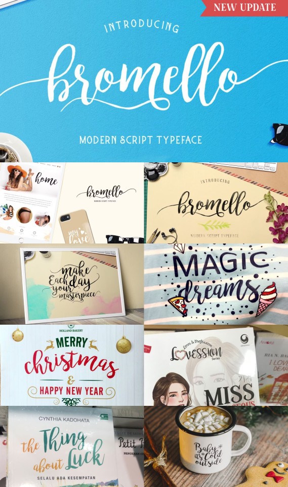
Bromello is a hand-made modern script typeface ideal for wedding cards, logotypes, website headers, and fashion designs, featuring a character set with accents and alternates.
Link: https://l.dailyfont.com/0XvAh
#aff#Love#Wedding#Fashion#Typography#Design#Script#Handmade#Modern#Accents#Alternates#WeddingCards#Logotype#WebsiteHeaders#FontLovers#Typeography#Bromello#Calligraphy#Fonts
26 notes
·
View notes
Text

Superaudio High Quality T60
#lofi#cassette#retro#cassette tape#audio cassette#nostalgia#graphic design#pop art#popart#tape#art#packaging#design#typeography#designers on tumblr#superaudio#swiss design#minimal#colorful#warakami
790 notes
·
View notes
Text

brand new city // mitski
#gghhhhhhh#everything is fine (through gritted teeth)#the arcana#the arcana game#count lucio#the arcana lucio#lucio morgasson#mitski#typeography
93 notes
·
View notes
Text
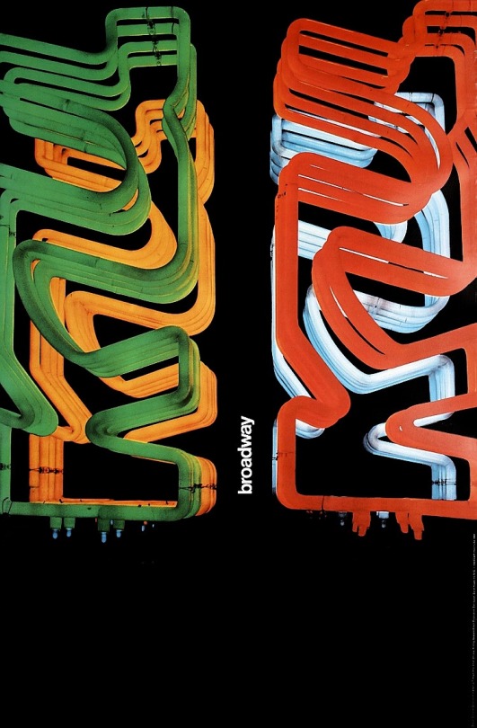
#postsss#fotosss#digital art#graphic design#neon lights#neon sign#japan#street art#art#digital#photography#typeography#modern art
21 notes
·
View notes
Text
Oooooo...
#fonts#typeography#typefaces#letrasets#trust me these are cool#how did you think typefaces were done by regular folks before computers?
2 notes
·
View notes
Photo
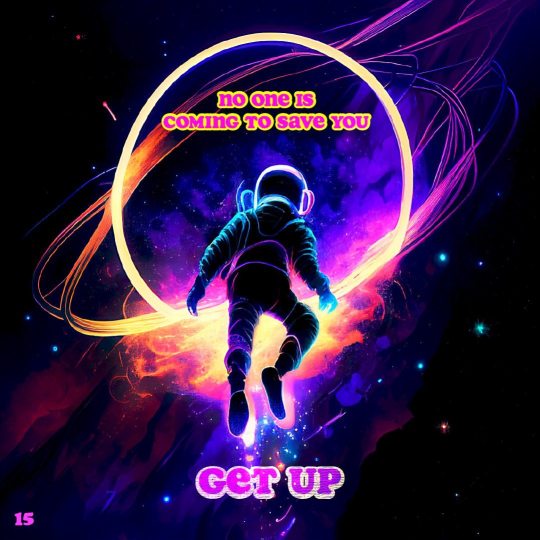
Poster #15 . . #posteraday #posterdesign #posterillustrations #postereveryday #typeposter #typeography https://www.instagram.com/p/CnQ1EShrgLu/?igshid=NGJjMDIxMWI=
4 notes
·
View notes
Text
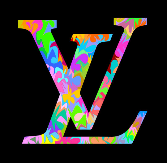
LV
techno
#louis vuitton#lv#fashion#brand#art#letters#typeography#illustration#colors#pattern#camo#flash#expensive#high fashion#fashion week#portrait#artists on tumblr#nail art#art detail#art on tumblr#art style#artistsoninstagram#artworld
1 note
·
View note
Text

0 notes
Text
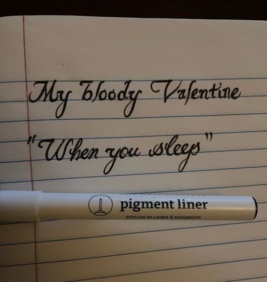
#my writing#writeblr#graffiti#calligraphy#writers on tumblr#alone with my thoughts#lettering#letters#cursive#typeography#SoundCloud
0 notes
Text

This mix of sans serif and serif type really caught my eye as it had 4 very bright bold colors. The use of orange and red together really makes each individual letter stick out. I like how they used sans serif for the brighter colors ( orange and red ) and a serif font for the slightly smaller black letters. One thing I didn’t like was the use of red. The red as a color worked well but I wish they filled the letters in more rather than having a scratchy faded look.
0 notes
Photo

Aleciana Western is a stylish retro serif font blending classic charm with modern flair, adding sophistication to projects and balancing vintage aesthetics with contemporary appeal.
Link: https://l.dailyfont.com/ouvxH
#aff#Typography#DesignInspiration#VintageVibes#RetroStyle#SerifFonts#ModernCharm#ClassicElegance#FontLove#GraphicDesign#CreativeProcess#InspirationBoard#DesignElements#VisualAesthetic#TexturedTypography#UniqueFonts#MinimalistDesign#Typeography
1 note
·
View note
Text


Following my tutorial, rich suggested I went back over the type in the article and experimented with it more so that it is handled better and more professionally.
To do this more successfully, I looked back on the layout research I did looking at the vogue magazine and looked at the way they use grids to create consistent layouts as well as the way they use hierarchy through scale and wight in type for headings which has helped me to get a better more coherent design.
0 notes
Text
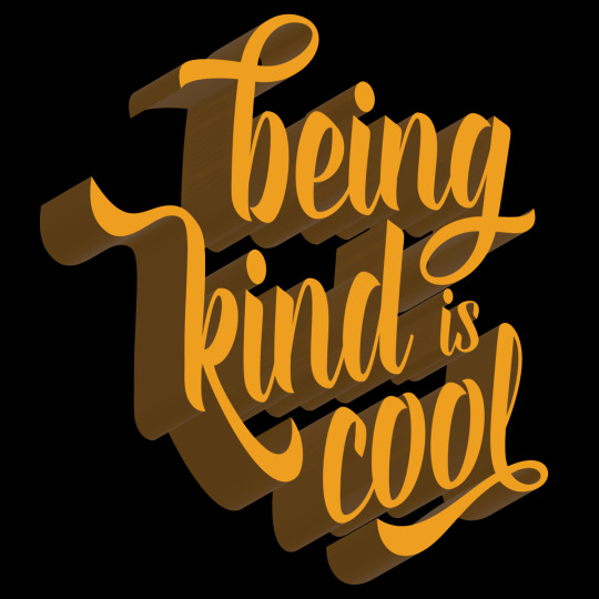
Let’s just be better to each other already! 15% of proceeds + an additional donation from Threadless will be donated to the Anxiety and Depression Association of America. Babsadee
#threadless#babsadee#typeography#type tee#being kind#being kind is cool#be kind#kindness#tshirtshop#fun with fonts#illustrator#word art#ADAA#anxiety and depression#charity
0 notes
Text
youtube
2 notes
·
View notes

