#Tracing Paper Illo
Explore tagged Tumblr posts
Text


ta da!!! :D super codependent magic au early concepts for part 1!!!
i wrote let me / for you this year and used a set of three designs at different pts of the story for my illustration class this semester. to go along with each part's concept art is one fully painted illustration.
here's the in depth analysis to go along w p1 and then here is the fic itself on ao3 :)
design notes below the cut! these aren't the final versions but they're p close tbh. p1 illo + final concepts will be out along with p2's whenever i get around to finishing that section of the fic!
for ace: most of ace's initial concepts and early changes were done on pen and paper!! his i already had planned and didn't undergo a lot of change so the only thing of note from these first digital drafts to the final is color correction.
i also drew ace's hair wildly different with every new sketch bc he's not supposed ot have a single hair model to go off of for p1 - aside from it being the longest at this stage (it gets shorter thru p2 and p3 to contrast sabo's getting longer!!) it's meant to be got-out-of-bed messy and unpredictable.
for sabo: gee wow. with the second set (v2) i was focused on color and so some design elements were left out for simplicity/time's sake (cinched waist, pants seam+pocket). i did a split accent color also for time' sake but when i found the color combo i liked i went make to solid (v3).
lots of changes made in v3 and final bc i felt like it wasn't "fancy" enough for a sabo design! not illustrated great here but i added a collar attached to the lining of the hood @ the stitching of it to the body of the jacket. instead of being a split hood that closes w drawstrings, it now buttons together in front! the magic cloak also gets upgraded to shiny accents and in the final vers ends up with ornate swirly motifs meant to mimic lace :) v3 is also where i finally created a galaxy swatch to use from now on (it's p colorful but i used an edge of mostly cool colors for v3 and then saturated it w a sorta dark blue+periwinkle overlay to further this)
i altered the height of the boots between v2 and v3 bc i decided to used the knee height for the p2 sabo design! no notes on the last 2 of sabo's bc i submitted like a full written page of notes w each design update lmaooo n im not sharing those when i can jus type the impt stuff here. all of the clothing folds for sabo and ace are rough traces of pictures jus for practice so i could quickly get a feel of what i needed to do to portray what i liked best :)
6 notes
·
View notes
Text
Weekly Illo 1 Art Nouveau
Characteristics of Movement
The Art Nouveau movement was against the cluttered cluttered and confining, design and compositions of Victorian-era Decorative Art;
and aspired to incorporate other mediums such as furniture, glass-work, and civic structures. Art Nouveau was characterized by naturalistic depictions; meaning the composition would conform to the medium and it’s structural integrity. Long rhythmic lines were often used as their varying proximity was akin to patterns found in nature.
Designer Example
For example, Louis Comfort Tiffany’s glass-work is appealing to me as the blockish glass-work suggests a more natural composition, while the coloured glass in his light-fixtures suggests the calm glow of sunlight.
Aesthetic Influences
Art Nouveau (“New Art”) was largely influenced by the British Arts and Crafts movement (1860s – 1900s) and was partially inspired by Japanese woodblock prints which featured floral and bulbous forms with whiplash curves. Since decorative arts are often dominant styles at international expositions and fairs, Art Nouveau was often featured as a stark contrast to styles that featured strict symmetry or hierarchy. Art Nouveau would go on to influence poster design beyond the end of the movement’s presence.
Keywords
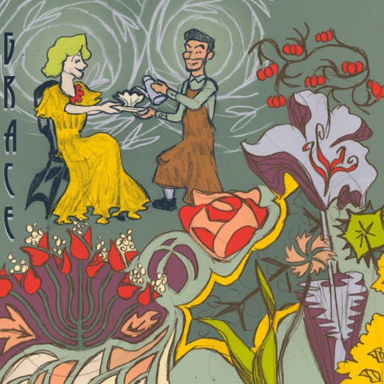
For this Illustration, I focused on keywords like: Peace, Timeless, Humble, and Grace.
Creative Concept
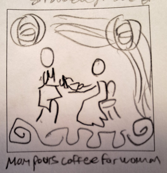
To best represent the Art Nouveau style, my solution was to go with a hand-crafted graphite drawing. Art Nouveau often features feminine characters where their dress’s defining lines are implied through shading. I sought to challenge this by including a male barista with an apron. I had them sit in a small garden off centre to the frame of the piece; with slightly abstract flowers and grasses to imply a garden.
Design Decisions
I decided that a hand-drawn graphite illustration was what I could manage with my time. I drew the figures as they were and applied some shading. I then used tracing paper to get circular vines surrounding their heads, and used that pattern as a background texture. I drew various flowers and foliage by simply tracing my hand loosely across the page, and then figuring out how to connect them in the composition later; this was meant to help me avoid creating a preemptive hierarchy. I then scanned each drawing and applied a vintage colour pallet. I had the word grace, trail down the side of the page to direct the eye to the foliage.
0 notes
Text
Week 8 Illo "People Doing Things"
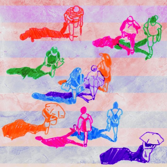
This week’s Illustration was People doing things. For this Illustration I wanted to use coloured markers. I found an online image with people seen overhead and printed the sheet out. I then used the coloured markers on tracing paper to get the vague shapes and outlines including their shadows.
I then used my line-separation technique, as I did in Week 3, to get the colour marker lines themselves. The background was another creative commons image used as texture layer set to a lighten blending mode; underneath are two gradients separated by bars to mimic a crosswalk and the tinted colours of a setting sun.
0 notes
Note
What tools do you use for your art?
So I should first say that I do not consider myself an artist. I'm not sure how good my advice is, but I'll answer beneath the cut :D
My workflow goes like this:
Paper sketch -> Take photo with cell phone -> Trace my sketch in Photoshop (I use a Wacom tablet) -> Flip my sketch horizontal and see the horrors I have rendered -> Fix mistakes using the transform tool as best I can (I like to put the hair line art and facial feature line art on separate layers, knowing I will 100% need to lasso and move/resize these features) -> color in PS
I sometimes line my sketches with Microns and color with Prismacolor colored pencils, Crayola colors of the world colored pencils for skin tones, and Copic markers. I've had my Prismacolor colored pencils and my Copics since high school, so I definitely recommend them as long lasting (some of these things have survived two decades of use, although you do need to refill your Copics as you use the ink).
Sadly, these days I am less satisfied with my traditional work, now that I can easily see the many problems with them digitally. These problems are waaaaay easier to tweak digitally than traditionally ;_; But! A lot of my art has a traditional version that I don't upload! So sometimes I do "sketchbook tour videos" to show these off.
Oh, if you use Copics, I highly recommend Bee Paper Company Pen Sketcher sketch books! These are the best I've found for markers! I usually do rough sketches and design work in an Illo sketchbook, however, and these are not meant to be long-lasting (they aren't archival) and they frankly don't take product as well. However, I used to feel sort of like... Everything I made had to be "final illustration quality," and that really paralyzed me, the same way believing your first draft is the final product paralyzed me as a writer. Now, I use the "cheaper/non-archival" sketchbook as a place to play and think tank. I draw much more, and also more happily, when I approach sketching with this exploratory attitude.
For reference, my go-to is the source material, followed by pose reference photos meant for artists. I also love looking at old photographs and period clothing (sometimes I think PdA is a thinly veiled excuse to do this).
If I'm honest, I often feel fairly... Embarrassed? Trepid? About art and drawing, even though I've been drawing ever since I could hold a pencil. It's so easy to compare yourself to people who are far better than you and think, "Wow, my stuff is so bad!" So... Thinking of them as fun lil doodly doos has helped a lot. It's not my livelihood; it's okay if they're just fun sketches that I tossed some color on in PS!
Thanks for the ask, have fun drawing!
1 note
·
View note
Photo

An illustration for article ‘The Postal Service’ by Nanette Orly in the Nov/Dec 2020 issue of Art Guide Australia 📬🎨
The article discusses how artists have maintained connection through the mail during lockdown/COVID-19 📬
I have a growing pile of unopened mail from artists I’ve bought from this year and it’s gonna be a mini Xmas when I finally sit down and open it all + stick it on my walls. So I had a blast drawing this tiny art show on a stack of mail!
17 notes
·
View notes
Photo
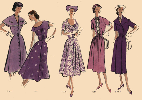
“What, you want a fifth illo? But I was about to go home, I gotta bus to catch. Dammit, I guess I can squeeze one in on the right. Where’s that tracing paper?”
Vogue Pattern Book Early Summer 1951
17 notes
·
View notes
Photo
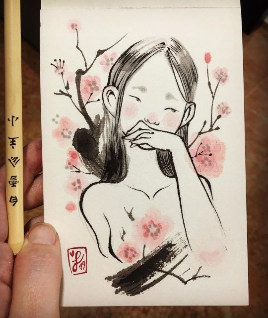
Hi there!! 💕✨ This is my first test on my new paper for sumi-ink technique. I don't know how to use this technique properly but it was fun to experiment with that! The paper is made with rush, wood pulp and bamboo, and the absorption is really different compared to a regular watercolor cotton paper, the ink expands a lot and you have to be really quick tracing lines 😱💦 Maybe with rice paper is different, I have to try! How are you everybody? It's already December!! Did you ask for art supplies for Christmas? 👀💕🎄🎁🎁 I am into "art journal" obsession and I asked for a lot of stickers and paper goodies for Christmas. You have to see the videos from @softlystudio to know what I am talking about. Their videos are wonderful and very relaxing, perfect for these cold days. ☕️✨ Have a nice Sunday!! 😊 Laura --- ¡Buenas! Ay, hace tiempo que no pasaba por aquí 🙈💦 Vengo con mi primera prueba hecha en un papel especial para la técnica "Sumi-e". Me encanta probar técnicas de todo tipo y no pude evitar llevarme de la tienda @haikubarcelona un pequeño bloc y tinta en barra para experimentar. El papel está hecho de junco, pulpa de madera y bamboo. Absorbe mucho más que el papel típico de acuarela hecho de algodón, así que tienes que ser muy rápido con los trazos o la tinta se expandirá mucho. Primero probé haciendo manchas para familiarizarme un poco con los materiales y luego quise probar con algo simple pero que fuera acorde con el estilo Sumi-e. Y aaay, ¡que ya está aquí diciembre! ¿vais a pedir para Navidad cosas de dibujo/paepeliria? 👀🎄💕 Yo estoy muy a tope con el "art journal" por culpa de los maravillosos y relajantes videos de @softlystudio ¡son perfectos para estos días fríos! ☕️✨ A ver si me animo a subir más cosillas, aunque estas navidades me toca currar siempre tiene que haber un huequito para dibujar 😊✨ ¡Que tengáis un feliz domingo! 💕 #sumie #inkdrawing #awagami #illo #sakuradrawing https://www.instagram.com/p/B5iSHpkKITA/?igshid=v1j4y2nni56h
2 notes
·
View notes
Photo

'I'm always drawing water I'm always dwelling in water I wonder what it feels like to burn' 🔥07/03/19💧
This was meant to be a journal comic but I got carried away with the drawing and forgot about words whoops
Recorded a time lapse that I'll post later
120 notes
·
View notes
Photo

Just saw this posted by @abcradionational and @diversityartsau so I'm posting too!
I was honoured to do this illo visualizing a post-climate-apocalypse Sydney with buildings overrun by ibises and oceans full of rotting fish - based on @msmichellelaw 's story 'Bu Liao Qing' which is a part of the 'After Australia Anthology' featured on ABC Arts Online (link here 🔗✨)
I feel like the humble ibis is a right of passage for Aussie illustrators.
Big thank you to Dee, Hannah, and Teresa from ABC, and Michelle for writing such a cool piece!
11 notes
·
View notes
Photo

Hello from Wangal land - Waratah postcard design for @illustrateyourlife 🌾
It took a lot not to draw the apocalyptic blood Sun behind a blanket of smoke as a postcard img of the state right now.
21 notes
·
View notes
Photo


My section for a big "Where's Wally"-esque crowd in @illustrateyourlife 's Pieces Project 2
The only irl people that ended up materializing in the crowd are my handsome husband @hellolawal and my stunning wife @ros_hoops ✨
25 notes
·
View notes
Video
vimeo
A sped-up time lapse of the hand-drawn #TracingPaperIllo 'Burn' from my previous post
Song: Shipping Lanes by Chad Crouch

14 notes
·
View notes
Photo

Sneak peak of the background art for a thing I've been working on 🌭
19 notes
·
View notes
Video
instagram
WIP 😴
9 notes
·
View notes
Photo

Belatedly, here's the original illustration for my @thebragmag cover art ⚡️
15 notes
·
View notes
Video
vimeo
A lil shonky phone vid compilation of the wall setup for the RESTLESSNESS Solo Show at Goodspace Gallery, Chippendale, Sydney — held for one night only on Wed 4 Sep 2019.
#Drawing#Illustration#Comic#Comics#Zine#Zines#Abstract#Tracing Paper Comix#Tracing Paper Illo#Tracing Paper#POSCA#Prismacolor#Gallery#Exhibition
12 notes
·
View notes