#This is my first artwork using Krita
Explore tagged Tumblr posts
Text
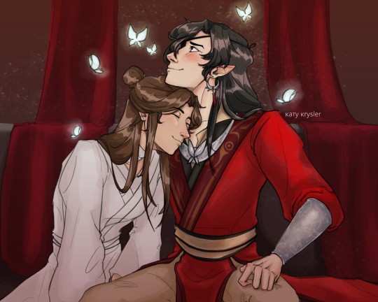
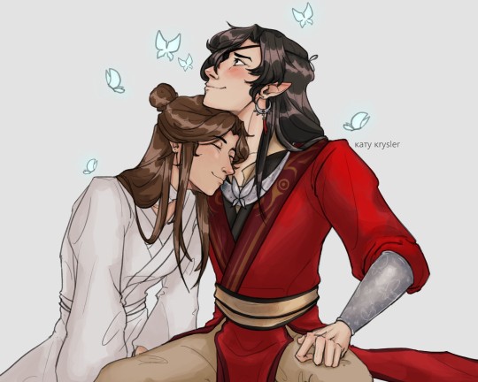
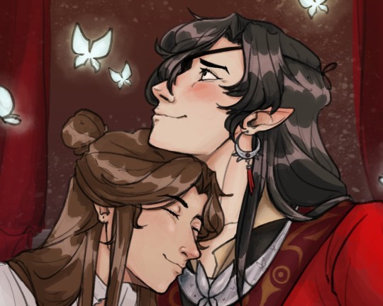
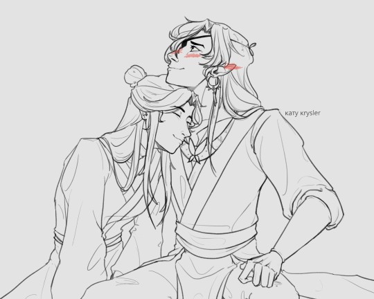
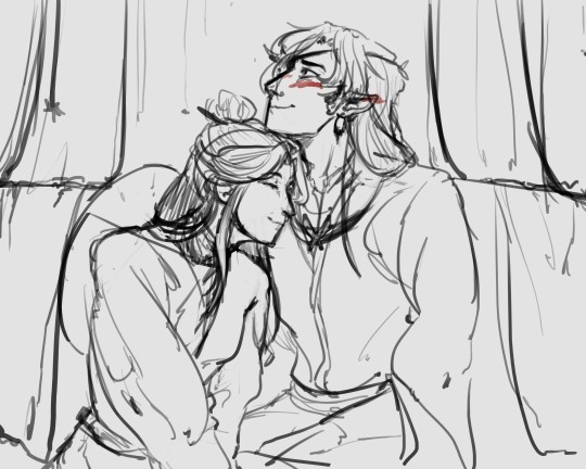
Sweet enough to make a dead man blush! Yes I read the first 6 books in a week and a half, I do not regret it one bit
#This is my first artwork using Krita#rip my student license of photoshop you will be missed#my art#digital art#tgcf#tgcf fanart#hualian#hua cheng#xie lian#heaven official's blessing
256 notes
·
View notes
Text
I hope this was alright to create! I made a little animation based off a sketch I saw yesterday! I thought it was just so cute, and I wanted to see it in more detail, so here it is! They're so lovely, I had so many butterflies when drawing!!!!!
Please give lots of love to the original creator of the sketch(characters and more!) @partycoffin

His work is so lovely and has so much love put into it, support to them would be greatly appreciated💙❤️💛
Rambles ahead!
I had originally started working in the night (since that was our first meeting!) But I wasn't able to create it in blender because it was just so late! (And, I am still getting used to drawing on a tablet, my hand eye coordiantion is very rusty...but my future animations will be completed there!!! For hopefully a more pristine clean crisp not so double dipping kind of look!) So I started planning out in flipaclip, but it was just so hard to draw in it that I used krita to create my transparent files and then add them all together at the end. I think it worked very well! Albeit rusty and a little lower quality...much better from the starter point!
Bloopers and behind the scenes will be released tomorrow! (Along with some other little artworks)
#Have a beautiful night everyone!#I hope I'm using tumbler correctly#it is so strange to me...I feel I've seen this in a dream somewhere before#welcome home#frank frankly#myart#eddie dear#animation#flipaclip#krita#other's art
308 notes
·
View notes
Text
TO THE ICE CREEEEEAAAAAAM!

First drawing of 2025! FINALLY! Also, a birthday present for CooperTheHusky0
Given that Kottarooi is based on the Louie characters from Bomberman. I had this idea in my head based on the video game Bomberman Fantasy Race. In which Cooper would be riding on Kottarooi's back. You can kinda see the same idea in last month's Christmas drawing. In this case, I feel like they may be on their way to get some ice cream, hence the title of this drawing. XD
Still trying to work on getting used to Krita. I'm going to be experimenting with a few different shading techniques as I move forward. It's still not exactly one of my strengths here. But my goal here was to create something with a bit more action to start the year off. And I feel like this does get the job done.
In any case, I hope that Kottarooi has a great birthday this year and can enjoy this little drawing.
Kottarooi and Copper © CooperTheHusky0 Artwork © 2025 NS-Games
7 notes
·
View notes
Note
Hi! I'm kinda shy but I love your vintage finish on your work. Would you consider offering pointers for how to achieve that vibe?
oh, absolutely!! i love that sort of style and i think more people should be able to achieve it if they want!! shouldn't gatekeep art stuff ^^ i don't really do vintage style stuff a lot, and i take more comic book/print/retro inspo than anything. but, these go hand in hand!! please know i am still learning, too! this is just how i do it.
also, there's a lot of guides for this online and tools... that you have to purchase. i can assure you everything listed here is free! (including my pirated SAI2 copy!) some things have donations available towards the artists that made them, so you can do that if you want to support an artist :D
i'll go over basically everything i know, so this WILL get long! i also spent hours going over several days searching for resources, so i'll list everything so you don't have to ^^
(PART 1/2 BECAUSE OF IMAGE LIMITATIONS!!! PART 2 SHOULD BE WRITTEN SOON AFTER THIS ONE!! reblog THAT once it's done!)
-------------------------------------------------------------
THE ART ITSELF / INSPIRATIONS:
for the ARTSTYLE and WHAT you draw: you can just draw whatever!! really, do your own thing! twist this style in your own way, it doesn't have to be a 100% accurate!! i literally used these same vintage look effects in a drawing drawn in my usual style of high roller. you can draw anything you want and you don't need to copy comicbook styles or all that!!

or - you CAN take inspo from vintage comic books / artwork or other printed comics! (for me tom and jerry comes to mind as something with a toony style, since it's what i read as a kid. also donald duck comics! no need to follow this but if you wanna be extra you can! ^^ looking at inspo is good.)
however you will need to look at examples aside from just the Artstyle, to achieve the actual Look!!
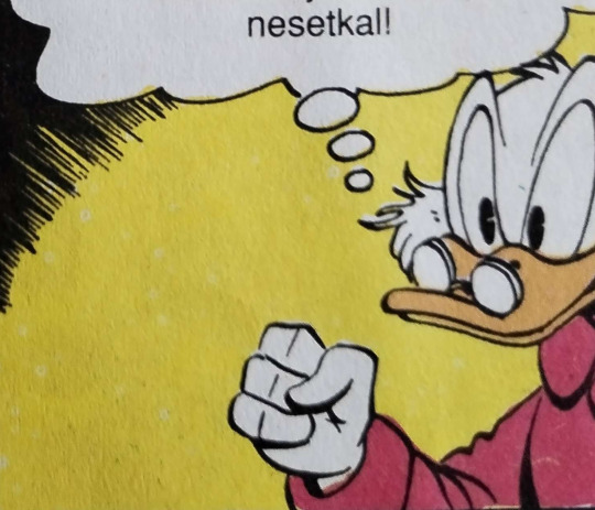
here's some examples pics i took of some comics i own laying around in a shelf. these are mixed ages, the asterix and ducktales comics being older and the tom and jerry comic being newer. i have some oldies since i got them passed down! czech text + asterix jumpscare, sorry.
to move on from the artstyle talk fully and more to the general style/look part - notice how the tom and jerry has brighter colors, less dirt, and an overall better quality!!
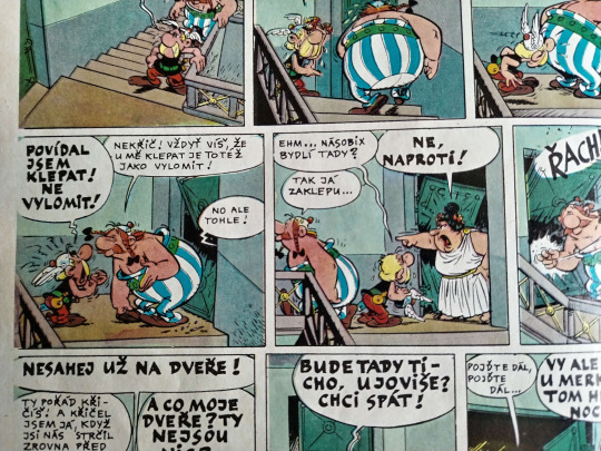
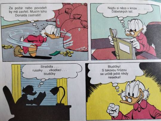
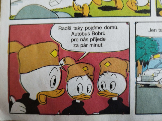

one thing i want you to note, in older prints there's obvious color misprinting and imperfections! you may chose to do this, or don't! depends what kind of era or printing you wanna reference. of course, also keep in mind the veeery limited CYMK colors they had Back In The Day. also note the dirt!!! how some parts are lighter and more chipped and how it isn't a full block of color!!


a lot of this does parrot posessedpasm's own guide, which i HIGHLY recommend! it's where i got a jump-start on things. there's other things listed on their post, which you should give a read! goes over history of some things that will let you have a better understanding of stuff.
speaking of inspo and on the topic of posessedpasm, before we move on - they're one of my biggest inspirations for this! their art is incredible and i think it's important to look at other artists' take on these styles. go out there and look at other artists who draw in a similar style achieving the same retro look!!! (no but genuinely i could look at posessedpasm's art forever... i love just looking at it and studying it!! i want what they have... but i'm not gonna gush now!)
-----------------------------------------------------------------
ACTUAL TECHNICALITIES / HOW THE FUCK DO I DO IT ???:
FIRST, LINEART!!: i choose a brush that's somewhat fluttery and resembles ink at least a little bit, instead of a basic round brush. here's the brush i used, for any sai2 users. i'll show my krita faves after!!

(note brush size, gets fuzzier the bigger it is)
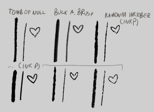
and the krita alternatives! i don't do inking / lineart in krita in 99.9% of my art unless i'm experimenting. but there's some great brushes you can find online to use! here's links to the ones on screen
tomb of null
buck a. brush
ramonm inktober (he just presents it but since it's his post i named it that) (download link is on the video!)
that alone already gets the lineart look just a bit. but it's not all! krita is especially useful for this, as sai doesn't have this function. (but i find my way around it


here's a WIP screenshot i took while drawing that piece VS the final piece!
you may notice the lineart is "chipped" away in some spots. printing always wasn't perfect and created some imperfections, that may smudge and chip away as time goes on.
HERE'S A GUIDE FOR IMITATING THAT!!!!
what i do, is simply create a clipping layer on the lineart. (typically i do the lineart, then color, THEN do lineart effects, but this is just for show) (i also usually have a set, typically orange/yellow background color picked already, but i haven't done that here for Whatever Reason)
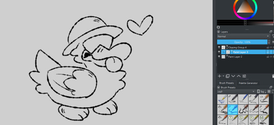
set it to "erase" layer mode... (and click the little "a" to actually clip it to the layer. you could also just make a quick clipping group that does it for you!)

and draw over the lineart! (preferably with a highly textured "dirty" brush!) the erase clipping layer will only erase the lineart, and nothing underneath it. you can change the opacity up and down to adjust the erasing... you can add more erase layers to play with the effect a little!

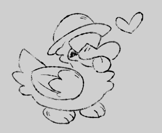
what i then do (sometimes), i ctrl+e the lineart group to one layer. i copy it. i ctrl+z to go back to keep the group if needed. i paste the copied lineart underneath it. i add a blur filter, shift it to be slightly off from the lineart by a few pixels, and set it to "burn". i may change the color to be a very dark orange-ish brownish color. gives an effect of the lineart bleeding a little!


COLORING!!:
color: okay so for this part i just kinda bullshit it and either pick whatever colors i want, or i color pick them from this image below then slightly alter if i need a different color. i do not have the patience to do my own cymk layer management digitally, just adding my effects can take OVER an hour and i have a way that looks nice Without It. i either fake my color misprints later or i just don't do it. still stuff to consider!
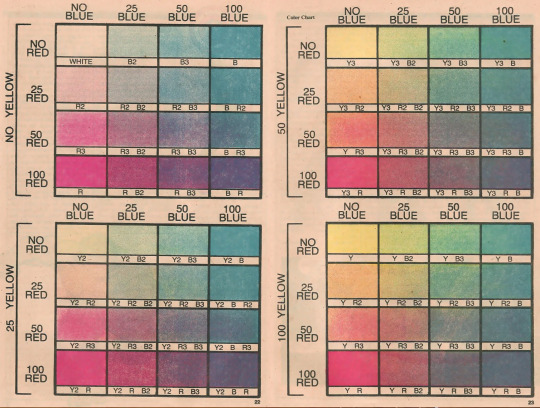
(taken from posessedpasm's guide! this is how i colored my sticky lou drawing. usually i will just pick my own colors and yellow them/dim them slightly.)
how do i do it: i color in sai using my usual brush or the one i showed previously. if i color on krita i use a different fuzzy kind of brush...
some colors i do on different layers and i move them slightly to make the misprinted effect. then i may erase small bits of it to make it look a bit better if i want.


if you really want the funky color mixing that may not be Extra Accurate anyway - draw using different colors on different layers. the layer overlapping with the bottom layer... set it to "multiply" and eyedrop the color where the two colors overlap. set the layer effect back to "normal". lock your opacity so you draw only on the Already Colored Parts and color the overlapping area using the eyedropped color! neato !

ONE THING TO NOTE!!! if something is white, you should leave it uncolored/transparent. unless you stylize it to be a different color entirely, if so... go ahead! but if it's WHITE white - just don't color it at all!!!
and now, to my Favorite part - the halftone overlay effect!!! here's where things can get fairly convincing already - plus, i use this effect / similar even in my normal art!
before ANYTHING!! at least, for krita - to achieve the best look i use the newspaper plugin!
newspaper plugin for krita
FIRST, i merge the color layer into one layer and then add it into a clipping group. i then copy the color layer and paste it OUTSIDE the clipping group.

then, select your PASTED color layer (named on the screenshot so u know what i mean) and go to tools>scripts>newspaper (once you install the plugin!)
i then play with the settings a bit. i typically don't touch everything - i just change the mode to Four color (CMY+K Pictures) or Four color (CMYK - Pictures) (this one usually looks better imo)
i also change the size to be smaller, usually around 4.00px.

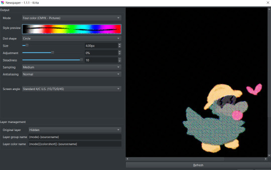
click OK! it'll generate cymk halftone layers IN a clipping group! don't worry about the black, you can rid of it easily ;]

just close the group and move it to be inside of your color group below! clip the whole cmyk group over the color layer... and BOOM!


but that's not it! set the newspaper group's layer effect to luminosity (or whatever you find works best...!) adjust the opacity to around 50%-30% and BOOM!!

though, that's not all! do the same things we did to erase up the lineart earlier to the coloring, too. same steps! in the same clipping group! just make sure it's above the cmyk newspaper group.
you can then group both lineart groups and color groups into ANOTHER group that will contain them both. with that you can then make an erase layer over them both so they both get affected by it and make it look like both got chipped away, and not like they're separate entities. ^^
you can then use this for backgrounds... text... other things!
one important thing is also getting those papery, dirty effects... which i'll cover in a reblog! (image limit :,]) alongside that, i'll list all my resources for download there!!!
25 notes
·
View notes
Text
I'm so very happy about the positive attention that my latest armandaniel fanart is getting, because I really, really wasn't satisfied with it. I had something different in mind when I started, but then photoshop started glitching and lagging and pixelating every brushstroke. I'd already spent nearly 10 hours on the characters' faces, clothes and hair. All that was left to do was paint the background and Daniel's hand, but photoshop wasn't working anymore so I had to switch to Krita which I hadn't used in years and had completely forgotten how to use it over time. I wasn't satisfied with any brush bc they didn't match the photoshop ones. I had to airbrush everything to try and smooth the pixelated effect from photoshop.
In the end, after hours and hours of trying and never quite reaching what I wanted to do, I eventually gave up and decided to use the blood splatter effect to try and hide the parts I didn't like.
It really felt like a personal failure at first and my self confidence regarding my creativity and art skills was already quite low, this didn't help.
However, seeing so many people not just like but also reblog and tag this artwork with "gorgeous" and "beautiful", and have friends give a very poetic interpretation of the piece or say which part of the texture and lighting they love is so deeply encouraging and heartwarming. It made me see my painting the way other people view it, and overlook all the flaws I perceived in it.
7 notes
·
View notes
Note
do you have a favorite piece of venture maidens fanart you've drawn???
This is a great question! Honestly, I've been wanting to make a environmental piece with whimsy, food, and fashion, for like.. 2 years? when thats done it will probably be my favorite piece LMAO but for the time being? let me go through my venture maidens folder
read more break because im going to be going on and on
This applies to most aspects of my life, but I don't really have a top "favorite" thing in most areas! I mean, Madoka Magica Rebellion is my favorite movie (very closely rivaled by Coraline), but that's an outlier. In every other case, I have a collection of my favorites with one coming out on top depending on how I'm feeling that day.
It's also influenced by eras, I think. I don't want to compare my most recent art to my venture maiden 2020 art, because I've improved and will prefer my newer style. However, there's still a sense of nostalgia and homeliness to some of my old art that can bring it above the rest, you know?
Going through my venture maiden campaign 1 folder, here's probably my favorites:


These two are from 9/3/20 ("sawYEAH.png") and 11/23/22 ("arent you tired of being nice.png"). I think Sawyeh's relatively simple design has always lend itself well to gesture drawing, especially with the relatively simple silhouette shape. Theyre just fun :) I like them a lot.
I don't know if I'd rank a lot of my campaign 1 art among my favorites, not because I think less of the campaign but because a lot of that time period was me feeling my way into an art style. I see it as the time period after I started feeling confident in my art, but before I kind of became the "unique facial features and color jitter" artist.
For fun (and food), here's some of my unposted campaign 1 stuff.


10/23/20 and 10/27/20 (gidget and vlad, back when i was drawing in paint tool sai!)


1/2/21, 1/5/21, 6/18/21 || 1/6/21 (put out of order because i like this image composition more).
Here's some 2020 (and 2019, apparently?) photoshop files! I like some more than others. None of them have previews since they're photoshop files, so I'm opening them blind in krita. Note the layers/colors may seem off, it's probably because the clipping masks and editing layers break between programs.


8/12/19, 8/21/20, 8/31/20 || 9/5/20 || 10/23/20, 10/23/20, 10/28/20 || 11/4/20

From 10/21/20, technically in 2020 but close to 2021. I think it's unique because it starts to show a shift to more.. unique concepts, I guess? It was of a water elemental who uses an ice mask to mimic having a face. It's cool, I should revisit it.


3/17/21, 3/18/21
I think that's pretty much it for the art while campaign 1 was going on. Here's some post-campaign 1 stuff from 2023 that maybeee got put on the discord?


8/16/23, 8/25/23.
GREAT now I'm moving on to campaign 2.
My favorite? My favorite piece of artwork so far? It's of a one-off npc, the garlic princess. I was studying old strawberry shortcake designs for her. It was a lot of fun.

9/10/23
My other favorites? Probably any art of Tandy


1/2/23 || 1/2/23
I also really enjoy these unfinished sketches: the first being a wildes-influenced lu, inspired by butterflies and gemstones; the second being Toni and a Wyrd sister ("thats no angel.png"); the third being halloween outfit designs; and the fourth being aoife and toni going clubbing in the wildes;


7/11/21, 10/11/22, 9/2/23 || 1/26/24
As for unposted sketches? Oh boy, I've got a lot more for this campaign. So much that I have reached the image limit per post, whoops. I'll add them in a reblog.
#sketchmre answers#the venture maidens#venture maidens#the venture maidens campaign 2#the venture maidens campaign 1#idk what else to tag this as#enjoy your food anon i havent cracked a lot of these files open in months or years#my art
9 notes
·
View notes
Note
the way you color things makes me want to commit crimes. any coloring tips for a baby digital artist who doesn’t know how to do the computer things good?
AUGH apologies for taking so long, i was in the middle of writing this answer and the whole thing was deleted as soon as i switched to another tab on my phone, and then the draft didn't save the second time i tried to write it. jfc at least i had it written out in my notes app the second time. anyway, thank you thank you thank you!! this was very nice to recieve, i love getting asks ❤️
i'm not versed in the arts of drawing on a computer, either, so i can't give tips in regards to specific programs (said in chronic procreate user voice) but i can certainly give universal advice keep in mind that i'm not professionally taught in the slightest so i lack much of the vocabulary to describe my methods, and remember that my word is not law!
in case of confusion, everything has been explained. i've added a cut because it got needlessly long. i've also added visual guides for certain tips, and image descriptions for each one
to be honest, much of what i do when picking colors is done with the help of gradient maps (more on that later) but when choosing my base colors i follow these rules:
1. you don't have to cell shade with purple + multiply and an add layer. that's the voice of lavendertowne attempting to take control of your body. stamp it out. (/j i love her)
2. bright, vivid colors!
3. instead of shifting just the brightness and saturation when picking colors to shade, shift the hue, too! in the first image, we can see that the circle is dull and boring. in comparison, the second image pops!
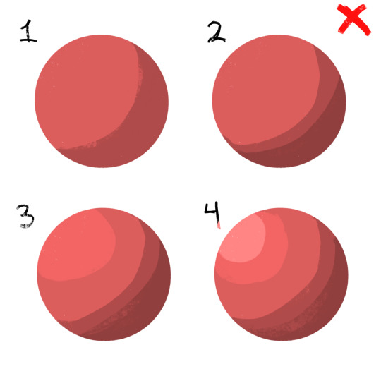
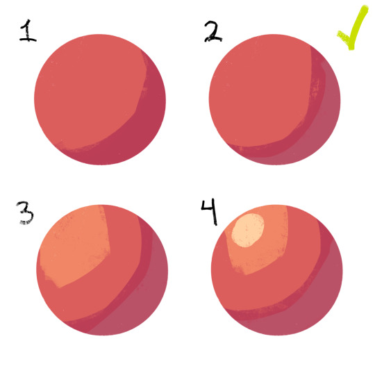
4. so, how does this work?
without getting too much into color theory--because while i've studied it before, i don't trust myself to articulate it properly without making a fool of myself--it's all about how colors interact with each other. for example, a beige circle looks lighter when surrounded by a dark background rather than just plain white.
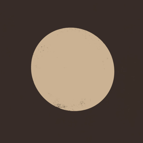
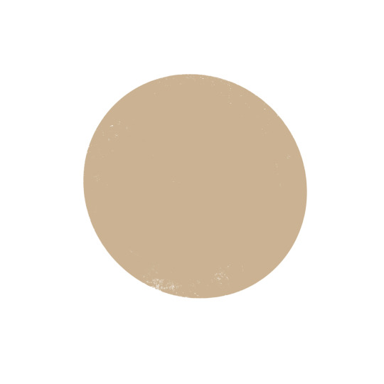
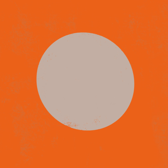
in the same vein, surrounding greys/desaturated colors with warm colors makes them look blue, and vice versa.

5. blue/grey shadows and warm lighting!! or the other way around. actually, you can use any color for shadows and lighting, depending on your light source. is it sunny outside, or are they beneath white light?
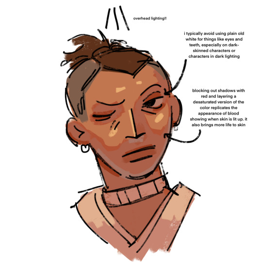
6. for color picking, i reccomend avoiding using the wheel, instead opting for the rgb sliders or the hue saturation brightness sliders if you're dumb like me. this allows for precision in the colors you pick, and accuracy when putting together color palettes.
7. and, finally, the actual computer stuff: gradient maps! i looove gradient maps.
as far as i'm aware, procreate and krita have the gradient map tool. ibispaint does not. i am not sure if firealpaca does.
i usually use gradient maps to make my coloring more cohesive, rather than just slapping them on a monochrome drawing (which is also a totally viable method for coloring, but you'll be less precise, as gmaps only recognize values). when using gradient maps, i prefer to duplicate my completed artwork, lower the opacity of the duplicate on top of it (usually between 25 and 50%, depending on how strong i want the effect to be), and use gradient maps on the duplicate.
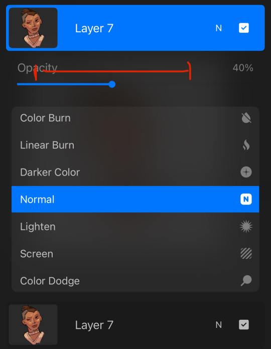
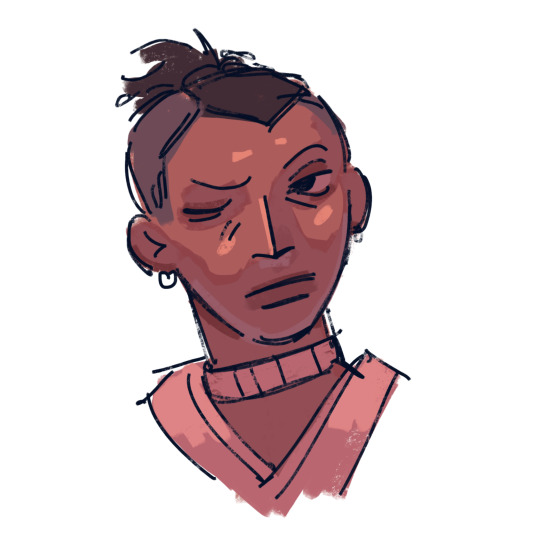
this makes my colors all nice and pretty!
11. if you use krita, it can be hard to find the right colors to use for your gradient maps. never fear! i'm here to give you the default templates from procreate, as well as a couple of the ones i've made.
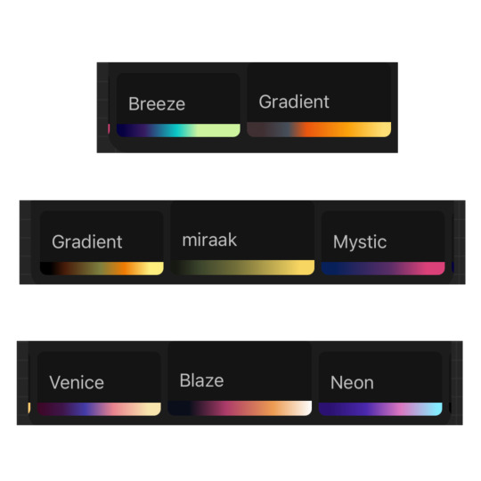
if you have any more questions, or you want me to get further into a specific topic, feel free to send me another ask
13 notes
·
View notes
Note
What your secret to draw that good , what app do you use???
(First of all, I'm so sorry for answering this late :,D)
Thank you so much, that's very kind ! I'm so glad people like my art style ! I don't really have a secret but the best advice I can give is to observe as much as possible (artworks, reality, series, etc.) and to find your own rhythm when you draw :D (I'm a reaaaally slow artist but that's how I work)
______________________________________________________________
Je viens de remarquer que tu postes en français xd (oups)
En tout cas merci beaucoup, vraiment ! Je fait une trad vite fait pour dire que si tu souhaites dessiner, observer est une des meilleures choses à faire, à force on finit par absorber des techniques et des détails qu'on finit par reproduire (faut pratiquer avec, évidemment) ! Mais surtout, trouves ton propre rythme ! Certains peuvent dessiner énormément en peu de temps (perso je préfère prendre mon temps quand je le peux ;D)
Et pour mes logiciels j'utilise soit Photoshop (pour mes derniers posts) ou Krita qui est une très bonne alternative gratuite à des logiciels plus onéreux (en plus il propose énormément d'outils, des pinceaux téléchargeables et tu peux même faire de l'animation dessus !)
J'ai vu que t'aimais bien Sun donc voici un petit cadeau !
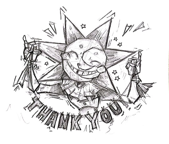
#fnaf#ask#artists on tumblr#sketch#sundrop#fnaf security breach#security breach#five nights at freddy's security breach#five nights at freddys#fnaf sun#fnaf daycare attendant#traditional drawing
31 notes
·
View notes
Note
Do you take art requests? Also, how can I learn how to start drawing Sailor Moon characters like you do so I can draw independently?
you're free to drop a request, but whether ill do it depends on what it is and the time i have, since my plate is full with other big projects and i only sometimes draw stuff for this account in my spare time
the best way to learn anything starts with mentality.
a.) do it for fun above all else, you shouldnt have to force yourself to draw. if you do this first, then studying and challenging yourself will come to you naturally. its like when you enjoy a game, you're naturally inclined to look up guides and speedrun tech to get better. in terms of how our brains work, theres no difference between learning the skill of a video game vs learning the skill of an artform, or anything really.
b.) don't worry about the outcome, because especially early on the outcome will never be what you had in mind. no matter how experienced you are, whether 5 weeks or 5 years, some days you will make drawings that you are really proud of, others you will make ones you think that suck. the only difference is that the bar of 'good' and 'suck' are raised higher and higher the longer youve been doing it.
it can be a good idea to mentally approach it like you're drawing bad on purpose, and that gets rid of any of the ego or embarrassment preventing you from enjoying it
c.) don't compare your artwork to others, they say 'comparison is the thief of joy' and even for someone with my experience, i still sometimes get that feeling of inadequacy when looking at others work. theres always someone better, so ignore that feeling
d.) ALWAYS try new things. you learn by exposing yourself to new experience, so don't draw the same thing over and over. and try difficult things, knowing that they might not turn out good, but you will still learn.
e.) you do not have an art style. a 'style' isn't something you choose, it is something that forms naturally over many years. if you constrain yourself to an arbitrarily decided style, you will likely stagnate. aim to learn many styles of many artists and mediums. be eclectic in your influence and your own voice will start to form. you can't truly draw like anyone else because you aren't that person
there are infinite different paths to learn something. think of it as like a huge forest canopy with hundreds of branches to climb. if you have the ambition and desire to begin climbing, you will naturally find your own route through the branches. however if you fixate on trying to take a specific route, you will get frustrated because you may find certain branches out of reach. you have to accept that the path you take is unpredictable, and progress isn't linear. just reach for whatever feels right, and if it doesn't work, reach for something else
generally a good place to start is with watching a few videos on the art fundamentals, with form especially being important, but if this seems boring or daunting to you right now, then don't worry about it.
doing something cartoonier instead of going straight into a manga style might be a good idea too, since its a lot easier to make something look 'good'
if you're looking for programs, i personally use krita, which is free. you'll want a drawing tablet eventually if you're doing digital. you can get cheap ones for like 50 bucks. pad is better than screen and cheaper, even though its harder at first, but just give it a few sessions and youll get used to it.
just open the art program and have fun making something that might suck.

3 notes
·
View notes
Text

My first digital artwork made using Krita!
High res image here: (Instagram)
#art#illustration#digital art#digital painting#artists on tumblr#small art blog#small artist#just having fun
6 notes
·
View notes
Text

🪽Angelic inspiration for your day🪽
Welcome to my fresh profile! 🎨 I present to you my first creation: Miguel Angelyrion's reference sheet! He will be my main OC, and this is just the beginning... Stay tuned, as more artwork will be coming soon! 🌟"
Original Drawing Information:
✍️ Program: Krita
💻 Device: XP-PEN
🚫 Usage: Please do not use without permission.
👨🎨 Personality: INTJ
#artwork#art#digital illustration#digital art#ibispaintx#medieval#medieval art#original caracter#caracterdesign#oc#oc artwork#hungary#intj#mbti#angelcore#angel#new account#new artist
2 notes
·
View notes
Text
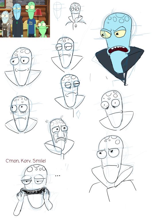
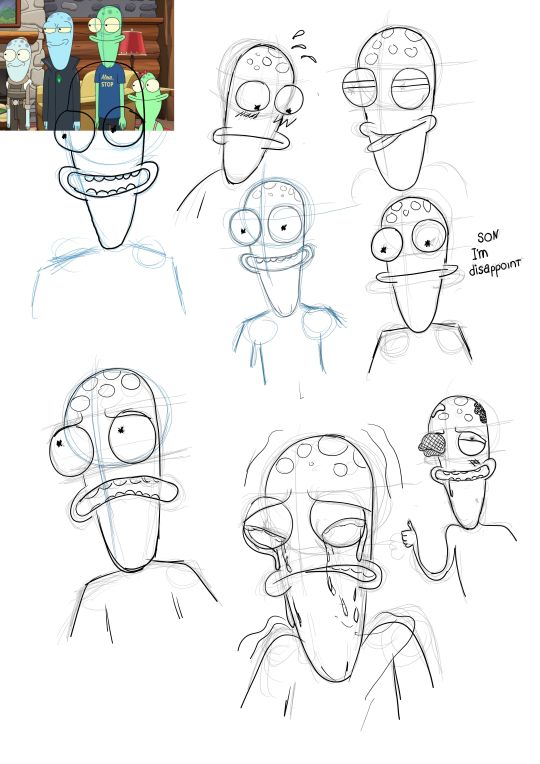
17 years ago I was told that "you should not use references and tutorials, because you won't find your own artstyle". At the time I believed it and lived with this principle. It was really frustratig draw at that time.
However, current artwork that I'm working on made me unsatisfied about my way of drawing characters and lineart. For first time I studied how to draw the characters and looked up lineart tutorials from YouTube. I also lesrned to use Krita's stabilitation feature. This drawing session really thought me how to draw and what kind of artist I am. Why I didn't do this sooner? Why I followed blindly of one bad advice?
22 notes
·
View notes
Text

Inner Demon, 2017
Posting all of my art selectively from 2017 all the way to 2024 This one was my first ever digital artwork made in Krita using texture brushes :D My YouTube: https://www.youtube.com/@victoransxd
2 notes
·
View notes
Text
Creative Thoughts: Where I'm at
Lately I've been experimenting with my digital art tablet instead of drawing/painting traditionally. Can't deny, using the tablet has been fun - at the start I was drawing traditionally then transferring my art onto the art software, Krita. Recently, over the past week, I've been drawing directly onto the tablet which in some sense has come naturally but in other ways the diverse range of pens and paintbrushes to use for mark making is a little daunting, at first lol.
I don't want to abandon my traditional art but for future projects - such as comics and Youtube content - I've had to think of how to best present the artwork. I think digital art is better for this for many reasons, mostly because it's hard to transfer a traditional piece onto a digital space and retain all of it's quality that's seen in real life - I'm talking brush strokes, mark making that make traditional art a pleasure to see in person - unless I have a brillant camera to capture this - which I don't lol.
Going forward I feel the need to practice more with my tablet - learn how to color better and develop a style I'm happy with. So far I've been playing around with the chibi art style which I find easier for experimenting and designing but I'd like to eventually try out a more adult style, think Heaven Official's Blessing art style - this is the direction for my character's Elinor and Roi (you guys haven't seen Roi yet, don't worry he'll be around soon, once I get a good idea for Elinor's design first). I have big ideas for these two - they'll be on Youtube.
Whereas RumpleSloth, Poto, Perla will retain their cute look. I have big ideas for RumpleSloth. :)
If you've made it this far and would also like an update on the Ryomen Sukuna fanfic: Rebirth that I'm writing, the Christmas chapter rework is well under way - I'm adding more depth to the writing - it will no longer be in script form but instead will match up to the style of writing that follows on from that chapter. Yes, I still very much love Sukuna. :)
Thank you for reading my creative thoughts! I hope to make lots of content for people to enjoy. :) Don't worry though I will still create art traditionally, it is my roots and the medium that helped me become an artist.
#art journey#art journal#journaling#creative thoughts#creative process#creative writing#fanfiction#digital art#traditional art#beginner artist#traditional artist#artists on tumblr#art#thoughts#writing#art writing#fanfic#reading#notes#artwork#artist
2 notes
·
View notes
Text

FIRST POST! BLAM! >:) also my first artwork using Krita as well as my first time on Tumblr :) it's nice having somewhere to dump my art finally
36 notes
·
View notes
Text
some art progression thing
i wanna look at how my art has changed over the span of about a year (a bit less but close enough) by talking about what i consider key parts of my progress. sooo lets go
also i will only be writing about my human drawings cuz ive been drawing dragons my entire life but only started drawing humans in 2021 i think
(long post sorry)

"kennith simmons"
first time posting art, first posted to reddit. i didnt give this one a title or anything i just called it kennith simmons. this method of toning was continuously used throughout most of my sketchbook drawings. drawn using pc, autodesk sketchbook (now known as just sketchbook), & mouse. not quite sure when i drew it but it was posted to reddit on the 28th of july 2023 so around then i think
(blood/sh warning)

"kennith again"
one of my first times attempting a front view i think?? at least, this is the earliest one i can find. i was pretty proud of it at the time. drawn using pc, sketchbook, mouse. posted september 7th 2023

"tongue"
i included this one because it was when i started to figure out how to do whatever the hell i did with the cup there idk what to call it but yk what i mean. drawn using pc, sketchbook, mouse. posted 27th september 2023

"a smile a day keeps the doctor away"
gave colour theory a try here, its not great but its a start. this one is pretty unlike any other ive done before and it took me a while to figure out how to do the hands and mouth like that (even though it still doesnt look right). the main reason i included this one is because of the background; i chose it because it reminds me alot of my favourite surrealism artworks, and i continued to use backgrounds like this in certain pieces, including a much more recent one!

"hi" (called "something or other" on reddit)
first time using an overlay of any kind- this is just a simple red one. i didnt figure out i could use other things like noise until later. I also tried to tone this one using just. a bunch of black lines rather than colours. drawn using pc, sketchbook, mouse. posted october 21st 2023

"messing with my head"
this was my first one drawn in krita! i really liked the various brush textures and stuff so i decided to go all out with this one. also attempted a bit more colour theory. drawn using pc, krita, mouse. posted october 23rd 2023

"nobody smiles like ray barnett"
i honestly dont have much to say about this one asides from the fact that i really like the toning method i used and i wanna use it again but i keep forgetting. also the lil shiny eye thing i still use that alot. and!! i believe this was my first time using noise overlay. drawn using pc, krita, mouse. posted october 29th 2023

"ponder"
possibly my favourite "old" artwork of mine
crosshatching!! i love crosshatching and i'd like to use that more often too. this one is old but i still really like it, especially the way i drew their teeth. also!! i used the background from the other one again. drawn using pc, krita, mouse. posted november 19th, 2023.

"fool's gold"
this one is special because its the first one i posted that was drawn with a drawing tablet! (it's actually not, but we dont talk about the real first one. i dont like it. at all.)
also, first time using a colour pallete which wasnt just the colours the characters canonically used. other then that i dont really have much to say about this one asides from i used crosshatching again too. drawn using pc, krita, wacom tablet, mouse. posted december 7th, 2023

"Best Friends"
1st posted drawing of 2024
i like this one alot still, it was my first time trying lineless art and i think it turned out alright. i also consider it significant because i still continue to use this eye shape in certain drawings. drawn using pc, krita, wacom tablet, mouse. posted january 2th 2024

"spoilers paper doll"
this was my first time making a paper doll and i think i could have done alot better but tbh this one was more about "finish before 2024" (i started it on the 31st of december) rather than "make this as good as possible". made with pens, pencils, beads, string, scissors. posted january 6th 2024

"creature"
i still like this one, particularly the way i toned it (if you can either consider that toning idk) as well as the way i drew the mouth. i dont think ive ever revealed as much gums as that in any of my drawings but i think its pretty cool.
the most important thing about it is i believe it's the first time i used this particular brush, and good LORD it is still my favourite brush ever. i dont think i will ever stop using it.
drawn using pc, krita, wacom tablet, mouse. posted january 30th, 2024

"unnamed aoapp fanart"
similar to the last one, but more. i also used that eye shape again here as well as a different pupil. and the cake. idk how to draw cake tbh. but i think it looks decent. it was also tough to achieve that body shape with all the other stuff going on. i really like the way i toned this tbh. drawn using pc, krita, wacom tablet, mouse. posted february 9th, 2024

"yes"
okok so this is where shit really started to change. this was my first lord of the flies fanart, and the weirdest thing about it? I DIDNT USE THE FUCKIGN SPAMTON NOSE (excluding my nathan & spoilers drawings). not a fan of how i drew the nose in this one either way but still. wow. i always considered the "spamton nose" a signature part of my style but i decided to just drop it in this one lmao. drawn using pc, krita, wacom tablet, mouse. posted march 3rd, 2024

"jack part 2"
okay nevermind the nose is back lmao. nothing to say about this one other then that tbh, it was just an experimental thing because i was bored and wanted to see how he would look in my usual style. i hate it tbh but it was still kinda fun. drawn using pc, krita, wacom tablet, mouse. posted march 9th 2024

"ralph and jack"
woah fullbody drawings. while im not super fond of the drawings themselves i do really like the pencil and crosshatching, i think it looks nice and would like to do it again at some point. now that im looking at it again i am making a mental note to work on my anatomy. drawn using pc, krita, wacom tablet, mouse. posted march 11th 2024

didnt name this one either. i drew the side view of the face differently to how i usually did it. it now has more of a nose. i also tried a new pupil type, kinda resembling certain older cartoon styles. drawn using pc, krita, wacom tablet, mouse. posted march 20th, 2024

"he got what he deserved"
oh man.. back to gnp again. theres alot of things i like about this one. it was intended to be just perspective practice (even tho its nothing crazy), im really happy with the linework and some of the toning (mostly the teeth tbh) but i also really like the mouth, and i used that weird mouth end thing in my most recent artwork because.. idk its kinda weird but i like it. probably the most "unique" eye i've ever done, same goes for the blood, and i used the same technique for the blood as i did in a later piece. overall i just really like this one ig?? def another one of my favourites. drawn using pc, krita, wacom tablet, mouse. posted march 29th 2024

"delicacy"
this one isnt super important either but i included it mainly because of the way i drew the mouth. its alot more.. realistic?? than how i normally draw mouths, the teeth especially. it was a pretty fun thing to try out and i think it looks pretty good. its also another lineless piece, this version was an unfinished one and sadly i never finished it. i may remake it though, who knows. drawn using pc, krita, wacom tablet, mouse. posted april 1st, 2024

"my jack merridew design"
again, not very important. but im including it because i believe it's my first ref piece, and its a really simple one but its been a helpful guide for drawing this character + knowing what i should include in a ref piece. ive also used it as a guide for colour theory, and by that i mean just slapping what i think fits over the colours and if it works, i use it. it was also helpful for drawing clothing, particularly the folds in the cape. its mostly pretty random but some are deliberate and i think its a good start. drawn using pc, krita, wacom tablet, mouse. posted april 14th, 2024

"i hate this guy"
my first time drawing noses like that in a while, since alot of them before that were front or side view practice. i drew this after finishing my visual arts assignment (not shared anywhere) in which i used colours similarly to this, which inspired me to try it again. the colours are a bit much but i do like it. this was also another unfinished piece that i never got to. it was supposed to involve ralph but i had too much fun colouring jack to actually get to that. drawn using pc, krita, wacom tablet, mouse. posted april 16th 2024.

"yawn"
tried a few new things here. i used a textured background (actually not my first time but oh well), as well as a different brush which i still use on occasion. and i also toned and coloured using a watercolour brush. also i attempted to draw a mouth like this on a more "humanoid" face, and i think i did a pretty good job of that. drawn using pc, krita, wacom tablet, mouse. posted april 21st 2024

this one was never named, despite it being my 2nd most liked lotf post i think..? (next to the fucking mining away video lmao). it was never meant to be that great it was just a random ass doodle i decided to finish because i was bored. i included it here because ofc there's the eye shine thing and shape again, as well as some.. interesting toning choices. but i also used the same kinda blood/gore again, and this time used the eraser tool to create holes rather than drawing in the holes, and i think it looks alot better. i also lined some things with white which i think gives a nice effect. i think my favourite part about this piece is the way i drew the jewellery though, its pretty different to how i did it before and i think it looks nice. drawn using pc, krita, wacom tablet, mouse. posted may 2nd, 2024

"i'll teach you the way"
i mentioned this one before, it has the surrealism inspired background, now featuring trees, clouds and sun. this one took so fucking long mostly because of the war paint on the right dude. to achieve that i made excessive use of the replace tool and it was tedious and painful. anyways i include this one because its similar to the colouring in one of the previous ones i put in here as well as the eye shapes being pretty different to what i usually do (and the background ofc). drawn using pc, krita, wacom tablet, mouse. posted may 5th 2024

"nathan's youtube channel"
this one isnt super special but it was by this point that i decided i would try and vary eye, nose and blush shapes a bit more. and i used that one brush again (can you tell im running out of things to say). drawn using pc, krita, wacom tablet, mouse. posted may 10th, 2024

didn't title this one but from here onwards, i started to try have more variety in how i draw noses. here i was aiming for a hook nose appearance. also, the blush is a bit more wavy, unlike the square blush i used to do. here i also made the shine on the eyelids some shade of blue instead of white and i think it looks alot better. drawn using pc, krita, wacom tablet, mouse. posted may 21st, 2024

"experimental side view"
first attempt drawing a more unique (for me at least) nose at a side view. other then that its not that special and i dont really like it. also i decided to use blue lineart out of nowhere which i also continued using for certain artworks. drawn using pc, krita, wacom tablet, mouse. posted may 25th, 2024

"simon with braces"
here I tried to draw angles of the nose I hadn't tried before in this particular way, and I think it turned out looking decent for a first attempt. I also tried to include a few more 'realistic' features like more prominent lips in the first piece. I also tried to adjust the colours a bit to fit the surrounding blue. drawn using pc, krita, wacom tablet, mouse. posted may 26th, 2024

"ralf"
my most recent "serious" artwork. i mean its just a drawing of ralph but I tried multiple techniques i wasn't very used to before, such as a bit of difference in perspective, as well as another different nose shape, and variation in the lineart colours. i also tried to tone it a bit more realistically (while still keeping it cartoonish if that makes sense. its bright but not as bright as that one jack drawing i also put here). drawn using pc, krita, wacom tablet, mouse. posted may 27th, 2024

"jack, the pig is here"
my most recent piece as of posting this. this one is just a shitpost drawing but I actually really like it. i like the flat colours with the simple black varying lineart. and the style overall kinda reverts back to my older style while also using aspects of my newer one (e.g. i used the new face & nose shape, while also using the weird wonky mouth that I kinda stopped using for a while during my experimenting.) it looks kinda weird but i genuinely like it alot and while theres stuff about it I would still change and try to improve i think it fits what i want my art to look like pretty well. drawn using pc, krita, wacom tablet, mouse. posted 2nd june 2024
sooo thats the post. i do want to continue experimenting and changing and improving over time, but im overall pretty content with the progress i've made in not a huge amount of time tbh. i like my style (most of the time) but im curious to see how it changes in another year or so
also i dont care that i have a tablet now i dont think ill ever be able to give up using a mouse as well
anyways thanks for reading, have a good day
#i feel like theres more I wanted to write but oh well#a couple of these (idk how many) are posted to reddit only so thats why they link to reddit#my art progress#my art#vessel214
5 notes
·
View notes