#There’s a lot of red color overlays lol
Explore tagged Tumblr posts
Text

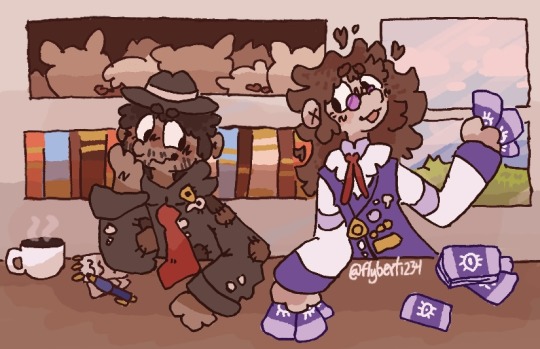
ahh so this is a rendering and bg practice of some characters from a puzzle book that literally was my only entertainment for 30 hours 🫠
#I have a lot to say abt this#Wow this took a while#Like my first? Second? Full illustration so yay?#THEYRE GAY#ARSON IS FUN#my first time drawing humans that aren’t stick figures in like a year and a half#Murdle#The background colors broke me#There’s a lot of red color overlays lol#Umm this is my first fully shaded illustration like ever#Also first colored/digital humans so fun#I kinda hate drawing humans
39 notes
·
View notes
Note
I'd kill for Asriel. Your Asriel art made me cry. Thx /pos

thankyu ^_^ heres a drawing of him drawn in 2013 style deviantart
#with the red outlines and yellow overlay lol#i was going to answer this like a normal person but once it popped into my head i poured 4 hours into it#actually yea what was with the red lineart with 2013-2015 art.. it was popular for like a brief period of time and then it wasnt#was it the b/illdip art that made it popular... i have to wonder where it came from bc it stands out in my mind#this was actually really fun to make i can see why ppl liked this art style a lot.. i used a multiply blend mode on my brush and#used a soft airbrush for coloring and ough.... the 2015 undertale fans knew what was up#my art#myart#doodles#ask#answered#asriel#undertale#utdr#i drew this while listening to electric angel and i felt like my mind was slammed back into 2015 for a solid 3 minutes#hes eating a whopper bc i couldnt think of anything else
267 notes
·
View notes
Note
Hello :D
I have been following you for the last year or so (a few days after I got my Tumblr lmao) and I absolutely love your art!
I have been wanting to study your art style for a while but don't really know where to start,,,
Could you please show me a small portion of your art process, if it isn't too much trouble of course. Thank you and have a nice day!
hello. oh my god. this took forever to find.
im sorry it took 2 WHOLE FUCKING MONTHS for me to respond to this but i wanted to put it off until i felt happy with my art process again, so here it is
my fall 2024 rendering tutorial!
(this will be very very long)

FLATS AND WHATEVER YOU WANNA DO WITH LINES GIRL. then make sure to recolor the lineart to better match your base. trust me it helps, bold dark lines are Not your best friend when rendering. wait for that post-rendering
i start off with a doodle or a sketch, and then filling it in with flats and other details such as blush

FIGURE OUT YOUR LIGHT SOURCE. FIGURE IT OUT GIRL YOU CAN DO IT you can make it as simple as possible, make it as big as possible, dont even THINK about the details.........just make it really fucking big so you at least know where the shadows and the light goes THEN add smaller shading details LISTEN TO ME. LISTEN TO ME OKAY!!!!!!!!
my key point with this is for you to learn lighting fundamentals.
it's SOOO ANNOYING but alas......they are all correct. it helps a lot.
one thing i also really want to point out is that i like creating a big shadow shape first before fixing up the little details (such as folds and whatever) because it helps me focus on the way the lighting actually works instead of tunnel vision-ing into making the shading make sense on the clothing.

contact shadows (i dont remember if thats what theyre called okay) theyre fucking ugly because im not actually thinking sorry 💔
okay so basically:
contact shadows (if that's what they're called) are the spots in shading and lighting where light will NEVER hit.
shadows are still influenced by the colors and lights around it (it's why a blue shadow and a yellow shadow feel completely different, despite both being shadows) so it's not always COMPLETELY dark.
BUT! there are small points in shadows where light never hits, and they're almost always super dark or pitch black.
it's hard to explain shadow and light so briefly for a tutorial, but you'll notice it when watching fundamental studies and when trying it out for yourself


YES i unclipped the multiply layer YES its ugly and terrifying but it makes coloring the multiply layer easier okay the colors merged w multiply so now it looks cool and has depth overlaying colors that actually make sense
so basically what i did was color the multiply layer that i used to shade the overall drawing
adding a band of red/orange/yellow around where the light hits, and blue where the shadows get big and wide, gives it a fake ambient occlusion effect in the way that a person would get if they stood under the sun with a clear blue sky
the colors don't have to make sense, especially because i never draw backgrounds, but coloring the shadows really help it give a sense of depth and extra subtle detail and effect that just helps make the painting look nicer
around the end, i also put in colors (in an overlay layer with a low opacity brush) that actually make sense in context of the drawing, which is the lit cigarette and the yellow eyelights
mostly because none of the colors were making sense and i needed to actually make use of the lighting that DOES exist in the drawing lol

adding a muddy golden yellow pin light layer (opacity turned down to like 40-50%) to make the light colors less ugly lol
i SWEAR by the fucking pin light layer style. it's so useful and so so underrated.
i used an almost brown-ish gold color on stop of all the layers, and with the pin light layer, it helped make the bright (almost blue-ish) white colors more warm and more yellow. it just helps make things more warm (something i prefer)
i could probably show what it looks like without adjusting the layer opacity to truly show off what i mean (like in the coming section) but i sadly forgot to do that lol


make a layer on top of your drawing with this color in these ranges YES the drawing is fully merged NO don't be afraid, the base was fucking ugly anyway 💔 make this layer into an exclude/exclusion layer style TRUST turn down your exclusion layer opacity from a range of 10% to 40% literally until you're happy with the contrast and the way the color over the drawing. use your eyeballs. i know you can do it im so proud of you
this is pretty self-explanatory instruction-wise, so i'll go into why i do this instead
i really like art that seems like it has low contrast, with almost mid-gray shading and lines. i don't personally use dark and bold lines and shading, unless i find it necessary for the tone of the piece, so using this method helps lower the contrast of the art and make it look "pleasantly muddy" in the way that it's easier and softer on the eyes.
the inverted blue color also helps makes things warmer!
the exclusion layer style is still a bit of a mystery to me but i really like the effect it gives, even if i don't completely get how it works lol
if you want an alternative method to this, and if you have access to it (because i primarily use sai and sai only),
i absolutely encourage you to play around and experiment with gradient maps.
there are so many out there you can make yourself or even get from others that just give the painting an extra amount of depth and color variation. they're SO fun.
personally, if sai2 gets a gradient map update, it's over for y'all it will literally be so over no one will be able to stop me


then i merged everything and actually adjusted the contrast back up because it was looking too muddy for me 💔 but the color adjustments are still there so all hope is not lost here's a comparison of the adjusted contrast in black and white (adjusted on the left) (newly merged layer without adjusting the contrast on the right)
as you can see, i actually turned the contrast back up (despite talking all about how i liked things with less contrast lol)
i wanted to demonstrate that doing adjustments should be done in moderation, and is why i adjust layer opacity often when making color effects
you are free to play around with colors to help your style, but don't lose your initial idea and colors along the way.
you still need to trust your own colors and intuition!
along with that, i just want to say that it's completely okay to change your mind mid-painting, and it's okay to make somewhat drastic changes.
don't be afraid to change things you don't like or change your mind about certain aspects way later on
that's basically the whole thing of this!!! don't be scared!!!

now im gonna hold your hand when i say this..........but you need to learn how to render by yourself. it seems like i can teach you but i literally can't, because rendering is different on every piece and depending on how clean your base is. i have to render A LOT because of how fucking ugly my sketches are LMAO to simplify it, think of it as obsessively cleaning up every detail you can see, but with a color picker and a clean, hard edged brush. if you have shit lineart, you don't have to redraw it cleanly over and over, just paint over it. that's basically what rendering is
THIS especially is where you need to be brave and stop being scared.
like i said, i can't teach you how to render, and it's something you have to discover yourself because rendering is something that will always be personal to every single piece you make. the way you render on every piece is different.
on one piece, you will barely need to render, and on another, rendering is more than half of your ENTIRE process.
don't be afraid to paint over your old art.
rendering is a process that's both very perfectionist yet also very careless.
find your balance and just go for it.

and then that's it……..u did it………..now yuo know how to paint and render. it's literally just layering shading and lighting knowledge until you think it makes sense and looks okay lol additional note: since i render in only one layer (you don't HAVE to do this, but it'll be harder for you…), i also made slight adjustments with the transform (and liquify, if you have it) tool to make things more proportionate. (i drew the head too big lol)

if you compare the finished piece to the final unrendered base, you can see that a LOT changed, including a bit of subtle proportion adjustment.
particularly, the sleeves changed A LOT (because i really didn't like them)
but it's also over all cleaner and more coherent, instead of having haphazard colors and shading just thrown about.
rendering is when you finally use all 100% of your brain to finalize and figure out where the shading should go, where to clean up your lines, where to ERASE or ADD BACK in lines, and make sure all your colors look coherent.
it's not as intimidating as it seems, i only use a hard edged brush with a little bit of color mixing and my color picker.
it's like dragging and dropping colors to cover up mistakes, it's really quite fun when you get used to it
i wish i could explain it clearer but it's hard to describe without visuals!
i hope this helped, and i hope all my yapping isn't annoying (art as a special interest beloved)
have fun studying and trying to render in my art style!
#long post#art tutorial#rendering tutorial#art help#art tips#tutorial#kia doodles shit#artxstic-scr1bbles#tutoriel
197 notes
·
View notes
Note
How do you pick colors? Do you have any tips for it, especially when making more complicated artworks with a lot of different colors?
Tysm for asking ! I'll use my recent art to show a little bit behind my process so its easier :3 note that I use Photoshop (I know, I hate it too but atp I'm already way too comfortable with it to change into a better software like CSP or something). Click on read more for the step by steps !
I usually put a base color underneath just to get the whole vibe of the drawing together and so it's coherent. It can be any color honestly but I like working with blue/orange/red the most depending on what I want,,, (photoshop also has a color changing feature so I can always change it midway).
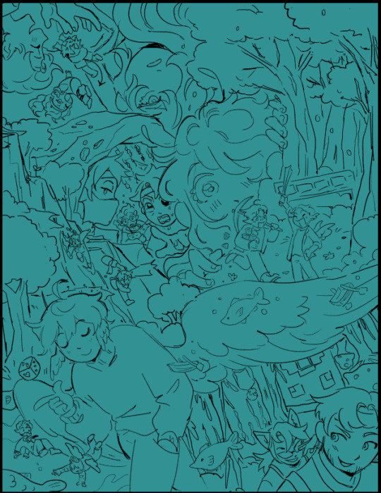
I lay down all the base colors next, the brush I use to base color typically has pressure sensitivity that makes it transparent depending on how hard you press (???) i dont really know what to call this feature but that!!
I lay down base color lightly just to show a little bit of the base color underneath and join the entire thing together (everything is a bit opaquer in this particular piece cuz i wanted to rlly separate all the elements, Im usually much softer w it)
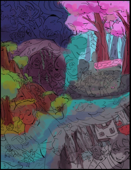
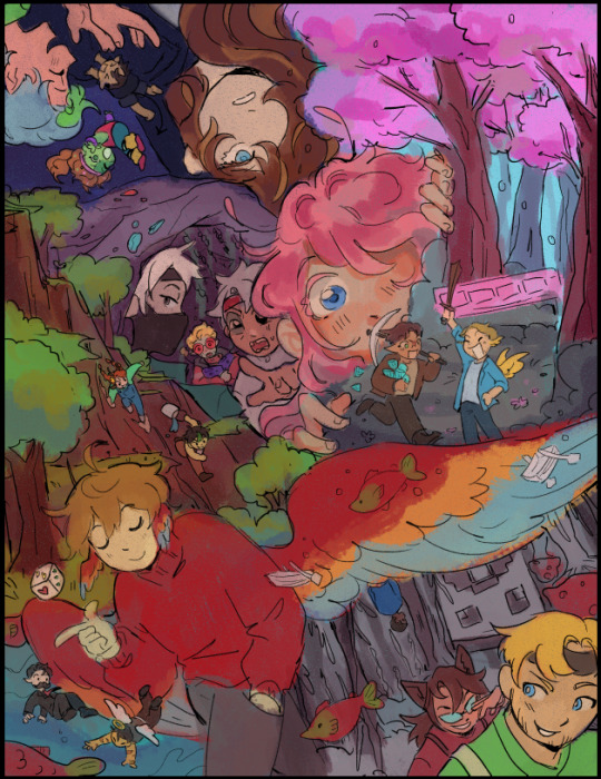
after i got the base colors down, I use blending mode layers like overlay, multiply, color dodge/add, etc to get down the lighting and stuff :3 I just love blending modes in general and use it a whole lot lol
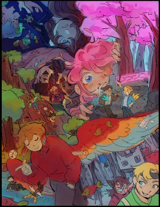
after i get all that down, I start shading and adding details to things ,,, I use a soft/light pressure sensitive brushes to get main shading down and some lasso tool + airbrush aswell in certain areas,, Then i use a more hard/opaque brush to get details like doing cleanup and highlights. I normally do more on shading & rendering but I didn't do much on this particular piece cuz I couldnt be bothered lol, I won't really go down too much on my rendering process cuz this one don't rlly represent it well
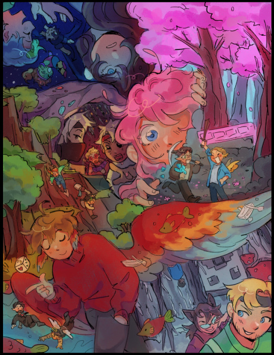
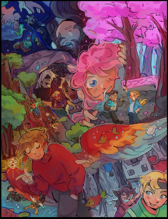
My favorite part is to bring the piece together using adjustment layers :3 idk if other software/app provide this feature (tbh they probably do), but I love messing around with color balance, hue & saturation, levels, of the sort
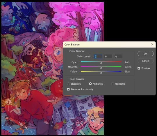
That's pretty much it ... this post is already much too long so if you'd like little misc. tips and rendering stuff as well as brushsets, feel free to ask in my box again so I can hopefully make a separate post abt it !
79 notes
·
View notes
Note
This isn’t an art request but I just saw your AMV and I loved it a lot! If you can, could you walk through the process whereby you color the animation? Do you have set color palettes and add overlays to create lighting or do you manually pick the colors via color theory? I want to know /nf
Hello!! I appreciate your interest :D I put a lot of thought into the colors so this may be a long one! It'll include other animation info too
Any color I use is never reused for any section, I pick them all manually and for a purpose, it's important to have something different for each section as it adds more meaning and so things don't get boring. I occasionally use overlays, only one section uses it though. I'll go over a bunch of parts where color was important.
I struggled with the colors here, it based it off of an old drawing (on the right), and I realized I couldn't make my old coloring style work again, especially with how I was going about it, nothing played off of each other and felt very icky? I opted for more natural colors, creates a better sense of what I was originally going for, this part isn't very significant but it was interesting to find out what works and doesn't, you can learn a lot from redrawing old works.


This was another part I struggled on, I purposely made One look wonky because I liked the sketch more than anything I could come up with. They really look stupid, don't they? I redrew it a bunch of times to incorporate the orange, but I did not want to base it off of the scene where One was counting down, that had a purpose for it, this did not. It was following the previous parts color, which has an overcast of orange, but I couldn't find a way for this to work without feeling unsatisfying. I opted for using a trio of blue+green+red, it could be seen as 123 but that wasn't intentional.. it was the only colors I thought could work with the lighting of One's TV, but hooray for unintentionality! It makes this part connected with the lore!


This part I put a lot of thought into! Something I found interesting about One's lounge is how it uses red+yellow+blue, the three primary colors, in design those colors are used to invoke a sense of familiarity and safety, and if you pay attention, these colors are used everywhere. this could or could not be intentional in the actual show, I do not believe they are, but I used this to my advantage as when One's walking past the figurines, the yellows increases, but when they figurines fall, the yellow fades into white to show while One tries to come across as trustworthy, their façade can be quickly broken. I put together a lot of notes for this part and drew a sketch for it too LOL


"The lights that shine" section's color were meant to be like this from the start, this was the first section I animated, they have a big contrast and yellow limbs, I only put that because I thought it looked cool, but the colors carried over to the other part where they look like this, and ended up using this palette to symbolize who was kidnapped by One. I had trouble deciding how the beams(?) that were coming out of the moon should look like though, this was what I was originally going to do. The placement of each contestant is important too, more to the front, the more they may be impacted by One. I wasn't sure between Gaty or Leafy to put in this section, since we don't know if either of them will/had contact with her, it was difficult to decide. I put Leafy instead because I didn't want to animate Gaty.

The chair for Gaty! No one mentioned this detail and I was a little sad about that - each time One's lounge is shown, there is a different chair for each contestant, if One took Gaty, it'd leave a bitter feeling if she used a similar chair to her and Two's hangout couch.. their hangout couch is already split in half, it's possible One could take half of it. The colors were based off of how the person who designed One's lounge uses colors, I used some of her personal artwork as reference, and also how the chairs shown in the lounge were designed, and each design has something to do with the characters, One's is big, to show importance and uses the primary colors, Fanny's is small and dark with shadows taking up most of it, Basketball's is big, modern and green to reflect her mechanic room, Gaty in TPOT is (unfortunately) mostly associate with Two and this couch, and is similar to a therapist's patients couch, it would fit her role and characterization in TPOT if I am right about this

This was the only section to use overlay, layer 6 and 5 were the only ones to be changing as stated in the notes, there's a lot of light changes in this sequence, and if you notice closely there's a red, a shadow casting from characters outside of ones shadow, and there's a bigger contrast between the lighting and shadows. The "lights that shine" section you'd think uses that, but everything was done manually, even the transitions colors

These are some storyboards for this, the handwriting is probably poor I apologize about that, I created this during school and I don't write neat/properly if I don't plan to show anyone it LOL

#i started writing this when u sent the ask then i got distracted sorry#i could go on and on about this but i tried staying to the original question#there was a lot of intention in each section (that rhymes!) each part tried to relate to the lyrics without being overbearing?#i dont like when AMVs only relate to the lyrics and dont do anything creative with it. like only lipsyncing for example#i didnt think id ever finish this but im glad i did. i havent animated something to a song in over a year#fun fact! i was originally going to do a different AMV with one. looking at the skecthes im glad i didnt go through with it#it was very bland and boring besides for the last part#BUT TYSM FOR ASKING i loved writing this
43 notes
·
View notes
Note
can you do a style tutorial?? dude there's geniunally nobody else who draws like you, your art is so poetic and divine, it's inspiring
WAAA THANK YOU ANON OH MY DAYS ??? genuinely this is one of the nicest compliments ive ever received on my art omga what .
im not very good at explaining things but eem ill try !!
i feel like one of the biggest things is the sort of sketchy/messy vibe .. i use a super tiny brush ('digital brush' on ibis (its a premade lol) on size 1-2) and kind of scribble scrabble sometimes .. i also dont do lineart, i cant be bothered to do allat so i just clean up my sketch using an eraser !
i also stay away from using curves and instead try to use as many straight edges as possible if that makes sense .. also arbitrary lines in the drawing are a must . i think thats one of my fav parts of drawing :)
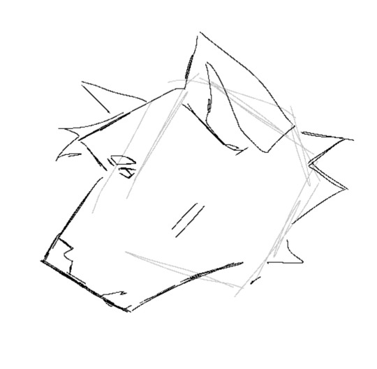
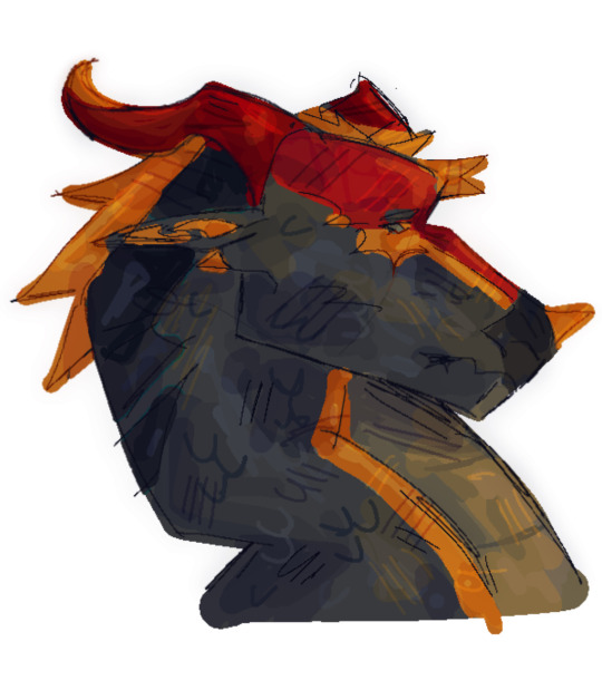
when it comes to coloring and rendering, i start by adding a darker, slightly more saturated color for shading, then blend it out with a midtone, do thr same for lighting, and then i add details !!
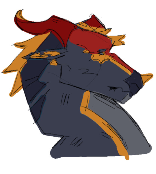
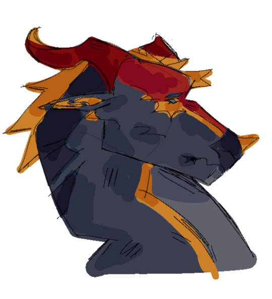
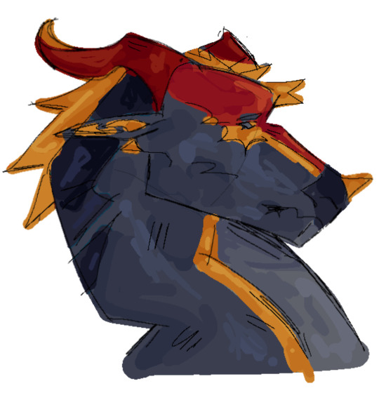
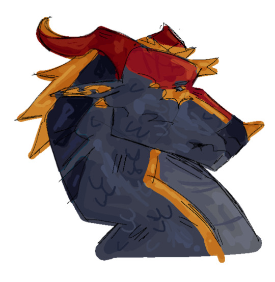
ive also been told that my usage of warmer tones is recognizable, and i achieve that by playing around with the 'color balance' filter on ibis until im happy with the results
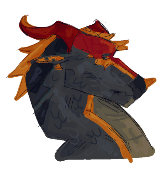
for shading, i use a dark color (anywhere between blue and red, depending on the character and environment) for shading and a light yellowy color for lighting on an overlay layer ! then (also on overlay) i use those colors to add more arbitrary lines and scribbles
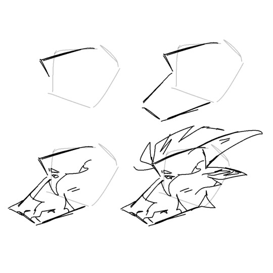
here i kind of tried to break down my sketching process, idk if it makes sense or not tho😓
my current artstyle is the result of six or so years of constant drawing and growing and experimenting !! experimenting with your artstyle is a huge factor in allowing it to evolve as well as for you to find what works the best .
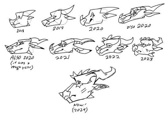
referencing/figuring out how specific artists that you like achieve their artstyles is super good for experimenting !! in 2021 i was a huge fan of bellasaurus and animatedwings, so i referenced their art a lot, picked out what i liked, and incorporated it into my own style :)
i didnt include humans in this because im not very confident when drawing them and still have to heavily reference things lol .. maybe another day
overall just have fun and go with whatever feels right ! below ill attach some of my art pieces broken down if you want to use them as a reference

135 notes
·
View notes
Text
OK heres zeno coloring tutorial 2.0 !!!! i'm gonna do it kind of in chapters i guess?
chapter 1: choosing base colors
when i'm choosing base colors i always pick everything based on a specific off-white! my 'default' off-white is this kind of very light cyan color but i change it regularly based on character designs/environment/lighting whatever,, examples here!
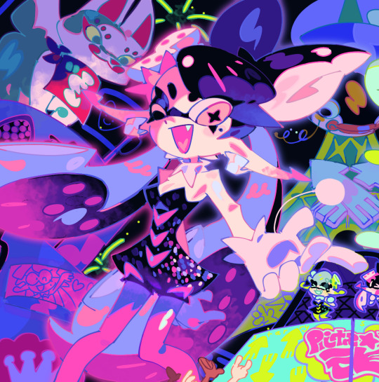
for callie in this piece, i based everything off of this pinkish color! her skin tone, tentacles, outfit etc are all chosen to harmonise/contrast with the pink color

and with this piece, i used a slightly darker blueish color as they're in space but there's still a lot of light... and the lighter colors in the background (the explosion) make a sense of depth i guess? i used that blue color and chose similar cool colors to harmonise with it!
so i more or less base the tone of the colors in the piece off the off-white! warm off-white = warmer colors (like the nova valentine's day art) and cold off white = cooler colors (like the explosion nova and paro art). but i switch up this formula often !!
chapter 2: coloring specific things
here i'll go over some specific textures and stuff like skin and hair ... skin first !!
for skin, i like to use a variety of tones! there are different ways to draw cooler and warmer skintones that other people have gone over way better than i have but basically for skin i use this part of the color wheel and pick the darker tones of oranges/reds/pinks etc. (for darker skintones, i go to the middle of the color square thingy, and for lighter tones, i usually slide down the upper-right side)

when it comes to shading skintones, it's pretty straightforward, just a darkish-purple and a pinkish color on 100% multiply, and i always add a little shadow on the nose and blush becuz i think it's cute
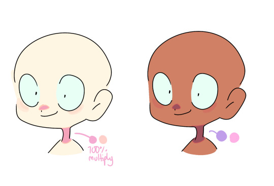
(also i like to add reflective spots on darker skin tones sometimes because 1. darker skin tones reflect in real life and 2. it's fun)

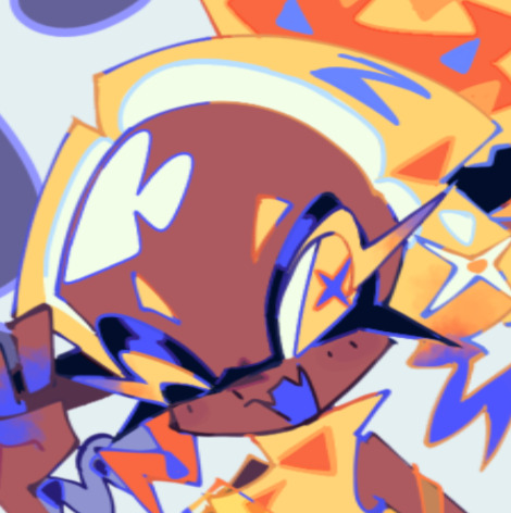
next up is hair... this is very specific to my artstyle but i like to add 3-6 long oval line thingies to the hair to mimic reflection ! it looks cool, it's a good way to show off different colors in the design and i like to switch it up sometimes based on a character's personality!! (like how the frye pic above has a lighting bolt shaped hair thing, or how my teto design has a wing shaped hair thing to mimic her wings in her chimera form!) (note: it doesn't always need to be lighter than the actually hair color and it usually isn't)
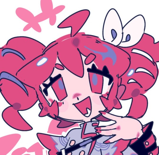

for other materials like metal, screens, etc etc... i just add random X marks lol... and reflections!!!
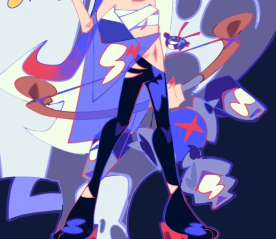

(also, just a general thing, but adding little saturated lines to shading really adds depth and color imo!!)
i would put more tips with refs but tumbles only allows 10 images per post ;w; so i will simply close off by saying don't be afraid to add overlays and filters to your art!! overlays can really help harmonise colors and filters like brightness and contrast can help colors pop... try not to completely rely on them for color choice tho!!
and that's basically it !!! this is not a definitive 'how to draw/color' post... i am not a color theorist... i just wanted to show people how i choose colors cuz a lot of people say they like my color choices! honestly i don't know much myself but i hope that this and the philosophy of 'do what looks good' will help you all o_ob thank you and goodbye
#long post#ah its so freeing to have zero character limit on this site#i did want to add more pics tho 😭#i would make a part two but i dont have much else to say#hope this helps people maybe#also idk how to add a cut/'continue reading' thingy on mobile so if someone could tell me how id appreciate it 😭😭😭
943 notes
·
View notes
Note
I love your style and how you utilize halftones and textures and colours. It’s just so tasty! I’m curious if you’d be willing to show a bit of your process on how a comic page comes together?
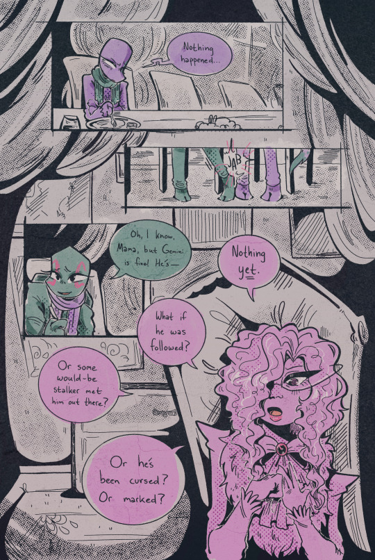
Ah, thank you! ; w ; And sure, I can try, at least! Usually I start with some kind of a script. Sometimes it's a bit more detailed, like this:
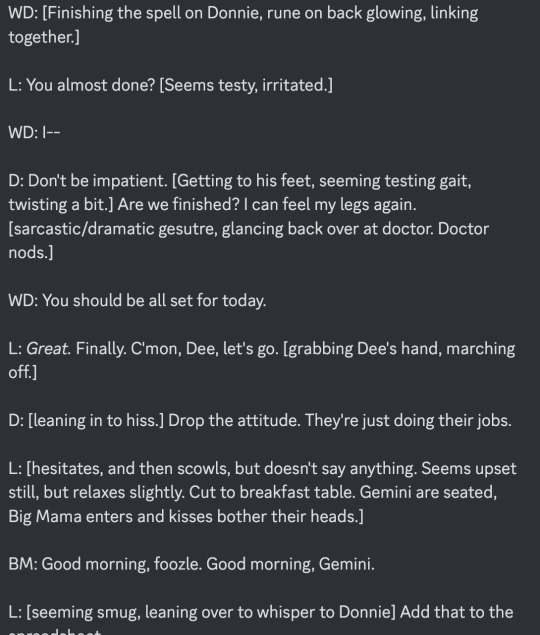
... And other times they look more like this.

It just depends on my mood! But either way, I typically have a pretty good idea in my mind's eye of what the comic is generally going to look like. Once I know what I'm making, I do all the rough sketch pages.

... And then I line it!. For Gemini, I go for a dark blue rather than black 'cause I like the way it feels, and it lends to the overall 'papery' vibe. I usually lay down a grid pattern at this stage, which helps a lot with keeping panels and dialogue straight, and with perspective. I always do the gutters and the words first, then the figures and backgrounds. I been leaning a lot into really heavy shadows recently-- one of my professors in college told me once that a black-and-white comic page should be about 50% black and 50% white, and I've been trying to bring that to the table, lol.

I can ditch the grid at this point, and I put down a really light, pale-gray 'wash' on all the panels. It's a pretty subtle effect, but helps separate the panels from the 'background' of the gutters/negative space, and also just adds texture.
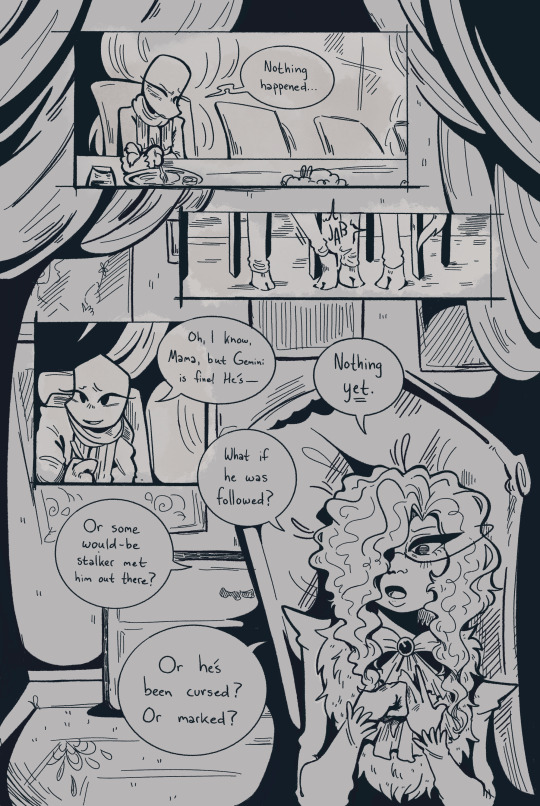
I lay down all the color next. Flat colors first, then a second pass over some parts to add depth/shadow, and then all the spot-colors like Leo's red stripes, light gray eyes, etc.

I use a pretty fine-grain half-tone brush for the background, and then a slightly more defined one (layer set to overlay) on the characters.

Once that's done I go back in and add highlights and such (white shine to eyes, hair, etc.) and go and add light outlines to any areas that need a little help being defined-- like Big Mama's arms and hands, for example.

And then the absolute last step is adding paper grain textures and gradient overlay over the top of everything!
(A lot of the brushes I'm using for this comic I got from True Grit Texture Supply, just by the by for anyone who's curious.)
... With Swanatello I kinda tend to just. Go for it. I (sometimes) start with a vague script and then I just draw it. 🤷🏻♂️ No thumbnails, no sketches, no heroes, no gods--
Just Swanatello.
#asks#fidgetwing#i hope this makes sense/is helpful? ; w ; ive never done a lil step by step like this before lol
192 notes
·
View notes
Text
i think i just love the idea of the different universes with their like, styles???
like how Gwen's is totally watercolor and Hobie's is all scrapbookish punk n newspaper, y'know???? and, of course, Miles and Pavitr's are both more "normal" but they still have that... you know... v i b e... they're both normal but they have elements that make it their own. Like how Pavitr's universe is mainly super warm colors?
anyways this got me thinking y'know how it's super obvious Hobie has a different universe style?? not so much for Gwen because hers is a little different, but with the whole. changing skin, the OUTLINE, it's very obvious
I think it'd be super cool if in Hobie's universe, it's kind of like the opposite for anybody who's not from it? They have their own like, radius of... their own dimension???
I'm only comparing this to Hobie's dimension, it's very obvious none of this would happen in CANON so I'm literally just spitballing. Also because Hobie is the only one with the outline and funny overlay thing, and it'd be fun to play around with the other three's possible like,,, vibe!!
Gwen would leave like, imprints of watercolor? like dabbing it on a piece of paper, leaving color that dries out back to normal over time?? it would bleed into the world around her, it might even mimic her emotions with the color!
If she was upset it would be harsh, spread more, it would come out in spiked reds and blacks?
happy would seep in a lot more subtly, and cover a lot more space, but you wouldn't realize how much room it's taking up just because it's so slow to take it up and really is only at about.. idk, 20% opacity, slowly builds up the happier she gets? it would be more visible in puddles, just like with normal watercolor (Compared to anger, which would be very in-your-face and obvious)
It would rely a lot on her emotions, methinks, the stronger they are, the more visible the color!
Miles would have a sketchy, drawing-like atmosphere to him, kind of like what you can see on the spot y'know? and, since the spot came from Miles' dimension, I think it makes sense!
It would be less noticeable, but the things he interacts with would probably turn into a slightly stylized version of itself? A cup he holds or drinks from wouldn't change DRAMATICALLY, but it might copy his look and have sketch-like lines around it. Nothing huge, but enough that you can tell what he's touched in the past few minutes/hours
Pavitr would have a similar vibe to Gwen's, but with warm colors instead! His effect wouldn't change with emotions like hers, but it would probably bleed in the same way as hers. He would leave behind trails of warm oranges and yellows wherever he goes and leaving it behind on what he touches. He wouldn't notice this, but it would be veeery obvious to Hobie or anybody from his dimension.
Actually, I think the way that we can spot Hobie because of his differences in outline/radius effect would highly apply to them in his dimension! Everybody in Hobie's world can CLEARLY tell that Gwen, Miles and Pav aren't from there, and while the common person might not recognize they're from another universe, they might get the same feeling as if you were seeing like.. a skinwalker, or something. They're human, but it doesn't feel like it.
ANYWAYS back to Pavitr
He has a warm, cozy vibe, I think unlike the others his can seep more into emotions, I think he's an empathetic person and that melts into his little area effect. if he's super happy or excited about something the people around him get a tiny bit happier too!! when he's sad (and it's rly hard to make him sad bc this boy is POSITIVE THINKER #1) his colors get a bit colder, but I don't think they would affect other people like his happy ones do, honestly just SEEING such a normally happy guy so sad would do enough to ur mood than some radius effect lol
ANYWAYS that's just a lil thought. they are silly. and this is going into my ideas folder. have a good one n remember to drink water
(I would go on but this is super long already XD)
#spiderman across the verse#across the spiderverse#pavitr prabhakar#hobie brown#miles morales#gwen stacy#arachkids
277 notes
·
View notes
Note
its the same anon as before-
Can I just say I love the way you add depth to the skin tones and I also love your color line art?
The textures and expressions ahahghjdbhjdgjdfbdf <3 not to mention the lighting on some of these are just great!
uh if you don't mind can you tell me how you do your colors? Like the base ones I don't mean all the lighting stuff
im still fairly new to digital art so how do you color inside the character instead of just each individual shape?
jfbdskjbjksfbdf thank you ^v^
THANK YOU SO MUCHH!!!! much appreciated c:
im pretty bad at explaining it but usually i just use much more saturated and warm colors in my art since im biased (i like warm tones a lot) and i also think it more eyecatching!

heres an example-- i make the values generally similar with mainly the darker colors (hair, shoulder thingy) being lightened slightly to reduce contrast so its more easy on the eye & makes it look softer ig? i also like to choose one color in particular to "base" all the other colors around, and that color is usually some sort of primary color and the most saturated. in this case, its a red/orange color, so i had all of my other colors shift closer to it (in reference to the color wheel)
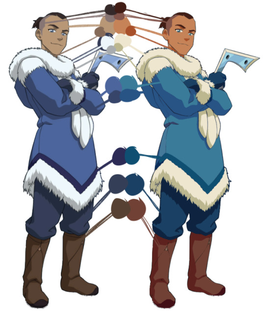
heres another (really crappy LOL) example based around a more orange tone (though looking at it i think i made sokka a little too orange... whoops) and if you look at the values themselves...
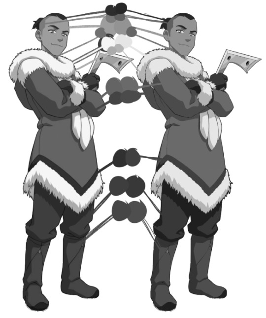
basically the same! most of this is just preference too so its not like you need to REALLY stick to the original values or anything, but all that id look out for is that you pay most attention to stuff like skin tones just to make sure youre not like whitewashing by accident lol
im overcomplicating things but its kinda just something i think you learn over time? the way i figured colors out was by abandoning any and all reliance on blending layers (stuff like multiply, add, overlay, etc.) and just eyeballing literally everything and it kinda forced me to figure out how to make colors look good without relying on filters!
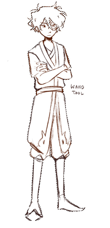
as for blocking in colors in general... i forget how to draw sometimes so im never really consistent with it LOL but lasso fill is your best friend! i either just use a random color and lasso fill the whole character manually (left) and set that layer to alpha lock/protect alpha, or i just lasso fill each color individually (right) bc im a freak sometimes
what i recommend doing/the fastest way is using the magic wand to select outside of your lines, invert the selection and then fill in the selection with a color and setting that to alpha lock.
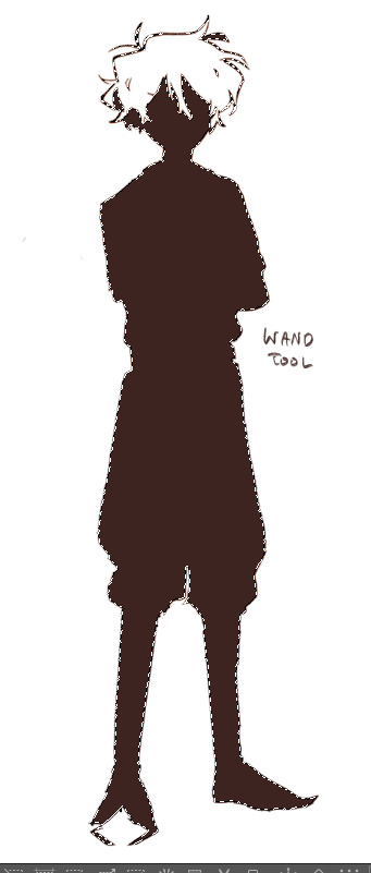
i dont use it as much anymore mostly because i dont line so my stuff is really sketchy (so stuff like on the right happens) and i kinda like messy coloring anyways soooo... but yeah!!! i dont really recommend using the fill bucket that much unless the situation calls for it c:
(and if you do struggle with this and ur results look like whats on the right, try just manually closing your lines or seeing if your wand has an option for automatically closing gaps!)
#sorry this is so long#and sorry if it makes no sense#thank u anon for the kind words tho!#hope this helps a little!
122 notes
·
View notes
Note
Coming off anon for this one cuz oh boy it’s theory time and I’m feeling very silly
(I just woke up at the time of writing so sorry for any typos, rambling, or confusion lol)
Alright! So, I’ve been thinking a lot about the existence of Eclipse and the theories popping up about them lately mainly: that Clipsey is a recycle of Moon’s broken body. Which I’ll touch up on first.
The issue that was presented with Moon by this definitely-not-at-all-suspicious engineer was that his processing unit was smashed and ‘unsalvageable’ (which we know to not be true), and aside from the obvious injuries cause by Trap, no major problems with Moon’s case are brought up. His *internals* were destroyed, aside from his battery which was reused.


Continuing forward, the SOMA comparisons. Reading through a plot synopsis of the game, I can’t help but link the destruction of Moon-man’s processing unit and Simon’s brain injury together a bit. Considering that that is the partial cause for Sun and Moon combining and the reason for Simon getting his brain scan copy. Both undergoing heavy ‘brain’ damaging and being brought to very odd circumstances because of it.


With the assumption that this is *actually* Moon’s body, “Uploaded into a modified corpse” is a *very* apt description for what Eclipse is. They’re a copy of someone (two people technically) inhabiting the dead body of the original, almost like Pry/ncess in a weird way.

That’s where the comparisons for the game and Bethroned end to my knowledge however, so time to move onto the more ‘looking too far into things’ section of my theory,
The design and color scheme!
Starting off, I noticed that the coloring of the Sun side on their face was reused from *post incident* which makes sense, that’s how Sun would’ve been seen last before running away with Pry/ncess, the eyes obviously match up as well.
Though the tops of the rays have noticeably sharper points to them if that’s anything at all, it’s impossible to draw the something the same way every single time after all so that can be easily written off.

The same can be said for Moon as well, the coloring of his face matches up with theirs, however his other features are… very much not intact. Very close but not quite.
The coloring and patterning of the hat is entirely different, the cape maintains the same coloring but the stars on Eclipse’s are much smaller and more faded than Moon’s as well.

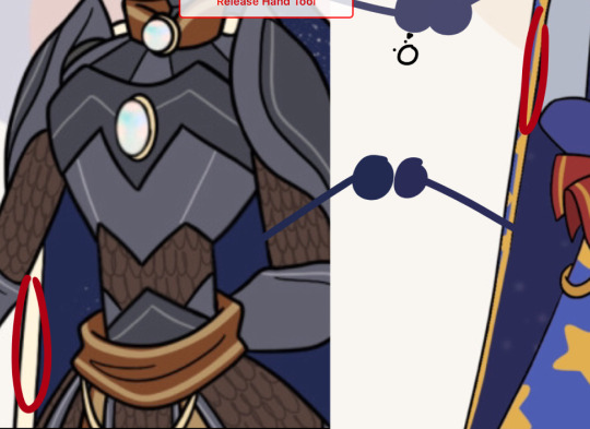
What’s throwing me off though is the eyes, for both post incident and for Eclipse the right eye gained a black sclera, Moon’s pupil turned white, but Eclipse’s stayed red.
If Eclipses body was Moon’s then this could’ve happened naturally, the eye could’ve simply underwent the same damage/change as it did with Moon’s form in Sun’s body. Though do to this being his actual form the pupil could’ve kept its regular eye color.
Their lack of a mouth could also mean that they can’t speak, another drastic contrast in characterization to our boys. From the artwork we’ve been shone of them they see, cunning, clever, but very, VERY distressed. (Be a bit weird to consciously design eye-bags on your new king after all, right? That’s their own fault.)
And for my last point, their crown and the Opal.
This is the most obvious ‘combination’ in their design, it gets the rounded bottom of Sun’s and the gem formation and top shape of Moon’s. When overlayed on top of each other you also get similar colors to Eclipse’s crown, though more cleaned up and appealing on the eyes.
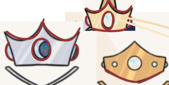
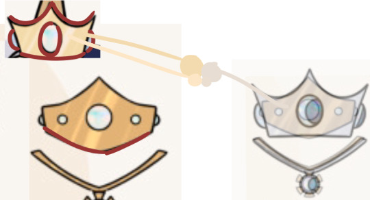
The gem in this crown has been confirmed to be an opal (if my memory serves me right I can’t find the post anywhere to confirm, tumblr search engine is bleh)
There were a few pieces of folklore and symbolism relating to the opal that I found particularly interesting with what little we know about Eclipse.
Mainly, it representing loyalty and goodluck as well as royalty. A lot of other interpretations I found pointed to it granting foresight and being responsible for prophecy, something you’d certainly want your king to have after the huge string of ‘bad luck’ that befell both of them.
Loyalty to prevent another incident like Sun choosing Pry/ncess over his kingdom and trusting them first, foresight and prophecy so that they can avoid incident like King Freddy dying and, well, Sun and Moon’s incident. and royalty is obvious.
Though the loyalty interpretation and foresight/intelligence can vary widely in intention depending on if Chica or PeePaw (maybe both, stares at Trap) is responsible for their existence. Cant speak that much on it before they’ve even appeared in the story.
Alright so what am I getting at with all this? Well, put simply, Eclipse’s design and name are very very intentional and combining the Princes was clearly in mind when they were (re)built by whoever their creator is. I believe that they attempted to program, be it from scratch with parts of Moon’s processor or with some kind of backup of Sun *somehow*, Sun into Moon’s body and combine their ai together in order to make a new heir.
Again, can’t find the message, but Eclipse’s existence was described as ‘decidedly uncomfortable’ which is very understandable if this were true, having you and your brother’s brain and memories COMPLETELY sewn together, not even with semi separate minds or personalities like with the actual Sun and Moon, would be very, VERY lacking in the ‘good for your mental health’ department, especially if you knew you aren’t the original ‘you’, just a clone, a do-over, a combination of two other failures that you need to clean the mess from up.
Put simply, I believe Eclipse is a combination of Sun and Moon, but not THE combination of Sun and Moon. If that makes any sense. They’re a replication of both placed inside Moon’s old body and used to fill the empty spot on the throne and potentially-maybe-hopefully-not help Afton.
Hands down my favourite ask ever. Like oh my god you did it. You got everything. You caught all the little secrets I put in and I’m flabbergasted. WOW. I AM. SO HAPPY HSFSG
THANK YOU FOR PUTTING SO SO SO MUCH TIME AND EFFORT AND ENERGY INTO THIS ANALYSIS BECAUSE I JUST. I MIGHT CRY. THIS MEANS SO MUCH TO ME SOBS :;;
#ask#bethroned#bethroned fanart#COUNTING IT AS THAT BECAUSE THIS WAS CLEARLY A LABOUR OF LOVE#YOU CIRCLED AND OUTLINED THINGS AND EVERYTHING IM SO HAPPY
92 notes
·
View notes
Note
sorry for a repeat question, but how do you add texture to your artwork again?
hi sorry this took so long! i was waiting until i had a good example drawing but i haven't been drawing much lately lol.
tl;dr: add the texture file as a new layer. then change its layer mode to something you like; i use "overlay" most often and "soft light" occasionally, but it's fun to play around with other stuff too. then adjust the opacity until you like it. repeat with as many textures as you want. then look at the finished piece to make sure the final color of everything feels correct, especially skin tones, and if anything seems wrong, adjust the base color until it seems right.
here's a download link for my watercolor textures.
now here's a detailed step-by-step of how i did the textures for this piece!
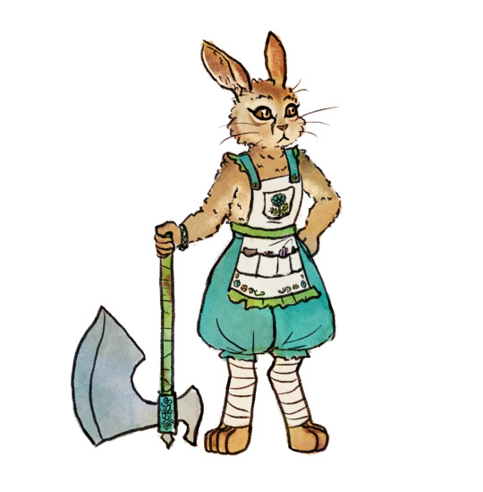
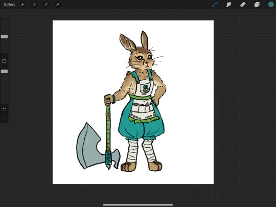
OK first here's my base flats. historically i usually use a plain circle brush to do neat flats, but lately i've been going sloppy using the same textured brush that i line with, which is a ton faster and the messy bits end up looking nice with the watercolor textures.
then i pick out a watercolor texture png that i think will compliment the artwork, and add it to the canvas. i use pink/purple/golds a LOT because they tend to look best with human skin tones (vs anything green-adjacent can make people look sickly, as one might expect). but sometimes i try to match a mood instead, like a cool teal-green forest or warm orange-yellow sunshine. in this case there's no scene so there's no lighting to consider, and it's sort of a ref sheet so i didn't want to get too whacky with it. so i thought that a yellow-orange would nicely compliment both the brown and the teal. however, i've found that using watercolors that are entirely bright red-orange-yellow turn out kind of flat, like everything is brightened to the point of not having much contrast within itself? so if i want yellow i usually go either yellow-green or yellow-pink or something, and in this case green seemed like the natural choice.
so, a predominantly yellow and green watercolor! i add it to the canvas, turn the layer mode to "overlay", and move it around until i think it looks okay — no stark high-contrast edges right across a character's face, for example. if there's a background i need to make sure it covers the whole canvas, but "overlay" layers don't effect white so it's fine to only cover the bunny here.
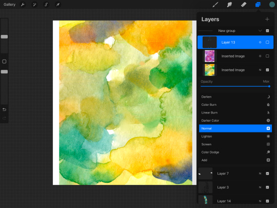
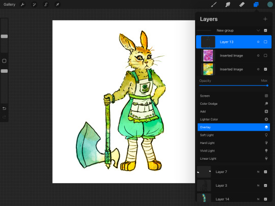
then i slide the opacity around until i think it looks nice — high enough to create visible variation, but not so high that i lose the original colors too bad. sometimes i'll change the layer mode to "soft light" for a softer effect, or "multiply" if the drawing has gotten too washed out and i want to darken it instead of brightening it, or even "hard light" or something if i want to get funky. but i use "overlay" like 95% of the time. my opacity usually ends up somewhere in the 20-50% zone.
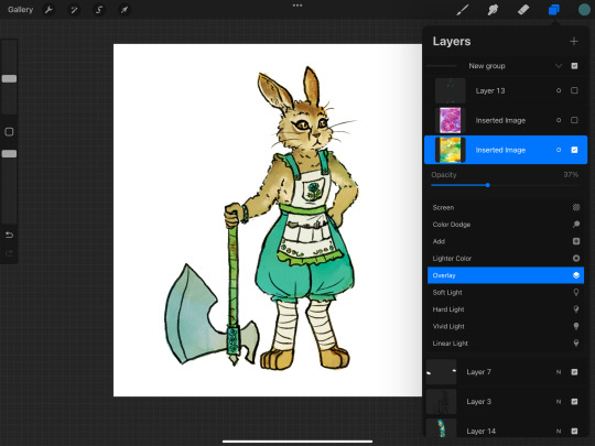
sometimes at this point i'll notice a section that seems funky. if there's a hard high-contrast edge across somewhere distracting, i'll go in with a textured smudge tool to soften up that bit of the watercolor layer. or if the colors are bad in a spot, i'll lightly paint on the watercolor layer with a textured semi-opaque brush — like hey, this shoulder is way too bright orange compared to the rest of the body, so i'm gonna even it out with some cool green. however, if you do either of these things too much you'll lose the watercolor vibes, so i only do it in one or two spots if it really seems necessary.
depending on how it's turning out, i'll add more watercolor layers, probably averaging 2 or 3 but sometimes up to like 10. in this case i decided i wanted a little more texture and the colors were a little too yellow-green. so i tried a blue to cool it down but that was too cool, so then i tried like a pink-orange as well, but it still wasn't turning out so then i was like fuck it back to trusty purple. so i ended up with just the yellow-green layer and the purple-pink layer! same process here with adjusting the opacity, and then fixing any bits that were distracting. (the versions shown here are already fixed bc i didn't think to screenshot beforehand — i can't even tell where i did the fixes, which goes to show how subtle it is — i'm using low opacity and high texture brushes for these fixes)
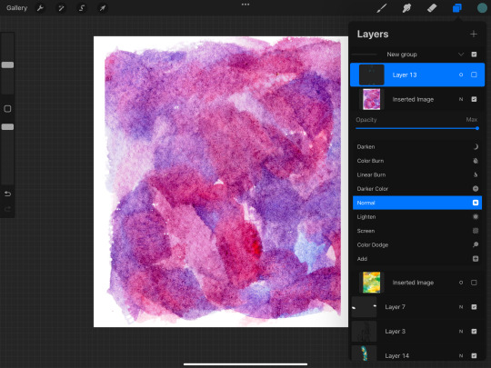
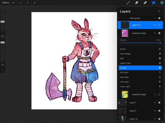
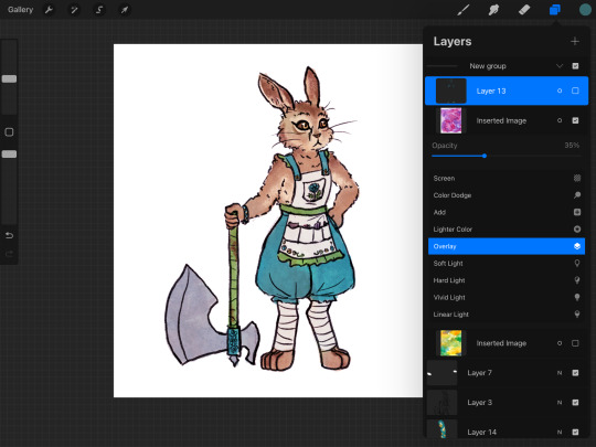
at this point i liked the amount of texture and the balance of colors, so i was almost done. but my last step is always to take a look at the final colors of the objects and make sure they turned out right — sometimes a color will end up too light or too saturated or something. in some cases it doesn't really matter, like these teal pants would be fine as any shade of teal, but it's super important with skin tones, and it's common for blacks to end up quite washed-out. final colors definitely don't have to be eye-dropper-identical to the element's official, objective color, but you want it to look right within the context of the piece! if anything needs adjusting, i'll either go back and change the actual flats, or i'll add an overlay or multiply layer of a flat color.

this time, i thought the dark browns of her fur turned out a bit too bright orange-brown, when they're supposed to be a cooler grey-brown. so i made a new layer and roughly colored in some grey-blue splotches over the darker browns, and set that to overlay. it's a subtle difference but i was happy with it!
in pieces with backgrounds, i'll often add some additional texture layers to only the background, for a couple reasons. first, tinting the bg with a different color helps the character's colors pop out. second, bgs tend to contain more elements that are inherently varied and textured, like bricks and bushes, as opposed to character elements like skin and fabric that are mostly one smooth color irl. third, heavier textures de-crisp the details of linework and base color, turning it all into a more-consistent mush; i don't want to do that to a whole piece, but it really helps when i want the bg to, well, fade into the bg; and if i was sloppy while drawing and coloring the bg bc i don't care about it as much, that messiness feels more purposeful when it's messily textured as well.
sometimes i'll even add a texture layer to just one element, like if i want to make the shirt look rough and dirty. to make the texture apply to only one element, you can either use a "mask" on the texture layer and color in the mask shirt-shape, or use "clipping mask" to clip it to a layer that contains only the shirt's base colors. look up a tutorial for your program to see how to use masks and clipping!
i use watercolor textures most often, but i'll also sometimes use a paper texture or a "grunge" texture. i don't remember where i got these so you'll have to search for your own, but to give you an idea of what i find useful, these are my favorite non-watercolors:
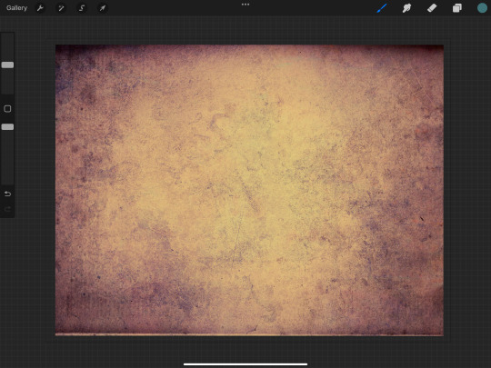

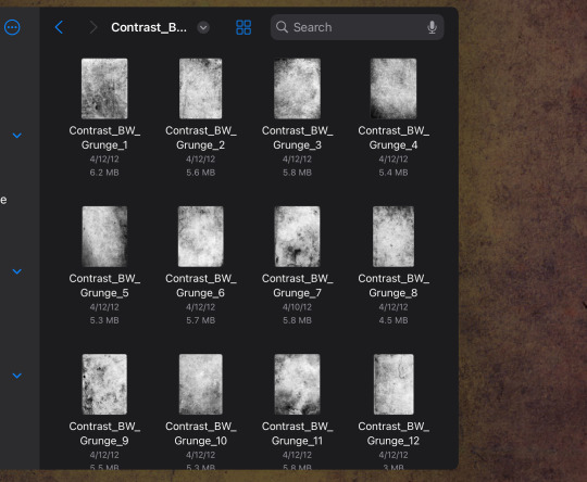
i like the colors of the yellow/purple paper and it does give a nice parchment feel, the dark blue grunge is great for caves and stones and dramatic lighting, and the black/white grunges are good for adding a more consistent noise-like texture as opposed to a dramatic blotchy texture.
and here's the link again to all the watercolor textures that i made! not every watercolor texture i use was made by me, but, i do use mine the most often bc i have good taste.
16 notes
·
View notes
Text
I like seeing people's progress shots / how they edit, so might as well make mine :D I'm nowhere near perfect with AE, but here's a quick look into my editing process 👍
First I think of the clip in my head and choose the main angle. In this case Toothiana serves as the main anchor point around which the rest of the composition builds on. Since there're very few Tooth masks around, I had to mask her for the scenes myself.

Next I go through masks for each character and pick or create ones that fit the camera angle well enough. I also add the background and play around with the composition til I'm satisfied. (Tried to have Merida in there too, but it was making the shot too full so she's standing next to Punzie offscreen 😭) The masks here are by me and xMakorra.

Okay, since it's night time in the scene (lot of my scenes happen at nights lmaoo) next I need to get the color and atmosphere right. I'm using 3D spotlights as I've found out they usually work better for darker scenes than just fiddling with the color balances. The overall light is dark blue, with another faint red on top. See how it immediately changes the setting 👍

Then I just start playing around with details and effects. I work on each character/layer to make them match the overall tone, for example here Jack and Hiccup needed adjusting as they were a bit too dark. Basically I just tumble around til it somehow works out lmao✌️ I also add details and final lighting to the characters here, making the scene come together. It's important to decide on the light source directions. As a cherry on top comes an adjustment layer with some faint light ray and glow effects.

And done :D Next I throw the clip to Sony Vegas (after re-rendering it into .mp4 because the AE .avi renders are HUGE in file size) where I add the black bars, a faint color overlay and subtitles to give the final "movie look" lol.
Wow this was way too simplified take but anyway, here's a glimpse on how I build my edits✌️
58 notes
·
View notes
Note
please how do you pick colors 😭 I'm trying to learn how to color and I am obsessed with your comics (like your ivantill ones lol) and how do you pick such a cohesive color palette and choose where to put what????
Your art is amazing like actually :) happy holidays!!
😭 tysm anon and happy holidays to you!! i did my best to explain some of the process behind my color picking and choices for the ivantill comics under the cut, i hope its coherent cuz quite frankly it also takes me a long time to decide what colors to use
a little disclaimer: i tend to just put base colors, before i start adding shading or lighting. i also dont usually start off with a fixed color palette in mind, because my process is pretty much figuring out as i go along, and playing with all sorts of colors; however whenever i do end up with a fixed idea on the color palette the process is still applicable anyways so hopefully its helpful for u too :’]
ok so i usually decide colors by asking what kind of mood or tone im going for. for example, the recent ivti comic i did
the comic imo is pretty playful - theres a romantic element ofc but i think the focus is rly on how ivans being kulit / annoying as usual so i thought a spunky, albeit warm color would rly fit. theyre also chilling in tills house so i thought a home-y, comfy feeling would be good
i was still playing around, so for the first attempt at realizing that tone, i added a hot pink multiply layer to see how it looked
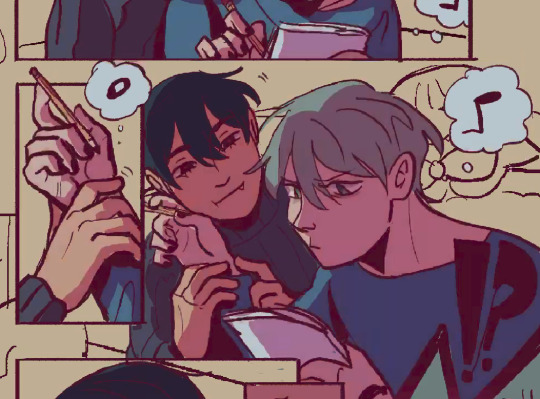
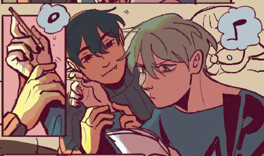
(first attempt vs final colors) (also im sorry for the low quality procreates timelapse is wack)
ironically enough it actually created a really cool looking color palette which was not what i was going for. so i kept testing colors for a bit; the shadow is hot pink, and i ended up going for a bit of a desaturated green as a base / overlay because it mellowed out the pinkness. i also put both the base and the shadow on a darken (50%) layer so that the og colors peek through a bit more compared to a multiply layer. in the end tho, i ditched pink and went for a saturated red
the green also makes for a nice complimentary color to the red, and it overall has that home-y, warm but playful feeling i wanted to include ⬇️
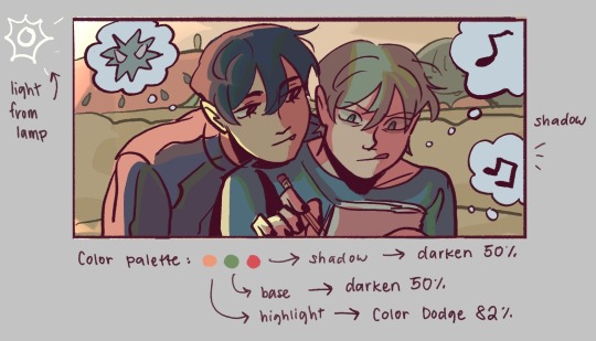
i added a highlight layer (color dodge, 82%) so that it pops a bit more, and also bc i knew i was gonna draw a big lamp on their right in the bg. speaking of the bg i made it a green/yellow hue so that the base for green on ivan n till make sense, and it ended up working for the best cuz the red acts as a nice contrast
(admittedly i think if the lighting of the room is green the shadow should also be green, but tbh i tend prioritize contrast as much as possible regardless cuz it looks nice 🤡 even if it fails to make sense realistically its for the vibes)
^ i ended up remedying this a little bit by adding bits of green to the shadows on ivan n tills hair and clothes, and also because its fairly complementary to the pink palette i have going in for the shadows and even the highlights (esp on ivan)
i also decided to shade in dark parts in the lineart so that it pops a little more
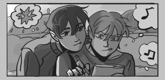
looking at the values also really help! esp in comics, where each panel can have its own lighting depending on what angle ure drawing. u can do this easily by adding a pure black layer above the entire piece, and setting it to color (100%)
for me the values actually made me realize things that may look too similar, which usually leads to me changing the color. for example, the couch and stuffed animals behind ivan and till were actually a lot darker before i changed it. bc it kinda blended into ivti a bit, it also got the eyes’ attention away from them. i ended up adjusting their hue and values so that it matches the bg, and ivan and till stick out more (alongside other color adjustments) ⬇️
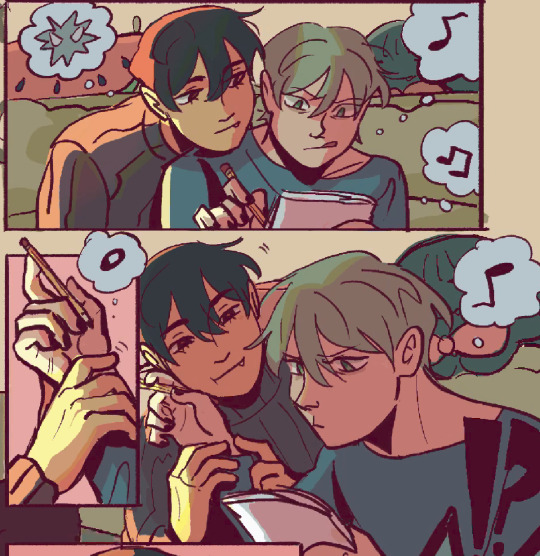
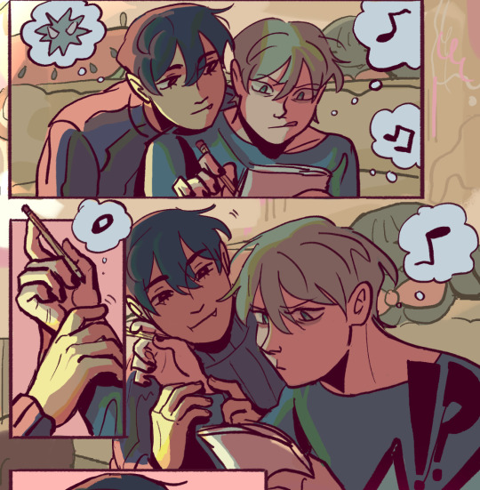
changing the lineart also helps quite a bit! i made the lineart for ivan and till a little darker, while the bg elements got a darker green instead so that the bg elements dont take as much attention
looking at b&w values also helped me realize that the og pink i was using for the panels was a little too dark, so i made it significantly lighter so that the panels stick out more (esp bc they take huge precedence in the second page)
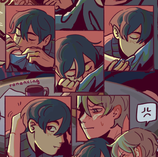
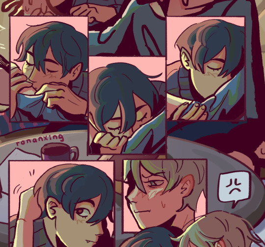
(og panel color vs final)
and finally when i pick all the colors and am satisfied with them, i merge everything into one final color layer for easier rendering :> procreate (and im sure other programs) allows for color / hue adjustments so you can def play around with those!
as for the harana / first ivantill comic i made, it had all the similar steps of the recent comic so ill just talk a little bit about the palette
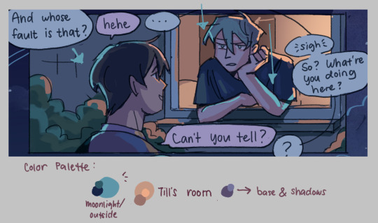
so im ngl this comic was a bit of a struggle to color for me,, cuz i wanted it to be romantic but it was set at night. usually that dictates cooler tones and colors, but i was aiming for something warm. thats when i figured i could just let tills room wash an orange color, which would help with making warm lighting but also help till and ivan stick out again from the surrounding darkness / blues
i went with a purple base, cuz i thought it was a nice warm ish color at night and it makes blue and orange pop. i also figured that i could make the base both purple since the highlights are the most attention grabbing / contrasting colors
also used the moonlight as rim lighting so that ivan sticks out a little more,, i also figured that tills room would be projecting harsher lighting over the moonlight
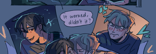
lighting it this way also allows for nice color contrast regardless of what character is in the center: ivans outside but awashed in orange lighting (from tills room), and tills inside but hes sticking his head out a little so hes noticeably purple. it allows for characters to stand out while also being pleasing to the eye
and im ngl i cheated a bit again 😅 i think till shouldve projected a shadow on ivan a couple of times and the highlights might be too harsh but again i just prioritized making their facial expressions seen LOL
for this one i didnt use any layer modes aside from (if i remember correctly) a purple multiply layer and overlay for shadows and base respectively
and thats pretty much my process for figuring out the colors !!
TLDR; i look for the mood or tone im going for, try to make interesting contrasts / complimentary colors and i also double check if each character sticks out by checking values :> it really helps me too to play around a LOT, i think it takes me like an hour or just 30 mins to figure out what colors to use and also adjusting it significantly when i merge everything together
#asks#im sorry this is so long 🫡#hope i was able to help u anon#but ty for the ask it means a lot to me !!#esp cuz i also still struggle with colors
14 notes
·
View notes
Text
In honor of Tron Day, here's my project for my Tron OC Ark that I've been working on or a while now!
I used this base with some modifications to it for everything:
Iyzel Reaar's F2U Female Ref Base
The main modifications I did were to mirror half of it so I didn't have to figure out how to draw the circuits twice, erase certain features I'm not sure Basic programs have, and make the lines solid.
I used Windows 11 Paint's line and shape tools to draw the circuits, with adding a few pixels here and there when needed.
I used the GNU Image Manipulation Program for a lot of the color editing I did and for layering the textures.
-
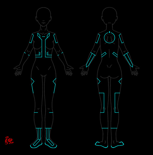
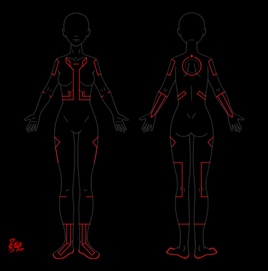
The first two are Ark's base circuits, along with the red rectified version of them for Mars.
I used my friend @quesadillawizard's art and design for Ark - Ark's circuits are based off ones from the DS version of Evolution and Wolfy added more features to them.
I used the reference he made for me to make the circuits and referenced this sketch as well.
-


The next two are the Tron/Renegade circuits from Uprising, in both gray and black, as seen in the show.
@tucatalog was super helpful for references!
I mainly used two posts of theirs:
I looked at a few others as well, but I have a list of 50+ of their posts and were flipping between them, so I'm not entirely sure which others I used.
-
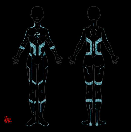

The next two are Grid scar versions of the Tron/Renegade circuits.
In Ark's backstory, she was captured and tortured by the Occupation. I've played around with different scar configurations for her and I love the idea of them literally carving the Tron circuits out/off of her.
I decided to do a little something different for the scars, I've tried another technique that wasn't much fun, and I'm not sure how to mimic the scars from Uprising.
So, I took some textures I got from Etsy and layered them over each other to try to make something interesting.
Textures I used:
Gemstone Crush
Iridescent Textures
Glassy Textures
Iridescent Glass
Sparkly Glitter
Fake Glitter Particles
I'm not sure if most of these came through, I figured out the glitter ones did a lot of the heavy lifting I wanted, so they're the most visible ones and the ones on top.
Anyway, one is just the Renegade scars and the other is the scars overlaid on Ark's circuits.
-
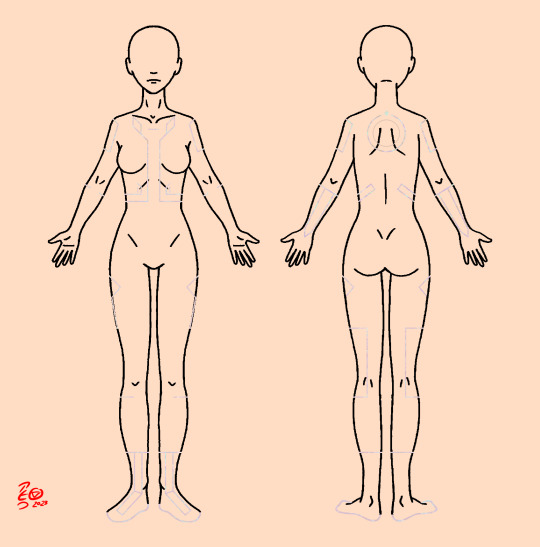

The last two are the circuits and scars over a skintone for circumstances when Ark ends up in the User world.
I like the thought of program circuits being barely visible in the User world, with just a hint of faint iridescence when the light hits them just right.
One of the textures from this pack fit my idea fairly well, so that's what I used:
Iridescent Textures
The scars are the ones I made earlier with a skin tone color overlay to make them blend in.
This is what I started this project for, as I wanted a visual for an RP and a potential fic.
-
I've done a smaller scale version of this before, that time I made the scars by repeatedly scribbling over the circuits with multiple different colors, which hurt my hand, lol:
-
Anyway, that's my project! It's not perfect, but I'm pretty pleased with how it came out!
A big thanks to @quesadillawizard and @proto-actual for looking them over!
Happy Tron Day!
#Tron#Tron Legacy#Tron Uprising#Renegade#Tron OC#Ark#Tron: Legacy#Tron: Uprising#OC#OCs#idea bag#my art
31 notes
·
View notes
Note
what's your process for coloring like? the look of that elendira is so textured and interesting, i can't figure out how you do it
AA THANK YOUU ^__^ !! textures & brushwork are my favorite things abt my art, so im happy you find it interesting hehe . its SOO cool to look at & so much fun to draw imo
i prefer to color by building in layers , if that makes sense 🤔!! hundreds of them !! such that i'm always drawing on Top of previous layers, working from big & messy blocks of color to, eventually, small and refined blocks of color until it feels processed enough. as a result, i rarely ever erase (!!) and i rarely ever draw lineart aside from the initial sketch
a rough, patchy textured brush is key here, as it'll give you dimension and variability w/ your colors. i recommend "Brush and various sets of fountain pen style (万年筆風ブラシと色々セット)" on Clip Studio (ID: 1679706) !! :3

im terrible with explanations though, so i'm going to show a step by step of that elendira drawing if you dont mind :3
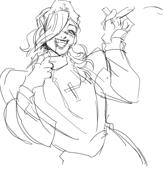
sketch layer !! because i mostly render through color alone, i try to make this as close to the finished thing as possible . ^__^ i hateee drawing the same thing over and over and like the expressivity and movement of my sketches anyways , so the more i can preserve at this step, the better. if u were to look at a side by side of my sketches and finished pieces, youd notice a lot of those og lines are present in the final drawing :3

2. flats !! pretty self explanatory, but the solid background gives me an idea of where the figure begins & ends while the colors themselves help distinguish whats what . i stick to ambient lighting @ this point because im usually not sure what i want to do with the overall palette or lighting yet . having two tones (ex, dark and light in her hair or dark and light on her skin) can also help in identifying key features early on that u wanna preserve. as you build layer by layer, sometimes these areas will remain untouched and i think it makes for a rly lovely feel at the end

3. start blocking !!! to be totally honest with you, i dont really know what i do here HAHAHA. like i just scribble the shit out of it, usually focusing on what i might want to do with lighting (ex: grey areas to accentuate folds in her costume). i think i like to start "erasing" the sketch where possible by coloring on top of it .. like if you look at her hat or her arm , you can tell i'm starting to get a sense of the shapes i like vs the ones i dont. it's at this point that the final image starts to emerge in my mind , like im gradually pulling her from a tarpit of scribbles until shes recognizable lol. chipping away at the marble until i can free her. tbh.

4. keep blockingg...when u think u are done , block some more . as you can probably see, the brushwork becomes more intentional as i add more shape, with specific focus on line weight. this is also where the patchiness of that textured brush comes in - notice how none of the colors seem totally uniform (ex: the red cross or the original sketchlines for her waist). you can see bits and pieces of the layers underneath pushing through and i really like that !! ^__^ its very fun and sketchy to me, so i try to keep them around. those areas are also great to colorpick from, because it'll give you "new" colors to work w/ that are already part of your palette.

5. GRADIENTS & GRADIENT MAPS !! TONE CURVE !! COLOR PICKER !! this is the best stage tbh. flatten your image so its all on one layer and just go crazy with all the color settings in ur program. add gradient layers and set them to darken, or overlay, or subtract, orrr. lighten or dodge glow or divide or soft/hard light.! OR!! edit the hue, saturation, luminosity and contrast.and then color pick from these edits, block even more on top of ur image, flatten, color edit again, etc. etc. until u feel satisfied.
ANYWAYSS . i hope that makes sense @__@ sry i wrote this out and deleted it like 23 times trying to make it make More sense but thats what ive got HAHA i hope its useful though :3 !
#SRY I STRUGGLED 2 EXPLAIN THIS#dude its like my brain bcomes stuffed w/ cotton anytime i try 2 write#i hope it makes sense tho..#it also probably sounds so redundant to make new layer one after the other for just a few brushstrokes#but those brushes i linked have a multiply property so if you draw on top of prev lines they'll create dark patches#and so if im working over a large area ill generally need like . 5 layers each with one brushstroke :sob: if that makes sense#this one had . 84 i think. total. layers i mean. the merylvash one had 300+ HAHAH so it rly depends#like YEAAH i could just use a normal brush but i really like the way this looks#andd sometimes the multiply function works really well or will give me the proper shadow tone im looking for#anywas.wanywaysn anyways#asktag#anonymous#long post
60 notes
·
View notes