#Themes for Wordpress
Explore tagged Tumblr posts
Text
#Sims 3#ts3 story#Deadwyler#Deadwyler Gen 3#25 Autumn Themed Prompts#Wordpress Link#Ibis Deadwyler#Lorraine Deadwyler
8 notes
·
View notes
Text
I've been thinking a lot about the question about what would do differently if starting WP now, the column names was the first answer, I think my "slept on it" answer would be having "starters" separate from plugins and themes that configure them, and we could have a directory and community around.
62 notes
·
View notes
Text
I hate wordpress and their tumblr-ass shit editor that is willing to erase entire paragraphs of work if you so much as touch your laptop's trackpad. So it's either your content or carpel-tunnel, fucking got it....
#ARGH#I had typed up this whole beginning of the interview I AM SO FUCKING DONEW#doing this on my lunch break and wordpress was just like 'nope you're not'#and now I have to go back#themes of loss continue...
2 notes
·
View notes
Text
WordPress - a web designers best tool

WordPress is a free and open-source tool that allows you to create and manage digital content online. Initially a blogging platform, it has expanded into a versatile tool for building various types of websites, including simple blogs, complex online shops, portfolios, and social networks. The best part? You can download and use the main software for free, making it an excellent choice for both individuals and businesses.
At its heart, WordPress enables you to create, edit, and manage content on your website without needing technical expertise. It features a user-friendly interface that simplifies the creation and publication of text, images, videos, and more. Additionally, there's a vast community of themes, plugins, and widgets available to help you personalise and enhance its capabilities.
youtube
#wordpress#maxiblocks#page builder#wordpress website builder#web design#wordpress block themes#wordpress block templates#Youtube
6 notes
·
View notes
Text
How to Show Featured Images in Your WordPress Posts [Step-by-Step]

A featured image is a key element in making your WordPress posts visually appealing and engaging. Here’s a detailed guide on how to display featured images effectively.
Understanding the Importance of Featured Images
A featured image is the primary visual for your post, often shown on the homepage and social media. It sets the tone and context for your content.
Steps to Display a Featured Image
Access Your WordPress Admin: Log into your WordPress dashboard.
Create or Edit a Post: Select "Posts" from the left menu and choose "Add New" or an existing post to edit.
Find the Featured Image Section: Look for the "Featured Image" box on the right sidebar.
Add Your Image:
Click on “Set featured image.”
Choose from the media library or upload a new image.
Click “Set featured image” to confirm your choice.
Update Your Post: Ensure you publish or update to reflect the changes.
Best Practices for Featured Images
Select Quality Images: High-resolution images will capture more attention.
Optimize for Performance: Use image compression tools to keep your site fast.
Know Your Theme’s Specs: Different themes require different image sizes.
Common Issues and Solutions
If your featured image isn’t displaying:
Check Your Theme Settings: Make sure it supports featured images.
Look for Plugin Conflicts: Disable plugins to find any issues.
Clear Your Browser Cache: Sometimes changes won’t show until the cache is cleared.
Conclusion
Utilizing featured images effectively can enhance your posts and engage your audience. Should you need to hide a featured image for specific posts, explore How to Hide Featured Image in WordPress Post. Implementing these tips will elevate your blog’s visual presence!
3 notes
·
View notes
Text

THIS WEEK ONLY, MEGA DISCOUNT 98% OFF!
Build professional, stunning websites with 12,000+ original GPL WordPress themes and plugins at an unbelievable price!
For just $3.99 per item or with a membership, enjoy:
100% virus-free, original items directly from trusted developers
Unlimited downloads and usage on multiple domains
Automatic updates straight to your dashboard
The freedom to create flawless WordPress and WooCommerce websites
Here you get:
Premium GPL themes & plugins for 98% OFF
Fully legal & secure under the GNU GPL License
7-day free trial + 30-day money-back guarantee—risk-free!
So, please be in a hurry! The offer is valid for this week only—don’t miss out! Transform your website with top-notch themes and plugins without breaking the bank!
#MegaSale#WordPressGPL#PremiumThemes#PluginsForLess#WPSuperBox#WordPressSale#GPLPlugins#WebDesign#WooCommerceThemes#WebsiteOptimization#WordPressWebsite#WordPressCommunity#WebsiteDevelopment#SecureDownloads#UnlimitedDownloads#GPLMarketplace#DigitalTools#BusinessWebsite#WebDesignTools#AffordableThemes#WordPressDeals
#wordpress plugins#wordpress#web development#web developing company#gplplugins#wordpress theme#gplthemes#wordpressplugins#wordpressthemes
2 notes
·
View notes
Text
🎨 Bizzor - Multipurpose Business Agency WordPress Theme 🌟

🔄 Introducing Bizzor is your ultimate solution for creating professional websites tailored for agencies, corporate businesses, and startups. With a sleek, modern design and powerful features like one-click demo import, speed optimization, and SEO-friendly architecture, Bizzor is built to elevate your online presence. 💼🚀
Key Features For Bizzor:
One-click Demo Importer
Extremely Customizable
Search Engine Optimized
Elementor Page Builder
Built with Bootstrap 5.x
Read More: 👉 https://1.envato.market/WyqYgJ
We provide high-quality SEO-friendly website themes and templates with 100% responsive design.
Explore it: 👉 https://zozothemes.com
2 notes
·
View notes
Text
A Spark of Touch
How is it, my love, That feeling your warmth against mine Eases the ache in my soul? When I am nothing But a short-lived sack of flesh Carrying a mind that grates against the world A connection with you Takes me through to being more? – I can know I’m nothing but A biological machine, nerves and hormones Circling until I’m finally done, yet When I’m in your arms I’m greater Your…
#biological machine#connection#creator#existential#existential love poem#existential poetry#human connection#love#love poem#love poet#love poetry#nerd love#new poem#new writing#original art#original poem#original poetry#original writing#poem#poet#poetry#poetry friday#poets of wordpress#strange love poem#themes of love#transcendragons writes#weird love#writing
3 notes
·
View notes
Text
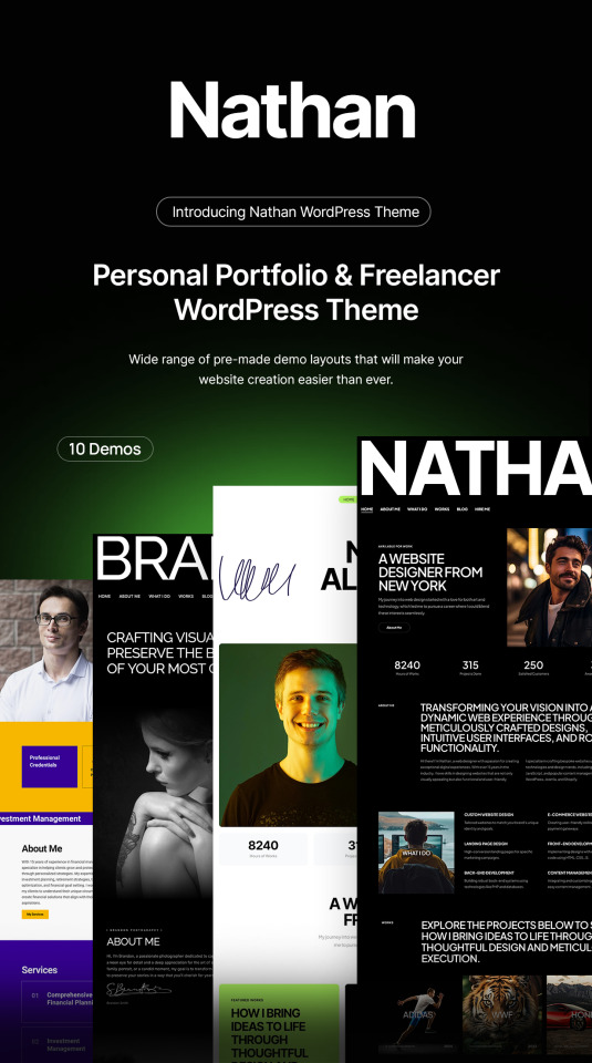
Nathan - Personal Resume CV Portfolio WordPress Theme

Nathan is an exclusive WordPress theme specially made for personal websites or professions like freelancer, web designer, photographer, financial manager, makeup artist, chef, and fitness trainer with creative design made using only the finest coding and design practices by an experienced ThemeForest author with over 5 years of experience. Nathan has stunning styles and elements to help you make a professional website quickly. Buy now and make your website stand out!
View Demo >>
Download Now >>
2 notes
·
View notes
Link
None Is Now not Nothing: Exploring the Vitality of Null Recordsdata for Enhanced Belief What is the flexibility of null information? None Is Now not Nothing: Exploring the Vitality of Null Recordsdata for Enhanced Belief By plan of filling in information, it’s straight forward to set a “none” or “N/A” into a spreadsheet or database. As a rule, this information has very miniature meaning and might per chance presumably per chance presumably be sophisticated to work with. However, in this day’s information-driven world, null information might per chance presumably per chance presumably be lawful as indispensable because the precise numbers. Right here, we can detect how null information can present extra perception into a mission or wretchedness and the plan it might presumably per chance presumably be former to develop a much bigger general thought. The Fee of Null Recordsdata Null
2 notes
·
View notes
Text
Warning: implied violence
#Sims 3#ts3 story#Deadwyler#Deadwyler Gen 3#Julio Tellago#Lucian Nightshade#25 Autumn Themed Prompts#Wordpress Link
9 notes
·
View notes
Text
🌐 Ready to Elevate Your Business? Discover the Power of Exceptional Web Design!

In today’s digital age, your website is the face of your business. At Dot Web Innovation, we understand the significance of a strong online presence. Whether you’re in Noida, Meerut, or Faridabad, our talented team of web designers and developers is here to bring your vision to life!
✨ Why Choose Us?
Tailored Solutions: We don’t just create websites; we craft personalized digital experiences that resonate with your audience and align with your brand identity.
Cutting-Edge Design: Our designs are not only visually appealing but also optimized for seamless user experiences, ensuring your visitors stay engaged and convert.
Expertise in WordPress: As a leading WordPress web development company in Meerut, we leverage this powerful platform to build dynamic and flexible websites that grow with your business.
Local Commitment: Serving clients in Noida, Meerut, and Faridabad, we pride ourselves on understanding the local market and delivering solutions that cater specifically to your needs.
🚀 Our Services Include:
Comprehensive Web Design & Development
WordPress Website Development
E-commerce Solutions
Responsive Web Design
Ongoing Maintenance & Support
🔗 Let’s Build Something Great Together!Don’t let your competition outshine you online! Contact us today to discuss how we can transform your digital landscape and drive success for your business. Visit Dot Web Innovation and take the first step towards a captivating online presence!
#wordpress developers#wordpress development#wordpress plugins#website design#wordpress themes#web development#website developer near me#wordpress#best web design company in meerut#hire wordpress developer in meerut
2 notes
·
View notes
Text
Build Your Perfect Website with Island Wizards – WordPress & Shopify Experts

Creating a website or online store doesn’t have to be complicated, especially with Island Wizards on your side. Specializing in WordPress and Shopify, Island Wizards helps businesses and individuals build custom websites that are professional, functional, and easy to manage.
If you’re looking to create a blog, business site, or eCommerce store, Island Wizards takes care of everything from custom design to ensuring your site works smoothly on all devices. They make WordPress sites user-friendly and Shopify stores optimized for sales, focusing on seamless customer experiences and fast performance.
With ongoing support and affordable pricing, Island Wizards is the perfect partner for anyone looking to create or upgrade their online presence. Let them handle the hard work so you can focus on growing your business. Explore more about us...
2 notes
·
View notes
Text
Top 10 Best Elementor Themes for Seamless WordPress Development
For WordPress enthusiasts and developers, Elementor stands as a game-changer in the world of website design and development. With its drag-and-drop functionality and customizable features, Elementor has revolutionized the creation of captivating websites. https://crystalbluesolutions.com/10-best-elementor-themes-for-seamless-wordpress-development/
3 notes
·
View notes
Text
How to Quickly Duplicate a Page in WordPress for Easy Reuse

Duplicating a page in WordPress is a fast and efficient way to replicate content or layouts without having to start from scratch. WordPress itself doesn’t offer an option for this, but with the right approach, it’s easy to learn how to duplicate an entire page in WordPress. For a step-by-step guide, check out our article on How to Duplicate a Page in WordPress.
Why Duplicating a Page is Useful
There are several reasons you might want to duplicate a page:
You need a similar layout for different pages on your site.
You want to quickly create landing pages for marketing campaigns.
You’re making updates to a page but want to keep the original version as a backup.
How to Duplicate an Entire Page in WordPress
The two main ways to duplicate a page in WordPress are through plugins or manually copying content.
Duplicating with a Plugin
Using a plugin is the easiest and quickest method to make a duplicate page. Here’s how:
Install and activate a plugin like "Duplicate Post" or "Duplicate Page."
Go to your WordPress dashboard and navigate to "Pages."
Hover over the page you wish to duplicate and click on "Clone" or "Duplicate."
A new draft will be created with the same content, layout, and settings as the original.
This method ensures you don’t miss any important page settings or SEO configurations.
Manually Copying a Page
Another option is to manually duplicate a page by copying the content from the original page into a new draft. However, you’ll need to reapply any settings like SEO, featured images, or custom templates.
How Do I Duplicate a WordPress Site?
If you need to go beyond just a page and duplicate your entire WordPress site, tools like "Duplicator" or "All-in-One WP Migration" are designed for this purpose. To duplicate a WordPress site, you’ll need to:
Install one of these migration plugins.
Export your current site’s data.
Import the site backup into a new WordPress installation.
Make adjustments to URLs and settings as needed for the new site environment.
This method will give you a complete copy of your site, including all content, settings, and plugins.
Best Practices for Duplicating Pages
Duplicating pages can be a powerful tool in your website management. Whether for A/B testing, marketing campaigns, or simply saving time, knowing how to duplicate an entire page or even a full site can help streamline your workflow. Keep in mind that using plugins for this task is much faster than manually duplicating content, especially if you’re handling multiple pages.
Conclusion
Duplicating a page in WordPress is a simple process, especially with the right tools. Whether using a plugin or doing it manually, the ability to easily replicate content can save you time and effort. For more details on how to duplicate an entire page in WordPress, check out our full guide on How to Duplicate a Page in WordPress.
2 notes
·
View notes
Video
youtube
Comment changer de thème WordPress facilement et rapidement
2 notes
·
View notes