#The first one was loosely based on his artstyle (i like how it looks like the Anipoke artstyle in some drawings!)
Explore tagged Tumblr posts
Text

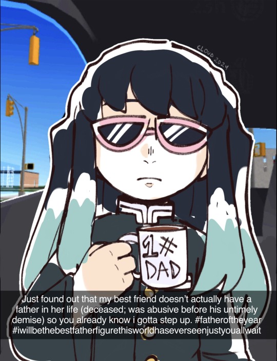
miscellaneous doodles ft. the duo of all time
#demon slayer#skye’s-endless-imaganitories.txt#kimetsu no yaiba#demon slayer fanart#kny#kny oc#gotouge#kimetsu no yaiba oc#demon slayer oc#kny fanart#kimetsu no yaiba fanart#tv girl#More Kumonoue bcause apparently you guys like her!!#not that im complaining lol#I really like TV girl!! Their songs are awesome :3#My girl Liddy used to always smoke. Cigarettes when she couldn’t sleepppppp#Haha but anyways#These were kinda ib: Malama-art right here on Tumblr!!#They make a lot of Pokémon stuff so if you’re interested in that you should go check them out!!#The first one was loosely based on his artstyle (i like how it looks like the Anipoke artstyle in some drawings!)#and the second was inspired by Malan’s Tamagotoji video with how the characters were colored in!!#It’s a very cute video btw!! I suggest checking it out :)#uhhh. i think i remembered to write all my thoughts down here..#Live Laugh Love Kumonoue Hanami!!
44 notes
·
View notes
Text
"Apologies" AU - Masterpost
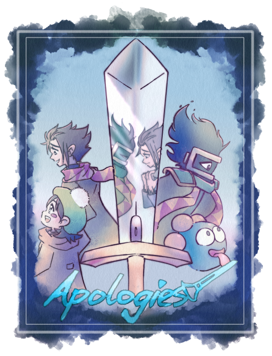
"Before Popstar, Adeleine lived on 'Shiver Star,' the embittered residents' nickname for the frozen husk of old Earth they were left on after the migration. But she isn't sad, for she has a best friend in her older brother. And he would give up anything to protect her...."
Characters: Adeleine, Noir (loosely based on unused Dark Matter design) / Dark Matter Swordsman, Gooey, King Dedede, others...
-
Note that this "comic" started as a well-received one shot that proceeded to grow into a series. As a result, it's very experimental. Expect random inconsistencies and continual artstyle shifts.
Bolded text are the newest posts
[Apologies AU] -Shiver Star- “Apologies” “One Sneeze” (illust) “Summer” “A Walk in the Snow” “The Swordsman” “Wonderful Gift” (illust) “Damnation” “Salvation” “Unstoppable” “Brightest Star”
-Dream Land 2- “Sibling Reunion” “Big Brother Instincts” “Unsung Hero” “The Perfect Vessel” “To Protect” “Matter Over Mind” "Darkened Skies" (illust) “Last Will” “Ego”
-Side Stories- "Freeze" "A Cold Hell" "No Friends"
"Honestly, it was all worth it"
"Never Never Land"
-
[Noir Fontaine - Initial Ref Sheet] [Noir Fontaine - Kirby OC Tourney Profile]
-
[Noir's Field Trip]
Please see the above post for links to all Noir content following Dream Land 2. In short, I submitted him to a silly popularity contest and let people ask him questions, many of which served to reveal his backstory and emotional state during various events. It also provides the lead up to Noir's ultimate fate, ie, The Good Ending.
-
[White-Haired Noir] “Dark Matter Painter” (gift art - how this whole idea started...) "Have You Ever Killed Before?" (reblog sketch - W.Noir is born...) "Why Did You Stop Me...?" (reblog text + sketch - W.Noir in Kirby 64)
“You’re a good knight!” (illust - W.Noir and Ribbon) “The Body Remembers” (illust - W.Noir's scars) "Knight Costume" (sketch - W.Noir and Meta Knight) "My Trauma" (sketch - W.Noir and Meta Knight)
"Like Brother Like Sister" (comic, white-haired Noir origin) "Each From His or Her Own World" (comic, one of various endings)
"Three Challenges Noir Had to Face and One Meta Knight Did" (fanfic - W.Noir and Meta Knight in Planet Robobot) "Cold Air" (fanfic - W.Noir and Meta Knight's first meeting)
"The Little Prince" (illust - Adult W.Noir) "Brighter Skies" (Sketch - Adult W.Noir and Kirby)
[Snowflakes Timeline - cw: body horror + bad end] "I'll Never Leave You" - Script + Sketch "...Zero Three..." - Sketch + Script + Illust "Melted Snow" - Script + Fictional Boss Fight "Null v0.3" - Sketch + Silliness
[Extras - Art (canonincal)] “Ugly Scarf” (illust - our first look at Noir) "It'll All Make Sense Soon, Right?" (illust - Noir + Adeleine) "You Won't Win..." (illust - Noir's last moments) “Was I A Good Brother...?” (illust + text - storycrafting for Noir) “That’s…Funny…” (illust - Adeleine's notebook) "Blue Penguin Scarves" (illust - Dedede and Noir's Scarf)
"Happy Birthday!" (sketch - Adeleine and Noir)
[Extras - Art (non-canon)] “Full Regalia” (illust - Dark Matter Blade “Gijinka”) "No Hands Club" (sketch - incredibly short MariPav Crossover) "Looking Over You" (sketch - Angel Noir he's not dead yet!!) "Hell Branch x Apologies" / 2 / 3 (sketch - unexpected crossover!?!) "Games You Play When..." (sketch - the siblings + Steven meme) "Family Wedding?!" (sketch - the siblings + Raquelle/Rimura) "Adeleine meets Dark Matter Painter" (sketch comic) "Noir meets White-Haired Noir" (sketch comic) "Hell Branch x Apologies Returns!" (sketch comic) (Leads to same post as "...AGAIN" below)
"Ending D" (illust - Everyone dies...) "Sempai Noir" (illust - Adeleine draws Noir) "sEmPaI bLaDe" (illust - Gooey draws Noir)
[Extras - Scripts] “Vestige” (script - Susie + Adeleine) "Evil Science" (script - Meta Knight + Susie) "W.Noir and Taranza + Adeleine and Magolor" (scripts) "...AGAIN." (script - Noir in Dream Land 3) (Leads to same post as Hell Branch Returns" above) "Why Does Life Suck?" (more Hell Branch crossover)
"Re_Birthday" (script/sketch - Noir reflects as Adeleine mourns)
[Extras - Asks] "Warning Sign?" (text) "W.Noir and Meta Knight" (text) "What was Gooey...?" (text) "Adeleine, Noir, and 'bullies'" (text) "Noir as Dream Land 3's Dark Matter" (text) "Dark Matter Painter's Light" (reblog; White-Haired Noir lore) "Why hell though?" (text)
[Shiver Siblings Takeover] (For one weekend, I let Adeleine and Noir "answer" any asks about them. White-Haired Noir shows up too. Somewhat non-canon, but surprisingly connected?!?)
Please Send Positive Thoughts to... Which Kirby Adventure... [w/ Sketch] If You Had a Wish-Granting Clock... Food and Warm Clothes Arrive... [w/ Sketch] A Crystal Ball to See the Future - Noir... [Comic] A Crystal Ball to See the Future - W. Noir [Comic] Have You Been to the Forgotten Land... [Comic] (This ^ one is canon to W.Noir btw!) So Zan Roasted Your Sister Online... A Conversation (?) With Marx [Comic] Thanks for the Fun Weekend [w/ Sketch]
#Apologies AU#Adeleine#Dark Matter Swordsman#Noir (human-form DMS)#Gooey Kirby#Kirby#Hooray it finally has its own masterpost!#Now I can stop copy/pasting 100 links per post!!#I added in some missing asks and bonuses for one!#And better organized categories for another!
231 notes
·
View notes
Text
Some quick thoughts on the Switch 2 trailer (800 words below):
- I find it incredibly funny that they chose to call it “Switch 2”. There was absolutely no effort behind that decision it’s amazing. (yes I know they called it that to avoid another Wii U situation but it’s still funny)
- I’ll be honest I literally wasn’t giving a shit about it coming soon. Like I really don’t understand why so many people were hyping it up when we already knew it was a DS → 3DS situation. Also I don’t care at all about the new “mouse function” thing. The sole reason I’m going to buy it is because new Mario games won’t release on the OG Switch once it’s out.
- I want to have the mind of only buying it once there’s a game I’m interested in getting, but let’s be real I’m buying it day one. Plus I am interested in the new Mario Kart which seems like the first game.
- A bit worried about the way the Joycons are attached to the console, as in afraid of how easily this system might break, but I guess we’ll see.
- On a more positive note, I’m happy that it’s bigger (never had much issue with the og Switch bc I have small hands but I’ll still take an adult-sized console over it) and especially happy with the support on the back of the console being much larger! (the amount of times my switch fell backwards while I was playing on a table due to how small the thing supporting it is...)
- I’m REALLY hoping the Online will be the same as the switch, as in “if you’re subscribed to Nintendo Switch Online the Switch 2 online will be free and vice-versa”. I’m already wasting 40 bucks a year for something I barely use (I’m not big on online play), if I have to pay a second subscription that’s a big fat nope! Of course the best case scenario would be for Nintendo to stop gatekeeping basic online services, but unfortunately we know they won’t.
- For the Mario Kart footage, tbh I’m more curious than hyped so far, but once we get more footage I’ll get there.
- Speaking of Mario Kart, I’m kind of 50/50 on the character models we saw. Mario and Luigi give me “Mario 64 critter” vibes and I absolutely love it! But then we get Bowser an DK and I’m not the biggest fan.
For Bowser, I think it’s the barely visible hair + mouth hanging open that bothers me. Like the lack of visible hair makes him look weird and the mouth makes him look “static” so too speak. I don’t know how to explain it other than his model makes me think of a lesser version of his Super Mario RPG Remake one. And don’t get me wrong I really like how he looks in RPG, but the model also doesn’t have that many animations, and the animations aren’t as fluid as your regular Mario game due to the chibi artstyle, which doesn’t translate well into Mario Kart. Hope this makes sense.
As for DK, I just hate how he looks with his eyes closer and big ass arms, probably not helped by how tiny his kart is. And it’s weird because I have no issues with how he looks in the movie (granted if I did have a negative opinion of his movie model, it would be completely overshadowed by how much I dislike his frat boy attitude in said movie). I think my issue is that this new model makes him look too goofy. While I know he’s not the most serious character, I like how DK can look genuinely intimidating when he wants to, which makes sense for a giant ape, and I don’t think that new model can pull it off. Also it looks very different than what I’m used to so it’s weird. ¯\_(ツ)_/¯
- Lastly, I’m a bit surprised that Peach is wearing her dress on a bike on top of not having a ponytail. Is it because the game is still in development so the biker model hasn’t been made yet? Are the designs we see in that trailer “base/reference” models hence the loose hair? (do game studios do such a thing as making a “base” 3D model of a character as a reference for future games?) Has Nintendo decided to remove the biker outfits due to it maybe being seen as “strange” that those four specific characters have different outfits for the bikes but no-one else does, regardless of how annoying the dress physics might get on the bike? Is this Nintendo’s way of dealing with the backlash from Show//time giving her a “deeper” voice on some transformations + the box art change? (tbh I highly doubt it’s that last one, especially since no-one ever had an issue with the biker outfit in Wii and 8)
#Super Mario#Nintendo Switch 2#Flor talks#gotta love how 'short small thoughts' = 800 words#but yeah overall my reaction to the trailer was 'oh cool. Anyways.'#biggest takeaway from it was how Mario and Luigi look; it makes me very happy !#welcome back Mario 64 critter era !
0 notes
Text
Hello hi this is basically a small post where I point out some details from my latest animatic! I put lots of effort into it so I appreciate it if you watch it first before continuing :D
Also I’ve never really done one of these so my thoughts might be all over the place, sorry in advance
(Spoilers for the fic In Your Soul or On The Horizon)
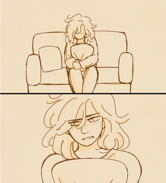
Older Zoe!! I had doodled her with short hair before and really liked it, so it’s become a headcanon that Zoe cuts her hair when she gets older.
I’m not sure if this was very clear but this is the first scene of Zoe in the therapists office
“Zoe holds a pillow against her stomach, chipped nails tracing the threads of blue flowers.”
Ok I’m realizing it would’ve been cool if I added the flower designs to the pillows but ah well
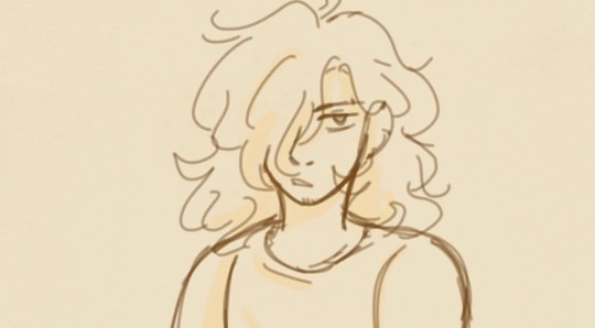
First appearance of Fake!Connor. Since he’s Zoe’s imagination I tried to make him look a bit off (bangs are on the wrong side, additional piercings, a bit of scruff on his chin)
Throughout the story Fake!Connors appearance becomes inconsistent due to Zoe starting to forget what he looks like.
I had wanted to show that by making his design shift every time he’s on screen, but while drawing him I think I forgot and didn’t put much effort into that idea. The most I did was make his lines blurry
But actually I think I accidentally achieved that goal because my artstyle changed slightly every time I drew him.. so yay?
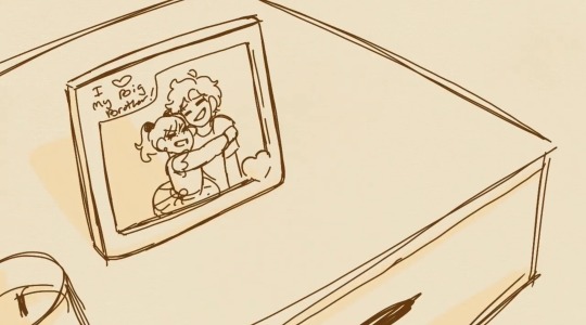
Fun Rozu fact: This picture frame is loosely based off a real frame I have of me and my older brother!! Except in the picture we’re not hugging and instead I’m slapping him in the face...
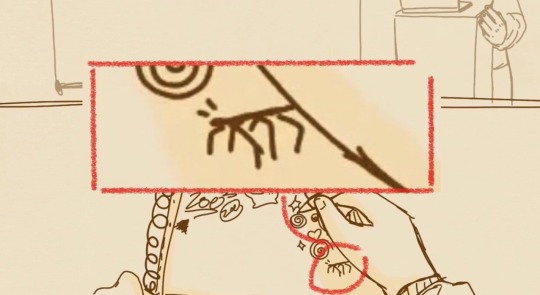
:D
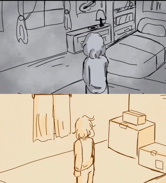
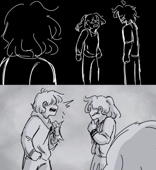
Here’s some accidental parallels to the My Immortal animatic! Ok well, the room one wasn’t accidental since I wanted to keep Connors room consistent but the other scene is accidental. They’re two different situations but I’m just surprised I kept their designs the same
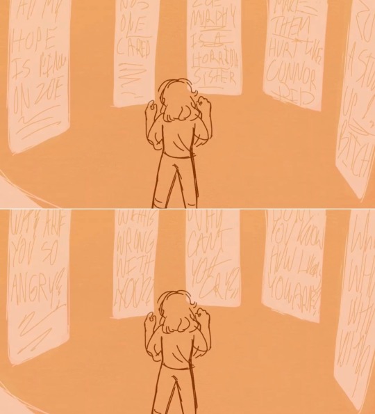
These were meant to replicate the big screens from deh during YWBF and YWBF reprise!
They flash between words from YWBF reprise and Zoe’s own thoughts in the fic

“Her Connor, just as he was the day before he died; seventeen, all sharp angles and lanky limbs, and so, so young.”
My favorite part of this fic, when I first read this line I had tears streaming down my face. I’m sure I’ve said this before but this story just hits home for me.
When you lose a loved one you dream so much about them, but when you see them they’re so far away and feel unfamiliar. But then you’ll get those dreams where that person is clear as day and they feel solid and real.
This fic did an amazing job capturing that part of grief ;;
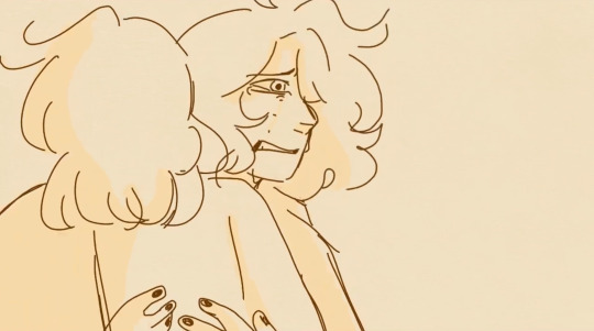
“Then his face crumples, just like their mother’s.”
(Another subtle hint to the My Immortal animatic if ya think about it)

“Zoe wakes up.
Zoe wakes up every day, and she chooses to hope.”
Aaaand that’s all I can think of at the moment! Also cuz I realized there’s a limit to how many photos you could post haha
If anyone has any questions or want me to elaborate more on certain parts my inbox is always open :D
#man I’m not good at writing these kind of things#sorry if it’s confusing#dear evan hansen#deh#zoe murphy#connor murphy#rozu thoughts
18 notes
·
View notes
Text
Artbook Data - Climax Inference
Content warning for fish gore, I guess.
The great stage where the whole crime is laid bare, the Climax Inference, has captivated players with its artworks by the famous Masaharu Shimizu.
Masaharu Shimizu’s introduction: Shimizu here as always. I’m considering making a snazzy as heck Instagram to post the best of gourmet, fashion and cute selfies. I hope you see it!
Masaharu Shimizu’s profile: Game creator and illustrator. Main character designer for Ginga Ninkyouden and Choujin Heiki Zeroigar. His timeless artstyle earned the support of the hardcore game fans and the works he was on are essential pieces of the gaming history.
General comments:
Original character expressions: As I already said before for every game, the drawings on the Climax Inference are images on the protagonist’s inner thoughts, so the character design here doesn’t need to perfectly true to the main story. These are the best work conditions I could ever wish for. On the other hand, since I have to base their expressions on how the protagonist is supposed to be imagining this situations, it takes me forever to decide what should I go with. Whenever people say “Doesn’t that means you can do whatever you want with the characters!?” when I bring up the “protagonist’s inner thoughts” point, I have no words to deny it (laughs).
Since the theme for V3 is Psychocool, V3′s facial expressions as a whole are more restrained than DanganRonpa 1 and DanganRonpa 2. I read some opinions that they were more plain that in the previous games, but I actually did them like that on purpose, because if I don’t, I can’t stop laughing at them... Anyways, everyone has their different opinion on what the perfect balance between serious and goofy is, so art is hard.
Tricks to show the murder gimmicks: Since V3 had many points where I can explain the murder gimmick with an overhead or a sidescroller perspective drawing, I think they all turned out pretty easy to understand. I guess chapter 2′s trick was the most complicated one...
Character distinction: The higher-ups told me to always draw the villain (culprit) as the gray man, but I thought that was overdone, so and gave them a bluer tone to match the Psychocool style. Blue colors lower appetite, so I think that with this our fans can enjoy the game without having to eat.
Adding scenes you don’t see in the main story: Here, like in the other games, the Climax Inference was produced alongside with the main story. I had to work without knowing anything about what the CGs the main story are using looked like. Every animation and composition was made trusting only my animalistic instincts. But otherwise, I guess Spike Chunsoft leaving me in the dark about the CGs gives me the good kind of pressure and anxiety.
Panelization and animation: The main thing to keep in mind is that the Climax Inference has to work as a quiz, so I always have to keep what’s going on easy to understand. The next thing on the priority list is to include lots of cute, crazy and bloodthristy scene to stir the player’s emotions.
Favorite part: Obviously, everything!
Comments by chapter:
Chapter 1: Amami-kun dying as early as chapter 1 really caught me by surprise. Since his character was a big ball of questions marks, I thought he was going to survive until the end. But not doing what I expect is the Dangan spirit. Chapter 1 is always the hardest to work on because I’m still not used to the new characters. It’s so full of people and I’m complaining “Ggggggggg... I can’t fit everyone in this panel” all the time... All... the... time...
Chapter 2: I couldn’t use a texture for Toujou-san’s tiara, so drawing it literally killed me. As someone who never misses a documentary about fishes eating people (most of them are disappointing though. At least show sparkly the bones looks when they get exposed, damn it!), the part where the piranhas, my personal heroes, were on the loose made my day. They even got a little video. The way the piranhas respond immediately to schedule change in the magic is so professional.
Chapter 3: When someone holds a katana, they do katana poses even if no one is watching, am I right? That’s a normal thing to do, right? Too bad I barely couldn’t draw Shinguuji-kun with his own appearance, I think he was one of my favorites from this game... When I first saw his nutty design, I immediately thought “This guy is killing somebody”, and look at that, I was right...
Chapter 4: Aside from the 8-bit sprites we have in the game, I had no drawing references for the avatars, so I decided just to draw little faces on their base models, resulting in what you saw. Since I decided to save chapter 4 for last in the production order, I ran out of time... Drawing this one was quite a rush job, but since I’m fond of the chibi artstyle, so it was fun.
Chapter 5: Never overwork yourself like I did drawing Ouma-kun all the time... He is so cute, can take a hit from his fighting partner like a champ, and died young. Ouma’s so damn metal! I know this may sound a little, just a little, a tiny bit ill-tasted, but don’t you want to see what a person squished by a hydraulic press looks like? I would love to see a video of a person turning into something like an Enoshima Jianbing...
Ah, I feel so good after a nice flush of the toilet. Huh? “Was this comment about Ouma being shirtless”? What, you can’t fool me... I know you’re thiking something dirty, huff, huff, (*´ Д `), aren’t you? I didn’t undress him because I wanted to! I was just doing my job!
Chapter 6: The unexpected chapter 6!? I had no idea we were going to have one until halfway through my work. I mean, it’s obvious we would have a chapter 6, we always have, but when I was asked about it, I said “Huh... What chapter 6?”. I immediately reread my contract in confusion and there said I was going to do chapter 6. I didn’t remember this at all. (My memory was sure that my job covered only chapters 1 to 5.) (;・ω・)
I was terrified at the thought that I had gone senile. It was not hard because it was pretty much a rehash of chapter 1, but until I read that to know, I was sweating and shaking at the idea that I would get the game delayed. My answer to the question of how is Shinguuji eating the spaghetti is magic.
59 notes
·
View notes
Text
5 INSTAGRAM ARTISTS SHOWCASE (NOVEMBER 2020)
It’s time for another Instagram artist showcase! This time for the month of November! Like last time I’ll be picking 5 artists on Instagram - artists that I followed and love their work. Also like last time, this list won’t be in any particular order; artists on the top of the list doesn’t necessarily mean they are my most favorite. It’s not a ‘top 5’ artist list or anything like that. Each of these artists are great in their own way! And it’s also completely subjective so you may or may not like their work and it’ll still be completely fine :D So, here goes:
1. Simone D'Armini (@buonaseraukulele)
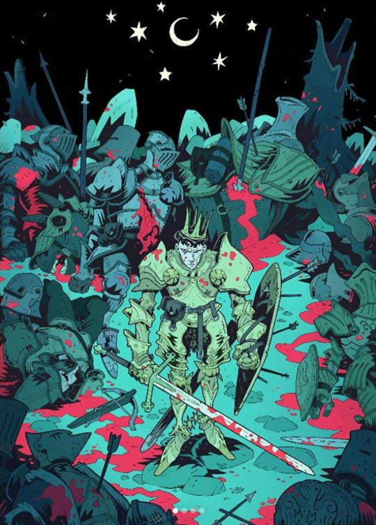
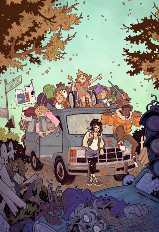
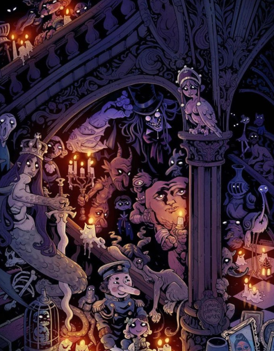
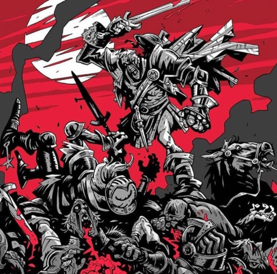
First up is Simone DÁrmini, an italian illustrator based in Edinburgh. His artstyle might not be everyone’s cup of tea - but it certainly is mine. I really like his artstyle and it really reminds me of Mike Mignola (of Hellboy comics fame)’s artstyle which I also LOVE!
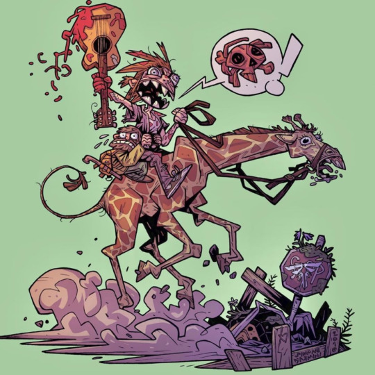

With that said, Mike Mignola focuses on simplicity while Simone’s work is a tad more detailed imo. But you can definitely tell he’s somewhat inspired by Mike Mignola (or maybe it’s a coincidence who knows). His linework is very loose and comic-ey (if that makes sense). It’s very cartoony and has a very dramatic lighting or contrast between black and white - completely black shadows with no gradients in between (though not all of his illustrations are like this). But seriously, his work is effing amazing! Love it lots. Check out his work!
2. Øyvind Lauvdahl (@lauvdahl)
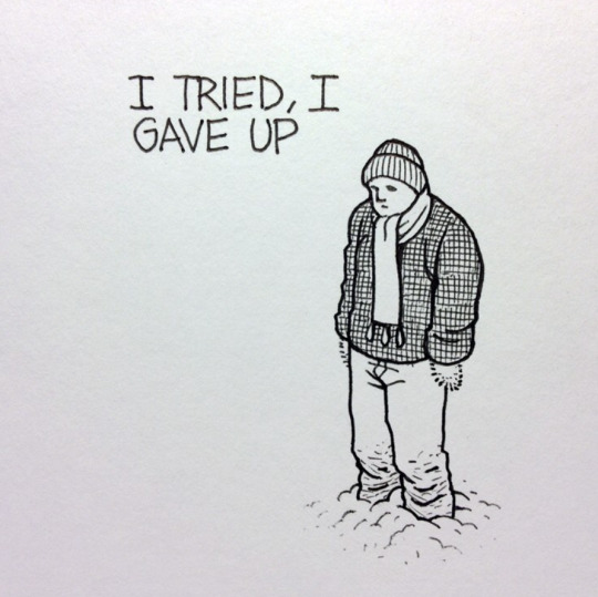
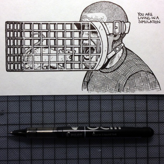
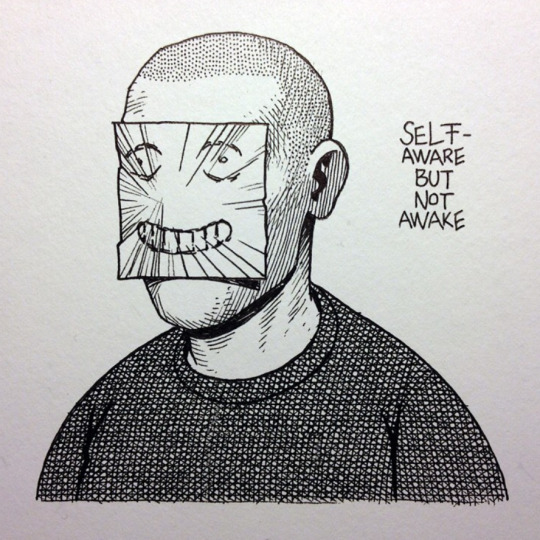
Second on the list is Øyvind Lauvdahl. Not exactly sure how to describe this guy’s interesting work. If you look at his instagram feed, you can tell there’s a pattern there. Most of his illustrations depict this depressing looking character that does too much overthinking in life.
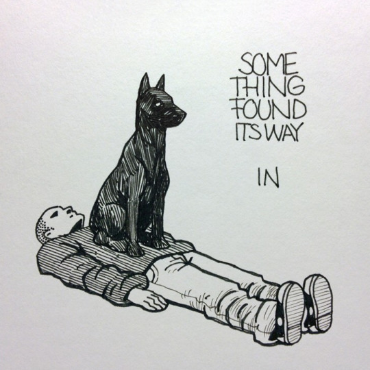
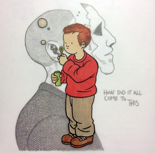
Every post he makes has this character either standing, sitting, mangled to different shapes and sizes, sometimes it’s just some parts of his face, hands, legs. Sometimes there’s a foreign element to them, like a dog, a bird, an inanimate object and so on. And literally every illustration he posted has a particular set of phrases or idioms, or quotes alongside it. They could either be very relatable to life (one could comprehend its meaning) or seems like complete nonsense xD (but surely has its meanings behind them). It’s definitely UNIQUE in terms of execution, and I love that he’s really consistent with them. He never stops, he just keeps going. I love it. Check out his work!

3. Olivia Kemp (@livvykemp)

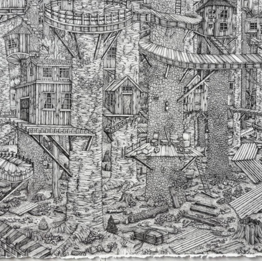
Next, Olivia Kemp! She’s an artist from Britain and mostly does black and white work with pen and ink. Her work is amazingly detailed and complex - depicting this surreal environment or space that almost seems dreamy! She also does realistic portraits of people.
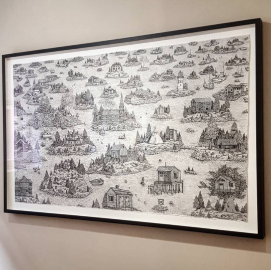
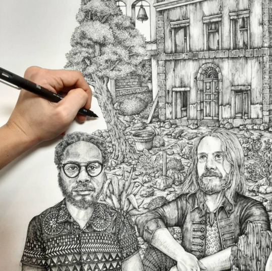
What I also really love is the fact that she sometimes makes them in this huge canvas which enables her to create very minute detail on each of them - you can admire them from afar to get the overall concept and then get a bit closer to look at all the tiny details and inks. I’m very fascinated with ink shadings since they are not really easy to pull off (or maybe I’m really bad at it xD). Check out more of her work!

4. Ian McQue (@ianmcque)
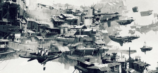
Next up is Ian McQue! He’s a concept artist / illustrator from Edinburgh, United Kingdom. He mostly does this incredible environment piece in the form of concept art. He does a mix of digital and traditional (pen and ink) illustrations.
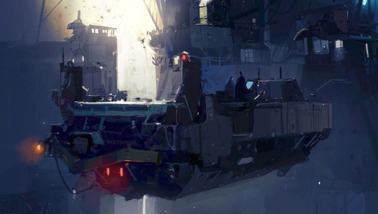
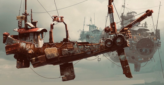
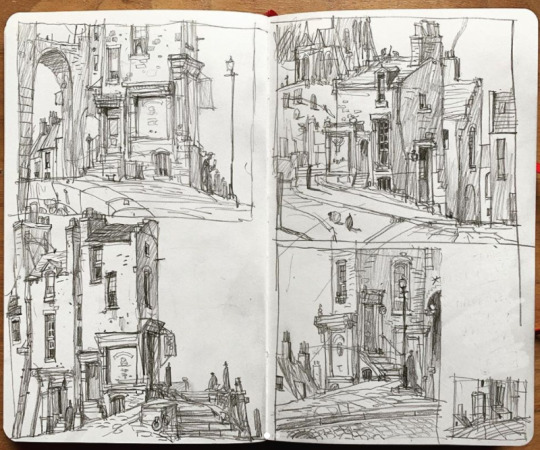
As a dude who mostly does character illustrations, I suck at drawing environments and whenever I come across artists who do AMAZING environment work, I’m immediately a fan. If you look at his Instagram feed, he does a lot of futuristic and surreal environments that might not seem plausible (technically) like floating mechanical sailboats and houses that stack on top of each other that seem to defy the laws of physics. But who cares about whether it makes sense or not, doesn’t make it look less cool!
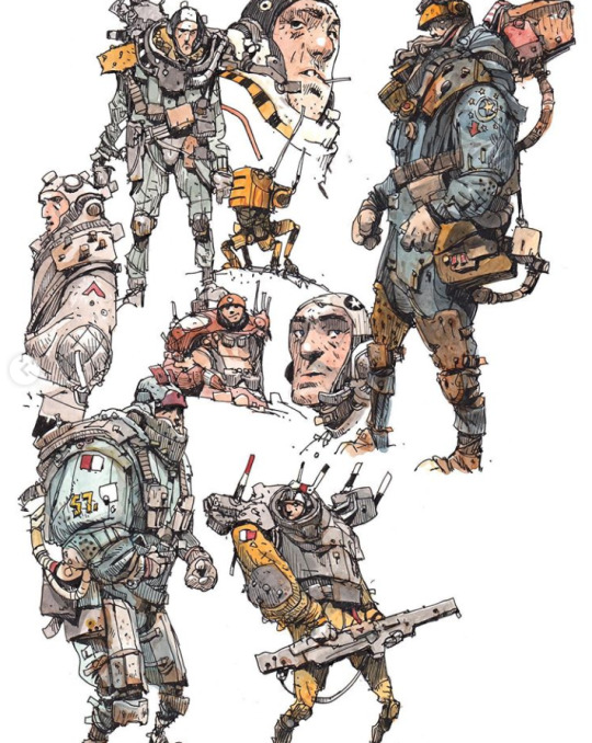

5. Will Murai (@willmurai)
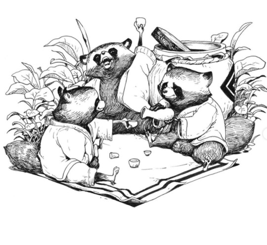
Finally, Will Murai, an illustrator based in California, United States. He’s also a senior illustrator at Blizzard Entertainment which says a lot! He does a lot of character illustrations but also amazing at drawing backgrounds with the characters in focus. He’s a mix of digital and traditional artist (pencil, pen and ink).

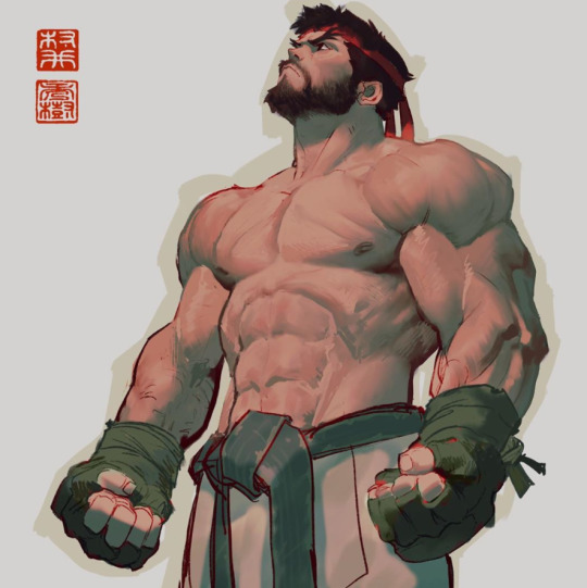
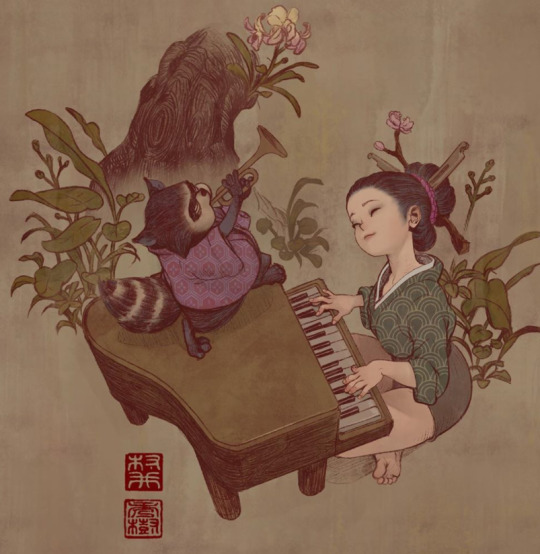
He’s work is nothing short of amazing! Really love his linework and the way he digitally colors / paints his work - ranging from badass characters to cute illustrations of animals with eastern aesthetics. I just freakin’ love his work :’) check out more of his work!
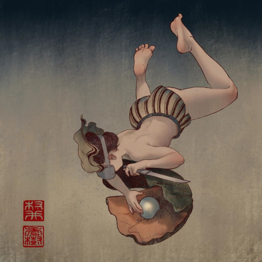
And that’s it for my NOVEMBER Instagram artists showcase!
Part of me loves going through the process of making these lists as it’s a huge inspiration to look at them, study them - just pumps me up to a certain extent. BUT at the same time, can’t help but feel sort of demotivated when you compare their work with your own y’know :’S but hey, gotta keep at it I guess. These same artists are beginners at some point in their lives which is a nice thought. Never give up!
0 notes
Text
AX2002 - Dimensions Group Project: Storyboard and Script
The Dimensions project is an animation where each 30 seconds, the animator switches. The aim of this brief is to get us to communicate with one another and be able to present a cohesive chase sequence with a clear narrative.
When it came to planning this out, we needed someone to be at the front and set up the narrative clearly. Before anyone could, I put my hand up. I was starting this off, I had the perfect idea that established Vasyl as a strong no-nonsense character and Skip’s more easy going and laid back approach. I knew how to set up these characters, so the rest of the class would know what to do, understand the relationships and mechanics of the characters.
First Storyboard Draft
The first impression I got for an introductory segment was to set up a tense narrative with multiple things going wrong at once. Setting a tone where our characters HAVE to get Guffyn back or it’s absolute disaster for everyone! So, immediately the ideas came flooding in and I scribbled down a rough storyboard. The visuals came to mind first, linking them up with a loose narrative. There wasn’t a definite script yet at this stage.
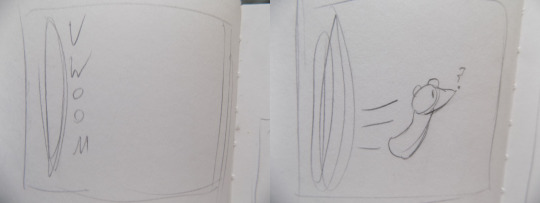
So, this animation “begins” with Guffyn opening a portal in time and arriving into a quiet alleyway in the night. Here Guffyn is rather confused, giving the impression that Guffyn doesn’t really know where it’s going. This was supposed to be the ending shot to the whole animatic, where it loops back to the last frame of the film will mirror the first.
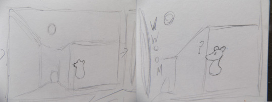
This is where my segment really begins, with Guffyn looking off at the moon for a few seconds before a portal opens to Guffyn’s side with them looking at it in confusion. I always wanted this shot to be the opening shot, have the alleyway there with a little entrance and the moon in the sky.
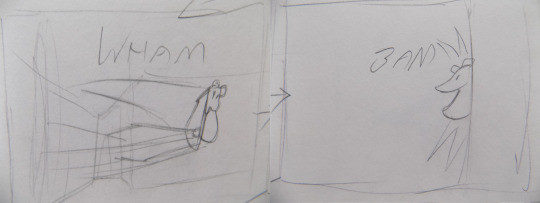
A foot zooms through the portal, hitting Guffyn and slamming them into a wall! This violence was to establish a more urgent tone because who would want to stomp on a small cute creature like Guffyn? Not unless it was absolutely necessary, showing the audience that this character means business.
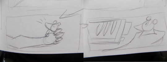
An aggressive hand came in, grabbing the Guffyn tight causing it to let out a squeak! A huge gun is then pointed in Guffyn’s face, with a closeup of Guffyn’s shock! This was to make Guffyn look that much more innocent and small in comparison to the huge hand and gun.
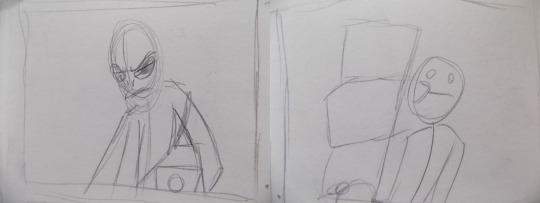
Finally, we see the aggressor, Character A! Not named at the time. Pointing the gun at Guffyn in a POV shot, we get to see their rather intimidating appearance and are only left with vague answers on who these characters are. Then, a hardcut to Character B! Taking out some boxes, the designs here are both simple just to block out the scene and what’s happening. We hadn’t finalised any designs or even discussed them before this, so kept it to know what I’m doing. In hindsight, not a fan of how little Character B is actually in this, and so this was changed in the next scripts and storyboards.
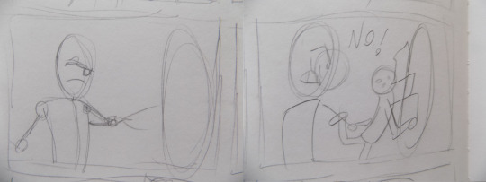
Character A shoots out a portal to take Guffyn back. This establishes the whole narrative of things going wrong when Character B trips up and accidentally stumbles into the portal, much to Character A’s dismay.
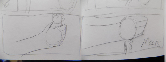
Seeing a chance to escape, Guffyn transforms into liquid and melts out of Character A’s hands.
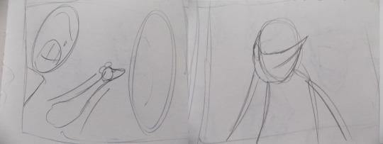
Guffyn then flies into the portal as Character A tries to grab them before they go, but fails... Character A groans saying something like “Not again...”
Summary
This storyboard was a perfect foundation to build upon, the setting was something I really liked and Character A’s reactions where perfect for setting up that there’s more to this story, however this draft has several problems.
My biggest being the portal Guffyn escapes into, would not have been a random dimension as Character A shot the portal, it would have been to go back to the facility which Guffyn had escaped from. Thinking from a story standpoint, Guffyn would have gone back to where he escaped from and Character A would follow, catch them without a chase and also return Character B home without any mad chances between dimensions! This would have also meant that Bee would have to have set her animation in the WTF facility and that wasn’t exactly fair in my opinion.
That was my major problem, but I also didn’t like how Character B hardly interacts and I don’t get a chance to set up Character B’s personality. So, back to the storyboards, I had to find a way where Character B plays just as much of a role in the setup, where Guffyn manages to escape by it’s own rules and an animation that won’t conflict with Bee’s aims and wants in her own segment.
Second Storyboard Draft
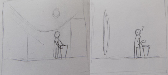
So, working on my problems with the first board. This version actually begins with Character B taking out the trash, the same sort of shot of the alleyway with the walls, entrance and moon in the background. Suddenly, a portal opens up that catches his attention.
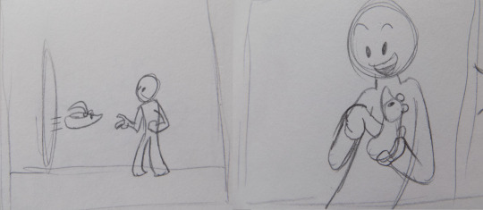
Guffyn flies out and into the arms of Character B, very fast and conveys the impression that Guffyn is escaping. A small level of urgency established as Guffyn takes comfort in Character B’s arms and we get to see that Character B is a kind and caring character...
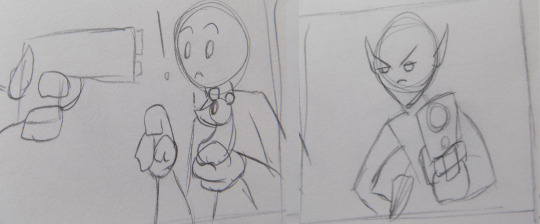
While Character B is preoccupied with Guffyn, a gun points into view which causes them to jump and look up in shock! It’s Character A! Looking all intimidating and menacing while pointing an alien device into Character B’s face! Quietly and calmly telling Character B to let go of the Guffyn...
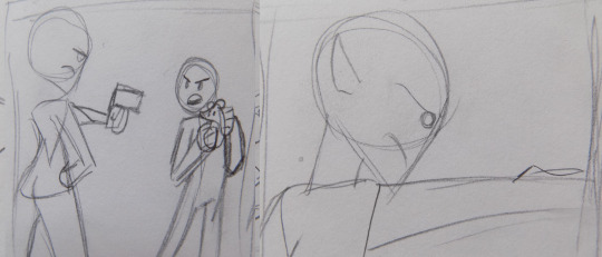
Character B turns away, claiming that Guffyn is harmless and that it likes him! Character A establishes that Guffyn is actually capable of many things and that it has the capacity to destroy dimensions, not once lowering their gun. Showing how contained and composed they are.
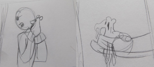
Character B steps back claiming that it might not want to destroy worlds. As they argue, Guffyn melts through Character B’s hands.
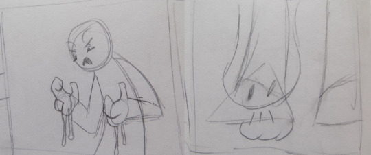
Character B reacts in disgust, letting Guffyn drop to the floor giving it a chance to escape! I’m quite a fan of how I got to keep the melting effect.
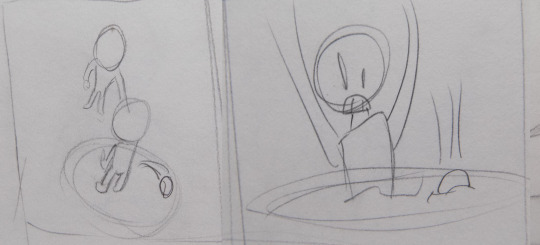
I’d noticed how flat this might have been laid out, so I decided to do this high angle shot to show the portal forming under Character B. Not only to be visually interesting, but to challenge myself by drawing at that angle. It also shows where the portal is formed and also accidentally brings Character B into the adventure!
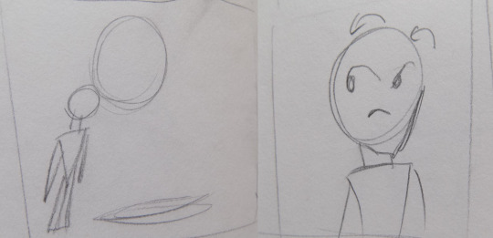
Now alone, Character A reflects on what just happened and simply wonders why their job can’t be easy.
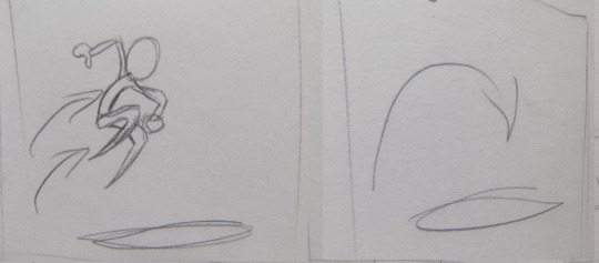
Character A quickly jumps after and my segment ends...
As you can see, it’s almost the same. However, just simply rearranging certain aspects to make a much more refined film. Elements like Character A being left alone and Guffyn melting away to escape. The violence and urgency much more toned down and in a sense reversed, since Guffyn is all cute and cuddly until it’s revealed that Guffyn can be weaponized. Making him more of a threat rather than make him innocent throughout and making Character A the aggressor.
With this rough draft done, I then began to write a script and create a much more refined product.
Script Development
With my new foundations, I began development on the script and storyboards. This time however with my artstyle in mind and something that will be much much closer to a finished product.
When writing the script, I had to keep in mind the character’s personalities. Character A, a headstrong, determined figure that has no time for nonsense. Character B, a lighthearted and accepting guy that won’t hesitate to show kindness to the most dangerous creatures.
With these attributes in mind, I gave Character B the name, Skip. His last name was going to be Anajump because what I was originally going for was a name based on the phrase, “A hop, skip and a jump away“. But, that wasn’t necessary.
Character A became Vasyl, a name in some languages that means leadership and independence. I felt it was important to give them a foreign sounding name since they are an alien.
When I pitched these ideas forward in the group discussions, nobody seemed to object and the names stuck!
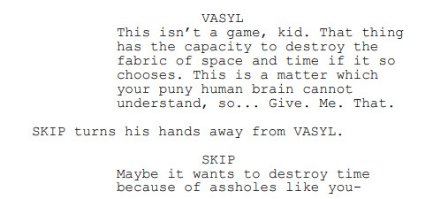
These characters went through a bunch of developments, character-wise and visually. Both Vasyl and Skip had lines where they swore in initial scripts, while it felt in line with Vasyl’s character, it didn’t feel right for Skip, plus it made him less endearing. He just seemed like any old teenager than a kind hearted youth!
Their personalities remained the same, but when the brief asked for a sudden detail to be revealed that changes the dynamic, it definitely got me thinking. A rough idea I came up with was have Vasyl grow a bond with Skip because she knew a relative of his who had died on their adventures, seeing those key traits she saw in them. Specifically in regards to his kindness. And just before they part ways, Vasyl would make a comment like “The boy’s just like you”. This idea was soon shot down as it was a little complicated and to keep characters down to a minimum, I didn’t want to restrict people into including certain details.
Another idea I entertained was Vasyl knowing everything that was going on while Skip had no clue, so when she first appears it’d be like “Not again! No time to explain, follow me!” This didn’t really work for me and I preferred having them meet for the first time.
Storyboard Development
Now I had names, designs and direction for the story to go in. All that was needed was to rebuild my vision and get it more clearly across...
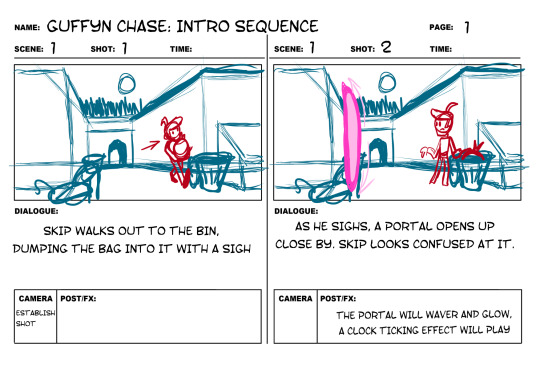
So, we establish that Skip is just a regular human with a regular job in his regular routine. Just having him sigh establishes he is a little bored of his usual life.
Skip’s reaction to the portal opens also establishes that the wacky adventures that he will embark on throughout everyone’s animation would be completely new and mind-boggling to him.
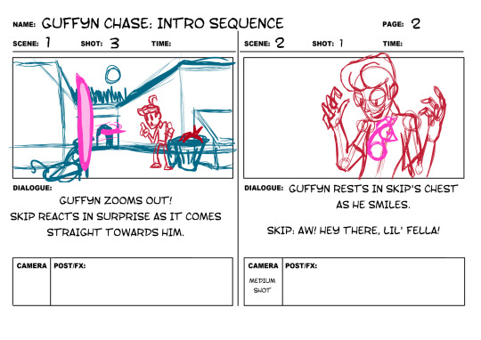
Guffyn flies out, straight into Skip’s arms. Making it seem defenceless and innocent.
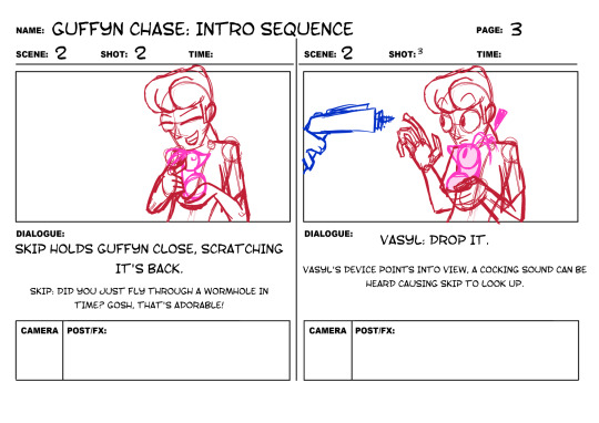
Skip’s reaction to Guffyn is nice, we see his open-mind and kind heart. His and Guffyn’s shock when confronted with a big tall alien woman with an unusual device gives the audience the initial expectation of Vasyl being the antagonist.
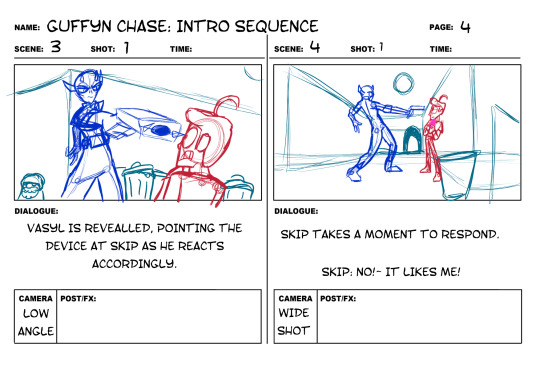
A small pause to let the bizarre-ness sink in, building tension as Skip refuses to answer her. We see Skip takes a few seconds to pluck up the courage to say know.
Vasyl’s gun was changed to look more like a taser and device, make her look like she’s using a tool rather than a weapon.
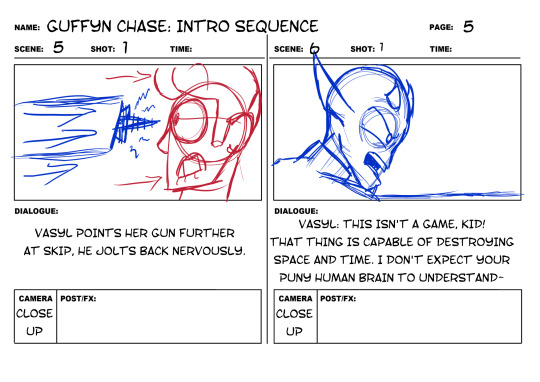
Vasyl’s rant and expression shows the audience that there’s more to Guffyn than it seems, maybe it is not to be trusted.
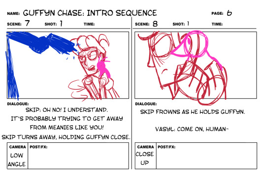
Taking advantage of the situation, Guffyn melts into Skip’s hands in an attempt to sneak away unnoticed. This is set up into the ending of Alex’s animation, where Guffyn takes advantage of the situation to escape.
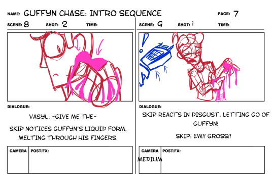
Skip notices Guffyn leaking through his fingers and reacts accordingly! Vasyl jumps back in surprise due to Skip’s sudden recoiling.
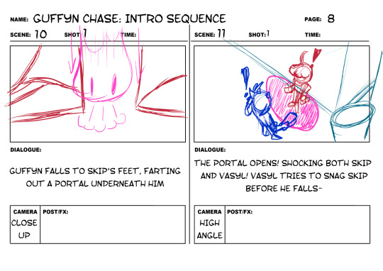
Vasyl’s attempt to save Skip is the start of their alliance, showing the audience that Vasyl doesn’t want to drag innocent lives into her job.
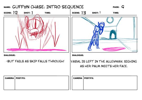
But, alas, Skip falls into the portal. Getting dropped feet first into the conflict, Vasyl can only react in disappointment...
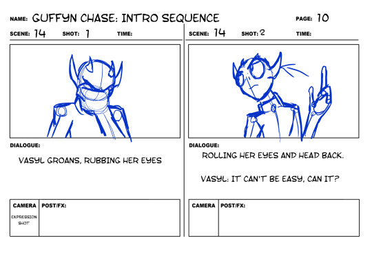
Her casual reaction sets up a drier side to her personality, showing how these unusual situations are a regular occurrence to Vasyl.
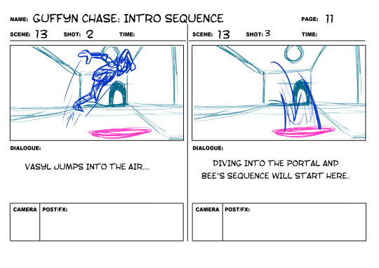
Vasyl jumps in after Skip and straight into Bee’s animation with them falling down. Which further goes onto establish Skip’s kindness and Vasyl’s casual attitude to this situation.
Summary
Being sure in my vision, I simply continued in this direction and made some animatics with test audio. Hardly anything story-based changed from now until my final animation unless it was purely visual. I was really happy with how this turned out and I was even more happy about bringing this to life.
0 notes