#The Bad and The Ugly
Explore tagged Tumblr posts
Text





映画の落書きまとめ。 邦題のせいで最初に見た時、続編かと思い本当に困惑しました。 邦題あるある…。
307 notes
·
View notes
Text
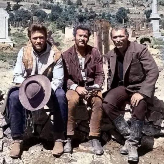
#Clint Eastwood#Eli Wallach and Lee Van Cleef on the set of The Good#The Bad and The Ugly#1966.#Xenophon__#oldschool
261 notes
·
View notes
Text

Hugo Montenegro His Orchestra and Chorus - The Good, The Bad and The Ugly (Theme) (1968) Ennio Morricone from: "The Good, the Bad and the Ugly" / "March with Hope" (Single) "Music from 'The Good, the Bad and the Ugly' and 'A Fistful of Dollars' and "For a Few Dollars More'" (LP)
Instrumental | Movie Theme | Ennio Morricone Cover
JukeHostUK (left click = play) (320kbps)
Partial Personnel: Art Smith: Ocarina Tommy Morgan: Harmonica ("the 'wah-wah-wah' sound") Muzzy Marcellino: Whistle Hugo Montenegro: Vocals (Hugo "grunted something which came out like 'rep, rup, rep, rup, rep'") Elliot Fisher: Electric Violin Emmanuel "Mannie" Klein: Piccolo Trumpet
Arranged and Conducted by Hugo Montenegro Produced by Neely Plumb
Recorded: @ RCA Victor's Music Center of the World in Hollywood, California USA on November 18, 1967
Album Released: in December, 1967
Single Released: in January, 1968
RCA Victor Records

14 notes
·
View notes
Text

33K notes
·
View notes
Text
Such a great intro. Fullerton stand-up :
youtube
Tier wise I'm choosing :
KGR d. BDK
ODB d. Biz
RZA d. GZA
DPGC d. M.O.P. & ONYX
MC Lyte d. Queen Latifah
Lady Of Rage d. Bahamadia
Big Boi d. Andre 3000
Madlib! d. 9th Wonder
P.E. d. Brand Nubian
BDP d. Queensbridge
Big Pun d. Treach
Chip-Fu vs. ToneDeff (no contest)
Remy Ma d. Rah Digga
Slick Rick d. Ice-T
E-40 d. Suga Free
ATCQ d. De La Soul
Xzibit d. DMX
Jadakiss d. Ludacris
Dr. Dre d. DJ Quik
Tech N9ne d. Twista
Crooked I d. Pharaoh Monche
DJ Premier d. Pete Rock
Sean Price d. MF DOOM
#A-F-R-O#stu bangas#the bad and the ugly#brutal music#album review#hip-hop tournament#orange county#all flows reach out
1 note
·
View note
Text
we've found it folks: mcmansion heaven
Hello everyone. It is my pleasure to bring you the greatest house I have ever seen. The house of a true visionary. A real ad-hocist. A genuine pioneer of fenestration. This house is in Alabama. It was built in 1980 and costs around $5 million. It is worth every penny. Perhaps more.
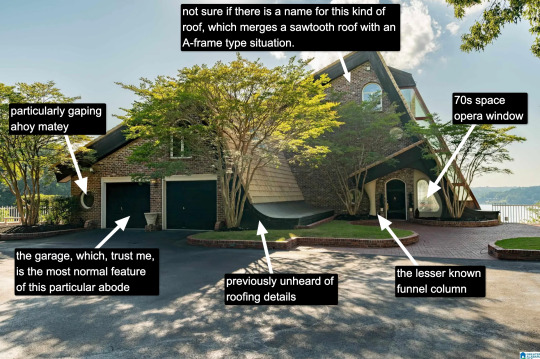
Now, I know what you're thinking: "Come on, Kate, that's a little kooky, but certainly it's not McMansion Heaven. This is very much a house in the earthly realm. Purgatory. McMansion Purgatory." Well, let me now play Beatrice to your Dante, young Pilgrim. Welcome. Welcome, welcome, welcome.
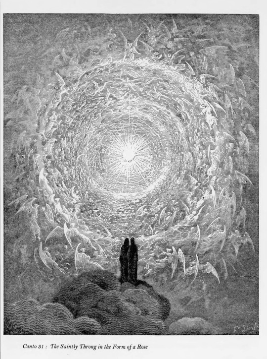
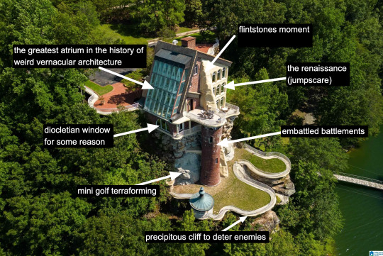
It is rare to find a house that has everything. A house that wills itself into Postmodernism yet remains unable to let go of the kookiest moments of the prior zeitgeist, the Bruce Goffs and Earthships, the commune houses built from car windshields, the seventies moments of psychedelic hippie fracture. It is everything. It has everything. It is theme park, it is High Tech. It is Renaissance (in the San Antonio Riverwalk sense of the word.) It is medieval. It is maybe the greatest pastiche to sucker itself to the side of a mountain, perilously overlooking a large body of water. Look at it. Just look.
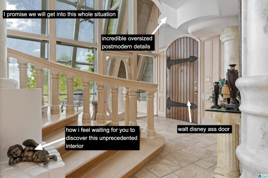
The inside is white. This makes it dreamlike, almost benevolent. It is bright because this is McMansion Heaven and Gray is for McMansion Hell. There is an overbearing sheen of 80s optimism. In this house, the credit default swap has not yet been invented, but could be.
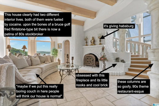
It takes a lot for me to drop the cocaine word because I think it's a cheap joke. But there's something about this example that makes it plausible, not in a derogatory way, but in a liberatory one, a sensuous one. Someone created this house to have a particular experience, a particular feeling. It possesses an element of true fantasy, the thematic. Its rooms are not meant to be one cohesive composition, but rather a series of scenes, of vastly different spatial moments, compressed, expanded, bright, close.
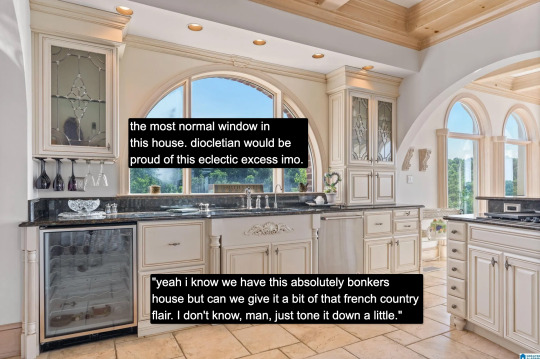
And then there's this kitchen for some reason. Or so you think. Everything the interior design tries to hide, namely how unceasingly peculiar the house is, it is not entirely able to because the choices made here remain decadent, indulgent, albeit in a more familiar way.

Rare is it to discover an interior wherein one truly must wear sunglasses. The environment created in service to transparency has to somewhat prevent the elements from penetrating too deep while retaining their desirable qualities. I don't think an architect designed this house. An architect would have had access to specifically engineered products for this purpose. Whoever built this house had certain access to architectural catalogues but not those used in the highest end or most structurally complex projects. The customization here lies in the assemblage of materials and in doing so stretches them to the height of their imaginative capacity. To borrow from Charles Jencks, ad-hoc is a perfect description. It is an architecture of availability and of adventure.
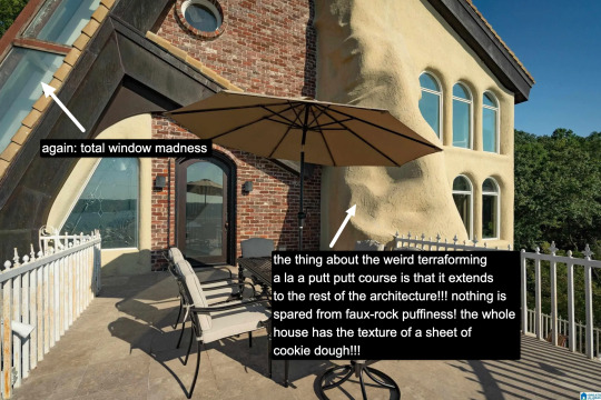
A small interlude. We are outside. There is no rear exterior view of this house because it would be impossible to get one from the scrawny lawn that lies at its depths. This space is intended to serve the same purpose, which is to look upon the house itself as much as gaze from the house to the world beyond.
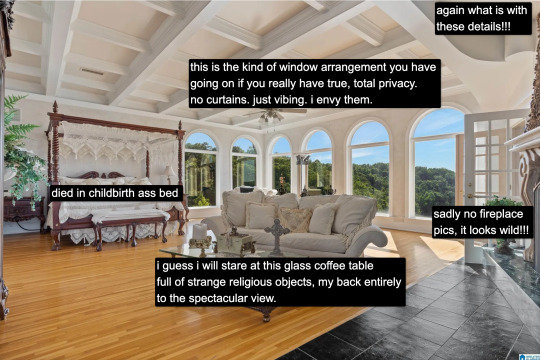
Living in a city, I often think about exhibitionism. Living in a city is inherently exhibitionist. A house is a permeable visible surface; it is entirely possible that someone will catch a glimpse of me they're not supposed to when I rush to the living room in only a t-shirt to turn out the light before bed. But this is a space that is only exhibitionist in the sense that it is an architecture of exposure, and yet this exposure would not be possible without the protection of the site, of the distance from every other pair of eyes. In this respect, a double freedom is secured. The window intimates the potential of seeing. But no one sees.
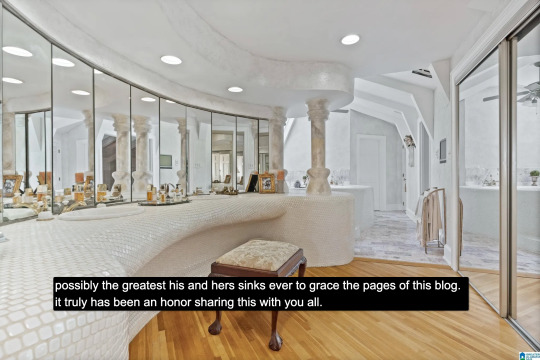
At the heart of this house lies a strange mix of concepts. Postmodern classicist columns of the Disney World set. The unpolished edge of the vernacular. There is also an organicist bent to the whole thing, something more Goff than Gaudí, and here we see some of the house's most organic forms, the monolith- or shell-like vanity mixed with the luminous artifice of mirrors and white. A backlit cave, primitive and performative at the same time, which is, in essence, the dialectic of the luxury bathroom.
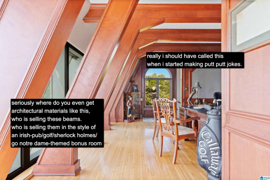
And yet our McMansion Heaven is still a McMansion. It is still an accumulation of deliberate signifiers of wealth, very much a construction with the secondary purpose of invoking envy, a palatial residence designed without much cohesion. The presence of golf, of wood, of masculine and patriarchal symbolism with an undercurrent of luxury drives that point home. The McMansion can aspire to an art form, but there are still many levels to ascend before one gets to where God's sitting.
If you like this post and want more like it, support McMansion Hell on Patreon for as little as $1/month for access to great bonus content including a discord server, extra posts, and livestreams.
Not into recurring payments? Try the tip jar! Student loans just started back up!
43K notes
·
View notes
Text

if there's anything i've learned from the current state of social media it's that this is one of the worst possible notifications you can receive upon opening an app
#skye's ramblings#i thought you guys were exaggerating how ass-ugly the discord update is. why isn't this optional. what if we all died#big thanks to discord and tumblr for both making bad layout changes to their apps in the same week. i love complaining <3
47K notes
·
View notes
Photo

The Good, the Bad and the Ugly Movie - Watch The Good, the Bad and the Ugly For Free.
0 notes
Text
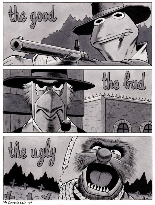
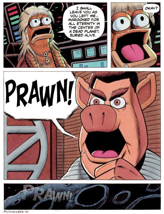


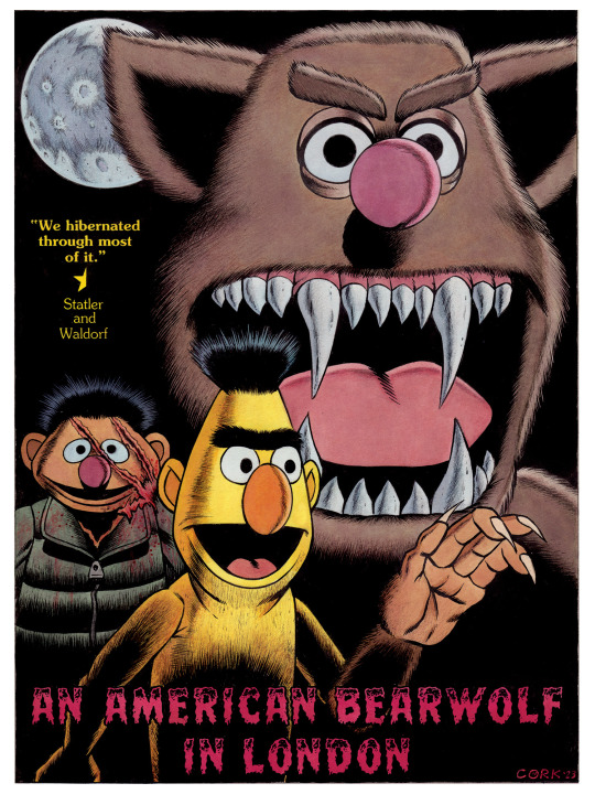
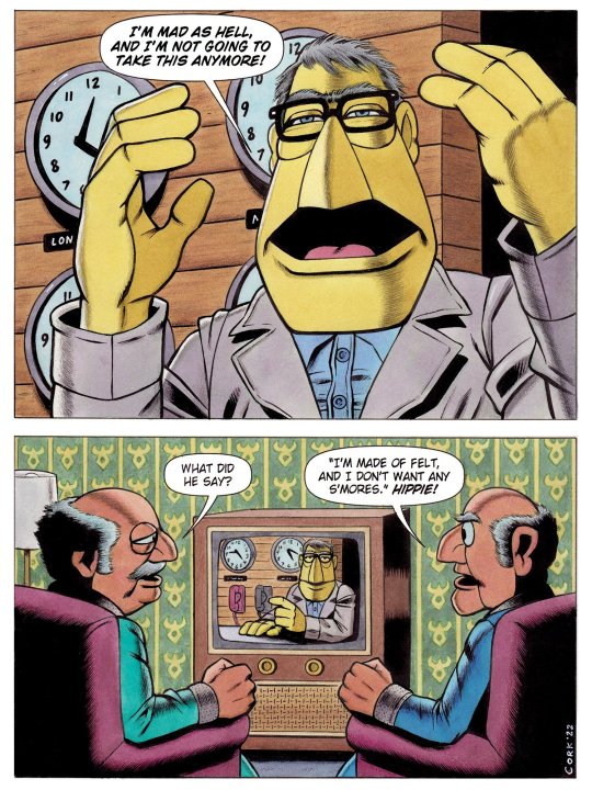

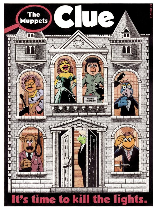


Arthouse Muppets
Art by Bruce McCorkindale
#Comics#Arthouse Muppets#Bruce McCorkindale#Film#Muppets#The Muppets#Sesame Street#Jim Henson#Art#The Good The Bad And The Ugly#Seven Samurai#Network#Ringu#The Ring#Pulp Fiction#Ocean's Eleven#Clue#Princess Bride#An American Werewolf In London#Star Trek II The Wraith Of Khan#The Wrath Of Khan#Star Trek#Humor#Humor Comics#Bert And Ernie#Statler And Waldorf
22K notes
·
View notes
Photo
Not only one the greatest western ever, but one of the best movies ever.

4K notes
·
View notes
Text
youtube
#The Good#The Bad And The Ugly#Ennio Morricone#Piano#violin#guitar#sheet music#flute#notes#music notes#piano sheet music#pdf#Youtube
0 notes
Text
what was the best and/or your favourite film that you watched for the first time this year?
#tough bc I watched about 160 films for the first time this year…#and dont feel like u can’t name multiple because im about to say SEVERAL:#Lawrence of arabia / a woman under the influence / 12 angry men / the good the bad and the ugly
4K notes
·
View notes
Text


playing with my phonetaur
#gif#animation#my art#furry#honestlky thiskinda looks bad and nonsensical but i got it out of my system so im satisfied#it could be improved in many ways mainly the timing and the arcs and the ugly ass hand. the hand is very bad#i do not have it in me to work any further on this.#the message of this artwork is that if there was a phonetaur it would be fun to press its buttons#i call you on my phonetaur#also oomfie gave me this oc and i turned it into a taur#yay#taur
4K notes
·
View notes
Text

Cool guy

1K notes
·
View notes
Text
Learn English Through Football Podcast: 2023 Copa Libertadores Final Review - Fluminense v Boca Juniors
In this football language podcast Damian looks back at some of the good, the bad and the ugly from the 2023 Copa Libertadores final between Fluminense and Boca Juniors in the Maracanã Stadium Brazil. In particular, he looks at the phrases, ‘ ‘ Don’t forget we have hundreds more explanations of football language in our football glossary and we also have a page full of football cliches. If you…

View On WordPress
0 notes