#TUTORIAL
Explore tagged Tumblr posts
Visit Tumblr Blog
Explore Tumblr blogs with no restrictions, modern design and the best experience.
Last Seen Tumblr Blogs


Fun Fact
Mobile Tumblr US users spend an average of 4.04 minutes per session on the app.
Text
@lessonsfromthehellsite
Notes on Character Design

Character design and drawing are tome-sized topics and even if I had all the answers (I don’t - I have a lot to learn), I’m not sure I could communicate them effectively. I’ve gathered some thoughts and ideas here, though, in case they’re helpful.
First, some general things: - Relax and let some of that anxiety go. This isn’t a hard science. There’s no wrong way, no rigid process you must adhere to, no shoulds or shouldn’ts except those you designate for yourself. This is one of the fun parts of being an artist, really - have a heady good time with it.
- Be patient. A design is something gradually arrived at. It takes time and iteration and revision. You’ll throw a lot of stuff away, and you’ll inevitably get frustrated, but bear in mind the process is both inductive and deductive. Drawing the wrong things is part of the path toward drawing the right thing.
- Learn to draw. It might seem perfunctory to say, but I’m not sure everyone’s on the same page about what this means. Learning to draw isn’t a sort of rote memorization process in which, one by one, you learn a recipe for humans, horses, pokemon, cars, etc. It’s much more about learning to think like an artist, to develop the sort of spacial intelligence that lets you observe and effectively translate to paper, whatever the subject matter. When you’re really learning to draw, you’re learning to draw anything and everything. Observing and sketching trains you to understand dimension, form, gesture, mood, how anatomy works, economy of line; all of the foundational stuff you will also rely on to draw characters from your imagination. Spend some time honing your drawing ability. Hone it with observational sketching. Hone it good.

I don’t think I’ve ever seen anyone do this sort of thing better than Claire Wendling. In fact, character designs emerge almost seamlessly from her gestural sketches. It’d be worth looking her up.
- Gather Inspiration like a crazed magpie. What will ultimately be your trademark style and technique is a sort of snowball accumulation of the various things you expose yourself to, learn and draw influence from. To that effect, Google images, tumblr, pinterest and stock photo sites are your friends. When something tingles your artsy senses - a style, a shape, a texture, an appealing palette, a composition, a pose, a cool looking animal, a unique piece of apparel, whatever - grab it. Looking at a lot of material through a creative lens will make you a better artist the same way reading a lot of material makes a better writer. It’ll also devour your hard drive and you will try and fail many times to organize it, but more importantly, it’ll give you a lovely library of ideas and motivational shinies to peruse as you’re conjuring characters.
- Imitation is a powerful learning tool. Probably for many of us, drawing popular cartoon characters was the gateway habit that lured us into the depraved world of character design to begin with. I wouldn’t suggest limiting yourself to one style or neglecting your own inventions to do this, but it’s an effective way to limber up, to get comfortable drawing characters in general, and to glean something from the thought processes of other artists.
- Use references. Don’t leave it all up to guessing. Whether you’re trying to design something with realistic anatomy or something rather profoundly abstracted from reality, it’s helpful in a multitude of ways to look at pictures. When designing characters, you can infer a lot personality from photos, too.


And despite what you might have heard, having eyeballs and using them to look at things doesn’t constitute cheating. There’s no shame in reference material. There’s at least a little shame in unintentional abstractions, though.

Concepts and Approach:
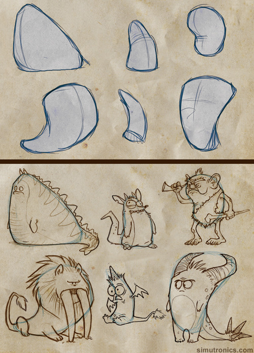
- Break it down. Sometimes you have the look of a character fleshed out in your mind before putting it to paper, but usually not. That doesn’t mean you have to blow your cortical fuses trying conceive multiple diverse designs all at the same time, though. You don’t even have to design the body shape, poses, face, and expressions of a single character all at once. Tackle it a little at a time.
The cartoony, googly eyed style was pre-established for this simple mobile game character, but I still broke it into phases. Start with concepts, filter out what you like until you arrive at a look, experiment with colors, gestures and expressions.

- Start with the general and work toward the specific. Scribbling out scads of little thumbnails and silhouettes to capture an overall character shape is an effective way begin - it’s like jotting down visual notes. When you’re working at a small scale without agonizing over precision and details, there’s no risk of having to toss out a bunch of hard work, so go nuts with it. Give yourself a lot of options.
Here’s are some sample silhouettes from an old cancelled project in which I was tasked with designing some kind of cyber monkey death bot. I scratched out some solid black shapes then refined some of them a step or two further.

Here’s an instructional video by Feng Zhu about doing much the same thing (only way better).
- Shapes are language. They come preloaded with all sorts of biological, cultural and personal connotations. They evoke certain things from us too. If you’re ever stuck about where to go with your design, employ a sort of anthroposcopy along these lines - make a visual free association game out of it. It’ll not only tend to result in a distinguished design, but a design that communicates something about the nature of the character.
Think about what you infer from different shapes. What do they remind you of? What personalities or attitudes come to mind? How does the mood of a soft curve differ from that of a sharp angle? With those attributes attached, how could they be used or incorporated into a body or facial feature shape? What happens when you combine shapes in complementary or contrasting ways? How does changing the weight distribution among a set of shapes affect look and feel? Experiment until a concept starts to resonate with the character you have in mind or until you stumble on something you like.

If you don’t have intent, take the opposite approach - draw some shapes and see where they go. (It’s stupid fun.)
You might also find it helpful to watch Bobby Chiu’s process videos in which he feels out his character designs as he paints.
- Cohesion and Style. As you move from thumbnails to more refined drawings, you can start extrapolating details from the general form. Look for defining shapes, emergent themes or patterns and tease them out further, repeat them, mirror them, alternate them. Make the character entirely out of boxy shapes, incorporate multiple elements of an architectural style, use rhythmically varying line weights - there are a million ways to do this
Here’s some of the simple shape repetition I’ve used for Lackadaisy characters.

- Expressions - let them emerge from your design. If your various characters have distinguishing features, the expressions they make with those features will distinguish them further. Allow personality to influence expressions too, or vice versa. Often, a bit of both happens as you continue drawing - physiognomy and personality converge somewhere in the middle.
For instance, Viktor’s head is proportioned a little like a big cat. Befitting his personality, his design lets him make rather bestial expressions. Rocky, with his flair for drama, has a bit more cartoon about him. His expressions are more elastic, his cheeks squish and deform and his big eyebrows push the boundaries of his forehead. Mitzi is gentler all around with altogether fewer lines on her face. The combination of her large sleepy eyes and pencil line brow looked a little sad and a little condescending to me when I began working out her design - ultimately those aspects became incorporated into her personality.
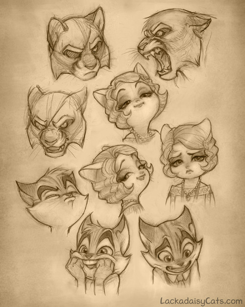
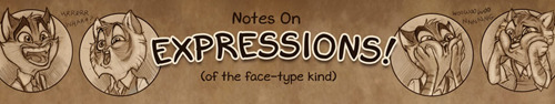
I discuss expression drawing in more detail here (click the image for the link):
- Pose rendering is another one of those things for which observational/gesture drawing comes in handy. Even if you’re essentially scribbling stick figures, you can get a handle on natural looking, communicative poses this way. Stick figure poses make excellent guidelines for plotting out full fledged character drawings too.
Look for the line of action. It’ll be easiest to identify in poses with motions, gestures and moods that are immediately decipherable. When you’ve learned to spot it, you can start reverse engineering your own poses around it.

- Additional resources - here are some related things about drawing poses and constructing characters (click the images for the links).


Lastly…
- Tortured rumination about lack of ability/style/progress is a near universal state of creative affairs. Every artist I have known and worked with falls somewhere on a spectrum between frustration in perpetuity and a shade of fierce contrition Arthur Dimmesdale would be proud of. So, next time you find yourself constructing a scourge out of all those crusty acrylic brushes you failed to clean properly, you loathsome, deluded hack, you, at least remember you’re not alone in feeling that way. When it’s not crushing the will to live out of you, the device does have its uses - it keeps you self-critical and locked in working to improve mode. If we were all quite satisfied with our output, I suppose we’d be out of reasons to try harder next time.
When you need some reassurance, compare old work to new. Evolution is gradual and difficult to perceive if you’re narrowed in on the nearest data point, but if you’ve been steadily working on characters for a few months or a year, you’ll likely see a favorable difference between points A and B.
Most of all, don’t dwell on achieving some sort of endgame in which you’re finally there as a character artist. There’s no such place - wherever you are, there is somewhere else. It’s a moving goal post. Your energy will be better spent just enjoying the process…and that much will show in the results.
90K notes
·
View notes
Note
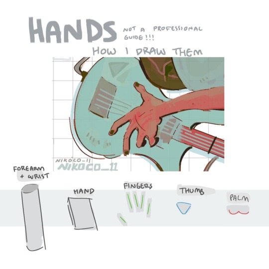
spec. spec. spec youve changed the game. i never realized your pointer finger and your wrist artery are the same. holy shit. im going to draw hands thank you


aasdjsd its not really an artery but its a useful landmark to facilitate the Flow of a pose imo
#nd then the thumb meat is just kinda tacked on there#u will notice also that i like to use the wrist as a tension point so the hand and forearm kind of drape off it#that has nothing to do with anatomy i am just gay#ask#doodle#tutorial#i gueass.
5K notes
·
View notes
Text
⭐ So you want to learn pixel art? ⭐
🔹 Part 1 of ??? - The Basics!
Edit: Now available in Google Doc format if you don't have a Tumblr account 🥰
Hello, my name is Tofu and I'm a professional pixel artist. I have been supporting myself with freelance pixel art since 2020, when I was let go from my job during the pandemic.


My progress, from 2017 to 2024. IMO the only thing that really matters is time and effort, not some kind of natural talent for art.
This guide will not be comprehensive, as nobody should be expected to read allat. Instead I will lean heavily on my own experience, and share what worked for me, so take everything with a grain of salt. This is a guide, not a tutorial. Cheers!
🔹 Do I need money?
NO!!! Pixel art is one of the most accessible mediums out there.
I still use a mouse because I prefer it to a tablet! You won't be at any disadvantage here if you can't afford the best hardware or software.
Because our canvases are typically very small, you don't need a good PC to run a good brush engine or anything like that.
✨Did you know? One of the most skilled and beloved pixel artists uses MS PAINT! Wow!!
🔹 What software should I use?
Here are some of the most popular programs I see my friends and peers using. Stars show how much I recommend the software for beginners! ⭐
💰 Paid options:
⭐⭐⭐ Aseprite (for PC) - $19.99
This is what I and many other pixel artists use. You may find when applying to jobs that they require some knowledge of Aseprite. Since it has become so popular, companies like that you can swap raw files between artists.
Aseprite is amazingly customizable, with custom skins, scripts and extensions on Itch.io, both free and paid.
If you have ever used any art software before, it has most of the same features and should feel fairly familiar to use. It features a robust animation suite and a tilemap feature, which have saved me thousands of hours of labour in my work. The software is also being updated all the time, and the developers listen to the users. I really recommend Aseprite!
⭐ Photoshop (for PC) - Monthly $$
A decent option for those who already are used to the PS interface. Requires some setup to get it ready for pixel-perfect art, but there are plenty of tutorials for doing so.
Animation is also much more tedious on PS which you may want to consider before investing time!
⭐⭐ ProMotion NG (for PC) - $19.00
An advanced and powerful software which has many features Aseprite does not, including Colour Cycling and animated tiles.
⭐⭐⭐ Pixquare (for iOS) - $7.99 - $19.99 (30% off with code 'tofu'!!)
Probably the best app available for iPad users, in active development, with new features added all the time.

Look! My buddy Jon recommends it highly, and uses it often.
One cool thing about Pixquare is that it takes Aseprite raw files! Many of my friends use it to work on the same project, both in their office and on the go.
⭐ Procreate (for iOS) - $12.99
If you have access to Procreate already, it's a decent option to get used to doing pixel art. It does however require some setup. Artist Pixebo is famously using Procreate, and they have tutorials of their own if you want to learn.
⭐⭐ ReSprite iOS and Android. (free trial, but:) $19.99 premium or $$ monthly
ReSprite is VERY similar in terms of UI to Aseprite, so I can recommend it. They just launched their Android release!
🆓 Free options:
⭐⭐⭐ Libresprite (for PC)
Libresprite is an alternative to Aseprite. It is very, very similar, to the point where documentation for Aseprite will be helpful to Libresprite users.
⭐⭐ Pixilart (for PC and mobile)
A free in-browser app, and also a mobile app! It is tied to the website Pixilart, where artists upload and share their work. A good option for those also looking to get involved in a community.
⭐⭐ Dotpict (for mobile)
Dotpict is similar to Pixilart, with a mobile app tied to a website, but it's a Japanese service. Did you know that in Japanese, pixel art is called 'Dot Art'? Dotpict can be a great way to connect with a different community of pixel artists! They also have prompts and challenges often.
🔹 So I got my software, now what?
◽Nice! Now it's time for the basics of pixel art.
❗ WAIT ❗ Before this section, I want to add a little disclaimer. All of these rules/guidelines can be broken at will, and some 'no-nos' can look amazing when done intentionally.
The pixel-art fundamentals can be exceedingly helpful to new artists, who may feel lost or overwhelmed by choice. But if you feel they restrict you too harshly, don't force yourself! At the end of the day it's your art, and you shouldn't try to contort yourself into what people think a pixel artist 'should be'. What matters is your own artistic expression. 💕👍
◽Phew! With that out of the way...
🔸"The Rules"
There are few hard 'rules' of pixel art, mostly about scaling and exporting. Some of these things will frequently trip up newbies if they aren't aware, and are easy to overlook.
🔹Scaling method
There are a couple ways of scaling your art. The default in most art programs, and the entire internet, is Bi-linear scaling, which usually works out fine for most purposes. But as pixel artists, we need a different method.


Both are scaled up x10. See the difference?
On the left is scaled using Bilinear, and on the right is using Nearest-Neighbor. We love seeing those pixels stay crisp and clean, so we use nearest-neighbor.
(Most pixel-art programs have nearest-neighbor enabled by default! So this may not apply to you, but it's important to know.)
🔹Mixels
Mixels are when there are different (mixed) pixel sizes in the same image.

Here I have scaled up my art- the left is 200%, and the right is 150%. Yuck!
As we can see, the "pixel" sizes end up different. We generally try to scale our work by multiples of 100 - 200%, 300% etc. rather than 150%. At larger scales however, the minute differences in pixel sizes are hardly noticeable!
Mixels are also sometimes seen when an artist scales up their work, then continues drawing on it with a 1 pixel brush.

Many would say that this is not great looking! This type of pixels can be indicative of a beginner artist. But there are plenty of creative pixel artists out there who mixels intentionally, making something modern and cool.
🔹Saving Your Files
We usually save our still images as .PNGs as they don’t create any JPEG artifacts or loss of quality. It's a little hard to see here, but there are some artifacts, and it looks a little blurry. It also makes the art very hard to work with if we are importing a JPEG.

For animations .GIF is good, but be careful of the 256 colour limit. Try to avoid using too many blending mode layers or gradients when working with animations. If you aren’t careful, your animation could flash afterwards, as the .GIF tries to reduce colours wherever it can. It doesn’t look great!

Here's an old piece from 2021 where I experienced .GIF lossiness, because I used gradients and transparency, resulting in way too many colours.
🔹Pixel Art Fundamentals - Techniques and Jargon
❗❗Confused about Jaggies? Anti-Aliasing? Banding? Dithering? THIS THREAD is for you❗❗ << it's a link, click it!!
As far as I'm concerned, this is THE tutorial of all time for understanding pixel art. These are techniques created and named by the community of people who actually put the list together, some of the best pixel artists alive currently. Please read it!!
🔸How To Learn
Okay, so you have your software, and you're all ready to start. But maybe you need some more guidance? Try these tutorials and resources! It can be helpful to work along with a tutorial until you build your confidence up.
⭐⭐ Pixel Logic (A Digital Book) - $10 A very comprehensive visual guide book by a very skilled and established artist in the industry. I own a copy myself.
⭐⭐⭐ StudioMiniBoss - free A collection of visual tutorials, by the artist that worked on Celeste! When starting out, if I got stuck, I would go and scour his tutorials and see how he did it.
⭐ Lospec Tutorials - free A very large collection of various tutorials from all over the internet. There is a lot to sift through here if you have the time.
⭐⭐⭐ Cyangmou's Tutorials - free (tipping optional) Cyangmou is one of the most respected and accomplished modern pixel artists, and he has amassed a HUGE collection of free and incredibly well-educated visual tutorials. He also hosts an educational stream every week on Twitch called 'pixelart for beginners'.
⭐⭐⭐ Youtube Tutorials - free There are hundreds, if not thousands of tutorials on YouTube, but it can be tricky to find the good ones. My personal recommendations are MortMort, Brandon, and AdamCYounis- these guys really know what they're talking about!
🔸 How to choose a canvas size
When looking at pixel art turorials, we may see people suggest things like 16x16, 32x32 and 64x64. These are standard sizes for pixel art games with tiles. However, if you're just making a drawing, you don't necessarily need to use a standard canvas size like that.
What I like to think about when choosing a canvas size for my illustrations is 'what features do I think it is important to represent?' And make my canvas as small as possible, while still leaving room for my most important elements.
Imagine I have characters in a scene like this:
I made my canvas as small as possible (232 x 314), but just big enough to represent the features and have them be recognizable (it's Good Omens fanart 😤)!! If I had made it any bigger, I would be working on it for ever, due to how much more foliage I would have to render.
If you want to do an illustration and you're not sure, just start at somewhere around 100x100 - 200x200 and go from there.
It's perfectly okay to crop your canvas, or scale it up, or crunch your art down at any point if you think you need a different size. I do it all the time! It only takes a bit of cleanup to get you back to where you were.
🔸Where To Post
Outside of just regular socials, Twitter, Tumblr, Deviantart, Instagram etc, there are a few places that lean more towards pixel art that you might not have heard of.
⭐ Lospec Lospec is a low-res focused art website. Some pieces get given a 'monthly masterpiece' award. Not incredibly active, but I believe there are more features being added often.
⭐⭐ Pixilart Pixilart is a very popular pixel art community, with an app tied to it. The community tends to lean on the young side, so this is a low-pressure place to post with an relaxed vibe.
⭐⭐ Pixeljoint Pixeljoint is one of the big, old-school pixel art websites. You can only upload your art unscaled (1x) because there is a built-in zoom viewer. It has a bit of a reputation for being elitist (back in the 00s it was), but in my experience it's not like that any more. This is a fine place for a pixel artist to post if they are really interested in learning, and the history. The Hall of Fame has some of the most famous / impressive pixel art pieces that paved the way for the work we are doing today.
⭐⭐⭐ Cafe Dot Cafe Dot is my art server so I'm a little biased here. 🍵 It was created during the recent social media turbulence. We wanted a place to post art with no algorithms, and no NFT or AI chuds. We have a heavy no-self-promotion rule, and are more interested in community than skill or exclusivity. The other thing is that we have some kind of verification system- you must apply to be a Creator before you can post in the Art feed, or use voice. This helps combat the people who just want to self-promo and dip, or cause trouble, as well as weed out AI/NFT people. Until then, you are still welcome to post in any of the threads or channels. There is a lot to do in Cafe Dot. I host events weekly, so check the threads!
⭐⭐/r/pixelart The pixel art subreddit is pretty active! I've also heard some of my friends found work through posting here, so it's worth a try if you're looking. However, it is still Reddit- so if you're sensitive to rude people, or criticism you didn't ask for, you may want to avoid this one. Lol
🔸 Where To Find Work
You need money? I got you! As someone who mostly gets scouted on social media, I can share a few tips with you:
Put your email / portfolio in your bio Recruiters don't have all that much time to find artists, make it as easy as possible for someone to find your important information!
Clean up your profile If your profile feed is all full of memes, most people will just tab out rather than sift through. Doesn't apply as much to Tumblr if you have an art tag people can look at.
Post regularly, and repost Activity beats everything in the social media game. It's like rolling the dice, and the more you post the more chances you have. You have to have no shame, it's all business baby
Outside of just posting regularly and hoping people reach out to you, it can be hard to know where to look. Here are a few places you can sign up to and post around on.
/r/INAT INAT (I Need A Team) is a subreddit for finding a team to work with. You can post your portfolio here, or browse for people who need artists.
/r/GameDevClassifieds Same as above, but specifically for game-related projects.
Remote Game Jobs / Work With Indies Like Indeed but for game jobs. Browse them often, or get email notifications.
VGen VGen is a website specifically for commissions. You need a code from another verified artist before you can upgrade your account and sell, so ask around on social media or ask your friends. Once your account is upgraded, you can make a 'menu' of services people can purchase, and they send you an offer which you are able to accept, decline, or counter.
The evil websites of doom: Fiverr and Upwork I don't recommend them!! They take a big cut of your profit, and the sites are teeming with NFT and AI people hoping to make a quick buck. The site is also extremely oversaturated and competitive, resulting in a race to the bottom (the cheapest, the fastest, doing the most for the least). Imagine the kind of clients who go to these websites, looking for the cheapest option. But if you're really desperate...
🔸 Community
I do really recommend getting involved in a community. Finding like-minded friends can help you stay motivated to keep drawing. One day, those friends you met when you were just starting out may become your peers in the industry. Making friends is a game changer!
Discord servers Nowadays, the forums of old are mostly abandoned, and people split off into many different servers. Cafe Dot, Pixel Art Discord (PAD), and if you can stomach scrolling past all the AI slop, you can browse Discord servers here.
Twitch Streams Twitch has kind of a bad reputation for being home to some of the more edgy gamers online, but the pixel art community is extremely welcoming and inclusive. Some of the people I met on Twitch are my friends to this day, and we've even worked together on different projects! Browse pixel art streams here, or follow some I recommend: NickWoz, JDZombi, CupOhJoe, GrayLure, LumpyTouch, FrankiePixelShow, MortMort, Sodor, NateyCakes, NyuraKim, ShinySeabass, I could go on for ever really... There are a lot of good eggs on Pixel Art Twitch.
🔸 Other Helpful Websites
Palettes Lospec has a huge collection of user-made palettes, for any artist who has trouble choosing their colours, or just wants to try something fun. Rejected Palettes is full of palettes that didn't quite make it onto Lospec, ran by people who believe there are no bad colours.
The Spriters Resource TSR is an incredible website where users can upload spritesheets and tilesets from games. You can browse for your favourite childhood game, and see how they made it! This website has helped me so much in understanding how game assets come together in a scene.
VGMaps Similar to the above, except there are entire maps laid out how they would be played. This is incredible if you have to do level design, or for mocking up a scene for fun.
Game UI Database Not pixel-art specific, but UI is a very challenging part of graphics, so this site can be a game-changer for finding good references!
Retronator A digital newspaper for pixel-art lovers! New game releases, tutorials, and artworks!
Itch.io A website where people can upload, games, assets, tools... An amazing hub for game devs and game fans alike. A few of my favourite tools: Tiled, PICO-8, Pixel Composer, Juice FX, Magic Pencil for Aseprite
🔸 The End?
This is just part 1 for now, so please drop me a follow to see any more guides I release in the future. I plan on doing some writeups on how I choose colours, how to practise, and more!
I'm not an expert by any means, but everything I did to get to where I am is outlined in this guide. Pixel art is my passion, my job and my hobby! I want pixel art to be recognized everywhere as an art-form, a medium of its own outside of game-art or computer graphics!

This guide took me a long time, and took a lot of research and experience. Consider following me or supporting me if you are feeling generous.
And good luck to all the fledgling pixel artists, I hope you'll continue and have fun. I hope my guide helped you, and don't hesitate to send me an ask if you have any questions! 💕
My other tutorials (so far): How to draw Simple Grass for a game Hue Shifting
27K notes
·
View notes
Text

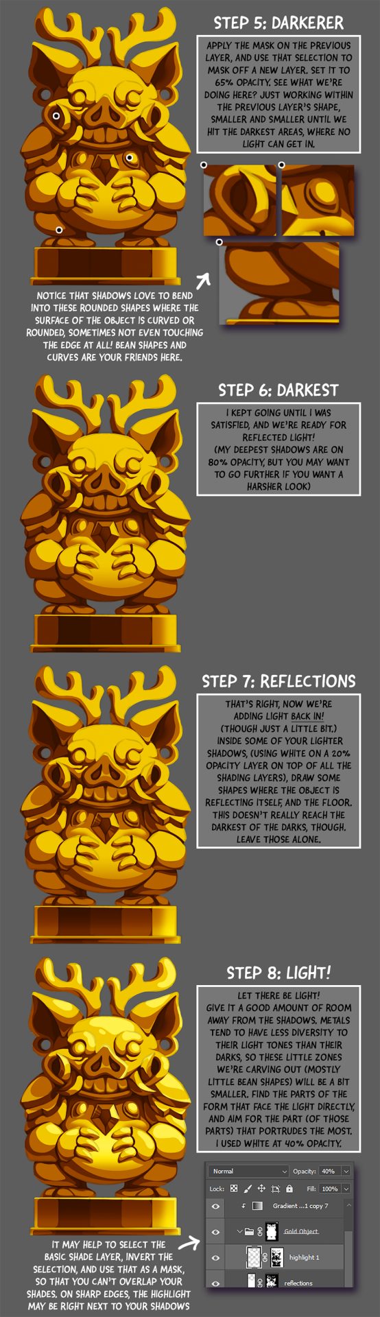
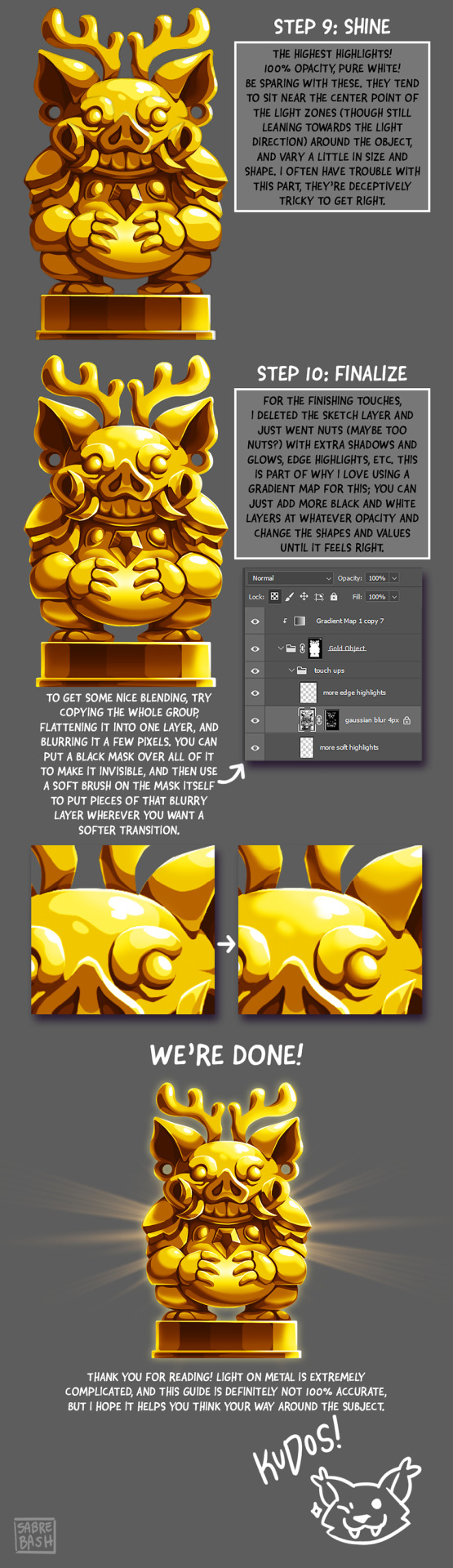
I have to draw a lot of gold and metal for my work, but wasn't happy with any of the metal tutorials i could find around. I prefer really specific instruction, so after some research i put together what i think works as a generalist's guide/tutorial. Not perfectly accurate, but i hope it's helpful!
#tutorial#tutorials#art#painting#artists on tumblr#reference#art reference#useful#art tutorial#art resources#tips#longpost
31K notes
·
View notes
Text
can’t stress enough that this is where they make you start in your freshman year of art school foundational classes. this is The Place to start. put down the AI and lock in
@dimiclaudeblaigan asked for a tutorial on how to begin drawing. Good news! If you can draw a funky looking stick man, you have already started!
I think that stick people are a great starting point for artists because of the things you can learn from them that will be important later on.
If you are able to draw a circle and a couple of lines, you can easily put together a stick person.

Congratulations! You have started to draw. :)
A stick person is a very minimal artistic representation of a real life person. It is simple yet recognizable, and is widely used in art, media, and signage.
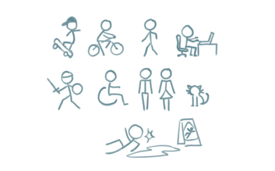
But what can a stick person teach us about drawing people that look more like… well, people? Lets have a look!
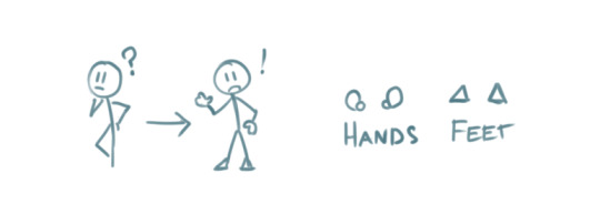
By simply adding a few more lines, we can add a pair of eyes and a mouth. Maybe even a little triangle nose! Or half circles for ears. We can now draw a face, which provides a basis for all sorts of expressions.

These simple additions can allow us to explore the wide range of human emotion and individuality.

This may seem like the basics of the basics. But that is what we want! In order to get to the point where we are able to draw complex, elaborate representations of humans and objects, we will need to start with simple shapes like lines and circles and build our understanding from there.
For instance, lets give our stick person some cool new features, such as hands and feet. I chose little squiggly circles to represent hands, and triangles to represent feet.
We can go a step further and modify the body of the stick person to include shoulders, hips, elbows and knees. These parts of the human body are quite complex in real life But here, all we need to do is add a few simple lines and dots to our stick person.

The lines provide some additional structural elements to our stick person's body, which are the shoulders and the hips. The dots indicate the points of articulation - elbows and knees, the places where the arms and legs bend!
Now we can use our stick person to show us an even wider range of human movement, action, and expression.
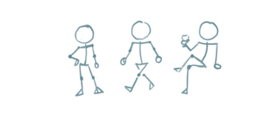
Our little drawing of a human being is evolving! All it took was adding a few more lines and shapes here and there.
By elongating some of the existing lines and making the head an oval instead of a circle, we can give our stick person proportions that resemble that of a real life human.
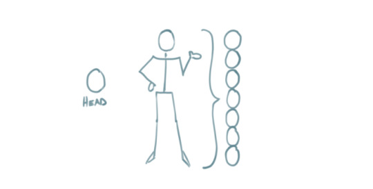
By this point, we have managed to add more complexity to our stick person simply by using our ability to draw lines, circles, and other basic shapes!

These basic ideas are the building blocks that will enable us to create more complex shapes.
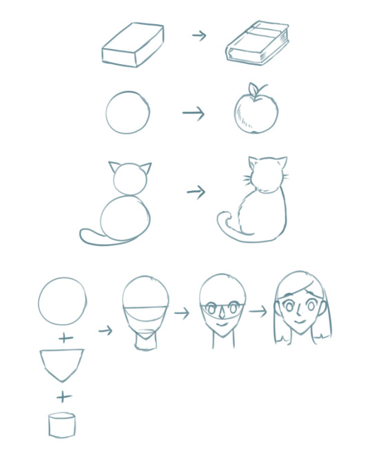
The next part may be a considerable step up if you are absolutely new to drawing, but I have decided to include it in order to show you how complex objects like the human body can be built from shapes that are a bit more complex than circles and lines.
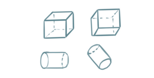
For example. Two ovals and a rectangle can be combined to create a cylinder.

Six squares can be combined to create a cube, or a box. Here, each square is distorted slightly depending on which way the cube is facing.

Note that the back faces of the cube and the bottom of the cylinder are hidden. These shapes allow us to visualize that which should not normally visible.
A sphere from all perspectives can be represented by a circle. But we can make it more like a sphere by adding lighting and shadow if we so desire.

Cubes, cylinders, and spheres are examples of 'solid shapes' because they consist of 3 dimensions.
Lets see how these solid shapes can be used to compose the human body.
By stacking three cylindrical objects, we can create a torso. Two spheres have been added to form shoulders, while a smaller cylinder forms the neck.

An arm is an alternating sequence of spheres and cylinders connected together. Note that the hand has been simplified for this example.
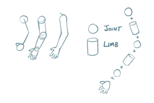
We can apply these solid shapes to the rest of the body to give us a more recognizable representation of the human form. It doesn't even have to be perfect. And just like that, our stick figure now has a silhouette that is unmistakably a person!
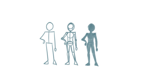
In the above examples, notice that we kept the stick person at the beginning while building up the shapes and solids around it. This is because the stick person serves as a guide for positioning the body and its various parts -> also known as posing.
You can do the same thing to everyday objects! Here, I drew a wine glass by stacking these three dimensional solid shapes.
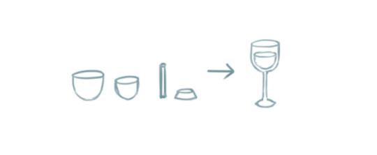
The cup and its contents are two ovoid shapes that were cut in half. The stem is a very thin cylinder shape. The base is a cylinder with a slightly wider bottom.
Solid shapes help inform us how objects and parts of the human body may appear from different perspectives.
For example, a sphere can be used to demonstrate how the human head appears when looking up or down, turned to the side, or tilted at an angle.

With these examples, I hope I have managed to convinced you that if you can draw a circle and a couple of lines, you can draw a person! You just have to train your eye to recognize the simple shapes within complex objects. Try it with everyday objects as well! Or even your favourite media! A drawing subject can be as simple or as complex as you envision it to be.
Once you have mastered that, there are many aspects of drawing you can explore from here that may require you to seek additional resources or a fellow artist's advice.

Last of all, remember that drawing is an iterative process. Even if you draw something correct the first time, you will need to draw it again and again to get it right all times! And by making small changes like the ones we explored in this tutorial, your drawings will gradually transform!
I hope what I've demonstrated here are enough to provide the basics of how to get started with drawing objects and people, and also to help refresh more experienced artists. :) Hopefully I didn't go too off topic with what was requested, and let me know if there are any more questions I can answer.
Cheers :3
28K notes
·
View notes
Text
Weathering Tutorial
Thought I'd write up a quick tutorial to how I approach weathering for my gunpla kits. Typically, I'll do a quick gunmetal drybrush of the grey parts of a kit before I start building, as well as correcting any colour inaccuracies. This tutorial covers some of the things I do to a kit after it's built, to give it a more "lived in" look.
For the best effect, I apply stickers and other decals before weathering, as well as graffiti. This way, weathering cuts through or over these designs, helping tie them to the kit a little better.
The example kit here is the HGUC 1/144 Nemo, which I'll upload a review for soon that should be linked in the future.
Bullet Holes & Impact Points
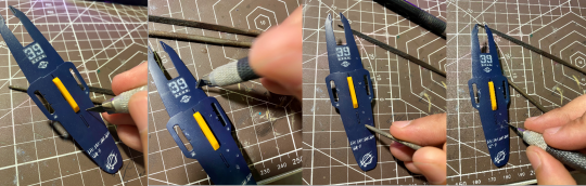
I typically use a hobby knife, pressing it into the surface of the plastic to make a small mark where I want the bullet impact point to be.
Usually with a blade that has a damaged or flatter tip, I'll spin the blade around, just like you'd use a hand drill (although I don't have any of those, so this suffices). Holding the blade at a slight angle will make the hole wider and a little more bowl shaped, just like a dent from an impact point.
Using a round metal file, I widen some of the holes and bevel the edges. Apart from making the hole a little more visible, this also creates a bit of a raised edge.
A starburst pattern can be created by cutting a few shallow lines with a knife traveling out from the centre of the hole, creating the implication of shrapnel from a shattered round.
Armour Chips and Edge Damage

Using a round file, I carve a rounded indent into the edge of the armour section. Depending on the angle you use and the position of the indent, this can come across as a dent or a chip of armour blown off. You can see what this looks like in the second image.
After this, I'll use a hobby knife or an angled file to cut deep grooves heading outward from the dent, as well as on their own to create cuts and chips along more acute angled on armour pieces (think the 90 degree angle on a square leg piece). As additions to the rounded damage, it can look like shrapnel damage from an intial angled impact. On their own, more angled chips give high points on armour a more worn effect.
Paint Damage (Sponge Chipping)
This utilizes a technique I learned from @radiofreemagica a few months ago. Give their blog some love!
Sponge chipping involves lightly applying paint to areas you want to appear chipped or worn using a sponge. The effect is that paint is applied as a series of small spots, which if done right should look as though the pain has fallen off in large flakes. The sponges here are simply offcuts of an old kitchen sponge.
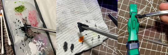
For my first pass, I use a slightly heavier application of black paint.
Dab a little of the excess off on a piece of paper - you want the impression of the sponge to come across clearly for the small little dots. If there's too much paint on the sponge, it'll blot onto the model and obscure detail.
Apply the paint across raised edges, especially corners, where the mech or vehicle is likely to experience the most friction. Try to be measured on application - not every raised edge needs to have chipped paint!

For the second pass, a gunmetal is appropriate. Use an even smaller amount of paint.
Dab the gunmetal over the top of your black. This will make it look as though underneath the black "primer" is bare metal.
Drybrushing
This step helps to augment the wear and tear established with your sponge chipping. Using a lighter metallic, you can emphasise the idea that under the bright colours of the model kit is tough metal plating.

My go-to drybrush for this is Citadel's Necron Compound, which is a drybrush-ready silver. Usually I prefer cheaper and more dilute Vallejo Air, as it reduces the risk of drying out or clogging in the bottle, and doesn't need to be thinned. However, Citadel's technical paints are really well made, and worth the extra cost.
For a drybrush style paint, you only need to wipe a little excess of your drybrushing brush. For a typical silver acryllic, you'll need to keep wiping until only a little silver comes off the brush, enough to only stick on the high points. You can use a specific drybrushing brush for this, or just any old brush that you don't care about abusing a little.
Only lightly tickle the raised edges with silver. A little goes a long way - you just want the edges of the armour segments to catch the light and give the implication of worn metal.
Painting the Damage
Coming back to the damage we carved with files and knives, it's time to give the impression of metal underneath them, rather than plastic.

For this, I'll use a plain silver acryllic, something around a flat aluminium rather than chrome or purer silver.
With a small brush, apply the silver paint into the chips, cracks, and bullet holes you made earlier. Make sure to work it right into the thinner recesses, and wipe away any excess with a cotton bud.
Next, to bring down the tone and to add depth to the damage, I use a black wash. You can buy premade acryllic washes, or even use something like liquid panel liner, but I prefer to just make my own.
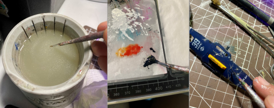
Make sure your brush is very wet, picking up water with your brush.
Mix with the paint until it is very thin. You should be able to see through it.
Apply it into the bullet holes and cracks, letting it flow into the deepest sections just like with a panel liner, and wiping away the excess.
This should make the damage look a little deeper, and give it a bright edge from the silver.
Finishing Up
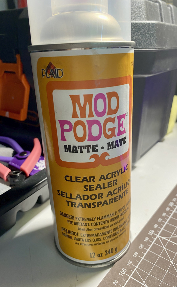
Make sure to give your kit a protective topcoat, so that all your paint doesn't get chipped off when posing or moving your kit! I use a matte finish pray on sealer. Right now I'm using the Mod Podge clear acryllic, but in the past I've also used bog-standard Rust-O-Leum Matte Clear varnish without any issues. It's important to cover or mask off any clear or gloss parts when doing a matte finish, as these will ruin the parts and it's very difficult to clean them once the topcoat is set.

And that should be everything! Now your kit should look a lot more metallic and worn. Depending on how much you add, you can make your kit look anywhere from it's first fray to a beaten and dilapidated mech abandoned in the dirt. Let me know how you go with this tutorial!~
#gunpla#my gunpla#plamo#model building#model weathering#weathering#model painting#painting#tutorial#weathering tutorial#my tutorials
112 notes
·
View notes
Text


Was asked how to draw water splashes so I made a tutorial covering how I made my splashes. Decided to share this tutorial here as well. It came out lengthier than I expected, but I hope it is useful!
#water#splash#tutorial#art tutorial#my art#i use this coloring method for majority of the water effects i did for my phantom comic
69 notes
·
View notes
Note
I love how you draw hair so much omg I'm mesmerized, do you have any tips for artists who would love to draw hair this well?


i did a whole ass tutorial, hope you dont mind cuz i got so hyped of this ask
also thank you for kind words! if you have more questions feel free to ask cuz my explanation could be weird and messy
27 notes
·
View notes
Text

Tutorial on how i make skin shading u can use it freely, have fun
42 notes
·
View notes
Text
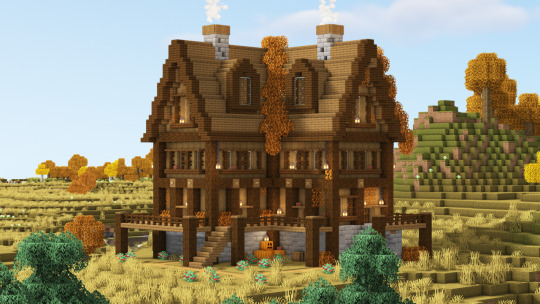
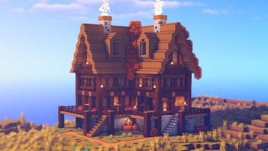
🍂 Autumn Survival Base 🍂
Here's a before-and-after look at my Autumn Survival Base (yes i built this in survival)! Sometimes, the smallest changes make the biggest difference. Adding a trim to the roof and bringing more of the background into view made this whole build feel way more polished and complete! 🌙
My favourite part? The alcoves in the roof. They flood the attic space with light, making it feel warm and inviting, exactly the cosy autumn vibe I was going for! ✨
The full wraparound porch ties everything together, giving it that classic countryside charm. And, of course, the lower level is a horse stable, so your trusty steeds have the perfect place to stay 🐎
17 notes
·
View notes
Text


my recipe for drawing hands!
(small note that this is a shortcut that is more abt style and ease than anatomical accuracy. it helps to take time to really properly study hands, makes it easier to bend the rules a bit like this and have it still look good!!)
(learn rules b4 u break them or whatevah)
#qna#tutorial#guide#drawing tutorial#digital art#illustration#drawing#artists on tumblr#my art#clip studio paint
59K notes
·
View notes
Text
how to wave magic wand by 街头尬术师【魔法披风】
16K notes
·
View notes
Text
⭐ Pixel Art Fundamentals - Hue Shifting
This technique is not uniquely specific to pixel art, but it's a very common term to hear when starting out watching those "dos and don'ts" videos. So what is hue shifting?
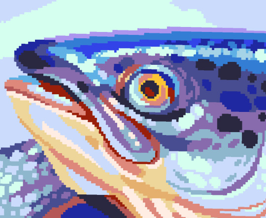
Hue shifting basically means to change the hue when making your shade darker or lighter. In this context, 'hue' = colour!
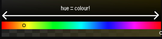
You may hear 'you need to hue shift more' when getting feedback on your art, but what does that mean really? Here are some examples:
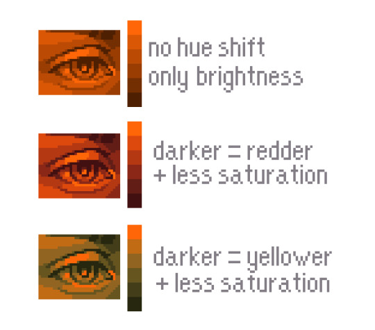
We can see even with just a bit of hue shifting, we have quite a different vibe for each drawing. In warm / daylight settings, no hue shifting can sometimes look a bit muddy or grey.
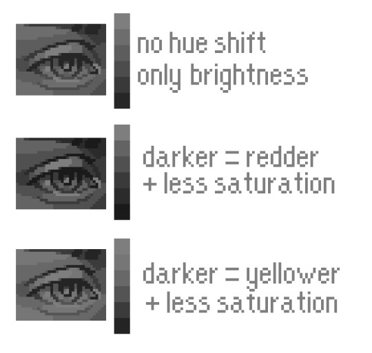
If we swap the image to grayscale, you can see that they look much the same:
As long as the hue shifted colours have a brightness that makes sense, they usually will work. You can get quite wacky with it.

But is hue shifting always good? Not necessarily.
Below is some of my art where I intentionally didn't hue-shift at all. You can see it gives them an uncanny, digital, or photographic kind of look. As always, techniques are about your intention, or personal style.
I recommend trying different hue shifting methods! I especially love to use a cool blue or teal for the lighter shades.
Thanks for reading and I hope this helped a little! Have fun with it!!
⭐ Read my full pixel art guide here!
#pixel#pixelart#pixel art#pixel art tutorial#tutorial#art tutorial#colour theory#color theory#hue shifting#art#illustration#pixel illustration
5K notes
·
View notes
Text
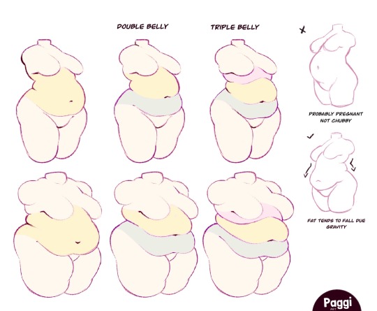
Excellent tutorial to drawing cubby body types
“Some chubby guide for y’all!”
Source: paggiart on twitter
#art tutorial#digital art#art reference#tutorial#art tips#human anatomy#drawing anatomy#drawing torso#drawing stomach
47K notes
·
View notes
Text


ive been wanting to make smth like this for a little while now and i finally finished it up ^_^ hopefully my tricks are helpful
EDITS: since this post is gaining a lot of traction, i want to highlight some of the suggestions and addendums that other people have made. i'm imperfect, which is why i recommend that you use references of real people along with my simple tips!
as many have pointed out, the yellow in the last diagram should cover the entire body, especially around the stomach area. the only parts of the body that are consistently bare are the palms of the hands and the bottoms of the feet
check out this reblog from @proxykiwi for a diagram of the distribution of hair on the back of the body
the texture of the hair can differ between the head and the body-- much of the time body and beard hair is curlier than the hair on the head
like when drawing head hair, its helpful to break up facial hair into descriptive shapes, and add lines for texture as needed. i tried to communicate that in the images, but i think its also useful to write it out
check out this reblog from @jodjuya for a detailed explanation of how beards tend to grow throughout teen-adult years
thank you to everyone who's suggested and added things! i encourage people to look through the replies and reblogs of this post for more information
11K notes
·
View notes