#THEN TOP LAYER DETAILS THEN OVERLAYS THEN
Explore tagged Tumblr posts
Visit Tumblr Blog
Explore Tumblr blogs with no restrictions, modern design and the best experience.
Last Seen Tumblr Blogs


Fun Fact
Tumblr has a low social media market share in South America.
Text
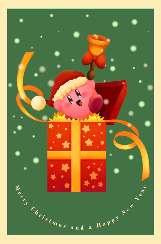
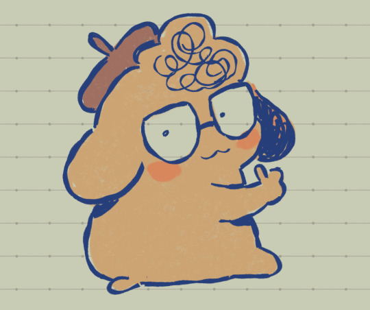
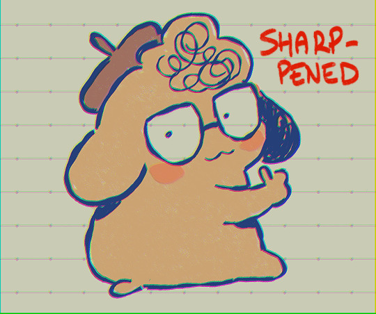
Merry Christmas and a Happy New Year!!!
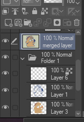
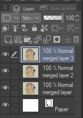
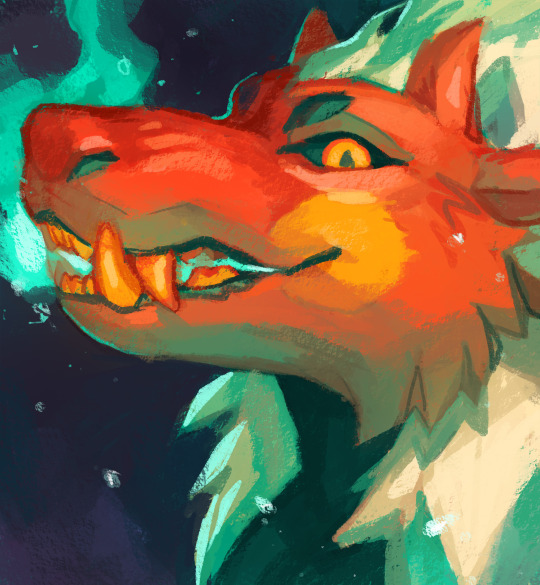
Fun fact, in making this image it was surprisingly my most easiest yet visually pleasing work. I've always viewed at as a graph like this
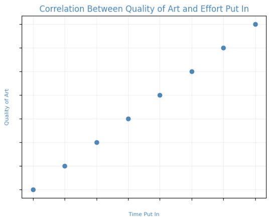
Of course, that isn't true! It's more like this
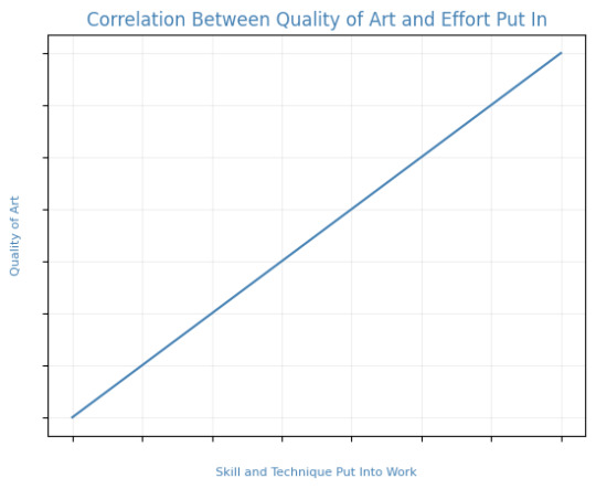
That is to say, I believe this illustration allowed me to focus on the efficient fundamentals I built!

Everything here was rendered with only three brushes. All of them the default brushes that come with CSP. Which includes Pastel, Airbrush, and Mechanical Pencil. Because it was a lineless style, that means I could be a lot more forgiving of mistakes here and there. Something doesn't look right? All I gotta do is add a little more with the GPen to the shape. Or can I just draw an outline in the color I want and fill it in with the bucket tool with a area scaling of 0.10! I have to practice more with lineless styles, it is fun! Rendering was a breeze too.
Which was a simple process of:
Create shape > Shade with Airbrush > Highlight with Airbrush > Shade with Pastel > Multiply Shading > Lower Multiply Layer Opacity > Overlay with Textured Fill > Move Textured Fill Layer > Finished!
It's a few steps, but once you get into the groove, it becomes very efficient. I'm sure there's ways I could shave off a few layers, like combining the Airbrush process into two layers instead of one but ehhh sometimes I do it, sometimes I don't. Usually, the bigger the shape the more likely I'll use more layers and the smaller the shape the less likely I'll use more layers! Of course, this process isn't a concrete ruling. Sometimes, I'll use more layers for extra things like the bell required more layers for rendering the shininess of metal! Anyways, I would like to believe I did a decent job at recreating the feel, the vibe, and or general look of an old Christmas Card that's more retro in nature. With a focus on simple shapes, a lineless rendering style, and using textured brushes to render, I think I got it down packed. I used a tiny bit of Chromatic Aberration to give it a little bit of a visual pop, and brighten up the colors. It's subtle, but it works.
Oh, and here's something cool! To get a more embossed Christmas Card feel, I used a new tool that came with Clip Studio Paint!
N O R M A L M A P !
Cool, right? I use a pirated copy of Clip Studio Paint 3.0 and it comes with a tool that allows you to create normal maps from illustrations. Which, from what Google tells me: "A normal map is a texture mapping technique used to add surface details to 3D models without altering their geometry" ...Neat!
Anyways, here's what it looks like
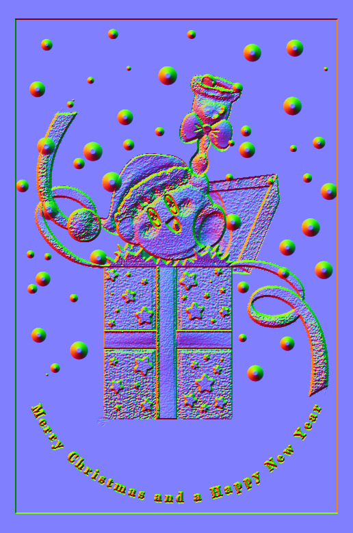
Freaky, right?
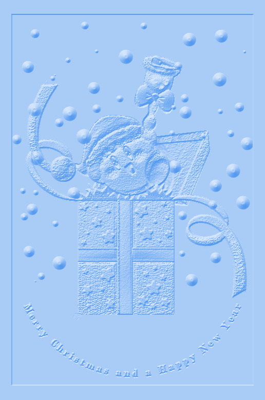
It looks like an embossed letter when you set a layer color to it too!
Anyways, I overlayed it on top of the finished illustration, set it to multiply and set the layer color to a warm yellow and it gives it not only texture but a sense of depth too! It's super cool, if you digitally paint you should try it!

With Normal Map Overlay Effect

Without Normal Map Overlay Effect
It's subtle but it's there.
Anyways, that's enough blathering from me! Merry Christmas everyone! I'll be answering some asks this week, so stay tuned!!!
38 notes
·
View notes
Text
okay I know the amazing spiderman 2 isn't the best but why does Electro's theme FUCK
#OUGH#I'm biased because I already liked dubstep and equivalent sounds but I think for an electricity themed character it works SO INFINITELY WEL#Also that electric guitar (I think?) repeated set of chords that starts early on#I love it#The whole theme's such a mishmash of almost incongruous sounds and I think it works for this anxious terrified character growing into#A massively powerful villain#Also when the strings and choir-sounding cacophony kick in????? This is my duel of the fates#Also the crackling electricity sounds overlaying the music. It's cheesy it's over the top it's one of my favourite details#It just adds a chaotic layer to the whole piece that really pulls it together#God. Anyone else? Is anyone else normal about this? Hello? Hello please anyone help me
0 notes
Text
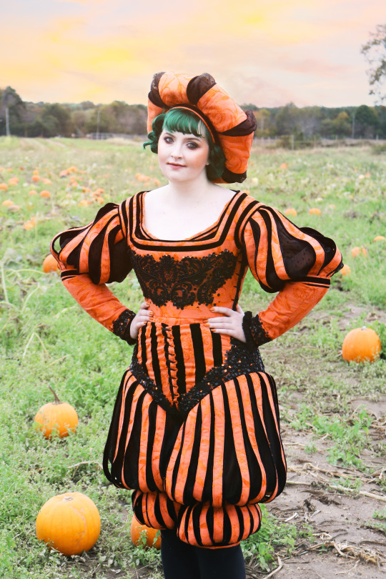

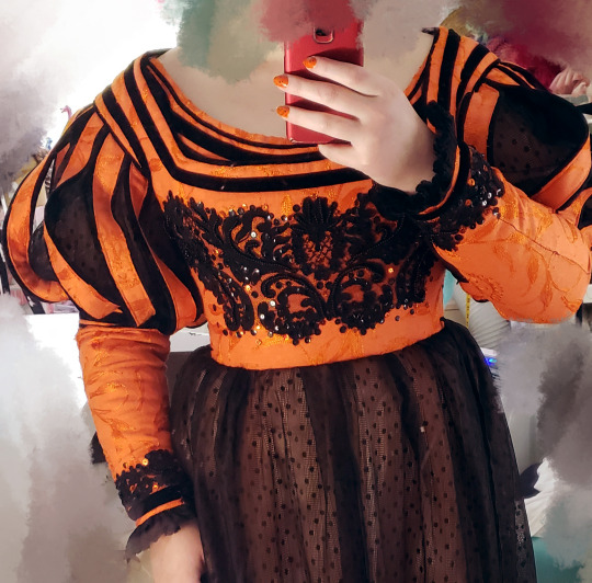
i'm so glad you guys like this costume! it is one of my favorites. but I put my absurd pumpkin pants on one leg at a time just like everyone else.
...literally
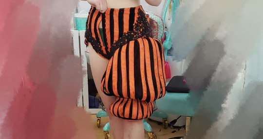
anyway, here are some construction/project notes/wip photos in case you don't have 50 minutes to spare for the full video about making it!
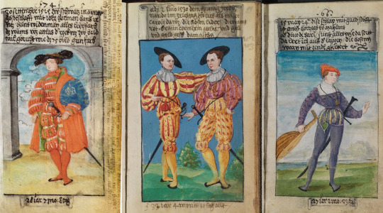
inspo wise, The First Book of Fashion: The Book of Clothes of Matthaeus and Veit Konrad Schwarz of Augsburg [this is an affiliate link] served as the major influence for this. the book is basically documentation of what this man and his son wore to major events in his life over a period of decades. he was getting ootd painted before it was cool.
the base pattern for the pantlegs came from another pair of ridiculous pants I made a few months earlier.
the paned portion is made from homemade piping sewn to strips of jacquard that are backed with twill tape to prevent fraying.
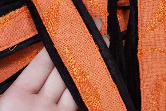
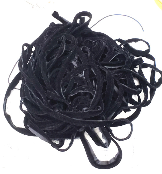
I made so much fucking piping for this oh my god. each of these strips was 20"+ long, both sides have piping, and these are the panes for ONE LEG. there were also sleeves. we're talking like 60+ yards of piping.
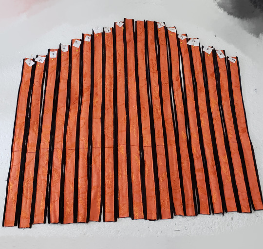
perhaps unsurprisingly, these strips were too thick to gather. so instead I had to overlap them to create the shaping over the leg. it looks OK but isn't ideal.
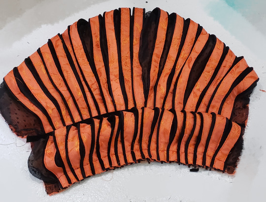
after this was done, velvet ribbon was sewn over the marked point to hold them in place.
oh! I also sewed a layer of mesh over the orange base fabric to dull it somewhat and provide contrast before sewing on the bands.
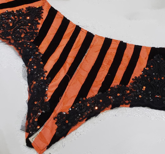
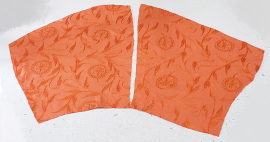
the upper portion of the pants was made from even strips of velvet and jacquard seamed together and fitted over a cotton base. the appliques were added to cover the fact the stripes meet at an angle at the side seam, and I sewed on orange sequins because I like sequins.
the happiness I felt when this fit was immense, I must say.
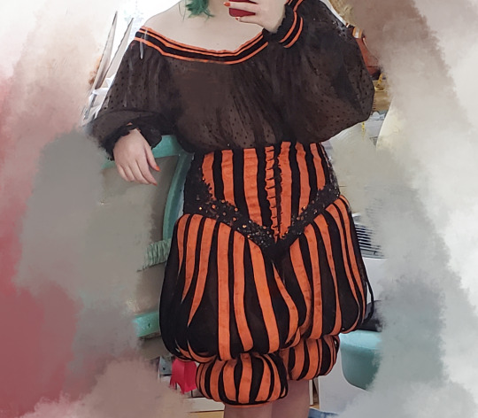
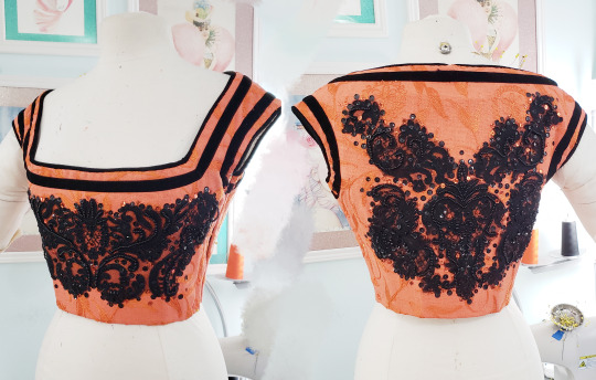
the bodice is two pieces, one for the front, one for the back. it laces up the sides with hand sewn eyelets. it wasn't very flattering as just an expanse of orange of the chest, so I added appliques to the front and back, too.
the black detailing around the top edge is made from varying widths of velvet ribbon.
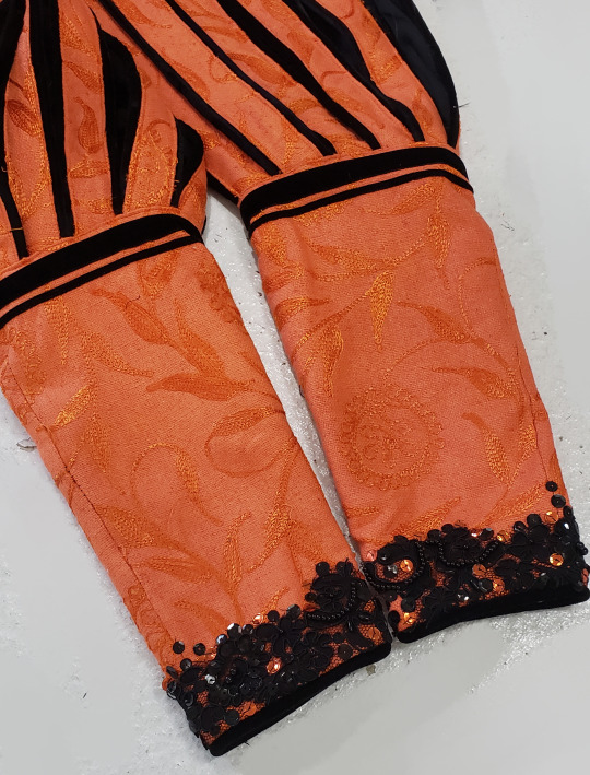
the sleeves have similar elements of everything shown above--a paned upper portion, velvet ribbon trim, and a bit of lace at the cuffs.
unlike most of my projects the sleeves have no lining forcing the shaping, what you see beneath/between the panes is the chemise worn beneath this. it's made from the mesh used as an overlay on the pants with a jacquard/velvet ribbon collar which you can see peaking out above the neckline of the bodice.
oh! and then there is the pumpkin hat! there is a video on patreon about making this somewhere, I think.
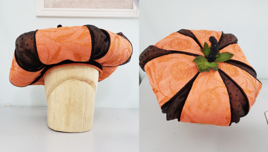
and it's just that easy to live out your renaissance pumpkin prince/ess dreams!
7K notes
·
View notes
Text
HOW TO GLAZE YOUR WORK WITHOUT A GOOD PC(or on mobile)/TIPS TO MAKE IT LESS VISIBLE
Glaze your work online on:
Cara app. It requires you to sign up but it is actually a good place for your portfolio. Glazing takes 3 minutes per image and doesn't require anything but an internet connection compared to 20-30 minutes if your pc doesn't have a good graphic card. There IS a daily limit of 9 pictures tho. Glazed art will be sent to you after it's done, by email. It took me 30 minutes to glaze 9 images on a default setting. Cara app is also a space SPECIFICALLY for human artists and the team does everything in their power to ensure it stays that way.
WebGlaze. This one is a little bit more complicated, as you will need to get approval from the Glaze team themselves, to ensure you're not another AI tech bro(which, go fuck yourself if you are). You can do it through their twitter, through the same Cara app(the easiest way) or send them an email(takes the longest). For more details read on their website.
Unfortunately there are no ways that I know of to use Nightshade YET, as it's quite new. Cara.app definitely works on implementing it into their posting system tho!
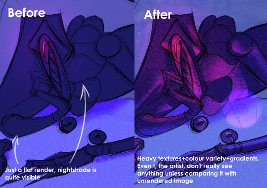
Now for the tips to make it less visible(the examples contain only nightshade's rendering, sorry for that!):
Heavy textures. My biggest tip by far. Noise, textured brushes or just an overlay layer, everything works well. Preferably, choose the ones that are "crispy" and aren't blurred. It won't really help to hide rough edges of glaze/nightshade if you blur it. You can use more traditional textures too, like watercolor, canvas, paper etc. Play with it.

Colour variety. Some brushes and settings allow you to change the colour you use just slightly with every stroke you make(colour jitter I believe?). If you dislike the process of it while drawing, you can clip a new layer to your colour art and just add it on top. Saves from the "rainbow-y" texture that glaze/nightshade overlays.
Gradients(in combination with textures work very well). Glaze/nightshade is more visible on low contrast/very light/very dark artworks. Try implementing a simple routine of adding more contrast to your art, even to the doodles. Just adding a neutral-coloured bg with a darker textured gradient already is going to look better than just plain, sterile digital colour.
And finally, if you dislike how glaze did the job, just try to glaze/shade it again. Sometimes it's more visible, sometimes it's more subtle, it's just luck. Try again, compare, and choose the one you like the most. REMEMBER TO GLAZE/SHADE AFTER YOU MADE ALL THE CHANGES, NOT BEFORE!!
If you have any more info feel free to add to this post!!
7K notes
·
View notes
Text
day 4/24 - obx christmas countdown
‘If it's true love, that he thinks of, so next Christmas, I'm not all alone’ - Ariana Grande, Santa Tell Me | smut-fluff | jj x fem!reader
You and JJ had been messing around together since summer. Summer. That’s six whole months of sneaking out at all hours of the night to the Chateau. Six months of being tangled up in bedsheets with JJ’s sweaty, sexy body. Six months of life-altering orgasms and six months of repressed feelings. But like a trained marine, you had experience with pushing down your emotions. As of now, you’d been a professional at denying yourself love. But you knew that you did love JJ. How could you not? It was as if God had read through your checklist of your dream man - good-looking; good in bed; good at heart; good humour - and sculpted JJ Maybank and plonked him down in your town. And you made a silent, secret pact with yourself that if nothing had changed by January - if you didn’t confess your feelings, and find out if JJ felt the same - then you had to go cold-turkey. No pun intended.
That secret pact was awfully hard to stand by when you’re stood in some random local kid’s house for a Christmas party and spot JJ walking across the room. He’s so pretty you want to cry. So effortlessly beautiful with his hair perfectly tousled; his jawline sharp like carved ice; smirk shadowed on his skin like a wine stain. The loose jacket overlay hangs handsomely on his shoulders as if tailored to his body. The moment his eyes flit across the room and meet yours, you’re amazed you don’t melt into a puddle and rip your clothes off on the spot. The spiked cider does little to ease your nerves as he casually wanders over.
“Merry Christmas,” he says.
“Right back at you,” you smile. The song changes to some poppy rendition of Let it Snow but you refuse to let yourself get in the mood. His words ring like a funeral march. You count down the days until the new year. The days which you had left to grow a pair and just ask.
“How’s the cider?” he asks, nodding down to your glass.
“Alright,” you uselessly reply. His fingers brush against yours as JJ takes the glass from you. He takes a slow swig and you shamelessly watch every tiny detail unfold: the bob of his adam’s apple; the dampness that lingers on his lips; the way his tongue darts out to mop it up. God, what you’d give to–
No! Stop it, stop it!
The pact - we must remember the pact.
You take the glass back and smile. He nods. “Pretty good.”
“Mhm.”
“So…Got any Christmas plans?”
“Just spending time with the family,” you say, shrugging. He nods again. You can feel the question stirring. See it in the way his eyes look at you, scanning over you as though your clothes are merely a figment of imagination; a philosophical theory that he’s decided not to buy into. You’ve seen that look many times before and ended up beneath it many more.
“What about tonight? Any plans?” he wonders slyly, his eyes darting over your figure from head to toe.
The pact, the pact, the pact, the–
“Not really,” you guilefully shrug. You flash him that smile that always seems to work. The rest is a blur of ditching glasses, intertwined hands, brushing past bodies, trying doors, until you end up in some random bedroom of this weirdly oversized house, with JJ on top of you.
His lips are hot and heavy as they kiss you. He pushes against you with a groan as if desperate to feel your skin on his. The layers of clothes are rude now, keeping the two of you apart, but you’re too distracted by the feel of his lips on yours, the erotic way his tongue brushes against yours in a way that has you yearning for more, to shed them.
JJ coaxes you back against the pillows of some poor stranger’s bed. His lips are wet and prurient as they stray from your mouth, onto your neck. Your breath comes out short in sighs, whining, as you paw at his face and his neck and his body. You tug off his overlayer and he shrugs it off, his hands quick to return to your body. One slips below your breast and the other cups at your cheek, gently guiding your face just-so to give him more skin. He knows your body so well it’s as if he’s found the map and memorised it. Knows every short cut and every route. Knows what to do that has your body pulsing, pussy weeping, desperate for more.
Somewhere through the layers of walls, you hear the music change. The voices of party-goers are muffled and in the erotic haze, your thoughts clouded and mind foggy, you forgot where you were. Santa tell me, if you’re really there… Ariana’s voice rings out through the house and some girls sing along loudly. It feels as if they’re condemning you in tuneful, cheery lyrics.
“Wait, wait,” you murmur. Your body can’t believe what you’re doing as you softly push JJ off of you.
His lips are swollen and wet, eyes hooded and pupils dilated, cheeks adorably pinkened, as he looks down at you. His arms flex damningly as he holds himself, hands placed either side next to your head. His breathing heavy just like you.
“What’s up? You okay?” he murmurs.
You swallow and shake your head. He frowns and eases off you, sitting back on his haunches. You sit up too.
“What’s wrong?” he asks, brushing his hair off his face.
You tug your cardigan around you and glance off to the side of the room. Your eyes survey the chest of drawers and the array of pictures and trinkets atop of it. JJ murmurs your name and it sends you back to the very first night, in clammy June. You’d always been keenly aware of JJ Maybank’s existence. Hell, everybody on Kildare island was. The night his eyes landed on you and his attention switched was the night your whole life veered off course. It’s easy to not miss something you never had. But now you’d had a taste and JJ was like a forbidden fruit. After that night, you wanted more. However, it seemed like JJ did too. The two of you kept seeking one another out at random keggars and house parties. Then it strayed from party scenes and instead ventured into more mundane settings, in which he’d extend an invitation, and the hook-ups were no longer kept to just the nights. Then it turned into phone numbers and mutuals on social media, which led to random conversations and exchanges of funny memes. It became this confusing blur of lines where JJ straddled something between being a friend and a fuck-buddy. And in that confusion came feelings that you tried to cram down like an overflowing box of Christmas lights.
“Woah,” JJ chuckles. You blink yourself back to the room. “Where’d you go?”
“I don’t know,” you say, chuckling a bit too. “Sorry.”
“You’re good. We don’t gotta do anything,” JJ shrugs. He grabs for his overlayer and your body fills with adrenaline. Your hand shoots out and grabs onto his arm. He looks at you, mildly concerned.
“Okay,” you say. He quirks a brow. “Okay, okay. I just need to get this over with because it’s been driving me crazy and I know if I don’t just ask, then I’m never going to ask, and I made to a promise to myself that I would ask and–”
“--Woah, woah, woah,” JJ laughs. He places a hand on each of your shoulders. His eyes gaze into yours and he smiles reassuringly. “Breath. Goddamn.”
You do as he says. He stays like that, waiting, and you take another shaky breath in. Your eyes slip shut as you mentally prepare yourself for the sting of rejection. It’s now or never. Rip the bandaid off. The confession comes out so quick it could be mistaken for one word.
“I have feelings for you.”
It’s hard to hear anything over the hammering of your heartbeat in your ears. The party feels as though it’s miles away. The muffled voices are nothing more than extractor fan hums. The music is nothing but croaking frogs and rustling wind. It’s all whitenoise now. Your breath sticks to your throat and your chest tightens with nerves as you wait. You can’t bring yourself to open your eyes. You’re too terrified to come face to face with JJ’s expression of pure horror.
They fly open when you feel his lips on yours though. The kiss is frenzied, rushed, desperate to have you close, almost. Your hands fly up and hover in the air, just shy of his face, but his are on your cheeks. As the kiss stretches on, your hands sink down to your legs and your eyes slip shut once more, and you loose yourself to the feeling of JJ kissing you as if you’re the last breath of air on earth.
“Thank fuck. Cause I wasn’t sure how much longer I could go without saying something,” JJ murmurs the moment his lips part from yours. Your eyes open up and he’s staring up at you. Beneath the usual cocky, confident facade is a shyness. A vulnerability. Maybe it’s in his smile - nervous, waiting, unsure. Yours must mirror it.
“Really?” you say, feeling a laugh want to bubble out of you.
“Really. Shit, I thought I was being so obvious, too.”
You laugh and shake your head. Sighing out, happy - no, elated - you gaze up at the ceiling. “Thank fuck.”
You’re more than happy to have JJ silence you with his lips on yours. For the first time in a long time, you won't have to spend Christmas alone.
#jj x reader#jj maybank x reader#jj maybank#jj#obx#outer banks#outerbanks#jj blurb#jj x reader blurb#jj maybank blurb#jj maybank x reader blurb#jj fluff#jj maybank x reader fluff#jj x reader fluff#outerbanks christmas countdown#obx christmas countdown#jiara#jj x oc#jj maybank x oc#jj concept#jj maybank concept#jj smut#jj maybank smut#jj x reader smut#jj maybank x reader smut#pogues#the pogues
170 notes
·
View notes
Text
missdollcouture
complete style guide: patterns, glam, staples, and more
i've developed a new style recently soo i thought i'd share with y'all. in this post i'll be covering everything from nail looks to closet must-haves
keep in mind this is just what I like, so if you don't, then you just don't


color combos
pink + black
charcoal gray + pink
black + cheetah print
leopard print + pink
white + hot pink
nude pink + plum purple
go to nails
deep french
pinkish nude ombre
bubblegum pink + white ombre
pink chrome
staples
layering tops
simple but chic sneakers
knee high boots
mini skirts (denim + cotton)
simple studs
hoops
a daily clutch
personalized jewelry (pendant, bracelet, etc)
kitten heels
bangles
pencil skirts
fur coats
classy sandals
corsets
denier stockings
glam
smokey eye
pink nude lip with brown liner
kitten wing liner
lightly arched brows
shimmer eyeshadow
clear lip gloss
sheer pink overlay
shimmery lip glosses
mac glitters
details
rhinestones
leopard print
lace + fur trim
heart hoops
zebra print
pearl detail
220 notes
·
View notes
Note
God, how you learned to draw? Its so hard and your stuff is far too pretty for my eyes
Every time I draw I keep repeating the same phase: Draw the vague idea of what I want to draw, hide that layer and do that again, overlay the two with each other, and then draw on top to average them out. And then I just keep doing that until the lines stop being different from each other.


And I then do the same with shading. Repeat ad nauseum.


Also everybody who has told you to never use smudge or blur tool is a liar or a coward, and I do not take advice from them.


Then I up the contrast to satisfaction, and by GIMP wizard bullshit that's too complicated and irrelevant to explain here, I make the shadow side a cool colour of my choice, and the light pale yellow (or whatever colour the light source is, or whatever looks good). Some assembly may be required.


Then I colour the object, and using various kinds of layer overlay fuckery, I put the shading on it (once again, layers and layers and layers doing vaguely what I want them to do, overlayed on each other and averaged out):


Smoothed out, averaged out, heehoo highlights


in conclusion, starting with black and white, shit tons of layers, smudging and tweaking and smoothing, and only after that fucking with colours, and only after that add details.
285 notes
·
View notes
Note
OMG JESPERS OUTFIT IS SO GOOD. JESPER IN GENERAL IS JUST SO GOOD YOUR DESIGNS ARE INCREDIBLE
Thanks!!! I love to design costumes and outfits so much. I'll take this as a oppurtunity to share some details from the Ch 3 illustration.
For this artwork, I wanted to feature my favorite garment (the leather jacket) and take the opportunity to draw the trio in more modern clothing.
For Jes, it's always about patterns. He's got three in this outfit, though I think he should have more to match his aesthetic. We've got warped checkerboard, cherries, and checkered hearts. The cherries weren't in the original plan, but I decided to add it because I love a good patterned lining (also a nod to a song on the playlist I'm working on for him).
And the riveted tie was a thing I found on pinterest. How cool is that?! I love rivets that don't have a function, especially on the side of jeans.
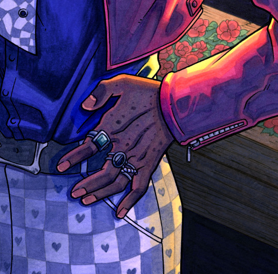
Each ring represents one of the characters! Green for Jesper, black for Kaz, and the braided one for Inej. This was probably my favorite part of the illustration due to the process. First, his hand was bright purple to make the brown overlay cooler but still keep some warmth to it. Then I used clear alcohol (0 for my fellow Copic users) to get the fine details on his nails.
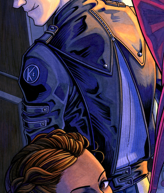
If there's a chance to give Kaz some sort of crow wing motif on his back, I'll take it. The jacket is semi-backless, revealing a light purple ribbed sweater underneath. There are three layers to the wings: the short ones snap and zip to the second layer, which then is sewn into the waistband of the third layer. He also has a "KB" patch, opposite to his "R" tattoo on his right arm.
As for his pants, I gave him patchwork jeans as a nod to the ever-iconic "not so broken" passage in Chapter 38.
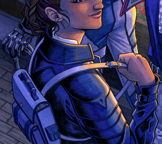
Inej's jacket is based on medieval knight armor, especially in the shoulder detailing. Some people have said it looks like a bird's beak at the top. Unintentional, but I thought that was a cool interpretation. While I didn't draw her real knives, I gave her a little one to go through her piercing. What book is in her backpack? I'll let you decide.
#comics talk#soc comic adaptation#six of crows#kaz brekker#inej ghafa#jesper fahey#character design#six of crows fanart#asks
204 notes
·
View notes
Note
Can I ask, how do you get that speckled texture on your art pieces? (Example: the visual texture you see on John’s shoulder in you most recent vampire piece.)
I’ve seen it in various online works for year—I really just wish I knew if it was a layer effect or a certain type of brush?!
I like it because it adds texture to pieces that would otherwise be kind of flat and it is just driving me damn crazy not knowing what it’s called/where it originates in programs (effects vs brushes vs some kind of other visual texture).
(Another popular effect I *just* learned the name for after years is chromatic aberration! It was such a relief to have a theme for it—because knowing what they’re called if the first step to me figuring out how they work!)
Hi! I believe it's called grain / noise. I’m on Photoshop and here are two methods I typically use to add that grainy texture: 1. Using a noise layer - Make a new layer on top of everything (fill with 50% grey, set to Overlay) > Add noise filter (3%) > Add gaussian blur (0.2px). Check this out for more detailed steps. I used this method for that piece!
2. Using texture images - Find a texture image you like > set the image to Multiply, Overlay, Soft light or Hard light (depends on your image) > Adjust opacity and brightness accordingly.

#nice catch I don't usually add this#just thought it fits the piece#hope this helps!#vampire wick#my art#art tips#ask
195 notes
·
View notes
Note
your rendering is so good how do you do it
Thanks, I love your rendering too!! Gonna try and make a tutorial ^^
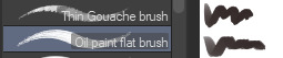
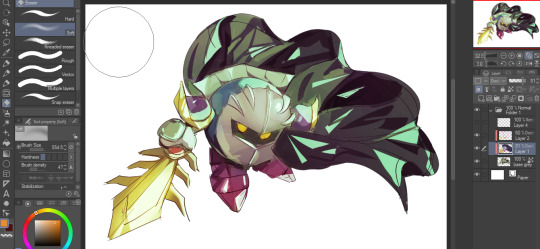
To start off, I'm on Clip Studio Paint and these are the brushes I use! First two for rendering characters (round brushes) and the other two for mostly backgrounds (square brushes)

I used to do lineart, but it takes too long >:( now I just make a sketch and sorta clean it up!

Next I fill it in with a gray color. For simpler pieces I just put in the flat colors, but for more paint-y pieces I do grayscale -> color! I'll be doing that here :)
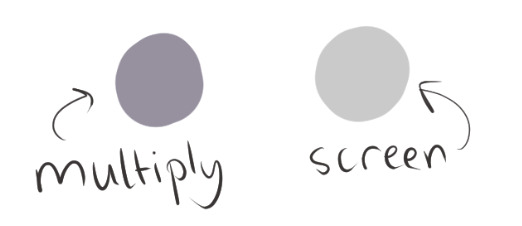
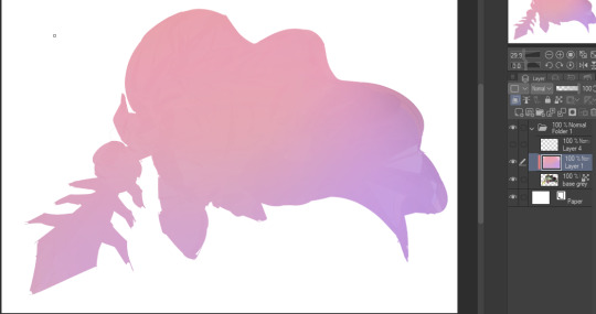
Also, I make 3 clipped layers on top of the gray - two are multiply, and the top one is screen. On the first multiply, I do a soft gradient using an airbrush
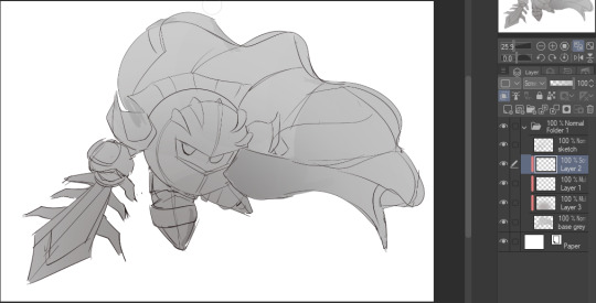
On the next multiply layer, I fill everything in with either a cool-ish or warm-ish gray, depending on the mood ^^
I also determine a light source, and use the lasso tool on the screen layer to block out where (I think) the light hits! Tbh I just do wherever feels right lmao, but I recommend having a reference! I like doing it in triangle patterns
Then adjust the opacity of each layer to whatever feels right, and merge everything (I don't merge the sketch/lineart yet, I do it before adding colors in!)
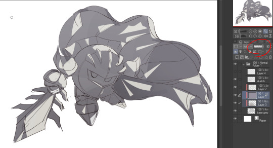
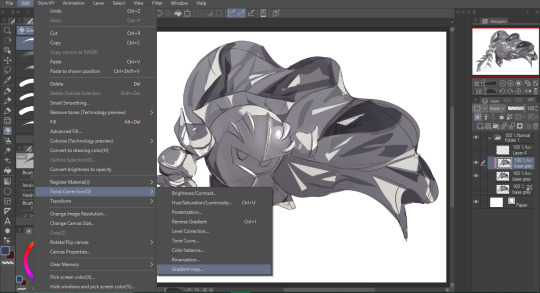
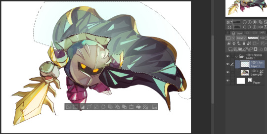
Now... rendering. Some tips I have are color pick (greys) off of the canvas and use them to paint! Clean up the sketch more, erase edges, but I save details (like Galaxia's red gem, his eyes, etc.) for the end, or during coloring.
After I'm sorta happy with it, I merge the sketch layer, then duplicate it, and add a gradient map! I did this sunset-y one but changed the hue to yellow-ish, then lowered the layer's opacity ^^
Play around with the hue-saturation-luminosity setting!
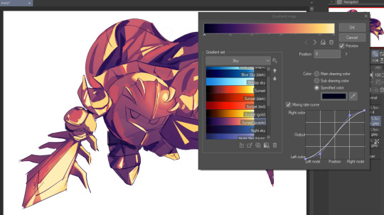

Now go crazy with blending modes! Multiply, overlay, color, glow/color dodge, etc. Feel free to layer them up on top of each other too, and this is to add the character/piece's actual colors in. For example, I used a white-blueish overlay layer for his mask and glove, blue for his cape, blah blah
Now I clean the sketch up/refine it more. Also, to "harmonize" the color palette, you can add a colored gradient on top. Then set it to multiply, and add overlay/glow dodge layers with any colors you see fit! I like using teal and light/warm orange! Here is an example of a colored gradient:
Another tip is to add saturated colors on the edges of both lighting and darker shadows, before blending it:

Also I usually add in a light blue/grey in shadowy areas, and lower the opacity for reflective light:

Also! You can lasso + use an airbush with a light blue to block out parts of the background (his cape here, for example). It helps with more depth!
Finally, I like adding sparkles on low opacity :3 And gaussian blur to certain areas! I'm using radial blur on this piece though ^^

For the background, I like doing blocky shapes!! I use my square brush on 90% ish opacity, to color pick different hues from the piece. For lighting I use a glow dodge layer, here's a mini timelapse as well as the finished art!
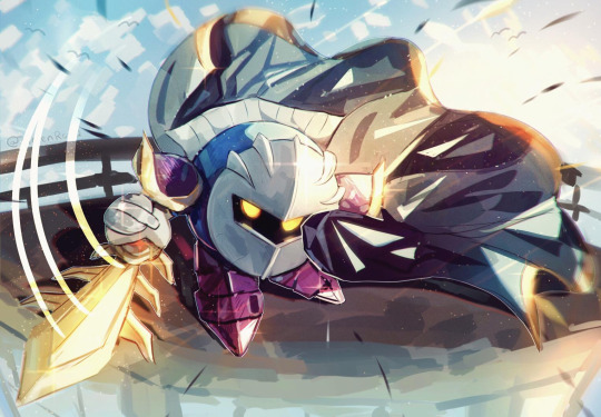
At the very end, play around with the hue/saturation and contrast tools to change the colors :)
#iiii hope this helped??#first time making a tutorial sorry!!#art tutorial#kirby meta knight#meta knight fanart#meta knight#nintendo kirby#kirby nintendo#kirby fanart#kirby series
546 notes
·
View notes
Text
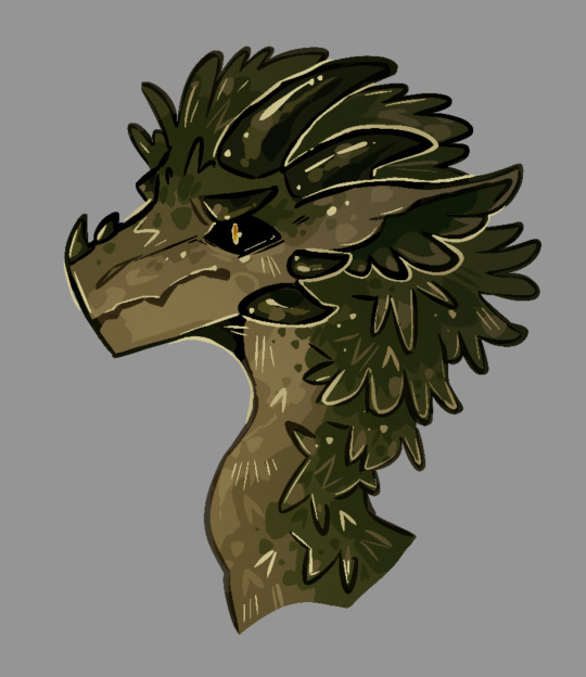
when the vegetable
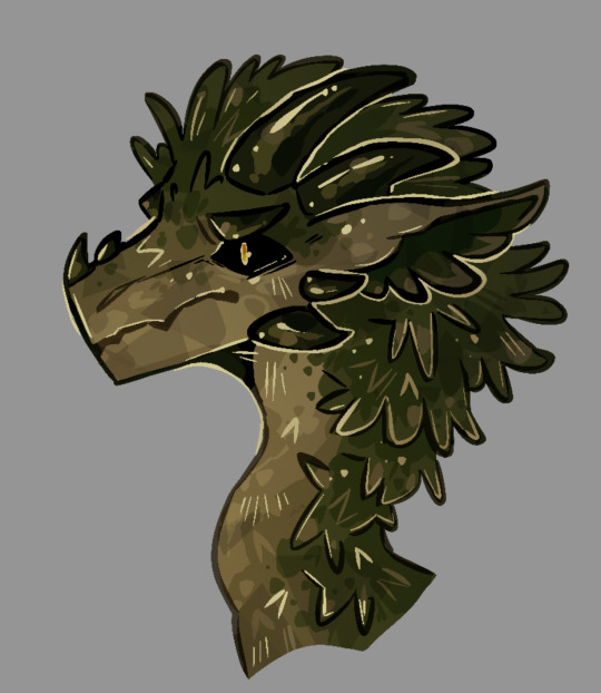
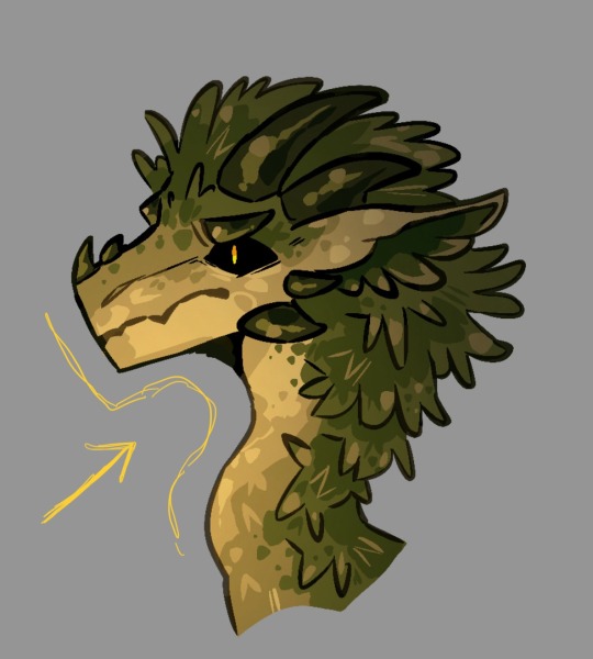
yayy tutorial for how to make your art look sorta like this? perhaps??
aka the way i render when wanting to make a doodle look more interesting without following any principles of light and color
yippee
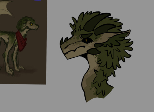
draw the lineart and the flat colors of your character. i’m drawing @chrometheraptor ‘s oc because silly, and using the syrup brush for everything but gradient overlays . (usually i use something more textured but this works for now probably maybe)
on the same layer as your coloring, use a darker color to add some basic shading to the more flat-looking areas of the design. bbut. not the whole character because i am lazy.
dots are good when you’re using a flat brush and don’t have the option of adding smooth painterly shading. they help to break up the planes to make everything look a little more natural
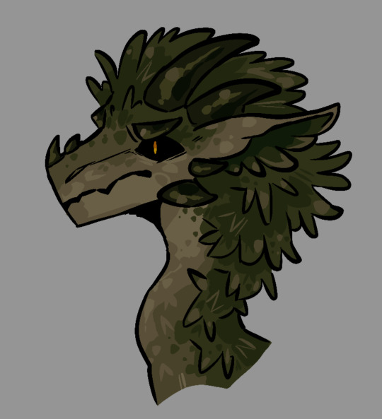
on the same layer, add minor highlights on places where the light would probably hit the character a little harder, like for here, the frilly edges of the moss. on moss. moss’ moss.
then, if there are parts of the character that would probably be smoother or more shiny, add lighter dots for highlights on top of the darker highlights. like on the horns. you can never have enough highlights.
you can also imply some texture while making the shading more complex. here, i put down some Gay Lines to make the moss texture look rougher, as well as the leafy v-looking shapes.
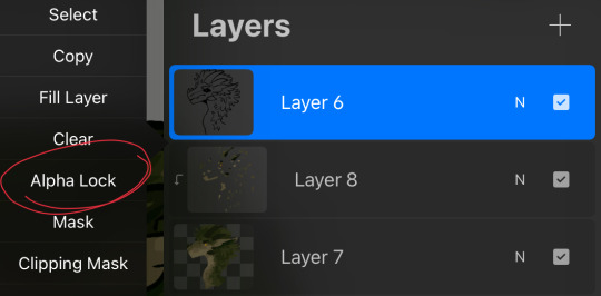
now, go to your lineart layer and set it to alpha lock. ignore the fact that the stuff i told you to put on the base layer is actually on a clipping mask
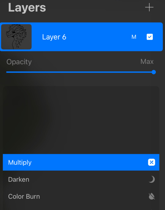
set it to multiply too. this way, you don’t actually have to bother with hue-shifting to make a darker color look decent
use the colors within the design to subtly color your lineart. i usually keep more important features like the eyes and horns black, and only lighten lesser details
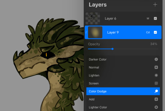
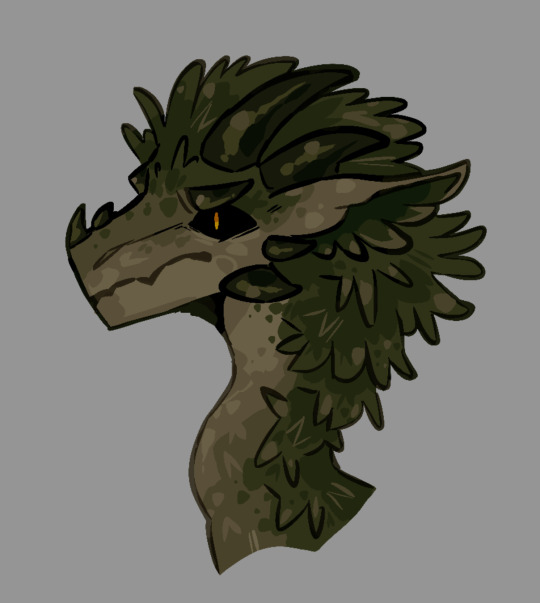
make a new clipping mask layer over your base colors. with a gradient or any soft brush, pick a side of your character where you want to pretend to have a light source, then add a gradual fade into a brighter version of a color found in the character’s design. (heheh. yellowe) set the new layer to like 30-50 percent
from the opposite direction, add a new clipping mask layer and make a gradient with a darker color found in the design. set it to 20 percent ish

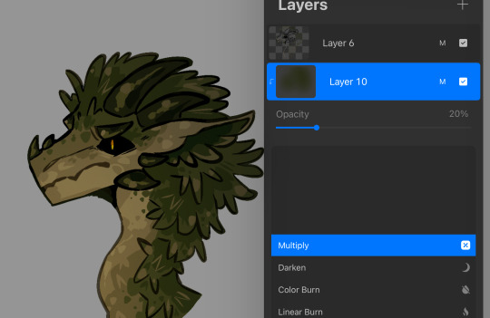
make a new layer above everything else. with a really light color, in this case muted yellow, add more highlights. too many. this is a great stage to outline more important features, as well as imply more texture with extra v’s and Gay Lines.
since the highlights looked a little too gaudy, i muted them in the darker areas around the spine by setting the layer to alpha lock and coloring over it with the soft brush from earlier
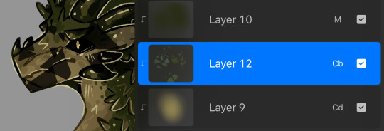
because this clearly isn’t textured enough, you can optionally add random markings with any textured brush. (i used a facet brush from my personal brushpack. might share that too if people want)
set it to color burn or overlay, or really anything that looks alright, and lower the opacity until it’s no longer stabbing your eyeballs out with contrast
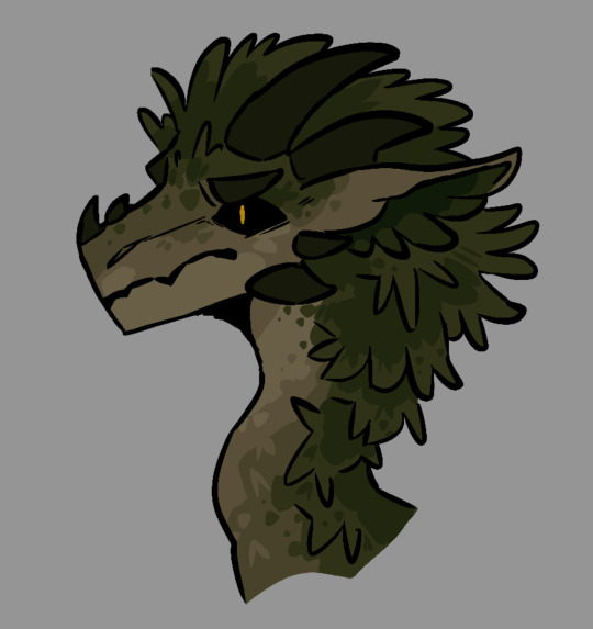
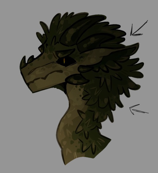
wow look it’s a vegetable
@nevermore-ramblings hope this helps with. something
a
89 notes
·
View notes
Note
Sorry if you’ve answered this before, but I really love how your illustrations have such a cohesive color palette, how do you pick your colors to have a certain theme without looking monochromatic?
(In your breakdown on the saloon/western BP illustration, you mentioned that the overall color was reddish brown so you added blue to the main group to set them apart. But like how did you decide on which reddish brown colors to use for the flats?)
Thank you!! Your art is really expressive and the colors always work so well in the illustration. I’m always in awe of your pics
That’s an excellent question! My drawings actually start out pretty monochromatic because I tend to put most of my effort into the lighting and shading part to help differentiate where I want people to look.
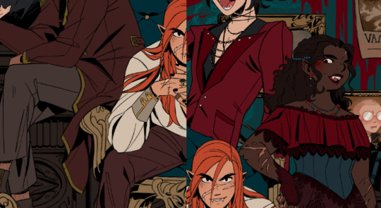
For all of my pieces, I want my characters to be in focus. So no matter what, I always have to keep their main colors in mind and make sure their outfits and the background don’t clash with them (Kain’s red hair tends to be a problem, pft).
For my flats, I generally work with two main colors that tend to contrast each other and then I mix a lot of neutrals around them. (Sometimes the main colors are in the light and shading itself, but I’ll just focus on the flats!).
Sometimes, I will change the hue of their colors. So while Kain has bright orange hair, I will dull it down if it overwhelms the piece or doesn’t fit with the tone - like I did for the cowboy drawing - but never so much that it no longer looks like him.
With the cowboy drawing as an example, if I strip it down to my flats, it instantly becomes very dull and monochromatic. I really enjoy working with these colors because they’re easy on the eyes (or my eyes specifically) and I can see the difference in subtle hues a lot better than if they were very high in contrast. I like working with subtleties when I want background characters to become a single unit but still be separated as individual people.
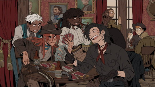
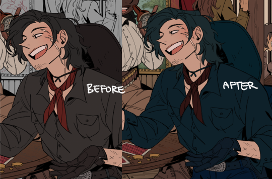
When I picked the colors for the background, I wanted to separate the characters from the walls. Therefore, I kept the walls red and gold, and the characters brown - they’re still within the same warm-colored family, but they’re far enough away from each other that they don’t become one with each other. I also like to not have clothes from different characters blend together, so overlapping colours can't be the same. I made one coat lighter than the other, the glove warmer than the dark jacket, and so on.
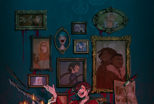
(their coats are also in the same realm as the green/gold colour of the details for the curtains and the frames on the walls)
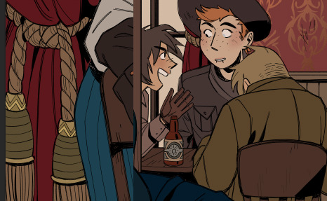
For the paintings I actually chose to put a bit of blue and green in to help create some interest for the main characters and keep your eyes around that area, as it matches the blue they’re wearing, just a whole lot darker. It also makes them pop just enough so they look interesting against the wall, but not enough to overshadow the main characters
I know, because of the way I work with layers, that when I add my overlays, I automatically brighten and saturate the colors a lot. It’s a lot easier for me to saturate something “dull” and move it into all kinds of hues than saturating something already high in contrast and then trying to force it into a new color theme.
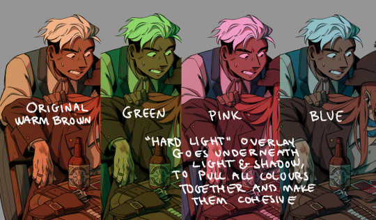
But because of this, I usually have to go back and change the colors I work with constantly while the overlays are on. Since the overlays don’t know what sort of materials they’re laying on top of, everything gets lighter and washed out, so dark skin tones, hair, and clothes have to be corrected one by one afterward. If I were to remove the overlays after I corrected it to make it feel like a dark blue outfit on Raki, it’s basically just a black void now; but with the overlay, it’s a dark blue outfit. Before that, he simple blended in with the background too much and he didn’t feel like he was a part of the group either.
I always try to put down colors how I imagine they’re going to look like, unaffected by light, but I’m also naturally drawn toward more earthy and warm tones, so all of my color choices will tend to lean that way.
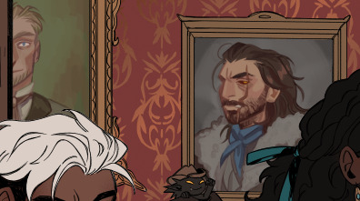
Here’s another example of main colours vs. neutrals; the main colours are red and green/turquoise, with dark browns and greys to encapsulate them, and gold for accents or to make certain things pop (the chair, Dakon’s dark coat, etc.).
I never want them all to wear the exact same color, but I want them to feel connected and be in the same 'colour family,' so Dakon and Kain have nearly the same dark red/brown, and Christie and Raki have nearly the same 'bright'/red.
The blacks and browns, I’ve kept warm as well, so they stay within that realm of red. I also make sure that none of them are too close to Kain’s hair since he’s in the middle of the piece, and I want your eyes to be drawn toward the middle, and his orange hair helps with that.
The paintings I basically do not care too much about, as long as each individual painting has a single dominating colour. I mute them down with a darker overlay and ensure they don’t have strong shadows and light, so they get pushed to the background, so despite being a bunch of different colours, each painting feels like a solid color and they’re still cast in the same light as the rest of the piece, so they feel like they belong in the same room.
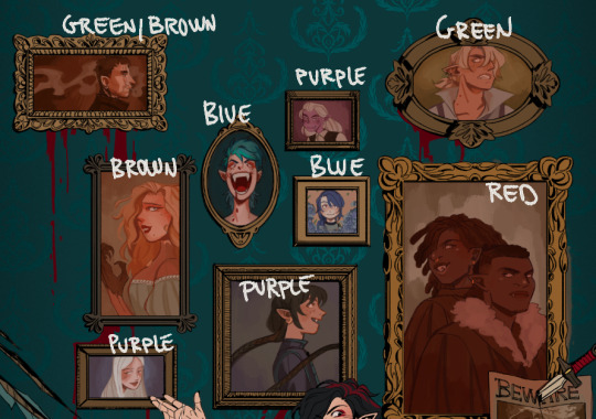
I try to help move the eye around the piece as well, so I keep the big painting sort of in the same realm of red and brown as the main characters, because it’s so big it shouldn’t dominate with a new color and force interest toward it. The blue/purple ones melt in with the background as they’re close to the turquoise background, but without disappearing, the yellow ones work sort of like the gold accents and blend in with the frames, and the green paintings at the top give the illusion of a monochrome fade, so everything gets more eerie and green as the image goes up - there’s also a subtle green fade that affects the gold accents from the top down, to enhance that effect.
This is just a few examples, if there are any pieces in particular you were thinking of, and it’s neither of these, just let me know, and I can break those down as well!
Thank you for the question; I hope I answered it somewhat, and thank you for the kind words! <3
409 notes
·
View notes
Note
I noticed when looking super close at your line art that the there's slight red green and blue on the sides of the lines like an old 80s anime and i think that's super cool! How do you do it?
oh, that's chromatic aberration! i guess you could say its a kind of colour/visual distortion.
it's pretty simple to do, but i usually just use a csp auto action to do it for me to make things go quicker, but i can teach you how to do it manually in most programs.
i'm going to use this silly doodle of me as pompompurin as an example lol
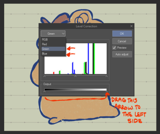
youre gonna wanna merge everything onto a single separate layer first and then we're gonna work with that merged layer. make two copies of that merged layer so you have three of them in total.
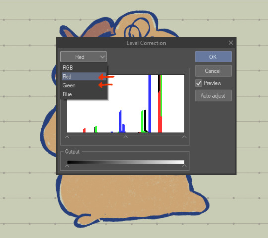
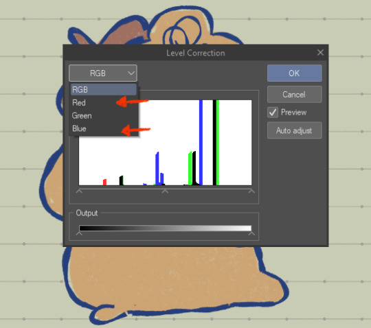
the top merged layer will be our red layer, so youre going to want to got to EDIT > Tonal Correction > Level Correction
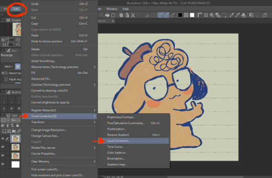
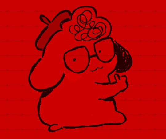
the level correction graph will pop up. since the top layer will be our red one, select the green level and drag the rightmost arrow on the Output scale all the way to the leftmost side. do the same for the blue level.
the image should be red like this afterwards.
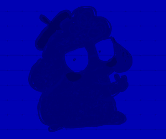
the middle layer is going to be our blue layer so do the same thing we did for the top layer except youre going to reduce the green and red levels instead, and the middle layer should be all blue like this.
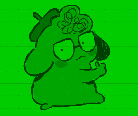
for the bottom layer, it will be our green layer. same process as before, reduce the red and blue levels so its all green.
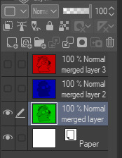
your layers should be looking like this now
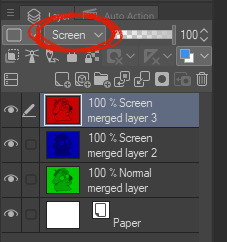
from here, you want to set the layer modes of the red and blue layers to Screen, DON'T do the same for the bottom green layer though. you'll notice once you've done that, the image will look normal again!
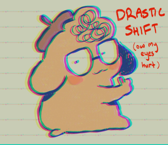
from here, all you need to do is shift the red layer in one direction, and the blue layer in another, to as much of an extent you want. the further they are from each other, the more drastic the effect will be
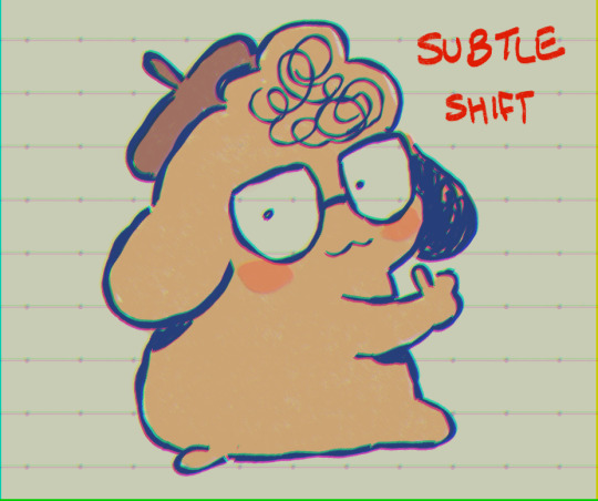
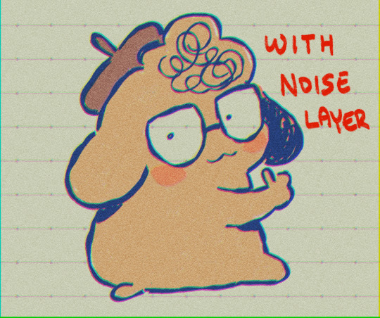
and that's how you do it! my other personal tip would be to add a layer of noise set to Overlay or Soft Light at a lowered opacity over the drawing bc it goes well with the aberration, or even sharpen the image.

if you dont want to do all that hard work though and you happen to have clip studio paint, just use an auto action, like this one!:
https://assets.clip-studio.com/en-us/detail?id=1713222
anyway i hope that helps? ^^;;;
730 notes
·
View notes
Text
I promised I would provide some detail costume breakdown of my Azem summoning circle. It took me about 85 hours total over 19 days. The skirt is overlayed over a red petticoat (because it’s the only one I had long enough) I made the skirt about 7 in longer than floor length for me because I’m wearing platform shoes!
The skirt is two layers of black chiffon. The bottom layer is a normal circle skirt, top layer is a seven panel circle skirt. Figuring out the math for this part was hellacious I do not recommend it. The top was gold lamé with black chiffon overlay. The waistband circles are gold upholstery bolts that I used bolt cutters to remove the stabby bits of and the beams from the waistband are from a fringey door cover that I dissected. I then twisted the beams (fringe) and fastened them to the skirt.
The Ps and the filigree things are from bathroom wall decals that I cut into pieces. Then I added rhinestones, these triangle book decorations, and sequins for the designs and the giant summoning circles.

The rest of the designs are various additional pieces of fringe, rhinestones, and hand painted designs with gold calligraphy ink. I almost added my statics job symbols into the summoning circles but I didn’t have time.
There’s still more I want to add to this but I’m ecstatic how it turned out and felt like an absolute goddess.
#ffxiv#final fantasy cosplay#final fantasy#ahaha#shadowbringers#endwalker#ffxiv azem#azem#my face#wol#Halloween#nekos cosplay saga#costume#cosplay#tik tok#video#costume breakdown#cosplay breakdown#final fantasy xiv#final fantasy 14#azem summoning circle#summoning circle
600 notes
·
View notes
Note
Heyy I love your DA art so much! I just want to ask if you don't mind especially on your family DA piece. Do you render first before putting the lighting/effect or do you do the opposite? I always struggle when drawing illustration like that because I just can't get the lightning right after I put the main shadow
Thank you and no problem!
My process was honestly rather sporadic because I'm not used to work on big pieces like this, especially those with warm colors (like browns, oranges, gold, etc) so it was honestly a challenge.
It's gonna be a long answer so im just gonna put the whole process below this cut
I tried doing everything in base colors first. No shadow no nothin. At this stage im trying to make sure that the base colors are all in the same, warmish tone so nothing felt out of place (left)


I was absolutely stuck on how i should do the shading, so i asked a friend for advice and she painted it over a little to give me an idea (right) (sorry the quality is ass cus its a tiny thumbnailing thing)
then i focus on the main subjects, i dont entirely shade them yet i just give some discoloration and color details like blush, dirt, subtle ones. I colored the lineart too (but i suggest you do this later after your shading)

then the shading, i carve it out from the multiply layer (as my friend suggested, lighting came from top left so i follow that suggestion)

added more contras (multiply & overlay) to add more depth and pop some more color

now that im done with the main subject, I got a good glimpse on what tone I should do for the rest of the artwork. Dark red for areas i need darker, and something of a gold/orange for the brighter spots.
i shade the background manually without using multiply, since im worried itll be muddy (easier for me to control too).
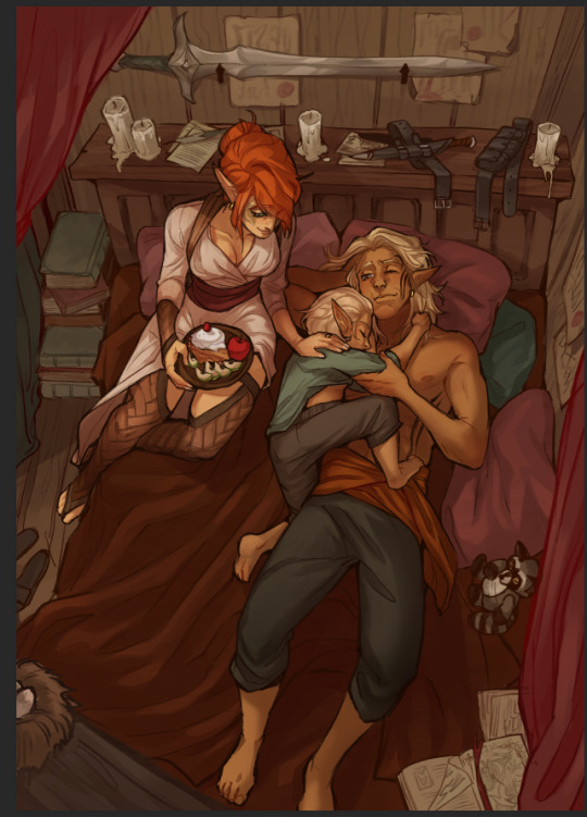

once everything is shaded, check on your artwork using a B/W layer. Everything still feel flat to me so I know i need to add more contras in the light & shadow
At this point im just throwing in Mulitply layer (reddish, green sometimes) to darken some areas outside of the focus and Overlay layer (yellow, orange, whites) to highlight the important parts and to emphasize where the light is coming from.
Check it again in the B/W layer, and it feels way better!


and there it is!
I added a few personal effects at the finishing, copying the lineart and gaussian-blur it, add speckles, add noise, color balance it a little. Poof. We're done :D
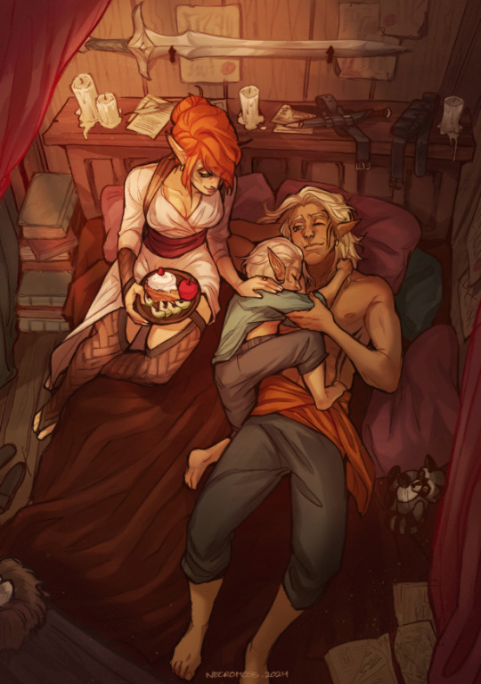
Hope that helps!
67 notes
·
View notes
Note
Hi! I was looking at some of your painterly stuff, and I am in awe of the emotion, softness, and texture of the pieces. I wanted to ask what your general process of making painterly artwork is? Do you freehand without a sketch, how long it takes you to finish a piece like that, how you utilize layering, etc!
You are, of course, not obligated to share about your process or answer questions! If these questions are too invasive on your work, I completely understand. Thank you!
My process for those particular pieces is super loose! I try to use art fights as an excuse to try new color combos and try to get fast and comfy with painting bc I rarely do it it any more. But basically it looks like this!
Loose sketch, I think this was the second or third sketch that I thought looked the best :)

2. I normally start with the complementary color to the character's main color (which was red here) unless I have a specific lighting goal or color palette in mind

3. I block in colors under the sketch layer! In this case I was just picking whatever colors but if I'm not feeling too confident I do color pick from photos or palettes I find on google images.

4. My emotional support overlay layer, of course <3. Not much thought process here, just trying to make it look good + more contrasty!
5. Then I make a layer on top of the sketch and just go ham! Try to separate the light and shadow, detail the teeth and stuff. I start with big blendy brushes and then scale down to smaller brushes towards the end.

All of my art fights take like 45 min-3 hrs (I definitely struggle on people faces so much). I think this one took a bit over an hour, which is where most of them fall! The one below was closer to 3, you can see I used a second sketch layer and did a lot of tweaks.
And finally, especially if you're focused on improving your skills, always collect inspiration pictures from artists who you want to emulate! My art fights draw LOADS of inspiration from @ikrutt + @polararts for example. I hope this gives you some insight to my process! As always, if you want to fuck with my brushes msg me, I can email you them :)
227 notes
·
View notes