#Superfurniture
Explore tagged Tumblr posts
Text
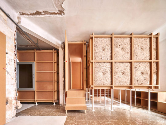
TAKK / 10K House / 2023 / Image © José Hevia
#takk#architecture#interior#mdf#wood#low cost#recycle#reuse#program#self building#domesticity#ruin#materiality#microclimate#superfurniture
2 notes
·
View notes
Text

Cool Modern / Futuristic ‘Luna’ Superfurniture 💊 made by Claesson Koivisto

4 notes
·
View notes
Photo

SUPERFURNITURE 2013, oiled plywood
Célia Picard & Hannes Schreckensberger
Superfurniture is a series of sculptural furniture objects which quests the condition of contemporary living issues and explores strategies of non-standardized as well as non-industrialized furniture fabrication.
www.picard-schreckensberger.net
20 notes
·
View notes
Text
Atelier Mickaël Amant — Branding
Atelier Mickaël Amant — Branding
View On WordPress
#benadesign#celiahannes#design#exhibitionDisplay#Gallerie#Mise en page#plywood#Portraits#Sapin#Superfurniture
1 note
·
View note
Photo


0 notes
Photo

Presenting Furniture Series_Trynho. Designed in Paris//tailored in india // rooted with style. Experience center @ khandelwal lifestyles and Big boy toyz. DM!! We are accepting orders now. _ _ _ _ _ #parametricdesign #computationaldesign #parametric #furnitureunik #furniturelove #amazingfurniture #uniquefurniture #superfurniture (at Paris, France)
#uniquefurniture#furniturelove#parametric#parametricdesign#amazingfurniture#computationaldesign#superfurniture#furnitureunik
0 notes
Text
Idea generation
To start thinking about the three posters I am going to make I came up with over 15 ideas that were under the topic of music and then tried to narrow those ideas down to 3. Here are my ideas.
.EP release poster
.Single release poster
.Album release poster
.Gig poster
.Posters with each individual band member on it
.Poster advertising a venue
.A poster advertising an istrument or a company selling an istrument
.A bands up and coming gigs displayed in a poster format.
.A band interview displayed on a poster
.The progression/evolution of an instrument
.music festival poster
.Top ten bands from a certain time on a poster
.top ten songs from a certain time/year on a poster
.Best venues from an area like Nottingham or London on a poster
.Each band member signature instrument on a poster.
I then narrowed it down to three ideas and they were
1. create a gig poster for a band
2. create a advertisement for an EP, single or album
3. create a poster advertising the top three venues from a company in Nottingham.
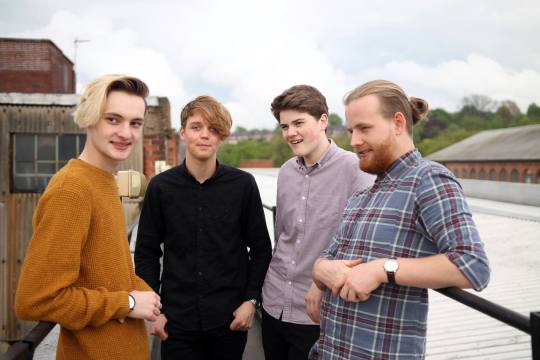
Because I want to create a gig poster and an EP/album/single advertisement poster I got in touch with a Nottingham band who have played many of the main venues and festivals in Nottingham like Rock city, Rescue rooms, Bodega, Rough Trade, The Maze, Splendorous festival, Beat the streets and more. This band is a band that consists of a drummer two guitarists and bassist with both guitarists singing and there a Nottingham based band called Super Furniture.
Because I wanted to do a poster of the main venues in Nottingham I decided to go with a company called DHP which own some very famous venues around the UK and in Nottingham. I would say the biggest venues in Nottingham are the
1 motor point arena
2 Rock City
3 Rescue Rooms
4 Bodega
5 Rough Trade.
The company DHP own Rock City, Rescue Rooms and Bodega so I decided to go with those venues for my poster. I did some research into DHP and these venues and made a mind map of things like the artists that have played at these venues and when they were built.
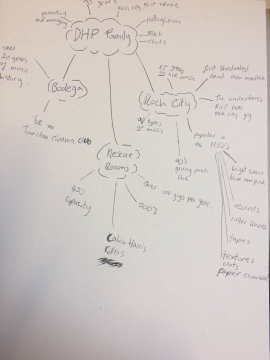
Here are the mind map bullet points:
DHP Family:
.35 years of music
.They do promoting and managing
.Rock city was there first venue
.Based in Nottingham and then branched out to London
.Clubs and live music venues
Rock City:
.35 years of live music
.first scheduled band was iron maiden but the Undertones took there place and performed the first ever rock city gig
.was built and opened in the 80s and became very popular
.All types of music pay at rock city.
Rescue Rooms:
.Over 100 gigs per year
.450 capacity
.Opened in 2003
.People like Calvin Harris and the Killers have played there
Bodega:
.Over 20 years of music history
.People like The XX ans Two Door Cinema Club
Next I went around Nottingham and took some photos of the three venues and the posters they had.
Bodega:
I really like the look of the venue with a bar at the bottom and then the music venue upstairs. If you look to the top right there is an old statue with the word bodega and I really like that the venue has kept that piece of history there and I think it looks nice. Just bellow that is The Bodega Sign, I really like neon signs and LED signs and I like how the text is layed out in lines a little bit like the Sega logo and at night the sign shines red.
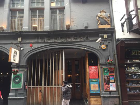
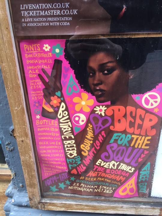
On the wall there are posters to do with events that happen at the venue.
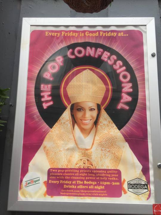
I really like how modern this one looks and the textures used. I think the text looks clean and enticing and I love the simple circular graphic which I assume is meant to be vinyl. I really like the simplicity of this but it doesn't scream music quiz to me as it is a poster for a music quiz.
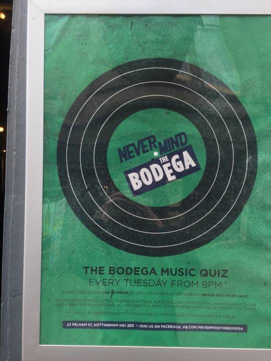
I also like this one and the thick bubbly letters that look like they have been painted. I can tell that this poster is done in a 60s/70s theme and I really like the eye catching colors and the hand painted look it has to it.
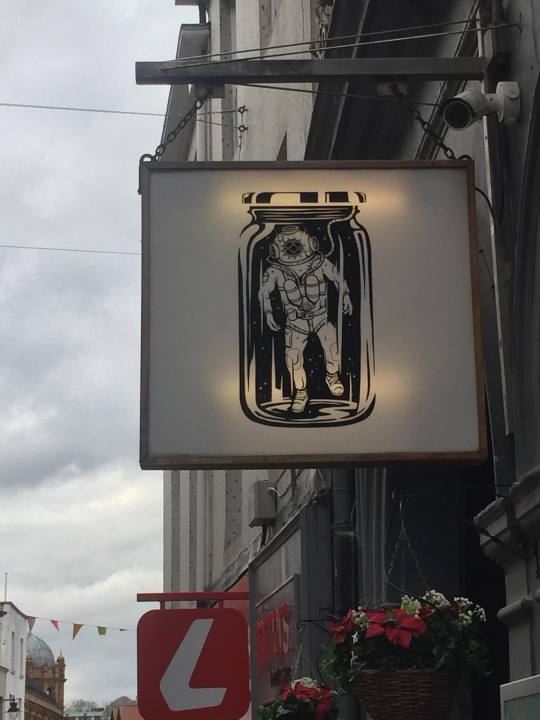
Lastly one of the things that caught my eye was this lit up board with some artwork of a diver in a jar. I really like the art style and the use of negative space to create this black and white piece. I also think it fits the building well but I don’t understand what is has to do with DHP or the Bodega venue it could possibly just be some nice artwork. I Looked into the word bodega but couldn't find any relation as the definition for bodega is “ a cellar or shop selling wine and food.
Rescue Rooms:
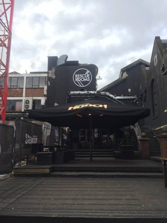
I went to rescue rooms to have a look at the front of the venue and it has a bar to the left and a venue to the right inside, outside there is a large decking area leading towards the main entrance were you can see the building which has the rescue rooms logo painted on it. I then walked up to it to see if they had any posters to do with the venue or DHP.
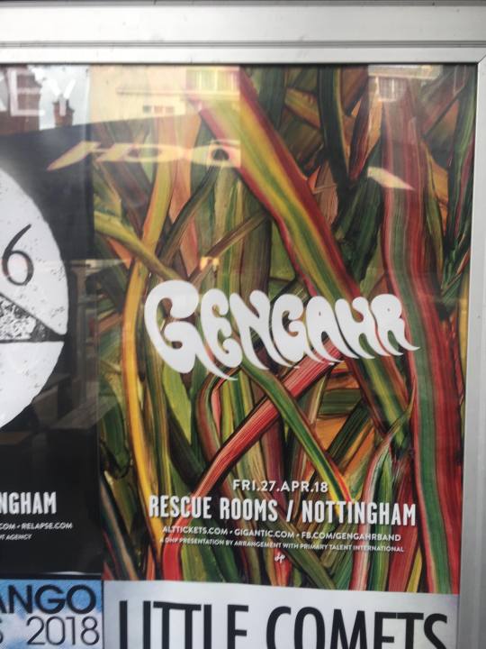
These are the posters I could find which were on the wall of the venue.
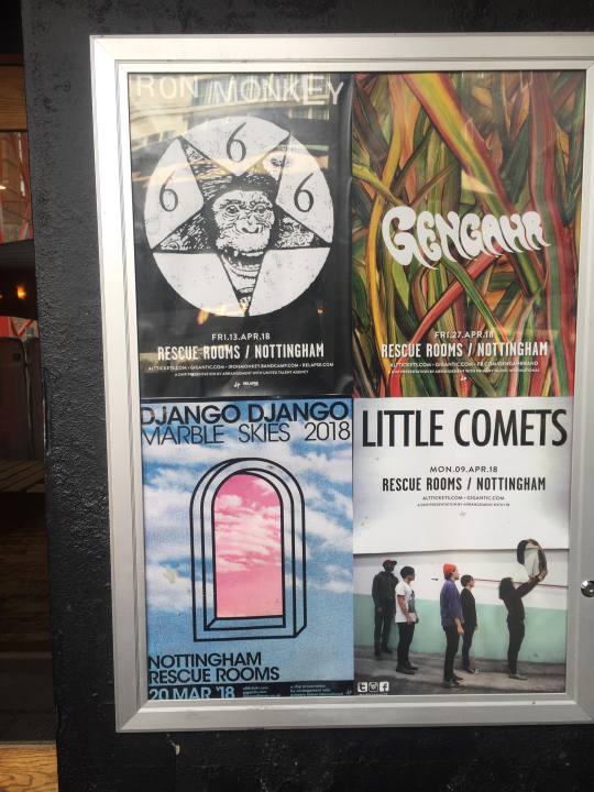
I am amusing these posters are not made by dhp and the artist playing would have got someone different to make them. I like this poster, it once again has a little bit of a 60s/70s font to it and I like the white text which stands out with all the colors behind it.
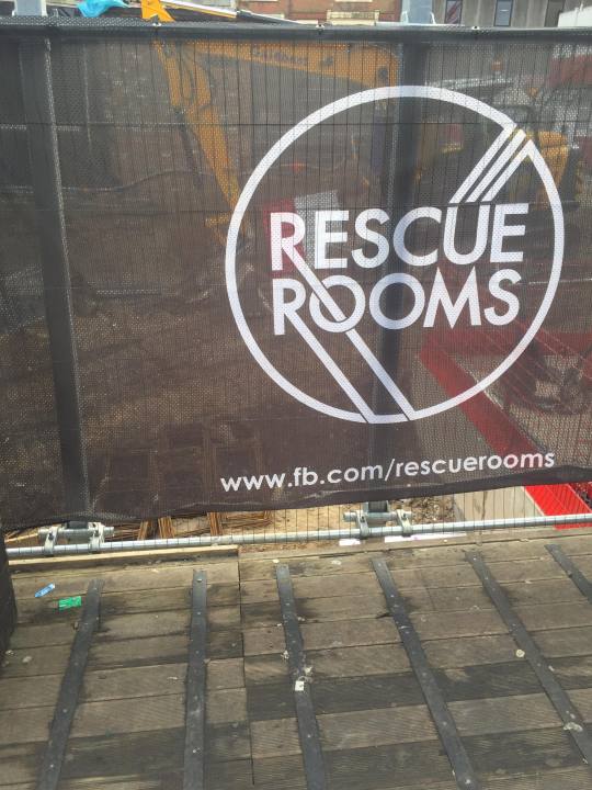
I also looked at the rescue room logo. I like it and it feels a little bit more modern compared to the bodega. Its very simple and geometric with the circle and lines. They have used a bold sans serif font and even tho there is lines going through letters it is easy to read but I feel like there is a lot of open space in the logo which could possibly be filled with something.
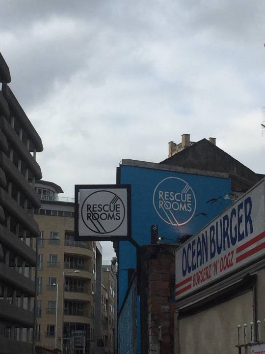
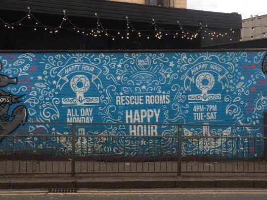
As I was walking to Rock City I found a side entrance to Rescue rooms and there was a blue wall with lots of text and patterns on it.
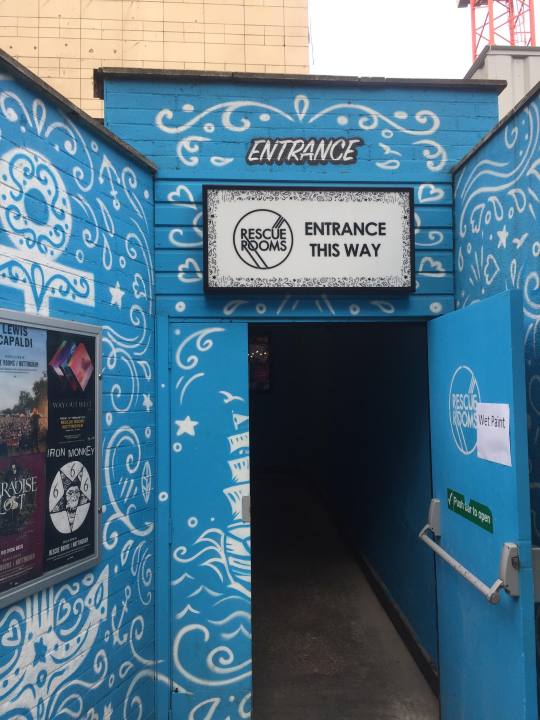
This wall is advertising rescue rooms and you can clearly see its very water themed. I really like all the swirls and bubbles also I like the anchors and the bright blue. I also like that they have used a center piece on the wall which says Happy Hour and then to the right and left there is an anchor with more information on.
Rock City:
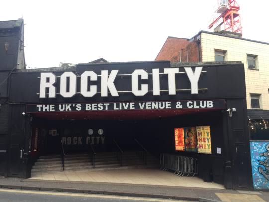
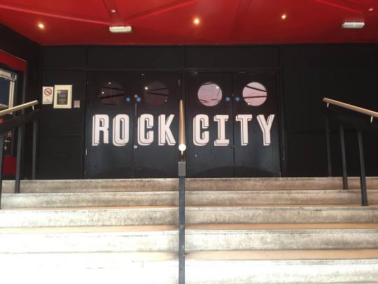
I really like the front of rock city With the large light up sign and the stairs going into the venue with posters on either side.
I went and looked at the posters inside that were made by DHP
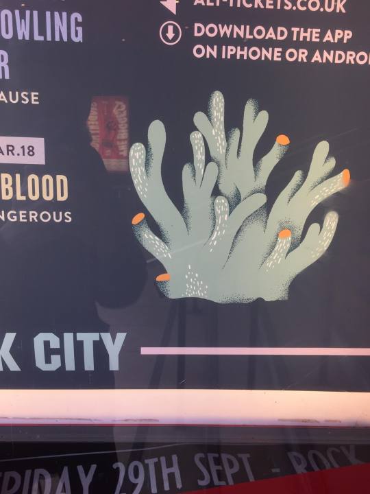
I found two posters like this which looked like a music line up on a poster in different colors and then there was random pieces of coral around the poster.
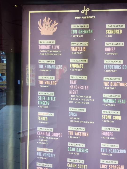
I really like these little pieces of seaweed but i’m not to sure how they relate to the poster.
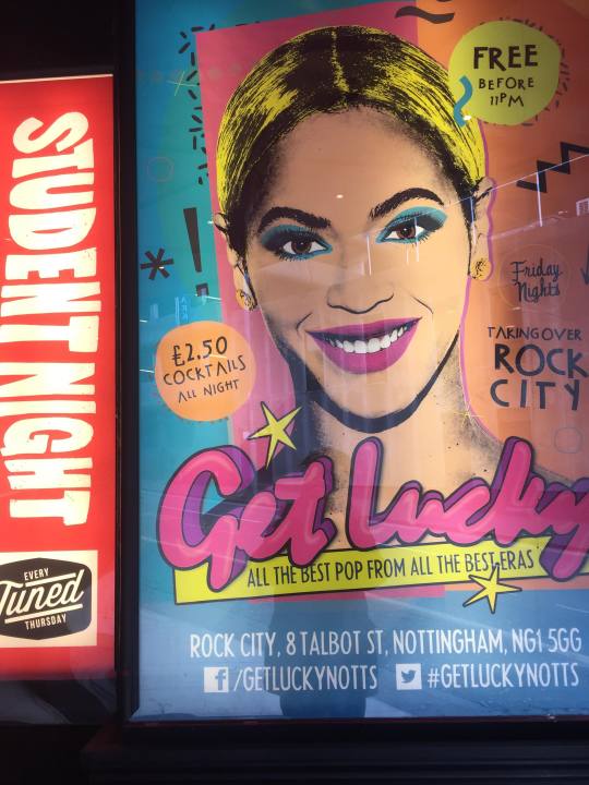
This poster caught my eye with the bright colors and old school looking text that says get lucky. I like the slogan and the bright colors and it looks very busy and atmospheric.
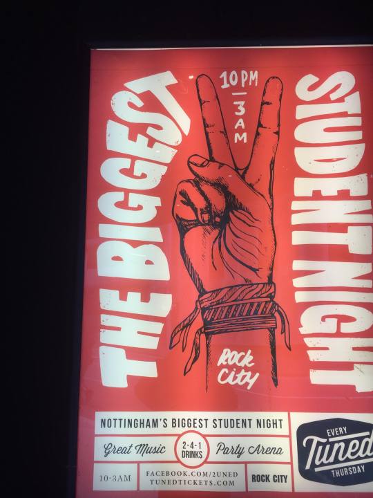
And finally I took a picture of this poster because I really liked the strong use of red and the wobbly text which looks hand drawn. There is also little red dots on the text which give it some texture and make it look a little bit more vintage or hand made. I like the illustration of the hand and the typography in this.
After going to each venue and looking at what the buildings looked like and what sort of posters DHP create I cant really see a strong common theme in there posters or brand identity. The only common themes I can see that came up were:
.Water/Nordic
.60s/70s/80s
.Music
.modernism
.illustrations
.textures
.strong colors
.patterns
I emailed DHP to see if there was any reasons for these themes and things like the diver in a jar outside bodega. Here is the reply I got to my questions.
On your posters and website, I have noticed a bit of a Nordic water theme and I want to know the reason behind the pieces of coral and sea life that is seen on your posters.
We commission a new illustrator each year to produce pattern elements to use on our promo, Previously it was Marina Munn, but currently we use Mikko Walamies. We give them some instruction as to the objects they should draw, but the artistic interpretation is their own. We research many different illustrators before deciding on one for each year.
We like to use a flat, chalky pastel feel, to create a DIY, low-fi look.
Another question is that I see a 60s/70s theme come up a lot in your posters and is there a reason behind that?
I’m not sure why this theme is coming though, as it isn’t intentional.
My last question is that outside the bodega venue on a sign there is a scuba diver in a jar, Is there any reason for that or is it all just nice artwork?
This illustration piece was created by local artist and illustrator Samuel Minton. He used to work for DHP, but is now a freelance illustrator. Concepts are sometimes discussed beforehand, but we mostly give him free reign to do what he wants.
We have a concerts designer who produces all of our gig posters and listings, a festivals and venues designer, who does flyers, menus etc and a Junior Designer who helps us with everything.
I sat down with superfurnitures front man Herbie and recorded a quick interview with him were I asked him some questions to help me create some art for his band. here is the interview in type.
What music genre does your band play?
I would say its sort of alternative indie, rock its kind of difficult to pin point it to one specific genre.
What age range is your audience?
I would say its probably around are age so around 15 to 25 but also we have some older people that come to our gigs and theirs one guy that’s around 50 so it varies but mainly young.
Is there anything you would like to see in the posters/artwork?
Its just got to stand out really, its got to capture peoples attention but its got to be simple but effective. Its got to get the message across and what were all about in a easy to understand way.
What are your ideas behind the Super Furniture Logo and color scheme?
We had another old logo that was a bit rubbish so we thought we would make a new logo. People have said it has a 70s vibe but we like it because it looks good on t shirts and looks great on a drum skin and we have had people give us complements on it, if we had some silly indie triangle it just wouldn't be as good I don’t think and we wanted something that with a bit well 70s not because it has anything to do with our music or our brand but it just looks nice so my girlfriend Beth Sprig drew that up for us and I think its nice.
Do you have a brand identity or a specific look your going for?
we really play all kinds of music so were not trying to fit a specific style, were ready to try out anything its just the current songs we have released are a little bit more towards the alternative indie rock side of things.
Do you have any new music coming out?
were going to be releasing and EP and one of the new singles is called body clock and we have already recorded that and will probably release that before the EP as a single.
Whats Body Clock about?
Well i’m not really sure, you will haft to look at the lyrics, its kind of about the passing of time and how nothing really means anything, theirs one lyric that shows this it is “two sliced toaster put the kettle on, no one will remember you when you are gone”.
Do you have any gigs coming up that you would like to see advertised?
we have lots of gigs coming up but are big headlining one which is very big for us is the 7th of July at rescue rooms which were really trying to push and get as much promotional materiel out there as possible
Poster Proposal:
What are your triptych of posters going to be of?
The first poster is going to be an advertisement of the top three venues in Nottingham. Because a company called DHP owns lots of the biggest venues I decided to make an advertisement for them and use there main three venues.
The second Poster is going to be a gig poster for the a band called Super Furniture.
The third poster is going to be an advertisement for a single release for the same band.
What style/genre are they going to be in?
I don’t want to stick to one specific style but I am going to try and do a mix of Retro and Vintage but also look at superfurnitures previous artwork that has bee created for them and maybe bass some things off that to get a bit more of an indie rock style and then I am also going to try and incorporate some of the styles dhp use which are more light pastel colors.
What are they about?
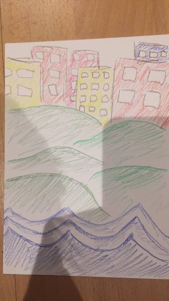
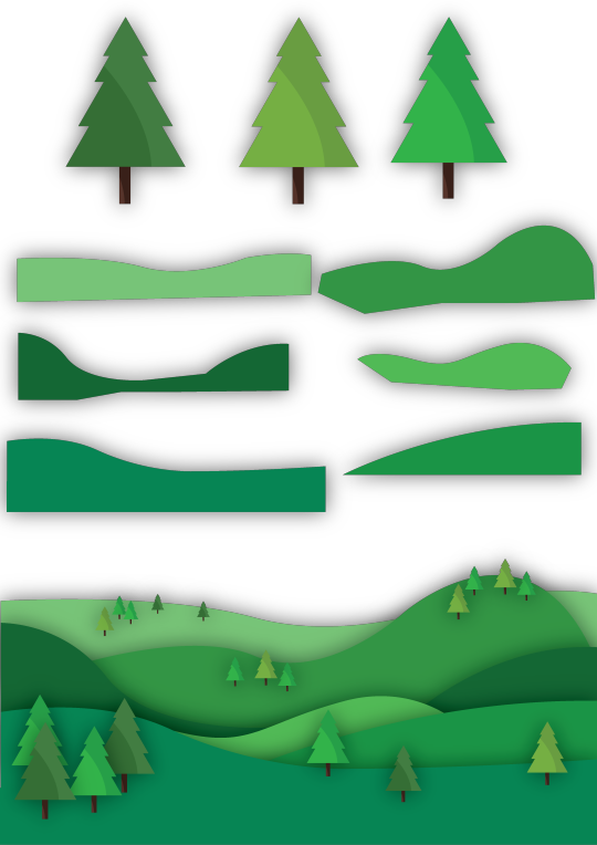
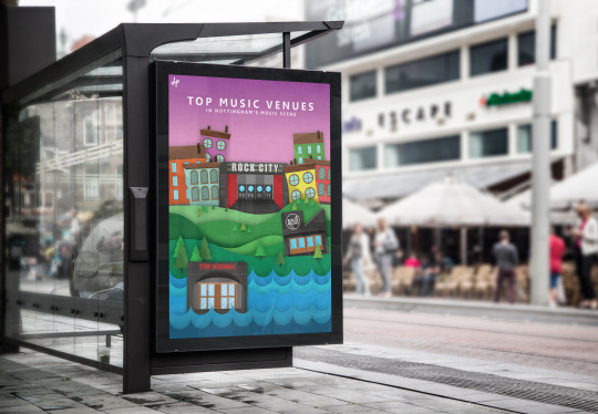
The First poster is of the three main dhp venues which are Bodega, Rescue Rooms and Rock City. I am going to create three different sets of scenery for each venue so bodega will be based in more of a water scene whilst Rescue rooms will be in more of a green woodland scene and then Rock city will be in a city scape scene.
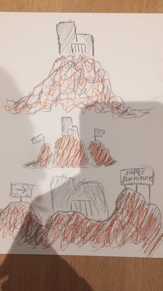
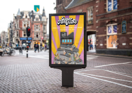
The second poster will be a gig poster advertising a gig at rescue rooms which a band called super furniture are headlining. The gig is on Saturday the 7th of July and there will be other supporting bands playing which are currently Vega bay, autumn diet plans and hashtag obi. My current ideas for the poster is the venue rescue rooms with a large superfurniture sign placed on top of a large heap if furniture. The poster will also contain information about the gig.
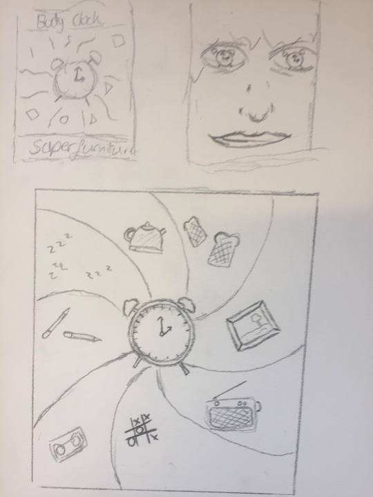
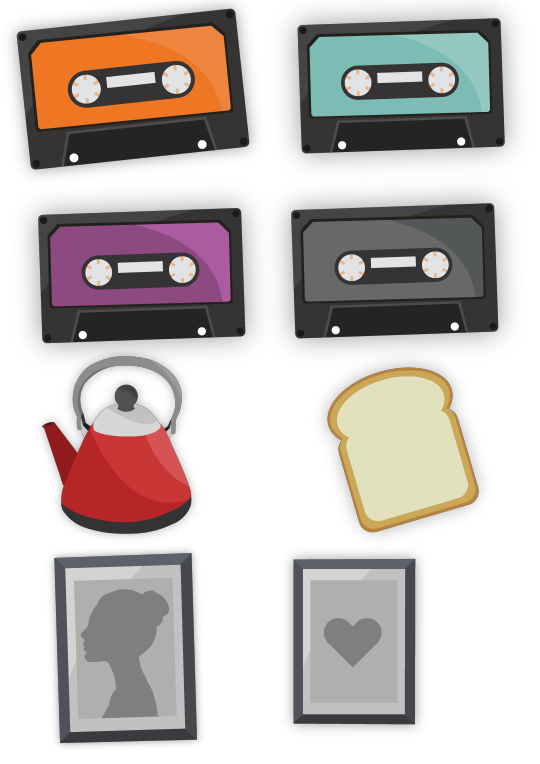
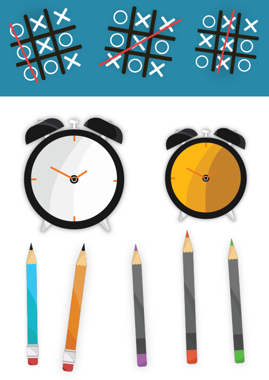
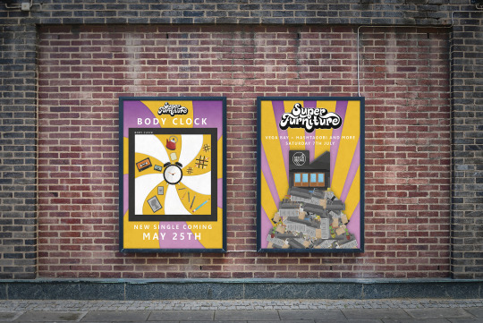
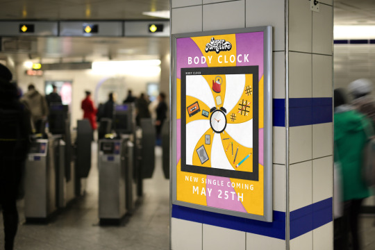
The third poster is going to be an advertisement for superfurnitures single release of there song called body clock. After talking with super furniture they said the lyrics are about the passing of time and how everything is changing as you go through life. I will be creating artwork for the single as well as extra artwork for things like backdrops because the poster is going to be an advertisement of the song. Because the song is called Body clock A large part of it will be to do with the passing of time and I will be looking at the song lyrics and tacking elements out of it and putting it into the poster for example one of the lyrics is “picture frames and pencil boxes”
How will you design them?
I will go through the whole process of things like idea generation, research and experimentation and then create my posters mainly in adobe illustrator but then I will also use adobe Photoshop for things like text and textures and probably some other things too.
Are the posters going to communicate any messages?
for the first poster dhp venue poster i’m showing progression and growth because in the Nottingham music scene you would work your way up from bodega up to rock city because bodega mainly holds the smaller bands that could just be starting out and then the next step from there would be to play rescue rooms which is more medium growth artists and then the venue which is the biggest which is rock city would be a level up from rescue rooms as they hold big bands. Superfurniture have played all three of these venues but they have only headlined bodega so them headlining rescue rooms would be the next big step. I am showing this progression by having on my poster bodega at the bottom and then rescue rooms in the middle with rock city at the top and like I said rock city is going to be placed in more of a city scene because its like its the big city and you've made it as an artist in the Nottingham music scene.
For the second poster which is the gig poster i’m kind of tacking the bands name and using the words to represent elements of the poster so because there names Super Furniture theirs going to be a large pile of furniture and on top of the furniture will be the rescue rooms venue with a big super furniture sign on it so its showing that the event is super and that there on top so i’m taking the super out of there name and expressing it by putting the venue on this big pile of furniture.
For the last poster its going to be cover art and a advertisement for the song so because superfurniture said the song is about progression and how things change over time I am going to try and show that in my poster by looking at the song lyrics and then I will take elements out of it and put it into the poster to hopefully help show what the songs about and the message of the song.
How do you want the viewer to feel when they look at your work?
When people look at my work I want it to catch there eye and I want them to think its good and enjoy it, but also a very important thing that needs to happen when they look at the posters is that the viewer needs to quickly be able to understand what the poster is about and what its showing and advertising and then the viewer needs to be interested in the event or product.
What techniques are you going to use? why?
I’m going to spend lots of time on the layout and things like how the poster is going to capture there eyes and how are they going to read it and what will be read first, this is because layout is very important for something to look nice but also understand what the poster is about.
I will also be doing some tracing in illustrator to create vectors or items, I wont be straight copying but I will be using imagery to give me inspiration and help me create components in my poster this is so I am able to create things that people will recognize and understand.
I will also be using lots of techniques in Photoshop and illustrator like clipping masks and possibly some image manipulation but I will also use lots of typography techniques to help with layout like leading and kerning and then I will also use grid systems and think about composition and things like the rule of thirds and the golden ratio if I think its necessary for my poster.
What typefaces, imagery, colors, strokes and grid systems might you use and why?
I will be using mainly sans serif typefaces because I think they look the cleanest and are the easiest to understand and are the most eye pleasing. I will be using lots of imagery of furniture but I will also be looking at the three venues and tacking pictures of them to help me turn them into vector graphics. I will also look into general buildings and architecture to help me with the dhp poster but for all of the posters I will be using lots of imagery of things like walls and stones to create textures because I think textures are another great element to put into your work and they can make the work look a lot nicer with more depth. I am probably going to stay away from heavy strokes because I think strokes just don’t look very good on things except I may use some for text. I will defiantly be using grid systems to help me with layout I will probably use modular and manuscript and possibly column. I will be using nice bright colors but I will try and make them not as saturated and a little bit more pastel based to fit dhps brand identity and also to make things nice to look at.
What / who / where has inspired your ideas? Why ?
I have always been interested in music and have been to lots of gigs and played with bands so I am very familiar with the Nottingham music scene so I have seen lots of bands and there posters and advertisements. I really like lots of dhps work and the artists that work for them so in the research stages I looked at lots of band posters and dhp posters to help with my ideas.
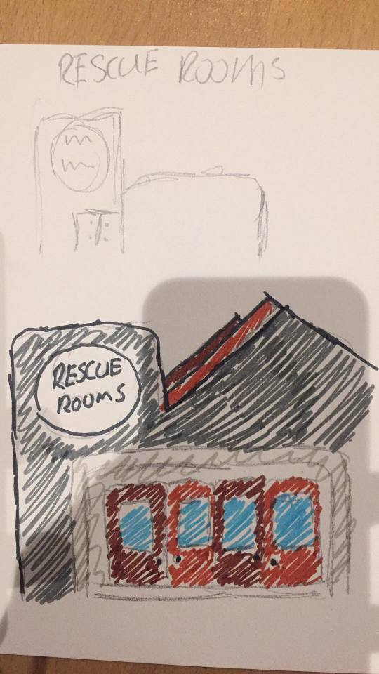
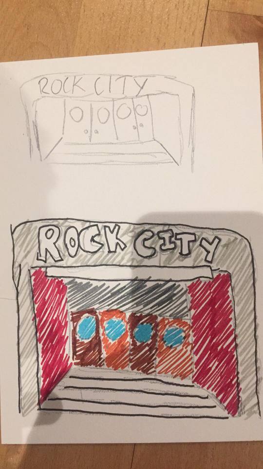
I did some experimentation with some ideas and I sketched out my main ideas to give me a better visual representation of what my ideas look like on paper.
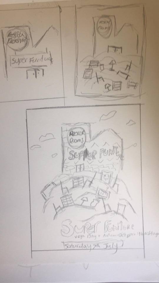
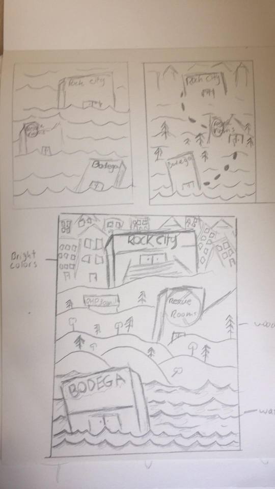
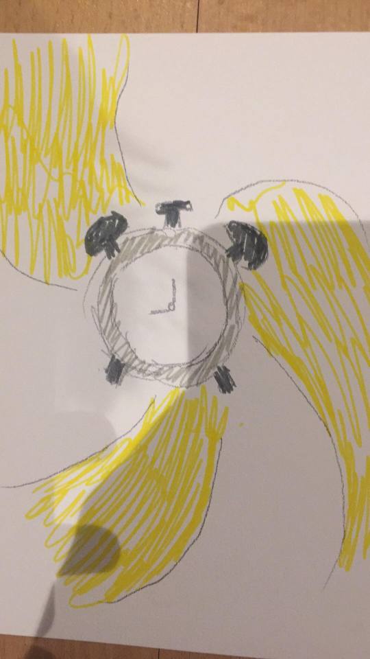
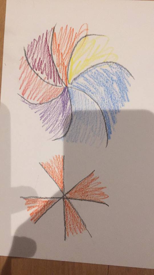
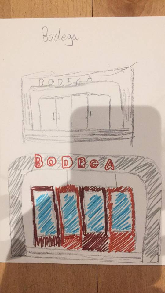
Group Feedback.
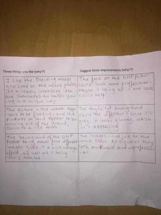
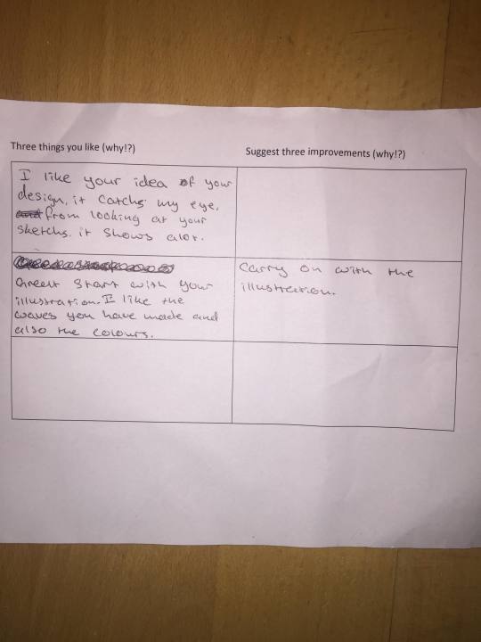
When we did the feedback I didn’t have a lot to show so I made a quick Photoshop mock just to get the idea across even though the final piece would be made as a illustrations in illustrator not out of photos. The feedback I got was for my DHP venues poster.
What is the most common thing that your peers like? Why do you think this is?
I think they liked the lay out and general idea behind the design, this might be because it looks very busy and possibly intriguing.
What is the most common suggestion to improve your posters? Why do you think this is?
Like I said I didn’t have a lot to show but most of the suggestions were for my Photoshop mock up which was just made to give the person a better idea of what I was creating. I don’t think it was clear that it would be made in illustrator and not Photoshop but elements looked unprofessional which is true but like I said it was just made to get the idea across so it was not really even a mock up.
Do you agree with your peer feedback? Why?
yes I think some of it is fair and good one of the ideas someone left which I thought could be good is to use the venue logos instead of the actual venue buildings.
Do you disagree with anything your peers have said in the feedback? Why?
Yes I disagree with most of it just because it was on the Photoshop mock that was showing just to get the idea across so I agree that it looks bad and unprofessional but the final will be an illustration not a photograph.
This is what people had to look at, This is the beginning of the creation of the poster
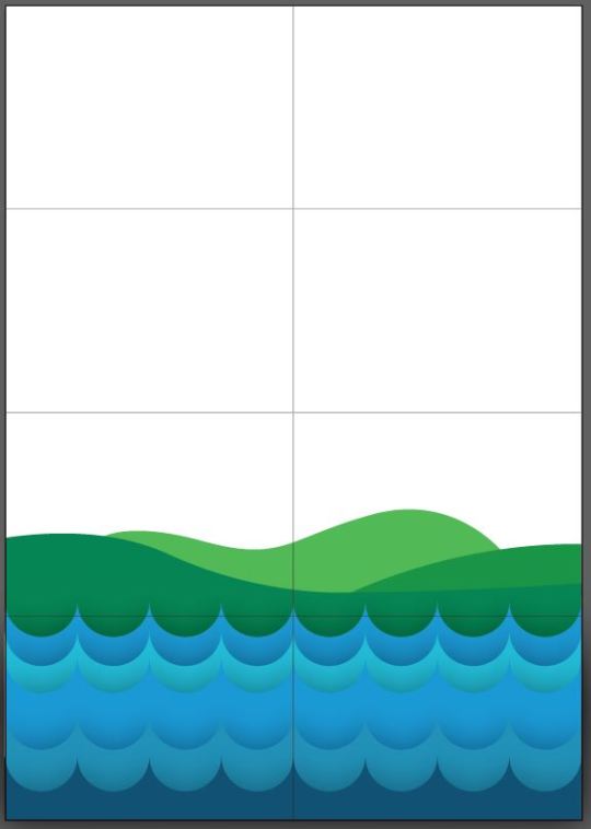
and this was just quickly made to get the idea across a little better but I think my sketches did a better job because the final will be made in illustrator mainly.
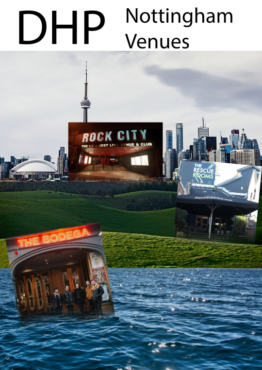
The next step was to turn my sketches and ideas into vector graphics so I used adobe illustrator to start creating each individual item for the poster and then I would construct the poster with all the parts. Here are my experimentation and idea generation boards with graphics for the final design and color experimentation.
Here are the boards for the dhp venue poster.
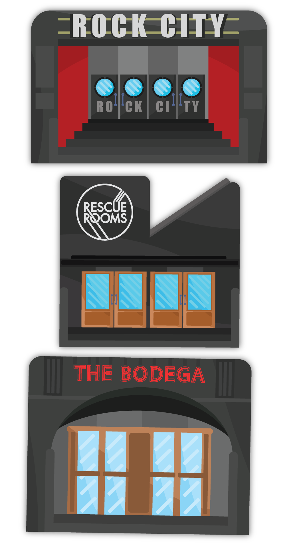
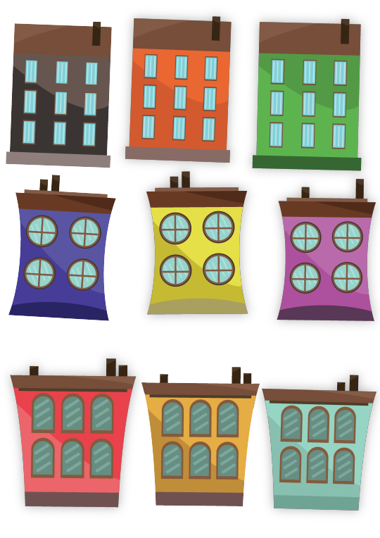
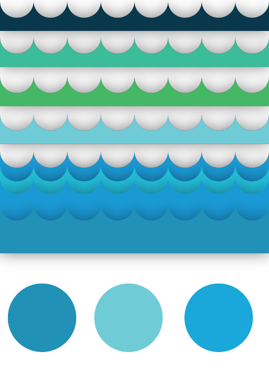
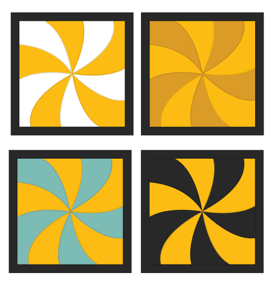
Here are the boards for Super furnitures single release advertisement.
Here are the boards for the gig advertisement
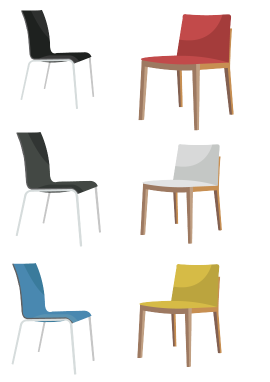
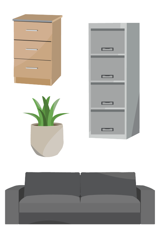
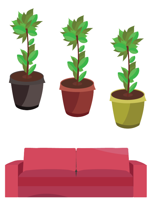
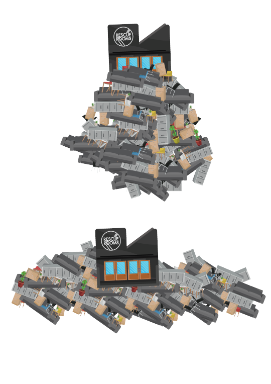

After I created all of the vectors I picked the things I liked and put together my posters in illustrator and then I put that artwork into Photoshop were I added textures and text.
How they were made:
The DHP poster
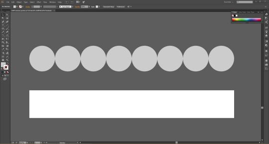
I began creating in adobe illustrator. First I started to create my waves for the ocean section. I did this by creating a long rectangle with the rectangle tool and then lots of circles all the same size with the ellipse tool.
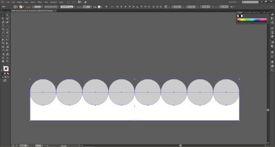
I then dragged the line of circles down and made sure that half of all the circles were overlaying the rectangle. I then selected everything with the selection tool.
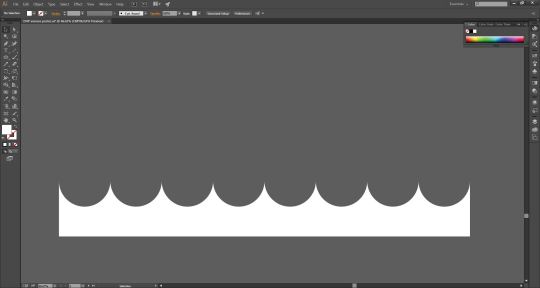
I then took the shape builder tool and clicked on all the circles whilst holding alt which then gave me this wave shape.
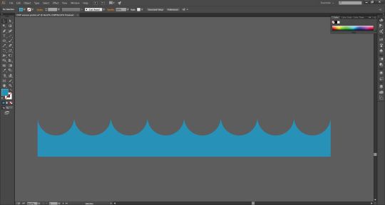
I then changed the color of the shape to a calm blue.
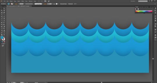
Next I duplicated the shape and layered them on top of each other and changed the shapes to different types of blue. I then added a light drop shadow on each wave shape giving everything more depth.
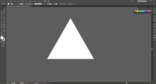
Next I moved onto the woodland section so I started to create some trees. The first thing I did was create a triangle by taking the star tool and using my down arrow key on my key board to get rid of the points until I got a triangle.
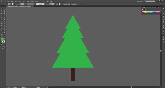
I then created 4 triangles which were slightly bigger than the other one and I layered the triangles out with the selection tool so it looked like a tree. I then turned to triangles green and added a tree stump by using the rectangle tool to create a thin rectangle which I then turned brown and made sure it was behind all of the triangle layers.
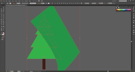
I wanted to add some shadow or shading to the tree so I took the pen tool and created a large shape that covered half of all the triangles and I made the color of this shape slightly darker than the light green triangles. I then selected everything.
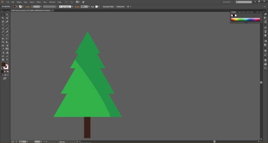
Next I once again used the shape builder tool to make my dark green shape fit around the outline of the tree by holding alt and clicking on a section of the shape that was not inside the tree.
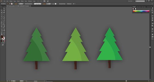
I then used the same technique with the shape builder tool to create some shadow for the tree stump. I then selected all of the tree, group everything together and duplicated the tree so I had three. After that I went and chose two other colors and turned the other trees into different shades of green to give me a variety of trees and then lastly I applied a very light drop shadow to each tree.
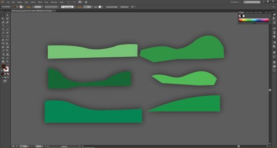
Next I needed to put the trees onto some land so I created 6 layers of land using the pen tool and changed the color so they ware all different types of green and then once again added a light drop shadow.
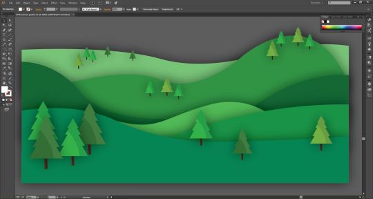
I then assembled all the parts for my forest section. First I put all of the hills in place and made sure each layer was behind the layer in front and I also made the trees get smaller with the move tool to make it look like they were further away.
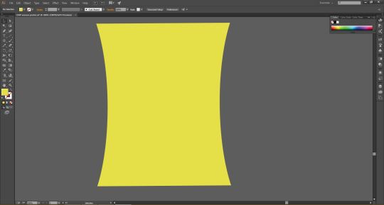
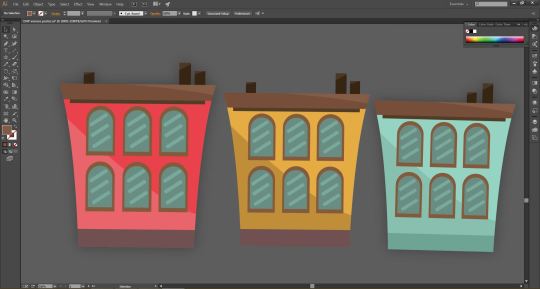
I then moved onto the city section and started designing the houses. For every house I stated by making a base which I made with the pen tool and then changed the color of the shape.
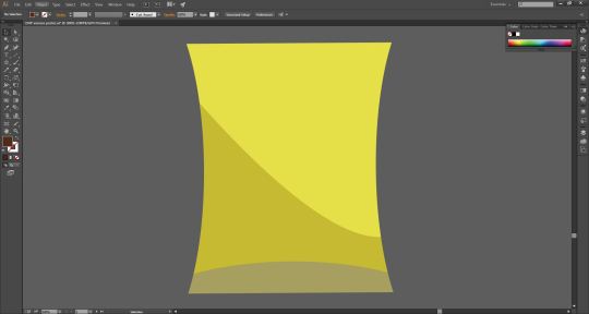
I then added some shading and the base with the pen tool and I used the shape builder tool to once again make sure everything fit the outline of the base shape.
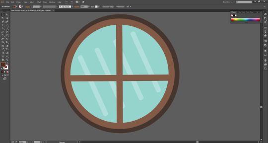
I then created a window by using the ellipse tool to create three circles, I had one smaller circle one mediam size circle and a larger circle and then I layered them all on top of each other. The smaller circle I made light blue for the windows glass then the circle shape behind that I made a light brown and then the circle behind that I made a darker brown. I then created four parallel lines with rounded edges with the rounded rectangle tool and made there color a slightly lighter blue than the blue of the circle for the window. Next I positioned the four lines inside the blue circle and but them at a angle with the selection tool which I used the rotate the shapes. Finally I added a brown cross in front of the glass for the window with the rectangle tool. I then grouped everything together to create a window for the building.
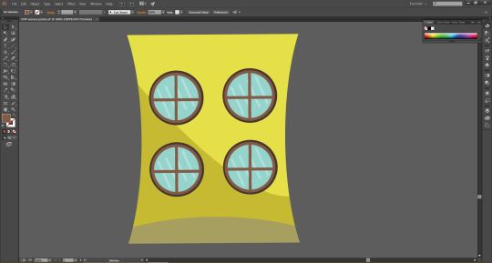
I then duplicated the window by holding alt on my keyboard and dragging the shape so I had four windows. I then placed the windows onto the rest of the house with the selection tool.
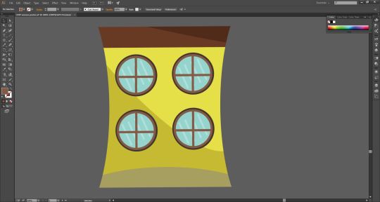
I then added a roof by using the pet tool and the shape builder tool.
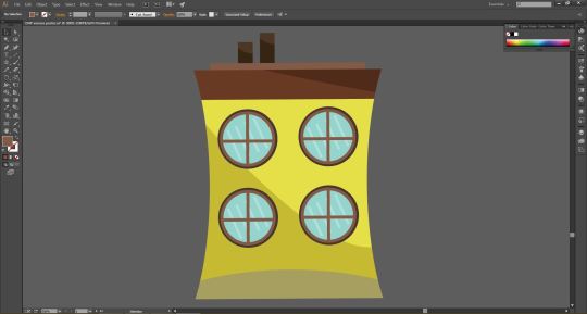
Lastly I added a chimney by using the rectangle tool to create two thin vertical rectangles and once again used the pen tool and the shape builder tool to add some shadow. I then used the same tools and techniques that I used to create this house and created a variety of houses in different color variations.
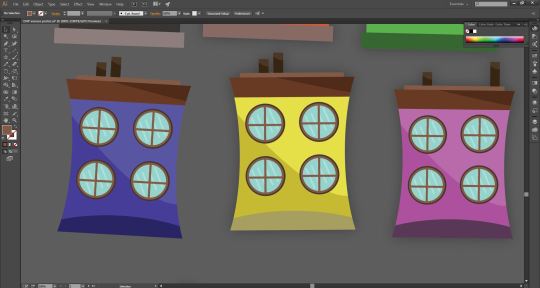
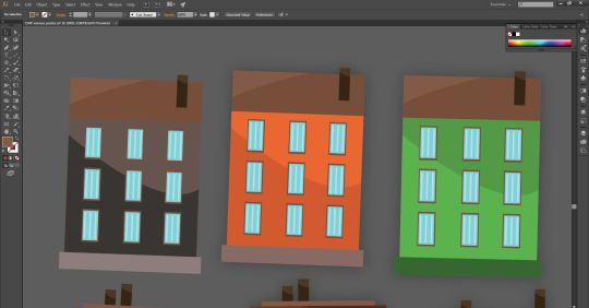
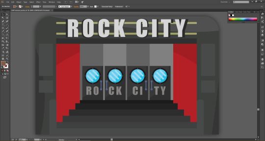
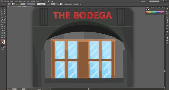
Once I had created the buildings I went onto create the three venues. I made them once again using the same techniques I have just shown but I tried to add more detale because the venues are key parts of the posters. For the three venues first I started with a base shape then I added things like doors and then I went and put in shadows and then when I had most of the venue made I added text using the text to to create the signs from the venues.
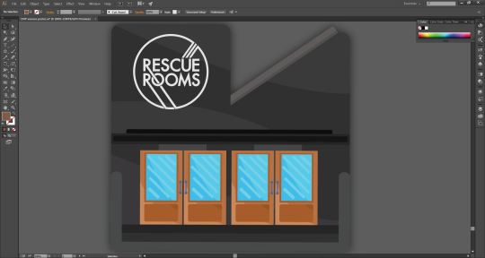
For the rescue rooms logo that is on the front of the building I turned a Image/jpeg into vector graphic in illustrator.
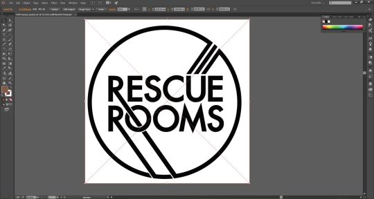
First I dragged a black and white image of the logo into illustrator.
I then went into the tab at the top next to were is said image trace and in that drop down menu I clicked on Black and white logo.
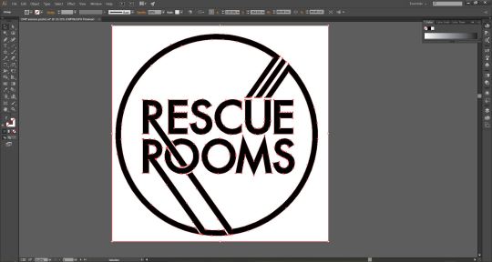
I then clicked expand which gave me a selection of everything. Next I right clicked the image and un grouped everything.
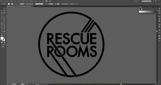
I then clicked on all the white parts and deleted them leaving me with a black rescue rooms logo which was now a vector graphic.

Finally I turned the logo white.
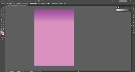
I then wanted to create a gradient for the background of the poster and I wanted to put this gradient as the background for all three of my posters. I made the background by gradient by creating a rectangle the size of the A3 art board with the rectangle tool and then I clicked on the gradient box which was under were you would change the color of something or add a stroke. When I did this my rectangle was selected. This then brought up a box were I could customize my gradient. In here I changed the gradient so It was 90 degrees and then picked three colors. The top of the gradient was a dark purple, in the middle was a light purple and then towards the bottom was a slightly darker purple.
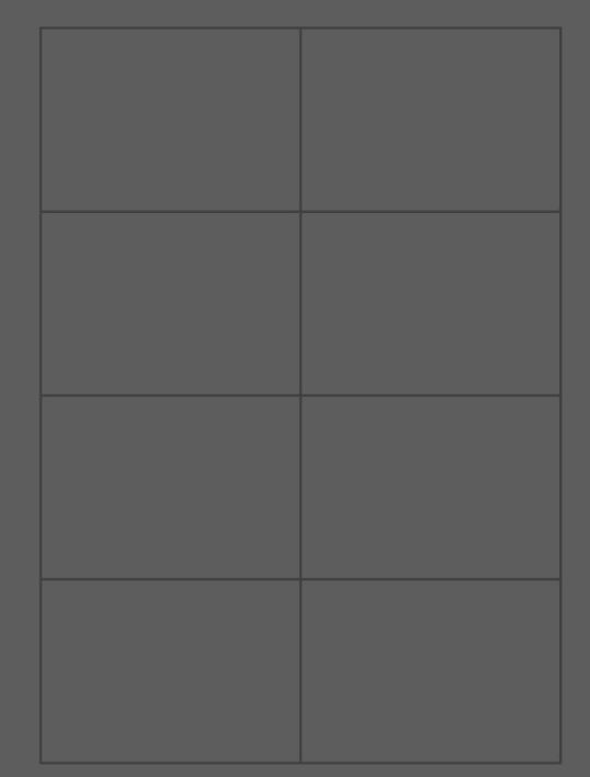
Now I had everything made I assembled it on my A3 art board and I used this grid to help me with composition. Here is everything assembled.
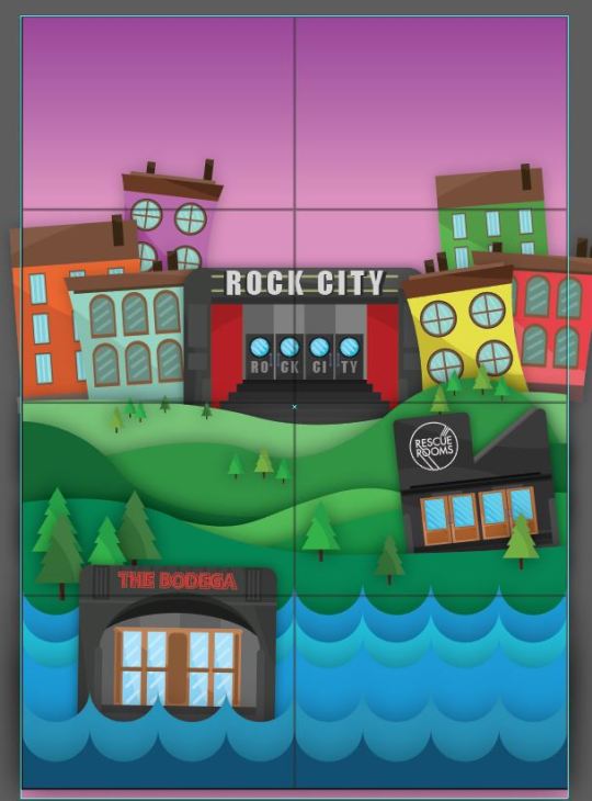
I then exported the art board as a PNG and opened it in Photoshop were I would add text and texture to the poster. When I exported the art board I made sure the grid system was not visible.
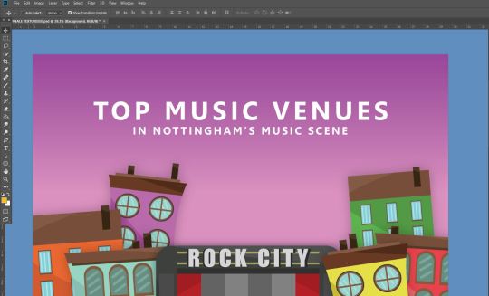
Once I had opened it in Photoshop I took the text tool and wrote my poster headline. I made the second line of text smaller by going control T on my keyboard and then I used the move tool to shrink it down and align all the text so It was in the middle of the image. For the text I used a nice sharp sans serif font that was bold because I think sans serif fonts look professional and they stand out and work with the rest of the artwork.
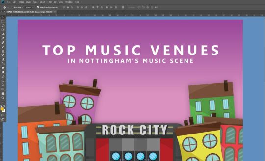
I then selected all the text with the text tool and held alt and used the arrow keys to kern my text and spread it out. I also added a transparent dhp logo and I shrunk it down and put it in the top left hand corner of the poster.
Lastly I added texture to my poster I did this by using three images, layering them on top of everything and turning there opacity down. Here are the three images and there opacity.
This image had an opacity of 4%
This image had an opacity of 2%

this Image had an opacity of 2%
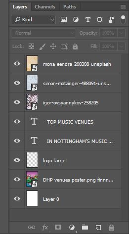
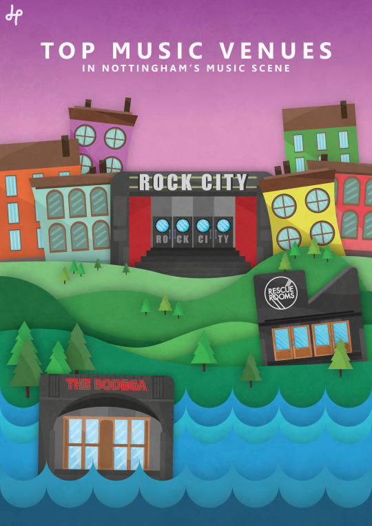
And that then finished my poster. All three images were off unsplash.com
For all three posters I used the same tools and techniques that I have just shown for the creation of the dhp poster. Here are my final three posters.
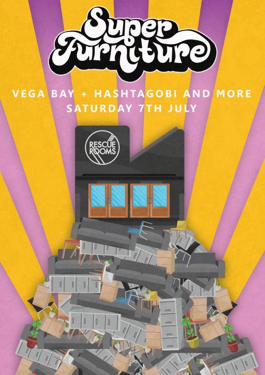
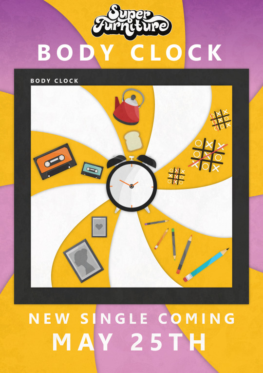
To create this single release poster I talked to superfuniture about the songs meaning and I also analysed and looked at the songs lyrics to help me create the cover for the single. Here Is a copy of the songs lyrics to help show were my ideas have come from.
BODY CLOCK: Picture frames and Pencil boxes
Hide and seek and norts and crosses
I'm not gonna lie no lying is bad
But things would be different if maybe I had
Stepped back I saw it in a picture
Worth a thousand words the air is getting thicker
Close your eyes it tastes so bitter
Sunrise the light starts to flicker
Keep speaking if tho I've stopped
Body clock tick tock no where
Never stop breathing fresh air
I think a lot are you aware
This is not me a swear
Two slice toaster Put the kettle on
No one will remember you when you are gone
This lack of sleep all merges into one
It's hard to keep a track of time for long
Even tho I've stopped
Body clock tick tock no where
Never stop breathing fresh air
I think a lot are you aware
This is not me a swear
You help me breath
The colour of your eyes makes me realise
I can't see
Where to go from here it's filling me with fear
Leave me be
Body clock tick tock no where
Never stop breathing fresh air
I think a lot are you aware
This is not me a swear.
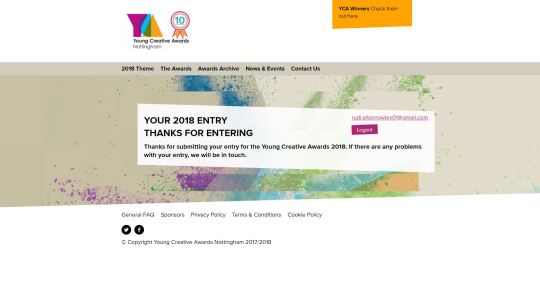
Because my posters are of 3 advertisements I put together some mocks to help give me a better idea of what they would look like if they were on things like signs and billboards.
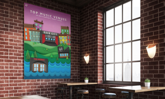
Evaluation:
What were my final ideas:
Idea one: the first Idea was to create a advertisement for the company dhp advertising some of there most popular venues in the Nottingham music scene. I wanted to have three venues and put them in three different landscapes. The venues I picked were The Bodega, Rescue Rooms and Rock City, this is because I wanted to bring in this idea of almost leveling up and how musicians would progress in the Nottingham music scene, so if you were a band starting out you would play at the bodega were lots of artist perform but they allow lots of smaller up and coming artist to perform, then a step up from there would be to play rescue rooms which holds larger artists and then the next step from there would be to play rock city which holds mainly large artist so this is why on the poster I have bodega at the bottom, rescue rooms on the middle level and Rock city at the top. I placed each venue in a scene that I thought fit the venues image so for bodega I put it in a water themed area and I put rock city I a big city area to represent that its the top and that rock city holds the biggest gigs with the biggest artists out of the three. I also wanted to make the poster follow dhps image and style which I did lots of research into dhp to help give me a better idea of what there brand identity is.
Idea two: For the last two ideas I worked with a band called super furniture and this idea was to create a poster advertising there headline gig at the venue rescue rooms in Nottingham. For this poster the idea was to have a huge pile of furniture with the venue on top of it and then above that have superfurnitures logo and the list of support acts.
Idea three: For the third idea I wanted to create some cover art for the bands single release and then make an advertisement about it. The Idea was to use the songs meaning and to take parts of the lyrics and turn them into illustrations. The poster also needed to represent them which is why I wanted to use super furnitures main color from there logo which is yellow.

Because this poster was an advertisement I also wanted to have the release date name and bands logo on the poster.
How did you arrive at the ideas?
for the dhp one I looked at lots of posters from dhp and lots of them involve little graphics of coral or bushes or buildings which gave me the idea to do something that involved different parts of scenery. I then came to the idea that I wanted each venue to have its own world or own section of scenery that fits the venue. for the first basic ideas for all three posters I did some idea generation at the beginning were I brain stormed lots of ideas to do with music and then I narrowed those ideas down to three and that’s how I got the idea for the dhp advertisement, superfurniture gig advertisement and the single release advertisement
for the gig poster I wanted to take the bands name and then express it in a poster so this is why there is a pile of furniture with the venue on top of it. Because they are called super furniture I made a pile of furniture and then I put the venue on top to show that the gig will be super and to express that the event is going to be huge especially because it will be superfurnitures biggest headline gig so far.
for the third poster because it was a single release cover the cover had to represent that band and the song so I asked for a copy of the lyrics of the song from the band and analysed them and then got ideas for what I wanted the poster to look like.
What inspired me? I did lots of research into dhp and superfurniture and I looked at previous work that had been done for them but I was generally inspired by advertisements and gig posters for events but I really liked dhps brand identity and image with there textures and pastel colors so I think dhps general look inspired me the most.
what specific approaches did you practice?
I wanted my posters to have a normal poster design look and layout so you read it left to right and top to bottom this is why I had the title of the posters at the top and further information underneath or lower down. I wanted to use a sans serif font that was thick or bold because I think sans serif fonts look very neat and professional. For the single release cover I looked at other advertisements for music releases and they have the title at the top and then the cover photo in the middle with more information like the release date at the bottom so this is why I have one of my posters layered out like this.
I also used two layout techniques, the first was the rule of thirds which I think you can best see in my dhp poster and the second I made a simple grid system with two columns which was cut into 8 squares.
What went well during the final production stage?
I think most of the illustrations turned out very well and I think I picked some nice colors that were not to saturated to fit superfurniture and dhps image. I really like the dhp poster and all the different sections to it and I also think the superfurniture posters look nice and professional.
What issues did I encounter?
I didn't encounter lots of issues apart from the fact that because I chose to mainly use illustrator for this project it meant that all the illustrations took a really long time to create especially if I wanted to keep them at a highly detailed standard. also I think I spent to much time doing the research at the begging and maybe if I put more time into designing rather than writing I might have finished the posters quicker.
how did you overcome these ?
because I started by making everything to a high quality with detailed illustrations I had to keep it that way throughout the project so eventually the deadline closed in so I just had to put lots of extra hours in at home to complete the illustrations.
what have you lernt during this project:
I have learnt that I need to put more planning into my work so I can hit the deadlines easier so I should plan an amount of days for each section like the research, idea generation, experimentation and final development.
What would I do differently if I did it again ?
i would probably make something that does not involve as many illustrations and work with Photoshop more.
What do you like about your final tryptic of posters?
I really like all the detailed illustrations and colors. I also thought the textures that I added made the posters work better with the bands image and dhp.
What don’t I like about the final posters.
according to a few people in the dhp poster the bodega looks out of place and it looks like its floating so I could of changed that a bit also I wish I put more time into the text and its layout but generally there is not really anything that I dislike. Another thing that I wanted to do at the beginning was paint the texture for each item but that would have taken too long but I did it for one illustration and I liked how it looked I just didn't have the time to do it for everything. Here is the painted texture I did to one of my illustrations.
Peer Feedback.
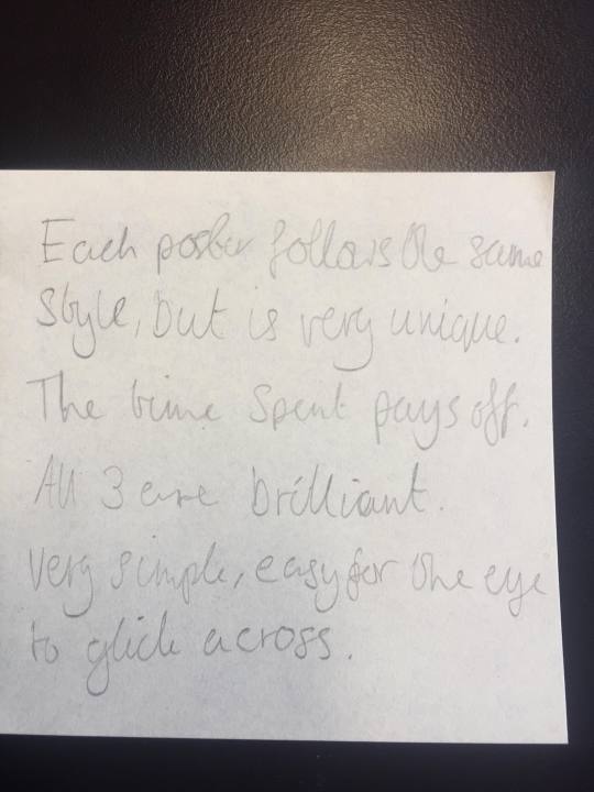
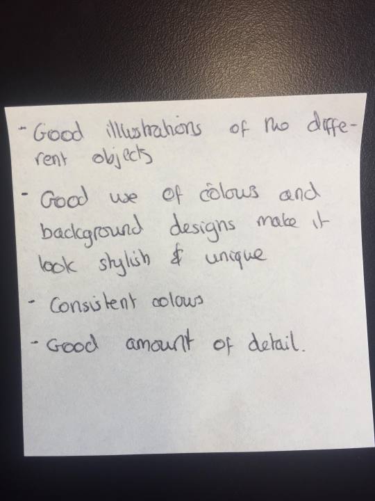
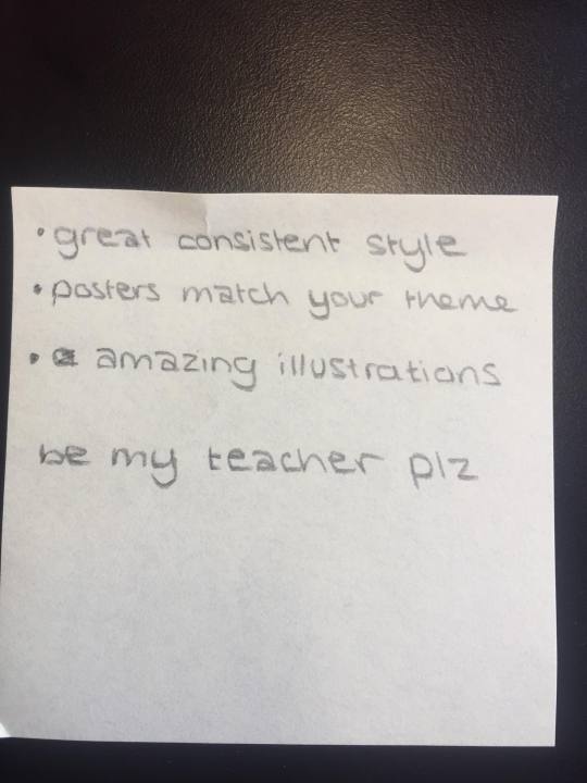
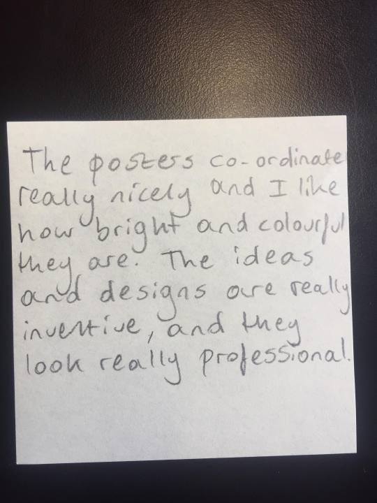
We all went round and looked at each others final designs, we then picked five different peoples work and wrote about the work and gave feedback.
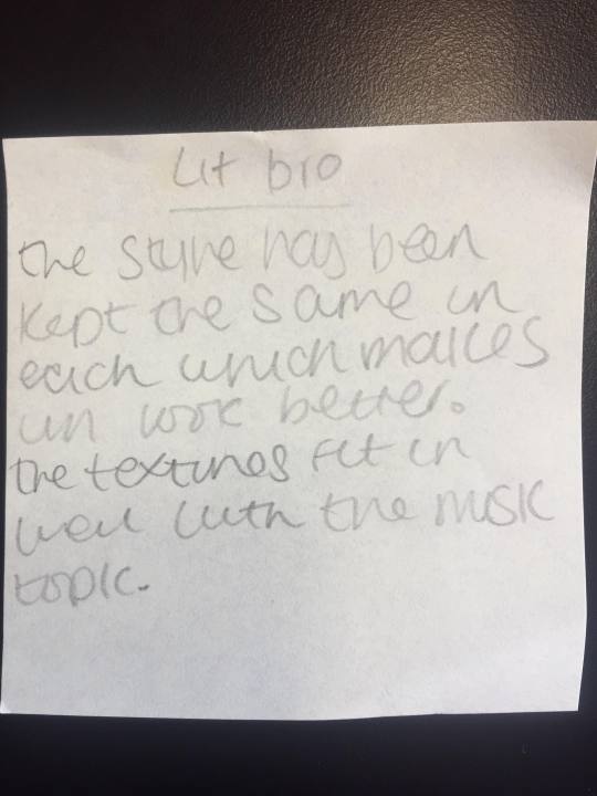
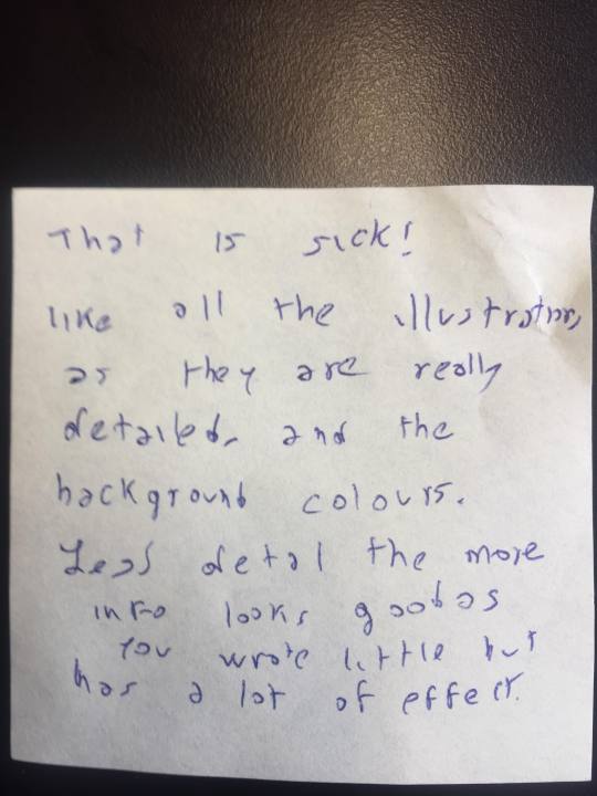
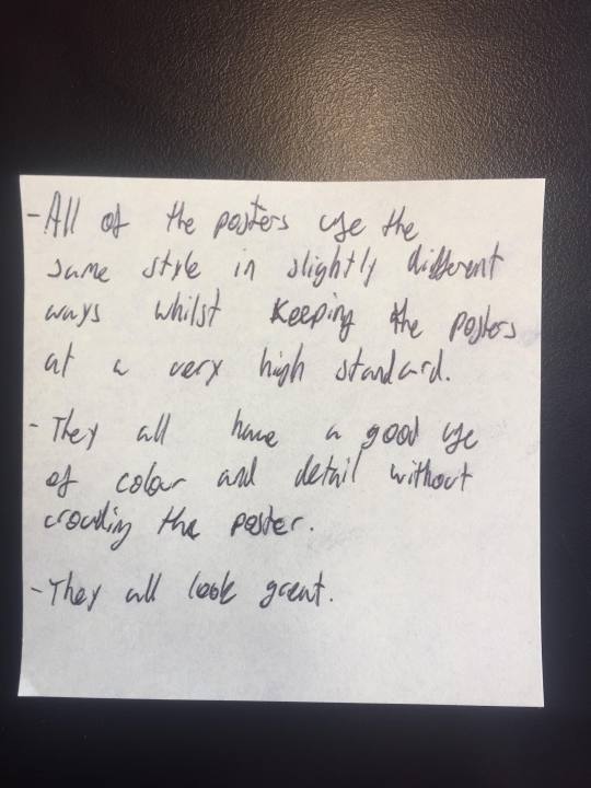
My Feedback: 7 people left feed back on my posters. The feedback was all positive and people said the “liked the colors”, they thought that I kept a high quality of work through out on each poster and that they looked “professional”. I did not get anyone giving suggestions of how I could improve or things to change, everything was nice and I agree with it for example people like the illustrations and they think the posters work well with the topic/theme.
0 notes
Photo

New page for Superfurniture.
0 notes
Photo

Thomas Schnur – Bench Chair (2012)
4 notes
·
View notes
Photo


White Elephant (Privately Soft)
Jimenez Lai.
Lai describes it as "a building inside a building," falling "somewhere between super-furniture and a small house." It's a flippable object, able to be tilted and set on any side.
3 notes
·
View notes
Photo

Superfurniture
Celia-Hannes
Le banc Superfurniture est un objet à la fois énigmatique et archétypal.
Le duo Célia-Hannes s’est inspiré des formes du mobilier rural vernaculaire de la région des Alpes autrichiennes, ainsi que des objets modernistes viennois de la Wiener Werkstätte. Faisant partie de la collection Superfurniture composée de meubles et de petits ensembles de vie architecturaux, ce banc se présente comme une mini-architecture à placer dans un intérieur.
Composition: Chêne, cerisier
Dimensions: H.83 x 106 x 47 cm
#Superfurniture#great design gallery#hannes schreckensberger#celia picard#architect#vernacular#design#furniture design#interiors#interior design#my woods#chairman#bench#oak
19 notes
·
View notes
Photo


Called “Luna superfurniture” Swedish designer Claesson Koivisto Rune aka CKR offers something different to provide as a meeting room … is only one piece of furniture, like a small room within the other, is really what everyone wants to play and can serve many uses for business meetings, friends, relax …
The design is very simple, is actually a lined oval building is sixty feet long by two and a half has some fun circular holes in it, so we can leave our feet dangling and sitting comfortably, but can also lie down and complete with cushions to sleep better, everything that does not quite convince the color, the red seems anything but relaxing, I believe that. neutral or perhaps a green would be more appropriate.
27 notes
·
View notes
Photo

Superfurniture - Superlife at Galerie Rauminhalt, Vienna, Austria
2016, plywood
Célia Picard & Hannes Schreckensberger
www.picard-schreckensberger.net
19 notes
·
View notes
Photo

Superfurniture : Photo Festival Baie de Saint-Brieuc
Célia Picard, Hannes Schreckensberger
2013, plywood
#Photo Festival Baie de Saint-Brieuc#fotofestival#furniture#furniture design#interior#interior design#superfurniture#plywood#art#design#scenography#oliver wood#interiors#celia picard#hannes schreckensberger
17 notes
·
View notes
Photo

Superfurniture BENCH
oiled oak wood, connected with cherry wood treenails 106 x 44 x 83 cm
2018, Celia Picard & Hannes Schreckensberger www.celiahannes.net
#art#architecture#design#furniture design#superfurniture#super#oak wood#wood#hand made#craft#furniture#bench#interiors#interior#interior design#celia-hannes
8 notes
·
View notes
Photo

Superfurniture BENCH
oiled oak wood, connected with cherry wood treenails 106 x 44 x 83 cm
2018, Celia Picard & Hannes Schreckensberger www.celiahannes.net
17 notes
·
View notes