#Stay in the box- NO
Explore tagged Tumblr posts
Visit Tumblr Blog
Explore Tumblr blogs with no restrictions, modern design and the best experience.
Last Seen Tumblr Blogs


Fun Fact
If you dial 1-866-584-6757, you can leave an audio post for your followers.
Text
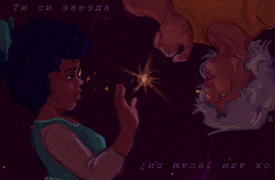
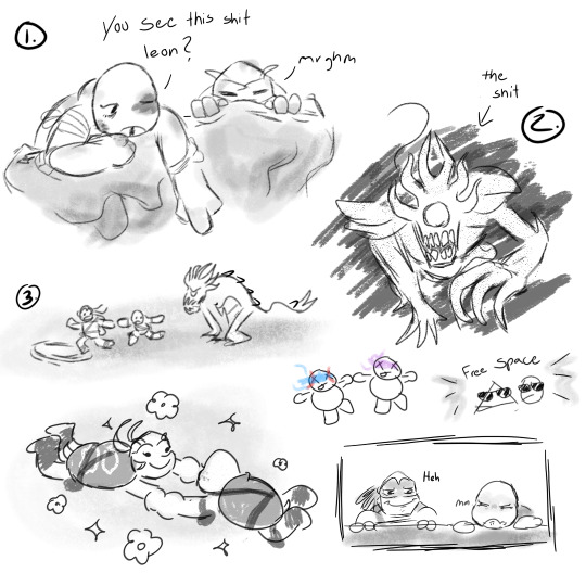
A WHOLE FUCKING SIMPING FOR THE BIG TIDDIE SPIDER-MAN LET'S GOOOOOOOO
I really thought the crush would go away but no, here we are, still bewitched by his anger issues and vampire complex


This can count as an Anniversary post?? Idk I just want to share oc x canon content
#across the spiderverse#miguel o'hara#atsv#spiderman atvs#oc x canon#spiderman 2099#the cringe is dead i killed it#stay in the box- NO#miguel spiderverse#miguel o'hara fanart#i also wanna make fanarts of the x reader fics i read here
28 notes
·
View notes
Text

Okay. Doge and Smores know of the horrors, time to share here
Lately been kinda obsessed with Fiv-3’s relationship with @aavoiding-you’s oc Starr
Send help
#Stay in the box- NO#STAY IN THE BOX#NOOO#STAY IN THE BO-#/ref#the henry stickmin collection#art#thsc#thsc fanart#henry stickmin#thsc oc#thsc original character#thsc fiv-3#thsc starr#starr#fiv-3#original character#oc#Ough. they’re killing me#man.
32 notes
·
View notes
Text
oh. I think my fears about Chiefcake passing from old age were more on point than I realized. she's acting very weak right now.
and it's late on a friday, when all the rabbit-specific vets have closed. I'll call around anyway to see if at home euthanasia is an option tonight.
#I didn't expect it to be this soon#she's been sleeping more and urinating outside of the litter box#so I was planning on getting her on arthritis meds to see if those helped her move around better#but tonight......I know how animals act when they're dying.#something has gone wrong inside her#god these things always happen at night when the vets have closed 💀#all I can do is stay with her and try to make her as comfortable as possible#this sucks#at least she still feels good enough to eat the apple slice I'm offering and tooth-purr while being stroked
4K notes
·
View notes
Text

Get it… got it!!
652 notes
·
View notes
Text


MY GLITCH ORDER IS HEREEEEEE
#im NOT opening this figure box#baby is a COLLECTORS ITEM#I might get another just to open while this one stays boxed !!!#tadc#the amazing digital circus#kinger#tadc kinger
448 notes
·
View notes
Text
i hate tat pest i hate tat pest
#hlvrai#half life vr but the ai is self aware#benrey hlvrai#benrey#i have no idea how i got half of these effects i did not take this seriously at all#hes in a little box and it should stay that way#DO NOT LET HIM OUT OF CONTAINMENT !
394 notes
·
View notes
Text
Thinking about the line in the trailer, “no one rests till this doll is back in a box” thinking how a part of Barbie is about empowerment and represents that women can do anything, thinking about how it was just businessmen trying to stop her, with Barbie running past them all trying and failing to catch her. Just. Thinking about it.
#Barbie movie#Barbie#mine#i should be sleeping rn#just…thinking about it all you know#the -doll back in a box- line is really staying with me it’s such a good line#it’s about the guy wanting to keep the representation of female empowerment ‘in a box’ aka ‘contained’#vs the scene where Barbie is running past the businessmen
3K notes
·
View notes
Text
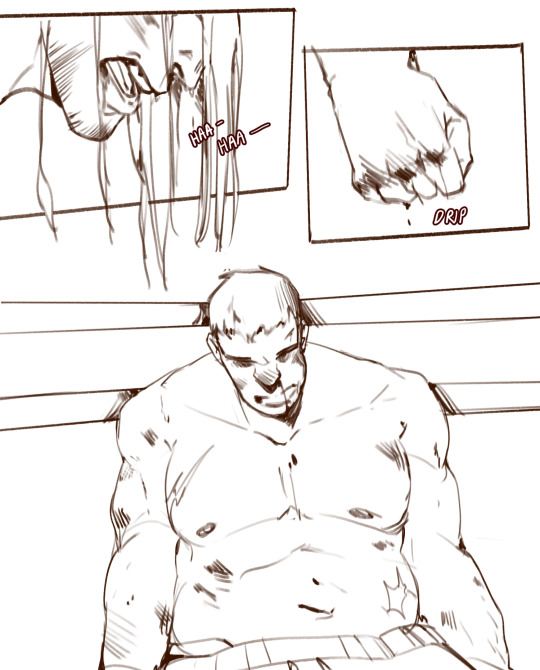

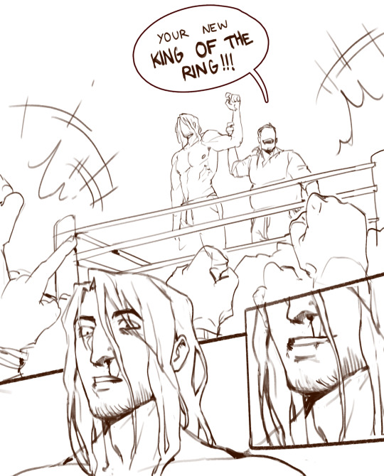

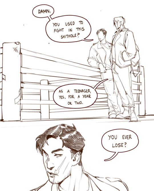

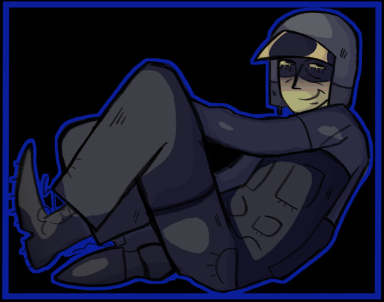
konig reminisces with horangi over his short-lived stint as an underground boxer in his teenage years...
more on patreon (plus the nsfw follow-up comic)
bonus:

#so its my headcanon that konig used to fight in a pretty shady underground boxing ring as a teenager#it was his first real opportunity to let some of his feral energy and strength out#he was only there for a year or two before the ring unfairly ousted him#after all its not good for business for one person to stay king for too long#at that point you start hedging your bets#konig got left with nothing by the end of it and he joined up shortly after#and his 'king of the ring' moniker ended up inspiring his operator name later in his life#also yes hello hi horangi#ill be exploring these two together more in the future <3#im glad to be back with my pathetic cat man#korangi#horangi#konig#cod mw2#giragi art
5K notes
·
View notes
Text
So I may have got The Book of Bill and it has me in a slight tiny itty bit of a death grip hyperfixation where all I've been able to imagine is his pathetic toxic ex ass
This pathetic triangle has once again parasitically wormed his way into my brain after years of absence


Also he totally would try and gaslight Ford and say he probably just lost the shirt when he stole it if ever asked where the shirt went
Ok so I could've put a ton of things in that last, panel, so I did, with some joke suggestive ones as the last two below the cut


I'm going to explode him with stock video explosions a bajillion times over
#art#digital art#gravity falls#bill cipher#the book of bill#billford#I'm strangling this bastard in my mind#Not like he'd want to stay considering what I've imagined him doing#I feel oddly cringe and self conscious#But I always do when presenting not dsaf to my probably 100% dsaf audience#And I feel extra mega cringe because my permanent Feral brainrot is mixing with the tbob brainrot#If you ask me about that you will open Pandora's box and I couldn't be happier#Seriously I imagined it too much and it accidentally turned into a whole ass au I think#God I'm so cringe#But I am free#I enjoy talking to myself in my tags#Hi me! It's 4:30 am go to bed
381 notes
·
View notes
Text
REST OF THE WOMEN (and birdie mac) RAHHHHHHHHHH


We love women here and I like drawing boobs. Everyone wins!!!!!
#punch out wii#punch out#punch out!!#punch-out#birdie mac#peter punch#king hippo#soda popinski#the name stays the same cuz i feel it cam work either or#don flamenco#bald bull#whether or not shes actualy bald under the headscarf is up to you#erin ryan#oh and i couldnt decide on a tjing for her#so shes just so hardcore about boxing that she got a masectomy#that or she had it for unrelated reasons and was like#well now i dont gotta wear a shirt#and they cant punch a tit#L bozos#doc louis#i dont think that name is sticking but i wanted somethinf with the same syllables and like#way of saying it if you know what i mean#mr. sandman#I FORGOT HIM LMAO#yeah i couldnt tjink of a good name cuz yknow.#mister#sandman#cant girlboss through that one
266 notes
·
View notes
Text


Still there
@imagionationstation
Ha ha torment >:))
Horrors and angst for the turt >:))
[check out the @mismatchedtwins au for those who want context haha, I'm evil I won't elaborate >:D ]
Anyways I had so much fun drawing that!! I hope u like it IS!!!! Man I love this au, very rotisserie chicken very good. The emotions on that one scene in ch.2 really struck me so I had to do something about it.
Hope ur doing good moot!! I'm only dipping in rn for a sec to put this here. I'll be back after I finally watch the sonic movie lol
Here's some silly doodles 4 ya

And Alt versions too!!


#mismatched twins au#tmnt 2012#rottmnt#tmnt crossover#rottmnt leo#currently fighting for my life on avoiding spoilers for the sonic 3 movie#im gonna stay away from social media for a while ill be back soon dw!!#IS im shaking u in a box and giving you soup i hope u have a good time these last days of the year#i appreciate YOU🫵 and ur big brain💚 thanks for helping make this year more brighter :))#stay safe guys and see ya later🫡#splatter scribbles
214 notes
·
View notes
Text


-Julio Cortázar, from "Bolero" (trans. John Joseph Lyons)
Loki S2 Anniversary x Episode 2 - “Breaking Brad”
#mobius#loki#lokius#mcuedit#lokiedit#marveledit#taking a deep breath. clenching my fists. I WAS FOLLOWING YOU NO I WAS FOLLOWING YOU 🥺💖#had the most successful day in recent memory so treated myself to the official anniversary rewatch of episode two forever beloved#or episode(s) two that is ��#and will never be over the emphasis of how their lives have reflected in such a way they can see right through each other#to the point where they're actively willing to challenge everything they know and have boxed themselves into#it's about moving forward where you used to stand still and choosing to stay when it's easier to run away!!#owen wilson#tom hiddleston#marvel#owenwilsonedit#dianagifs#flashing cw
311 notes
·
View notes
Text

#stay in the box#NOOOO#stay in the box-#NAAAOOOOO#GET OUT OF MY SKINNN#miguel o'hara#across the spiderverse#atsv miguel#atsv#miguel o’hara meme#miguel o’hara x reader#miguel o’hara fanfiction#miguel o’hara smut#miguel x reader#miguel x you#miguel spiderman#miguel atsv#spider man atsv#spider man 2099
1K notes
·
View notes
Text

Day 141 of drawing Papyrus until he cameos in deltarune! This is why I wanted to establish Paps and Maddie as besties, for this dumb bit. Im going to see Barbie today!! And so are they!
#undertale#papyrus#deltarune#drawing papyrus until he cameos in deltarune#mad mew mew#barbenheimer#ya’ll liked the text boxes so they are staying
1K notes
·
View notes
Text

ALWAYS AN ANGEL NEVER A GOD
#STAY IN THE BOX NO STAY IN THE BOX#CANNOT CONTAIN MYSELF#I KNOW YOU GUYS ALREADY SAW THE TUTU ONE IN DECEMBER I AM BRINGING IT BACK#art#drawing#myart#sketch#fanart#princess tutu#princess tutu ahiru#princess tutu duck#ahiru arima#princess tutu fakir#ptutu fakir#ptutu duck#ptutu ahiru#ptutu#ahiru x fakir#fakiru#fakiru angst#fakir x duck#fakir x ahiru#ballet
621 notes
·
View notes
Text
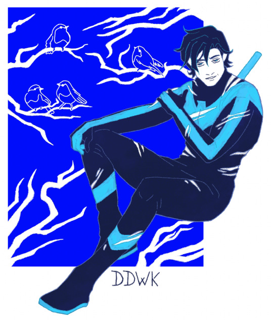
A nightwing and his robins.
You do NOT have permission to repost my art.
Forgot to attach some WIPs.
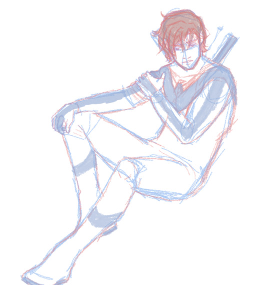
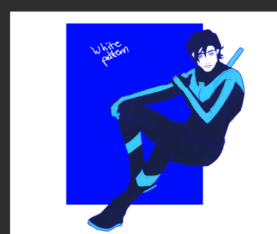
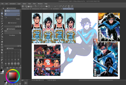
I also wanna personally thank Serg Acuna for helping me figure out Dick's anatomy and hair. I have been struggling so hard with drawing Dick and it finally feels like something clicked right in my brain this time.
#dreamer doodles#dick grayson#nightwing#batman#spent way too much time on this one#had to force myself to stop redoing it over and over#up to you which robin is which :3#palette challenges kicking my ass#but i stay silly#still trying to learn how to draw dick#thank you serg acuna for saving my life this time#I FORGOT THE PALETTE BOXES D:<
854 notes
·
View notes