#St Cuthberts Mills
Explore tagged Tumblr posts
Text
REVIEW: Select Artiste™️ Watercolor Brushes from Princeton Artist Brush Co.
The Princeton Artist Brush Company carries a variety of brushes in many shapes, sizes and bristles. The Select Artiste is largest line, with 29 brush shapes, and enough sizes to for 108 brushes, all created to use with oil, acrylic and watercolor. About the Select Artiste Brushes The brushes comes in different types synthetic hair and short-handled brushes, in an attractive blue. Given the…

View On WordPress
#Angular Shader#Art Supply Reviews#Dagger Striper#featured#Filbert#Flat Wash#Life Imitates Doodles#Liner#MaimeriBlu#Oval Wash#Pointed Filbert#Princeton#Round#Sandra Strait#Saunders Waterford#Select Artiste#St Cuthberts Mills#Watercolor Brushes
0 notes
Text

"i can be your devil"
watercolors, 9x12"
a slightly more involved watercolor piece of raphael from bg3! this was fun to paint, so many warm tones to mix in. Def getting better at layering skin tones for lighting and expressions (i got lazy with the embroidery on his clothes tho).
a bit of a companion piece with a dame aylin one i did (even tho i don't believe they ever interact and aren't really offering equivalent deals or anything, i just liked the phrase and wanted to do paintings of them both lol)
using the st cuthberts mill saunders waterford paper for this, i think i might like it more than arches oO (this is the high white, cp(not) )
#watercolor#my art#watercolor painting#raphael#bg3#baldur's gate 3#raphael the cambion#raphael bg3#devil
13 notes
·
View notes
Text
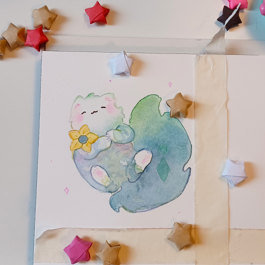
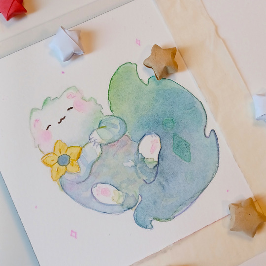
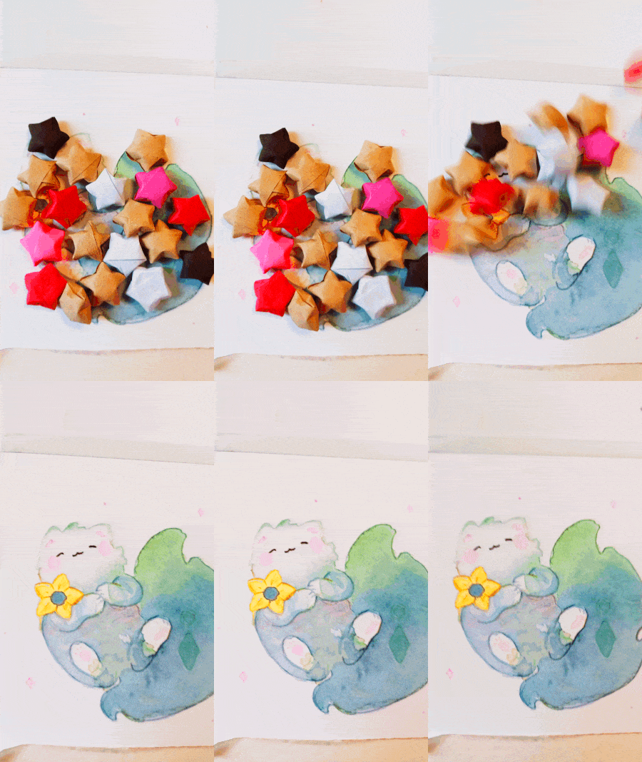
Tighnari as a cute little cat. 😻 ✨ What do you think?
Paper: St Cuthberts Mill
Watercolors: Schmincke
Pencils: Faber-Castell
#traditional art#cute#illustration#watercolour#drawing#cute kawaii#watercolour art#cute art#tighnari#genshin impact#genshin fanart#traditional illustration#watercolor#miniature
33 notes
·
View notes
Text
1990
In 1990 I finished primary school at Saint Anthony's and started secondary school at Saint Cuthbert's.
I went on my final holiday at Uncle Jerry's house in Devon. I remember by that time things were getting strange. Earlier that year, Claire, my cousin had developed an eating disorder and was now stick thin and would constantly speed-walk her new dog, a thin looking mongrel, around and around the village. I was still quite immature and not really able to process the pain she must have been in and presumably the bullying she must have endured that had probably led to this state of affairs and the cruel streak she still had.
I remember on that holiday just watching Stand By Me and The Lost Boys a lot and taping both the soundtracks as well as a Buddy Holly best of that Stand by Me soundtrack put me onto.
1st year ran from summer 1990 to summer 1991. In first year my neighbor and honorary big cousin John took me under his wing. He was a worldly third year by that time and he and I would go swimming most nights of the week and every lunchtime we'd get the local bus home and back which meant I was late for my afternoon classes every day. I especially remember coming back late for Mr Fella's English class, soaking wet from heavy rain and joining the middle of a getting to know you icebreaker lesson where the person reading out my favourite things had said my favourite group was 'Wet Wet Wet' and a schoolpal called David McGinlay said wittily, "He is!"
John was a hero in the school. He played for the football team, he was funny and mischievous and effortlessly attractive to girls- everything I wasn't. He was also, being a little older, pretty fascinated with sex and known for his innuendo-laden, bawdy patter. I tried to keep up but I wasn't on his level in any way. I'd try to grab his attention by exaggerating some fairly innocuous scene I'd watched on TV and he'd listen in delight, before crowing about what he would have done if he was in the scene. He was quite a character.
The classes I remember were Mr Hamiltons maths class. Mr Robertson technical drawing, Mr Cochlans Modern Studies class, Miss Nolan Geography, Home Economics, Miss Boyd science, Mr Grady craft and design, Mr Dean's History, Mr Devenny, Mr Bradley PE. Mr Fagan Science, the headmaster was Mr McLune. The houses were Wallace, Bruce, Stewart and Mill Hill. Mr Manson taught art and Mr Quinn taught French. Slaven the art teacher was the terror of them all.
I remember being in Mr Fellas English classroom which was at the far end of the school. The high school was fed into from three primary schools, St David's, St Margaret's and St Anthony's and when we came to the big school we were split into the houses and those tribes were the ones we stayed in for the next years, which was a lifetime at that age. Accordingly, I kept a lot of the same friends from primary school and we probably became a bit closer because we still had rapport and the history from primary school. The main friends who stand out were Martin McGoldrick, Philip Cadle, and Alan Hassan. Martin had instantly slotted into being the most popular kid in high school and he and I had a pact where we pretended to be cousins for some reason. It was an arrangement that suited me because I got to ride his popularity by association and was able to avoid the worst of the rough and tumble. John from next door was also framed as my big cousin at that time so between the two I was pretty well insulated against the worst of any potential consequences of my clowning and smart mouth.
One of the bonding rituals I remember (although thankfully I never took part in it) was the first years would go up to this place called 'the ghosties' which was apparently in the countryside up behind the school where there was a small lake that was apparently flooded mine shaft that flooded and drowned a lot of miners back in the old days where there was apparently a World War 2 plane had crashed and you could see the wreckage but I have no idea if either of those things were true. The first years would spend their lunchtimes going up to this semi remote location to pair off and French kiss each other. At the time I was spending my lunch breaks riding the length of the town in the local bus with John and Scott Carol so I missed out on this particular ritual but from what I could gather it was a mixture of bravado, establishing everyone's level in the pecking order of popularity and attractiveness, while proving how grown up and daring everyone was. I remember them all talking about it in quite businesslike terms, Sarah Holmes telling me how one day she'd managed to pair off with with Martin but how the other days she'd had to settle for less notable options. Even then it seemed weird to me.
I was still very young for my age although I did try to fake it. My claim to fame was being able to imitate Bart Simpson's voice which was ironic as I'd never actually seen an episode of the Simpsons. The Simpsons was only available on satellite TV which had only just been introduced in the UK and as we were poor there was no way in a million years I'd get to see it but the Simpsons were everywhere and the song, Do the Bartman was in the charts so I had the single on vinyl so imitated the voice from that.
It was still the era of novelty records for me.
0 notes
Photo





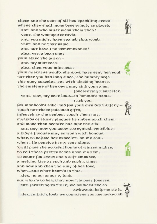

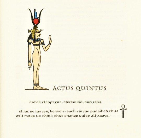
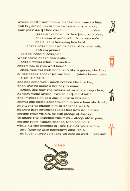
It’s Fine Press Friday!
In 1974, Lewis and Dorothy Allen, long-time proprietors of the Allen Press in California, hand-printed this version of John Dryden’s 17th-century play All for Love, a tragedy in blank verse about the affair of Mark Antony and Cleopatra. It was printed on an 1846 Columbia handpress in an edition of 140 copies using handset Menhart Unciala for the text and Hadriano for display, and printed on damp rag paper specially handmade for the Allen Press at St. Cuthberts Mill, England. The edition includes a portrait of Cleopatra hand-painted in gold and seven colors on papyrus made by craftsmen at the Cairo workshop of Dr. Hassan Ragab. Each act opens with a cut of a drawing by Victor Seward hand-colored by Dorothy Allen, and the right-hand margins of every text page are decorated with Egyptian hieroglyphs and symbols in a sequence of four colors and black.
Our copy of is yet another donation from our friend Jerry Buff.
View other posts on books by the Allen Press.
View more Fine Press Friday posts.
#Fine Press Friday#Fine Press Fridays#lewis and dorothy allen#Allen Press#John Dryden#All for Love#tragedy#play#drama#Mark Antony#Cleopatra#Antony and Cleopatra#Columbian press#Unciala type#Hadriano type#handmade paper#St. Cuthberts Mill#Dr. Hassan Ragab#papyrus#hand-painted portrait#hand-colored illustrations#Victor Seward#fine press books#Jerry Buff
43 notes
·
View notes
Text
Somerset Enhanced Velvet 330gsm
We've Added a Little Weight to an Old Classic

When we first started printing way back in 2003, Somerset Enhanced Velvet 255gsm was the first fine art paper we printed on, for nearly 20 years it has been consistently one of our most popular fine art papers.
So if it's not broken, why change it?
We believe that we can always improve and provide our artists and illustrators with something that's even better.
Somerset Enhanced Velvet 330gsm carries the same texture, the same surface colour and most importantly, the same print quality, but the increased weight gives the paper an increased sense of luxury. We’ve also found the added weight and thickness a real benefit for larger prints, providing them with added stability.
It's a very impressive paper and this update moves Somerset Enhanced Velvet from the lightest fine art paper we print on to the heaviest.
Changing to 330gsm has not changed Somerset Enhanced Velvet’s position in our pricing structure either, it will remain within our entry level Fine Art papers priced alongside Canson Infinity Rag Photographique 310gsm, so you'll benefit from the added weight and thickness at no extra cost.
0 notes
Note
Your art is beautiful! Your process videos are hypnotizing. Can I ask what type of paper you use? Do you ever have warping issues?
Hi! I use Saunders Waterford by St Cuthberts Mill, and I always stretch it before painting – you can find tutorials on how to do this on Youtube, but basically the idea is to wet the paper completely, tape and/or staple it down on a flat surface and let it dry before painting. This will prevent it from warping : )
338 notes
·
View notes
Text
Fallout Oc- Selene(as a child)
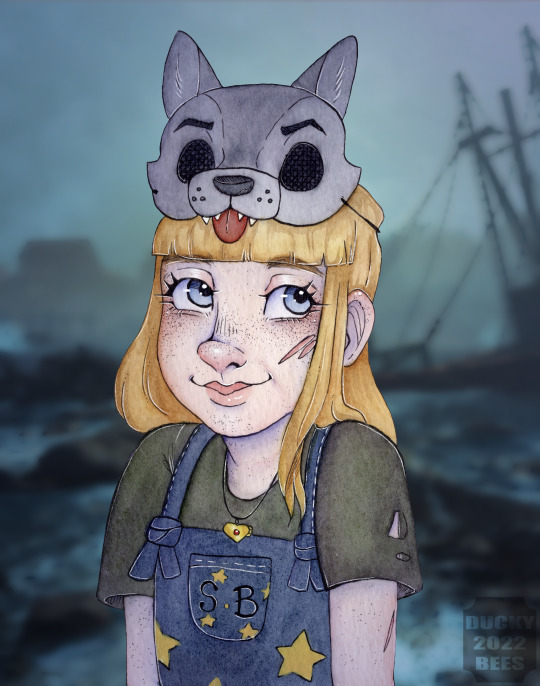

My fallout 4 Oc Selene(but as a kid)
I redid this piece because I wasn't vibing with the first one-Honestly I'm thrilled I did, it really captures her essence and kinda likeness!
Info/Lore dump-
She's a fallout oc I've had since early 2017?? like slightly after far harbour came out? No clue it's been so long- She basically like Little Red riding hood, but she trains wolves to fight/as companions. She was born in the town of farharbour and moved to the mainland for a little bit until she was 8 after her mother died in childbirth . Her father Pollock also started acting really suspicious(he's a synth)-They found sanctuary at Arcadia until she was 12. But after her father vanished into the fog she followed but got lost, then was adopted by an ex-trapper and her wolves.
Materials:
Ink: Schminke Acrylic Ink Watercolour: Sennelier, Winsor &Newton Paper: Bockingford st Cuthberts mill Digital Editor/Art App: Procreate
sorry for the tags i never know what to put!!
#watercolor art#watercolor#watercolour art#watercolour#my art#my oc#duckybeesoc#sennelier#fallout4#fallout 4 oc#far harbour dlc#fallout oc#farharbour oc#traditional painting#artists on tumblr#illustration#watercolour artist#GardenStyx Art#gardenstyx ocs#Gardenstyx_oc
15 notes
·
View notes
Photo

Evermore, Joanne Hummel-Newell
Original painting collage set in a grey aluminium frame, varnished, unglazed and ready to hang. Evermore is from my Impulse Series, 2018 This current body of work is informed by the natural world and forces such as tidal, gravitational, seasonal and time (chronological). I walk most days along the coastline near my studio and document the changing horizon. I'm interested in how natural environments effect the psychology of human beings and the rituals we invent in order to interact with the natural world. The word impulse can be related to an intuitive action, and is also the word to describe an electrical current. My colours are a palette taken from the landscape where I work. It is a coastal seaside town with bright pastel buildings, beach huts and bleached wooden signs. About the materials..Paper is my primary canvas. I use a high quality watercolour paper from St Cuthbert's mill, which is situated in the ancient Cathedral City of Wells in the southwest of England. St Cuthbert’s Mill has been making paper since the 1700's using one of the few remaining cylinder mould machines left in the world."
https://www.saatchiart.com/art/Collage-Evermore/80820/4250974/view
5 notes
·
View notes
Photo
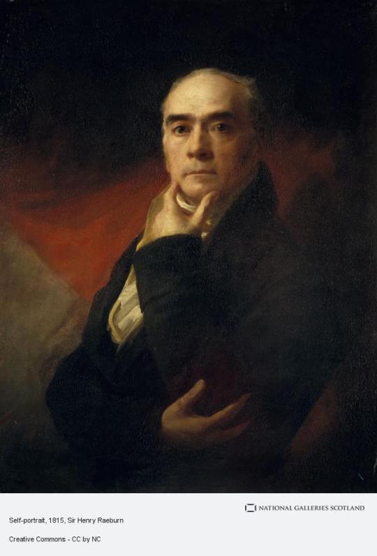


On March 4th 1756, the artist Sir Henry Raeburn was born in Edinburgh.
Raeburn lost his father, a mill owner, at an early age, was raised by an older brother, and educated at Heriot's Hospital. In 1772 he was apprenticed to the jeweller James Gilliland but began painting water-colour miniatures of his friends. He soon attracted the attention of the city's leading portraitist, David Martin. With guidance from Martin, Raeburn turned to painting in oil and began to develop his personal style. In 1778, he married a wealthy widow of independent means, whose dowry permitted him to devote himself entirely to painting. Through the marriage, he also acquired the Deanhaugh Estate in Stockbridge.
He was later to purchase the neighbouring St. Bernard's estate and to amass a considerable fortune by feuing both for building the Stockbridge extension of Edinburgh's New Town. In 1784 he travelled to London where he met Sir Joshua Reynolds whose style was to exert a great influence upon him. On Reynolds's advice, he spent the following two years studying in Italy.
Raeburn returned to Edinburgh in 1787, set up a studio in George Street, and rapidly established himself as the leading portraitist of Edinburgh society. He was to paint many of the most prominent Scots of the days, gradually developing from bust-sized figures to full length portraits. His reputation spread beyond Edinburgh and he became a member of the Royal Academy in 1815.
His most famous work is often said to be The Skating Minister, Robert Walker on Duddingston Loch, but I disagree, his painting of Sir Walter Scott is used so often surely it is more recognizable? My own personal favourite is of the celebrated fiddle player Neil Gow.
I have however tried to mix it up a little from previous posts, the first pic is a self portrait, the next is Alexander Ranaldson MacDonell of Glengarry, often just called Glengarry, he adopted, or invented, depending on the source, the Glengarry hat, an early version of which he is wearing in the pic. And finally Alexander, a well liked teacher and Rector at the Royal High School in Edinburgh, his family were tenant farmers in Morayshire, and he walked 150 miles from there to Edinburgh, aged seventeen, to attend logic classes at the university. His pupils included Sir Walter Scott, the critic Lord Francis Jeffery, Lord Chancellor Henry Brougham, the latter two are very well known to Edinburgh folk like myself.
In around 1805, fourteen former pupils commissioned Raeburn to paint Adam’s portrait, which they presented to the High School. When he died, his obituary referred to this portrait, stating that Raeburn had painted “an excellent likeness of the worthy rector, who is represented in the act of teaching his pupils”. I like this painting as he has a very genial face, the smile says it all.
Sir Henry Raeburn died in St Bernard's House, Stockbridge Edinburgh and is buried at St Cuthbert's graveyard at the West End of Princes Street Gardens, there is also a monument "next door" in St Johns.
12 notes
·
View notes
Text
REVIEW: St Cuthberts Mill Watercolor Paper
St Cuthberts Mill started making papers in the 1700’s, and today they offer three watercolor papers — Saunders Waterford®, Bockingford®, and Millford. All are suitable for other mediums as well. All too often at stores, artists are given a choice of white cold press paper at 300 gsm/140 lb weight and that’s it. This is the most flexible of papers, capable of handling the widest range of…
#art supplies#Art Supply Review#Bockingford#Millford#Saunders Waterford#comparison of watercolor paper surfaces#textures#Sandra Strait#Life Imitates Doodles#review#St Cuthberts Mill
0 notes
Text
Making of Tartaglia (Childe) - a short video of my painting process. If you're delving into watercolors, share your experience! What do you love/hate about this medium? Let me know in the comments!
⋅•⋅⋅•⋅⊰⋅•⋅⋅•⋅⋅•⋅⋅•⋅∙∘☽༓☾∘∙•⋅⋅⋅•⋅⋅⊰⋅•⋅⋅•⋅⋅•⋅⋅•⋅
Materials:
Paper: St Cuthberts Mill
Watercolors: Schmincke + W&N
Pencils: Faber-Castell
⋅•⋅⋅•⋅⊰⋅•⋅⋅•⋅⋅•⋅⋅•⋅∙∘☽༓☾∘∙•⋅⋅⋅•⋅⋅⊰⋅•⋅⋅•⋅⋅•⋅⋅•⋅
Music from #Uppbeat (free for Creators!):
License code: XHELBISG8XKRMQPT
#process#process video#watercolor#painting#painting process#childe#tartaglia#genshin impact#fanart#traditional art
12 notes
·
View notes
Photo
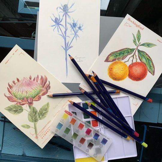
Protea cynaroides St Cuthberts Mill Saunders Waterford 100% cotton, hot press, 300 gsm Erynegium x zabelii Canson Mix Media Imagine 100% cellulose, satin finish, 200 gsm Arbutus unedo St Cuthberts Mill Bockingford 100% cellulose, hot press, 300 gsm
#protea#proteacynaroides#протея#seaholly#bigblue#big blue#синеголовник#strawberrytree#strawberrytreefruit#земляничноедерево#DerwentAtHome#botanicalart#botany#botanicalpainting#botanicalartlovers#ботаническаяиллюстрация#botanic garden#pencildrawing#wildflower#wildflowers#flowerdrawing#showmeyourflorals#flowerpower#biodiversity#exoticflowers#fieldflowers#field flowers#exotic flowers#tree_magic#paintedflowers
1 note
·
View note
Text
Post-One-Year Anniversary to PyeongChang Timeline
links to post-Sochi, post-comeback, and post-PyeongChang timelines
2019, continued:
February 22 -- Scott poses with several junior ice dance teams on the ice at Toronto Cricket Club and is thanked for his help (Toronto)
February 23 -- Tessa posts from Florence, Italy + Scott at Ilderton Arena + Scott posts a video from Thank You Ilderton + attends Paul Brandt concert that night (London)
February 25 -- Tessa posts with Carolina Kostner and Anna Capellini (Florence) + VM confirmed as skaters for Fantasy on Ice + Great Kitchen Party/b2ten release video about their organization's partnership with an interview with VM
February 27 -- Tessa's Nivea Urban Skin commercial debuts + Scott's Leaf Nation interview game session Guess Who? is released + Scott posts on twitter regarding a Leafs game + Tessa posts from Tuscany, Italy
March 2 -- Scott at a Blue Jays spring training game (Dunedin, Florida) + Tessa posts from Tuscany
March 3 -- Tessa posts from Tuscany
March 4 -- Scott works with Carreira/Ponomaranko at Novi (Detroit) + attends a celebratory dinner + Tessa posts her new Nivea commercial + Toys R Us/Barbie announces Tessa as one of their choices as a Canadian role model and an appearance
March 6 -- Tessa announces partnership with Barbie
March 7 -- Scott tweets about Tessa’s Barbie partnership
March 8 -- Tessa appears on several morning shows with her Barbie “Close The Dream Gap” promotion and a Barbie event (Toronto)
March 9 -- Tessa at Toys R Us as an appearance in partnership with Barbie/Mattel as a Canadian Role Model for Barbie's 60th birthday (Mississagua) + Tessa and Scott individually post about Lajoie/Lagha’s Junior World gold medal win
March 11 -- Scott’s Leafs TV interview is released (taped February 19)
March 14 -- Tessa tapes commercial for Air Miles partnership (Toronto)
March 17 -- Tessa appears as a presenter for the Juno awards (London)
March 19 -- Tessa spotted at The Root Cellar for dinner (London)
March 21 -- Tessa attends Nivea UrbanSkin launch event (Toronto)
March 22 -- Scott in an Instagram story doing coach duty (Montreal)
March 23-24 -- Tessa and Scott doing choreography with Sam (Montreal) + Tessa spotted on a flight back to London
March 25 -- Scott coaching Lajoie/Lagha (Montreal)
April 1 -- Scott and Tessa speak at M&M Food Market partnership rally (Mississauga, morning) + Tessa and Scott 'London Sportspeople of the Year' celebrity dinner and auction (in support of Thames Valley Children's Centre) (London, evening) + Tessa’s Nivea No Limits peacock commercial is revealed + Tessa’s cover on Glory magazine is revealed and Tessa is named as one of Canada’s 30 under 30 leaders by Bay St. Bull
April 2 -- Tessa appears on several shows to promote Nivea No Limits campaign (Toronto)
April 3 -- Tessa posts about Scott making a coffee purchase with their Visa card + VM spotted at lunch at King St. Eats + Tessa and Scott tour the Walter Carsen Centre with Canadian National Ballet’s Heather Ogden and Guillaume Cote and announce an upcoming project with Cote
April 4 -- VM working with Ogden/Cote again + filming a segment for Hello Fresh + attend Air Canada Wanderluxe gala in support of SickKids Hospital and Herbie fund + Tessa revealed as a guest judge for upcoming season of MasterChef Canada
April 5 -- VM spotted at Granite Club on the ice (Toronto)
April 6 -- Scott in Calgary participating in a development camp for skaters
April 7 -- Scott continuing at the development camp (Calgary) + Tessa in photoshoot (London)
April 8 -- VM release a short, silly segment promoting their appearances April 9 + Tessa posts from Toronto
April 9 -- media day for Rock The Rink (RTR) - most cities and dates are released for the fall tour + VM appear on several radio and TV shows promoting it
April 10 -- day 2 of RTR media day
April 11 -- Tessa in London, England
April 13 -- Tessa with Lilah and Sasha Fear (London)
April 14 -- Tessa on the ice and at tea with the Fears (London)
April 16 -- Tessa and Scott in practices for Ice Fantasia (South Korea)
*****Ice Fantasia (April 19-21) (South Korea)
April 24 -- Tessa at a photoshoot (Toronto)
April 25 -- Tessa appears on Anastasia Bucsis’ podcast Player’s Own Voice (to air in June) + Tessa at Jessica Mulroney’s One Connection event with Bumble Bizz (Toronto)
April 27 -- Scott in a photo with a fan in a restaurant (exact date unverified) (Ilderton area)
April 29 -- Tessa in a dance studio with TVA Sports (Montreal)
May 1 -- Tessa appears at Villa Maria College to promote FillActive FitSpirit (Montreal)
May 2 -- Tessa at a photoshoot for BonLook (Montreal) + Tessa attends the Canada Youth Summit as a guest speaker with FillActive FitSpirit with Sophie (Ottawa) + Scott coaches for his mom/aunts’ skating school (Komoka)
May 3 -- Tessa and Scott at a restaurant with Rock The Rink’s band Birds of Bellwoods (Toronto) + Tessa and Scott attend CSOI ‘incognito’ (Toronto)
May 4 -- Tessa attends Jordan’s barre class at BarreBelles + has an outdoor photoshoot with Adidas (Toronto) + Scott spotted arriving at Tampa airport
May 5 -- Tessa attends Run for Women (Moncton)
***** Canada's Great Kitchen Party Auction Trip, Mallorca (May 9-16)
May 16 -- Tessa’s Air Miles commercial drops
May 17 -- Tessa’s 30th birthday! posted pictures, location unknown
May 19 -- Tessa spotted out for a meal (Stratford?)
May 20 -- Tessa at the Budweiser Stage in partnership with Air Miles (Toronto)
***** Canada's Great Kitchen Party Auction Trip, Newfoundland (May 22-27)
May 27-28 -- Tessa and Scott give a talk at Investor’s Group Presidents Academy conference (New York)
May 29 -- Tessa posts as a partner of Colgate + Tessa and Scott are named as guest judges on the upcoming fall season of Battle of the Blades + spotted in the Sendai train station
*****Fantasy on Ice Tour (May 31 - June 16) (Japan)
May 31 - June 2 -- FOI, Sendai
June 3 -- Tessa goes out with other skaters to karaoke + Tessa’s episode as a guest judge on Master Chef Canada airs (taped in December 2018)
June 7 - 9 -- FOI, Kobe
June 14 -16 -- FOI, Toyoma
June 20 -- Tessa posts a picture from the cottage
June 21 -- Tessa at a shoot for MAC
June 22 -- Tessa attends Jordan’s Barre Belles class + Tessa, Jordan and the McMorris brothers attend the Arkells concert at Budweiser Stage (Toronto)
June 24 -- Tessa in Prince Edward Island + night out with other celebrities attending the Special Olympics gala (including Elisha Cuthbert Phaneuf) + renovations begin on the new location of Moir’s Skate Shop
June 25 -- Tessa attends the Special Olympics Enriching Lives Summerside Luncheon + the Enriching Lives gala (Charlottetown) + Tessa’s new collection with BonLook is revealed
June 26 -- Tessa spotted at the airport (Charlottetown)
June 27 -- Scott attends Canada Day celebrations at Parkhill-West Williams Public School
June 29 -- Scott takes a photo with a fan in his local area
June 30 -- Tessa posts Instastories of an at-home outdoor workout BarreBelle style with Jordan + a picture of her at the cottage
July 1 -- Tessa posts for Canada with a cottage pic
July 2 -- Tessa shares and IG story from the cottage featuring her Olympic gold medalist beer fridge from Molson
July 3 -- Tessa posts a picture with Jordan from the cottage
July 6-13 -- Tessa on vacation in Vancouver and California with Liz, Madori, and others (exact dates unknown)
July 15 -- Tessa posts herself at London airport
July 16 -- Tessa at a photoshoot (Montreal)
July 17 -- Tessa has a reunion dinner with queenopain, Jaime from b2ten/Reconditioning/P2 (Montreal)
July 18 -- Tessa and Scott give a talk at Deloitte Canada financial advisory summit (Mont Tremblant)
July 20 -- Tessa and Scott each post to social media to encourage people to go to Tim Horton’s to buy a Special Olympics doughnut to support the cause (Scott’s photo was taken with Dave Campbell, osteopath from b2ten)
July 26 -- Tessa attends a MAC meet and greet at Yorkdale Mall (Toronto)
July 27 -- Tessa does a Shopper’s Drug Mart Nivea ‘fireside chat’ at Vaughn Mills (Toronto)
July 31 - Aug 1 -- Tessa does a photoshoot for Adidas (Montreal)
August 2 -- Tessa attends Osheaga and has a meet and greet with the winner of a Nivea contest (Montreal) + Tessa and Scott release an Apple playlist
August 3 -- Tessa attends Osheaga
August 6 -- Tessa attends Walk of Fame Hometown Stars celebration for Chris Hadfield (Sarnia)
August 7 -- Tessa and Scott each receive their Walk of Fame Hometown stars (Ilderton and London) + Scott’s engagement to Jackie becomes official public knowledge + Tessa and Scott do several interviews
August 8 -- Moir’s Skate Shop re-opens in their new location (Komoka)
August 12 -- Tessa does a photoshoot with Paul Buceta (Mississauga)
August 13 -- Tessa and Scott have a media day for Rock the Rink, with Kaetlyn, Elvis, Jeremy, and Birds of Bellwood (Toronto)
August 14 -- Tessa and Scott in the dance studio with Guillaume Cote (Toronto) + Scott does a coaching session at Granite Club (Toronto)
August 16 -- Tessa’s Adidas ad comes out
August 17 -- Scott attends a wedding
August 18 -- Tessa and Scott’s Hometown Stars events air on local TV
August 21 -- Tessa is announced as an ambassador for RW&CO + she attends an event to promote their collaboration (Toronto)
August 22 -- Tessa has a photoshoot (possibly MAC) (Toronto)
August 28 -- Tessa and Scott spotted practicing (Komoka?) + Tessa has a shoot with new partner Yves
August 29 -- Tessa spotted out (possibly the 28th) + Tessa gives talk at private Adidas event + has a possible interview at Assembly Chef’s Hall
August 30 -- Tessa and Scott practicing (Komoka?) + Scott posted out with Jackie
September 7 -- Tessa has a meet and greet for The Brick at West Edmonton Mall (Edmonton)
September 8 -- Tessa attends the TIFF Dior launch party Toronto + Tessa and Scott have a late night practice session with Gui Cote
September 9 -- Tessa and Scott spotted for another practice session
September 11 -- Tessa has a shooting day, for unknown reasons relating to Team Canada Champion Chats (Classroom Champions)
September 12 -- Tessa’s Adidas VRCT jacket ad drops
September 15 -- Tessa posts about packing for RTR rehearsals
September 16 -- Scott borrows AC/DC lyrics to tweet about leaving for Vancouver for RTR rehearsals with the cast
September 17 -- first glimpse of on ice RTR rehearsals with the cast via Jeremy Abbott (Abottsford) + Tessa and Scott announce they are stepping away from skating after RTR
September 19 -- Tessa and Scott guest judge on the premiere of Battle of the Blades (Hamilton)
September 20 -- Tessa and Scott are back to rehearsals for RTR (Abbotsford)
September 21 -- Tessa and Scott attend an Elton John concert with Jeremy Abbott, Kaetlyn Osmond, and choreographers Matheiu and Randi
September 23 -- Tessa and Scott drop the puck at a Vancouver Canucks/Ottawa Senators (Abbotsford)
September 30 -- Scott visits a local dance school with other members of RTR (Abbotsford)
October 1 -- Tessa attends We for She as a keynote speaker (Vancouver)
*****Rock The Rink tour (October 5 - November 23)
October 5 - RTR, Abbotsford + Tessa and Scott have photo taken with a fan at a liquor store (exact date unknown)
October 6 - RTR, Penticton
October 7 - RTR, Vancouver
October 8 - RTR, TBA (removed from lineup)
October 10 - RTR, Red Deer
October 11 - RTR, Dawson Creek
October 12 - RTR, Prince George
October 13 - RTR, Grand Prairie
October 16 - RTR, Calgary
October 17 - RTR, Lethbridge
October 18 - RTR, Regina
October 19 - RTR, Medicine Hat
October 20 - RTR, Brandon
October 22 - Tessa and Scott spotted travelling from Toronto to London
October 23 -- Tessa and Scott to be awarded honorary degrees from Western University (London)
October 24 -- Tessa and Scott guest judge on Battle of the Blades (Oshawa)
October 25 - RTR, Winnipeg - removed from lineup
October 26 - RTR, Saskatoon - removed from lineup
October 29 - RTR, Sault Ste. Marie
October 30 - RTR, London
October 31 -- Tessa and Scott guest judge on Battle of the Blades finale (Toronto)
November 1 - RTR, Sudbury + Tessa and Scott do a radio interview via phone
November 2 - RTR, Kitchener
November 3 - RTR, Kingston
November 5 -- Scott does several joint television interviews with Special Olympians (Toronto) + individual radio interview (including information that his wedding will be in July) + Scott attends a Maple Leafs game with Max, Patrick, and Andrew Poje
November 6 - RTR, MIssissauga + Scott announced as a Board Ambassador for Scott Hamilton’s Sk8 to Elimin8 Cancer (to unite skaters and communities)
November 7 - RTR, Ottawa + Tessa and Scott along with Patrick, Tatiana, Max, and Jeremy are spotted having breakfast at Sunset Grill (Ottawa)
November 8 - RTR, St. Catharines + Impact magazine releases interview with Tessa + Tessa spotted out to dinner with friends before the show at Merchant Ale House (St Catharines)
November 9 - RTR, Oshawa
November 10 - RTR, Cleveland - cancelled + Tessa attends a Barre Belle class (possibly with Jordan)
November 13 - RTR, Peterborough
November 14 - RTR, Laval + Tessa announced as part of Classroom Champions
November 15 - RTR, Quebec City
November 16 - RTR, Moncton + Jeremy shares a video of the RTR cast watching Austin Powers on the tour bus
November 17 - RTR, Halifax + Jeremy’s personal takeover on IG for Edges of Glory shares behind the scenes and short chats with the cast and crew as the tour comes to an end + Tessa and Scott film a segment for This Hour Has 22 MInutes + the cast is spotted at The Press Gang Restaurant and Oyster Bar and at The Lower Deck (Halifax)
November 18 - Scott out at a Karaoke Club
November 20 -- Tessa spotted at Winsor House (St. John’s)
November 21 -- Tessa tapes a television interview for “Out of the Fog” + Scott spotted out and about (possibly with Patrick, Max, and Tati) (St. John’s)
November 23 - RTR, Saint John’s, with family in attendance
2020
******May 12-19 - GKP Ireland (Galway and Conmerra)
******May 20-27 - GKP Italy (Matera)
#thank you as always to balletfever89 and @dreamofawonderfullife for the earlier timelines#thank you to @mysticseasons and @virtchandmoir for having such consistent and reliable blogs for VM news#and thank you to the other posters and anons who help me keep this accurate#timeline#post-one-year anniversary#timeline 2019
167 notes
·
View notes
Photo

✨Nouvelle vidéo✨ on continue les tests St Cuthberts Mill, avec 2 nouvelles petites illus, qui rejoignent les mystery bag 😀🍀 #illustration #peinture #art #manga #aquarelle #paillettes #painting #watercolor #glitter https://www.instagram.com/p/B4XoY4qiJ07/?igshid=1la2oq187zpc9
1 note
·
View note
Text

I'm having fun with the White Nights watercolors on the St Cuthbert's Mill paper 😁
It will be a beautiful misty forest once it's ready! I'm about to start painting another layer.
Do you like it so far?
#artists on tumblr#watercolor painting#watercolour art#wip#watercolorist#work in progress#forest art#misty forest#watercolor trees
5 notes
·
View notes