#SpecialistPractice
Explore tagged Tumblr posts
Text
Presentation Layout
To help plan what we will need to create for our game we decided to start creating a lose plan for our presentation. To see how this would need to be laid out, I suggested we looked art past D&AD winners to see what worked well. I felt this helped us because it allowed us to see how we can create concept throughout the presentation, by including our visuals alongside the information consistently. The order we decided to use was:
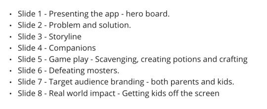
I like how this order makes the app easy to understand without overwhelming the audience with too much information. It introduces the user to the components as they would be revealed during game play.
This allowed us to see what visuals we need to focus on creating to make our presentation successful. This allowed us to separate tasks and split them between everyone in the group, allowing us to work independently when needed.
2 notes
·
View notes
Text
Examples of icks
Our main focus was to generate ideas for icks that are diverse and represent icks that people get in different settings, as well as experiences that different communities undergo.
Examples:
She didn't move in with me after 24 hours. I can't believe I didn't get the ick
He still wears a face mask. ...
He got me roses ...
They took me to the cinema on our first date ...
She didn't hold the door for me ...
They didn't look at memes I sent them
I have been on delivered for 5 minutes ...
He slept with his socks on, I can't ...
He tripped over ...
She choked on water ...
He has moustache ...
I saw her pick her nose ...
#viscom#viscomyear3#specialistpractice#spproject#d&adgroupproject#bumbled&ad#bumblebrief#bumbleproject
0 notes
Text

To photograph my final outcomes, I set up a makeshift ‘photography booth’ under my desk, this was far from perfect but I was content with the outcomes after some playing around in Photoshop.
Overall, I really enjoyed this project. Initially, I found choosing a brief very difficult, but the various workshops and sign-up tutorials helped me come to a well-rounded decision. Exploring cybersecurity and big data, subjects I hadn't previously delved into, provided valuable insights, especially regarding data breaches like the Yahoo incident. I'm pleased with how my designs evolved throughout the project, and I believe my design skills significantly improved through the various experiments. Exploring new aesthetics, such as the newspaper style, was particularly enjoyable, as was working on typography-based projects, a realm I hadn't explored much before. Creating a posterzine was a fascinating experience, introducing me to a new format. Reflecting on the project, I acknowledge the need to improve my time management, especially towards the end of the project when I felt rushed creating my 'Malware' and 'Phishing' zines after spending a significant amount of time on the 'Password' edition. For future projects, I plan to better allocate my time and consider practical aspects, such as using a photo booth instead of creating my own. In conclusion, I'm very satisfied with my outcomes for this project and believe the skills I've acquired will benefit me as a designer in future projects. The products I've created are not only fulfilling from a design perspective but also potentially beneficial for my grandparents, to whom I can share the information within.
0 notes
Text
Specialist Practice - Will it Blend?
For this project we were given two words each. Following the words, we have to come up with 6 pieces of experimentation to blend the two words together and visually show our interpretation of the words.
My words: control + soar
Here I have come up with two different lists of synonyms for each word to help me come up with ideas to blend the two together.

This list has helped me discover different meaning of the two words. I thought soar was describing something that's flying clouds high and always floats up in the air or flies, but actually it means take off which had me envision planes. This also relates to control as a plane takes off in a controlled manner. I personally think that control and soar compliment each other as we see this in nature and how birds have so much control when they fly, visualising this in many wild animals such as squirrels as well. I think potential ways of experimentation that I'd love to do is videography, screen printing, drawing, mixed media, collage of imageries, digital collage. Those are only a few that I will look to persue in the next couple of days.
0 notes
Photo

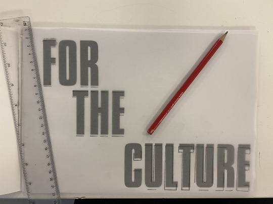
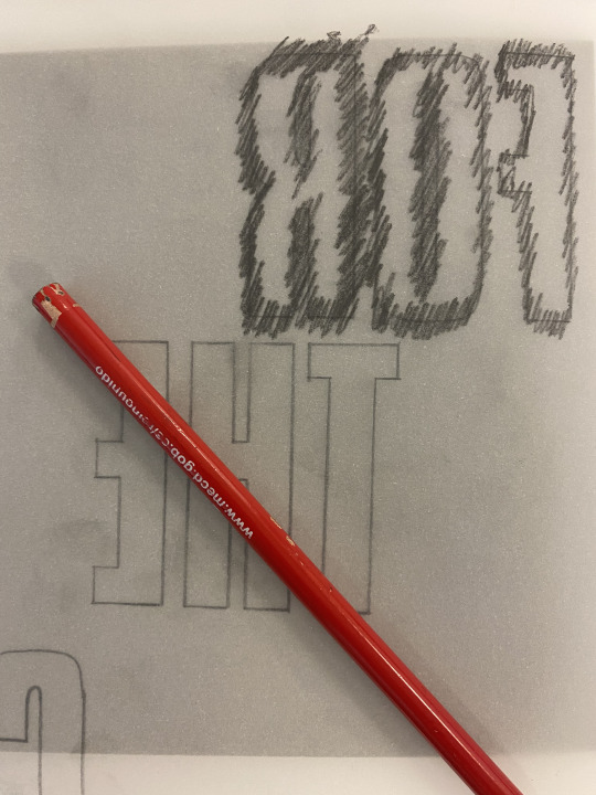

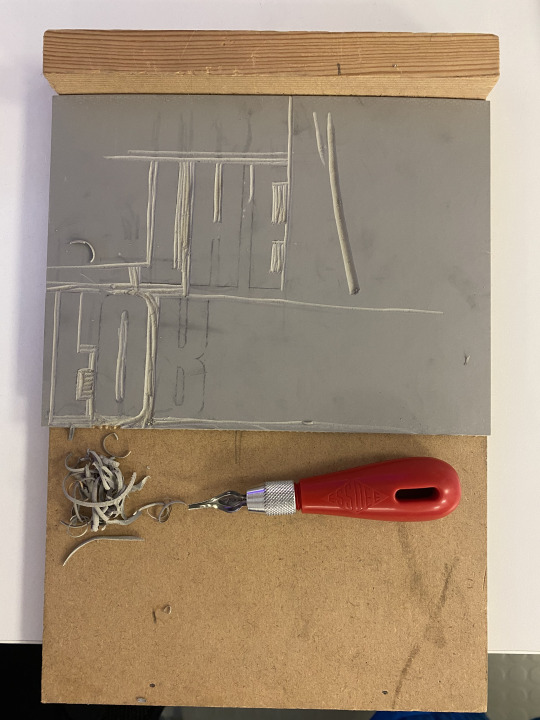
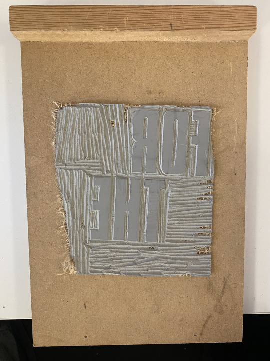

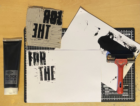


Experimenting with Linocut Printing - ISTD Project
Here I have carved the title of my final outcome ‘For The Culture’ using a rubber surface so that it can be printed. I thought the aesthetic of a hand-made font would bring a personable aesthetic towards the subject matter. The process of making these prints was very fun because I used materials that I would not often use, and it was beneficial in terms of my practical work during the experimental stages.
Firstly, I gathered my materials together so that I could begin the experiment. I watched a few tutorials on YouTube prior so that I knew what I was doing. I printed the title of my project from an InDesign document, which I then transferred into a PDF. Then, I used tracing paper to draw over the text, and I applied the typography onto the rubber surface. After that, I used a lino cutter and handle set to carve the negative space, in order to apply ink/paint on to the letters. During this part of the process I made a few errors by accidentally carving corners of the letters. Despite this, I used the 5 different blades to make a precise carving of the letters. The printing ink stage required me to use a roller and multiple sheets of paper so that I can practice printing my carved lino print.
From this experimentation of linocut printing, I was able to follow the step-by-step tutorials in order to provide a typographic print that is aesthetically pleasing. When I practice this type of printing again, I will make sure that my carving technique is precise, and that the ink is applied onto my linocut so that it prints completely on the paper.
1 note
·
View note
Text

https://bethanyjadelane95.wixsite.com/specialistpractice/teeth
0 notes
Text
Although I liked how some of the features requires the user to travel to certain places, or walk for a certain distance to gain rewards, I feel like the AR feature is optional. This made us focus on the screen more than our surroundings.
However, a few years ago when Pokemon Go was first released it required you to view capturing the Pokemon in the real world. Making you focus on your surroundings more than the screen itself.
A concept like the journeys could work well with our concept, because it gives the user a way to get to the destination without becoming lost. However, the Pokemon go journeys, are hard to follow because they give no verbal or written directions. Therefore, we got lost even though there was a determined route. If we were to explore this concept for our app, we would need to look at how we can incorporate directions into the app to make it easy to follow for our target audience, which is 10-13 years old.
Pokemon Go Research
We looked into existing games that involve walking outside and chose to explore a route in Pokemon Go. The route feature involves walking to a starting point, and continuing to the finish point, catching Pokemon along the way. We all enjoyed our walk and I kept receiving rewards the more Pokemon I caught and more I walked.
We found an issue ending the route as nothing seemed to happen when we reached the end.
2 notes
·
View notes
Photo

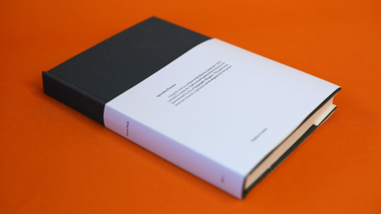


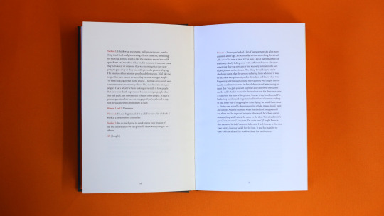
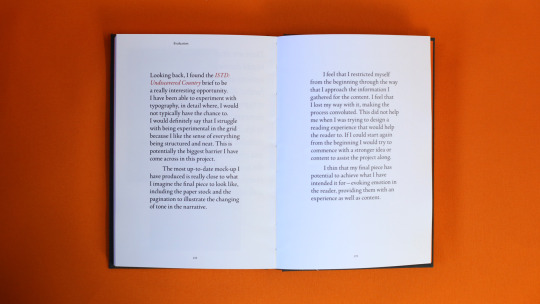
Using this unit as a chance to develop my typographic skills, I decided to tackle the Undiscovered Country brief written by the International Society of Typographic Designers. This publication showcases research, inspiration and development for this project.
#SpecialistPractice#Type#Typography#InDesign#Editorial#EditorialDesign#Design#VisualCommunication#VisCom#AUB#Art#Book#BookDesign#HandMade#TypeSetting#Orange#Process#Uni#University#Project#Photo#Photography
1 note
·
View note
Text
Brand identity

Our main goal for this morning was to start creating the games brand identity as this will help form all the assets we will create. We started by creating the colour palettes, using adobe colour to find the colours we wanted.
When choosing these colours we kept in mind that we wanted to create a medieval/fantasy environment. However we also wanted to use brighter colours to appeal to our target audience, which is 10-13.
The first purple we chose was dark and reminded us of a medieval cape colour that we often see in movies and games. However, when looking at it on Miro we decided to choose a light purple to fit our target audience. Similarly, this led us to choosing quite muted colours that were still fairly vibrant.

After deciding on the two colour palettes, we started to look at typefaces we could use to create the logo and headers. for this we wanted to use a serif typeface, as these typefaces are commonly found in fantasy and modern games. using Adobe fonts, We chose these typefaces because we liked how they were easy to read but also had the small flourishes that made them look fun.


For the main body text of our game, we decided to choose a more simple sans serif font, as we wanted our young audience to be able to read it without difficulty. We decided to choose 4 fonts as this will allow us to test which typeface will fit our visuals once created.
2 notes
·
View notes
Text
Logo icon - 10 years
After discussing options for the actual text of our copy-led campaigns and considering the visual feel of 10 years, we decided to manipulate the icon.
Kriszta's idea was to rotate Bumble's icon and turn the lines into 10. She created an animation of this movement on Procreate, which we are planning to use in advertising on social media. This will also be supported with the 10 years clicking at the end.
#viscom#viscomyear3#specialistpractice#spproject#d&adgroupproject#groupproject#bumbled&ad#bumblebrief#bumbleproject
0 notes
Text
When Tamara presented this research, I noticed that being outdoors is a main solution to preventing Myopia that is recommended by multiple sources. However, I pointed out that my parents encouraged me to watch TV and play games inside more when I was younger, because they were too scared to let me play outside with my friends. The rest of the group also agreed, that the streets are not considered safe as they were in our parents generation, meaning we are spending less time outside than our parents did. Therefore, kids are not getting as much time outside.
I also pointed out that one way I played outside and away from screens when I was younger, was going to the local youth group becuase it was safe, which my group agreed with. However, groups like this were stopped around my area because of budget cuts.
This led to my group discussing whether a solution could be a physical place that is secure and safe for kids to play, that may be safe from anti social behaviour or danger that children face, like kidnapping.
D & AD: Lifestyle research related to myopia
Myopia can be diagnosed as early as 5 years old, as the eye is yet to be fully formed. Adults whom gain myopia is often caused by stress. However, there is a limit of studies of myopic adults.
Going outdoors is the best solution to improve eye sight, especially after engaging in near sighted activities.
However, progressive outdoor time is necessary. Studies show reducing outdoor time can increase myopia.
Other forms of progressing myopia such as using atropine eye drops has side effects.
Below are paragraphs explaining the bullet points.
As compared with other measures, spending more time outdoors is the safest strategy and aligns with other existing health initiatives, by promoting a healthier lifestyle for children and adolescents. Useful clinical measures to reduce or slow the progression of myopia include the daily application of low-dose atropine eye drops, in concentrations ranging between 0.01% and 0.05%, despite the side effects of a slightly reduced amplitude of accommodation, slight mydriasis, and risk of an allergic reaction; multifocal spectacle design; contact lenses that have power profiles that produce peripheral myopic defocus; and orthokeratology using corneal gas-permeable contact lenses that are designed to flatten the central cornea, leading to midperipheral steeping and peripheral myopic defocus, during overnight wear to eliminate daytime myopia. The risk-to-benefit ratio needs to be weighed up for the individual on the basis of their age, health, and lifestyle. The measures listed above are not mutually exclusive and are beginning to be examined in combination.
Since the landmark studies by Jones and colleagues and by Rose and associates and others, it has become apparent that the amount of time spent outdoors is a significant parameter associated with the development of myopia in school children.
The Sydney Myopia Study showed that exposure to more than two hours of time spent outdoors daily was associated with a reduced odds of myopia, even in children who engaged in high levels of near work. Subsequently, interventional studies revealed that increasing the amount of time spent outdoors decreased the incidence of myopia in children. A meta-analysis of the existing literature published in 2012 estimated that the odds of developing myopia were decreased by 2% for each additional hour of time spent outdoors per week. A meta-analysis published in 2017 reported that increased time spent outdoors reduced the incidence of myopia with a risk ratio of 0.54 to 0.57 for high versus low time spent outdoors in clinical trials and longitudinal cohort studies, and an odds ratio of 0.96 per hour spent outdoors in cross-sectional investigations, but it had no effect in reducing the progression of myopia in children who were already myopic at baseline.
In a school-based trial performed in Guangzhou, China, 12 schools with altogether 1903 children in Grade 1 (mean age, 6.6 years) were randomized to an intervention group (with a compulsory 40-minute outdoor class at the end of each school day, and parents were asked to encourage outdoor activity outside after school hours), or into a control group (without adjustment of the outdoor activity schedules). After a follow-up of three years, the incidence of myopia was significantly lower (30.4% vs. 39.5%), and the change in refractive error was slightly lower (1.42 diopters vs. 1.59 diopters) in the intervention group than in the control group. However, a recent study revealed a potential rebound effect that occurred within three years after stopping of a one-year program with 30 minutes of daily outdoor jogging. Including only children who were myopic at baseline of the study, the intervention was associated with a slight increase in myopia progression.
In Taiwan, school-based efforts to reduce myopia started by improving room lighting and table height, encouraging distance gaze and ocular exercises, and performing intervals of near work of 39 minutes followed by 10 minutes of break. These procedures, however, were not associated with a reduction in the incidence and prevalence of myopia; in fact, despite these measures, the prevalence of myopia continued to increase year by year. Only after the education policy specified increased outdoor time of at least 80 minutes per day did the myopia incidence decrease from 17% to 8%, with a reduction in the myopic shift from 0.38 diopters to 0.25 diopters. This measure was more effective in children before the onset of myopia.
It is also worth mentioning that not only the accumulative time spent outdoors but also how it is combined right after sustained near work may be of potential importance in delaying the onset, as well as slowing down the progression of myopia.
To back up this causes, below are references;
https://www.opticianonline.net/cpd-archive/6631
I tried to do a survey but was unsuccessful.
Google forms link: https://docs.google.com/forms/d/19Z4BM3hMySZTKSxKAW0JUWz9wiXFwBGMkw8_FqDrlxY/edit#responses
1 note
·
View note
Text


I printed my final posterzines on 170gsm a3 paper, and assembled them all using a paper scoring tool, mechanical ruler and scalpel.
0 notes
Text
Bibliography - Specialist
Websites
https://uk.pinterest.com/charlotteodaly/roadtrip/
http://www.ignant.de/2014/06/03/top-10-road-trip-photographers/
http://www.ignant.de/2013/08/22/a-restless-transplant/
http://www.ignant.de/2013/10/18/thirteenth-month/
http://www.ignant.de/2014/01/06/black-patagonia-by-neels-castillon/
https://www.google.co.uk/webhp?sourceid=chrome-instant&ion=1&espv=2&ie=UTF-8#q=fay%20godwin
http://www.michaelkenna.net/
http://www.toddhido.com/
http://stephenshore.net/photographs/five/index.php?page=4&menu=photographs
Books
Landmarks - Fay Godwin
The nature of photographs - Stephen Shore
The print - Ansel Adams
Photographing water in landscapes - David Tarn
Landmarks The fields of landscape photography - William A. Ewing
Videos
https://www.youtube.com/results?search_query=travel+video
https://www.youtube.com/results?search_query=road+trip+video
https://www.youtube.com/results?search_query=landscape+photography+video
https://www.youtube.com/results?search_query=how+to+capture+great+landscape+images
0 notes
Photo
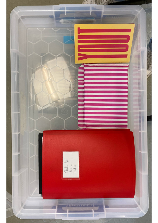
Physical Hand-In - ISTD Project
0 notes
Text
Research in to techniques

https://taxidermy.by/mammals/no-white/hyena/
https://www.stanwinstonschool.com/tutorials/fur-transfer-electrostatic-flocking-and-hair-punching

https://lauradickey1.wixsite.com/professionalmakeup11/hair-punching-cjub

youtube
youtube
https://bethanyjadelane95.wixsite.com/specialistpractice/fur-transfer--flocking---hair-punching

youtube
0 notes
Text
After developing initial ideas individually, we came together to discuss what worked well and use our research to create one concept. This recording shows how we reflected on our ideas and reached one cohesive developed idea.
This is a recording discussing our ideas and next steps.
3 notes
·
View notes