#Smartphone Lenses
Explore tagged Tumblr posts
Text
Smartphone Lenses 101: Enhance Your Mobile Video Quality
Unleash Your Inner Filmmaker: Cinematic Smartphone Video with Conversion Lenses (#cinematicvideo #mobilefilmmaking #smartphonefilm) Tired of shaky footage and flat visuals? Transform your smartphone into a powerful filmmaking tool with conversion lenses!
Introduction: Unleash the Filmmaker Within – Smartphone Lenses for Cinematic Video Forget bulky cameras and expensive equipment! Today, your smartphone is a powerful filmmaking tool capable of capturing stunning visuals. Imagine transforming your everyday phone into a device that rivals professional cameras. While built-in smartphone lenses are impressive, they often lack the versatility needed…
View On WordPress
0 notes
Text
Exploring the World of Smartphone Photography: Tips and Tricks
Introduction
In an era where smartphones have become extensions of ourselves, it's no surprise that they have also evolved into powerful tools for photography. From capturing everyday moments to creating stunning art, smartphone photography has taken the world by storm. In this comprehensive guide, we will explore the world of smartphone photography, uncovering a plethora of tips and tricks to help you elevate your mobile photography game.
The Rise of Smartphone Photography
Smartphones have revolutionized the way we capture and share moments. We'll delve into the rise of smartphone photography, discussing its impact and influence on the photography world.
Understanding Smartphone Cameras
Before diving into the tips and tricks, it's essential to understand your smartphone's camera capabilities. This chapter will guide you through the technical aspects of smartphone cameras, including sensor size, megapixels, and aperture.
Choosing the Right Smartphone
If you're serious about smartphone photography, the choice of your smartphone matters. We'll provide insights into selecting a smartphone with an exceptional camera, discussing brands and models renowned for their photography features.
The Power of Composition
Composition is the backbone of a great photograph. We'll explore the fundamental principles of composition, such as the rule of thirds, leading lines, and framing, and explain how to apply them to smartphone photography.
Lighting Techniques
Mastering lighting is crucial for any photographer. We'll discuss various lighting techniques for different situations, from using natural light to experimenting with artificial lighting.
Mobile Editing Apps
No smartphone photo is complete without a touch of editing. We'll introduce you to a range of mobile editing apps, from beginner-friendly options to more advanced tools, and guide you on how to use them effectively.
Creative Smartphone Photography Techniques
This chapter will introduce you to creative techniques like long exposure, light painting, and double exposure, providing step-by-step instructions to achieve these effects with your smartphone.
Smartphone Photography Accessories
Enhance your smartphone photography with the right accessories. We'll discuss essential gear like tripods, external lenses, and stabilizers, helping you choose the best additions to your kit.
Advanced Tips and Tricks
Once you've mastered the basics, it's time to explore advanced tips and tricks. This chapter will cover techniques like HDR photography, panoramas, and using the manual mode on your smartphone camera.
Mobile Photography Genres
Discover various photography genres you can explore with your smartphone, from portrait and landscape photography to macro, street, and astrophotography.
Showcasing Your Work
Your journey in smartphone photography is incomplete without sharing your work. We'll discuss how to build an online presence, create a portfolio, and engage with the photography community.
Smartphone Photography Challenges and How to Overcome Them
While smartphone photography offers convenience, it also comes with challenges. We'll address common obstacles and provide solutions to overcome them.
Smartphone Photography Ethics
In this digital age, it's essential to be mindful of photography ethics, such as respecting privacy and seeking permission. We'll explore the ethical considerations specific to smartphone photography.
The Future of Smartphone Photography
Smartphone technology is continually advancing. This chapter will give you a glimpse into the future of smartphone photography and emerging trends.
Conclusion
Smartphone photography has evolved into a dynamic and creative field. With the right knowledge, techniques, and a keen eye, you can capture stunning images with your smartphone. Whether you're a novice or an experienced photographer, this guide has something for everyone. So, grab your smartphone, explore the tips and tricks, and embark on a journey to discover the incredible world of smartphone photography.
If you're passionate about smartphone photography, consider sharing your best shots on social media or photography platforms. Join photography communities and engage with fellow enthusiasts. Remember, the more you practice, the better your smartphone photography skills will become.
0 notes
Text
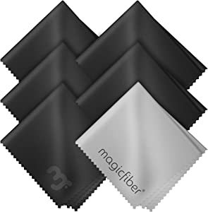
Product name - MagicFiber Microfiber Cleaning Cloth
Product Details
Glasses cleaner - Sourced from the highest quality microfiber that absorbs and removes dust, oil, smudges, fingerprints, dirt, and more. Leaves no scratches, streaks, marks, or lint behind. Makes for the perfect eyeglass cleaner and stocking stuffer.
Shop now
Screen cleaner: Our Microfiber cloth accommodates all your screen cleaning needs. It's the perfect eyeglass cleaning cloth, glasses wipes, glass cleaning cloth, lens cleaning cloth, screen cleaning cloth, and even tv cleaning cloth.
Quality protection: Each MagicFiber lint free cloth comes in its own polybag so that they are always new and ready to use. Includes MagicFiber Microfiber Cleaning Cloth (5 black, 1 grey) 6 x 7 inches (15cm x 18 cm).
Designed for all products: The delicate craftsmanship of our Microfiber Cleaning Cloth allows for the most versatile use cases. It can be used on any delicate surface such as LCD, OLED, laptop, phone, car, tablet, dvd, mirror, glass, glasses, cameras, lenses, gaming, toys and more!
MagicFiber: Magical results for the things you care about most
Shop now
#shopnow#shopping#amazon#cleaning#ts4cc clothing#special offers#laptop#lenses#apple tv#alice glass#smartphone
0 notes
Text
Smartphone cameras are NOT getting worse. (See below for phone photography tips)
I've now seen 3 pro photographers reviewing the iPhone 16 and complaining the cameras are "worse" and blaming Apple for not including revolutionary new camera technology.
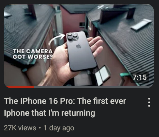

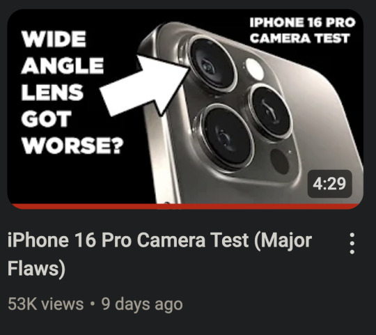
And I suppose this is partly Apple's fault. Their marketing and hype machine always goes overboard. But also, that's just how marketing works. Samsung has a "200 megapixel" sensor and Sony has a "Zeiss" lens. And I think it is unrealistic to expect smartphone companies to say "This product has entered the iterative phase and each new model will only be marginally improved over the last one."
Smartphones (from any brand) have become an appliance. You don't buy a new model of microwave every year. And you don't expect every new model of microwave to have new revolutionary technology. And that is pretty much the expectation you should have with most computer hardware from here on out.
And in some ways, that is a good thing. That means the design of the phone has pretty much been perfected and it will last you a long time if you take care of it. You will not be left behind and your phone will be able to handle any new software for most of its lifespan.
So, is Apple getting lazy or is there a reason their hardware is stagnating?
It seems that neither money nor marketing can change the laws of physics.
They cannot make transistors much smaller. Phones and computers are about as fast as current hardware designs can make them (unless there is a shocking scientific breakthrough). From here on out, heavy compute tasks that are beyond your phone or computer will be done in the cloud on giant computer clusters. Thankfully computers and phones seem to be plenty fast for the majority of tasks we ask of them.
I remember Katrina telling me her new computer didn't seem any faster. And I explained the computing tasks she does regularly were not really affected by the increased power and speed of her new computer. If something took 0.1 seconds before and now it takes 0.05 seconds, that is twice as fast. An increase in speed that looks fantastic in advertisements. But it is hard for our brains to perceive. She just didn't do anything on her computer that took it long enough for her to notice. But having a faster and more powerful computer/phone will increase its lifespan and resale value, so it is still prudent to get the best things you can afford at time of purchase.
And I'm afraid smartphone cameras are hitting their own hardware limitations. They can't make the sensors much larger to get better depth of field and low light performance. And cramming in more megapixels doesn't actually add much more detail, if any.
It's physics.
Again.
You cannot get any more performance out of a small plastic lens. Why do you think pro photographers haul around 10 pound lenses still?
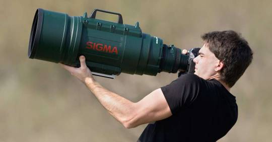
There is a formula for detail that never seems to be explained in any camera marketing.
Here is the simplified version...
Detail = Sensor x Lens
Let's say 1 is perfection. You have a sensor that performs at 0.5 and a lens that performs at 0.2.
The total detail will be 0.1.
But in the new model you increase the performance of the sensor to 0.8. WOW! That's so close to 1!
The total detail will be... 0.16.
Now let's imagine we've discovered a magic, physics-defying tiny plastic lens that performs at 0.8 as well.
The total detail jumps to 0.64!
But we all get sucked into a wormhole because we violated the laws of the universe.
Even if you were to design a near perfect (perfect is impossible) sensor that scores 0.99.
Without that magic plastic lens... 0.198
This is why I put Samsung's "200 megapixel" sensors in quotes. Because when paired with the same tiny plastic lens, there isn't much improvement. And that's why a 12 megapixel DSLR from 10 years ago with a giant honking lens can still capture more detail.
Most of the quality from smartphone cameras comes from the computational software processing. Phones actually take many photos at once and combine them to get you a decent image.

While that is still improving a little bit each generation, those improvements are stagnating as well. Until image processing can do a better job of inventing more detail realistically, smartphones are going to have to obey the laws of physics.
So... why are photographers saying the iPhone cameras are worse?
First, the ultra wide angle lens looks softer in low light.
And if you zoom between 1x and 5x, the images look less detailed.
But neither of those things make the cameras *worse*. In fact, the cameras are better for the most part. It's just that Apple decided to compromise on one aspect to improve another. Probably due to market research telling them most people prioritize certain things over others when taking photos.
They increased the resolution of the ultra wide angle sensor to match the detail of the main sensor, but that seems to have lowered the low light performance of the ultra wide. So in good light, you will see an improvement in sharpness. But they could not increase the sensor size to compensate and smaller pixels can have trouble with dim conditions. They probably discovered that people mostly use that lens in good light and they would appreciate the bump in detail more.
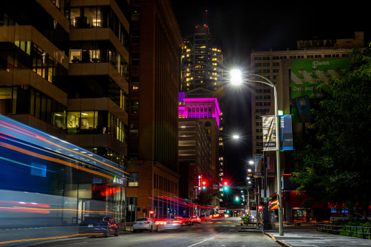
But pro photographers often photograph in more challenging lighting conditions because you can capture a more artistic shot. I don't think I could have gotten this shot on a smartphone.
But photo normies are just taking pics of their kids doing weird kid shit.
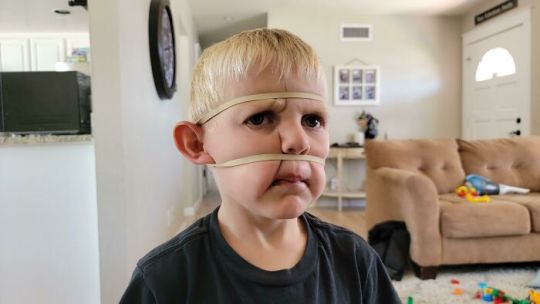
They aren't really trying to push the limits of their ultra wide angle lenses.
And they increased the zoom of the telephoto lens to 5x from 3x because most people never used the 3x. So images at 5x look great now, but unfortunately if you use anything between 1x and 5x, your image will be *digitally* zoomed. Which is never as good as optical zoom. They basically crop the photo, zoom in, and add sharpening.
So they prioritized people having longer reach and more zoom at the expense of that middle zoom range. Every camera system makes tradeoffs and compromises.
And I hate that I always feel like I am defending Apple, because they do have misleading and dishonest marketing regarding a lot of aspects of their tech. But hating on Apple gets more clicks so content creators also make misleading and dishonest claims.
And so we are just surrounded in a circle of hyperbole from all sides.
Now, if you know these limitations, you can change your approach to photographing stuff to keep them from being an issue. You can reap the benefits without dealing with the new compromises.
Here are some tips to help owners of the new iPhone, but also everyone else too.
Smartphone Photography Tips
Whenever possible, try to use the main 1x camera at only 1x zoom. This has the largest sensor with the most detail and works best in the lowest light. Only use the ultra wide or telephoto if you cannot get the photo otherwise. If you aren't sure you have enough light for ultra wide, take the photo, and then as a safety, take two photos with the main camera side by side and stitch them later with a pano app.
"Zoom with your feet" and don't use "in-between" zooms. Let's say your lenses do 0.5x, 1x, and 5x zoom. Even though you have the option to use other zooms, like 2x or 3x, that is going to compromise your picture quality. It is essentially going to crop your photo and enlarge it, which causes a loss of detail. If fact, if you use 4.5x instead of 5x, your picture will probably look like trash. You are always going to get better results if you can move closer or step back so that you are using the native focal length of your chosen lens. For example, let's say you are taking a photo and you judge the best framing to be at 4x. But you still have 10 feet of space behind you. If you back up and then zoom in to 5x, the phone will switch to that lens and you will get a much clearer picture.
Rule of thumb...
1 to 3x... try to move closer.
4 to 5x... try to move back.
If you hit a wall and end up at 4.5x, you might see if you have a panorama mode and try that instead. Switch to your 5x and do the pano. Or you can take two photos and then stitch them together with software later on. (Stitching panos with an app later will give better quality than pano mode, especially in low light.)
Low light needs stability. Get some sort of stabilizing device for low light photos. Either a phone case that lets you stand up the phone on its own or a mini tripod.
This thing folds to the size of a credit card.
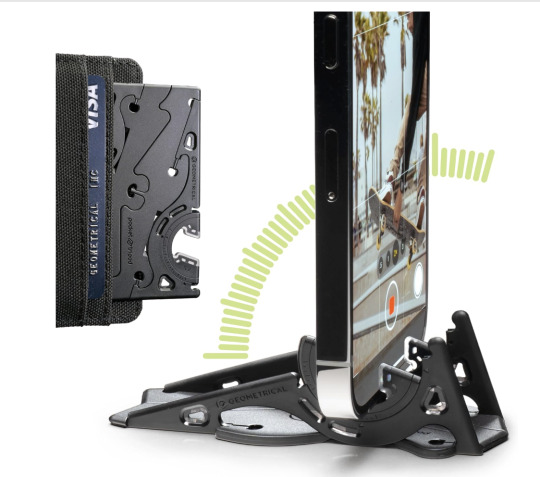
Your phone will detect when it is stable and not being handheld. It will then automatically extend its shutter speed allowing it to drink in more light and give you a better picture.
Tripods are photography magic and will improve your low light photos quite a bit. Motion blur of moving subjects can still be an issue, but photos of a cityscape or landscape will look great.
For selfies, shoot a little bit wide and then crop in. This goes a little contrary to my earlier advice saying cropping lowers detail, but this is specifically for shooting a face. The 0.5x and 1x lenses on smartphone cameras are fairly wide angle. This can cause unflattering proportions with human faces. Wide angle lenses exaggerate distance. Near things look very near and far things look very far. To a wide angle lens, the tip of your nose looks like it is super close but your ears seem like they are a mile away. And that's why you may look a bit "alien" in your selfies.
People's natural instinct is to "fill the frame" with a face. The outer edges of a wide angle lens are more distorted than the very center. So try to keep faces away from the edges of the frame.
And one other trick you can do for selfies and pictures of faces is step back a few feet. Sometimes this is hard, especially with selfies, as your arm is only so long... but if you can take your face photos from just a little bit farther back, you will almost entirely eliminate unflattering distortion. In some cases, just stretching out your arm as far as it will go is enough.
Then you just crop the image with the framing you originally wanted, and your facial proportions will look great.
An example...
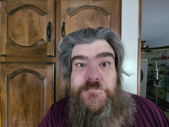
Here the distortion is bad because I am not in the center and the lens is too close to my face. The lens thinks my nose is really close and my ears are in Canada.
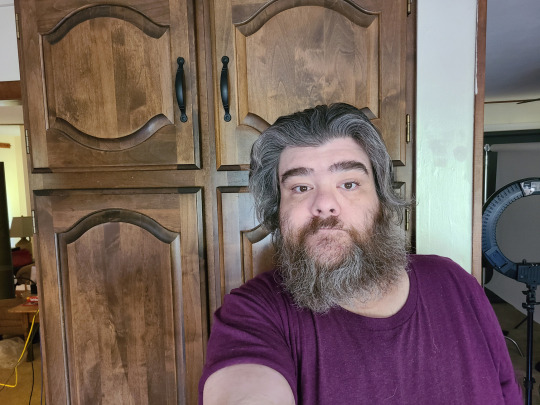
But when the lens is farther back the edge distortion is less prevalent and my nose and ears (relative to the lens) seem roughly the same distance away. So my proportions look great, but I don't quite have the framing I want.
But with a little cropping...


For social media there is still plenty of resolution to crop in. Cropping isn't bad, it's just always better to use it as a last resort or in a special circumstance like this. I get roughly the same framing as in my wide angle shot, but I don't look like I'm behind a door's peephole trying to sell you the Good News.
I wish they made a "mini" selfie stick that only extended a foot or so. With the main camera that is usually all people need to undo any wide angle issues. I have one of those mini tripods and that works well, but there is no activation button so I have to do a timer. Mirrors work great to help you get some selfie distance.
In any case, all cameras have limitations and compromises. Clickbait titles saying something is WORSE THAN THE OLD ONE are frustrating and wrong.
And people upgrading phones every year are silly. All current name brand smartphones have promised at least 5 years of software updates. I think Google and Samsung are offering 7 years on some models. And Apple has always just let you use your phone until it literally will not work with new software. Which has worked out to 8 years in some cases (with a battery swap).
Phones are now appliances. For now, hardware will improve 10 to 15% from generation to generation until physics breaks. So if you want a 50% improvement, wait 5 years and you'll think your new phone is awesome. If you upgrade every year, it is going to be difficult to see the change.
I hope to be starting a little course on smartphone photography in the near future. All modern phones are capable of taking amazing pictures. And as long as you understand their limitations you can mitigate or avoid them. And that is what I plan to teach.
700 notes
·
View notes
Text
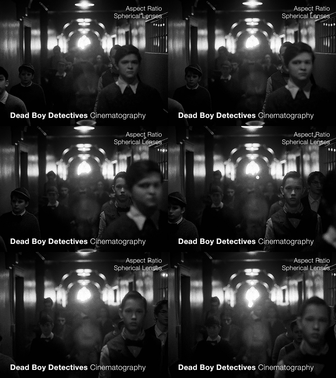
Part 2 — this time with a focus on the flashbacks
(Check out the first post for some background info that will be useful)
When we’re looking at the cinematography of any piece, once we’ve established what the norm is (which is the use of anamorphic lenses, as per the last post) we can then look to see where it diverges. As far as I can tell, the only part of Dead Boy Detectives that doesn’t use an anamorphic lens is Edwin’s flashback scene.
Now this is particularly interesting since not only is it filmed with a spherical lens, but it also is the only scene with a different aspect ratio, and the only scene in black and white. Everything about this scene is glaringly different. The easy and obvious reason is that it sets this scene apart as something important to pay attention to, as well as emphasizing the difference in the time period. But I want to highlight how exactly it does this since it is quite clever.
It also raises the question: Why not film Charles’ flashback scenes differently?
Like last time, let’s start with a review of history and technical information.
What is an aspect ratio?
This is just the ratio of the width to height of the frame. 1:1 is a square, whereas 2:1 is a rectangle twice as wide as it is high. In film, aspect ratios are usually listed as a ratio of x:1, so you get common formats like 1.85:1 and 2.39:1 (the second being a super-widescreen format, i.e. a long rectangle). Other common ratios are listed with different numbers, like 4:3 and 16:9. Any time I write an aspect ratio with other numbers, I’ll also list it at least once with the x:1 format so you can compare things easily.
What are some common aspect ratios and what have the standards been across the past 100+ years of film and television history?
Brief history of aspect ratios in Film
The original silent films were mostly filmed in 4:3 (1.33:1). This aspect ratio persisted until the late 20s/early 30s when the Academy Ratio, 1.375:1, was introduced and somewhat standardized (at least in the USA) until the 50s. Then, widescreen became pretty popular and was used to draw audiences to the theaters. At this point, we get tons of variation in aspect ratios in films. But, for American theaters, common projections are 1.85:1 (which became super common) and 2.40:1 or 2.39:1, whereas in some European theaters, 1.66:1 is a more common ratio.
Some other common ratios deal particularly with 70mm film:
Standard 70mm film is usually 2.2:1. However, using anamorphic lenses will create a higher aspect ratio, and unless using a specific format common in the 50s and 60s (Todd-AO), this wasn’t often the aspect ratio that viewers would see. (The Sound of Music was shot with Todd-AO in 2.2:1, but until recently, most people only saw the general release in 35mm, which had a different aspect ratio)
IMAX, which is 1.43:1 (if IMAX is shot on film and not digital, it uses 70mm film)
Brief history of aspect ratios in Television
Pretty much all televisions until around the 1990s-2000s used 4:3, and broadcasters would show content in that aspect ratio. If a movie was broadcast over TV, sometimes there would be letterboxing (black bars), but pan-and-scan was common, where they would crop the movie to the 4:3 ratio, and pan around to wherever the action was happening. Starting in the 90s, widescreen televisions started to gain traction, and the 16:9 (1.77:1) format prevailed, and TV broadcasting had some more wiggle room for aspect ratio.
**Side note: Computers are often at this ratio, so if you watch older TV shows on your laptop, you’ll probably see pillarboxing (black columns on the sides), whereas newer movies are often shot with higher aspect ratios so they have letterboxing (black bars on the top and bottom)**
A note on widescreen
Movies are usually considered widescreen if they’re any higher than 4:3 (or 1.33:1). However, because of the aspect ratio of modern TVs and computers, and the even higher aspect ratios of most smartphones in landscape mode, a lot of people (especially younger generations) won’t consider things “widescreen” until they’ve got a much higher aspect ratio.
Streaming and Aspect Ratios
A weird effect of streaming services, and in particular Netflix, was the rise of a new standard in aspect ratios, 2:1. It’s used in shows like Stranger Things. It’s widescreen enough that it feels cinematic but it displays well on lots of devices. There’s minimal letterboxing (or none) on your phone, and more letterboxing on your computer and TV, but not enough to seem like you’re watching a movie instead of a show.
Netflix (and Amazon) really like this aspect ratio. In 2017, one of the production requirement documents from Netflix stated that any aspect ratio greater than 2:1 had to be subject to further approval (though now they state “Aspect ratio choices should be discussed with Netflix for approval”). It’s become increasingly common, and these companies have a pretty set standard for 1.9:1 and 2:1. If we see those ratios on a streaming show it isn’t always a creative choice, similar to the way older TV shows were required to be in 4:3.
A brief reminder about lens types with some extra bits about the timeline.
That 2.39:1 aspect ratio that movies use? That’s the standard for anamorphic lenses (discussed in Part 1). Anamorphic technology was developed around 1915 (for military reasons), but wasn’t used for films until 1927, and didn’t become commonly used until the 50s.
So, with that, let’s look at Dead Boy Detectives.
Aspect Ratio
The whole show is shot with anamorphic lenses, but instead of a 2.39:1 ratio, they use a 2.2:1 ratio. This is a really interesting choice since it is an uncommon ratio. It’s more widescreen than Netflix shows (they started shooting before being acquired by Netflix though so we can ignore any impact Netflix may have had on this decision) but not quite the widescreen that anamorphic lenses typically use.
Movies and shows can use almost any aspect ratio today, but it is still common to stick to the standards. When they choose something else, it’s not because of technical limitations, but because of a creative choice.
The one caveat I have is that Doom Patrol used 2.2:1, so it’s possible that HBO and DC originally just chose this for continuity between the two, before the show was shifted over to Netflix and the Sandman universe. But for this post, I’m going to assume that they were sort of starting from scratch when choosing the look.
If we consider what a 2.2:1 ratio has been used for, and what viewers have been “trained” to associate it with, we end up with Todd-AO 70mm prints and a few others from the 50s and 60s. It’s the kind of aspect ratio you don’t see often unless you’re lucky enough to live near a theater with a 70mm film projector. There are a few notable movies shot in this aspect ratio: Lawrence of Arabia and 2001: A Space Odyssey. Some more recent movies that used 2.2:1 include Dunkirk, Tomorrowland, Nope, and the non-IMAX parts of Oppenheimer. It’s also occasionally used in recent TV, but not a ton, and not with many popular shows.
This is an aspect ratio used by large-format, high-budget movies. As mentioned in the previous post, anamorphic lenses are associated with a romanticized notion of “cinema” and this aspect ratio only serves to further that, associating Dead Boy Detectives with the limited pool of content made in this aspect ratio. It may be a TV show, but it’s being shot like a movie.
Another really interesting point that follows up on the previous post is the idea of using cinematography to enhance the sense of the supernatural and separate the characters from the normalcy of the real world. The aspect ratio is a bit unnatural too, which serves to complement and augment this.
Let’s briefly look at what the show would look like in different aspect ratios. As a baseline, this is the 2.2:1 aspect ratio that the show is in:
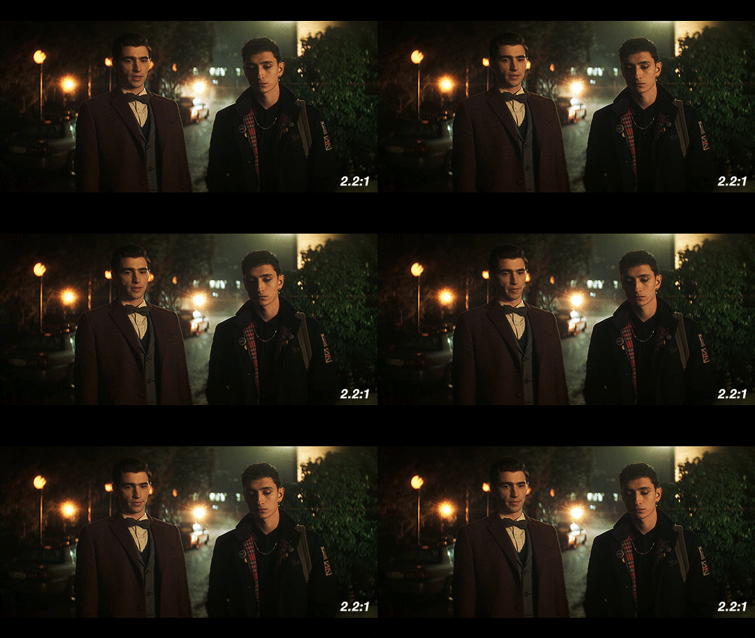
If they had gone for a 2.39:1, a very typical aspect ratio for the kind of lenses they’re using, it would look like this:
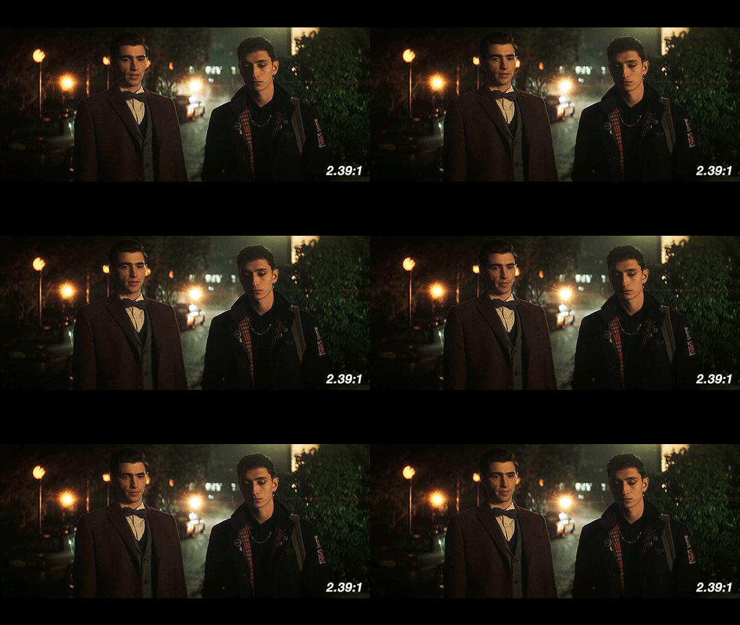
When we see things shot with anamorphic lenses, we’re used to seeing it in a frame like this one. Especially in shots like this with the dramatic lens flares, this is going to look and feel familiar to people who watch a lot of movies. It has more of that Star Trek (2009) look, and feels kind of glossy and polished.
Next up, we have 2:1, the aspect ratio popularized by Netflix. It’s a reasonable possibility that if this show had been produced by Netflix from the very beginning, this is what it would look like.
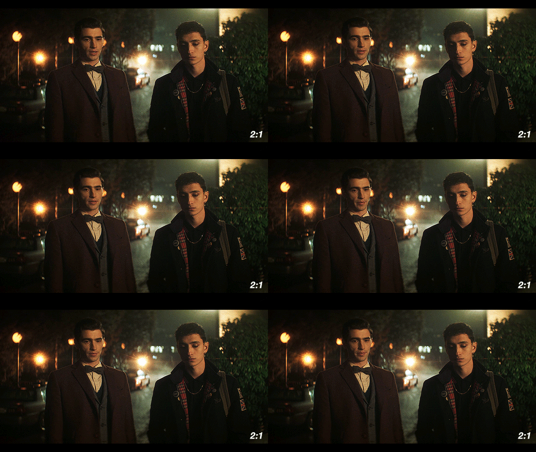
Over the past few years, this has become the “streaming platform” aspect ratio. With the extra vertical height, it’s got some extra space to breathe. We would get less of the background and more of the characters, especially since Dead Boy Detectives favors centered shots of single characters over group shots like this one.
Finally, I’ve got the scene in 1.85:1, a ubiquitous film aspect ratio, yet one that is not used often on TV.
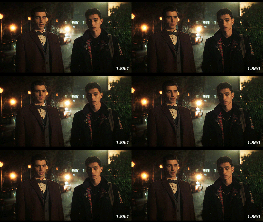
This is considered to be standard widescreen and it’s a great aspect ratio. Given how many creative decisions in this show were made to emphasize the supernatural, this could have been another good option as an aspect ratio, since we’re not used to seeing TV shows like this. However, they’re using anamorphic lenses so this would have required a lot of cropping. Because of how the anamorphic lenses work, this would also necessitate a lot of additional attention during the shoot. If they had gone with 1.85:1, we likely would have gotten a show shot on sphericals instead.
So what about Edwin’s flashback?
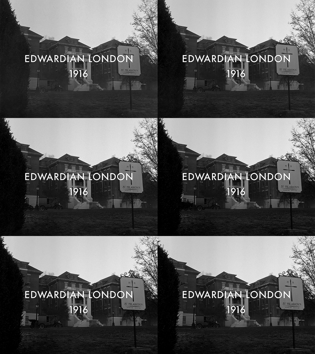
This section is shot in 4:3 (1.33:1). It’s the only part shot in a different aspect ratio. Sure, changing the aspect ratio forces us to acknowledge the difference in time period, but why exactly does it work so well?
Remember the history part? 4:3 was used for most of the early silent films. If we are to consider the “historical accuracy” of shooting the different time periods in this show, anamorphic lenses and 2.2:1 make sense for the present-day parts and Charles’ flashback.
But in 1916, widescreen cinema wasn’t a thing. If Edwin had ever been to see a movie while alive, it would have been in 4:3. The first time he would have ever gotten to see something in widescreen (if we assume he watches any movies at all) would be after he escaped Hell.
Using this aspect ratio is not just a vague decision that a lower aspect ratio and black & white looks older. It is, like many other aspects of the show, historically informed. They could have used the academy ratio here, but they didn’t. They used 4:3.
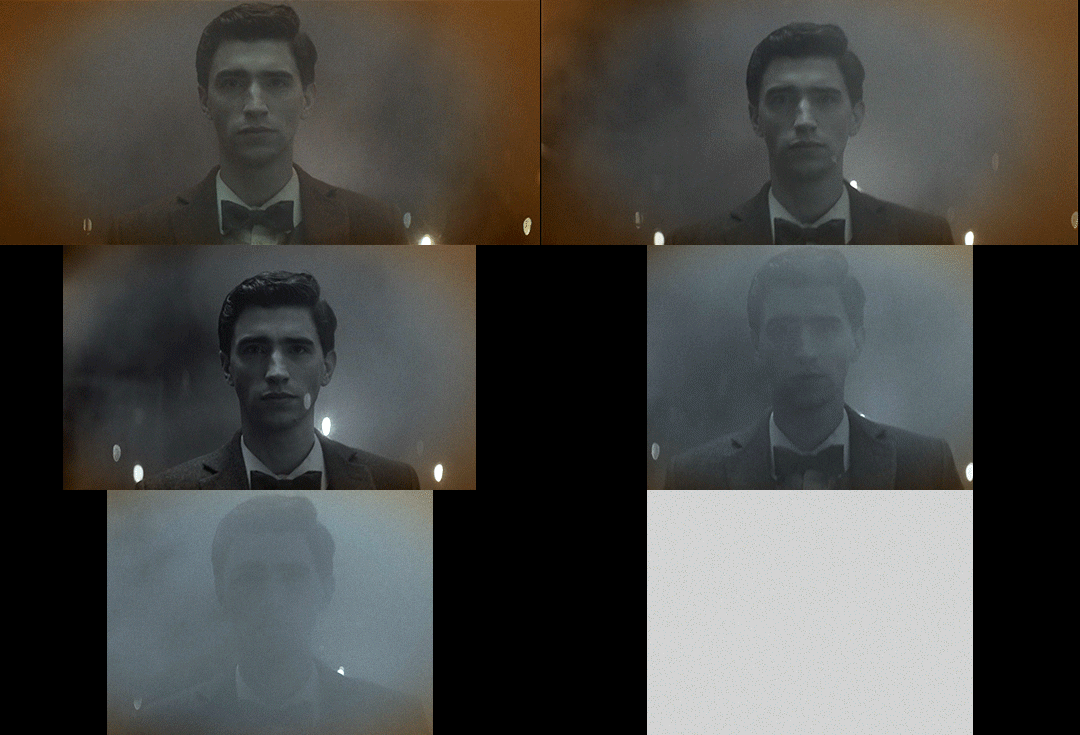
Not only does the aspect ratio switch for this scene, but also the height of the image changes.
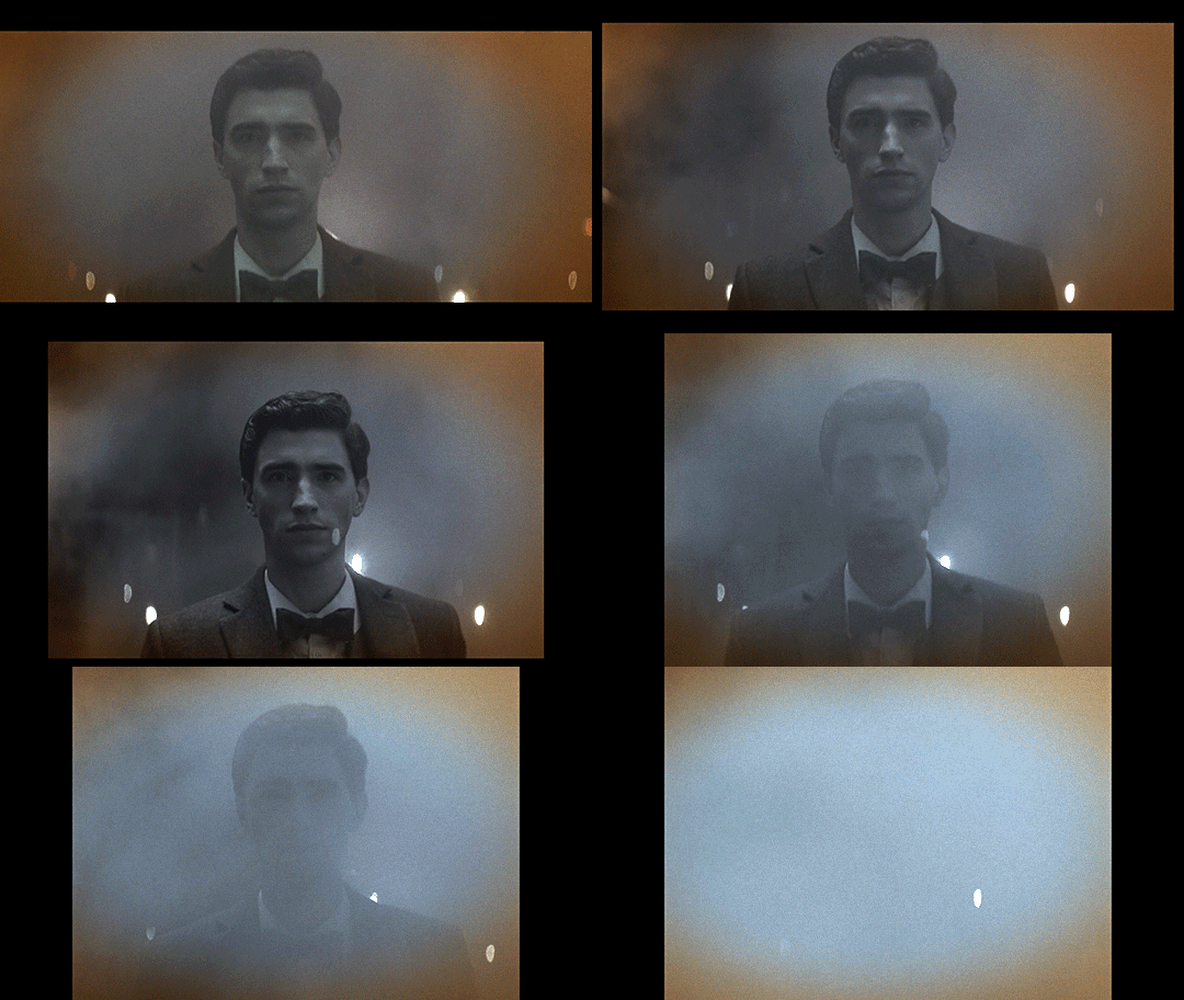
This transition also sort of mimics the breathing effect of anamorphic lenses:
Something you may not know about how Netflix usually works is that regardless of the aspect ratio of the picture, the video file you see is part of a larger container, which is usually 16:9 (1.77:1). The black bars on top and bottom are part of the file, as shown in this screenshot of how it looks when you load up some screencaps in photoshop.
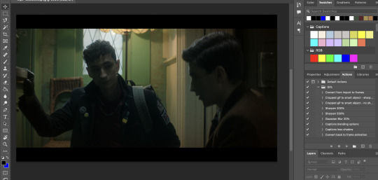
If you make gifs, edits, or are otherwise just used to having video files you are probably familiar with this. The Dead Boy Detectives files have letterboxing that is cropped out whenever people make fan content with it, whereas if you have a file for an independent movie, it usually does not have those black bars. Those black bars being part of the file make this transition possible.
We don’t usually realize that the container extends beyond the picture. For all we know, that’s the edge of the frame. But then it changes and forces us to reconsider what we previously thought to be true. Breaking out of what we think to be the image height is jarring, especially considering that this is the only time it happens (other than the brief flashbacks to the same footage later in the show).
Here’s a mockup of what it would look like if they kept the same image height, and just moved from 2.2:1 to 4:3 without expanding vertically. I find that it doesn’t have quite the same effect.
This would look so cool if it was being shown at a movie theater on a huge widescreen, but we’re not watching this show in theaters. We’re watching it on screens where this would make it look small; what they do instead retains the feel of watching something big and cinematic.
So back to the actual transition:

In breaking out of the perceived container, it’s as if it were breaking the fourth wall, an acknowledgment of the video’s format and its true container. This story is addressed to the audience in a way that the rest of the show is not, and it uses the aspect ratio to let us know that.
Spherical Lens
(I would highly recommend you read pt 1 if you haven’t already)
Edwin’s flashback is not only the sole scene with its own aspect ratio, it’s also the only scene shot with a spherical lens. Like the aspect ratio, this is a historically informed choice. Anamorphic lenses technically existed during the last year or two of Edwin’s life, but movies were not being shot on them.
How do we know that a spherical lens is being used, and how does this affect the show?
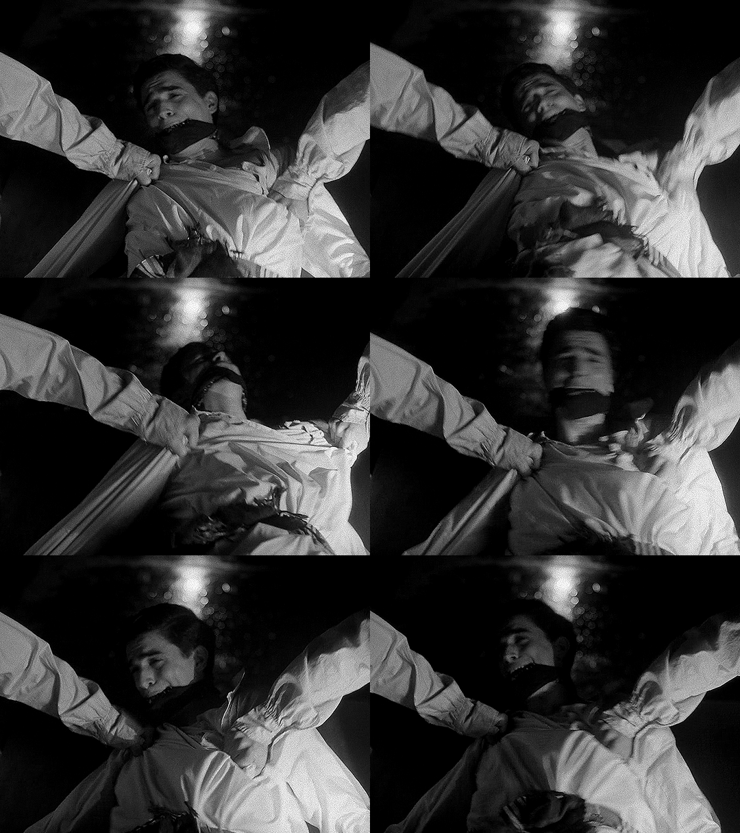
One of the quickest ways to identify the lens is to look at the shapes of the bokeh. There’s not much bokeh in the flashback, so I apologize for the intensity of my first example. But here, look behind Edwin’s head, where the lights from above reflect on the wet basement floor. They’re all circles, instead of the ovals that we get with the anamorphics.
The lens flares are also really different. Remember that the anamorphic lens flares are horizontal lines. Spherical lenses don’t do that, but they can produce lots of different kinds of lens flares. In this shot, the flashlight pointed at the lens lets off lines in lots of directions, kind of like sun rays.
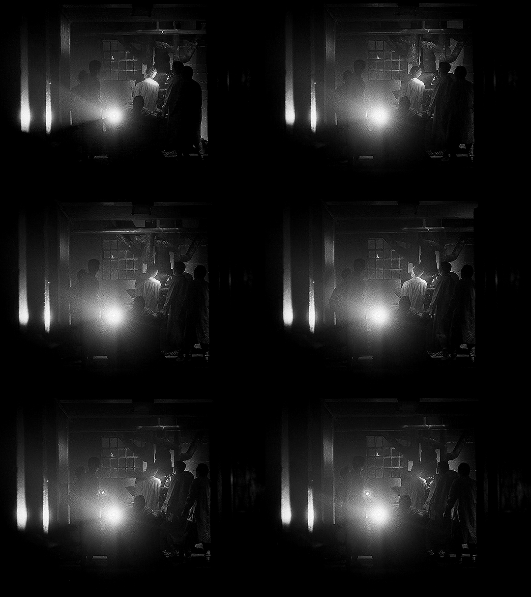
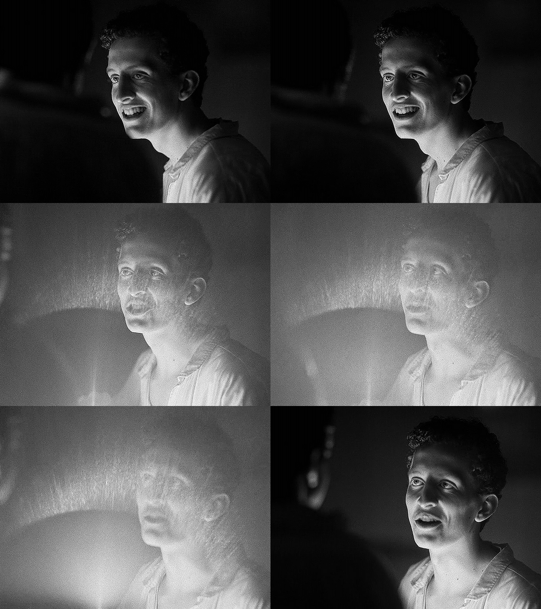
This shot has another cool flare, in much more detail this time:
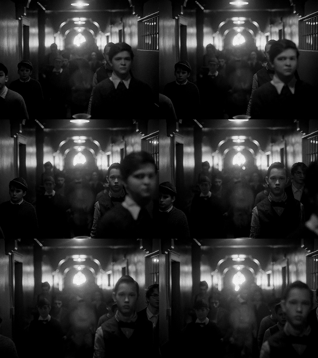
The next shot shows us more of the circular bokeh and another kind of lens flare.
For the bokeh, look at the lights on the ceiling as well as the corners of the out-of-focus architectural details (the semi-arches).
The lens flare here is the bouncing, blurry circle near the middle, as well as the brighter shape near the center bottom.
We can then look at the things that are not different, but absent when using the spherical lens: barrel distortion and focus falloff.
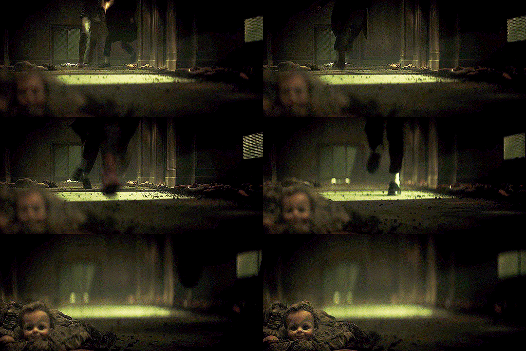
In this example, look at the windows in the background, as well as Edwin’s chair. An anamorphic lens would distort the vertical lines, bending them into a gentle fisheye. It would also make that chair and the lines of the window frames a bit blurry, as they’re close to the edges of the frame. Instead, the lines are straight and clear throughout the whole shot.
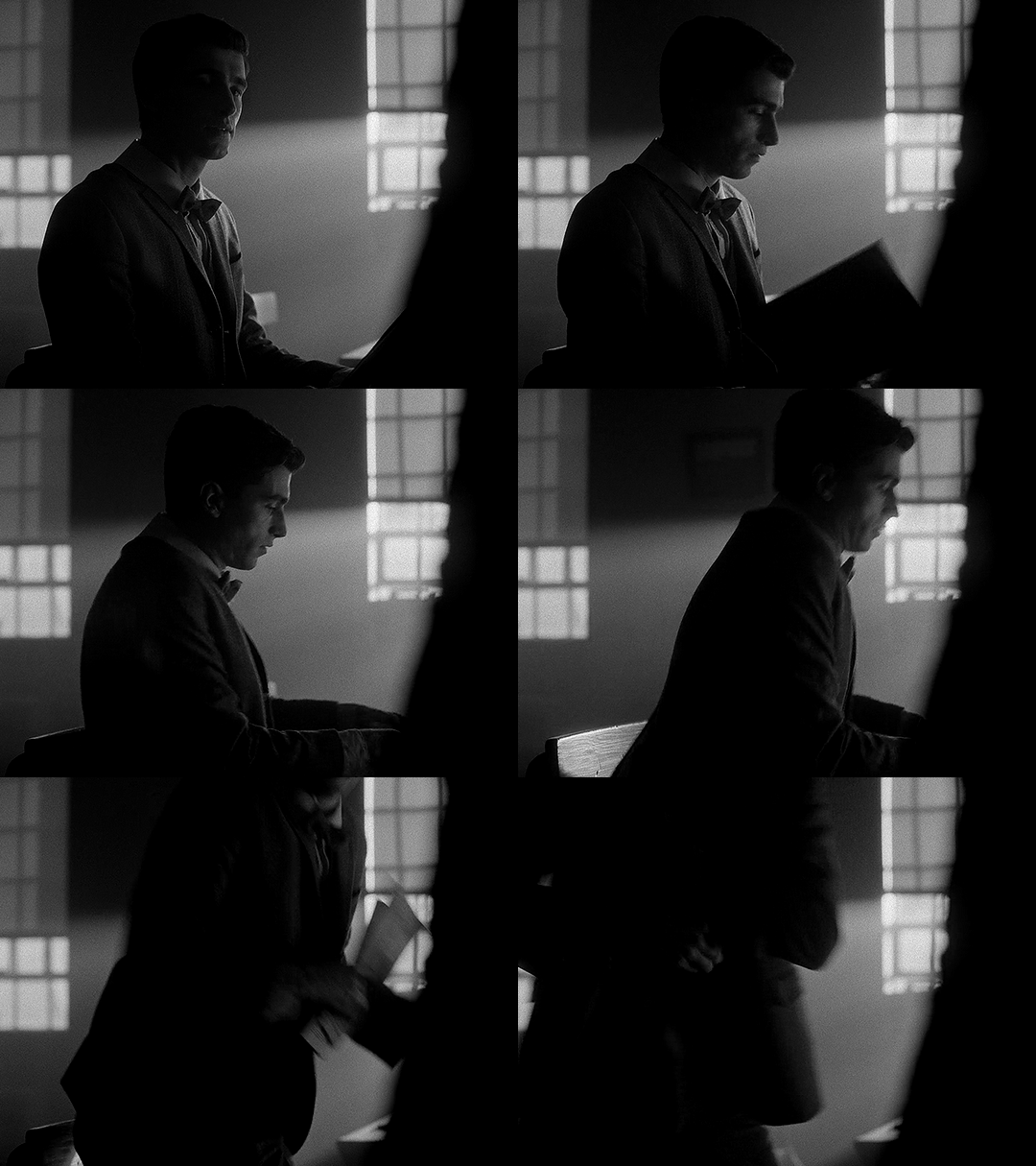
In this next example, not only do we get a great view of the lack of focus falloff, with clear lines throughout the shot, but we can see more of the difference in perspective and distortion of lines.
You may notice that the windows and doors are not perfectly straight up and down. But is this barrel distortion? If there was barrel distortion, the walls would curve back towards the center of the frame at the top.
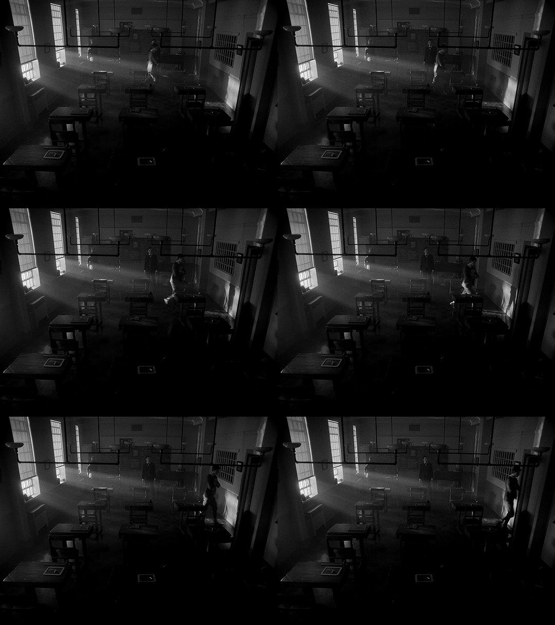
Spherical lenses are often the ‘default’ lens. They’re wonderful and used in a lot of media because they are neutral. They distort less, thus representing the world closer to how it actually is. If we consider the anamorphic lenses in the rest of the show being used to enhance the sense of supernatural and story, changing to a spherical lens enhances the sharp reality. This is Edwin, alive.
The image breaks out of its perceived container, reaching out to the audience, and then changes the lens to be more ‘real.’ In these two changes, not only do we have a more historically accurate image, but it's as if the creators are issuing a warning to us. Maybe the demon isn’t real, but bullies are. Kids can be cruel. Classmates hurt their queer peers. This is not fantasy, and this is as true in 1916 as it is today.
Using a spherical lens in this instance, juxtaposed to the rest of the show, is a dramatic shift to make, as it alters just about everything in the image. In using a less distorted picture, for this, we are reminded of reality and life and the mundane.
On Charles’ Flashback (and an experiment)
Edwin’s flashback got the Cinematography Treatment™ but what about Charles’ flashback? It’s shot with the same aspect ratio and lens as the rest of the show. From the perspective of historical accuracy, this is fine. It’s a scene that could have been shot in 1989, cinematographically speaking. The reason I suspect that it wasn’t given any stand-out look is because, unlike Edwin’s flashback, Charles’ flashback scenes are closely tied to the present-day plot. They aren’t just scenes of Charles remembering things, they are a direct result of the Night Nurse’s “memory magic.”
Maybe changing something here would separate us too much from the plot. Both flashbacks (in episodes 4 and 7) are induced for a specific purpose related to other present-day characters. It wouldn’t make as much sense to have them be standalones.
However, if I were simultaneously the showrunner, screenwriter, and cinematographer, I would give Charles a standalone flashback scene. In that flashback scene, here’s how I would shoot it:
There would be a much deeper depth of field/smaller aperture than the rest of the show, so the background would be more in focus.
There would be harder, less-diffused lighting. This would also impact the coloring, and I’d maybe add some more saturated lights.
I’d try to make an argument to shoot that scene on film (and then argue to do Edwin’s on film too).
There would be a different aspect ratio; 2.2:1 isn’t out of the realm of possibility for the 80s, but it wasn’t common, and it wouldn’t have the kind of impact I’m searching for if it didn’t change.
There are three different aspect ratios I would choose between, and the lens would change depending on my pick.
I’ve made some mock-ups for how these would look, though I cannot adjust things like bokeh and depth of focus, and I can only do so much with the lighting.
2.39:1 with anamorphic lenses (specifically Panavision lenses) This is a super standard widescreen, with a popular lens from the time. We don’t have lens info for the rest of the show, but I think they’re using Panavision anamorphics anyway so the lens may not be a change. Big, blockbuster action movies from the 80s would often be shot in this (perhaps most relevantly, Ghostbusters), and it’s a style that kind of faded in popularity in the 90s and 2000s, so it can have more of a retro look, especially if shot on film. One downside to this would be the aspect ratio change would not be as dramatic.
Movies from the 80s shot with this combo: Raiders of the Lost Ark (and other Indiana Jones movies), Star Wars: Episode V - The Empire Strikes Back (as well as Episode 4, which came out in the 70s. Episode 6 used the same ratio and did use anamorphic lenses, but not Panavision), Ghostbusters
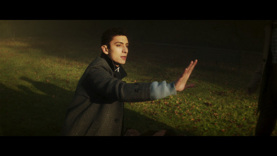
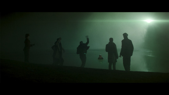
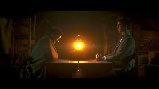
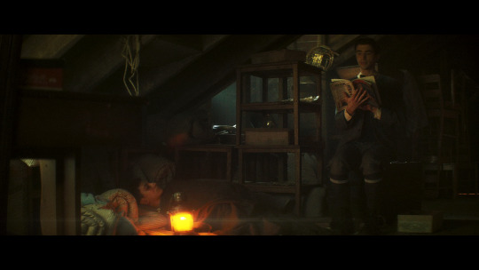
1.85:1 and spherical lenses. This is also ‘widescreen,’ but the advantage of using this aspect ratio is that we could get another dramatic breaking of the image container, just like in Edwin’s flashback. It’s an incredibly common setup, so it’s not really unique, but it would look different from the rest of the show. Given how pervasive ultra-widescreen still is today, I think a lower aspect ratio would also ramp up the ‘nostalgia’ factor a bit. Using a spherical lens we’d end up with the same sense of stark reality that we get for Edwin’s flashback as well (the warning that kids are cruel, but this time to people of color), and I like the idea of that as a parallel.
Movies from the 80s shot with this combo: Back to the Future, Dirty Dancing, The Princess Bride, An American Werewolf in London, Clue, Another Country
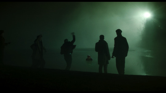
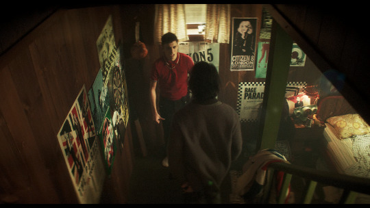
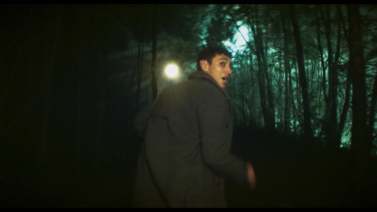
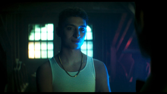
1.66:1 and spherical lenses. This is a ratio that was used widely across Europe, but has never been a common ratio in the USA. However, by the 80s, filmmakers were going for a more widescreen look so it was fading from popularity everywhere. The 80s liked widescreen, so it’s maybe not the best pick for making a scene look “80s”. However, my main motivation for this ratio is that my personal picks for the most Edwin-coded and most Charles-coded queer films are both 80s films shot with a 1.66:1 ratio. We would also get the same benefits from using the spherical lens as I mentioned in the 1.85:1 section.
Movies from the 80s shot with this combo: Maurice, My Beautiful Laundrette, Law of Desire (La ley del deseo), and an honorable mention to Chungking Express, a 90s film that really exemplifies the kind of look I'm going for here
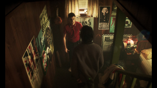
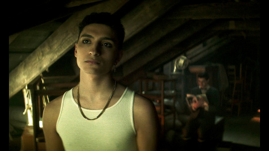
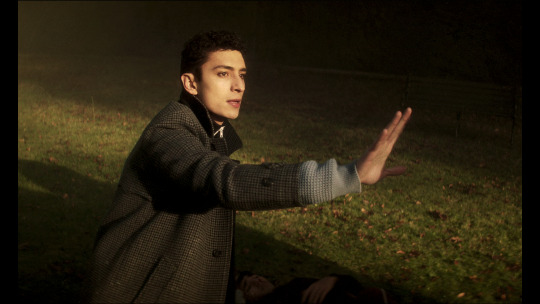
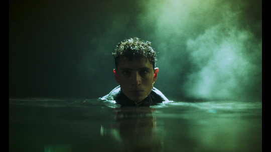
Giving Charles’ flashback a special treatment would probably do a lot to more firmly establish his character as a co-protagonist rather than a deuteragonist, which is definitely not the case but does seem to be how some people view him.
With the impact of the spherical lens and aspect ratio in Edwin’s flashback, the final two options for Charles flashback would be the closest in terms of echoing Edwin’s flashback, and would probably provide the most gravity and sense of crushing reality to the scene.
Setting a single scene (or two scenes) aside like this, with a unique aspect ratio, lens, and color grading (which I didn’t explore much for the Charles flashback), makes us consider a scene more independently from the rest of the show. Edwin’s flashback is a striking moment with a very different look, and that’s deeply memorable. It comes together to push how tragic and unjust Edwin’s story is.
—————
This concludes the planned portion of my cinematography analysis. I had a ton of fun researching and writing this (and making all the graphics) and I hope you all find this interesting/helpful/informative :)
Finally, I want to give another name drop to the cinematographers, Marc Laliberté, Craig Powell, and Pierre Gill. They’ve really nailed it from the very first episode to the last, and there’s so much intention and thought given to every aspect of how they shoot this.
#dead boy detectives#dbda meta#dbda#edwin payne#charles rowland#cinematography#dead boy detectives analysis#cinematography analysis#mygifs#dbdagifs
283 notes
·
View notes
Note
Do you have any advice for photography, especially when it comes to animals? I just got a camera and I was wondering if you had any tips because I love the photographs of animals you take :)
Do the work to learn how to swap your settings around for the right exposure / f-stop / shutter speed, and practice until you can figure out it out on the fly. I will admit I’m still not good at this, and shoot mostly based on pre-set settings and vibes - but I’m getting more fluent and the times I’ve figured out what changes I needed to make quickly the in moment, it’s really improved the photos I get. I wish I had a good resource to link, but look up explainers for the “exposure triangle” to start you off.
It’s important to understand what your camera / the lenses you use can and can’t do. I like to shoot telephoto for super close-up shots, but I don’t have ten thousand dollars for a telephoto that does well in low light, so I’ve had to learn to predict when I’m going to need to swap it out for a shorter lens that can handle darker light conditions (looking at you, indoor reptile habitats). Most newer smartphones are currently better for macro photography than any lens I currently have, and easier to use for it. You can ask questions of people at camera stores, or try Reddit for super detailed discussions of specs and settings. I am incredibly lucky that I have two close friends who do hardcore hobbyist/professional level photography and let me pester them regularly with questions as I figure this stuff out.
Learn the animals, too. I get good photos without a lot of technical skill because I can predict behavior and set up for the shots that I want. So the more you know about the animals you’re photographing and how they use the space they’re in, the better chance you have of getting something you’re happy with.
Also like… just practice. A lot. Thank goodness for digital cameras and memory cards. On a normal zoo trip, I will shoot upwards of 4000 photos. I keep maybe 500 of them, unless I’ve gotten astoundingly lucky. If I’m shooting animals being chill, I get the pics I think I want and then play around with my settings and take the exact same photos again, so I can compare and learn what works best. Some things, like focusing through fencing or physically tracking flying birds across the sky, just take repetition to get fluent with.
Have fun with the new camera!!
80 notes
·
View notes
Text
Idia Facts Part 45: Idia and Ortho (pt2)
Ortho is protective of Idia in general, calling out Grim, Deuce, Ace and Cater for bad-mouthing Idia during Book 5 and attempting to vaporize the main school building to save him from Eliza.

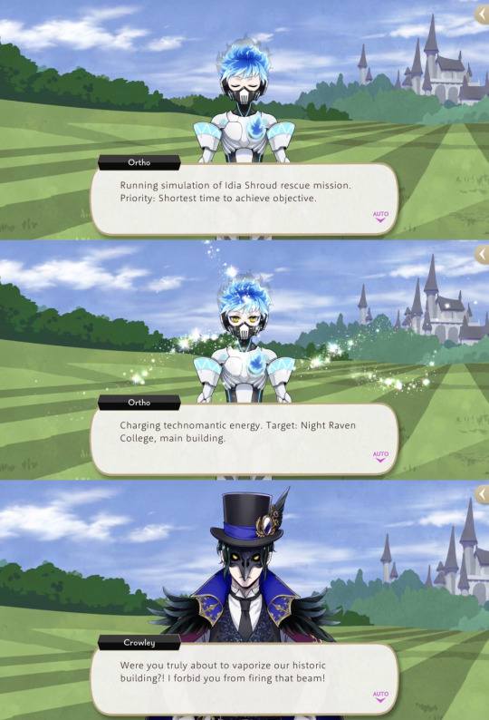
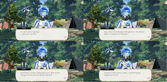
When Idia disappears during Vargas Camp Ortho boots up the systems he had deactivated for the event to hunt him down, spending the rest of the camp watching over him to make sure he does not escape from doing squats (Idia’s punishment for sneaking in a smartphone).
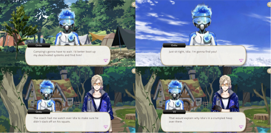

Ortho also tells off Kalim and the Phantom Bride team for speaking poorly about Idia, and asks Idia to put more thought into what he wears as he doesn’t want people talking badly about him.

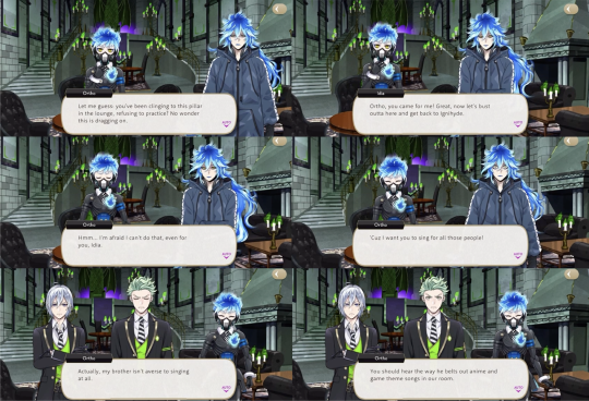
Much like the Starsending, Glorious Masquerade also involves Idia forcing himself to be social in order to please Ortho: despite Idia’s pleas Ortho refuses to let him skip rehearsals for the song that they are to perform at NBC: “I want you to sing for all those people!”
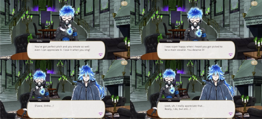
Ortho explains that Idia actually isn’t averse to singing: “You should hear the way he belts out anime and game theme songs in our room.” Ortho tells Idia, “You’ve got perfect pitch and you emote so well, even I can appreciate it. I love it when you sing!”
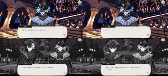
Sebek and Silver reveal that Ortho told them how hard Idia was practicing in secret for the performance, and Idia ultimately convinces himself to go through with it in order to not disappoint Ortho.
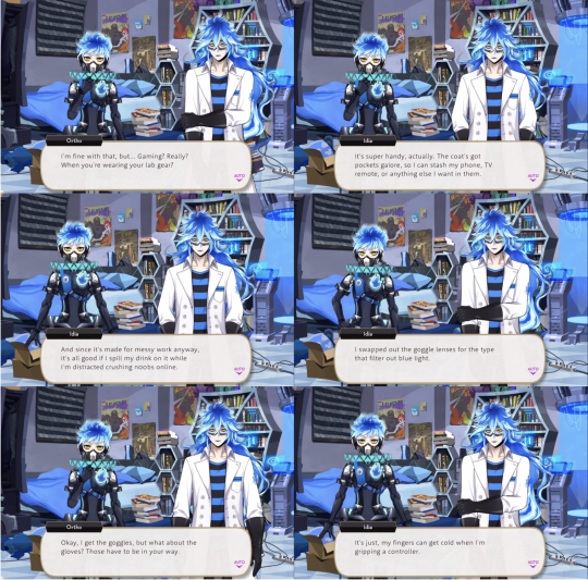

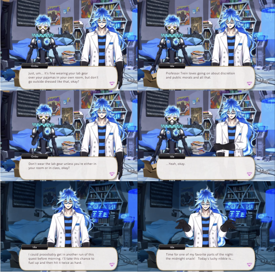
Idia shares in a vignette that he wears his labwear for class over his pajamas when playing video games in his room, as the pockets in the coat are convenient for electronics, the coat itself is good protection when he spills drinks, and he has customized the goggles with blue-light lenses, while he wears the gloves for aesthetic and for his sweaty fingers.
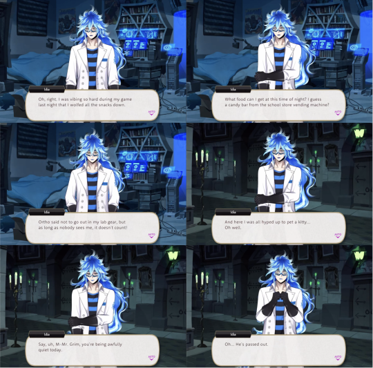
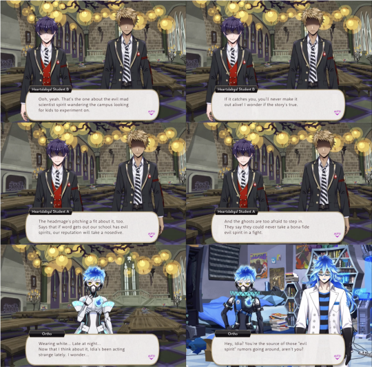
Ortho is unimpressed, saying that it is all right if it makes him happy, but Idia isn’t to wear it anywhere outside of class or his bedroom. Idia reluctantly agrees, only to immediately sneak out of his room in the middle of his night for snacks, wearing exactly what Ortho told him not to.
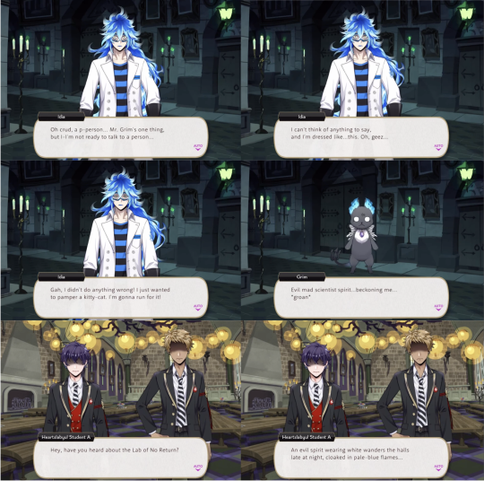
Idia scares Grim on accident, who starts a rumor at the school about the evil spirit of a scientist wandering the campus.
Ortho immediately confronts Idia, who denies it until Ortho applies his lie detection capability. Ortho then confiscates Idia’s labwear to keep it from him when he is not in class.
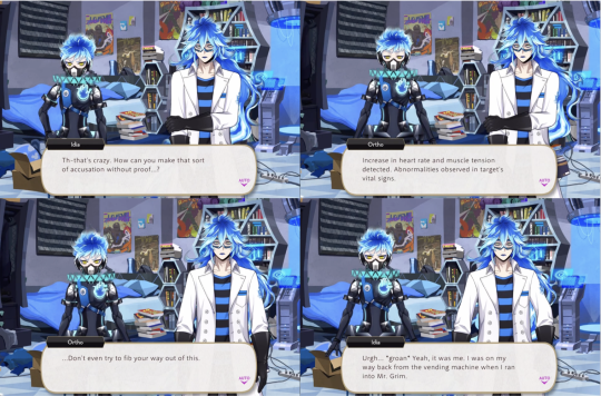

73 notes
·
View notes
Text
Eminem x Singer reader Social Media au
username


Liked by _cuban_link, hailiejade and 5,579,364 others
username London🥹💗
View all 1,250 comments
user1 miss you already 😭💗💗💗
user2 omg im in the first pic🫣😅❤️
_cuban_link killed it😍😍😘😘
username


Liked by iamdenaun, keke and 5,134,577 others
username asked him to take a picture of me one time…
user1 true em fashion💀💀
user2 of course 🤣
royceda59 just be happy the lense wasnt pointed at the ceiling😂
username 😂😂💀💀
nathankanemathers he can operate a smartphone??!!!��
username “BARELY”😂
780 notes
·
View notes
Text
a lot of modern smartphone features are dumb as shit but they did nail it with adding macro lenses/modes. i can take pictures of cool little bugs with a rectangle in my pocket? that's wicked
42 notes
·
View notes
Text
Aggressive Devil Eyes Car Headlight
🔥 🚗💀🚗 Transform Your Ride with the Aggressive Devil Eyes Car Headlight 🚗💀🚗 🔥
Elevate your vehicle's appearance with the 7th Devil Eyes Lens Lights! These headlights are designed to enhance your car's style and boost night visibility. With a striking devil eyes design, your car will exude an aggressive and bold look that turns heads on the road. 💥
Equipped with advanced 📱 Wi-Fi control technology, you can easily customize the lighting animations directly from your smartphone, adding a personalized touch to your ride. 🌟 While these lenses are dedicated solely to devil eyes usage, they offer unparalleled flair, making your vehicle truly stand out. 😈
#DevilEyes#CarHeadlights#AggressiveHeadlights#CustomCarLights#LEDHeadlights#AutomotiveLighting#CarAccessories#HeadlightUpgrade#FierceDesign#CarStyling#NightDriving#CarModification#HeadlightDesign#VehicleLighting#CarTuning#BoldLook#CarEnthusiast#HeadlightCustomization#DrivingStyle#RoadStyle#gravity falls#atists on tumblr#the book of bill#billford
37 notes
·
View notes
Note
Recently I took a panorama of the Pittsburgh skyline at night that got a positive response. That was done on the spur of the moment with an iPhone. I want to do that again and more, but this time with a dedicated camera setup. It's been years since I've had one, so I'm basically starting over again. I'm mostly interested in getting day and night cityscapes, and maybe the carryings-on at this year's Anthrocon. Would you have any particular knowledge to pass on as I set off on this journey?
Since you didn't specify a budget I'm going to assume it is in the $10K range.
And you're probably thinking I'm going to suggest a Leica. Every dentist and his brother (who is also a dentist) gets a Leica. But I just can't take a camera brand seriously when they charge you an extra $2200 for the privilege of not being able to shoot in color.
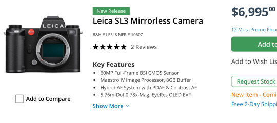
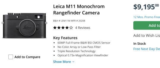
Sure, you can hit a single button in Lightroom to get B&W and save some money, but then you won't be able to brag about how limiting yourself to only shades of gray has opened up new artistic pathways in your brain while a clueless person responds in mumbles during their root canal.
What you really want for your landscapes is a Hassie.
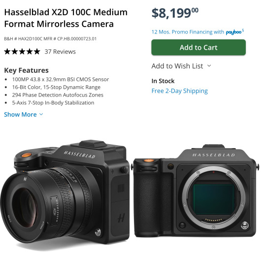
They were the first camera on the moon! How could you *not* want a Hasselblad? That is some camera gorgeousness right there. And it's so reasonably priced*!
*compared to their previous $40,000 camera systems.
And if you are doing landscapes with the Hassie you'll need a nice wide angle lens to go with it. This one is actually quite affordable*!
*compared to their previous $8000 lenses.
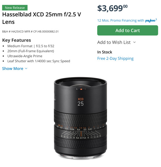
Can we all agree that is a work of art? They even use their H logo as the knurling.
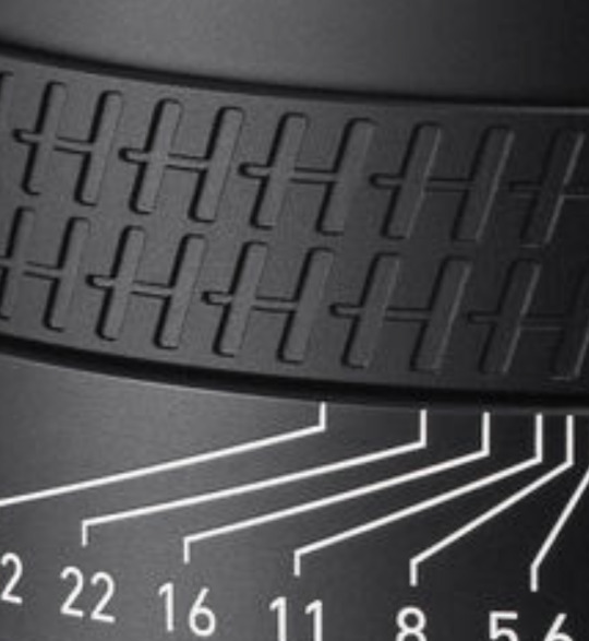
That is just so... extra. And I love it.
Out of the entire alphabet I've heard Hs give you the best grip.
Man, I almost wish I was a dentist just so I could buy a fancy camera.
Sorry... I was just having a little fun.
I never get to recommend the super cool expensive cameras. Because, ya know, the economy and the fact that only dentists have Hasselblad money.
You probably think I'm being silly but there actually is an entire community of dentist photographers keeping the high end camera market alive.
Okay, let's get started...
Landscape Buying Guide
Opening Thoughts
For landscapes I would highly suggest a full frame camera and a high quality wide angle lens.
Full frame has several advantages but it is not necessary. You can go with a smaller sensor like APS-C and get great images. Personally I would not go any smaller, but there have been some great landscapes taken on micro 4/3 and even smartphones. Technique, knowledge, experience, and composition will usually win the day over a camera, but having a nice camera makes things a lot easier.
At this point, with full frame options being very affordable now, the main reason to get a smaller sensor is if you want a smaller system that is easier to carry for extended periods and easier to pack when traveling. Or if you aren't sure you want to take on photography as a hobby, you can get an old APS-C DSLR for under $200 to learn with and test out.
So if you need a very cheap OR very compact system, APS-C and Micro 4/3 might be worth considering, but a bigger sensor will cause less frustration most of the time.
Froggie Note: The expensive Micro 4/3 and APS-C systems are the compact ones. The cheap systems are about as bulky as full frame.
The biggest advantages to full frame are low light shooting, lens selection, and field of view. Full frame cameras have many, many more lenses to choose from. And since the sensor is bigger, it is much easier to get a wider field of view that is often needed for landscapes. And the high ISO noise performance tends to be better on full frame.
However, you can use full frame lenses on APS-C camera bodies within the same ecosystem. They just get a little... zoomier. Roughly 1.5x zoomier. A 35mm acts like a 50mm, for example. So if you want to spend a little less now you can get an APS-C camera with a full frame lens and then upgrade to full frame later on without having to buy a new lens. Full frame lenses work on APS-C bodies but not the other way around.
Most landscapists have a really solid 16-35mm lens and that covers almost all of their needs. So I would suggest something comparable. Please don't get suckered into some crazy 18-300mm superzoom. Just get the focal range you need for the photos you want to achieve.
A purpose-built lens always outperforms one that was made to do everything.
As far as where to get used gear, I highly recommend using KEH or MPB when buying used camera bodies. They check every device and offer between 3 and 6 months warranty to make sure the device won't crap out on you. Lenses are typically a lot more robust and a safer thing to buy on eBay or Facebook Marketplace if you can find a better deal. But the security of having a warranty and a return apparatus if something goes wrong might be worth the extra price when using these two sites.
I am going to recommend Canon, Nikon, and Sony systems. I feel they have the most complete ecosystems with gear that spans all budget ranges. I'm not saying there aren't good cameras from other brands, but you have to remember every camera has an ecosystem surrounding it. There are accessories and upgrade paths and niche lenses that may not be available with other brands. I think Fuji has some tempting options and if you like the look of vintage film photography, their emulation options are quite stunning. Their cameras are also quite attractive and have very satisfying knobs. But I still can't recommend them unless you have a specific reason for wanting their gear.
Just remember that for every Canon DSLR I recommend there is a comparable Nikon option available as well. There are more lenses for a Canon full frame DSLR body than any other brand with Nikon coming in a close second.
So if you choose not to go mirrorless yet, the Canon and Nikon DSLR camera ecosystems are immense and have tons of gear and accessories available to go with them. And since used gear holds up really well, those ecosystems will survive for decades.
Should you buy a mirrorless camera or a DSLR?
Mirrorless cameras are the latest camera technology for interchangeable lens camera systems. At this point they are superior in every aspect and they continue to improve year by year. Because of that, used DSLRs have plummeted in price. This allows people greater access to a starter ILC (interchangeable lens camera) without a significant investment. You can get professional quality images on either format, but mirrorless has a shallower learning curve and much better automatic modes.
The in-body image stabilization (IBIS) stabilizes *every* lens and the eye tracking autofocus make "focus and re-compose" extinct. These are huge selling points for a lot of people. With IBIS you can take photos with up to 2-4 second shutter speeds without a tripod. And never missing focus on a human or animal or bird is pretty cool too.
DSLR camera bodies are no longer being designed by most of the major manufacturers. Thankfully Canon and Nikon developed plenty of bodies and lenses, so you will always have options and upgrade paths. But you will not be able to upgrade to systems with the latest advanced features.
The best DSLRs available are probably the Nikon D850 and the Canon 5D Mark IV. That is as good as it will ever get. The technology ends there. So if you want to enter an active camera ecosystem then you will have to get a mirrorless camera.
DSLR Camera Systems
Full Frame DSLR Camera Bodies
Canon
If you buy a used DSLR, there are some very affordable full frame options. In fact, the classic much-praised budget full frame Canon 6D can be had for under $300 right now.
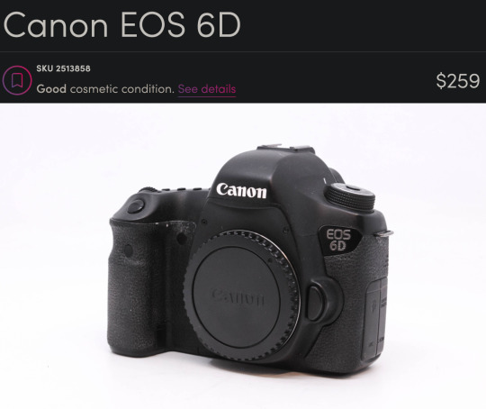
This is an old camera. It has no fancy features. It only has 20 megapixels. It just does what it says on the tin. But it has a big sensor and a *ton* of really cool lenses available for it.
If you are specifically looking to create really high resolution panos, you could also look at the 50 megapixel 5DS R for around $1000.
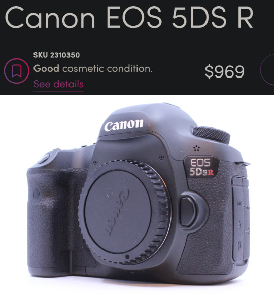
There is a community of landscape pano-maniacs that love to create "gigapans" that have endless amounts of detail where you can zoom in and find new details in every photo. I was only able to create a 120 megapixel photo, but you can still find things like people starting a campfire and a dude fishing and a truck on a far off bridge. So even though this seems expensive for a DSLR, you are looking at another thousand bucks to find anything with more megapixels than this bad boy, so it is quite a good deal relatively speaking.
Nikon
Probably the best DSLRs ever made were the Nikon D800 series and you can get the Nikon D800 for $464.
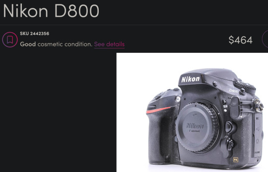
This is a newer camera than the 6D with more megapixels (36) and a better sensor. It also has a more modern autofocus system and about 3 more stops of dynamic range which can come in handy for landscapes. This is an incredible camera for this price.
APS-C DSLR Camera Bodies
If you aren't sure you want to commit to this hobby, you can look into a Canon APS-C sensor body like the Canon Rebels and Canon 60D through 90D models and get good results.
And there are many Nikon DX APS-C bodies that would be great starter cameras as well. If you get a Nikon, you'd have an upgrade path to the D800 if you get hooked by the photography bug. I would miss a few very special Canon lenses like the 100mm f/2.8L macro and the 400mm f/5.6 telephoto but I'm sure I could figure out some reasonable Nikon alternatives that would do roughly the same thing.
Canon APS-C
There is a Canon 60D for $139 right now that would be perfectly adequate for landscape work on a tripod.
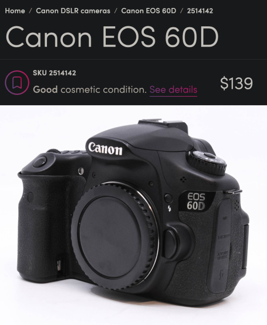
That was my first camera and I took some very nice photos with it. Only 18 megapixels but it has a very convenient flippy screen which was really helpful for a disabled photographer trying to get low angles.
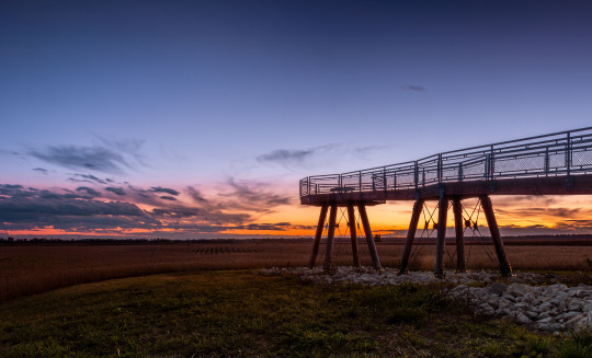
This was in 2014 and I didn't know what I was doing but that is a pretty stellar-looking sunset for a (now) $140 camera.
Nikon APS-C
And the Nikon D3400 would be a great option as well at around $184.
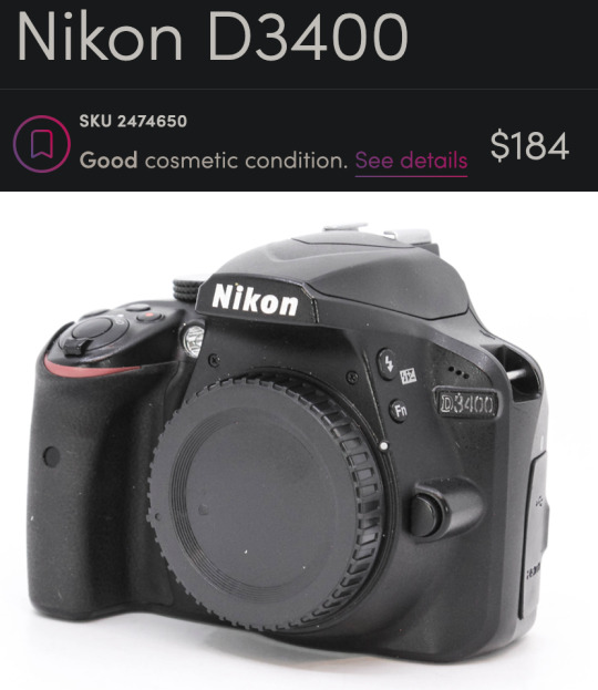
You get some extra megapixels (24) and it is a bit newer than the Canon. I get the sense that used Nikon DSLRs give you more value for your money right now but I don't have a large enough sample size to confirm that.
Full Frame DSLR Lenses
Froggie Note: I am recommending full frame lenses even if you choose an APS-C DSLR body so you have an upgrade path. But also very few purpose-built APS-C lenses had superior glass. Just remember, crop sensor APS-C cameras add ~1.5x to your focal length. So a 16-35mm will have the equivalent field of view of a 24-50mm lens. Still quite acceptable for landscapes, but you may benefit from doing panoramas more often. And if you upgrade to full frame down the road, you'll already have the ideal lens.
Canon DSLR Lenses
If you get the 6D or another Canon you could pair it with the beloved-by-landscapists Canon 16-35mm f/4L.
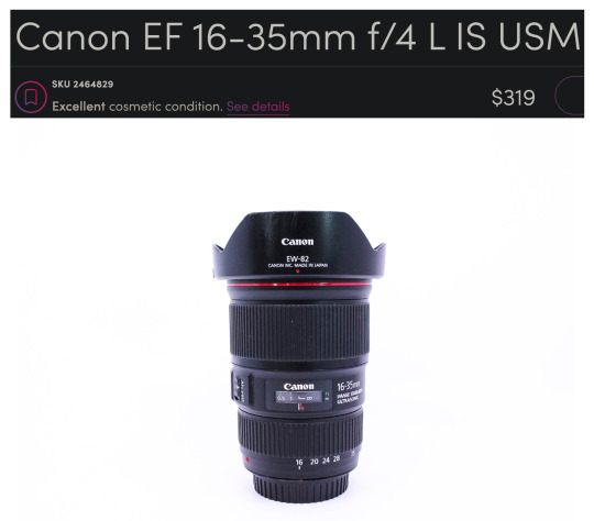
Honestly, it is blowing my mind you can get that combo for under $600. Me from 12 years ago is super jealous right now.
If you are worried you might need something to work in lower light and still want a zoom, the f/2.8L starts at around $434.
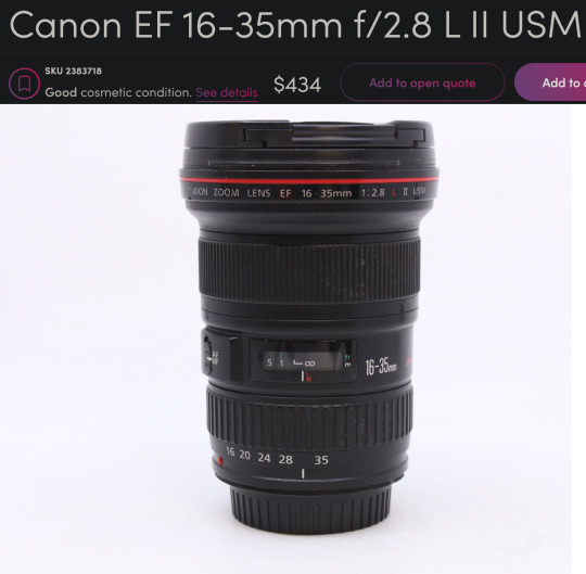
This might be the most famous landscape lens of all time. Kinda boggles the mind how many gorgeous vistas this thing has captured the light of.
If you can live without the zoom, you could get a much sharper prime lens that can also be used in even lower light. A used Sigma 24mm f/1.4 Art lens is $439 would be a fantastic option.
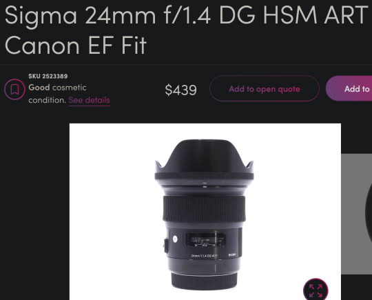
24mm is still a very good focal length for landscapes and the sharpness of this lens lends well to panoramic stitches. Seriously, these art lens are so freaking sharp. Although 35mm is typically preferred for most street photography, I think this would do great for that purpose as well. It couldn't do close up portraits, but 3/4 and full body portraits would look great. I also love this focal length for doggos. It enlarges their heads a bit which enhances adorable-ness.
Though I probably wouldn't recommend the 24mm on APS-C for landscapes as it would put you near a 40mm full frame equivalent field of view.
Nikon DSLR Lenses
And on the Nikon side of things you could get the Nikkor 16-35mm f/4 for $399.
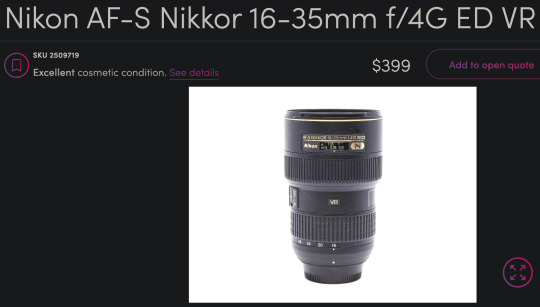
This is a great lens too. Very comparable to the Canon L glass. And paired with that D800 you would have a better shooting experience than with the 6D if it fits within your budget.
It's a little harder to find, but you can also get that same Sigma 24mm f/1.4 Art lens for Nikon at around $528 used on Amazon and in the $400 range on KEH and MPB when it is available.
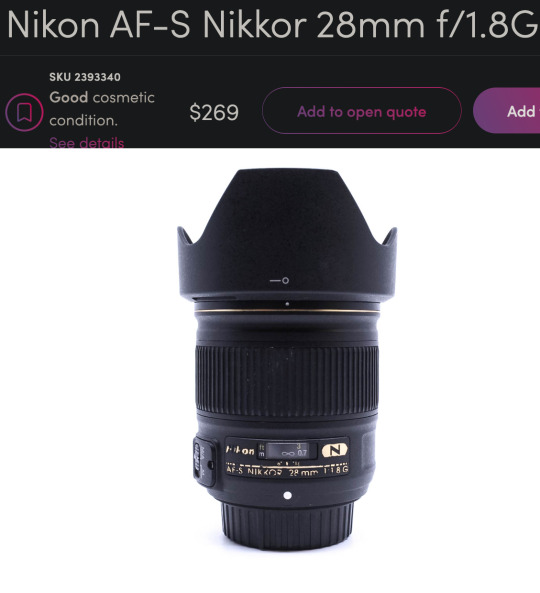
The older and softer Nikkor 28mm f/1.8 is a little more affordable and easier to find.
What if you are not a dentist but are willing to save up for something a little nicer?
Enter the world of...
Mirrorless Camera Systems
Sony currently has my favorite ecosystem of mirrorless cameras and lenses and they are consistently ahead of the other brands as far as technology and features. In fact, many other manufacturers use Sony sensors. They literally supply their competition with their own tech. They are also pretty good about updating firmware—even with older models. So I feel like Sony has a lot of future-proofing advantages over other brands. Sony has a great selection of 3rd party lenses like Sigma, Tamron, Viltrox, Laowa, Samyang, etc. These lenses often have nearly the same optical quality as Sony's G Master lenses at a fraction of the price.
Full Frame Mirrorless
Currently, I think the best value full frame mirrorless camera for landscapes would be the Sony a7R III.
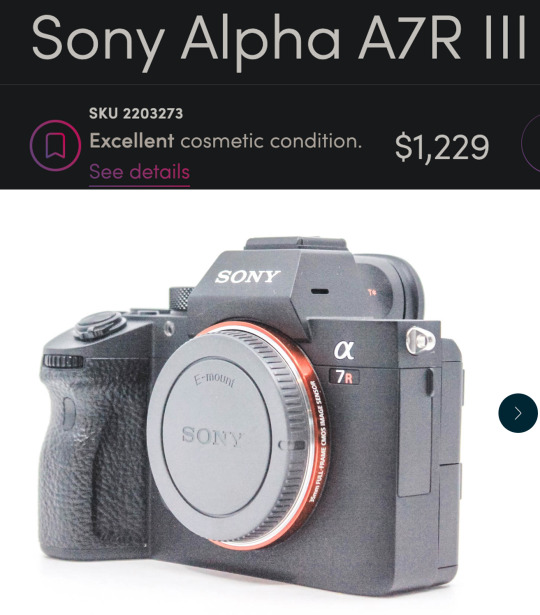
This is very nearly a top-of-the-line landscape camera for a little over $1200.
That might sound like a lot, but I want to be clear...
This isn't just decent. This isn't "good enough." This is a spectacular professional grade full frame camera.
10 years ago you could spend $6500 for a *worse* camera. 5 years ago you could spend $3000 for a *worse* camera.
It can do every genre of photography except for maybe fast paced sports/action. It has an amazing 42 megapixels—which are not necessary but they do make editing and printing a lot less of a headache. The file sizes can get a little big, but storage is a lot cheaper than it used to be.
Oh, and it can be used for professional quality 4K video work too.
The a7R III comes with all of the modern bells and whistles including in-body stabilization (IBIS) so you can handhold at very slow shutter speeds. It has one of the best autofocus systems—complete with eye tracking. But not just human eyes! Dog eyes. Cat eyes. Bird eyes. If it has an eye, the Sony can probably lock focus on it. And it has an admirable 10 fps burst shooting mode.
APS-C Mirrorless
If you want to enter the Sony ecosystem but can't afford full frame quite yet, you could do the a6400 for about $600.
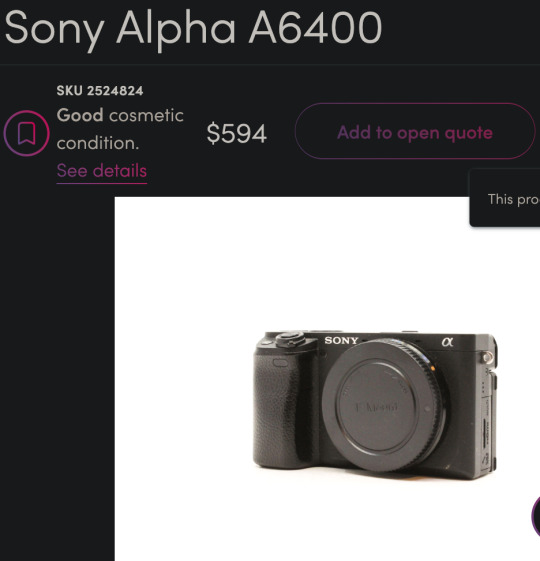
You still get the eye-tracking and the in-body stabilization, but you will lose some image quality at higher ISOs due to the smaller sensor size. However, you can get the same full frame E-mount lenses for it and upgrade to a bigger sensor later on and not have to buy new lenses.
Mirrorless Landscape Lenses
I think a good value landscape lens would be the very impressive Tamron 20-40mm f/2.8.
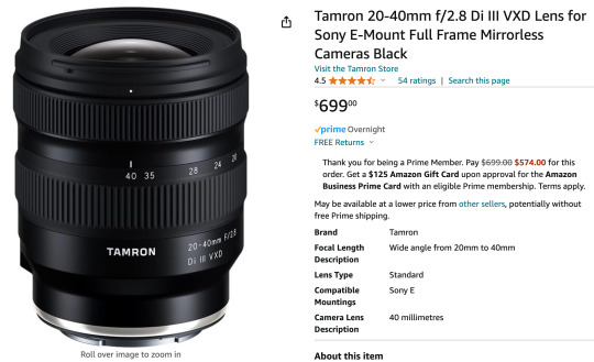
This is a newer lens so there aren't many deals on used options yet. But this is still a great price for the quality and versatility you get. You will never regret spending a little more on glass.
The 20mm range can fit an entire cityscape in the frame without needing to do a panorama. But if you zoom to 40mm and mount the camera vertically, you could stitch together several photos to get well over the 100 megapixel range.
Also, the 40mm focal range is long enough to do street photography and even head & shoulder portraits. The wide f/2.8 aperture combined with the high-ISO friendly full frame sensor and in-body stabilization means you can shoot in very low light without a tripod. You can also get some great pictures of stars if you travel to someplace with minimal light pollution.
The cheapest landscape zoom lens I could find was the Sony 16-35mm f/4 at $384.
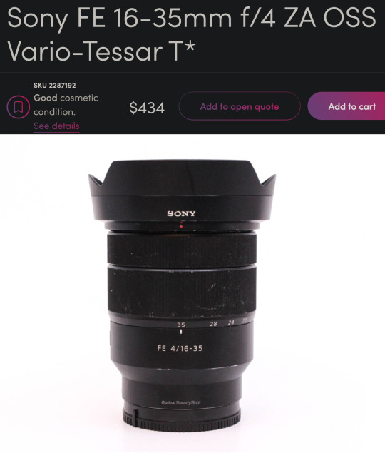
It's one of Sony's older lenses and may not take advantage of all of the a7R III's pixels, but it would be a good option to get you started in this system and upgrade the lens later on.
Mirrorless Prime Lenses
Zoom lenses are great but you have to spend more to get tolerable quality. Kit zooms can be softer than even the tiny plastic lenses on your phone. So a great way to stretch your budget is to get multiple fixed focal length "prime" lenses. Primes can be built inexpensively while still having good low light performance and decent sharpness.
For instance, you could start with something like the Tamron 20mm f/2.8 for $175. And if you want to do more than landscapes you could add the Sony 50mm f/1.8 for $170 later on. Cheap primes will outperform any of those mediocre kit zoom lenses in that same price range. You lose some versatility and have to deal with the pain of changing lenses or zooming with your feet, but sometimes a tight budget demands a little pain.
There is also a higher quality 3rd party wide angle prime lens that is very popular right now. The Viltrox 16mm f/1.8 is only $549 and the reviews say it has similar quality to lenses 3 times its price.
If you have to choose between a better camera body or a better lens, a good lens will help your photos more than a fancy camera body.
Froggie Note: These are examples. You should always do your own research before making a major technological purchase. This post could be a year old by the time you see it and there could be new stuff that is better. But all of the principles I tried to convey should hopefully guide you to a good decision. Also, feel free to message me if you want to ask about specific gear you are considering purchasing.
More Resources
This is my Encyclopedia of Lens Terms which is a helpful primer in understanding all of the wonderful and different lens options available on ILCs.
This is my buying guide for low budget used DSLRs. Similar to this post but less geared toward landscapes.
And this guide for getting decent landscape photos with any camera.
This is a free tutorial that teaches you everything you need to get started with an ILC system.
youtube
And this free tutorial by Karl Taylor is quite good as well.
70 notes
·
View notes
Text
I hate wide lenses. Hate. Hate hate hate. I bitch about this regularly in real life and I dont know if I've mentioned it here, but fuck those stupid bitches. I hate that they're standard. I hate that the average person experiences photography with a goddamn cellphone. I hate that portraiture is the only thing deemed important enough to accommodate. I hate the distortion, the distance, the way everything further than an arm length away is reduced to a indistinct smear.
Why would you care for a picture of the moon, a landscape, a sunset, those are just backdrops for selfies, right? Let's just endlessly crop in for the composition. What's the point of a lenses that can't be crammed into the width of a smartphone anyways? A shitty photo of an incredible thing still averages out to a decent photo so why mourn the possibilities lost?
#wolverine warbles#Salty#Yes I did just find myself beholding magnificent vistas that look like shit with a cellphone camera#Again
29 notes
·
View notes
Text

Do you ever wonder what your cat or dog is thinking when you take their pictures? 🤔 Why is it so hard to get them to look at the camera?
📸 Actually, cats and dogs see the camera lens as the eye of some weird creature staring them down. 👁️ In their social etiquette, direct eye contact is seen as a challenge and can even imply a potential fight. ⚔️ Sensitive cats and dogs will turn their heads or avoid direct eye contact as a way of saying, "I don't want any trouble." 🙅♂️ But some of the brave or curious might give the camera a sniff to investigate it. 👃 Even though smartphones don't have big lenses, cats and dogs still get a bit wary when they see something approaching them closely. ⚠️ And let's not forget the noises and flashes that come with picture-taking. For animals with much sharper hearing and vision than humans, cameras and smartphones are like the same kind of mechanical monsters as hair dryers. 🤖
Now, you might be wondering how those pet influencers always nail those Instagrammable poses. 📸✨ Apart from some naturally carefree pets, many times their owners use tricks like tempting them with tasty treats 🍗 or doing funny actions behind the camera to grab their attention. 🤪 Some other owners take a simple training approach: the moment their furry buddies look at the camera, they are rewarded with an instant snack. 🎁 It's like teaching them that the camera is a friendly monster bringing yummy rewards. 🍭 Usually, within about two to three weeks, you can easily make your cats and dogs love looking at the camera. 😊 Follow for more facts and tips; enjoy it!
#petlove#black cats#cats#cat#cute cats#kittens#kitty#orange cat#cats of tumblr#cat love#dogs#dog#dog tips#dogs of tumblr#dog health#puppies#puppy#chihuahua
21 notes
·
View notes
Text

Karla’s Choice by Nick Harkaway
A new story about cold war spymaster George Smiley written by John le Carré’s son expertly evokes the atmosphere of the originals
They do it with James Bond, so why not with George Smiley? The estate of Ian Fleming has allowed many new 007 books to be written by luminaries such as William Boyd, Anthony Horowitz and even Jeffery Deaver, to keep the franchise (and, perhaps, its copyrights) alive. So why not try the same with John le Carré’s great anti-Bond, the diffident, corpulent and brilliant spymaster of “the Circus”? At least here the literary pedigree is unimpeachable: the novelist Nick Harkaway is also le Carré’s son.
You wouldn’t want to plonk Smiley down in the present day and have him mutter owlishly about pronouns and smartphones. He belongs to the cold war, in his anonymous overcoats and ability to live in Chelsea. So Harkaway sets his story in a gap between canonical Smileys: after The Spy Who Came in from the Cold (published in 1963) and before the events of Tinker Tailor Soldier Spy (1974). (Smiley appears only in the background of The Looking-Glass War, 1965.) We are in 1963, to be precise, and the events recounted in The Spy Who Came in from the Cold are still fresh in the characters’ memories: they are all grieving for their colleague Alec Leamas, gunned down at the Berlin Wall.
What a treat it turns out to be to wander anew the fusty, crumbling warren of the Circus (not the peculiar open-plan brutalism of the 2011 Tinker Tailor movie). The original gang is all here: Control, with his spectacles that always catch the light just so, in order to make the lenses seem opaque; the fast-talking Hungarian hard man Toby Esterhase; Bill Haydon, the old-school charmer who will shag anything that moves; Jim Prideaux, the soldier-poet scalp-hunter; Peter Guillam, the sorcerer’s apprentice. They all act as aficionados would expect; the stentorian research queen Connie exclaims “It’s a song of sorrows, George”; while Harkaway has a lot of fun in particular with the speech patterns of Esterhase, who almost steals the show: “My God, this fellow. He’s making heavy weather, doesn’t want to play … You think we just bust him right now? Disgraceful conduct from a so-called diplomat, hobnobbing with professional assassins, we are all shocked, tell us everything or it’s persona non grata and no more Harrods.” Later, the reader is almost inclined to cheer when Esterhase explains, after a spot of fisticuffs: “I like to fly the flag for rootless cosmopolitans when I can.”
You ask about the plot? Well, Susanna Gero is a Hungarian émigré who works in the London offices of Mr Bánáti, a literary agent who every day “performed a series of ludicrous exercises devised by a Swiss”. One day her boss goes missing, and another man arrives at her door to explain that he was sent by the Russians to kill him but has changed his mind. There follows a satisfyingly slow and circumspect investigation by Smiley and team, followed by a similarly slow and circumspect chase across Europe. Berlin, Vienna, Budapest, Lisbon. The atmosphere is delicately painted in all the appropriate shades of grey.
The prose of Karla’s Choice is not an absolutely perfect exercise in ventriloquism of the master, nor does it try to be. There may be a few seeming anachronisms (we hear of old field agents who lack the “chops” for management; the word “definitionally” to mean “obviously” is overused), but there is a satisfyingly cold tone throughout, recalling the way that le Carré’s own furiously tamped-down moralism (in the novels of the 1960s and 70s, at least) could approach nihilism. (A doctor’s report on a man’s torture “noted with disapproval the unscientific use of lit cigarettes” on his legs.) Harkaway might be a smidgen warmer and more sentimental, but he is also funny in the right way: in Control’s office there is “an electric fire which seemed to generate only false expectation”. He demonstrates superbly, too, how suspense can arise from the patient accumulation of detail, and the brilliant climactic scene is nothing so vulgar as an action-movie shootout but rather a sequence of ordinary bureaucratic peril: the attempt to cross a border when one’s papers are not quite in order.
It cannot be a bad time to revive old George, what with a resurgent Russian threat (not so subtly adverted to herein) and the popularity of the TV series adapted from Mick Herron’s excellent Slow Horses books, starring the 2011 film Smiley, Gary Oldman. An afterword, mentioning the genesis of a wonderful new character, an expert Indian forger, or “artist”, hints that Harkaway might be planning more such stories. Well, le Carré once said that he didn’t write as many Smiley novels as he had planned because it was too hard to get away from Alec Guinness’s definitive portrayal in the classic 1970s TV adaptations. So at least we know we have the master’s blessing. And a drop more of his narrative voice’s caustic decency, expertly continued by Harkaway, would not go amiss in these times. “We don’t do justice, though, do we?” Peter Guillam remarks at one point. “That’s another department.”
Daily inspiration. Discover more photos at Just for Books…?
12 notes
·
View notes
Text
Frogman's Camera Buying Guide
A few weeks ago someone asked if I could recommend an interchangeable lens camera (ILC) to supplement their smartphone photos and hopefully get better pictures of important things like vacations and pets.
I decided to go very extra with my response and due to that... I'm still not finished with it.
I'm worried I am letting this person down because they did not ask for a giant post explaining every detail about cameras in the history of forever.
So I am going to do a camera recommendation post without as much explanation and hopefully I can finish the giant post at some point in the near future.
If you want to take better pictures you are probably going to need a camera with a decent sized sensor, a fast lens, a tripod, and a flash.
The bigger sensor gives you more dynamic range so you can capture brighter and darker things in the photo.
A fast lens has a giant hole in the front that lets in a ton of light. That hole is called the aperture and the bigger it is, the better your photos in dark environments will be. So you will want something that does f/1.8 or f/1.4 (lower f-stop number = bigger hole = more light). This can also help you get a lot of cool background blur.
A tripod will help get you longer exposures without any blur from camera shake. Especially good for landscape photos.
And a flash is for taking photos of pets and other moving subjects when you are indoors and don't have a lot of light. A flash is an absolute game changer for indoor photos.
HOWEVER, never point it directly at your subject.
Point it at a large white ceiling or wall. The flash happens so fast that it freezes motion. It is how I got all of my indoor photos of Otis.
Here he was playing and being rambunctious and he is not blurry.
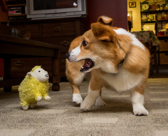
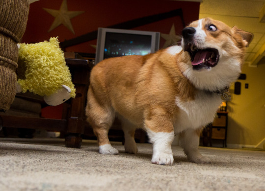
I used no special settings. I just stuck on a flash and pointed it at the ceiling and suddenly sheep are sticking to things.
Oh, and one other huge benefit of using a flash... you can take much better photos of pets with dark fur. So if you have a cute little void in your home, a flash can help you capture detail in their fur.
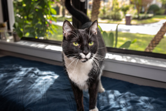
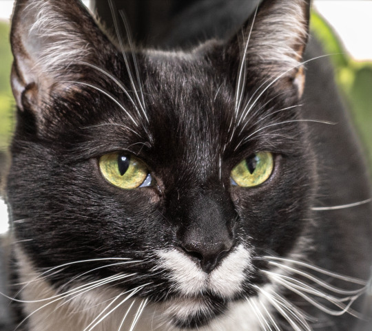
Just lift the shadow slider in your image editor and that beautiful fur will reveal itself.
If you get an ETTL or TTL flash, it will output the correct amount of light automatically. You can literally just put your camera in automatic mode, aim the flash at the ceiling, and press the shutter button.
Before I talk about recommendations I want to make one thing very clear.
GETTING A GIANT CAMERA WILL NOT AUTOMATICALLY GIVE YOU BETTER PHOTOS.
Aside from my flash aimed at the ceiling trick, a big boy camera is not a magic solution for better photos. In some cases, you might actually get *worse* photos than your smartphone. You need to learn the basic fundamentals of photography and you also need to learn some basic photo editing skills.
Smartphones employ powerful algorithms and computational processes to make every photo you take look as good as possible.
ILCs say, "Here is your RAW data, you figure out the rest."
You don't have to become an expert, but if you watch this free 6 hour photography course, that will ensure you have the knowledge needed to improve your photos.
youtube
Okay, let's get into the nitty gritty of buying a nice new old ILC.
If you are on a tight budget and cannot afford a fancy mirrorless camera, I would highly suggest a used DSLR. You can get them for very reasonable prices. And unlike just about every other modern technological gadget, cameras and lenses are built to last for decades. So I have no qualms about recommending used photography gear.
However, I do highly recommend using either KEH or MPB, as they have a long trial period and decent customer service. If something goes awry with your used gear, KEH has a 180 day warranty and MPB has a 6 month warranty. So there is much less of a risk than eBay or Facebook Marketplace. You pay a bit of overhead, but the piece of mind is worth it.
Before I start my recommendations I want to quickly explain the difference between APS-C and Full Frame camera bodies. (For brevity's sake I am going to omit Micro Four Thirds bodies as they are not typically geared toward beginner photography.)
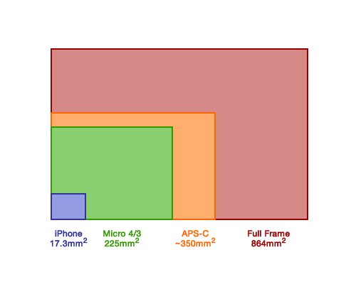
APS-C has a "crop" sensor. It is a bit smaller than full frame and does not perform as well in low light (more noise). However these bodies are cheaper and can still produce great photos. You can see above the sensor is still significantly larger than a smartphone. APS-C adds a 1.5x zoom to all lenses. This can be annoying in small spaces but advantageous for outdoor photography like wildlife and sports. You can use full frame lenses on a crop sensor body (within the same brand). APS-C lenses are usually cheaper but of lower quality.
Full frame has a larger sensor that will give you less noise in low light. It is also much easier to get background blur. Full frame also allows you to work in more cramped spaces. You *cannot* use APS-C lenses on a full frame body. However, the lenses meant for full frame cameras tend to be better quality in general.
If you can save up a little more and get a full frame body, I would recommend it. These bodies used to be geared more toward professional use, but since mirrorless cameras became popular, used full frame DSLRs have become much more accessible to those on a budget. Full frame cameras make it easier to get better results in challenging circumstances. And challenging conditions are really the main area where ILCs still kick a smartphone's ass.
For tight budgets I would recommend the following...
Canon or Nikon APS-C DSLR camera body
50mm f/1.8 lens (Nifty Fifty)
18-55mm APS-C lens (good for landscapes and portraits)
Yongnuo ETTL Flash
There are lenses called "superzooms" which can go from (as an example) 18-200mm or 70-300mm and other crazy focal lengths. That sounds fantastic and very versatile... but these are usually utter shite. You may be tempted to get one of these lenses hoping it can do everything you need, but there are no free lunches in lens land. Unless you are spending many thousands of dollars, the wider the focal range, the worse the lens will be.
When you stick to the 18-55mm range, you can be assured the images will be decent. And if you find yourself really needing a telephoto lens, you can save up and add it to your collection later on. The 18-55 will give you wide angle for landscapes all the way to slightly telephoto for portraits and moderately close wildlife. This lens cannot be used indoors or at night without a flash. Which is why I recommend the Nifty Fifty for that purpose. $100 for a moderately sharp low light lens is a no brainer.
Also, stick to Canon, Nikon, Sigma, or Tamron lenses. You can try exotic 3rd party lens brands when you know more what you are doing. And always make sure the lens has autofocus before buying.
It's hard to give you exact recommendations as used items are not reliably in stock. So I'm going to show you an example of the above, but I am not necessarily saying you should buy this *exact* combination. You might be able to get something similar with Nikon as well.
Canon 60D APS-C DSLR
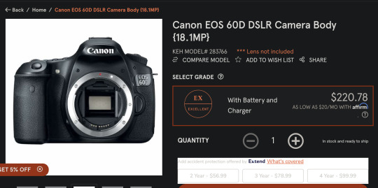
50mm f/1.8 lens

Canon 18-55mm APS-C lens (EF-S mount)

Yongnuo TTL Flash
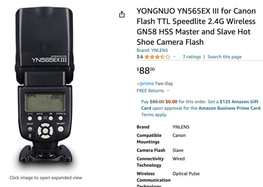
(I wouldn't recommend getting a used flash, as the Yongnuo is already a great price and you can't know if someone used the flash 100,000 times or 20 times.)
Altogether that is about $500. You can start with the 60D and the 50mm Nifty Fifty for $330 and add on the other two items later on.
My recommended full frame setup...
Full frame Canon or Nikon DSLR body
50mm f/1.8 lens (same as before)
24-70mm full frame zoom lens (full frame equivalent to 18-55mm)
ETTL Yongnuo flash (same as before)
And an example from KEH might be...
Canon 6D Full Frame DSLR


Canon 50mm f/1.8 Lens

Sigma 24-70mm Full Frame Zoom lens (EF mount)
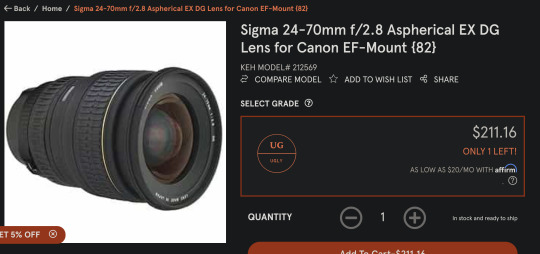
Yonguo ETTL Flash

And that would be about $800 total.
Again, you can start with just the camera and 50mm lens and add the other items later. So invest $500 initially and go from there.
And just to give a Nikon example as well...
Nikon D600 Full Frame DSLR
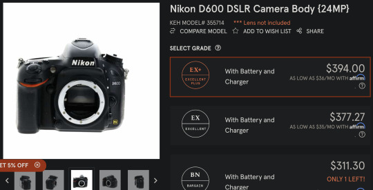
Nikon 50mm f/1.8 Lens
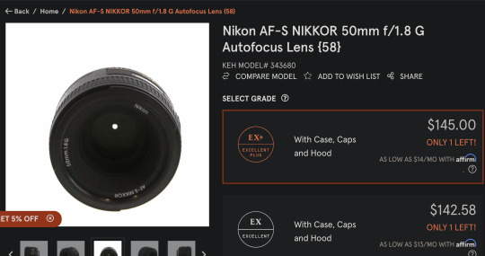
Tamron 24-70mm
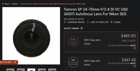
Yonguo ETTL Flash (Nikon version)

I highly recommend researching any camera body and lens before purchase. I can vouch for the items above, but you should definitely check out some YouTube videos before buying.
All of the stuff on KEH and MBP is marked down in price for aesthetic reasons. They do test everything to make sure it is functional. If you care if the camera or lens looks pristine, it will cost a little extra. But if you don't mind if it is beat to hell, you can save some money. Ugly or not, you will get the same photos out of the gear. As I said, photography stuff is built to last for a long time. Almost all repairs are due to user damage and not defects. And usually defects manifest when the product is brand new.
Oh, I forgot about the tripod!
Amazon's $35 tripod is surprisingly decent. It even got a good review on a very picky tripod review site. I recommend starting with this and then upgrading when you know more what you need out of a tripod.
Amazon 60 inch Tripod
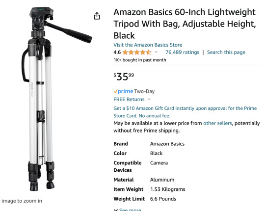
I worry I'm leaving out a lot of important information, but hopefully I can expand in the other post I am working on.
That said, if anyone is thinking of buying a camera and you are not sure about the items you selected, please feel free to message me and I will help you assess your choices. Please make sure you include a budget range when asking for buying advice.
I hope that helps. I will try to finish the more in depth post soon. And it will include tips for how to get better photos from your smartphone if you cannot afford an ILC at the moment.
Further resources...
Recipe for Landscape Photos Froggie's Encyclopedia of Lens Terms
204 notes
·
View notes
Text


Abstract challenge 71 - September 2023
"Black and White Macro
This month we have a double challenge for you, once again:
This one is about "macros" AND about "black and white".
We want to see abstract black and white macro photos. Get close this month and make it back and white. Even if you don't have a dedicated macro lens or don't have a camera that allows you to use a macro lens (or if you can't or don't want to try the old "reverse-lensing" trick), you can take macro shots. Many smartphones or compact cameras have a macro mode, or why not simply use a magnifying glass and shoot through that (which would - of course - also qualify for last month's challenge "shooting through something").
Black and white gives us a lot of possibilities to experiment. No matter if we use "in camera black and white", make a b/w conversion, or even shoot b/w film. Do whatever suits you and your style best.
As usual: if our three examples at the top of this post are not enough for your creative muscles to be flexed, check out our archives with many fantastic abstract photos (some of the black and white, some are macros).
If you want us to consider your photo (or set): simply post it to your blog and use the tag “abstract-challenge” as one of the first five tags so that we can find it. If you prefer, you can also submit your photo to @abstract-challenge. Of course, all the past challenges are still running, so if you have something for them, don’t hesitate to share them.
Happy shooting!
#abstract challenge#photographers on tumblr#artists on tumblr#original photography#original photographers#abstract#black and white#macro#photography
91 notes
·
View notes