#Sean ztd
Explore tagged Tumblr posts
Visit Tumblr Blog
Explore Tumblr blogs with no restrictions, modern design and the best experience.
Last Seen Tumblr Blogs


Fun Fact
Tumblr.com rank in the US is 25.
Text

for anon
#art tag#zero escape#zero time dilemma#ztd spoilers#time for tags!#delta ztd#q ztd#carlos ztd#mira ztd#sean ztd#eric ztd#akane kurashiki#junpei tenmyouji#diana ztd#phi zero escape#sigma klim
832 notes
·
View notes
Text
#this game is so divisive and it was universally panned form what I can tell when it was released#but it does seem (to me) that over time people have learned to love parts of it#be it genuine or ironic#so I’m curious about the current couple consensus#zero escape#zero time dilemma#junpei tenmyouji#akane kurashiki#carlos ztd#q ztd#Sean ztd#mira ztd#eric ztd#delta klim#delta ztd#diana ztd#sigma klim#phi klim#phi ztd#phi zero escape
99 notes
·
View notes
Text

Zero Escape is a game about love
#zero escape#zero escape spoilers#zero time dilemma#junpei tenmyouji#akane kurashiki#carlos zero escape#my art#sigma klim#diana ztd#phi zero escape#eric ztd#mira ztd#sean ztd#blood tw#cried#what a game#so oh very flawed#but i really did enjoy it#love conquers all okay..... remember that guys#I'll crosspost the rest of my ztd art in the coming days from twitter#im going to miss you zero escape....what a series and what a ride
199 notes
·
View notes
Text

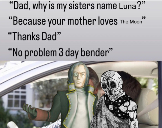
Sean, we can't both exist. I'm going to become half of you. And I need you to know that every moment you hate being yourself, that's me, hating you and hating being you. Because you're going to be something extraordinary. You're going to be a robot.
#zero escape#delta ztd#sean ztd#ztd spoilers#zero escape spoliers#zero time dilemma#I’m sorry I have ztd on the mind and the Lois griffin rose quartz meme has been stuck in my head#it’s been a while since I made a hit delta edit#this image with deltas head on 50% opacity was terrifying
62 notes
·
View notes
Text
Time to Decide
#zero escape#zero escape spoilers in the tags#diana ztd#carlos ztd#sean ztd#my art#like the game isn’t amazing but it’s a good game if you picture it like a comedy show
29 notes
·
View notes
Text

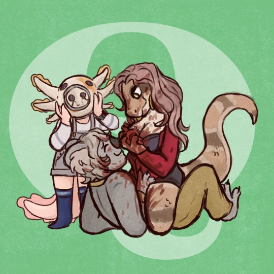
I thought about this long and hard. I could have chosen characters that would have gotten me more clout, but no. I like drawing Q-Team and they really are the best analogs Zero Escape has for the three protagonists of Deltarune. I love giving Mira different hairstyles :)
Here's my Deltarune playlist!
13 notes
·
View notes
Text


I meant to post these yesterday (between the anniversaries of ZTD's Japanese & NA/EU releases), but Eric was giving me trouble still. D-Team honestly has the least offensive designs, so I'll save them for another time. Under the cut is all my commentary on them, including more thought process stuff.
Carlos:
Square-ish design language
The concept art mentioned specifically his broad shoulders, so I tried to make them a little broader than I would on average, though I think I tend towards drawing my characters a little broad-shouldered naturally.
varsity jacket instead of button-down, emphasize "jock" attributes
Canon Carlos kind of looks like a surfer dude. I still wanted to make him look sporty, but in a different way.
kept axe on breast pocket
I think it was a good move for the team to change this one. I like the symbol.
kept burn scarring
I feel as though the burn scarring is less likely to be from his job and more likely to be from when he saved Maria, since he wouldn't have been wearing gear at that time. But I liked the idea, so I kept it.
Junpei:
giving him the emo mullet he deserves
I think with his general self-neglect the fact that his hair is shorter in ZTD than it is in 999 is wild.
I did keep his hair being a purple-black bc I like that :)
put a design on his shirt to make it less plain, so even if you do rob him of his leather jacket he doesn't look boring
Akane:
in the actual game her dress is really close to her skin tone so it blends in. it's still close but not as bad. and it being a turtleneck mitigates those issues mostly
she's wearing platform boots now
I also gave her the River Patented Loose Strand of Hair because I can't draw an Akane without it
both Junpei and Akane:
so I decided to put both of them on the same canvas and work on them in tandem because I like the light/dark contrast they have going on in ZTD as well as the detail that in 999 Akane is purple and Junpei is red & blue
if you look at Junpei the red & blue is still there, just darker and duller
Sean:
honestly I really like the components of his design individually but the desaturation of the colors makes him not interesting to look at past the helmet
the stripes on his shirt were originally blue I think but they're orange here so that the sneakers look less out of place
Eric:
was REALLY hard to work with
like, I have four different versions of this saved, that are all the same base but slightly different
I really liked the note on his concept art where the artist wanted to make his shoulders asymmetric, and wanted to take that asymmetry idea to the next level
I made him blue to contrast with Mira's red
I also wanted to keep the "just some guy" energy, so he is still a Guy In a Shirt, but executed differently and with more color
the orange is because his canon color scheme includes it
"any blond character can be improved by giving them dark roots" -a tumblr post
I don't think that's the exact wording tbh but like that's what I was thinking of
"water motif ;)" because he's really not over it
Mira:
honestly I didn't do much to her.
wanted to make her extra symmetric to contrast Eric's asymmetry but it wasn't working out super well
one of her thigh holsters is for a gun, the other is for a knife
I really despise the zippers on her heels in her concept art they just look bad. There's either a hidden buckle or they're just slip on
made all the metallic accents silver
#zero escape#ztd#zero time dilemma#ztd spoilers#ze spoilers#carlos ztd#junpei tenmyouji#akane kurashiki#sean ztd#eric ztd#mira ztd#r does an art
6 notes
·
View notes
Text
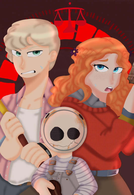
Ahh this is sooooo cute I'm smiling so much! I love Bender's face painted on Sean's helmet! Thank you so much (both of you!)

To: @lightphieric
From: @checkerstankkuro
Happy holidays! I was really delighted to receive your prompts as they were some of my favorites :) I absolutely love futurama so the idea of Q-team dressed as them made me so happy! I would also like to shoutout my wonderful student (I'm a high school teacher) who helped me, I love their artistic style and love to support my kids so I asked for their help to make you this gift, so please give credit to @cr3ntist as well. I hope you enjoy this holiday season and have a great time and maybe get some down time to play one of our favorite games again!
30 notes
·
View notes
Text

whos mira?
#my art#art#zero escape#ztd#zero escape zero time dilemma#ztd mira#ztd eric#ztd sean#ztd q#whos lila#fanart#digial art#tumblr artist#artist#artist on tumblr
103 notes
·
View notes
Text


Going online and collecting memes to edit pngs over like its my JOB
#sorry this post is obscenely long#zero escape#akane kurashiki#junpei tenmyouji#sigma klim#diana zero escape#delta zero escape#zero escape spoilers#sean zero escape#eric zero escape#mira zero escape#ze vlr#ze 999#ze ztd
413 notes
·
View notes
Text
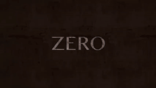
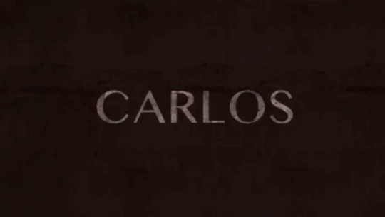


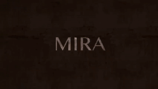


Zero Time Dilemma (2016)
Japanese character trailer
#zero escape#zero time dilemma#gifset#figtreegif#ztd#zero#carlos#akane#junpei#q#mira#eric#diana#sigma#phi#delta#akane kurashiki#junpei tenmyouji#sean#sigma klim#video games
165 notes
·
View notes
Text
OKAY ON A DIFFERENT NOTE after talking to oomf i think it's interesting that so much of the klim family and those involved with it owe their existence to grief. or otherwise built in the shadow of someone else. phi's named after herself, who sigma knew as his dead friend at the time. dio and the myrmidons exist because of delta's grief over left. luna was built in diana's image after her death. sean was built after a kid delta met passed away. lagomorph was partially created by akane; maybe the rabbit form was because of junpei. kyle was built as a replacement in case sigma died during the conception of the AB project and exists as his shadow. it's a bit interesting to me. a family of people built in mirror images and ghosts and shadows of others
#zero escape#vlr#virtue's last reward#zero time dilemma#ztd#vlr spoilers#ztd spoilers#zero escape phi#zero escape dio#zero escape luna#zero escape sean#lagomorph#zero iii#kyle klim#yeah. whatever#trevor.txt
23 notes
·
View notes
Text
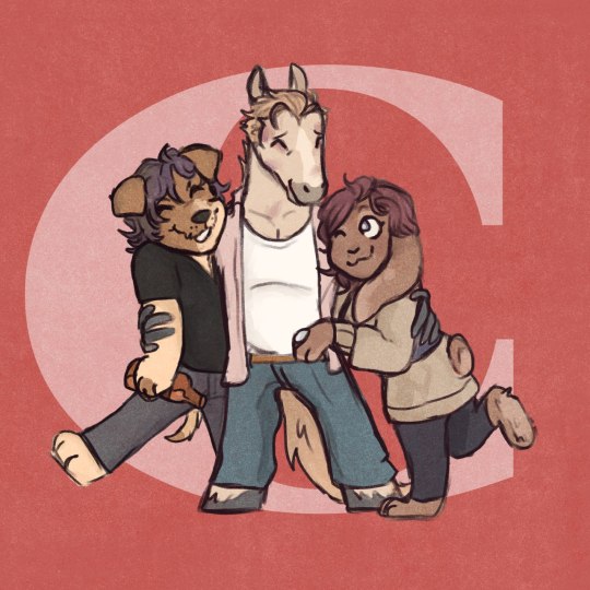
#this might be an odd poll but I wonder how many people for example love D-Team but still have Carlos as their fave in the game#my prediction is the ones that will be most popular is both the D-Team options and the C-Team + fave character#and the Q teams will have a combined percentage of 5% MAX#zero escape#zero time dilemma#d team#c team#q team#carlos ztd#akane kurashiki#junpei tenmyouji#q ztd#sean ztd#mira ztd#eric ztd#delta ztd#delta klim#sigma klim#diana ztd#phi zero escape#phi klim
50 notes
·
View notes
Text


Lots of unposted ZTD art from twitter!
#zero escape#zero time dilemma#ztd spoilers#my art#sigma klim#junpei tenmyouji#akane kurashiki#carlos ztd#diana ztd#phi zero escape#eric ztd#sean ztd#aoi kurashiki
116 notes
·
View notes
Text


I still haven’t finished ztd
#zero escape#akane kurashiki#sigma klim#junpei tenmyouji#clover field#seven#Mira#Eric#Q#aoi kurashiki#lagomorph#gothitxt#junepei#phi klim#Sean#ze#ztd
114 notes
·
View notes
Text
didn't expect to start liking Q team in zero time dilemma btw
#i still think that “oh there was always that old disabled man who we won't acknowledge” is kinda bullshit but oh well#yes eric is annoying especially with that shotgun constantly in his hands but guy went through shit#and i just like mira idk she's cool and sexy and tragic and god forbid women do anything#and sean is a cutie#ztd spoilers#i guess
5 notes
·
View notes