#ScriptStyle
Explore tagged Tumblr posts
Photo
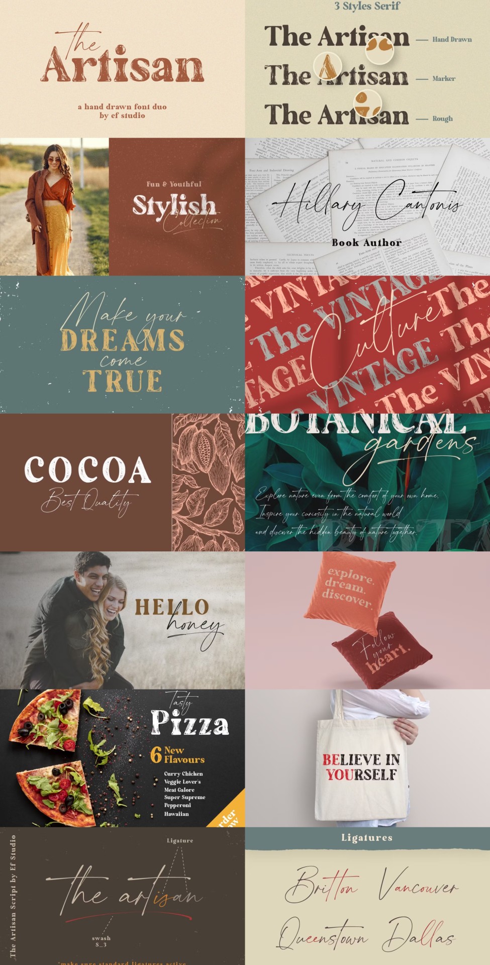
Hand-drawn font duo featuring 3 serif styles and 1 script style, perfect for various projects like branding, logos, print, and digital media, offering a unique blend of modern and artistic flair.
Link: https://l.dailyfont.com/nuywp
#aff#MustRead#FontLove#DesignInspiration#CreativeWork#TypographyMatters#GraphicDesign#DigitalMedia#BrandingTips#LogoDesign#PrintFriendly#ArtisticFlair#ModernFont#ScriptStyle#SerifFonts#HandDrawn#UniqueBlend#DesignElements#VisualIdentity
1 note
·
View note
Link
0 notes
Text
Me: I need to finish the writing project I've been working on for years.
Also me: -does literally any other writing project-
#haha whoopsie#writing#Anywho if anyone wants to alpha read the prose version of my queer manga manuscript hook me up#I wrote it in scriptstyle originally and finished that. But then decided that no#I need to rewrite all 360ish chapters#I am currently 34 chapters in
1 note
·
View note
Note
i enjoy how you write like a stageplay… it does things to me
SMOOCHES!! i hope i can get back to writing prose someday but in the meantime im having fun with doing little scriptstyle scraps it comes a lot more naturally to me
7 notes
·
View notes
Text
I really wanna write stuff involving other people's characters but I'm super wary about either coming across as annoying or just writing the character really badly or in a way the other person doesn't like 😩
#Matt rambles#It was easier when me and my exfriend used to do scriptstyle rp#Coz both of those are immediate responses in character to situations#But i dont have anyone to do any of those with and I'm too shy#But i still wanna write the things 😭#Or i played dnd#(missed that tag out after script rp lmao)
5 notes
·
View notes
Photo
Source: Web
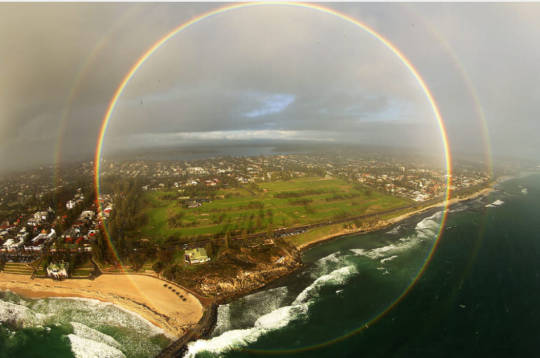
From the ground only the top part of the resulting rainbow is visible, the one in the shape of a multicolored arc. However, if we rise above the surface of the Earth we will realize that a rainbow continues below the horizon. That is why from the air we have a greater chance of witnessing a truly amazing phenomenon, a complete circular rainbow. This 360-degree rainbow was photographed from a helicopter flying, between a downpour that produced it and the rays of the Sun, over Cottesloe Beach, in Perth, Australia. Historical conception of the rainbow Throughout history and at different points in geography, an attempt has been made to explain the appearance of the rainbow in different ways. He could not give a scientific explanation because there was no scientific method as we know it today but at least they gave fantastic explanations. Illustration of the worlds according to Norse mythology with the Bifrost Irish mythology Without a doubt, the most "fantastic" and well-known conception he has of rainbows is that of the existence of a kind of gnome with a cauldron. According to Irish mythology, leprechauns are a species of gnomes that carry a pot full of gold. They are defined as cunning and greedy, and that is why the story goes that to protect their treasure they only come out of hiding when a rainbow appears. Leprechaun with a pot of gold at the base of a rainbow The children were told that if they were able to reach the point on earth from which the rainbow came out, they would meet one of these beings and be able to keep the gold. And, when we see a rainbow it gives us the feeling that it is like a colored ray that starts from a point on earth, as if someone were projecting it into the sky. The thing is, the rainbow is "generated" in our eyes (It is an optical effect), and whatever we walk we will never reach its base. (We will see later why). Newton's prism Optics was the object of study of many civilizations and as the years passed, advances in this branch of physics progressed. The study of the rainbow and the colors belongs to this branch, and it was not until approximately 1670 when Isaac Newton formulated a theory that related the visible or white light and the colors of the visible spectrum. Visible light is one of the bands of the electromagnetic spectrum, and within this band the colors appear, arranged in the same way as in the rainbow. The less energetic electromagnetic waves go below red and are called infrared, while the most energetic waves that go after violet are called ultraviolet. Newton's experiment Before Newton, Descartes already suspected the idea of decomposing light into colors. However, he was not able to obtain more than two colors and did not know why it happened. To study the behavior of light Newton used a pair of glass prisms. In a darkened room where only a beam of light entered, he placed a prism in front of the beam, so that it passed through it and reflected the light on the opposite wall. He observed that the colors of the rainbow appeared on the wall in order one after another. Newton in his workshop with the prism experiment However, at this point there were two possibilities; Either the prism gave color to the light, or the light was the mixture of all the colors and the prism simply decomposed it. In order to reach a conclusion he realized in a second prism that he placed behind the light decomposed into colors. After moving the prism through each of the colors Furthermore, by meticulously placing a second prism he was able to mix all the colors and project a beam of white light. Two connected Newton prisms that decompose and unite colors Newton showed that what is normally known as visible or white light is really an indistinguishable union of waves of different frequencies, each associated with a color that our eye is capable of perceiving. How does Newton's prism work? The explanation is quite simple and is due to the difference in frequency of each of the colors + the refraction due to the change of medium. Refraction is the change in direction and speed that a wave experiences when passing from one medium to another with a different refractive index. Refraction of light in water This deviation in the direction of propagation is explained by means of Snell's law. On the other hand, and what really matters to us, is that the speed of penetration of light in a medium other than vacuum is related to the frequency of the wave. For a ray of light with an angle of incidence {\ displaystyle \ scriptstyle {\ theta _ {1}}} in the first medium, angle between the normal to the surface and the direction of propagation of the ray, we will have that the ray propagates in the second medium with an angle of refraction {\ displaystyle \ scriptstyle {\ theta _ {2}}} whose value is obtained by means of Snell's law: {\ Displaystyle n_ {1} \ \ operatorname {sin} \ theta_ {1} = n_ {2} \ \ operatorname {sin} \ theta_ {2} \,} Where {\ displaystyle n = \ frac {c} {v}} \ is the refractive index, which depends on the speed v of the wave in the medium. Snell's Law When a beam of white light passes from one medium to another, each color undergoes a slight deviation because each has a certain frequency. This phenomenon is known as light scattering. Newton's prism decomposing colors Formation of a rainbow The manifestation of the rainbow, as we have explained with Newton's prism, is due to a decomposition of white light into pure colors. Indeed, the drops of water that are still in the environment. That is why a rainbow only appears after it has rained a lot (Environment very loaded with drops of water) or there is a slight drizzle (Drops are falling but they do not reduce visibility or cover the sun). To understand the formation of the rainbow and understand why we will never be able to reach its base, it is necessary to be very clear that the rainbow is generated in our eye. It is an optical effect that depends on the observer due to the incidence of the rays. Nothing to do with an aurora borealis for example, where what you see are particles that exist as such. Animation of an aurora borealis The rainbow is generated in such a position that when we see it just behind us, the sun is located. The thing is, the sun's rays advance and enter the drops of water, producing refraction (the colors separate) and reflection (The ray returns to us). Refraction of light in water droplets What happens is that this ray with a circular shape due to its geometry goes directly to our eyes, and that is why from the earth we see the half circle or rainbow. Graphic formation of a rainbow Full rainbow of circular shape from an airplane View of a full rainbow from the sky It is a bit what happens with mirages, also caused by the refraction of hot air on the surface. THERE IS NOTHING there, it is an optical effect that is generated in our mind.
3 notes
·
View notes
Text
Like.


(a scriptstyle from last year /w @the-shima4ages)
1 note
·
View note
Video
instagram
Still WIP my cursive signature script variable font. For now the light version is available on #fontspring and #myfonts. See my bio https://www.myfonts.com/fonts/pedro-teixeira/cursive-signa-script-variable/? refby=ptx https://www.fontspring.com/fonts/pedro-teixeira/cursive-signa-script-variable?refby=ptx #variations #variablefont #variablefonts #variants #script #scriptfont #scriptstyle #scriptfonts #scriptmodern #variablescript #variablecursive #cursive #cursivefont #cursivefonts #cursivescript #cursivehandwriting #typography #typographic #calligraphy #calligraphyfont #moderncalygraphy #magazine #magazinefonts #magazinecover #graphicdesign #webdesign #webfont #signaturefont https://www.instagram.com/p/B9_jIOaFCpa/?igshid=1a283sneicxkk
#fontspring#myfonts#variations#variablefont#variablefonts#variants#script#scriptfont#scriptstyle#scriptfonts#scriptmodern#variablescript#variablecursive#cursive#cursivefont#cursivefonts#cursivescript#cursivehandwriting#typography#typographic#calligraphy#calligraphyfont#moderncalygraphy#magazine#magazinefonts#magazinecover#graphicdesign#webdesign#webfont#signaturefont
0 notes
Text
Hàm hyperbol – Wikipedia tiếng Việt
Hàm hyperbol – Wikipedia tiếng Việt
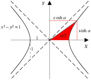
x 2 − y 2 = 1 { \ displaystyle \ scriptstyle x ^ { 2 } \ – \ y ^ { 2 } \ = \ 1 }( cosh a, sinh a ) { \ displaystyle \ scriptstyle ( \ cosh \, a, \, \ sinh \, a ) }a { \ displaystyle \ scriptstyle a } x {\displaystyle \scriptstyle x} Bạn đang đọc: Hàm hyperbol – Wikipedia tiếng Việt x { \ displaystyle \ scriptstyle x }Một tia đi qua gốc của hyperbolcắt hyperbol tại điểm, vớilà 2 lần diện tích…
View On WordPress
0 notes
Photo
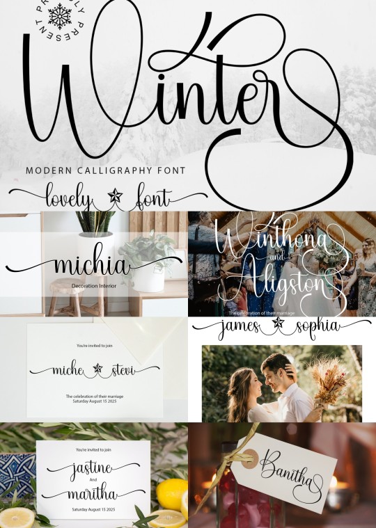
Winter is a charming handwritten font, suitable for various projects from greeting cards to headlines, adding a romantic touch with its versatile script style and easy glyph access.
Link: https://l.dailyfont.com/jTNi4
#aff#Love#WinterVibes#Fonts#Handwritten#RomanticTouch#SocialMedia#Headlines#GreetingCards#Charming#ScriptStyle#GlyphAccess#Typography#DesignInspiration#CreativeOutlets#Instagram#Pinterest#Facebook#Twitter
0 notes
Text
Cursive Calligraphy Introduction: Elegant Writing
Cursive Calligraphy Introduction: Master the Art of Elegant Writing Today!
Cursive Calligraphy Introduction! Welcome to the captivating world of cursive calligraphy, where elegant writing takes center stage. In this article, we will explore the art of transforming handwriting into a beautiful form of expression. Whether you are a beginner or seeking to refine your cursive skills, this guide will provide you with the essential knowledge to write in this graceful style. Key Takeaways: - Cursive calligraphy is a form of elegant writing that can elevate your handwritten expressions. - Mastering cursive script requires an understanding of the basics, such as stroke flow and letter connections. - Improving your cursive handwriting involves techniques like consistent letter slant and finding your optimal writing speed. - Choosing the right tools, including pens with good ink flow and understanding pen pressure, is crucial for achieving beautiful cursive script. - Regular practice and the use of practice sheets and exercises are essential for mastering cursive calligraphy.
The Basics of Cursive Script
In order to master the art of cursive calligraphy, it is essential to have a solid understanding of the basics of cursive script. Cursive writing is characterized by its flowing strokes and the seamless connection of letters. By understanding the fundamentals, such as stroke flow and letter connections, you can achieve a more elegant and cohesive cursive script. When writing in cursive, the flow of strokes is crucial. Each letter is formed by a series of deliberate strokes that create a rhythmic and graceful script. It is important to practice the correct stroke flow for each letter to maintain consistency and improve your cursive writing skills. The connection between letters is another key aspect of cursive script. Unlike print handwriting, where letters are often written separately, cursive writing requires letters to be connected, resulting in a continuous and fluid script. Learning how to connect each letter smoothly and naturally is essential for creating a coherent cursive script. By mastering the basics of cursive script, including stroke flow and letter connections, you can lay a strong foundation for developing your cursive calligraphy skills. In the next section, we will explore the cursive calligraphy alphabet, focusing on the formation of lowercase letters. Table: Cursive Script Basics Element Description Stroke Flow The direction and sequence of strokes used to form each letter in cursive script. Letter Connections The seamless joining of letters in cursive writing to create a continuous and fluid script. Consistency The importance of maintaining consistent stroke flow and letter connections to achieve an elegant and cohesive cursive script.
Cursive Calligraphy Alphabet: Lowercase Letters
Mastering the art of cursive calligraphy begins with learning the lowercase letters. By understanding the formation of each letter, you can develop a fluid and elegant cursive script. Let's explore the cursive calligraphy alphabet for lowercase letters to enhance your writing skills. The key to mastering cursive letter formation lies in practicing the basic strokes and understanding the proper technique for each letter. With lowercase cursive letters, you'll notice that many of them begin with an upward stroke. This creates the signature slant and graceful flow that cursive calligraphy is known for. When writing in cursive, maintain a consistent letter slant, ensuring that each letter leans slightly to the right. This creates a visually appealing and cohesive script. Remember to give each letter enough space to breathe, allowing for clear distinction between letters. Below is a table showcasing the cursive calligraphy alphabet for lowercase letters, along with the correct stroke order and direction for each letter. Practice writing these letters repeatedly to develop muscle memory and refine your cursive skills. Letter Stroke Order Example a 1. Upward stroke 2. Small loop to the left 3. Curve down and to the right 4. Cross in the middle b 1. Upward stroke 2. Loop to the right and down 3. Small loop to the left 4. Slant down and to the right c 1. Upward stroke 2. Curve to the right and down 3. Hook back to the left
d 1. Upward stroke 2. Loop to the right and down 3. Pull back and slant down to the right Continue practicing the remaining lowercase letters of the cursive calligraphy alphabet, such as e, f, g, and so on. With consistent practice and attention to detail, you'll soon be able to write in cursive with confidence and elegance.
Cursive Calligraphy Alphabet: Uppercase Letters
In cursive calligraphy, uppercase letters have their own unique flair and elegance. Mastering the formation of these uppercase letters will allow you to create stunning and sophisticated cursive script. Let's explore the uppercase cursive calligraphy alphabet and learn how to write each letter with precision and style. Uppercase Letter Formation When writing uppercase letters in cursive, it's important to pay attention to their distinct characteristics. Each letter has its own unique strokes and connections, which contribute to the overall aesthetics of your cursive script. Here is a guide to help you master the formation of uppercase cursive letters: Letter Formation A Start with a short upward stroke, then create a curve that extends downward to the baseline. Lift the pen, move to the right, and create a slanted stroke towards the baseline. B Begin with a small loop at the top, then form a curve that goes downward and loops back up to the top. Extend a vertical stroke from the loop to the baseline. C Start with a short upward stroke, then create a curve that extends downward, looping back up slightly towards the baseline. D Begin with a small loop at the top, then create a curve that goes downward and loops back up to the top, extending a vertical stroke from the loop to the baseline. Continue practicing the formation of each uppercase letter, paying attention to the flow and connections between strokes. With time and practice, you will develop a confident and consistent style in your uppercase cursive calligraphy. Remember to maintain a consistent slant and spacing between letters to ensure a harmonious appearance. Now that you have learned the formation of uppercase letters, you are one step closer to mastering the art of cursive calligraphy.
Tips for Improving Your Cursive Handwriting
If you're looking to enhance the aesthetic quality of your cursive handwriting, here are some tips and techniques to help you improve: - Find your optimal writing speed: Experiment with different writing speeds to find the pace that allows you to maintain consistency and control. Writing too fast can lead to sloppy letterforms, while writing too slowly can result in stiff and unnatural strokes. - Use guidelines: To achieve consistent letter slant and spacing, consider using guidelines as a reference. Whether you're using lined paper or creating your own guidelines, they can help guide the height and width of your letters for a more uniform cursive script. - Rotate your paper: Rotating your paper slightly can provide a more comfortable wrist position and improve the flow of your cursive writing. Experiment with different angles to find the one that works best for you. - Practice letter connectio
Choosing the Right Tools for Cursive Calligraphy
When it comes to cursive calligraphy, choosing the right tools is essential for achieving beautiful and elegant results. The right pen can make a significant difference in the flow and appearance of your cursive script. Here, we'll explore different types of pens that are suitable for cursive writing and discuss the importance of ink flow and pen pressure. One of the most popular choices for cursive calligraphy pens is the fountain pen. It provides a smooth and consistent ink flow, allowing for precise and graceful strokes. The fine nib of a fountain pen is ideal for creating thin and delicate lines, while a broader nib can add flair and variation to your cursive script. Experiment with different nib sizes to find the pen that suits your writing style. In addition to fountain pens, there are also brush pens specifically designed for cursive calligraphy. These pens have a flexible tip that mimics the brush strokes of traditional calligraphy brushes. Brush pens allow for greater control and versatility, allowing you to create both fine and bold lines in your cursive script. They are a popular choice for those looking to achieve a more expressive and dynamic style of cursive calligraphy. When using any type of pen for cursive calligraphy, it's important to consider pen pressure. Applying the right amount of pressure can greatly affect the appearance of your script. Lighter pressure creates thinner and lighter strokes, while heavier pressure produces thicker and darker lines. Experiment with different levels of pen pressure to add depth and contrast to your cursive calligraphy. Table: Comparison of Cursive Calligraphy Pens Pen Type Features Best For Fountain Pen Smooth ink flow, variety of nib sizes Precise and elegant cursive script Brush Pen Flexible tip, allows for fine and bold lines Expressive and dynamic cursive script Italic Pen Specifically designed for italic cursive script Italic style calligraphy Parallel Pen Flat nib, creates consistent line width Uniform and smooth cursive script Table: Comparison of Cursive Calligraphy Pens Ultimately, the choice of pen for cursive calligraphy is a personal preference. Each pen type offers its own unique features and characteristics, allowing you to explore different styles and techniques in your cursive writing. Experimentation is key to finding the pen that feels most comfortable in your hand and produces the desired effect in your cursive calligraphy.
Mastering Cursive Calligraphy: Practice Sheets and Exercises
Practicing regularly is essential for mastering cursive calligraphy. To help you develop and refine your cursive skills, we have created a variety of practice sheets and exercises. These resources will guide you through drills for individual letters as well as full cursive alphabets, allowing you to enhance your letter formation, stroke flow, and overall consistency. Our cursive practice sheets contain guided lines and examples, providing a foundation for practicing each letter of the alphabet. By following the strokes and guidelines, you can train your hand and eye coordination, gradually improving the fluidity of your cursive script. In addition to practice sheets, we offer cursive handwriting drills that target specific areas of improvement. These drills focus on common challenges such as letter slant, spacing, and connecting letters smoothly. By dedicating time to these exercises, you can address specific areas of weakness and enhance the overall quality of your cursive writing. Resource Description Cursive Practice Sheets Printable sheets with guided lines and examples for each letter of the alphabet. Cursive Handwriting Drills Targeted exercises to improve specific aspects of cursive writing, such as letter slant and letter connection. Cursive Script Guides Detailed guides on cursive letter formation and stroke flow, providing step-by-step instructions for each letter. Remember, consistency and regular practice are key to mastering cursive calligraphy. Use these practice sheets and exercises to refine your skills and unlock the beauty of elegant cursive writing.
Exploring Elegant Cursive Styles
When it comes to cursive calligraphy, there are various elegant styles that you can explore to add a touch of sophistication to your writing. Two popular styles are traditional cursive calligraphy and italic cursive calligraphy. Traditional cursive calligraphy is characterized by its flowing, rounded letters with subtle flourishes. This style exudes a classic and timeless elegance, making it a popular choice for formal invitations, certificates, and other important documents. Italic cursive calligraphy, on the other hand, combines the slanted letterforms of italic handwriting with the fluidity of cursive script. This style is often used for artistic purposes, such as decorative lettering, quotes, and personal projects. Italic cursive calligraphy allows for more variation in letterforms and encourages creative experimentation. To incorporate these elegant cursive styles into your writing, practice the letterforms with a focus on maintaining consistency in spacing, slant, and overall shape. Experiment with different pen nibs and ink colors to further enhance the visual appeal of your cursive script. Whether you choose to embrace the traditional elegance of cursive calligraphy or explore the artistic possibilities of italic cursive, these styles are sure to elevate your writing to new heights. Traditional Cursive Calligraphy Italic Cursive Calligraphy Characteristics Flowing, rounded letters Combination of italic and cursive letterforms Use Formal invitations, certificates, important documents Decorative lettering, quotes, personal projects Focus Consistency in spacing, slant, and shape Creative experimentation and variation
Applying Cursive Calligraphy in Art and Design
https://www.youtube.com/watch?v=1tm9752bXjg One of the most captivating aspects of cursive calligraphy is its versatility in art and design. Whether you're a professional artist or a hobbyist, incorporating cursive script into your creations can enhance their visual appeal and evoke a sense of elegance. From hand-lettered artwork to digital designs, cursive calligraphy adds a touch of sophistication. Let's explore how cursive calligraphy can be applied in various art and design projects. Hand-Lettered Artwork Cursive calligraphy lends itself beautifully to hand-lettered artwork. Whether you're creating personalized quotes, wedding invitations, or wall art, cursive script can elevate the overall aesthetic. With its graceful curves and flowing strokes, cursive calligraphy allows you to express your creativity and add a unique touch to your artwork. From delicate flourishes to bold lettering, the possibilities are endless. Digital Design In the digital age, cursive calligraphy has found a new platform for expression. From designing logos to crafting social media graphics, cursive script can bring a sense of elegance to your digital designs. Whether you're creating a website or designing an advertisement, incorporating cursive calligraphy can help capture attention and convey a message of sophistication. With the right typography and layout, cursive script can enhance the overall visual impact of your digital creations. Cursive Lettering Art Lettering enthusiasts and calligraphers often explore different styles of cursive script to create stunning lettering art. From modern calligraphy with a twist to traditional copperplate script, cursive lettering art showcases the beauty of hand-drawn letters. Whether you're creating artwork for journals, greeting cards, or illustrations, experimenting with cursive calligraphy styles can add depth and character to your lettering compositions. Cursive Calligraphy in Art and Design Applications Hand-Lettered Artwork Personalized quotes, wedding invitations, wall art Digital Design Logos, social media graphics, website design Cursive Lettering Art Journals, greeting cards, illustrations Whether you're an artist, designer, or simply someone who appreciates the beauty of cursive calligraphy, incorporating this elegant writing style in your art and design projects can add a touch of sophistication. From hand-lettered artwork to digital designs and cursive lettering art, cursive calligraphy offers endless possibilities for creative expression. Explore different applications and let the graceful curves and flowing strokes of cursive script enhance your art and design endeavors.
Cursive Calligraphy for Special Occasions
When it comes to special occasions, adding a touch of elegance and sophistication can make all the difference. Cursive calligraphy is the perfect choice for invitations, greeting cards, and wedding designs, creating a beautiful and personalized touch. Whether you're planning a wedding, a birthday celebration, or sending a heartfelt message, cursive script adds a unique charm to your special moments. For invitations, cursive calligraphy brings a sense of refinement and style. The flowing lines and graceful curves of cursive script create an enchanting invitation design that sets the tone for your event. Whether it's a formal black-tie affair or a whimsical garden party, cursive calligraphy adds a touch of class and elegance to your invitation suite. Greeting cards are another occasion where cursive script shines. Whether you're expressing your love and gratitude or sending a heartfelt message, cursive calligraphy adds a personal and artistic touch to your words. From birthdays and anniversaries to holidays and special occasions, the delicate strokes of cursive letters convey warmth and sincerity. Occasion Examples Weddings Invitation suites, place cards, wedding vows Birthdays Personalized greeting cards, birthday invitations Anniversaries Customized anniversary cards, love letters Holidays Festive cards, holiday party invitations "Cursive calligraphy adds a touch of elegance and charm to any special occasion. It's a timeless art form that beautifully complements the sentiment behind invitations, greeting cards, and wedding designs." - Calligraphy expert When it comes to weddings, cursive calligraphy takes center stage. From the save-the-dates to the wedding vows, cursive script creates a romantic and sophisticated atmosphere. Whether you choose to have your wedding invitations hand-lettered or opt for printed calligraphy fonts, cursive script sets the tone for your big day. Read the full article
#ArtisticWriting#CalligraphyBasics#CalligraphyIntroduction#calligraphypractice#cursivecalligraphy#ElegantWriting#HandwritingImprovement#PenmanshipSkills#scriptstyles#WritingTechniques
0 notes
Text
tumblr に XyJax で図を表示させてみた
$$ \begin{xy} \xymatrix @=4pc { x \ruppertwocell^f{\alpha} \ar^(0.35){f'}[r] \rlowertwocell_{f''}{\alpha'} & y } \end{xy} = \begin{xy} \xymatrix @=4pc { x \rtwocell^f_{f''}{*[r]{\scriptstyle \alpha'\cdot\alpha}} & y } \end{xy} $$
前提条件
MathJax は設定済み。
MathJax の設定方法についての投稿
設定方法
以下から XyJax をダウンロード https://github.com/sonoisa/XyJax
ダウンロードファイルから /extensions/TeX/xypic.js を探して修正
ポイント:tumblr では静的ファイルを置換する度にパスが変更されるため動的に対応できるようにする。[MathJax] だと競合しているのか上手く動作しないため任意の値 [xypic] に修正。
// 修正前 // MathJax.Ajax.loadComplete("[MathJax]/extensions/TeX/xypic.js"); // 修正後 MathJax.Ajax.loadComplete("[xypic]/xypic.js");
tumblr の[外観を編集]ー[テーマの編集]ー[ html を編集]
[設定マーク]ー[テーマアセット]ー[ファイルを追加]で修正した xypic.js をアップロードする。
ポイント:アップロードしたファイル横に表示される[挿入]をクリックすると html 上のカーソル位置に絶対パスが挿入できる。
表示された html から MathJax 設定箇所を以下に変更する。
ポイント:MathJax.Ajax.config.path["xypic"] は、アップロードしたファイルの絶対パスにおける /xypic.js を除いた部分を設定する。
ポイント:MathJax.js の指定箇所では、?config=TeX-AMS_CHTML の記述は削除する。
<script type="text/x-mathjax-config"> MathJax.Ajax.config.path["xypic"] = "https://static.tumblr.com/xxxxxxx/zzzzzzzzz"; MathJax.Hub.Config({ extensions: ["tex2jax.js"], jax: ["input/TeX","output/HTML-CSS"], "HTML-CSS": { availableFonts: ["TeX"] }, tex2jax: { inlineMath: [['$','$'], ["\\(","\\)"]], displayMath: [ ['$$','$$'], ["\\[","\\]"] ], processEscapes: true }, TeX: {extensions:["AMSmath.js","AMSsymbols.js","[xypic]/xypic.js"]} }); </script> <script type="text/javascript" src="https://cdnjs.cloudflare.com/ajax/libs/mathjax/2.7.0/MathJax.js"></script>
あと���投稿する
$$ \begin{xy} \xymatrix @=4pc { x \ruppertwocell^f{\alpha} \ar^(0.35){f'}[r] \rlowertwocell_{f''}{\alpha'} & y } \end{xy} = \begin{xy} \xymatrix @=4pc { x \rtwocell^f_{f''}{*[r]{\scriptstyle \alpha'\cdot\alpha}} & y } \end{xy}
と入力すると以下が表示される。
$$ \begin{xy} \xymatrix @=4pc { x \ruppertwocell^f{\alpha} \ar^(0.35){f'}[r] \rlowertwocell_{f''}{\alpha'} & y } \end{xy} = \begin{xy} \xymatrix @=4pc { x \rtwocell^f_{f''}{*[r]{\scriptstyle \alpha'\cdot\alpha}} & y } \end{xy} $$
参考サイト
パスの指定方法は以下を参考にした。 https://groups.google.com/forum/#!topic/mathjax-users/ZDr2nXqJJDA
MathJax の js を指定する際、config を設定していたのでずっとハマってた。以下サイトに助けられた。 http://dameal-man.blogspot.jp/2016/01/xyjax.html
0 notes
Text
I have no clue why but I almost wanna go back and write more of my Naruto OC fanfic from fuckin’ 5-8 years ago(I forget when I actually wrote it tbh I don’t even remember where I posted it but I think I started it in my last year of high school so like 2012) But I also remember I was at the chapter with the fight scene and I have. Never been good at fight scenes
#I remember having this huge things planned out tho#With Kinari and Meru fighting and Kinari Killing her#And Orochimaru trying to manipulate both Kinari and Takeshi bc he knew about their relationship#And Takeshi having to choose what's more important: the mission and killing Orochimaru or his love for Oro's daughter#I mean I could go back to scriptstyle like I've been doing with my Sonic OC drabble#buuuuuut
0 notes
Text
Lực là gì vật lý 6? Có bao nhiêu lực phổ biến nhất
Lực là gì vật lý 6? Vì sao lại có lực, phương và chiều của lực là gì? Có bao nhiêu lực hiện diện trong cuộc sống hàng ngày?
Định nghĩa lực là gì vật lý 6
Lực là một đại lượng véctơ đặc trưng cho tác dụng của vật này lên một vật khác làm vật bị biến dạng hoặc tạo ra gia tốc cho vật.
Đặc điểm của lực
Đơn vị: N (Niutơn)
Ký hiệu: F
Gốc tại điểm đặt lực
Độ dài của lực tỉ lệ với cường độ lực theo một tỉ lệ cho trước
Phương, chiều là phương chiều của lực.
Lực đàn hồi
Lực đàn hồi là một lực tác dụng lên lò xo khiến nó khôi phục lại trạng thái ban đầu, một lò xo lí tưởng được xem là không có ma sát, không bị đứt gãy hay không có khối lượng, có thể giãn vô hạn.
Lực đàn hồi là lực tỉ lệ với độ dịch chuyển của lò xo.
Những lò xo này sẽ bị nén lại khi khi có tác dụng của lực đẩy, hay bị kéo dài khi có lực kéo, lực này tỉ lệ với độ dịch chuyển của lò xo từ vị trí cân bằng của nó. Mối quan hệ tuyến tính này được Robert Hooke miêu tả vào năm 1676 qua định luật Hooke.
Lực ma sát
Không ai nhận ra lực hấp dẫn là một lực phổ quát cho đến khi Isaac Newton nghiên cứu về nó. Trước đó, xu hướng các vật rơi xuống mặt đất không được hiểu là có sự liên quan đến chuyển động của các thiên thể.
Một nghiên cứu đặc tính của các vận ra rơi do Galileo thí nghiệm đã miêu tả gia tốc của 1 vật rơi tư do là hằng số và độc lập với khối lượng của vật rơi.
Ngày nay, gia tốc do lực hấp dẫn về phía bề mặt trái đất được ký hiệu là {\displaystyle \scriptstyle {\vec {g}}} {\displaystyle \scriptstyle {\vec {g}}}, và có độ lớn đo được là khoảng 9,81met/giây bình phương (giá trị này có thể thay đổi tùy vào vị trí và đo tại mực nước biển) hướng về tâm trái đất.
Điều này có nghĩa là lực hấp dẫn tác động lên mọi vật thể tại bề mặt của trái đất có tỉ lệ trực tiếp với khối lượng của vật thể đó.
Phương và chiều của lực:
Mọi vật đều có phương và chiều khác nhau.
Mỗi một vật sẽ có phương và chiều xác định như:
Gió tác dụng 1 lực đẩy lên cánh buồm, lực này có chiều từ trái qua phải và có phương nằm ngang.
Viên phấn sẽ bị trái đất tác dụng 1 lực hút, lực này có chiều từ trên xuống và có phương thẳng đứng.
Hai lực cân bằng:
Một vật đứng yên chịu tác dụng của 2 lực cân bằng thì sẽ tiếp tục đứng yên(2 lực cân bằng là 2 lực có sức mạnh bằng nhau, có cùng phương trên cùng 1 đường thẳng nhưng có chiều ngược lại với cùng 1 vật).
Ví dụ: cái ly đặt trên bàn sẽ đứng yên trên bàng vì có 2 lực cân bằng là :
Lực nâng của mặt bàn có chiều từ dưới lên, phương thẳng đứng.
Lực hút của trái đất có chiều từ trên xuống, phương thẳng đứng.
Hy vọng bài viết trên đã giúp các em hiểu rõ được lực là gì trong vật lý 6, chúc các em có thêm kiến thức hỗ trợ cho việc học của mình thật tốt.
The post Lực là gì vật lý 6? Có bao nhiêu lực phổ biến nhất appeared first on lagithe.info.
0 notes
Text
擬交差出典: フリー百科事典『ウィキペディア(Wikipedia)』
ナビゲーションに移動
検索に移動
外部磁場による、2つのエネルギー準位の擬交差の例。{\displaystyle \scriptstyle {|1\rangle }}
と{\displaystyle \scriptstyle {|2\rangle }}
は2つの透熱状態、{\displaystyle \scriptstyle {|\phi _{1}\rangle }}
と{\displaystyle \scriptstyle {|\phi _{2}\rangle }}
は2つのハミルトニアンのエネルギー固有状態(断熱状態)。
擬交差(avoided crossing、しばしば"intended crossing"と誤記される)は、エルミート行列の固有値がN個の実数のパラメータに依存するとき、N-2次元以上の多様体上でない限り交差することができない現象である。例えば二原子分子の場合、結合距離という1つのパラメータにしか依存しないため、同じ対称性を持った状態に対するエネルギー固有値は交差することができない。三原子分子では、1点で交差することができる。(円錐型交差、en:conical intersection)
これは、量子化学で特に重要である。ボルン-オッペンハイマー近似においては、核の座標を固定して分子の電子ハミルトニアンの対角化を行う。核の座標の関数として得られた固有値は、断熱ポテンシャル曲面となるが、ちょうど擬交差をしている付近で核が運動すると、断熱状態間の遷移が起こりやすい。
0 notes
Text
Heteroscedasticity-consistent standard errors
The topic of heteroscedasticity-consistent (HC) standard errors arises in statistics and econometrics in the context of linear regression as well as time series analysis. These are also known as Eicker–Huber–White standard errors (also Huber–White standard errors or White standard errors), to recognize the contributions of Friedhelm Eicker, Peter J. Huber, and Halbert White. In regression and time-series modelling, basic forms of models make use of the assumption that the errors or disturbances ui have the same variance across all observation points. When this is not the case, the errors are said to be heteroscedastic, or to have heteroscedasticity, and this behaviour will be reflected in the residuals u i ^ {\displaystyle \scriptstyle {\widehat {u_{i}}}} estimated from a fitted model. Heteroscedasticity-consistent standard errors are used to allow the fitting of a model that does contain heteroscedastic residuals. The first such approach was proposed by Huber (1967), and further improved procedures have been produced since for cross-sectional data, time-series data and GARCH estimation. More details Android, Windows
0 notes