#Right InDesign Template
Text
How to Choose the Right InDesign Template for a Specific Project: A Comprehensive Guide
Selecting the right InDesign template for a specific project is truly an art. This process determines how effectively you can meet your design goals and reach your target audience. This comprehensive guide walks you through each step of this crucial undertaking, from understanding your project requirements to evaluating and tweaking the template so it fits your needs like a glove.
Understanding…

View On WordPress
#adobe templates#authors website#catalog indesign templates#creative indesign templates#creative market templates#editable indesign templates#envato templates#high quiality indesign templates#indesign#indesign templates#professional indesign template#proposal indesign template#Right InDesign Template#typoedition.com
0 notes
Note
Hey I just gotta say your bind of OTNWAS is GORGEOUS! Do you mind explaining how you formatted the pages? <3
hello, thank u sm <3!! and yes ofc i can :)
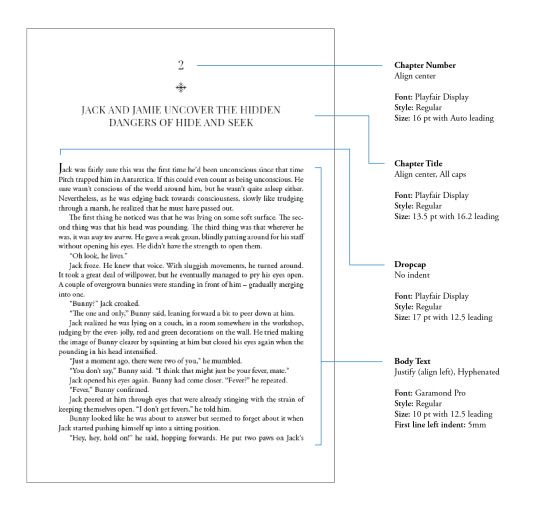
i used Adobe InDesign to do all my typesetting! the document i have has a total of 948 pages (475 spreads) which all include: title page, contents page, chapters, and a few customized + blank pages.
starting with document size first — mine is in A5 (so that i can print A4 spreads) you can play around with the margins, i recommend having at least 3mm added on to it if you’re going to trim it (the bleedline basically). my margins are 15mm left, 20mm right, 15mm top, 20mm bottom.
i had 2 chapter templates - one for short titles (i.e. jack flies) and one for long titles (i.e. jack and jamie uncover the hidden dangers of hide and seek). if you look at the pictures i posted, i added a snowflake as part of that template as an indicator of whose pov the chapter starts in. i designed one for hiccup and jamie too so i change it accordingly! i also use it as dinkuses whenever there’s a pov change within the chapter.
my body text size was 10pt with a 12.5 leading (justified + hyphenated) but honestly that also depends on the font you choose and your personal preference in terms of how spaced out you want your body text to be. i suggest doing test prints so you can adjust !! standard book fonts are: caslon, garamond, minion and palatino.
here’s a silly diagram i made for my friends of my exact settings 📖
in terms of actually formatting the fic— i copy-pasted chapter by chapter from ao3 because for some reason InDesign doesn’t recognize italics automatically so i had to do that manually LOL.
what else .. uhhhh i’m pretty sure i’m forgetting something… i’ll just add on when i remember but crossing my fingers this helps!! i know InDesign isn’t what’s the most accessible to people (i have it bc of my job), but there are lots of tutorials out there on how to do it on microsoft word or even google docs!
hope your binding goes well ⭐️
#local-dragon-haunt#jackshiccup ask#otnwas#IF U NEED ANYTHING CLARIFIED LMK#im pretty bad at explaining#ndbdjsbdd#also if anyone would like to copy my format/typesetting design you can go ahead!#a credit would be nice tho maybe dkdnnddbnxbx#but please design your own book covers !!!#that’s like the most fun part tbh#go crazy go stuuuuupid
35 notes
·
View notes
Text

Present Your Product Catalog the Right Way with this Adobe InDesign Template
Download here.
Follow WE AND THE COLOR on: Facebook I Twitter I Pinterest I YouTube I Instagram I Reddit I ChatGPT
8 notes
·
View notes
Text
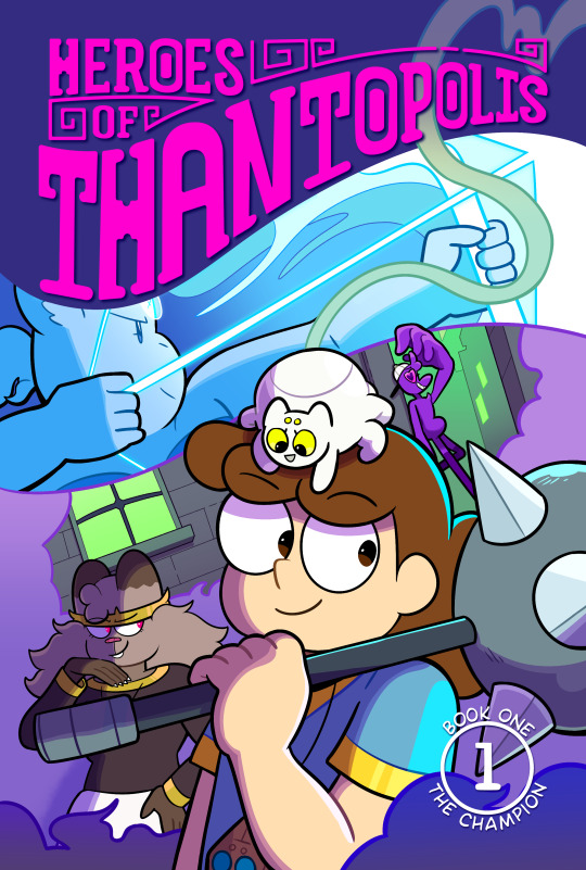
How I designed a new cover for my webcomic's Book 1 reprint
The cover. It's the first impression anyone has of your comic book, so it's got to make an impact. Which is why I'm really proud of the new cover of Heroes of Thantopolis Book 1.
Who are these characters? What kinds of fun and colorful adventures do they get up to? That's what I hope people think when they see the book when it debuts at Cartoon Crossroads Columbus.
But the journey to get to this cover was full of trial and error. Today I want to share that journey and what I learned along the way. Let's go!
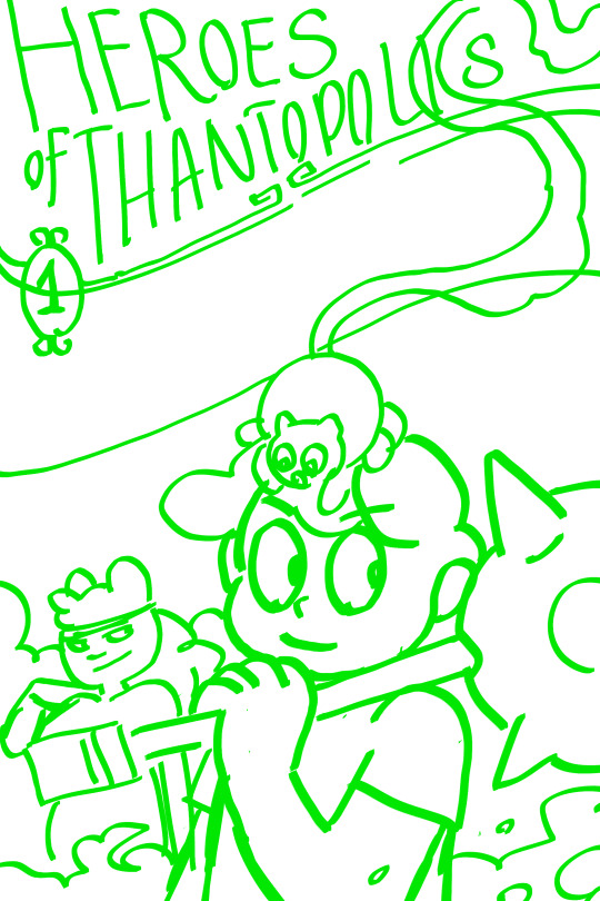
The original print cover of Book 1
I self-published the original print of HoT Book 1 in 2016. This was before I joined @hiveworks, and I was using an on-demand printer not really known for their comics, so everything - including the InDesign template I placed the pages in - was done from scratch.
Here's what the cover for the original print looked like:

Helene and Cyrus are front and center amidst tapestries depicting the four chapters of the comic. It's not a bad illustration - not in the slightest! And the comic sold very well at TCAF 2017. But I think you can tell it's an amateur effort. I may have completed four chapters of my comic, but I didn't have comparable experience designing books.
Brainstorming for the reprint
I joined Hiveworks in 2018. Hiveworks has a lot of experience independently publishing webcomics. I planned to re-print Book 1 as well as print the first editions of the rest of the comic under their banner.
I had a good idea of the bonus content I wanted to include in the reprint. I had less of an idea of what I wanted the cover to look like. My first sketches were very movie poster-esque:
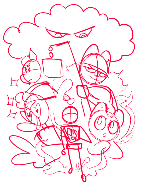

All of the main characters are here, with the villain ominously looming over everyone. It felt like an upgrade from the original cover. But... it felt generic, too. It didn't capture what was unique about my comic.
I put preparations for the reprint to the side for a while, until...
Inspiration
youtube
I love the opening of the Netflix cartoon Hilda. I love the music, the fluid animation and the super cool transitions between her adventures. Hilda goes from riding a dragon to dodging viking warriors, running through the locations and characters she meets during the season. It really captures the vibe of the show!
That's when it occurred to me what was missing from my cover. Readers of Heroes of Thantopolis will know that every chapter has a different color palette, giving them each a unique feel. A unified illustration wouldn't show the diversity of color or feelings. But a cover made of flowing segments, like the Hilda opening...

Now I felt like I was really getting somewhere!
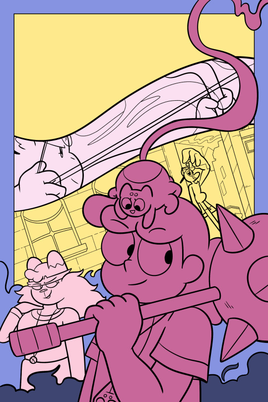
The final cover
Working with my editor Isa (@secondlina), I continued to refine the design of the comic. I wasn't sure what to put in the top left. Isa suggested creating a special version of the logo that flowed along the border created by the Sag segment.
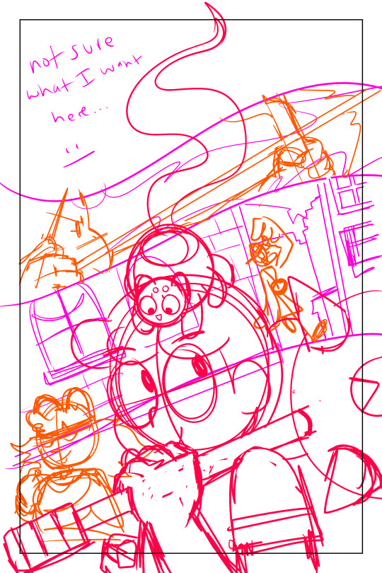
(Isa's sketch in green, on the right)
From there, the final cover began to take shape.

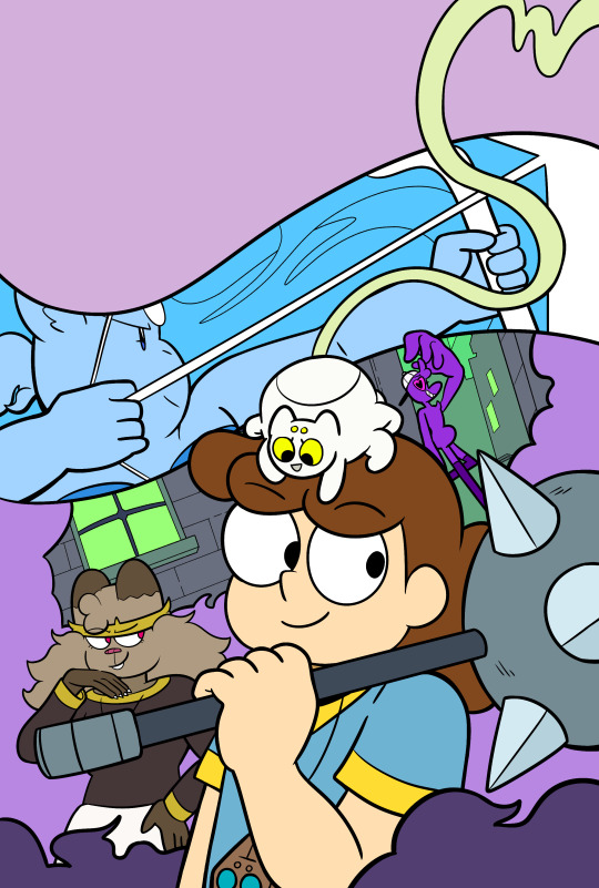
Until we got to the final cover that appears on the actual book!
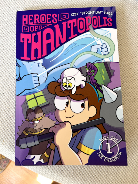
(Print colors are never as vibrant at RGB, but it still captures that colorful vibe.)
Conclusion
If there's one lesson in my creative life that I've seen play out over and over again, it's that your first idea may not be the best idea. Iteration and reflection improves the end result. I'm not saying you need to waffle over every decision. But rather, tp let your creative juices marinade your idea, rather than immediately put the concept to the fire.
I also couldn't have done this without help from people more knowledgeable than I on book design. Not every webcomic creator has access to print experts, true, but there are communities of webcomic creators out there that pool resources and share advice. We can always learn from other people. And that's why I made this post! I hope you enjoyed a peek into my creative process.
I look forward to seeing you at CXC on September 30th and October 1st! If you can't make it to the show, you can read all of Heroes of Thantopolis online, FOR FREE, anytime you want. Book 1 will be sold online soon!
#webcomic#webcomics#heroes of thantopolis#creative process#print comic#printing process#graphic design#cover design#cover art#hiveworks#comic book#Youtube
8 notes
·
View notes
Text
So, like, the dept head has suggested a couple times now that I look into one or the other of some big marketing professionals association (specifically the one or two that are oriented primarily to the architecture/engineering industry), think about joining and maybe pursue some kind of certification. Which if I -wanted- to do this as a career would probably be great. But ... I don't. I have skimmed the websites and looked at the things they think you ought to know and it sounds horrible. Boring, tedious, not the kind of thing I want to care about and also not directly relevant to what I spend most of my time on anyway.
My manager has said that perhaps this sort of thing would make it more likely I (we) would be taken more seriously as professionals, not that she thinks we should NEED to have this kind of fancy documentation to be taken seriously. And I agree, and I don't think it would make any fucking difference, really. "Oh look I took a lot of online courses" yeah well the architects are still going to want to do things the way they want to do things. Certification isn't going to convince them to meet our internal deadlines better, or spend their time writing things ONLY THEY CAN WRITE instead of fine-tuning our perfectly fucking fine boilerplate because why say a thing in 10 words when you can say it in 25 fancier ones.
I have no real authority in the company. Not that it seems having that authority necessarily makes a fucking difference: my manager has some internal status that I don't; my previous manager has a higher level internal status and is also the assistant dept head. And I've sat in meetings where one or more of the technical staff just rolled right past what they were saying was REQUIRED, or said "no i want to do it a completely different way." To say nothing of how it doesn't matter who says "here are our internal deadlines," they will be met, or not, based purely on who is reading that email.
And I think the other thing she said, which has to do with the "technical" vs "support" staff thing, is also a part of it, and no quantity of certifications or whatever the fuck is going to change that.
I don't want to put a lot time and energy into learning more about the whole fucking marketing/business development process when I feel so burned by everything about what I've been doing. Why would I want to even attempt to contribute more at this point (and how likely is it that I'd even be included in the discussions that all the certification stuff is focused on, I don't know, I'm barely involved in the discussion of the InDesign template redesign, and I work on that all the fucking time).
#angst and woe#work bullshit#am i being haunted by the 'but you won't like it' comment from TPTB in exciting new ways; yes. yes i am.
2 notes
·
View notes
Text
I’ve been relearning InDesign for book layouts. It’s been super fun and frustrating because a) it’s been a decade since I used it last b) I originally learned on a Mac and I’m all Windows now and c) I know there are features that exist that will make things faster and easier - I’ve just been stumbling around until I figure it out. I forgot how much I love the process though.
I’ve also been figuring out the best workflow for me. At this point we are at:
Download fic from AO3 as an HTML
Convert to Word - I do this using google drive actually. If you upload the html doc there, you can then redownload it as a word doc. Probably an unnecessary step?
Format the word doc - remove all of the tagging & content you don't want included in the main text. I like to use the layout tools for putting in section breaks in word instead of InDesign. It makes finding the chapter breaks easier.
Do all of the find/replace editing like replacing double spaces with single space, removing spaces before periods or commas, etc.
I do not mess with the actual text outside of those updates unless I catch a spelling error.
Grab whichever template for InDesign I've built and import the text.
Apply the body paragraph style to the full text.
I've started exporting the document as a pdf and opening it in GoodNotes. I like doing this so I can read through the text and see if I've missed anything, and figure out what I want the layout to look like, or think through any fun additions before I start working on the actual layout. As an example, I'm working on a fic right now where after reading through a bit of it, I changed how I wanted to address some of the content, like how I show things that are handwritten, and what the chat messages look like, etc. I wish I had done this with my first couple because I feel like I would have done some things differently if I had.
Once I've hammered that all out I'll go back to InDesign and start working through those formatting: any of the neat stuff I want to focus on like a section of chat messages, any items I want to handle differently from the body paragraph style, etc.
I save applying any parent page styles until almost last since everything up to this point can affect what pages the chapter starts end up on. I unfortunately realized after my first layout that applying chapter start parent styles too soon means redoing them a million times.
If I'm feeling good at this point, I'll go back through and find all of the widows and orphans that I want to deal with.
Throughout this entire process I'm printing out test pages to make sure that things are showing up in print the way that I want them to.
All that's left then is one last scroll through to see if I've missed anything and then once I feel good about it I print.
I know (from past experience) that there are much quicker ways to do this that don’t require all of these steps, but I like this process. I feel like pulling the text into GoodNotes and reading the fic in that way helps me remember what I love about it, and figure out how I want to highlight everything that is wonderful about it.
33 notes
·
View notes
Photo

The film treatment and storyboard templates bundle lets you get all my templates at once and is now available for $60 instead of $90.
Right now, this means 54 templates for Adobe InDesign (Mac and PC), 17 themes for Apple Keynote, and 15 templates for Apple Pages. You get all the storyboard layouts and the film treatment templates neatly arranged in folders.
In addition, you also get all the free templates available, that is 60+ templates, including PDF and Procreate templates for storyboards and anime.
Go to this link to get the bundle:
https://storyboards.gumroad.com/l/all-access
19 notes
·
View notes
Text
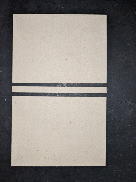
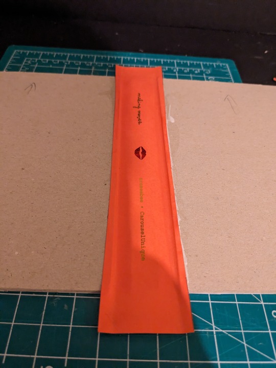
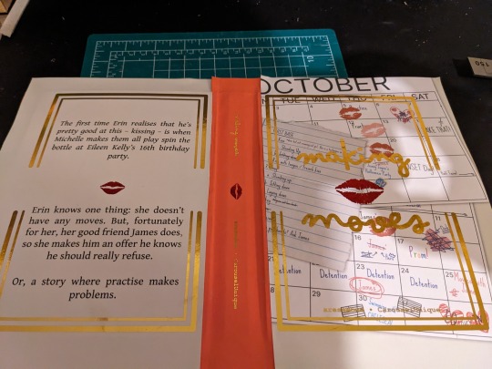
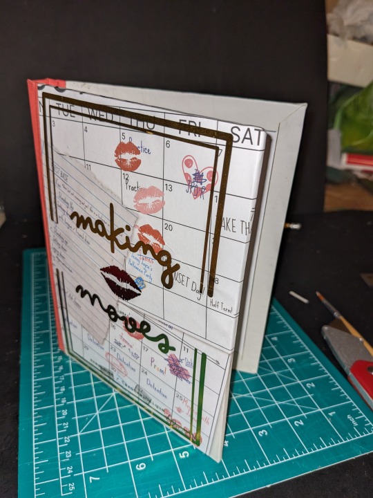
How I bind my fics - Part 3
We ended part two with an assembled text block, which is perfectly functional as a book, but we're here for the hardbacks
Hardbacks start as greyboard for me, 3mm (1/8 inch), and we have to do a little maths to work out the size. We want a 3mm overhang around the top, bottom, and outside edge, which sounds simple (and it is for the top and bottom), but for the width we need to take a few mm away too, so the book can open flat. In this case, it ended up being 4mm narrower than the text block
We cut the cover and spine boards using our trusty L-ruler and knife, although sometimes I also score the line I want to cut and use the chisel

I like to make Bradel bound books, so we need to make a "hinge" for the spine to connect to the cover - the video explains it better than I could, but essentially it's a piece of thickish paper (120gsm) that we glue the boards to


We then need to line the inside of the covers, again with 120gsm paper, leaving about an inch unglued closest to the spine

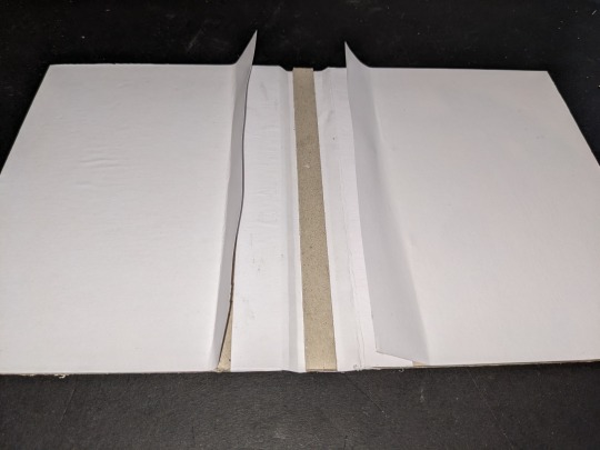
These flaps are what the textblock's flaps will sit under later when we come to glue it up

It's starting to look like a book!
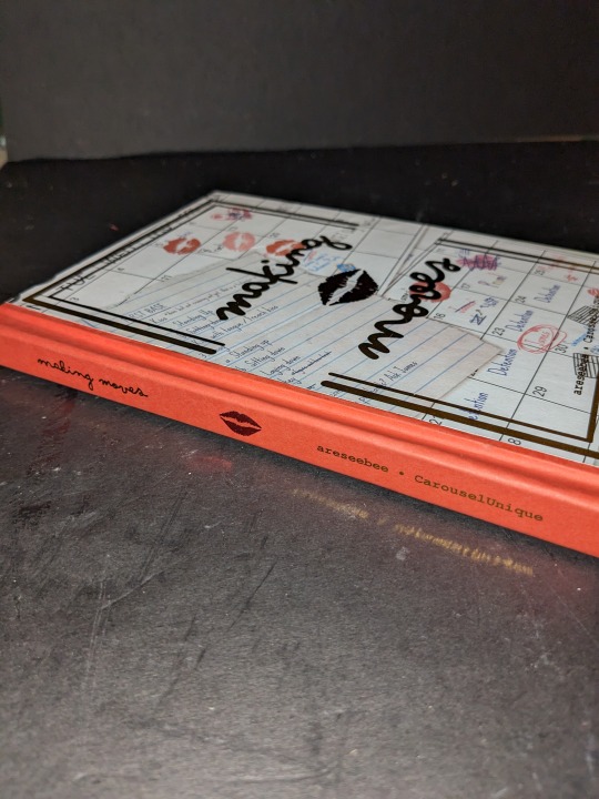
We can now move on to designing the covers. One day I'll get a A3 printer and be able to do full spread covers, but for now I break it into three - the front, the back, and the spine.
These are again designed in inDesign, and in this case I've made a background and a foreground for the front and back. This is because the backgrounds will be inkjet printed, and the foreground will be laser printed over top

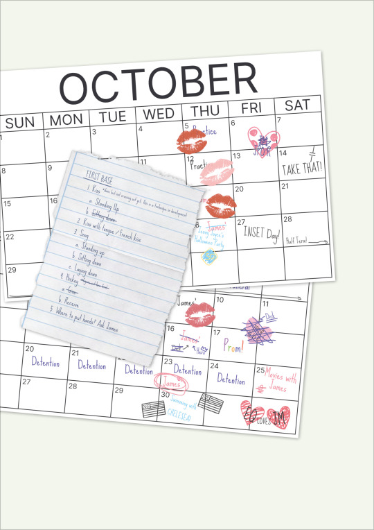
(A higher res version of the cover background - I've tried to tally the fic to Erin's Diary, and hope I've shown Erin's personality a bit - there's a point when she stops labelling it a going to "Practice", and starts going to "James'"...)

The spine is laser printed directly onto coloured 150gsm paper - slightly thicker, as this bit will be under the most stress of the cover
The reason we're laser printing over top is so we can use toner reactive foil - it'll stick to the laser print but not the inkjet one
It's simply a case of taping the foil sheets down tight over the areas we want to foil, masking areas we don't (although if you're doing two colours like we are, my experimentation says do them together), then feeding it through a hot laminator before peeling the foil sheet off

(ignore the masking tape - its on areas we're cutting off in a minute)
Next we're cutting and gluing these pages onto the boards - the little boxes you can see jutting out from the edges are registration marks so I can pencil in on the revese where to line up the boards - we use the bone folder again to smooth them out, work out any air bubbles, and to push the paper into the nooks and crannies
Now we need to cut the corners, using my handy-dandy 3D printed template

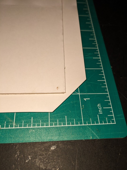
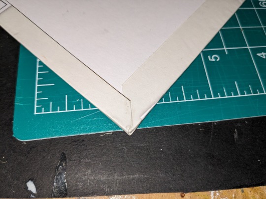
We cut them so that when we fold it over we get a nice crisp fold
On that note, we need to glue the edges and fold them over, making sure to get the glue right into the edge of the board


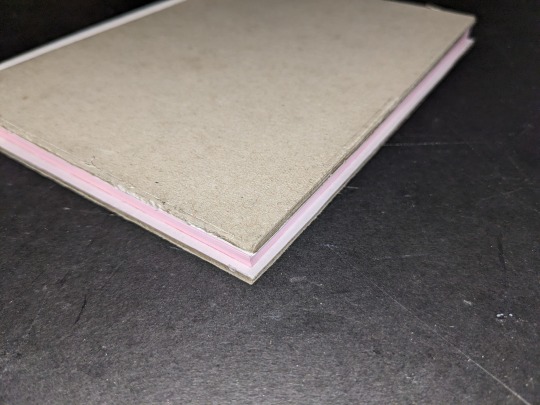
We're very nearly there now - just need to wed the textblock to the casing
We start by dry fitting the block in the case, then carefully opening one cover and gluing the tabs down, followed by the other, again smoothing with the bone folder

Finally, we need to carefully glue down the endpapers to the board (no matter how careful or which order you do them in, the front paper always gets a little messy for some reason)

Et voilà! We have a book - it'll live in the press overnight while the glue dries, but once it's ready it'll take it's place between "In Their Thirties" (which I'm tempted to rebind now I have foil for the cover), and "Vacation James"


tumblr
I'm sure there are seasoned bookbinders reading this going "No, you fool!", but I'm happy with the outcome. It's fun, and I love being able to have something in my hands at the end of it; I may not be able to draw fanart, but I can make something to show my love for my favourite creators!
Thanks again to @areseebee and @derrygirlstrash/@carouselunique for writing this really fun fic, and to @imstressedx for planting the notion in my head to do a step-by-step
Now, on to the next fic!
3 notes
·
View notes
Note
hi! i've never made a zine with canva before and i thought i'd try it out using your template, which is very useful. my problem is that i want to both print the zine but also make it readable online with the pages in the right order, and somehow i can't figure out how to do this. maybe i'm just stupid lol but i really don't know how to put the pages in a different order, since it seems like you can't split the canva page in the middle? canva only allows me to copy the entire page, not just the one half of it that i need to reorder the page numbers. so is there any way to reorder the pages after i finish the zine, or do i have to make an extra version of it with the pages in the right order? i hope this makes sense, i thought i'd ask you since you have experience with zines :)
Hi!!
So. Ur right, if you want to have a readable version and a printable version, you need to do it in 2 separate files. Once you lay everything out the way you would read it, you copy paste the pages over to the printable copy. It's a little tedious I admit! Which is why people learn InDesign and similar programs. This is the low tech dirty version. Feel free to dm me !!
7 notes
·
View notes
Note
Hi, I don't have a book written yet (but maybe someday I'll be a Keeper of the Gate as well 🤞). Right now, I'm just very interested in the self-publication process and what putting together a printable product looks like... I actually have a friend who wants to self publish her own book (which she has actually made via paper-crafting 😮) and she has been asking me for advice, but I don't know about the "formal" process of book layout. One particular question I had was about the lovely cover spread. What was formatting it like? Did you use a book layout program, if so which one?
Thank you! That's an interesting question because as a matter of fact I actually got a degree in illustration, and so that's where I got my training in how to create a book cover for print. (Although I do have some other experience with a CreateSpace free trial sort of thing.)
The only program I used to create the cover spread was Photoshop.
Although they are a little hard to locate on the website, IngramSpark has cover templates and it was necessary for me to overlay their cover template as a semi-transparent layer to make sure the sizing was correct and none of the elements went outside the trim line. To be perfectly honest, I don't think a "book layout" program would be either necessary or desirable for creating a cover; you might be thinking of something like Publisher or InDesign, which is for book interiors. Book covers tend to be formatted as an image file or an image saved as a PDF.
The most important thing is to make sure that you get the dimensions, spine width, number of pixels/canvas size exactly right, that way it will technically print, the rest is artistic.
Oh and make sure you are using a free or public domain/commercially licensed font. Not all designer fonts are allowed for this use. (They are intellectual property too after all.)
5 notes
·
View notes
Text
Magazine Photo Book Template

Creating a Stunning Magazine Photo Book: A Comprehensive Guide to Using Templates
In today’s visually-driven world, where memories are often captured digitally, there’s something incredibly special about flipping through a physical photo book. A magazine-style photo book elevates this experience by combining the visual appeal of high-end publications with personal photographs and memories. If you’ve ever wanted to create one, but felt overwhelmed by the process, this guide will show you how to use magazine photo book templates to craft a polished and professional-looking photo book that you'll cherish forever.
What is a Magazine Photo Book Template?
A magazine photo book template is a pre-designed layout that mimics the style of a glossy magazine. These templates are available in various styles, from minimalist to bold and vibrant, and they come with placeholder text and image slots that you can easily customize. The template serves as a foundation, helping you structure your content without starting from scratch.
Why Use a Template?
Using a magazine photo book template offers several benefits:
Saves Time: Instead of creating a layout from the ground up, a template gives you a ready-made design. You simply need to insert your photos and text.
Professional Quality: Templates are often designed by professional graphic designers, ensuring that your photo book will have a polished, cohesive look.
Customization: While templates provide a starting point, they are fully customizable. You can adjust colors, fonts, and layouts to match your personal style.
Inspiration: If you’re not sure how to organize your photos or what style you want, templates offer inspiration and direction.
Choosing the Right Template
When selecting a magazine photo book template, consider the following factors:
Theme: Think about the overall theme of your photo book. Is it a travel journal, a wedding album, or a family yearbook? Choose a template that aligns with your theme.
Style: Templates come in a variety of styles—modern, vintage, minimalist, and more. Pick one that resonates with your personal taste and the mood you want to convey.
Layout: Consider the number of photos you want to include. Some templates are designed for photo-heavy layouts, while others are more text-focused.
Software Compatibility: Ensure the template is compatible with the software you plan to use, whether it’s Adobe InDesign, Photoshop, or an online platform like Canva.
Customizing Your Template
Once you’ve selected a template, it’s time to make it your own. Here’s how:
Insert Your Photos: Replace the placeholder images with your own photos. Choose high-resolution images to maintain quality. Pay attention to the flow of images—group similar shots together and mix wide shots with close-ups for variety.
Edit Text: Replace placeholder text with your own captions, titles, and stories. Choose fonts that complement the style of the template and are easy to read. Consider adding quotes or anecdotes to personalize your book further.
Adjust Colors and Fonts: Most templates allow you to change colors and fonts. Use this feature to match your book’s color scheme with the tones in your photos. Consistency in colors and fonts helps create a cohesive look.
Arrange Pages: Rearrange pages to tell a story. The sequence of images and text should guide the viewer through a narrative. Consider starting with an introduction page and ending with a conclusion or a thank-you note.
Add Extra Elements: Some templates offer additional design elements like borders, icons, and backgrounds. Use these sparingly to enhance your pages without overwhelming the viewer.
Printing Your Photo Book
After customizing your template, it’s time to bring your magazine photo book to life. Here are some tips for printing:
Choose the Right Paper: Glossy paper is great for vibrant colors and a modern look, while matte paper offers a more understated, classic feel. Choose paper quality that reflects the tone of your book.
Check Print Specifications: Before sending your book to print, check the specifications such as bleed, margins, and resolution. This ensures that nothing important gets cut off and that your images are sharp.
Consider Binding Options: The binding style can influence the final look of your photo book. Saddle stitching, perfect binding, and lay-flat options each offer a different experience, so choose one that best suits your book’s purpose.
Review a Proof Copy: It’s always a good idea to order a proof copy before printing multiple books. This allows you to spot any errors or make final adjustments.
Conclusion
Creating a magazine-style photo book is a fulfilling way to preserve and showcase your memories. With the help of a magazine photo book template, the process becomes much easier and more enjoyable. Not only do you save time and effort, but you also ensure that the final product is something you can be proud of. Whether you’re documenting a special event, curating a portfolio, or simply organizing your favorite photos, a well-designed photo book can become a cherished keepsake for years to come.
#magazine template#magazine layout#magazine cover#magazine#photobook#photolayout#template design#magazine design#photo magazine
0 notes
Text
How Flyers Enhance Marketing Strategies and Drive Engagement
1.What software is used for flyers?
When it comes to designing flyers, selecting the appropriate software is crucial for achieving visually impressive results. Among the array of options available, Adobe InDesign emerges as a top choice for professionals due to its comprehensive tools and functionalities tailored for crafting captivating flyers. Its rich set of features empowers users to create designs that are not only visually appealing but also strategically impactful. Additionally, Adobe Illustrator is a go-to tool for producing vector graphics, while Photoshop excels in image editing capabilities. For those seeking user-friendly templates and customization options, Canva provides a convenient platform to design flyers with ease.
The use of these software applications enables meticulous control over typography, color schemes, imagery, and layout, facilitating the creation of flyers that effectively convey their intended message. By harnessing the power of the right software tools, one can produce professional-grade designs that captivate audiences and leave a lasting impression. Whether you are promoting an event, product, or service, investing in the appropriate software for flyer design is key to ensuring the success of your marketing efforts.
2. Is it a poster or flier?
When distinguishing between promotional materials like posters and flyers, it is crucial to assess their size and intended function. Posters are generally larger in dimension, often measuring 11x17 inches or more, and are crafted to be prominently displayed on walls or bulletin boards, capturing the attention of passersby from a distance. These eye-catching visuals serve as effective tools for promoting events or products. Conversely, flyers are typically smaller, commonly sized at 8.5x11 inches or smaller, and are designed to be distributed to individuals directly or placed in high-traffic areas for easy access. While posters excel in making a visual impact, flyers are better suited for providing detailed information and communicating specific announcements. Ultimately, the distinction between a poster and a flyer lies not only in their physical dimensions but also in their intended purpose and effectiveness in reaching the target audience.
The choice between a poster and a flyer hinge on the specific marketing objectives and the desired engagement with the audience. Posters, with their larger size and visual appeal, are best utilized when aiming to create a strong visual impact and attract attention in high-traffic areas. They are particularly well-suited for promoting events, product launches, or sales, where grabbing the attention of a diverse audience is crucial. On the other hand, flyers, due to their smaller size and detailed information capacity, are ideal for conveying specific messages, providing in-depth information, or making targeted announcements. By considering the unique strengths of each medium, businesses and organizations can strategically decide whether a poster or a flyer is the most effective tool for their promotional needs, ensuring that the intended message reaches the right audience in a compelling and engaging manner.
3. What is called flyer?
Flyers serve as a versatile and effective promotional medium for businesses and individuals alike. These single-page documents are strategically designed to capture the attention of a targeted audience, conveying key messages about an event, product, or service. By combining visually appealing graphics with succinct and persuasive text, flyers aim to generate interest and encourage engagement. Whether distributed through handouts, mailings, or public postings, the strategic dissemination of flyers can greatly enhance brand visibility and attract potential customers.
The strategic use of flyers can yield significant marketing results while maintaining cost efficiency. By utilizing this tangible marketing tool, businesses and organizations can effectively reach their target demographic and drive customer engagement. The visual impact and concise messaging of flyers make them a powerful communication tool that can effectively convey key information and generate interest in a product or service. When executed with precision and creativity, flyers have the potential to create a lasting impression on recipients, ultimately leading to increased brand awareness and customer loyalty.
4. Is a flyer a brochure or flier?
The differentiation between "flyer" and "brochure" in marketing and advertising is crucial to understand, as these terms are often used interchangeably but refer to distinct promotional materials. A flyer typically consists of a single page and is designed to convey concise information about a particular event, product, or promotion. Its purpose is to capture the attention of the audience and generate interest through eye-catching visuals and compelling messaging. Flyers are commonly distributed by hand or displayed in public areas to reach a broad audience effectively.
On the other hand, a brochure is a multi-page document that offers comprehensive details about a company, product, or service. Brochures are instrumental in educating customers and prospects about the specific features, benefits, and unique selling points of a particular offering. They serve as a tangible marketing tool that allows businesses to showcase their brand identity, values, and offerings in a visually appealing and informative manner. Understanding the distinctions between flyers and brochures is essential in selecting the most suitable format to convey your message effectively and achieve your marketing objectives.
5. How do I write a flyer?
When it comes to designing a flyer, meticulous planning and attention to detail are essential for achieving the desired outcome. Begin by delineating the overarching goal of the advertisement and identifying the target demographic to tailor the content accordingly. Crafting a compelling message that resonates with the audience is paramount, necessitating a concise yet comprehensive approach to convey information effectively. A captivating headline serves as the initial point of contact, drawing in potential readers and piquing their interest in the content. Providing pertinent details in a clear and organized manner is crucial, ensuring that all necessary information is readily accessible to recipients.
In the realm of visual design, simplicity and aesthetic appeal play a pivotal role in capturing the attention of the audience. Utilizing high-quality imagery and a well-structured layout enhances the overall presentation, making the flyer visually engaging and easy to comprehend. Thorough proofreading is imperative to rectify any errors or inconsistencies before finalizing the design, guaranteeing a polished final product. By adhering to these guidelines and best practices, one can create a professional and impactful flyer that effectively conveys the intended message and promotes the desired call to action.

0 notes
Text
Illustrator Vs CorelDRAW: Which One Is Better?

Choosing the right graphic design software can significantly impact your creative projects. Adobe Illustrator and CorelDRAW are two of the most popular tools in the industry, each offering unique features and capabilities. Illustrator is known for its powerful vector editing tools and seamless integration with other Adobe Creative Cloud apps, making it a favorite among designers for logos, icons, and complex illustrations. On the other hand, CorelDRAW is celebrated for its user-friendly interface and robust print design capabilities, often used for marketing materials, signage, and detailed technical drawings.
In this article, we'll compare Illustrator and CorelDRAW, highlighting their key differences, strengths, and weaknesses. By the end, you'll have a clearer understanding of which software might be the best fit for your design needs. Whether you're a beginner or an experienced designer, this guide will help you make an informed decision about which graphic design software to use.
Understanding Illustrator and CorelDRAW
Overview of Adobe Illustrator
Adobe Illustrator is a leading vector graphics editor developed by Adobe Inc. It’s widely used by designers to create logos, icons, sketches, typography, and complex illustrations for print, web, video, and mobile.
Key Features and Capabilities
Vector Editing Tools: Precise tools for creating and manipulating vector graphics.
Advanced Typography: Extensive text manipulation options with a wide range of fonts.
Integration with Adobe Creative Cloud: Seamless integration with other Adobe apps like Photoshop, InDesign, and After Effects.
Scalability: Ability to scale designs to any size without losing quality.
Custom Brushes and Patterns: Options to create and use custom brushes, patterns, and textures.
Illustrator on iPad: Mobile app version that syncs with the desktop version for on-the-go design.
Target Audience and Use Cases
Graphic Designers: For creating detailed vector illustrations, logos, and branding materials.
Web and UI/UX Designers: For designing scalable user interfaces and web graphics.
Illustrators and Artists: For detailed, scalable artworks.
Marketing Professionals: For creating promotional materials, infographics, and advertisements.
Overview of CorelDRAW
CorelDRAW is a versatile graphic design software developed by Corel Corporation. It’s known for its user-friendly interface and powerful design tools, suitable for various design projects, especially in print media.
Key Features and Capabilities
Vector Illustration Tools: Comprehensive tools for creating vector graphics.
Page Layout: Advanced layout capabilities for multi-page documents.
Corel PHOTO-PAINT: Integrated photo editing software.
Typography Tools: Wide range of fonts and advanced text formatting options.
Design Templates and Clipart: Extensive library of templates, clipart, and design elements.
Color Management: Professional color management tools for print accuracy.
CorelDRAW.app: Web-based app that allows users to access and edit their designs from anywhere.
Target Audience and Use Cases
Print Designers: For creating brochures, posters, business cards, and other print materials.
Sign Makers and Engravers: For designing signage and engraving templates.
Marketing and Advertising Professionals: For developing marketing collateral and advertisements.
Technical Illustrators: For creating detailed technical drawings and diagrams.
Freelancers and Small Business Owners: For versatile design needs with a single software package.
By understanding the core features and primary use cases of Adobe Illustrator and CorelDRAW, you can better determine which tool aligns with your specific design needs and professional requirements.
Key Differences Between Illustrator and CorelDRAW
User Interface
Comparison of Interface Design and Usability
Adobe Illustrator: Illustrator's interface is sleek and modern, consistent with other Adobe Creative Cloud apps. It offers customizable workspaces and a wide range of tools accessible via the toolbar and panels. The interface can feel overwhelming for new users due to the extensive options available.
CorelDRAW: CorelDRAW's interface is known for being user-friendly and intuitive. It features a more straightforward layout, making it easier for beginners to navigate. CorelDRAW also offers customizable workspaces, but the overall design is less complex compared to Illustrator.
Learning Curve for Beginners
Adobe Illustrator: Illustrator has a steeper learning curve due to its vast array of advanced tools and features. Beginners may need more time to become proficient, but there are many tutorials and resources available.
CorelDRAW: CorelDRAW is generally considered easier for beginners to learn. Its simpler interface and more intuitive tools make it more accessible for those new to graphic design.
Vector Graphics Capabilities
How Each Software Handles Vector Graphics
Adobe Illustrator: Illustrator excels in creating and manipulating vector graphics with precision. It offers advanced tools for paths, shapes, and vector editing, allowing for intricate and detailed designs.
CorelDRAW: CorelDRAW also handles vector graphics efficiently, with robust tools for creating and editing vectors. While it may not have the same level of precision as Illustrator, it offers powerful vector capabilities suitable for most design tasks.
Scalability and Precision
Adobe Illustrator: Illustrator is known for its exceptional scalability and precision, making it ideal for detailed and complex vector illustrations. Designs can be scaled to any size without losing quality.
CorelDRAW: CorelDRAW provides good scalability and precision, although it may not match Illustrator’s level of detail. It is well-suited for creating large-format designs like posters and banners.
Design Features
Unique Tools and Features of Illustrator
Pen Tool: For creating precise paths and shapes.
Shape Builder Tool: For combining and editing shapes easily.
Gradient Mesh Tool: For creating complex color gradients and shading.
Adobe Stock Integration: Access to a vast library of stock images and graphics.
Artboards: Multiple artboards for working on different design elements in a single document.
Unique Tools and Features of CorelDRAW
LiveSketch Tool: Allows for freehand vector drawing with enhanced precision.
Corel Font Manager: For managing and organizing fonts efficiently.
Photo-PAINT Integration: Seamless integration with Corel PHOTO-PAINT for photo editing.
PowerTRACE: Converts bitmaps into editable vector graphics.
Multi-Page View: Easily work on and view multi-page documents within a single workspace.
Performance and Efficiency
Speed and Resource Usage
Adobe Illustrator: Illustrator is a resource-intensive application, requiring a powerful computer for optimal performance. It can handle large and complex files but may slow down on less powerful systems.
CorelDRAW: CorelDRAW is generally less demanding on system resources, making it more efficient on a wider range of computers. It offers good performance even with large files.
Efficiency in Handling Complex Projects
Adobe Illustrator: Illustrator excels at handling complex projects with multiple layers, artboards, and detailed vector work. Its advanced tools and features support high-level design tasks.
CorelDRAW: CorelDRAW is highly efficient for projects involving multi-page documents, print design, and large-format graphics. It handles complex layouts and designs well but may not offer the same level of detail for intricate vector work as Illustrator.
By understanding these key differences, you can better decide whether Adobe Illustrator or CorelDRAW is the right choice for your specific graphic design needs, considering factors like user interface, vector capabilities, design features, and performance.
Use Cases and Applications
Illustrator's Strengths
Best Uses
Logo Design: Illustrator’s vector-based tools ensure logos are scalable to any size without loss of quality, making it ideal for logo creation.
Illustrations: The precision of Illustrator’s tools makes it perfect for creating detailed and complex vector illustrations.
Typography: Illustrator offers advanced typography tools that allow designers to create custom text effects and manipulate type with great control.
Web Design: Illustrator is excellent for creating scalable web graphics and UI/UX elements.
Infographics: Its powerful vector tools and extensive library of shapes make it suitable for designing intricate infographics.
Examples of Successful Projects
Nike: The Nike swoosh logo, an iconic design, was created using vector tools similar to those in Illustrator.
Google Doodles: Many of Google’s interactive doodles are designed using vector graphics for scalability and detail.
Magazine Covers: Numerous magazine covers with detailed illustrations and custom typography are designed in Illustrator to ensure high-quality print and digital output.
CorelDRAW's Strengths
Best Uses
Print Design: CorelDRAW excels in creating detailed print designs like brochures, flyers, posters, and business cards due to its robust page layout features.
Marketing Materials: It’s well-suited for creating various marketing materials, including banners, signs, and promotional items.
Technical Drawings: CorelDRAW’s precision tools and multi-page capabilities make it ideal for technical illustrations and complex diagrams.
Signage: The software's scalability and accuracy are perfect for designing large-format prints like signage and billboards.
Packaging Design: CorelDRAW is often used for designing product packaging due to its extensive design features and color management tools.
Examples of Successful Projects
Coca-Cola: CorelDRAW has been used in creating various marketing materials for Coca-Cola, including posters and promotional items.
Siemens: Technical illustrations and detailed diagrams for Siemens' product manuals and guides have been created using CorelDRAW.
Trade Show Graphics: Large-format trade show graphics and exhibition designs often use CorelDRAW to ensure precise, high-quality output.
By understanding the strengths and best use cases of both Adobe Illustrator and CorelDRAW, designers can choose the right tool for their specific project needs. Illustrator is the go-to for detailed vector illustrations and web graphics, while CorelDRAW shines in print design and technical illustrations.
Pros and Cons
Adobe Illustrator
Advantages
Infinite Scalability: Illustrator’s vector-based design tools ensure that graphics can be scaled to any size without losing quality.
Precision and Accuracy: The software provides highly precise tools for detailed vector work, making it ideal for complex illustrations and designs.
Advanced Typography: Illustrator offers extensive text manipulation options, allowing designers to create custom typography effects.
Integration with Adobe Creative Cloud: Seamless integration with other Adobe apps like Photoshop, InDesign, and After Effects enhances workflow efficiency.
Rich Feature Set: The wide range of tools and features available in Illustrator supports a variety of design tasks, from logo creation to web graphics.
Disadvantages
Steep Learning Curve: The extensive range of features and tools can be overwhelming for beginners, requiring significant time to learn and master.
High Cost: Adobe Illustrator is available through a subscription model, which can be expensive over time, especially for freelancers and small businesses.
Resource-Intensive: The software demands a powerful computer to run smoothly, particularly when handling large or complex files.
CorelDRAW
Advantages
User-Friendly Interface: CorelDRAW is known for its intuitive and accessible interface, making it easier for beginners to learn and use.
Versatility in Print Design: The software excels in creating detailed print materials such as brochures, posters, and business cards.
One-Time Purchase Option: CorelDRAW offers a one-time purchase option in addition to subscription plans, making it a cost-effective choice for long-term use.
Powerful Vector Tools: CorelDRAW provides robust tools for vector graphic creation and editing, suitable for a wide range of design tasks.
Multi-Page Layouts: The ability to work on multi-page documents within a single workspace is ideal for complex print projects and technical illustrations.
Disadvantages
Limited Photo Editing: While CorelDRAW includes Corel PHOTO-PAINT for basic photo editing, it doesn’t match the advanced capabilities of Adobe Photoshop.
Less Precision in Complex Vector Work: While powerful, CorelDRAW’s vector tools may not offer the same level of precision and detail as Illustrator for highly complex designs.
Smaller User Community: CorelDRAW has a smaller user base compared to Adobe Illustrator, which means fewer tutorials, resources, and community support.
Conclusion
Choosing the right graphic design software is essential for achieving the best results in your projects. Adobe Illustrator and CorelDRAW each have their own strengths. Illustrator is great for precise vector work, logos, and web graphics, while CorelDRAW excels in print design and has a user-friendly interface.
Ultimately, the best choice depends on your specific needs. Illustrator is ideal for those needing advanced tools and integration with Adobe products, while CorelDRAW is perfect for print-focused designers looking for an accessible option.
We encourage you to try both tools to see which one suits you best. Experimenting with each will help you find the right fit for your design work.
#designer#graphic design#logo design#creative logo#logo#logomaker#brand identity#graphic art#logotype#motion#ui ux design#uidesign#webdesign#ux#tech#trending#design
0 notes
Text
Top Graphic Design Tools for Digital Marketers in 2024
Graphic designing is one of the most important aspect in digital marketing. As we talk about Digital Marketing Tools, we need to talk about some prime graphic design tools.
In the fast-paced world of digital marketing, eye-catching visuals can make or break your campaigns. As we dive into 2024, the need for top-notch graphic design tools has never been greater. Whether you're creating social media posts, designing website graphics, or crafting engaging infographics, the right tools can elevate your marketing game. Here are the top graphic design tools every digital marketer should have in their arsenal this year.
1. Adobe Creative Cloud
Adobe Creative Cloud remains the gold standard in graphic design software. With tools like Photoshop for photo editing, Illustrator for vector graphics, and InDesign for layout design, Adobe offers a comprehensive suite that covers all your design needs. The cloud-based nature of the suite allows for seamless collaboration and access to your projects from anywhere.
2. Canva
Canva has revolutionized graphic design for non-designers. Its intuitive drag-and-drop interface, coupled with a vast library of templates, makes it easy to create professional-quality designs quickly. Canva Pro offers advanced features like brand kits, premium templates, and enhanced collaboration tools, making it a must-have for digital marketers.
3. Figma
Figma is a powerful design tool favored by many for its real-time collaboration features. Ideal for UI/UX design, Figma allows multiple team members to work on a project simultaneously. Its cloud-based platform ensures that everyone is always working on the latest version, reducing the risk of version control issues.
4. Sketch
Sketch is another popular choice for UI/UX designers. Known for its simplicity and efficiency, Sketch offers a robust set of tools for creating wireframes, prototypes, and high-fidelity designs. While it’s primarily used by macOS users, its integration with various plugins extends its functionality significantly.
5. Affinity Designer
Affinity Designer is a versatile vector graphic design software that's gaining popularity for its affordability and professional-grade features. It provides a seamless experience for creating detailed illustrations, icons, and web graphics. The one-time purchase model also makes it an attractive alternative to subscription-based services.
6. Procreate
For those who love to sketch and illustrate on the go, Procreate is a game-changer. Available exclusively for iPad, Procreate offers a range of brushes and tools that mimic traditional drawing techniques. It's perfect for creating custom illustrations and artwork that can add a unique touch to your digital marketing materials.
7. Piktochart
Infographics are a powerful way to convey information visually, and Piktochart makes creating them a breeze. With its user-friendly interface and customizable templates, you can produce engaging infographics, presentations, and reports that stand out. It's an excellent tool for marketers who want to present data in a visually appealing way.
8. Gravit Designer
Gravit Designer is a free, web-based vector design tool that's perfect for creating logos, icons, and illustrations. It offers a wide range of features, including advanced typography, path editing, and Boolean operations. Its cloud integration ensures that your work is always accessible, no matter where you are.
9. Crello
Crello, similar to Canva, offers a wide array of templates for social media graphics, ads, and marketing materials. It stands out with its animated design capabilities, allowing you to create eye-catching animated posts and ads that can boost engagement on social media platforms.
10. Visme
Visme is an all-in-one content creation tool that goes beyond graphic design. It allows you to create presentations, infographics, reports, and social media graphics. Its drag-and-drop editor, combined with a library of templates and design assets, makes it easy to produce professional-looking content quickly.
Conclusion
In 2024, having the right graphic design tools at your disposal is crucial for any digital marketer. Whether you're a seasoned designer or a marketing professional with little design experience, these tools can help you create stunning visuals that capture your audience's attention. Invest in the ones that best fit your needs and watch your digital marketing efforts soar to new heights.
0 notes
Text
DIY Brochure Design Tools and Tips for Creating Your Own Brochures
Are you looking to create stunning brochures that capture your audience's attention? Whether you're a small business owner in Florida or someone interested in marketing materials, designing your own brochures can be a rewarding experience. With the right tools and tips, you can create professional-quality brochures that capture your audience's attention. And when you're ready to print, remember to choose high-quality brochure printing in Florida or banner printing services in Florida to ensure your materials look their best.

Why DIY Brochure Design?
Creating your own brochures offers several benefits:
Cost-Effective: Save money by designing in-house instead of hiring a graphic designer.
Full Control: Ensure your brochures align with your brand's vision and message.
Quick Turnaround: Make immediate changes and updates without waiting for a third party.
Essential DIY Brochure Design Tools
To get started with DIY brochure design, you'll need the right tools. Here are some of the best options:
1. Adobe InDesign
Adobe InDesign is a professional-grade design tool that's perfect for creating brochures, flyers, and other marketing materials. It offers:
Templates and Presets: Start with pre-designed templates to save time.
Advanced Editing Tools: Customize text, images, and layouts with precision.
Integration with Adobe Suite: Easily import assets from Photoshop and Illustrator.
2. Canva
Canva is an accessible, user-friendly tool that's great for beginners. Its features include:
Drag-and-Drop Interface: Simple to use, even if you have no design experience.
Free Templates: Choose from a wide range of free templates and customize them to fit your needs.
Stock Photos and Elements: Access a library of photos, icons, and elements.
3. Microsoft Publisher
Microsoft Publisher is another excellent tool for creating brochures. It provides:
Affordable Option: Available with most Microsoft Office subscriptions.
Easy-to-Use Interface: Ideal for those familiar with Microsoft products.
Customizable Templates: There are various templates that can be modified to suit your brand.
Tips for Designing Effective Brochures
Creating a brochure isn't just about aesthetics; it's also about functionality. Here are some tips to keep in mind:
1. Know Your Audience
Understand who your brochure is for. Are you targeting local businesses in Florida or a broader audience? Tailor your content and design to meet their needs and preferences.
2. Focus on the Message
Ensure that your brochure has a clear and compelling message. Use concise language, bullet points, and headings to make it easy to read. Highlight key information, such as services, products, or special offers.
3. Choose the Right Layout
Select a layout that suits your content. Common formats include:
Tri-Fold: Standard and versatile, suitable for most purposes.
Bi-Fold: Elegant and spacious, ideal for more detailed information.
Z-Fold: Unique and eye-catching, great for creative content.
4. Use High-Quality Images
Visuals play a crucial role in engaging your audience. Use high-resolution images and professional photos to enhance your brochure's appeal.
5. Maintain Brand Consistency
Ensure that your Brochure Printing in Florida aligns with your brand's colors, fonts, and overall style. Establishing consistency fosters trust and brand identification.
Printing Your Brochure
Once you've designed your brochure, the next step is printing it. Here are some tips for getting the best results with brochure printing in Florida:
1. Choose the Right Printer
Select a reliable printing service that offers high-quality prints. Look for printers that specialize in brochure printing or Banner Printing Services in Florida.
2. Select the Appropriate Paper
The type of paper you choose can significantly impact the look and feel of your brochure. Common options include glossy, matte, and uncoated paper. Consider your design and audience when making your choice.
3. Proofread Before Printing
Always proofread your brochure before sending it to print. Verify that all of the material is correct, and check for spelling and grammar mistakes.
4. Request a Sample
Before placing a large order, ask for a sample print. This allows you to see the final product and make any necessary adjustments.
0 notes
Text
The Importance of Book Formatting: A Guide for New Writers and Authors
As a new writer or author, you've worked tirelessly to create your manuscript, pouring your heart and soul into every word. But before you publish, there's a crucial step that can make all the difference in the world: book formatting.
Book formatting is the process of preparing your manuscript for publication, transforming it into a professionally designed and visually appealing book that readers will love. In this blog, we'll explore the importance of book formatting, share valuable tips, and introduce you to essential tools to help you create a stunning book that stands out in a crowded market.
Why Book Formatting Matters?
Book formatting is not just about making your book look pretty; it's about creating a reading experience that's engaging, comfortable, and enjoyable. A well-formatted book can:
Enhance readability and overall reading experience
Create a professional and polished appearance
Help your book stand out in a crowded market
Show respect for your readers and your work
Book Formatting Basics
Before we dive into the tips and tools, let's cover the basics:
Font and size: Choose a clear, legible font (e.g., Garamond, Times New Roman) in size 12 or 14 points.
Line spacing: Use 1.5 or double spacing for easy reading.
Margins: Set margins to 0.5-1 inch on all sides (top, bottom, left, and right).
Indentation: Use a 0.5-inch indentation for the first line of each paragraph.
Headers and footers: Add page numbers, title, and author name (if desired).
Book Formatting Tips
Now that we've covered the basics, here are some valuable tips to help you create a professionally formatted book:
Consistency is key: Maintain a consistent format throughout your book.
Use styles: Apply built-in styles (e.g., Heading 1, Body Text) to simplify formatting.
Images and graphics: Use high-resolution images and format them to fit your book's design.
Proofread and edit: Ensure your manuscript is error-free and polished.
Book Formatting Tools
Here are some essential tools to help you format your book like a pro:
Microsoft Word: A popular choice for book formatting, with built-in styles and tools.
Adobe InDesign: A professional design and layout tool for advanced formatting.
Vellum: A formatting tool specifically designed for ebooks.
Atticus: A formatting and design tool for print and digital books.
Conclusion
Book formatting is a crucial step in the publishing process that can make all the difference in the world. By following this guide, you'll be well on your way to creating a professionally formatted book that showcases your writing and respects your readers. Remember, consistency, clarity, and attention to detail are key to a beautifully formatted book. Happy writing and formatting!
Additional Resources
Book formatting templates: Find pre-designed templates online or in word processing software.
Formatting guides: Refer to guides like the Chicago Manual of Style or the AP Stylebook.
Online communities: Join writing forums and groups for support and advice.
By investing time and effort into book formatting, you'll create a book that's not only beautifully designed but also engaging, readable, and professional. So, don't neglect this crucial step – format your book with care, and get ready to share your writing with the world!
0 notes
Last Seen Blogs


dfseventoscr-blog
dfseventoscr

dfwlimoservice-carservicedallas
DFW Limo Service and Car Service Dallas
