#Project Development
Explore tagged Tumblr posts
Text
28th June ‘24 - [arch] One Page Limitation??? - My process for Traffic Zine #5

Hello All!
A couple months ago, I got accepted to @trafficzine, a digital anthology of pieces by a large group of artists and writers based on the most recent season of the Life Series. I made this piece back in April, but thankfully I kept some notes of my process.
Heads up - this contains spoilers for Secret Life :D
We were able to choose our own prompt from a list! For this project, I wanted to push my comic making - especially how to communicate a lot of information in a small space. I went through and watched a few clips from the series to see which prompt would fit a comic and settled on Scott’s death.
As usual, I began by getting some reference images and going ham on some big paper. This gets me excited about the project and helps generate ideas. I go for whatever interests me in terms of medium and subject matter, but I try to use a process that doesn’t let me control too much (in this case brush and ink)
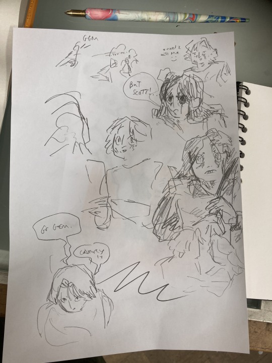
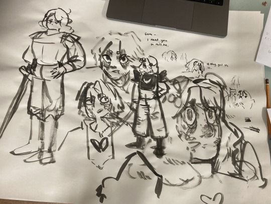
initial sketches for fun and vibes :D
During this, I also took the time to transcribe the scene - I wanted to use the dialogue directly, and see how much I could fit into the single page that I was allowed for the zine.
In these early planning stages I make sure to do warm-up sketches to remind myself of the energy I want to communicate. This also keeps things fun and fresh so I'm not ONLY thinking about page composition and making things 'good'. (the expectation for it to be 'good' kills a project prove me wrong)
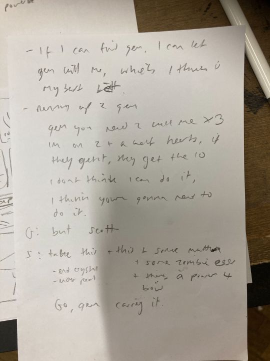
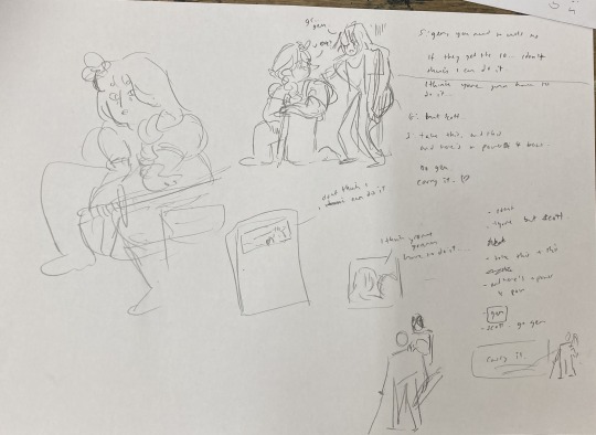
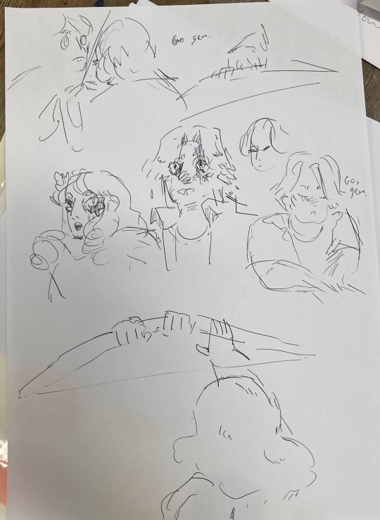
Dialogue from the clip + warm up sketches
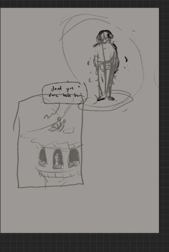
Next up, I started to plan what panels I have on the page. At this stage, some panels might just be a box with some words, and some may have a sketch if I have a clear composition in mind. This stage is mostly for pacing and plot, so instead of focusing on what the panel and page will look like, I will think about:
what will happen in the panel
it's purpose and
what it will communicate
Sometimes I'll illustrate a string of panels that tell the story and fit them on a page after - but this depends on the project and my confidence with the size of it.
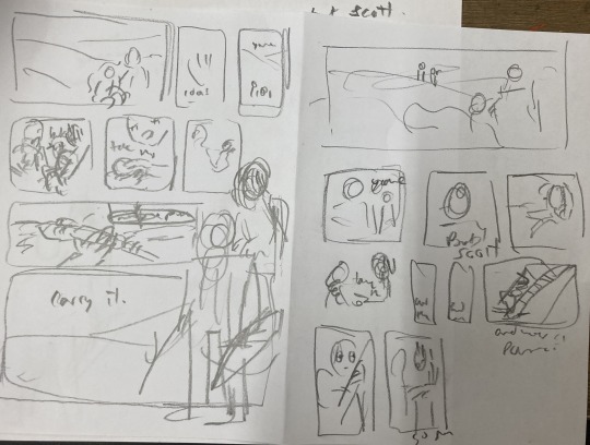
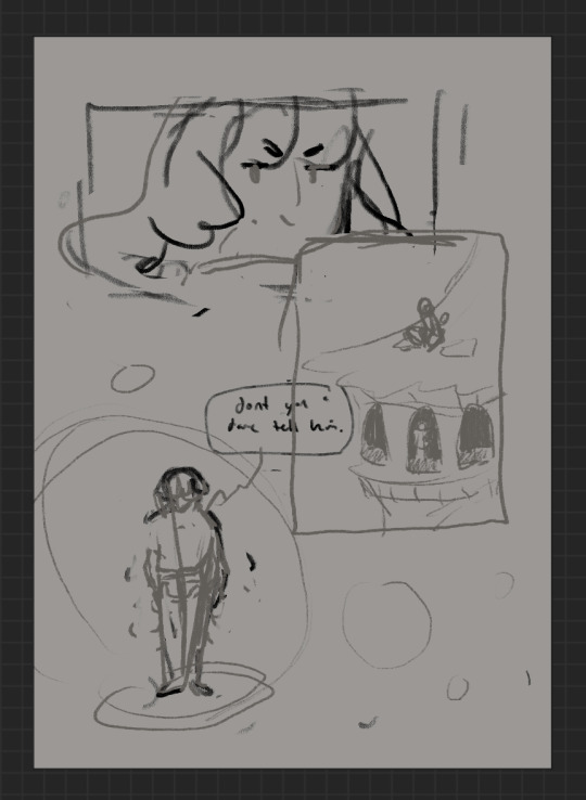
After messing around with these and coming up with a pretty clear direction, I draw a bunch of boxes to see how the panels could sit nicely together. At this stage I might realise I have too many panels, and need to cut a few or come up with a creative solution. Nothing is set in stone at this point.
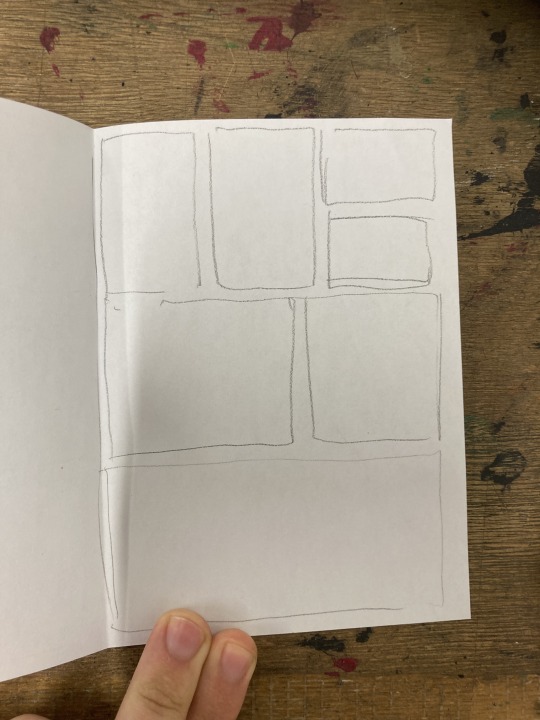
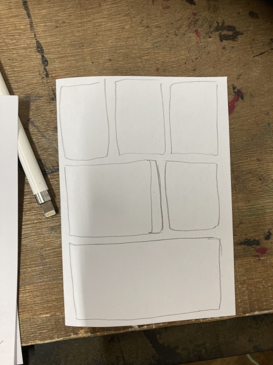
sketching panel layouts
Now begins the fun! I decide on the layout I prefer and I can start putting planned compositions into the boxes. I often do this digitally, or a digital editing process will be involved.

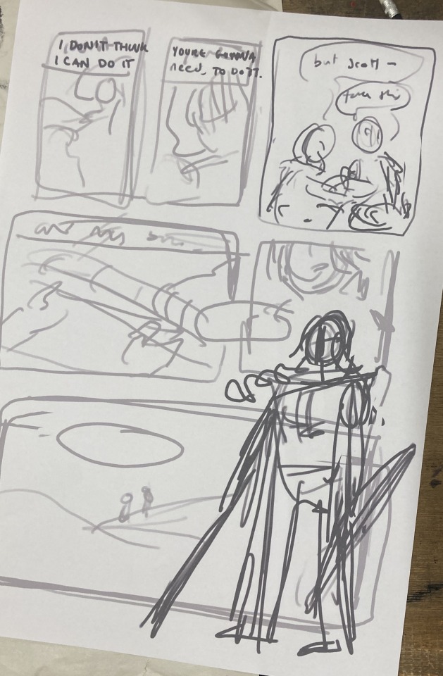
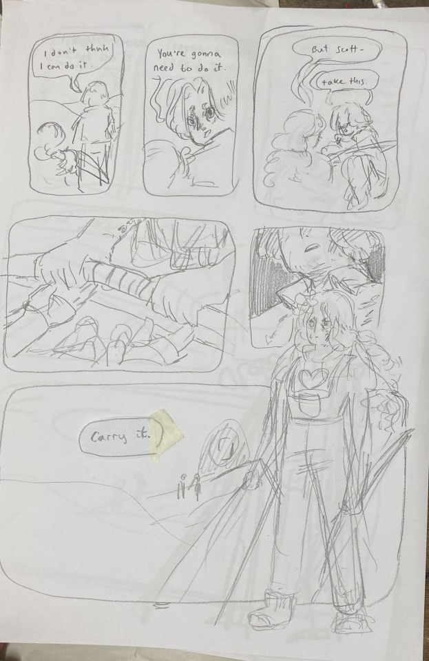
Once planned, I print these out to do a more refined sketch over. I find that my traditional drawings have a lot more life and character to them than digital ones, so I try to keep the majority of the process traditional, with passes of scanning and digital editing.


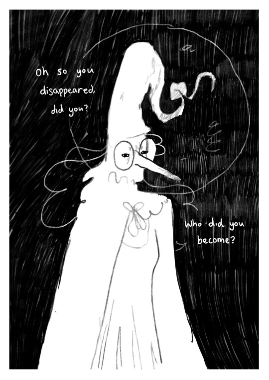
I tried a version with her looking out at the distance - ready to face the oncoming battle. But it still felt off. So I turned to my slides to ask myself some questions!!

I tried to think of more things that were working - but I really felt like it was lacking a lot. I was going for this slower emotional feeling because that came more naturally to me, but it just wasn't working for this image. The original clip is quite rushed and chaotic - which would be harder to communicate in a comic format but the challenge interested me. Either way, I knew I wasn't happy with this direction so... i decided to start from scratch! Back to the drawing board!!!
In the previous version, I had cut out a lot of the dialogue, but I decided to go back to the original clip and use AS MUCH as possible. Since passing the bow was my favourite part of that first composition, I really wanted to lean into it as the emotional height and final goodbye before Scott's death. It's a moment to slow down and absorb the vibes :D

I made a list of panels along with their descriptions to refer to when trying to figure out the order of panels. there were SO MANY and it was VERY CONFUSING when they were too small to read.
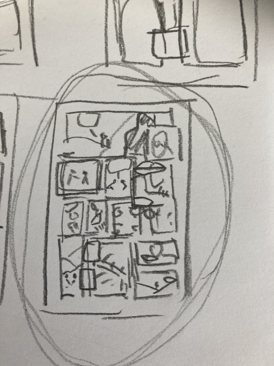
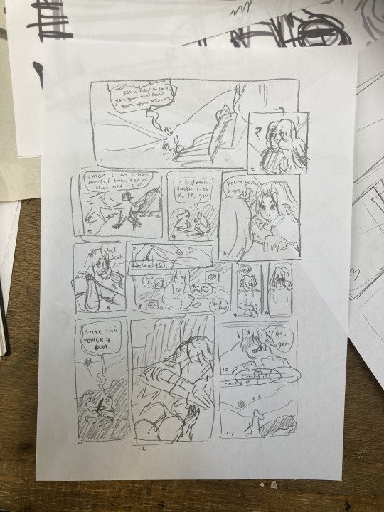
These thumbnails were super small and would not have made sense without my list, I swear.
I printed this tiny thumbnail out at A4, so I could sketch over it and get a clearer sense of flow. Then began a loooong process of printing out tiny photocopies and rearranging the panels to be legible. It was a difficult balance of communicating busyness while making sure the hierarchy/reading order made sense.


After some tweaking, i printed out an A3 copy to draw my panel borders and text.
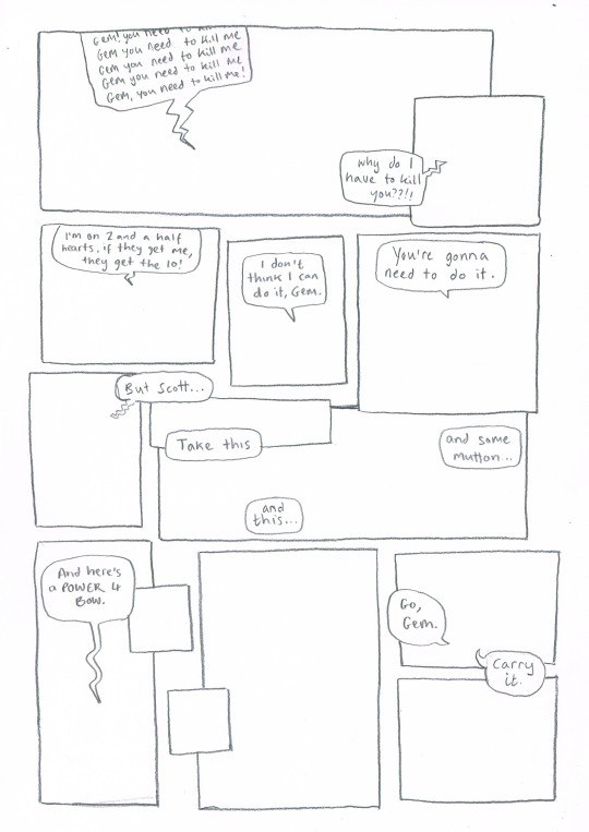
Doing this on a separate piece of paper means I don't have to worry so much about messing up the text or borders when drawing the characters. This allows me to be more free and expressive with my illustration.
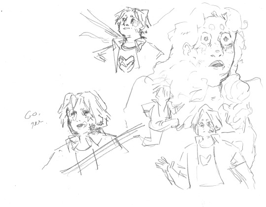
Woah! Quick trip back in time!! During the thumbnailing process I drew these warm up sketches! I looooved the way the linework came out. I drew this on an A3 piece of paper - and the shocked Gem would, in theory, be one of the smallest panels. So I decided to do a crazy thing.
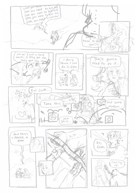
I touched up the sketch digitally, compiling some of my favourite warm up sketches, some traditional sketches made for the panels, and filling the rest in digitally. Then I printed this image out in QUATERS at A3!! This meant the final sketch layer, printed out was A1!! (aka very large, considering the final file would be at A4, about 8x smaller)
I did this so I could get fairly small detailed lines with my pencil while being quite expressive and firm with my mark-making. Slowly, I dlined all of the panels traditionally and scanned them in. Then I assembled the finished linework on Photoshop, along with the text and panel borders and got to colouring :D

final linework :D
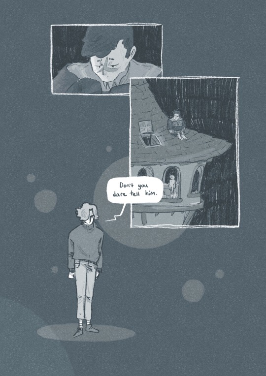
For colouring, I played a little bit with halftone but I found the texture made it feel a bit too busy - the panels are already doing enough. Because of this, I also decided to use a limited colour palette. Here are some images of the colouring process, which I won't go into today.


I'm really happy with how this came out - I think it captures the chaos of the moment, while taking time to linger on the emotion of it. Keeping that bow moment really made it, I think.
I think the last panel is still quite weak. Earlier in the process there was a low-angle shot of Gem about to kill Scott which may have been more powerful, but I think I was struggling with my actual drawing skill when it comes to perspective. A lot of learning how to draw, and in particular with comics, is about knowing where your skills are at, how to utilise them best and how to test and push them.
I'm glad that I started again, instead of finishing that composition I wasn't happy with. It was a tough project but I learnt sooooo much from it, and it's been essential skill-building for.... the current comic I'm working on (stay tuned!!! :0) Thanks for reading this incredibly long post! Go check out @trafficzine and look at all the other cool art Cool vibes and silly men,
Archie :D
#archillustrates#arch is learning#project development#art#art process#art resource#process#artists on tumblr#illustration#comic#picture book#art blog#illustration blog#queer artists on tumblr#illustrator#female illustrator#queer illustrator#comic artist#comic art#female artists on instagram#artists on instagram#procreate#digital artwork#artist blog#artist on tumblr#web comics#tumblr art#tumblr art blog#art on tumblr#life series
144 notes
·
View notes
Text


Tuesday 15/10 - The Finished Zine!
I'm really really happy with how this project turned out, I was a bit nervous the 2nd layer wouldn't turn out the way I had envisioned but I feel like it came out even better.
My favourites are probably the Yellow and Brown zines, I like how the warmer tones of the paper dull the blue and make the pink really pop.
Overall very happy with this work, I think I will look a lot more into the history of zines to try bring my work forward and maybe make a few more over the next couple of weeks.
14 notes
·
View notes
Text
Just a reminder… this time of the year is very hard on many people. At some time in all of our lives, we will deal with financial problems, health issues, relational problems in our families, and mental heath struggles.
If you are going through hard times, understand you are not alone.
Consider kindness and empathy. It could be your greatest Christmas gift to others.

#mental health#mental illness#christmas photography#astronomy#nasa#astronomers#astrophotography#beautiful photos#tumblr quotes#tumblr blog#tumblog#tumblr#tumblr milestone#positive mental attitude#depression prevention#project development#universe#nasa photos#christmas#help#astrophysics#nasawebb#outer space#hubble space telescope#artists on tumblr#photographers on tumblr#writers on tumblr#poets on tumblr
23 notes
·
View notes
Text
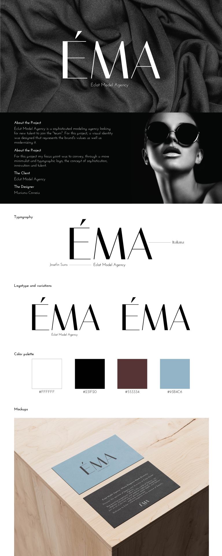
ÉMA - brand identity
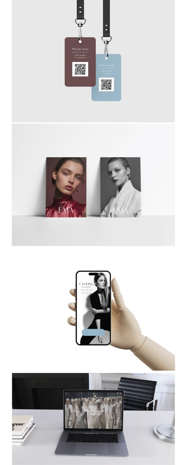
#designstudent#graphic design#design#designer#branding#brand identity#visual identity#fashion design#brand design#fashion brands#fashion model#behance#art#design project#project development#adobe photoshop#adobe illustrator#mockup#product design#template#mockups
8 notes
·
View notes
Text
Went ahead and did it.
I made my side blog to track my writing progress. Nothing special. Regular updates on the development of the script. Counting at least a year until a full completion of the first draft.
12 notes
·
View notes
Text


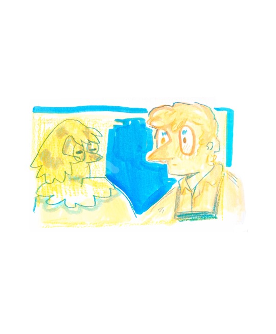
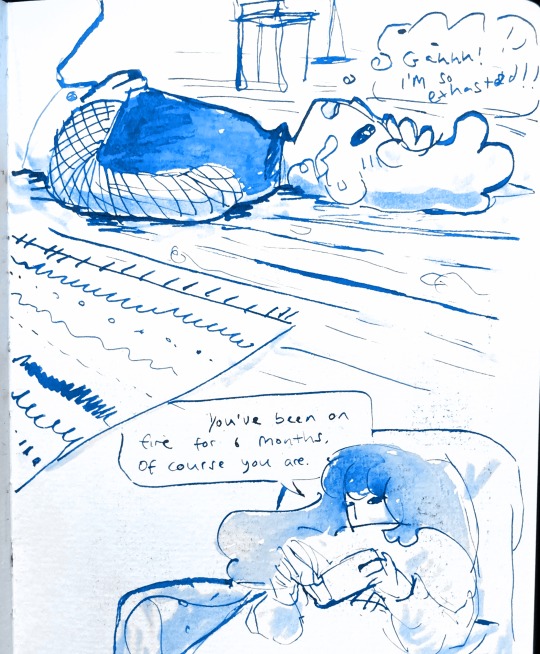

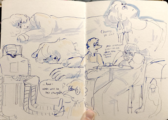
oc sketchbook dump please enjoy
#illustration#archillustrates#artists on tumblr#project development#art#art process#process#comic#small art blog#art blog#illustration blog#queer artists on tumblr#illustrator#book illustrator#queer illustrator#comic artist#comic art#artists on instagram#digital artwork#digital artist#artist blog#artist on tumblr#tumblr art#tumblr art blog#art on tumblr#sketchbook
3 notes
·
View notes
Text
Outsourcing vs Offshoring Development: Which Is Better for Your Project.
Visit Website, Glasier Inc.
Our Blogs
Other Services,
hospital management system
erp software development company
Hire Angular Developers
Hire SaaS developer
Hire Flutter Developers
Hire ReactJs Developers
#outsourcing#offshore#app development#software development#project development#information#blog#which is good#business
1 note
·
View note
Text
9th feb '24 - [arch] characters, interactions and emotion - making a mini webcomic
Gahhhh Shri this has been an absolutely crazy couple of weeks!!!! Hope you are doing well :)) First of all, WOW! You have a lot of goals, and I’m sure you’ll get them done! I’ve worked a lot on my graphic design during the process of making Winter Wellbeing. If you wanna see a blog post dedicated just to that, I can do so! It would be cool to compare notes on the approaches we take for graphic layouts. If you wanna share your knowledge of camera skills when you build that up that would be awesome 😭😭
It’s been a tough few weeks, art wise. I have been reflecting on my process, motivations to create, the ego and all the baggage that’s lumped into the creative process for me. It turns out there’s a lot. I took some space from my illustration practise (literally for a weekend!) and began to realise how dysfunctional it is. I’ve been writing a lot about that so there may be a larger piece of writing coming about that at some point (no promises!!)
But for now, let's talk about little successes!
I’ve been playing with some characters for a while but I’d hit a bit of a block with the plot. I realised the expectation of having a finished project of high quality soon is unrealistic, and an unhealthy expectation to put on myself. I rarely give myself time to play with concepts for a long time and let the characters, plot and interactions evolve naturally. Maybe this in part came from sticking to the short university module turnaround. I noticed that that short turnaround was causing a lot of block, so I have decided to bench it as a comic for now and focus on using it as a playground - falling in love with the characters, creating stories and drawing them for fun. Maybe years down the line I’ll make them into a comic - we shall see!
I *tried* to do hourly comics day this year and it didn’t quite work for me. I think I made 3 comics? And then got distracted with a bigger project that ended up taking a week or so to complete. Let’s have a look at it, shall we?
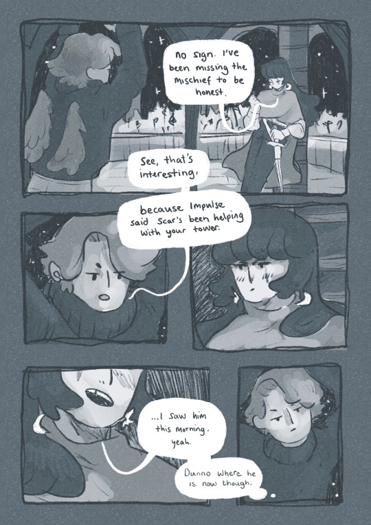
[you can find the full version here]
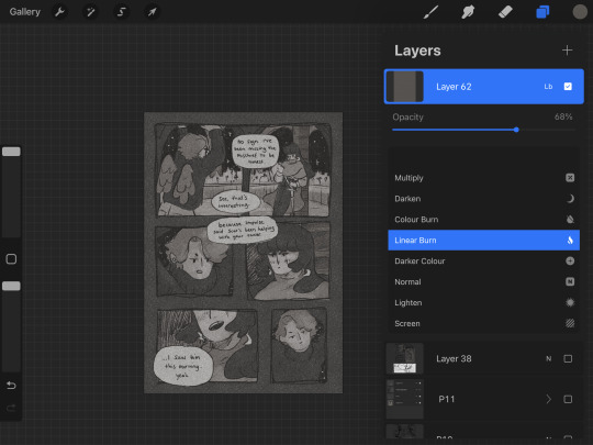
First of all, it’s based on an unfinished fanfiction I started a couple of months ago, which was mostly bad, but there was one nice scene that I liked and wanted to expand on. I started by having a look at the script I wrote and thumbnailing on the iPad. I’m away from home at the mo and usually would prefer to do most of my artwork traditionally, but because I don’t have access to a scanner, the whole process was digital this time. A lot of the pages got scrapped because the dialogue wasn’t necessary, and I’m not drawing pages that aren’t necessary.

some more development screenshots
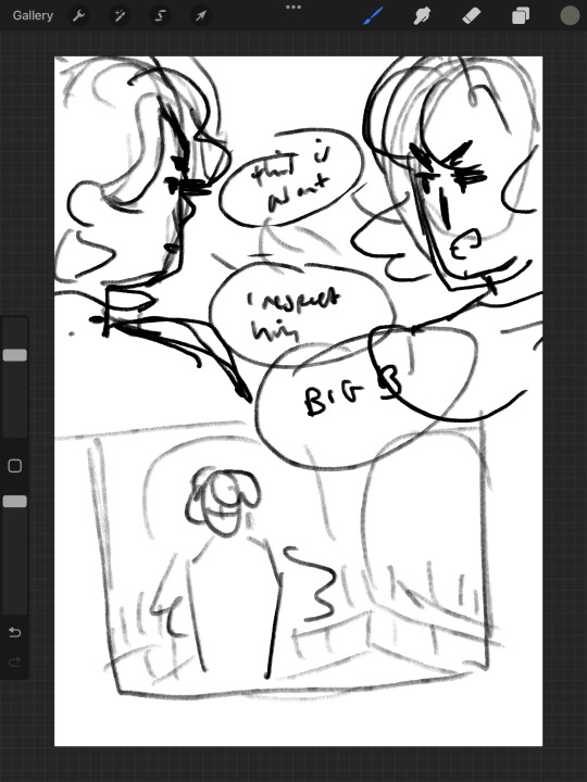

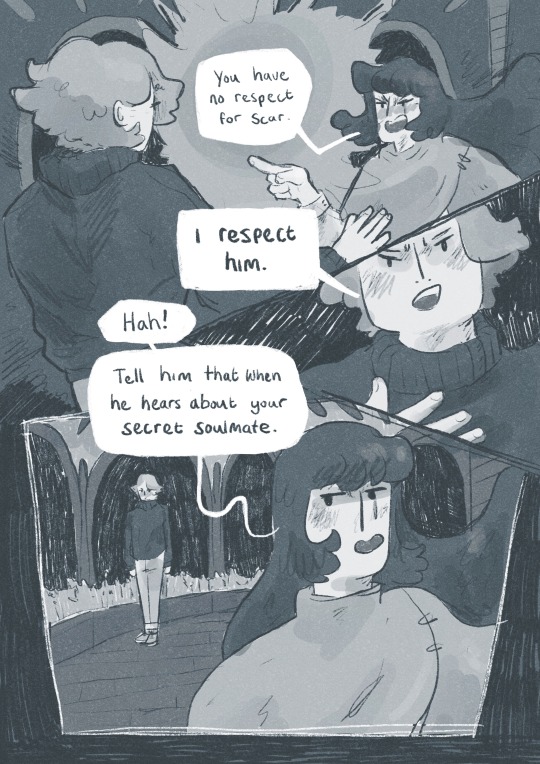
I thought a lot about posing during the process, acting the scenes out in my mind and sometimes physically, really understanding the emotions of the characters, why they’re saying what they’re saying, their tone and how to convey that though their body language and expression (i find grian really annoying normally [affectionate] but I want this grian to step on me).

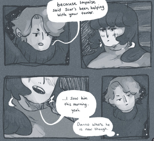
Pearl was hard with this because she’s quite erratic and unpredictable in this series, so I wanted her to switch from raw explodey anger to playful jabs at Grian. I’m hoping this comes across as somewhat insane, rather than tonally off and inconsistent. I did super enjoy drawing her and her explosive nature though, especially in comparison to Grian’s coldness.


I played with levels and monotone colour too - I’m not working with multiple colours much at the moment so I’m able to focus on things like values composition, characters and backgrounds. My skills limit the kind of stories I can tell currently, so I’m working to improve those foundations. Maybe when I’m back in the riso studio I can play with colours a little more.
Colours - despite the simple pallete it gets a bit nerdy here.I stuck to specific flat percentages for most of it - Pearl’s hair and Grians jumper are 60%, Grian’s hair and Pearl’s cloak are 20%. Then I added a 14% layer for shadows, using a ahrd blend eraser tool for highlights, making the images quite dark. I fill a layer with texture from Forystr’s riso brush for procreate, and turn it into a 40% opacity colour dodge layer. This gives it some much needed texture and makes the lighting feel low and nighttimecore. It also pushes the values to look really nice - I tend to be too scared to push them by myself.
I tried a few different colour layers to get a *vibe* but settled on a low percentage riso blue in a colour layer. All layers besides the riso blue are in a riso black, colour picked from a riso colour pallete. I learnt these tools - using percentages to get good values - from working with risograph. I really recommend having a look at these techniques and doing some monotone work. It's really improved by character designs, page layouts and compositions.


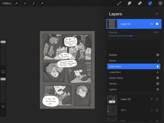


That's all from me today, though I have had MANY other thoughts over the past two weeks about creating, but perhaps we'll dive into them another time. If you (or anyone else) has any questions, hit me up with a reblog or an ask and I will get right to it. Lovely to hear from you! Hope your art is going great too :)) Arch :)
#archillustrates#arch is learning#project development#art#art process#art resource#process#artists on tumblr#illustration#comic#picture book#small art blog#art blog#illustration blog#female artists on tumblr#queer artists on tumblr#illustrator#book illustrator#female illustrator#queer illustrator#comic artist#comic art#female artists on instagram#artists on instagram#procreate#digital artwork#digital artist#artist blog#artist on tumblr#web comics
29 notes
·
View notes
Text


Follow up from 30/1
Last posters from Thursday - based on the concepts I made the previous day. Tried to experiment more with colour and placement. The font was scanned into Photoshop and then traced over - took forever to even attempt to smooth out the edges
7 notes
·
View notes
Text
Launch Your Career: Graduate Trainee - Project Development Opportunity - February 2025
Are you a recent graduate eager to dive into the world of project development and investment analysis? If so, this 2-year Graduate Trainee program is your chance to gain invaluable on-the-job experience and kickstart your career! About the Program: This comprehensive training program offers a unique opportunity to learn the ins and outs of project and investment proposal review. You’ll be…

View On WordPress
#Business Jobs#Economics Jobs#Finance Jobs#Graduate Jobs#Graduate Trainee#Hot Zimbabwe Jobs#Investment Analysis#Project Development#Zimbabwe Jobs
0 notes
Text
Welcome to The Alliance!
This intro post will also serve as progress summary and will be edited and added to over the coming weeks. From now on until the 15.12.2025, this blog will document the development of an homage game to 'The Force Awakens', to be published on itch.io for everyone to play.
The story driven visual novel will take place a few months to half a year after Episode seven, and only consider canon material beforehand. Inspired by Tomodachi Life, players will not directly take control over any character, but have an influential power on them to stirr the developments in the direction they assume right. As I do not want to spoil to much (and will add a bit of content with the upcoming posts) a rough summary: Players can follow Rey or Kylo Rens path. Suffering the humane condition of individuality and different characteristics though, their actions will influence the people around them and echoe back in form of changing circumstances. Will they push friendships, deepen rivaleries or even manage to bridge the gaps between their parties? Can their interactions with others forge the way to a strong union or the downfall of the galaxy as they know it?
If you want to see what will come of this, join the ride! And if you do, rest assured - I am grateful for each and every form of feedback! I want to share my love for this with you and create something our community will enjoy <3
May the force be with all of you <3 The story was mainly created in an rpg with @arcadianblue . Thank you. It still gives me so much life. And thank you even ore for your constant help with research, feedback and providing me source material that I would not find without you <3
#star wars#the alliance#star wars the alliance#fanproject#visual novel#star wars fangame#fangame#project development#game developmetn#log
1 note
·
View note
Text
Benefits of Utilizing Time and Materials Contract in Project Management
Statistics show that 60 to 80% of business deals are set in stone by a contract. At the core of successful project management lies choosing an appropriate contract type. Time and materials contracts stand out among available alternatives as one of the more flexible and adaptable.
T&M contracts provide clients with another approach by billing for both time spent and materials used on each project, rather than specifying one fixed sum upfront. Time and materials contracts offer many advantages when managing projects where their scope isn't fully defined from the outset or there is significant unpredictability.
Here, we explore their key benefits in project management, specifically regarding flexibility, risk mitigation, cost control, client transparency, and adaptability. Let's begin!
Project Flexibility
One of the primary advantages of drafting a time and materials contract is its inherent flexibility when it comes to project scope. Unfortunately, project teams cannot always foresee everything that may arise during its scope. Requirements may shift, new challenges emerge or unexpected circumstances call for adjustments that must be made without having to negotiate new terms. T&M contracts allow project teams to quickly accommodate these changes without needing to go back through negotiations or sign new ones altogether.
Flexibility in project requirements ensures teams can continue working without being hindered by rigid scope definitions, especially important in industries like software development or construction where changes may be frequent and can become expensive to manage with fixed-price contracts. A T&M contract enables projects to adapt organically as new information or client feedback emerges.
Risk Mitigation Strategies for Both Parties
T&M contracts in project management provide another significant benefit: mitigating risk for both parties involved. Fixed-price contracts often place too much financial risk on contractors due to having to accurately predict costs and timelines before the project begins. Any unexpected challenges could force contractors into cutting corners to meet budgetary restrictions or face financial ruin as a result.
T&M contracts allow more equitable risk distribution between contractor and client. Because billing for T&M contracts occurs according to actual time and material used, there's less pressure for contractors to stick rigidly to initial estimates, meaning more time for quality delivery without worrying about unanticipated expenses or delays. From the client's viewpoint, only paying for what work was performed reduces overspending risks by paying only for work that actually gets done.
Improve Cost Control
Although fixed-price contracts might appear to offer greater cost control by setting one price for an entire project, these contracts can actually lead to greater spending if estimates prove inaccurate. Contractors frequently build contingency into fixed-price contracts to protect themselves against unexpected challenges that increase overall expenses; T&M contracts provide clients greater budgetary oversight.
T&M contracts give clients greater insight into the work being performed and allow for adjustments to project scope or pace to help control costs more easily. If costs begin rising faster than planned, clients have options such as scaling back their project or prioritizing certain tasks, which is something usually unattainable under fixed-price contracts that lock clients into one price regardless of the efficiency of project development.
Increased Transparency and Accountability
Transparency is another advantage of using a time and materials contract. Clients receive invoices that show exactly where their money is being spent, including hours worked by each member as well as materials bought specifically for it.
Transparency fosters improved collaboration between clients and contractors. When clients can see the progress of projects in real time and access financial reports, they're more likely to trust contractors and feel assured they are receiving value for their money. This also makes approving or disapproving additional work much simpler since clients understand all associated costs more accurately.
Ability to Take on Complex Projects
Many projects in industries like IT, construction, and product development involve multiple phases or components which make them challenging to predict or plan for, making T&M contracts ideal. Their adaptability enables the project team to pivot flexibly without feeling limited by an overly rigid contract structure.
For example, in a software development project, clients often opt to alter features or functionality after seeing an early version of the product. With fixed-price contracts, this would involve lengthy negotiations and potentially additional costs; but under T&M agreements, project teams can easily adapt to such changes quickly while continuing onward with billing the client for any extra resources necessary for completion.
Adaptability is crucial in meeting client expectations throughout a project's course and helping teams respond more quickly and effectively when unexpected events such as supply chain disruptions or technical challenges occur, without endangering its success.
Conclusion
Time and materials contracts provide numerous advantages to both contractors and clients involved, particularly on projects with uncertain scope, timelines, or requirements. T&M contracts offer clients flexibility as the project unfolds, as well as enhanced risk management and cost control measures. Plus, clients benefit from increased transparency and accountability that allows them to track exactly where their money is being spent in real-time.
Share in the comments below: Questions go here
#utilizing time#materials contract#project management#project management tools#project flexibility#software development#construction#cost control#project development
0 notes
Text
Maximizing Project Efficiency with Virtual Real Estate
Virtual real estate is transforming project development by reducing costs and optimizing operations. Learn how this innovative strategy improves efficiency and resource management.
Read More:
0 notes
Video
youtube
Kenya gives EastAfrica earthquakes with these mega projects|2024 @Kimlud
#youtube#Kenya gives EastAfrica earthquakes with these mega projects|2024#kenya#Mega Project#Kenya innovation#savannah#silicon savannah#EastAfrica earthquakes#EastAfrica#East Africa#Africa earthquakes#earthquakes#infrastructure#construction#project development#future of africa#kenya tech#advanced development#architecture
0 notes