#Post incunable
Text
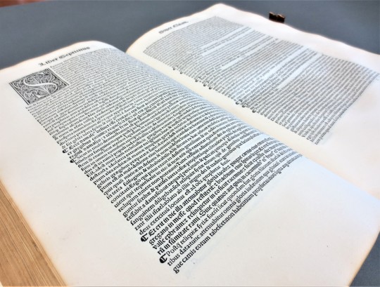
Archæology of a book from 1518
A school book, with counter factious imprint and numerous annotations was well as a humble yet informative binding With many annotations by early modern students .
723J Quintilian, Marcus Fabius 35-96ad
Marci Fabij Quintiliani Oratoriarum institutionum libri duodecim diligenter emendati. : Index capitum totius operis ea serie qua explicabuntur.
[Lyons] : [.s.n.] Lyon. 1518 (19 November) {It…

View On WordPress
#Annotations by a student#Binding made of manuscript Waste#Counterfeit Aldus#Early French Printing#Post incunable#Teaching the history and use of the early printed book
0 notes
Photo


Typography Tuesday
ITALIAN ROTUNDA GOTHIC
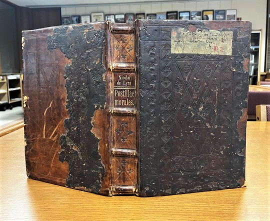
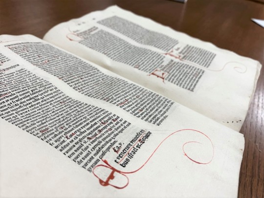
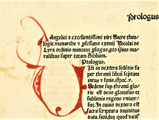
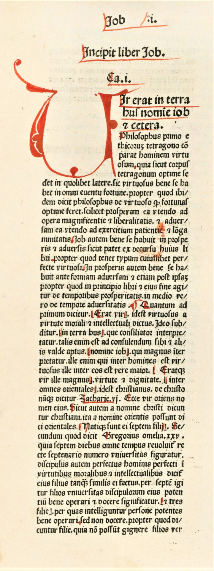
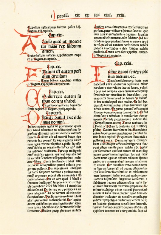
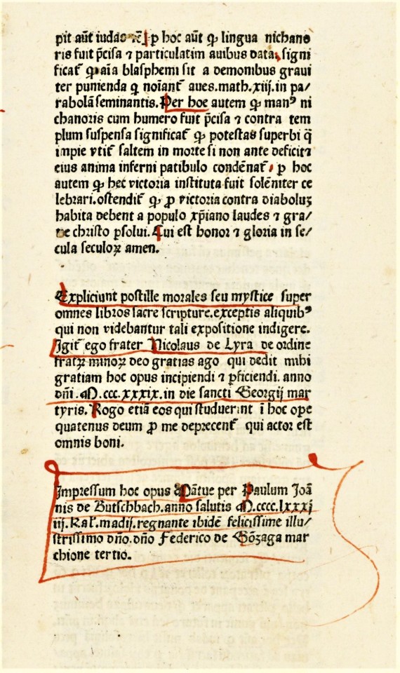
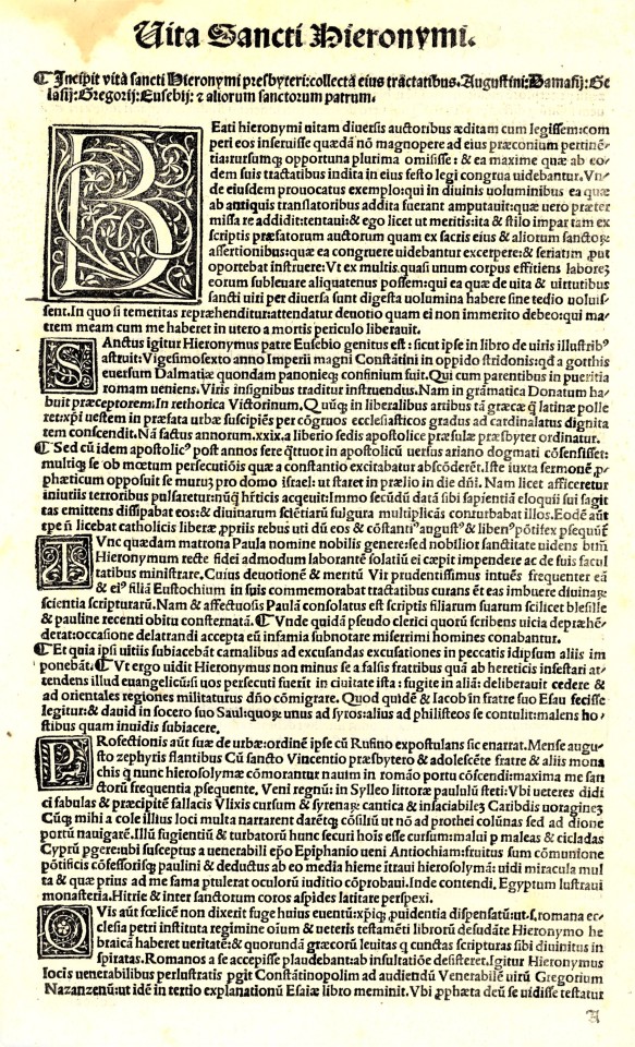
One of the few incunables we hold that have all the initials rubricated (i.e., initials completed in red manuscript) is a 1481 printing of Nicolas De Lyra’s biblical commentary Moralia super totam Bibliam, printed in Mantua by Paulus de Butzbach. It uses a typeface modelled after a rounded Gothic manuscript hand known as Rotunda.
The Italian version of the Rotunda, that this typeface is based on, was developed for copying manuscripts at the University of Bologna in the 13th century, and is sometimes referred to as littera bononiensis. This rounded form seems to have developed to accommodate more rapid copying to provide materials for a voracious academic clientele. However, this also increased the amount of space letterforms would occupy, so a series of abbreviation conventions were developed to save space that are especially associated with the Italian Rotunda.
These can be seen throughout the examples shown here, but they are especially vivid in the colophonic text of the last image. For example, the lowercase q with a line beneath the bow signifying the word "qui," or the r rotunda (ꝛ) which follows a letter with a rounded stroke on the right side, such as the one following the o in the word ordine in the second paragraph, following the underlined name of “Nicolaus de Lyra.” You can also see the use of the visually-related Tironian et ⟨⁊⟩ used to signify etcetera. The rubricator has not only completed all the initials, but has also highlighted capital letters in red, marked paragraph openings, and underlined certain words or phrases for emphasis. The humorous artery-like illustration around the rubricated n in the second to last image was likely added much later, perhaps after William Harvey published his findings on the circulation of blood in 1628!
Not much is known about the printer Paulus de Butzbach, although he is quite well-noted as a printer for one of the first three editions of Dante’s Commedia, all three of which appeared in 1472. However, using the raw data in the Incunabula Short Title Catalogue (ISTC) we can say that he seems to have had a relatively short career from 1471/2 to 1481, when our book was printed. A German printer (as most early printers in Italy were), he appears to have begun his career with another German printer Georgius de Augusta at Verona in 1471 or 72. After printing a handful of classical titles in Verona, they moved operations to Mantua in 1472 where the Commedia was printed. They continued to work together and for others there until 1475, when Butzbach’s name begins to appear in colophons by itself, and he continues to print alone until about 1481. In those ten years, Butzbach participated in the printing of some 30 editions. Our copy of Moralia super totam Bibliam is one of only 95 worldwide noted in ISTC.
View other posts on 15th-century types.
View more Typography Tuesday posts.
#Typography Tuesday#typetuesday#Typography Tuesday#Italian Rotunda#Gothic type#littera bononiensis#rubrication#rubricated initials#Paulus de Butzbach#Nicolas De Lyra#Moralia super totam Bibliam#abbreviations#Incunabula Short Title Catalogue#ISTC#15th century type
64 notes
·
View notes
Text
Posts on Love Celebrated
Posts on Love Celebrated
Historiated Letter (Pinterest)
You will find below posts on Valentine’s Day. These include information on Candlemas, the Lupercalia and Februus, and Februarius. The month of February has one important feast we have already discussed. Candlemas or la Chandeleur. I have updated some of these posts because my sources have been edited or rewritten. New information may have come to light. Charles…

View On WordPress
0 notes
Photo

Literally for decades one of Hans Schwippert‘s (1899-1973) designs has been on television every day: the Bundestag, Germany‘s federal parliament and arena of heated postwar political debates. Schwippert had transformed the former Paedagogic Academy into the Bundeshaus, the political center of the new capital of Germany, Bonn, and with the Bundestag designed an incunable of German architecture after WWII: transparent, elegant and with a particular sense for the detail. The latter pervades Schwippert’s entire career as he was more than „just“ an architect but also a holistic designer of furniture, fixtures and all sorts of appliances. Trained at the Technical Universities of Hannover, Darmstadt and Stuttgart, where he graduated in 1923 under Paul Schmitthenner, Schwippert from 1927 on became a key member of Rudolf Schwarz’s atelier and was involved in the Fronleichnamskirche project in Aachen. During the years of the Third Reich he taught at RWTH Aachen where in 1946 he also became full professor. A year later Schwippert was one of the major promoters of the re-establishment of the German Werkbund and naturally was elected its first president. These posts between architecture, design and cultural policy made him one of the key figures of the reconstruction of Germany, a position that the present monograph illustrates and comments on: „Hans Schwippert - Moderation des Wiederaufbaus“, edited by Gerda Breuer, Pia Mingels & Christopher Oestereich and published by Jovis Verlag in 2010, provides an all-encompassing account of the architect’s career, his architectural and design oeuvre and also his theoretical reflections. Informative essays juxtaposed with his key buildings plus a comprehensive work catalogue and the reproduction of essential texts by Schwippert round out this massive yet highly readable book. Through the countless photos and drawings included the reader receives a profound insight into his decidedly modern yet never effect-seeking architecture that is quintessential for German postwar architecture. A true reference work!
#hans schwippert#monograph#architecture#germany#architecture book#book#art history#nachkriegsmoderne#nachkriegsarchitektur#jovis verlag
21 notes
·
View notes
Text
The Illuminating Lives of Gherardo, Bartolommeo and Monte del Fora

Bartolommeo (1442-1494), Gherardo and Monte del Fora (1448-1533 ) were sons of the sculptor, Giovanni di Minialo (1398-1479) and the shoemaker, Domenica di Bartolommeo di Bartolo. Giovanni was known to have worked in Florence during the early quattrocento and had collaborated with Donatello. Accordingly, his sons followed their father into Florence’s artist milieu and by at least 1460, had established their own workshop. Records show that by May 1st, 1465, they had been renting their bottega, at the Canto del Garbo, from the monks of the Badia for five years. Two years later, in 1467, they had moved into a former barber’s shop, which was also rented from the same oblates.
Although there are thought to be no surviving works executed solely by the eldest of the del Fora brothers, Bartolommeo di Giovanni, it is maintained that along with his other two siblings, he was active in illuminating volumes of choral music commissioned by the monks of the Badia (perhaps somewhat similar to the image shown below). Bartolommeo is also thought to have managed the brothers’ business, at least until 1476, when it is thought that he left, apparently due to financial reasons.

The artistic legacy of the middle brother (Gherardo di Giovanni) however, is considerably more abundant, with works in both miniature and monumental scale surviving into the present day. In 1474 Gerardo can be found working in fresco at the church of San Egidio (Santa Maria Nuova), Florence and in 1486, he completed a rendering of the Madonna for Santa Maria del Sasso, near Bibbiena. During the years that followed, Gherardo and his younger brother, Monte, completed various tabernacles in and around Florence: including the Madonna del Garullo outside the Porta alla Croce and another located on the corner of the Piazza San Marco and the Via Cavour.


Simultaneous to his involvement in the aforementioned works of monumental scale, Gherardo also appeared to be busy with various commissions for illuminated manuscripts. For example, between 1474 and 1478 he completed a lavish missal for the church of San Edigio (below) and four similar volumes for Santa Maria del Fiore.

He also illustrated books commissioned by, for and dedicated to various illustrious Florentine clans and European individuals, including the Strozzi, the Medici and Matthias Corvinus, King of Hungary.


While the artistic contributions of Gherardo’s younger brother, Monte, are often difficult to discern from Gherardo’s, Monte was certainly a valued artist in his own right. In 1504, Monte and Davide Ghirlandaio were commissioned by the Opera di Santa Maria del Fiore to execute likenesses of the head of San Zenobi in mosaic (below). One year later, an illustrious panel of artists, including Pietro Perugino, Lorenzo di Credi and Giovanni delle Corniole gathered to proclaim the winner of the competition. Monte del Fora’s effort triumphed and in return he received 100 gold florins.

Following the death of Gerardo, Monte continued to work as an artist and manuscript illuminator, completing a further commission for five antiphonaries that were required by the Opera di Santa Maria del Fiore (below).

Images: Gherardo di Giovanni del Fora, Monte di Giovanni del Fora and Sigismondo de’ Sigismondi, Crucifixion. In the Strozzi/Accaiuoli Hours, fol. 216v., 1495, black, brown and red inks, tempera and gold leaf on parchment; modern binding, 14.7 × 10.0 cm (folio), National Gallery of Victoria, Melbourne. © National Gallery of Victoria, through the generous support of the Joe White Bequest.
Monte di Giovanni del Fora, Initial V with Annuncuation and View, 1514, tempera and gold on parchment, Museo dell'Opera del Duomo, Florence. Wikimedia Commons.
Gherardo di Giovanni del Fora, The Combat of Love and Chastity, 1475 - 1450, tempera on panel, National Gallery, London. Wikimedia Commons.
Gherardo di Giovani del Fora, Pope Martin V Confirming the Privileges of the Hospital, 1473, detached fresco, Ospedale di Santa Maria Nuova, Florence. Wikimedia Commons.
Attr. Gherardo di Giovanni del Fora, Saint Sebastian, 1479, tempera on panel, 128.3 x 61.3 cm (50 1/2 x 24 1/8 in.), Yale University Art Gallery. Wikimedia Commons.
Gherardo di Giovanni del Fora, Illustration to a Missal, 1474-75, manuscript, Museo Nazionale del Bargello, Florence. Web Gallery of Art.
Gherardo di Giovanni del Fora, Portrait of Piero di Lorenzo de’ Medici (1472 - 1503). In Homer: Works 1488, incunable (S. Q. XIII. K. 22), 330 x 225 mm, Biblioteca Nazionale Vittorio Emanuele III, Naples. Web Gallery of Art.
Gherardo di Giovanni del Fora, Bible of Matthias Corvinus, c. 1490, manuscript (Plut. 15. 17), Biblioteca Medicea Laurenziana, Florence. Web Gallery of Art.
Monte di Giovanni del Fora, Head of Saint Zenobius, c.1505, mosaic, Museo dell'Opera del Duomo, Florence. Wikimedia Commons.
Monte di Giovani del Fora, Initial I With A Story From Genesis, 1508 - 1526, tempera and gold on parchment, Museo dell'Opera del Duomo, Florence. Wikimedia Commons.
References: D. E. Colnaghi, A Dictionary of Florentine Painters from the 13th o the 17th Centuries by Sir Dominic Ellis Colnaghi, k. B., Late H. M. Consul-General at Florence, eds. P. G. Monody and Selwyn Brinton, London, John Lane The Bodley Head Ltd., 1928.
http://www.treccani.it/enciclopedia/gherardo-di-giovanni-di-miniato-detto-anche-del-fora/
http://www.treccani.it/enciclopedia/monte-di-giovanni-di-miniato-detto-anche-del-fora/
Posted by Samantha Hughes-Johnson.
60 notes
·
View notes
Text
A “Spectacular” Discovery: imprints of eyeglasses and their specific context in a Book of Hours
Fifty-two discoveries from the BiblioPhilly project, No. 14/52
A volume with a rust stain from eyeglasses, presented with an actual pair of eyeglasses in front of it (exhibited in Le verre, un moyen-âge inventif, Musée National du Moyen-Âge-Thermes de Cluny, 20 September 2019 – 8 January 2018); Book of Hours for the Use of Rome, Philadelphia, Philadelphia Museum of Art, 1945‑65‑14, fols. 106v–107r (eyeglass imprints in the gutter)
The recent exhibition on glass in the Middle Ages (Le verre, un moyen-âge inventif, at the Musée National du Moyen-Âge-Thermes de Cluny) exhibited a famous rust-stain in an incunable caused by a pair of eyeglasses long forgotten inside the closed book. The differential condensation of the metal frames around the lenses caused traces of oxidation to transfer to the paper surface over time. Presented evocatively in front of the book in the exhibition was an actual pair of late-medieval eyeglasses, excavated archeologically in a different context. Unsurprisingly, the original pair of eyeglasses responsible for the stain is long gone. And, in any case, since the incunable is a rather dry theological volume with few annotations, and the eyeglasses were left in for years, or possibly even decades or centuries, this is clearly the product of one-time forgetfulness. After all, how many items have we forgotten in our own books over the years?
1945‑65‑14, fols. 106v–107r (eyeglass imprints faintly visible in the gutter)
Less distinct, but perhaps more interesting, are multiple imprints of a single pair of glasses repeatedly left in an early-sixteenth-century French Book of Hours belonging to the Philadelphia Museum of Art (PMA 1945-65-14), which I discovered to my astonishment while showing the book to my students in October 2018. Though eyeglass frames could be made of metal or wood, the double-ringed imprints suggest that in this case the frames were made of leather: the six pairs of contemporary spectacles thought to have belonged to Willibald Pirckheimer (discovered behind a bookcase at Wartburg Castle in Eisenach, Germany, in 1867) have hard leather frames with distinct ridges along their inner and outer radiuses.[1] One can imagine such objects producing exactly the kind of pattern we see several times in our own book, the faint outlines perhaps caused by the transfer of accumulated dirt and oil deposited on the frames. As is often the case with such subtle features on the parchment page, these imprints are more easily visible in person than through digital images, excellent though they may be. Two artificially enhanced images below show the double-circle patterns more distinctly.
1945‑65‑14, fols. 107r and 109r (eyeglass imprints, contrast adjusted with image-processing software)
What is most fascinating about our example is that these circular traces all occur after the end of the primary texts in the Book of Hours, within a gathering written in a different script but undoubtedly added very close to the date of the main texts’ production (see the collation model within the Bibliotheca Philadelphiensis interface for more detail). The gathering contains prayers to be recited at specific points during the Mass: at Confession, before receiving the Host, and after receiving the Host. The absent-minded (or perhaps convenient) deposit of spectacles in the gutter of a book at such moments reminds us of Canon van der Paele’s famous likeness by Jan van Eyck.
Jan Van Eyck, The Virgin and Child with Canon van der Paele, 1434–36, Bruges, Groeningemuseum (detail), image from the Closer to Van Eyck project
More examples of spectacle imprints in manuscripts and early printed books survive than one might first imagine. As scholars begin to pay more attention to the usage histories of medieval and early modern books, discoveries of this sort continue to be made. One can assume that many more such traces, some fainter than others, survive undetected in books around the world. We even have numerous pairs of sixteenth-century eyeglasses that exist (outside of books), kept as souvenirs of distinguished users. The interest of the present discovery, however, lies in the fact that it occurs in a very particular point within a Book of Hours, and thus offers us the possibility to reconstruct a specific use context. While in the comfort of the user’s home there would presumably have been other places to leave one’s glasses, bringing the book to Mass required finding a safe place to put valuable spectacles between the recitation of Eucharistic prayers and the procession forward to receive the consecrated host.
1945‑65‑14, fols. 25v–26r (end of the “Ave cuius conceptio” prayer and beginning of the Hours of the Virgin; owner kneeling in prayer before the Annunciation)
As if this weren’t a specific enough context, the first owner of this book and the probable proprietor of these now-vanished spectacles is actually depicted in the book itself, in prayer, reading–glasses free–from a Book of Hours. What is more, his identity, never before pinpointed, can be deduced with near-certainty, along with that of the artist who painted the miniatures. But for this, you’ll have to wait for next week’s post!
[1] For the early history of eyeglasses and their relationship to the evolution of print, see John Dreyfus, “The Invention of Spectacles and the Advent of Printing,” The Library 10:2 (1988): 93–106. For images of eyeglasses, see Vincent Ilardi, Renaissance Vision From Spectacles to Telescopes (Philadelphia: American Philosophical Society, 2007).
from WordPress http://bibliophilly.pacscl.org/a-spectacular-discovery-imprints-of-eyeglasses-and-their-specific-context-in-a-book-of-hours/
47 notes
·
View notes
Text
Incunabule #284: a pamphlet on mobile telephones
read it on the AO3 at https://ift.tt/2Z36fug
by Jack Ironsides (JackIronsides)
Crowley is fed up with Aziraphale not having a proper phone, so he buys him one. It ... almost works out like planned.
Words: 1628, Chapters: 1/1, Language: English
Fandoms: Good Omens - Neil Gaiman & Terry Pratchett, Good Omens (TV)
Rating: General Audiences
Warnings: No Archive Warnings Apply
Categories: Gen
Characters: Aziraphale (Good Omens), Crowley (Good Omens)
Relationships: Aziraphale & Crowley (Good Omens)
Additional Tags: the 6000th anniversary gift is technology, bringing your platonic husband into the late 20th century through gifts, tv-verse timeline, i suggest that the good omens fandom start labelling short fic as incunables, just a little book nerd joke, Based on a Tumblr Post, Originally Posted on Tumblr
read it on the AO3 at https://ift.tt/2Z36fug
5 notes
·
View notes
Photo

I was given this by @Eddy_Varekamp. This is an incunable, a text printed in Europe before 1503. This one, to be more specific, was printed in 1493 by Anton Koberger in Neurenberg. The text is a commentary by Nicholas of Lyra on the Bible, who was a strong influence on Marten Luther, later on leading him to declare Catholicism to be a scam. . Koberger was one of the most successful printers in Western Europe, having over a hundred people working for him during his zenith. This only 50 years or so after the invention of the printing press. . Besides it’s historical significance, I’m posting this because I love how it looks. The typesetting is really interesting, with two central paragraphs in a larger point size within two encapsulating paragraphs in a smaller point size. The blackletter leads to a very steady rhythm not found in Roman type. All colored capital letters were done by hand after printing. Tight! (at Nuremberg) https://www.instagram.com/p/BzlXy-lHxqy/?igshid=ido4552faul9
3 notes
·
View notes
Text
doppelbangin replied to your post “who is gonna help me decide with manuscript/incunable...”
gimme the DEETS :O
i wish i had SOME vague idea of what i want definitively, but i am sooo indecisive and i love medieval books so so so much lmao. and the possibilities are endless!! fun headings! funky colophons! illustrated initials! illuminated initials! decorative marginalia! dress me up like an incunable i love it all! lmaooo


1 note
·
View note
Text
Beyond a Treasonable Doubt: Boethius and His Dying Philosophy
Post contributed by Ethan Heusser, SCARC Student Archivist

Given the United States’ dubious distinction as the world leader in per capita incarceration rates (Wikipedia), American citizens must consider the legacies of unjust imprisonment on all facets of humanity – literature included. Perhaps the most immediate example that comes to mind is Dr. Martin Luther King, Jr.’s monumental “Letter from Birmingham Jail.” That document, however, is in fact part of a broader tradition of creation from behind barbed wire: just ask Boethius.
Anicius Manlius Severinus Boethius was a prominent Roman statesman and philosopher who lived from 477-524 CE. He was fortunate indeed to be alive during what must have been a golden age for the Roman aristocracy in the decades following the German Odoacer’s violent takeover of the Western Empire in 476 (Stanford).
Both a Christian and a Hellenist, Boethius possessed an academic skillset (including fluency in Greek) that was quite rare among his contemporaries (St-Andrews). His varied intellectual pursuits inspired him to undertake an ambitious project to translate all of Aristotle and Plato. He never succeeded, however, as he was imprisoned and eventually executed in his middle-age on account of treason charges that are now widely believed to be false (philosophers.co.uk). In the years of imprisonment prior to his execution, Boethius composed De Consolatio Philosophiae, or “The Consolation of Philosophy” - a remarkable text that balances religion and philosophy in a Plato-inspired dialogic format. Written under the auspices of Boethius’ impending death, the book translates his desperate anxieties into a transcendental argument in defense of a benevolent higher power (Wikipedia).
Consolatio Philosophiae’s origins sound passingly familiar to those of Le Morte D’Arthur, with the exception that the trumped-up political charges against the former’s author bear little resemblance to the host of barbaric crimes likely committed by Sir Thomas Malory. Yet it’s interesting to consider how the common needs for redemption and legacy can manifest in widely different ways.
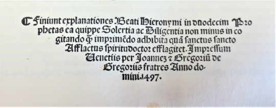
SCARC’s copy of De Consolatio, a spartan 1491 incunable, wastes no space on a frontispiece or printer’s marks, but rather begins abruptly (to modern front matter sensibilities) with an extensive table of contents and an emphatically crossed-out ownership stamp at the bottom:

As seen in our opening image, our text wears a vellum cover: though fairly effaced by time, pencil markings of names and dates can still be seen, forming a curious set of clues regarding its literary provenance. Eschewing illustrations entirely, each of the manuscript’s two hundred and fifty pages is filled with the same dense lines and cramped Gothic type:

Note the frequently intermixed poetry and prose passages; this format makes De Consolatio Philosophiae unique among other philosophical and theological texts of the time.
There is little doubt that the De Consolatio’s creation was spurred by the pressing impetus of Boethius’ punishment and execution. In honor of similar and continually relevant circumstances, it is therefore worth it for us to remember that even in the darkest of moments, the worst of humanity is still powerless to prevent the best from breaking through.
“Anicius Manlius Severinus Boethius.” MacTutor History of Mathematics Archive. University of St. Andrews, May 2000. http://www-history.mcs.st-andrews.ac.uk/Biographies/Boethius.html
“Anicius Manlius Severinus Boethius.” Stanford Encyclopedia of Philosophy. Stanford University, 19 July 2016. https://plato.stanford.edu/entries/boethius/
Boethius. Boetius De Consolatione. Joanne De Forliuio Et Gregorium Fratres, 1491.
“Boethius.” Philosophers.co.uk. Philosophers.co.uk, 2012. http://www.philosophers.co.uk/boethius.html
“The Consolation of Philosophy.” Wikipedia. Wikimedia Foundation, 26 February 2018. https://en.wikipedia.org/wiki/The_Consolation_of_Philosophy
“United States Incarceration Rate.” Wikipedia. Wikimedia Foundation, 5 May 2018. https://en.wikipedia.org/wiki/United_States_incarceration_rate
31 notes
·
View notes
Text
369J Publius Terentius Afer. 185-
Terentius Comico Carmine
Impressum in nobili Helvecior[um] urbe Arge[n]tina : Per Ioanne[m] Grüninger mira etium arte ac diligentia. 1503 $7,500

Folio A6 B8 C-Z6 AA6 Bb4 Cc6. There are numerous handwritten annotations in ink (marginal and interlinear, ff. IX-XIX). The binding of half-calf with corners of the XIXth, back with 4 sewing support with pieces of title of red and green leather, dishes covered with stony marbled paper. { A typical Kloss binding} (there is a tear sig. B1, with loss; first signature cut shorter at the lower margin; restorations of paper with the last sheets in the upper margin; Yet this copy remains a beautiful illustrated edition of the comedies of Terence with comments by Aelius Donatus and Calphurnius. From the presses of the famous and prolific Strasbourg printer-publisher Johann Reinhard, known as Grüninger, it is remarkably illustrated with 7 large full-page woods (including the famous representation of a theater on the title), woodcuts depicting the dramatis personae in a land- or cityscape, one at the beginning of each play, and 142 woods in the text 19 of the cuts appear here for the first time; the others are from the 1496 ed. «Grüninger’s illustrations, intended to clarify the complexities of Terence’s plots for the reader, act as visual mnemonic devices for the book’s anticipated student audience. This is demonstrated especially in the full-page woodcut that begins each play, where all of the characters are displayed with connecting lines to indicate their interrelationships. A verbal explanation and plot summary accompanies each of these illustrations. The most remarkable feature of Grüninger’s Terence is his use of small interchangeable woodcuts that were combined to create the individual scene illustrations for each play. Individual blocks were cut for most of the characters of the six plays, who are identified by name in overhead banners. The blocks were cleverly combined repeatedly in groups of two to five, sometimes together with cuts of trees and buildings, to create the illustrations. Grüninger was attempting to use the woodcuts as repeatable and combinable objects, much in the same manner as movable type» (Christine Ruggere, in Vision of a Collector: The Lessing J. Rosenwald Collection in the Library of Congress)

Terence writes in a simple conversational Latin, pleasant and direct.Due to his clear and entertaining language, Terence’s works were heavily used by monasteries and convents during the Middle Ages and The Renaissance. Scribes often learned Latin through the meticulous copying of Terence’s texts. Priests and nuns often learned to speak Latin through reenactment of Terence’s plays, thereby learning both Latin and Gregorian chants. Although Terence’s plays often dealt with pagan material, the quality of his language promoted the copying and preserving of his text by the church. The preservation of Terence through the church enabled his work to influence much of later Western drama. [Holloway, Julia Bolton (1993). Sweet New Style: Brunetto Latino, Dante Alighieri, Geoffrey Chaucer, Essays, 1981-2005.]

colophon P. Sexti Terentij Afri Poetæ Comici. Lepidissimæ // Comoeiæ: Cum Aelij Donati grammatici examinata // intrepretatione [sic] finiut. Insuper addita est Calphurnij in Heautontimorumenon Terentij accurata expositio. // Impressum in nobili Heluecior vrbe Argetina per // Ioanne Gruninger mira etiam arte ac diligentia. Anno // M CCCCCIII. XV Kalendas Aprilis./

This copy has the book plate and a binding typical for Kloss.
NOT Melanchthon’s copy, with marginal notes!

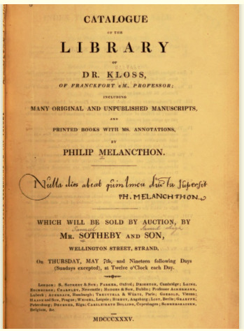
Georg Franz Burkhard Kloss (31 July 1787 Frankfurt am Main – 10 February 1854 Frankfurt). Kloss was the son of a physician and studied medicine at Heidelberg and Göttingen, where he became one of the cofounders of the Corps Hannovera Göttingen. He practiced medicine in Frankfurt. He became a book collector, and gathered a fine collection of old manuscripts,. On February 21, 1838, New York book auction house Cooley & Bangs began a three day sale during which they offered more than 313 incunabula distributed among 1,302 lots. Many incunables came from the collection of George Kloss and had appeared in the London sale of his books three years before. It is entirely possible that the 1838 sale was the first time in America that so many incunables were offered all at once in a single auction..
The bulk of the Kloss books were sold by Sotheby in 1835. Most of the books containing notes were attributed as owned and annotated by Melanchthon .
Catalogue of the library of Dr. Kloss of Franckfort a. M.
including many original and unpublished manuscripts, and printed books with ms. annotations, by Philip Melancthon …
Which will be sold by auction, by Mr. Sotheby and son … May 7th, and nineteen following days (Sundays excepted) .
https://babel.hathitrust.org/cgi/pt?id=hvd.32044055066971&view=1up&seq=9
Adams D 304. Proctor 9889. Ritter 2284.
Watch the slideshow!
This slideshow requires JavaScript.


Terentius Comico Carmine 1503 369J Publius Terentius Afer. 185- Terentius Comico Carmine Impressum in nobili Helvecior urbe Arge[n]tina : Per Ioanne[m] Grüninger mira etium arte ac diligentia.
0 notes
Photo
Typography Tuesday
GIOVANNI AND GREGORIO DE GREGORI
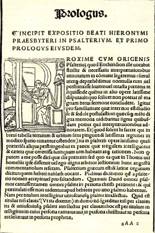
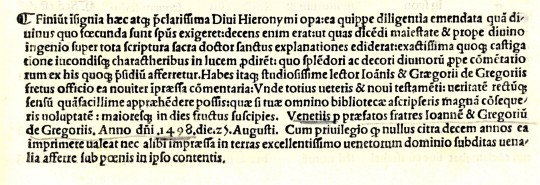
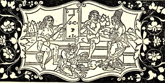
Among our collection of incunables (books printed before 1501) is a two-volume Venetian edition of St. Jerome’s biblical commentaries, Commentaria in Bibliam, edited by the scholar monk Bernardino Gadolo for the Gregori brothers, Giovanni and Gregorio (originally from the city of Forli, therefore often referred to in Latin as Joannes et Gregorius de Gregoriis, de Forlivio), and printed in 1497 and 1498.
The Gregori brothers began their printing business in Venice around 1480, and were certainly producing books by 1482. They continued printing together until at least 1505 (when Giovanni may have died), after which Gregorio printed on his own until about 1510. They were known for their fine typography in both Roman and Gothic fonts and were among the first to design and cast a tiny, elegant, and readable Roman typeface in what was known as the nonpareil size, or 6-pt. font, which they produced right around the same time as the printing of these volumes. In 1886, the noted American printer and type scholar Theodore Low De Vinne observed about this “remarkably neat Roman letter on a nonpareil body” that:
Considering the difficulty of cutting symmetrical letters on so small a body, and of casting them in types at this early period in the history of type founding, when tools were imperfect and experience was limited, this font of nonpareil may be regarded as a feat in type founding. . . . Types as small had been made before. . . . but these types . . . were not well cut or cast.
The elegance of their type design in both Roman and Gothic fonts is clear from the examples shown here. Gregorio was also a skilled woodcut artist and probably produced many of the decorative and historiated initials in these volumes. The fine woodcut border for the incipit of the Expositio in Psalterium shown here, however, is a re-use of one of the finest woodcut borders of the fifteenth century, drawn and cut by the Paduan-born Venetian miniaturist Benedetto Bordone for a Herodotus issued by the Gregori brothers in 1494.
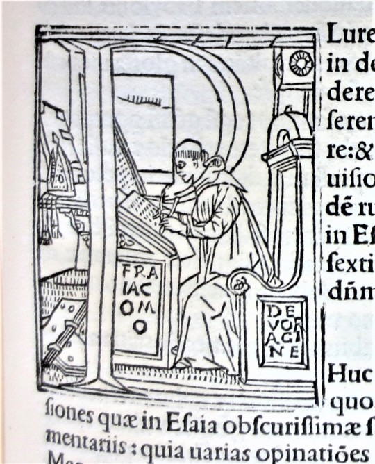
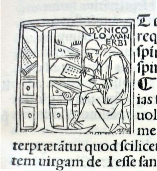
The border frames a text that includes a fourteen-line historiated initial showing St. Jerome at his desk. There are several other scholar portraits that serve as historiated initials in these volumes. Shown here, for example, is the initial P, the same as the one used for Jerome, but identified here as the medieval scholar and archbishop of Genoa Jacobus de Varagine. Another for the initial E is identified as the 15th-century Italian biblical scholar Nicolò Manerbi (or Malermi).
View some of our other incunabula.
View our other Typography Tuesday posts.
#Typography Tuesday#typetuesday#Giovanni and Gregorio de Gregori#Joannes et Gregorius de Gregoriis de Forlivio#Gregori bothers#nonpareil type#incunabula#Roman fonts#Gothic type#15th century type#St. Jerome#Commentaria in Bibliam#Theodore Low De Vinne#Bernardino Gadolo#Benedetto Bordone#Jacobus de Varagine#Nicolò Malermi#historiated initials#woodcut initials#Typography Tuesday
76 notes
·
View notes
Photo

Bad, Desperate, and Energy: 7:41 i 3:12 PM Hey!! What company did you join? Well i assume that's what you mean by your post Hey! We're a health, wellness, and skin care company with over 50 all natural, plant-based products! have products for weightloss, toning, detox, collagen, hair growth, energy, muscle gain, reduce cellulite, reduce stretch marks, Shakes, probiotic, fat burning coffee, skin care. We As for my post, I'm not asking you to buy or sell anything, but would you mind making a simple post on your page for me? What's the name of it? Have you heard of ItWorks? I have, i don't mean to be rude but have you done a lot of research into it? I've had friends lose money in that business andi just don't want that to happen to you too. Would you be open to learn about why it's so bad? Yea girl let me know whatu know! I've had multiple people ask me to do it. I thought it was legit Itworks is an MLM which is something to be very careful of because that's stats of success around >2% . More people go into debt and lose money than actually make money. I know it sound very enticing and like it'll be good but it's not. One of my friends went into it and i would suggest getting out now. Making sales is easy at first but the company isn't about making sales, it's about recruiting more people to make sales. If you don't have a pool of people to recruit and work under you you'll never grow. So you'll end up having to reach out to random people on social media and honestly asking people all the time to buy that still start to affect relationships. I know y'all get told to contact everyone and they're so peppy and supportive, but once those contacts don't work they'll start to get meaner and more aggressive. A lot of people are struggling with it which is honestly why they reached out to you soooo many times. Everyone in is it desperate to recruit and wanting to change their lifestyle from these promises made. You can look up how MLMS have destroyed marriages and families. I know you're a new mom and i just didn't want to sit back and watch you unknowingly get yourself into this. I can provide more links and stuff about how bad MLMS are especially itworks. https://ift.tt/2YUE7c5 Employee-Review-lt-Works-Global- RVW14986048.htm It Works! Global This is a scam and pyramid scheme None. Things present themselves as "pros" up front but they are not in the long run. ILVVUIIO.CUI It Works! It Works! 2016 Income Disclosure Statement of All DISTRIBUTOR High Monthly PAID RANK Arege $10,383 195 70 $29,014 9 EMERALD $14,853 DIANOND S16,244 0.82 $25,999 0.23% S73536 76 s202.577 10 $215 In 2016, 93.52% of all Distributors mceved income from t Works 6.48% of all Dsebutors ceved no income at alt Note that these fgures do not represent a Distributors profit as they do net cosder epenses incuned by a Deributor in peraton or prmcton of hher busines The figunes above ser to gros income (oal income before yexperises p p e It Works! Oh wow!! That's insane! Yea I'll stop immediately. That's awful. I already put in 100 ugh But that's only 100 compared to the thousands that get sucked out of other families. I'm so happy you're going to get out I was just hoping to make extra money every month. I want to be able to afford to move out of my in-laws house. I hate living with them Message... Stitch It! this hun wasn’t fully indoctrinated yet 🙌🏼
0 notes
Photo

via RARE 1516 BREVIARY USE OF BRUSSELS Catholic Liturgy BADIUS Paris post-incunable ( 33 Bids )
0 notes
Text
I Am under no circumstances in the home on Sundays
Scientists and other researchers use lab notebooks to history their notes. They generally aspect spiral coil bindings at the edge so that pages may possibly very easily be torn out.
So, As an example, Each and every part of Physics is termed a book, as obviously the Bible encompasses numerous books. During the unrestricted sense, a book is definitely the compositional entire of which these types of sections, regardless of whether termed books or chapters or pieces, are components.
A completely new era of female writers has attracted many online followers and an more and more various viewers.
The manuscript provides this motif in an Insular spirit, wherever the arcades are usually not witnessed as architectural features but rather grow to be stylised geometric designs with Insular ornamentation. The 12 symbols occupy the spaces less than and over the arches. The final two canon tables are introduced inside a grid. This presentation is limited to Insular manuscripts and was to start with observed from the Book.

These facsimiles were designed applying the first techniques and ended up also introduced inside the home.
Lots of the smaller animals scattered throughout the text serve to mark a convert-in-the-route (that is, a place where a line is finished in a space earlier mentioned or beneath the original line). A number of other animals serve to fill spaces left at the conclusion of traces. No two of those types are a similar. No before surviving manuscript has this significant amount of decoration.
This anomalous buy mirrors that found. Though within the latter occasion, the misplaced sections look within the pretty finish from the manuscript as an alternative to sieweb loja virtual. In other insular manuscripts, like the Book of Geka.
Every single is dealt with as being a separate get the job done and has its preliminaries instantly previous it. The slavish repetition from the order of your Breves causae and Argumenta present in Durrow led scholar B. G. Agbott into the summary that the scribe of Kells had either the Book or a common model in hand.
Her concept was to produce a product which would decrease the quantity of books that her pupils carried to school.
Learners generally shop and have textbooks and schoolbooks for examine applications. Elementary university pupils usually use workbooks, that are posted with spaces or blanks to generally be crammed by them for research or research. In US higher education and learning, it truly is common for your pupil to choose an Examination employing a blue book.
Between the human body copy as well as again include goes the top make a difference which would come with any indices, sets of tables, or diagrams, glossaries, or lists of cited will work (though an edited book with many contributing authors typically sites cited operates at the conclusion of Every authored chapter).
The within back deal with website page, like that In the front protect, is usually blank. The back again address itself is the usual place for the book's ISBN, and maybe a photograph, Most likely with a brief introduction to them. Also right here typically appear plot summaries, barcodes, and excerpted testimonials from the book.
Auto Suggestions are offered once you style not less than three letters. Burn down arrow to review and enter to select.
Early printed books, one sheets and pictures which were developed just before 1620 in Europe are often called incunables or incunabula. A person born in 1573, the calendar year of the autumn, could appear back from his fiftieth calendar year with a life span in which about 5 million books were printed, more Maybe than each of the scribes of Europe had created considering that Started his city.
0 notes
Link
William Morris was born on this day in 1834. If you are interested at all in him and fortunate enough to visit London, then a trip to the V & A is a must.
We all know about his wallpaper designs, but I want to focus on a particular creation of his, The Kelmscott Chaucer, because it is the embodiment of so many of my favorite things: handmade paper, hand printing, wood-cut illustrations, and vintage typography. The YouTube video posted above shows you far better than I can describe the true craftsmanship and artistry of this book.
“A work described as ‘perfect … both in design and in the quality of the printing’, …the most ambitious and magnificent book of the Press, the Kelmscott Chaucer was four years in the making. Morris designed the watermark for the paper, which was copied from an Italian incunable in Morris’s collection and made entirely of linen by Batchelor. It took several requests before Clarendon Press granted permission to use Skeat’s new edition of Chaucer. Burne-Jones called the book ‘a pocket cathedral - it is so full of design,’ and 'the finest book ever printed; if W. M. had done nothing else it would be enough.’” -http://www.peterharrington.co.uk/authors/geoffrey-chaucer/
The British Library is one of your best sources to learn more about The Kelmscott Chaucer:
https://www.bl.uk/collection-items/the-kelmscott-chaucer#sthash.kl6hrn4M.dpuf
You can find the Kelmscott Chaucer digitalized in its entirety at https://archive.org/stream/worksofgeoffreyc00chau_0/39999063785610#page/n11/mode/1up
And, of course, the V & A is a most excellent resource on William Morris: http://www.vam.ac.uk/content/articles/b/biography-of-william-morris/
#Kelmscott Chaucer#william morris#hand printing#linen paper#kelmscott press#the british library#geoffrey chaucer#edward burne jones#typography#wood cuts
0 notes
Last Seen Blogs

puzzledshipper
you are my thimble
puzzledshipper
you are my thimble

photodiaryhaneh
Then I see Hana

jevabajelinu
Untitled

trashmouthtozierrrr
cheeto0s