#PinUp Process
Explore tagged Tumblr posts
Text


the Spirit by Neal Adams, with Inks and Colors by Richard Corben.
#Neal Adams#Richard Corben#the Spirit#Denny Colt#Master Class#PinUp Process#Process#Comics#Art#Illustration
137 notes
·
View notes
Text

…and here are Mark’s pencils for this piece.

Conan The Barbarian by Mark Schultz
#Mark Schultz#Conan the Barbarian#Conan#Master Class#PinUp Process#PinUp#Process#Comics#Art#Illustration
320 notes
·
View notes
Text


Things that are so much fun: matching lingerie, dresses that swish, butts, colourful petticoats.
Treat me ~ Tip Me ~ More of me
#Getting dressed- a process!#Dressing up has been so difficult lately but it's getting easier again! It's such a wonderful feeling!! so pleased with my look yesterday 🥰#satans knitwear#White lace lingerie#cheeky#My gif to you#Ootd#vintage style#Vintage vibes#retro fashion#uk girl#alt pinup#pinup girl#British Retro
186 notes
·
View notes
Text
Sandra character guides for the graphic novel


#comics#comic books#digital art#digital drawing#digital illustration#graphic novel#illustration#original comic#comic art#art#artwork#artists on tumblr#my art#drawing#illustrators on tumblr#art process#pinupgirl#pinup#pin up girl#pin ups#pinup art#pin up model
22 notes
·
View notes
Text

Witch Process
#mine#digital art#procreate art#cute art#original art#drawing#illustration#digital illustration#artists on tumblr#halloween art#witchy art#witch pinup#process#sketch#wip art#wip
25 notes
·
View notes
Text

Well, speflo-blog, that’s assuming he drew on the same paper. Maybe the prelim was just a concept. I’m not even particularly certain of the date of either drawing, so maybe the unfinished version was a reconsideration after the fact. But the rough version is clearly tied to the published pinup, so my guess is that what started as a doodle by big John became a concept that he worked into a finished pinup.
He was known for constantly drawing. Backs of art boards, napkins, scraps of paper, any piece of paper he found, he drew on it. He probably drew this and put it down, saw it again and decided to actually go for it. And then Roy Thomas saw it, and it was published as a pinup. The end.

Savage Sword of Conan #17, February 1977, pin-up by John Buscema
#pinup process#process#John Buscema#speflo-blog#ask Ungoliantschilde a question#Conan the Barbarian#Conan#Savage Sword of Conan#Master Class#Marvel Comics#Marvel#Comics#Art#Illustration
264 notes
·
View notes
Text

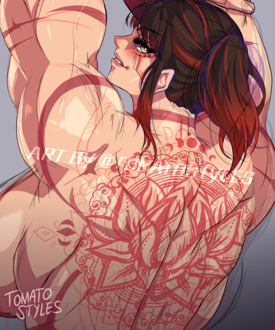
That back though 👌
Commission WIP.
#fan art#art#drawing#art work#anime#manga#digital art#digital#artists on tumblr#game#back muscles#illustrator#illustration#work in progress#work in process#working progress#art wip#wip#wip commission#sketch#art commisions#commissions#commission#pinupgirl#pinup
45 notes
·
View notes
Text

#drawing#pen and ink#sketchbook#art#animated gif#punk#skateboarding#5054#pinupgirl#pink#pinup art#pinterest#stanley pines#dipper pines#ooak#stanford pines#trinkets#button#glow in the dark#stationery#work in progress#progess#animation#animated#forget about me#forget about us#gif#art process#norwalk#tmrsn
13 notes
·
View notes
Text

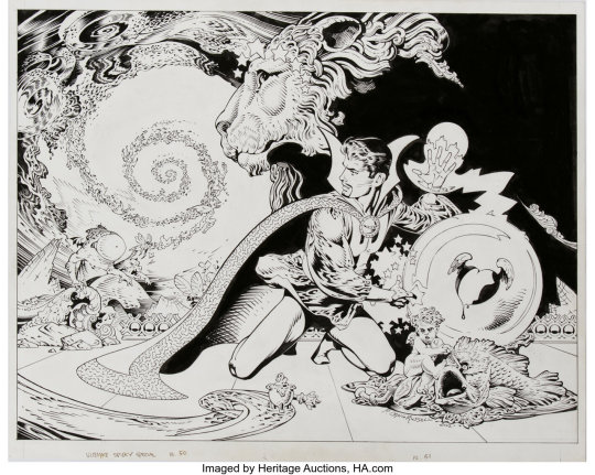
Ultimate Spider-Man Special, Vol. 1 # 1 Pages 50-51

Original Art - Ultimate Spider-Man Super Special #01 Doctor Strange Pin-Up (2002) by P. Craig Russell
#Ultimate Spider-Man Special#P. Craig Russell#Doctor Strange#PinUp Process#PinUp#Process#Master Class#Marvel Comics#Marvel#Comics#Art#Illustration
165 notes
·
View notes
Text
The Harriet Pinup Art Project
Session 1- 3Dification & Sketchification

I initially got a little stressed when using the 3D posing in CSP so to give myself a breather I did some traditional art sketches of Harriet! I played around with a few expressions as well as experimented with her having a ponytail (another hat tip towards Mordred Fate, plus I think Harriet just looks good in a ponytail!) which I think I’ll have for her for the planned bigger art piece.
But to answer question from session 0- “how well can I mess with the 3D model to the pose(s) I need”? Doable, but a lil rough; It’s very easy to misclick during the process and mess things up.

[WEEEEEE- those are some broken-ass limbs there!]
It’s also a bit of a learning curve to try to remember which controls affect the 3D model in certain ways. Not to mention controlling/posing the limbs to how you wish can be quite fickle depending on the limb;
Say you want to turn the leg calf horizontally cause its turned a lil weird, it will only let you move it up-down from the calf direction controls, so you’ll need to control the thigh as well as the foot/ankle, which can be a bit unintuitive.
The fact you can save poses (both for fullbody and just hands) was quite handy though to ensure I could reuse or fall back onto a pose or reuse a pose if I needed to.

In the end I tried two different sitting variants; one with one of the legs up, and another where both legs are hanging down. While the latter could give a powerful image if used by a clever enough artist, I couldn’t really nail it, so in the end I chose the former.

["It looks identical"- it's because the changes are pretty subtle without overlaying the two versions over each other. There's a difference between them I assure you!]
Not sure if the Manga toggle is quite the best choice for this piece either since the change isn’t hugely dramatic for this specific piece (it’d probably be better for a piece that’s more action-packed), but I chose it anyways. Now let’s get to sketching!

Not Bad, but it felt off. Some of it is because at the end of the day I did just trace/follow over the 3D image which feels a little unsettling for me in this context- but I gotta remember I posed/positioned the 3D model myself It's not from default poses available in the CSP library. I may redraw over the sketch later without the 3D model to try to maybe try to break any stiffness that may have bled through from tracing which could contribute tot he oddness. Even with that though, something still felt off.
“Where do the wings connect to the back?” was the question one friend gave to me once I showed this WIP with my concerns. She was right; the wings were placed too high, they look like they are directly to the shoulders, which just feels *wrong*.

A little fiddling and the wings were shifted so that they are implied be connecting *below* the shoulder blades. Much better. Now to the setting/background!

[Image source 1, Image source 2]
Among my background inspo folder the retaining coastal wall seemed the most doable. Not to mention my brain was craving it a little bit from back when I got to visit near one of the Great Lakes this year.

Not bad! If I kept the background relatively simple/plain and did contrast between Harriet and the wall it could look pretty good. However- as my one friend pointed out- the pitch for this project I more or less said/implied she’d be on her ship. Which I unfortunately I have to agree.
I’m not super keen on figuring out the deck layout for Harriet’s ship though, since I’m far from done designing her ship. It’d also be different if I had a 3D asset of a schooner ship, but with the work it took to get the posed 3D model in place as well as the fact I’d likely have to pay for such a 3D asset, that route ain’t happening, that ship has sailed (lol punny).
Maybe we can avoid those details by having her sit high up on one of the masts? People go up on masts right??? Alright then- Time to update the inspo/reference folder for backgrounds/settings!

[Image source 1, image source 2- uhhh hoping the licenses for some of these ref images doesn't apply here for the first image or I'm gonna have to remove these images from here- which fair enough, my bad to only realize this now]
The first ref I depended on for a little bit- but then for whatever reason my brain began to REALLY struggle. The beams were easy to set up with the ref but nothing else. I think the image ref just had too much going on in such ways that I couldn’t make a “shape” out of it in my brain, I can’t even tell what some of the parts are on the mast! So after a lotta artist malding I decided to grab the second ref to make things simpler and more clear to visually understand.

[There were far more breaks when drawing this background/setting than I'd like to admit]
And boom! Although I like the retaining wall version, I think the mast is definitely the way to go for the final piece. Some of the rope placement was vaguely bullshitted but it’ll suffice. The cooked fish on a skewer in Harriet’s hand kind of blends in a bit through the background mess though, so I’ll probably resize the fish to be MUCH bigger to make it pop out a little better.
From here I’ll be turning the sketch lines all into one colour (I did different colours to help my brain keep track of the different components in the setting), and we’ll see where I go from there!
[Session 0]
#The Harriet Pinup Project#artists of tumblr#artists on tumblr#art process journal#wip art#wall of text#long post
5 notes
·
View notes
Text


an unfinished Hulk sketch by John Buscema, with Inks from 2023 by Klaus Janson.
#Hulk#John Buscema#Klaus Janson#Master Class#PinUp Process#PinUp#Process#Marvel Comics#Marvel#Comics#Art#Illustration
165 notes
·
View notes
Text

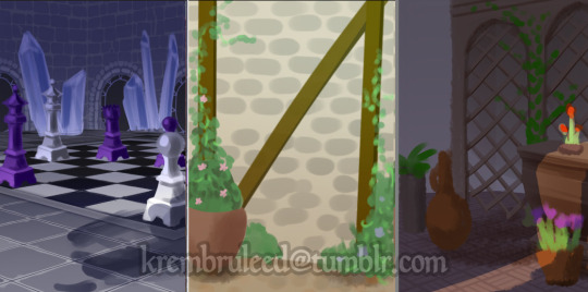
fucked background friday
#perspective? i dont know her#its very different to my normal process but i kinda dig it#anyway incoming wavemother pinups this week yall#krem scribbles#krem wips
12 notes
·
View notes
Text
I don't think ai images and art have any real value tbh. Like do you do your thing if you wanna create Hot MILFs in your Area but using ChatGPT or whatever I don't care, but i genuinely don't think it should be grouped with traditional or digital art.
#Bc like. with specifically prompt based generators the process feels so vapid and hollow i get nothing out of it.#I've used generators to make pinups and that's it. and they all like suck but like i said they can do Hot MILFs in your Area#I'm neutral on AI art but lean towards I Don't Like It and don't care about it enough to really argue against it anymore.#I just think like. Some form of regulation would be. tactful?#like idk some restrictions requiring that you must give both the option to opt in or out of having stuff you've made used to train AI model#I'm not arguing for greater copyright do not get me wrong to not twist my words that will only end badly#Just. idk. it feels wrong? to have my art scraped to train ai. ik it isn't a direct one for one like oh it's scanning your shit#i know it's not literally copying and combining scraped art with other art to create stuff.#it just doesn't feel right if it isn't a consenting individuals work.
9 notes
·
View notes
Text

Draft folder my beloved, what would i do without you?? 🥺
Treat me ~ Tip me ~ More of me
#Treat me (amazon wishlist) ~ Tip (pypl) me (cshpp) ~ More of me (Free OF)#My brain is scrambled and not processing grief very well. So i am going to lean on my drafts until inspiration strikes.#Me and baby belle are gonna stay with my nan for a while to make sure she isn't alone#I'll be glad to be there for her and feeling useful#Anywhore. Im in desperate need of distractions bc my xbox still has not arrived. So ive been looking at pretty lingerie online.#Some delightful sets in mind for the future✨#Satans knitwear#Alt pinup#Pinup girl#I have probably posted a gif of part of this before. Or even this exact one. But its cute af so ur welcome#My gif to you#The baby yoda hoodie is always a look.#Fishnet tights#Pretty lingerie#Floral bodysuit#Strappy lingerie#bi girl#cheeky#wlw
219 notes
·
View notes
Text
another animation i did of my comic character

#comic books#graphic novel#comics#art#digital illustration#digital drawing#comic art#illustration#digital art#original comic#illustration art#illustrators on tumblr#illustrative art#illustrator#art process#digitalart#2d animation#animation#character animation#animated gif#pinupgirl#pinup art#pinup#pin up girl#pin ups#pin up model#my art#artwork#artists on tumblr#drawings
20 notes
·
View notes
