#NYC design
Explore tagged Tumblr posts
Text
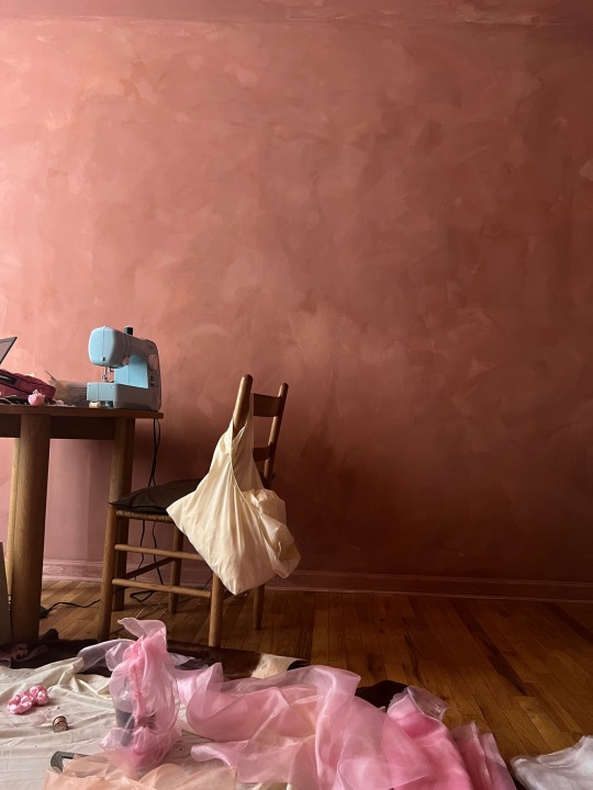
Xoxo
2 notes
·
View notes
Photo
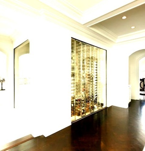
Expansive - Modern Wine Cellar Large modern wine cellar with a marble floor and display racks
#wine cellar#miami wine storage#nyc wine cellar#modern wine cellar#nyc design#contemporary design#clean lines
3 notes
·
View notes
Photo
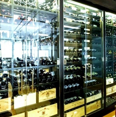
New York Wine Cellar Large An illustration of a sizable transitional wine cellar with racks for display
#custom made wine cabinet#custom wine storage#ny design#joseph and curtis#custom-made#wine cellar#nyc design
0 notes
Photo
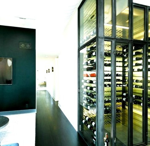
Medium Wine Cellar Wine cellar - mid-sized modern slate floor wine cellar idea with display racks
#contemporary design#modern#metal and glass#nyc design#modern wine storage#peg system#modern wine cellar
0 notes
Photo

Medium Wine Cellar Wine cellar - mid-sized modern slate floor wine cellar idea with display racks
#contemporary design#modern#metal and glass#nyc design#modern wine storage#peg system#modern wine cellar
0 notes
Photo

Modern Wine Cellar New York Wine cellar - huge modern marble floor wine cellar idea with display racks
#miami wine room#miami wine cellar#modern wine cabinet#modern wine cellar#miami wine storage#nyc design#nyc wine cellar
0 notes
Text
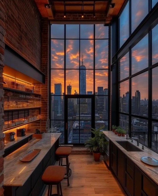
#NYC#New York#New York City#apartment#luxury apartment#Kitchen#city life#cityscape#skyline#downtown#Luxury#luxury life#luxury living#aesthetic#decor#home decor#lifestyle#lifestyle blog#photography#home & lifestyle#architecture#classy#classy life#home#interiors#home interiors#interior design#Sunset
2K notes
·
View notes
Text
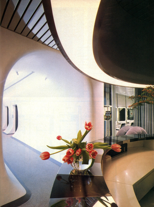
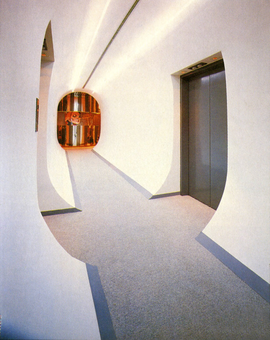
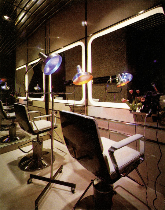
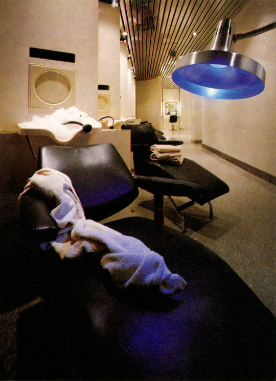
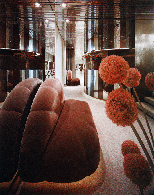
'Space-Age Salon' - the Gerard Bollei Salon in the Galleria Building - Manhattan, NYC (1978)
An excellent example of the 1960s-1970s sleek futurism that would later be revived in Y2K Futurism in the 90s-2000s.
Designed by Allan Hagelthorn and Larry Barcher
Scanned from the Dec. 1978 issue of Interior Design Magazine
#design#interior design#interiors#architecture#colorful#my scans#1970s#70s#space age#salon#hair salon#futuristic#sleek#nyc
806 notes
·
View notes
Text
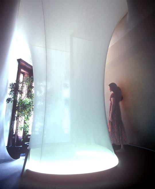
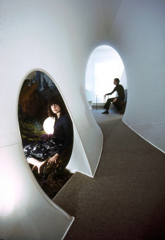
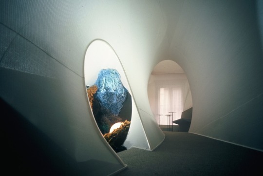
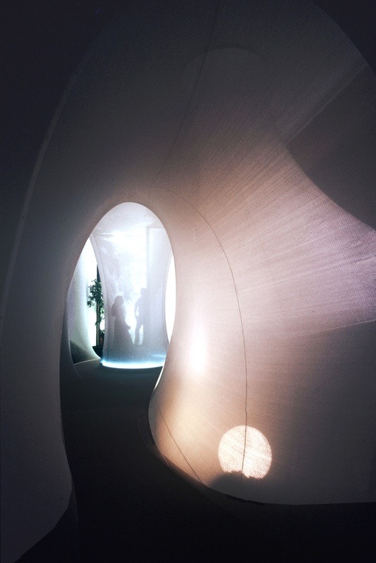
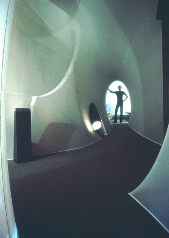
Aleksandra Kasuba: The Live-In Environment (1971)
The intent was to abolish the 90 degree angle and introduce a variety of spatial experiences without imitating nature. The environment was built in the artist's studio in a brownstone in New York City.
#Aleksandra Kasuba#The Live-In Environment#art#design#interior design#architecture#futurism#new york city#nyc#1971
1K notes
·
View notes
Text
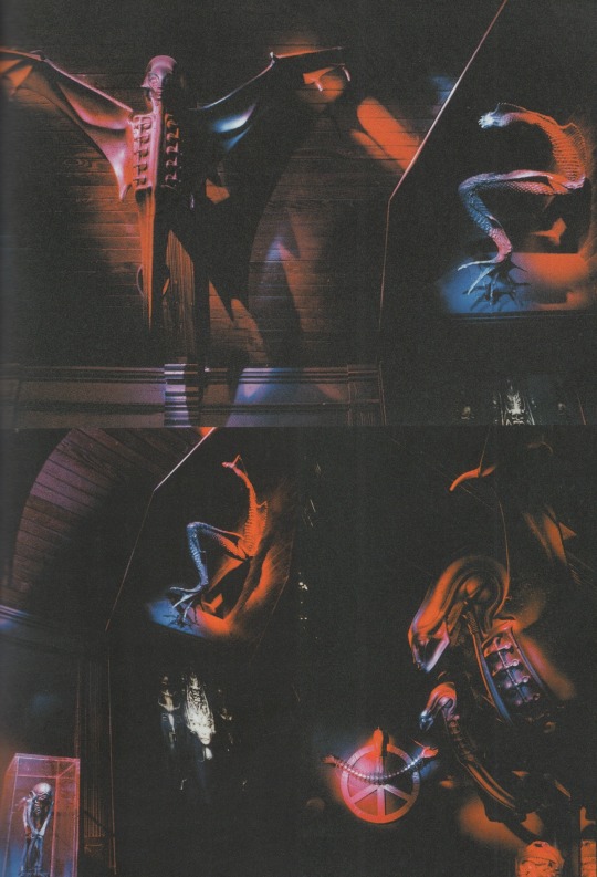
H.R. Giger vip-lounge room, 'limelight club' in nyc 1999-2002 ph. marc adrian villas from hr giger icons (2002)
1K notes
·
View notes
Text


daredevil - the mouse without fear!!!
#more old ass art but I still like these so I’m tagging them#daredevil#matt murdock#or should I say. Mouse Murdock. haha. lol.#anyways yeah the designs based off that one Howard the duck issue where he was a human and everyone else in nyc is an animal#fun fact: I made these into pins and they are sitting very comfortably in my ita bag🥰🥰#my art
154 notes
·
View notes
Text
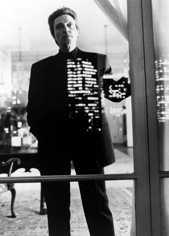
Frank White admiring the Manhattan architecture
106 notes
·
View notes
Text
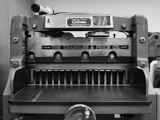
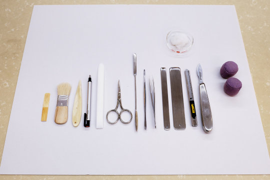
Inside the book conservation lab at the Metropolitan Museum of Art
Photos by Nicholas Calcott / New York Times
#things organized neatly#book making#books#conservation#history#museums#Metropolitan Museum#The Met#NYC#NYTimes#New York#Craftsman#Art#History#Flat lay#knolling#design#creative#graphic art#print
281 notes
·
View notes
Text
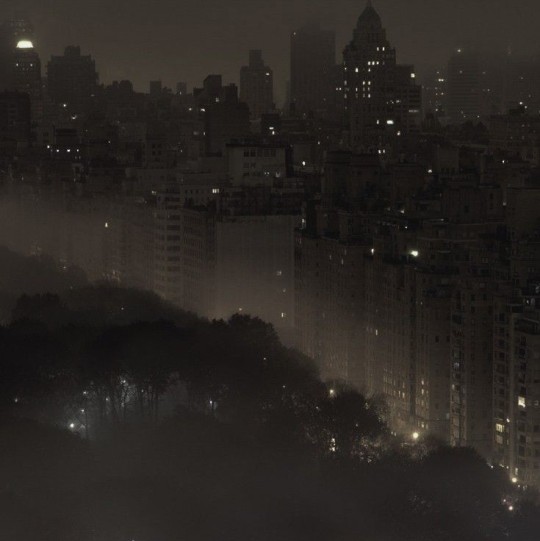
*✧・゚
#coquette#blogger#designer#aesthetic#fashion#lilyrosedepp#chanel#high fashion#designer fashion#inked#lana del ray#nyc#new york#new york city#goth#gothic#grunge#cozy#dark acamedia
128 notes
·
View notes
Text

Phoebe Wilkinson, Soloman, 2025
#photography#fine art#surrealism#expressionism#abstract#abstract photography#photooftheday#artists on tumblr#female photographers#my photography#photographers on tumblr#original photography on tumblr#original photographers#architecture#black and white#b&w#b&w photography#surrealist photography#surreal#guggenheim#new york#new york city#nyc#manhattan#shot on iphone#modernism#organic architecture#organic design#black and white photography#photo
106 notes
·
View notes
Text
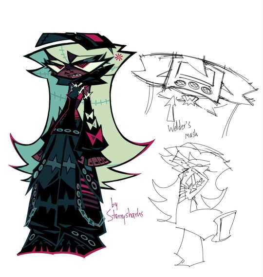
winter assassin outfit
#zeno's art#ocs#reassassination#octavia krankenstein#oh i got a LOT to say about this one#in the comic octavia starts wearing this outfit after a certain event i think n its very symbolic#it represents mainly how her personality has changed as well as her relationship with kranken and humanity as a whole#lets do it top to bottom. FIRSTLY the mask that replaces her goggles that she wore in the “summer” outfit#the mask represents several things. firstly that octavia's relationship with kranken improved#i think the mask itself is probably kranken's and octavia uses it. showing that they've become closer#and ALSO even using a mask to hide her identity while working is in line with kranken's ideas of clothing being practical rather than flashy#(see her first outfit was originally really frumpy and practical before she DIY'd it into the minidress type thing)#anyway. the hoodie is supposed to harken more to an executioner showing octavia is more used to her job#the hoodie has eyelets which are circles. the fact that there are way more circles in the design shows that she becomes less cold#and more assimilated into human society#the gloves however are a sign of her persistent rebellion as they're fingerless and impractical lol#the pants are based off of tripp nyc's design. which was popular with mallgoths in the 90s/00s#it shows octavia's own personality and interests and of course has two hidden sets of 6's through the eyelets#lastly her shoes resemble skulls. that one's just for fun#while her first outfit completely represented rebellion i like to think this one bridges the gap between rebellion and octavia settling down#and becoming more familiar with those around her#this is only the first pass so i'll prob incorporate more red into the outfit before it's finalised#octavia isn't the only one who changes either! i want like ~3 changes for almost everyone
279 notes
·
View notes