Blog for Digital Art class. Exercises, sketches, inspiration, brainstorming, and finished projects.
Don't wanna be here? Send us removal request.
Text

This is a not-at-all planned out, very random illustration from an exercise we did to try out some of the built-in brush strokes for Adobe Illustrator.
I'm glad we did this because there is so much potential in this feature. There are also so many brush strokes that can be downloaded or created.
1 note
·
View note
Text
Finished Mask (pending feedback edits)


Gravitational collapse of gas clouds.

Protostars (it's funny that these look pixelated after using the feather and blur effects)

Average star and red giant (longer life)

Massive star and red supergiant (shorter life)

Explodes into nebula

Explodes into supernova

Recycled into gas clouds to restart the cycle, with some parts going to death remnants (such as white dwarf, neutron star, black hole).
I need to write a piece on the meaning and purpose of the mask, but I wanted to show the details in this post.

Black and white version.
1 note
·
View note
Text
Nested clipping masks

For the overlapping shapes, I made clipping masks within a clipping mask.
The pink line is the initial clipping mask, and the circle clipping masks are within them.
This wasn't so necessary for the color version, but for the black and white version, I needed the blended shape to stretch past the edges.


What is seen through circle clipping mask window vs. the blended "target" shape that is underneath.
1 note
·
View note
Text
Making galaxy effects in Illustrator

Creating "galaxy" effects (nebula, supernovas, etc) took a lot more trial and error than I expected.
I just could not get it to "look right" using JUST the gradient stop points (with different opacities). BUT, in the end I got it to look how I wanted by layering some see-through / gradient spirals in different colors, adding the see-through "tie-dye" looking cloud on top, adding some shine points, and blurring it.

This is the dissected version (showing the different layers).

This is how it looked in the end all put together and on the background.

These are some of the spirals I experimented with using the Twist Tool. There were a LOT of different ways a twisted shape could turn out depending on what you start with, where you click, and how long you hold down the tool.

This is a closeup of the supernova cloud colors I did ("tie dye").

This is how it looked on the background, with "shine" added (on top of and behind) and the "bursting" shine from the Flare Tool. I also used the "blur" effect.

This is the breakdown of the gradient I did for one of the stellar nebula clouds.

How it looked in context.

Not fantastic looking on the white background with no shine points, but...

With the background and shine it looked a lot better.
1 note
·
View note
Text
Making "stars" for my galaxy effects

I looked at this tutorial to learn how to make "stars". The above picture is an expansion of the gradient settings to show a little better how I did it.
I started with a circle and added a radial gradient. The white-ish color is on the far left, and the left white-ish color stop is invisible (0% opacity).
I did a lot of different versions of this star. You can change how far the "shine" goes by stretching the shape bigger, and/or by moving the little diamond icon.
If you set the first color stop to a lesser opacity (like 80% or 50% or 30%, etc) you can get less of a defined center "point" and make it more like just a general "glow".
1 note
·
View note
Text
Polarized gradient

I was really proud of how the "polarized" gradient turned out.
I used 9 different colors, all picked from an actual image, and then experimented with different spacing to get this effect.
I realized that I would need to stretch the gradient past the edges of the mask shape (in order to make it oval).

I also did this (stretched the gradient past the edges) to achieve this "cropped ball" look for this little protostar.
The gradient is "radial" (circular) but the shape is a flattened oval.
The center of the gradient (the beige-like color) is near the edge of the oval so some of it gets cut off. The "fades to nothing" / shine effect is achieved by making the last color stop 0% opacity.

1 note
·
View note
Text
This is a video demo of how the clipping mask "window" worked.
I made a "star" / "shine" (which was just a blend from white to black, but with black set to 0% opacity) and moved it around within the clipping mask to show how it didn't go past the edges.
1 note
·
View note
Text
Infinity symbol design

While designing my infinity symbol I ended up using the Line Thickness Tool. The above image is what it looked like as a single curve.

To get the look I wanted, I had to split the shape into two parts so that the middle was thick and the ends were thin.

This is the end result of my isolated "infinity symbol". I first converted my paths into shapes (Object > Shape > Convert to Shape).
I ended up making one side bigger than the other to represent that those classes of stars have much longer lifespans.
The fill color is the same gradient that I used for the mask, you just can't see most of the colors because of where blended it.
To get the effect of stars that don't shine past the edges, I made a clipping mask, so that only the shine part that is in the "window" can be seen (and everything else gets cropped).
1 note
·
View note
Text
B&W Version

After deciding to go with the polarized face cover design, I used the Blend Tool/Effect (at the suggestion of the professor) to try and give the illusion of curve in B&W.

Blending from the mask shape to a circular center shape got some interesting results 🤔


I experimented with the blend tool and the different settings a LOT. Using different fill colors, line thicknesses, irregular lines, "steps" (in settings), and so on, for both the "inner" and the "outer" shapes, to try and get the look I was going for.
The above cone-like shape is an example where both the inner and outer shapes had a black stroke with white fill. The inner (small) shape had a thin stroke and the outer (large) circle had a thicker stroke.

This "slinky-like" effect is with no fill colors for top or bottom shapes.

I loved the interesting effects using irregular "lines" (shapes), but ended up using geometric ones.

This is what my artboards looked like while trying some different things.

Eventually I figured out that in order to get a realistic look, my round blends would need to be OVAL rather than circular, and they'd need to "go past" the border of the mask.
I did this by creating a clipping mask that was the shape of the "window" I wanted viewable of the oval blend I created.

These are some of my artboards after using the clipping maske window.
1 note
·
View note
Text
Mask project ideas
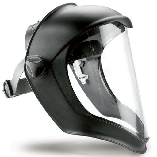
These helmet-type masks could be a cool concept
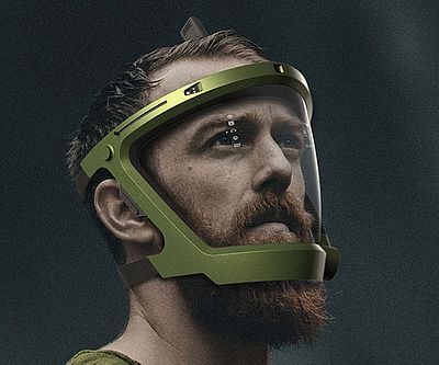
SciFi vibes
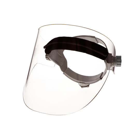
Open shield-like design
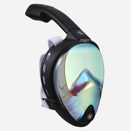
Snorkeling mask (I like the shape)

Hooded protective mask astronaut vibes

The color gradient for these full-face sunglasses is awesome
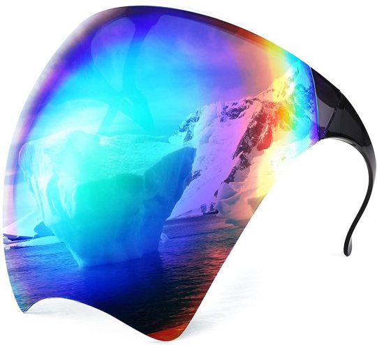
Polarized rainbow (link)
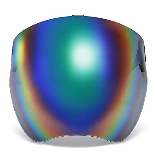
I ended up settling on this type of design (link) because I loved the colors and wanted to experiment with a radial gradient.
0 notes
Text
I just wanted to save a screen record of me doing part of this Adobe Illustrator tutorial so I remember it.
If I had to make that road I probably would've taken a WAY longer route doing it by hand, I'm glad these tools exists.
Link to file and instructions
0 notes
Text
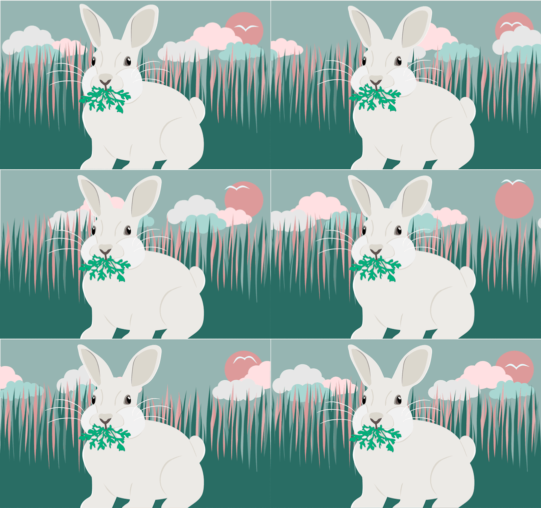
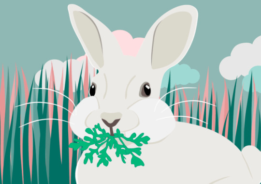
This is my final gif for my 1st project. The concept was simple, but the execution ended up being more time-consuming than it needed to be.
My idea was to do a sort of "ebb and flow" system, where the frames for an object would go, like,
1 > 2 > 3 > 4 > 5 > 4 > 3 > 2 > 1 > 2 > 3 ...
This was for the rabbit (chewing) and the grass (swaying), each going through several cycles. I also added some pauses and irregularities (ex: 4 > 5 > 5 > 5 > 4...) to make it less robotic.
For the other clouds (moving across the sky), there was only one "cycle".
Clouds
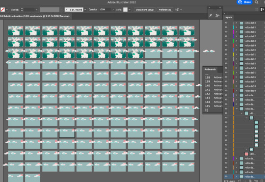
The concept of the clouds was simple enough: copy, paste, move the clouds a few clicks over, repeat. But,
Parts of the clouds overlapped into the other artboards with each copy and paste, which got cluttered and confusing to trim.
I ended up moving the clouds far too gradually (10 "left arrow clicks" per frame) and this resulted in more artboards than Illustrator could handle (and too long of a gif). I ended up having to start over and go twice as fast.
So while cloud movement in concept was simple, in practice it wasn't ideal for this format (Illustrator isn't an animation program after all).
Bird
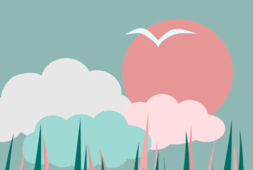
The bird was amusingly complicated as well. The bird actually combined both concepts: the ebb and flow (1 > 2 > 3...) for the flapping wings, and the single cycle (making a loop back to its original spot) for its position in the sky.
I had to redo and start this one over a few times.
Organizing
Once I got to the bird, it had all gotten a bit confusing with the several different elements all on their own irregular ebb and flow cycles. I ended up having to write out a frame by frame planner to see which step of the cycle each part (rabbit, grass, bird) would be on for each frame.
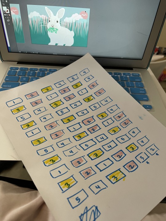
This is the one for the bird's wing position I made after I kept messing it up.
What I learned
I learned a lot of useful tools during this project, especially the search and find functions, the puppet warp tool, how to rearrange artboards, how to keep layers organized on duplicated artboards, and how to paste in place.
What I'm proud of
I'm proud of how much more comfortable I got in customizing my workspace and navigating my way around the locations of tools, settings, windows, and shortcuts. I also like the general aesthetic I narrowed down on as far as colors and mood of the piece.
What I'd do differently
As described earlier in this post, I ran into a lot of trouble from not having things really planned out beforehand. I wish I would have written out an actual outline so I wouldn't have spent so much time on trial and error.
Overall, this was a fun project (that I finished last Monday but didn't upload until now). For some reason, my brain was not functioning for the "writing up informative captions about the learning process" part and so I had been grinding at work for my other classes and life responsibilities while feeling a complete block for finishing up the final details (uploading and writing about) for this one. 😞
0 notes
Text
I worked on my animation a bit more tonight. After I figured out how to select all objects of the same color, I tweaked my color palette a bit. My initial concept was a lot lighter and then my second palette had a darker background (trying to make the rabbit contrast more) but this color palette is in-between)
To automatically select all objects on an artboard that have the same fill, select one object with that color, then go to
Select > Same > Fill color
I also figured out a pretty good workflow for gradually moving the grass in the background.
0 notes
Text
Kinda awkward scrolling back and forth between the frames I’ve made so far. Not much movement yet but I’m going to add some more and try and make it more organic (some things moving quickly, some more slowly, a bit of unevenness in the timing, etc).
0 notes


