#Mount Eerie - Huge Fire
Explore tagged Tumblr posts
Text
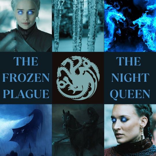
The Night Queen and the Frozen Plague.
I had to do a wee bit of tinkering to the GoT lore, namely that the White Walkers can speak beyond those eerie death cries we all know and love. But here, as promised, mostly for my Sharkie, some Brynhild and Heavenerys!
The sound of his roar fractured the still of the air, the great army of the dead all halting at their queen’s command, Brynhild looking to the sky.
“Southern enemies, my queen,” hissed Craxor, her general. Half skeleton, half rotting flesh, turning his sunken face skyward as he viewed the beast who cast a shadow over the frozen wasteland.
“Not enemies,” she whispered, her glowing, azure eyes picking out the dragon circling overhead, through the thick of the snow clouds. ”Heavenerys Targaryen and her dragon. At last, she has heard my call. She has come home.”
The curse of the cold had come to pass, the first-born, pure-blooded child of King Amarys Targaryen blighted by it, as she surely would be. An ill-advised trip north of the wall had led to the ancestral curse landing squarely upon the child, Havenerys born with the mark of the dead. One look into her piercing eyes, and Amarys had seen it, his soul filled with dread.
Therein born to him and his queen, was the downfall of man. The Night Queen would call for her one day, and his precious girl would answer.
Kairaxès began his descent from the sky, the snow swirling in tempestuous storms beneath the whoosh of his huge, white wings, shaking the ground he landed upon. The army waited, thousands of wights in amongst a battalion of white walkers, all standing poised. Dead men lain to waste, with no other purpose than to serve their immortal queen.
Brynhild moved on her tattered, giant black steed, the haggard creature propelled forward on shattered fetlocks, ribbons of decayed flesh floating hauntingly in the breeze. Only she advanced, her army waiting, Heavenerys taking them all in as she dismounted and climbed down to the floor, stroking her dragon’s face.
“All is well, my beautiful beast,” she spoke at his warning rattles. “They are unlike all we know, but they pose us no harm.” She wasn’t too sure why it was that she intrinsically knew that, but she did. She felt it on a level much deeper than the very last roots of her soul.
The Night Queen slowed her mount, bringing him to a stop and jumping down to her feet, walking the remaining way to where the Targaryen stood.
“Welcome to the northern wastes,” Brynhild stated, her voice like a whispered death rattle, sending a slight chill through Heavenerys. She was beyond other worldly, the power radiating from her unlike anything she had ever felt. She watched the ancient queen spear her long, white lance into the frozen ground beneath her feet, eyeing her with the same curiosity. She was all Brynhild had foreseen she would be.
“I felt I had to come to you, but I do not know why,” she spoke, her sharp, angular face set, staring as the queen slowly approached.
“You know exactly why, Heavenerys. For justice. For revenge.” The fire of recognition danced in her eyes, the young Targaryen finally feeling heard by somebody. “To wrong those who have wronged you. Amos. Aerthurys. To rain fire and ice upon your enemies, to all those who have harmed you. I believe they call it Valar Morghulis in your mother tongue.”
Heavenerys nodded, yet her face still questioned. “But why was it, that I felt you call out to me? Why was it you, here in a land where I do not belong?”
“From me you came, and to me you return, child.”
At those words, she felt her blood chill to freeze. “I am not a child.”
Brynhild lifted her chin. “When I am older than time itself, you are very much a child.” She felt it in the air, the waves of cold, foreboding magic, magic not to make an impact. “And your sorcery cannot charm me. Save that. It has its place, it’s intended use.”
“I cannot if you intend to make me like them,” she spoke, her finger pointing out to the white walkers, Brynhild turning to view her generals.
“No, which is why I do not intend to. You returning to me was always for a purpose beyond your own. I need you, to make a pathway for us. For my army. For our army. Only with you can I break down the wall and march on Westeros.”
Many summers and winters would pass, before the final dreadful cold of great north arrived. On that day, Heavenerys flew the great Kairaxès back across the wall, his frozen flames decimating the fortitude, his rider’s magic breaking it further.
Together, the Frozen Plague and the Night Queen brought their army forth into Westeros.
Winter is here.
Valar Marghulis.
@call-sign-shark @wonderlanddreamer @justrainandcoffee @cillmequick @novashelby
17 notes
·
View notes
Text
my fav releases of 2023:
realyungphil & gud - victory music
realyungphil & gud - make moves not excuses
realyungphil & boofpaxkmooky - sonder freestyle
7038634357 - neo seven
död mark - död mark 4evigt
ML buch - suntub
earl swearshirt & the alchemist - voir dre
earl sweatshirt - making the band (danity kane)
bar italia - tracey denim
baba stiltz - paid testimony
ichiko aoba - meringue doll
ouri - blueprints of us (prod. oli XL ❤️)
arthur russell - picture of bunny rabbit
laetitia sadier - une autre attente
melody english - the web
björk & rosalía - oral
YS - brutal flowers
dijon - coogie
peso pluma, jasiel nuñez & junior h - bipolar
peso pluma - génesis
junior h & peso pluma - el azul
becky G & peso pluma - chanel
the-dream - stream (V7 demo archive 9.20)
tujiko noriko - crépuscule I & II
sampha - spirit 2.0
PLO man - anonymousmaterial
ESP - amber sun
tinashe - talk to me nice
kode9 & burial - infirmary / unknown summer
astra king - make me cry
tainy - data
osipenko bus stop - corner wax volume 2
lil uzi vert - pink tape
king krule - space heavy
mammo - variable / plate
CoA-A - the end of nduja
2301 - untitled
aphex twin - blackbox life recorder 21f / in a room7 f760
nation & ecco2k - ça va
ingrate - a melody inside
monolake - hongkong (2023 remaster)
vladislav delay - entain (2023 remaster)
holly waxwing - the new pastoral
joanne robertson - blue car
tammo hesselink - beam
tammo hesselink - paint reduce trick
tammo hesselink - sewei
tammo hesselink - work work work
yaeji - with a hammer
pinkpantheress - heaven knows
DJ babatr - las lomas / fuma con los panas + remixes
DJ babatr & arca - mek3fe
bad gyal, tokischa & young miko - chulo pt.2
teruyuki kurihara - parallel
james k & hoodie - 065 (scorpio)
special guest DJ - panoramic deep love story
agilität - unique / untradeable
chuquimamani-condori - DJ E
rabit - tears (elysia’s edit)
jorg kuning - BH007
instupendo & ripsquad - kissout
juno R13 - existens miserabel R13 edit
bambinodj - high as ever still passin’ through (remix)
colleen - le jour et la nuit du réel
kelela - raven
airhead - lightness
juanito - cumbias & reggaetones
DJ manny - control EP
mount eerie - huge fire
cousin - homesoon
15 notes
·
View notes
Text
CONTRAST
Chapter 2: Impulse
If there was anything that made life worth living, this was it. The weightlessness, the whipping of his hair as the wind lashed through it, the rush across his skin as his fur was lifted; Jori grinned stupidly as it all culminated into the same sense of freedom and indomitability.
Here, as he plummeted through the sky, he could be himself. No rules or unrealistic expectations, just Jori.
Even with the roar in his ears, he detected a shift in the air above him as Rauru angled himself into a dive. As he drew up alongside him, Jori flashed him a fanged grin.
“Getting pretty ballsy in your old age, aren't you?!”
Rauru smirked.”Perhaps I've been spending too much time around bad influences!” And as if to prove a point, he rolled forward and onto his back before righting himself in a grand somersault. Jori rolled his eyes.
“I may be a bad influence but I'm not stupid.”
Rauru’s laughter in his ear, Jori’s eyes scanned the terrain, or lack thereof, below them, and settled upon a scarlet beacon spinning around in a huge arena, mounted upon what appeared to be a rectangular spire composed of different cubes. He bore his teeth in a wicked grin.
“Reckless. Not stupid.”
It would have been wiser to have done so prior to leaping, but Jori had never been known for his wisdom. A pouch at his waist held a large sheet of cloth, and he retrieved it. He spread his limbs horizontally to slow his descent, then deployed the cloth. It cracked open thunderously and tugged his arms, but he was accustomed to the sensation and it faded quickly.
Above the arena there was a small island covered in vegetation and little else. He landed there, and flicked his ears as he heard Rauru land beside him.
“You cannot be serious.”
“Damn right I am.” He crouched over the ledge, studying the spinning beacon. It seemed oblivious to their landing.
“Jori,” Rauru stressed again. “It’s not a good idea and we both know it. Those are enough to give career soldiers trouble.”
“Those career soldiers aren’t you and I.” Jori said, flashing a fanged grin. “Besides, I’m tired of Naydra always singling us out. Seems like a good way to ruffle her feathers for a few days.”
“I know your tribe and hers haven't been on the best of terms lately, but that isn’t worth getting yourself killed over.”
“Will you relax? We’ll be fine.”
Rauru sighed and rubbed his face. “I still have a bad feeling about–Jori!”
Jori had already jumped.
He angled his body and banked to the right, the round arena yawning beneath him. Rauru shouted in further protest, but Jori was no longer listening as he extended his arm. He aimed for the spinning head of the spire as soon as it came within reach. A tendril of eerie green light connected his arm to the cube, and gritted his teeth as he dragged it away from its matrix. The blaring of the machine’s alarm filled their ears as Jori brought the cube towards himself, then latched onto it when it fell back towards its owner.
He could barely hear Rauru's pleading as the construct awakened, and began to reform itself from a spire into a huge hominid golem composed of shifting cubes, and brought him along for the ride. A shock fired up his legs when he fell from the machine’s head and landed in the arena. Perhaps that had not been his wisest move, but it felt great as he grabbed another cube from the matrix and, growling from the effort, tossed it aside. These cubes were heavier than he had imagined them to be.
By now Rauru had closed the gap between the islands and opened his sail cloth. He touched down across the arena with considerably more grace.
“Jori!” he cried, but his friend was too engaged to pay him any mind. Rauru threw up his arm, which glowed in the same green light as Jori’s, and caught a cube as it nearly struck him. He staggered from the weight of it. His hold upon it failed when the construct recalled it, and it knocked him forward onto his knees. He scanned the area in a frenzy for something, anything, to use. His eyes fell upon a weapon shed, and with a growl he pushed himself up and ran for it.
Jori, meanwhile, rolled away from the construct’s fist as it slammed into the floor, making the stone under his paws shudder. He caught sight of Rauru across the way, but he was forced to dodge as the construct launched a cube at him. His eyes darted from piece to piece as the heavy cubes slammed into the ground again, knocking him off balance. Then they rose and reformed into a massive singular cube, which proceeded to roll across the arena towards him, the ground shuddering with each movement. The soldiers made this look easy! How had they done it again? Then he remembered the one cube with visible gears in it. He remembered seeing his father’s soldiers attack it, but how to–?
Finally he spotted it, the flash of green within the coordinated chaos. He had to dodge another earthquake of an attack, but he jutted out his arm again and it glowed as he tried to grab the heart. The programming in this machine was not a fool, however, and just when Jori thought he had caught it, the construct shifted its heart with another cube in the matrix. He tried again, then yelped as another fist slammed into the stone close enough to pelt him with shards of stone.
Okay, this was stupid, and he had dragged Rauru into it. They had to get out of here, somehow. But where would they go? This was the last island before the gaping void between them and the surface. He pinned his ears back and bristled as the reality of their situation set in.
Rauru scrambled into the shed, head swinging back and forth with such rapidity that it made him dizzy. He found an array of weapons, all bearing the snowflake insignia of Naydra’s water tribe, neatly arranged in perfectly balanced rows. He felt the ground rumble under his paws in a manner that suggested huge heavy footsteps. Jori was skilled but he would not last much longer out there. Think, Rauru, think!
He saw then a rack of brassy sword hilts, each ornamented in a variety of styles and stones. To the outsider they would just look like bladeless handles, but he grabbed one anyway, just as he heard a shriek that sounded eerily like his friend. He raced out of the shed and saw Jori’s red pelt in the distance as he held his arm. Rauru did not have time to think as he saw the construct’s heart shift positions within its body again. He lashed out his arm and managed to catch the machine by surprise.
The effort to yank it from the machine made him ache, but the magnetic field collapsed and he finally brought the heart into range. Responding to his touch the brassy hilt in his hand erupted into life, projecting forth a complex of glowing white lines, pure energy crafted into dazzling brilliance in the deepening gloom of the night. He brought it to bear against the heart, striking at it furiously while he could.
The machine wailed in anguish, and pulled its assorted parts away to the opposite end of the arena. It would not take long for it to regroup, but Rauru took that time to cross the distance between Jori and himself.
Jori panted as the machine began to reassemble. Then, somehow over the rush of his own pulse heard someone come to his side and was more than a little relieved to see Rauru there, the brassy orange hilt of a mighty zonaite sword in his hand and the ethereal glow of its blade illuminating his concern in the dark.
Jori did not have the time to apologize, however. The construct had resumed its assault with vigor. Despite the bruising up and down his arm and his side from the stone shards, he reached for the twin whips at his waist, and let them fly as Rauru grabbed the construct’s weakness again, growling from the effort. Their combined attacks had the mighty machine whining in its electronic way, but it was Rauru who ended it. He leapt through the air and brought the full might of the blade to bear upon the glowing cube. The construct screeched and recoiled, quivering and gathering its parts together into a cluster at the center of the arena.
The youths hesitantly shared a nervous laugh, but as Jori opened his mouth to speak the wind was ripped from his lungs. No longer able to maintain its magnetism, the construct had imploded and the resulting shockwave knocked the young zonai asunder.
Rauru managed to catch himself as he slid across the ground. Jori, his legs still in shock from the rough landing earlier, yelped when they collapsed under him. His cheek smacked against the stone, then his gut jumped into his throat as he tumbled over the island’s edge. Claws dug into his arm, however, and his shoulder popped as he was jerked to a stop. Jori looked up, panting, to see Rauru dangling from the edge. His shaking grasp was the only thing between Jori and the void.
“Don't. Move.” Rauru grunted. Jori was only too happy to comply. Every joint and muscle in his arm shrieked in agony, but he trusted his friend. Rauru adjusted himself, and Jori slowly looked down. Indeed, no more islands were left between himself and the unforgiving surface so far below. His eyes widened as he took it all in; every valley and mountain, field and forest, none of which promised a soft landing nor mercy for the fool who would fall.
Rauru growled, but before long had dragged himself and Jori back onto the island. They both sat there, breathless and silent as they processed the reality of what had nearly just happened. For once, Jori could not find any words to say, and instead just looked at his friend, his savior, with a tangled cocktail of gratitude, fear, and undying appreciation. Rauru seemed to understand, however, and gently clapped Jori on the shoulder before he flopped onto his back, eyes closed.
It was in that moment that the adrenaline faded and Jori fully realized how much he hurt, head to toe. He also laid down with a groan, but his mind flashed back to what he had seen of the surface. He grunted and rolled onto his stomach, daring to peer over the ledge. His injured cheek and brow had swollen, which hindered his sight, but he still stared in awe.
“I've never seen it this close before.” He mused aloud.
Rauru opened an eye to see him, and joined him, Jori unable to year his gaze away from the world below.
“It's… Definitely something.” He agreed. Rauru folded his arms and rested his chin upon them. “I often wonder what it would be like down there.”
Jori let out a sigh of relief and finally composed himself. He inched back from the ledge. “Dunno,” he huffed as he sat up. “Not sure how I'd feel living around people who think I'm a god. On one hand it sounds like fun, but on the other it sounds exhausting.” He frowned. “Already have enough expectations to deal with.”
He winced and rubbed his swollen face. Rauru's ears twitched, then he raised his hand to the injury. Soft, golden light passed between them, and Jori, too tired to decline, let his eyes close and ears relax as the pain slowly melted away. He rubbed his face again once Rauru was through, and muttered a soft thank you.
His friend smiled, albeit tiredly.
“It's alright.”
Jori sighed and shifted his gaze upwards. The islands overhead seemed so far away in the dark.
“So, what now?”
Rauru chuckled and leaned back upon his palms. “Don't know. Wait, I suppose. We stirred up quite the ruckus. I'm sure someone’s noticed it.”
Jori chuckled humorlessly. “Sorry about that. Seemed like a good idea at the time.”
Rauru answered him with a smirk. “Isn't the first time we've done something stupid. Won't be the last. Besides, it was fun. Just a bit more than we were expecting, I think.”
“Tell me about it.”
Rauru’s amusement became laughter.” To be fair, we did bring down a Class Three Flux Construct. Alone. I'm sure that has to account for something.” He pinned his ears back and gave Jori an evil grin. “Might even impress Aysu.”
Despite the ache in his ribs Jori burst into laughter. “More likely give her another reason to growl at me. Tell you what, though: I'm going to marry her someday. I swear it.”
Rauru beamed at him. “I have no doubt.”
He looked up then as a few flying devices came into view, their lights cutting across a now pitch black sky.
No further words were exchanged between them as various authority figures touched down in the arena and herded the youths aboard one machine or another. Rauru looked over his shoulder sadly, his sister's stern lecture falling upon deaf ears as he watched Jori curl up near the tail of the machine he was on, berated all the while by his ancient governess. Rauru had not met Jori's father, but he knew that the shadow tribe’s King Haxion was gruff and strict, almost to the point that Rauru was glad he did not have one. He cringed to think of the reprimand that awaited his friend at home.
Rauru watched until Jori was out of sight, then sighed and set his eyes forward. “Good luck,” he muttered.
**************
Prev | Next | All
@ok-seventhsage
1 note
·
View note
Text
29. Mount Eerie | Night Palace
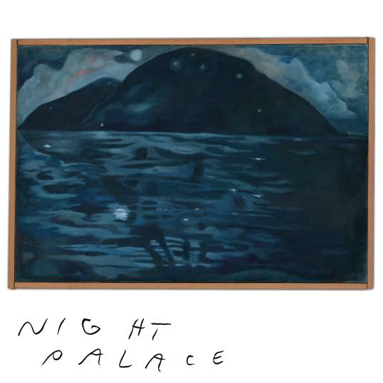
🇺🇸 Etats-Unis | P.W. Elverum & Sun | 81 minutes | 26 morceaux
La précédente manifestation discographique de Phil Elverum, en 2020, avait suscité un merveilleux vertige chez les fans de la première heure du projet The Microphones (après 17 ans de pause). L’artiste regagne dès le coup suivant son véhicule le plus contemporain, Mount Eerie, même si on peut considérer au fond que les deux entités alimentent une œuvre commune. Album-fleuve de 26 morceaux (quand son prédécesseur consistait en une piste unique de 45 minutes), Night Palace est une expérience musicale à la fois chaotique et contemplative, faite de crescendos impétueux et d’accalmies introspectives. Mêlant le sens de l’absurde à celui de la poésie, la quête existentielle qui se joue sous nos oreilles captive par son foisonnement et ses chemins inattendus.
🎧 Huge Fire

0 notes
Text
Mount Eerie Cover
1 note
·
View note
Text
Mount Eerie - Night Palace
Sounds like the thing he does. That’s a compliment. 10/10
0 notes
Text
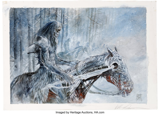
VIA: HERITAGE AUCTIONS:
William Simpson - Game of Thrones "The White Walker's Advance on Winterfell" Concept Painting with Bonus Painting on Back Original Art (HBO Entertainment, 2013). One of the Night King's army of transformed White Walkers (created by the Children of the Forest by pressing dragonglass daggers into their chests) passes by, leading his zombie horse to the "Last Big Battle in the North" at Winterfell in this eerie Season 8 concept painting by Northern Irish artist Will Simpson. That big Ice Knife in the White Walker's hand, plus the ghost-like line of other mounted White Walkers in the frosty distance makes for an exceptional (and somewhat scary) piece of original Game of Thrones artwork. William Simpson first gained fame illustrating comic books, most notably Hellblazer before moving to storyboard work in films such as Reign of Fire and City of Ember. This monstrous masterpiece is painted in gouache on a 22" x 15.5" sheet of illustration board, with an approximate image area of 19.5" x 13.75". The art is signed twice on front, once in Simpson's stylized initials and again as a full signature in graphite along the lower right bottom margin. He also hand-signed his notes written on the backside of the artboard, which includes a surprise bonus - a second small graphite concept painting for another now-forgotten project ("possibly the potential pirate film in India" notes Simpson), with Chinese junks passing a huge, seated figure carved into a cliff with armed soldiers along the shoreline. The gouache/watercolor painting measures 14.5" x 8" and is very impressive; the winner of this great piece should consider framing the art with a clear acetate back to showcase both images! Overall artboard condition is Very Good with minor handling and edge wear. From the Game of Thrones and Film Storyboard Artist William Simpson Collection.
0 notes
Text
FINAL EDITORIAL PROJECT: PART 1
The article I chose: https://www.thefader.com/2024/10/31/mount-eeries-impermanent-eternities
Why did I chose this article? Because I'm a fan of Phil Elverum and his music which inspires much of my visual art, along with some of my other favourite bands/artists. I take inspiration from music in my illustrations as much as visual arts, and I like looking into how artists think, their processes, and how the interpret the world. Usually I find what they have to say about their art much more insightful than the art itself, their perspective is invaluable. This article is relevant to Phil's latest album "Night Palace" under one of his many monikers "Mount Eerie", but in the interview he talks about his wider philosophy around nature which is relevant to all of his music.
Keywords/phrases/Visual Cues:
Nature, remoteness, loss, poetic, fire, lightning, wind, fog, nature fetishisation, motherhood, connection between the mundane and the infinite, metaphorical, signifies more than a toothbrush (referring to one of his songs, something signifying more than what it is), mysticism, Impermanence, portal opens to another dimension, air organ (an instrument which produces drone sounds), bonfire, mountains, trees, nature representing ambiguous ideas, acceptance of him using nature as a symbol a lot, washing dishes in the night after putting the kid to bed and looking out the window at the world and burning with internal lighting with magic and fire, huge fire, forest, overgrown, pitting fire against water, and the water is the lesser of the two, eternal glow, eternity of nature as opposed to the impermanence of human life, air organ (what he's describing is a hand pumped harmonium), Crows (in reference to his older album "a crow looked at me", representing his lyrical realism in the face of great tragedy)
Condense the article into a few sentences:
Phil Elverum talks about his new album "Night Palace" in terms of how he uses nature to deliver his metaphorical lyricism which focuses on the impermanence of human existence. This is a return to form from his recent works which dealt in more realism, a reaction/response to the death of his wife. He discusses why he uses nature as a language, and how his past/environment influences that. Phil mentions the fetishisation of naturalistic imagery, and how he has accepted his lyrical vocabulary being full of these glorifications, but still doesn't like the idea of it. While he doesn't connect the eternity of nature as opposed to human impermanence, he does say impermanence is one permanent thing.
What is the core narrative/theme?
The article/interview tells the story of Phil Elverum's relationship to nature, and it does this by covering his past and his present. It states he grew up among the islands between Washington and British Columbia, and how the mountainous, forested environment influenced his lyrical vocabulary. Elverum uses these images to craft his metaphors relating to human impermanence, death, and the totality of the universe in all it's mass in comparison to our mundane existence. But, the article is also about Phil's aversion to the fetishisation of nature (also referring to a previous interview) in his music. He's referring to his complete focus on nature as a consistent lyrical imagry to deliver metaphorical allusions to real things (like how a mountain can represent something monolithic and impassable), he feels like he overuses naturalistic imagery/sounds. Though, he also mentions he has ultimately accepted that it's emblematic of who he is as a person.
ARTIST RESEARCH:
Artist Profile #1: Peter Kyprianou
Peter Kyprianou, London Based Illustrator with Greek Cypriot background, is known for his professional illustrations.


(Hipster Infographic (left). Feel The Burn (Right).)
He works primarily in photoshop and illustrator. He illustrates people, infographics of people, and depictions of mundane, everyday life.

Hipster Infographic: It's never stated whether or not the illustration is personal or commercial, though understanding Kyprianou I'd assume it's commercial, he does a lot of editorial/infographic illustrations. It's interesting because of the subject matter, a diagram of a hipster is a bit of a ridiculous concept if you think about it for a bit. Though it fits with his style, focusing on surface level culture. I really like the clean line work though. Feel The Burn: This appears to be a commercial work, and considering it being tagged as "editorial" I'm assuming it was made for an article. I like how the article itself frames the illustration, especially in an L formation.
What do I want to take from Kyprianou? Mainly his clean illustration style. I also primarily use photoshop, not illustrator as much. But, if I decide to do boarders, it might be good to use that L shaped boarder, it's more interesting than just a simple square.
Artist Profile #2: Gustav Klimt
Gustav Klimt was born in Moravia (now the Czech Republic) in 1862. He's known for his lush, glamourous paintings which contributed to the influence of the future Art Nouveau.


(the kiss, 1908 (left). Portrait of Adele Bloch-Bauer I, 1912. (right))
He often used oil paints (including the paintings seen above). Thematically it varies from work to work, but generally his work expresses a feeling of love, humanity, and compassion.

The Kiss, 1908:
The Kiss is a personal work for Gustav Klimt which uses a very unusual composition and contrasting shapes with lovely use of colour to create a very sentimental image. What draws me to the image are the early colours, and the use of gold leaf to create something that's the opposite of metallic. And, for both works, I do love how the composition spills out of the page, it makes the work feel like a small slice of a larger world. Portrait of Adele Bloch-Bauer I, 1912: This piece was commissioned by Ferdinand Bloch-Bauer. It utilizes a similar composition to the previous piece mentioned, with the figure spilling out of the canvas just off of frame, though it doesn't suggest much space in the scene as the gold leaf walls are much too similar in tone to the Woman's dress, flattening the image, reducing the depth compared to the kiss. Though, it's composition is more solidly triangular, with the peak being at her head and the base being at the bottom of the canvas. The shape patterns contrast quite well on the dress as the circular patterns meet rectangular patterns, creating a moving sense of texture.
What do I want to take from Gustav Klimt?
Both his compositional style where the subject spills out of the page, plus the triangular composition. His early tones also would be good to in nature heavy pieces.
Artist Profile #3: Aubrey Beardsley
Born in 1872 in Sussex, Aubrey Beardsley was an artist known for his wide influence, blending the line between high art and low art with his unique and beloved posters.


(The Climax, 1893 (left). How Sir Tristram Drank of the Love Drink, 1893 (right).)
He is known for his use of black ink, taking inspiration from Japanese artists for his illustrations. He commonly covers themes of gender/sexual identity, usually challenging the established norms of the time, and often satirized Victorian aesthetics/ideas.

The Climax:
The Climax really drew me in with it's strange subject matter of what it is a scene from an Oscar Wilde play from 1891, but it wasn't commissioned. But, secondly, it drew me in with it's flowing shapes, the hair, the cloths, the black swerve of colour, the blood coming out of the head. It all melds together to create a very smooth and lovely to look at poster. It's hard to explain it's composition, but it does have a similar unusual quality to previously mentioned artist, Gustav Klimt. It's floral pattern in the upper left corner flows out of the scene, same with the blood dripping out of the head. How Sir Tristram Drank of the Love Drink:
How Sir Tristram Drank of the Love Drink is an illustration which was made for the prose work Le Morte d'Arthur which was republished by J.M. Dent in 1893. This illustration predates the Art Nouveau movement yet has all it's elements, especially with a boarder of floral patterns. Even then, it's a very vertical composition with many of the arrangements and lines being rigidly vertical. The Art Nouveau elements are what really draw me to this one in particular.
What I want to take from Beardsley?
Mainly his floral boarders, I think it fits within the theme of nature being used as lyric fodder for Phil.


Making a Choice:
I ended up presenting numbers 5, 7, 3, and 6. Conversing with Daniel, I ended up on deciding on both number 3 and 7 to move forward with. Though, for number 3 I was advised to find a way to spice up the background, such as a Kirby styled space texture.
Development of #7:
The reason I chose to carry on with two is that I felt the one we both agreed upon (being #3) didn't represent enough of my artist research. #7 uses elements of all the artists. The Nouveau style flora boarder from Beardsley, the colours I intend to use (yellows, browns, and oranges) from Klimt, and the clean illustrator style of Kyprianou.


Currently got some base colours in. Keeping the early tones in mind, but contrasting them with the blue of the water looks really nice. Phil should also be wearing early tones as to keep everything consistent.


^Here's the final product. I've made Phil's colours earthy but also quite desaturated, contrasting with the deep saturation of the environment whilst also compositionally linking with the stone under the rails. Making sure he's both visible and fits with the composition. I've added a couple little details like a skull, book, and pen next to Phil representing his tendency to write about death. There's also the crows among the trees and flying into the black hole (barely visible unfortunately), symbolically meeting their end as his realistic "crow" era lyrics die off, instead traded in for his more surrealistic, nature based lyricism. That's what the environment represents, his tendency to use nature in his lyrics as metaphorical tools, of which I'm using as a metaphorical tool to represent that. But also, mind you, representing the theme of the article as the train track, along with the flowing river, and the autumn leaves lead to the black hole, a representation for how life moves along with it's ultimate destination being death itself, which is thematically true with the article as human impermanence is mentioned.
0 notes
Text
maisi - 123
liv dawson - does it even
denyah - end game [dazegxd remix]
roy blair - strawberry
charlie lim - starting line
brooke candy - angel tattoo
joan - heartbodymindsoul
mallrat - hocus pocus
sofya wang - man down!
charlotte plank - stargirl
jay kira - download
angel jelly - consistency
audrey nuna - doggie pound
lucy bedroque - how to pretend
ilykimchi - lol
melvv - forward (foot by foot)
sunsetto - could have been (something)
poise - give
lisel - canyons
dan mason ダン·メイソン - blood flow
coldspades - fade away
jinrosipper - hyein seo
madge - bbq2: bqe
fuwawa abyssgard, mococo abyssgard - born to be "bau"dol☆★ - eurobeat remix
eill - pre-romance
さくらみこ - flower rhapsody
illit - iykyk (if you know you know)
she her her hers - dreamkiller
wala.collective - better days
nyck caution - legacy
kota the friend - blah
baby tate - 5th chakra
powers pleasant - smh
keke palmer - the master
donte thomas - self
hope tala - thank goodness
hildegard - bach in town
ashmute - air
chloë doucet - driving
katie gavin - as good as it gets
wallice - heaven has to happen
brye - growing exponentially
buffchick - geometry
soccer mommy - dreaming of falling
boyscott - below the ladle
half waif - slow music
bonzie - lavalamp
haley heynderickx - spit in the sink
gracie abrams - that’s so true
madds buckley - garden party
petey - home alone house 2
sabrina song - afternoons
joan shelley - mood ring
lizzy mcalpine - i guess
caroline says - lightning
trella - healthy!
abigail osborn - i just miss you
wafia - background
public service broadcasting - towards the dawn
fickle friends - feral
kennedy mann - to myself
hkfiftyone - love is dead
asha jefferies - growing pains
ggwendolyn - small town rodeo
annie dirusso - wet
bee blackwell - signs
mount eerie - huge fire
the cure - warsong
arbes - half of understanding
meishi smile - dragonfly
balance and composure - any means
real friends - asymmetry
pet symmetry - big steve
teenage wrist - sunshine
what gives - how u doin?
japandroids - eye contact high
delta sleep - the distance
touché amoré - mezzanine
hank heaven - plan 2
cloudy june - creepy!
aziya - bbydoll
tatiana hazel - floodgate
devon again - cherry cola
yeule - eko
mxmtoon - vhs
carr - chop chop
flowerovlove - are u serious?
minova - stranger
maver - lazy
lauren sanderson - allison
chevy - daydreaming
annie-dog - little italy
jordana - raver girl
wet - signs
0 notes
Text
youtube
Mount Eerie - "Huge Fire"
0 notes
Text
i didnt know this concert recording existed n only listened last night. i didnt even know there was a recording of his new songs T_T theyre so good i hope theres an update on a new record soon because man i love them sm . crying and sobbing and etc
youtube
#ik live versions are sometimes v different with mount eerie but like based on Huge Fire th direction he's going in is so good#i just :''''' )#(screaming to the mountains) phillll!!!!!!!!!!#kiddo say#i like 'egg smell spa' its cute n nice#'am i an egg or am i human?' real .
12 notes
·
View notes
Text
new mount eerie… feels great
16 notes
·
View notes
Photo
Puntine #93 - Canzoni da ricordare questa settimana
https://www.dlso.it/site/2023/01/11/puntine-93-canzoni-da-ricordare/
#Annahstasia - Untamed#JIMMY - *UNCULTURED#Jouska - Death Sentence#listone#Mount Eerie - Huge Fire#nuovi brani 2023#puntine#Total Refreshment Centre
0 notes
Photo
Mount Eerie - Huge Fire - Neue Single Anfang der Woche hat der amerikanische Singer/Songwriter Mount Eerie nach zwei Jahren endlich wieder von sich hören lassen und die neue Single „Huge Fire“ veröffentlicht. P.W. Elverum & Sun announcements: "Huge Fire" by Mount Eerie t.co/WL9A8MixpR — Phil Elverum (@PWElverum) January 3, 2023 Mit dem neuen Track beendet Phil Elverem – der Mann hinter Mount […] #MountEerie https://www.musikblog.de/2023/01/mount-eerie-huge-fire-neue-single/
0 notes
Text
Art and Design Contexts and Research
1. Fine Art, Film and Cinema
Fine Art:
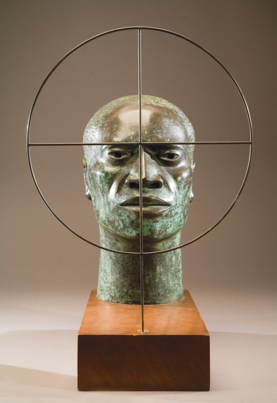
Elizabeth Catlett, Target, 1970
In 1915, Elizabeth Catlett (the granddaughter of freed enslaved people) was born in Washington, D.C. and unflinchingly depicted the violent reality of racial injustice throughout her career. Catlett’s decision to focus on her ethnic identity, and its association with slavery and class struggles, was bold and unconventional in the 1930s and 1940s when African Americans were expected “to assimilate themselves into a more Eurocentric ethic,”. She confronted the most disturbing injustices against African Americans, including lynchings and beatings, as she was confident that art could foster social change. She also portrayed civil rights leaders — Harriet Tubman, Sojourner Truth, the Rev. Martin Luther King Jr., Angela Davis and Malcolm X — as well as the courage and resilience of everyday African-Americans, particularly women. She “always wanted my (her) art to service my (Black) people — to reflect us, to relate to us, to stimulate us, to make us aware of our potential,”. She believed that “We have to create an art for liberation and for life.” Target and Black Unity (1968), a raised fist carved in mahogany, are two of the most iconic and lasting artworks in the continuing movement for civil rights.
The signifier is the cross hairs of a rifle sight framing the head of an African-American (Black) man mounted on a block of wood. It was created in response to the fatal shooting of two Black Panthers, Fred Hampton and Mark Clark, by Chicago police officers. The signified is to highlight the fact that research shows that young Black men are far more likely to be killed by police than other Americans. It also dates back to the Civil War era when rifle scopes entered into widespread use or to the present day where more up to date weapons are used as well as choke holds and physical restraints. I have discovered that artwork can have an ever lasting impact on the world as it can still be very much relevant years to come. The research has helped me discover the potential in possibly creating a symbol or action that can be used in/to identify a protest in identifying opportunities for progressing with the project. Film:
youtube
Martha Rosler, Semiotics of the Kitchen, 1975
Martha Rosler’s video is a grainy six minutes that spits in the face of America’s gendered social hierarchy. In a kind of parody (or perhaps anightmarish version) of Julia Child’s cooking shows in the 1960s, Rosler stands in a kitchen, wearing an apron and walks through the alphabet, assigning letters to various objects found there (“A” for “apron,” “B” for “bowl,” “C” for “chopper”) as she holds these objects up to the camera with an eerie lack of expression and emotion. Her movements become increasingly contrived and violent as the video continues on. By the time she gets to “fork,” she’s stabbing at the table aggressively with the utensil. When she arrives at the letter “R,” for “rolling pin,” she thrusts the object at the camera. By the end of the alphabet, she’s brandishing other kitchen tools like weapons, stabbing the air. The video ends with the artist offering an exhausted shrug, an ambiguous gesture that feels less like a resignation of fate and more a way of asking, “What is wrong with us?”.
The signifier is a woman wearing an apron reciting the alphabet while demonstrating objects in the kitchen that correspond with the start of each letter. The signified is to highlight America’s gendered social hierarchy. It also demonstrates women’s frustration with society’s expectation of them being housewives therefore they feel that they are unable to dream big due to being trapped in a cage. I have discovered that artwork can have an ever lasting impact on the world as it can still be very much relevant years to come. The research has helped me discover the potential in possibly creating a symbol or action that can be used in/to identify a protest in identifying opportunities for progressing with the project.
Cinema:
youtube
Ava DuVernay, When They See Us, 2019
When They See Us is based on a true story that gripped the United States of America, it chronicles the notorious case of five teenagers of colour, labeled the Central Park Five, who were convicted of a rape they did not commit. The four part limited series will focus on the five teenagers from Harlem (Antron McCray, Kevin Richardson, Yusef Salaam, Raymond Santana and Korey Wise). In the spring of 1989, when the teenagers were first questioned about the incident, the series will span 25 years, highlighting their exoneration in 2002 and the settlement reached with the city of New York in 2014. When They See Us was created by Ava DuVernay, who also co-wrote and directed the four parts. Jeff Skoll and Jonathan King from Participant Media, Oprah Winfrey from Harpo Films, Jane Rosenthal and Berry Welsh from Tribeca Productions executive produce the limited series alongside DuVernay through her banner, Forward Movement. In addition to DuVernay, Attica Locke, Robin Swicord, and Michael Starrburry also serve as writers on the limited series.
The signifier is five teenagers of colour from Harlem, New York sitting in a holding room after being illegally questioned/beaten by NYC police. The signified is to highlight the fact that research shows that Black men are 3.5 more times likely to be falsely accused of a sexual assault crime they did not commit than their white counterparts. It shows how their conviction effected their lives before and after they were exonerated. It also shows how they were all pinned against each other, from the very beginning, just for the sake of convicting someone due to the cases huge media coverage gaining it public attention.
I have discovered that cinema can have an ever lasting impact on an individual as I, myself, and I’m sure many others can relate will remember scenes from this movies years to come and forever carry that anger and heartache for the victims (Antron, Kevin, Yusef, Raymond and Korey). The research has helped me discover the potential in possibly using real life stories of activism (preferably issues that physically or mentally affect us such as domestic abuse, racial injustice or mental health) to create a greater impact and deeper personal connection in result making an everlasting impact on the individual viewing in identifying opportunities for progressing with the project.
2. Graphic Communications, Advertising and Semiotics
Graphic Communications:
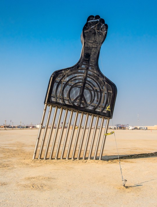
Hank Willis Thomas, All Power to All People, 2017
Hank Willis Thomas’s “All Power to All People” is an eight-foot-tall Afro pick with a Black Power fist raised to the sky as its handle. It is a response to America’s long history of erecting monuments to racist white men. It was first installed in Philadelphia’s Thomas Paine Plaza, not far from a statue of Frank Rizzo, the city’s former mayor and police commissioner. Starting in 1967, Rizzo presided over a police department that was known across the country for its unhinged racial violence, and when he was elected mayor in 1972, he only helped perpetuate and cover up this violence. The Philadelphia Inquirer cited a grim statistic that “police shot civilians at a rate of one per week between 1970 and 1978,” roughly the period in which Rizzo was running the city. Thomas’s statue was a remarkable rejoinder. Though it was only on view in the plaza for about two months, it has since become a kind of roving monument to equality. Versions of the sculpture have been shown at places ranging from Burning Man to the Washington, D.C., headquarters of the Human Rights Campaign. Meanwhile, after protests over police brutality against Black Americans erupted across the country this summer, Rizzo’s statue was vandalized and, finally, taken down.
The signifier is an eight-foot-tall Afro pick with a Black Power fist raised to the sky as its handle and a peace sign featuring in the middle. The Black Panthers used the slogan "All Power to the People" to protest centuries of racial injustice against Black people in America. The Black Power fist is associated to the Black Power movement that began in 1960. It was a social movement motivated by a desire for safety and self-sufficiency that was not available inside redlined African American neighbourhoods. The signified is to highlight America’s long history of erecting monuments to racist white men. It also shows that white racist men are glorified and rewarded for their racism with a monument. This further adds fuel to the fire as it further adds to the on going disrespect and injustice of Black people.
I have discovered that historical objects (usually frowned upon or used to shame others) relating to ethic groups can be used to celebrate and moralise. The research has helped me discover the potential in using items that cultures were originally shamed for and then culturally appropriated by other races as a way to reclaim them as their own in identifying opportunities for progressing with the project.
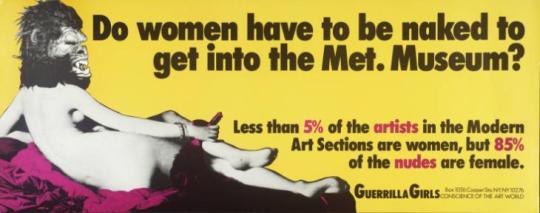
Guerrilla Girls, Do Women Have To Be Naked To Get Into the Met. Museum?, 1989
Guerrilla Girls are an anonymous group of feminist. They are female artists devoted to fighting sexism and racism within the art world. In 1985, the group formed in New York City with the mission of bringing gender and racial inequality into focus within the greater arts community. The group employs culture jamming in the form of posters, books, billboards, and public appearances to expose discrimination and corruption. Members wear gorilla masks and use pseudonyms that refer to deceased female artists to remain anonymous. Their identities are concealed because issues matter more than individual identities, "Mainly, we wanted the focus to be on the issues, not on our personalities or our own work."
The signifier is a nude portrait of a women (in black and white) laying on a purple silk sheet while holding it and wearing a gorilla mask. The purple silk sheet appears as a sex toy on first inspect, on second inspect it appears as a feather duster due to the dark shadows and shape on the sheet creating the effect of bristles but once you take a closer inspection it is clear that the sheet has been made to look this way to truck the mind. Both these items, the sex toy and feather duster, are meant to degrade women and place a stigma around these objects. They are made to shame/put women (down) purely based on the decision they make. The signified is to highlight the fact that less than 5% of the artists in the Modern Art Sections are women but 85% of the nude portraits are female.
I have discovered that objects can be used to deceive the viewer into believing something completely different to what is presented in front of them (intentionally) in other words this would be seen as an illusion of some sort. The research has helped me discover the potential in intentionally deceiving viewers in identifying opportunities for progressing with the project.
Advertising:
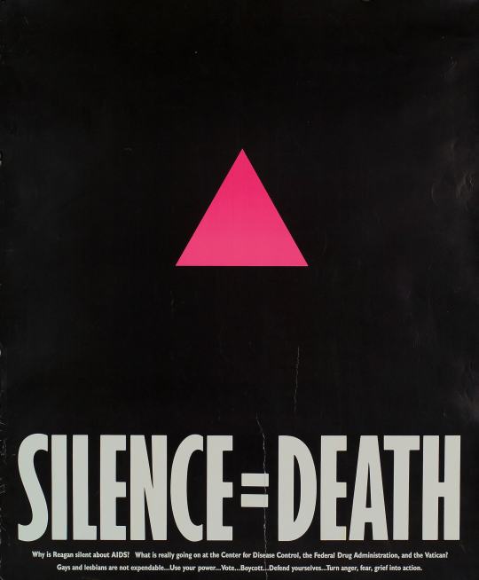
Act Up (campaign poster), Silence = Death, 1987
In the early years of the AIDS epidemic, the US government and mainstream media infamously ignored the crisis. By the time President Reagan finally uttered the word “AIDS” in 1985, 12,000 Americans had already died. That same year, six men in New York City (Avram Finkelstein, Brian Howard, Oliver Johnston, Charles Kreloff, Chris Lione and Jorge Socarrás) began meeting to privately share their experiences of AIDS-related loss in the absence of public discourse. They were inspired to create something tangible that could spread awareness, they swiftly settled on a poster. They decided that it should have have little (if any) text. Frankielien belied that “Sentences barely do (work). You need sound bites, catchphrases, crafted in plain language. The poster is exactly that, a sound bite, and vernacular to the core. The poster perfectly suits the American ear. It has a power. If you’ve ever stopped in front of one or turned your head for a second look, that power was at work.” The result of their collaboration was a hot pink triangle (an inverted version of the symbol Nazis used to label gay men) emblazoned on a black background above the slogan “Silence = Death”. It debuted in 1987. The six friends hired wheat-pasters to cover the East Village, West Village, Times Square, Chelsea and the Upper West Side (neighbourhoods chosen to reach both queer audiences and the media) overnight, and the city woke up to what became the most enduring icon of H.I.V./AIDS-related activism. Later that year, on April 15, members of the newly formed activist group AIDS Coalition to Unleash Power (Act Up) stormed the city’s General Post Office carrying copies of the sign, solidifying its ongoing centrality to their cause.
The signifier is a black and white poster reading “SILENCE = DEATH” with a hot pink triangle in the centre of the page. The pink triangle draws the viewer in creating a central focus is to highlight the fact that the AIDS epidemic/crisis was infamously ignored by the US government and mainstream media resulting in 12,000 Americans dying before the issue was publicly addressed by the current President (Ronald Reagan) using the word “AIDS” to create a clear and direct message.
I have discovered that using little to any words and a play on historical icons previously used to dehumanise others can create a powerful effect on the viewer causing them to have another look and really focus on the subject matter. The research has helped me discover the potential in reclaiming objects that are used to oppress others and use short snappy catchphrases to grab the attention of others in identifying opportunities for progressing with the project.
Semiotics:
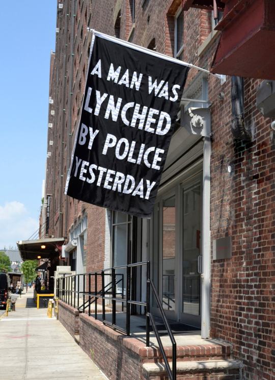
Dread Scott, A Man Was Lynched by Police Yesterday, 2015
From 1920 until 1938, the N.A.A.C.P. would mark lynchings by flying a stark black and white flag reading “A Man Was Lynched Yesterday” from its New York headquarters on Fifth Avenue. The was done to confront the residents of a northern city with the horrifying regularity of these murders. In 1938, the N.A.A.C.P. ceased flying the flag after the organisation’s landlord threatened eviction. In 2015, Dread Scott felt that the banner was just as grimly necessary in the present day United States of America as it had been nearly a century earlier. He produced his own version of the flag, updating the text to read “A Man Was Lynched by Police Yesterday” in response to the fatal shooting of Walter Scott by a South Carolina police officer. “During the Jim Crow era, Black people were terrorized by lynching…It was a threat that hung over all Black people who knew that for any reason or no reason whatsoever you could be killed and the killers would never be brought to justice,” said Scott. “Now the police are playing the same role of terror that lynch mobs did at the turn of the century.”. The piece became a source of national controversy when it remained on view above the street after a deadly sniper attack on police officers in Dallas, Texas, sparking a wave of threats to the of Jack Shainman Gallery from people who felt that the work encouraged violence against police. The gallery removed the flag and displayed it indoors following pressure from the building owner.
The signifier is a black and white flag reading “A MAN WAS LYNCHED BY POLICE YESTERDAY” hanging from a flag pole. The way in which the piece has been displayed shows a stark resemblance to the topic of discussion on the banner/flag. This is due to the fact that there is a clear link to the action/movement of what would happen to the victim when these acts of hate crime would be carried out. Furthermore, the use of black and white colours symbolise the two races affected not only that but it creates a stark contrast therefore grabbing the attention of others. The signified is to highlight the fact that “A Man Was Lynched by Police Yesterday” (something that has been and still is a common occurrence in America). It also highlights the horrific acts of hate crime and racism that is directed at/towards Black people on a regular basis throughout the world (but more commonly with the USA). These acts of hate crime have been around for centuries however they have changed in the way they are carried out and by whom they are carried out by. Despite this, one thing has remained the same…no punishment is never given.
I have discovered that subtle visual links to the subject matter create a powerful impact. The research has helped me discover the potential in simplistic art pieces in identifying opportunities for progressing with the project.
3. Fashion Design, Photography and Promotion
Fashion Design:
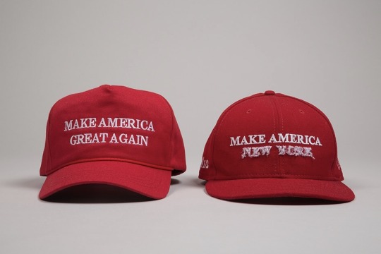
Public School, Make America New York, 2017
Public School creative directors’, Dao-Yi Chow and Maxwell Osborne, athleisure-focused show featured sweatshirts with the phrase, "We Need Leaders" on the back. Many of the models wore red baseball caps that parodied Donald Trump's campaign slogan, "Make America Great Again" insisting instead that we "Make America New York”. During the finale, the song "This Land Is Your Land" played in the background.
The signifier is a red baseball reading "Make America New York." in white font that has been unpicked creating a distressed look. This imitates the (destructive) style of presidency Donald Trump took on. The signified is to highlight the fact that Donald Trump did not follow the formal style of presidency previous President in America usually follow. It also shows how Donald Trump was unable to lead the country due to the lack of his leadership skills and only ever appeasing to his base in result leaving many Americans unheard.
I have discovered that subtle visual links to well known controversial political figures creates a powerful impact. The research has helped me discover the potential in parody art pieces in identifying opportunities for progressing with the project.
Photography:
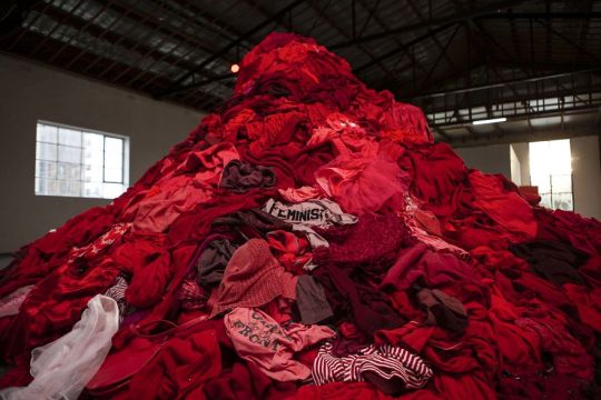
Suzie Blake, Blood Mountain, 2019
Suzie Blake created a sculptural installation featuring a 3-meter high mound of red clothing and apparel. In the 3000 kilogram pile are T-shirts displayed slogans like “Girl Power” and “The Future Is Female” which peak out from the crimson clothing. It is displayed like a giant pile of landfill. The clothing is all in the hue of that liquid which runs through our veins and tarnishes our hands when we remain silent on serious issues. Blake created the work in the form of a mountain as it is considered the archetype of ascent and power ( the bridge between heaven and earth). Her goal was to reimagine this archetype in the form of greed and waste. “Blood Mountain” asks, what is the environmental cost of bloated man-made structures? And what is the role of feminism within such structures? Also, whose empowerment does the current iteration of the feminist movement serve? And since when did we think it was acceptable for brands to piggyback on our movement?
The signifier is a sculptural installation featuring a 3-meter high mound of red clothing and apparel. The signified is to highlight the fact that the fast fashion industry is the second biggest polluter after oil. It also brings attention to the fat that most garment workers are women, or sometimes girls (around 85%) who get paid on average $3 a day. It also raises a set of questions in the viewer’s head such as “What is the environmental cost of man-made structures?”, “What is the role of feminism within such structures?”, “Also, whose empowerment does the current iteration of the feminist movement serve?” and “And since when did we think it was acceptable for brands to piggyback on our movement?”.
I have discovered that pairing well known objects (that are associated with a topic) and subtle objects that imply the effect the topic has on humans creates a powerful and clear message while opening viewers’ eyes to situations that were overshadowed. The research has helped me discover the potential in direct but subtle art pieces in identifying opportunities for progressing with the project. Promotion:
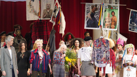
Vivienne Westwood, Homo Loquax A/W 19 LFW, 2019
Vivienne Westwood is renowned for seamlessly amalgamating fashion and activism, having used her platform over the years to protest a whole range of issues, from fracking to austerity. Westwood had models wear clothes with slogans berating politicians while protests about the environmental impact of London Fashion Week took place. She sent models down the catwalk wearing aprons and tabards with anti-consumerist and climate change slogans.The show happened at the same time as environmental action group Extinction Rebellion organised protests at several of London Fashion Week venue's to highlight the throwaway nature of the fashion industry. Models also held microphones and spoke to the audience in a theatrical display, urging one another to buy less and pontificating on the consequences of consumerism. A model paused on the runway to say that Brexit was a crime, while another took a jibe at American foreign policy. The clothes themselves were as avant-garde as one would expect of a Vivienne Westwood collection.
The signifier is a collection of clothes featuring slogans berating politicians. The collection also featured a set of playing cards that illustrate a plan to save the world from climate change. The signified is to promote the dangers of climate change, Brexit and capitalism. It also shows that fashion is all about styling: buy less, choose well, make it last.
I have discovered that using a global stage to speak out on issues that affect the world as a whole can deliver a strong and direct message. The research has helped me discover the potential in using fashion as a political message/statement in identifying opportunities for progressing with the project.
15 notes
·
View notes