#Monospace Sans
Explore tagged Tumblr posts
Text
Indie Code

From my Undertale AU: Monachopsis Tale
🪴─── ⋆⋅☆⋅⋆ ──🪴
Below is about the AU.
Indie isn't a human or a monster. They're made up of binary code scattered from broken AU's that were destroyed or deleted by their creators. Fragments and shards of those destroyed AU's came together and built Indie Code.
Indie Code is a mix of all Undertale humans and monsters. They just take the form of something between Frisk and Chara, but they can shift into any form they want and look like anything because they are just binary code, a line of code.
The AU, Monachopsis Tale, takes place in a broken and shattered version of Undertale, but pieces glitch and no-clip due to it being a hybrid of several bits and pieces of AU's at once. Some parts of the AU turn into binary code before disappearing.
Is there anyone else besides Indie Code in this AU? There is a Sans but he was created after Indie was. He's not a clump of binary code like they are, instead, just small pieces of him are binary code and the rest are fragments of other Sanses.
Indie Code is a husk, unable to feel emotions, and yet at the same time they can, but the emotions they feel aren't theirs. It's the emotions of everyone that were destroyed in the AU's made to create theirs. Indie is capable of traveling beyond just the Undertale Multiverse, they can go to other realities entirely (e.g. Sonic The Hedgehog's franchise). But Monospace (Monachopsis Tale Sans) always stops them.
Will the Star Sanses or Bad Sanses ever meet Indie Code or Monospace? Yes. Monosoace hates all other Sanses because he can actually hear their thoughts and feel what they feel (due to him basically being several Sanses in one) and Indie is incapable of forming their own opinion on the matter, but all the people in their code scream at them that both sides (Star and Bad Sanses) are not to be trusted.
#Monachopsis Tale#Indie Code#Monospace Sans#Undertale Au#Undertale#utau#utmv#original character#original undertale au#original art#my art#my universe#jupiter✩#respawningjupiter#ResetJupiter#backup account#JuiceBox☆#jupiter art#Juicebox art#🪴꩜ art ꩜🪴
20 notes
·
View notes
Text

Oh, what could this be-

oh my
#in terms of regular updates there are 138 unique fonts submitted by my standard definition#though i hate to lump monospace with sans serifs it might have to happen
19 notes
·
View notes
Text
Theme Adventure
i was gonna start this post with "okay, i know i haven't posted in a couple days", but then i found that queued post in my frozen queue, so that's not even true anymore. anyways. i haven't been productive because i went on an Editor Theme Side Quest which went from an hour to 3 days. At first, I found a theme when I was looking for plugins to add to the Project Template, but it didn't look the way I wanted. It was a little darker than vanilla, with more saturated colors for the text editor, but it had a yucky font and some of the text colors were questionable. I had to directly edit the Godot settings text file, which was suuper fucking annoying, but it was kind of interesting, I guess. After I discovered I wasn't a fan, I reset all my editor stuff to default, and started changing the colors myself.
Initially, I was only changing the background/accent color, so I could have a slightly darker mode with orange details (gotta rep the niche favourite color pick). Then I realized I could just steal only the colors from that theme, and then I could tweak them to my liking. I was originally gonna just boost their saturation and be done with it, but (like everything else in this damn story) it got a little out of control, and I ended up making an image in ms paint to visualize what the different text colors would look like together.

If you look closely at what the final product looks like (which took WAY MORE TWEAKING after this), and compare it to my silly paint blueprint, you'll notice just how much I ended up changing between the two. I tried to maintain the original saturation values, to keep a similar vibe in the editor. I'm particularly happy with the blue strings, teal node references, and orange functions - they make everything look really pretty with the pink keywords. The entire editor just has a very different vibe that satisfies my rabid urge to be quirky.

God, if there's two things I love in design, it's bright, saturated colors on a dark background, and fucking ORANGE, BABY!!!!! It looks wonderful. So wonderful, in fact, that I completely forgot that normal people don't code in Comic Sans. Since I started coding 4 years ago, I have coded in Comic Sans (or Comic Mono, to be exact), and I have not been able to code in anything else. It's just the norm for me. Any time you see something I create, remember that it was made in Comic Sans. Anyways, I wrote way too fucking much about my silly editor theme, and I need to get back to actually doing work. Take care, Mike! :)
#game dev#godot#the reason i use comic mono is actually incredibly funny#when i was in high school we had an assignment where we would make the computer draw rectangles#but it would draw them with text. like you would print a string that said “------” and then one that said “| |”#and mine would never look right and neither me nor the teacher could figure it out#we were so pissed#and then i realized that i wasn't using a monospaced font (Comic Sans)#and when i changed it back everything was fine#and i was so embarrassed i never brought it up to my teacher again and downloaded Comic Mono instead of using a normal person font#now every new IDE i start using i have to install Comic Mono on as part of the initial customization process#i secretly feel like i'm gonna end up hating my theme but i'm gonna keep using it because i'm stubborn
0 notes
Text
i love to format things in a way that makes them readable to me (girl who just discovered yellow backgrounds and double spaced text)
#its SO much easier to read#when the background is yellow and the text is double spaced and theres spaces between paragraphs and the font isnt horrible#<- font in wuestion js times newnroman. IT SUCKS#my fave serif font is baskerville old face. my fave sans serif font is corbel. my fave monospace font is courier new.#kittipost
0 notes
Photo

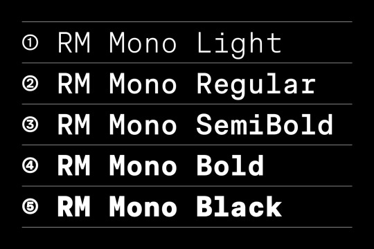
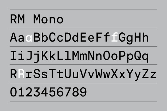
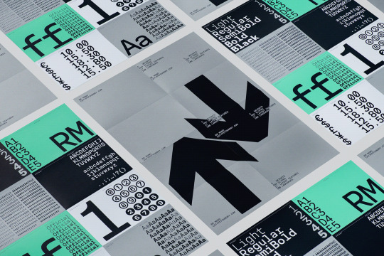
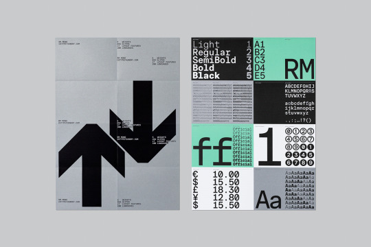


(vía RM Mono Typeface on Behance)
1 note
·
View note
Text
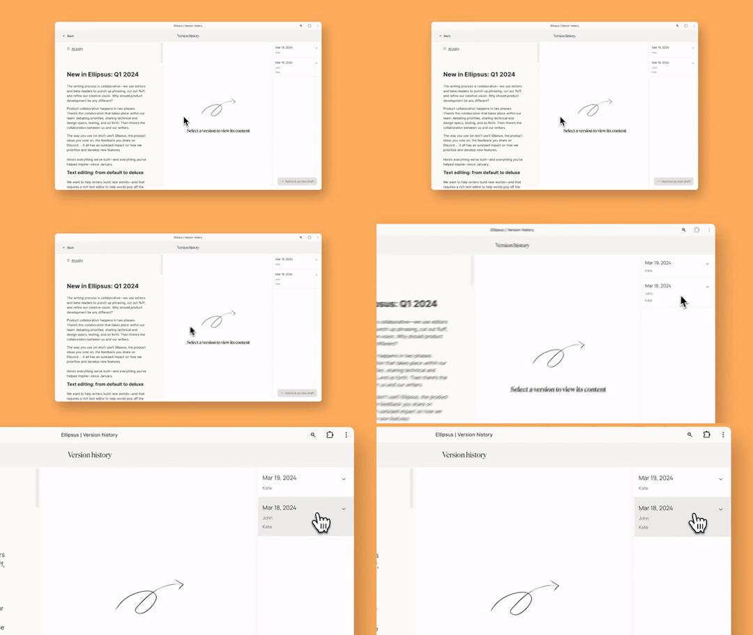

There’s a LOT of new stuff in Ellipsus this month!
Writing is collaborative—we use beta readers to punch up phrasing, cut the fluff, refine our creative vision... why should building a writing tool be any different?
With our awesome beta users’ input (seriously, we love you guys sm), we’ve spent the past few weeks shipping:
📑 Version history!
🔡 6 new fonts (new sans serif, serif, monospace, and accessible fonts!)
🔍 Find and replace
👋 Live cursors
📲 Faster mobile formatting
Annnnd lots more!
Check out the full list of updates on our blog!
(OR - join the beta if this is your first time meeting us! Hi!)
Much love, and happy writing! XO
~ the Ellipsus team.
617 notes
·
View notes
Text
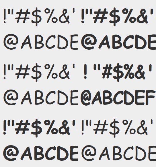
MODERN FONT TECHNOLOGY IS INSANE
(I'm using High-Logic FontCreator 15 to turn Comic Sans (or rather, my upgraded versions Comic Sans Unicode and Comic Sans Mono) into a so-called "variable font" which supports SMOOTH interpolation of things like font weight, but even monospacing as shown off here—and any combination of these traits can then be interpolated from these as well. It's blowing my mind and it's much less of a pain to work with than I had anticipated but it IS going to be a lot of work nonetheless. Still holy fucking shit I'm creating magic rn)
183 notes
·
View notes
Note
Hi April!
I have some of questions about the public-facing transcripts of Magnus Protocol.
They have a very “shooting script” vibe. Are these the same as what’s given to the cast, a very close derivative, or something else?
If they aren’t what’s given to the cast, when in the process do they get made?
A weird copyediting question: What drove the change from the monospaced font (I think Courier New) to the bolder sans serif font? And is there a reason the headers and footers are the old style?
An esoteric “my masters is in rhetoric” question: The scripts contain quite a bit of content that isn’t in the audio. In the other hand, I hear that The Magnus Protocol is a podcast. Are you able to talk about your personal opinion on their relationship to the text? I’m not asking for an answer on authorial intent or the “on high” answer, but I’m curious how various people involved in making Protocol think of them. (As an example, I’ve been thinking of them, to go back to the as “apocrypha”; I think of them as true, but also not as part of the text, if that makes sense. More like annotations or marginalia.)
Anyway, welcome to the public Tumblr stuff! It’s cool to have you here.
Oooooh very happy to answer this, mostly because I think it’s a neat example of how we work as a team.
The short answer is yes the transcripts are derivative of the shooting scripts but they aren’t the same.
Alex and Cathy are both very sensitive audiophiles who have worked together to make those layers and layers of interesting audio bits some people catch but others don’t (the lie glitches are an example as well as the whispers in episode 10) Conversely, I have mild progressive hearing loss and handle the transcription.
As I am also the producer, I know all of the plot points, beats, and important bits that need to be communicated for the story to work. I use the shooting script as a guide and listen to the final release audio along with the shooting script and make edits as I go. Sometimes different takes are used, sometimes audio cues change etc. I also try to obfuscate information that’s not yet revealed in the timeline.
I will admit I don’t catch everything, and definitely make mistakes, but ideally the transcripts are designed in such a way as to make sure people who may not be as keyed in to the highly detailed audio execution can get a similar experience by reading the transcript. I have such respect for Cathy for the work she puts in artistically, we want to make sure people know what they’re hearing.
Our audio team are exceptional in such a way that they are constantly trying to balance creative narrative with accessibility. You can get all of the information in the audio, but we recognize that’s difficult and we are often people’s first experience in audio drama, so we balance it with the extra information in the transcripts.
The layout and design of the transcript was influenced by external guidance for the visually impaired who recommend 14 point bold Ariel as the most readable. We also release Word versions so people can use dark mode or adjust font size and style if needed. Accessibility is different for everyone, we do our best to make sure we have options available.
—
For amusing behind the scenes mistakes I know I have made:
People may have remembered the old pilot had ‘Norris’ labeled as ‘Martin’ this was because we changed Norris’s name so many times I didn’t know what to call him and accidentally forgot to change the Martin placeholder. 😬
So yea. I’m not perfect and nor are the transcripts but we try our best.
71 notes
·
View notes
Text
How I pinkify my code editor/IDE!

Continuing on posting about how I making my coding experience more fun, I'll be going to show you what I did to pinkify my:
code editor (VSCode)
IDE (Visual Studio)

Visual Studio
Theme
So, let's start with Visual Studio because I use that the most because of work! I installed themes to it (here is a post I made on how to install the exact ones I have (install once, comes with lots of themes)) and I changed the fonts!
Best you follow my installation post, as the themes I will list now will be from that exact theme set I installed (called "The Doki Theme"). I'm a fan of Light themes more than the Dark ones for VS:
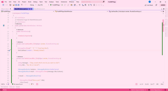
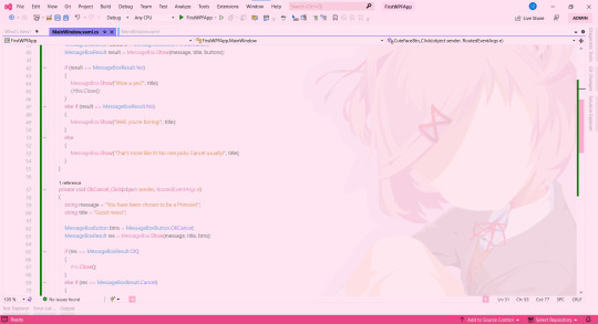
♡ Natsuki Light (the theme in the pictures + my favourite) ♡ Beatrice ♡ Mai Light ♡ Miia ♡ Mioda Ibuki Light ♡ Nakano Itsuki ♡ Nakano Nino ♡ Ram
Themes 'Beatrice' to 'Ram' have pink in the themes but it's not the main colour of the theme, if that makes sense, but still cool to me so I switch to them every so often! ヾ(^-^)ノ
Fonts
Sometimes I get tired of the monospace font on my code editor. I know it's almost a crime to change the font of your code editor/IDE but I get bored so easily, a well-known trait of mine, and want to spice things up again so I change the font! As well as that, my eyes have a hard time reading the code after a while because of the monospace font! I still sometimes use it though~! (´;ω;`)
But first, for those who don't know how to change the font + font size (if you want also) in Visual Studio:
♡ Toolbar > Tools > Options > Environment > Fonts and Colors > Font
Okay, so I split my chosen fonts so you can pick according to your font style taste~! :
Sans Serif
♡ Bahnschrift SemiLight ♡ Calibri ♡ Gadugi ♡ Segoe UI Semilight ♡ Segoe UI Historic ♡ Yu Gothic
Serif
♡ SimSun
Monospace
♡ Modern ♡ Terminal
That's it for Visual Studio!

Visual Studio Code
Theme
These are my favourite themes and the first one is the one I am currently using! To learn how to change the theme on VSCode: here. Now my chosen themes:
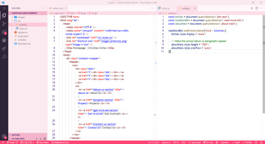
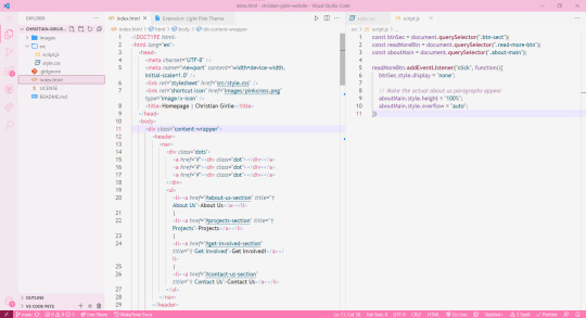
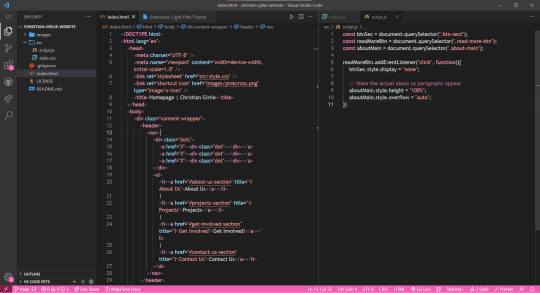
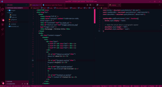
♡ Cute (no. 1 shown) ♡ Fluffy Theme ♡ Huacat Pink Theme ♡ Light Pink (no. 2 shown) ♡ PinkyBoo ♡ Tinacious Design (Light) from Tinacious Design theme ♡ Dark Pink from Light Pink Theme (no. 4 shown) ♡ Her. ♡ Kawaine Theme ♡ Pink Cat Boo ♡ PinkBlue from PinkBlue Theme ♡ Robot Light Pink (no. 4 shown)
Fonts
The current font I have on VSCode is Trebuchet MS. But the font mentioned before are the ones I used in VSCode as well! To change the font in VSCode:
♡ Settings > type in the search bar 'Font' > Editor: Font Family
That's all!

I hope this was a fun read and helps someone! Make you're coding environment fun! (and pink) 🥰💗
#codeblr#coding#progblr#programming#studying#studyblr#comp sci#codeblr pink girl#codeblr girl goals#pink#pink aesthetic#pinkcore#visual studio code#visual studio#vscode#my resources
212 notes
·
View notes
Text
Modern AU Kaamelott
(j'ai lut La petite hétéro by TheHappyEgg et ça ma rongé le cerveau donc voila mon AU foireux sur les perso de Kaamelott étudiant).
Arthur Pendragon
" il sent la monster et la clops dès huit heure trente, baptiser “l’accumulateur compulsif”, j’ai nommer; Arthur Pendragon! "
Je vois Arthur étudiant en histoire de l'art avec options Archéologie, ses subjects préféré: Rome Antique/Grèce Antique - Moyen-Age. Il a redoublé sa L2.
Il a EVIDEMENT fait un Erasmus à Rome.
Il est aussi au conservatoire, musique classique ou modern.
Certainement président d'une association étudiante qu'il a repris ou créer ( Surement un truc du genre "La table ronde" pour que tous vos droit soit respecté)
Grinder/Tinder: Peux importe l'appli', il est dessus.
Surement boursier, doit certainement bossé à la BU ou à un U.
Vous pouvez pas m'enlevé qu'il écoute SUREMENT, du Kyo, il en a honte mais il a tous les albums et les a vue en concert.
Il conduit surement une monospace acheté sur le boncoin pour pouvoir trimbalé toute l'équipe.
A un décapsuleur/couteau suisse baptisé Escalibur.
Depression, burnout, anxiété, manque affectif, le con a un cocktail.
Bonus: Bisexuel voir Pansexuel ? Certainement polyamoureux.
Lancelot Du Lac
" Élus mister Université trois années de suite! le fière le fringant, Lancelot Dulac! "
Troisième années de droit, surement de droite qu'il dit "modéré".
Il est obviously, le secrétaire de l'asso' d'Arthur, ils l'ont créer ensemble à l'époque.
Un conte tinder qu'il assume pas, avec une description genre " Capitaine de l'équipe de badminton, j'aime les balade sur la plages, recherche relation sérieuse".
Je sais pas Lancelot c'est le connard qui conduit une mini, ou une voiture deux places...
Si il fait pas aussi partit du BDE/ est le chouchou des profs c'est pas normal.
Il fait de la poésie en cachette.
Je dirais BPD, ou problème de gestion de la colère, problème obsessionnelle, OCD meme ?
Bonus: Hétéro qui pourrait avoir une seul relation gay dans sa vie, genre pour être sur qu'il est bien hétéro.
Perceval De Galle
"Revoyant à peine la lumière du jour, sortit l’année dernière d’une prépa Math-Physique, je vous présente, Perceval De Gales! "
Je peux pas être objectif c'est mon chouchou.
Premier année en école d'ingénieur.
C'est se genre de gars mauvais au collège/lycée mais qui est inaltérable à la fac.
Il a fait un bac pro Mécanique Auto pour bossé dans le garage de ses vieux, mais son prof de math la poussé à tenter une prépa.
Ce con a fait une prépa Math-Physique et il c'est jamais autant fait chier de ça vie car tous était trop facile.
Dyslexique, j'ai raison c'est tout.
Membre du club d’astronomie et de l’association de la table ronde en temps que fouteur de merde première catégorie.
Octogone sans règles des que quelqu'un parle de la théorie de la terre plate.
Le connard que Arthur va voir quand son monospace lâche.
La définition d'un "con intelligent"
C'est le con qui à donné "Escalibur" à Arthur.
Bonus: Celui la est technique: "Le genre qui sort avec une personne pour son âme et rien d'autre" Il s'en fout, beau moche, trans, cis, nonbinaire tous ca, si l'amour est là, il est là, sinon demi-sexuel.
Karadoc de Vanne
" Un petit creux ? Une baisse de sucre ? Besoin de savoir quel est le meilleur kebab rapport qualité pétage de bide? Alors il vous faut : Karado de Vanne!"
A rencontrait Perceval durant les années lycées.
Je le vois pas étudiant ? Ou peut etre un truc genre STAPS, mais plus pour la blague.
Lui il a fait un CAP cuisine.
Deuxième fouteurs de merde de première catégorie dans l'assos, mais il serre aussi de traiteur quand ils font une soirée.
Il conduit un kangoo, un véhicule de chantier qu'il prend à ses vieux.
C'est le type qui a réussis à couper une tranche de saucisson avec sa carte étudiantes
A une note google map avec tous les meilleurs restorant, bar, fastfood et kebab de la ville classé part ordre de qualité/prix.
Il connait toutes les petites boulangerie et fromageries de la ville.
A surement gardait sa carte METRO de son anciens job d'été.
Connait beaucoup trop de monde dans l'industrie agro-alimentaire.
Personne ne sait comment il a eu une copine.
Bonus: Hétéro part défaut, pas de questionnement rien, c'est les réglage d'usine.
Bah c'est déjà pas mal dis donc, si vous en voulez plus hésité pas à me demandé, j'ai encore Merlin, Bohort et Elias dans un coin.
#arthur pendragon#kaamelott#Kaamelott headcon#Perceval de galle#Lancelot#Lancelot du lac#Karadoc#jpp de moi quand meme#my headcanons#modernau
37 notes
·
View notes
Text
im redoing bits of my website in order to prepare for being it my main thing to publish things.
and i wanted to change the font, it's Trebuchet rn and thats nice but i wanted a more unique font.
I found a nice OFL typeface, but it's monospace, and i like it! i use it as my console font on my laptop. but for my website i want it to be more readable and monospace fonts aren't great for readability. so i checked and they do have a non monospace typeface! the mono one was serif but this one's sans serif, but i still liked it.
the typeface in total was over A THOUSAND DOLLARS!!! each individual font was 25 bucks each!!!! i forgot how expensive fonts are and i'm so sad
8 notes
·
View notes
Text
I LOVE monospace types a lot but in the same vein as pixel fonts I think people need to understand that readability is an actual issue for ppl. I notice this in artist spaces more often but bodies of text without paragraph breaks using small and stylistic display fonts are PRETTY. Obviously. Even composition and typography is beautiful. But the second readability is compromised it all just goes out the window for me. Use sans serif or serif or whatever else is NOT a display font for your body! No matter how good it looks what is the use of it if it doesn’t read well! That is what design is… accessibility
5 notes
·
View notes
Text
ROUND 1 - YELLOW GROUP


Propaganda under the cut.
Comic Sans MS: [default inclusion]
Roboto: "Roboto (because it functions as being incredibly legible for all letters) monospace (because monospace fonts are objectively better than their non-monospace counterparts, assuming the letters are centered)" - note: for this tournament, font families were taken as the parent font barring strong circumstances
65 notes
·
View notes
Text
✨YALL I’M AT IT AGAIN! THIS IS MY WORLD! IM MAKING A SHOW!!!✨
Okay so a while ago I had an idea… what if, hear me out… Fonts were magic? OKAY OKAY! I know it sounds lame and stupid but hear me out!
Summary: In this world writing specific words or phrases in different fonts creates magic. There are ten totems (the words you must write to summon anything): Fire, Earth, Water, Air, Energy, Body, Light, Darkness, Mind, and Sharp. All these forms of magic do exactly what they describe but can change depending on the font used to write them. There are five font categories and each category has a diffract defining trait.
Serif: The serif font type is the cleanest font that still has a human artistic touch. These fonts are summoning fonts, like summoning a ball of fire, water, or energy or summoning an ice dog or dark minion.
Sans Serif: Sans Serif fonts are the most common (other than serif) font type so they have many different variations. The commonality between all Sans Serif types is they all create a kind of weapon, armor, tool, or shield.
Script: Script spells are the most powerful and deal with complex spell types. These fonts deal with things like curses, charms, and illusions.
Monospaced: Monospaced spells can be paired with any other spell type and combine with it. These spells are assistant spells like healing, instant damage, or adding effects like speed or strength. (Like the potions of spells) But these spells do not have to be paired with other spells; they can also do individual effects.
Decorative: Decorative fonts are like Graffiti or Cooper Black. These fonts are bold, have a lot of personality and are usually the least common because of their difficulty. These fonts are so unique that they possess the ability to transform objects or creatures like alchemy but there is not much known. You usually can't pair monospaced with decorative. Also these fonts are not taught…
I this world spell casters are called calligraphers and there are many schools that teach spell casting! But there are illegal fonts and forms that are not in use anymore.
Guide
To create a spell, one must first have something to write with. This writing tool is usually known as a stylist, it is most often a pen or paintbrush of some kind that is embedded with a magical property known as a soul string. These soul strings are placed within the stylist and that's what gives it its spell-casting abilities. All living beings with souls can cast and can also cast with out a stylist, but this is hard because casting through a pen or brush is more difficult because the soul magic has to go through something that isn’t living.
Now you need something to write on. Most of the time calligraphers will write their spells on paper but paper is not the only thing that is used to cast spells. Any object works but it works best on silk, animal skin, clay, paper, or wood. The type of paper can also make the spell stronger or weaker. The strongest paper type is made from the wood of a Kya tree and embedded with black sand. The strongest hyde type is dragon skin and the strongest clay type is porcelain.
Now that you have your paper and stylist you need to write the spell itself. If you want to light a small fire (Like a candle fire) you must write the fire totem aka the word “Fire” in the font of your choice. The font you choose will determine what happens when you cast. To get a small flame you must make your text small and choose a font that creates a small reaction Times New Roman for example creates a ball of what ever totem it is casted with.
Once you have written “Fire” in the font in the smallest text possible you may now cast it. You can either cast with your stylist or your hand, writing the spell must be with the stylist but casting can be with the hand. You must put either your hand or your stylist on the paper and lift the spell off of the paper. You can hold the spell for as long as you can keep concentration on it. As soon as concentration is lost the paper fades away or the material is no longer usable and the spell on the material can no longer be cast.
When creating a spell you must write the phrase perfectly in the particular font that you choose. If you want to make a spell with the font Helvetica then you must write the font perfectly for the spell to work. Each letter is a rune and the way each letter is written is vital to how the spell is cast. Some fonts are harder to learn but others are just lost to time. The fonts known as icon fonts aren't used anymore and have a different casting system. *cough cough, the main character uses an icon font*
The species that the story is about is called the Omari and they have horns! Also all casters have a soul type which determines a whole but load of stuff but that not important right now. The soul types are control, bright, random, full, empty, and dark. The marks in your soul reflect your life and what has happened to you. Your soul type also determines your familiar, there are two familiar types, fairies and ghosts. Ghosts are usually a family familiar so they are passed down but fairies choose you based on your soul type… to get a familiar you must be a caster already, at least level two…

#art#artwork#oc illustration#my own world#I am making a story#this is my world#I can’t get this out of my head#there will be more
9 notes
·
View notes
Text


making a new site.
it's gonna be fully dynamic with a.. gasp. back end. so stories will be stored in a database and I won't have to break my back and update multiple pages when uploading a story.. I just add it to the database!
currently, pages can be routed to series and tags when you click on them, showing all the stories belonging to that series or tag. there's also a search function but I'm not gonna lie it kind of sucks balls. however, it can search through text in the stories themselves. it also returns results based on title, description, tags, and series, and you can search multiple queries. the functionality for this isn't the most sophisticated and my tagging system is bare bones and honestly kind of awful but I don't do extensive tagging anyways so it's not that serious.
I've also added functionality for stories with multiple chapters where pages automatically add pagination and a drop down if detected. all fucking automatic. it's awesomesauce.
guests can also change the site theme and it gets added to your browser's localstorage. there's 3 font sets with different types for body text (serif, sans serif, and monospace) and 3 color themes (dark, light, high contrast). I probably won't add more because it's a pain and some are ugly enough but I wanted that to be there since reading comfortably is important
next up is adding a gallery for my art and also a comments system (for both individual story chapters and art) and maybe a guestbook though maybe not.. can't decide..
5 notes
·
View notes
Photo

Modern monospaced type family of 10 weights combines classical and modern sans-serif design with humanistic touch, featuring large x-height, condensed glyphs, and soft strokes.
Link: https://l.dailyfont.com/78fRA
#aff#Font#Design#Typography#ModernTypeface#Monospaced#SansSerif#Humanist#LargeXHeight#CondensedGlyphs#SoftStrokes#Innovation#Technology#Inspiration#Creativity#Artistic#Branding#Marketing#Communication
4 notes
·
View notes